Archiwum miesiąca: luty 2017

Kabarga logo

EVN

Every Pixel Counts at D&AD Next Awards
Post pobrano z: Every Pixel Counts at D&AD Next Awards
F/Nazca Saatchi & Saatchi have released a new series of stop motion animations as the centre-piece of this year’s “Every Pixel Counts” campaign, promoting the D&AD Next Awards. The Every Pixel Counts campaign spotlights the work of previous Next Award winners and the attention to detail of their creative process. Animations will be shared across all social channels over the coming weeks before entries close on 22 February. The animations were created using over 500 acrylic pieces, which were carefully lit and photographed frame by frame. It took seven days in the studio, more than 840 photos were taken, and for the animation and composition, each pixel in each frame of the film was individually separated, treated and coloured.

Production company Piloto talked about the animation process, “We created the motion scenes on the computer, trying to find graphic patterns in movement, and then repeated them manually on the animation table, forming a ballet of Pixels.”

Care for the smallest details is also evident in the choice of sound producer and voiceover for the animated campaign, Dru Barnes, a Grammy-nominated rapper, who immersed himself in the different texts before performing them. The six tracks were filmed in one day in New York with Brazilian musicians “Aldo the Band” providing the instrumental accompaniment.
The “behind the scenes” film brings all these elements together and an exclusive filmed interview with Rodrigo Castellari and Pedro Prado, creative directors at F/Nazca Saatchi & Saatchi, explains the creative thinking behind the campaign.
Every Pixel Counts Credits
The Every Pixel Counts campaign was developed at F/Nazca Saatchi & Saatchi, Sao Paulo, by general creative director Fabio Fernandes, creative directors Pedro Prado and Rodrigo Castellari, account managers Ricardo Forli and Thiago Iusim, RTV team Elucieli Nascimento, Fernanda Sousa, Rafael Paes, Renato Chabuh and Victor Alloza.
The films were produced at Piloto, Sao Paulo, by director/DOP Daniel Soro, director/art director and editor Alexandre Chalabi, editor Arthur Britto, stop motion animator Breno Licursi, animation and composition team Ricardo La Bella Simonetti, Rafael Meira, Monica Meira, Petterson André and Igor Romana, rotoscope artist Diego Ruiz, finisher Ed Andrade, executive producer Natalia Souza, production coordinators Suyan Mariotti and Caroline Souza, account managers/line producers Regina Knapp, Roberta Frederico, Ariane Esteves, Catia Nucci, post production coordinators Nayla Kols and Regina Mimi , sound producer Evil Twin, maestros André Faria and Murilo Faria, documentary content director Ariel Danzinger (NY), account manager Juliana Tangary with voiceover by Dru Barnes.
BHF Unexpected – When You Least Expect It
Post pobrano z: BHF Unexpected – When You Least Expect It
The British Heart Foundation (BHF) is running “When You Least Expect It”, a controversial integrated brand campaign that continues to reinforce the message of the sudden and unexpected devastation of heart disease: ‘Heart disease can kill when you least expect it”. The provocative element of the campaign is a commercial set in a wedding, in which the maid of honour collapses and dies. The BHF Unexpected campaign brings together a broad spectrum of media to deliver the unexpected. Real time native content was provided for a takeover of The Sun’s key editorial locations including the sports page and TV listings. Unexpected ‘lifestyle’ media including coffee cups, taxis, cinema tickets and mirror clings. The BHF Unexpected campaign seeks to act the same way that heart disease behaves in real life, with content that disrupts routines, draws the viewer in with its unexpected nature. Tailored, custom long form copy is designed to draw attention with a relevant and irreverent message, bespoke to the media. In doing so the campaign also tackles the indiscriminate nature of heart disease by delivering what feels like a direct, one to one conversation with whoever is interacting with it, but at a national audience level.

Heart disease can affect anyone at anytime, tearing families apart in an instant. The fact it strikes without warning is what makes it cruel – leaving loved ones with no time to prepare for it, no time to say and do the things they really wish they had. But there’s a way of fighting back. For over 50 years the BHF has pioneered life saving research to fight heart disease, believing that no one should have to suffer this devastation.


Carolan Davidge, Director of Marketing and Engagement at the British Heart Foundation, said: “This campaign aims to shift the way people think about heart disease. The truth is that heart disease can strike at any time, leaving loved ones devastated and unable to say goodbye. Around 3,000 lives are lost to heart and circulatory disease every week in the UK. By making people contemplate the unexpected devastation that heart disease causes, we hope to inspire people to donate funds so the BHF can continue to fund life saving research.”
Richard Denney, Executive Creative Director MullenLowe explains: “Heart disease is cruel and its scale is often underestimated by the public. Our new work aims to make sure that every medium used in this multi channel campaign, engages and resonates with the viewer to deliver the British Heart Foundation’s message.”
BHF Unexpected Credits
The BHF When You Least Expect It campaign was developed at MullenLowe London by executive creative director Richard Denney, creative team Andy Long and James Millers, agency producers Nicholas Kurs and Rose Reynolds, planner James Dawkins, account team Paul Wilde, Tom Lindo, Charlie Hurrell and Kirsteen Scoble.
Media was produced at PHD.
Designers were Elisabeth Bolzon, Rob Hare and Ryan Self.
Filming was shot by director Ed Morris via Rattling Stick with director of photography Federico Alfonzo and producer Dulcie Kellett.
Editors were Sacha Szwarc and Ellie Johnson at Speade.
Post production The Mill by executive producer Chris Batten, producer Evelyn O’Reilly, 2D lead artist Dan Adams, 2D artist George Rockliffe, production assistant Kate Michaelis, colourist Mick Vincent, and assistant colourist Thomas Mangham.
Audio post-production was done at GCRS by sound engineer Ben Leeves.
Edeka Eatkarus learns to fly
Post pobrano z: Edeka Eatkarus learns to fly
German supermarket brand Edeka is running “Eatkarus”, the story of a boy (Joseph Harmon) who dreams of flying and discovers the significance of food choices. The Edeka Eatkarus commercial was inspired by the Greek myth of Icarus and Daedalus, whose escape from the labyrinth of Crete was made possible with wings of feathers and wax. The story of Eatkarus shows the boy raised in an environment of obesity fuelled by gray splodge. His discovery of a bird through the window sparks a dream of flying. In the mountains he discovers the bird’s secret. “Iss wie der, der du sein willst”, is translated in English as “Eat like the one you want to be”. Edeka’s action site, edeka.de/issso, provides daily tips for diet, a body mass index calculator, and the Eatkarus film.

Edeka Eatkarus Credits
The Edeka Eatkarus campaign was developed at Jung von Matt/Alster, Hamburg.
Filming was shot by director Alex Feil via Tempomedia with director of photography Carlo Jelavic.
Music is “All I Can Do”, by Ben Kendrick.

All I Can Do Lyrics
Why does life sometimes feel so wrong
like running in circles and you don’t belong?
I always knew that this day would come
It’s time to break free, meet me on the run.
But what am I really running from?
And I look up to the open sky,
hopes in my heart,
dreams in my eye.
Will I ever make it right this time?
And all I can do
And all I can do
And all I can do is try
I hear the sound of change,
it’s everywhere they’re tryin’ to hold me down,
but I don’t care whatever they say, I believe in me.
Why am I the only one to see?
I won’t give up and I won’t give in.
Where it ends is where I begin
But am I really, am I really strong enough?
And all I can do
And all I can do
And all I can do is try
Order from Chaos
Post pobrano z: Order from Chaos

Pause Fest: OCULAR
Post pobrano z: Pause Fest: OCULAR

How to Create a Vector Portrait With Curly Hair in Adobe Illustrator
Post pobrano z: How to Create a Vector Portrait With Curly Hair in Adobe Illustrator

This tutorial was originally published in November 2012 as a Tuts+ Premium tutorial. It is now available free to view. Although this tutorial does not use the latest version of Adobe Illustrator, its techniques and process are still relevant.
I’ve created several vector portrait tutorials in the past, but one request is made several times and that is how to create curly hair. In today’s tutorial, I’m going to show you one of the easiest ways of creating detailed curly hair. So let’s jump in and begin creating!
To create gorgeous portraits of your own, consider one of our amazing Adobe Illustrator Hair Brushes from GraphicRiver. Or enlist the help of a design professional to create your very own portraits from Envato Studio.
1. How to Prepare the Document
Step 1
I start by creating a New document and then File > Place my stock image onto the canvas. As I want the hair to be one of the biggest features of this composition, I want to make sure that it has enough space to garnish the attention from the viewer.
I then set up my layers as shown in the Layers panel below. In the layer „BG” I have placed a white fill Rectangle (M) over the stock image set to 50% Opacity. This is to make the edges of my shapes more prominent against the stock image when I’m tracing shapes.

Step 2
I often use the default „Skintones” palette from Adobe Illustrator. You can access these by clicking on the drill-down menu in the Swatches panel > Open Swatch Library > Skintones. For Caucasian skin, I select the top four palettes so I can mix them to create multi-tone shading. Skin isn’t all one color—there are different shades depending on the area of the face/skin, which I’ll go into later on. By clicking on the folder to the left of the palette, you can automatically add them to your Swatches panel.

I’ve then selected a mid tone and used the Pen Tool (P) to trace my overall skin base shape.

2. How to Render the Skin
Step 1
For the initial skin shading shapes, I’ve used the same skin tone as the base and traced areas of highlight on the face with the Pen Tool (P). I’ve then created a Compound Path (Control-8) with the first set of shapes and used Pathfinder > Minus Front from a duplicate of the skin base shape.

I use the same process several times. Once done, I set the shapes to Blending Mode Multiply, Opacity 10%, and then Group them (Control-G).

Step 2
Using a slightly darker skin tone, I trace areas of shadow with the Pen Tool (P). Again after one set is created, I’ll add it to its own Compound Path (Control-8). Each Compound Path is then set to Blending Mode Multiply, Opacity 10% and then Grouped together (Control-G).

Step 3
As you may have noticed the shapes go beyond the base shape. I’ve duplicated the base shape and Grouped the two groups of skin shading shapes (Control-G) and then created a Clipping Mask (Control-7). All future skin shading shapes will be added to this Clipping Mask to keep a clean edge.

Step 4
Using an even darker shade, I add darker shadows with the Pen Tool (P) using the same process. Typically the darker the area, the smaller the shapes created. These shapes are set to Blending Mode Multiply, Opacity 10%.

Step 5
Now to add the highlights. I create a transparent radial gradient using the lightest skin tone. I then use it to fill shapes highlighting areas of the skin. These shapes aren’t added to a Compound Path.

Instead each set of shapes is Grouped together (Control-G). Each set is set to Blending Mode Screen, Opacity 15%.

Step 6
There are areas which are in deeper shadow than anywhere else. Typically it’s areas where the skin folds (eyelids, lips, nose crease), but also near the hairline, along the nose to help it stand out, and around the nostrils. These shapes are much darker and are set to Blending Mode Multiply, Opacity 15%.

Step 7
From the more pink hue skin tones, I’m going to add a light pink transparent radial gradient to the skin, first to just below the cheekbone within an Ellipse (L).

The next is on the shoulder. These shapes are set to Blending Mode Multiply, Opacity 60%. I’ve added the cheek coloring above the other skin shading, whereas the shoulder is below the skin shading.

Step 8
To modify the overall base of the skin shading, I’m going to add gradients below the rendered skin shading shapes. Duplicate the original base shape and first add transparent radial gradients with the highlight gradient. Using the Gradient Tool (G) move the sources of the gradients over the face and over the shoulder/arm. These are set to Blending Mode Screen, Opacity 30%.

I’ve then added a transparent linear gradient under the skin shading set to Blending Mode Color Burn, Opacity 100%.

Step 9
Using the skin highlighting radial gradient, I’ve then added more intense highlights to the eyeball and skin. These are set to Blending Mode Screen, Opacity 60%.

Step 10
Skin isn’t all one color—there are a variety of tones throughout. Typically you’ll find a hint of grey towards the corner of the eyes. Use a transparent radial gradient set to Blending Mode Color to add a grey tint. Reduce the Opacity accordingly, although keep in mind that the more prominent the grey, the more aged a person will appear.

The tip of the nose typically is more rosy. So use a red radial gradient set to Blending Mode Color Burn, Opacity 20% to add a hint to the nose.
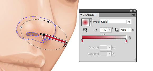
To make the cheekbones stand out more, add shading underneath them. I’ve added more color to the cheekbone with a purple transparent radial gradient. This is set to Blending Mode Color Burn, Opacity 10%.

Step 11
To show the creases in the neck, I’ve added further highlights using the highlighting skin gradient. These are set to Blending Mode Screen, Opacity 30%.

3. How to Render the Lips
Step 1
When I begin skin shading, I always treat the lips as if they have no color and shade them with the skin. This is because I don’t want the lips to look as if they are floating independently on top of the skin.
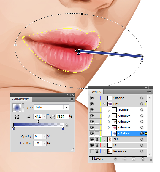
I then use gradients to add color to the lips. I’ve used a pink transparent radial gradient on the three shapes I’ve created for the lips: one for the overall lips shape and one each for the top and bottom lips. They overlap in the center to help darken this area which is in shadow. These shapes are then set to Blending Mode Color Burn, Opacity 40%.

Step 2
I use a brown transparent radial gradient to add shadow and creases to the lips. These shapes are set to Blending Mode Color Burn, Opacity 50%.

Due to the contrast created with these shapes, I’ve added further shading to the face with the same gradient. These shapes are set to Blending Mode Color Burn, Opacity 100%.

Step 3
With the Pencil Tool (N) and a light pink transparent radial gradient, add highlights to the lips. The Pencil Tool (N) will allow you to add many shapes much quicker than using the Pen Tool (P). These shapes are then set to Blending Mode Overlay, Opacity 30%.

Then using the highlighting skin gradient, add further more intense shapes. These are set to Blending Mode Color Dodge, Opacity 40%.

Step 4
I want the lips to appear more pink than red/orange, so I duplicate the shape covering the whole of the lips area and add a dark blue transparent radial gradient. Set it to Blending Mode Soft Light, Opacity 100%. This helps „neutralise” the red/orange tone.
4. How to Render the Eyes
Step 1
Using a similar theory, I’m going to „neutralize” the red/orange tones on the eyeballs slightly by using a light blue radial gradient. This will be set to Blending Mode Color and Opacity 30%.

Then I’m going to add highlights to the eyeball using the highlighting skin gradient set to Blending Mode Screen, Opacity 40%.

Step 2
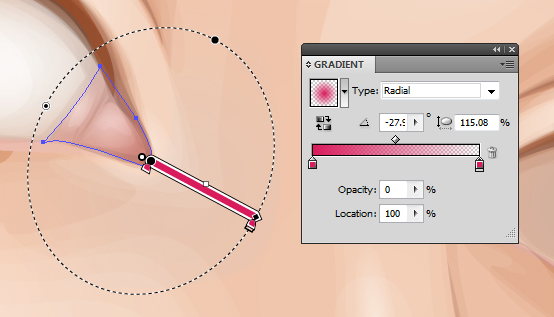
I’m going to add a pink tint to the water line with a rose transparent radial gradient set to Blending Mode Color, Opacity 100%.

Then add a bolder and darker gradient in the corner of the eyes set to Blending Mode Multiply, Opacity 30%.
Step 3
With a golden brown fill color, use the Pencil Tool (N) to add shading around the waterline and corner of the eye. These shapes are set to Blending Mode Multiply, Opacity 10%.

Then with a light pink, add highlights with the Pencil Tool (N) set to Blending Mode Screen, Opacity 40%.

Step 4
I’m going to use Clipping Masks (Control-7) for the iris. First duplicate the largest shape for the eyeball. Then draw an even circle with the Ellipse Tool (L).

Create a Clipping Mask: first a duplicate of the iris and then a Clipping Mask containing this iris mask, with the eyeball duplicated shape. This will give you a Clipping Mask within a Clipping Mask. You will see the benefit of this soon.

Step 5
I’ll be adding the detailing to the eyes via the Appearance panel. I’ve used a mid brown for the iris. The first fill is set to 60% Opacity, and the second from bottom fill is Offset Path by -1 pt and 100% Opacity. This gives the iris a soft edge.
Then the pupil is made from two dark brown fills. One is Offset Path by -12 pt with a Blending Mode of Multiply, Opacity 40%. The next is Offset Path by -13 pt and with a Blending Mode of Multiply, Opacity 80%. Again this is to create a soft edge.

Step 6
Gradients are then added to the iris. These are Offset Path by -1 pt. An inverted dark brown radial gradient is applied to give a vignette effect around the iris.

This is then duplicated and with the Gradient Tool (G) is enlarged and brought down towards the bottom of the iris. This gives a slight shadow at the top of the iris.

Then a green to orange radial gradient is applied to the bottom of the iris. This is to give a golden brown tone to the eyes.

Step 7
Duplicate Item and give an Offset Path -1 pt and a dark brown transparent radial gradient fill. Then go to Effect > Transform & Distort > Zig-Zag and use the settings below. If the two Clipping Masks were not applied, the zig-zag effect would overlap onto the eyelid and onto the eyeball. Once done, go into the Graphic Styles panel and Add New Graphic Style and apply it to the other eye so you’ve got the same effects on both.

Step 8
Using the Pen Tool (P) and a dark brown fill, draw shapes around the eye and eyelid crease. This is to help build upon a base for the eyelashes and to define the eyelids. These shapes are set to Blending Mode Multiply, Opacity 30%.

Further, more subtle shapes are added with a black fill, set to Blending Mode Multiply, Opacity 10%. These help to add shadow onto the eyeball.

Step 9
Using the skin highlighting gradient, add a light reflection along the waterline and over the pupil. These are set to Blending Mode Screen, Opacity 70% to 100%.

Step 10
Eyelashes are added using the Width Profile 1 brush I’ve created in a previous tutorial. Both lashes use a dark brown stroke color, but the top are set to Blending Mode Multiply, Opacity 70%, and the bottom are set to Blending Mode Multiply, Opacity 40%.

5. How to Render the Hair
Step 1
Before I begin adding the hair, I decide to sketch out ideas. I use the Blob Brush Tool (Shift-B) to sketch with. I Create New Layer above and below the core elements of the portrait to sketch hair on top and underneath the portrait. I’ve decided in this case I’m going to fill all the negative space with hair.

Step 2
For curly hair, you need to treat each curl as its own entity. Each curl should cover any hair which is underneath it to create a mane of healthy, thick curls. One of the easiest ways of going about this is to create an Art Brush of a curl. Of course we’re not drawing an actual curl, but imagine pulling a curl straight.
Using the Rounded Rectangle Tool, draw out a shape and use the Direct Selection Tool (A) to select the end points of the shape. Then use the Free Transform Tool (E) to reduce the size at the end of the shape to create a tapered effect. I want to give the portrait a mass of green hair.

Step 3
As you can’t include a gradient or a Clipping Mask with an Art Brush, I’m going to create a gradient effect using a Blend. Duplicate the tapered shape twice. Use the Free Transform Tool (E) to reduce the size of the shape on top. For the larger one, set it to 0% Opacity. Then with both shapes selected create a Blend (Control-Alt-B) with Specified Distance Spacing of 4 pt. Set the Blend to Blending Mode Multiply.

Step 4
Using the Width Profile 3 brush, add strokes using the Line Segment Tool (\) at the tip of the tapered end with a 2 pt Stroke Weight. These strokes should be the same green as the original tapered shape and placed below the Blend.

Step 5
With the Width Profile 1 brush, add 2 pt Strokes with the Line Segment Tool (\) on top of the shape with Blending Mode Screen, Opacity 30% to add highlights. Then using the same settings, add darker strokes with a Blending Mode of Multiply, Opacity 30%. Group all the elements once done (Control-G).

While the group is selected, in the Brush panel create a New Brush > Art Brush and click on OK.

Step 6
Using the Pen Tool (P) for a smoother curve, add curls around the face underneath the face elements. Group them together once you’ve applied the initial curls (Control-G).

Add the curls in groups so you can place them underneath the previous ones. The curls in front should be above all the others and the curls at the back should be at the bottom of the layer.

Step 7
While layering the curls, for any gaps present I use a dark green shape to block the gaps.

Then when I’ve finished the layering of curls, I add a dark green Rectangle (M) behind all the curls.

Step 8
Using the Width Profile 1 brush and the Paintbrush Tool (B), I add strokes with a medium green along the sides of the curls and at the tip. As each curl is identical, I want to make them look more individual. So adding additional strokes helps me achieve this. These strokes are set to Opacity 80%.

I repeat this same method for the curls at the back and add them in stages.

Step 9
With a lime green, I add 4 pt Stroke Weight, Width Profile 1 strokes to the curls. These are set to Blending Mode Color Dodge, Opacity 40%. These strokes add a highlight to the curls and give them further definition.

I then add 2 pt Stroke Weight strands to add more detail to the highlights. These are set to Blending Mode Screen, Opacity 40%.

Step 10
Using the Pencil Tool (N), I add lime green transparent radial gradients over the top of the highlighted areas of the curls. This adds a smoother highlight to them. These are set to Blending Mode Color Dodge, Opacity 25%.

6. How to Create the Eyebrows
The finishing touches are to add eyebrows. I’ve used the Width Profile 1 brush to add 1 pt strokes to the brow bone. The initial strokes are set to Blending Mode Normal, Opacity 80%.

Finishing off with some strokes set to Blending Mode Multiply, Opacity 50%.

Awesome Work, You’re Now Done!
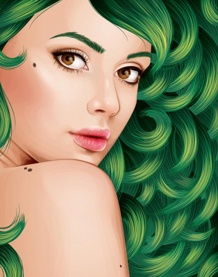
If you’ve followed my tutorials in the past, you’ll know I finish off with a couple of moles to the face and skin. These are created using two-layered brown transparent radial gradients set to Blending Mode Multiply. I hope you’ve enjoyed this tutorial and learnt one of the methods possible for creating curly hair.
Adobe Illustrator Hair Brushes From GraphicRiver
To help save time with your next fabulous portrait, consider using one of the amazing Adobe Illustrator Hair Brushes from GraphicRiver to speed up time. Check out one of these helpful brush packs below!
Easy Hair Brushes for Adobe Illustrator
Create quick hairstyles like a pro with this amazing brush pack! Designed with 17 easy hair brushes, simply drag and drop the brushes into the preset folder to begin creating realistic hair of your own in no time! Ideal for use with the Pen Tool, you can also use these brushes with a mouse or graphics tablet!


Car that detects when you look at it / Détection de similarités
Post pobrano z: Car that detects when you look at it / Détection de similarités
 |
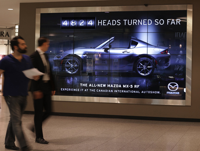 |
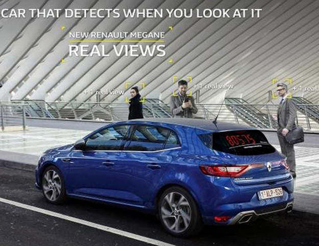
| THE ORIGINAL? Renault Megane “Real Views” – 2016 A car that detects when you look at it Source : Cannes BRONZE LION Agency : Publicis, Brussels (Belgium) |
LESS ORIGINAL Mazda MX-5 “Head turning billboard” – 2017 A car that detects when you look at it Source : Coloribus Agency : JWT Toronto (Canada) |