The Designer’s Guide to Basic UX Writing & Microcopy: Focus on the Power of Words in UI

Post pobrano z: The Designer’s Guide to Basic UX Writing & Microcopy: Focus on the Power of Words in UI

As designers, we obsess over pixels, grids, and color palettes. But there’s an invisible material in our interfaces that is just as crucial: language. The words we choose can be the difference between a user who feels guided and empowered, and one who is confused and frustrated.

This is the domain of UX writing and microcopy—the small but mighty bits of text that guide users through your product. It’s the button label, the error message, the placeholder text. It’s not just “copy”; it’s a core component of the user interface.

When done well, microcopy is invisible. It quietly does its job, building user confidence and paving the way for a seamless experience. Let’s break down the principles for writing clear, concise, and helpful text for the most critical UI elements.

Why Microcopy Matters: More Than Just Words

Before we dive in, let’s reframe what these words are:

  • Button Text: Not just a label, but a commitment. It tells the user what will happen when they click.
  • Error Messages: Not just an alert, but a solution. They should help the user fix the problem, not just announce it.
  • Labels & Instructions: Not just a description, but a guide. They prevent errors before they happen.

With that in mind, here are the fundamental principles.

Principle 1: Write Button Text that Builds Confidence

Buttons are the primary call-to-action (CTA) points in your interface. Their text needs to be specific, action-oriented, and predictable.

❌ What to Avoid:

  • Vague commands: “Submit,” “Go,” “Ok”
  • Technical jargon: “Configure,” “Execute,” “Transmit”
  • The classic, unhelpful: “Click Here”

✅ Principles & Examples:

  • Be Specific and Action-Oriented: Use a strong verb that describes the exact result of the action.
    • Instead of: Submit
    • Write: Sign Up for Free or Publish Post or Send Invoice
  • Use the Active Voice: Focus on what the user is doing.
    • Instead of: Your profile can be edited here.
    • Write: Edit Profile
  • Create a Sense of Value: When possible, hint at the benefit.
    • Instead of: Download
    • Write: Get My Ebook or Save Preferences

Real-World Example:

Notice how the button doesn’t just say “Ok” or “Confirm.” It explicitly repeats the destructive action, Delete Document, leaving no room for misunderstanding.

Principle 2: Write Error Messages that Solve Problems

Nothing halts user momentum like an error. A bad error message adds insult to injury; a good one turns a moment of failure into a moment of guidance.

❌ What to Avoid:

  • Technical gibberish: “Error 500: Internal Server Fault.”
  • Vague blame: “Invalid Input.”
  • Condescending tone: “You did it wrong.”

✅ Principles & Examples:

  • Explain the Problem in Plain Language: Clearly state what went wrong.
    • Instead of: Form Submission Error.
    • Write: We couldn't save your profile.
  • Provide the Solution (Most Importantly!): Tell the user exactly how to fix it.
    • Instead of: Invalid Email.
    • Write: Please enter a valid email address (e.g., name@example.com).
  • Be Humane and Respectful: The tone should be helpful, not accusatory. Use “we” to take responsibility where possible.
    • Instead of: You forgot to fill out the required fields.
    • Write: We need a few more details to complete your registration.

Principle 3: Write Labels & Instructions that Prevent Errors

The best error message is the one you never have to show. Clear labels and instructions set user expectations correctly from the start.

❌ What to Avoid:

  • Inconsistent terminology (e.g., “Client Name” in one place, “Customer Name” in another).
  • Ambiguous language.
  • Instructions that are paragraphs long.

✅ Principles & Examples:

  • Be Clear and Consistent: Use the same word for the same concept everywhere.
    • Instead of: Handle (What does that mean? Username? Nickname?)
    • Write: Username
  • Put the Key Information First: In placeholder text or hints, lead with the most important detail.
    • Instead of: Enter your phone number, including the area code first.
    • Write: Phone Number (including area code)
  • Use Sentence Case: Capitalize only the first word for labels and buttons (e.g., “Email address”). It’s easier and faster to read than Title Case.
  • Show Examples: When format matters, show, don’t just tell.
    • Instead of: Enter your date of birth.
    • Write:
      • Label: Date of Birth
      • Placeholder: MM/DD/YYYY

Real-World Example:

The labels are simple and standard. The placeholders provide a clear formatting template, preventing user guesswork and ensuring the data is collected correctly.

The Golden Thread: Tone & Voice

Underpinning all these principles is a consistent Tone of Voice. Is your product a trusted professional? A friendly guide? A witty companion? Your microcopy should reflect this consistently.

  • Be Concise: Omit needless words.
  • Be Useful: Your primary job is to help the user complete a task.
  • Be Human: Write like you speak (to a colleague, not a stranger).

Your Words are Part of the Design

The next time you’re designing a form, a modal, or an empty state, don’t treat the text as a last-minute filler. Wireframe with real, purposeful copy. Prototype with the exact messages.

Ask yourself: Is this button text a clear promise? Does this error message help the user move forward? Do these labels prevent confusion?

When you wield words with the same intention as you wield color and layout, you elevate your design from a mere visual arrangement to a coherent, helpful, and human-centered conversation.

The post The Designer’s Guide to Basic UX Writing & Microcopy: Focus on the Power of Words in UI appeared first on Designer Daily: graphic and web design blog.

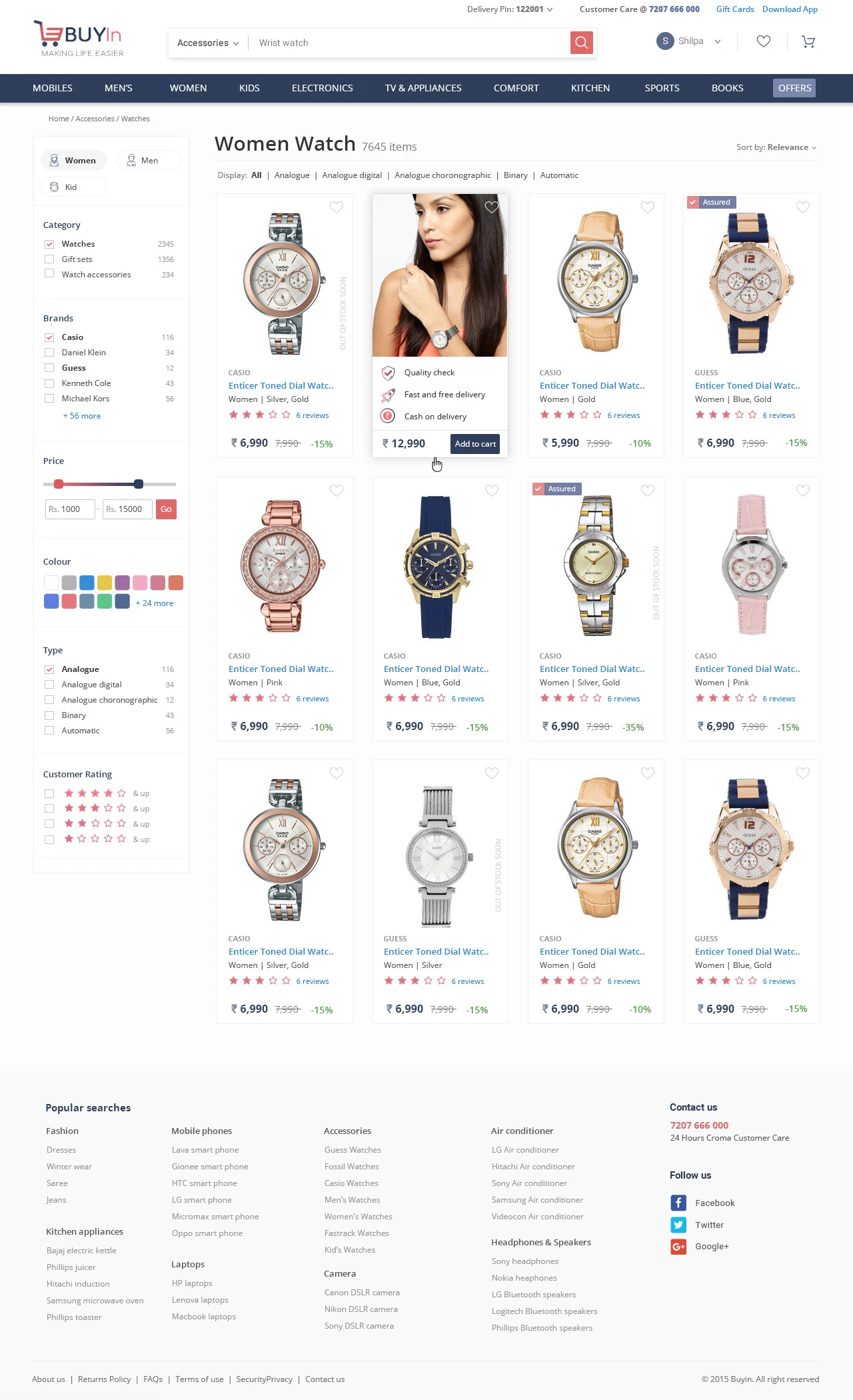
The Gestalt Principles in Practice: A Visual Guide to How Our Brains Perceive Design

Post pobrano z: The Gestalt Principles in Practice: A Visual Guide to How Our Brains Perceive Design

As designers, we often operate on intuition. We “feel” when a layout is right or when a button is in the wrong place. But what if that intuition could be backed by a century-old psychology that explains exactly how our brains make sense of visual information?

Enter the Gestalt Principles.

Born from German psychology in the 1920s, Gestalt (meaning “unified whole”) theory is built on the idea that our brains are hardwired to see structure, patterns, and relationships by default. Instead of perceiving a collection of disconnected elements, we group them into a coherent whole.

For UI/UX designers, these principles are not just academic trivia; they are the bedrock of creating intuitive, user-friendly, and effective designs. Let’s break down the key Gestalt principles with real-world examples from the interfaces you use every day.

1. Proximity: Elements that are close together are perceived as related.

The Gist: Our brains group objects that are near each other, separating them from those that are farther apart. This is one of the most powerful tools for creating structure and organization without adding visual clutter.

UI/UX in Practice:
Think of any form you’ve ever filled out online. How do you know which label corresponds to which input field?

  • Bad Example: Labels are equidistant from multiple input fields, causing confusion.
  • Good Example: The label “First Name” is placed in close proximity to its text box, and there is clear, generous space between that group and the “Last Name” group. This visual grouping happens instantly, without the need for lines or boxes.

Takeaway: Use white space strategically to imply relationships. Group related interface elements (like a label and its input, or an icon and its text) by placing them close together.

2. Similarity: Elements that share similar attributes are perceived as related.

The Gist: Objects that look alike—whether through color, shape, size, or orientation—are perceived as part of the same group or as having the same function.

UI/UX in Practice:
Navigation menus are the classic example. But let’s look at a product listing.

Each product card has the same structure: image, title, price, and a button. Because they share the same visual attributes (same size, same font treatments, same button style), we instantly understand that they are the same type of object. Furthermore, if one “Add to Cart” button were a different color, we would perceive it as different—perhaps it’s out of stock, or already in the cart.

Takeaway: Establish consistent styles for similar elements (like all primary buttons) to create a predictable and scannable interface. Conversely, make different elements (like a “Delete” action) look distinctly different.

3. Closure: Our brains fill in the gaps to see a complete object.

The Gist: When presented with a complex arrangement of elements, we tend to look for a single, recognizable pattern. We will mentally “close” gaps to perceive a complete shape.

UI/UX in Practice:
Logo design famously uses this principle (see the WWF panda or the NBC peacock). In UI, it’s often used in loading animations and icon design.

The IBM logo is made of disconnected blue stripes, but we effortlessly read the letters “IBM.” In a UI, a loading spinner might be a circle with gaps, but our brain perceives a single, rotating shape. This allows designers to create recognizable forms with minimal elements, reducing cognitive load.

Takeaway: You don’t have to show every detail. Use suggestive shapes and negative space to create elegant, simple icons and graphics that the user’s mind will complete.

4. Common Region: Elements within a bounded area are perceived as a group.

The Gist: This is proximity’s powerful cousin. By placing elements inside a clearly defined boundary—like a box, a background color, or a subtle shadow—you create a strong perceived group.

UI/UX in Practice:
Look at any modern web app’s card-based layout.

On a dashboard, a “Statistics” card might contain a title, a chart, and a data point. Even if these elements are spaced out, the shared background and subtle border firmly group them together, separating them from the “Recent Activity” card right next to it. This is why cards are so effective for organizing diverse pieces of information on a single screen.

Takeaway: When proximity alone isn’t enough to create a strong group, use a common background, border, or shadow to define a “container” for related content.

5. Figure/Ground: We instinctively separate elements into foreground (the figure) and background (the ground).

The Gist: This is the basis for how we perceive depth and focus. The “figure” is the focal element, and the “ground” is the backdrop. A clear distinction is crucial for readability and hierarchy.

UI/UX in Practice:
Modal windows and pop-ups are the most direct application.

When a modal appears, the rest of the interface is often darkened or blurred. This immediately pushes the background content into the “ground,” making the modal the clear “figure” that demands the user’s attention. Without this effect, the modal would feel less distinct and more difficult to parse.

Takeaway: Use contrast, color, and blur to create a clear hierarchy between interactive elements (figures) and their context (ground). This is essential for overlays, modals, and navigation menus.

6. Focal Point (Prägnanz): The mind will interpret ambiguous images in the simplest way possible.

The Gist: Also known as the “law of simplicity,” this overarching principle states that we naturally order our experience in a manner that is regular, orderly, and simple. Every stimulus is perceived in its most simple form.

UI/UX in Practice:
A cluttered, confusing user interface violates this principle. A clean, well-organized one embraces it.

Consider the Google homepage. What do you see? A logo, a search bar, and two buttons. It’s the simplest possible interpretation of a search engine. There is no ambiguity. Your brain doesn’t have to work to figure out what to do. A competing, cluttered portal page with countless links and modules is complex and ambiguous, forcing the user to parse and simplify it themselves.

Takeaway: Reduce complexity. Strive for clarity and simplicity above all else. The easiest design for the brain to process is the one it will prefer.

Design with the Brain in Mind

The Gestalt Principles aren’t a set of rigid rules to be followed blindly. They are a framework for understanding the unconscious processes of visual perception. By designing with these principles in mind, you work with the user’s brain, not against it.

You create interfaces that feel intuitive because they are built on the very psychology that defines intuition itself. So the next time you’re refining a layout, ask yourself: How is my design using proximity, similarity, and closure to tell a clear, simple story? The answer will lead you to better design.

The post The Gestalt Principles in Practice: A Visual Guide to How Our Brains Perceive Design appeared first on Designer Daily: graphic and web design blog.
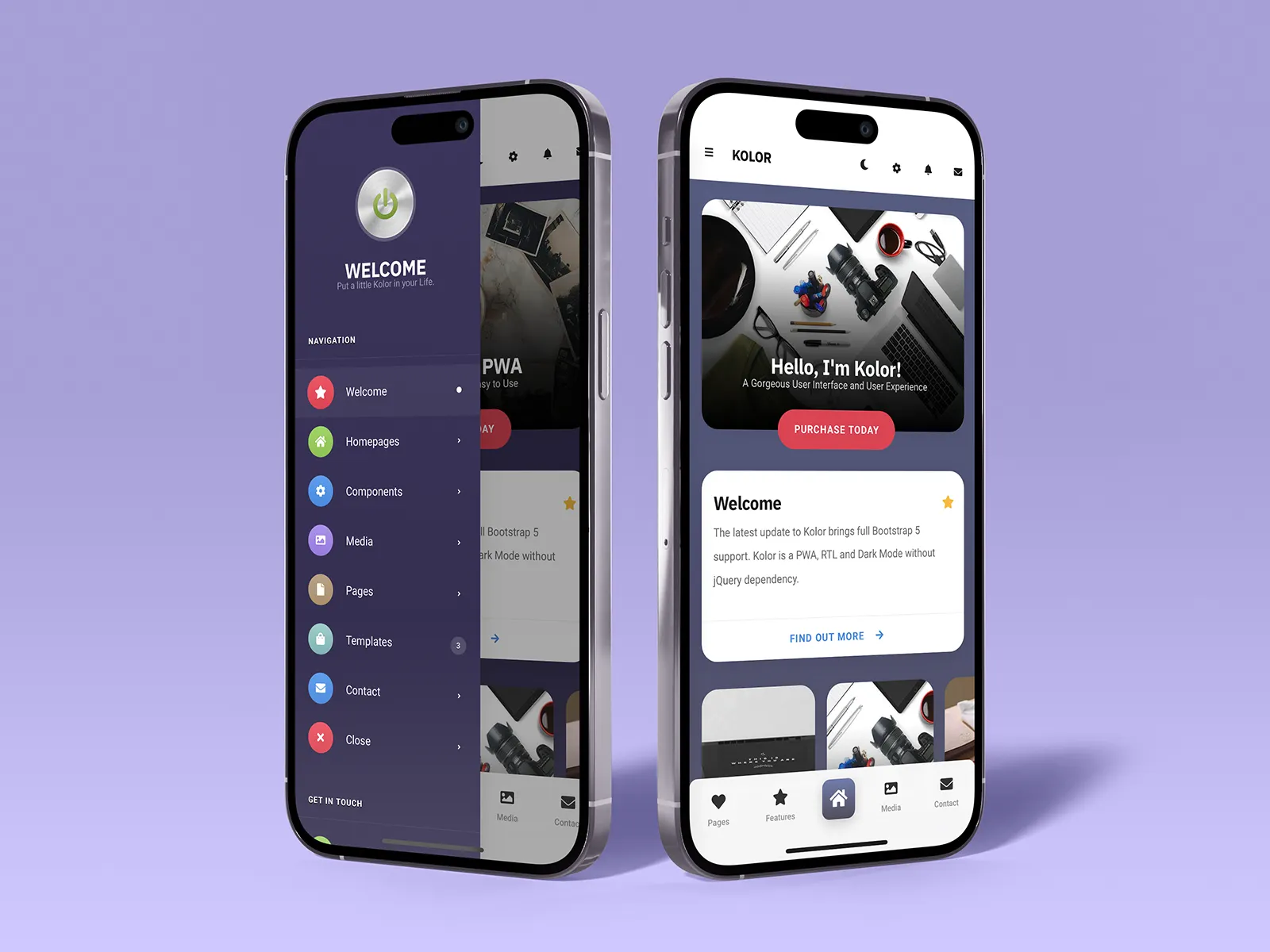
Iconography in the Wild: A Visual Analysis of How Top Apps Use Icons to Guide Users

Post pobrano z: Iconography in the Wild: A Visual Analysis of How Top Apps Use Icons to Guide Users

Icons are the silent workhorses of digital product design. In a crowded interface, they are the visual shorthand that guides us, informs us, and helps us act without a single word. But when done poorly, they become a source of confusion and friction—a universal “huh?” moment.

Great iconography, however, is a seamless language. It doesn’t just decorate; it communicates. To understand this language, we need to look at the experts. Let’s dissect how top-tier applications use icons to create intuitive, efficient, and beautiful user experiences.

We’ll break down our analysis into three key areas: Style, Consistency, and Metaphor.

1. Style: The Visual Voice of the App

An app’s icon set is a core part of its visual identity. The style choice is never arbitrary; it reinforces the brand’s personality and ensures visual harmony.

  • Linear Icons (The Minimalists): Apps like Twitter and Notion heavily rely on clean, thin-lined icons. This style conveys simplicity, clarity, and efficiency. It doesn’t shout; it whispers, getting out of the way of the content. In Notion, this is particularly effective, as the content is the interface, and the linear icons provide structure without visual weight.
  • Filled/Bold Icons (The Confident Guides): Spotify and Slack use bold, filled icons. This style is about energy, confidence, and making key actions unmistakable. Spotify’s vibrant green and thick white icons feel alive and tactile, perfectly matching its brand of immersive, continuous music playback.
  • Rounded & Friendly (The Approachable): Many consumer-facing apps, like Headspace and Calm, use icons with soft corners and generous curves. This style is psychologically associated with safety, approachability, and calm—exactly the emotions these brands want to evoke.
  • Duotone & Gradients (The Distinctive): Apps like Instagram and Discord have made duotone and gradient icons part of their core brand DNA. This style is highly distinctive and can make an app instantly recognizable, but it requires careful handling to avoid visual noise.

The Takeaway: The most effective icon style is an extension of the brand’s soul. A corporate finance app would feel wrong with playful, bubbly icons, just as a creative app would feel stifled by harsh, angular ones.

2. Consistency: The Unseen Framework

Consistency is what separates a random collection of pretty pictures from a true icon system. It’s the glue that makes a set of icons feel coherent and predictable.

Let’s analyze Figma as a masterclass in consistency. Their toolbar is a perfect example:

  • Grid & Proportion: Every icon lives within the same invisible bounding box. They have consistent visual weight, ensuring no single icon appears heavier or lighter than its neighbors.
  • Stroke Weight: The line thickness is uniform across all linear icons. Whether it’s the Frame tool or the Pen tool, the stroke is the same.
  • Detail Level: The complexity is consistent. Icons don’t mix highly detailed, realistic sketches with ultra-minimalist outlines.

When consistency breaks down, users subconsciously notice. If one icon is filled, another is linear, and a third uses a different corner radius, the interface feels messy and untrustworthy.

The Takeaway: Create and religiously adhere to an icon design system. Define rules for size, stroke, color palette, and a geometric grid. This ensures your icons work together as a unified team.

3. Metaphorical Language: Bridging the Abstract and the Literal

This is the hardest part of icon design: creating a visual metaphor that users instantly understand. The best apps use a mix of universal, familiar symbols and their own unique, but learnable, visual language.

  • Universal Metaphors (The No-Brainers):
    • Magnifying Glass = Search. Used by virtually every app (Chrome, App Store, Amazon).
    • Hamburger Menu = Navigation Menu. Despite its controversy, it’s widely recognized.
    • Envelope = Mail/Messages. A direct physical metaphor.
  • Platform Conventions (The Context-Aware):
    • The “Share” icon is a brilliant example of a learned convention. It started as a box with an arrow emerging from it on iOS. While the design varies slightly (Android uses connected dots), the concept is now universally understood. Apps that deviate from this (using an upload icon, for instance) often create momentary confusion.
  • Unique but Learnable (The Brand Builders):
    • TikTok’s “Inbox” isn’t an envelope; it’s a speech bubble. This fits their social, comment-driven environment.
    • Figma’s “Component” icon (a diamond) is an abstract metaphor. It doesn’t exist in the real world, but within the context of Figma, it becomes a powerful and specific symbol that users quickly learn.
    • Slack’s “Huddle” icon is a phone receiver inside a circle. It’s a fresh take on the classic “call” icon, fitting their modern brand while remaining clear.

The Pitfall: The “Mystery Meat” Navigation
This is what happens when the metaphorical link is broken. An icon that is so abstract or unique that the user has to tap it to discover its function. This is a failure of communication. The best icons are either instantly recognizable or become so after a single, logical explanation.

Lessons from the Wild: Your Iconography Checklist

After analyzing these apps, here’s a practical checklist for your next project:

  1. Audit for Style: Do your icons share a common visual language (stroke, corner radius, detail) that aligns with your brand?
  2. Enforce Consistency: Are they all on the same grid? Do they have the same visual weight?
  3. Test for Clarity: Can a first-time user correctly guess the function of your most important icons without a label? (Labels are still crucial for accessibility, but the icon should stand on its own).
  4. Prioritize Universal Metaphors: Where possible, use established symbols. Innovate only when it provides a clear benefit and is easy to learn.
  5. Context is King: An icon that works in a bottom navigation bar might be too vague in a complex toolbar. Consider the user’s location and expectations.

Iconography is a powerful design tool that operates just below the level of conscious thought for most users. When executed with purpose, style, and rigorous consistency, it creates an experience that feels effortless. It’s the quiet guide that leads users home, every time.

The post Iconography in the Wild: A Visual Analysis of How Top Apps Use Icons to Guide Users appeared first on Designer Daily: graphic and web design blog.

AI Solutions Trends for UX/UI Design in 2026

Post pobrano z: AI Solutions Trends for UX/UI Design in 2026

In recent years, AI development solutions have transformed the way businesses approach digital design. From automating repetitive tasks to generating highly personalized user experiences, artificial intelligence is now a cornerstone of modern UX/UI strategies. As we approach 2026, the landscape of AI-driven design continues to evolve rapidly, introducing innovative tools, techniques, and methodologies that empower designers to craft more intuitive, adaptive, and engaging interfaces than ever before. In this blog post, we explore the key AI solutions trends set to redefine UX/UI design in 2026, examining how AI not only enhances design processes but also reshapes user expectations and experiences.

1. AI-Powered Personalization Takes Center Stage

One of the most significant trends in UX/UI design is the growing emphasis on hyper-personalization powered by AI. Traditional approaches to personalization often relied on basic user data, such as age, location, or browsing history. However, AI algorithms in 2026 are now capable of analyzing complex behavioral patterns, contextual cues, and even emotional responses in real-time.

This enables interfaces to adapt dynamically to each user. For instance, e-commerce platforms can tailor product recommendations not just based on past purchases but also on current browsing intent, time of day, and mood inferred from interaction patterns. Similarly, AI-driven personalization in web and app design allows content layouts, color schemes, and navigation structures to shift fluidly according to the preferences and engagement levels of individual users.

Designers no longer need to create multiple static versions of a product to cater to different audiences. Instead, AI development solutions provide smart automation that delivers highly customized experiences, enhancing user satisfaction and engagement while driving business outcomes.

2. Generative AI for UX/UI Design

Generative AI is revolutionizing the design process itself. Tools leveraging generative AI can now produce fully realized interface concepts, wireframes, and even interactive prototypes within minutes. By inputting high-level design goals, such as target audience, brand aesthetics, and functional requirements, designers can receive multiple design variations instantly.

In 2026, generative AI is expected to evolve beyond basic layout suggestions. Designers can leverage these tools to explore complex design problems, generate alternative interaction flows, and simulate how users might respond to various UI elements. This accelerates ideation, reduces the time from concept to prototype, and allows for rapid experimentation with different visual and functional approaches.

Moreover, AI-generated content is becoming increasingly sophisticated in maintaining brand consistency. Designers can instruct AI tools to adhere to specific typography, color palettes, or brand voices, ensuring that all generated materials align with organizational standards without extensive manual oversight.

3. Voice and Conversational UI Enhancement

Voice interfaces and conversational AI are no longer niche trends—they are becoming central to modern UX design. By 2026, AI-powered voice and chatbot systems will have advanced natural language processing capabilities that allow for seamless, context-aware interactions with users.

Designers will increasingly focus on creating conversational flows that are not only functional but also emotionally intelligent. AI can predict user intent, handle nuanced queries, and guide users through complex workflows with minimal friction. This shift has profound implications for UX/UI design, as designers must now think beyond visual layouts to include tone, dialogue structure, and the integration of multimodal experiences that combine voice, text, and touch interactions.

Additionally, AI can analyze conversation logs and real-time user interactions to continuously improve interface performance. This iterative learning ensures that conversational interfaces become more intuitive over time, providing a more natural and human-like experience.

4. Predictive and Adaptive Interfaces

Predictive analytics has been a staple in business intelligence, but its integration into UX/UI design represents a new frontier. By leveraging AI models that anticipate user needs, designers can create interfaces that adapt proactively rather than reactively.

For example, predictive AI can pre-fill forms, suggest shortcuts, or highlight relevant content before the user even searches for it. Adaptive interfaces, guided by AI, can adjust layout complexity depending on user proficiency, providing simplified navigation for newcomers and advanced tools for experienced users. This level of responsiveness ensures a more efficient and satisfying user experience.

The 2026 trend emphasizes the combination of predictive AI with real-time feedback mechanisms. Interfaces are no longer static or one-size-fits-all—they evolve with the user, creating a dynamic relationship between human behavior and digital interaction.

5. Ethical AI and Inclusive Design

As AI becomes more embedded in UX/UI design, ethical considerations and inclusivity are gaining prominence. AI solutions can inadvertently amplify biases if training data is unrepresentative or flawed. Consequently, designers and developers are prioritizing ethical AI practices to ensure that interfaces are fair, accessible, and inclusive.

In 2026, we expect tools that assist in bias detection, accessibility audits, and inclusive design recommendations to become standard in the AI design toolkit. These solutions will help designers identify potential discrimination in automated decision-making, optimize readability for diverse audiences, and ensure that AI-driven features are usable by people with disabilities.

Inclusive design powered by AI also extends to cultural adaptation. Interfaces can automatically localize content, adjust visual cues, and tailor user flows to resonate with different demographic or regional audiences while maintaining brand coherence.

6. AI-Enhanced Design Collaboration

Collaboration is a cornerstone of modern UX/UI design, and AI is transforming how teams work together. AI-powered project management and collaborative design platforms enable real-time feedback, version control, and workflow optimization. Designers, developers, product managers, and stakeholders can interact with AI tools to generate suggestions, highlight inconsistencies, and streamline review processes.

In 2026, AI will further bridge the gap between design and development. For example, AI can automatically translate design prototypes into clean code, ensuring fidelity between design intent and functional implementation. This reduces miscommunication, accelerates development timelines, and allows designers to focus on creativity rather than manual coding tasks.

7. Emotionally Intelligent Interfaces

Emotion recognition is no longer confined to experimental research; it is becoming an integral part of UX/UI design. AI can analyze facial expressions, voice tones, and interaction patterns to gauge user emotions. This capability enables designers to craft interfaces that respond empathetically to user feelings.

Emotionally intelligent interfaces can, for instance, detect frustration during a checkout process and offer assistance proactively or provide calming visual cues to reduce cognitive load. In 2026, we can expect AI-driven emotional intelligence to play a pivotal role in creating experiences that are not only efficient but also emotionally resonant, enhancing user satisfaction and loyalty.

8. Immersive Experiences with AI

The convergence of AI with augmented reality (AR) and virtual reality (VR) is another trend shaping UX/UI design in 2026. AI can generate adaptive 3D environments, simulate real-world interactions, and optimize spatial layouts for immersive experiences.

Designers can use AI to personalize VR and AR content in real-time, creating scenarios tailored to individual preferences, learning styles, or professional needs. This opens possibilities for gaming, e-commerce, training simulations, and virtual collaboration spaces that are both engaging and highly effective.

The key to success in immersive design lies in balancing automation with creative input. AI can handle computationally intensive tasks like environment generation, while designers focus on narrative, emotional impact, and aesthetic coherence.

9. Continuous Learning and UX Optimization

One of the most profound advantages of AI in UX/UI design is its ability to learn continuously. Traditional design feedback cycles were slow and often relied on post-launch analytics. In contrast, AI tools in 2026 can monitor user behavior in real-time, identify friction points, and suggest design improvements instantaneously.

This continuous learning loop ensures that interfaces evolve alongside user needs and market trends. Designers can adopt a more proactive approach, iterating designs based on predictive insights rather than reactive fixes, resulting in superior user satisfaction and higher conversion rates.

10. Preparing for the Future

As AI development solutions continue to advance, UX/UI designers must embrace a mindset of experimentation, adaptability, and ethical responsibility. Staying informed about AI capabilities, investing in upskilling, and fostering cross-disciplinary collaboration will be critical for success in 2026 and beyond.

The trends outlined—hyper-personalization, generative design, conversational interfaces, predictive and adaptive UI, ethical AI, collaborative design, emotionally intelligent systems, immersive experiences, and continuous learning—are not isolated phenomena. They are interconnected forces driving a holistic transformation in the digital experience landscape. Designers who leverage AI thoughtfully will not only improve efficiency but also create experiences that are more intuitive, empathetic, and engaging for users worldwide.

Conclusion

The intersection of AI and UX/UI design in 2026 represents a thrilling era of innovation. AI development solutions are enabling designers to go beyond traditional limitations, delivering interfaces that are smarter, more adaptive, and profoundly user-centric. From predictive analytics and generative design to emotionally intelligent interfaces and immersive experiences, AI is reshaping every aspect of digital interaction.

Embracing these trends will empower designers to create products that are not only visually appealing but also deeply responsive to human behavior and needs. As technology continues to evolve, the future of UX/UI design is undeniably intertwined with AI, promising a new standard of excellence in user experiences that is personalized, ethical, and immersive.

By understanding and integrating these trends, organizations and designers can position themselves at the forefront of AI-driven innovation, shaping the digital experiences of tomorrow.

The post AI Solutions Trends for UX/UI Design in 2026 appeared first on Designer Daily: graphic and web design blog.
Rummy Nabob: The Royal Destination for Ultimate Card Gaming

Post pobrano z: Rummy Nabob: The Royal Destination for Ultimate Card Gaming

Online gaming in India has undergone a dramatic transformation in the past decade, and one of the brightest stars in this evolution is the classic game of Rummy. While many platforms offer rummy games, few have captured attention quite like Rummy Nabob. With its luxurious feel, rewarding structure, and smooth gameplay, Rummy Nabob is making waves among card game enthusiasts of all levels. Play Rummy Nabob now for exclusive rewards!

But what makes this platform so appealing? Why are players flocking to it, and how can you get started? Let’s explore everything you need to know about Rummy Nabob and why it might just be your next favorite gaming destination.

What is Rummy Nabob?

Rummy Nabob is a modern online rummy platform offering players an all-in-one card gaming experience with real cash rewards. Known for its royalty-inspired branding and user-friendly interface, Rummy Nabob provides access to a variety of rummy formats, including:

Points Rummy

Pool Rummy

Deals Rummy

Private tables and tournaments

The app is designed to cater to both new and experienced players. Its sleek, minimalistic design is paired with top-tier security features and smooth transaction systems, ensuring users can focus on what matters most—playing and winning.

Whether you’re looking for quick games or competitive tournaments, Rummy Nabob promises a premium gaming atmosphere that blends skill, fun, and the opportunity to win real money.

rummy nabob

Why Players Are Choosing Rummy Nabob

As the rummy market becomes increasingly saturated, it’s platforms like Rummy Nabob that stand out for all the right reasons. Here’s why it’s attracting attention:

1. Welcome Bonuses and Cash Offers
Rummy Nabob entices new players with attractive bonuses. The moment you sign up, you can unlock welcome rewards that can be used to enter games and tournaments. These bonuses help you start your journey without making a major financial commitment.

2. Real Cash Winnings and Quick Withdrawals
One of the biggest attractions of Rummy Nabob is its real-money gaming format. Win a round, collect your rewards, and withdraw earnings with ease. The platform supports quick and secure withdrawals via UPI, Paytm, bank transfers, and other digital payment methods.

3. Clean User Interface
The platform is light on the eyes and smooth to navigate. Whether you’re playing on a high-end smartphone or a mid-range device, the game operates seamlessly. No lags. No bugs. Just pure rummy fun.

4. 24/7 Customer Support
Unlike many other apps, Rummy Nabob has a responsive customer support team available to help with transactions, technical issues, or gameplay questions. Help is just a message away.

5. Fair and Secure Gameplay
The platform uses advanced algorithms and encrypted software to ensure fair play. Every shuffle is random, every game is genuine, and every win is based on pure skill.

Getting Started with Rummy Nabob

Joining Rummy Nabob is a straightforward process. Here’s a quick guide to help you get started:

Step 1: Download the App
Rummy Nabob is usually available through third-party websites or the official site, since real money gaming apps are not typically found on Play Store. Visit the official site or a trusted source to download the APK file.

Step 2: Register Your Account
Use your mobile number to sign up. Most platforms will send an OTP (One-Time Password) to verify your identity and create a secure login.

Step 3: Claim Your Bonus
Once registered, claim your welcome bonus—this often includes a cash bonus or chips that allow you to enter low-stake games immediately.

Step 4: Start Playing
Explore the game formats, select your preferred variant, and start playing. Use the practice tables to get used to the interface if you’re a beginner.

Step 5: Withdraw Your Winnings
After winning a few rounds, head to the wallet section, link your bank account or UPI ID, and withdraw your cash securely.

Tips to Maximize Your Experience

Success in rummy doesn’t depend on luck alone—it’s a game of skill, observation, and timing. Here are some pro tips to help you climb the leaderboard:

Master the Basics First
Learn how sequences and sets work. Know the difference between a pure sequence and an impure one. Understanding the rules will give you a solid foundation.

Play Practice Games Before High-Stake Tables
Use practice tables to hone your strategy and learn from your mistakes. Jumping into cash games too soon can be costly.

Watch Your Opponents
Pay attention to the cards your opponents are picking and discarding. This will help you guess their hands and plan your strategy accordingly.

Avoid Emotional Play
Don’t let a bad hand frustrate you. Take your time, stay calm, and play smart. Rummy is a game of patience and consistency.

Use Bonuses Wisely
Use welcome bonuses and promotional chips to join special tournaments. These often have higher rewards with limited risks.

Conclusion: Step Into the Royal Court of Rummy

In a world full of gaming options, Rummy Nabob rises as a premium destination for anyone looking to play rummy with class, comfort, and competitive rewards. It’s not just about playing a card game—it’s about entering a digital world where every move matters and every win feels royal.

The post Rummy Nabob: The Royal Destination for Ultimate Card Gaming appeared first on Rummy All.

Rummy All: Your Ultimate Destination for Every Rummy Variant in One Place

Post pobrano z: Rummy All: Your Ultimate Destination for Every Rummy Variant in One Place

If you’re a fan of online card games, chances are you’ve already experienced the thrill of playing rummy. With its perfect mix of strategy, skill, and real-time excitement, it has earned a spot as one of the most loved games across India and beyond. But what if you could access every version of this timeless game—all in one place? Welcome to the world of Rummy All. Start playing Rummy All now for exciting gameplay!

More than just a buzzword, Rummy All represents a new wave of digital gaming platforms that unify every major rummy format under one roof. Whether you’re a beginner exploring Points Rummy or a pro battling in 21-card formats, these platforms have something for everyone.

rummy all

What is Rummy All?

Rummy All refers to a full-suite rummy gaming experience offered by select online platforms. Instead of offering a single format, these platforms allow users to access and switch between multiple rummy variants easily. Here’s what a typical Rummy All platform may include:

Points Rummy – Fast-paced games where each point has a cash value.

Pool Rummy – Eliminative format where the last one standing wins the pool.

Deals Rummy – Fixed number of deals; the player with the highest score wins.

13-Card and 21-Card Rummy – Traditional Indian rummy played with one or two decks.

Private Tables – Invite-only tables for friends and family.

Tournaments – Competitive gameplay with entry fees and high cash prizes.

This comprehensive model caters to all types of players and creates a dynamic space where you can explore, compete, and sharpen your skills with every login.

Why Rummy Platforms Are Gaining Popularity

The rise of Rummy All platforms is not just a trend—it’s a reflection of what modern players want: variety, convenience, and engagement. Here’s why these platforms are changing the game:

1. One App, Many Choices
Instead of downloading multiple apps or switching between websites, players get all popular variants in one platform. This not only saves space on your device but also simplifies the user experience.

2. Seamless Switching Between Games
Feel like a quick 13-card match? Or ready for a longer session in 21-card pool rummy? Rummy All lets you switch formats without having to re-register or reload. One wallet, one account, and unlimited access.

3. Better Bonuses and Promotions
Since these platforms offer multiple variants, they often run variant-specific promotions. You may find cashback offers on Points Rummy today and a free-entry tournament in Deals tomorrow. These changing bonuses keep the excitement alive.

4. Skill Development Across Formats
Each rummy variant requires different strategic approaches. By playing all formats, users enhance their overall gameplay, learn new tactics, and increase their chances of winning across the board.

5. Community and Competition
All platforms often host large tournaments that attract players from all over the country. You’ll not only improve by playing against better opponents but also enjoy a sense of community in the gaming world.

How to Get Started with it

Starting your Rummy All journey is simple and quick. Here’s a step-by-step breakdown:

Step 1: Choose a Reputable Platform
Select a licensed and secure platform that clearly offers a variety of rummy variants. Look for platforms with good user reviews, transparent policies, and responsible gaming features.

Step 2: Register and Verify Your Account
Use your mobile number or email address to register. Most platforms offer instant OTP verification and an optional KYC process for withdrawals.

Step 3: Claim Your Welcome Bonus
Many platforms greet new players with attractive welcome bonuses—sometimes as high as ₹51 or more. These bonuses can be used to test the waters and explore different game types.

Step 4: Explore the Lobby
The game lobby usually has tabs or filters for each variant. Pick the one you want to start with. Try low-stake or practice tables first to get used to the gameplay and features.

Step 5: Play, Learn, and Earn
As you grow in confidence and skill, move to real-money tables, join tournaments, and compete for bigger rewards. Always play with discipline and stick to your strategy.

Smart Tips for Winning Across All Variants

The beauty of playing on platform is that you develop a versatile skill set. Here are a few pro tips to help you succeed:

Understand Each Format Thoroughly
The strategy that works in Pool won’t necessarily work in Deals Rummy. Study the rules and payout structures before you play.

Start Small
Begin with low-entry tables to minimize losses while you’re still learning.

Observe Opponents
Reading the discards and understanding patterns is key to smart gameplay.

Avoid Emotional Decisions
Stay calm even when the cards aren’t in your favor. Remember, it is a game of patience.

Use Bonuses Wisely
Many platforms allow you to use bonuses as entry fees. Take full advantage of them, especially for tournaments.

Final Thoughts: Embrace the Full Experience

The online gaming landscape is evolving, and Rummy is leading the way with its inclusive, flexible, and rewarding model. It’s perfect for anyone who doesn’t want to be boxed into a single format and loves variety in their gameplay.

Whether you’re a casual gamer looking for some evening entertainment or a competitive player chasing high-stakes tournaments, it offers a tailored experience just for you. It’s a complete package—easy to access, fun to play, and rewarding to master.

The post Rummy All: Your Ultimate Destination for Every Rummy Variant in One Place appeared first on Rummy All.

Rummy All Apps: A One-Stop Guide to Every Variant of the Game You Love

Post pobrano z: Rummy All Apps: A One-Stop Guide to Every Variant of the Game You Love

In the vibrant world of online gaming, few card games have managed to retain their charm across generations like Rummy. Whether played at family gatherings or on digital platforms, Rummy continues to win hearts with its perfect mix of skill, strategy, and excitement. As the digital wave transforms how we play, one term is starting to gain traction—Rummy All Apps.

But what exactly does Rummy All mean? And why should gaming enthusiasts pay attention to this concept? In this blog, we’ll dive into the universe of Rummy All, covering everything from its meaning to why it matters, and how it’s shaping the online card gaming experience today. Get started on Rummy All for a seamless Rummy experience!

Rummy All Apps

What Does Rummy All Mean?

Rummy All refers to the collective offering of all rummy variants in a single online platform or application. Instead of limiting players to just one version of the game, platforms that promote “Rummy All” provide a comprehensive experience with multiple formats such as:

Points Rummy

Pool Rummy (101 and 201)

Deals Rummy

Indian Rummy (13-Card & 21-Card)

Gin Rummy

Kalooki Rummy

Oklahoma Rummy

This concept caters to both beginners and advanced players by offering variety, flexibility, and engagement all under one digital roof. Think of it as a complete rummy universe, where every player finds their comfort zone—or their next challenge.

Why Rummy is a Game-Changer for Online Gamers

Today’s gaming audience expects more than just accessibility; they want depth, diversity, and user-centric features. The Rummy All approach delivers precisely that. Here’s why it’s rapidly becoming the go-to choice for rummy enthusiasts:

1. Variety Keeps the Fun Alive
Repetition can be a buzzkill. With Rummy All, players don’t have to stick to a single variant. They can switch modes based on mood, experience level, or strategic preference. This versatility adds a fresh dimension to online gameplay and makes the experience more immersive.

2. Skill Enhancement Across Formats
Each rummy variant comes with its unique rules and winning strategies. Playing multiple formats on the same platform challenges your brain, sharpens decision-making skills, and improves overall mastery of the game. It’s not just about luck—real skill gets rewarded.

3. Better Rewards and Promotions
Many Rummy All platforms offer distinct bonuses, referral rewards, and tournament entries depending on the format you’re playing. From welcome bonuses to cashback offers, players are constantly incentivized to explore different variants.

4. Inclusive for Every Player Type
Whether you’re a casual player looking to pass the time or a competitive gamer eyeing big tournament wins, Rummy All platforms have something for everyone. Low-stake tables, practice rounds, high-roller tournaments—you name it, it’s there.

5. One Wallet, One Account, Unlimited Options
Rummy All streamlines your gaming life. One account allows you to access every format, making it easy to manage your balance, track your progress, and switch games effortlessly.

How to Get Started with Rummy All Apps Platforms

Getting started is easier than ever. Here’s a simple step-by-step process for those new to the Rummy All experience:

Step 1: Choose a Trusted Platform
Select a reliable and licensed rummy platform that explicitly offers multiple variants. Read reviews, check for certifications, and explore user testimonials.

Step 2: Register and Verify
Sign up using a valid mobile number or email. Complete the KYC process if necessary to unlock full access and withdrawal options.

Step 3: Claim Your Welcome Bonus
Most platforms offer a welcome bonus, like a ₹51 or ₹100 credit, upon joining. Use this to test the waters before depositing your own money.

Step 4: Explore All Variants
Don’t limit yourself to just one format. Try different variants to find your favorite or expand your skill set.

Step 5: Play Smart and Track Progress
Use in-app features to analyze game history, win-loss ratios, and performance across formats. This will help improve your strategy over time.

Promoting Responsible Gaming While You Enjoy Rummy All Apps

It’s easy to get lost in the thrill of the game, but responsible gaming should always be a priority. Here are a few practices to follow:

Set daily or weekly deposit limits.

Never play under stress or fatigue.

Treat the game as entertainment—not income.

Take regular breaks and monitor screen time.

Reach out to customer support if you suspect signs of compulsive behavior.

Remember, the joy of Rummy lies in its gameplay, not just the stakes. Play for the challenge, the learning, and the fun.

Final Thoughts: Why Rummy All Is the Future of Online Card Games

The Rummy All experience represents the next step in digital gaming evolution. It offers more than just convenience—it delivers a complete package filled with variety, strategic learning, user rewards, and flexibility. Whether you’re a beginner curious about the game or a veteran looking for variety, this is your cue to dive in.

The post Rummy All Apps: A One-Stop Guide to Every Variant of the Game You Love appeared first on Rummy All.

Exploring the Rummy 51 Bonus: A Smart Way to Start Your Online Gaming Journey

Post pobrano z: Exploring the Rummy 51 Bonus: A Smart Way to Start Your Online Gaming Journey

In today’s fast-paced digital world, online games have transformed the entertainment landscape, offering not just fun and excitement but also great incentives. Among the most beloved card games in India, Rummy stands out for its blend of strategy and skill. For beginners and seasoned players alike, one exciting offer catching widespread attention is the Rummy 51 Bonus. But what exactly is this bonus, and how can you make the most of it? Claim your Rummy 51 Bonus today!

What is the Rummy 51 Bonus?

The Rummy 51 Bonus is a promotional offer provided by various online rummy platforms to attract new users. Simply put, it means players receive ₹51 for free as a welcome bonus when they register on a participating rummy app or website. This bonus can be used to explore different game modes, join practice tables, or even enter low-stake cash games.

Unlike other promotions that come with hidden terms or steep wagering requirements, the Rummy 51 Bonus is generally straightforward. It’s designed to give players a real feel of the gaming environment without requiring an initial deposit.

Rummy Bonus

Benefits of Claiming the Rummy 51 Bonus

The growing popularity of the Rummy 51 Bonus isn’t without reason. Here’s why players are opting for platforms that offer it:

1. Risk-Free Introduction
If you’re new to online rummy, this bonus is your golden ticket. You don’t need to commit your own money immediately, which takes away the stress of losing. It’s an excellent way to practice and learn the ropes without financial risk.

2. Boosts Confidence
Using the bonus to play a few rounds helps build familiarity with the platform’s interface, gameplay, and rules. It empowers players with confidence and experience before entering higher-stakes games.

3. Gateway to Bigger Rewards
Though the bonus itself is small, many players have used it as a stepping stone to win more. With smart play and a bit of luck, ₹51 can be turned into significantly larger amounts through tournaments and cash tables.

4. Promotional Offers and Loyalty Programs
Platforms that offer a Rummy 51 Bonus often have generous loyalty programs and additional bonuses. Once you start playing, you might receive cashback, referral bonuses, or participation incentives that further enrich the experience.

How to Use the Rummy 51 Bonus Wisely

While the bonus is a great starting point, maximizing its potential requires a bit of strategy. Here are some tips to make the most of your ₹51 bonus:

Choose the Right Platform
Ensure the rummy platform you register with is licensed, secure, and has a good reputation. Always read the terms and conditions of the bonus to understand any withdrawal or usage limitations.

Start with Practice Games
Even if the bonus allows you to join cash games directly, it’s wise to first play in practice mode. This helps you refine your skills and avoid rookie mistakes that might cost you.

Understand the Rules Thoroughly
Rummy is a game of skill, and each platform may have slight variations in rules. Before placing your bets, be fully familiar with sequences, sets, joker usage, and points calculation.

Participate in Low-Entry Tournaments
Look for beginner-friendly tournaments where you can enter using the bonus amount. These often have better odds for new players and can multiply your returns.

Track Your Progress
Many players lose track of their spending and winnings. Use built-in analytics or a simple spreadsheet to keep an eye on your growth, helping you make informed decisions.

Is the Rummy Worth It?

The short answer is yes, provided you use it wisely. The Rummy 51 Bonus is more than just a marketing gimmick—it’s an opportunity. For players who are willing to learn and play strategically, this small bonus can unlock big potential.

Many success stories in the online rummy community began with a modest bonus like this one. It offers value to the platform by increasing user engagement and benefits the player by reducing initial financial barriers.

Moreover, as platforms continue to compete for user attention, such bonuses may soon come with enhanced value—like cashback, free tournaments, or skill workshops for new users.

Final Thoughts

The Rummy 51 Bonus represents a smart, low-risk gateway into the world of online rummy. It’s ideal for anyone who wants to explore this thrilling card game without the pressure of an upfront investment. Whether you’re playing for fun or aiming for higher winnings, starting your journey with a bonus is both strategic and rewarding.

So, if you’re curious about online rummy and want to test your skills, go ahead and claim your Rummy 51 Bonus today. Just remember—play responsibly, understand the game, and most importantly, enjoy the experience.

The post Exploring the Rummy 51 Bonus: A Smart Way to Start Your Online Gaming Journey appeared first on Rummy All.

Creating Scroll-Based Animations in Full view()

Post pobrano z: Creating Scroll-Based Animations in Full view()

The CSS animation-timeline property accepts a view() function which, in turn, returns a timeline of how much of an element is visible in the part of a scroll container that’s viewable (formally known as a scrollport). In other words, rather than letting an animation run a linear progression based on how much time has elapsed, view() runs animations based on the visibility of the animated element within a scrollport.

I like to equate it as the CSS version of JavaScript’s Intersection Observer. We can run an animation on an element as that element enters and exits the scrollport.

Here’s an example:

CodePen Embed Fallback

Pretty neat, right? Depending on where an image is in the scrollable carousel, it goes from small and blurry at the far sides while getting larger and clearer when it hits the center. We have a little scroll snapping in there as well to make sure each image item makes a stop.

It’s not that hard to do! I’ll show you how it’s really the same old animation you’re used to writing in CSS, only applied on a view timeline instead of a normal timeline.

But first, the general layout

All I’m making here is an element I’m calling .carousel:

<main class="carousel">
  <!-- scroll items -->
</main>

The elements in .carousel will lay out in a single row, which is a one-liner with flexbox. We’ll also make sure that any content overflowing its space is scrollable:

.carousel {
  display: flex;
  width: max(480px, 50vw);
  overflow-x: auto;
}

And, of course, we need items in it that we can scroll around. A set of image slides.

<main class="carousel">
  <div class="carousel-slide">
    <!-- (optional) empty bookend slide -->
  </div>
  <div class="carousel-slide">
      <img src="image-1.jpeg" alt="alt text for image 1">
  </div>
  <div class="carousel-slide">
      <img src="image-2.jpeg" alt="alt text for image 2">
  </div>
  <!-- etc -->
  <div class="carousel-slide">
    <!-- (optional) empty bookend slide -->
  </div>
</main>

As far as styling those items, each one will be one-third the size of the available space so that we see three items at a time when scrolling:

.carousel {
  /* same as before */

  .carousel-slide {
    flex-shrink: 0;
    width: calc(100% / 3); /* show three at a time */
    aspect-ratio: .8;
    img {
      width: 100%;
    }
  }
}

Then the scrolling

We’ve already set overflow-x on the .carousel, officially making it our scroll container. We can drop in a little scroll snapping to make sure we’re only scrolling one item at a time.

.carousel {
  /* same as before */

  scroll-snap-type: x mandatory;
  scroll-behavior: smooth; /* optional for smooth scrolling */
  scrollbar-width: none; /* optional to hide the scrollbar */
}

We want to make sure that the slides are aligned to the center of the scroll container when snapping into place:

.carousel-slide {
  /* etc. */
  scroll-snap-align: center;
}

Here’s what we have so far:

CodePen Embed Fallback

Next, the animation

Here’s the really cool thing I mentioned at the very start: a view timeline animation is really the same thing as any other CSS animation you write with keyframes. In this case, we want keyframes where the carousel items are small and blurry at the start and end, but become larger and clearer right smack dab in the middle of the animation.

@keyframes slide {
  /* from start to 45%, and to the end (100%) */
  45%, 100% {
    transform: scale(0.5);
    border-radius: 20px;
    filter: blur(6px) brightness(.8);
  }
  /* middle */
  50% {
    transform: scale(1);
    border-radius: 4px;
    filter: none;
  }
}

Looks familiar, right? This is the sort of CSS you’ve been writing forever! And guess what? We set the animation on the element we’re animating just as you normally would as well:

.carousel-slide {
  /* etc. */
  animation: slide; 
}

The only difference is that we want the animation to run on a timeline based on the element’s current view() instead of the regular timeline. That’s where the animation-timeline property comes into play:

.carousel-slide {
  /* etc. */
  animation: slide; 
  animation-timeline: view(inline);
}

Now, technically speaking, we could slap that timeline directly in the animation shorthand property like any other constituent animation property, e.g., animation-name, animation-delay, animation-duration, etc. But assigning a timeline function this way is not supported by any browsers yet. So, for now, your best bet is to declare it on its own. Just be sure to declare it after the animation shorthand, or else you may find yourself inadvertently overriding your view timeline with auto (the default property value) instead of view().

That completes our demo:

CodePen Embed Fallback

See that? All we’ve really done is set a CSS animation that runs on elements. However, instead of running on the default timeline, the animation runs when an element scrolls in and out of view. That’s the difference between standard and view timelines.

view() vs. scroll()

But wait! You may or may not know that view() timelines are part of a larger feature set called CSS Scroll-Driven Animations. And view() is not the only function supported by the animation-timeline property. We also have the scroll() function.

The scroll() function creates a scroll progress timeline that’s tied to the scroll position of a container, whereas view() creates a view progress timeline that’s based on the visibility of an element within its container.

Both functions are useful in their own ways! I generally think view() is better for item-specific reveal effects. So, for example, if we want to animate a slide only as that specific slide scrolls into the scrollport, then the view() function is the perfect fit. That’s why I’ve focused on it for our carousel example — we want to track an element’s position in the scrollport and run the animation accordingly.

Inset parameter and animation-range

You might also be wondering what the heck goes in the parentheses of the view() function. It’s a function, after all, so it must accept something in there, right?

CSS view() takes two arguments: axis (block, inline, x, and y) and the inset. The inset parameter defines an offset from the scrollport’s edges within which the animated element is tracked. The official syntax looks like this:

animation-timeline: view(<axis> <view-timeline-inset>);

…which is merely a fancy way of getting specific with exactly what areas of the scrollport we want to trigger the animation. For some animations, starting and ending the timeline when element fully enters and exits the scrollport may cut things off.

CodePen Embed Fallback
Two columns of list items. The width of the first item is 100% and each subsequent item in the list gets progressively shorter, creating an effect like a reversed staircase.

That’s no good! We want each item to fully slide in when it fully enters the scrollport, not when it fully exits. That’s why all the items look so staggered — they’re all at different points in the view timeline.

That’s where the inset parameter makes a big difference. We can be more specific about saying we want each element to start animation when it comes up from the bottom of the scrollport.

animation: slide-in linear both;
animation-timeline: view(100% 0%);

Ah, much much better:

CodePen Embed Fallback

The animation-range property works along similar lines.

animation-range: entry; /* same as: entry 0 entry 100%; */
CodePen Embed Fallback

The animation-range property accepts a slew of other keywords, including exit (when the element leaves the scrollport), cover (when the element begins to enter begins to leave the scrollport), and contain (when the element fully enters then fully leaves the scrollport), among others. Geoff has published a bunch of notes and examples looking specifically at each one.

One last carousel example

Generally, carousels use effects like fade in-and-out, scaling, and parallax. However, since most CSS properties are animate-able, and even those who aren’t can be tricked into being so using registered CSS properties (like in the case of gradient lines), you have the option to explore more creative ways of using view() for carousels.

Here’s an example where an animation of just the background position creates a nice movement in a carousel.

CodePen Embed Fallback

Creating Scroll-Based Animations in Full view() originally published on CSS-Tricks, which is part of the DigitalOcean family. You should get the newsletter.

CSS Wrapped 2025

Post pobrano z: CSS Wrapped 2025

The Chrome Dev Team recaps the new CSS features that shipped in Google Chrome this past year in one amazingly designed webpage. They cover new functionality for creating more customizable components, next-gen interactions, and optimizing ergonomics.

We’ve been tracking many of these features as well:

This is just scratching the surface though, check out the full CSS Wrapped 2025 to see what all made it into the Chrome browser in 2025. It’s been a wild year for CSS and the CSS Wrapped 2025 page itself demonstrates that in spades.


CSS Wrapped 2025 originally published on CSS-Tricks, which is part of the DigitalOcean family. You should get the newsletter.