How to Create the Guardians of the Galaxy Logo Text Effect

Post pobrano z: How to Create the Guardians of the Galaxy Logo Text Effect

Final product imageFinal product imageFinal product image
What You’ll Be Creating

Interested in learning how to draw the Guardians of the Galaxy logo? Follow this tutorial and learn how to make it from scratch while learning many new techniques. You will definitely get inspired to create other unique logos and text effects in future projects.

If you don’t have the time to learn how to draw the Guardians of the Galaxy logo, you can always try Envato Elements, where you will find a large selection of fonts, text effects, and logos that are ready to be used in your project.

What You’ll Learn in This Guardians of the Galaxy Logo Tutorial

  • How to make the Guardians of the Galaxy font
  • How to make the Guardians of the Galaxy text effect
  • How to make the Guardians of the Galaxy logo background
  • How to make a neon light effect in Adobe Illustrator

Tutorial Assets

You’ll need the following resources in order to complete this project:

1. How to Make a New Document in Adobe Illustrator

Launch Illustrator and go to File > New to open the New Document window. There, type the name of the document and set up the dimensions as shown. Keep the Units to Pixels and the Color Mode to RGB. Once you’re done, hit Create Document.

In the image below, you can see the other settings that I prefer to use while working in Illustrator. You can access them by going to Edit > Preferences.How to open a new document in Illustrator How to open a new document in Illustrator How to open a new document in Illustrator

2. How to Make the Guardians of the Galaxy Font

Step 1

Let’s start by taking the Type Tool (T) and writing the word „GUARDIANS” in capitals on your artboard. Use the Sezectra Regular font with a size of 212 pt. The color is not important at the moment.

While the text stays selected, go to the Character panel and change the following settings in order to distort the font (1):

  • Set the tracking for the selected characters: -10
  • Horizontal Scale: 115%
  • Vertical Scale: 88%

Next, type „GALAXY” on your artboard using the Sezectra Regular font with a size of 212 pt, and apply the following settings in the Character panel (2):

  • Set the tracking for the selected characters: 25
  • Horizontal Scale: 115%
  • Vertical Scale: 85%
How to type Guardians and Galaxy in IllustratorHow to type Guardians and Galaxy in IllustratorHow to type Guardians and Galaxy in Illustrator

Step 2

Still using the Type Tool (T), write „OF” on your artboard using the same font (1). Apply these settings:

  • Set the font size: 80 pt
  • Set the tracking for the selected characters: 0
  • Horizontal Scale: 125%
  • Vertical Scale: 100%

The next piece of text is „THE”. Use the following settings and then arrange it under the word „OF” (2).

  • Set the font size: 80 pt
  • Set the tracking for the selected characters: -25
  • Horizontal Scale: 125%
  • Vertical Scale: 100%

Before you continue, make sure that the words „THE” and „GALAXY” are aligned at the bottom and that the words „OF” and „GALAXY” are aligned at the top. Once that’s done, select everything on your artboard and go to Type > Create Outlines followed by Object > Ungroup (Shift-Control-G).

How to type OF and THE in IllustratorHow to type OF and THE in IllustratorHow to type OF and THE in Illustrator

Step 3

In order to make the font more similar to the original Guardians of the Galaxy vol 3 logo, we need to distort the letters. We can achieve this by using the Direct Selection Tool (A) and moving some of the points where we want them to be. I recommend activating the Smart Guides by going to View > Smart Guides to help you align the points easily. Let’s start with the letter „G”.

First, while the letter is selected, go to Object > Compound Path > Release to obtain the three separate shapes that make up the letter G. Now, select only the points highlighted in green using the Direct Selection Tool (A) and move them downwards until you cover the empty space in the upper left side of the letter. Also elongate this top shape by dragging the two end points a little to the right.

Next, select only the point highlighted in red using the Direct Selection Tool (A), and move it downwards so it is aligned with the rest of the points at the bottom of the letter.

Continue to select only the points highlighted in blue, and move them upwards by pressing the Up Arrow key on your keyboard about 15 times, which means 15 px. Next, select the two end points and move them to the right to cover the empty space. Finally, select the two points highlighted in orange and move them to the right as shown. Also, elongate the top of this shape by dragging a selection over the three points, and move them upwards by pressing the Up Arrow key on your keyboard a few times.

Once you are done with the distorting (1), select all three shapes and press Unite in the Pathfinder panel to merge them into one shape. This will be the new letter G (2).

How to distort the letter GHow to distort the letter GHow to distort the letter G

Step 4

For the letter „U”, first go to Object > Compound Path > Release to obtain the two separate shapes that make up the letter. Now, select only the two points highlighted in green using the Direct Selection Tool (A), and move them upwards by pressing the Up Arrow key on your keyboard about 15 times (15 px) until the empty space is covered. Once that’s done, select both shapes and press Unite in the Pathfinder panel to merge them into the new letter U (1).

Following the simple distortion techniques explained above, you can modify the rest of the letters in the word „GUARDIANS” (2). How to distort the letter UHow to distort the letter UHow to distort the letter U

Step 5

Continue with the letters in the word „GALAXY” next. Some of the letters are repeated, so there’s no need to make them again. The ones that need to be modified are L, X, and Y, as shown in the image below (1).

Repeat the same techniques for the words „OF” (2) and „THE” (3).

How to distort Of The Galaxy textHow to distort Of The Galaxy textHow to distort Of The Galaxy text

3. How to Make the Guardians of the Galaxy Text Effect

Step 1

Now that you have the Guardians of the Galaxy logo text ready and arranged on your artboard, you can go ahead and create the text effect, which consists of multiple appearances.

First, create a group out of all the letters in the word „GUARDIANS” and then another group out of the letters in the word „GALAXY” by going to Object > Group (Control-G). Select the GUARDIANS and GALAXY groups and, in the Appearance panel, click on the Add New Fill icon at the bottom. This will add the first Fill attribute above the Contents line. Use the burgundy linear gradient shown, and set the Angle to 100 degrees.

While the two words stay selected, click on Add New Fill again to add a second Fill attribute under the first one. Use the gold linear gradient shown, and set the Angle to 109 degrees. While this Fill attribute is selected in the Appearance panel, go to Effect > Path > Offset Path and apply an Offset of 2 px.

The gradient color stops are:

  • Color: 916D3C, Location: 0%
  • Color: 553E1B, Location: 7.5%
  • Color: 7A5E38, Location: 8.5%
  • Color: DBB555, Location: 10%
  • Color: FFFD9D, Location: 15%
  • Color: DCB456, Location: 27.5%
  • Color: 785C37, Location: 35%
  • Color: E3BD5E, Location: 45%
  • Color: BF9246, Location: 55%
  • Color: 6E5029, Location: 65%
  • Color: 4D3717, Location: 70%
  • Color: BE9146, Location: 80%
  • Color: D3A74F, Location: 92.5%
  • Color: 4E391C, Location: 100%
How to add appearances 1-2 of Guardians of the galaxy text effectHow to add appearances 1-2 of Guardians of the galaxy text effectHow to add appearances 1-2 of Guardians of the galaxy text effect

Step 2

Add a third Fill attribute under the previous two, and use a linear gradient from black to pale yellow at a 90-degree Angle. Keep this Fill attribute selected in the Appearance panel, go to Effect > Path > Offset Path, and apply an Offset of 5 px. Set the Blending mode to Screen (1).

Add the fourth Fill attribute at the bottom of the Appearance panel and use the linear gradient shown, set at a 110-degree Angle. Next, apply a 4 px Offset; then go to Effect > Stylize > Drop Shadow and apply the settings shown (2).

The gradient color stops are:

  • Color: D3A74F, Location: 0%
  • Color: 71501F, Location: 9.5%
  • Color: 4D3717, Location: 40%
  • Color: 6E5029, Location: 45%
  • Color: BF9246, Location: 55%
  • Color: F6C668, Location: 63%
  • Color: 693A05, Location: 73%
  • Color: DCB456, Location: 82%
  • Color: FFFFDB, Location: 95%
  • Color: 916D3C, Location: 100%
How to add appearances 3-4 of text effectHow to add appearances 3-4 of text effectHow to add appearances 3-4 of text effect

Step 3

Still with the GUARDIANS and GALAXY groups selected, use a white to black to white linear gradient at a 90-degree Angle to stroke the letters. Increase the Stroke Weight to 2 pt. Next, go to Effect > Distort & Transform > Transform and apply a 98% Vertical Scale along with a -2 px Horizontal Move. Hit OK.

While the Stroke attribute is still selected in the Appearance panel, go to Effect > Blur > Gaussian Blur and apply a Radius of 1 px. This is a small adjustment just to blur out the stroke a bit and turn it into a soft inner glow. Set the Blending mode to Screen (black becomes transparent).

How to stroke the Guardians Galaxy textHow to stroke the Guardians Galaxy textHow to stroke the Guardians Galaxy text

Step 4

We are almost done with this text effect; only the shadow is missing. Click on the Add New Fill icon again to add a new Fill attribute under all the others. Use dark brown as the fill color, and then apply an Offset of 5 px. Next, go to Effect > Distort & Transform > Transform and apply a 99.8% Horizontal and Vertical Scale. In the Copies box, choose 6 and hit OK. Finally, go to Effect > Stylize > Drop Shadow and apply the settings shown below.

How to add shadow to Guardians Galaxy textHow to add shadow to Guardians Galaxy textHow to add shadow to Guardians Galaxy text

Step 5

The groups OF and THE have a different text effect applied to them, so we will create it in the following steps.

Click on the Add New Fill icon at the bottom of the Appearance panel to add the first Fill attribute above the Contents line. Use the brown linear gradient shown and set the Angle to 109 degrees (1).

Add the second Fill attribute above the first, and use the golden brown linear gradient shown. Apply an Offset of -2 px; then go to Effect > Stylize and apply the Inner Glow effect (2).

How to add appearances 1-2 to OF THE How to add appearances 1-2 to OF THE How to add appearances 1-2 to OF THE

Step 6

Add the third Fill attribute under the previous two, and use a pale yellow to black linear gradient at a 90-degree Angle. Apply an Offset of 1.5 px; then set the Blending mode to Screen and reduce the Opacity to 75% (1).

Add the fourth Fill attribute at the bottom and use the linear gradient shown at a 110-degree Angle. Apply an Offset of 1.5 px; then go to Effect > Stylize and apply the Drop Shadow effect (2).

The gradient color stops are:

  • Color: D3A74F, Location: 0%
  • Color: 71501F, Location: 9.5%
  • Color: 4D3717, Location: 40%
  • Color: 6E5029, Location: 45%
  • Color: BF9246, Location: 55%
  • Color: 693A05, Location: 73%
  • Color: DCB456, Location: 82%
  • Color: 916D3C, Location: 100%
How to add appearances 3-4 to OF THE How to add appearances 3-4 to OF THE How to add appearances 3-4 to OF THE

Step 7

For the last Fill attribute, use dark brown and apply an Offset of 2.3 px. Next, go to Effect > Distort & Transform > Transform and apply a 99.8% Horizontal and Vertical Scale. In the Copies box, choose 6 and hit OK. Finally, go to Effect > Stylize > Drop Shadow and apply the settings shown below.

How to add shadow to OF THE textHow to add shadow to OF THE textHow to add shadow to OF THE text

4. How to Make the Guardians of the Galaxy Logo Background

Step 1

Use the Pen Tool (P) to draw a shape around the entire text, as shown in the image below. Give it a 20 pt Stroke using a light brown color. In the Stroke panel, click on the Round Join and Align Stroke to Outside options.

While the shape stays selected, go to Effect > 3D and Materials > 3D (Classic) > Extrude & Bevel (Classic) and apply the settings shown. Hit OK. This will turn the shape into a 3D edge.

How to make the 3D edge around text effectHow to make the 3D edge around text effectHow to make the 3D edge around text effect

Step 2

Copy and Paste in Front (Control-F) the 3D edge shape; then reduce the Stroke Weight to 19 pt and remove the 3D Extrude & Bevel (Classic) effect. Now, go to Effect > 3D and Materials > Extrude & Bevel. As you can see, this effect is different from the classic one and has much more settings and options to choose from.

Under the Object tab, make sure that Extrude is active and use the following settings:

  • Depth: 1447 pt
  • Preset: Front
  • Perspective: 3 degrees

Under the Materials tab, find and click on Cork Natural to apply it. Next, open the Main Parameters settings and change some of them as shown on the right side of the image.

How to add texture to 3D edgeHow to add texture to 3D edgeHow to add texture to 3D edge

Step 3

Copy and Paste in Back (Control-B) the 3D edge and open the 3D and Materials window to change some of the settings. In the Materials tab, find and click on Natural Terrazzo Inserts to apply it and replace the Cork Natural material. Next, change the settings under Main Parameters and Inserts, as shown on the right side of the image. Once done, you will get the background behind the Guardians of the Galaxy text effect.

How to make 3D textured background behind text effectHow to make 3D textured background behind text effectHow to make 3D textured background behind text effect

Step 4

Select the 3D edge with the 3D Extrude & Bevel (Classic) effect applied, and then Copy and Paste in Place (Shift-Control-V) to make a copy of it in front of everything. Go to Object > Expand Appearance to turn the 3D path into a group of shapes (1). Use the Direct Selection Tool (A) to select only the outer border and delete it. You only need the inner shapes (2).

Double-click on the group of shapes to enter Isolation Mode. Zoom in on a section as much as needed, and select all the small shapes that make up that section as shown in the close-up. Click on Unite in the Pathfinder panel to merge them into one shape (3).

Repeat the same thing for all the other sections, and you will get all the colored shapes shown in the image below (4).

How to make highlight shapes on 3D edgeHow to make highlight shapes on 3D edgeHow to make highlight shapes on 3D edge

Step 5

Fill all the colored shapes obtained in the previous step with yellow, and set the Blending mode to Overlay. Keep the Opacity at 100% for some of the shapes, and reduce it to 50% for others, depending on the location of each shape (1). You can adjust this after you create the neon light effect, if needed.

To increase the light even more in some of the sections, Copy and Paste in Front (Control-F) the shapes shown below. Keep the same yellow fill color, but set them to Blending mode Overlay and 40% Opacity (2).

How to make highlights on 3D edgeHow to make highlights on 3D edgeHow to make highlights on 3D edge

5. How to Make the Neon Light Effect

Step 1

Copy and Paste in Place (Shift-Control-V) the 3D edge again, and remove the 3D Extrude & Bevel (Classic) effect. You only need the path. Give it a 6 pt Stroke using any color for the moment. While the path is selected with the Selection Tool (V), drag the bounding box inwards to make the shape smaller (1).

After that, take the Scissors Tool (C) and click on the points highlighted in red to cut the path. Delete the segment between them (2) and then modify the path using the Pen Tool (P) as shown in the image below (3). Before you continue, click on the Round Cap and Round Join icons in the Stroke panel.

How to make the neon light pathHow to make the neon light pathHow to make the neon light path

Step 2

We will use the path obtained in the previous step to create the neon light effect that goes around the Guardians of the Galaxy text effect. This neon effect consists of multiple appearances and blur effects, as most neon effects usually are.

While the path stays selected, first go to Object > Expand in order to turn the 6 pt Stroke into a filled shape. Follow up with Object > Ungroup (Shift-Control-G). Set the fill color to white; then go to Effect > Blur > Gaussian Blur and apply a Radius of 4 px. Hit OK (1).

With the path still selected, click on the Add New Fill icon at the bottom of the Appearance panel to add a second Fill attribute under the first one. Set the fill color to ivory, and then apply a 4 px Gaussian Blur again (2).

How to add appearances 1-2 of neon light effectHow to add appearances 1-2 of neon light effectHow to add appearances 1-2 of neon light effect

Step 3

Add a third Fill attribute under the previous two, and set the fill color to orange. Keep it selected, go to Effect > Distort & Transform > Transform, and apply the settings shown. Once that’s done, go to Effect > Blur > Gaussian Blur and apply a Radius of 5 px. Set the Blending mode of this Fill attribute to Overlay (1).

Add the fourth Fill attribute at the bottom of the Appearance panel, and use yellow as the fill color. Apply a 5 px Gaussian Blur and set the Blending mode to Overlay (2).

How to add appearances 3-4 of neon light effectHow to add appearances 3-4 of neon light effectHow to add appearances 3-4 of neon light effect

Step 4

Add another Fill attribute under the others, and set the color to yellow. Apply the Transform effect using the settings shown, and also a 10 px Gaussian Blur. Set the Blending mode to Overlay (1).

Add a new Fill attribute at the bottom, and set the color to orange. Apply the Transform effect again using the settings shown, and then a 13 px Gaussian Blur. Set the Blending mode to Hard Light this time (2).

How to add appearances 5-6 of neon light effectHow to add appearances 5-6 of neon light effectHow to add appearances 5-6 of neon light effect

Step 5

For the last Fill attribute, use orange again; then go to Effect > Blur > Radial Blur and set the Amount to 22. Make sure that the Blur Method is Zoom and the Quality is Good. Hit OK. Reduce the Opacity to 60%.

How to add radial blur effect in IllustratorHow to add radial blur effect in IllustratorHow to add radial blur effect in Illustrator

Step 6

At this point, the neon light effect is done. One final thing that you can do to improve the final look of the Guardians of the Galaxy Vol 3 logo is to select the GALAXY text effect and, in the Appearance panel, select the black to pale yellow gradient fill and change the Angle to -90 degrees. This will move the highlight to the bottom of the text, which is closer to the neon (1).

Also, select the text „THE”, head over to the Appearance panel, and change the Angle of the black to pale yellow gradient fill to 120 degrees. This will move the highlight to the top left side of the text, which is closer to the neon (2). That’s it!

How to improve Guardians of the Galaxy logo text effectHow to improve Guardians of the Galaxy logo text effectHow to improve Guardians of the Galaxy logo text effect

Congratulations! You’re Done

You have successfully learned how to draw the Guardians of the Galaxy logo. Now that you know how to make it, feel free to apply the same techniques to create other unique logos and text effects. You should definitely be inspired!

Make sure to check out Envato Elements, where you’ll find plenty of resources that will help you in your projects, from logos to text effects, fonts, actions, and so much more. Download as many as you need with a subscription.

Guardians of the Galaxy vol 3 logo final imageGuardians of the Galaxy vol 3 logo final imageGuardians of the Galaxy vol 3 logo final image

Popular Resources From Envato Elements

Envato Elements is an excellent resource for fonts, text effects, logos, actions, and so much more. Here’s a short list of some of the most popular resources that you can find. Grab them and take your designs to the next level.

Noventa Display Font (TTF, WOFF)

This font is another great option that you can include in your designs to get that unique, futuristic look. It’s also similar to the font we used here. Be creative with it!

Noventa Display Font available on Envato Elements Noventa Display Font available on Envato Elements Noventa Display Font available on Envato Elements

Space Wars Text Effect (AI, EPS)

If you’re looking for a text effect that’s ready to be used, here is the perfect choice. All you have to do is to change the text in one click. It will definitely make your designs pop.

Space Wars Text Effect available on Envato Elements Space Wars Text Effect available on Envato Elements Space Wars Text Effect available on Envato Elements

Pilot Spaceship Vector Illustration Design (EPS)

Here is a gorgeous, detailed logo template that you can easily edit and make your own. Add your personal touch by changing the colors or the text, and it will fit perfectly in your next project.

Pilot Spaceship Illustration available on Envato Elements Pilot Spaceship Illustration available on Envato Elements Pilot Spaceship Illustration available on Envato Elements

Guardians Mascot & Esports Logo (AI, EPS, PNG)

Looking for something more eye-catching and bold? This guardian logo definitely looks fierce and will get all the attention. It is vector and editable, so you can try any other colors you want.

Guardians Mascot logo available on Envato Elements Guardians Mascot logo available on Envato Elements Guardians Mascot logo available on Envato Elements

Galaxy Photoshop Action (ATN, ABR, PAT)

Want to edit photos instead? Turn any photo that you have into a cool design by using this Galaxy action. It’s easy to use, and you can customize the effect even further. Give it a try!

Galaxy Action available on Envato Elements Galaxy Action available on Envato Elements Galaxy Action available on Envato Elements

Want to Learn More Illustrator Skills?

We have loads of tutorials on Envato Tuts+ that teach many other useful techniques. Here’s a list of tutorials specially made for you. Take a look!

How to Add a Drop Shadow in Illustrator

Post pobrano z: How to Add a Drop Shadow in Illustrator

Final product imageFinal product imageFinal product image
What You’ll Be Creating

In this tutorial, you’ll discover how to add a drop shadow in Illustrator and learn everything you need to know about the Illustrator drop shadow effect.

Would you like to watch this Illustrator drop shadow effect tutorial in action? You can follow this tutorial in this cool video from the Envato Tuts+ YouTube channel. Don’t forget to visit and subscribe if you’d like to watch more content like this!

How to Add a Drop Shadow in Illustrator

Step 1

To add a drop shadow in Illustrator, select your shape(s) and just go to Effect > Stylize > Drop Shadow. This will open the Drop Shadow window, where you can select the settings of your drop shadow in Illustrator.

Make sure that you have the Preview box checked to get a live preview with the applied effect and to notice any changes that you choose to make.

drop shadow illustratordrop shadow illustratordrop shadow illustrator

Step 2

Using the Mode dropdown menu, you can select the blend mode of your drop shadow in Illustrator. For this example, we’ll use Overlay, but feel free to try out the other blend modes. You can use the up/down arrow buttons from your keyboard to easily toggle between blend modes.

drop shadow Illustrator blend modedrop shadow Illustrator blend modedrop shadow Illustrator blend mode

Step 3

The Opacity value sets the transparency of your drop shadow in Illustrator.

Hover the cursor over the existing value and roll the mouse wheel to adjust it easily. You can also use the arrow buttons or simply enter the desired value in the input field. Holding down the Shift key when you click one of those arrow buttons will increase/decrease the value by 10%. For this example, we’ll keep it at 50%.

drop shadow Illustrator opacitydrop shadow Illustrator opacitydrop shadow Illustrator opacity

Step 4

The X and Y Offset settings control the location of your drop shadow in Illustrator.

The X Offset moves your shadow horizontally, while the Y Offset moves your shadow vertically. Set a negative value whenever you wish to move your shadow up or to the left. For these examples, we’ll set both values to 15 px.

drop shadow Illustrator offsetdrop shadow Illustrator offsetdrop shadow Illustrator offset

Step 5

The Blur setting controls the blurriness of your shadow.

You can set this to 0 px to add a sharp drop shadow or increase it to make your shadow bigger. For this example, we’ll set it to 20 px.

drop shadow Illustrator blurdrop shadow Illustrator blurdrop shadow Illustrator blur

Step 6

With Color, you can set the color of your drop shadow in Illustrator.

Just click the color wheel and select the color that fits your need. For this example, we’ll keep the default black.

drop shadow Illustrator colordrop shadow Illustrator colordrop shadow Illustrator color

Step 7

With Darkness, the color of your drop shadow is influenced by the fill color of your shape.

Set this value to 0% to use the same color for your shadow that’s used to fill the shape. Just increase the Darkness whenever you wish to use a darker shade of the fill color for your drop shadow in Illustrator. Once you’re done, you can click OK, and that’s how you create a drop shadow in Illustrator.

drop shadow Illustrator darknessdrop shadow Illustrator darknessdrop shadow Illustrator darkness

Congratulations! You’re Done!

Now that you know how to add a shadow in Illustrator and where the drop shadow is in Illustrator, you can apply these techniques in your future projects.

You can find some great sources of inspiration at Envato Elements, with interesting solutions on how to do a drop shadow in Illustrator in more creative ways.

drop shadow Illustrator final product drop shadow Illustrator final product drop shadow Illustrator final product

Popular Assets From Envato Elements

Envato Elements is an excellent resource for Illustrator assets and add-ons. Here’s a great Illustrator add-on that can help you quickly recreate the Illustrator drop shadow effect without needing to learn how to add a shadow in Illustrator.

Amazing Shadow Actions (EPS)

Now you know how to add a drop shadow in Illustrator, but you’re still looking to add a different type of shadow effect? This pack of actions gives you 40 alternatives to choose from. Just click play and you’ll get your shadow.

illustrator drop shadow actionillustrator drop shadow actionillustrator drop shadow action

Want to Learn More?

We have loads of tutorials on Envato Tuts+, from beginner to intermediate level. Take a look!

20+ Cool Classic Modernist Fonts (Swiss Style Fonts)

Post pobrano z: 20+ Cool Classic Modernist Fonts (Swiss Style Fonts)

Swiss-style sans serifs are the go-to fonts for both digital and print projects. Today, we take a look at the best of these classic modernist fonts from Envato Elements. Elements is a subscription-based marketplace that offers tons of graphic templates, fonts, logos, add-ons, and more—all for one low monthly fee.

Alexio Ace Display TypefaceAlexio Ace Display TypefaceAlexio Ace Display Typeface

Simple and elegant, the Alexio Swiss typefaces come in four weights. This download also offers free updates and feature additions, so it’s an excellent choice for long-term projects.

Ageo geometric sans serif fontAgeo geometric sans serif fontAgeo geometric sans serif font

Geometric-style fonts are easy to read and visually pleasing. Ageo contains eight weights from thin to heavy, with matching italics. You’ll get OpenType features like standard ligatures.

Jacques Display TypefaceJacques Display TypefaceJacques Display Typeface

You can’t go wrong with the Jacques Swiss typeface. With eight weights, it’s versatile enough to stand out at larger and smaller sizes. It’s one of the popular modern fonts on Elements.

Pulse A Modern Sans-Serif TypefacePulse A Modern Sans-Serif TypefacePulse A Modern Sans-Serif Typeface

If you’re looking for classic font styles, check out Pulse Modernist Fonts. Find five weights with their corresponding italics. It includes numbers, punctuation, and uppercase characters.

SPACIA - Unique & Modern Display TypefaceSPACIA - Unique & Modern Display TypefaceSPACIA - Unique & Modern Display Typeface

Looking for a headline Swiss font? Spacia is a font with a classic look. It offers five weights, from light to extra bold. This makes it an excellent choice for branding, logos, banners, posters, etc.

Pacco - Sans Serif FontPacco - Sans Serif FontPacco - Sans Serif Font

Pacco Modernist Fonts is a display Swiss font that won’t let you down when you need it for either personal or business projects. The download is available in three file formats.

Zubayr typefaceZubayr typefaceZubayr typeface

Looking for a modern Swiss font? Check out Zubayr Sans Serif. This font contains uppercase characters only, as well as numbers, punctuation, and foreign language characters. 

Univa Nova - Minimalist Typeface with Clean DesignUniva Nova - Minimalist Typeface with Clean DesignUniva Nova - Minimalist Typeface with Clean Design

Sans serif classic font styles like Univa Nova are all about clean lines and simplicity. Univa Nova offers a total of 16 modernist fonts: eight weights from thin to heavy, and their italics.

Crops - A Clean Sans SerifCrops - A Clean Sans SerifCrops - A Clean Sans Serif

Crops Swiss Font is a simple sans serif that comes in light, regular, and bold styles. This uppercase font with a classic look includes numerals, punctuation, and multilingual support.

Luxora Grotesk - Clean & Minimalist TypefaceLuxora Grotesk - Clean & Minimalist TypefaceLuxora Grotesk - Clean & Minimalist Typeface

With a total of 329 glyphs, the Luxora Swiss Typefaces are versatile. This download offers 14 font styles consisting of seven weights and seven italic versions for each.

Argon modern-grotesk fonArgon modern-grotesk fonArgon modern-grotesk fon

Inspired by Swiss font aesthetics, the Argon modernist fonts come in two weights: regular and oblique. These can be used at larger and smaller sizes without compromising legibility.

Axon Minimalist Sans Serif FamilyAxon Minimalist Sans Serif FamilyAxon Minimalist Sans Serif Family

The Axon Swiss type font is a minimalist sans serif typeface that offers four different weights. It’s an excellent choice for a wide range of projects, from titles to banners. 

Gayaku - Modern Sans Serif FontGayaku - Modern Sans Serif FontGayaku - Modern Sans Serif Font

Why not try Gayaku sans serif Swiss fonts for your next design project? This thin font contains upper and lowercase characters and is a perfect choice for greeting cards and headers.

Luciano Display TypefaceLuciano Display TypefaceLuciano Display Typeface

What’s so great about the Luciano modernist font isn’t just its simplicity but also the fact that it offers six weights. From light to bold, Luciano can be used in a variety of applications at any given size.

Modric - Condensed Sans SerifModric - Condensed Sans SerifModric - Condensed Sans Serif

The irresistible Modric Modernist Font is one you should have in your library. Use it whenever you need an elegant font with a classic look for business or personal use.

Aginoe Modern Sans Serif FontAginoe Modern Sans Serif FontAginoe Modern Sans Serif Font

Download the Aginoe popular modern fonts for your next branding project. You’ll get upper and lowercase characters, numbers, and punctuation. Aginoe comes in two weights and their italics.

Enwicken Modern Slab-Serif TypefaceEnwicken Modern Slab-Serif TypefaceEnwicken Modern Slab-Serif Typeface

You won’t be able to resist the Enwicken modernist font. This Swiss typeface offers seven fonts with lower and uppercase characters, numerals, and extended punctuation.

Karolina - Sans Serif FontKarolina - Sans Serif FontKarolina - Sans Serif Font

Karolina Swiss Typography is a sans serif font with a classic look. You’ll get lowercase characters, numbers, punctuation, and support. Karolina is perfect for both body text and headers.

Monerd - Simply Sans SerifMonerd - Simply Sans SerifMonerd - Simply Sans Serif

The Monerd modernist font is a sans serif offered in four styles: solid, bold, outline, and outline bold. It’s a great choice for logos, magazine titles, and so much more!

Influencer - Feminine Beauty Sans SerifInfluencer - Feminine Beauty Sans SerifInfluencer - Feminine Beauty Sans Serif

Looking for classic font styles to create a brand? Take a look at the Influencer modern Swiss fonts. This sans serif offers upper and lowercase characters, numbers, punctuation, and support.

Naia Sophisticated Serif TypefaceNaia Sophisticated Serif TypefaceNaia Sophisticated Serif Typeface

Naia is a pack of six modernist fonts with a classic look. They come in three weights and three italics. You’ll also get all Latin characters, numbers, special characters, and punctuation.

Choose Your Favourite Classic Modernist Fonts

Now that you know just where to find the best classic modernist fonts when you need them, head to Envato Elements and download your favourites today. 

If you want to know more about popular modern fonts as well as other hot font styles for 2023, check out the video on font trends below:

Here are more top resources to try from Envato Tuts+:

How to Create a Perspective Grid in Photoshop

Post pobrano z: How to Create a Perspective Grid in Photoshop

Final product imageFinal product imageFinal product image
What You’ll Be Creating

Unlike Adobe Illustrator, Photoshop doesn’t have a dedicated perspective grid tool. So if you want to create a perspective grid in Photoshop, you need to use a special brush or set up the Shape tool in a very specific way.

In this tutorial, I’ll show you how to create a perspective grid in Photoshop that you can turn into a brush or a custom shape for future use!

Prefer video tutorials? Then don’t miss this new video by Abbey Esparza from the Envato Tuts+ YouTube channel. Learn everything you need to know about drawing perspective grids in Photoshop:

What You’ll Learn in This Photoshop Perspective Grid Tutorial

  • How to draw a perspective grid in Photoshop
  • How to create a perspective grid Photoshop brush
  • How to create a vector perspective grid
  • How to draw a one-point perspective grid in Photoshop
  • How to draw a 2-point perspective grid in Photoshop
  • How to use a vanishing point in Photoshop

1. How to Create a Perspective Grid in Photoshop

Step 1

Let’s start this Photoshop perspective grid tutorial. Open the software and create a New File. Use the 5000 x 5000 px for the dimensions, and keep the background white.

create new filecreate new filecreate new file

Step 2

Open the Shape Tool menu in the toolbar, and select the Polygon Tool.

take polygon tooltake polygon tooltake polygon tool

Step 3

Set the Mode to Shape, Fill and Stroke to black, and make the Stroke 1 px thick.

adjust shape settingsadjust shape settingsadjust shape settings

Step 4

Now click anywhere in the canvas—a new window should appear. Adjust the settings the following way:

  • Set Width and Height to 5000 px
  • Set Number of Sides to 100
  • Set Star Ratio to 1%
  • Check From Center
polygon tool optionspolygon tool optionspolygon tool options

Step 5

A nice one-point perspective grid in Photoshop should appear! Select both layers now with the Shift key, take the Move Tool (V) and Align Horizontal and Vertical Center to properly position the grid.

align the gridalign the gridalign the grid
photoshop perspective gridphotoshop perspective gridphotoshop perspective grid

2. How to Create a Perspective Grid Photoshop Brush

Step 1

You could create the grid this way every time you need it, but it’s easier to turn it into a perspective grid Photoshop brush, or simply a custom shape. To turn it into a brush, simply go to Edit > Define Brush Preset and give it a name.

create perspective grid brushcreate perspective grid brushcreate perspective grid brush

Step 2

Then you can create your perspective grid just by clicking on the canvas. However, this grid can’t be resized on the fly to a size bigger than 5000 px. You can resize it after drawing it, but it’s raster, so it will come with a loss of quality.

perspective grid photoshop brushperspective grid photoshop brushperspective grid photoshop brush

Step 3

The second method of drawing perspective grids is to turn the grid into a custom shape. To do this, select the layer with the grid and choose the Polygon Tool (U). Then go to Edit > Define Custom Shape and give it a name.

create perspective grid shapecreate perspective grid shapecreate perspective grid shape

Step 4

Your perspective grid is now available on the Custom Shape tool’s list of shapes.

use custom shape tooluse custom shape tooluse custom shape tool
select new shapeselect new shapeselect new shape

Step 5

In the Path Options, check From Center—it will make it easier to place the vanishing point where you want it to be. Check Defined Proportions as well, to keep the grid symmetrical.

adjust path optionsadjust path optionsadjust path options

Step 6

Now you can just draw the grid by clicking and dragging.

This perspective grid is vector and can be resized without any loss of quality.
draw vector perspective griddraw vector perspective griddraw vector perspective grid

3. Drawing Perspective in Photoshop

Step 1

Once you have your grid tools, all you need to do is decide the location of the horizon and the vanishing points in Photoshop. You can draw the horizon using the Line Tool (U) from the Shape Tool menu. Use the same settings as before, and set the Weight to 1 px.

horizon line settingshorizon line settingshorizon line settings
horizon linehorizon linehorizon line
You can also use a Guide for the horizon

Step 2

Now we’ll see how to use a vanishing point in Photoshop. To create a one-point perspective grid in Photoshop, place your vanishing point right in the center. You don’t have to be precise—after drawing the grid, you can take the Move Tool (V) and use the arrow keys to nudge the grid into the right place.

place the one point perspective gridplace the one point perspective gridplace the one point perspective grid
one point perspective exampleone point perspective exampleone point perspective example
Use the Shift key to draw straight lines

Step 3

To create a 2-point perspective grid, place two vanishing points on your horizon. It’s good to keep them far away from each other.

place two point eprspective gridplace two point eprspective gridplace two point eprspective grid
two point perspective exampletwo point perspective exampletwo point perspective example

Good Job!

Now you know how to create a perspective grid in Photoshop, both in the 1-point and 2-point versions, and how to use a vanishing point in Photoshop!

photoshop perspective grid examplephotoshop perspective grid examplephotoshop perspective grid example

Top Recommended Photoshop Brushes From Envato Elements

Are you looking for Photoshop brush sets designed to look like traditional tools? Give these a try!

Pencil Brushes (ABR)

Pencil BrushesPencil BrushesPencil Brushes

A pencil is the simplest drawing tool, but its textured strokes are a perfect base for any type of artwork—from technical sketches to detailed portraits. This set is simply a must-have for any digital artist!

Pen Brushes (ABR)

Pen BrushesPen BrushesPen Brushes

If you’re interested in technical drawing, a digital brush imitating the strokes of a ballpoint pen can make your sketches clean, while also keeping that natural effect of traditional drawing. This set contains 60 of them!

Marker Brushes (ABR)

Marker BrushesMarker BrushesMarker Brushes

Sometimes you may need thicker strokes for your artwork, and although it’s possible to make pencil or pen strokes bigger, it makes the natural effect go away. If you need thicker strokes, use a thicker tool—and this set gives you exactly this!

Dry Marker Brushes (ABR)

Dry Marker BrushesDry Marker BrushesDry Marker Brushes

If you want to make your strokes look extra convincing, you can add a „drying ink” effect to them with this set. It contains 70 marker brushes with realistic textures.

Stipple Brush Set for Photoshop and Illustrator (ABR, AI, EPS)

Stipple Brush Set for Photoshop and IllustratorStipple Brush Set for Photoshop and IllustratorStipple Brush Set for Photoshop and Illustrator

If you need something for shading, you can use any brush—but nothing will give you a unique style like a set of stipple brushes. This set contains 62 brushes—32 for Photoshop and 30 for Illustrator.

Discover More Photoshop Tutorials and Resources

If you want to learn more about drawing in perspective, try these tutorials:

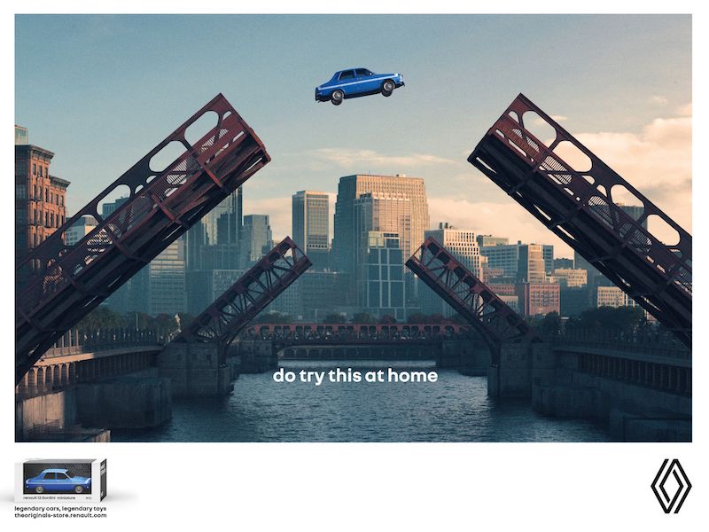
Do try this at home / La même idée en cascade?

Post pobrano z: Do try this at home / La même idée en cascade?

THE ORIGINAL?
Hot Wheels / Small trucks stunt – 2007
“Kids! Do try this at home”
Click the image to enlarge
Source : Adsoftheworld
Agency : Ogilvy Frankfurt (Germany)
LESS ORIGINAL
Renault / Legendary Toys stunt – 2022
“Do try this at home”
Click the image to enlarge
Source : Cannes Lions OUTDOOR BRONZE
Agency : Publicis Conseil Paris (France)