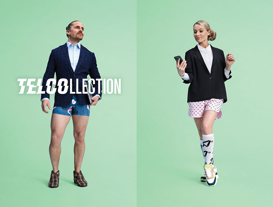
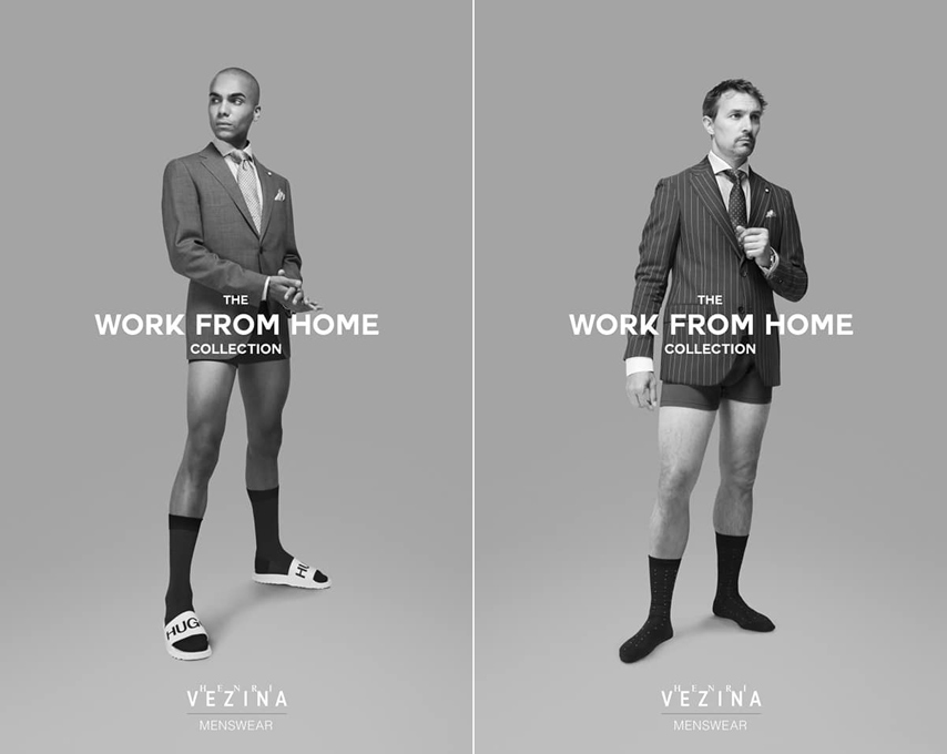
THE ORIGINAL? Ford / Used Cars / “olor a nuevo” – 2012 “Smells new”
Watch the Case Study Film Agency : Bassat Ogilvy Madrid (Spain)
LESS ORIGINAL Dacia Duster “Perfume sample” – 2020
“For all those who forgot what the smell of new was”
Source : La Réclame
Agency : Publicis Conseil Paris (France)
Being more productive and avoiding procrastination are the biggest challenges everybody wants to overcome.
The designer profession requires you to be a creative person. For someone who is always brainstorming there’s no other way to stay competitive.
All this sounds easy. Here is when frustration will come up because staying productive as a designer is super tough.
This world has been designed to distract you. You can easily put off things for later or jump from one thing to another.
Productivity can make the difference between two designers. You should be able to brainstorm and troubleshoot problems. At the same time, you will need to handle other tasks.
Here are some productivity tips for designers to stay focused, creative, and avoid procrastination.
Plan your day ahead
Planning is everything. If you don’t know where you are and where you go, anything will be the best choice.
Productivity comes from a well-organized agenda. Having clarity which is the next step and marked things done. It seems simple but most people don’t do it. There’s no point to pretend to be productive without a plan ahead.
This is not related to the field you are in, it is something that depends on you. Schedules and due dates are overwhelming.
Build a to-do List
Planning will give you the list of tasks you need to get done. Yet if you want to prioritize and organize your day a to-do list should be your weapon.
Without it is overwhelming to accomplish your daily goals. You have a lot of things on your plate but you don’t know where to start.
Once you create a to-do list and if you refer to it several times a day you have high chances to get things done easier and faster.
Build habits and stick to them
Building good habits will help you be more productive. Yet this is not as easy as it sounds; it requires commitment and patience to stick to them.
Your task is to build and stick to habits that work for you. They should make your life easier.
They will allow you to focus on creative activities having a positive impact at the end of the day.
Find peace in your environment
If you don’t feel peace and good vibes from your current environment, it could be a good idea to make a change.
Believe it or not, a few changes in your behavior are enough to recover and get inspired.
From hanging a picture of your family to a piece of art or even re-design completely your work environment are the changes you need to be more productive.
It’s not only about software high-quality tools it is also about all around you. Pens, board, notebooks, paper, or anything else that make your job easier. This generates emotions and creativity.
Figure Out the Best Time
Your optimal time slots are different than anyone else out there. If you figure out which time fits with which tasks you will have better results at the end of the day.
You already know yourself. You probably enjoy getting up early and start the day ahead of the rest of the world. Or on the contrary, you are a night owl and you feel you get more focus and creativity at nights.
Once you find the ideal time to work and that works for you, you will see the positive effects on your productivity.
Workout to Reset Your Mind
Working out creates emotions and they are the booster to productivity.
As a designer no doubt you will spend 90% of the day in front of your computer. This means you will not have the chance to give your body the movements it needs.
Exercise will reset the state of mind. It will disconnect from any work-related thing. You don’t need to go to the gym. You only need commitment and start to exercise from 20 to 30 minutes during the day.
Choose the Right Tools
I bet to say that you have heard this popular advice. Work smart, not hard.
Choose the right tools that will increase your productivity. You will deliver more with them.
No matter if you are designing a website, a mobile app, or a logo. There is one thing you need to make sure you have in place: the right tools and also they set up to make part of the job.
You have the freedom to get a freemium or premium tool. That depends on your possibilities. Either of them should help you to be more productive.
Tracking your time
Do you know how much time a task demanded you during the day? How do you know you are being faster than yesterday on the same task?
You will not have the answer to those questions if you aren’t tracking your tasks time.
If you follow the creation of a to-do list and if you make it achievable and realistic then it is a good opportunity to start to track each task. How can you do it?
There are plenty of tools out there that allows you to track your tasks. Basically, their usage is pretty straightforward. You decide which tasks tracking and to which project they belong to.
Tracking your tasks will give you more than productivity. It also helps you to keep the focus on tasks and allows you to evaluate where you could be faster.
Have effective and strong communication
Having strong communication skills should be a must for everybody. It’s not only about your technical skills, but also your abilities to communicate and handle the relationship with clients.
Sometimes there’s a barrier between you and your client due the client doesn’t know the topic and jargon of your field. You can fall into the mistake of using design words like wireframes, mock-up, and the client will feel lost.
If you can have effective and clear communication you can easily and as a result fulfill what exactly clients want.
When trying to complete a big task without dividing it up it is probably you will end up not finishing it on time or poor quality. You don’t need to overwhelm yourself and be snowed with the big picture instead see the small goals.
Break down the general goal into specific ones. Once you have granular tasks you can think about the priority.
Breaking down the tasks will not be worth it if you decide to assign yourself many of them at the same time. At this point, you should assign them based on the complexity, effort, and if you have worked on similar tasks before.
Use shortcuts
Sometimes we underestimate the power that keyboard shortcuts give us. No doubt once you use them you save a lot of time giving you the chance to spend that time on other tasks during the day.
You don’t need to memorize them, as soon as you start to know and use them the faster you will be. This is a simple way to gain extra time at the end of the day.
Repeated tasks like taking a screenshot are a real case scenario to leverage shortcuts.
Finally, the better thing is that you also can add your keyboard shortcuts, those you feel more comfortable with.
Breathe and take a break
No matter how busy you are or how many tasks you need to get complete. You need a way to disconnect completely from what you are working on – you need to take a break.
As a designer, you spend many hours a day sitting down in front of your computer as much time you stay there the less productive you will be.
Set aside time for a break every single day. It shouldn’t be a long time, five minutes will be enough to reset your mind and fill it out with energy to continue doing your job.
Give yourself rewards
One of the biggest mistakes everyone makes is to underestimate the act of rewarding yourself. When you get a kudos, clap, or even a material gift you feel important and rewarded.
Why not give the same to yourself when you have worked hard to get things done?
No need to buy something, it could be to stand up and go for a good coffee, see the sky for a while or prepare a great tea. Then sit down in front of your television and watch for a moment something that makes you laugh. By doing this you change your state of mind.
Avoid Distraction and finish what you start
This world is designed to distract you. Avoid falling into the distractions trap.
There are high chances that push notifications, email, or WhatsApp conversion comes up and distracts you.
If you jump to any of them you will waste your time, focus, and energy. Build the habits of sticking to what you are working on and force yourself to stay there until you finish it.
Find focus and motivation by listening to music
Music can have an incredible impact on the way you work. Find music that keeps you working at a steady pace, the genre will be different for everyone so try out different styles to see what works for you. Music relaxes your mind and soul. It gives you peace, focus, and inspiration.
Listening to music is a good decision while you are working since it keeps you motivated. No doubt, listing music will have a positive impact and effects on your productivity.
Share your Thoughts and Opinions
Sharing your doubts and thoughts early will save you a lot of time. Ask questions for clarification when you are not completely clear on your tasks.
This should be an often task during the creative process. Share your point of view based on your experience and hear other ones too.
A successful design team is the result of flexibility and an open mind. So don’t worry to try to spread your voice.
Keep Up the Momentum
Momentum makes you believe in the impossible. The battle is how you keep it up.
Every single day ask this question: what do I need to do today to get closer to my goal? This will get you quickly momentum and focus on what you are trying to achieve.
Your productivity will soar once you keep the momentum up.
As you know if you have been reading Designer Daily for a while, A’ Design Award & Competition is the world’s leading international annual juried competition for design. In a wide range of creative fields, designers compete for awards that are judged by an international jury panel of experienced academics, prominent press members, and established professionals. As a designer or agency, you can register on this page.
The Graphic Design and Visual Communication Awards
Most readers of Designer Daily will probably be particularly interested in the Graphic Design and Visual Communication Awards. Some of the type of designs that can be sent for this category include: Symbols, Logos, Typography, Posters, Books and Page Layouts, 2D Packaging and More. Graphic Awards Sub-categories and their descriptions are available on this page. The deadline
Previous winners of a Graphics and Visual Communication Award
The best way to understand what type of designs are accepted and appreciated, just check the previous years’ winners in this category.
Typeface Calendar by Katsumi TamuraGrand Egyptian Museum Corporate Identity by Rana GaberThe Moment 2020 Calendar by Xiutao FuI Really Like Math Interactive Textbook by Jaehun KimAirport Bremen Wayfinding System by Thomas GeissertFIL Brand Vision System Random But Unified Brand Vision System by Young HualeMountain Stone Exhibition Visual Exhibition Visual by Weiquan LongText of Cycle Font Design by Junheng LiPeace and Presence Well-Being Branding by Lisa WinstanleyAll In One Experience Consumption Infographic With Animated Gif by YuJin Jung
If the work you have seen above inspires you, do not hesitate to submit your own work and compete with the world’s best designers for recognition. Register here.
Making sure your website will look good on every browser and device needn’t be an insurmountable challenge. These responsive designs show you how it’s done.
When, according to data from StatCounter, more than half of today’s website traffic is viewed on mobile devices, a web designer is left with three options: (1) stick with desktop browsers, (2) go mobile, or (3) maximize traffic by going with both.
Going with Option 3 requires extra effort, but not all that much, and the rewards are great (if roughly twice the amount of traffic appeals to you).
There’s a list of specs and requirements that must be satisfied in designing a responsive website; but given today’s tools and techniques those specs and requirements needn’t be difficult to satisfy.
High-quality WordPress themes like those BeTheme provides do most of the heavy lifting for you to make designing a responsive website just like taking the proverbial walk in the park.
Both desktop and mobile users have easy access to your site, and Google will reward your responsive, mobile-friendly site with better search rankings
Which is why Responsive web design is a must.
It’s simply not true that responsive design takes desktop users out of the picture. Prioritize the mobile experience, and if you do it well everyone will be happy.
Let’s look at some examples of what “doing it well” involves.
How responsive web designs can encourage leaner yet highly engaging desktop experiences
One advantage of designing for desktop users is having more space, and therefore more pixels to work with. Trying to get the most out of “every pixel” is not only impractical but a poor design approach as well.
Consider the popularity of sites featuring minimalist design techniques or exhibit a generous use of white space.
Designers have in fact learned to create leaner and more efficient desktop experiences in their drive to create effective mobile experiences.
Take designer/developer Rob Grabowski’s website as an example.
On a mobile screen it looks like this:
Website visitors have no problem focusing on the welcoming message and the photo behind it.
Desktop visitors encounter virtually the sameexperience:
This is a great example of seamless transitioning between desktop and mobile displays. With the proper design techniques,it’s not hard to accomplish.
Mobile web designs that simplify and enhance the decision-making process
One of the pitfalls of an over-busy website is that it can present an overabundance of choices or options to the user, which in turn can make choosing between similar options more difficult.
Responsive design techniques force web designers to take a modular approach to designing a site, creating levels of website sections which in turn makes it easier to review one option at a time.
BeRepair, one of the 500+ pre-built sites in BeTheme’s library, does an excellent job of demonstrating this design approach.
This responsive layout makes it easy for the viewer to focus on the message without being distracted by an overabundance of information.
Let’s take a look at a completely different websitetype, in this case the BeRestaurant pre-built desktop site:
Great looking, right? The mobile version is every bit as attractive while featuring fewer details that could prove to be distracting.
Note how the menu has been placed on a separate but readily accessible level by incorporating it into the hamburger menu, allowing the visitor to proceed one step at a time.
Responsive designs that excludeexcessive information
Consider paintings you might encounter in an art museum.
You’ll see landscape murals that are rich in beautiful details yet still tend to have a central focus.
That central focus is generally more clearly defined in portraits, even when surrounded by intricate details.
Responsive websites offer the best of both worlds. When you think of landscape, think desktop, where there is an abundance of space to work with. When you think of portrait, think mobile, there’s less space to work with but more than enough to focus on the message.
To get from one to the other, it’s a matter of knowing what details can be trimmed away as excess in such a way as to ensure the mobile experience remains worthwhile.
BeITService is a good example of this. First, the desktop version:
This is a great looking home page. Plenty of detail, and plenty of space as well in this responsive image. Note how easy it is to remove some of the detail to create the mobile version:
While some of the image has been trimmed away, it’s fair to say that nothing has really been lost in the transition and the message is still front and center.
Culturally Connected, while involving some rearranging to make the transition, takes a very similar approach.
The desktop version:
The desktop version features a rather elaborate background graphic. Much of the graphic can however be looked upon as excess, giving you this on mobile:
Again, nothing has been lost. The secondary text has been placed in a different section where it will not serve as a distraction.
BeTutor is another great example of this technique. The desktop version looks like this:
To get to the mobile version, the designer simply omits the smaller text. The primary message remains intact.
None of the subject matter that reveals the type of service offered has been removed.The graphic is unchanged, and the design as a whole remains uncluttered.
Responsive websites that leverage their space
The previous two examples removed secondary textin the mobile versions. In the following example, by leveraging space web designers can sometimes take advantage of different screen size ratios.
The mobile version on the other hand takes advantage of the vertical space to show additional content that will be of value to the viewer.
While mobile designs are sometimes forced to show less content to work effectively, it doesn’t always have to be that way. BeCosmetics is a good example of this.
The desktop view:
The mobile view leverages the added vertical space to provide the viewer with some useful introductory content plus a button that invites the visitor to check out the product line:
While it may sound counterintuitive, having less space doesn’t always limit the amount of comment if you are able to leverage that space.
Responsive websites that heighten readability
Internet users tend to be an impatient lot to begin with, and even when they find a site to their liking, they’re not apt to put up with text that, for whatever reason, is difficult to read.
It’s not only font type that matters. Too many words on a line or cramped lettering can be enough to cause a reader to bail out.
One helpful hint is to use visual elements to even out the text, as has been done in the BeDanceSchool site.
While it’s easy for visitors to focus on the content on the desktop version, thanks to the eye-catching graphics, the same design won’t work on mobile. By taking advantage of both the strengths and weaknesses of mobile screen size, the problem can be handled like this:
Significantly paring back the graphic designelements enables visitors to easily read the content. The text itself is beautifully styled to support readability.
The choice of font size and type also matters of course. See what Base Coat has done to ensure the text is both readable and engaging:
Be mindful of the fact that, while a vertical format can often be used to advantage with respect to text, lengthy text that requires scrolling can prove to be daunting for mobile users.
Mobile sites that highlightvisual content
Turning from how best to deal with lots of text on mobile sites, let us now take a look athow storytelling elements can contribute to a highly positive mobile experience.
Starting with what visitors experience on BeBand on the desktop:
A mobile screen doesn’t provide nearly as many options to play with design balance as on a desktop, but it can nevertheless highlight whatever image you’ve chosen:
It’s not only website static images that work well on mobile. The Scott Resort, for example, invites its first-time mobile visitors to watch a brief video:
Regardless of the device a visitor is using, a responsive video will automatically conform to the width of the screen.
The video as seen on desktop:
The video on mobile looks like this:
A mobile responsive design gives the maximum number of users the experience you want them to enjoy by allowing your content to adapt to the devices they happen to be using.
Mobile responsive sites that do a great job of accumulating leads
It needs to be emphasized at this point that, while responsive websites will typically generate more traffic, mobile conversion rates are not as high as they are on desktop; a situation that is expected to improve over time.
Given than, a responsive site should be designed to capture as many leads as possible to help achieve an acceptable conversion rate.
The BeClub pre-built website illustrates how this can work:
Note how effectively “Newsletter” is highlighted on the home page, and how it immediately precedes an invitation to subscribe.
The result? A ton of subscribers.
Here’s how the same page appears on mobile:
Not only is it very well done, but the mobile version may be even more effective in engaging potential subscribers due to its smaller,more dedicated space.
As is the case here, and with all the previous examples, website owners receive an extra benefit whenever a visitor uses both desktop and mobile devices.
Responsive web designs for the win
What do WordPress users look for in a theme to base their website design on? Most certainly, they look for many if not all of the following qualities:
Easy to work with
Cost effectiveness
Key features
Customizability
Overall design quality, including performance
Yet another quality must be added, and that is responsiveness. Not every WordPress theme has been designed with mobile users in mind.
That’s not the case with BeTheme. Each of its more than 500 pre-built websites has mobile responsiveness baked right in. With BeTheme, you won’t have to agonize over how you think your pages might show up on mobile screens. You can spend the time you would have otherwise spent stressing yourself out with worry to getting your site online and building your business.
As you already know, photography wasn’t a thing in the Middle-Ages. This made reporting on wildlife from other continents much less accurate, as it was impossible to bring back a direct depiction of the animals observed.
In this post, you will see some drawings and paintings created by artists based on the oral or written description made by travellers. As one could expect, the results are not very precise and often hilarious.
This “Hippopotamus” by Jacob van Maerlant sometime around 1350A 12th Century tiger by an unknown artist.Probably the most agressive snail ever, by Jacob van Maerlant around 1350.Weird elephants by unknown artist from the late 13th Century.Another elephant, without ears this time. Fromt he Bestiary of William the Clerk.
The tornado trunk elephant of Jacob van Maerlant. Year unknown.
A whale that looks pretty much like a dragon, from the 13th Century.Lions and bears, by an unknown artist of the early 13th Century.A crocodile that can walk on water, by an unknown artist from the late 13th Century.Another crocodile, by Eward Topsell in 1658.
A weird looking leopard, funny to see this gracious animal being represented with such a “square” head shape. From the Aberdeen Bestiary.
In back-end development, storage is a common part of the job. Application data is stored in databases, files in object storage, transient data in caches… there are seemingly endless possibilities for storing any sort of data. But data storage isn’t limited only to the back end. The front end (the browser) is equipped with many options to store data as well. We can boost our application performance, save user preferences, keep the application state across multiple sessions, or even different computers, by utilizing this storage.
In this article, we will go through the different possibilities to store data in the browser. We will cover three use cases for each method to grasp the pros and cons. In the end, you will be able to decide what storage is the best fit for your use case. So let’s start!
The localStorage API
localStorage is one of the most popular storage options in the browser and the go-to for many developers. The data is stored across sessions, never shared with the server, and is available for all pages under the same protocol and domain. Storage is limited to ~5MB.
Surprisingly, the Google Chrome team doesn’t recommend using this option as it blocks the main thread and is not accessible to web workers and service workers. They launched an experiment, KV Storage, as a better version, but it was just a trial that doesn’t seem to have gone anywhere just yet.
The localStorage API is available as window.localStorage and can save only UTF-16 strings. We must make sure to convert data to strings before saving it into localStorage. The main three functions are:
setItem('key','value')
getItem('key')
removeItem('key')
They’re all synchronous, which makes it simple to work with, but they block the main thread.
It’s worth mentioning that localStorage has a twin called sessionStorage. The only difference is that data stored in sessionStorage will last only for the current session, but the API is the same.
Let’s see it in action. The first example demonstrates how to use localStorage for storing the user’s preferences. In our case, it’s a boolean property that turns on or off the dark theme of our site.
CodePen Embed Fallback
You can check the checkbox and refresh the page to see that the state is saved across sessions. Take a look at the save and load functions to see how I convert the value to string and how I parse it. It’s important to remember that we can store only strings.
This second example loads Pokémon names from the PokéAPI.
CodePen Embed Fallback
We send a GET request using fetch and list all the names in a ul element. Upon getting the response, we cache it in the localStorage so our next visit can be much faster or even work offline. We have to use JSON.stringify to convert the data to string and JSON.parse to read it from the cache.
In this last example, I demonstrate a use case where the user can browse through different Pokémon pages, and the current page is saved for the next visits.
CodePen Embed Fallback
The issue with localStorage, in this case, is that the state is saved locally. This behavior doesn’t allow us to share the desired page with our friends. Later, we will see how to overcome this issue.
We will use these three examples in the next storage options as well. I forked the Pens and just changed the relevant functions. The overall skeleton is the same for all methods.
The IndexedDB API
IndexedDB is a modern storage solution in the browser. It can store a significant amount of structured data — even files, and blobs. Like every database, IndexedDB indexes the data for running queries efficiently. It’s more complex to use IndexedDB. We have to create a database, tables, and use transactions.
Compared to localStorage , IndexedDB requires a lot more code. In the examples, I use the native API with a Promise wrapper, but I highly recommend using third-party libraries to help you out. My recommendation is localForage because it uses the same localStorage API but implements it in a progressive enhancement manner, meaning if your browser supports IndexedDB, it will use it; and if not, it will fall back to localStorage.
Let’s code, and head over to our user preferences example!
CodePen Embed Fallback
idb is the Promise wrapper that we use instead of working with a low-level events-based API. They’re almost identical, so don’t worry. The first thing to notice is that every access to the database is async, meaning we don’t block the main thread. Compared to localStorage, this is a major advantage.
We need to open a connection to our database so it will be available throughout the app for reading and writing. We give our database a name, my-db, a schema version, 1, and an update function to apply changes between versions. This is very similar to database migrations. Our database schema is simple: only one object store, preferences. An object store is the equivalent of an SQL table. To write or read from the database, we must use transactions. This is the tedious part of using IndexedDB. Have a look at the new save and load functions in the demo.
No doubt that IndexedDB has much more overhead and the learning curve is steeper compared to localStorage. For the key value cases, it might make more sense to use localStorage or a third-party library that will help us be more productive.
CodePen Embed Fallback
Application data, such as in our Pokémon example, is the forte of IndexedDB. You can store hundreds of megabytes and even more in this database. You can store all the Pokémon in IndexedDB and have them available offline and even indexed! This is definitely the one to choose for storing app data.
I skipped the implementation of the third example, as IndexedDB doesn’t introduce any difference in this case compared to localStorage. Even with IndexedDB, the user will still not share the selected page with others or bookmark it for future use. They’re both not the right fit for this use case.
Cookies
Using cookies is a unique storage option. It’s the only storage that is also shared with the server. Cookies are sent as part of every request. It can be when the user browses through pages in our app or when the user sends Ajax requests. This allows us to create a shared state between the client and the server, and also share state between multiple applications in different subdomains. This is not possible by other storage options that are described in this article. One caveat: cookies are sent with every request, which means that we have to keep our cookies small to maintain a decent request size.
The most common use for cookies is authentication, which is out of the scope of this article. Just like the localStorage, cookies can store only strings. The cookies are concatenated into one semicolon-separated string, and they are sent in the cookie header of the request. You can set many attributes for every cookie, such as expiration, allowed domains, allowed pages, and many more.
In the examples, I show how to manipulate the cookies through the client-side, but it’s also possible to change them in your server-side application.
CodePen Embed Fallback
Saving the user’s preferences in a cookie can be a good fit if the server can utilize it somehow. For example, in the theme use case, the server can deliver the relevant CSS file and reduce potential bundle size (in case we’re doing server-side-rendering). Another use case might be to share these preferences across multiple subdomain apps without a database.
Reading and writing cookies with JavaScript is not as straightforward as you might think. To save a new cookie, you need to set document.cookie — check out the save function in the example above. I set the dark_theme cookie and add it a max-age attribute to make sure it will not expire when the tab is closed. Also, I add the SameSite and Secure attributes. These are necessary because CodePen uses iframe to run the examples, but you will not need them in most cases. Reading a cookie requires parsing the cookie string.
A cookie string looks like this:
key1=value1;key2=value2;key3=value3
So, first, we have to split the string by semicolon. Now, we have an array of cookies in the form of key1=value1, so we need to find the right element in the array. In the end, we split by the equal sign and get the last element in the new array. A bit tedious, but once you implement the getCookie function (or copy it from my example :P) you can forget it.
Saving application data in a cookie can be a bad idea! It will drastically increase the request size and will reduce application performance. Also, the server cannot benefit from this information as it’s a stale version of the information it already has in its database. If you use cookies, make sure to keep them small.
The pagination example is also not a good fit for cookies, just like localStorage and IndexedDB. The current page is a temporary state that we would like to share with others, and any of these methods do not achieve it.
URL storage
URL is not a storage, per se, but it’s a great way to create a shareable state. In practice, it means adding query parameters to the current URL that can be used to recreate the current state. The best example would be search queries and filters. If we search the term flexbox on CSS-Tricks, the URL will be updated to https://css-tricks.com/?s=flexbox. See how easy it is to share a search query once we use the URL? Another advantage is that you can simply hit the refresh button to get newer results of your query or even bookmark it.
We can save only strings in the URL, and its maximum length is limited, so we don’t have so much space. We will have to keep our state small. No one likes long and intimidating URLs.
Again, CodePen uses iframe to run the examples, so you cannot see the URL actually changing. Worry not, because all the bits and pieces are there so you can use it wherever you want.
CodePen Embed Fallback
We can access the query string through window.location.search and, lucky us, it can be parsed using the URLSearchParams class. No need to apply any complex string parsing anymore. When we want to read the current value, we can use the get function. When we want to write, we can use set. It’s not enough to only set the value; we also need to update the URL. This can be done using history.pushState or history.replaceState, depending on the behavior we want to accomplish.
I wouldn’t recommend saving a user’s preferences in the URL as we will have to add this state to every URL the user visits, and we cannot guarantee it; for example, if the user clicks on a link from Google Search.
Just like cookies, we cannot save application data in the URL as we have minimal space. And even if we did manage to store it, the URL will be long and not inviting to click. Might look like a phishing attack of sorts.
CodePen Embed Fallback
Just like our pagination example, the temporary application state is the best fit for the URL query string. Again, you cannot see the URL changes, but the URL updates with the ?page=x query parameter every time you click on a page. When the web page loads, it looks for this query parameter and fetches the right page accordingly. Now we can share this URL with our friends so they can enjoy our favorite Pokémon.
Cache API
Cache API is a storage for the network level. It is used to cache network requests and their responses. The Cache API fits perfectly with service workers. A service worker can intercept every network request, and using the Cache API, it can easily cache both the requests. The service worker can also return an existing cache item as a network response instead of fetching it from the server. By doing so, you can reduce network load times and make your application work even when offline. Originally, it was created for service workers but in modern browsers the Cache API is available also in window, iframe, and worker contexts as-well. It’s a very powerful API that can improve drastically the application user experience.
Just like IndexedDB the Cache API storage is not limited and you can store hundreds of megabytes and even more if you need to. The API is asynchronous so it will not block your main thread. And it’s accessible through the global property caches.
If you build a browser extension, you have another option to store your data. I discovered it while working on my extension, daily.dev. It’s available via chrome.storage or browser.storage, if you use Mozilla’s polyfill. Make sure to request a storage permission in your manifest to get access.
There are two types of storage options, local and sync. The local storage is self-explanatory; it means it isn’t shared and kept locally. The sync storage is synced as part of the Google account and anywhere you install the extension with the same account this storage will be synced. Pretty cool feature if you ask me. Both have the same API so it’s super easy to switch back-and-forth, if needed. It’s async storage so it doesn’t block the main thread like localStorage. Unfortunately, I cannot create a demo for this storage option as it requires a browser extension but it’s pretty simple to use, and almost like localStorage. For more information about the exact implementation, refer to Chrome docs.
Conclusion
The browser has many options we can utilize to store our data. Following the Chrome team’s advice, our go-to storage should be IndexedDB. It’s async storage with enough space to store anything we want. localStorage is not encouraged, but is easier to use than IndexedDB. Cookies are a great way to share the client state with the server but are mostly used for authentication.
If you want to create pages with a shareable state such as a search page, use the URL’s query string to store this information. Lastly, if you build an extension, make sure to read about chrome.storage.
This is a neat little HTML preprocessor from Giuseppe Gurgone. It has very few features, but one of them is HTML includes, which is something I continue to be baffled that HTML doesn’t support natively. There are loads of ways to handle it. I think it’s silly that it’s been consistently needed for decades and HTML could evolve to support it but hasn’t. So anyway, enter another option for handling it.
📢 Today I am open sourcing ✨ ₪ xm ✨ a tiny compiler for HTML that adds support for
What is extra neat is that it’s not just includes, but templating with includes in a really clean way. If this was Nunjucks, they solve that by creating a template.njk like…
{% block header %}
  This is the default (overridable) header.
{% endblock %}
<footer>
  {% block footer %}
    This is the default (overridable) footer.
  {% endblock %}
</footer>
And then your actual pages use that template like…
{% extends "parent.html" %}
{% block footer %}
  Special footer for this page.
{% endblock %}
In xm, the syntax stays HTML-y, which is nice. So this template.html…
The moment I fell in love with front-end development was when I discovered the style.css file in WordPress themes. That’s where all the magic was (is!) to me. I could (can!) change a handful of lines in there and totally change the look and feel of a website. It’s an incredible game to play.
Back when I was cowboy-coding over FTP. Although I definitely wasn’t using CSS grid!
By fiddling with HTML and CSS, I can change the way you feel about a bit of writing. I can make you feel more comfortable about buying tickets to an event. I can increase the chances you share something with your friends.
That was well before anybody paid me money to be a front-end developer, but even then I felt the intoxicating mix of stimuli that the job offers. Front-end development is this expressive art form, but often constrained by things like the need to directly communicate messaging and accomplish business goals.
Front-end development is at the intersection of art and logic. A cross of business and expression. Both left and right brain. A cocktail of design and nerdery.
I love it.
Looking back at the courses I chose from middle school through college, I bounced back and forth between computer-focused classes and art-focused classes, so I suppose it’s no surprise I found a way to do both as a career.
The term “Front-End Developer” is fairly well-defined and understood. For one, it’s a job title. I’ll bet some of you literally have business cards that say it on there, or some variation like: “Front-End Designer,” “UX Developer,” or “UI Engineer.” The debate around what those mean isn’t particularly interesting to me. I find that the roles are so varied from job-to-job and company-to-company that job titles will never be enough to describe things. Getting this job is more about demonstrating you know what you’re doing more than anything else¹.
Chris Coyier Front-End Developer
The title variations are just nuance. The bigger picture is that as long as the job is building websites, front-enders are focused on the browser. Quite literally:
front-end = browsers
back-end = servers
Even as the job has changed over the decades, that distinction still largely holds.
As “browser people,” there are certain truths that come along for the ride. One is that there is a whole landscape of different browsers and, despite the best efforts of standards bodies, they still behave somewhat differently. Just today, as I write, I dealt with a bug where a date string I had from an API was in a format such that Firefox threw an error when I tried to use the .toISOString() JavaScript API on it, but was fine in Chrome. That’s just life as a front-end developer. That’s the job.
Even across that landscape of browsers, just on desktop computers, there is variance in how users use that browser. How big do they have the window open? Do they have dark mode activated on their operating system? How’s the color gamut on that monitor? What is the pixel density? How’s the bandwidth situation? Do they use a keyboard and mouse? One or the other? Neither? All those same questions apply to mobile devices too, where there is an equally if not more complicated browser landscape. And just wait until you take a hard look at HTML emails.
That’s a lot of unknowns, and the answers to developing for that unknown landscape is firmly in the hands of front-end developers.
Into the unknoooooowwwn. – Elsa
The most important aspect of the job? The people that use these browsers. That’s why we’re building things at all. These are the people I’m trying to impress with my mad CSS skills. These are the people I’m trying to get to buy my widget. Who all my business charts hinge upon. Who’s reaction can sway my emotions like yarn in the breeze. These users, who we put on a pedestal for good reason, have a much wider landscape than the browsers do. They speak different languages. They want different things. They are trying to solve different problems. They have different physical abilities. They have different levels of urgency. Again, helping them is firmly in the hands of front-end developers. There is very little in between the characters we type into our text editors and the users for whom we wish to serve.
Being a front-end developer puts us on the front lines between the thing we’re building and the people we’re building it for, and that’s a place some of us really enjoy being.
That’s some weighty stuff, isn’t it? I haven’t even mentioned React yet.
The “we care about the users” thing might feel a little precious. I’d think in a high functioning company, everyone would care about the users, from the CEO on down. It’s different, though. When we code a <button>, we’re quite literally putting a button into a browser window that users directly interact with. When we adjust a color, we’re adjusting exactly what our sighted users see when they see our work.
That’s not far off from a ceramic artist pulling a handle out of clay for a coffee cup. It’s applying craftsmanship to a digital experience. While a back-end developer might care deeply about the users of a site, they are, as Monica Dinculescu once told me in a conversation about this, “outsourcing that responsibility.”
We established that front-end developers are browser people. The job is making things work well in browsers. So we need to understand the languages browsers speak, namely: HTML, CSS, and JavaScript². And that’s not just me being some old school fundamentalist; it’s through a few decades of everyday front-end development work that knowing those base languages is vital to us doing a good job. Even when we don’t work directly with them (HTML might come from a template in another language, CSS might be produced from a preprocessor, JavaScript might be mostly written in the parlance of a framework), what goes the browser is ultimately HTML, CSS, and JavaScript, so that’s where debugging largely takes place and the ability of the browser is put to work.
CSS will always be my favorite and HTML feels like it needs the most love — but JavaScript is the one we really need to examine The last decade has seen JavaScript blossom from a language used for a handful of interactive effects to the predominant language used across the entire stack of web design and development. It’s possible to work on websites and writing nothing but JavaScript. A real sea change.
JavaScript is all-powerful in the browser. In a sense, it supersedes HTML and CSS, as there is nothing either of those languages can do that JavaScript cannot. HTML is parsed by the browser and turned into the DOM, which JavaScript can also entirely create and manipulate. CSS has its own model, the CSSOM, that applies styles to elements in the DOM, which JavaScript can also create and manipulate.
This isn’t quite fair though. HTML is the very first file that browsers parse before they do the rest of the work needed to build the site. That firstness is unique to HTML and a vital part of making websites fast.
In fact, if the HTML was the only file to come across the network, that should be enough to deliver the basic information and functionality of a site.
That philosophy is called Progressive Enhancement. I’m a fan, myself, but I don’t always adhere to it perfectly. For example, a <form> can be entirely functional in HTML, when it’s action attribute points to a URL where the form can be processed. Progressive Enhancement would have us build it that way. Then, when JavaScript executes, it takes over the submission and has the form submit via Ajax instead, which might be a nicer experience as the page won’t have to refresh. I like that. Taken further, any <button>outside a form is entirely useless without JavaScript, so in the spirit of Progressive Enhancement, I should wait until JavaScript executes to even put that button on the page at all (or at least reveal it). That’s the kind of thing where even those of us with the best intentions might not always toe the line perfectly. Just put the button in, Sam. Nobody is gonna die.
JavaScript’s all-powerfulness makes it an appealing target for those of us doing work on the web — particularly as JavaScript as a language has evolved to become even more powerful and ergonomic, and the frameworks that are built in JavaScript become even more-so. Back in 2015, it was already so clear that JavaScript was experiencing incredible growth in usage, Matt Mullenweg, co-founder of WordPress, gave the developer world homework: “Learn JavaScript Deeply”³. He couldn’t have been more right. Half a decade later, JavaScript has done a good job of taking over front-end development. Particularly if you look at front-end development jobs.
While the web almanac might show us that only 5% of the top-zillion sites use React compared to 85% including jQuery, those numbers are nearly flipped when looking around at front-end development job requirements.
I’m sure there are fancy economic reasons for all that, but jobs are as important and personal as it gets for people, so it very much matters.
So we’re browser people in a sea of JavaScript building things for people. If we take a look at the job at a practical day-to-day tasks level, it’s a bit like this:
Translate designs into code
Think in terms of responsive design, allowing us to design and build across the landscape of devices
Build systemically. Construct components and patterns, not one-offs.
Apply semantics to content
Consider accessibility
Worry about the performance of the site. Optimize everything. Reduce, reuse, recycle.
Just that first bullet point feels like a college degree to me. Taken together, all of those points certainly do.
This whole list is a bit abstract though, so let’s apply it to something we can look at. What if this website was our current project?
Our brains and fingers go wild!
Let’s build the layout with CSS grid.
What fonts are those? Do we need to load them in their entirety or can we subset them? What happens as they load in? This layout feels like it will really suffer from font-shifting jank.
There are some repeated patterns here. We should probably make a card design pattern. Every website needs a good card pattern.
That’s a gorgeous color scheme. Are the colors mathematically related? Should we make variables to represent them individually or can we just alter a single hue as needed? Are we going to use custom properties in our CSS? Colors are just colors though, we might not need the cascading power of them just for this. Should we just use Sass variables? Are we going to use a CSS preprocessor at all?
The source order is tricky here. We need to order things so that they make sense for a screen reader user. We should have a meeting about what the expected order of content should be, even if we’re visually moving things around a bit with CSS grid.
The photographs here are beautifully shot. But some of them match the background color of the site… can we get away with alpha-transparent PNGs here? Those are always so big. Can any next-gen formats help us? Or should we try to match the background of a JPG with the background of the site seamlessly. Who’s writing the alt text for these?
There are some icons in use here. Inline SVG, right? Certainly SVG of some kind, not icon fonts, right? Should we build a whole icon system? I guess it depends on how we’re gonna be building this thing more broadly. Do we have a build system at all?
What’s the whole front-end plan here? Can I code this thing in vanilla HTML, CSS, and JavaScript? Well, I know I can, but what are the team expectations? Client expectations? Does it need to be a React thing because it’s part of some ecosystem of stuff that is already React? Or Vue or Svelte or whatever? Is there a CMS involved?
I’m glad the designer thought of not just the “desktop” and “mobile” sizes but also tackled an in-between size. Those are always awkward. There is no interactivity information here though. What should we do when that search field is focused? What gets revealed when that hamburger is tapped? Are we doing page-level transitions here?
A lot of those things have been our jobs forever though. We’ve been asking and answering these questions on every website we’ve built for as long as we’ve been doing it. There are different challenges on each site, which is great and keeps this job fun, but there is a lot of repetition too.
Allow me to get around to the title of this article.
While we’ve been doing a lot of this stuff for ages, there is a whole pile of new stuff we’re starting to be expected to do, particularly if we’re talking about building the site with a modern JavaScript framework. All the modern frameworks, as much as they like to disagree about things, agree about one big thing: everything is a component. You nest and piece together components as needed. Even native JavaScript moves toward its own model of Web Components.
I like it, this idea of components. It allows you and your team to build the abstractions that make the most sense to you and what you are building.
Your Card component does all the stuff your card needs to do. Your Form component does forms how your website needs to do forms. But it’s a new concept to old developers like me. Components in JavaScript have taken hold in a way that components on the server-side never did. I’ve worked on many a WordPress website where the best I did was break templates into somewhat arbitrary include() statements. I’ve worked on Ruby on Rails sites with partials that take a handful of local variables. Those are useful for building re-usable parts, but they are a far cry from the robust component models that JavaScript frameworks offer us today.
All this custom component creation makes me a site-level architect in a way that I didn’t use to be. Here’s an example. Of course I have a Button component. Of course I have an Icon component. I’ll use them in my Card component. My Card component lives in a Grid component that lays them out and paginates them. The whole page is actually built from components. The Header component has a SearchBar component and a UserMenu component. The Sidebar component has a Navigation component and an Ad component. The whole page is just a special combination of components, which is probably based on the URL, assuming I’m all-in on building our front-end with JavaScript. So now I’m dealing with URLs myself, and I’m essentially the architect of the entire site. [Sweats profusely]
Like I told ya, a whole pile of new responsibility.
Components that are in charge of displaying content are almost certainly not hard-coded with data in them. They are built to be templates. They are built to accept data and construct themselves based on that data. In the olden days, when we were doing this kind of templating, the data has probably already arrived on the page we’re working on. In a JavaScript-powered app, it’s more likely that that data is fetched by JavaScript. Perhaps I’ll fetch it when the component renders. In a stack I’m working with right now, the front end is in React, the API is in GraphQL and we use Apollo Client to work with data. We use a special “hook” in the React components to run the queries to fetch the data we need, and another special hook when we need to change that data. Guess who does that work? Is it some other kind of developer that specializes in this data layer work? No, it’s become the domain of the front-end developer.
Speaking of data, there is all this other data that a website often has to deal with that doesn’t come from a database or API. It’s data that is really only relevant to the website at this moment in time.
Which tab is active right now?
Is this modal dialog open or closed?
Which bar of this accordion is expanded?
Is this message bar in an error state or warning state?
How many pages are you paginated in?
How far is the user scrolled down the page?
Front-end developers have been dealing with that kind of state for a long time, but it’s exactly this kind of state that has gotten us into trouble before. A modal dialog can be open with a simple modifier class like <div class="modal is-open"> and toggling that class is easy enough with .classList.toggle(".is-open"); But that’s a purely visual treatment. How does anything else on the page know if that modal is open or not? Does it ask the DOM? In a lot of jQuery-style apps of yore, yes, it would. In a sense, the DOM became the “source of truth” for our websites. There were all sorts of problems that stemmed from this architecture, ranging from a simple naming change destroying functionality in weirdly insidious ways, to hard-to-reason-about application logic making bug fixing a difficult proposition.
Front-end developers collectively thought: what if we dealt with state in a more considered way? State management, as a concept, became a thing. JavaScript frameworks themselves built the concept right in, and third-party libraries have paved and continue to pave the way. This is another example of expanding responsibility. Who architects state management? Who enforces it and implements it? It’s not some other role, it’s front-end developers.
There is expanding responsibility in the checklist of things to do, but there is also work to be done in piecing it all together. How much of this state can be handled at the individual component level and how much needs to be higher level? How much of this data can be gotten at the individual component level and how much should be percolated from above? Design itself comes into play. How much of the styling of this component should be scoped to itself, and how much should come from more global styles?
It’s no wonder that design systems have taken off in recent years. We’re building components anyway, so thinking of them systemically is a natural fit.
Let’s look at our design again:
A bunch of new thoughts can begin!
Assuming we’re using a JavaScript framework, which one? Why?
Can we statically render this site, even if we’re building with a JavaScript framework? Or server-side render it?
Where are those recipes coming from? Can we get a GraphQL API going so we can ask for whatever we need, whenever we need it?
Maybe we should pick a CMS that has an API that will facilitate the kind of front-end building we want to do. Perhaps a headless CMS?
What are we doing for routing? Is the framework we chose opinionated or unopinionated about stuff like this?
What are the components we need? A Card, Icon, SearchForm, SiteMenu, Img… can we scaffold these out? Should we start with some kind of design framework on top of the base framework?
What’s the client state we might need? Current search term, current tab, hamburger open or not, at least.
Is there a login system for this site or not? Are logged in users shown anything different?
Is there are third-party componentry we can leverage here?
Maybe we can find one of those fancy image components that does blur-up loading and lazy loading and all that.
Those are all things that are in the domain of front-end developers these days, on top of everything that we already need to do. Executing the design, semantics, accessibility, performance… that’s all still there. You still need to be proficient in HTML, CSS, JavaScript, and how the browser works. Being a front-end developer requires a haystack of skills that grows and grows. It’s the natural outcome of the web getting bigger. More people use the web and internet access grows. The economy around the web grows. The capability of browsers grows. The expectations of what is possible on the web grows. There isn’t a lot shrinking going on around here.
We’ve already reached the point where most front-end developers don’t know the whole haystack of responsibilities. There are lots of developers still doing well for themselves being rather design-focused and excelling at creative and well-implemented HTML and CSS, even as job posts looking for that dwindle.
There are systems-focused developers and even entire agencies that specialize in helping other companies build and implement design systems. There are data-focused developers that feel most at home making the data flow throughout a website and getting hot and heavy with business logic. While all of those people might have “front-end developer” on their business card, their responsibilities and even expectations of their work might be quite different. It’s all good, we’ll find ways to talk about all this in time.
In fact, how we talk about building websites has changed a lot in the last decade. Some of my early introduction to web development was through WordPress. WordPress needs a web server to run, is written in PHP, and stores it’s data in a MySQL database. As much as WordPress has evolved, all that is still exactly the same. We talk about that “stack” with an acronym: LAMP, or Linux, Apache, MySQL and PHP. Note that literally everything in the entire stack consists of back-end technologies. As a front-end developer, nothing about LAMP is relevant to me.
But other stacks have come along since then. A popular stack was MEAN (Mongo, Express, Angular and Node). Notice how we’re starting to inch our way toward more front-end technologies? Angular is a JavaScript framework, so as this stack gained popularity, so too did talking about the front-end as an important part of the stack. Node and Express are both JavaScript as well, albeit the server-side variant.
The existence of Node is a huge part of this story. Node isn’t JavaScript-like, it’s quite literally JavaScript. It makes a front-end developer already skilled in JavaScript able to do server-side work without too much of a stretch.
“Serverless” is a much more modern tech buzzword, and what it’s largely talking about is running small bits of code on cloud servers. Most often, those small bits of code are in Node, and written by JavaScript developers. These days, a JavaScript-focused front-end developer might be writing their own serverless functions and essentially being their own back-end developer. They’ll think of themselves as full-stack developers, and they’ll be right.
Shawn Wang coined a term for a new stack this year: STAR or Design System, TypeScript, Apollo, and React. This is incredible to me, not just because I kind of like that stack, but because it’s a way of talking about the stack powering a website that is entirely front-end technologies. Quite a shift.
I apologize if I’ve made you feel a little anxious reading this. If you feel like you’re behind in understanding all this stuff, you aren’t alone.
In fact, I don’t think I’ve talked to a single developer who told me they felt entirely comfortable with the entire world of building websites. Everybody has weak spots or entire areas where they just don’t know the first dang thing. You not only can specialize, but specializing is a pretty good idea, and I think you will end up specializing to some degree whether you plan to or not. If you have the good fortune to plan, pick things that you like. You’ll do just fine.
The only constant in life is change.
– Heraclitus
– Motivational Poster
– Chris Coyier
¹ I’m a white dude, so that helps a bunch, too. ↩️ ² Browsers speak a bunch more languages. HTTP, SVG, PNG… The more you know the more you can put to work! ↩️ ³ It’s an interesting bit of irony that WordPress websites generally aren’t built with client-side JavaScript components. ↩️
Ever wondered how to make stars in Adobe Photoshop? Well, wonder no more! In this quick tip tutorial, you will learn how to make stars in Photoshop quickly and easily.
In your document, go to the Polygon Menu, right-click on it, and select the Polygon Tool (U), which is a pentagon.
Step 2
Go to the Settings in the top toolbar. This will be shaped like a cog. Click on this and select the Star checkbox with the Radius set to 25%.
Step 3
Next, drag out your shape. This will give us a chunky star.
Step 4
Change the percentage to create a range of different star shapes. Simple!
2. How to Create a Star Effect in Adobe Photoshop
Step 1
Create a New Layer (Control-N) in your document and fill the layer with black.
Step 2
Next, go to Filter> Add Noise and set the Amount to 50%, select Gaussian, and check the Monochromatic box. Click OK.
Step 3
Go to Filter >Blur>Gaussian Blur and set the blur Radius to 1.5%, and click OK.
Step 4
Next, we go to Levels (Control-L) and move the arrows to the base of the curve in the Input Levels, similar to how this is below. Play with these sliders until you get a pleasing star field intensity.
Step 5
Next, set the Layer Blend Mode to Screen. To add extra intensity to your stars, simply duplicate the layer. I think this makes a really impressive star effect with not much effort.
3. How to Make Star Trails With a Brush
Step 1
Create a star of your choosing as in „Part 1. How to Make a Star in Adobe Photoshop”, and make sure that it’s set to black.
Here are the settings I used to create a star trail.
Brush Tip Shape
Spacing to 102%
Shape Dynamics
Size Jitter to 27% with Control set to Pen Pressure
Angle Jitter at 70% with the Control set to Pen Pressure
Roundness Jitter to 20%; Control: Off
Minimum Roundness to 25%
Scattering
Scatter is set to 196% on Both Axes; Control: Pen Pressure
Count Jitter to 14%; Control: Pen Pressure
Transfer
Opacity Jitter is set to 0%; Pen Pressure is set to Minimum 0%
Flow Jitter at 0% set to Pen Pressure with Minimum at 76%
Smoothing
On
Step 2
Now you can save your brush by clicking the square with the + sign at the bottom of the Brush Settings panel.
Step 3
Here’s how our star trail brush looks with our settings.
4. How to Create a Shining Star
Step 1
Draw out your stars using the Star Trail Brush we just created and duplicate the layer.
Step 2
On the lower layer, go to Filter > Blur > Gaussian Blur and set the Radius to 8.6 Pixels. Click OK.
5. How to Create a Shooting Star
Step 1
In the Brush Settings, select the default Hard Round Pressure Opacity brush and squeeze the tip shape to a narrow oval.
Step 2
On a New Layer (Control-N), draw out a shooting star with the tip being more intense than the trail.
Step 3
Select the Eraser (E) and use a Soft Brush to gently paint out some of the tail.
Step 4
To create a meteor shower effect, hold Alt and use the Move Tool (V) to duplicate each layer. Scale, move, and repeat as necessary. Optionally, to add depth, you can lower the opacity of some of the shooting stars.
Conclusion
Now you have learned how to make stars in Photoshop! I hope you found this quick tip useful and can use these techniques to jazz up your artwork.
If you’d like to learn more from Envato Tuts+, here are some excellent tutorials on how to get started with Adobe Photoshop, working with brushes and light effects!