In the world of fashion, there’s never two days the same with it always evolving and changing. For example, streetwear was once only worn by the likes of skateboarders and rappers, however as a major contributor in the fashion world, it’s grown into most people’s wardrobes.
For example, the baggy jeans style was usually only worn by people either on a skate park or performing rap, however these days it’s in most people’s spring and summer time wardrobes, as streetwear has become popular with a number of different fashion styles.
This is mainly due to a number of different celebrities and famous people starting to wear and style them differently, adapting them to everyday use and incorporating them into their different styles of clothing. But what exactly is streetwear and how would you style your outfit to incorporate it? Let’s find out.
What is streetwear
Streetwear has a number of different pieces to it. From sneakers to shirts and accessories, there’s a number of different fashion pieces that go into streetwear and can be anywhere from a hoodie to the full outfit. Streetwear was originally worn by skaters and consists of baggy clothing such as jeans and hoodies, with a lot of them also boasting a number of different accessories such as chains.
These normally had very bold outfits and allowed the person styling them to express themselves freely and easily, giving them full control to show who they are and what their style is.
Depending on what was worn, the art style and logos usually resembled or had reference to 90’s hip hop or something retro themed. Over time, more and more designers started to incorporate these designs into their clothing brands, with their usual smart tailor fitted style clothing now changing to adapt to the growing popularity of streetwear.
Over time you would see more and more famous brands do collaborations with these streetwear brands, opening up a number of different options for people looking to include some streetwear into their outfits.
This also worked the other way, as people who had worn streetwear for a number of years were now able to try out other brands who they would previously not have given the time of day to, opening up options for both sides and bringing them together through fashion and their identity.
Why it stands out
Streetwear stands out from other types of clothing because it doesn’t follow the usual trend of fashion. It keeps true to its roots and doesn’t change based on that season, it keeps true to itself and remains the same. Whilst it does adapt and bring in new ideas, incorporating new trends into its style, it doesn’t completely change how it looks and feels and keeps the core ideas the same.
This is why streetwear from today looks similar to streetwear from the 90s as it’s taken inspiration from it and hasn’t completely changed over the years, only adapting and making tweaks to its look over time.
This means you’re able to buy both new and old streetwear items and both still be in fashion, with a lot of the newer items taking a great deal of inspiration from the older items. This also means streetwear items will hold their value, as you’ll know in ten years they’ll still be extremely fashionable and in style, allowing you to continue to wear them year in year out.
With just how popular streetwear has become in recent years, it’s no surprise to see different designers trying to use this to their advantage and incorporate it in their designs. Most of the top fashion brands will all offer some form of streetwear along with their other forms of clothing, showing just how much impact it’s had on the fashion industry.
As streetwear goes from strength to strength, it’s exciting to see where it will be in another ten years.
Plugins serve a variety of purposes. For the most part they either extend the functionality of a theme or contribute in one way or another to make websites more attractive or engaging. They can also help businesses streamline or add horsepower to one or more of their operations and enable web designers and developers to add features to websites that might otherwise entail a significant amount of coding.
An increasing number of newer plugins have either AI-supported features or provide helpful support via AI-supported chat boxes, and they can also be used to build future-proofed websites.
The purpose of this article is to acquaint you with 7 excellent WordPress plugins that provide you functionalities or characteristics you may be looking for and can do so better than others that provide the same types of solutions.
In short: Amelia offers businesses an intuitive and aesthetically pleasing interface and a time-saving approach to their appointment or event booking operations.
Click anywhere on the video to see Amelia live.
With Amelia, a business can fully automate its appointment/event booking operations, minimize the risk of human-caused errors, and significantly reduce administrative burdens on staff while being able to manage appointment bookings effectively and much more efficiently.
Key features:
Top feature: “Packages” allows Amelia’s users to take multiple services and bundle them into cohesive packages. Deliver more value to your clients and unlock new revenue possibilities at the same time.
Ease of use: Amelia’s intuitive interface ensures that users can navigate the system, establish schedules, and manage appointments with minimal effort.
Adaptability: Thanks to its versatile customization tools, Amelia caters to numerous business types with ease. Amelia’s Sports and Gym template can easily be customized for use by any service-oriented business.
Client feedback: “Great product & easy to use. After lots of research I decided to go withAmelia. I’m finding it really good and fairly easy to use. I have submitted lots of tickets towhich all have been responded to. I have given it 4/5 as I think it has all the functionalityI need as well as scope for further if I need it.”
In short: wpDataTables’ robust filtering, sorting, and search options make it easy for its users to explore, analyze, and visualize data.
Click anywhere on the video to see wpDataTables live.
Processing large amounts of complex data can often be a tedious, error-prone, and sometimes unwelcome task. Designed with ease of use in mind, the wpDataTables plugin makes the entire process quick, easy, and effective.
Key features:
Performance: A wpDataTables’ strength is its ability to handle datasets with thousands or millions of rows can with ease without slowing down a website’s performance.
Adaptability: The plugin’s Multiple Database Connections capability permits simultaneous connections to multiple databases irrespective of the servers they reside upon.
WooCommerce Integration: This feature introduces dynamic, customizable product tables that enhance the functional scope of WooCommerce stores. The Cycle Shop template is one example.
Visualization: Key data trends on wpDataTables editable and responsive tables and charts can be highlighted through the use of conditional formatting.
Client specific features: wpDataTables is ideal for anyone tasked with preparing and presenting data in tables or charts for educational, scientific, business, or personal purposes.
Client feedback: “wpDataTables has a user-friendly interface, many customization options and integrates very well with my WP sites. wpDataTables works well on my sites and has very good support. wpDataTables support helped me with some customisations and supported me until it worked. Thanks to the team for providing us such a great tool! This is a wordpress responsive table plugin I have been waiting for for a long time.”
In short: If you have large datasets and need to visualize them on a map, MapSVG is a great solution.
Click anywhere on the video to see MapSVG live.
The MapSVG plugin deals with various things you can do with maps in addition to merely retrieving them. With MapSVG, flexibility and adaptability is the name of the game.
Updates: Updates are published frequently.
Key features:
Interactivity: Use the system’s embedded drawing tools to add clickable areas on an image or arial photo. One example would be to create an interactive map for a WordPress real estate website.
Custom content: With the MapSVG Form Builder you can create custom map content featuring everything from people, shops, and ad events to sales representatives and real estate properties.
Data Visualization: Bring your data to life with MapSVG’s multicolored maps, where every color tells a story.
Customizability: Craft rich, interactive map experiences with MapSVG’s customizable templates—design info windows your way and link them where they matter most.
Support: Alongside its dedicated support team, the MapSVG plugin includes an AI-powered and assisted chat box (with human agents as well). Map SVG is the first WordPress plugin to offer this kind of support.
In short: Slider Revolution beginner-and mid-level designers create anything they can imagine including sliders, carousels, hero sections, and even full websites.
Click anywhere on the video to see Slider Revolution live.
While it’s noteworthy that Slider Revolution empowers its users to make positive improvements in their web designs, the quick and easy way it enables them to do it is every bit as important. These positive improvements include engaging and often future-ready:
Sliders and carousels.
Attention-getting hero sections.
Award-winning full pages and even complete websites.
It it’s all possible without writing a single line of code.
New demo releases: new demos are released on a monthly basis.
Key features:
Performance: Slider Revolution slickly-animated templates are optimized for speed and responsiveness.
Templates: Customizable templates can often provide a quick and easy way to create engaging content, and example being the responsive AI Particle Cluster Hero example with its dynamic animations.
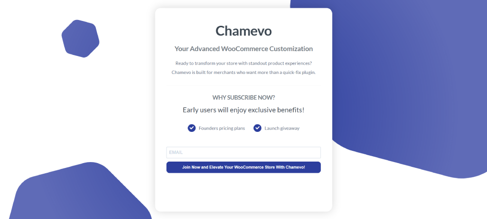
In short: Chamevo gives designers and developers of WooCommerce websites and WooCommerce merchants the ability to create high-converting product customizations.
Chamevo’s plugin is the WooCommerce merchants’ friend. Its product personalization properties gives them flexibility, depth, and expert-level integration with WooCommerce that enables them to power their businesses through the use of high-converting product customizations.
Key features:
Performance: Chamevo’s smooth, workable interface enables merchants to easily deal with high-traffic or large catalogs. Chamevo users quickly discover just how deep the tool with its custom text and fonts, advanced layering/positioning and other properties can go once they start working with real products.
Benefits to merchants: Because of Chamevo’s deep WooCommerce integration, merchants enjoy unparalleled customization freedom. They can easily craft unique product experiences ranging from complex personalization rules to print-ready outputs at scale Should a store’s product line and/or customer base suddenly expand, its owners can implement increasingly sophisticated personalization options without having to sacrifice performance.
Client Specific features: Designers and creative agencies appreciate the way in which layout grids and advanced styling can be applied to maintain consistent brand aesthetics across a variety of product lines. Hooks and filters for deeper integrations allow developers to augment or tailor the plugin’s core functionality.
In short: LayerSlider effortlessly combines style and functionality to transform a WordPress website into an unforgettable experience.
Click anywhere on the video to see LayerSlider live.
LayerSlider is a full-fledged visual builder for WordPress. Designed for modern websites, LayerSlider empowers you to create immersive sliders, dynamic slideshows, engaging hero sections, and rich animations with ease. With powerful features like scroll and hover interactions, it opens the door to highly interactive and visually striking content. A great example is the Wine Estate template, which showcases attention-grabbing parallax-reveal effect — easily customizable with your own images and text to match your brand.
New Content release: new demos are released approximately weekly.
Key features:
Project Editor: Everything is designed to keep you in the creative flow—from drag-and-drop simplicity to real-time previews and a clean, distraction-free workspace.
Adaptability: LayerSlider templates offer multi-purpose solutions for all kinds of websites.
Client Specific features: Marketing visuals are just minutes away with LayerSlider—popups, banners, counters, countdown timers, 404 and maintenance pages, coming soon screens, and more. All easily animated for maximum engagement.
Support: Built-in help in LayerSlider, Ticket System, and Product Manual.
In short: With the help of the Essential Grid plugin you can add grids that contain almost any type of content to your website.
Click anywhere on the video to see Essential Grid live.
If you are looking for grids that contain posts, products, images, or videos to your website and one you can use with any theme, look no further than Essential Grid. Possible applications range from portfolios, blogs, and galleries to WooCommerce shops and anything else you can imagine.
Key features:
Top feature: With over 50 customizable grid skins, Essential Grid enables users to create stunning galleries and portfolios with ease. Each skin is crafted to be both attractive and motivational. The Leon Draisaitl WooCommerce Grid for WordPress is a minimal shop grid with an interesting image change effect upon hovering.
Adaptability: This plugin is ideal for any portfolio or gallery-building project that requires a searchable, filterable, and sortable grid listing of items.
Global Settings: You can set permissions for who can change and edit grids.
Performance: Galleries created on Essential Grid are noted for their quick loading and 100% responsiveness.
Client feedback: “I had some particular functions that I was interested in for a cobble grid and Irfan was super helpful in helping these come to fruition. I would highly recommend Essential Grid for its flexibility as well as their customer support!”
*******
Having had an opportunity to learn more about these excellent WordPress plugins, you have hopefully found one or more that will enable you to simplify a complex or time- and resource-consuming task, or transform your WordPress sites from a little above average, into ones that are exceptional in terms of performance and visitor engagement capabilities,
Explore the demos and test their features, and having done so you’ll be in a better position to address your site’s or project’s most immediate needs by installing one or more of them.
Summer interns are about to start on an exciting journey filled with learning, growth, and productivity. Your summer internship will teach you countless things about yourself, your professional goals, and your skills as you set the foundation for a blossoming career. It’s important to be prepared so that you can make the best impression possible.
This is your guide to the tools and products that will help you stand out and make this internship one to remember.
1. Branch: Get Elevated With Standing Desks
Photo Source: Branch
The ideal workspace is one where you’re not tied down to a chair and you can stretch your legs and stand tall. Branch’s standing desks can make all the difference, combining function and comfort to ensure maximum productivity during your internship.
With a standing desk from Branch, you can effortlessly switch between sitting and standing, bringing fluidity to your workflow. A standing desk has many benefits, including improved posture, increased focus, and the potential to thwart the mid-afternoon slump that many interns know all too well.
When you elevate your workspace, you can embrace a dynamic work experience that sets the stage for performance and poise. Stand out, literally and figuratively, as you conquer tasks with style and comfort all summer long.
2. Opensend: Optimize Your Retargeting Strategies With Marketing Solutions
Missing out on potential customers just before they make a purchase or test out a service can be frustrating, especially for summer interns who want to prove their capability in the office. Opensend helps professionals cross the finish line with an email marketing tool that captures the contact information of users who engage with your site, even if they don’t check out.
The best way to ensure that potential customers return and turn into loyal customers is to stay engaged across devices and browsers. Opensend makes it easy to create personalized email campaigns that capture, re-engage, and retain high-value leads, so you never have to worry about missed opportunities again.
With Opensend, you’ll find a range of options that help you connect, reconnect, and revive customer relationships in order to optimize your email campaigns, SMS strategies, and other marketing methods for maximum ROI. Show your bosses what you can achieve when it comes to customer growth and retention with targeted marketing help from Opensend.
3. Tumble: Unleash Your Inner Designer With Washable Rugs
Photo Source: Tumble
Workspaces often resemble the Arctic tundra when it comes to warmth and comfort. Thankfully, Tumble is here to rescue your office ambiance with a touch of cozy chicness through washable rugs, which can help infuse personality and comfort into your workspace.
You’ll be able to enjoy the comfort of a stylish rug as you conquer tasks and revitalize a dreary office with vibrant patterns and colors. Rugs define spaces and create a sense of belonging, and their washable design means you and your coworkers won’t need to worry about spilled coffee or tracked-in dirt ever again. Just toss this rug in the wash, and watch it come out as good as new!
With Tumble’s selection of rugs, you have the power to transform your workspace into a haven of creativity, where every task is executed with confidence and flair. Skip the lackluster office vibe this summer and create a space where design meets functionality — and you feel your most capable.
4. Custom Goods: Optimize Supply Chain Logistics and Streamline Business Strategies
Interns are often left to take care of logistics, and that can mean hours spent filling out paperwork or verifying data. If you want to stand out and free up time to make a real difference for your company, Custom Goods makes it easy, with supply chain support that will get your packages to the right customers with ease and efficiency.
Custom Goods provides support for warehousing and transportation, with over nine million square feet of warehouse space in more than 30 different locations across the country. They work in a wide range of fields and industries, including automotive, construction, food, and retail, and they’re dedicated to getting your products to their destinations without worry or delay.
Whether you need labeling, packaging, or light assembly, Custom Goods is the team you can trust. They take the guesswork out of supply chain management, so interns have more time to learn and help the business. Streamline your fulfillment process and enjoy peace of mind on every shipment this summer.
5. CON-CRĒT: Power Up Your Brain With Creatine Pills
Photo Source: CON-CRĒT
If you’re ready to take your workflow to the next level, CON-CRĒT creatine pills can give your brain the boost it needs to excel. They’re not just for bodybuilders looking to gain muscle. They also support enhanced brain health, immunity, and more during those demanding workdays.
Creatine is like a spark plug for your brain, boosting your cognitive abilities in a soluble and bioavailable micro-dosing format. With CON-CRĒT creatine pills, you can supercharge your brainpower and outshine the competition in your internship without the pesky side effects you might encounter with traditional creatine supplementation.
CON-CRĒT’s creatine pills will help you transform your summer into a mental marathon where you’re sure to be the winner.
6. Kizik: Step Into the Office in Style With Slide On Sneakers
When you’re an intern, every second counts. Time wasted on mundane tasks like tying shoelaces can quickly add up, preventing you from being efficient and impressing your boss. That’s where Kizik’s innovative slide on sneakers come into play.
These stylish and comfortable shoes are the perfect tool to boost your productivity, allowing you to step into the office ready to tackle the day’s tasks. Kizik designs its shoes with patented hands-free technology — simply step in, and you’re ready to go. This can save you precious time and add a level of convenience that aligns with a busy intern’s schedule.
Of course, Kizik’s slide on sneakers aren’t just about saving time. They also hit the mark when it comes to style and comfort. With a range of looks, you can choose the one that best fits your personal style and the office dress code. Walk into your internship with Kiziks and make the most of this professional experience.
7. O Positiv: Feel Your Best With Help From URO Probiotics
The last thing you want to deal with when starting a summer internship is odors or discomfort. After all, even your most intimate areas have a naturally diverse microbiome just like your gut. When your pH becomes too basic, it can cause a host of side effects that get in the way of acing your internship and securing that coveted return offer.
URO probiotics from O Positiv may be just what you need to keep your microbiome on track. Featuring four strains of Lactobacillus, these probiotics are specifically designed to address women’s unique wellness needs. If you’re struggling with odor, for instance, these supplements can be your professional secret weapon.
By balancing your vaginal pH and promoting healthy flora, URO probiotics can take your mind off your microbiome and let you focus on the task at hand. Thanks to O Positiv, you can crush your summer internship and enjoy yourself in the process.
8. Litter-Robot by Whisker: Tackle the Mess and Keep Your Space Clean With a Self-Cleaning Litter Box
Does office chaos have you feeling overwhelmed? Whether you’re stressed out by chores when you come home for the day or work from a home office, Litter-Robot by Whisker has the purr-fect solution for maintaining a clean and clutter-free workspace — a self-cleaning litter box. This gadget is for your furry friends as much as it is for your own sanity and productivity.
A cluttered home is a recipe for distraction and disarray, hindering your ability to stay focused, recharge, and put your best foot forward. With Litter-Robot by Whisker’s self-cleaning litter box, you can enjoy a pristine work environment where creativity thrives. This gadget takes care of the cleanup for you, leaving you with a tidy, stress-free space to conquer your new tasks like a pro.
9. Everyday Dose: Kickstart Your Mornings With Mushroom Coffee
Photo Source: Everyday Dose
The sun is rising, birds chirping, and you’re armed with a steaming mug of mushroom coffee from Everyday Dose and ready to kickstart your day with a burst of energy and focus. Mushroom coffee is not your average Joe. It’s a powerhouse blend of functional mushrooms, nootropics, and collagen protein that promises to elevate your mornings to new heights of alertness and clarity.
No more groggy mornings or midday crashes — mushroom coffee from Everyday Dose is here to revolutionize your daily energy boost and revitalize your routine. The compounds in mushrooms like Lion’s Mane and Chaga offer sustained energy, improved focus, and a heightened sense of well-being, setting the stage for an energized day ahead.
It’s time to energize your mornings and seize the day with mushroom coffee from Everyday Dose. Awaken your senses, fuel your focus, and embark on your newest professional adventure with gusto — your bosses are sure to be impressed.
10. Zoom: Skyrocket Your Efficiency With an AI Assistant
Photo Source: Zoom
Imagine having a trusty sidekick by your side throughout your internship — a pocket-sized tool that can juggle tasks, summarize meetings, and provide the answers you need. With Zoom’s AI assistant, that dream becomes a reality. This cutting-edge technology can make all the difference for interns looking to skyrocket their efficiency.
Your AI Assistant from Zoom is like having a personal secretary at your beck and call, ready to tackle your to-do list and keep you on track. Need meeting agendas? Check. Want to create a summary of an email or chat thread? Done. Looking for notifications about upcoming deadlines and project milestones? Your AI Assistant has got you covered.
With this intelligent companion by your side, you can conquer the challenges of your internship with ease, revolutionize your workflow, and amplify your efficiency. Zoom’s AI assistant is always there to support you and elevate your work experience to new heights.
11. Eden: Handle Your Workplace Logistics With Desk Booking Software
Workspaces can sometimes resemble a chaotic game of musical chairs. Eden has the ultimate solution to streamline your workplace logistics with desk booking software. This ingenious tool is your ticket to a hassle-free and organized workspace where you can reserve your spot with a few taps on your device.
Gone are the days of aimlessly wandering around the office in search of a vacant desk or fighting over prime real estate by the window. With Eden’s desk booking software, you can reserve your workspace in advance or see open workspaces in real-time, ensuring you have a designated spot to conquer your tasks and unleash your productivity.
If you’re ready to boost productivity with seamless workplace booking and organization, Eden desk booking software makes it easy. Sail through your internship with ease and efficiency, knowing that your workspace logistics are in capable hands.
12. Nimble: Stay Connected on the Go With Portable Charging Solutions
As a young professional on the move, staying charged and connected is non-negotiable, and a Nimble portable charger can help. These nifty gadgets are your lifeline during hectic workdays, ensuring that your devices stay juiced up and ready to tackle any task that comes your way.
Whether you’re rushing between meetings, working from different locations, or simply multitasking like a pro, Nimble’s portable charging solutions provide the power boost you need to stay productive and connected. Say goodbye to the anxiety of a drained battery and embrace the convenience of on-the-go charging that keeps you in the loop and ahead of the game.
13. Topo Design: Redefine Your Look With a Backpack Briefcase
It’s time to gear up for work with Topo Design’s backpack briefcase, a versatile accessory that combines the best of both worlds: style and functionality. This ain’t your average bag; it’s a statement piece that exudes sophistication while catering to your practical needs at work.
The Topo Design backpack briefcase is here to revolutionize your look with its sleek design, premium-quality materials, and multifunctional compartments that effortlessly accommodate your gadgets, documents, and everyday essentials. Whether you’re heading to a client meeting or a brainstorming session, this bag has your back — literally.
With Top Design’s backpack briefcase, you can stride into your office with confidence and panache, knowing that you’re not just dressing the part but embodying professionalism and style. This accessory is about making a statement, showcasing your attention to detail, and leaving a lasting impression on your colleagues and supervisors.
Elevate, Energize, and Excel With Productivity Tools!
As you prepare for your summer internship, armed with a toolkit brimming with productivity-boosting tools, remember that success is about working smart. Each of the tools in this guide can help enhance your efficiency, productivity, and overall professional experience.
Consider these tools your allies in the quest for success, and let them streamline your workflow, boost your energy levels, and improve your workspace aesthetics. Your internship is an opportunity to shine, learn, and improve, and the right tools at your disposal will help you make the most of it.
Here’s to a summer filled with growth, achievement, and unforgettable experiences. It’s time to crush it like a pro!
While it is not all that difficult to find a theme that will enable you to create an attractive website, finding one that fully meets current website design and usage trends and requirements, is future ready, and offers excellent user support can be a real challenge.
In this article you are presented with 9 highly adaptable, high-performance WordPress themes. They are up to date with respect to meeting current design and usage requirements and they are future ready as well. They are not perfect. Few things are. They share one thing in common however and that is they strive to approach perfection with every update, in spite of the fact that usage demands and requirements are continually changing.
In brief: BeBuilder, the theme’s top feature is fast and easy to work with. Building pages is an incredibly smooth process.
Click the video to check one of Betheme’s top downloaded templates.
Betheme is feature-packed and still growing in size. Its 70+ website design and building tools has only made it the biggest and one if the most flexible WordPress themes. What might come as a surprise given its size is that it is one of the fastest and easiest to work with themes of all.
Flexibility and Ease of Use: BeBuilder, the theme’s top feature is fast and easy to work with. Building pages is an incredibly smooth process. When you add Be’s Header builder, Footer builder, and WooCommerce builder to the mix the design possibilities are limitless.
Time Saving: You can also save time by using built-in theme options that automatically apply styles, or if time is really of the essence you could start with one of the 700+ customizable pre-built websites like Be’s Luxury Furniture one-page website template.
Betheme also features 250+ pre-built websites for Elementor, a Developer Mode for developers, Popups for marketers, and fully supports freelancers, businesses, and creative professionals as well.
In brief: Blocksy is an intuitive, well-optimized WooCommerce theme that can be used by anyone.
Click the video to check one of Blocksy’s top downloaded templates.
Blocksy is not your ordinary, every-day WordPress theme. What you get with Blocksy is an eCommerce solution that features dozens of advanced functionalities that include the recently added Shop Extra extension.
Blocksy gives users:
Flexibility: The Shop Extra extension represents a groundbreaking evolution for WooCommerce stores. It is comprised of suite of modules that address a range of individual shopper-centric features and in doing so serve to elevate a store’s functionality and improve the overall user experience.
Workflow Time Saving: Pressed for time? The Blocksy Furniture Store starter site example can help you get off to a quick and easy start. It is not only pleasant to look at, but its universal design can be used for just about anything!
Testimonial: “The more I use this theme the better it seems. I like to customize to extremes, Blocksy copes well with that. I also have some sites where it is fairly standard. This theme is very good indeed. Very flexible and great out of the box. Never be in doubt that it’s a superb theme.”
In brief: Avada has everything you need to build a successful website or online store.
Click the video to check one of Avada’s top downloaded templates.
Avada’s assemblage of website building features and its ease of use, flexibility, and performance have contributed to making it the top selling WordPress theme of all time.
Ease of Use: With Avada’s Live Builder at your fingertips you can build an impressive website in a few short hours. Building a shop? The WooCommerce builder makes building a shop incredibly easy. If you are in a hurry, you can select one of Avada’s Ecommerce templates and customize it to the finest detail.
Flexibility: With respect to layouts and design Avada offers limitless possibilities since you can customize every aspect of your layout or design, plus everything will rest upon a responsive framework.
Performance: Avada’s drag and drop visual builder can make building a website quick and enjoyable, but it you are in a hurry, simply import an Avada template, like the easily customizable Avada Business example.
Update frequency: Sufficient to maintain compatibility with the most recent WordPress and 3rd party integrated plugin updates.
Testimonial: “Multiple years of use across multiple sites – well thought out, always improving, developers seem to read the minds of the audience and add new features.”
In brief: Pro Theme gives you The most advanced features of any website builder on the market including dozens of 3rd party plugins, custom extensions, and a family of builders.
Click the video to check one of Pro Theme’s top downloaded templates.
Anyone can build anything with Pro’s Cornerstone Builder with its modern lean architecture that makes it one of the most intuitive, fastest, SEO friendly themes on the market.
Ease of Use: Cornerstone’s app-like design gives you complete control over every aspect of your website while its WYSIWYG capability offers building in the browser at its best. Pro Theme’s more than two dozen 3rd party plugins and extensions provide maximum flexibility at minimal effort. The Simple Icon template can not only be easily customized but it tells you a few things about Pro Theme as well.
Client-specific: Pro has every feature a seasoned developer would want with extensive controls including granular settings designed to limit what clients can access.
Support: In addition to its support manual and YouTube videos Pro Theme has released more tutorials on YouTube than any other theme. Pro’s user forum with its 250,000+ forum posts is another good source for information.
Update frequency: new updates are released twice monthly.
Testimonial: “The Themeco Customer support is outstanding, and many would argue that its Facebook community is one of the best found, always ready to help in minutes.
In brief: Kalium makes website building almost ridiculously easy for anyone, including first time website builder.
Click the video to check one of Kalium’s top downloaded templates.
Building a website using Kalium can be done in three simple steps.
Choose a starter site that matches the business or enterprise your website is addressing.
Select any or all of the features on the starter site you want to apply and install the starter site.
Customize it by replacing the content with yours.
Alternatively, you can use an Elementor or WPBakery live page builder to create your website a page at a time.
Page Building: You can build your website pages easily with your choice of Elementor or WPBakery top rated page builders.
Pre-made Templates: Every page in the aforementioned starter sites, and not just the home page, are designed to the tiniest detail. Kalium’s Construction starter site example features an intriguing layout you can nevertheless easily customize to suit your needs.
WooCommerce: Kalium’s seamless integration with WooCommerce enables you to create a site that offers its users an amazing shopping experience.
Testimonial: “What truly sets Kalium apart is their customer-first approach. They guided me, informed me, and listened to every request, no matter how big or small. Amazingly, they never once said “no” to a request, providing solutions that exceeded expectations every time.”
In brief: Uncode is a feature-packed theme you can use to build a WordPress site or a WooCommerce site that looks like it was done by a skilled professional.
Click the video to check one of Uncode’s top downloaded templates.
What is Uncode’s top feature? To many, its simply its mix of advanced design features, its collection of pre-built demo websites, or its User Showcase that can serve as a source of inspiration. Or it might just be a powerful new feature that made its appearance in Uncode’s Version 2.9.2. This new feature, Scroll-Triggered Row Animations, makes it easy for users to create striking scrolling effects that can impart a fresh, dynamic feel to any web page.
Ease of Use: Uncode’s Wireframes Plugin allows you to import 800+ section templates you can use to create pages or a complete website. Uncode’s enhanced frontend page builder with its 85+ premium modules makes creating a website easy.
Demos: Uncode’s aforementioned customizable demos can also serve as sources of inspiration. The Portfolio Cards demo offers about an attention-getting approach you seldom if ever see in a portfolio.
Update frequency: every 3-6 months based largely on customer input and demand.
Testimonial: “I’ve used many themes so far, but Uncode beats all of them IMHO and the new update is mind-blowing! You can use it to create any kind of design, any kind of site. It’s a wonderful solid theme with tons of options and settings. I’m very happy with that! A big thank you!.”
In brief: Litho is fully compatible with Elementor, and WooCommerce and can be used to create a website of any type or usage.
Click the video to check one of Litho’s top downloaded templates.
Litho’s user-friendly WordPress Customizer and its assortment of custom Elementor widgets make customizing easy, while the integrated header-footer builder lets you choose a pre-built layout or create your own layout. Litho is also compatible with most plugins although plugins are generally not required. The Slider Revolution plugin is included in the package.
Key Section Builder Feature: With Litho’s section builder feature most page items can be customized using Elementor-like section elements.
One-Click demo Install: Users can install specific demo pages / posts, import the whole demo, or mix and match various sections / templates / elements from different demos to their selected demo site.
Startup Templates: Litho’s template selection includes 37+ ready home pages, 200+ creative elements, and 300+ templates that include templates for startup websites. Litho’s straightforward and easily customizable Home Business template could be precisely what you need to get started.
Testimonial: ““I’ve been working with the Litho WordPress theme by ThemeZaa for many years now on several client websites. Their theme templates have a modern and spacious design aesthetic whilst integrating perfectly with Elementor and therefore are fully customizable. Perfect for my requirements. And if I need any help, their tech support is first-class and always prompt in getting back to me with assistance. Thank you ThemeZaa.”
In brief: XStore offers a veritable feast of standout features with its 140+.ready-to-use template being a clear user favorite.
Click the video to check one of XStore’s top downloaded templates.
In addition to its pre-built demo library with over 140+ ready-to-use templates a favorite XStore feature is the XStore Sales Booster with its native upsell, cross-sell, and discount system that greatly eliminates the need for additional third-party plugins.
Adaptability and Flexibility: 1) XStore’s AI-Powered Smart Recommendations feature dynamically suggests related products based on user behavior. 2) The significance of XStore’s full integration with Elementor Booster Sales is that users do not need Elementor PRO when working with the XStore theme.
Performance: XStore’s AMP for WooCommerce significantly improves mobile loading times while XStudio helps speed up design workflow by enabling users to preview, sort, and combine different demos along with the full range of available content. XStore’s 130+ customizable and responsive pre-built templates also contribute to workflow savings. XStore’s Niche Market template could be just what you need to create a one-page website that puts your product line on full display.
Testimonial: “With heartfelt gratitude to the talented developers of the “XStore” theme for creating such a stunning, well-documented, and user-friendly product! I would also like to extend my sincere thanks to the customer support team for their prompt responses and impressive ability to resolve almost any issue with ease. I wholeheartedly recommend this theme to every WordPress user!”
In brief: With one click you can import a fast, responsive, and beautiful demo to create your WooCommerce website.
Click the video to check one of WoodMart’s top downloaded templates.
Woodmart offers an ideal approach to creating a WooCommerce site that gives its visitors the ultimate shopping experience. WoodMart comes with 85+ pre-built websites and 400+ page templates you can mix and match to create your store and shop layouts can be customized using WoodMart’s custom layouts builder to include whatever customer-centric features you choose to implement.
You will more than likely find a pre-built site that offers a close enough match to what you are looking for, but if that is not the case you can easily mix and match pre-made prototypes and elements to create the store you envision.
Ease of Use: There is rarely any need to invest in additional plugins to build your store, nor does the size of your store matter as far as website designing and building is concerned.
Client-Specific Features: Client specific features include social integrations for Marketers, a White Label option for developers, and customer-centric design elements of store owners.
You can easily customize WoodMart’s Smart Home demo layout to create your own one-page website to promote whatever product line or service you choose. You can in fact easily customize just about everything else in the Woodmart collection.
Update frequency: new demos and pre-built websites are released monthly.
Having reviewed these top themes, have you found something that you want to use for your website building needs for 2025? More than one item perhaps? If that’s the case, whichever one you eventually use will be an excellent choice!
You would be forgiven if you’ve never heard of Cohost.org. The bespoke, Tumblr-like social media website came and went in a flash. Going public in June 2022 with invite-only registrations, Cohost’s peach and maroon landing page promised that it would be “posting, but better.” Just over two years later, in September 2024, the site announced its shutdown, its creators citing burnout and funding problems. Today, its servers are gone for good. Any link to cohost.org redirects to the Wayback Machine’s slow but comprehensive archive.
The landing page for Cohost.org, featuring our beloved eggbug.
Despite its short lifetime, I am confident in saying that Cohost delivered on its promise. This is in no small part due to its user base, consisting mostly of niche internet creatives and their friends — many of whom already considered “posting” to be an art form. These users were attracted to Cohost’s opinionated, anti-capitalist design that set it apart from the mainstream alternatives. The site was free of advertisements and follower counts, all feeds were purely chronological, and the posting interface even supported a subset of HTML.
It was this latter feature that conjured a community of its own. For security reasons, any post using HTML was passed through a sanitizer to remove any malicious or malformed elements. But unlike most websites, Cohost’s sanitizer was remarkably permissive. The vast majority of tags and attributes were allowed — most notably inline CSS styles on arbitrary elements.
Users didn’t take long to grasp the creative opportunities lurking within Cohost’s unassuming “new post” modal. Within 48 hours of going public, the fledgling community had figured out how to post poetry using the <details> tag, port the Apple homepage from 1999, and reimplement a quick-time WarioWare game. We called posts like these “CSS Crimes,” and the people who made them “CSS Criminals.” Without even intending to, the developers of Cohost had created an environment for a CSS community to thrive.
In this post, I’ll show you a few of the hacks we found while trying to push the limits of Cohost’s HTML support. Use these if you dare, lest you too get labelled a CSS criminal.
Width-hacking
Many of the CSS crimes of Cohost were powered by a technique that user @corncycle dubbed “width-hacking.” Using a combination of the <details> element and the CSS calc() function, we can get some pretty wild functionality: combination locks, tile matching games, Zelda-style top-down movement, the list goes on.
If you’ve been around the CSS world for a while, there’s a good chance you’ve been exposed to the old checkbox hack. By combining a checkbox, a label, and creative use of CSS selectors, you can use the toggle functionality of the checkbox to implement all sorts of things. Tabbed areas, push toggles, dropdown menus, etc.
However, because this hack requires CSS selectors, that meant we couldn’t use it on Cohost — remember, we only had inline styles. Instead, we used the relatively new elements <details> and <summary>. These elements provide the same visibility-toggling logic, but now directly in HTML. No weird CSS needed.
CodePen Embed Fallback
These elements work like so: All children of the <details> element are hidden by default, except for the <summary> element. When the summary is clicked, it “opens” the parent details element, causing its children to become visible.
We can add all sorts of styles to these elements to make this example more interesting. Below, I have styled the constituent elements to create the effect of a button that lights up when you click on it.
CodePen Embed Fallback
This is achieved by giving the <summary> element a fixed position and size, a grey background color, and an outset border to make it look like a button. When it’s clicked, a sibling <div> is revealed that covers the <summary> with its own red background and border. Normally, this <div> would block further click events, but I’ve given it the declaration pointer-events: none. Now all clicks pass right on through to the <summary> element underneath, allowing you to turn the button back off.
This is all pretty nifty, but it’s ultimately the same logic as before: something is toggled either on or off. These are only two states. If we want to make games and other gizmos, we might want to represent hundreds to thousands of states.
Width-hacking gives us exactly that. Consider the following example:
CodePen Embed Fallback
In this example, three <details> elements live together in an inline-flex container. Because all the <summary> elements are absolutely-positioned, the width of their respective <details> elements are all zero when they’re closed.
Now, each of these three <details> has a small <div> inside. The first has a child with a width of 1px, the second a child with a width of 2px, and the third a width of 4px. When a <details> element is opened, it reveals its hidden <div>, causing its own width to increase. This increases the width of the inline-flex container. Because the width of the container is the sum of its children, this means its width directly corresponds to the specific <details> elements that are open.
For example, if just the first and third <details> are open, the inline-flex container will have the width 1px + 4px = 5px. Conversely, if the inline-flex container is 2px wide, we can infer that the only open <details> element is the second one. With this trick, we’ve managed to encode all eight states of the three <details> into the width of the container element.
This is pretty cool. Maybe we could use this as an element of some kind of puzzle game? We could show a secret message if the right combination of buttons is checked. But how do we do that? How do we only show the secret message for a specific width of that container div?
CodePen Embed Fallback
In the preceding CodePen, I’ve added a secret message as two nested divs. Currently, this message is always visible — complete with a TODO reminding us to implement the logic to hide it unless the correct combination is set.
You may wonder why we’re using two nested divs for such a simple message. This is because we’ll be hiding the message using a peculiar method: We will make the width of the parent div.secret be zero. Because the overflow: hidden property is used, the child div.message will be clipped, and thus invisible.
Now we’re ready to implement our secret message logic. Thanks to the fact that percentage sizes are relative to the parent, we can use 100% as a stand-in for the parent’s width. We can then construct a complicated CSS calc() formula that is 350px if the container div is our target size, and 0px otherwise. With that, our secret message will be visible only when the center button is active and the others are inactive. Give it a try!
CodePen Embed Fallback
This complicated calc() function that’s controlling the secret div’s width has the following graph:
You can see that it’s a piecewise linear curve, constructed from multiple pieces using min/max. These pieces are placed in just the right spots so that the function maxes out when the container div is 2px— which we’ve established is precisely when only the second button is active.
A surprising variety of games can be implemented using variations on this technique. Here is a tower of Hanoi game I had made that uses both width and height to track the game’s state.
SVG animation
So far, we’ve seen some basic functionality for implementing a game. But what if we want our games to look good? What if we want to add ✨animations?✨ Believe it or not, this is actually possible entirely within inline CSS using the power of SVG.
SVG (Scalable Vector Graphics) is an XML-based image format for storing vector images. It enjoys broad support on the web — you can use it in <img> elements or as the URL of a background-image property, among other things.
Like HTML, an SVG file is a collection of elements. For SVG, these elements are things like <rect>, <circle>, and <text>, to name a few. These elements can have all sorts of properties defined, such as fill color, stroke width, and font family.
A lesser-known feature of SVG is that it can contain <style> blocks for configuring the properties of these elements. In the example below, an SVG is used as the background for a div. Inside that SVG is a <style> block that sets the fillcolor of its <circle> to red.
CodePen Embed Fallback
An even lesser-known feature of SVG is that its styles can use media queries. The size used by those queries is the size of the div it is a background of.
In the following example, we have a resizable <div> with an SVG background. Inside this SVG is a media query which will change the fill color of its <circle> to blue when the width exceeds 100px. Grab the resize handle in its bottom right corner and drag until the circle turns blue.
CodePen Embed Fallback
Because resize handles don’t quite work on mobile, unfortunately, this and the next couple of CodePens are best experienced on desktop.
This is an extremely powerful technique. By mixing it with width-hacking, we could encode the state of a game or gizmo in the width of an SVG background image. This SVG can then show or hide specific elements depending on the corresponding game state via media queries.
But I promised you animations. So, how is that done? Turns out you can use CSS animations within SVGs. By using the CSS transition property, we can make the color of our circle smoothly transition from red to blue.
CodePen Embed Fallback
Amazing! But before you try this yourself, be sure to look at the source code carefully. You’ll notice that I’ve had to add a 1×1px, off-screen element with the ID #hack. This element has a very simple (and nearly unnoticeable) continuous animation applied. A “dummy animation” like this is necessary to get around some web browsers’ buggy detection of SVG animation. Without that hack, our transition property wouldn’t work consistently.
For the fun of it, let’s combine this tech with our previous secret message example. Instead of toggling the secret message’s width between the values of 0px and 350px, I’ve adjusted the calc formula so that the secret message div is normally 350px, and becomes 351px if the right combination is set.
Instead of HTML/CSS, the secret message is now just an SVG background with a <text> element that says “secret message.” Using media queries, we change the transform scale of this <text> to be zero unless the div is 351px. With the transition property applied, we get a smooth transition between these two states.
Click the center button to activate the secret message:
CodePen Embed Fallback
The first cohost user to discover the use of media queries within SVG backgrounds was @ticky for this post. I don’t recall who figured out they could animate, but I used the tech quite extensively for this quiz that tells you what kind of soil you’d like if you were a worm.
Wrapping up
And that’s will be all for now. There are a number of techniques I haven’t touched on — namely the fun antics one can get up to with the resize property. If you’d like to explore the world of CSS crimes further, I’d recommend this great linkdump by YellowAfterlife, or this video retrospective by rebane2001.
It will always hurt to describe Cohost in the past tense. It truly was a magical place, and I don’t think I’ll be able to properly convey what it was like to be there at its peak. The best I can do is share the hacks we came up with: the lost CSS tricks we invented while “posting, but better.”
Hey, did you see the post Jen Simmons published about WebKit’s text-wrap: pretty implementation? It was added to Safari Technology Preview and can be tested now, as in, like, today. Slap this in a stylesheet and your paragraphs get a nice little makeover that improves the ragging, reduces hyphenation, eliminates typographic orphans at the end of the last line, and generally avoids large typographic rivers as a result. The first visual in the post tells the full story, showing how each of these is handled.
That’s a lot of heavy lifting for a single value! And according to Jen, this is vastly different from Chromium’s implementation of the exact same feature.
According to an article by the Chrome team, Chromium only makes adjustments to the last four lines of a paragraph. It’s focused on preventing short last lines. It also adjusts hyphenation if consecutive hyphenated lines appear at the end of a paragraph.
Jen suggests that performance concerns are the reason for the difference. It does sound like the pretty value does a lot of work, and you might imagine that would have a cumulative effect when we’re talking about long-form content where we’re handling hundreds, if not thousands, of lines of text. If it sounds like Safari cares less about performance, that’s not the case, as their approach is capable of handling the load.
One thing to know as a developer, the performance of text-wrap is not affected by how many elements on the page it’s applied to. Perf concerns emerge as the pretty algorithm takes more and more lines into consideration as it calculates what to do. In WebKit-based browsers or apps, your text element would need to be many hundreds or thousands of lines long to see a performance hit — and that kind of content is unusual on the web. If your content is broken up into typical-length paragraphs, then you have no reason to worry. Use text-wrap: pretty as much as you want, and rely on our browser engineers to ensure your users will not experience any downsides.
Great, carry on! But now you know that two major browsers have competing implementations of the same feature. I’ve been unclear on the terminology of pretty since it was specced, and now it truly seems that what is considered “pretty” really is in the eye of the beholder. And if you’re hoping to choose a side, don’t, because the specification is intentionally unopinionated in this situation, as it says (emphasis added):
The user agent may among other things attempt to avoid excessively short last lines… but it should also improve the layout in additional ways. The precise set of improvements is user agent dependent, and may include things such as: reducing the variation in length between lines; avoiding typographic rivers; prioritizing different classes of soft wrap opportunities, hyphenation opportunities, or justification opportunities; avoiding hyphenation on too many consecutive lines.
So, there you have it. One new feature. Two different approaches. Enjoy your new typographic powers. 💪
There was once upon a time when native CSS lacked many essential features, leaving developers to come up with all sorts of ways to make CSS easier to write over the years.
These ways can mostly be categorized into two groups:
Pre-processors
Post-processors
Pre-processors include tools like Sass, Less, and Stylus. Like what the category’s name suggests, these tools let you write CSS in their syntax before compiling your code into valid CSS.
Post-processors work the other way — you write non-valid CSS syntax into a CSS file, then post-processors will change those values into valid CSS.
There are two major post-processors today:
PostCSS
LightningCSS
PostCSS is the largest kid on the block while Lightning CSS is a new and noteworthy one. We’ll talk about them both in a bit.
I think post-processors have won the compiling game
Post-processors have always been on the verge of winning since PostCSS has always been a necessary tool in the toolchain.
The most obvious (and most useful) PostCSS plugin for a long time is Autoprefixer — it creates vendor prefixes for you so you don’t have to deal with them.
Arguably, we don’t need Autoprefixer much today because browsers are more interopable, but nobody wants to go without Autoprefixer because it eliminates our worries about vendor prefixing.
What has really tilted the balance towards post-processors includes:
Native CSS gaining essential features
Tailwind removing support for pre-processors
Lightning CSS
Let me expand on each of these.
Native CSS gaining essential features
CSS pre-processors existed in the first place because native CSS lacked features that were critical for most developers, including:
CSS variables
Nesting capabilities
Allowing users to break CSS into multiple files without additional fetch requests
Conditionals like if and for
Mixins and functions
Native CSS has progressed a lot over the years. It has gained great browser support for the first two features:
CSS Variables
Nesting
With just these two features, I suspect a majority of CSS users won’t even need to fire up pre-processors or post-processors. What’s more, The if() function is coming to CSS in the future too.
But, for the rest of us who needs to make maintenance and loading performance a priority, we still need the third feature — the ability to break CSS into multiple files. This can be done with Sass’s use feature or PostCSS’s import feature (provided by the postcss-import plugin).
PostCSS also contains plugins that can help you create conditionals, mixins, and functions should you need them.
Tailwind 4 has officially removed support for pre-processors. From Tailwind’s documentation:
Tailwind CSS v4.0 is a full-featured CSS build tool designed for a specific workflow, and is not designed to be used with CSS pre-processors like Sass, Less, or Stylus. Think of Tailwind CSS itself as your pre-processor — you shouldn’t use Tailwind with Sass for the same reason you wouldn’t use Sass with Stylus. Since Tailwind is designed for modern browsers, you actually don’t need a pre-processor for things like nesting or variables, and Tailwind itself will do things like bundle your imports and add vendor prefixes.
If you included Tailwind 4 via its most direct installation method, you won’t be able to use pre-processors with Tailwind.
@import `tailwindcss`
That’s because this one import statement makes Tailwind incompatible with Sass, Less, and Stylus.
But, (fortunately), Sass lets you import CSS files if the imported file contains the .css extension. So, if you wish to use Tailwind with Sass, you can. But it’s just going to be a little bit wordier.
Either way, many people won’t know you can continue to use pre-processors with Tailwind. Because of this, I suspect pre-processors will get less popular as Tailwind gains more momentum.
Now, beneath Tailwind is a CSS post-processor called Lightning CSS, so this brings us to talking about that.
Lightning CSS
Lightning CSS is a post-processor can do many things that a modern developer needs — so it replaces most of the PostCSS tool chain including:
Besides having a decent set of built-in features, it wins over PostCSS because it’s incredibly fast.
Lightning CSS is over 100 times faster than comparable JavaScript-based tools. It can minify over 2.7 million lines of code per second on a single thread.
Speed helps Lightning CSS win since many developers are speed junkies who don’t mind switching tools to achieve reduced compile times. But, Lightning CSS also wins because it has great distribution.
It can be used directly as a Vite plugin (that many frameworks support). Ryan Trimble has a step-by-step article on setting it up with Vite if you need help.
If you need other PostCSS plugins, you can also include that as part of the PostCSS tool chain.
// postcss.config.js
// Import other plugins...
import lightning from 'postcss-lightningcss'

export default {
  plugins: [lightning, /* Other plugins */],
}
Many well-known developers have switched to Lightning CSS and didn’t look back. Chris Coyier says he’ll use a “super basic CSS processing setup” so you can be assured that you are probably not stepping in any toes if you wish to switch to Lightning, too.
If you wanna ditch pre-processors today
You’ll need to check the features you need. Native CSS is enough for you if you need:
CSS Variables
Nesting capabilities
Lightning CSS is enough for you if you need:
CSS Variables
Nesting capabilities
import statements to break CSS into multiple files
Tailwind (with @apply) is enough for you if you need:
all of the above
Mixins
If you still need conditionals like if, for and other functions, it’s still best to stick with Sass for now. (I’ve tried and encountered interoperability issues between postcss-for and Lightning CSS that I shall not go into details here).
That’s all I want to share with you today. I hope it helps you if you have been thinking about your CSS toolchain.
There’s not enough chairs for them to all sit at the bar, so you need the tenth div to sit on the lap of one of the other divs, say the second one. We can visually cover the second div with the tenth div but have to make sure they are sitting next to each other in the HTML as well. The order matters.
<div>1</div>
<div>2</div>
<div>10</div><!-- Sitting next to Div #2-->
<div>3</div>
<div>4</div>
<div>5</div>
<div>6</div>
<div>7</div>
<div>8</div>
<div>9</div>
The tenth div needs to sit on the second div’s lap rather than next to it. So, perhaps we redefine the relationship between them and make this a parent-child sorta thing.
<div>1</div>
<div class="parent">
  2
  <div class="child">10</div><!-- Sitting in Div #2's lap-->
</div>
<div>3</div>
<div>4</div>
<div>5</div>
<div>6</div>
<div>7</div>
<div>8</div>
<div>9</div>
Now we can do a little tricky positioning dance to contain the tenth div inside the second div in the CSS:
Anchor positioning simplifies this process a heckuva lot because it just doesn’t care where the tenth div is in the HTML. Instead, we can work with our initial markup containing 10 individuals exactly as they entered the bar. You’re going to want to follow along in the latest version of Chrome since anchor positioning is only supported there by default at the time I’m writing this.
Instead, we define the second div as an anchor element using the anchor-name property. I’m going to continue using the .parent and .child classes to keep things clear.
.parent {
  anchor-name: --anchor; /* this can be any name formatted as a dashed ident */
}
Then we connect the child to the parent by way of the position-anchor property:
.child {
  position-anchor: --anchor; /* has to match the `anchor-name` */
}
The last thing we have to do is position the child so that it covers the parent’s lap. We have the position-area property that allows us to center the element over the parent:
No punchline — just one of the things that makes anchor positioning something I’m so excited about. The fact that it eschews HTML source order is so CSS-y because it’s another separation of concerns between content and presentation.