CSS Meditation #8: .work + .life { border: 10px solid #000; }
originally published on CSS-Tricks, which is part of the DigitalOcean family. You should get the newsletter.
CSS Meditation #8: .work + .life { border: 10px solid #000; }
originally published on CSS-Tricks, which is part of the DigitalOcean family. You should get the newsletter.
CSS Meditation #7: Nobody is perf-ect.
originally published on CSS-Tricks, which is part of the DigitalOcean family. You should get the newsletter.
CSS Meditation #6: The color space is always calc(rgb(0 255 0)+er) on the other side of the fence.
originally published on CSS-Tricks, which is part of the DigitalOcean family. You should get the newsletter.
CSS Meditation #5: :where(:is(.my-mind))
originally published on CSS-Tricks, which is part of the DigitalOcean family. You should get the newsletter.
Post pobrano z: Award-Winning Design Meets Fashion at the Museum at FIT by Lily Liu
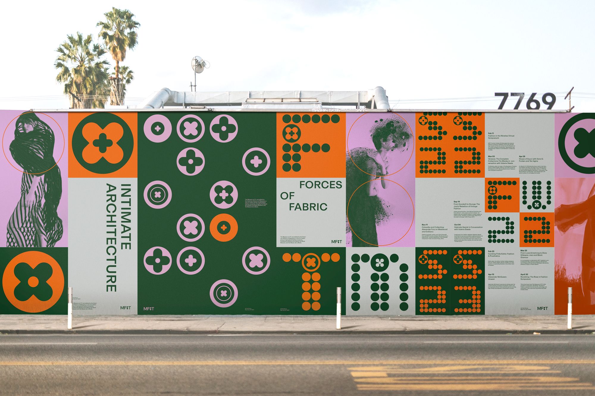
Award-winning graphic and UX/UI designer Lily (Ziqi) Liu has taken her unique blend of traditional and digital design techniques into the fashion world with her award-winning rebranding of the Museum at FIT (Fashion Institute of Technology). As an innovative graphic and UI/UX designer, Liu brought a new twist to the museum’s brand using her digital design skills and an eye for fashion. The impact of her rebrand design and the methods she used to capture the essence of our digital world today while honoring the history of fashion will have a ripple effect.

Liu was interested in fashion, so she selected MFIT and jumped at the chance to help inject youthful and vibrant energy into the MFIT brand. Her design was inspired by classic button patterns. Taking these simple buttons, Liu reimagined them into a fluid geometric framework. They became a metaphor for connection and unity, bring together people and ideas. Liu saw the button as a symbol of embracing diversity, inclusivity, and the spirit of inventive thought, all while keeping within the museum’s ethos.
Liu took her design skills and brought them together with her coding knowledge. She used Processing for a code-driven design, also called generative design. This approach allowed her to write code that can automatically generate patterns, shapes, and visual elements. Liu created unique designs by programming specific algorithms with set parameters. Using code, Liu can easily experiment with new design parameters, such as colors, shape, and movement. Signs, banners, postcards, posters, tickets, and more could be designed quickly and with a far more distinct visual style, like the MFIT rebranding. The code also allows Liu to add movement to her designs instead of merely static images, making them more engaging – using both her designer and UI/UX design sides.
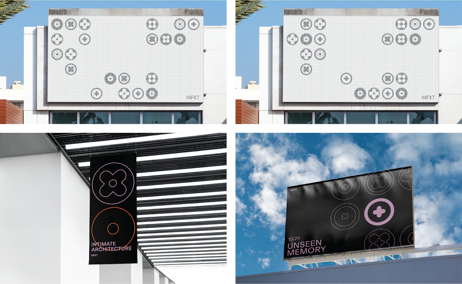
The specific coding Liu used to create the designs was used for the billboards which would change designs throughout the day.
For her rebrand, Lily (Ziqi) Liu won several awards. In January of 2024, Liu won a Gold at the International Design Awards 2023 for her Museum at FIT rebranding, as well as the MUSE Creative Awards in October 2023. More detailed information on Liu’s MFIT project can be found on her website here.
Her use of generative design indicates our technology-driven world. Instead of fighting against technology as some wanted to do, Liu took hold of that technology and made it her own. As Liu showed in her designs, the generative design is perfect for experimentation and customization. Digital billboards were programmed to change throughout the day, showing different patterns while keeping in line with the new branding. More graphic and UI/UX designers are likely to follow her lead going forward.
Liu is now looking to her future, growing her skills, and seeking challenges for her creativity and puzzle-solving. She works as a designer and continues to seek opportunities for learning, whether through formal education, workshops, or collaborations. Last year, Liu was selected to participate in a Google-sponsored workshop, DesignStorm, to work on future mobile software and user experience.
Lily (Ziqi) Liu is an award-winning graphic and UI/UX designer studying in California. She has received multiple awards for her designs: International Design Awards 2023; Gold for “When Innocence Hurts” Zine Design in January 2024. MUSE Creative Awards: Silver for “When Innocence Hurts” Zine Design in October 2023. She has been recognized on the Provost’s list at the University and was featured in the ArtCenter Student Gallery for her MFIT Branding Design as well as for “In Between” Book Design.
The post Award-Winning Design Meets Fashion at the Museum at FIT by Lily Liu appeared first on Designer Daily: graphic and web design blog.
Post pobrano z: Essential Tools for Graphic Designers Working Remotely
Remote work has become increasingly popular, allowing professionals, including graphic designers, to work from the comfort of their homes or while traveling.
To maintain productivity and deliver high-quality work, graphic designers need the right tools. Here are some essential tools for graphic designers working remotely.
Having reliable hardware is fundamental for any graphic designer. A high-performance computer with a strong processor, ample RAM, and a high-resolution monitor is essential for handling graphic design software.
Additionally, a portable power station is crucial for remote work, especially in areas with unreliable power supplies. These devices ensure that your equipment stays charged and you can continue working without interruptions.
The core of any graphic designer’s toolkit is powerful design software. Adobe Creative Cloud, which includes Photoshop, Illustrator, and InDesign, remains the industry standard.
These applications provide a comprehensive set of tools for creating everything from simple graphics to complex illustrations and layouts.
For graphic designers who create illustrations or digital paintings, a digital drawing tablet is indispensable. Wacom tablets are widely regarded for their precision and pressure sensitivity, making them ideal for detailed artwork.
Cloud storage solutions are vital for remote work, enabling designers to access and share their work from anywhere. Services like Google Drive and OneDrive offer secure storage and easy collaboration with clients and team members.
Cloud storage not only ensures your files are backed up but also facilitates seamless collaboration on projects, no matter where you are.
Effective communication is essential for remote graphic designers to stay connected with clients and colleagues. Tools like Microsoft Teams and Zoom enable instant messaging, video calls, and file sharing, making it easier to collaborate and receive feedback.
Accurate color representation is crucial for graphic design. Color calibration tools ensure that the colors you see on your screen match the final printed output.
Devices like the X-Rite i1Display Pro can calibrate your monitor, providing consistent and accurate colors across different devices. This precision is essential for maintaining the quality and consistency of your designs.
Access to high-quality stock images, vectors, and other assets can save time and enhance your designs. Websites like Shutterstock and Adobe Stock offer extensive libraries of royalty-free images and graphics.
These resources provide a wide range of options to choose from, allowing you to find the perfect elements for your projects.
Typography is a critical aspect of graphic design, and having access to a variety of fonts is essential. Tools like Google Fonts and Adobe Fonts offer extensive libraries of free and premium fonts.
These platforms allow you to explore and experiment with different typefaces, ensuring that your designs have the perfect typography to convey your message.
Equipping yourself with the right tools is essential for thriving as a remote graphic designer. By investing in reliable hardware, powerful software, and effective communication and collaboration tools, you can maintain productivity and deliver high-quality work from anywhere.
The post Essential Tools for Graphic Designers Working Remotely appeared first on Designer Daily: graphic and web design blog.
Post pobrano z: 5 Modern Devices with Innovative Design Features
Everybody loves a gadget, especially those innovative design features that leave you scratching your head, wondering how nobody thought of that before.

From everyday gadgets to specialized tools, innovative design features are transforming the way we interact with modern devices. Let’s take a look at 5 of the best.
Vape pens have become huge in recent years thanks to their convenience, portability, and sleek design. One standout feature of modern vape pens is the dual mesh that now comes as standard in all WAKA Vapes. Dual mesh improves the vaping experience by providing more surface area for e-liquid to contact, leading to more even heating. This means better vapour and temperature control, a better taste, and improved coil longevity. It’s vaping, but taken up another gear.
Smartwatches are another gadget that seems to have gone from 0 to 100mph in the blink of an eye. Beyond just telling time, smartwatches have evolved to become comprehensive health and fitness monitors. One of the most impressive design features is the integration of advanced sensors that track heart rate, blood oxygen levels, and even ECG readings. Add in voice assistants, such as Siri or Google Assistant, and suddenly you can perform tasks hands-free while running down the road. Staying productive has never been so easy.
Wireless earbuds are everywhere—wires were so in the early 2000s. Look around any modern park, and you’ll be sure to see countless people with little white buds nestled in their ears. These small devices have revolutionized the way we listen to music and take calls on the go. With touch control, where the user simply has to tap the earbud, you can manage their audio experience and answer calls without needing to access their phone.
Who remembers the old Nokia or Samsung flip phones? Well, who would have thought they would come roaring back in the age of smartphones?
Foldable smartphones represent a significant leap forward (or maybe backwards) in mobile device design. They feature flexible screens that can be folded in half, offering both the portability of a smartphone and the expansive display of a tablet. The hinge mechanism is a critical design component, engineered to withstand thousands of folds without degrading.
Love them or hate them, electric scooters are here to stay. Believe it or not, car manufacturer Peugeot designed and released the first electric scooter in 1996, but they have come a long way in such a short span of time.
Modern electric scooters are designed with lightweight, foldable frames that make them easy to carry and store. One of the standout features is the regenerative braking system, which recharges the battery while slowing down, enhancing efficiency.
Innovation is booming, and it can sometimes feel difficult to keep up. Who knows what 20 years in the future will look like, but we can be sure it’ll be littered with many more incredible design features in our tech that will make our lives easier, faster, better, or more enjoyable. Whatever’s next—flying cars?
The post 5 Modern Devices with Innovative Design Features appeared first on Designer Daily: graphic and web design blog.
Post pobrano z: CSS Container Queries
Container queries are often considered a modern approach to responsive web design where traditional media queries have long been the gold standard — the reason being that we can create layouts made with elements that respond to, say, the width of their containers rather than the width of the viewport.
.parent {
  container-name: hero-banner;
  container-type: inline-size;

  /* or container: hero-banner / inline-size; */
}

}

.child {
  display: flex;
  flex-direction: column;
}

/* When the container is greater than 60 characters... */
@container hero-banner (width > 60ch) {
  /* Change the flex direction of the .child element. */
  .child {
    flex-direction: row;
  }
}.cards {
container-name: card-grid;
container-type: inline-size;
/* Shorthand */
container: card-grid / inline-size;
}This example registers a new container named card-grid that can be queried by its inline-size, which is a fancy way of saying its “width” when we’re working in a horizontal writing mode. It’s a logical property. Otherwise, “inline” would refer to the container’s “height” in a vertical writing mode.
container-name property is used to register an element as a container that applies styles to other elements based on the container’s size and styles.container-type property is used to register an element as a container that can apply styles to other elements when it meets certain conditions.container property is a shorthand that combines the container-name and container-type properties into a single declaration.container-name property is optional. An unnamed container will match any container query that does not target a specific container, meaning it could match multiple conditions.container-type property is required if we want to query a container by its size or inline-size. The size refers to the container’s inline or block direction, whichever is larger. The inline-size refers to the container’s width in the default horizontal writing mode.container-type property’s default value is normal. And by “normal” that means all elements are containers by default, only they are called Style Containers and can only be queried by their applied styles. For example, we can query a container’s background-color value and apply styles to other elements when the value is a certain color value.background-color when it is a certain size — but we can change the background-color of any element inside the container. “You cannot style what you query” is a way to think about it.@container my-container (width > 60ch) {
article {
flex-direction: row;
}
}@container at-rule property informs the browser that we are working with a container query rather than, say, a media query (i.e., @media).my-container part in there refers to the container’s name, as declared in the container’s container-name property.article element represents an item in the container, whether it’s a direct child of the container or a further ancestor. Either way, the element must be in the container and it will get styles applied to it when the queried condition is matched.width can be queried with when the container-type property is set to either size or inline-size. That’s because size can query the element’s width or height; meanwhile, inline-size can only refer to the width.width (i.e., inline-size), there’s an element’s aspect-ratio, block-size (i.e., height), and orientation (e.g. portrait and landscape).>) and “less than” (<), but there is also “equals” (=) and combinations of the three, such as “more than or equal to” (>=) and “less than or equal to” (<=).and, or, and not.container-namecontainer-name: none | <custom-ident>+;none: The element does not have a container name. This is true by default, so you will likely never use this value, as its purpose is purely to set the property’s default behavior.<custom-ident>: This is the name of the container, which can be anything, except for words that are reserved for other functions, including default, none, at, no, and or. Note that the names are not wrapped in quotes.nonenone or an ordered list of identifierscontainer-typecontainer-type: normal | size | inline-size;normal: This indicates that the element is a container that can be queried by its styles rather than size. All elements are technically containers by default, so we don’t even need to explicitly assign a container-type to define a style container.size: This is if we want to query a container by its size, whether we’re talking about the inline or block direction.inline-size: This allows us to query a container by its inline size, which is equivalent to width in a standard horizontal writing mode. This is perhaps the most commonly used value, as we can establish responsive designs based on element size rather than the size of the viewport as we would normally do with media queries.normalcontainercontainer: <'container-name'> [ / <'container-type'> ]?If <'container-type'> is omitted, it is reset to its initial value of normalwhich defines a style container instead of a size container. In other words, all elements are style containers by default, unless we explicitly set the container-type property value to either size or inline-size which allows us to query a container’s size dimensions.
none / normal| Unit | Name | Equivalent to… |
|---|---|---|
cqw |
Container query width | 1% of the queried container’s width |
cqh |
Container query height | 1% of the queried container’s height |
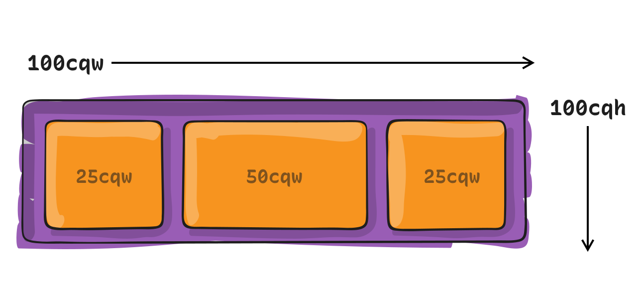
| Unit | Name | Equivalent to… |
|---|---|---|
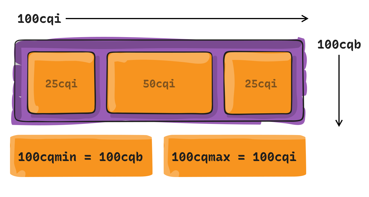
cqi |
Container query inline size | 1% of the queried container’s inline size, which is its width in a horizontal writing mode. |
cqb |
Container query block size | 1% of the queried container’s inline size, which is its height in a horizontal writing mode. |
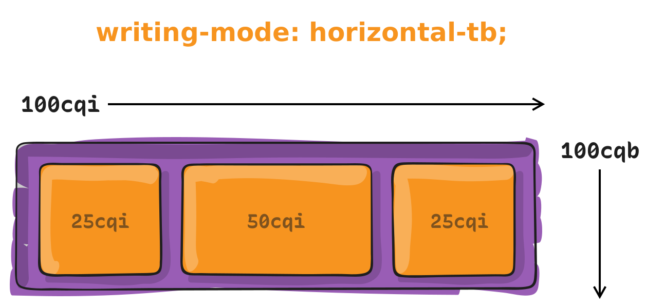
| Unit | Name | Equivalent to… |
|---|---|---|
cqmin |
Container query minimum size | The value of cqi or cqb, whichever is smaller. |
cqmax |
Container query maximum size | The value of cqi or cqb, whichever is larger. |
Container Style Queries is another piece of the CSS Container Queries puzzle. Instead of querying a container by its size or inline-size, we can query a container’s CSS styles. And when the container’s styles meet the queried condition, we can apply styles to other elements. This is the sort of “conditional” styling we’ve wanted on the web for a long time: If these styles match over here, then apply these other styles over there.
CSS Container Style Queries are only available as an experimental feature in modern web browsers at the time of this writing, and even then, style queries are only capable of evaluating CSS custom properties (i.e., variables).
The feature is still considered experimental at the time of this writing and is not supported by any browser, unless enabled through feature flags.
This browser support data is from Caniuse, which has more detail. A number indicates that browser supports the feature at that version and up.
| Chrome | Firefox | IE | Edge | Safari |
|---|---|---|---|---|
| 129 | No | No | 125 | TP |
| Android Chrome | Android Firefox | Android | iOS Safari |
|---|---|---|---|
| 125 | No | 125 | 18.0 |
article {
  container-name: card;
}
That’s really it! Actually, we don’t even need the container-name property unless we need to target it specifically. Otherwise, we can skip registering a container altogether.
And if you’re wondering why there’s no container-type declaration, that’s because all elements are already considered containers. It’s a lot like how all elements are position: relative by default; there’s no need to declare it. The only reason we would declare a container-type is if we want a CSS Container Size Query instead of a CSS Container Style Query.
So, really, there is no need to register a container style query because all elements are already style containers right out of the box! The only reason we’d declare container-name, then, is simply to help select a specific container by name when writing a style query.
@container style(--bg-color: #000) {
  p { color: #fff; }
}
In this example, we’re querying any matching container (because all elements are style containers by default).
Notice how the syntax it’s a lot like a traditional media query? The biggest difference is that we are writing @container instead of @media. The other difference is that we’re calling a style() function that holds the matching style condition. This way, a style query is differentiated from a size query, although there is no corresponding size() function.
In this instance, we’re checking if a certain custom property named --bg-color is set to black (#000). If the variable’s value matches that condition, then we’re setting paragraph (p) text color to white (#fff).
.card-wrapper {
  --bg-color: #000;
}
.card {
  @container style(--bg-color: #000) {
    /* Custom CSS */
  }
}@container style(--featured: true) {
article {
grid-column: 1 / -1;
}
@container style(--theme: dark) {
article {
--bg-color: #000;
--text: #fff;
}
}
}CSS Container Queries are defined in the CSS Containment Module Level 3 specification, which is currently in Editor’s Draft status at the time of this writing.
Browser support for CSS Container Size Queries is great. It’s just style queries that are lacking support at the time of this writing.
This browser support data is from Caniuse, which has more detail. A number indicates that browser supports the feature at that version and up.
| Chrome | Firefox | IE | Edge | Safari |
|---|---|---|---|---|
| 106 | 110 | No | 106 | 16.0 |
| Android Chrome | Android Firefox | Android | iOS Safari |
|---|---|---|---|
| 125 | 126 | 125 | 16.0 |
Many, many examples on the web demonstrate how container queries work. The following examples are not unique in that regard in that they illustrate the general concept of applying styles when a container element meets a certain condition.
You will find plenty more examples listed in the References at the end of this guide, but check out Ahmad Shadeed’s Container Queries Lab for the most complete set of examples because it also serves as a collection of clever container query use cases.
In this example, a “card” component changes its layout based on the amount of available space in its container.
This example is a lot like those little panels for signing up for an email newsletter. Notice how the layout changes three times according to how much available space is in the container. This is what makes CSS Container Queries so powerful: you can quite literally drop this panel into any project and the layout will respond as it should, as it’s based on the space it is in rather than the size of the browser’s viewport.
This component displays a series of “steps” much like a timeline. In wider containers, the stepper displays steps horizontally. But if the container becomes small enough, the stepper shifts things around so that the steps are vertically stacked.
Sometimes we like to decorate buttons with an icon to accentuate the button’s label with a little more meaning and context. And sometimes we don’t know just how wide that button will be in any given context, which makes it tough to know when exactly to hide the icon or re-arrange the button’s styles when space becomes limited. In this example, an icon is displayed to the right edge of the button as long as there’s room to fit it beside the button label. If room runs out, the button becomes a square tile that stacks the icons above the label. Notice how the border-radius is set in container query units, 4cqi, which is equal to 4% of the container’s inline-size (i.e. width) and results in rounder edges as the button grows in size.
Pagination is a great example of a component that benefits from CSS Container Queries because, depending on the amount of space we have, we can choose to display links to individual pages, or hide them in favor of only two buttons, one to paginate to older content and one to paginate to newer content.
Article
on
Oct 4, 2022
Article
on
Dec 16, 2019
Article
on
Jun 11, 2021
Article
on
Apr 6, 2017
Article
on
Jul 1, 2015
Article
on
Aug 29, 2022
Article
on
May 17, 2021
Article
on
Oct 9, 2019
Article
on
Dec 2, 2020
Article
on
Nov 12, 2020
Article
on
Jun 15, 2021
Article
on
Sep 21, 2022
Article
on
Dec 13, 2022
Article
on
Jan 19, 2022
Article
on
Jun 21, 2021
Article
on
Sep 1, 2022
Article
on
Dec 2, 2020
Article
on
May 4, 2020
Article
on
Nov 7, 2022
Article
on
May 22, 2024
Almanac
on
May 22, 2024
Almanac
on
May 22, 2024
Almanac
on
May 22, 2024
Article
on
May 1, 2024
Article
on
May 23, 2024
CSS Container Queries originally published on CSS-Tricks, which is part of the DigitalOcean family. You should get the newsletter.
Post pobrano z: CSS Length Units
Many CSS properties accept numbers as values. Sometimes those are whole numbers. Sometimes they’re decimals and fractions. Other times, they’re percentages. Whatever they are, the unit that follows a number determines the number’s computed length. And by “length” we mean any sort of distance that can be described as a number, such as the physical dimensions of an element, a measure of time, geometric angles… all kinds of things!
At the time of this writing, the CSS Values and Units Module Level 4 specification defines a bunch of different CSS units — and many of those are relatively new (this pun will make sense later).
| Unit | Name |
|---|---|
cm |
Centimeters |
mm |
Millimeters |
Q |
Quarter-millimeters |
in |
Inches |
pc |
Picas |
pt |
Points |
px |
Pixels |
| Unit | Relative to… |
|---|---|
| em | The font size of the element, or its nearest parent container |
| ex | The x-height of the element’s font |
| cap | The cap height (the nominal height of capital letters) of the element’s font |
| ch | The width of the 0 character of the font in use |
| ic | The average width of a full glyph of the font in use, as represented by the “水” (U+6C34) glyph |
| rem | The font-size value that’s set on the root (html) element |
| lh | The line-height value that’s set on the element |
| rlh | The line-height that’s set on the root (html) element |
| vw | 1% of viewport’s width |
| vh | 1% of viewport’s height |
| vi | 1% of viewport’s size in the root element’s inline axis |
| vb | 1% of viewport’s size in the root element’s block axis |
| vmin | Equal to 1% of the vw or vh, whichever is smaller |
| vmax | Equal to 1% of the vw or vh, whichever is larger |
vw |
1% of viewport’s width |
vh |
1% of viewport’s height |
vi |
1% of viewport’s size in the root element’s inline axis |
vb |
1% of viewport’s size in the root element’s block axis |
vmin |
1% of the vw or vh, whichever is smaller |
vmqx |
1% of the vw or vh, whichever is larger |
| Unit | Relative to |
|---|---|
cqw |
1% of a query container’s width |
cqh |
1% of a query container’s height |
cqi |
1% of a query container’s inline size |
cqb |
1% of a query container’s block size |
cqmin |
The smaller value of cqi or cqb |
cqmax |
The larger value of cqi or cqb |
| Unit | Description |
|---|---|
deg |
There are 360 degrees in a full circle. |
grad |
There are 400 gradians in a full circle. |
rad |
There are 2π radians in a full circle. |
turn |
There is 1 turn in a full circle. |
| Unit | Description |
|---|---|
s |
There are 60 seconds in a minute, but there is no unit for minutes. |
ms |
There are 1,000 milliseconds in a second. |
| Unit | Description |
|---|---|
fr |
One fraction of the free space in a grid container. |
| Unit | Description |
|---|---|
dpi |
Dots per inch |
dpcm |
Dots per centimeter |
dppx, x |
Dots per pixel unit |
| Unit | Description |
|---|---|
Hz |
Represents the number of occurrences per second |
kHz |
One kiloHertz is equal to 1000 Hertz. |
You’re going to see a lot numbers in CSS. Here are a few examples?
/* Integers */
1

/* Pixels */
14px

/* em */
1.5em

/* rem */
3rem

/* Percentage */
50%

/* Characters */
650ch

/* Viewport units */
100vw
80vh
50dvh

/* Container units */
100cqi
50cqb
While these all mean different things, they essentially do the same thing: define an element’s dimensions in CSS. We need units in CSS because they determine how to size elements on a page, whether it’s the height of a box, the width of an image, the font-size of a heading, the margin between two elements, how long an animation runs, etc. Without them, the browser would have no way of knowing how to apply numbers to an element.
So, what the heck is px? What’s up with this thing called rem? How are these different than other length units? The unit defines what type of number we’re dealing with, and each one does something different, giving us lots of ways to size things in CSS.
You may think a number is just a number, and you’re not wrong. Numbers are numbers! But we can distinguish between a few different types of numbers, which is helpful context for discussing the different types of units we attach them to since “number” can mean, well, a number of different things.
3)3.2)3.2rem)3/2)3%)Got that? They’re all numbers but with nuances that make them ever-so-slightly different.
From here, we can think of numbers in CSS as falling into two specific types of units: absolute and relative. Let’s start things off our deep dive on CSS length units by breaking those down.
An absolute unit is like Bill Murray in the movie Groundhog Day: it’s always the same. In other words, whatever the number is, that’s exactly how it computes in the browser regardless of how other elements are sized.
The most common absolute value you’ll see is the pixel value. It’s sort of hard to define, but a pixel is the smallest building block of a graphical display, like a computer screen. And it’s based on the resolution of the screen. So, if you’re on a super high-resolution screen, a pixel will be smaller than it would be on a low-resolution screen, as the resolution can pack more pixels into a smaller amount of space for higher clarity. But look at the example below. All of the boxes are sized with pixels, so you can get a sense of how large 50px is compared to 250px.
Absolute values are nice in that they are predictable. That could, however, change in some situations, particularly when it comes to zooming. If, say, a user zooms into a page using browser settings, then anything defined with an absolute value is going to increase its absolute size accordingly. So, if the font-size of a paragraph is set to 20px, the paragraph is going to be larger as the user zooms closer into the page. And because zooming is often used to make content more readable, using absolute values that retain their sizing could be a good approach for making pages more accessible by allowing users to zoom things up to a spot that more comfortable to read.
But then again, see Josh Collinsworth’s click-baity, but fantastic, post titled “Why you should never use px to set font-size in CSS” for an exhaustive explanation of how pixels behave when used to set the font-size of an element. It’s a great read to better understand the behavior and limitations of pixel units.
And, hey: pixels are only one of many types of absolute lengths that are available in CSS. In fact, we can group them by the types of things they measure:
Length units are a little funny because they can technically be either an absolute unit or a relative unit. But we’re discussing them in absolute terms at the moment and will revisit them when we get further along to relative length units.
A length is essentially a dimension, which is any integer proceeded by a unit, according to the list of types of numbers we looked at earlier. And when we talk about dimensions, we’re really talking about the physical size of an element.
| Unit | Name |
|---|---|
cm |
Centimeters |
mm |
Millimeters |
Q |
Quarter-millimeters |
in |
Inches |
pc |
Picas |
pt |
Points |
px |
Pixels |
What we’re looking at here are the types of units you might use see on a tape measure (e.g., cm and in) or in print design (e.g. pc and pt). They are what they are and what you see is what you get.
Angle units are purely geometric. They’re good for setting shape dimensions — like a circle’s radius, setting the direction of a linear-gradient(), or setting the how much we want to rotate() something.
| Unit | Name | Description | Example |
|---|---|---|---|
deg |
Degrees | A full circle is equal to 360deg. |
rotate(180deg) |
grad |
Gradiens | A full circle is equal to 400grad. |
rotate(200grad) |
rad |
Radiens | A full circle is equal to 2π (i.e., 2 × 3.14), or about 6.2832rad. |
rotate(3.14rad) |
turn |
Turns | A full circle is 1turn, like a bicycle wheel making one full rotation. |
rotate(.5turn) |
Time units are what you’d expect to find on a clock or watch, but only measure in seconds and milliseconds. Apparently the web cannot be measured in minutes, hours, days, weeks, months, or years. Perhaps we’ll get a new category of “calendar units” at some point, or maybe there’s no good use case for that sort of thing. 🤷♂️
| Unit | Name | Description | Example |
|---|---|---|---|
s |
Seconds | One full minute of time is equal to 60s. |
animation-duration: 2s |
ms |
Milliseconds | One full second of time os equal to 1000ms. |
animation-duration: 2000ms |
You won’t see frequency units used very often and for good reason: they’re not supported by any browser at the time of this writing. But they’re specced to change sound frequency, such as a sound’s pitch. The best I can make of it as it currently stands is that frequencies can be used to manipulate an audio file with a higher or lower pitch measured in hertz and kilohertz.
| Unit | Name | Description | Example |
|---|---|---|---|
Hz |
Hertz | Measures the number of frequencies per second | |
kHz |
Kilohertz | A value of 1Hz is equal to 0.001kHz. |
|
If you’re wondering what constitutes a “low” pitch from a “high” one, the spec explains it like this:
[W]hen representing sound pitches, 200Hz (or 200hz) is a bass sound, and 6kHz (or 6khz) is a treble sound.
Resolution is how many little dots are packed into a screen — such as the screen you’re looking at right now — where more dots per inch of space improves the clarity and quality of the display. The fewer dots there are, the more pixelated and blurry the display.
Why would you need something like this? Well, it’s great for targeting styles to specific screens that support certain resolutions in a media query.
img {
  max-width: 500px;
}

/* Double the resolution and above */
@media (min-resolution >= 2dppx) {
  img {
    max-width: 100%;
  }
}| Unit | Name | Description | Example |
|---|---|---|---|
dpi |
Dots per inch | The number of dots packed into one inch of space. | @media |
dpcm |
Dots per centimeter | The number of dots packed into one centimeter of space. | @media |
dppx (or x) |
Dots per pixel | The number of dots packed into one pixel of space. | @media |
Interestingly, the specification makes mention of an infinite value that is supported by resolution media queries for targeting screens without resolution constraints. It’s not so much of a “catch-all” value for targeting any sort of screen, but for cases when we’re using the media query range syntax to evaluate whether a certain value is greater than, less than, or equal to it:
For output mediums that have no physical constraints on resolution (such as outputting to vector graphics), this feature must match the infinite value. For the purpose of evaluating this media feature in the range context, infinite must be treated as larger than any possible <resolution>. (That is, a query like (resolution > 1000dpi)will be true for an infinite media.)
A relative unit is extremely well-named because whatever value we use for a relative unit depends on the size of something else. Say we have an HTML element, a <div>, and we give it an absolute height value (not a relative one) of 200px.
<div class="box">
  I am 200 pixels tall
</div>
.box {
height: 200px;
}That height will never change. The .box element will be 200px tall no matter what. But let’s say we give the element a relative width (not an absolute one) of 50%.
<div class="box">
  I am 200 pixels tall and 50% wide
</div>
.box {
height: 200px;
width: 50%;
}What happens to our box? It takes up 50%, or half, of the available space on the screen.
See that? Go ahead and open that demo in a new window and change the width of the screen. And notice, too, how the height never changes because it’s an absolute length unit in pixels. The width, meanwhile, is fluidly resized as “50% of the available space” changes with the width of the screen.
That’s what we mean when talking about computed values with relative numbers. A relative number acts sort of like a multiplier that calculates the value used to set a length based on what type of unit it is relative to. So, a value of 3rem is going to wind up becoming a different value when it is computed.
Percentages, like 50%, are only one kind of relative unit. We have many, many others. Once again, it’s helpful to break things out into separate groups to understand the differences just as we did earlier with absolute units.
We’ve already discussed percentages in pretty good detail. What makes a percentage relative is that it computes to a number value based on the length of another element. So, an element that is given width: 25% in a container that is set to width: 1000px computes to width: 250px.
| Unit | Name | Relative to… |
|---|---|---|
% |
Percent | The size of the element’s parent container. |
The em and rem units we looked at earlier are prime examples of relative units that you will see all over the place. They’re incredibly handy, as we saw, because changing the font-size value of an element’s parent or the <html> element, respectively, causes the element’s own font-size value to update in accordance with the updated value.
In other words, we do not need to directly change an element’s font-size when updating the font-size of other elements — it’s relative and scales with the change.
| Unit | Name | Relative to… |
|---|---|---|
em |
Element | The font-size value of the element’s parent container. |
rem |
Root element | The font-size value of the <html> element. |
ch |
Character | The width of one character of content relative to the parent element’s font. The computed width may update when replacing one font with another, except for monospace fonts that are consistently sized. |
rch |
Root character | The same thing as a ch unit except it is relative to the font of the root element, i.e. <html>. |
lh |
Line height | The line-height value of the element’s parent container. |
rlh |
Root element line height | The line-height value of the <html> element. |
cap |
Capital letter | The height of a capital letter for a particular font relative to the parent element. |
rcap |
Root capital letter | The same measure as cap but relative to the root element, i.e. <html>. |
ic |
International character | The width of a CJK character, or foreign glyph, e.g. from a Chinese font, relative to an element’s parent container. |
ric |
Root international character | The same measure as ic but relative to the root element, i.e. <html>. |
ex |
X-height | The height of the letter x of a particular font, or an equivalent for fonts that do not contain an x character, relative to the parent element. |
rex |
Root x-height | The same measure as ex but relative to the root element, i.e. <html>. |
Some of those terms will make more sense to typography nerds than others. The following diagram highlights the lines that correspond to relative font units.

So, at the expense of beating this concept into the ground, if width: 10ch computes to a certain number of pixels when using one font, it’s likely that the computed value will change if the font is swapped out with another one with either larger or smaller characters.
| Unit | Name | Relative to… |
|---|---|---|
vh / vw |
Viewport Height / Viewport Width | The height and width of the viewport (i.e., visible part of the screen), respectively. |
vmin / vmax |
Viewport Minimum / Viewport Maximum | The lesser and greater of vh and vw, respectively. |
lvh / lvw |
Large Viewport Height / Large Viewport Width | The height and width of the viewport when the device’s virtual keyboard or browser UI is out of view, leaving a larger amount of available space. |
lvb / lvi |
Large Viewport Block / Large Viewport Inline | These are the logical equivalents of lvh and lvw, indicating the block and inline directions. |
svh / svw |
Small Viewport Height / Small Viewport Width | The height and width of the viewport when the device’s virtual keyboard or browser UI is in view, making the amount of available space smaller. |
svb / svi |
Small Viewport Block / Small Viewport Inline | These are the logical equivalents of svh and svw, indicating the block and inline directions. |
dvh / dvw |
Dynamic Viewport Height / Dynamic Viewport Width | The height and width of the viewport accounting for the available space changing if, say, the device’s virtual keyboard or browser UI is in view. |
dvb / dvi |
Dynamic Viewport Block / Dynamic Viewport Inline | These are the logical equivalents of dvh and dvw, indicating the block and inline directions. |
dvmin / dvmax |
Dynamic Viewport Minimum / Dynamic Viewport Maximum | The lesser and greater of dvh/dvb and dvw/dvi, respectively. |
Ah, viewport units! When we say that something should be 100% wide, that means it takes up the full width of the contain it is in. That’s because a percentage unit is always relative to its nearest parent element. But a viewport unit is always relative to the size of the viewport, or browser window. If an element has a viewport height of 100vh and a viewport width of 100vw, then it will be as tall and wide as the full browser window.

This can be a neat way to create something like a hero banner at the top of your website. For example, we can make a banner that is always one half (50vh) the height of the viewport making it prominent no matter how tall someone’s browser is. Change the CSS in the top-left corner of the following demo from height: 50vh to something else, like 75vh to see how the banner’s height responds.
There’s something else that’s very important to know when working with viewport units. You know how mobile phones, like iPhone or an Android device, have virtual keyboards where you type directly on the screen? That keyboard changes the size of the viewport. That means that whenever the keyboard opens, 100vh is no longer the full height of the screen but whatever space is leftover while the keyboard is open, and the layout could get super squished as a result.
That’s why we have the svh, lvh, and dvh units in addition to vh:
svh is equal to the “small” viewport height, which occurs when the keyboard is open.lvh is equal to the “large” viewport height, which is when the keyboard is disabled and out of view.dvh is a happy medium between svh and lvh in that it is “dynamic” and updates its value accordingly when the keyboard is displayed or not.dvmin / dvmax is the greater ore lesser of dvh, respectively.It’s a bit of a tightrope walk in some cases and a good reason why container queries and their units (which we’ll get to next) are becoming more popular. Check out Ahmed Shader’s article “New Viewport Units” for a comprehensive explanation about viewport units with detailed examples of the issues you may run into. You may also be interested in Sime Vidas’s “New CSS Viewport Units Do Not Solve The Classic Scrollbar Problem” for a better understanding of how viewport units compute values.
| Unit | Name | Equivalent to… |
|---|---|---|
cqw |
Container query width | 1% of the queried container’s width |
cqh |
Container query height | 1% of the queried container’s height |
cqi |
Container query inline size | 1% of the queried container’s inline size, which is its width in a horizontal writing mode. |
cqb |
Container query block size | 1% of the queried container’s inline size, which is its height in a horizontal writing mode. |
cqmin |
Container query minimum size | The value of cqi or cqb, whichever is smaller. |
cqmax |
Container query maximum size | The value of cqi or cqb, whichever is larger. |
Container units are designed to be used with container queries. Just as we are able to target a specific screen size with a media query, we can target the specific size of a particular element and apply styles using a container query.
We won’t do a big ol’ deep dive into container queries here. The relevant bit is that we have CSS length units that are relative to a container’s size. For example, if we were to define a container:
.parent-container {
  container-type: inline-size;
}
…then we’re watching that element’s inline-size — which is equivalent to width in a horizontal writing mode — and can apply styles to other elements when it reaches certain sizes.
.child-element {
  background: rebeccapurple;
  width: 100%;

  @container parent (width > 30ch) {
    .child-element {
      background: dodgeblue;
      width: 50cqi;
    }
  }
}
Try resizing the following demo. When the parent container is greater than 30ch, the child element will change backgrounds and shrink to one-half the parent container’s width, or 50cqi.
Oh yeah, there are times when you’re going to see numbers in CSS that don’t have any unit at all — just a single integer or number without anything appended to it.
aspect-ratio: 2 / 1; /* Ratio */
column-count: 3; /* Specifies a number of columns */
flex-grow: 1; /* Allows the element to stretch in a flex layout */
grid-column-start: 4; /* Places the element on a specific grid line */
order: 2; /* Sets the order of elemnents in a flex or grid layout */
scale: 2; /* The elementis scaled up or down by a factor */
z-index: 100; /* Element is placed in a numbered layer for stacking */
zoom: 0.2;  /* The element zooms in or out by a factor */
This isn’t a comprehensive list of all the CSS properties that accept unit-less numeric values, but it is a solid picture of when you would use them. You’ll see that in most cases a unit-less number is an explicit detail, such as a specific column to position an element, a specific layer in a stacking context, a boolean that enables or disables a feature, or the order of elements. But note that anytime we declare “zero” as a number, we can write it with or without a prepended unit, as zero always evaluates to zero no matter what unit we’re dealing with.
border: 0; /* No border */
box-shadow: 0 0 5px #333; /* No shadow offset */
margin: 0; /* No margin */
padding: 0; /* No padding */In some cases, we may want to work with a numeric value, but CSS doesn’t exactly recognize it as one. In these cases, the number is recognized as a “string” value instead, regardless of whether or not it contains alphabetical characters. That’s where we can use @property to create what’s called a “custom property” that evaluates a numeric value in a certain way.
Here’s a good example. There was a time when it was virtually impossible to animate a gradient that changes colors over time because to do so would require (1) a color function that allows us to change a color value’s hue (which we have with hsl()) and (2) being able to interpolate that hue value around the color spectrum, between a range of 0deg and 360deg.
Sounds simple enough, right? Define a variable that starts at 0 and then cycles through 360 degrees at the end of an animation. But this doesn’t work:
/* 👎 */
.element {
  --hue: 0;

  animation: rainbow 10s linear infinite;
  background: linear-gradient(hsl(--hue 50% 50%);
}

@keyframes rainbow {
  from { --hue: 0; }
  to { --hue: 360deg; }
}
That’s because CSS reads the variable as a string instead of a number. We have to register that variable as a custom property so that CSS aptly reads it as a numeric value.
@property --hue {
  syntax: "<number>";
  initial-value: 0;
  inherits: true;
}
There we go! Now that we’ve given CSS a hint that the --hue syntax is that of a <number>, we can animate away!
/* 👍 */
@property --hue {
  syntax: "<number>";
  initial-value: 0;
  inherits: true;
}

.element {
  --hue: 0;

  animation: rainbow 10s linear infinite;
  background: linear-gradient(hsl(--hue 50% 50%);
}

@keyframes rainbow {
  from { --huw: 0; }
  to { --hue: 360deg; }
}
Find a deeper explanation of this same example in “Interpolating Numeric CSS Variables” by Geoff Graham.
This is super tricky because CSS is extremely flexible and there are no definitive or hard-and-fast rules for when to use a specific type of CSS length unit over another. In some cases, you absolutely have to use a specific unit because that’s how a certain CSS feature is specced, like using angle units to set the direction of a linear gradient:
.element {
  background: linear-gradient(
    135deg, red, blue;
  )
}
The same goes for the values we use in certain color functions, like using percentages to set the saturation and lightness levels in the hsl() function:
.element {
  background: hsl(0 100% 10%);
}
Speaking of color functions, we define alpha transparency with either an integer or number:
.element {
  background: hsl(0 100% 10% / 0.5); /* or simply .5 */
}
All that being said, many cases are going to be some degree of “it depends” but there are some instances where it makes sense to use a specific unit in your work.
rem and em unitsThis way, you can set things up in a way where changing the font-size value of the <html> or a parent element updates the font sizes of their descendants.
html {
  font-size: 18px; /* Inherited by all other elements */
}

.parent {
  font-size: 1rem; /* Updates when the `html` size changes */
}

.child {
  font-size: 1em; /* Updates when the parent size changes */
}It’s not a big deal or anything, but leaving off the units shortens the code a smidge, and anytime we’re able to write shorter code it’s an opportunity for faster page performance. The impact may be negligible, but we’re able to do it since 0 always computes to 0, no matter what unit we’re working with.
Container queries in general are so gosh-darn great for responsive layouts because they look at the size of the container and let us apply styles to its descendants when the container is a certain size.
.parent {
  container: my-container / inline-size; /* Looks at width */
}

.child {
  display: flex;
  flex-direction: column;
  max-width: 100vh; /* 100% of the viewport */
}

/* When the container is greater than 600px wide */
@container my-container (width >= 600px) {
  .child {
    flex-direction: row;
    max-width: 50%; /* 50% of the parent elenent */
  }
}
So, if we going to size the .child element — or any of its children — it’s worth specifying sizes in relation to the container’s size with container units than, say, the viewport’s size with viewport units.
.parent {
  container: my-container / inline-size; /* Looks at width */
}

.child {
  display: flex;
  flex-direction: column;
  max-width: 100cqi; /* 100% of the container */
}

/* When the container is greater than 600px wide */
@container my-container (width >= 600px) {
  .child {
    flex-direction: row;
    max-width: 50cqi; /* 50% of the container */
  }
}Yes, use container units for responsive design, but that only does you good if you know you are in the context of a container. It’s possible, though, that you use the same component in different places, and one of those places might not be a registered container.
In that case, go with a percentage value because percentages are relative to whatever parent element you’re in, regardless of whether or not it’s a container. This way, you can declare an element’s size as 100% to take up the full space of whatever parent element contains it.
The only word of caution is to note that we’re only basing the size on the parent. Meanwhile, container units can style any descendant in the container, no matter where it is located.
You may be thinking that viewport units are a bad thing since we’ve been advising against them in so many cases, like font sizing, but they are still incredibly useful, particularly when it comes to establishing a full-page layout.
I say “full-page” layout because container queries are the gold standard for sizing elements according to the space they have in their container. But if we’re working with a full page of containers, this is where viewport units can be used to establish a responsive layout at a higher level.
If the elements of individual containers look at their container for sizing information, then the sizing and placement of individual containers themselves probably ought to look at the viewport since it directly influences the amount of space on the page.
Let’s talk specifically about these two little buggers. We saw how a percentage unit calculates its size by the size of something else. em and rem units are sort of the same, but they are calculated based on the relative font size of specific elements.
Let’s start with em units and say we have an HTML element, a <div> with a .box class, and we set its font size to 20px. That means any text inside of that element is 20px.
Great, now what if we decide we need additional text in the box, and give it a relative font size of 1.5em?
See how a font size of 1.5em is larger than the 20px text? That’s because the larger text is based on the box’s font size. Behind the scenes, this is what the browser is calculating:
20px * 1.5 = 30pxSo, the relative font size is multiplied by the pixel font size, which winds up being 30px.
And guess what? rem units do the exact same thing. But instead of multiplying itself by the pixel font size of the parent container, it looks at the pixel font size of the actual <html> element. By default, that is 16px.
/* This is the browser's default font size */
html {
  font-size: 16px;
}

.box {
  font-size: 1.5rem; /* 16px * 1.5 = 24px */
}
And if we change the HTML element’s font size to something else?
html {
  font-size: 18px;
}

.box {
  font-size: 1.5rem; /* 18px * 1.5 = 27px */
}The character unit (ch) is another is another unit relative to font size and, while it isn’t used all that often, it is amazingly great at sizing things based on the amount of content displayed in an element, because one character unit equals the width of one character of content. Here’s how I wrap my own head around it. If we have this in our HTML:
<p>The big brown dog lazily jumped over the fence.</p>…and this CSS:
p {
  width: 10ch;
}
What we get is a paragraph that is 10 characters wide. That means the text will break after the tenth character, including spaces.
But note that the words themselves do not break. If the content is supposed to break after 10 characters, the browser will start the next line after a complete word instead of breaking the word into multiple lines, keeping everything easy to read.
If you’re wondering when you might reach for the ch unit, it’s absolutely boss at establishing line lengths that are more pleasant and legible, especially for long form content like this guide you’re reading.
The line-height unit (lh) looks at the line-height property value of the element’s containing (i.e., parent) element and uses that value to size things up.
.parent {
  line-height: 1.5;
}

.child {
  height: 3lh; /* 3 * 1.5 = 4.5 */
}
When would you use this? Personally, I find lh useful for setting an exact height on something based on the number of lines needed for the text. You can see this clearly demonstrated in Temani Afif’s “CSS Ribbon” effect that uses lh to establish dimensions for each row of text that makes for consistently-sized lines that adapt to whatever the parent element’s font-size value happens to be,
Article
on
Jan 18, 2020
Article
on
Sep 9, 2016
Article
on
Aug 5, 2020
Article
on
Dec 18, 2020
Article
on
Dec 13, 2022
Article
on
Jan 14, 2022
Article
on
Jun 11, 2021
Article
on
Apr 29, 2012
Article
on
Dec 21, 2017
Article
on
Mar 25, 2020
Article
on
May 18, 2020
Article
on
May 23, 2022
Article
on
Aug 9, 2021
Article
on
Jun 5, 2015
Article
on
Nov 15, 2022
Article
on
Nov 6, 2019
Article
on
Jun 24, 2015
Article
on
Jan 5, 2018
Article
on
Jun 28, 2021
Article
on
Apr 23, 2020
Article
on
May 19, 2020
Article
on
Apr 13, 2017
Article
on
Dec 17, 2015
Article
on
May 5, 2020
Article
on
Nov 15, 2022
Article
on
Jan 5, 2018
Article
on
Jun 24, 2015
Article
on
Feb 6, 2019
Article
on
Apr 9, 2019
Article
on
Mar 2, 2021
Article
on
Sep 8, 2020
Article
on
Jun 1, 2020
Article
on
Oct 30, 2010
Article
on
May 17, 2017
Article
on
Jan 7, 2017
Article
on
Jan 9, 2018
Article
on
Dec 9, 2010
Article
on
Aug 14, 2019
Article
on
Sep 6, 2022
Article
on
Aug 3, 2015
Article
on
Sep 19, 2022
Article
on
Oct 24, 2014
Article
on
Apr 10, 2017
Snippet
on
Feb 14, 2013
Article
on
Jun 30, 2021
CSS Length Units originally published on CSS-Tricks, which is part of the DigitalOcean family. You should get the newsletter.
Post pobrano z: The Role of Waste Management in Modern Architecture

In the evolving landscape of modern architecture, integrating sustainable practices has become a critical consideration. Architects and designers increasingly recognize the importance of waste management not only for environmental reasons but also for its potential to enhance the efficiency and aesthetics of building projects. As we move towards more eco-conscious construction methods, effective waste management solutions, such as archdale trash removal services, play a pivotal role in shaping the future of architectural design.
Sustainability is now an essential aspect of modern architecture, and all aspects, such as waste disposal and management, should be considered suitable from the design stage. Waste management is not regarded as in the latter stages of construction or even ignored altogether; instead, it is a critical element that dictates the construction and use of buildings. When architects and designers incorporate waste into their design considerations from the onset, they can create beautiful and functional structures without compromising the environmental sustainability of the structures.
The introduction of waste management in architectural plans involves numerous factors. First and foremost, it involves knowledge of the kinds and amounts of waste that are likely to be produced at the time of construction of a building as well as in later phases of its use. It enables architects to create working environments concerning waste disposal and recycling amenities without imposing on the appearance and efficiency of the structure.
Furthermore, the contemporary designs of buildings include aspects that boost waste minimization and recycling aspects. For example, structures can come with the provisions of specific recycling sections, composting stations, or enhanced waste disposal technologies such as waste to energy. It is important to note that these features not only lessen the effects of the building on the environment but also enhance the quality of living of the people who work or live next to these buildings.
The construction business is among the leading industries that accumulate waste in the environment. Hence, it is imperative to adopt sustainable construction practices to reduce the overall impact of new structures on the environment. Construction waste management means that construction resources must minimize the amount of waste they produce, reuse waste materials, and only dispose of trash that cannot be reused.
Using prefabrication, pre-assembly, and modular construction solutions can be considered one of the most efficient ways to minimize construction waste. These methods make measuring the correct amounts of material needed in the production process and reducing waste easier. Furthermore, they can also cause shorter construction times and, thus, lower labor expenses, which is favorable in many scenarios.
Recycling is another factor that must be considered in construction with regard to sustainability. Lumber, steel, concrete, and other building materials can be reclaimed and reused repeatedly in other construction projects. Using recycled materials in construction can help decrease the need for raw materials and the dumping of waste materials into the environment.
Waste management is also vital in construction because it is another aspect that must be executed efficiently for sustainability. Construction sites are recommended to establish adequate facilities for the proper disposal of waste due to possible health risks, as shown by the presence of asbestos and lead. When it comes to the removal of waste, it is essential to cooperate with professional waste management companies such as Waste Removal USA; this way, all the waste will be removed properly and efficiently.
Some factors have been deemed to make good waste management not only restricted to construction but a lifetime practice throughout the life of the building. Sustainable waste management in buildings involves ensuring that the buildings and the people in them implement strategies that help minimize the flow of waste materials into the environment and the costs incurred in the process.
About waste management, one of the key strategies from which building operations can benefit is the adoption of efficient recycling initiatives. The following measures should be implemented: The recycling containers must be readily available. They should provide proper labels. They should conduct waste assessments often to check for non-compliance. Several advantages of recycling participation are the understanding of community among the occupants of a building.
Another great approach to waste management within buildings with food services or extensive greenery is composting. By managing waste effectively, buildings can reduce the quantity of waste that is taken to the dumps and recycle the waste products into organic manure that may be used to improve the look of the compound or plant new crops.
Concerning sustainable waste management, Waste-to-energy systems are an added product that will assist buildings in becoming more sustainable. They transform non-recyclable garbage into usable energy and, therefore, cut the usage of fossil fuels and emissions of greenhouse gases. The incorporation of waste-to-energy technology as part of architectural solutions provides a renewable energy source and a way of handling waste.
Such a perspective can be attributed to the dynamics and development of the architectural industry, in which waste management will play a significant role in the future. Due to an increased demand for constructing environmentally friendly buildings and operations, the future development of buildings will require increased reliance on waste management technologies and systems.
Ideas like intelligent waste collection and disposal systems that rely on sensors and data collection and analysis are already being considered. These systems can enable real-time tracking of waste generation, and building managers can use this information to make appropriate decisions regarding waste.
Also, the idea of a circular economy is relatively new within the architecture profession. It focuses on the efficiency of product and material cycling and the use of recycled products and materials to establish a less wasteful economy. Holistic previews of the built environment may be more resilient if architects incorporate some of the circular economy strategies into their construction.
In conclusion, it is agreed that waste management is an essential factor in the current building design and use and thus needs to be incorporated. When designing buildings, architects should integrate good waste management strategies to develop sustainable buildings that align with modern society.
Further, with the development of the industry, there are growing trends towards applying improved waste management systems and adopting circular economies within architectural designs. Waste management plays a crucial role in creating a sustainable future in architecture and archdale trash removal services are some of the ways the problem can be solved.
The post The Role of Waste Management in Modern Architecture appeared first on Designer Daily: graphic and web design blog.