How to Create a Set of Divider Elements in Adobe Illustrator

Post pobrano z: How to Create a Set of Divider Elements in Adobe Illustrator

Final product image
What You’ll Be Creating

In today’s
tutorial we’re going to try something new both to me and probably some of you,
and learn how to create a set of stylized divider elements, using the Pen Tool in combination with some basic
shapes which we will adjust here and there.

So assuming you already have Illustrator running in the background,
bring it up and let’s get started!

Oh, and don’t forget you can always find more vector divider elements over on GraphicRiver.

1. How to Set Up a
New Project File

As with any other
project, we’ll have to create a New
Document
(File > New or Control-N) and tailor that according to our needs:

  • Number
    of Artboards:
    1
  • Width:
    800
    px
  • Height:
    600
    px
  • Units:
    Pixels

And from the Advanced tab:

  • Color
    Mode:
    RGB
  • Raster
    Effects:
    Screen (72ppi)
  • Preview Mode: Default
setting up a new document

2. How to Set Up a
Custom Grid

Now, I know we’re not working on icons
today, but since we’re going to be creating the dividers using a pixel-perfect
workflow, we’ll want to set up a nice little grid so that we can have full
control over our shapes.

Step 1

Go to the Edit > Preferences > Guides & Grid submenu, and adjust
the following settings:

  • Gridline
    every:
    1 px
  • Subdivisions: 1
setting up a custom grid

Quick
tip:
you can learn more about grids by reading this
in-depth piece on how Illustrator’s Grid System works.

Step 2

Once we’ve set up our custom grid, all we
need to do in order to make sure our shapes look crisp is enable the Snap to Grid option found under the View menu, which will transform into Snap to Pixel each time you enter Pixel Preview mode.

Now, if you’re new to
the whole “pixel-perfect workflow”, I strongly recommend you go through my how
to create pixel-perfect artwork
tutorial, which will help you widen your
technical skills in no time.

3. How to Create the Middle Divider

We’re going to kick things off by creating
the middle divider, so that we can create and position the other two in
relation to it.

Step 1

Using the Rectangle Tool (L), create a 16 x 16 px square, which we will color
using #4adbc8 and then center align to the Artboard
using the Align panel’s Horizontal and Vertical Align Center options.

creating and positioning the main shape for the middle dividers center section

Step 2

Turn the square that
we’ve just created into a diamond, by selecting the Add Anchor Point Tool (+) and using it to add a new anchor to the
center of each of its sides, removing the corner ones (highlighted with red)
using the Delete Anchor Point Tool (-).

adjusting the main shape of the middle dividers center section

Step 3

Give the resulting shape
an outline using the Stroke method,
by creating a copy of it (Control-C > Control-F) which we will adjust by first changing its
color to #352f2f and flipping its Fill with
its Stroke (Shift-X). After that, make sure to set its Weight to 4 px and its Corner to Round Join, selecting and grouping both shapes together using the Control-G keyboard shortcut.

adding the outline to the main shape of the middle dividers center section

Step 4

Create the outer
diamond using a 40 x 28 px rectangle
(#352f2f) which we will adjust using the same process of adding the new
anchor points to the center of its sides, and then removing its corner ones.
Turn the resulting shape into an outline by flipping its Fill with its Stroke (Shift-X), making sure to set its Weight to 4 px and its Corner to Round Join, center aligning it to the
previously grouped shapes afterwards.

creating and positioning the main shape for the middle dividers second center diamond

Step 5

Add the top circular
piece using a 6 x 12 px ellipse (#4adbc8)
with a 4 px thick outline (#352f2f), which we will group (Control-G) and
then position above the smaller diamond, center aligning the two.

creating and positioning the main shapes for the middle dividers top decorative ellipse

Step 6

Create a copy (Control-C > Control-F) of the shapes
that we’ve just grouped, and position it on the opposite side of the smaller
diamond piece, selecting and grouping all the sections that we have so far
together using the Control-G keyboard
shortcut.

creating and positioning the main shapes for the middle dividers bottom decorative ellipse

Step 7

Start working on the
divider’s left arm by creating the elongated diamond using a 58 x 14 px rectangle (#4adbc8), which we
will adjust by first turning on Pixel
Preview
mode (Alt-Control-Y) and
then adding a set of anchor points to the center of its side sections. Add
another set to its top and bottom sides, only this time make sure to position
them at a distance of 18 px from its
left edge, removing all the corner ones once you’re done.

creating and positioning the main shape for the middle dividers left elongated diamond

Step 8

Give the resulting
shape a 4 px thick outline (#352f2f)
with a Round Join, grouping (Control-G) and then positioning the two
shapes on the left side of the divider’s center section, at a distance of 8 px from its smaller diamond.

adding the outline to the middle dividers elongated diamond

Step 9

Using the Pen Tool (P), connect the elongated diamond to the smaller center one by drawing
an 8 px wide 4 px thick Stroke line
(#352f2f).

connecting the middle dividers elongated diamond to the smaller center one

Step 10

Continue working on
the arm by creating a 10 x 10 px square
(#352f2f) which we will adjust by turning it into a diamond with a 4 px thick outline and a Round Join. Once you’re done, position
the resulting shape on the left side of the elongated diamond, Vertically Center Aligning the two
using the Align panel.

adding the outline diamond to the middle dividers left arm

Step 11

Add the little
circular piece using a 12 x 6 px ellipse
(#4adbc8) with a 4 px thick outline
(#352f2f), which we will group (Control-G)
and then position on the left side of the previously created shape.

adding the decorative ellipse to the middle dividers left arm

Step 12

Using the Pen Tool (P), draw a 64 px wide 4 px thick Stroke line
(#352f2f), which we will position on the left side of the circular piece that
we’ve just created.

creating and positioning the horizontal stroke line onto the middle dividers left arm

Step 13

Create a 12 x 8 px ellipse, which we will color
using #352f2f and then position on the left end of the stroke line, center
aligning it to the anchor itself.

adding the ellipse onto the left side of the middle dividers left arm

Step 14

Create a 12 x 12 px circle with a 4 px thick Stroke (#352f2f) and a Round
Join
, which we will position on the left side of the previously created ellipse.

creating and positioning the larger circle onto the middle dividers left arm

Step 15

Adjust the shape that
we’ve just created by pinching its left anchor point using the Anchor Point Tool (Shift-C), and then selecting and pushing it to the left by a
distance of 10 px using the Move Tool (right click > Transform > Move > Horizontal > -10 px).

adjusting the shape of the middle dividers larger circle

Step 16

Make a copy (Control-C > Control-F) of the arm’s
elliptical piece, and position it on the left side of the circle that we’ve
just finished adjusting.

adding the second decorative ellipse to the middle dividers left arm

Step 17

Using the Rectangle Tool (M), create an 18 x 8 px shape (#4adbc8) which we will
turn into a diamond, selecting and then pushing its top and bottom anchors to
the right side by a distance of 4 px
(right click > Transform > Move
> Horizontal > 4 px
). Give the resulting shape a 4 px thick outline (#352f2f) with a Round Join, grouping (Control-G) and then positioning the two shapes
on the left side of the smaller ellipse.

adding the pointed decorative piece to the middle dividers left arm

Step 18

Finish off the left
arm by creating a 4 x 4 px circle,
which we will color using #352f2f and then position on the left side of the
pointed diamond, at a distance of 4 px.
Once you’re done, select and group all of the arm’s composing sections together
using the Control-G keyboard
shortcut.

finishing off the middle dividers left arm

Step 19

Finish off the
current divider by creating a copy (Control-C
> Control-F
) of its left arm, which we will vertically reflect (right click > Transform > Reflect
> Vertical
) and then position on the opposite side of the center diamond.

finishing off the middle divider

4. How to Create the Top Divider

Assuming you’ve managed to finish off the
middle divider, move a few pixels towards the top, and let’s start working on
the top one.

Step 1

Create the flower’s
center element using a 6 x 6 px circle,
which we will color using #352f2f and then center align to the Artboard, positioning it at a distance
of 44 px from the middle divider.

creating and positioning the main shape for the top dividers center section

Step 2

Start working on the
flower’s petals by creating
a 12 x 12 px circle, which we will
color using #4adbc8 and then position on top of the previously created shape,
at a distance of 2 px from it.

creating and positioning the main shape for the top dividers top petal

Step 3

Adjust the shape that
we’ve just created, by pinching its top anchor point using the Anchor Point Tool (Shift-C), and then selecting and pushing it to the top by a
distance of 2 px using the Move Tool (right click > Transform > Move > Vertical > -2 px).

adjusting the shape of the top dividers top petal

Step 4

Finish off the petal
by giving the shape a 4 px thick
outline (#352f2f) with a Round Join
followed by a 6 x 6 px circle (#352f2f)
which we will center align to its bottom edge, positioning it at a distance of
just 1 px. Once you’re done, select
and group all three shapes together using the Control-G keyboard shortcut.

finishing off the top dividers first petal

Step 5

Create the bottom
petal using a copy (Control-C >
Control-F
) of the one that we’ve just finished working on, which we will
horizontally reflect (right click >
Transform > Reflect > Horizontal
) and then position on the opposite
side of the smaller circle.

creating and positioning the main shapes for the top dividers bottom petal

Step 6

Add the remaining petals
using a copy (Control-C > Control-F) of the two that we
already have, which we will then rotate at a 90º angle using the Rotate
tool (right click > Transform >
Rotate > 90
).

creating and positioning the main shapes for the top dividers remaining petals

Step 7

Finish off the divider’s
center section by creating four 10 x 10
px
circles with a 4 px thick Stroke (#352f2f), which we will use to
form a square by positioning them at a distance of 8 px from one another, both horizontally and vertically. Once
you’re done, send all four shapes to the back of the flower (right click > Arrange > Send to Back),
grouping them and the remaining shapes together using the Control-G keyboard shortcut.

adding the decorative circles to the top dividers flower

Step 8

Start working on the
divider’s left arm by creating two 6 x 6
px
circles (#352f2f) which we will vertically stack 12 px from one another, grouping (Control-G) and then positioning them at a distance of 2 px from the flower’s decorative
circles.

creating and positioning the two decorative circle onto the top dividers left arm

Step 9

Continue working on the
arm by creating a 12 x 6 px ellipse
(#4adbc8) with a 4 px thick outline
(#352f2f), which we will group (Control-G)
and then center align to the larger flower, positioning them at a distance of 6 px from it.

adding the first decorative ellipse to the top dividers left arm

Step 10

Create another 6 x 6 px circle (#352f2f) and position
it on the left side of the decorative ellipse, at a distance of just 4 px.

adding the third decorative circle to the top dividers left arm

Step 11

Using the Pen Tool (P), draw a 116 px wide 4 px thick Stroke line
(#352f2f) with a Round Cap, and then
center align it to the decorative circle that we’ve just created, positioning
it at a distance of 4 px from it.

creating and positioning the horizontal stroke line onto the top dividers left arm

Step 12

Add the little right-facing arrows by drawing them using a 4
px
thick Stroke (#352f2f) with a
Round Cap. Once you’re done, select
and group (Control-G) all three
shapes together, aligning them to the right side of the horizontal divider line
afterwards.

adding the three right facing arrows onto the top dividers left arm

Step 13

Create a fourth 6 x 6 px decorative circle (#352f2f)
and position it on the left side of the horizontal stroke line, at a distance
of just 4 px.

creating and positioning the fourth decorative circle onto the top dividers left arm

Step 14

Move a few pixels
towards the left and create a 12 x 8 px ellipse
(#4adbc8) with a 4 px thick outline
(#352f2f) which we will group (Control-G),
and then position on the left side of the previously created circle, at a
distance of 4 px.

adding the second decorative ellipse onto the top dividers left arm

Step 15

Next, create two 6 x 6 px circles with a 4 px thick Stroke (#352f2f) which we will vertically stack, group (Control-G) and then position on the
left side of the decorative ellipse.

adding the vertically stacked circles onto the top dividers left arm

Step 16

Create another set of
10 x 10 px circles with a 4 px thick Stroke (#352f2f) and a 2 x 2
px
circle (#352f2f) in the center of each one, which we will group (Control-G) and then center align to the
previous set.

adding the second set of vertically stacked circles onto the top dividers left arm

Step 17

Start working on the
left-facing petal by creating its main body using a 14 x 14 px circle (#4adbc8) (1) which we will adjust by pinching
its left anchor point using the Anchor
Point Tool
(Shift-C) and then
pushing it to the left by a distance of 2
px
(right click > Transform >
Move > Horizontal > -2 px
) (2). 

Give the resulting shape a 4 px thick outline (#352f2f) with a Round Join followed by a 6 x 6 px circle with a 4 px thick Stroke (#352f2f) (3), grouping (Control-G) and positioning all three shapes on the left side of
the previously created shapes (4). Once you’re done, select all of the left
arm’s composing sections and group (Control-G)
those together as well.

finishing off the top dividers left arm

Step 18

Finish off the divider by creating its
right arm using a copy (Control-C >
Control-F
) of the one that we’ve just finished working on, which we will
vertically reflect (right click >
Transform > Reflect > Vertical
) and then position on the opposite
side of the center flower.

Once you’re done,
don’t forget to select and group all of the divider’s composing sections using
the Control-G keyboard shortcut.

finishing off the top divider

5. How to Create the Bottom Divider

We are now down to our third and last
divider, so without wasting any more time, let’s wrap things up!

Step 1

Start working on the
center section by creating a 14 x 32 px rectangle,
which we will color using #4adbc8 and then center align to the middle divider,
positioning it at a distance of 28 px from
it.

creating and positioning the main shape for the bottom dividers center section

Step 2

Turn the rectangle
into a diamond by adding a new anchor point to the center of each of its edges
with the help of the Add Anchor Point
Tool (+)
, removing the corner ones afterwards using the Delete Anchor Point Tool (-). Give the
resulting shape a 4 px thick outline
(#352f2f) with a Round Join, and
then group the two together using the Control-G
keyboard shortcut.

adding the outline to the main shape of the bottom dividers center section

Step 3

Create a 36 x 24 px ellipse with a 4 px thick outline (#352f2f) and a Round Join, which we will adjust by
pinching its side anchor points using the Anchor
Point Tool
(Shift-C), center
aligning the resulting shape to the previously created diamond, making sure to
position it underneath it (right click
> Arrange > Send to Back
). Once you’re done, select and group both it
and the diamond together using the Control-G
keyboard shortcut.

finishing off the bottom dividers center section

Step 4

Start working on the
divider’s left arm by creating a 10 x
10 px
ellipse (#4adbc8) which we will adjust by pinching its side anchors
using the Anchor Point Tool (Shift-C). Give the resulting shape a 4 px outline (#352f2f) with a Round Join, followed by an 8 x 8 px circle with a 4 px thick Stroke (#352f2f) towards its right side, grouping (Control-G) and then positioning all
three shapes on the left side of the center section.

creating and positioning the main shapes for the bottom dividers left petal

Step 5

Add two 8 x 8 px circles with a 4 px thick Stroke (352f2f) which we will vertically stack at a distance of 6 px from one another, grouping (Control-G) and then positioning them between the center section and the petal that we’ve just created.

adding the two vertically stacked circles to the bottom dividers left arm

Step 6

Create a 6 x 6 px circle, which we will color
using #352f2f and then position on the left side of the divider’s petal, at a
distance of 5 px.

adding the first decorative circle to the bottom dividers left arm

Step 7

Add the decorative bean
by creating a 12 x 8 px ellipse (#4adbc8)
with a 4 px thick outline (#352f2f),
which we will group (Control-G) and
then position on the left side of the previously created shape, at a distance
of just 4 px.

creating and positioning the main shapes for the bottom dividers first decorative bean

Step 8

Add the second
decorative circle using a 6 x 6 px shape
(#352f2f), which we will position on the left side of the bean, at a distance
of 4 px.

adding the second decorative circle to the bottom dividers left arm

Step 9

Using the Pen Tool (P), draw a 102 px wide 4 px thick Stroke line
(#352f2f) with a Round Cap, and then
center align it to the decorative circle that we’ve just created, positioning
it at a distance of 4 px from it.

creating and positioning the horizontal stroke line onto the bottom dividers left arm

Step 10

Add the little right-facing arrows by drawing them using a 4
px
thick Stroke (#352f2f) with a
Round Cap. Once you’re done, select
and group (Control-G) all three
shapes together, positioning them on the left side of the horizontal divider
line.

adding the three little right facing arrows to the bottom dividers left arm

Step 11

Create a 16 x 10 px rectangle (#4adbc8), which we
will turn into an elongated diamond by adding a set of new anchor points to
its sides, removing all the corner ones. 

Then, adjust the new shape by
selecting its top and bottom anchors and pushing them to the right by a
distance of 2 px (right click > Transform > Move >
Horizontal > 2 px
). Give the resulting shape a 4 px thick outline (#352f2f) with a Round Join, grouping (Control-G)
and then positioning the two shapes on the left side of the arrows, at a
distance of 5 px.

finishing off the bottom dividers left arm

Step 12

Finish off the divider by selecting and
grouping (Control-G) all of its left
arm’s composing sections together, and then creating a copy of them which we
will vertically reflect (right click
Transform > Reflect > Vertical
) and then position on the opposite
side of its center section.

Once you’re done,
don’t forget to group (Control-G)
all of the divider’s composing sections as well, so that they won’t get
separated if you move them.

finishing off the bottom divider

It’s a Wrap!

There you have it: a sweet-looking divider set created using some basic shapes and tools. I
hope that you’ve managed to keep up with each and every step, and learned
something new and helpful along the way.

Grammys It Was You Taylor Swift

Post pobrano z: Grammys It Was You Taylor Swift

The Recording Academy is promoting the Grammy Awards with “It was You”, a 60 second commercial featuring the words of Taylor Swift’s acceptance speech for the 58th Album of the Year award in 2016. Girls from a range of walks of life are shown reciting Taylor’s words as they work hard at achieving their dreams in theatre, music, sport and dance. Finally we cut through to Taylor herself delivering her last line, “And that will be the greatest feeling in the world”. The speech’s beginning reference to people who undercut success or take credit for accomplishments or fame is taken by fans and detractors to be a reference to Taylor’s ongoing rift with Kanye West and Kim Kardashian. However the Grammys It Was You commercial celebrates the positive power of music, and its ability to give us strength. We connect with certain artists, and their music speaks to our hearts. Their words can inspire, shift opinions, promote change and drive culture. The Recording Academy believes that Taylor’s passionate message of empowerment has inspired young women to reach for their dreams, and to not let anyone, or anything, get in their way. It gave young women everywhere something to believe in, and reminded us that music is sometimes bigger than just music.

Grammys It Was You speech

“Music both reflects and advances culture, so we try to do the same with our annual GRAMMY Award brand campaigns. I think our campaigns tap into the dominant theme of what’s happening in society, and this year, The Recording Academy felt it right to highlight music’s uplifting aspects,” said Evan Greene, Chief Marketing Officer of the Recording Academy. “Although most of the spots carry the message with humor, as a father of two young girls, it was important to me to also create something that would speak specifically to them—and all women—using music’s inspirational language to help them feel empowered.”

Taylor Swift Grammys acceptance speech

Taylor Swift’s Acceptance Speech

“And as the first woman to win Album of the Year at the Grammys twice, I want to say to the young women out there, there are going to be people along the way who try to undercut your success or take credit for your accomplishments or your fame. But if you just focus on the work and you don’t let those people sidetrack you, someday when you get where you’re going, you will look around and you will know it was you and the people who love you who put you there, and that will be the greatest feeling in the world.”

Grammys It Was You Credits

The “Grammys It Was You” film was developed at TBWA\Chiat\Day Los Angeles by creative chairman Stephen Butler, executive creative director Linda Knight, creative director Jason Karley, art director Stephanie Johnson, copywriter Paula Henzel, director of production Brian O’Rourke, executive producer Anh-Thu Le, senior producer Kaitlin Moore, chief strategic officer Neil Barrie, director of digital strategy Rohit Thawani, social strategist Renee Vafa, and data strategist Justin Karch.

Filming was shot by director Rachel McDonald via Tool of North America, director of photography Tucker Korte, managing partner Oliver Fuselier, executive producer Nancy Hacohen.

Editor was Lauren Brown at NO6 with assistant editor Josh Hayes, executive producer Carr Schilling, producer Michelle Dorsch. Visual effects were produced at NO7 by lead Flame artist Verdi Sevenhuysen.

Color was produced at Framestore by colourist Beau Leon, senior producer Andrew McLintock.

Sound and music were produced at Barking Owl by creative director Kelly Bayett, composer Houston Fry, sound designer and mixer Patrick Navarre, and producer KC Dossett.

Febreze Bathroom Break with Odor Odes

Post pobrano z: Febreze Bathroom Break with Odor Odes

Febreze, Procter & Gamble’s odor elimination brand, was promoted in “America’s Halftime Bathroom Break”, featured towards the end of the second quarter of the 2017 Super Bowl game. Kathryn Hahn (Parks and Recreation, Happyish, Transparent) provides a voiceover to a humorous look at the always-anticipated Halftime bathroom break, in which football and ad-loving fans rush to the bathroom during the ten minutes between halftime whistle and the halftime show. An extended version of the Febreze Bathroom Break commercial unpacks the factors associated with high frequency usage of the toilet. Research in the United States reveals that more toilets are flushed between the second and third quarter of the Super Bowl than at any other time during the year. The Febreze Bathroom Break commercial is an extension of Febreze’s “Odor Odes” marketing campaign, also voiced-over by Kathryn Hahn, which is centered on how the things we love the most, can also stink.

Febreze Bathroom Break

“I had so much fun working with Febreze in making this spot, which really is a humorous take on that squirm-in-your-seat moment we can ALL relate to,” said Hahn. “Whether we are tuning into the Super Bowl for the ads, the halftime show or even the game, let’s face it, any working mom can you tell you the real MVP is your bathroom!”

“Last week we launched our toughest Febreze formula to date and an all new brand marketing campaign. With over 100 million fans expected to watch the Super Bowl this year — and the anticipated spikes in halftime bathroom usage — we felt it was the perfect time and place to unveil our first-ever Super Bowl ad,” said Martin Hettich, Vice President of P&G Home Care North America and Brand Franchise Leader for Global Air Care. “We’re capturing the experience of millions of game watchers as they sit cross legged, squirming and holding it until halftime. It’s a witty and relatable moment that Febreze is uniquely poised to own on game day.”

Febreze Bathroom Break Credits

The Febreze Bathroom Break campaign was developed at Grey New York by chief creative officer Andreas Dahlqvist, executive creative directors Jeff Stamp and Leo Savage, creative directors Lance Parrish and Stephen Nathans, associate creative directors Patrick Conlon and Will Gardner, copywriters David Mattera, Cuanan Cronwright, Leo Barbosa, project director Hank Romero, strategy director Justine Feron, strategist Toni Dawkins, global account directors Rick Reilly and Mercedes Campos, account director Kelly Norris, account supervisor Tim Carpenter, account executive Stephen Koepp, assistant account executive Hannah Byrne.

Filming was shot by director Rob Leggatt via Knucklehead with executive producer Cathleen Kisichs, director of photography Ben Davis, and Grey Group’s Townhouse by president Bennett McCarroll, head of integrated production James McPherson, executive integrated producer James McPherson, executive integrated producer Tania Salter, integrated producer Emily Darby, music producers Zach Pollakoff and David Lapinsky.

Editor was Joe Guest at Final Cut with executive producer Sarah Roebuck, head of production Jen Sienkwicz, producers Brad Wood (UK) and Frankie Elster (NY), assistant editors Dan Berk (NY) and Kit Wells (UK).

Postproduction was done at Significant Others by creative director Dirk Greene, lead VFX artist Dirk Green, VFX artists Betty Cameron and Eric Gelgand, GFX artists Phillip Brooks and Will Kim, VFX producer Alex Rosa.

Colorist was Alex Bickel at Color Collective with executive producer Claudia Guevara.

Content curation and clearances were provided by Catch&Release.

Honda Yearbooks celebrate 20 Years of Dreams

Post pobrano z: Honda Yearbooks celebrate 20 Years of Dreams

Honda’s 2017 Super Bowl commercial, “Yearbooks”, features cameo appearances by the younger versions of Tina Fey, Amy Adams, Jimmy Kimmel, Steve Carell, Viola Davis, Missy Elliott, Earvin “Magic” Johnson, Stan Lee and Robert Redford. Real-life year book photos of the stars are brought to life with their own voiceovers. The Honda Yearbooks commercial was designed to promote the 2017 Honda CR-V and the 20th anniversary of the SUV brand. The release of the Honda Yearbooks ad online coincided with “Throwback Thursday,” the weekly social-media phenomenon that celebrates all things retro.The ad was supported online by homepage takeovers on ESPN, Amazon and Yahoo. The campaign will continue on TV and in out-of-home, radio, print and social media. Honda has arranged for some of the ad’s stars to interact with fans on social media.

Honda Yearbook

Honda considered a variety of ad concepts but landed on the yearbook idea because it hit on the theme of “always chase your dream and never give up,” Ms. Rossick said. The first-generation CRV appeared on the Super Bowl in 1997. The 2017 edition is “a culmination of our engineers and our designers dreams,” she added. “It all just fell into place.”

Some dreams are bigger than others, of course. There are dreams of success — and there are dreams of best-in-the-world, top-of-the-game success. For Honda’s engineers, their dream for the completely redesigned CR-V was the latter. The CR-V was already Honda’s best-selling vehicle, but they wanted to make it even better. To stand out in the big game, we wanted to connect with that passion for chasing dreams. It’s easy to forget that with every incredible success story, at one point they were just another person with a dream. What if we could capture the spirit that drove and inspired them back before they were successful? That was the creative spark that led to “Yearbooks.” School yearbooks capture that moment in time when our whole lives are ahead of us. So we recruited an A-list collection of celebrities and imagined their school yearbook-selves offering advice to the audience.

Photographs of the stars were inserted into shots of real yearbooks, collected from various staffers at RPA, Elastic and A52 and Honda. The students’ names were changed to follow alphabetization in the lineups. The final result is a composite of each celebrity’s original school photo, a 3-D scan of the celebrity today, motion capture as they performed their lines, and a stand-in performer re-creating the original photo.

Credits

The Honda Yearbooks campaign was developed at RPA, Los Angeles, by executive creative director Jason Sperling.

Filming was shot by director Angus Wall via Elastic with executive producer Jason Sterman, designer Leanne Dare.

Visual effects were produced at A52 by VFX supervisor Urs Furror, CG supervisor Adam Newman, rigging lead Adam Carter, on set supervisor Andrew Wilkoff, colourist Paul Yacono. Editor was Zoe Mougin at Rock Paper Scissors.

3D head scans were produced at SCANable.

Music was by Jeremy Turner.

How to Draw Stone and Rock Textures

Post pobrano z: How to Draw Stone and Rock Textures

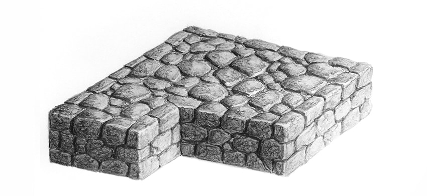
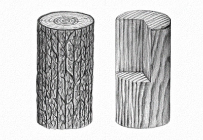
Final product image
What You’ll Be Creating

The texture of rock is deceptively simple, but it gets quite complicated when you try to get it right. In this tutorial I will show you how to draw a texture of a single rock or stone, and a texture of a structure made of stones, like a road or the wall of a medieval castle.

What You Will Need

  • HB pencil
  • 2B pencil
  • 4B pencil
  • 6B pencil
  • Pencil sharpener
  • Kneaded (or normal) eraser
  • Blending stump (optional)
drawing tools

It’s very hard to draw a rock texture from imagination. You may do better if you take a look at some photo references first, for example:

1. How to Draw a Rock

Step 1

Draw a top of the rock using the HB pencil. It should be roughly an oval, but not round at all.

drawing rock first step

Step 2

Add a side of the rock by drawing the bottom and connecting both parts.

rock basic form

Step 3

Gently sketch the edge of the rock to make it blunter. The wider these edge, the rounder the rock. You can even go all the way to the top, to create a dome shape.

rock 3d form blunt edge

Step 4

Add more guide lines to see the 3D form of the rock before you start shading. Use the eraser to make them barely visible.

rock sketch

Step 5

Slightly tilt your pencil and shade a side of the rock. Don’t cover the guide lines completely—leave a suggestion of them by pressing harder.

rock shaded side

Step 6

Take the 2B pencil and shade the part of the rock that won’t be directly illuminated. This time, don’t tilt your pencil so much, but try to draw little details: shadows between the „layers” of the rocks. You can create a very convincing texture just by drawing long, horizontal X shapes.

rock more shades

Step 7

Take the HB pencil again, tilt it, and draw rough „waves” on top of the rock. A rock surface is never smooth, and this will help us show this.

rock top texture

rock pencil texture

Step 8

Add more details to both the top and the side using the 2B pencil. The texture of rock is all about chaos that can’t be planned, so you need to be really creative with your strokes here.

rock side details
rock top details

Step 9

Take the eraser and brighten the illuminated edge with it. A bright edge is a great way to accentuate the shape of the rock.

rock bright edge

Step 10

Take the 4B pencil and use it to draw fine crevices and scratches. Think about this part of the drawing as negative space—you don’t want to draw dark lines, you want to accentuate the bright parts.

rock crevices
rock scratches

Step 11

Use the 2B pencil for the details on top. This is the illuminated side, and we don’t want too much contrast here.

draw rock details

Step 12

Look at your drawing from a distance and try to see what else can be improved by seeing the whole rock, not a set of strokes. Good shading does wonders, but don’t use too many details—they may drag attention from the rock as a whole.

how to draw a realistic rock

2. How to Draw a Stone Wall/Road

Step 1

Just like with the rock, draw the top of the structure first. Since it’s man-made, it should have a rather regular shape. Feel free to use a ruler for this, and draw using the HB pencil.

start drawing a wall

Draw the height of the structure…

draw a stone road

… and connect it with the bottom.

draw a stone structure

Step 2

Divide the height into as many parts as you need. The height of each part will be the height of a stone.

how to draw stone bricks

Step 3

Draw the rows on every side. The stones in this structure will not be as neatly placed as bricks, but they still should follow this rhythm as well as possible.

how to divide stone

Step 4

Imagine the stones are already on the side. Draw the width of their top.

stone wall how it works

Step 5

Sketch the rhythm of the stones. Again, they won’t be as regular as bricks, but a regular placement is required for durability of the structure.

bricks made of stone

Step 6

Luckily, such regularity is not required within the first row. First, sketch a chaotic rhythm on top…

castle wall structure

… then draw the outline of the rocks inside. Here they don’t need to be as regular. Instead, try to place them very tight, with small rocks between the big ones.

castle wall structure detail

Step 7

Time to add some form to each stone. Follow the perspective of the whole structure to decide which sides of the stone should be visible. Also, don’t forget to make the edge blunt—this will make it more primitive in look.

stone wall sketch

Step 8

Fill the spaces between the stones by pressing harder. Don’t make it too regular, but rather use it to „cut” some parts of the stones for a more natural look.

filling between stones

Step 9

Take the 2B pencil (sharpen it well) to make the filling between the stones less uniform.

shading of the filling

Step 10

Take the HB pencil again, tilt it, and shade the top of the stones. Don’t fill the sides by accident!

stone wall top shading

Step 11

Shade the sides of the construction, keeping the edges white.

stone wall side shading

Step 12

Take the 2B pencil and make the shadowed sides darker, both of the whole structure…

how to shade stone structure

… and of each stone on top.

how to shade stones

Step 13

Take the 4B pencil to darken the sides even more and accentuate the details during the process.

how to make stone structure

Step 14

Take the 6B pencil and shade the stones on the shadowed side with more detail. Pay attention to the crevices that have no way to be illuminated.

how to draw crevices in stones

Step 15

Shade the side of each top stone with the same pencil. This will increase the contrast of the whole structure.

how to shade road stones

Step 16

The illuminated side must stay light, but not without any details. Use the 2B pencil to add some.

how to draw details of castle wall

Step 17

Finally, take two steps back and look at the drawing as a whole. How can it be improved? In my case, I’ve used the blending stump to remove any trace of whiteness on the shadowed side, brightened the front with the eraser, and darkened the back of the top.

how to draw realistic stone castle wall with pencil

Good Job!

You did it! If you enjoyed learning this way, check out other tutorials from this series:

  • How to Draw Fur

    Fur can be very simple to draw, if you just learn one secret of it! In this tutorial I will show you how to draw long and short fur, but you can use these…
  • How to Draw Glass

    Transparent glass is incredibly hard to draw from imagination. That’s because we know it’s "invisible", so what is there to draw? But the correct…
how to draw realistic stone rock texture with pencils

How to Create a Brazil-Inspired Text Effect in Adobe Photoshop

Post pobrano z: How to Create a Brazil-Inspired Text Effect in Adobe Photoshop

Final product image
What You’ll Be Creating

In this tutorial I will show you how to create a Brazil-inspired text effect in Photoshop, using a layer style with a pattern that we will create. In the process, you will learn basic things about the Pen Tool and Convert Point Tool, and some keyboard shortcuts that I use every day.

If you’d like to skip this tutorial but still wish to buy the style, you can head over to GraphicRiver and buy Countries Styles.

Promo Image
Countries Styles

Tutorial Asset

The following font was used during this tutorial:

1. How to Create the Pattern

Step 1

Download the zip that is attached to this tutorial and open the Draft Pattern in Photoshop. If you already know how to use the Pen Tool and want to skip some steps, you can use this draft to continue with the tutorial. Just open it in Photoshop and then skip to step 12.

A draft of the pattern

Step 2

Press Control-Shift-N to create a new layer, and name it Shape 1. Then pick the Pen Tool (P) to start drawing.

Pen tool and a new layer

Step 3

Zoom in on the image to make it easier to work with it. You can do that by pressing Control-Space-Click (to zoom out press Alt-Space-Click). 

There are many ways to use the Shape Tool. I’m going to show you how to make one shape using a very simple technique, and then you can use the same technique for the other shapes. 

In order to better see what we are drawing, we need to change the color of the shape. So with the Pen Tool selected, change the color of the Fill to blue #130eef. Then select the layer Shape 1 and change its Opacity to 50%.

Changing the color of the fill

Step 4

Start clicking on the edges of the shape with the Pen Tool (don’t drag the mouse, just click). This will create anchor points. We have to place them on every sharp corner and where there is a curve. Keep doing that until you close the shape.

Drawing a shape

Step 5

Now pick the Convert Point Tool and click and drag on every anchor point that is on a curve, but don’t touch on the ones that are on sharp corners. It doesn’t have to be 100% like the original shape because it is an abstract thing, but try to do it as in the original image.

Here are some tips for this step.

  • If you need to move an anchor point, you need to hold Space while you are clicking on the anchor point, and then move it where you think it will fit better.
  • To remove an unnecessary anchor point, you have to click on it with the Pen Tool (P). To add a new one, just click with the Pen Tool where you need it. 
  • To select an anchor point with the Convert Point Tool, hold Control and click on it. Same thing for the Pen Tool (P).
  • When you select an anchor point, two handlers appear. You can hold Alt and click and drag to change only one handler.
Refining the shape with the Convert Point Tool

Step 6

After all shapes are completed, change the Opacity of every layer to 100%.

Changing the opacity of the layers to 100

Step 7

Create a new layer and name it BG. Then place it below the shapes. 

Creating a new background

Step 8

Change the Foreground color to #e2e2e2 and press Alt-Backspace to fill the layer BG with that color.

Changing the foreground color and applying it to the image

Step 9

Now pick the Pen Tool (P) again to change the color of the shapes to the correct color. You can use the original image and the Eyedropper Tool to pick the colors, or copy from the image below. Select the layer of the shape for which you want to change the color, and change the color just like in step 3.

Colors of the shapes

Step 10

Select all the layers except the Background layer, and then press Control-G to group them. 

Selecting all layers and grouping them

Step 11

Select the Group layer and press Control-Alt-Shift-E to merge everything into a new layer. Then rename this new layer to Base Pattern and hide the other layers by clicking on the eye icon.

Merging the layers

Step 12

Go to Image > Canvas Size and change the Width to 512 px.

Changing the canvas size

Step 13

Pick the Move Tool (V) and move the layer Base Pattern 128 px to the left.

Moving the layer

Step 14

Duplicate the layer Base Pattern by pressing Control-J. Then press Control-T to activate the Free Transform. Then move the layer 256 px to the right. After that, right-click the image and choose Flip Horizontal and press Enter.

Duplicating a layer and moving the copy

Step 15

Select the layers Base Pattern and Base Pattern copy, and press Control-E to merge them. Then rename this layer to Base.

Selecting the layers and merging them

Step 16

Go to Image > Canvas size and change the Height to 994 px.

Changing canvas size again

Step 17

Move the layer Base down by 249 px. Then make a copy of the layer Base and press Control-T to activate Free Transform again. Then right-click on the image and choose Flip Vertical. After that, move the layer Base copy up by 497 px and left by 256 px, and press Enter.

Moving the layer and flipping it

Step 18

Now make a copy of the layer Base copy and move it 512 px to the right.

Moving a copy of the layer

Step 19

Go to Edit > Define Pattern… and name it Abstract – Brazil Pattern, and then press OK. After that, save and close the document.

Saving the pattern

2. How to Create the Layer Style

Step 1

Go to File > Open... and open the background image that is in the zip.

Background image

Step 2

Pick the Type Tool (T) and write BRAZIL using the font Ash

Background image with BRAZIL written on it

Step 3

Right-click the text layer and choose Blending Options to create the Layer Style.

Let’s start with Bevel & Emboss:

  • Style: Inner Bevel
  • Technique: Smooth
  • Depth: 1000%
  • Direction: Down
  • Size: 250 px
  • Soften: 0 px
  • Use Global Light: Unchecked
  • Angle: 90º
  • Altitude: 50º
  • Gloss Contour: Choose the Brazil Contour (zip file)
  • Anti-aliased: Unchecked
  • Highlight Mode: Screen
  • Highlight Mode Color: #ffffff
  • Highlight Mode Opacity: 93%
  • Shadow Mode: Multiply
  • Shadow Mode Color: #0084ff
  • Shadow Mode Opacity: 100%
Bevel and Emboss settings

Step 4

Now add a Stroke:

  • Size: 1 px
  • Position: Inside
  • Blend Mode: Normal
  • Opacity: 100%
  • Overprint: Unchecked
  • Fill Type: Gradient
  • Style: Linear
  • Reverse: Unchecked
  • Align with Layer: Checked
  • Angle: -90º
  • Dither: Unchecked
  • Scale: 100%

Now click on the gradient bar and add a gradient with these settings:

  • First Stop Color: #106a00
  • First Stop Position: 0%
  • Second Stop Color: #7cdc00
  • Second Stop Position: 49%
  • Third Stop Color: #ffffff
  • Third Stop Position: 100%
Stroke settings

Step 5

Add an Inner Shadow:

  • Blend Mode: Overlay
  • Color: #000000
  • Opacity: 88%
  • Use Global Light: Unchecked
  • Angle: 90º
  • Distance: 0 px
  • Choke: 12%
  • Size: 21 px
  • Contour: Linear
  • Anti-aliased: Unchecked
  • Noise: 0%
Inner Shadow settings

Step 6

Add an Inner Glow:

  • Blend Mode: Linear Dodge (Add)
  • Opacity: 48%
  • Noise: 0%
  • Color: #ffffbe
  • Technique: Softer
  • Source: Edge
  • Choke: 0%
  • Size: 5 px
  • Contour: Linear
  • Anti-aliased: Unchecked
  • Range: 50%
  • Jitter: 0%
Inner Glow settings

Step 7

Add a Gradient Overlay:

  • Blend Mode: Vivid Light
  • Dither: Unchecked
  • Opacity: 100%
  • Reverse: Unchecked
  • Style: Linear
  • Align with Layer: Checked
  • Angle: 90º
  • Scale: 100%

Now click on the gradient bar and add a gradient with these settings:

  • First Stop Color: #00688e
  • First Stop Position: 0%
  • Second Stop Color: #ffde00
  • Second Stop Position: 51%
  • Third Stop Color: #53ba00
  • Third Stop Position: 100%
Gradient Overlay settings

Step 8

Add a Pattern Overlay:

  • Blend Mode: Normal
  • Opacity: 100%
  • Pattern: Choose the pattern that we created (Abstract – Brazil Pattern)
  • Scale: 25%
  • Link with Layer: Checked

At this point, you can move the Layer Style window to the side and left-click on the image and drag the mouse to move the pattern.

Pattern Overlay settings

Step 9

Add a Drop Shadow:

  • Blend Mode: Normal
  • Color: #00233a
  • Use Global Light: Checked
  • Angle: 90º
  • Distance: 4 px
  • Spread: 52%
  • Size: 3 px
  • Contour: Linear
  • Anti-aliased: Unchecked
  • Noise: 0%
  • Layer Knocks Out Drop Shadow: Checked
Drop Shadow settings

Step 10

Click on New Style… to save the layer style. Name it Brazil Layer Style and check the Include Layer Style Effect and Include Layer Blending Options boxes. After that, click OK to close the Layer Style window.

Saving the layer style

Congratulations, You’re Now Done!

In this tutorial, you learned how to create an abstract pattern and use it in a layer style in Adobe Photoshop. We started out by creating the pattern, and then we created a layer style.

I hope you have enjoyed this tutorial, and feel free to leave your comments below.

Result of the tutorial

This text effect that we just created is part of Countries Styles.

Promo image
Countries Styles

21 Frozen Lake Photos

Post pobrano z: 21 Frozen Lake Photos

One of my coolest frozen lake experiences was in Invermere British Columbia, Canada a few winters ago. Lake Invermere is fairly big, 8.43 km² to be exact, but that wasn’t the interesting part. What blew my mind was when I chucked a rock onto the ice, the lake made a crazy laser gun sound. It’s hard to describe if you haven’t experienced it for yourself, but I suggest you watch this video of something similar.

Anyways, not only can a frozen lake sound cool, they can also look spectacular. Take a scroll through the collection below. Case in point.

Credit to respective artists.


credit:Rajdip Mukherjee

credit:Kristian Sekse

credit:chris-1

credit:Karl Dyer

credit:Louise Milburn

credit:Cory Disbrow

credit:Cristian

credit:Andrew Smith

credit:Sienna62

credit:Ken

credit:Frédéric Le Duigou

credit:Roger Harrison

credit:Nathaniel Reinhart

credit:Dambe Dei

credit:Konstantin Voronov

credit:Elizabeth Sallee Bauer

credit:Carol Anne

credit:Noxi.

credit:Stephanie MJ

credit:Carlo

credit:Al Fed


Conclusion

Next time you come across a frozen lake, I recommend throwing a rock over the ice. If you can’t, then just sit back and enjoy the view! You won’t be disappointed either way.

I hope that you enjoyed this week’s photography roundup! Thanks for stopping by!


25 Melting Designs for your Inspiration

Post pobrano z: 25 Melting Designs for your Inspiration

What do you think of when you see something melting? Like a melting ice cream cone, or a melting snowman? I personally think a melting snowman looks very depressing and sad, but a melting ice cream cone can look amazing. In the same way, designs that use the melting effect can promote different feelings and emotions. Pay special attention to the Marvel designs; my personal favorites. Enjoy!

Credit to respective artists.


melt-1

melt-2
melt-3
melt-4
melt-5
melt-6
melt-7
melt-8
melt-9
melt-10
melt-11
melt-12
melt-13
melt-14
melt-15
melt-16
melt-17
melt-18
melt-19
melt-20
melt-21
melt-22
melt-23
melt-24

melt-25


Conclusion

Which design was your favorite? The purpose of this roundup is to serve as inspiration for your next project. I hope it has done just that! Thanks for stopping by!