Union of the Baltic Cities Safe Cities Commission has produced three short animation movies about safety at home. As the Union of the Baltic Cities includes around 100 cities from the Baltic Sea Region, these animation movies were made without an actual word spoken, so that they can be clear for everyone.
As designers and artists working with digital technology, it’s easy to get caught into overusing technology and special effect. Actually, art and design is probably more about creative ideas, not about technique only. Obviously, good and creative ideas that are well executed are the best.
Rich McCor, a London-based paper cutting artist, had a simple yet brilliant idea: adding life to photos with paper cutouts that are just presented by hand, no Photoshop involved. The resuts: funny and expressive photos that you’ll love.
Every week, we’ll give you an overview of the best deals for designers, make sure you don’t miss any by subscribing to our deals feed. You can also follow the recently launched website Type Deals if you are looking for free fonts or font deals.
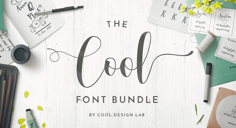
The Cool Font Bundle
How do you name a font bundle packed with cool fonts? Easy, you name it the cool font bundle.
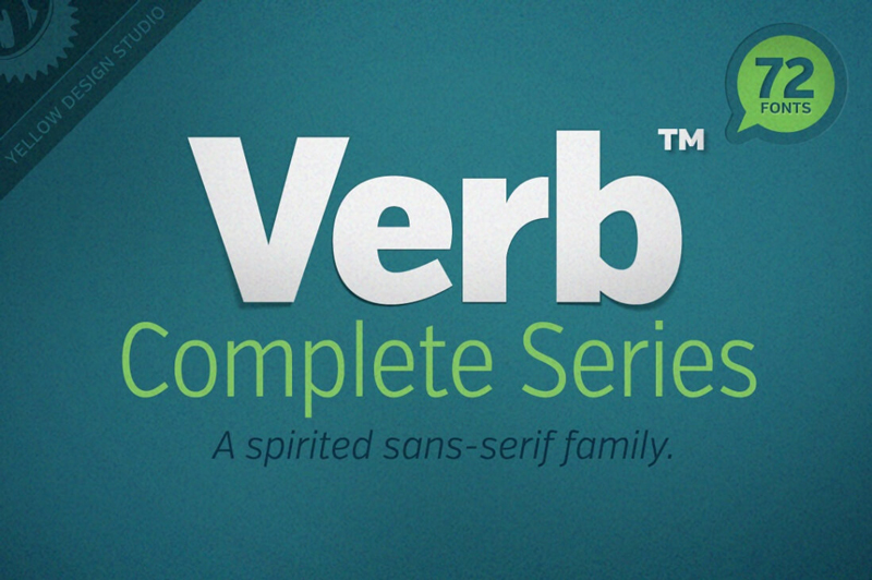
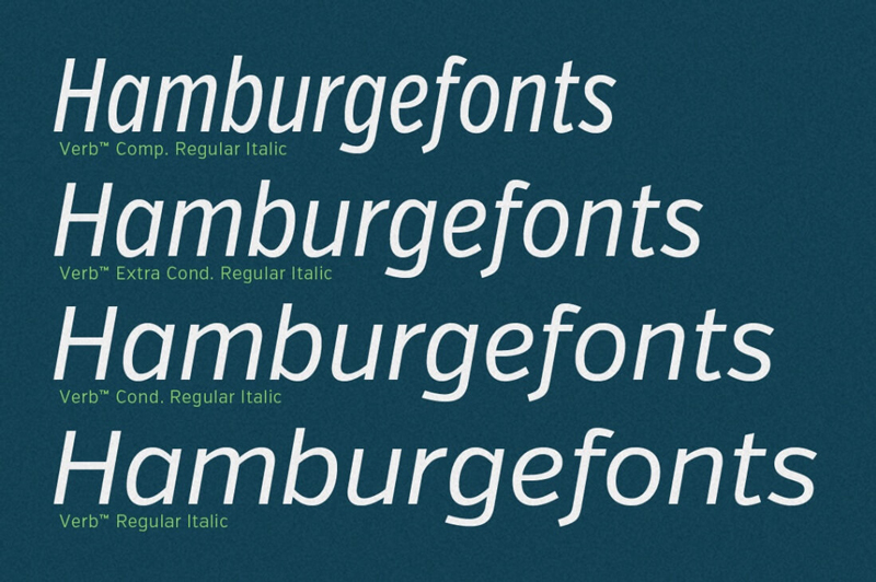
When artists create a new masterpiece, they have one goal in mind: to move you. Well, why shouldn’t the same go with Web designers? There’s no better way to get your next project moving than with the awesomely active (and actively awesome!) Verb font family!
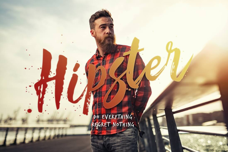
Spring Font Bundle – 35+ Beautiful Fonts from 6 Designers
Looking for a slew of new, exciting fonts? This Spring Font Bundle is bursting with more than 35 professional handdrawn, script and brush fonts. Culled from 6 different designers, you’re sure to get yourself a wide variety of typeface styles perfect for everything from invitations to logos.
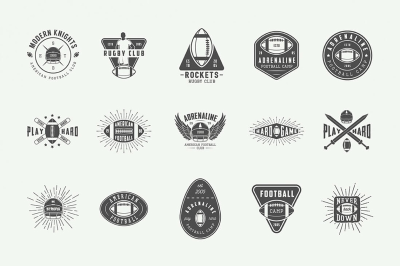
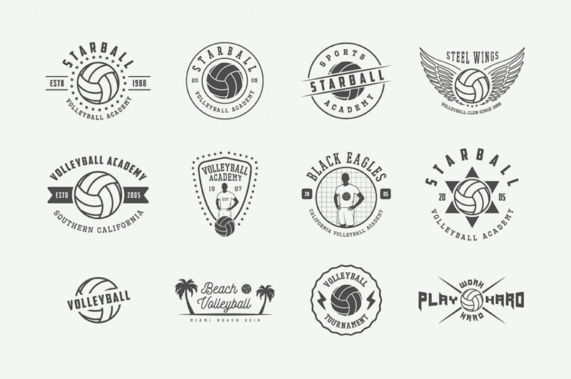
This Sports Emblems Mega Bundle comes over-stuffed with more than 300 total items to help you hit your next project out of the park! You’ll get hundreds of sports emblems, 75+ unique design elements and even a set of sports-themed poster templates.
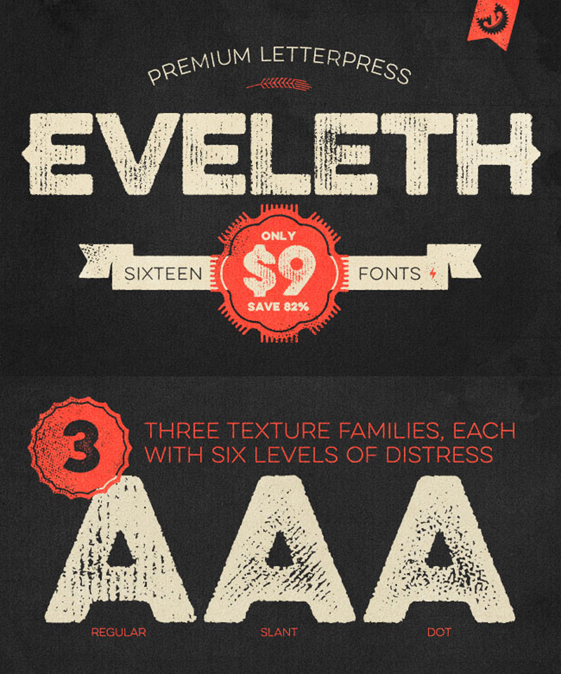
You’ll get yourself 16 charming vintage fonts to work with. Additional weights, shadow layers and entertaining icons, shapes and emblems are just a few of the extras that come along for the ride. And if you act now, you can save yourself 82% off the regular price!
Let’s take a look at what it takes to build a grid overlay with CSS. It will be responsive, easily customizable and make heavy use of CSS variables (known more accurately as „CSS custom properties”). If you aren’t familiar with custom properties, I’d highly recommend reading What is the difference between CSS variables and preprocessor variables? and watching Lea Verou’s enlighting talk on using them.
This grid overlay that we’re building will consider a developer tool, as in, a tool just for us, not really our users. So, let’s not worry too much about browser support (If you do care, check out caniuse… data on custom properties). While it’s impossible to preprocess custom properties to behave exactly the same as native support, if you use them just like you would preprocessor variables, tools like the postCSS plugin cssnext can transform them into CSS compliant with older browsers.
Preface
A couple of weeks ago, at work, I simplified the media queries on one of our projects and added a layout component based on the same principles as Flexbox Grid. Some of my fellow designers didn’t fully understand the responsiveness and fluidity of it, so I created a toggleable grid overlay to help them visualize it.
My hope is that this can be a tool to aid layout-related conversations on our teams and make sure we don’t use too many bespoke widths, paddings etc.
Terminology
Working as a front end designer I want all developers and designers to speak the same language (as much as possible) so I’ve chosen a terminology for the CSS variables that digital designers are also familiar with:
Columns: The vertical divisions of the page.
Gutter: The space between the columns.
Offset: The space between the sides of the viewport.
Baseline: The vertical rhythm used for text.
Making the Grid
1) „Box”
Let’s use a pseudo-element on the element to display the grid on top of all of our content. We want the overlay to work with a fluid layout, so we give the element a width off `100% – (2 * offset)` and also a max-width so the grid overlay doesn’t grow wider than our layout.
If you look at the grid you will notice that the repeating pattern is column+gutter pairs. We’re using repeating linear gradients as a background-image. We’ll set the size of the background-image to 100% + gutter making the repeating pattern 100% / columns wide and the actual column (100% / columns) – gutter wide.
As a side note, I also tried using regular linear gradients with background-repeat to get the lines more pixel perfect. It didn’t work because pixel rounding resulted in imperfect total width whenever the layout width wasn’t dividable by the number of columns.
3) Baseline
We also draw the baseline using repeating linear gradients but it’s slightly simpler since we don’t add horizontal gutters and we want it to be just a line instead of a block.
Let’s also add a baseline-shift variable that allows us to shift the baseline slightly upwards or downwards. We apply the baseline shift by simply adjusting the background-position.
Now that we have our basic setup, let’s introduce some media queries. If you look back at the math that we’ve used so far, you can see that none of it is tied up to any specific number of columns, gutter width, etc.
We use a mobile first approach and only include variables in the media queries when we want to change them. To make it clear for everyone using the overlay that we’ve passed a new breakpoint we also change the color at every breakpoint.
I recommend opening the Pen in a new tab and see how it behaves when you change different variable values and when you resize the viewport.
If you made a mental note in step 1 saying “but what if I want specific layout widths at specific breakpoints?” then now is when you can easily introduce that logic by setting --max_width for each media query.
5) Help Text
Designers like to think about mockups for different devices — which is generally a good thing as it’s critical that a website looks awesome on those different devices — but sometimes they forget that the layout on an iPad should work all the way up and/or down to the next breakpoint.
Breakpoints aren’t normally called „iPhone”, „Galaxy Note 🔥”, „iPad” etc. for many reasons including the above. A breakpoint denotes where a new range starts and it’s not device specific.
To make it more obvious what our breakpoints are called, we can add the names to our grid overlay.
I have a dream that one day a designer doesn’t come back to a developer and say: „we need to adjust how it looks on iPad” but instead says „we need to adjust how it looks on medium”.
Go Further
What about lines for the columns and gutters too? Easy, it’s just CSS. What about adding more breakpoints? Easy, it’s just CSS. What if I want different colors? Easy… you get it. 😄
Greg Hovanesyan, who recently posted here an Introduction to the Web Audio API, follows up with another huge post on how to use it to create iconic music from our nerds past, like sounds from The Legend of Zelda and Metroid.
This tutorial was originally published in April 2011 as a Tuts+ Premium tutorial. It is now available free to view. Although this tutorial does not use the latest version of Adobe Photoshop, its techniques and process are still relevant.
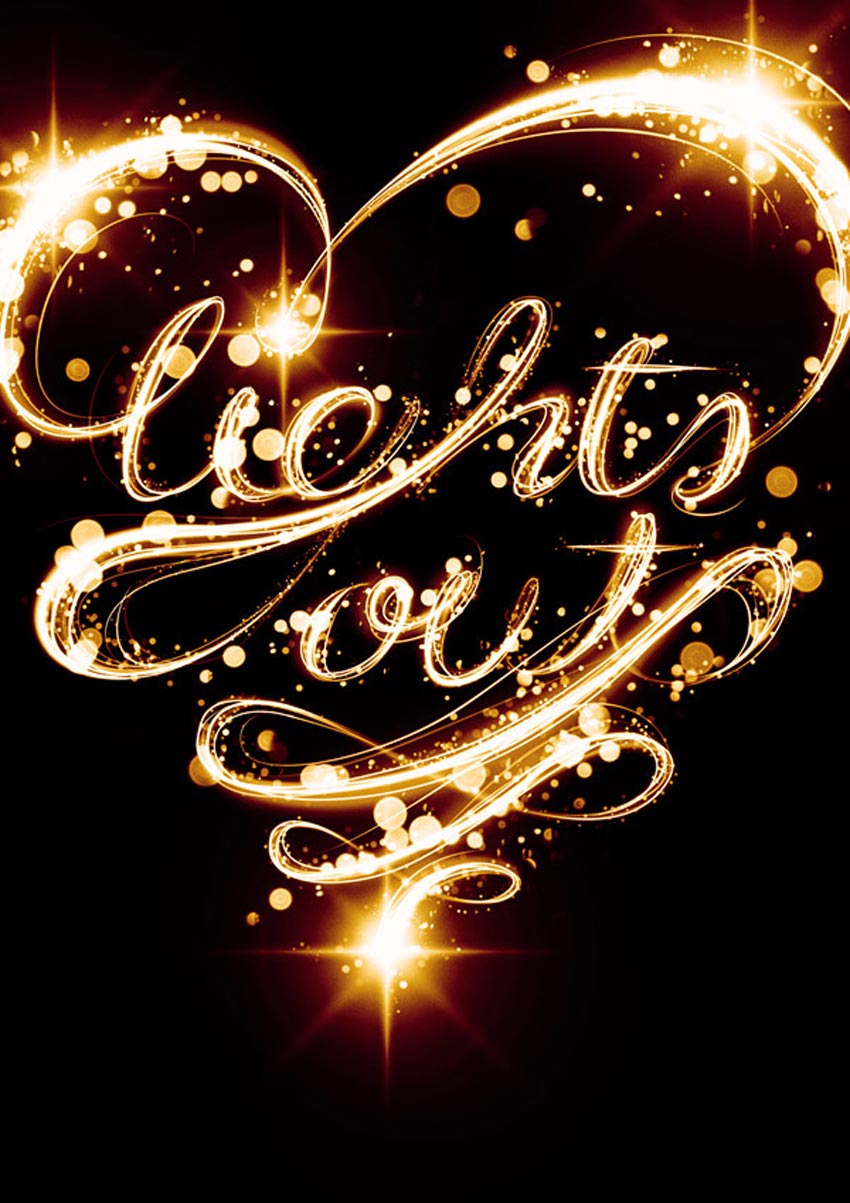
If you’ve ever attempted to write words using traditional light painting photography techniques, you probably know how challenging it can be to create words that are easy to read. In this tutorial, we will demonstrate how you can create a similar look without a camera and tripod. Let’s get started!
And for more insane lighting effects, check out our awesome selection of Light Painting Photoshop Actions from GraphicRiver. Or enlist the help of one of the talented professionals from Envato Studio for your custom typography needs.
1. How to Sketch Out Your Composition
Step 1
Let’s start in Photoshop. Launch the program and create a new document. When creating everything from scratch, it’s always a good idea to make it really big. That way an A2 format can later be chopped up and cropped in any other format desired. We’re going to create a borderless illustration for an A2 and later crop it into an A3. So create a new document with these sizes: W: 42.5cm, H: 59.4cm, 300 dpi, CMYK.
We want the overall shape to form a heart, so draw a heart really quickly.
Step 2
Use the guideline to draw in your text with a tablet. Consider this a sketch. If you’re more comfortable doing this on paper, do it and scan it.
Step 3
For this single step, I’m going to switch to Illustrator. I’m more comfortable with ol’ Illy when it comes to lettering, but it’s entirely doable in Photoshop too. Once you’re done, Copy it (Command/Control-C).
2. How to Create the Multiple Lines
Step 1
Paste it in Photoshop as a Path (Command/Control-V, select Path in the pop-up dialog).
Step 2
Select the Brush Tool (B) and change your brush to a 100% soft edged, 10 px diameter brush. Grab the Pen Tool (P), right-click and select Stroke Path. In the pop-up dialog, make sure Simulate Pressure is not checked and press OK.
Step 3
Go to Filter > Blur > Motion Blur. Change the direction to a 60 degree angle and strength to 20. Press OK.
Step 4
Reduce the Opacity by approx. 50% and Duplicate it. Apply a Layer Mask (Layer > Layer Mask > Reveal All) and start to hide away portions with a large, black, soft brush.
Step 5
Grab the Pen Tool and trace your first light streak in Path Mode.
Step 6
Just as you did before, stroke the path with a 10 px brush. You need to do this individually in order to keep the appearance realistic. Alternate between 5, 10 and 15 px brushes and various levels of Opacity.
Step 7
After you’ve applied it, you need to hide both ends of the line. Use a Layer Mask and draw with black on each end.
Step 8
Use the original lines only as a guide. Start to add thickness to the letters, but preserve a classic typeface look by keeping the top and bottom of the bowls thin, and the sides thick.
Step 9
As you progress with the words, try to thicken the left side of each letter. Doing so will preserve the spacing between the letters.
Step 10
Remember to fade out each end of the lines, otherwise they won’t look real.
Step 11
Work your way through the letters until you have reached a similar result.
3. How to Add Color
Step 1
By now, it’s a good idea to nail the colors of the project. Above all other layers, create a Gradient Map Adjustment Layer (Layer > New Adjustment Layer > Gradient Map) Use these colors: #000000; #54000c; #d69f0a; #fffee9.
Step 2
Leave the Adjustment Layer always on top. Now that we’ve finished the lines, it’s time to add glows. Repeat the path creation process, but this time use a very large size (100–200 px) and enable Pressure Simulation. As a color, use a 50% gray (#8c8c8c). Change the Layer Style to Screen.
Step 3
Cover all the thicker portions of the letters with similar glows.
Step 4
It’s time to add even thicker lines, but with Pressure Simulation enabled and white color. Use lines of varying widths (25–75 px).
Step 5
Add thicker, soft white lines all over the letters.
4. How to Add Flares to the Letters
Step 1
Download this flare image and place it in your project. Rotate it until the angles of the rays are at 90 degrees. Set the Layer Style to Screen.
Step 2
Duplicate the flare, and double its size. Rotate it by 45 degrees.
Step 3
Go to Filter > Blur > Gaussian Blur, and use approx. 30 px to soften the secondary flare.
Step 4
Duplicate this flare (both layers) and place it around the scene in points of interest.
Step 5
Repeat the previous steps to achieve the same effect for the bottom text.
Step 6
Create a few more lines around the scene that follow the original path only to a certain point. Make them white, and of different Opacity levels.
5. How to Add Bokeh
Step 1
Open the blurry lights image and place it in the document. Set its Layer Style to Screen.
Step 2
Apply a Layer Mask and mask out portions of the image that have lights under the crop of the image. Make sure all the lights that are left aren’t sliced.
6. How to Enhance the Light
Step 1
In order to add a bit of contrast to the lights image, add a Black and White Gradient Map Adjustment Layer and make it a Clipping Mask for the lights image. Set its Layer Style to Overlay.
Step 2
Duplicate the lights image and apply it to different parts of the image. Use composites where you combine large dots with small.
Step 3
Apply the image to different points of interest. Try not to make it too heavy.
Step 4
We’re now going to combine these lights with a custom brush to make our own. Create a new brush, and change the settings as seen below.
Step 5
Keep Shape Dynamics on and change the Scatter to 550.
Step 6
Enable Other Dynamics and change the settings.
Step 7
Use this brush to draw much finer blurry lights along the letters.
Step 8
Repeat this process.
7. How to Add Noise
Step 1
We’re now going to add some noise without damaging the colors and lighting. Choose a 50% gray and fill an entire blank layer with it. It will appear brown because it is underneath the Gradient Map Layer.
Step 2
Go to Filter > Noise > Add Noise and add a max amount noise filter.
Step 3
Blur it by 0.8 px (Filter > Blur > Gaussian Blur).
Step 4
Change the Layer Style to Vivid Light and Opacity to 5%.
Step 5
And as one last adjustment, go to Layer > New Adjustment Layer > Photo Filter. Choose the red one.
Awesome Work, You’re Now Done!
Great work! Feel free to share your own end results in the comments to show others.
Light Painting Photoshop Actions From GraphicRiver
Love typography and light paintings? Create super awesome text effects yourself by downloading one of the awesome Light Painting Photoshop Actions from GraphicRiver. Try these on your favorite quotes and more and check out one of our best sellers below!
Create wicked light effects in a matter of seconds with this cool Photoshop action. A fully customizable action that allows you to make light effects out of any shape or raster, this download comes complete with light brushes. Create stunning effects in no time with this one-click Photoshop action.
Halifax Bank is featuring two characters from the Thunderbirds stop motion animation TV series in their advertising campaign promoting Halifax Savers Prize Draw Superdraw. British aristocrat Lady Penelope Creighton-Ward and her butler/chauffeur Aloysius Parker are shown driving through town in the pink bulletproof armoured FAB 1 limousine. Parker asks if he can make a quick stop at a Halifax branch. He goes into the branch with a letter and is amazed to discover he has won the top prize of £500,000 in the Halifax Savers Prize Draw Superdraw. When asked by a bank employee what he’ll spend the money on, Parker thinks hard. Then we see him on a beach, cocktail in hand, while his boss Lady Penelope, is back at the mansion ringing the bell for attention with him nowhere to be seen! Filmed in the Halifax branch in Marlow, Buckinghamshire, the Halifax Thunderbirds advert features Halifax colleagues as extras.
This is the fourth in a series for Halifax bringing fictional animated characters to life and place them in the real world. The series began with Top Cat followed by Flintstones, Scooby Doo and now, Thunderbirds.
Parker and Lady Penelope will also feature on in-branch promotion, on outdoor posters and in digital advertising. Other characters from the series will appear on social media, including top tips for saving from Brains, aimed at encouraging young people to save. There will also be a special mobile savings game which will tour shopping centres in the UK, giving people the chance to play on a big screen and win prizes.
Halifax Thunderbirds Credits
The Halifax Thunderbirds campaign was developed at adam&eveDDB, London, by chief creative officer Richard Brim, group executive creative director Ben Tollett, agency producer Catherine Cullen, copywriter Jonathan John, art director David Mackersey, and chief strategy officer David Golding, account director Chloe Harding, head of account management Charlotte Wolfenden, account manager Katie Gough and acount executive Olivia Adamson.
Filming was shot by directors Dom & Nic via Outsider, with producer John Madsen, production manager Steve Elgar, director of photography Alex Barber, and Thunderbirds consultant Stephen La Riviere.
Puppetry was produced at Century 21 Films by puppeteers Andrew T. Smith, Geraldine Donaldson, Richard Gregory, Elliot Pavelin, Toby Chamberlain, and Hilton Fitzsimmons.
Editor was Struan Clay at Final Cut with producer Frankie Elster.
Visual effects and design were produced at The Mill by executive producer Alex Fitzgerald, producer Kirsty Ratcliffe, shoot supervisor/executive creative director Neil Davies, 2D lead artist Fergal Hendrick, shoot supervisor/3D lead artist Jonathan Wood, 3D lead artist Alex Hammond, 2D artists John Thornton, Gavin Marler, Nick Sze, Federico Ghetta, Zoe Cosh, James MacLachlan, Olivia O’Neil, Jose Caballero, Greg Spencer, Rebecca Clay, Adam Maynard, George Rockliffe, David Wishart, Richard Payne, Dan Adams, Gary Driver, Georgina Ford, Richard De Carteret, Sal Wilson, 3D artists Ashley Tilley, Giacomo Cavalletti, Sergio Xisto, Hitesh Patel, Peter Agg, Will Burdett, Matthew Kavanagh, Jasmine Ghoreishi, Tom Hales, Alberto Lara, Alain Thay, Adam Droy, Finlay Crowther, Arnau Gilabert, Joshua Barlow, Roberto Costas Fernandez, Andrew Bartholomew, matte painting team Rainer Stolle, German Casado, and Jiyoung Lee, art director Aurelien Ronceray, colorist David “Luddy” Ludlam, colour assist team Thomas Mangham and Brendan Buckingham.
Sound was produced at 750mph by engineer Sam Ashwell.
Agregator najlepszych postów o designie, webdesignie, cssie i Internecie