How Designers Should Utilize Social Media

Post pobrano z: How Designers Should Utilize Social Media
first image of the post

Social media offers innumerable opportunities for artists to get their creativity flowing. It can be used to share your art, promote an upcoming show and even serve as a medium for a creative project.

Designers sometimes find it difficult, though, to get what they want out of social sites. Here are seven ways for artists to successfully use social media.

1. Use the Site That Matches Your Medium

Different forms of art lend themselves better to different social media platforms. That doesn’t necessarily mean you should focus on just one or two sites, but it does mean you should use the sites that are best suited to your work.

Visual sites, like Instagram and Snapchat, for example, are good for visual art. Sites such as Bandcamp and Soundcloud are perfect for musicians. YouTube would be a smart choice for filmmakers.

By choosing the platforms that showcase your art most effectively, you’ll be putting you best foot forward online.

2. Connect With Like-Minded Designers and Art Enthusiasts

Social media can provide you with an opportunity to connect with designers whose work is similar or complementary to yours. It can also introduce you to people who appreciate your art.

Having a community of like-minded people can be extraordinarily helpful for artists. Social media allows you to expand that community beyond geographical boundaries.

The people you connect with on social media can provide you with inspiration, support and encouragement. You may get ideas from fellow designers or maybe receive an invitation to collaborate on a few projects.  Someone who discovers you online may share your work with their friends, growing your base of supporters.

3. Test out Your Ideas

By observing the activity on your social media sites, you can often gain helpful insight into how your ideas are being received.

By watching to see which posts are the most liked, shared and commented on, you can get an idea about what your followers like the most. You might decide to work on more projects similar to your most well-received ones.

Social media can also be a great place to test out new ideas. If there’s something you’re not sure about or want opinions on, post a snippet online and ask for feedback. There’s a good chance you’ll get some — hopefully — constructive feedback.

4. Highlight Your Best Work

Your social accounts can function as an easily accessible online portfolio. By sharing your best work online and a collection of work that represents what you do, you can let people know who you are as a designer and show off your talents.

Sharing your best work online can also create a positive first impression on potential fans. If they stumble upon your profile and are impressed, they may press the follow or like button and engage with you more in the future.

Artists should be careful, though, when posting their work online. In some cases, posting something on social media may cause you to lose the rights for the piece to the site you post it on. This differs from site to site and is one of the biggest potential issues for artists on social media. Make sure you read through the site’s terms before posting something you want the exclusive rights to.

5. Include Some Extra Incentives

Although sharing your best work on social media can be helpful, you also want to create some incentive for people to dig deeper into your work.

Sharing different content on Instagram, Twitter and your website will encourage people to pay attention on all three. If they’re all the same, they may focus on one and tune the rest out.

The right balance between what you share online and what you don’t is still hotly contested. Some designers put up all their work online. Others prefer to share just a snippet to encourage people to buy their work or take another action. Still others don’t share anything online and keep everything private unless it’s purchased.

None of these approaches are wrong. What’s best for you depends on your art, your beliefs and your audience. Whichever route you decide to take, social media can play an integral role.

6. Build Interest

Social media can be a great promotional tool. Social media marketing is huge for many of today’s businesses and can work similarly for artists.

You can build excitement around your work by posting samples from an upcoming project, a trailer for an upcoming installment or live clips to promote a future performance.

By offering ‘sneak previews’ to your social media followers, you encourage them to follow your accounts and build excitement around what you’re working on.

7. Build a Brand

Some artists may balk at the idea of branding their work, but it can be helpful, and social media can be an easy, pain-free and even fun way to do just that.

Posting content that is all in a similar vein and showing off your personality can help give people a consistent idea of who you are. If you present yourself accurately, the people attracted to your social accounts will likely be the people who are interested in your work and in you as an artist.

Make sure to keep your content consistent and relevant, though. Posting things that are unrelated to your work may confuse people and cause them to stop engaging with you on social media.

Social media is full of potential for all types of artists. It can be a great place to showcase your work, build a community around your art and promote your projects. It does, however, come with some risks that artists should be aware of.

If used carefully and correctly, though, social media can be an incredible tool for growing the careers of artists and can even provide inspiration or a fascinating new medium.

Lexie Lu is a freelance web designer and blogger. She keeps up with the latest web design news and always has some coffee nearby. She owns Design Roast and can be followed on Twitter @lexieludesigner

Easing Linear Gradients

Post pobrano z: Easing Linear Gradients

Linear gradients are easy to create in CSS and are extremely useful. As we’ll go through in this article, we can make them visually much smoother by creating them with non-linear gradients. Well, non-linear in the easing sense, anyway!

Here’s an example that shows how harsh a standard linear-gradient() can be compared to how smooth we can make it by easing it:

Screencap from „The Good, the Bad and the Ugly” with gradients overlaid.
  • Il buono (the good): Smooth gradients in CSS that blends into their context.
  • Il cattivo (the bad): No text protection (bad accessibility).
  • Il brutto (the ugly): Standard linear gradients with sharp edges.

In this article, we’ll focus on how we can turn Il brutto into Il buono.

The Frustrating Sharp Edges of background: linear-gradient()

Lately, I’ve been fiddling with gradients at work. I got frustrated with plain linear gradients because they looked like Il cattivo above.

/* Sharp edges :( */
.image__text {
  background-image: linear-gradient(
    hsla(0, 0%, 0%, 0.6),
    transparent;
  );
}

I started looking into creating consistently more visually appealing gradients. More accurately, I quickly eyeballed some prettier-looking gradients as one-offs and then started tinkering when I got home.

Inspiration: Math and Physics

Since a gradient is a transition of color, I got inspired by how we approach transitions elsewhere.

I’ve always been fascinated by the The Euler (or Cornu) Spiral, which has a curvature that increases linearly with the curve length, i.e., as we walk along the line from (0, 0) the radius decreases linearly with how far we walk (since the curvature is the reciprocal of the radius).

The end result is a curve that transitions as smoothly as possible from a straight line to a curve. (Side note: straight lines in Euclidian space are curves with an infinite radius!)

Euler Spiral by AdiJapan, CC BY-SA 3.0

This type of curve is called a transition curve and is used in the real word. Next time when you exit a well-built highway, then notice how gradually you turn the steering wheel. We can thank Euler for keeping sudden changes in centripetal acceleration to an absolute minimum, i.e., his math is the reason the car doesn’t flip over just as we exit the highway even at the highway speed limit.

The image below is an example of how gradual changes the changes are in the curvature of highways.

Intersection outside of Sagamihara, Japan by @digitalanthill

Inspiration: Typography

Type designers throughout history have been obsessed with smooth curves. We’ve done so because we don’t want the letters and numbers to look like a combination of different shapes but in itself form a coherent shape.

It’s why I’ve made the transition from a straight line to the circle in the „9” below as smooth as possible. It makes the number 9 read as a single shape and not a line plus a circle.

As type designers we have tools to help us achieve this. FontForge, an open source font editor, even has a Spiro/Euler drawing mode. One of the most popular type design extensions is Speed Punk, which visualizes the curvature.

Spiro mode in FontForge on the left and Speed Punk visualisation inside Glyphs on the right.

Inspiration: Design

Apple uses this approach to line-curve transitions heavily in both digital and hardware design departments. (See Apple’s Icons Have That Shape for a Very Good Reason). When Apple launched iOS7, the icon masks were updated to have a much smoother transition from straight line to rounded corners.

Visualisation of the curvature of the iOS6 and iOS7 app icons.

(Side note: The iOS7 shape above is taken directly from Apple HIG, which unfortunately has some minor imperfections especially where the horizontal lines start curving. It’s also sometimes known as a „Squircle”.)

Inspiration: Web Design

In web design, we’ve been limited in some cases by what we’re able to do. For example, border-radius doesn’t offer any way to make a squircle like the iOS7 icon. Similarly with linear-gradient, there is no natural easings available.

However, we do have easings and bezier curves available in animations! They have enabled us to make animations look more natural, smooth, and subtle.

Screenshot from easings.net

Gradient Implications

Most times, in web design, we want the gradient to blend in as much as possible. When we have a text protection gradient like Il buono, we don’t want the user to pay attention to the gradient itself. It should be rather invisible, thus, allowing the reader to focus on the image and text.

Scrim

In Material Design style guidelines for images, the designers at Google talk about text protection gradients. They call them a scrim. They recommend:

[the] gradient should be long… with the center point about 3/10 towards the darker side of the gradient. This gives the gradient a natural falloff and avoids a sharp edge.

A scrim according to Material Design guidelines

We can’t create exactly that with linear gradients, but we can (and will) create a „low poly” approximation with more color stops.

A scrim with 5 color stops to show the principle

Using only 5 color stops (like in the illustration above) would create some serious banding. Adding more stops makes the gradient a lot smoother. This is exactly what I’ve done in the demo you saw in the first image in this article. Il buono has a 13 color-stop gradient, which makes it blend nicer into the image.

See the Pen The Good, The Bad & The Ugly – correct text by Andreas Larsen (@larsenwork) on CodePen.

Compared to the Material Design scrim, I’ve tweaked it to be a bit more linear in the beginning to achieve higher text contrast and gave it a smoother fade out.

Comparison between the Material Design scrim and mine drawn using 13 color stops.

If we compare the Material Design scrim to a plain linear gradient, then it will have to be ~60% longer to achieve the same half way contrast whereas my attempt only has to be ~30% longer. The idea is to avoid darkening more of the image than necessary but still blend in smoothly with it.

The two scrims compared to a plain linear gradient

I’ve chosen not to include the Material Design scrim as it’s almost identical to the prettier easeOutSine. We can compare how linear-gradient , my scrim-gradient and ease-out-sine-gradient looks here:

Blending Both Ends

In the scrim example, we only need to blend one end as the other ends with the image. Sometimes, we need to blend in at both ends, and that’s where the easing functions, such as easeInOutSine comes in handy.

Linear-gradient vs. ease-in-out-sine approximation.

Using an easeInOut function, we make sure that both the transition from colorA to gradient and gradient to colorB is as smooth as possible. The same principle is illustrated in this Pen:

See the Pen.

How to Draw the Gradients

On YouTube, there’s a gradient behind the controls when you hover over a video. It’s created using a base64 PNG. This technique also works really well, but you can’t really automate it or easily tweak it.

Screenshot from YouTube (artist is Wintergatan).

Most other places use a linear-gradient(hsla(0, 0%, 0%, 0.8), transparent) where the start alpha most times is between 0.6-0.8. This solves the issue of making the text readable, but the resulting gradient is very prominent. An example of this is BBC where I tried using the scrim-gradient instead:

Screenshots from BBC with linear-gradient (left) and scrim-gradient (right).

PostCSS to the Rescue

I created a plugin that creates these gradients for me. Here’s the syntax:

scrim-gradient(
  black,
  transparent
);

becomes:

linear-gradient(
  hsl(0, 0%, 0%) 0%,
  hsla(0, 0%, 0%, 0.738) 19%,
  hsla(0, 0%, 0%, 0.541) 34%,
  hsla(0, 0%, 0%, 0.382) 47%,
  hsla(0, 0%, 0%, 0.278) 56.5%,
  hsla(0, 0%, 0%, 0.194) 65%,
  hsla(0, 0%, 0%, 0.126) 73%,
  hsla(0, 0%, 0%, 0.075) 80.2%,
  hsla(0, 0%, 0%, 0.042) 86.1%,
  hsla(0, 0%, 0%, 0.021) 91%,
  hsla(0, 0%, 0%, 0.008) 95.2%,
  hsla(0, 0%, 0%, 0.002) 98.2%,
  hsla(0, 0%, 0%, 0) 100%
);

The underlying principle is the one we’ve gone through: combining easing functions and multiple color stops to create approximations that look smoother than plain linear-gradients.

Actually, the scrim-gradient above is generated using a custom set of coordinates but if we look at the easing gradients such as ease-in-out-sine-gradient the steps are:

  1. Run through the .css (or .pcss) and find it.
  2. Generate evenly distributed coordinates along the ease-in-out-sine curve.
  3. Use these coordinates to create color stops. The x-coordinate determines the color mixing ratio, and the y-coordinate determines the color stop position.
  4. Replace the easing-gradient with the generated linear-gradient.
Ease-in-out-sine coordinate values generated in step 2.

The plugin currently has two optional settings:

  • precision — correlates to number of color stops generated
  • alphaDecimals — sets the number of decimals used in the hsla() alpha values

The Plugin: postcss-easing-gradients

Overall, I’m fairly happy with the output. Things I’m considering to add:

  • Sass version? I’m not using it anymore. Perhaps, someone else would like to write one?
  • The coordinates used to mix the colors for the color stops are distributed evenly over the easing curves. Ideally, the distance between the color stops would be relatively shorter where the delta change in curvature is biggest.
  • Maybe you folks have some ideas?

You can find it on GitHub, NPM and as a template on CodePen. Go play around with it! Your contributions and suggestions are very welcome.

CSS

Preferably, I’d like to be able to write something like ease-in-out-gradient(#bada55, transparent) and have the browser understand it without having to do any custom CSS processing.

References/Further Reading


Easing Linear Gradients is a post from CSS-Tricks

Mobile, Small, Portrait, Slow, Interlace, Monochrome, Coarse, Non-Hover, First

Post pobrano z: Mobile, Small, Portrait, Slow, Interlace, Monochrome, Coarse, Non-Hover, First

A month ago I explored the importance of relying on Interaction Media Features to identify the user’s ability to hover over elements or to detect the accuracy of their pointing device, meaning a fine pointer like a mouse or a coarse one like a finger.

But it goes beyond the input devices or the ability to hover; the screen refresh rate, the color of the screen, or the orientation. Making assumptions about these factors based on the width of the viewport is not reliable and can lead to a broken interface.

I’ll take you on a journey through the land of Media Query Level 4 and explore the opportunities that the W3C CSS WG has drafted to help us deal with all the device fruit salad madness.

Media queries

Media queries, in a nutshell, inform us about the context in which our content is being displayed, allowing us to scope and optimize our styles. Meaning, we can display the same content in different ways depending on the context.

The Media Queries Level 4 spec answers two questions:

  • What is the device viewport size and resolution?
  • What is the device capable of doing?

We can detect the device type where the document is being displayed using the media type keywords all, print, screen or speech or you can get more granular using Media Features.

Media Features

Each Media Feature tests a single, specific feature of the device. There are five types:

We can use these features on their own or combine them using the keyword and or a comma to mean „or”. It’s also possible to negate them with the keyword not.

For example:

@media screen and ((min-width: 50em) and (orientation: landscape)), print and (not(color)) {
  ...
}

Scopes the styles to landscape orientated screens that are less than or equal to 50em wide, or monochrome print outputs.

The best way to understand something is by actually doing it. Let’s delve into the corner cases of a navigation bar to test these concepts.

The Unnecessarily Complicated Navbar

One of the best pieces of advice that Brad Frost gave us on „7 Habits of Highly Effective Media Queries” is not to go overboard.

The more complex we make our interfaces the more we have to think in order to properly maintain them. Brad Frost

And that’s exactly what I’m about to do. Let’s go overboard!

Be aware that the following demo was designed as an example to understand what each Media Feature does: if you want to use it (and maintain it), do it at your own risk (and let me know!).

With that in mind, let’s start with the less capable smaller experience, also know as „The mobile, small, portrait, slow, interlace, monochrome, coarse, non-hover first” approach.

The HTML structure

To test the media query features, I started with a very simple structure. On one side: a header with an h1 for a brand name and a nav with an unordered list. On the other side: a main area with a placeholder title and text.

See the Pen Part 1: Mobile, coarse, portrait, slow, monochromatic, non-hover first by Andres Galante (@andresgalante) on CodePen.

Default your CSS for less capable devices and smaller viewport

As I mentioned before, we are thinking of the less capable smaller devices first. Even though we are not scoping styles yet, I am considering an experience that is:

  • max-width: 45em small viewport, less than or equal to 45em wide
  • orientation: portrait portrait viewport, height is larger than width
  • update: slow the output device is not able to render or display changes quickly enough for them to be perceived as a smooth animation.
  • monochrome all monochrome devices
  • pointer: coarse the primary input mechanism has limited accuracy, like a finger
  • hover: none indicates that the primary pointing system can’t hover

Let’s take care of positioning. For portrait, small, touchscreen devices, I want to pin the menu at the bottom of the viewport so users have comfortable access to the menu with their thumbs.

nav {
  position: fixed;
  bottom: 0;
  left: 0;
  right: 0;
}

Since we are targeting touchscreen devices, it is important to increase the touch target. On Inclusive Design Patterns, Heydon Pickering mentions that it’s still unclear what the magical size of a touch area is, different vendors recommend different sizes.

Pickering mentions Anthony Thomas’s article about finger-friendly experiences and Patrick H Lauke research for The W3C Mobile Accessibility Taskforce into touch / pointer target size, and the main takeaway is, „…to make each link larger than the diameter of an adult finger pad”.

That’s why I’ve increased the height of the menu items to 4em. Since this is not scoped, it’ll be applied to any viewport size, so both large touchscreen devices like an iPad Pro and tiny smartphones alike will have comfortable touch targets.

li a {
  min-height: 4em;
}

To help readability on monochromatic or slow devices, like a Kindle, I haven’t removed the underlines from links or added animations. I’ll do that later on.

See the Pen Part 2: Mobile, coarse, portrait, slow, monochromatic, non-hover first by Andres Galante (@andresgalante) on CodePen.

Small landscape viewports, vertical large displays, or mouse pointers

For landscape viewports orientation: landscape, large portrait viewports like vertical monitors or tablets min-width: 45em, or small portrait devices with fine pointers like a stylus pointer: fine, users will no longer be using their thumbs on a handheld device; that’s why I unpinned the menu and put it at the top right of the header.

@media (orientation: landscape), (pointer: fine), (min-width: 45em) {
  main {
    padding-bottom: 1em;
    padding-top: 1em;
  }
  h1, nav {
    position: static;
  }
}

Since the menu and the brand name are already flexed and stretched, then they’ll accommodate themselves nicely.

For users that have a fine pointer like a mouse or a stylus, we want to decrease the hit target to gain the real estate on the main area:

@media (pointer: fine) {
  h1, li a {
    min-height: 2.5em;
  }
}

See the Pen Part 3: Mobile, coarse, portrait, slow, monochromatic, non-hover first by Andres Galante (@andresgalante) on CodePen.

Vertical nav for large landscape viewports

Vertical navigations are great for large landscape viewports (orientation: landscape) and (min-width: 45em), like a tablet or a computer display. To do that I’ll flex the container:

@media (orientation: landscape) and (min-width: 45em) {
  .container {
    display: flex;
  }
  ...
}

Notice that hit targets have nothing to do with the size of the viewport or style of navigation. If the user is on a large touchscreen device with a vertical tab, they’ll see larger targets regardless of the size of the width of the screen.

See the Pen Part 4: Mobile, coarse, portrait, slow, monochromatic, non-hover first by Andres Galante (@andresgalante) on CodePen.

Animations, decorations and edge cases

Animations are a great way to enhance interactions and help users achieve their goals quickly and easily. But some devices are incapable of producing smooth animations – like e-readers. That’s why I am limiting animations to devices that are capable of generating a good experience (update: fast), (scan: progressive), (hover: hover).

@media (update: fast), (scan: progressive), (hover: hover) {
  li a {
    transition: all 0.3s ease-in-out;
  }
}

I am also removing the text decoration on color devices:

@media (color) {
  li a { text-decoration: none; }
}

Removing underlines (via text-decoration) is tricky territory. Our accessibility consultant Marcy Sutton put it well:

Some users really benefit from link underlines, especially in body copy. But since these particular links are part of the navigation with a distinct design treatment, the link color just needs adequate contrast from the background color for users with low vision or color blindness.

We made sure the colors had enough color contrast to pass WCAG AAA.

I’m also increasing the border width to 2px to avoid „twitter” (real term!) on interlace devices like plasma TVs:

@media (scan: interlace) {
  li a, li:first-child a {
    border-width: 2px;
  }
}

And here is the final result:

See the Pen Part 5: Mobile, coarse, portrait, slow, monochromatic, non-hover first by Andres Galante (@andresgalante) on CodePen.

Test it out

Testing all this may not be that easy!. This example relies on flexbox, and some browsers have limited support for other modern CSS features. A Kindle, for example, won’t read @media, @support, or flexbox properties.

I’ve added float fallbacks here:

See the Pen Part 6: Mobile, coarse, portrait, slow, monochromatic, non-hover first by Andres Galante (@andresgalante) on CodePen.

You can open the full page example in different devices, landscape, or portrait and test it out!

How soon will we realistically be able to use all these features?

Now! That is, if you are ok offering different experiences on different browsers.

Today, Firefox doesn’t support Interaction Media Queries. A Firefox user with a fine pointer mechanism, like a mouse, will see large hit areas reducing the main area real estate.

Browser support for most of these features is already available and support for Interaction Media Features, support isn’t bad! I am sure that we will see it supported across the board soon.

Remember to test as much as you can and don’t assume that any of this will just work, especially in less capable or older devices.

There is more!

I’ve covered some of the Media Features along the example, but I left others behind. For example the Resolution Media Feature that describes the resolution of the output device.

My goal is to make you think beyond your almighty MacBook or iPhone with a retina display. The web is so much more and it’s everywhere. We have the tools to create the most amazing, flexible, inclusive, and adaptable experiences; let’s use them.


Mobile, Small, Portrait, Slow, Interlace, Monochrome, Coarse, Non-Hover, First is a post from CSS-Tricks

Combining Fonts

Post pobrano z: Combining Fonts

Another one from Jake Archibald!

This one is using two @font-face sets for the same font-family name. The second overrides the first, but only select characters of it, thanks to unicode-range.

You know how designers love ampersands? It’s a thing. Dan Cederholm once pointed out some advice from Robert Bringhurst:

Since the ampersand is more often used in display work than in ordinary text, the more creative versions are often the more useful. There is rarely any reason not to borrow the italic ampersand for use with roman text.

Then Drew McLellan showed how to do that (without a <span>), using unicode-range.

Direct Link to ArticlePermalink


Combining Fonts is a post from CSS-Tricks

How to Draw a Dolphin Step by Step

Post pobrano z: How to Draw a Dolphin Step by Step

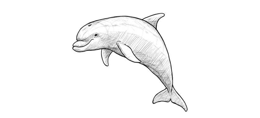
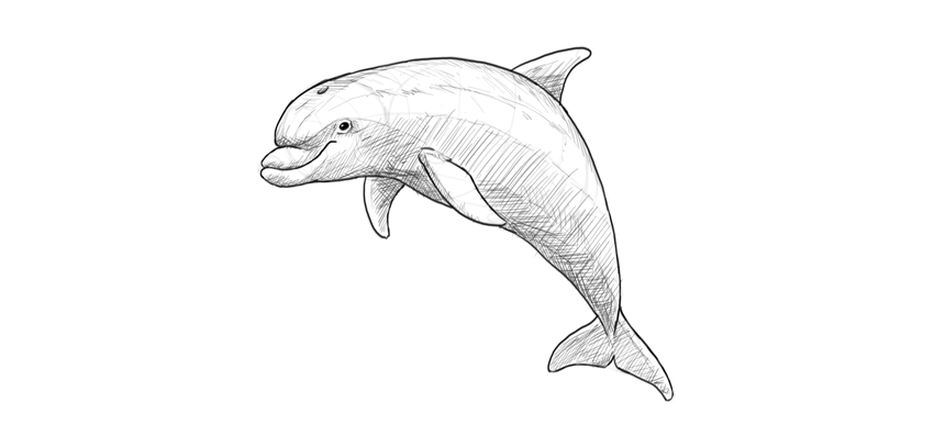
Final product image
What You’ll Be Creating

In this tutorial I will show you how to draw a cute dolphin step by step, from the silhouette and the details of the head to the fins. You will learn how to plan the drawing of an animal body, how to make it look 3D with some basic rules of perspective, and how to shade in a basic way. You can use any tools you want!

Before You Start

It’s important to draw what we see, not what we think we see. So let’s take a look at real dolphins to prepare for the task:

1. How to Draw a Dolphin’s Body

Step 1

Sketch the basic curve of the body.

dolphin body curve

Step 2

Find the middle of this curve. Don’t use any special tools—just estimate it.

dolphin body divide in half

Step 3

Divide each half of the curve into halves. This will help us with proportions.

dolphin body segments

Step 4

Draw a circle in the first quarter of the curve. It doesn’t need to be a perfect circle!

dolphin head sketch

Step 5

Draw an oval across another two quarters. Make it rotated, so that the curve is going right through it.

dolphin torso sketch

Step 6

Draw a row of circles, like beads on a string, until you reach the end of the curve. Make each gradually smaller than the previous one.

dolphin tail thickness
dolphin caudal part
dolphin tail silhouette

Step 7

Let’s add some perspective to the body to make it more realistic. Don’t worry, it won’t hurt! Draw an oval on the front of the head, creating a flat „face”.

dolphin face

Step 8

Cross the face in the middle to see this flatness better.

dolphin face perspective

Step 9

Can you see the form of the body? Draw a line along its side. Remember it’s you who decides where the side is!

dolphin body perspective

Step 10

Draw a line going through the bottom of the body. It must follow the rhythm defined by the side line.

dolphin body bottom

Step 11

Outline the whole form of the body, following this rhythm.

dolphin body outline

Step 12

You can add more form-creating lines along the body. They make it easier to see the depth of the drawing.

dolphin in perspective

2. How to Draw a Dolphin’s Head

Step 1

Draw an oval on the front of the face.

dolphin mouth

Step 2

Draw a small circle attached to that oval.

dolphin snout

Step 3

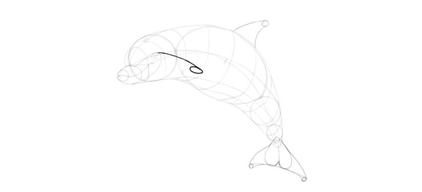
Find the position of the eye with a curve ending with an oval.

dolphin eye position

Step 4

Place the eye inside the oval. It should be shaped like an oval as well.

dolphin eye oval

Step 5

Time for the smile! Cross the small circle on the tip of the mouth with a curve.

dolphin smile

Step 6

From here, draw a curve towards the eye, and turn down right before it.

dolphin smile sketch

Step 7

You now have enough guide lines to outline the details of the head.

dolphin head details

3. How to Draw Dolphin Fins

Step 1

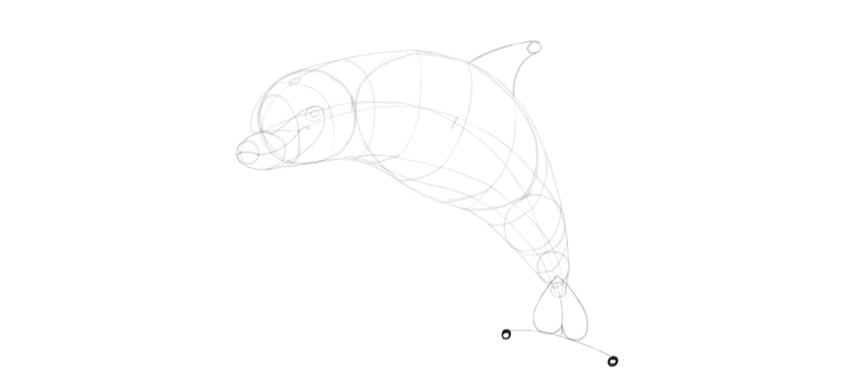
Draw a curve ending with a tiny circle on the back of the dolphin. It should start roughly in the middle of the body.

dolphin dorsal fin

Step 2

Draw a curve between the circle and the body.

dolphin dorsal fin drawing

Step 3

Attach an upside-down „T” to the tail.

dolphin caudal fin

Step 4

Draw an upside-down heart in this area.

dolphin tail fins

Step 5

Draw two tiny circles under the „T”.

dolphin tail caudal fin drawing

Step 6

Outline the shape suggested by the guide lines.

dolphin tail fins how to draw

Step 7

Again, use a curve ended with an oval to find a perfect spot for the pectoral fin.

dolphin pectoral fin position

Step 8

Another curve with a circle will create a part of the outline for the fin.

dolphin flipper sketch

Step 9

The fin is slightly wider than its base. Define this width with a flat curve.

dolphin flipper drawing

Step 10

Now you can outline the whole fin.

dolphin flipper outline

Step 11

Use the same method to draw the other fin.

dolphin pectoral fins
dolphin pair of flippers
dolphin flippers how to draw

4. How to Finish the Drawing of a Dolphin

Step 1

Now you have all the guide lines, so we just need to put the final lines over them. You can take a clean sheet of paper and put it over the sketch if you’re drawing traditionally. You can also try to erase most of the guide lines and darken the ones you want to keep with a darker tool.

Outline the basic lines of the dolphin body.

dolphin body outline

Step 2

Fill the oval of the eye with dark shade, leaving a dot of shine.

dolphin eye

Step 3

Use gentler, lighter strokes to show some less prominent features, like wrinkles of the skin.

dolphin details

Step 4

Gently accentuate the lines of perspective to keep the body 3D.

dolphin 3d body

Step 5

Let’s shade the dolphin now. Imagine the light source over its body and fill the shadowed area with strokes of one direction.

dolphin basic shading

Step 6

To create more levels of shade, change the direction of the strokes.

dolphin cross hatch shading
dolphin simple drawing

Step 7

The perspective guide lines can be turned into rough details on the skin to keep their depth-defining function.

dolphin drawing details

Step 8

Finally, outline the silhouette with dark strokes to make it pop.

dolphin dark outline

Good Job!

You have drawn a cute dolphin! If you want to learn more about these beautiful animals, as well as their relatives, check out this tutorial as well:

how to draw a cute dolphin step by step

50+ Amazing Photo Manipulation Tutorials

Post pobrano z: 50+ Amazing Photo Manipulation Tutorials

Unleash your creativity with a fun photo manipulation. Great for beginners, these tutorials will help you brush up on your Adobe Photoshop skills while learning new and exciting techniques.

Get inspired! Browse Envato Market for incredible Photo Manipulation resources.

Easy Step-by-Step Photo Manipulation Tutorials

Master your favorite photo manipulation techniques with these step-by-step tutorials. From surreal photo manipulations to abstract and even fan art themes, we’ve got a selection you don’t want to miss out on! Get fantastic, easy-to-follow lessons from our Photoshop professionals.

  • Flying Owl Photo Manipulation

    How to Create a Flying Owl Photo Manipulation for Beginners With Photoshop

    Not sure where to begin? Try this beginner photo manipulation tutorial using just three stock photos. Learn how to build a serene forest with this quick tutorial.

    Visit Tutorial

  • Dark Gothic Portrait Photo Manipulation
    How to Create a Dark Gothic Portrait Photo Manipulation With Adobe Photoshop

    Gothic photo manipulations are always hugely popular! In this tutorial, you’ll learn how to create a dark gothic portrait by importing your images while doing some light retouching. Finish by blending them together for a wicked result!

    Visit Tutorial

  • Frankensteins Monster Photo Manipulation
    How to Create a Frankenstein’s Monster Photo Manipulation in Adobe Photoshop

    Create this classic character! Inspired by the 1931 movie, this tutorial shows you how to transform a simple photo into Frankenstein’s famous monster. Learn important techniques for manipulating expressions, as well as how to tackle eerie colors in this fun tutorial.

    Visit Tutorial

  • Cute Baby Dragon Photo Manipulation
    How to Create a Cute Baby Dragon Photo Manipulation in Adobe Photoshop

    What if you could have your very own dragon? Well with this tutorial, you’ll get just that! Create a cute baby dragon as an adorable fantasy pet! Learn how to build the dragon from real animal photos before placing it on a human hand.

    Visit Tutorial

  • Queen of Hearts Photo Manipulation
    How to Create a Queen of Hearts Photo Manipulation With Adobe Photoshop

    In this tutorial, you’ll learn how to create a Queen of Hearts manipulation inspired by the classic movie, Alice in Wonderland. First build the ornamental background, and then add the model and cards!

    Visit Tutorial

  • Dark Surreal Photo Manipulation

    How to Create a Dark Surreal Photo Manipulation in Adobe Photoshop

    One of the best styles of art out there is surreal photo manipulation. And in this tutorial, you’ll get to learn how to compose a dark abstract manipulation. Create a powerful scene that features a man with a tree head in an open, stormy field.

    Visit Tutorial

  • Realistic Feet-Inspired Hiking Boots

    How to Create Realistic Feet-Inspired Hiking Boots in Adobe Photoshop

    Before shoes were ever invented, humans relied on their bare feet to get around. In this tutorial, learn how to create a wacky pair of boots from actual foot images.

    Visit Tutorial

  •  Abstract Psychedelic Portrait Photo Manipulation

    How to Create an Abstract, Psychedelic Portrait Photo Manipulation in Photoshop

    Step out of the box with this psychedelic tutorial. With this photo manipulation, you’ll learn how to create flowy effects using the Liquify Tool in Adobe Photoshop. Explore a unique composition while learning the importance of details.

    Visit Tutorial

  • Howling Werewolf Photo Manipulation

    How to Create a Howling Werewolf Photo Manipulation in Adobe Photoshop

    Based on the 80s classic, An American Werewolf in London, this tutorial takes you along the journey of creating a custom werewolf design. Create a ferocious effect with simple images in this fun tutorial.

    Visit Tutorial

  • Fantasy Sci-Fi Portrait Photo Manipulation

    How to Create a Fantasy, Sci-Fi Portrait Photo Manipulation in Adobe Photoshop

    This tutorial is a fabulous mix of fantasy and sci-fi! You’ll learn amazing techniques for achieving a galactic fantasy portrait. Create an exceptional result that blends a model’s photo into a colorful space background.

    Visit Tutorial

  • Apocalypse-Inspired Photo Manipulation

    How to Create an Apocalypse-Inspired Photo Manipulation in Adobe Photoshop

    Are you a huge fan of the X-Men movies? In this tutorial, learn how to create the infamous Apocalypse character from the comic. Use a mixture of photo manipulation and digital painting techniques for one awesome super-villain.

    Visit Tutorial

  • Dragon Landscape Photo Manipulation

    How to Create a Dragon Landscape Photo Manipulation With Adobe Photoshop

    Dive into a fantasy world full of beautiful dragons with this fun photo manipulation. In this tutorial, you’ll learn how to create a misty mountainous landscape with a flying dragon in the background. 

    Visit Tutorial

  • Devastating Twister With Photo Manipulation

    Create a Devastating Twister With Photo Manipulation Techniques

    Mother Nature is known for wreaking havoc upon the earth. And you can illustrate this easily with this simple twister photo manipulation. Create a devastating effect that combines several photos for an intense look.

    Visit Tutorial

  • Winter Landscape Photo Manipulation

    How to Create a Winter Landscape Photo Manipulation With Adobe Photoshop

    Stay warm as you tackle this wintry landscape. In this tutorial, you’ll be able to build a cohesive landscape scene by combining several winter photos. Use Adjustment Layers, Masks, and more to complete this winter wonderland.

    Visit Tutorial

  • Endless Picture Within a Picture Illusion

    How to Create an Endless Picture Within a Picture Illusion in Adobe Photoshop

    Test out your Photoshop skills with an exciting optical illusion! Create a mind-boggling experience with this endless photo illusion that uses a simple picture frame to achieve the effect.

    Visit Tutorial

  • Surreal Photo Manipulation in Adobe Photoshop

    How to Create a Surreal Photo Manipulation in Adobe Photoshop

    The possibilities are endless with creative photo manipulations. And in this tutorial, you’ll learn how to combine several sky photos to create a surreal background perfect for a realistic light portal.

    Visit Tutorial

  •  Glamorous Calavera Portrait in Adobe Photoshop

    How to Create a Glamorous Calavera Portrait in Adobe Photoshop

    Calaveras are gorgeous skull portraits used to celebrate the Mexican holiday, the „Day of the Dead.” And you can create a glamorous portrait of your own with this easy-to-follow Photoshop tutorial.

    Visit Tutorial

  •  How to Create a Mermaid in Adobe Photoshop

    How to Create a Mermaid in Adobe Photoshop

    Learn how to turn your vacation photos into stunning mermaid portraits! This fun tutorial shows you how to create a realistic mermaid effect using just two stock photos!

    Visit Tutorial

  • Emotional Molten Shattered Statue

    How to Create an Emotional, Molten, Shattered Statue in Photoshop

    Or give our most popular photo manipulation tutorial a try! In this tutorial, learn how to take a regular stock photo and transform it into a statue. Then combine amazing molten effects for an explosive, emotional scene.

    Visit Tutorial

  • Create Origami Birds Using One Dollar Bills

    How to Create Origami Birds Using One Dollar Bills in Adobe Photoshop

    Origami takes impeccable skill. It’s a cool paper folding technique that has been around for many years. And in this tutorial, you’ll learn how to create an origami bird using stocks of any currency. 

    Visit Tutorial

  • Floral Portrait Photo Manipulation

    How to Create a Floral Portrait Photo Manipulation in Adobe Photoshop

    Add lovely flowers to your favorite selfies! In this tutorial, you’ll learn how to use the Liquify Tool as well as basic photo manipulation techniques to create an extraordinary portrait.

    Visit Tutorial

  • Fantasy Landscape Photo Manipulation

    How to Create a Fantasy Landscape Photo Manipulation in Adobe Photoshop

    Take the afternoon to build a fantasy landscape in Adobe Photoshop. In this tutorial, you’ll learn advanced blending techniques in order to create inspiring compositions, color tones, and so much more!

    Visit Tutorial

  • Abstract Portrait Photo Manipulation

    Create an Abstract Portrait Photo Manipulation With Adobe Photoshop

    Enhance your Photoshop knowledge with this abstract photo manipulation. This tutorial shows you how to take abstract elements and combine them with several stock images. Learn how to use Adjustment Layers, Masks, and Brushes to create an epic effect.

    Visit Tutorial

  • How to Make Someone Look Older

    How to Make Someone Look Older in Adobe Photoshop

    You can’t prevent age from happening. And in this tutorial, we explore how to add aging to the face with incredible photo manipulation techniques. Add age spots, wrinkles, and more with a few simple tools in Photoshop.

    Visit Tutorial

  •  Vibrant Fantasy Lake Scene With Adobe Photoshop

    Create a Relaxing, Vibrant, Fantasy Lake Scene With Adobe Photoshop

    Explore your zen side with this relaxing photo manipulation. This tutorial shows you how to create a vibrant fantasy lake scene using Adjustment Layers and the Displacement Map settings in Adobe Photoshop.

    Visit Tutorial

  • Beautiful Abstract Portrait in Photoshop

    How to Create a Beautiful Abstract Portrait in Photoshop

    Create an artistic portrait that is sure to impress! In this Photoshop tutorial, you’ll learn how to apply brilliant ornamental images to a glamorous photo.

    Visit Tutorial

  • Energetic Paint Splashing Effect

    How to Create an Energetic Paint Splashing Effect in Adobe Photoshop

    Splash around with this energetic tutorial. Inspired by trendy sneaker ads, this tutorial shows you how to apply several acrylic paint splashes to a colorful shoe. Learn how to blend them together using Layer Blend Modes and so much more!

    Visit Tutorial

  • City Destruction Scene Photo Manipulation

    Create a City Destruction Scene Photo Manipulation in Adobe Photoshop

    Cause destruction with this extensive Photoshop tutorial. This tutorial shows you how to destroy a city with broken and damaged elements. You’ll also learn simple tips to make your city look more grunge for a realistic effect.

    Visit Tutorial

  • Turn a Landscape Photograph Into an Isometric Icon

    How to Turn a Landscape Photograph Into an Isometric Icon in Adobe Photoshop

    Create custom isometric icons with just a few simple steps! This tutorial shows you how to create a 3D isometric map using only basic landscape photos. No 3D software is required.

    Visit Tutorial

  • Abstract Vietnamese Woman Portrait

    How to Create an Abstract Vietnamese Woman Portrait in Adobe Photoshop

    Learn about traditional Vietnamese culture in this Photoshop tutorial. Build a background first using various textures before importing the model and bamboo elements. Create a fantastic design today!

    Visit Tutorial

  • Trendy Double Exposure Effect in Adobe Photoshop

    Make a Trendy Double Exposure Effect in Adobe Photoshop

    The double exposure photo effect is one of the hottest trends going around today. And you can achieve an amazing result of your own with the help of this Photoshop tutorial.

    Visit Tutorial

  • Hot Air Balloon Scene From The Wizard of Oz

    Create a Hot Air Balloon Scene From The Wizard of Oz in Adobe Photoshop

    Inspired by the classic movie, The Wizard of Oz, this tutorial teaches you how to create an iconic hot air balloon scene. Work with Photoshop’s 3D tools to create a dream-like photo manipulation.

    Visit Tutorial

  • Fantasy Landscape Matte Painting

    Create a Fantasy Landscape Matte Painting in Adobe Photoshop

    Ever wanted to create a matte painting? Learn how in this awesome tutorial. Start with the initial concept and sketch before diving into the details to create a fantasy landscape we’re sure you’ll love!

    Visit Tutorial

  • Sci-Fi Outer Space Scene With Adobe Photoshop

    How to Create a Sci-Fi Outer Space Scene With Adobe Photoshop

    Blast into space with this Photoshop tutorial! In this tutorial, you’ll learn how to create a space background from scratch as well as how to make a simple planet.

    Visit Tutorial

  • Fantasy Flaming Deer With Adobe Photoshop

    How to Create a Fantasy Flaming Deer With Adobe Photoshop

    Create an impressive flaming deer using basic photo manipulation techniques. In this tutorial, you’ll learn how to work with fire to create this fiery effect. 

    Visit Tutorial

  • Dory-Inspired Photo Manipulation

    How to Create a Dory-Inspired Photo Manipulation in Adobe Photoshop

    Finding Nemo is a family favorite everyone loves! And in this tutorial, you can create that same fantastic charm by creating the character Dory from the movie. Learn how to make your fictional character look real by incorporating actual fish images.

    Visit Tutorial

  • Elephant Sundae Using Photo Manipulation Techniques

    Create an Elephant Sundae Using Photo Manipulation Techniques

    Elephants are known for their wisdom and exceptional contorting skills! In this wacky tutorial, learn how to stuff an elephant into a giant sundae cup using basic photo manipulation techniques.

    Visit Tutorial

  • Gothic Crow Lady Photo Manipulation

    How to Create a Gothic Crow Lady Photo Manipulation With Adobe Photoshop

    Command a flock of crows with this powerful photo manipulation. Build the scene from the floor up with a custom surreal background, elegant wardrobe, and so much more!

    Visit Tutorial

  • Fantasy Fairy Photo Manipulation

    How to Create a Fantasy Fairy Photo Manipulation With Adobe Photoshop

    Fairies are a popular subject for many fantasy manipulations. And with this tutorial, you’ll learn how to create a colorful flowery background, incredible lighting effects, and enhanced depth of field.

    Visit Tutorial

  • Apocalypse Angel Photo Manipulation

    How to Create an Apocalypse Angel Photo Manipulation Scene With Adobe Photoshop

    Photo manipulations are a great way to shape your own original characters. In this tutorial, learn how to create a post-apocalyptic scene with an angel warrior in Photoshop.

    Visit Tutorial

  • Fun Underwater Photo Manipulation

    How to Create a Fun Underwater Photo Manipulation With Adobe Photoshop

    Go for a swim with this fun underwater manipulation. This Photoshop tutorial features a creative look at a surrealistic underwater scene. Learn cool tricks like painting bubbles and more!

    Visit Tutorial

  • Create a Pearl Necklace With the Mixer Brush

    Photoshop in 60 Seconds: Create a Pearl Necklace With the Mixer Brush in Photoshop

    Add your favorite types of jewelry to your own images in seconds! In this quick video, learn how to create a string of pearls using Adobe Photoshop’s Mixer Brush Tool.

    Visit Tutorial

  • Fantasy Snail Photo Manipulation

    How to Create a Fantasy Snail Photo Manipulation With Adobe Photoshop

    Snails need homes too! Create a tiny fantasy scene of a snail carrying a house in Adobe Photoshop. Blend several nature stocks together for a dreamy effect!

    Visit Tutorial

  • Desolate Wasteland in Adobe Photoshop

    How to Create a Desolate Wasteland in Adobe Photoshop

    Or give this desolate wasteland tutorial a shot! In this tutorial, learn how to build the environment, add cracks to the road, and add the rest of the broken-down elements for a realistic wasteland scene.

    Visit Tutorial

  •  Easy Rippled Reflection in Adobe Photoshop

    How to Create an Easy Rippled Reflection in Adobe Photoshop

    Add more drama to your photos with an easy ripple effect! This tutorial shows you the step-by-step process to achieve this effect with fiber textures and filters.

    Visit Tutorial

  •  Fantasy Photo Manipulation in Adobe Photoshop

    How to Create a Fantasy Photo Manipulation in Adobe Photoshop

    Voyage into a new world with this fantasy photo manipulation. Create a unique pathway scene using simple assets. Then treat your images with new lights and colors for a cohesive result.

    Visit Tutorial

  • Moonlight Scene Photo Manipulation

    How to Create a Moonlight Scene Photo Manipulation With Adobe Photoshop

    This photo manipulation tutorial is what romance novels are made of. Create a romantic moonlit scene with an elegantly dressed woman and vibrant flowers.

    Visit Tutorial

  • Dark Lady Photo Manipulation

    How to Create a Dark Lady Photo Manipulation With Adobe Photoshop

    Conjure up a spell with this photo manipulation. In this tutorial, you’ll learn how to compose a dark and eerie atmosphere perfect for any Halloween poster or graphic.

    Visit Tutorial

  • Floral Sugar Skull Photo Manipulation

    How to Create a Floral Sugar Skull Photo Manipulation With Adobe Photoshop

    Celebrate Dia de los Muertos with style. Try this beginner photo manipulation to dress up a sacred skull with flowers, colorful decorations, and makeup.

    Visit Tutorial

  • Dark Batman Photo Manipulation

    How to Create a Dark Batman Photo Manipulation in Adobe Photoshop

    Or call on a superhero to help you with your Photoshop needs. In this fun tutorial, try out this epic fan art photo manipulation featuring the one and only Batman.

    Visit Tutorial

  • Mysterious Forest Scene With Adobe Photoshop

    How to Create a Mysterious Forest Scene With Adobe Photoshop

    Last but not least, create a mysterious forest with the help of a few photos. Build an incredible atmosphere using Adjustment Layers, Layer Blend Modes, and more!

    Visit Tutorial

Conclusion

I hope this list has inspired you to take on a new photo manipulation challenge today! Find incredible Premium Stocks for all your photo manipulation needs only on Envato Market.

Want to be featured? Then share your results with us! After you complete one of these tutorials, don’t forget to post it into the comments section for the chance to be featured in our monthly Community Challenge right here on Envato Tuts+.

Let us know your favorites in the comments and tell us which tutorials you would like to see next!

25+ Logo and Branding Mockups

Post pobrano z: 25+ Logo and Branding Mockups

Stand out in any market with professional branding mockups. Enjoy this fantastic collection of professional mockup templates designed to highlight your work in its best light.

25+ Logo and Branding Mockups

Images rule the internet. They satisfy our short attention spans by filling our minds with satisfying visuals. And you can win over any client by harnessing this important marketing angle with a product mockup.

A
product mockup is a template created with professional images to display your logo, brand, or design. And you can easily insert your work into editable smart
objects to preview your designs on any product.

Today we present you with
over 25 incredible branding and logo mockups curated from GraphicRiver and Envato Elements.

Need a custom mockup for your business? Enlist the help of a professional from Envato Studio for all your branding needs. And let us know your favorites in the comments below!

Stationery / Branding Mock-Up Bundle

Let’s kick things off with this super luxurious branding bundle. Included in this download are 25 high-quality items you can easily change for an effective marketing campaign. With eight premade scenes, separated object layers, and advanced lighting, this powerful bundle will blow any client away. 

Stationery  Branding Mock-Up Bundle

50 Signs Mockups

A brilliantly designed sign will make anyone notice you. So take advantage of these gorgeous designs with this pack of 50 professional sign mockups. It includes a wide variety of signs to choose from, with high-quality surroundings and elegant buildings.

50 Signs Mockups

Logo Mockup

Sell your premium logo services to loyal customers with this wicked mockup bundle. Inspired by several real-life brand scenarios, this download includes eight Photoshop templates that allow for fast editing. And with a detailed user guide on hand, you’re bound for success with this amazing template.

Logo Mockup

Alternative Logo Mockups Vol.01

Need a cool way to display your professional logo work? Then check out this awesome mockup set. This set features six realistic logo mockups with interesting backgrounds to choose from. An additional help file is available if you need more instruction.

Alternative Logo Mockups Vol01

Craft Beer Package & Branding Mock-up – Vintage

Complement a beautiful craft beer with a gorgeous brand label. This product mockup features ten original Photoshop files with eight branding mockups and three different bottles. Utilize the six background textures included, or switch it out for a custom solid color.

Craft Beer Package  Branding Mock-up - Vintage

Cafe Branding Mockup

Take advantage of a professional mockup template to display your brand on several objects. This template, for example, features a delightful cafe theme with 14 Photoshop files. Explore the different angles available and easily customize the scene even further in Photoshop.

Cafe Branding Mockup

Branding / Identity Mockup

With over 1,700 sales, it’s no wonder why this identity mockup is a top seller! A sleek design that features a clean color palette, this template includes 12 presentations conveniently laid out in their own Photoshop files. Download today to present your work in an elegant way!

Branding  Identity Mockup

Coffee Branding Mockup

Bring
the refreshing warmth of a morning cup of joe to your business. This
product mockup features 12 professional photography scenes with a clean
coffee theme. Each scene is ready to use, and you can easily transfer
your brand images with flexible smart objects.

Coffee Branding Mockup

Office Interior Branding Mockups

Rock your next presentation with an impressive interior mockup. Designed specifically to present your work within a welcoming office interior, this template features nine premade scenes for an outstanding composition. Also included is an awesome logo simulator to make your logos 3D!

Office Interior Branding Mockups

Food Box Branding Mockup

Dinner, anyone? Show off your creativity for unique package design with this beautiful food box mockup. Created with real photography, this template features eight realistic scenes with an Asian takeout theme. Just paste your design onto the marked layer to enjoy your work in seconds!

Food Box Branding Mockup

Corporate Logo Mockups V1

It’s the subtle details that inspire clients to hire you as their designer. And this corporate mockup creates a clear vision with the logo as the centerpiece. Create an exciting elevator detail with five premade mockup files at high resolutions. Incorporate unique lighting effects and more for one cohesive presentation.

Corporate Logo Mockups V1

3D Signage Mockups

Help your clients visualize their business with a beautiful 3D sign. This wonderful template turns their logo into a glorious 3D sign that’s highly detailed. Enjoy ten Photoshop files complete with organized layers, high-resolution images, and more!

3D Signage Mockups

Van & Delivery Cars Branding Mockup

Professional car decals are an exciting way to elevate your current marketing strategy. And in this set you get access to five high-quality van and delivery cars that are printable on a standard A4 sheet. Change the background to one you prefer or keep the original for a seamless design.

Van  Delivery Cars Branding Mockup

Corporate Identity – Branding Mockups

Establish an instant sense of professionalism with this divine corporate identity mockup. Included in this download are 19 Photoshop files with everything you need to impress your clients. Enjoy fabulous letterheads, company signs, and more, for an incredible professional package.

Corporate Identity - Branding Mockups

Cupcake Mockup

Got a sweet tooth? Explore your love of cupcakeries with this super cute cupcake mockup. Ideal for any bakery owner, this template includes high-quality photography with business cards, cupcake toppers, and even a carton box. Peruse the 11 realistic mockups to find one that fits your brand.

Cupcake Mockup

Glasses Logo Mockup

One quick way to boost a restaurant or bar business is to add a signature logo to your glassware. And with this mockup template you can do just that! With this high-quality Photoshop file that allows you to control the shadows, you can easily preview your designs on a refreshing casual beverage.

Glasses Logo Mockup

Burger Store Mockup Creator

Or give this delicious burger mockup a shot! Created to showcase your branding on generic fast food packaging, this template features nine amazing scenes with a variety of paper textures. It works perfectly at multiple angles and looks great in both isometric and top view perspectives.

Burger Store Mockup Creator

Coffee With Cocoa Logo Mockup

Coffee baristas are super skilled with some espresso and milk. And you can achieve that famous coffee art effect with this delightful logo mockup. This template features four Photoshop files with four distinct angles to choose from.

Coffee With Cocoa Logo Mockup

Wax Seal Logo Mockup

Wax seals remind us of that romantic time in history when everything was written by hand. And you can emulate the look of a wax seal for your business with this awesome logo mockup. Included in this template is one Photoshop file you can quickly modify. Change the colors easily by experimenting with the Hue slider for more options.

Wax Seal Logo Mockup

3D Logo Mockup – 5 Styles

3D effects have a way of making your logos look more stylish and professional. And with this logo mockup, you get to enjoy five amazing styles that are all well organized with fully editable layers. Simply double-click a smart object layer to insert your logo before saving! It’s really that simple!

3D Logo Mockup - 5 Styles

Stationery / Branding Mockup

The secret to selling your work as a graphic designer is to enlist the help of a stationery mockup. This particular template includes 14 incredible presentations all in one convenient Photoshop file. Easily edit the layers to fit your project for an amazing photo-realistic finish.

Stationery  Branding Mockup

Store Logo Mockups

Bring your designs to life with exciting store mockups. This template features five Photoshop files that will automatically correct the angle of your logo to fit the side of the building. Create a winning combination that is sure to get you tons of referrals!

Store Logo Mockups

Chocolate Bar Packaging Mockup

Create a brand package you don’t have to spend too much time on! This wonderful package features two packaging types with 18 professional presentations to choose from. Experiment with the reflection and shadows for more realism, or change the background to one you prefer.

Chocolate Bar Packaging Mockup

Logo Label Mock-Up Set

Display the behind-the-scenes details of your business with this glorious label mockup. This template places your branding on a rustic label design and features seven high-quality presentations with more angles. Available for Photoshop CS4 and after, this template also includes a help file for more instruction.

Logo Label Mock-Up Set

Four 3D Logo Mockups

Create
a stunning logo that glistens in all its 3D glory. This premium mockup
template features four high-quality logo scenes to present your brand in
a fabulously unique way. It’s great for beginners to design, and you can enjoy a
professional result for one low price!

Four 3D Logo Mockups

Logo Mockup Set

And before you go, check out this brilliant bundle of logo mockups! Shot at different angles, this template includes 11 Photoshop files that are super easy to edit. Simple drag and drop your logo into the appropriate smart object and presto! You’ve got a beautiful logo display in no time!

Logo Mockup Set

Conclusion

This list is jam-packed with exciting resources for the avid designer
familiar with Photoshop and more. If you need additional
help creating custom branding mockups, enlist the skills of a talented
professional by choosing one of the amazing designers from Envato Studio.

And with thousands of logo and branding mockups to choose from, chances are we’ve missed a few to add to your personal collection. Be sure to browse Envato Market and Envato Elements for more resources, and let us know your favorites in the comments below!

Dyslexic Sperm Bank – made by dyslexia

Post pobrano z: Dyslexic Sperm Bank – made by dyslexia

Made by Dyslexia, a new not-for-profit launched this month by dyslexic entrepreneur Richard Branson, is changing the world’s perception of dyslexia through the Dyslexic Sperm Bank in central London. No one left with a dyslexic baby, but everyone left with a new perception of dyslexia. Hidden cameras captured the public’s reactions. In 3 days, the stunt reached 77 million and changed the world’s perception of dyslexia. Research in the UK shows that 80% of the population think dyslexia is a disability. One in ten people are dyslexic, accounting for more than 6.5 million people in the United Kingdom yet only 3% of people think it is a positive trait (YouGov research 2017). Posters in the store and online at madebydyslexia.org feature famous dyslexic men (where are the women?) who rose to greatness. From Albert Einstein to Henry Ford, Steve Jobs to Thomas Edison and Alexander Graham Bell, George Washington to Leonardo da Vinci and The Wright Brothers, dyslexics have made the modern world. The Made by Dyslexia logo is a matrix of nine coloured dots. The organisation’s “Connecting the Dots” report highlights key facts about dyslexia, combining a summary of what we already know, with new research into dyslexic thinking skills.

Dyslexic Sperm Bank

Richard Branson explains the thinking behind the Dyslexic Sperm Bank:

“And why the Sperm Bank? Well, some sperm banks haven’t let dyslexics donate until very recently, and have even described dyslexia as a “neurological disease”. Now, some progress has been made. We have been working with The London Sperm Bank, which now does accept donations from people with dyslexia.”

Dyslexic Richard Branson
Dyslexic Albert Einstein

Dyslexic Sperm Bank Credits

The Dyslexic Sperm Bank campaign was developed at Y&R London by executive creative director Jonathan Burley, creative director Psembi Kinstan, art director/copywriter George Robb, business director Claudia Newman, account director Lou De Keyzer, agency producers Megan O’Hagan and Adrienn Major, head of strategy Tamsin Djaba, and junior strategist Jenika Haipour.

Filming was shot by directors and art directors Ben Hanson and Simon Frost via Praxima with producers Sam Barlow and Zoe Barlow. Editors were Jude Moore and Ashley Joiner. Post production and sound was done at Hogarth by producers Robson Yeo and Fiona Winburn. Music was produced at Native by composer Joe Skinner and producer Dan Neale.

How to Create a Sketch Effect Action in Adobe Photoshop

Post pobrano z: How to Create a Sketch Effect Action in Adobe Photoshop

Final product image
What You’ll Be Creating

In this tutorial you will learn how to turn your photos into amazing, advanced sketches. I will try to explain everything in so much detail that everyone can create it, even those who have just opened Photoshop for the first time.

The effect shown on the left is the one I will show you how to create here in this tutorial. If you would like to create the effect shown on the right, a sketch with a paint effect, and just using a single click, then check out my TechnicalArt Photoshop Action.

Action final results

What You’ll Need

To recreate the design above, you will need the following photo:

1. Let’s Get Started

First, open the photo that you want to work with. To open your photo, go to File > Open, choose your photo, and click Open. Now, before we get started, just check a couple of things:

  1. Your photo should be in RGB Color mode, 8 Bits/Channel. To check this, go to Image > Mode.
  2. For best results, your photo size should be between 1500–4000 px wide/high. To check this, go to Image > Image Size.
  3. Your photo should be the Background layer. If it is not, go to Layer > New > Background from Layer.
  4. To make some auto-corrections to your photo tone, contrast, and color, go to Image > Auto Tone, Image > Auto Contrast and then Image > Auto Color.

Checking image size mode and making auto corrections

2. How to Create the Background

For the background we are going to use a solid color fill. Go to Layer > New Fill Layer > Solid Color to create a new solid color fill layer, name it ’Background Color’ and enter the settings below:

Creating new solid color fill layer

3. How to Create the Base Sketch

Step 1

Now we are going to create the base sketch. Select Background layer and go to Layer > New > Layer Via Copy to duplicate the Background layer and then drag that new layer to the top of the layers in the Layers panel. Press D on your keyboard to reset the swatches and go to Filter > Filter Gallery > Sketch > Photocopy and choose the settings below:

Adding the sketch photocopy filter

Step 2

Name this layer Base Sketch and change its blending mode to Multiply.

Renaming layer to Base Sketch and changing its blending mode

4. How to Create a Draft Sketch

Step 1

Now we are going to create a draft sketch. Go to Layer > New > Layer Via Copy to duplicate the Base Sketch layer. Pick the Lasso Tool (L), click anywhere inside the canvas, choose Free Transform, and increase the width and height to 105% as shown below:

Transforming draft sketch layer

Step 2

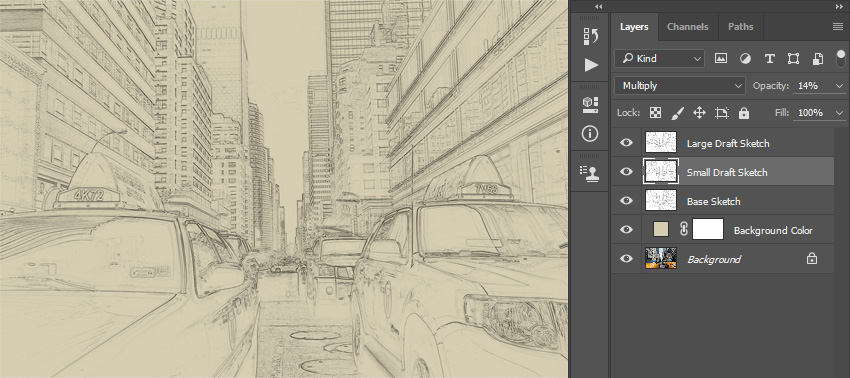
Name this layer Large Draft Sketch and set its Opacity to 14%.

Renaming layer to Large Draft Sketch and changing its opacity

Step 3

Select the Base Sketch layer and go to Layer > New > Layer Via Copy to duplicate the Base Sketch layer again. Pick the Lasso Tool (L), click anywhere inside the canvas, choose Free Transform, and decrease the width and height to 95% as shown below:

Transforming draft sketch layer

Step 4

Name this layer Small Draft Sketch and set its opacity to 14%.

Renaming layer to Small Draft Sketch and changing its opacity

5. How to Create a Rough Sketch

Step 1

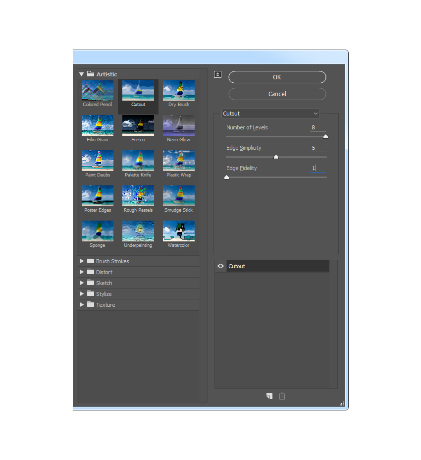
Now we are going to create a rough sketch. Select the Background layer and go to Layer > New > Layer Via Copy to duplicate the Background layer, and then drag that new layer to the top of the layers in the Layers panel. Go to Filter > Filter Gallery > Artistic > Cutout and choose the settings below:

Adding the artistic cutout filter

Step 2

Go to Filter > Stylize > Find Edges and then go to Image > Adjustments > Desaturate.

Stylizing and desaturating layer

Step 3

Name this layer RS_1, change its blending mode to Color Burn, and drop its Opacity to 30%.

Renaming layer to RS_1 and changing its blending mode and opacity

Step 4

Now we are going to create more rough sketch layers using the same method. So repeat Step 1 and Step 2 in this section, but in Step 1 instead of using the settings we used the previous time, use the new settings below:

Adding the artistic cutout filter

Step 5

Name this layer RS_2, change its blending mode to Color Burn, drop its Opacity to 25%, and drag it under the RS_1 layer to keep the proper layer order.

Renaming layer to RS_2 and changing its blending mode opacity and order

Step 6

Repeat again Step 1 and Step 2 in this chapter, but in Step 1 instead of using the settings we used previously, use the new settings below:

Adding the artistic cutout filter

Step 7

Name this layer RS_3, change its blending mode to Color Burn, drop its Opacity to 20%, and drag it under the RS_2 layer to keep the proper layer order.

Renaming layer to RS_3 and changing its blending mode opacity and order

Step 8

Repeat again Step 1 and Step 2 in this chapter, but in Step 1 instead of using the settings we used previously, use the new settings below:

Adding the artistic cutout filter

Step 9

Name this layer RS_4, change its blending mode to Color Burn, drop its Opacity to 20%, and drag it under the RS_3 layer to keep the proper layer order.

Renaming layer to RS_4 and changing its blending mode opacity and order

Step 10

Repeat again Step 1 and Step 2 in this chapter, but in Step 1 instead of using the settings we used previously, use the new settings below:

Adding the artistic cutout filter

Step 11

Name this layer RS_5, change its blending mode to Color Burn, drop its Opacity to 18%, and drag it under the RS_4 layer to keep the proper layer order.

Step 12

Repeat again for the last time Step 1 and Step 2 in this chapter, but in Step 1 instead of using the settings we used previously, use the new settings below:

Adding the artistic cutout filter

Step 13

Name this layer RS_6, change its blending mode to Color Burn, drop its Opacity to 7%, and drag it under the RS_54 layer to keep the proper layer order.

Renaming layer to RS_6 and changing its blending mode opacity and order

Step 14

Now we are going to group all these rough sketch layers. While the layer RS_6 is selected, Shift-click on the RS_1 layer to select these two layers and all other layers between them. Then go to Layer > New > Group from Layers to create a new group from the selected layers and name it Rough Sketch.

Creating new group from selected layers named Rough Sketch

6. How to Create Shading

Step 1

Now we are going to create some subtle shading. Select the Background layer and go to Layer > New > Layer Via Copy to duplicate the Background layer, and then drag that new layer to the top of the layers in the Layers panel. Go to Filter > Stylize > Find Edges and then go to Image > Adjustments > Desaturate.

Stylizing and desaturating layer

Step 2

Go to Filter > Filter Gallery > Brush Strokes > Angled Strokes and select the settings below:

Adding the brush strokes angled strokes filter

Step 3

Name this layer Shading_1, change its blending mode to Multiply, and drop its Opacity to 12%.

Renaming layer to Shading_1 and changing its blending mode and opacity

Step 4

Now repeat Step 1 in this chapter, and then go to Filter > Brush Strokes > Crosshatch and enter the settings below:

Adding the brush strokes crosshatch filter

Step 5

Name this layer Shading_2, change its blending mode to Multiply, drop its Opacity to 5%, and drag it under the Shading_1 layer to keep the proper layer order.

Renaming layer to Shading_2 and changing its blending mode and opacity

7. How to Add Noise

Step 1

In this step we are going to add some noise to our sketch. Select the Shading_1 layer and go to Layer > New > Layer to create a new layer and name it Noise.

Creating new layer named Noise

Step 2

Now press D on your keyboard to reset the swatches, go to Edit > Fill and enter the settings below:

Filling Noise layer with foreground color

Step 3

Go to Filter > Noise > Add Noise and choose the settings below:

Adding noise filter to the noise layer

Step 4

Now change this layer blending mode to Screen and drop its Opacity to 64%.

Changing Noise layer blending mode and opacity

8. How to Create the Color Look

Step 1

Now we are going to add a nice color look to our sketch. Go to Layer > New Adjustment Layer > Curves to create a new curves adjustment layer and name it Color Look.

Creating new curves adjustment layer

Step 2

Double click on this layer thumbnail and enter the following settings:

Changing settings of Color Look layer

9. How to Make the Final Adjustments

Step 1

Now we are going to make final adjustments to our sketch. Go to Layer > New Adjustment Layer > Photo Filter to create a new photo filter adjustment layer and name it Photo Tint.

Creating new photo filter adjustment layer

Step 2

Double click on this layer thumbnail and select the following settings:

Changing settings of Photo Tint layer

Step 3

Now we are going to add contrast. Press D on your keyboard to reset the swatches and go to Layer > New Adjustment Layer > Gradient Map to create a new gradient map adjustment layer and name it Overall Contrast.

Creating new gradient map adjustment layer

Step 4

Change this layer blending mode to Soft Light and drop the Opacity to 18%.

Changing overall contrast layer blending mode and opacity

Step 5

Now we are going to add vibrance and saturation. Go to Layer > New Adjustment Layer > Vibrance to create a new vibrance adjustment layer and name it Overall Vibrance/Saturation.

Creating new vibrance adjustment layer

Step 6

Double click on this layer thumbnail and choose the following settings:

Changing settings of Overall VibranceSaturation layer

Step 7

Now we are going to boost the highlights slightly. Go to Layer > New > Levels to create a new levels adjustment layer and name it Overall Brightness.

Creating new levels adjustment layer

Step 8

Double click on this layer thumbnail and choose the following settings:

Changing settings of Overall Brightnes layer

Step 9

Now we are going to add sharpening. Press Control-Alt-Shift-E on your keyboard to make a snapshot. Go to Filter > Other > High Pass and enter the settings below:

Adding high pass filter

Step 10

Name this layer Overall Sharpening, change its blending mode to Hard Light, and drop the Opacity to 76%.

Renaming layer to overall sharpening and changing its blending mode and opacity

You Made It!

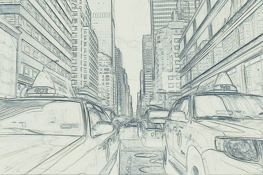
Congratulations, you have succeeded! Here is our final result:

Final result

Customize Your Results

You can now customize the final effect. I will give you a few tips:

  • Select the Background Color layer, double-click on its thumbnail, and inside the Color Picker panel choose some other color. Click OK.
  • Select some of the sketch layers and play with their opacities to create different sketch effects.
  • Select the Color Look layer, double-click on its thumbnail, and inside the Properties panel change the settings for a different color look.
  • Select the Photo Tint layer, double-click on its thumbnail, and inside the Properties panel change the settings for a different color look.
  • Select the layer Overall Contrast and change its opacity to adjust the contrast.
  • Select the layer Overall Vibrance/Saturation, double-click on its thumbnail, and inside the Properties panel play with the Vibrance and Saturation values to create different results.
  • Select the layer Overall Brightness, double-click on its thumbnail, and change the settings to adjust the brightness.
  • Select the layer Overall Sharpening, and change its opacity to adjust the amount of sharpening.

Here is what I got:

Customized final result

Awesome Work!

If you would like to create an even more advanced sketch with a paint effect as shown below, and just by using a single click, then check out my TechnicalArt Photoshop Action.

Action final result

The action works so that you just brush over the areas that you want to remain in paint, play the
action, and the action will do everything for you, giving you fully
layered and customizable results. 

Every time you run the action, you will get a unique paint variation even if you use the same brushed area. The action will create 15 preset
color looks for you, as well as canvas, halftone, and grid textures. It comes with a detailed video tutorial that demonstrates how to use and customize the look of your action to get the most out of the effect.

Action final results