
Archiwum miesiąca: maj 2017

Burns and Smiles Halloween addresses stigma
Post pobrano z: Burns and Smiles Halloween addresses stigma
French not-for-profit Burns and Smiles and TBWA\Paris have won a Yellow Pencil for film at the D&AD Awards, in recognition of “Halloween”, a commercial designed to sensitize the general public to the fight of the burners to change the gaze of the others in everyday life. With a view to heightening the general public’s awareness and helping burns victims step out of the shadows, we relate the story of one such individual, who we join for one very special evening. The film demonstrates the extent to which other people’s attitudes and sense of acceptance are two of the keys to coaxing burns victims out of isolation and putting a smile back on their faces, much more than just once a year.

Burns and Smiles explain the thinking behind the Halloween film:
“The production of the short film, by Nicolas Galoux, allows us to imagine the anguish that the burned feel when they leave their house. He has established a game between disguise and truth. The one actor, Boris Ravaine, is not himself burnt. It was therefore necessary to work on realistic makeup, especially in the treatment of the ears which is particularly successful and very close to reality. All the reactions of the characters in the film are authentic, yet they reflect behaviors that have nothing to do with the daily reality of the burned. While Halloween leaves room for monsters and horror, it is the only day that this man is “a normal guy among normal guys”!
Burns and Smiles Halloween Credits
The Burns and Smiles Halloween campaign was developed at TBWA\France, Paris, by executive creative directors Benjamin Marchal and Faustin Claverie, art directors Lena Monceau and Julia Deshayes, head of production Isabelle Dray, managing director Luc Bourgery, working with CEO and Co-Founder Laurent Gaudens.
Filming was shot by director Nicolas Galoux via TBWA\Else with actor Boris Ravaine, producers Jennifer Bauche and Anne-Cécile Jemin, CEO Maxime Boiron, editor Grégory Lefebvre, SFX Make-up artists Jean-Christophe Spadaccini and Laetitia Quillery, Pierre Parry, stylist Nadia Chmilewsky, sound director Fanny Mithois, sound engineers Max Labarthe and Vendome Uhl, and music rights producer Marie Roche.
Heineken Worlds Apart brings people together
Post pobrano z: Heineken Worlds Apart brings people together
Heineken® has launched a new Open Your World campaign in the UK to promote openness as a value that helps break through the barriers that divide us. For more than 150 years Heineken® has stood for openness, believing that the simple act of sitting down and having a conversation over a beer, helps bring people together. Now Heineken® is putting it to the test with a new campaign which aims to explore if the benefit of finding common ground with one another, can ultimately lead people to be more open. The campaign kicks off with a social experiment that features real people. ‘Worlds Apart’, a real-life social experiment that puts together two total strangers that are divided by their beliefs, meeting for the first time. What happens when you bring together a feminist, and an anti-feminist? A transgender person and a guy who struggles to understand the category. Or a climate change activist with someone who thinks the whole idea is “piffle”? Heineken® sets out to prove that when you see past the labels, even the most divided groups can come together to find common ground. Apart from Heineken Worlds Apart commercial, the campaign includes a study let by Goldsmiths University on the Science of Common Ground, an employee ‘Mix It Up’ campaign and Facebook Chatbot that connects people from diverse backgrounds.

To inspire as many people as possible to take action in real life, Heineken® is partnering with The Human Library™, a unique not-for-profit organisation that uses conversation to challenge stereotypes. Every ‘book’ in The Human Library™ is a real person with an extraordinary background – from street sleepers and refugees, to transgender and people with life-changing illnesses. At At Heineken® events across the UK, including the Wilderness Festival, the Human Library will be offering people the chance to meet some of the organisation’s ‘books,’ sharing stories, exchanging views and discovering what unites them.
Along with the Worlds Apart film and partnership with The Human Library, the Open Your World campaign includes:
- A new study, led by Goldsmiths University human behaviour expert Dr Chris Brauer, into the Science of Common Ground. The study reveals we can all be more open if we start with what unites us, choose tolerance and empathy over judgement, and look beyond our news bubbles.
- ‘Mix It Up’ sessions, an employer brand initiative where Heineken® colleagues from its offices and breweries across the UK will be encouraged to spend time over a sandwich or beer with people in the organisation they haven’t met before.
- A new Facebook Chatbot that connects unexpectedly like-minded people from diverse backgrounds. Answer a few questions about your passions and it will create your own personalised film that shows what you have in common with those you didn’t expect.
Cindy Tervoort, Head of Marketing at HEINEKEN UK says: “Open Your World is the first-time Heineken® has launched a campaign of this nature in the UK. Joining forces with The Human Library™ is a way for us to inspire more people to focus on the things that unite us rather than divide us. We don’t all support the same football team, listen to the same music or share the same taste in clothes. We know we’re never going to agree on everything but there will also be common ground. Whether it’s 1950, 2017 or 2027, being open lets us get more out of life. It makes the world a more interesting place. And it makes every story worth listening to.”
Dave Monk, Executive Creative Director, Publicis London adds: “This campaign is a fresh take on the line ‘Open Your World’. With the world becoming more polarised and with borders seemingly closing down, we felt it couldn’t be more timely, or apt, for a beer brand to play a part in bringing people together. It’s also a brave client that buys an unrehearsed and unscripted piece like this. You never quite know what you’re going to get. Which makes it all the more exciting to make and rewarding if you pull it off. I think we’ve created a campaign that will resonate in different ways with people from all walks of life and hopefully spark a few positive conversations of its own.”
Heineken Worlds Apart Credits
The Heineken Worlds Apart campaign was developed at Publicis London by global chief creative officer (Publicis Worldwide) Bruno Bertelli, executive creative director (Publicis London) Dave Monk, executive creative director (Publics Italy) Cristiana Boccassini, Heineken global digital creative director (Publicis Italy) Milos Obradovic, Heineken creative director (Publicis London) Marcus Iles, creatives Seb Howling, Dom Desmond, Mark Daw, and Rudhraigh Mcgrath, head of production Colin Hickson, project management team Kym Adams and Michael Fitzgerald, design team Andy Breese, Teju Sanusi, and Elisa Fuentes, planning team Sol Ghafoor, James Moore, and Chris Turner, account team Trent Patterson, David Pagnoni, Derek Muller, Katherine Thompson, and Elzabe Buys, working with Heineken head of marketing Cindy Tervoort.
Chatbot partner was Twyla.
Media was handled at Mediavest.
Filming was shot by director Toby Dye via RSA Films with producer Ben Porter and editor Julian Eguiguren.
Post-production was done at MPC.
PR was handled by Edelman.
Skin Memories on Facebook
Post pobrano z: Skin Memories on Facebook
Euromelanoma Belgium is running “Skin Memories”, an interactive campaign using skin patches and Facebook photography. Skin cancer is easy to avoid and detect. Still, every 54 minutes someone dies from it, because we forget to check our skin. But we do check our Facebook timeline. Constantly. So BBDO developed Skin Memories. Transparent patches were distributed through all Belgian pharmacies. People can get a free patch, put it on a skin mark, take a picture and post it on Facebook. Facebook Memories will automatically show them the same picture again, year after year, in public or private, reminding them to check their skin and helping them to measure the growth and evolution of their skin marks. In addition, the Skin Memories posts themselves will contribute to a strengthened awareness and behaviour change.


Skin Memories Credits
The Skin Memories campaign was developed at BBDO Belgium, Brussels, by creative directors Klaartje Galle, Sebastien De Valck, Arnaud Pitz, creatives Klaartje Galle, Gertjan De Smet, Frederic Clarysse, Morgane Choppinet, and Toon Vanpoucke.
Agency website: http://bbdo.be
League of Legends “God Fist Lee Sin”
Post pobrano z: League of Legends “God Fist Lee Sin”

Offf Barcelona with Vallée Duhamel
Post pobrano z: Offf Barcelona with Vallée Duhamel

Vallée Duhamel’s work is beautiful, playful, smart, and full of surprise. In this Motionographer Q&A we chat with Julien and Eve about their recent film for Offf and their world of high-class lo-fi videos.
The Motion Awards: 2016 Winners
Post pobrano z: The Motion Awards: 2016 Winners

It is our great pleasure to announce the winners of the first annual Motion Awards by Motionographer.
How to Create a Retro Science-Themed Icon Pack in Adobe Illustrator
Post pobrano z: How to Create a Retro Science-Themed Icon Pack in Adobe Illustrator

Ever wondered what it must feel like to be
a mad scientist creating all sort of mysterious inventions? If that’s the case, wonder no more, since in today’s tutorial we’re going to get our geek on and create a little retro science-themed icon pack using some of the most basic shapes and tools that Illustrator has to offer.
Also, don’t forget you can always expand the project by checking out GraphicRiver where you’ll find literally pages upon pages of science-themed icon packs.
1. How to Set Up a New Document
Since I’m hoping that you already have
Illustrator up and running in the background, bring it up and let’s set up a New Document (File > New or Control-N)
using the following settings:
- Number
of Artboards: 1 - Width:
800
px - Height:
600
px - Units:
Pixels
And from the Advanced tab:
- Color
Mode: RGB - Raster
Effects: Screen (72ppi) - Preview Mode: Default

2. How to Set Up a Custom Grid
Since we’re going to be creating the icons
using a pixel-perfect workflow, we’ll want to set up a nice little Grid so that we can have full control
over our shapes.
Step 1
Go to the Edit > Preferences > Guides & Grid submenu, and adjust
the following settings:
- Gridline
every: 1 px - Subdivisions: 1

Quick
tip: you can learn more about grids by reading this
in-depth piece on how Illustrator’s Grid System works.
Step 2
Once we’ve set up our custom grid, all we
need to do in order to make sure our shapes look crisp is enable the Snap to Grid option found under the View menu, which will transform into Snap to Pixel each time you enter Pixel Preview mode.
Now, if you’re new to
the whole “pixel-perfect workflow”, I strongly recommend you go through my how
to create pixel-perfect artwork tutorial, which will help you widen your
technical skills in no time.
3. How to Set Up the Layers
With the New Document created, it would be
a good idea to structure our project using a couple of layers, since this way
we can maintain a steady workflow by focusing on one icon at a time.
That being said, bring up the Layers panel, and create a total of four
layers, which we will rename as follows:
- layer
1: reference grids - layer
2: glassware - layer
3: microscope - layer 4: lamp checker

4. How to Create the Reference Grids
The
reference grids (or base grids)
are a set of precisely delimited reference surfaces, which allow us to build
our icons by focusing on size and consistency.
Usually, the size of the grids determines
the size of the actual icons, and they should always be the first decision you
make on you start a new project, since you’ll always want to start from the
smallest possible size and build on that.
Now, in our case, we’re going to be
creating the icon pack using just one size, more exactly 128 x 128 px, which is a fairly large one.
Step 1
Start by locking all
but the “reference grids” layer, and then grab the Rectangle Tool (M) and create a 128 x 128 px orange (#F15A24) square, which will help define the
overall size of our icons.

Step 2
Add another smaller 120 x 120 px one (#FFFFFF) which will
act as our active drawing area, thus giving us an all-around 4 px padding.

Step 3
Group the two squares composing the
reference grid using the Control-G keyboard
shortcut, and then create three copies at a distance of 40 px from one another, making sure to align them to the center of
the Artboard.
Once you’re done,
lock the current layer and move on to the next one where we’ll start working on
our first icon.

5. How to Create
the Glassware Icon
Assuming you’ve
already moved on to the next layer (that would be the second one) after
creating the reference grids, let’s kick off the project by zooming in on our
first reference grid, where we will start working on the little stand of glass test tubes.
Step 1
Start working on the first tube by creating a 12 x 88 px rectangle, which we will color using #56C1AD and then
position at a distance of 2 px from
the active drawing area’s top edge and 30
px from its left one.

Step 2
Adjust the shape that we’ve just created by setting the Radius of its bottom corners to 6 px from within the Transform panel’s Rectangle Properties.

Step 3
Give the resulting shape an outline using the Stroke method, by creating a copy of it (Control-C) which we will paste in front (Control-F) and then adjust by first changing its color to #5B4032
and then flipping its Fill with its Stroke (Shift-X), making sure to set its Weight to 4 px.

Step 4
Add the tube’s lip using a 20 x 4
px rectangle (#5B4032), which we will position onto the upper section of
its outline, center aligning it to the previously created shapes.

Step 5
Give the tube a hard shadow using a 12
x 6 px rectangle (#5B4032) which we will center align to the larger fill
shape’s top edge. Once you’re done, select and group all four shapes together
using the Control-G keyboard
shortcut.

Step 6
Create two copies of the tube that we’ve just finished working on (Control-C > Control-F twice),
and then distribute them on its right side, positioning them at a distance of
4 px from one another. Once you’re
done, select and group all of them together using the Control-G keyboard shortcut.

Step 7
Start working on the wooden rack by creating its base using a 104 x 16 px rectangle (#C48755) with a 4 px thick outline (#5B4032), which we
will center align to the active drawing area’s bottom edge.

Step 8
Add the little label using a 20 x
8 px rectangle (#5B4032) to the sides of which we will add two smaller 8 x 4 px ones (#5B4032). Select and
group (Control-G) all three shapes
together, center aligning them to the larger wooden section, making sure to
create another group afterwards.

Step 9
Create the rack’s side sections using two 10 x 64 px rectangles (#AF7245) with a 4 px thick outline (#5B4032), which we will individually group (Control-G) and then position on top of
the previous section, aligning them to its outer edges.

Step 10
Add the rack’s upper section using a 104 x 12 px rectangle (#C48755) with a 4 px thick outline (#5B4032), which we will group (Control-G) and then position on top of
the previously created shapes.

Step 11
Add the little screws using two 4
x 4 px circles (#5B4032) which we will position on top so that they align
with the rack’s side sections. Once you have them in place, select and group (Control-G) them to the underlying
section.

Step 12
Next, take a couple of moments and add in the hard shadows using two 10 x 6 px rectangles (#5B4032) for the
wooden rack’s side sections, followed by three 12 x 6 px ones (#5B4032) for the suspended glass tubes.

Step 13
Create the horizontal section holding the tubes using a 108 px wide 4 px thick Stroke line
(#5B4032), which we will center align to the rack, positioning it at a distance
of 20 px from its upper section,
making sure to send it to the back afterwards (right click > Arrange > Send to Back).

Step 14
Finish off the rack, and with it the icon itself, by drawing in the
little diagonal structural arms using a 4
px thick Stroke with the color
set to #5B4032. Once you’re done, select and group (Control-G) all of its composing sections together, doing the same
for the entire icon afterwards.

6. How to Create
the Microscope Icon
Assuming you’ve
finished working on the first icon, lock its layer and then move on up to the
next one (that would be the third one) where we will start working on the
little microscope.
Step 1
Create the lower section of the base using an 80 x 12 px rectangle (#6B5B51) with a 4 px thick outline (#5B4032), which we will group (Control-G) and then center align to the
underlying active drawing area’s bottom edge.

Step 2
Add the base’s upper section using a 96 x 12 px rectangle (#C48755) with a 4 px thick outline (#5B4032), which we will group (Control-G) and then position on top of
the previously created shapes.

Step 3
Create two 108 px wide 4 px thick Stroke lines (#5B4032) which we will position over the top and
bottom edges of the outline, adding one more to the center of the fill shape
afterwards. Once you’re done, select and group all of the upper section’s
shapes together using the Control-G
keyboard shortcut.

Step 4
Cast a hard shadow over the bottom section of the base, using an 80 x 6 px rectangle (#5B4032), which we
will center align to its upper edge. Once you’re done, group (Control-G) the shadow to its section,
doing the same for the entire base afterwards.

Step 5
Start working on the arm by creating a 12 x 72 px rectangle, which we will
color using #82756C and then position over the base at a distance of 30 px from its left edge.

Step 6
Create a smaller 12 x 14 px rectangle
(#82756C) and position it onto the left side of
the taller one from the previous step, uniting the two into a single larger
shape using Pathfinder’s Unite Shape Mode.

Step 7
Select the lower section’s top-left anchor point
using the Direct Selection Tool (A)
and then push it to the bottom by a distance of 6 px using the Move tool
(right click > Transform > Move
> Vertical > 6 px).

Step 8
Give the resulting shape a 4 px thick outline using the Stroke
method, making sure to set its color to #5B4032.

Step 9
Add the little screw using a 4 x
4 px circle (#5B4032), which we will position at the bottom of the arm, leaving a 4 px gap
around it. Once you’re done, select all three shapes and group them together
using the Control-G keyboard
shortcut.

Step 10
Start working on the upper tightening screw by creating an 8 x 8 px rectangle (#5B4032), which we
will position on top of the microscope’s arm.

Step 11
Create the screw’s thinner section using a 4 x 2 px rectangle (#5B4032) (2), on top of which we will add a 16 x 4 px rectangle (#5B4032) (3) followed
by a slightly narrower 12 x 4 px one
(#5B4032) (4). Position all three shapes on top of the rectangle from the
previous step, selecting and grouping (Control-G)
them together afterwards.

Step 12
Create a 16 x 8 px rectangle
(#5B4032), which we will position onto the left side of the microscope’s arm,
at a distance of 12 px from its
upper edge.

Step 13
Add the support rod using a 4 x
68 px rectangle (#5B4032), which we will also position onto the left side
of the arm, making sure to send it to the back of all the other shapes
afterwards (right click > Arrange
> Send to Back).

Step 14
Add the little adjustment wheel using a 16 x 16 px circle (#C48755) with a 4 px thick outline (#5B4032), on top of which we will add a smaller
4 x 4 px circle (#5B4032). Group (Control-G) all three shapes together
and then position them in the center of the microscope’s arm, at a distance of 22 px from the larger base.

Step 15
Give the wheel a hard shadow by creating a 14 x 14 px square (#5B4032) which we
will adjust by setting the Radius of
its bottom-right corner to 14 px from
within the Transform panel’s Rectangle Properties.
Position the resulting shape over the wheel’s lower half, making sure to align
it to its right side.

Step 16
Mask the shadow using a copy (Control-C)
of the arm’s fill shape as a Clipping
Mask, which we will paste in front (Control-F)
and then right click > Make Clipping
Mask. Once you’re done, send the shadow to the back of the wheel using the Arrange > Send Backward, selecting
and grouping (Control-G) all of the
arm’s composing sections together.

Step 17
Start working on the microscope’s main body, by creating an 18 x 40 px rectangle (#6B5B51) with a 4 px thick outline (#5B4032), which we
will group (Control-G) and then
position at a distance of 16 px from
the arm and 36 px from the larger
base.

Step 18
Create the observation tube using a 10
x 10 px square (#5B4032) on top of which we will add a smaller 6 x 4 px rectangle (#5B4032) followed
by a slightly wider 14 x 4 px rectangle
(#5B4032). Group (Control-G) all
three shapes together, positioning them on top of the tube’s larger body.

Step 19
Give the larger body a small insertion by creating a 6 x 6 px square (#5B4032) which we will
center align to its bottom edge.

Step 20
Create the upper section of the objective using a 10 x 10 px square (#D8A466) with a 4 px thick outline (#5B4032) to the bottom of which we will add a
slightly wider 18 x 4 px rectangle
(#5B4032) followed by a 10 x 6 px hard
shadow on the top (#5B4032). Group (Control-G)
all four shapes together, and then position them at the bottom of the
microscope’s larger body.

Step 21
Add the objective’s bottom section
using a 10 x 2 px rectangle (#5B4032), underneath which we will add a wider 22
x 4 px one (#5B4032). Group (Control-G)
both shapes together and then position them below the previous section.

Step 22
Create the actual lens using a 10
x 8 px ellipse (#56C1AD) with a 4 px
thick outline (#5B4032), which we will group (Control-G) and then position onto the previous section, so that its upper half ends up overlapping it. Once you have it in place, make sure to send
it behind the wider section by right
clicking > Arrange > Send to Back, selecting and grouping (Control-G) all of the microscope’s
lower sections together.

Step 23
Add the little adjustment wheel using a 4 x 4 px square (#5B4032), to the side of which we will add a 4 x 8 px rectangle (#5B4032). Group (Control-G) and position the two shapes
onto the lower right side of the microscope’s larger body, selecting and
grouping (Control-G) all of its
composing sections afterwards.

Step 24
Start working on the right section of the arm by creating a 32 x 12 px rectangle (#C48755), which we will
adjust by setting the Radius of its
right corners to 6 px from within
the Transform panel’s Rectangle Properties. Once you’re done,
position the resulting shape at a distance of 52 px from the microscope’s base.

Step 25
Create a smaller 14 x 12 px rectangle
(#C48755) and position it underneath the previously created section, uniting
the two into a single larger shape using Pathfinder’s
Unite Shape Mode.

Step 26
Adjust the resulting shape by first selecting its bottom-right corner
using the Direct Selection Tool (A) and
then removing it by pressing Delete.
Press Control-J to close up the
resulting path, and then give it a 4 px thick
outline (#5B4032), making sure to select and group (Control-G) the two together afterwards.

Step 27
Finish off the extending arm by adding the little screw using a 4 x 4 px circle (#5B4032), followed by
an 8 x 4 px rectangular insertion (#5B4032)
afterwards. Once you’re done, select and group (Control-G) all its composing shapes together.

Step 28
Cast the hard shadow onto the microscope using a 14 x 12 px rectangle (#5B4032) which we will adjust by setting the Radius of its bottom-right corner to 12 px from within the Transform panel’s Rectangle Properties. Position the resulting shape onto the bottom
half of the extending arm, making sure to send it to the back by selecting both
it and the larger microscope and then right
click > Arrange > Send to Back.

Step 29
Finish off the microscope, and with it the icon itself, by adding the
stage using a 48 x 4 px rectangle (#5B4032)
which we will position onto the right side of the microscope’s arm, at a
distance of 4 px from its larger
base. Once you’re done, select and group (Control-G)
all of the icon’s composing sections before moving on to the next step.

7. How to Create
the Lamp Checker Icon
We are now down to
our third and last icon, so assuming you’ve moved on to the next layer, zoom in
on its reference grid and let’s wrap things up!
Step 1
Create the lower section of the device’s base using an 88 x 12 px rectangle (#AF7245) with a 4 px thick outline (#5B4032), which we
will center align to the active drawing area’s bottom edge.

Step 2
Add the little side segments using two 6 x 4 px rectangles (#5B4032), which we will bottom align to the
visual section of the fill shape. Once you’re done, select and group all four
shapes together using the Control-G
keyboard shortcut.

Step 3
Create the base’s upper section using a 104 x 28 px rectangle (#C48755) with a 4 px thick outline (#5B4032), which we will group (Control-G) and then position on top of
the previous shapes.

Step 4
Add the little screws using four 4
x 4 px circles (#5B4032), which we will position at a distance of 4 px from each of the larger section’s
corners.

Step 5
Add the label using 28 x 16 px rectangle
(#5B4032), to the sides of which we will add two smaller 8 x 8 px squares (#5B4032). Group (Control-G) all three shapes together and then center align them to
the larger section, selecting and grouping (Control-G) all its composing shapes as well.

Step 6
Add the hard shadow to the bottom section of the
base, using an 88 x 6 px rectangle
(#5B4032) which we will center align to its top
edge. Once you’re done, select and group all the shapes that we have so far
using the Control-G keyboard
shortcut.

Step 7
Start working on the device’s upper body by
creating a 72 x 12 px rectangle (#82756C)
with a 4 px thick outline (#5B4032), which we will group (Control-G)
and then position on top of the larger base.

Step 8
Add the horizontal detail lines using two 84 px wide 4 px thick Stroke lines
(#5B4032), which we will position onto the top and
center section of the section’s outline. Once you have them in place, select
and group (Control-G) them and the
larger rectangles together before moving on to the next step.

Step 9
Create the little button using a 12 x 6 px rectangle (#C48755) with a 4 px thick outline (#5B4032), on top of which we will add another slightly narrower 8 x 6 px rectangle (#5B4032). Group (Control-G) all three shapes together
and then position them on top of the previous section, at a distance of 12 px from its left edge.

Step 10
Add the device’s socket using a 24 x 12 px rectangle (#6B5B51) with a 4 px thick outline (#5B4032), to the bottom of which we will add a smaller 8 x 6 px rectangle (#5B4032). Group (Control-G) all three shapes together,
and then position them onto the right side of the button, at a distance of 12 px from it.

Step 11
Create the light bulb’s base using a 16 x 12 px rectangle (#D8A466) with a 4 px thick outline (#5B4032) to the center of which we will add another 16 x 4 px rectangle (#5B4032). Group (Control-G) all three shapes together, and then position them over
the previously created section.

Step 12
Start working on the bulb’s glass section by creating a 16 x 4 px rectangle (#56C1AD), which we
will position on top of the base from the previous step.

Step 13
Next, create a 32 x 32 px circle (#56C1AD) which we will position above the
smaller rectangle, at a distance of 4 px
from its top edge.

Step 14
Open up the circle’s path by selecting
its bottom anchor point using the Direct Selection Tool (A) and then
pressing Delete. Do the same for the
rectangle by adding a new anchor point to the center of its top edge with the
help of the Add Anchor Point Tool (+),
and then removing it by pressing Delete.

Step 15
Unite the two paths into a single larger shape
by selecting them both and then pressing Control-J
twice.

Step 16
Smoothen up the resulting shape’s transitions by adjusting its curvatures with the help of its anchor’s handles while in Pixel Preview mode (Alt-Control-Y). Take your time, and
once you’re done, move on to the next step.

Step 17
Give the resulting shape a 4 px thick outline (#5B4032) using the Stroke method, selecting
and grouping (Control-G) both it and
the underlying fill shape together afterwards.

Step 18
Start working on the filament by creating two 8 x 8 px circles with a 4 px thick Stroke (#5B4032) at a horizontal distance of 2 px from one another, which we
will position in the center of the bulb, at a distance of 10 px from its upper edge.

Step 19
Open up the inner-bottom sections of each circle’s path by adding a new
anchor point using the Add Anchor Point
Tool (+), and then removing it by selecting and pressing Delete.

Step 20
Finish off the filament, and with it the icon itself, by selecting and
uniting the bottom anchor points using the Control-J
keyboard shortcut, drawing the vertical sections using the Pen Tool (P). Once you’re done, select and group all of the bulb’s
composing shapes, doing the same for the entire icon afterwards.

It’s a Wrap!
Great job! I hope you’ve found the tutorial interesting enough to
follow it until the end—since it was a long one—and most importantly
learned something new and useful along the way.


Everything but a new born idea / Pas de quoi être scotché?
Post pobrano z: Everything but a new born idea / Pas de quoi être scotché?
 |
 |
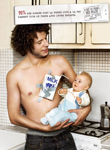
| THE ORIGINAL? Sony Playstation PS2 – 2004 Source : CB News Agency : TBWA Paris (France) |
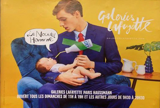
LESS ORIGINAL Galeries Lafayette, french department store – 2017 Headline : “The new man” (poster released in France) Agency : Wednesday London (United Kingdom) |
Getting Creative with Cryptocurrency: Where to Spend Your Bitcoins
Post pobrano z: Getting Creative with Cryptocurrency: Where to Spend Your Bitcoins
Creativity can often be found in the most unusual places and that’s certainly the case with the new wave of cryptocurrencies. Take, as an example, the process by which you spend Bitcoins: payments are made via invisible, heavily encrypted data known as the Blockchain and it’s not a procedure to get too excited about.
However, as more outlets begin to accept Bitcoin and cryptocurrency as a whole, the innovation comes in the art of spending. Here, then, are some of the more unusual places where you can use your Bitcoins.
Wining and Dining
One of our favorite recreational pastimes is eating out so it’s no surprise to see that a number of outlets across the globe are now taking Bitcoin in return for our favorite styles of food. Among the restaurants that accept this form of currency is Downtown Johnny Brown’s in San Diego or the Saw Mill Café in Stratford, East London, but they are just two from many hundreds.
After an evening out, you could finish with a couple of pints at a selection of bars and pubs including the Haymakers in Cambridge, UK or the Old Fitzroy in Sydney, Australia. As an alternative, if you don’t feel like heading out, you can exchange Bitcoins for a delivery via takeaway.com, which gives you access to a wide range of cuisines from all over the world.
Fancy a Flutter?
An increasing number of online sportsbooks and casinos are now accepting Bitcoin as a form of payment, alongside their more traditional methods. The list of operators is growing all the time and Bitcoin-based sites such as Sportsbet.io are among those who provide a wide list of sporting markets.
Whether you’re a serious punter or just someone who likes an occasional wager, the increasing acceptance of Bitcoin as a way of depositing to, or withdrawing, from your sportsbook account opens up a great deal of opportunities.
Take Yourself Away
Need a break from it all? Certain travel companies have also realized the potential of Bitcoin and you can now book a flight, or even a whole package holiday via this particular cryptocurrency. Private charter company privatefly.com were one of the first to embrace this new method of payment so, if you have the kind of budget that extends to chartering your own plane, they will have it covered.
Alternatively, there are much cheaper package deals around the web that can take care of flights, accommodation and more and these can cater for all pockets.
Or, maybe your travel plans are even more ambitious, in which case you could consider Virgin Atlantic. We know that Sir Richard Branson has always been at the forefront of innovation and creativity for many years so perhaps it’s no surprise that his the space travel arm of the Virgin Group has evolved to accept Bitcoins.
Other businesses where you can spend your Bitcoins include florists, taxi companies, coffee shops, clothing retailers, sports and theater ticket agents and much more. In terms of global currency, Bitcoin is still in its relative infancy but the list of outlets who accept it is getting bigger all the time. Soon, Bitcoin spending will be limited only by your imagination.