The Beginner’s Guide to Hot Foil Stamping

Post pobrano z: The Beginner’s Guide to Hot Foil Stamping

If you want to add a touch of luxury to your designs, you’re going to want to know a bit about foiling. Often used on premium print media, like invitations, business cards, reports and letterheads, this is a process whereby metallic foil is applied to the surface of the paper using either a manually-operated or pneumatic (air-powered) machine. The result? A truly stunning effect that pulls out details of the design in a metallic or colored sheen. 

In this article you’ll learn how to set up existing artwork for foiling, but you can also find ready-prepared foil print templates on GraphicRiver and Envato Elements.

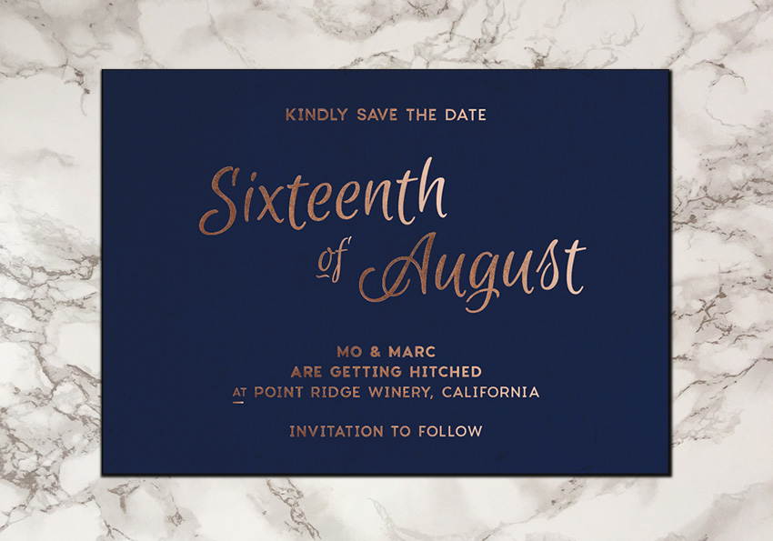
save the date foil

Let’s take a look at the historical background to foiling and some contemporary examples to whet your appetite. Skip to the end of the article to find out how to set up your digital artwork for foil stamping. 

How Did Foiling Come About?

Some of the very first manuscripts ever produced used real gold leaf to decorate intricate calligraphy. The process of applying raw gold leaf to paper was related to the craft of gilding, in which wafer-thin layers of gold were brushed onto items like bullae (amulets), picture frames, statues, and furniture. 

After printing presses became more widely used in Europe in the 18th and 19th centuries, books became the focus of metallic foiling. The most beautiful and expensive books were bound in leather cases which were often embellished with gold leaf. This process was combined with embossing or bevelling, which left a relieved or raised impression on the surface of the cover. 

hanna book cover
The gilded antique cover of an early 20th-century Jewish prayer book

Nowadays, the foiling process doesn’t use real gold leaf (save in exceptional, and very expensive, circumstances). Metallic foils are now made of aluminium or tin, and are combined with a color layer to produce the desired effect. For designers, this is a much-loved development, giving you a wider choice of colors without the risk of blowing your budget! 

Although many printers will have a standard range of foil colors that they provide at a lower price point, which typically include gold, silver and copper, you can also request custom foil colors from an almost endless range of options. Want a metallic rainbow effect on your wedding invites? There’s probably a foil color out there to do just that. 

business cards template
Stylish foil stamped business card template

Even though foiling is an added expense to a standard print job, due to the extra hours and resources that go into stamping the foil after printing, it is still a relatively economical method for producing an impressive effect that really ups the luxury factor of a product. 

You’ll notice that designers use foiling across all sorts of things, from packaging to stationery. It’s a sure-fire way of making your design feel more expensive and aspirational, without the hefty price tag. 

gold stationery template
Gold and black stationery template

How Does Foiling Work?

Foiling can be done either manually, using a manual hot foil stamping machine, or pneumatically, using an air-powered machine. Manual machines are used for low-volume jobs (e.g. for foiling a limited-edition book cover, or a small volume of invitations), while pneumatic machines are used for higher-volume jobs. Small print shops might have a manual machine in-store or send off your item to a specialist, while larger commercial printers might have a pneumatic machine in-house. 

For either machine, the foiling process is roughly the same. The design to be rendered in foil is etched onto a metal die. The die is heated up, and the foil is placed between the die and the surface of the paper or other material to be stamped. When the die is applied to the surface, the foil bonds to the surface, producing the metallic effect. 

Commercial foiling machines fall into three main categories­: clamshell presses, straight stamp presses, and roll presses. Clamshell presses are suited for medium runs, and the name comes from the movement of the machine, which closes like a clam, pushing the dye, foil and print surface together. Straight stamp and roll presses are designed to deal with larger item quantities, so these tend to be used by commercial printers for things like packaging. 

Dies range in price depending on their size and the material they are made of. The cheapest dies are made from magnesium, which is a softer metal and, as a result, can only be used for a certain number of impressions. More expensive dies are made from copper, which is pretty tough, or brass, which is even stronger. 

Once your die has been made using acid etching (where your die is placed in an acid bath after being exposed to UV light), it can be used for a number of print runs, which will vary depending on the material. If you’re producing a short print run, it’s possible that your die can be stored and used for another run later down the line. Your printer can store this for you, or you can request to take it away when the run’s finished.

Foils themselves come in a huge range of textures and colors, which can be split into four categories. Choosing your foil is probably the most exciting part of the foiling process, and if you’re willing to pay a little extra, your options are almost unlimited.

Metallic foils replicate the look of precious metals, such as gold, silver, or copper. These are considered standard by most printers, so they’ll probably carry this limited range in-house. But you can also request orders for other metallic foils, like rose gold or metallic colors like red and blue. 

blush copper invite template
Blush copper wedding invitation template

Pigment foils don’t have a metallic look, but instead come in a range of matte or gloss colors. These are great for pulling out text or logos in an eye-catching color and texture. 

Pearl foils add a pearlescent, ethereal sheen to otherwise mostly transparent or translucent color. They are used to give more tactile shine rather than color to a design, and are a pretty, subtle choice for elegant stationery like invitations and business cards.

Holographic foils appear to be silver before application, but in fact they reflect a variety of colors back at the viewer, giving the impression of a holograph or rainbow. These are fun and youthful when used in the right context, and are also popular for Christmas-themed designs. 

When Should I Use Foiling on My Designs?

There’s probably nothing more satisfying than seeing your digital design come to life when printed and foiled. A simple business card can look instantly impressive with a dash of bronze foil, and a silver sheen has the magical ability to make somebody choose one product over another, based on the packaging design alone. 

Almost all print media that is meant to be special in one way or another will probably benefit from foiling. Some items to consider adding foiling to are:

  • Invitations—for New Year’s Eve celebrations, Christmas parties, gala events and weddings.
  • Business stationery­—make your business seem more upscale by adding foiling to business cards, letterheads, envelopes, and reports.
  • Promotional materials—adding foiling to brochures, booklets and catalogs makes your offering seem instantly more aspirational and enticing.
  • Packaging—up the luxe factor of boxes, labels and stickers. Wine labels look particularly luxurious with a touch of foil.
wedding invite template
Wedding invitation template with silver foiling

Fired up for foiling? Awesome! Let’s check out how to set up your digital artwork for foiling.

How to Set Up Your Artwork for Foil Stamping

Preparing your own artwork for foil stamping is pretty simple. Different printers have different preferences for how they like the artwork to be set up, but in general most will be happy with the elements to be foiled placed on a separate layer and set in a spot color. 

Here, I’ve created a save the date card in Adobe InDesign, and I want to bring out all the typographic elements in a copper foil. 

save the date card

The process for setting up the file is roughly the same whether you’re working in a publishing program like InDesign or vector software like Adobe Illustrator. What is important to note is that you should always set up your foiling design in vector, not raster, format. This allows your dye to be produced to a high quality. With that in mind, let’s take a look at how I set up my card for stamping in InDesign.

Step 1

I’ve created a US postcard layout (7 by 5 inches) with a dark blue color set on its own Background layer (Window > Layers).  

I then created a New Layer and named this Typography, before using the Type Tool (T) to create the type design*.

type tool

* The fonts used on this design are Charlevoix Pro and Euphoria Script

Step 2

I right-click on the Typography layer and select Duplicate Layer “Typography”, to create a copy. 

duplicate layer

Double-clicking the duplicate layer allows me to edit the name of the layer. Name your layer something easily recognizable, like HOT FOIL STAMPING or SPOT FOIL.

hot foil layer

Step 3

Next, we need to vectorize all the elements on the page that are to be stamped. 

Select all the text elements on your layer and head up to Type > Create Outlines

create outlines
outlined text

Step 4

Go to the Swatches panel (Window > Color > Swatches) and create a New Swatch. Name the swatch something instantly recognizable, such as FOIL SPOT COLOR. Set the Type to Spot and adjust the levels of either Cyan, Magenta or Yellow to 100%. Then click Add and Done

new spot color

Apply the Spot Color Swatch to the elements on your layer.

apply spot color

Step 5

A final preparation step before exporting is to set the elements on your foil layer to overprint. This prevents the foil effect from knocking out other items on the page below. 

Go to Object > Output > Attributes and check the Overprint boxes which are not greyed out. 

set to overprint

Step 6

Now you’re ready to Export your design as a print-ready PDF file. 

Head up to File > Export, and choose Adobe PDF (Print) from the Format drop-down menu. Give the file a suitable name and hit Save.

export adobe pdf print

Step 7

In the Export window that opens select [PDFX1a 2001] from the Adobe PDF Preset menu at the top of the window. 

export pdf preset

Then click on Marks and Bleeds in the left-hand menu and check the All Printer’s Marks* and Use Document Bleed Settings boxes. 

Then go ahead and click Export to create your PDF file.

export pdf

* It may not be necessary to include all printer’s marks on your exported file. Check with your printer before you include this. It is, however, really important to always include a bleed on your exported print artwork.

Step 8

You can now see how your design is split into different print plates from Adobe Acrobat. In Acrobat, go to View > Tools > Print Production. Then select Output Preview from the Print Production menu. 

output preview

Keep in mind that the more separations or plates you have in your artwork the more time and resources will go into producing your final printed product, which will increase printing costs. You should always check with your printer ahead of preparing your artwork, and get a quote in advance. 

Conclusion: Have Fun With Foiling!

Applying foil to your print designs really does add a very special touch. The process adds both visual and tactile appeal—people won’t be able to resist touching your prints! 

Whether you go for luxurious metals, dreamy pearl effects or pops of glossy color, foiling is a lovely finishing touch for any product and every designer should experience the joyful satisfaction of seeing and touching the results of their foiling. 

If you’re still not super confident with setting up foil artwork on your own, there are lots of foil print templates available on GraphicRiver and Envato Elements, which do the hard work for you. It’s then easy-peasy to export your design and send it to the printers. They’ll be really impressed with the professional result. 

save the date card Adobe InDesign tutorial

How to Create a Mountain Landscape in Flat Style in Adobe Illustrator

Post pobrano z: How to Create a Mountain Landscape in Flat Style in Adobe Illustrator

Final product image
What You’ll Be Creating

In this tutorial I will show you how to create a natural mountain landscape in flat design using the most basic shapes and tools of Adobe Illustrator.

If you would like to skip the tutorial, you can just purchase the result as a part of my Camping Travel Landscape package. Find more inspiration for Travel Designs on GraphicRiver.

Camping Travel Landscape

1. How to Create a New Document

First we need to set up a New Document (File > New or Control-N) with these settings:

  • Number of Artboards: 1
  • Width: 1200
  • Height: 1200
  • Units: pixels

From the Advanced Tab:

  • Color Mode: RGB
  • Raster Effects: Screen
  • Preview Mode: Default
  • Uncheck Align New Objects to Pixel Grid
Creating New Document

2. How to Set Up the Layers

It would be a good idea to organize our project using layers, since this way we can easily focus on each part of our landscape.

Bring up the Layers panel, and create five layers, renaming each of them as follows:

  • layer 1: lake
  • layer 2: main
  • layer 3: hills
  • layer 4: mountains
  • layer 5: sky

Lock all but the first „lake” layer. To Lock layers, click the Edit Column button (to the right of the eye icon) in the Layers panel for each layer you want to lock.

I prefer to do it the faster way by Alt-Clicking the Edit Column button in the Layers panel for the only layer I want to stay unlocked.

Organizing the layers

3. How to Create the Mountain Lake

Step 1

Start to build a mountain lake by creating a 900 x 58 px light blue #4bafe3 rectangle in the bottom part of the artboard with the help of the Rectangle Tool (M). 

Make one more 580 x 40 px shape of the same color, placing it under the bottom edge of the first one closer to the left side.

Building two rectangles

Step 2

Using the Direct Selection Tool (A), select the corners of the large rectangle or just click inside the shape, holding down Shift. You can see the Live Corner Widget shown inside the corners. Make the shape’s corners fully rounded by pulling the circle indicators to the center. You can also use Effect > Stylize > Round Corners. 

Use the same method to round the corners of the smaller rectangle.

Select both objects and merge them into one object, using the Unite option of the Pathfinder panel.

Rounding corners and merging the rectangles

Step 3

Select the blue shape and Copy it, using Control-C. Click Control-B to get a Duplicate behind the main object. Move it a few pixels lower and change the color to #406e85.

Creating background shape

Step 4

Select the top edge of the light blue figure with the Direct Selection Tool (A) and Copy it by clicking Control-C. Press Control-F to get a Duplicate of the top side line in front of the main shape. Change the Fill color of the line to None and Stroke color to black. Set the Stroke weight to 3-4 px, making the stripe stand out from the main shape. 

Choose the line and go to Effect > Distort & Transform > Zig Zag. Change the Size value to 3 px, Absolute. And set Ridges per segment equal to 27. Select Smooth Points and click OK, getting the wavy line. Go to Object > Expand Appearance to apply the effect.

Building the wavy line

Step 5

Select both the left and the right side anchors of the wavy stripe with the Direct Selection Tool (A), and use Control-J to join the open path, getting a closed shape as a result.

Drag the resulting wavy shape right onto the top edge of the main blue figure and change its Fill color to #4bafe3 and Stroke color to None. Select the wavy shape together with the large blue form and merge them into one object, using the Unite option of the Pathfinder panel.

Adding the waves to the lake shape

Step 6

Choose the main blue form and press Enter to open the Move window. Set the Horizontal Position value to 0 px and the Vertical position value to -10 px, and click on the Copy button. Set the Fill color of the new shape to #73d0ff and place it to the back with the help of Shift-Control-[.

Repeat all the actions for the newly created figure to get another Duplicate behind it. Change the Fill of the second copy to #ace5f6.

Group all the shapes together with Control-G, aligning them to the middle of the artboard.

Working over the lake surface

Step 7

Now we are going to add some details to the lake to make it more real.

Take the Ellipse tool (L) and create a 22 x 10 px ellipse, filling it with #ace5f6 color. Convert the left and right anchor points from smooth to sharp corners by clicking on them with the Anchor Point Tool (Shift-C), getting the leaf-like shape (1).

Draw a horizontal line across the middle of the figure which passes through both sharp anchors. Divide both shapes in Pathfinder (2), Ungroup (Control-Shift-G) them, and Delete the top half (3).

Use the Move option window to create two more copies at the same distance (4). Group (Control-G) all the shapes.

Spread the copies of our group over the lake, making the sun’s glittering reflections (5), something like what we see on the water’s surface on a sunny day.

Forming sun glares on the water

Step 8

Make an 8.5 x 21 px ellipse of #fff75a color with the help of the Ellipse Tool (L). Click on the top anchor with the Anchor Point Tool (Shift-C), converting it to a sharp corner.

Select the left and right anchors of the ellipse with the Direct Selection Tool (A) and move them down by a few pixels, resulting in a drop-like shape.

Choose the yellow shape, take the Rotate Tool (R), and then Alt-click on the bottom anchor point of our figure. In the Rotate panel, set the Angle to 20° and click the Copy button. Press Control-D one more time to repeat the last action, getting two more copies. Select both copies and move them slightly to the bottom.

Creating the petals of water lily

Step 9

Keeping the copies selected, choose the Reflect Tool (O). Holding the Alt key, click on the top anchor of the vertical yellow figure. In the Reflect option window, set the Axis to Vertical and press Copy, reflecting both shapes to the right side of the vertical form. Group (Control-G) the yellow shapes. It will be the blossom of the water lily.

Build a 62 x 6.5 rectangle, Filling it with #c1db35 and making the corners rounded with the help of the Live Widget feature.

Place the yellow blossom closer to the right side of the green figure, hiding its bottom part behind the rectangle.

Create a 13 x 13 px circle Filled with this #fff75a color and send it backward with Object > Arrange > Send Backward. Then place the circle closer to the right side of the green rectangle, hiding its bottom edge behind the figure. Group (Control-G) all the parts together.

Create the yellow blossom and green bottom

Step 10

Using the same methods as in the two previous steps, create a small fish of #ace5f6 color. 

Spread the copies of fishes and water lilies over the lake surface as shown in the example below.

Adding lilies and fishes to the lake

4. How to Create the Meadow and the Forest

Lock all the layers but the „main” layer.

Step 1

Let’s start to create the bulrush by building a 1.7 x 55 px vertical rectangle, with #66801b for the color of the stalk. 

Make one more 4.25 x 17 px rectangle, which we will color using #696354. Use the Live Corners feature to make the corners of the shape fully rounded. 

Put the brown shape on the top of the green stalk, making its bottom part overlap the top of the stalk and aligning to its middle.

Using the Pen Tool (P), draw simple triangle-like shapes of #66801b color for the leaves on the bottom part of the stalk. Group (Control-G) all the bulrush parts together.

Making the bulrush

Step 2

Build an 82 x 78 px rectangle of #c1db35 color, making its top part fully rounded with the help of the Live Corners feature. Draw a vertical line which goes across the middle and the top anchor of the shape.

Divide both shapes in Pathfinder and Ungroup (Control-Shift-G) them. Color the left half with #79981f. Make a small circle of #99ba38 color on the right half of the large figure. Copy the circle and spread the copies over the right part, making it textured. Group (Control-G) all the parts together. This will be the bush.

Create a smaller Copy of the bush near the first one and drag both bushes to the left side of the lake, hiding their bottom parts behind the waves.

Make few copies of the bulrush that we created previously, and place them on the right side of the lake, hiding the bottom part of the stalks behind the water line.

Forming the bush and putting the plants on the lake

Step 3

Start to create the shore by building a 1075 x 57 px rectangle with a #a2c430 Fill color. Make if fully rounded and align it to the middle of the lake. Send it backward with Object > Arrange > Send to Back.

Select the green rectangle and Copy it with Control-C. Click Control-B to get a Duplicate behind the main object. Move it down by a few pixels and change the color to #406e85. Group (Control-G) the rectangles and place them behind the lake.

Creating the shore

Step 4

Let’s continue adding details to the shore by creating a 14 x 14 px rectangle with a #79981f Fill color. Choose the Add Anchor Point Tool (+) and click on the middle of the top edge of the rectangle, adding one more anchor point. Delete the left and right top anchors with the Delete Anchor Point Tool (-), getting the triangle shape (1).

Select the triangle with the Selection Tool (V) and press Enter to open the Move options window. Set the Horizontal Position value to 0 px and Vertical position value to 14 px, and click on the Copy button. Press Control-D to repeat the action, and continue pressing Control-D to add 17 copies (2). Group (Control-G) them together. This will be the grass.

Create a 110 x 100 px circle with a #7a7462 Fill color. Draw a horizontal line which goes across the middle and side anchors of the shape. Select both figures and Divide them, using the Pathfinder panel (3). Ungroup (Control-Shift-G) the shapes and Delete the bottom part. This figure will act as a stone. Create a smaller stone of #8f8873 color (4).

Combine and copy stones and grass, spreading them behind the ground rectangle. Don’t forget to use Object > Arrange > Send to Back for the objects to place them behind the ground rectangle. Add one or more copies of the bush we created previously. You can use and example below as a reference (5), but feel free to make different combinations of grass, bushes, and stones.

Working on the grass and stones

Step 5

Now we are going to work on the forest background. Build a 1030 x 40 px rectangle with #d0f341 color, aligning it to the middle of the artboard. Round its corners, send it backward with Object > Arrange > Send to Back, and place it behind the larger green rectangle, making its bottom part overlap the top edge of the larger figure.

Adding one more rounded rectangle to the background

Step 6

To form the forest we will need two types of trees: fir trees shaped like a triangle, and leaf trees shaped like a circle.

Create a 140 x 235 px rectangle with a #d0f341 Fill color. Click on the middle of the top edge of the rectangle with the Add Anchor Point Tool (+), adding one more anchor point. Delete the left and right top anchors with the Delete Anchor Point Tool (-), getting the triangle shape. 

Make a vertical line which goes across the middle and the top anchor of the shape. Divide both figures in Pathfinder and Ungroup (Control-Shift-G) them, coloring the left half into #a2c430. Create a small rectangle of #a2c430 color, Copy it, and spread the copies over the right part of the tree, making it textured. Group all parts and send the tree to back with Object > Arrange > Send to Back.

Building triangle-like tree

Step 7

Let’s make the crown of the second tree by building a 165 x 165 circle which we will Fill with #d0f341 color.

Draw a vertical line across the middle and anchors of the shape.

Divide both shapes in Pathfinder and Ungroup (Control-Shift-G) them. Color the left half with #a2c430. Add few small rounded rectangles of #a2c430 color to the right half for a textured effect. Add a trunk with a #7a7462 Fill color to the bottom of the crown.

Group (Control-G) all the parts and send them to the back with Object > Arrange > Send to Back.

Building circle-like tree

Step 8

Let’s place our trees in a row behind the back rounded rectangle shape, Duplicating some of them and varying the sizes to form a balanced composition. Add a few more of the brushes we’ve created already.

Leave an empty space in the middle of the forest for the hills and the mountains which we will be creating in the following steps. The result should look like this:

Placing the trees and the bushes on the main scene

5. How to Create the Hills

Lock all the layers except the „hills” layer.

Step 1

With the help of the Pen Tool (P), create the wavy shape with a #8ead28 Fill color.

Select the figure, and then choose the Reflect Tool (O) and, holding the Alt key, click on the bottom right anchor. In the Reflect option window, set the Axis to Vertical and press Copy, reflecting the shape to the right side.

Merge both shapes into one with the Unite option of the Pathfinder panel, getting the hill.

Creating the hill

Step 2

Put the hill behind the main scene, placing it closer to the right side. Make a smaller Copy of the darker green color (#79981f) on the left side of the landscape, hiding it behind the first shape. All the side and bottom parts of our hills should be hidden behind the trees, bushes, and the ground level.

Placing the hills on the landscape

Step 3

First, select the left hill that we created in the previous steps.

Right-click and choose Isolate Selected Group from the drop-down menu. The isolated hill appears in full color, while the rest of the artwork appears dimmed.

Take the Pen Tool (P) and build a vertical zig-zag line crossing the hill shape. Set the Fill of the line to None, the Stroke Weight to 9 px, and the Stroke Color to #66801b. Make the corners of the line rounded by choosing them with the Direct Selection Tool (A) and dragging the Live Corners markers.

Choose the line and go to Object > Expand. Check the Stroke option, and uncheck the Fill option, pressing OK. Our stroke will transform into a filled shape

Let’s cut off the parts of the path that stand outside the hill. Select the overlapping path together with the hill shape, and use the Shape Builder Tool (Shift-M) by holding down the Alt key and clicking the unwanted pieces to Delete them.

Press OK and Escape to exit isolation mode or, using the Selection Tool (V), double-click outside of the isolated group.

Adding the footpath to the hill

Step 4

Unlock the „main” layer. Select one leaf and one fir tree and Copy them. Lock the „main” layer again and go back to the „hills” layer. Press Control-V or go to Edit > Paste, getting the copies of our trees on the „hills” layer.

Spread the trees over the hills, Duplicating some of them and varying the sizes to fill the empty space.

Spreading the trees over the hills

Step 5

Create silhouettes of the background hills by making Duplicates of the previously created hills, changing their Fill colors to #515c1b and making taller or shorter shapes with the help of the Selection Tool (V)

You should get something like this:

Adding background hills

6. How to Create the Mountains

Lock all the layers but the „mountains” layer.

Step 1

Let’s start to form the mountain shape by creating a 582 x 540 px rectangle, Filling it with #99927b color.

Take the Add Anchor Point Tool (+) and click on the middle of the top edge of the rectangle, adding one more anchor point. Delete the left and right top anchors with the Delete Anchor Point Tool (-), getting the triangle shape.

Creating brown triangle

Step 2

With the help of the Line Segment Tool (/), build a 400 px Width black Stroke without Fill, positioning it under the top part of the rectangle, leaving a gap of about 200 px from the top anchor and aligning it to the middle of the rectangle.

Select the line and go to Effect > Distort & Transform > Zig Zag. Set the Size value to 10 px, Absolute. And set Ridges per segment equal to 9. Select Smooth Points and click OK. Go to Object > Expand Appearance to apply the effect.

Choose the triangle shape and Copy it, using Control-C. Click Control-F to get a Duplicate on top of the triangle. Select the duplicate and the line using the Divide option of the Pathfinder panel, dividing our triangle into two shapes. Ungroup them and remove the bottom part. Color the upper remaining figure with #e2f0e9, getting the snowy top of the mountain.

Adding the snow cape to the mountain

Step 3

Create a narrower Copy of the triangle in front of the first one and change its color to #99927b, forming slight shadows on the mountain. Build a narrower Duplicate of the shadow part in the front of it, coloring the new one with #87806c.

Now our mountain looks more detailed and interesting.

Working over the shadow parts of the mountain

Step 4

Now that the basic view of the mountain is ready, let’s add a flat-style shadow, covering one half of the rock.

Select the back triangle shape, Copy it and Paste in Front (Control-C > Control-F). Keeping the duplicate selected, go to Object > Arrange > Bring to Front, placing the copy in front of the mountain. Select the bottom right anchor of the triangle with the Direct Selection Tool (A) and drag it to the center, aligning to the middle anchor.

Change the Blending Mode of the resulting triangle to Multiply while lowering the Opacity levels to 40% in the Transparency panel, getting the shadow. Group (Control-G) all the mountain parts together.

Forming a flat-style shadow on the mountain

Step 5

Put the mountain on the main scene, hiding its bottom part behind the hills. Create two smaller mountains to the left and to the right of the main rock, making them overlap the larger mountain and placing them in front of it.

Form two more triangle mountain silhouettes with a #659cad Fill color behind the main landscape, finishing the composition.

Positioning the mountain and its copies on the main scene

7. How to Create the Background

We are almost done with our mountain landscape. But we still need a background depicting sky, sun, and clouds.

Let’s start by Locking all the layers except the „sky” layer.

Step 1

Build a 1200 x 1200 px square of #77b8cc, aligning it to the middle of the artboard.

Adding the blue rectangle to the back

Step 2

To fill the empty space and add depth to our landscape, create cloud-like shapes of #9accdb color behind the mountains with the help of the Pen Tool (P) or the Rectangle Tool (M), making the corners of the resulting figures rounded.

Creating cloud-like shapes on the sky

Step 3

Start to build the cloud by creating two overlapping circles with the Ellipse Tool (L), setting their Fill and Stroke to the default black and white colors. Switch to the Rectangle Tool (M) and place a narrow stripe at the bottom of the cloud, letting it down a little lower than the bottom edge of the large circle.

Unite all the shapes in the Pathfinder to make a single object. Change the Fill color to #e2f0e9 and stroke to None. Make a few more clouds of different sizes and spread them over the sky, leaving an empty space for the sun.

Working over the clouds

Step 4

Build a 105 x 105 px circle which we will color using #fff45a. Draw a vertical line across the middle of the circle, using the Line Segment Tool (\). Keeping the line and the circle selected, Divide them in the Pathfinder. Ungroup (Control-Shift-G) the shapes and color the left half with #fde23d

Build one more 144 x 144 px circle of #fbcd30 color, placing it behind the first one, aligning to its center. Select the large circle and go to Effect > Distort & Transform > Zig Zag. Set the Size to 5 px, Absolute. And set Ridges per segment equal to 10. Select Smooth Points and click OK. Go to Object > Expand Appearance to apply the effect.

Group all the sun shapes together and place it on the main scene.

Unlock all the layers.

Creating the sun

Our Mountain Landscape Is Ready!

Great job! Our flat-style mountain area scene is finished. You can use your imagination and continue playing around and adding details until you are fully satisfied with the result.

This mountain landscape illustration is just a part of my Camping Travel Landscape, and there are far more travel and adventure illustrations in my portfolio!

Camping Travel Landscape From GraphicRiver

I hope you’ve discovered some new tips and tricks that you can use for creating wonderful illustrations in future. Feel free to share your results in the comments below.

Flat Mountain Landscape Adobe Illustrator Tutorial

Browserslist is a Good Idea

Post pobrano z: Browserslist is a Good Idea

I think, as front-end developers, we’re well aware that different browsers (and versions) support different things. We make choices based on web features we’d like to use balanced with what statistics tell us about our users and what browsers they use. Only 0.01% of users left on IE 9, we might see from our Google Analytics, OK, let’s start using Flexbox and .classList.

Enter Autoprefixer. Autoprefixer, over time, became a nearly ubiquitously part of CSS build processes because it helped us with cross browser support almost effortlessly. Even though IE 10 only supported an older Flexbox syntax, we didn’t have to worry about that because Autoprefixer did it’s best to port the modern syntax to the older one, and it did a great job at that.

Autoprefixer allows you to configure what browsers you wanted to target with the prefixing. This means you don’t have to generate prefixes for every browser ever (resulting in potentially more code output than you want) but instead only generate prefixes for the browsers you’ve decided to support. There are lots of ways to use Autoprefixer, but let’s say it’s a part of your Grunt build:

grunt.initConfig({
  autoprefixer: {
    options: {
      options: {
        browsers: ['last 2 versions', 'ie 8', 'ie 9']
      }
    },
    your_target: {
      // Target-specific file lists and/or options go here.
    },
  },
});

As you might guess, that Autoprefixer configuration will process based on the last 2 versions of all major browsers as well as specifically do what is needed for IE 8 and IE 9.

That’s great, but Autoprefixer isn’t the only tool out there making choices about browser versions.

Indeed.

I bet many of you have worked with Babel or at least heard of it. You write as modern of JavaScript as you like, and it processes it into JavaScript that will run in older browsers. There is a project called babel-preset-env which allows you to configure what browsers Babel will compile down to. For example:

"babel": {
  "presets": [
    [
      "env",
      {
        "targets": {
          "browsers": ["Edge 15"]
        }
      }
    ]
  ]
},

There we are specifically targeting Edge 15. Just as one little example, Babel won’t even bother converting anything in const a = `string`; because Edge 15 supports const and `backticks`. But if we told it to also target IE 10, we’d get var a = "string";.

Browserslist is about a single configuration for all tools that need to know what browsers you support.

We just looked at two major tools that can be configured based on which browsers to support: Autoprefixer and Babel. Doesn’t it make sense to be targeting the same list of browsers? (Yes.)

Enter Browserslist.

browserl.ist helps you see exactly what browsers you’re supported based on your configuration string.

With Autoprefixer, just by having a Browserslist configuration, it will automatically use it.

{
  "browserslist": [
    "> 1%",
    "last 2 versions",
    "IE 10"
  ]
}

That’s an example of having the configuration stored in your `package.json` file. There are other ways to make sure a Browserslist configuration is available though, like having a BROWSERSLIST environment variable or a `.browserslistrc` config dotfile.

Babel still requires babel-preset-env.

There are other interesting tools using Browserslist.

For example, your linting setup can be configured to warn you if you use code that isn’t supported outside of your Browserslist setup. This is done with the eslint-plugin-compat plugin for ESLint.

On the CSS side, the same can be done with stylelint and the stylelint-no-unsupported-browser-features plugin.

Those things feel like a natural extension of Browserslist, and it’s really cool they exist already. Perhaps slightly more surprising is PostCSS Normalize, which actually builds a CSS „reset” (Normalize isn’t really a reset, but you know what I mean, it handles cross browser differences in CSS) based on the browsers your target.

If you’d like to read a bit more, check out the article Autoprefixer 7.0 and Browserslist 2.0 from the developers behind these projects.

Even better, check out an example repo of all of these things combined together in a minimal example.


Browserslist is a Good Idea is a post from CSS-Tricks

Managing State in CSS with Reusable JavaScript Functions – Part 2

Post pobrano z: Managing State in CSS with Reusable JavaScript Functions – Part 2

In my previous article, which shall now retroactively be known as Managing State in CSS with Reusable JavaScript Functions – Part 1, we created a powerful reusable function which allows us to quickly add, remove and toggle stateful classes via click.

One of the reasons I wanted to share this approach was to see what kind of response it would generate. Since then I’ve received some interesting feedback from other developers, with some raising valid shortcomings about this approach that would have never otherwise occurred to me.

In this article, I’ll be providing some solutions to these shortcomings, as well as baking in more features and general improvements to make our reusable function even more powerful.

Article Series:

  1. Original article
  2. Managing State in CSS with Reusable JavaScript Functions (You are here!)

For reference, here’s the JavaScript from Part 1 for our reusable function as it stands:

// Grab all elements with required attributes
var elems = document.querySelectorAll("[data-class][data-class-element]");

// closestParent helper function
closestParent = function(child, match) {
  if (!child || child == document) {
    return null;
  }
  if (child.classList.contains(match) || child.nodeName.toLowerCase() == match) {
    return child;
  }
  else {
    return closestParent(child.parentNode, match);
  }
}

// Loop through if any are found
for(var i = 0; i < elems.length; i++){
  // Add event listeners to each one
  elems[i].addEventListener("click", function(e){

    // Prevent default action of element
    e.preventDefault();

    // Grab classes list and convert to array
    var dataClass = this.getAttribute('data-class');
    dataClass = dataClass.split(", ");

    // Grab linked elements list and convert to array
    var dataClassElement = this.getAttribute('data-class-element');
    dataClassElement = dataClassElement.split(", ");

    // Grab data-class-behaviour list if present and convert to array
    if(this.getAttribute("data-class-behaviour")) {
      var dataClassBehaviour = this.getAttribute("data-class-behaviour");
      dataClassBehaviour = dataClassBehaviour.split(", ");
    }

    // Grab data-scope list if present and convert to array
    if(this.getAttribute("data-class-scope")) {
      var dataClassScope = this.getAttribute("data-class-scope");
      dataClassScope = dataClassScope.split(", ");
    }

    // Loop through all our dataClassElement items
    for(var b = 0; b < dataClassElement.length; b++) {
      // Grab elem references, apply scope if found
      if(dataClassScope && dataClassScope[b] !== "false") {
        // Grab parent
        var elemParent = closestParent(this, dataClassScope[b]),

        // Grab all matching child elements of parent
        elemRef = elemParent.querySelectorAll("." + dataClassElement[b]);

        // Convert to array
        elemRef = Array.prototype.slice.call(elemRef);

        // Add parent if it matches the data-class-element and fits within scope
        if(dataClassScope[b] === dataClassElement[b] && elemParent.classList.contains(dataClassElement[b])) {
          elemRef.unshift(elemParent);
        }
      }
      else {
        var elemRef = document.querySelectorAll("." + dataClassElement[b]);
      }
      // Grab class we will add
      var elemClass = dataClass[b];
      // Grab behaviour if any exists
      if(dataClassBehaviour) {
        var elemBehaviour = dataClassBehaviour[b];
      }
      // Do
      for(var c = 0; c < elemRef.length; c++) {
        if(elemBehaviour === "add") {
          if(!elemRef[c].classList.contains(elemClass)) {
            elemRef[c].classList.add(elemClass);
          }
        }
        else if(elemBehaviour === "remove") {
          if(elemRef[c].classList.contains(elemClass)) {
            elemRef[c].classList.remove(elemClass);
          }
        }
        else {
          elemRef[c].classList.toggle(elemClass);
        }
      }
    }

  });    
}

Going forward, this is going to serve as the base for our improvements.

Let’s get started!

Accessibility

The most common piece of feedback I’ve received from other developers in response to Part 1 was the approach’s lack of consideration for accessibility. More specifically, it’s lack of support for ARIA attributes (or ARIA states if you prefer) and its failure to provide keyboard events for triggering our reusable function.

Let’s see how we can integrate both.

ARIA attributes

ARIA attributes form part of the WAI-ARIA specification. In the words of the specification they…

…are used to support platform accessibility APIs on various operating system platforms. Assistive technologies may access this information through an exposed user agent DOM or through a mapping to the platform accessibility API. When combined with roles, the user agent can supply the assistive technologies with user interface information to convey to the user at any time. Changes in states or properties will result in a notification to assistive technologies, which could alert the user that a change has occurred.

Revisiting the accordion example from part 1, an aria-expanded attribute set to true when the component is expanded, and vice versa when at its default state, would allow assistive technologies such as screen readers to better assess the component.

In addition to providing these benefits, as Ben Frain explores in his article, we can drop stateful classes and instead rely on ARIA attributes as our CSS hooks for styling some component state:

Adopting this approach results in what is (cringingly) referred to as a „Win Win” situation. We get to improve the accessibility of our web application, while also gaining a clearly defined, well-considered lexicon for communicating the states we need in our application logic.

For example, instead of:

.c-accordion.is-active .c-accordion__content {
  [...]
}

We would have:

.c-accordion[aria-expanded="true"] .c-accordion__content {
  [...]
}

Coming back to our reusable function, we’ll build in support so the data-class attribute can also accept an ARIA attribute reference. Since we’re now manipulating attributes rather than just classes, it would make sense semantically to rename data-class and all of its associated attributes to data-state:

<div class="c-mycomponent" data-state="aria-expanded" data-state-element="c-mycomponent" aria-expanded="false" tabindex="0">

In the above example, clicking c-mycomponent should toggle aria-expanded on itself. Whilst in the below example, in addition to the previous behaviour my-class would be removed from c-myothercomponent.

<div class="c-mycomponent" data-state="aria-expanded, my-class" data-state-element="c-mycomponent, c-myothercomponent" data-state-behaviour="toggle, remove" aria-expanded="false" tabindex="0">

In addition to aria-expanded, other examples of how ARIA attributes could be used instead of stateful classes are:

  • aria-disabled="true" instead of is-disabled
  • aria-checked="true" instead of is-checked
  • aria-pressed="true" or aria-selected="true" instead of is-active

Here’s a handy ARIA cheatsheet which came in handy whilst researching this article.

Implementation

Our reusable function currently assumes that everything passed to it via our newly renamed data-state attribute is a class. It then acts accordingly based on either what’s defined in data-state-behaviour or its default toggle behaviour:

// Cycle through target elements
for(var c = 0; c < elemRef.length; c++) {
  if(elemBehaviour === "add") {
    if(!elemRef[c].classList.contains(elemClass)) {
      elemRef[c].classList.add(elemClass);
    }
  }
  else if(elemBehaviour === "remove") {
    if(elemRef[c].classList.contains(elemClass)) {
      elemRef[c].classList.remove(elemClass);
    }
  }
  else {
    elemRef[c].classList.toggle(elemClass);
  }
}

Let’s tweak this slightly:

// Cycle through target elements
for(var c = 0; c < elemRef.length; c++) {
    // Find out if we're manipulating aria-attributes or classes
    var toggleAttr;
    if(elemRef[c].getAttribute(elemState)) {
        toggleAttr = true;
    }
    else {
        toggleAttr = false;
    }
    if(elemBehaviour === "add") {
        if(toggleAttr) {
            elemRef[c].setAttribute(elemState, true);
        }
        else {
            elemRef[c].classList.add(elemState);
        }
    }
    else if(elemBehaviour === "remove") {
        if(toggleAttr) {
            elemRef[c].setAttribute(elemState, false);
        }
        else {
            elemRef[c].classList.remove(elemState);
        }
    }
    else {
        if(toggleAttr) {
            if(elemRef[c].getAttribute(elemState) === "true") {
                elemRef[c].setAttribute(elemState, false);
            }
            else {
                elemRef[c].setAttribute(elemState, true);
            }
        }
        else {
            elemRef[c].classList.toggle(elemState);
        }
    }
}

To support ARIA attributes, we’ve simply added a check to first see if the given ARIA attribute exists on the element, and if not, assume it’s a class and process it as before. This way we can support both ARIA attributes and classes to cover all eventualities. Also removed are the classList.contains() checks, as in current spec classList.add() and classList.remove() are smart enough to account for this.

Keyboard Events

For a website to be considered accessible, it’s important that it can be easily navigated and interacted with through just the use of a keyboard. As far as the developer is concerned, this often involves the usage of the tabindex attribute and leveraging keyboard events.

In most browsers, elements such as the anchor already have these properties by default. You can tab to them and when in focus they can be activated on the press of the enter key. However for many components built with a combination of semantic elements and divs, this is not the case.

Let’s make our reusable function pick up this slack by writing logic to automatically add a keyboard event to the trigger element so it can be activated – like an anchor – with a press of the enter key.

Implementation

At the moment, as the function logic is triggered by clicking an element with data-state and data-state-element attributes, everything is wrapped in a click event listener:

elems[i].addEventListener("click", function(e){
  // Function logic
});

As a press of the enter key is going to need to trigger the same function logic as a click, it makes sense to seperate out this logic into it’s own function so it can be triggered from either. We’ll call it processChange():

// Assign click event
elem.addEventListener("click", function(e){
    // Prevent default action of element
    e.preventDefault(); 
    // Run state function
    processChange(this);
});
// Add keyboard event for enter key to mimic anchor functionality
elem.addEventListener("keypress", function(e){
    // e.which refers to the key pressed, 13 being the enter key.
    if(e.which === 13) {
        // Prevent default action of element
        e.preventDefault();
        // Run state function
        processChange(this);
    }
});

In addition to the existing click event listener, we’ve added an extra listener to react when the enter key is pressed. When a matching keypress event occurs on a focused trigger element, it’s just a matter of running our new processChange() function and passing the element.

You will also notice there’s no logic to automatically add a tabIndex attribute. This is because it may conflict with any tabIndex hierarchy already defined on the page and interfere with developer intent.

Example

Here’s a modified version of the accordion example from part 1, but fully updated to leverage ARIA attributes and keyboard events to make it a more accessible component. You can see the full reusable function as it now stands in the JavaScript panel.

See the Pen #7) Accessibility example by Luke Harrison (@lukedidit) on CodePen.

Accounting for elements added to DOM later

In Part 1, an issue was raised in the comments section:

I think this would have some issues for elements added to the DOM at a later point. In that case you would need to repeat assigning the click event. Am I correct?

That is correct! Any elements with data-state and data-state-element attributes added after the initial render of the DOM won’t have any event listeners assigned to them. So when they are clicked or swiped, nothing will happen.

Why? This is because in our Javascript, once the initial round of assigning event listeners to elements with data-state and data-state-element is complete, there’s no functionality in place to say „Hey! Watch out for any new elements withdata-state and data-state-element attributes and make them work.”

Implementation

To fix this, we’ll leverage something called MutationObservers. Whilst they can be explained much better in David Walsh’s great overview of the API, MutationObservers essentially allow us to track any nodes added or removed from the DOM (also known as „DOM mutations”).

We can setup one up like so:

// Setup mutation observer to track changes for matching elements added after initial DOM render
var observer = new MutationObserver(function(mutations) {
    mutations.forEach(function(mutation) {
        for(var d = 0; d < mutation.addedNodes.length; d++) {
            // Check if we're dealing with an element node
            if(typeof mutation.addedNodes[d].getAttribute === 'function') {
                if(mutation.addedNodes[d].getAttribute("data-state") && mutation.addedNodes[d].getAttribute("data-state-element")) {
                     // Create click and keyboard event listeners etc
                }
            }
        }
    });  
});

// Define type of change our observer will watch out for
observer.observe(document.body, {
  childList: true,
  subtree: true
});

This is what our MutationObserver is doing:

  1. Recording any DOM mutation to the body element which are immediate children childList: true or its decendents subtree: true
  2. Checking if that DOM mutation is a new element node, rather than a text node
  3. If true, then check if the new element node has data-state and data-state-element attributes

The next step, assuming these 3 checks pass, would be to setup our click and keypress event listeners. Like with the implementation of keyboard events, let’s seperate out this setup logic into its own function so we can reuse it both on page load and when an element with data-state and data-state-element attributes is detected by our MutationObserver.

We’ll call this new function initDataState().

// Init function
initDataState = function(elem){
  // Add event listeners to each one
  elems.addEventListener("click", function(e){
    // Prevent default action of element
    e.preventDefault();
    // Run state function
    processChange(this);
  });    
  // Add keyboard event for enter key to mimic anchor functionality
  elems.addEventListener("keypress", function(e){
      if(e.which === 13) {
          // Prevent default action of element
          e.preventDefault();
          // Run state function
          processChange(this);
      }
  });
}

Then it’s just a matter of hooking everything up correctly:

// Run when DOM has finished loading
document.addEventListener("DOMContentLoaded", function() {

  // Grab all elements with required attributes
  var elems = document.querySelectorAll("[data-state][data-state-element]");

  // Loop through if any are found
  for(var a = 0; a < elems.length; b++){
    initDataState(elems[a]);
  }

  // Setup mutation observer to track changes for matching elements added after initial DOM render
  var observer = new MutationObserver(function(mutations) {
      mutations.forEach(function(mutation) {
          for(var d = 0; d < mutation.addedNodes.length; d++) {
              // Check if we're dealing with an element node
              if(typeof mutation.addedNodes[d].getAttribute === 'function') {
                  if(mutation.addedNodes[d].getAttribute("data-state")) {
                       initDataState(mutation.addedNodes[d]);
                  }
              }
          }
      });  
  });

  // Define type of change our observer will watch out for
  observer.observe(document.body, {
      childList: true,
      subtree: true
  });
});

Example

Click the „Add” button to insert more elements into the page (example Pen below):

See the Pen #8) Correctly set up new data-class elements when they are added to the DOM by Luke Harrison (@lukedidit) on CodePen.

Swipe support

At the moment, our reusable function is using click and keyboard events to trigger state logic. This is fine at desktop level, but on touch devices for some UI components (Such as closing a sliding navigation menu for instance) it’s often more useful to have this logic trigger on detection of a swipe.

Let’s build in optional swipe support for our reusable function. This will require adding a new data attribute to compliment our existing set:

data-state-swipe

The purpose of this new attribute is to allow us to define the swipe direction which should trigger our state logic. These directions should be:

  • up
  • right
  • down
  • left

Let’s also build in the option to specify if or not the swipe event should replace the click event, or if both should coexist. We can add a comma separated boolean to data-state-swipe to trigger this behaviour:

  • true – Swipe event listener replaces click event listener
  • false – Swipe event listener and click event listener are both added (Default)

So for example, when the div below detects a left swipe, the aria-expanded attribute on js-elem would be changed to true. The swipe event listener would also in this instance replace the click event listener, as we’re passing true in data-state-swipe:

<div data-state="aria-expanded" data-state-element="js-elem" data-state-swipe="left, true" data-state-behaviour="add">

Now let’s make the changes.

Implementation

Swipe is managed in just the same way as you would manage clicks and keyboard input – via event listeners. To keep the article focused on our reusable function, I’ll be using a helper function called swipeDetect() which will handle all the calculations required for accurate swipe detection. However feel free to use your own preferred method of detecting swipe direction in place of it.

We’re building swipe into our reusable function as another way of triggering function logic, so it makes sense that it should sit with the click and keyboard event listeners in initDateState() and then trigger processChange() once our requirements for a desired swipe direction are met.

Though we also have to account for the behaviour flag passed in data-state-swipe that determines if swipe should replace click. Let’s refactor initDataState() to add some scaffolding to properly support all of this:

// Init function
initDataState = function(elem){
    // Detect data-swipe attribute before we do anything, as its optional
    // If not present, assign click event like before
    if(elem.getAttribute("data-state-swipe")){
        // Grab swipe specific data from data-state-swipe   
        var elemSwipe = elem.getAttribute("data-state-swipe"),
              elemSwipe = elemSwipe.split(", "),
              swipeDirection = elemSwipe[0],
              elemSwipeBool = elemSwipe[1],
              currentElem = elem;

        // If the behaviour flag is set to "false", or not set at all, then assign our click event
        if(elemSwipeBool === "false" || !elemSwipeBool) {
            // Assign click event
            elem.addEventListener("click", function(e){
                // Prevent default action of element
                e.preventDefault(); 
                // Run state function
                processChange(this);
            });
        }
        // Use our swipeDetect helper function to determine if the swipe direction matches our desired direction
        swipeDetect(elem, function(swipedir){
            if(swipedir === swipeDirection) {
                // Run state function
                processChange(currentElem);
            }
        })
    }
    else {
        // Assign click event
        elem.addEventListener("click", function(e){
            // Prevent default action of element
            e.preventDefault(); 
            // Run state function
            processChange(this);
        });
    }
    // Add keyboard event for enter key to mimic anchor functionality
    elem.addEventListener("keypress", function(e){
        if(e.which === 13) {
            // Prevent default action of element
            e.preventDefault();
            // Run state function
            processChange(this);
        }
    });
};

These amends to initDataState now give it 3 different outcomes:

  1. If there’s a data-state-swipe attribute on the trigger element, and its behaviour boolean is set to true, then only swipe and keyboard events are assigned.
  2. If there’s a data-state-swipe attribute on the trigger element, but its behaviour boolean is set to false, then swipe, click and keyboard events are all assigned.
  3. If there’s no data-state-swipe attribute on the trigger element altogether, only click and keyboard event listeners are assigned.

Example

Here’s a very barebones example of the new swipe functionality in practice. Click the button to toggle the menu and then swipe right on the menu whilst on a touch device (or your preferred browser inspector) to close it. Simple.

See the Pen #9) Adding swipe support to our reusable function by Luke Harrison (@lukedidit) on CodePen.

Function Refinements

Finally, we’ll be looking into ways we can refine our reusable function to make it more efficient and easier to use.

Targeting the trigger element

Say for example I have an element named c-btn which on click would need to toggle aria-pressed on itself. With our reusable function as it stands, the HTML would look something like this:

<button class="c-btn" data-state="aria-pressed" data-state-element="c-btn" aria-pressed="false">

The problem here is that on click, aria-pressed would be toggled on all instances of c-btn everywhere, which isn’t the behaviour we’re looking for.

This was the problem which data-state-scope was created to resolve. By scoping our data-state instance to the nearest c-btn (which in this case would be itself) then we are creating the desired toggle behaviour.

<button class="c-btn" data-state="aria-pressed" data-state-element="c-btn" data-class-scope="c-btn" aria-pressed="false">

Whilst the above snippet works fine, it’s a bit jarring having all these attributes all referencing the same c-btn element. Ideally if data-state-element and data-state-scope aren’t defined, then the function should default to the element triggering it. This would allow easy targeting of our trigger element. Like so:

<button class="c-btn" data-state="aria-pressed" aria-pressed="false">

Implementation

data-scope-element is currently a required attribute. If it isn’t present, the function will not be able to assign any event listeners. This is because in our reusable function as it stands, the initial scan of the document is looking for elements with both the data-scope and data-scope-element attributes:

// Grab all elements with required attributes
var elems = document.querySelectorAll("[data-state][data-state-element]");

We need to tweak this so we’re only looking for elements with data-state, as data-state-element will shortly be relegated to an optional attribute.

// Grab all elements with required attributes
var elems = document.querySelectorAll("[data-state]");

In addition, we need to add an if-statement to processChange() which wraps around the retrieval of the data-state-element value, as if it’s not present, the function will throw an error when trying to call getAttribute() on something which doesn’t exist.

// Grab data-state-element list and convert to array
if(elem.getAttribute("data-state-element")) {
  var dataStateElement = elem.getAttribute("data-state-element");
  dataStateElement = dataStateElement.split(", ");
}

Next, let’s implement the logic which makes data-state-element and data-state-scope default to the trigger element if they are not explicitly defined. We can build on our previous amends to processChange() and add an else block to our data-state-element check to manually declare our target element and scope.

// Grab data-state-element list and convert to array
// If data-state-element isn't found, pass self, set scope to self if none is present, essentially replicating "this"
if(elem.getAttribute("data-state-element")) {
  var dataStateElement = elem.getAttribute("data-state-element");
  dataStateElement = dataStateElement.split(", ");
}
else {
  var dataStateElement = [];
  dataStateElement.push(elem.classList[0]);
  if(!dataStateScope) {
    var dataStateScope = dataStateElement;
  }
}

Another consequence of making data-state-element no longer required is that in processChange(), it’s length is used in the for loop to make sure all the elements defined in data-state-element receive their changes of state. This is the loop as it stands:

// Loop through all our dataStateElement items
for(var b = 0; b < dataStateElement.length; b++) {
  [...]
}

Thankfully, all we need to do here is swap out our now optional data-state-element attribute for our still required data-state element as the base for this loop.

// Loop through all our dataStateElement items
for(var b = 0; b < dataState.length; b++) {
  [...]
}

This is because in instances where multiple values have been passed to each data-state attribute (For example: <div data-state="is-active, is-disabled" data-state-element="my-elem, my-elem-2" data-state-behaviour="add, remove">) the length of the array which is derived from each of these is always going to match, so we’re always going to get the same amount of loops in the for block.

Simplifying repeated values

Another improvement which we could make relates to assigning similar types of logic in a single data-state use. Consider the below example:

<a data-state="my-state, my-state-2, my-state-3" data-state-element="c-btn, c-btn, c-btn" data-state-behaviour="remove, remove, remove" data-state-scope="o-mycomponent, o-mycomponent, o-mycomponent">

Whilst this a legitimate use of our reusable function, one thing you will notice is that we have a lot of repeated values in many of the data-state attributes. Ideally, if we want to assign similar types of logic many times over, we should be able to just write a value once and have the function interpret that as repeat values.

For example, the below HTML snippet should perform the same action as the one above.

<a data-state="my-state, my-state-2, my-state-3" data-state-element="c-btn" data-state-behaviour="remove" data-state-scope="o-mycomponent">

Here is another example of what should be considered a valid data-state use:

<a data-state="aria-expanded" data-state-element="c-menu, c-other-menu, c-final-menu" data-state-behaviour="remove, add">

Implementation

The first thing we need to consider is the for loop in processChange() which we last amended in the previous section. As it uses the length of data-state as a base for it’s loop amount, implementing these changes would expose a bug in scenarios where we have one class being applied to many elements.

Consider the following:

<a data-state="my-state" data-state-element="c-btn, c-btn-2" data-state-behaviour="remove" data-state-scope="o-mycomponent">

What would happen here is because data-state only has a single value, the for loop in processChange() would only loop a single time, meaning our intended logic for c-btn-2 would never be assigned.

To fix this, we need to compare data-state and data-state-element. Whichever has the most values then becomes the base for our loop. Like so:

// Find out which has the biggest length between states and elements and use that length as loop number
// This is to make sure situations where we have one data-state-element value and many data-state values are correctly setup
var dataLength = Math.max(dataStateElement.length, dataState.length);

// Loop
for(var b = 0; b < dataLength; b++) {
  [...]
}

As for the rest of the implementation, it’s now a matter of adding logic in the for loop for each attribute which says „If a matching value can’t be found, use the last valid one”.

Let’s use data-state value as an example. Currently, the code in the for loop which grabs the state value looks like:

// Grab state we will add
var elemState = dataState[b];

The problem now is if we have 3 data-state-element values, but only 1 data-state value, on loops 2 and 3 elemState would be undefined.

What we need to do is only redefine elemState if we have a value to give it. Like so:

// Grab state we will add
// If one isn't found, keep last valid one
if(dataState[b] !== undefined) {
  var elemState = dataState[b];
}

This would ensure elemState would always have a value, including inheriting any previous values if one can’t initially be found.

Example

Here’s a final example showing all of our function refinements:

See the Pen #10) Allow easier targeting of self & general improvements by Luke Harrison (@lukedidit) on CodePen.

Closing

In this article, we’ve covered how to build upon the reusable function created in Part 1 to make it more accessible and easier to use.

In addition, we’ve also added swipe support for trigger elements and have made sure any data-state elements added after the initial render of the DOM are no longer ignored.

As before, any comments or constructive feedback are welcome. I’ll leave you will the full reusable function which we’ve developed over the last 2 articles:

(function(){

  // SWIPE DETECT HELPER
  //----------------------------------------------

  var swipeDetect = function(el, callback){ 
    var touchsurface = el,
    swipedir,
    startX,
    startY,
    dist,
    distX,
    distY,
    threshold = 100, //required min distance traveled to be considered swipe
    restraint = 100, // maximum distance allowed at the same time in perpendicular direction
    allowedTime = 300, // maximum time allowed to travel that distance
    elapsedTime,
    startTime,
    eventObj,
    handleswipe = callback || function(swipedir, eventObj){}

    touchsurface.addEventListener('touchstart', function(e){
      var touchobj = e.changedTouches[0]
      swipedir = 'none'
      dist = 0
      startX = touchobj.pageX
      startY = touchobj.pageY
      startTime = new Date().getTime() // record time when finger first makes contact with surface
      eventObj = e;
    }, false)

    touchsurface.addEventListener('touchend', function(e){
      var touchobj = e.changedTouches[0]
      distX = touchobj.pageX - startX // get horizontal dist traveled by finger while in contact with surface
      distY = touchobj.pageY - startY // get vertical dist traveled by finger while in contact with surface
      elapsedTime = new Date().getTime() - startTime // get time elapsed
      if (elapsedTime <= allowedTime){ // first condition for awipe met
        if (Math.abs(distX) >= threshold && Math.abs(distY) <= restraint){ // 2nd condition for horizontal swipe met
          swipedir = (distX < 0)? 'left' : 'right' // if dist traveled is negative, it indicates left swipe
        }
        else if (Math.abs(distY) >= threshold && Math.abs(distX) <= restraint){ // 2nd condition for vertical swipe met
          swipedir = (distY < 0)? 'up' : 'down' // if dist traveled is negative, it indicates up swipe
        }
      }
      handleswipe(swipedir, eventObj)
    }, false)
  }


  // CLOSEST PARENT HELPER FUNCTION
  //----------------------------------------------

  closestParent = function(child, match) {
    if (!child || child == document) {
      return null;
    }
    if (child.classList.contains(match) || child.nodeName.toLowerCase() == match) {
      return child;
    }
    else {
      return closestParent(child.parentNode, match);
    }
  }


  // REUSABLE FUNCTION
  //----------------------------------------------

  // Change function
  processChange = function(elem){

    // Grab data-state list and convert to array
    var dataState = elem.getAttribute("data-state");
    dataState = dataState.split(", ");

    // Grab data-state-behaviour list if present and convert to array
    if(elem.getAttribute("data-state-behaviour")) {
      var dataStateBehaviour = elem.getAttribute("data-state-behaviour");
      dataStateBehaviour = dataStateBehaviour.split(", ");
    }

    // Grab data-scope list if present and convert to array
    if(elem.getAttribute("data-state-scope")) {
      var dataStateScope = elem.getAttribute("data-state-scope");
      dataStateScope = dataStateScope.split(", ");
    }

    // Grab data-state-element list and convert to array
    // If data-state-element isn't found, pass self, set scope to self if none is present, essentially replicating "this"
    if(elem.getAttribute("data-state-element")) {
      var dataStateElement = elem.getAttribute("data-state-element");
      dataStateElement = dataStateElement.split(", ");
    }
    else {
      var dataStateElement = [];
      dataStateElement.push(elem.classList[0]);
      if(!dataStateScope) {
        var dataStateScope = dataStateElement;
      }
    }

    // Find out which has the biggest length between states and elements and use that length as loop number
    // This is to make sure situations where we have one data-state-element value and many data-state values are correctly setup
    var dataLength = Math.max(dataStateElement.length, dataState.length);

    // Loop
    for(var b = 0; b < dataLength; b++) {

      // If a data-state-element value isn't found, use last valid one
      if(dataStateElement[b] !== undefined) {
        var dataStateElementValue = dataStateElement[b];
      } 

      // If scope isn't found, use last valid one
      if(dataStateScope && dataStateScope[b] !== undefined) {
        var cachedScope = dataStateScope[b];
      }
      else if(cachedScope) {
        dataStateScope[b] = cachedScope;
      }

      // Grab elem references, apply scope if found
      if(dataStateScope && dataStateScope[b] !== "false") {

        // Grab parent
        var elemParent = closestParent(elem, dataStateScope[b]);

        // Grab all matching child elements of parent
        var elemRef = elemParent.querySelectorAll("." + dataStateElementValue);

        // Convert to array
        elemRef = Array.prototype.slice.call(elemRef);

        // Add parent if it matches the data-state-element and fits within scope
        if(elemParent.classList.contains(dataStateElementValue)) {
          elemRef.unshift(elemParent);
        }
      }
      else {
        var elemRef = document.querySelectorAll("." + dataStateElementValue);
      }
      // Grab state we will add
      // If one isn't found, keep last valid one
      if(dataState[b] !== undefined) {
        var elemState = dataState[b];
      }   
      // Grab behaviour if any exists
      // If one isn't found, keep last valid one
      if(dataStateBehaviour) {
        if(dataStateBehaviour[b] !== undefined) {
          var elemBehaviour = dataStateBehaviour[b];
        }
      }
      // Do
      for(var c = 0; c < elemRef.length; c++) {
        // Find out if we're manipulating aria-attributes or classes
        var toggleAttr;
        if(elemRef[c].getAttribute(elemState)) {
          toggleAttr = true;
        }
        else {
          toggleAttr = false;
        }
        if(elemBehaviour === "add") {
          if(toggleAttr) {
            elemRef[c].setAttribute(elemState, true);
          }
          else {
            elemRef[c].classList.add(elemState);
          }
        }
        else if(elemBehaviour === "remove") {
          if(toggleAttr) {
            elemRef[c].setAttribute(elemState, false);
          }
          else {
            elemRef[c].classList.remove(elemState);
          }
        }
        else {
          if(toggleAttr) {
            if(elemRef[c].getAttribute(elemState) === "true") {
              elemRef[c].setAttribute(elemState, false);
            }
            else {
              elemRef[c].setAttribute(elemState, true);
            }
          }
          else {
            elemRef[c].classList.toggle(elemState);
          }
        }
      }

    }

  },
    // Init function
    initDataState = function(elem){
    // Detect data-swipe attribute before we do anything, as its optional
    // If not present, assign click event like before
    if(elem.getAttribute("data-state-swipe")){
      // Grab swipe specific data from data-state-swipe
      var elemSwipe = elem.getAttribute("data-state-swipe"),
          elemSwipe = elemSwipe.split(", "),
          direction = elemSwipe[0],
          elemSwipeBool = elemSwipe[1],
          currentElem = elem;

      // If the behaviour flag is set to "false", or not set at all, then assign our click event
      if(elemSwipeBool === "false" || !elemSwipeBool) {
        // Assign click event
        elem.addEventListener("click", function(e){
          // Prevent default action of element
          e.preventDefault(); 
          // Run state function
          processChange(this);
        });
      }
      // Use our swipeDetect helper function to determine if the swipe direction matches our desired direction
      swipeDetect(elem, function(swipedir){
        if(swipedir === direction) {
          // Run state function
          processChange(currentElem);
        }
      })
    }
    else {
      // Assign click event
      elem.addEventListener("click", function(e){
        // Prevent default action of element
        e.preventDefault(); 
        // Run state function
        processChange(this);
      });
    }
    // Add keyboard event for enter key to mimic anchor functionality
    elem.addEventListener("keypress", function(e){
      if(e.which === 13) {
        // Prevent default action of element
        e.preventDefault();
        // Run state function
        processChange(this);
      }
    });
  };

  // Run when DOM has finished loading
  document.addEventListener("DOMContentLoaded", function() {

    // Grab all elements with required attributes
    var elems = document.querySelectorAll("[data-state]");

    // Loop through our matches and add click events
    for(var a = 0; a < elems.length; a++){
      initDataState(elems[a]);
    }

    // Setup mutation observer to track changes for matching elements added after initial DOM render
    var observer = new MutationObserver(function(mutations) {
      mutations.forEach(function(mutation) {
        for(var d = 0; d < mutation.addedNodes.length; d++) {
          // Check if we're dealing with an element node
          if(typeof mutation.addedNodes[d].getAttribute === 'function') {
            if(mutation.addedNodes[d].getAttribute("data-state")) {
              initDataState(mutation.addedNodes[d]);
            }
          }
        }
      });    
    });

    // Define type of change our observer will watch out for
    observer.observe(document.body, {
      childList: true,
      subtree: true
    });
  });
}());

Article Series:

  1. Original article
  2. Managing State in CSS with Reusable JavaScript Functions (You are here!)

Managing State in CSS with Reusable JavaScript Functions – Part 2 is a post from CSS-Tricks
How to Create a Floral Portrait Photo Manipulation in Adobe Photoshop

Post pobrano z: How to Create a Floral Portrait Photo Manipulation in Adobe Photoshop

Final product image
What You’ll Be Creating

In this tutorial I’ll show you how to create a floral portrait of a woman with flowers, leaves, branches and butterflies. We’ll not only combine different images using standard blending techniques but also learn how to make abstract elements. We’ll also use filters and enhance the color to achieve a fresh and creative result. 

Tutorial Assets

The following assets were used during the production of this tutorial:

1. Add the Background

Step 1

Create a new 1500 x 1500 px document in Photoshop with the following settings:

new file

Step 2

Go to Layer > New Fill Layer > Solid Color and pick the color #e4dbe7:

background fill layer

Step 3

Select Layer > New Adjustment Layer > Curves and decrease the lightness a bit:

background curves

On this layer mask, use a soft round brush with black color (soft black
brush) and Opacity about 20-30% to paint on the middle of the canvas
to make this area a bit brighter than the edges. It will help to focus
on the center. Here are the results on the mask and on the picture:

background curves mask
background curves result

2. Add the Model

Step 1

Open
the model image and isolate her from the background using your favorite method. In this case, I used a layer mask with a hard black brush.
Create a new fill layer between the background and the isolated model
and pick any light colors.

isolate model

Step 2

Create two new layers and use a soft brush with the colors #331f18 and
#9c7966 (these colors are picked from the head) to fill in the hair.

hair painting 1
hair painting 2

Step 3

Hide the background and the fill layer and hit Control-Shift-Alt-E to
merge all the transparent layers into a new one. Move the merged model
into our main canvas using the Move Tool (V):

add model

Click the second icon at the bottom of the Layers panel to add a mask to
this layer. Use a medium-soft black brush to remove the bottom of the model’s body:

model masking

Step 4

Use a Hue/Saturation adjustment layer set as Clipping Mask to
desaturate the model. Change the Master settings as the screenshot below
shows:

model hue saturation

Step 5

Make a Curves adjustment layer to brighten the model. On this layer
mask, use a soft black brush to erase the areas which are bright
already.

model curves

3. Make the Branches

Step 1

First we’ll be making the abstract branches. Open the flower 1 image.
Isolate the flower using the Magic Wand Tool (W) and add it to the main
canvas. Go to Filter > Liquify and choose the Forward Warp Tool. Set
the brush size to about 300 px (it depends on the flower size you’ve
chosen). Stretch it to change the shape and make it much longer, like a
curvy branch:

add flower 1
liquify flower 1
liquify flower 1 result

Step 2

Duplicate this layer many times and liquify them to get results in a similar style to the first. Arrange them on both sides of the model.

make other abstact branches

Step 3

Select all of these layers, press Control-G to make a group for them, and change this group mode to Normal 100%. Add a mask to this group and use
a medium-soft black brush to erase the bottom of some of the branches
to make them look as if they’re growing from the model’s body.

abstract branches masking

Step 4

Duplicate several branches, make them smaller and move them to the eye:

eye decoration

Step 5

Create a Hue/Saturation adjustment layer within this group to change the branches’ color.

abstract branches he saturation

Step 6

Use a Curves adjustment layer to darken the branches:

abstract branches curves

Step 7

Open the branch image and cut it out from the white background. Add it
to the bottom of the model’s body and duplicate it. Flip it horizontally by
choosing Edit > Transform > Flip Horizontal. Place these layers
under the abstract branches group.

add branches

Add a mask to each of these layers and clear their bottom.

branches masking

Step 8

Duplicate them several times and arrange them around the bottom of the model’s body and her
head. Use the Free Transform Tool (Control-T) to vary their size and
position.

add more branches and leaves

Step 9

Make a group for these branches and add a Color Balance adjustment layer. Increase the Red value of the Midtones:

branches color balance

Step 10

Use a Photo Filter adjustment layer and pick the color #ec0075:

branches photo filter

4. Add the Flowers

Step 1

Open the flowers 3 image and isolate the flowers using the Magic Wand Tool.
Place the image at the bottom of the model and cover the holes between the
leaves and branches.

add flowers 3

Use a layer mask to blend the flowers with the existing elements:

flowers 3 masking

Step 2

Create a Color Balance adjustment layer and change the Midtones and Highlights settings:

flowers 3 color balance
flowers 3 color balance result

Step 3

Use a Hue/Saturation adjustment layer and change the Master settings:

flowers 3 hue saturation

Step 4

Make a Curves adjustment layer and increase the lightness to make the flower brighter:

flower3 curves

Step 5

Open the flowers 2 image and cut the flowers out as you did with the other
elements. Move it into the main document and rotate the side with the
flowers and buds in the direction of the eyes.

add flowers 2

Here is the result after masking off the parts covering the face:

flowers 2 masking

Step 6

Duplicate this several times and arrange them around the model. Use a
layer mask to delete the areas you don’t want to show on the picture.

duplicate flowers 2 twice

Step 7

Use the Lasso Tool (L) to select the flower on the top of the model, and
press Control-J to duplicate this flower on a new layer. Choose the
Liquify Tool
and pick the Twirl Clockwise Tool to bend and tweak this
flower to make it appear like an abstract one. Feel free to form it in
the way you want but keep it still looking like a flower, so don’t tweak it too much. Place it on the left of the head area with the leaves.

select a flower
flower 2 liquify

Step 8

Duplicate this flower several times and continue bending them to make
them appear different but still in a similar style. Place them above the top of the abstract branches and on the arm.

flower 2 liquify more

Step 9

Make a group for all the elements made from the flowers 2 image. Use a
Hue/Saturation adjustment layer and reduce the Saturation value to –40:

flowers 2 hue saturation

5. Create the Abstract Makeup

Step 1

We’ll be going through a very interesting stage. Press D to turn the
foreground and background to default (black and white). Create a new
layer on top of the layers and use the Elliptical Marquee Tool (M) to
draw a circle on the canvas. Go to Filter > Render > Clouds:

clouds filter

Press Control-D to deselect this circle and go to Filter > Pixelate > Pointillize. Set the Cell Size to 67:

pointillize filter
pointillize filter result

Step 2

Tweak this circle using the Liquify Tools to get a result similar to the one below, or any shapes you wish for.

result liquifying

Step 3

Change this layer mode to Soft Light 100% and use a layer mask to make the effect visible only on the model’s cheek:

makeup soft light
makeup masking

Step 4

Duplicate this layer twice and move them to the forehead and arm. Mask
off the unwanted details to make the effect subtle and soft.

add more makeup

Step 5

Create a group for these layers (remember to change the group mode to Soft Light 100%) and use an Invert adjustment layer to invert the effect color:

makeup invert

6. Add the Butterflies

Step 1

Open
the butterfly 1 image and isolate the butterflies from the background. Select the
middle butterfly and place it above the highest abstract flower on the
right side.

add butterfly 1

Step 2

Use a Hue/Saturation adjustment layer to make the butterfly more saturated:

butterfly 1 hue saturation

Step 3

Open the butterfly 2 image. Take the blue butterfly on the top left and move it above the highest abstract flower on the left of the main document:

add butterfly 2

Step 4

Change the butterfly color using a Hue/Saturation adjustment layer:

butterfly 2 hue saturation

Step 5

Use a Curves adjustment layer to make the butterfly brighter:

butterfly 2 curves

7. The Final Adjustment

Step 1

We’ve finished adding the elements, and now it’s time to change the color.
Create a Color Fill layer on top of the layers and pick the color
#1f0901. Set this layer mode to Exclusion 100%:

color fill layer whole effect

Step 2

Make a Color Balance adjustment layer and change the Midtones and Highlights values:

whole scene color balance
color balance result

Step 3

Add a Curves adjustment layer to change the contrast and color of the whole image:

whole scene curves

Step 4

Make a Photo Filter adjustment layer and pick the color #bbb85d:

whole scene photo filter 1

Step 5

Create
another Photo Filter adjustment layer and select the color #f7014c. On
this layer mask, use a soft black brush to reduce the effect on the
edges and the model’s face. This aims to avoid making the color effect look flat.

whole scene photo filter 2
photo filter 2 masking
photo filter 2 result

Step 6

Use a Selective Color adjustment layer to alter the color of the leaves and butterfly 1.

whole scene selective color

Step 7

Add a Vibrance adjustment layer to enhance the effect. You know it’s my all-time favorite adjustment layer!

vibrance adjustment layer

Step 8

Make a Levels adjustment layer and decrease the Midtones value. Select
this layer mask and paint on the middle to make the edges a bit darker. It helps to create a subtle vignette effect.

whole scene levels

Congratulations, You’re Done!

I hope that you’ve learned something useful for your future projects.
Feel free to leave your comments in the box below—I’d love to see them.
Enjoy Photoshopping!

final result