Tros: It’s just the beginning

Post pobrano z: Tros: It’s just the beginning

Film
Tros

TROS is a well-established men’s grooming product brand in Thailand. For over 20 years, they have focused their communications on the functional benefits of their products – demonstrating on how they helped young men look their best. In 2017, they wanted to elevate their brand, from being only an appearance-enhancer to become a confidence-provider, by helping groom the personality and mindset of their audience as they enter adulthood. TROS believes that the beginning of adulthood is the stage where life starts to become more interesting with new responsibilities, challenges, and opportunities on the horizon. However, because it is also a stage of life where young men have to take responsibility for their decisions, they now rely on their self-confidence more than ever. Unfortunately, the fear of failure has driven many young Thai men to adopt a lifestyle of procrastination, thus influencing them to be contented with living an ordinary life following norms, rather than chasing their dreams. With Ray MacDonald (a well-respected Thai actor, TV host, adventurer and idol) as the brand ambassador, TROS inspires young men to start taking chances, to face their fears, and even make mistakes, rather than living a life full of regrets.

Advertising Agency:GREYnJ United, Thailand
Chief Creative Officer:Jureeporn Thaidumrong
Executive Creative Director:Andrew Chu
Senior Art Director:Arnon Kantawang
Creatives:Supakit Yindeeanant, Ratanaparn Songsermsawad
Managing Director:Kanaporn Hutcheson
Client Service Director:Konthamas Ratanasuvan
Account Executive:Nicharee Chatchavalkijkul
Digital Account Director:Pojanee Sowantip
Social Media Specialist:Pannavit Thanasuwannakul, Prapapan Lekda
Traffic Manager:Warangkana Naksakul
Corporate Communications Director:Huma Qureshi
, APAC PR
Corporate Communications Executive:Cedric Wceke
Production Company:Hub Ho Hin Bangkok
Director:Kanchit Sopchokchai
Producer:Penluck Ruangrabeab
DoP:Naruphol Chokanapitak
Editor:Chonlasit Upanigkit
Music:Wild at heart sound studio
Sound Design:Wild at heart sound studio

The Allstate Foundation: Lost purse

Post pobrano z: The Allstate Foundation: Lost purse

Media
The Allstate Foundation

Allstate Foundation Purple Purse, an initiative aimed at ending domestic violence through financial empowerment, just announced its partnership with tennis champion, entrepreneur and philanthropist Serena Williams. As program ambassador, Williams will bring awareness to the invisible yet catastrophic role financial abuse plays in domestic violence, while encouraging the public to help break the cycle of abuse.

The film shows how real people respond when directly confronted with domestic violence and financial abuse. The participants’ reactions illustrate how we, as a society, think, talk and ultimately act when faced with this issue. By depicting real efforts to help a victim in need, viewers are encouraged to ask themselves, “What would they do in this situation?”

Advertising Agency:MSLGROUP Chicago, USA
Advertising Agency:Leo Burnett, Chicago, USA
Chief Creative Officer:Britt Nolan
Executive Creative Directors:Mikal Pittman, Jon Wyville, Dave Loew
Associate Creative Directors:Donna Foster, Kristen Schwanz
Head Of Production:Veronica Puc
Group Executive Producer:Denis Giroux
Senior Producer:Leah Karabenick
Music Producer:Alec Stern
Account Director:Kaitlyn Nolan
Communications Director:Lynsey Elve
Strategy Director:Ariel Tishgart
Account Supervisor:Lily Merritt
Production Company:Rival School Pictures
Executive Producer:James Blom
Director:Andrew Lane
Dp:Megan Donnelly
Line Producer:Chris Lettley
Editorial:Whitehouse Post
Editor:Matthew Wood
Assistant Editor:Steve Kroodsma
Post Producer:Lauren Connolly, Derek Goldsmith
VFX & Color:Filmworkers
Colorist:Jeff Altman
Vfx:Jeff Charatz
Recording Studio:Another Country
Recording Studio Executive Producer:Tim Konn
Sound Engineer:John Binder
Music:Nylon Studios
Composer:Lydia Davies
Senior Account Executive:Eva Glas

Altair: Surface to Air

Post pobrano z: Altair: Surface to Air

Media
Altair

With innovations in design and technology paving the way, essentially transforming sailboats into airplanes, the sport of sailing is becoming one of the fastest, most dangerous competitions on earth. Millimeter changes in design translate to knots of difference on the water, which is the difference between winning and losing, so Altair was excited to share their design simulation software and consult with Artemis Racing to help give the Swedish team a competitive advantage. The film explores how technology is transforming sailing as well as the intriguing, and often perilous world of the America’s Cup, and all that comes with its developments in boating – including competitors who are determined to spy and steal coveted engineering secrets along the way.

Advertising Agency:Grey, San Francisco, USA
Chief Creative Officer:Curt Detweiler
Director:Curt Detweiler
Executive Producer:Daniel Tuggle, Jon Ettinger
Account Director:Ben Warden
Production Director:Ben Warden, Edward Fung
Account Supervisor:Edward Fung
Chief Officer:Joe Lampertius
Art Director:Alex Anderson
Copywriter:Emma Brooke
Group Account Director:Will Egan
Account Executive:Teresa Tran
Production Assistant:Linden Carty
Group Director:Abe Snyder
Strategic Communications:Abe Snyder
Insights:Ryan Miller
Investments:Ryan Miller
Line Producer:Barry Fink, Meat Shop Bambi
Screenwriter:Shasha Levinson
Researcher:Alexandre Lefebvre
Director Of Photography:Billy Peña
1st Assistant Camera:Andrew Laboy
2nd Assistant Camera:Matthew Pothier
Composer:Gunnard Doboze
Audio Engineers:Mark Pitchford, Phil Lantz
Bermuda Fixer:Bayard Outerbridge
Transportation:Sinclar Robinson
Editor:Blake Bogosian, Beast Editorial
Assistant Editor:Seth Andrews

Amazon Fresh: DUO

Post pobrano z: Amazon Fresh: DUO

Online
Amazon

DUO by AmazonFresh introduces a unique ecommerce experience – especially for foodies – that also showcases the wide range of products available on the platform. Foodies would be able to select whether they would like to shop by recipe or ingredient and the platform would use its smart algorithm to complete the shopping list.

Advertising Agency:Miami Ad School Europe, Hamburg, Germany
Tutor:Niklas Frings-Rupp
Art Directors:Belen Aragon, Tania Shevereva, Boreum Kim

How to Create Your Own Font

Post pobrano z: How to Create Your Own Font

Final product image
What You’ll Be Creating

In this article, we’ll be talking about fonts! Have you ever tried making one? Even if you haven’t ever thought about this, you might get inspired after reading my story. 

I’ll tell you how I decided to try my hand at font design, how I prepared to create my very first font, and why you should try and make your own font too! The process is really challenging and calming at the same time. You will learn so many new things while digging through a new creative field. 

If you’re not going to create a font yourself but you need one for your designs, then feel free to jump right to the Bananito Font Duo page on GraphicRiver and get it there!

Bananito Font Duo

We can’t help but notice a vast variety of fonts surrounding us in our everyday life. Any product you pick up in the shop, any website you look through on the internet, and any advertisement banner you stumble upon in the street will usually contain at least one word or phrase typed with a heavy sans-serif font or a playful handwritten script typeface. 

Fonts can be of any kind, depending on the purpose of the design. They can be geometrically perfect or curvy with bouncing letters. A font can even be something apart from letters, such as a symbols font with icons or doodles instead of letters.

symbols font
An example of a Symbols Font with doodles instead of letters

Looking at all this feast of typefaces around me, I noticed hand-written display fonts and whimsy script fonts becoming more and more trendy, making any design look fresh and unique. You can easily spot such fonts on GraphicRiver, for example, or check out the following article about stunning handwritten fonts:

I became really inspired by the idea of trying something new after working as an illustrator for many years. So why not channel my passion for drawing… into drawing letters?

How I Created My First Font

After reading several books about typography and studying the theory of font design, I moved on to practicing my calligraphy skill. At this point, the endless drills began. I printed tons of practicing sheets and practiced those upstrokes and downstrokes whenever I had a free minute. I can’t help but notice how calming this process is. Apart from making your hand firm, it helps you to focus and get rid of the unwanted thoughts, just the same as if you were meditating. 

digital practice sheets
Digital version of the calligraphy practice sheets. Making drills on an iPad.

As I became more acquainted with the typography, calligraphy and lettering world, I finally decided to make an actual typeface, one you could install on your PC and use in programs like Adobe CC, Affinity Designer and Corel Draw for designing or Microsoft Office and Pages for typing and formatting documents. 

This is what differentiates a font from a set of vector letters or alphabet—you can just install it like any usual font that you download from the web, and work with it in any software instead of constructing a word from single letters in a graphic program. 

using font in a software

To start off, I decided to create a font duo consisting of a simple uppercase display font and a set of doodle symbols for decoration. Such a font duo is great for making fancy designs in a few clicks as you already have everything you need included. Apart from that, such a playful hand-drawn font goes perfectly with other serif or sans serif fonts if you need a heading and a subheading. 

And this is how the Bananito Font Duo was born! 

After the font went online, it was handpicked for a promotional email newsletter and also got included in a big font bundle.

bananito font used in a design
Example of how the Bananito Font Duo can be used

Inspired by the first results, I decided to continue developing my skills in this field and try something more sophisticated: a script font. 

Script fonts look really elegant when involved in a design. Here is an inspiring article about stylish cursive fonts:

Here is a quick tip if you’re thinking of creating a font but don’t know how to start. Yes, the amount of work to be done may scare you away, but only if everything is disorganized and done in a chaotic order. 

Start with a simple font, and don’t try to add all the bells and whistles in your very first typeface if you’re not sure whether you’ll have enough strength and motivation to finish it. In any case, it is better to try and make at least one simple font than to give up in the middle of making a more complex one.

designing a script font
Designing a bouncy script textured font. First steps.

So let me tell you about the process of how I designed and created the Bananito Font Duo, from scratch to finish.

How to Create a Symbols Font

How to Draw Out the Letters

To start with, we need to draw all the letters. I was going to make only the uppercase version of the font, so I needed to depict the 26 letters of the English alphabet. The style of your font is fully optional and depends on many factors. While thinking up a new font, try to keep in mind that it should be:

  • trendy (look through the top fonts on GraphicRiver, for example, in order to realize what is trending at the moment and which fonts have a higher rating or were handpicked by the Envato staff)
  • easy to read in both big and small scale
  • useful for various types of design, hence, multipurpose

It doesn’t have to look like your own handwriting, but it certainly can if you want it to (besides, handwritten fonts are one of the hot trends).

If you prefer a brush pen and paper, go for it! You may also prefer to use a pencil as it is easy to correct with the help of the eraser. When you’ve finished drawing out all the letters on paper, go on and scan it or use your phone to make a photo. 

It’s better to draw everything in one take, without postponing the work for the following day as the letters might look a bit different. I noticed that my hand behaves differently each time I draw—sometimes it feels more tired and firm, and another day it’s easier to make light, swirly lines. In fact, it will be much easier to draw all letters in a consistent style if we draw them all one by one. And don’t forget about the figures and punctuation marks! Sometimes people need them for designing as well, so why not add them to our typeface?

Take a look at Calligraphr (formerly known as MyScriptFont.com), where you can find a very useful template containing all the glyphs for our future font. Just print it out and use it as a guide, or import into your programs if you’re working digitally.

drawing letters on the template

By the way, a few words about working digitally. At first, I started practicing calligraphy on paper. However, later on, I moved to drawing everything on iPad, using the Apple Pencil and the Procreate app. You can find some really great brushes for lettering and calligraphy, or even make your own as I did. I spent a few hours playing with settings and textures until I created a perfect brush that behaved like a real brush-pen, making the whole process smoother and faster. 

There are some advantages in drawing letters digitally, such as the opportunity to undo and edit anything, change the scale and colors of the elements, and transfer the completed image into your computer just in one click. 

However, the option of drawing digitally is not for everyone: there are many people who enjoy drawing on paper because it gives you a pleasant tactile feeling of the real paper texture and more control over the strokes. On the contrary, the glass of the digital screen might feel too slick and slippery for drawing, and the strokes of the digital pen are not so precise as those of the real brush pen. However, drawing digitally may turn out to be much easier because of the automatic smoothing of the lines, so that you don’t have those wobbly, shaky strokes.

drawing letters digitally
Drawing letters on iPad using the grid

How to Transfer Your Drawing Onto the Computer 

Once you are happy with your hand-drawn letters, it’s time to open them in Adobe Illustrator and use the Image Trace function to turn them into nice clean vectors! 

Your Image Trace settings may be different from mine, depending on the thickness and size of the letters and on the brightness and contrast of your letters if you’re drawing on paper. I usually keep the Threshold somewhere between 120 and 170 if I want the letters to be more or less detailed. I also set the Paths and Corners to 75%, leaving all other options as default. 

Once you’ve finished, click the Expand button in the control panel on top to turn the letters into curves. Remember to delete the white background by clicking it with the Magic Wand Tool (Y).

It may require some time to clean up the letters after tracing, making the lines smoother and getting rid of the unneeded elements and stray points. 

trancing the font in adobe illustrator

As soon as we’re happy with the result, we can place each symbol in its own cell and prepare for export.

traced letters distributed in adobe illustrator

The rest of the process depends on the software you’ll be using for making fonts. It may be either FontLab or, for example, Glyphs

If you’re a Windows user, I would suggest trying out FontLab, a very powerful program for creating fonts! This set of tutorials will be very useful for creating your first font from zero up to the very end:

I prefer using Glyphs. However, it is only for macOS, and that is its only drawback so far. The program itself is very easy and fun to use with its user-friendly interface and descriptive guides and tutorials. So if you’re a Mac user, try its free 30-day trial and go for it. 

Glyphs app interface
The Glyphs interface

If you’re not sure whether you want to study new software and create more fonts in future, you can try something simpler for starters. For example, Calligraphr, which I mentioned earlier in the article, is a great chance to check how your font functions. Just follow the comprehensive instructions on the website and create your font quickly and easily! 

This is my favorite moment, when the font is finally tested and exported and it goes live! Now you can use it in your own designs, creating banners, flyers and whimsy postcards much faster and easier than if you were combining the letters into words one by one. 

making postcard with your font

Also, here are a couple of descriptive and comprehensive step-by-step tutorials about creating a font from scratch up to the very end. Check them out!

Why You Should Try to Create Your Own Font

Still hesitating whether you should go for it or not? Here is a list of reasons that come to mind instantly after I’ve decided to dive into such an engrossing process as font making. 

  1. This is a great opportunity to try something new. If you’re stuck in the middle of your way and feel as if you’re losing the creativity and motivation of doing the things you’ve got used to doing, making fonts can be a breath of fresh air. The process of creating fonts is very interesting and challenging. You may also find it meditative and calming. 
  2. Designing a font is a good way to try both traditional and digital media. Some of us enjoy drawing letters on paper, using various brush-pens, brushes, and calligraphy pens. Others choose digital calligraphy on PC or iPad, trying out various brushes and creating our own to find a perfect combination of size, tilt, opacity, and texture. 
  3. Your drawing skills will improve. While completing drills, making all those upstrokes, downstrokes and circles day by day, you will find that your hand becomes steadier and that you’re now drawing long, straight strokes with firmness and confidence. No more shaky lines here! This skill will also be helpful for other fields of illustration as it is always great to have a firm hand while drawing.
  4. A curious fact about the chemical aspect of our body is that learning new skills makes your brain work more, causing it to create new connections between neurons, replacing some of those we lose over time. Isn’t that awesome? Apart from that, new experiences increase your level of dopamine, giving you a feeling of joy.
  5. It is always a plus to add some new skills to your CV. This will obviously score you more points in the eyes of your future boss or client, whether you’re looking for a job or freelancing.
  6. You will become more proficient in design by learning how to pair and combine fonts. Beautiful font combinations make any design look better, while inappropriate fonts can spoil any good design.
  7. It is convenient to use your own fonts in your designs without caring about what type of license you need depending on the purpose of your end product.
example of the package design
An example of the packaging design using the Bananito Font Duo

To Sell or Not to Sell?

Another point of creating fonts that’s worth being mentioned here is the opportunity to make some money. Although there are many free fonts, you can still sell a good-quality font. 

Once you’ve spent enough time learning and finally created an outstanding product, try uploading it to the Fonts section of GraphicRiver and promote it by making a presentation in your portfolio. Hand-drawn and script fonts are top trends in modern design—you can find them almost anywhere in product design, package design, clothing, advertisement, and in the interior design of shops and cafes. What’s more, such fonts make a product unique, whereas free fonts tend to become overused among designers

using your font in package design

On the other hand, competition among font designers is rising and more great free fonts are appearing, so people don’t have to spend a lot of money to make a stylish poster or flyer. Apart from that, making a free font has its own advantages too:

  • It is a good way to promote yourself by distributing freebies and showcasing your other projects at the same time. 
  • It is a great opportunity to increase the quality of your future fonts by practicing. 
  • It will help you to become a better font designer while trying out new styles of writing and sharing them with the world.

To sum up these two points, you can actually make a difference between a font that you give out for free and one that you sell. A free font might not have all the features like ligatures, letter alternatives, enhanced punctuation, webfont or multilingual support. All these features may be added to the full version of the font.

all the features of the font

The last but not the least thing to mention here is licensing. If you want to make fonts to sell, you should definitely study all the types of licenses and the differences between them in order to know how the price varies and for what purposes people might need your font. 

Although most online markets have descriptive FAQs about all types of licenses or even have the relevant type of license already selected for you, knowing this information for yourself is very important anyway. Some of your customers may have questions or doubts whether they can use your font or not, and in that case, you’ll be able to resolve any question without hesitation.

using the bananito font

Give It a Try!

And that’s it! I hope you’ve found out some new interesting information about creating fonts and gathered enough inspiration to try it out yourself! It’s not as difficult or scary as it might seem, in fact. Just remember that you can start with something simple, gradually moving to something more complicated step by step. If you find this process bringing you joy and relaxation, you won’t be able to stop, that’s for sure.

And remember that if you liked the Bananito Font Duo which is mentioned in this article and you want to use it in your designs, you can get it right from GraphicRiver just in a few clicks.

Bananito Font Duo

Form Validation Part 2: The Constraint Validation API (JavaScript)

Post pobrano z: Form Validation Part 2: The Constraint Validation API (JavaScript)

In my last article, I showed you how to use native browser form validation through a combination of semantic input types (for example, <input type="email">) and validation attributes (such as required and pattern).

While incredibly easy and super lightweight, this approach does have a few shortcomings.

  1. You can style fields that have errors on them with the :invalid pseudo-selector, but you can’t style the error messages themselves.
  2. Behavior is also inconsistent across browsers.

User studies from Christian Holst and Luke Wroblewski (separately) found that displaying an error when the user leaves a field, and keeping that error persistent until the issue is fixed, provided the best and fastest user experience.

Unfortunately, none of the browsers natively behave this way. However, there is a way to get this behavior without depending on a large JavaScript form validation library.

Article Series:

  1. Constraint Validation in HTML
  2. The Constraint Validation API in JavaScript (You are here!)
  3. A Validity State API Polyfill (Coming Soon!)
  4. Validating the MailChimp Subscribe Form (Coming Soon!)

The Constraint Validation API

In addition to HTML attributes, browser-native constraint validation also provides a JavaScript API we can use to customize our form validation behavior.

There are a few different methods the API exposes, but the most powerful, Validity State, allows us to use the browser’s own field validation algorithms in our scripts instead of writing our own.

In this article, I’m going to show you how to use Validity State to customize the behavior, appearance, and content of your form validation error messages.

Validity State

The validity property provides a set of information about a form field, in the form of boolean (true/false) values.

var myField = document.querySelector('input[type="text"]');
var validityState = myField.validity;

The returned object contains the following properties:

  • valid – Is true when the field passes validation.
  • valueMissing – Is true when the field is empty but required.
  • typeMismatch – Is true when the field type is email or url but the entered value is not the correct type.
  • tooShort – Is true when the field contains a minLength attribute and the entered value is shorter than that length.
  • tooLong – Is true when the field contains a maxLength attribute and the entered value is longer than that length.
  • patternMismatch – Is true when the field contains a pattern attribute and the entered value does not match the pattern.
  • badInput – Is true when the input type is number and the entered value is not a number.
  • stepMismatch – Is true when the field has a step attribute and the entered value does not adhere to the step values.
  • rangeOverflow – Is true when the field has a max attribute and the entered number value is greater than the max.
  • rangeUnderflow – Is true when the field has a min attribute and the entered number value is lower than the min.

By using the validity property in conjunction with our input types and HTML validation attributes, we can build a robust form validation script that provides a great user experience with a relatively small amount of JavaScript.

Let’s get to it!

Disable native form validation

Since we’re writing our validation script, we want to disable the native browser validation by adding the novalidate attribute to our forms. We can still use the Constraint Validation API — we just want to prevent the native error messages from displaying.

As a best practice, we should add this attribute with JavaScript so that if our script has an error or fails to load, the native browser form validation will still work.

// Add the novalidate attribute when the JS loads
var forms = document.querySelectorAll('form');
for (var i = 0; i < forms.length; i++) {
    forms[i].setAttribute('novalidate', true);
}

There may be some forms that you don’t want to validate (for example, a search form that shows up on every page). Rather than apply our validation script to all forms, let’s apply it just to forms that have the .validate class.

// Add the novalidate attribute when the JS loads
var forms = document.querySelectorAll('.validate');
for (var i = 0; i < forms.length; i++) {
    forms[i].setAttribute('novalidate', true);
}

See the Pen Form Validation: Add `novalidate` programatically by Chris Ferdinandi (@cferdinandi) on CodePen.

Check validity when the user leaves the field

Whenever a user leaves a field, we want to check if it’s valid. To do this, we’ll setup an event listener.

Rather than add a listener to every form field, we’ll use a technique called event bubbling (or event propagation) to listen for all blur events.

// Listen to all blur events
document.addEventListener('blur', function (event) {
    // Do something on blur...
}, true);

You’ll note that the last argument in addEventListener is set to true. This argument is called useCapture, and it’s normally set to false. The blur event doesn’t bubble the way events like click do. Setting this argument to true allows us to capture all blur events rather than only those that happen directly on the element we’re listening to.

Next, we want to make sure that the blurred element was a field in a form with the .validate class. We can get the blurred element using event.target, and get it’s parent form by calling event.target.form. Then we’ll use classList to check if the form has the validation class or not.

If it does, we can check the field validity.

// Listen to all blur events
document.addEventListener('blur', function (event) {

    // Only run if the field is in a form to be validated
    if (!event.target.form.classList.contains('validate')) return;

    // Validate the field
    var error = event.target.validity;
    console.log(error);

}, true);

If error.validity is true, the field is valid. Otherwise, there’s an error.

See the Pen Form Validation: Validate On Blur by Chris Ferdinandi (@cferdinandi) on CodePen.

Getting the error

Once we know there’s an error, it’s helpful to know what the error actually is. We can use the other Validity State properties to get that information.

Since we need to check each property, the code for this can get a bit long. Let’s setup a separate function for this and pass our field into it.

// Validate the field
var hasError = function (field) {
    // Get the error
};

// Listen to all blur events
document.addEventListner('blur', function (event) {

    // Only run if the field is in a form to be validated
    if (!event.target.form.classList.contains('validate')) return;

    // Validate the field
    var error = hasError(event.target);

}, true);

There are a few field types we want to ignore: fields that are disabled, file and reset inputs, and submit inputs and buttons. If a field isn’t one of those, let’s get it’s validity.

// Validate the field
var hasError = function (field) {

    // Don't validate submits, buttons, file and reset inputs, and disabled fields
    if (field.disabled || field.type === 'file' || field.type === 'reset' || field.type === 'submit' || field.type === 'button') return;

    // Get validity
    var validity = field.validity;

};

If there’s no error, we’ll return null. Otherwise, we’ll check each of the Validity State properties until we find the error.

When we find the match, we’ll return a string with the error. If none of the properties are true but validity is false, we’ll return a generic „catchall” error message (I can’t imagine a scenario where this happens, but it’s good to plan for the unexpected).

// Validate the field
var hasError = function (field) {

    // Don't validate submits, buttons, file and reset inputs, and disabled fields
    if (field.disabled || field.type === 'file' || field.type === 'reset' || field.type === 'submit' || field.type === 'button') return;

    // Get validity
    var validity = field.validity;

    // If valid, return null
    if (validity.valid) return;

    // If field is required and empty
    if (validity.valueMissing) return 'Please fill out this field.';

    // If not the right type
    if (validity.typeMismatch) return 'Please use the correct input type.';

    // If too short
    if (validity.tooShort) return 'Please lengthen this text.';

    // If too long
    if (validity.tooLong) return 'Please shorten this text.';

    // If number input isn't a number
    if (validity.badInput) return 'Please enter a number.';

    // If a number value doesn't match the step interval
    if (validity.stepMismatch) return 'Please select a valid value.';

    // If a number field is over the max
    if (validity.rangeOverflow) return 'Please select a smaller value.';

    // If a number field is below the min
    if (validity.rangeUnderflow) return 'Please select a larger value.';

    // If pattern doesn't match
    if (validity.patternMismatch) return 'Please match the requested format.';

    // If all else fails, return a generic catchall error
    return 'The value you entered for this field is invalid.';

};

This is a good start, but we can do some additional parsing to make a few of our errors more useful. For typeMismatch, we can check if it’s supposed to be an email or url and customize the error accordingly.

// If not the right type
if (validity.typeMismatch) {

    // Email
    if (field.type === 'email') return 'Please enter an email address.';

    // URL
    if (field.type === 'url') return 'Please enter a URL.';

}

If the field value is too long or too short, we can find out both how long or short it’s supposed to be and how long or short it actually is. We can then include that information in the error.

// If too short
if (validity.tooShort) return 'Please lengthen this text to ' + field.getAttribute('minLength') + ' characters or more. You are currently using ' + field.value.length + ' characters.';

// If too long
if (validity.tooLong) return 'Please short this text to no more than ' + field.getAttribute('maxLength') + ' characters. You are currently using ' + field.value.length + ' characters.';

If a number field is over or below the allowed range, we can include that minimum or maximum allowed value in our error.

// If a number field is over the max
if (validity.rangeOverflow) return 'Please select a value that is no more than ' + field.getAttribute('max') + '.';

// If a number field is below the min
if (validity.rangeUnderflow) return 'Please select a value that is no less than ' + field.getAttribute('min') + '.';

And if there is a pattern mismatch and the field has a title, we can use that as our error, just like the native browser behavior.

// If pattern doesn't match
if (validity.patternMismatch) {

    // If pattern info is included, return custom error
    if (field.hasAttribute('title')) return field.getAttribute('title');

    // Otherwise, generic error
    return 'Please match the requested format.';

}

Here’s the complete code for our hasError() function.

// Validate the field
var hasError = function (field) {

    // Don't validate submits, buttons, file and reset inputs, and disabled fields
    if (field.disabled || field.type === 'file' || field.type === 'reset' || field.type === 'submit' || field.type === 'button') return;

    // Get validity
    var validity = field.validity;

    // If valid, return null
    if (validity.valid) return;

    // If field is required and empty
    if (validity.valueMissing) return 'Please fill out this field.';

    // If not the right type
    if (validity.typeMismatch) {

        // Email
        if (field.type === 'email') return 'Please enter an email address.';

        // URL
        if (field.type === 'url') return 'Please enter a URL.';

    }

    // If too short
    if (validity.tooShort) return 'Please lengthen this text to ' + field.getAttribute('minLength') + ' characters or more. You are currently using ' + field.value.length + ' characters.';

    // If too long
    if (validity.tooLong) return 'Please shorten this text to no more than ' + field.getAttribute('maxLength') + ' characters. You are currently using ' + field.value.length + ' characters.';

    // If number input isn't a number
    if (validity.badInput) return 'Please enter a number.';

    // If a number value doesn't match the step interval
    if (validity.stepMismatch) return 'Please select a valid value.';

    // If a number field is over the max
    if (validity.rangeOverflow) return 'Please select a value that is no more than ' + field.getAttribute('max') + '.';

    // If a number field is below the min
    if (validity.rangeUnderflow) return 'Please select a value that is no less than ' + field.getAttribute('min') + '.';

    // If pattern doesn't match
    if (validity.patternMismatch) {

        // If pattern info is included, return custom error
        if (field.hasAttribute('title')) return field.getAttribute('title');

        // Otherwise, generic error
        return 'Please match the requested format.';

    }

    // If all else fails, return a generic catchall error
    return 'The value you entered for this field is invalid.';

};

Try it yourself in the pen below.

See the Pen Form Validation: Get the Error by Chris Ferdinandi (@cferdinandi) on CodePen.

Show an error message

Once we get our error, we can display it below the field. We’ll create a showError() function to handle this, and pass in our field and the error. Then, we’ll call it in our event listener.

// Show the error message
var showError = function (field, error) {
    // Show the error message...
};

// Listen to all blur events
document.addEventListener('blur', function (event) {

    // Only run if the field is in a form to be validated
    if (!event.target.form.classList.contains('validate')) return;

    // Validate the field
    var error = hasError(event.target);

    // If there's an error, show it
    if (error) {
        showError(event.target, error);
    }

}, true);

In our showError function, we’re going to do a few things:

  1. We’ll add a class to the field with the error so that we can style it.
  2. If an error message already exists, we’ll update it with new text.
  3. Otherwise, we’ll create a message and inject it into the DOM immediately after the field.

We’ll also use the field ID to create a unique ID for the message so we can find it again later (falling back to the field name in case there’s no ID).

var showError = function (field, error) {

    // Add error class to field
    field.classList.add('error');

    // Get field id or name
    var id = field.id || field.name;
    if (!id) return;

    // Check if error message field already exists
    // If not, create one
    var message = field.form.querySelector('.error-message#error-for-' + id );
    if (!message) {
        message = document.createElement('div');
        message.className = 'error-message';
        message.id = 'error-for-' + id;
        field.parentNode.insertBefore( message, field.nextSibling );
    }

    // Update error message
    message.innerHTML = error;

    // Show error message
    message.style.display = 'block';
    message.style.visibility = 'visible';

};

To make sure that screen readers and other assistive technology know that our error message is associated with our field, we also need to add the aria-describedby role.

var showError = function (field, error) {

    // Add error class to field
    field.classList.add('error');

    // Get field id or name
    var id = field.id || field.name;
    if (!id) return;

    // Check if error message field already exists
    // If not, create one
    var message = field.form.querySelector('.error-message#error-for-' + id );
    if (!message) {
        message = document.createElement('div');
        message.className = 'error-message';
        message.id = 'error-for-' + id;
        field.parentNode.insertBefore( message, field.nextSibling );
    }

    // Add ARIA role to the field
    field.setAttribute('aria-describedby', 'error-for-' + id);

    // Update error message
    message.innerHTML = error;

    // Show error message
    message.style.display = 'block';
    message.style.visibility = 'visible';

};

Style the error message

We can use the .error and .error-message classes to style our form field and error message.

As a simple example, you may want to display a red border around fields with an error, and make the error message red and italicized.

.error {
  border-color: red;
}

.error-message {
  color: red;
  font-style: italic;
}

See the Pen Form Validation: Display the Error by Chris Ferdinandi (@cferdinandi) on CodePen.

Hide an error message

Once we show an error, your visitor will (hopefully) fix it. Once the field validates, we need to remove the error message. Let’s create another function, removeError(), and pass in the field. We’ll call this function from event listener as well.

// Remove the error message
var removeError = function (field) {
    // Remove the error message...
};

// Listen to all blur events
document.addEventListener('blur', function (event) {

    // Only run if the field is in a form to be validated
    if (!event.target.form.classList.contains('validate')) return;

    // Validate the field
    var error = event.target.validity;

    // If there's an error, show it
    if (error) {
        showError(event.target, error);
        return;
    }

    // Otherwise, remove any existing error message
    removeError(event.target);

}, true);

In removeError(), we want to:

  1. Remove the error class from our field.
  2. Remove the aria-describedby role from the field.
  3. Hide any visible error messages in the DOM.

Because we could have multiple forms on a page, and there’s a chance those forms might have fields with the same name or ID (even though that’s invalid, it happens), we’re going to limit our search for the error message with querySelector the form our field is in rather than the entire document.

// Remove the error message
var removeError = function (field) {

    // Remove error class to field
    field.classList.remove('error');

    // Remove ARIA role from the field
    field.removeAttribute('aria-describedby');

    // Get field id or name
    var id = field.id || field.name;
    if (!id) return;

    // Check if an error message is in the DOM
    var message = field.form.querySelector('.error-message#error-for-' + id + '');
    if (!message) return;

    // If so, hide it
    message.innerHTML = '';
    message.style.display = 'none';
    message.style.visibility = 'hidden';

};

See the Pen Form Validation: Remove the Error After It’s Fixed by Chris Ferdinandi (@cferdinandi) on CodePen.

If the field is a radio button or checkbox, we need to change how we add our error message to the DOM.

The field label often comes after the field, or wraps it entirely, for these types of inputs. Additionally, if the radio button is part of a group, we want the error to appear after the group rather than just the radio button.

See the Pen Form Validation: Issues with Radio Buttons & Checkboxes by Chris Ferdinandi (@cferdinandi) on CodePen.

First, we need to modify our showError() method. If the field type is radio and it has a name, we want get all radio buttons with that same name (ie. all other radio buttons in the group) and reset our field variable to the last one in the group.

// Show the error message
var showError = function (field, error) {

    // Add error class to field
    field.classList.add('error');

    // If the field is a radio button and part of a group, error all and get the last item in the group
    if (field.type === 'radio' && field.name) {
        var group = document.getElementsByName(field.name);
        if (group.length > 0) {
            for (var i = 0; i < group.length; i++) {
                // Only check fields in current form
                if (group[i].form !== field.form) continue;
                group[i].classList.add('error');
            }
            field = group[group.length - 1];
        }
    }

    ...

};

When we go to inject our message into the DOM, we first want to check if the field type is radio or checkbox. If so, we want to get the field label and inject our message after it instead of after the field itself.

// Show the error message
var showError = function (field, error) {

    ...

    // Check if error message field already exists
    // If not, create one
    var message = field.form.querySelector('.error-message#error-for-' + id );
    if (!message) {
        message = document.createElement('div');
        message.className = 'error-message';
        message.id = 'error-for-' + id;

        // If the field is a radio button or checkbox, insert error after the label
        var label;
        if (field.type === 'radio' || field.type ==='checkbox') {
            label = field.form.querySelector('label[for="' + id + '"]') || field.parentNode;
            if (label) {
                label.parentNode.insertBefore( message, label.nextSibling );
            }
        }

        // Otherwise, insert it after the field
        if (!label) {
            field.parentNode.insertBefore( message, field.nextSibling );
        }
    }

    ...

};

When we go to remove the error, we similarly need to check if the field is a radio button that’s part of a group, and if so, use the last radio button in that group to get the ID of our error message.

// Remove the error message
var removeError = function (field) {

    // Remove error class to field
    field.classList.remove('error');

    // If the field is a radio button and part of a group, remove error from all and get the last item in the group
    if (field.type === 'radio' && field.name) {
        var group = document.getElementsByName(field.name);
        if (group.length > 0) {
            for (var i = 0; i < group.length; i++) {
                // Only check fields in current form
                if (group[i].form !== field.form) continue;
                group[i].classList.remove('error');
            }
            field = group[group.length - 1];
        }
    }

    ...

};

See the Pen Form Validation: Fixing Radio Buttons & Checkboxes by Chris Ferdinandi (@cferdinandi) on CodePen.

Checking all fields on submit

When a visitor submits our form, we should first validate every field in the form and display error messages on any invalid fields. We should also bring the first field with an error into focus so that the visitor can immediately take action to correct it.

We’ll do this by adding a listener for the submit event.

// Check all fields on submit
document.addEventListener('submit', function (event) {
    // Validate all fields...
}, false);

If the form has the .validate class, we’ll get every field, loop through each one, and check for errors. We’ll store the first invalid field we find to a variable and bring it into focus when we’re done. If no errors are found, the form can submit normally.

// Check all fields on submit
document.addEventListener('submit', function (event) {

    // Only run on forms flagged for validation
    if (!event.target.classList.contains('validate')) return;

    // Get all of the form elements
    var fields = event.target.elements;

    // Validate each field
    // Store the first field with an error to a variable so we can bring it into focus later
    var error, hasErrors;
    for (var i = 0; i < fields.length; i++) {
        error = hasError(fields[i]);
        if (error) {
            showError(fields[i], error);
            if (!hasErrors) {
                hasErrors = fields[i];
            }
        }
    }

    // If there are errrors, don't submit form and focus on first element with error
    if (hasErrors) {
        event.preventDefault();
        hasErrors.focus();
    }

    // Otherwise, let the form submit normally
    // You could also bolt in an Ajax form submit process here

}, false);

See the Pen Form Validation: Validate on Submit by Chris Ferdinandi (@cferdinandi) on CodePen.

Tying it all together

Our finished script weight just 6kb (2.7kb minified). You can download a plugin version on GitHub.

It works in all modern browsers and provides support IE support back to IE10. But, there are some browser gotchas…

  1. Because we can’t have nice things, not every browser supports every Validity State property.
  2. Internet Explorer is, of course, the main violator, though Edge does lack support for tooLong even though IE10+ supports it. Go figure.

Here’s the good news: with a lightweight polyfill (5kb, 2.7kb minified) we can extend our browser support all the way back to IE9, and add missing properties to partially supporting browsers, without having to touch any of our core code.

There is one exception to the IE9 support: radio buttons. IE9 doesn’t support CSS3 selectors (like [name="' + field.name + '"]). We use that to make sure at least one radio button has been selected within a group. IE9 will always return an error.

I’ll show you how to create this polyfill in the next article.

Article Series:

  1. Constraint Validation in HTML
  2. The Constraint Validation API in JavaScript (You are here!)
  3. A Validity State API Polyfill (Coming Soon!)
  4. Validating the MailChimp Subscribe Form (Coming Soon!)

Form Validation Part 2: The Constraint Validation API (JavaScript) is a post from CSS-Tricks

How to Create a Chalkboard BBQ Poster in Adobe InDesign

Post pobrano z: How to Create a Chalkboard BBQ Poster in Adobe InDesign

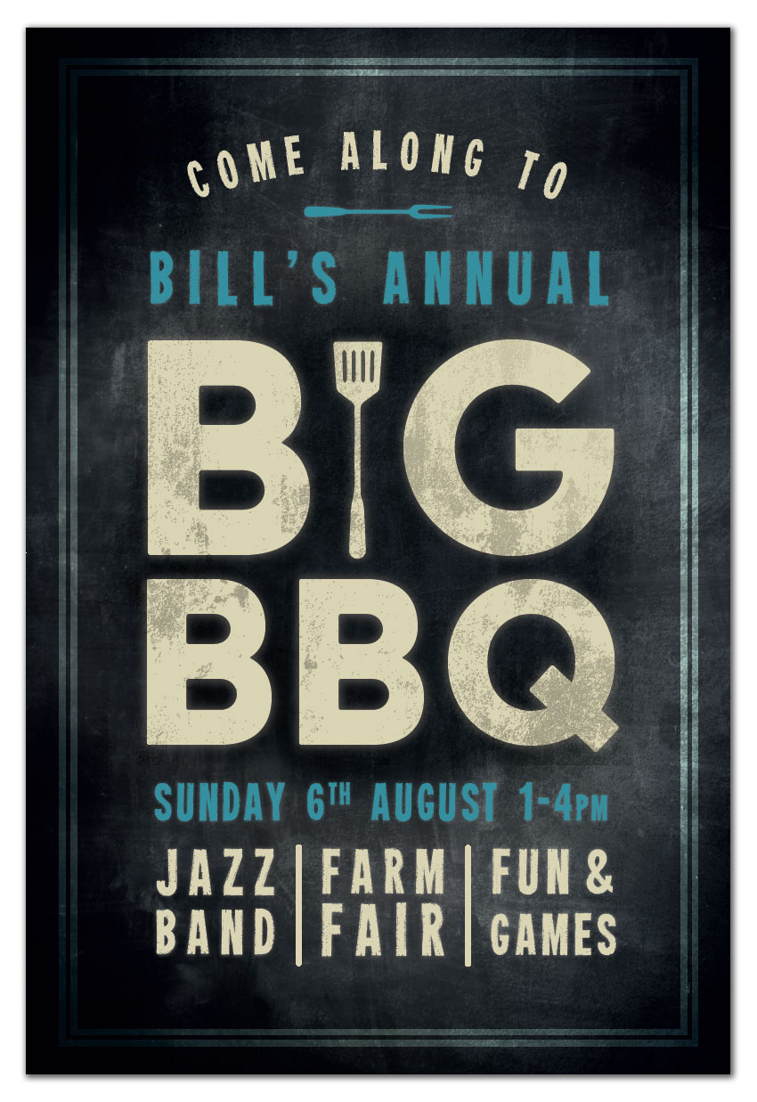
Final product image
What You’ll Be Creating

Summer is here, and with it come long, laid-back days flipping burgers on the BBQ. If you’re planning a big BBQ event over the coming months, you can promote it in style with this chalkboard poster. 

Aimed at beginners to print design, this tutorial will focus on building up textures to create that authentic chalky look. You’ll need access to Adobe InDesign and Adobe Illustrator for this tutorial, and it’s super simple to adapt the design to your own event details.

Looking for a quick-to-edit event poster or flyer? Check out the selection of events templates on GraphicRiver

Can you pick up that wonderful smoky smell in the air? Let’s dive right in…

What You’ll Need to Create Your Poster

You’ll need to have access to both InDesign and Illustrator for this tutorial. You can pick up a free trial of both apps from the Adobe website. You’ll also need to download the following images and fonts:

Once you’ve saved the images to the same folder and installed the fonts, you’re ready to get started with designing your poster. Let’s go!

1. How to Create a Chalkboard Background

Step 1

Open up Adobe InDesign and go to File > New > Document. 

Keep the Intent set to Print, Number of Pages to 1, and deselect Facing Pages, in order to create a single-page layout. Set the Width to 24 in and Height to 36 in, which will create a standard ‘Architectural D’ poster size.

Add Margins of 0.5 in and a Bleed of 1 in on all sides, before clicking OK

new document

Step 2

Expand the Layers panel (Window > Layers) and double-click on the Layer 1 name to open up the Layer Options window. Rename the layer Background.

layer options

Use the Rectangle Frame Tool (F) to create an image frame that extends across the whole page, up to the edges of the bleed on all sides. Go to File > Place, choose the blackboard background image and Open. Allow the image to fill the whole frame (you can click on the Fill Frame Proportionally button in the Controls panel at the top of the workspace). 

placed background

Step 3

Expand the Swatches panel (Window > Color > Swatches) and click on New Color Swatch in the panel’s drop-down menu. Name the new swatch Board Black, setting the Type to Process and Mode to CMYK. Set the percentage levels to C=91 M=79 Y=62 K=97. Click Add, and then OK

new color swatch

Take the Rectangle Tool (M), and drag across the page to create a shape to match the dimensions of the image frame below. From the Swatches panel, set the Fill to Board Black. 

black rectangle

Step 4

Select the Board Black rectangle and go to Object > Effects > Gradient Feather. Select Radial for the Type, and adjust the direction of the gradient so that the lighter area extends outwards from the center of the page. 

gradient

Click OK to exit the Effects window. And there we have it—a chalkboard background with a subtle gradient effect, which is going to showcase your typography beautifully. 

background

2. How to Add Texture to Your Poster

Step 1

Lock the Background layer and click on the Create New Layer button at the bottom of the Layers panel. Rename this layer Black. We can add a slightly darker area to the central point of the page to allow the main text title to really stand out.

Take the Ellipse Tool (L) and drag onto the center of the page to create a rough circle. Set the Fill to Board Black and the Stroke Color to [None].

circle

Go to Object > Effects > Transparency and choose a Multiply Mode. Bring the Opacity down to 70%.

multiply mode

Click on Gradient Feather at the bottom of the left-hand menu and create a Radial gradient, with the darkest part at the center of the shape. Click OK

effects gradient

Step 2

Open up the wall texture EPS file in Adobe Illustrator. Select the image and Right-Click > Ungroup. 

ungroup

Select the exclamation marks in the corner of the image and delete them, leaving just the plain texture behind. 

delete excess

Step 3

Go to the Swatches panel (Window > Swatches) and create a New Swatch. Name it Cream, and set the CMYK levels to C=12 M=10 Y=31 K=0. 

cream swatch

Apply the Cream swatch to the texture; then head up to File > Save As and save the texture as an EPS  file, giving it the name ‘Texture Cream.eps’.

cream texture

Step 4

Return to your InDesign document and lock the Black layer. Create a new layer above, naming it Texture A. 

Use the Rectangle Frame Tool (F) to create a frame across the whole page, and File > Place your Texture Cream.eps image, allowing it to fill the whole frame. 

texture

With the frame selected, go to Object > Effects > Transparency. Set the Mode to Overlay and the Opacity to 20%, before clicking OK

overlay

3. How to Create Chalky Typography for Your Poster

Step 1

With the rulers visible (View > Show Rulers), pull out a guide from the left-hand ruler to a central position on the page, 12 in. 

guide

Then pull out two more vertical guides to around 4 in and 20 in, splitting the layout into four columns. 

guides

Step 2

Create a new CMYK swatch, C=15 M=11 Y=33 K=0, naming it Cream.

cream swatch

Take the Type Tool (T) and drag onto the page, just above the center, creating a rectangular text frame. Type in ‘B’ and ‘G’, with a space between the two letters. 

From either the Character Formatting Controls panel running along the top of the workspace or the Character panel and Paragraph panel (Window > Type & Tables), set the Font to Charlevoix Pro Bold, Size 747 pt, and text to Align Center. Adjust the Font Color to Cream.

We want the letters to meet the guides on either side, so increase the Kerning (space between individual letters) if necessary. 

text frame

Step 3

Select the text frame and Edit > Copy, Edit > Paste it, positioning it below the first frame. Adjust the text to read ‘BBQ’ and reduce the Font Size to match up the alignment to the guides on either side, here 575 pt.

font size

Select both text frames with your Selection Tool (V, Escape) cursor and head up to Object > Effects > Outer Glow. Adding a slight glow to your text will give it much more of an authentic chalky look, as if some of the chalk dust has extended past the edge of the text itself. 

Adjust the Mode to Normal, and bring the Opacity down to around 43%. Click on the colored square to open the Effect Color window. From here, you can select Swatches and choose a matching Cream swatch for the glow effect. Click OK.

Back in the Effects window, set the Technique to Softer, Size to around 0.4 in, Noise to 12% and Spread to 17%. Click OK.

effect color

Step 4

Open the barbecue silhouettes vector in Illustrator. Isolate the spatula, and Edit > Copy it.

spatula vector

Head straight back to your InDesign layout and Edit > Paste the vector directly onto the poster.

Position the spatula directly between the ‘B’ and ‘G’, scaling the image while holding Shift to match the height of the letters. Change the Fill Color to Cream, and apply a similar glow effect (Object > Effects > Outer Glow). 

outer glow

Step 5

Create a new swatch, C=77 M=25 Y=30 K=0, and name it Blue.

swatch options

Create a new text frame above the ‘BIG’ text frame, using the Type Tool (T). Type in an introduction to the main title, like ‘Bill’s Annual’, setting the Font to Heavyweight. Increase the Size and Tracking (space between all letters) until the text meets the guides on either side. Adjust the Font Color to Blue

character panel

Go to Object > Effects > Outer Glow to add a glow effect to the text frame, selecting the Blue swatch for the Effect Color. 

outer glow

Step 6

Copy and Paste the text frame, moving this below the ‘BBQ’ frame. Adjust the text to read the date and time of the event, and again alter the Font Size and Tracking to allow the text to stretch to meet the guides. 

glow

Step 7

Use the Type Tool (T) to create three small text frames at the bottom of the layout, typing in individual snippets about the event in two-word pairs, set in Heavyweight. Adjust the Font Size and Tracking of each individual word to create a neat, square effect in each text frame. Change the Font Color to Cream

ampersand

Use the Line Tool (\) to create vertical dividers between the text frame, holding Shift to create a perfectly straight line. Set the Stroke Color to Cream. From the Stroke panel (Window > Stroke), change the Stroke Weight to 5 mm, and add a Round Cap to soften the ends of the lines. 

line dividers

Step 8

Take the Ellipse Tool (L) and draw a rough oval towards the top of the layout. We’re going to use this as a basis for creating a curved text sub-heading.

ellipse tool

From the Type Tool’s drop-down menu in the Tools panel, you’ll find the Type on a Path Tool (Shift-T). Click once towards the top-left corner of the oval to transform the shape into a text path. You can now type in your sub-heading (here, ‘Come along to’), and format the text as you would for any other text frame. 

Set the Font to Heavyweight and Color to Cream, and move the vertical lines criss-crossing the oval to maneuver the position of the text. You want it to curve perfectly over the top of the other text frames. 

curved text

Step 9

Return to Illustrator and your barbecue silhouettes vector. Isolate the fork, and Edit > Copy it.

fork vector

Return to InDesign and Edit > Paste it onto the page. Right-Click > Transform > Rotate 90 Degrees CW, and adjust the Fill to Blue. Go to Object > Effects > Outer Glow to add a glow effect. Position it just below the curved text frame, centrally on the page. 

outer glow

4. How to Frame Your Poster and Add a Chalky Texture

Our poster’s looking great so far, but we can just add a few more touches to make it feel more complete and give it more of a grungy, chalky texture. 

Step 1

Ensure that all the text on the page is sitting centrally on the page. If not, select all the frames with your cursor and use the arrows on your keyboard to shift the frames up or down a little. When you’re happy with the result, lock the Type layer. 

type so far

Create a new layer and name it Border. Then take the Rectangle Tool (M) and drag onto the page, allowing it to sit against the margin line on all sides. Set the Stroke Color to Cream, and from the Stroke panel set the Weight to 15 mm. Adjust the Type to Thick – Thick.

border

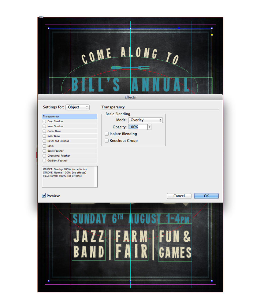
With the border selected, go to Object > Effects > Transparency and set the Mode to Overlay. 

overlay

Step 2

Lock the Border layer and create a final new layer above, calling it Texture B. 

Return briefly to Illustrator, and to your Texture Cream EPS file. Add a new swatch, name it Board Black, and set the levels to C=91 M=79 Y=62 K=97. Apply this to the texture, before going to File > Save As and saving it as Texture Black.eps.

texture vector

Step 3

Return to your InDesign poster and create a new image frame across only the main title. File > Place and Open your Texture Black.eps image. 

texture

With the image frame selected, go to Object > Effects > Transparency, adjusting the Mode to Multiply and bringing the Opacity down to 20%.

multiply

To soften the effect further, you can also add a subtle Gradient Feather to the frame, setting the Type to Linear. Click OK to exit the Effects window.

gradient

Step 4

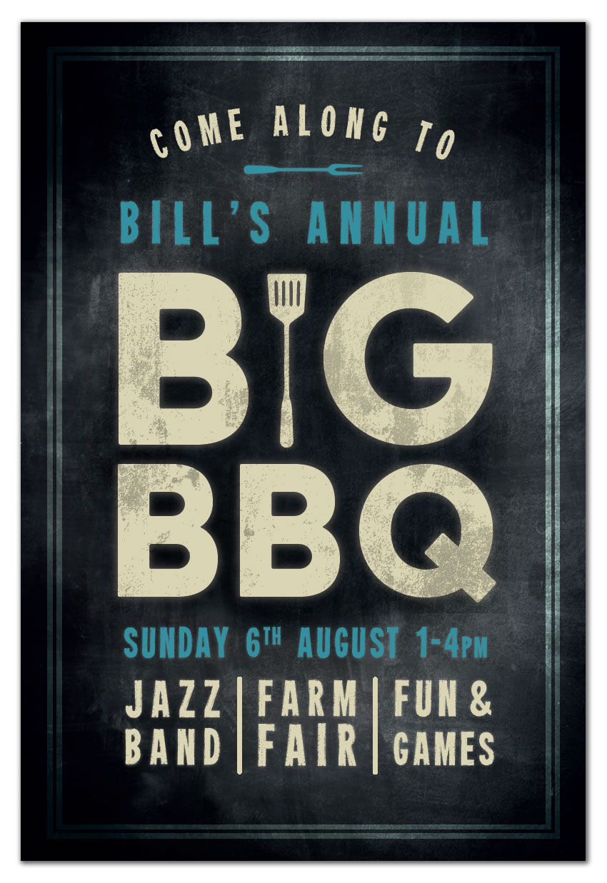
Congratulations, your poster artwork is finished! Make sure to head up to File > Save to keep all your hard work intact. If you’re printing your poster from home, you can simply head up to File > Print. If you’re sharing your poster online or via email, you can save your artwork as an Interactive PDF, JPEG or PNG by going to File > Export and choosing the file type you prefer from the Format drop-down menu.

If you’re sending your artwork off for professional printing, go to File > Export and choose Adobe PDF (Print) from the Format menu at the bottom of the window. Hit Save to open the Export Adobe PDF window. Choose [Press Quality] from the Preset menu at the top of the window. 

press quality

Click on Marks and Bleeds in the window’s left-hand menu. Check All Printer’s Marks (optional, depending on your chosen printer’s preferences) and Use Document Bleed Settings. 

printers marks

Then hit OK to create your exported PDF. This is ready for sending straight off to the printers—great work!

exported pdf

Let’s Get the Grill On! 

You’ve finished your BBQ poster, and it’s looking fantastic. Awesome job! Before you get started on the other preparations for your event, take a moment to recap what skills and techniques you’ve picked up over the course of this tutorial. You should now feel more confident with:

  • Creating print-ready poster layouts in Adobe InDesign.
  • Building up background textures and gradients to create a pro-standard backdrop for your design.
  • Formatting advanced typography and adding glow effects to replicate chalky textures.
  • Adding finishing touches like borders and overlay textures to take your poster to the next level.

Looking for more events posters and flyers? Check out the great selection of events templates on GraphicRiver here. Or why not browse more useful background and overlay textures?

final poster