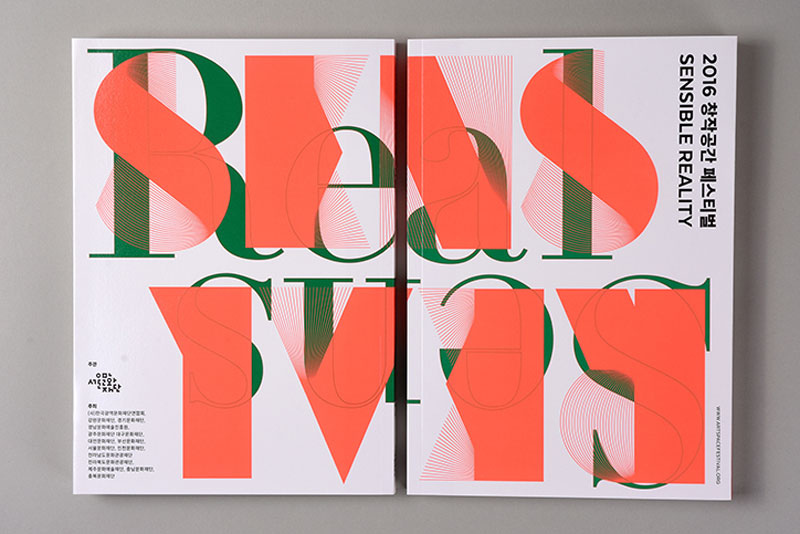
The Korean design studio, founded by Kwon Joonho, Kim Kyung-chul and Kim Eojin, regularly works for Cultural institutions and has a collaborative approach to design. They work primarily in the field of graphic design, but also like to experiment with other types of design. You can discover more of their work on their portfolio website.
A business website is one of the most effective marketing tools. It performs several crucial functions at a time. It can help you drive traffic, increase the amount of sales, expand your business popularity and help achieve lots of other business goals depending upon the niche you specialize in.
There are two options you can choose from to build a business website today. This task can be effectively completed by a professional web designer, whose services, however, are not that cheap. This is not to mention the fact that the entire process may take several months before you manage to gain the expected result. The second option is using small business website builders. These services consider all the UI and UX nuances and make it possible to create websites, the design of which is not worse (or even better) than that of custom made websites. Let’s have a look at the most obvious benefits of website builders now:
Ease of Use. Website builders are very easy to use. The prevailing amount of them come with intuitive dashboards understandable to all users, irrespective of their web design skills and experience. These systems offer informative step-by-step guidelines users may follow to master the basics of web creation process. Everything is simple and convenient here, while the result is amazing.
Management Convenience. Custom made websites are more difficult to manage and update after they are ready. This cannot be said about website builders. Websites created with these systems are extremely easy to update whenever this is necessary and even a newbie can cope with this task.
Rich Choice of Templates. Website builders offer an extensive selection of templates. You can always choose the one that suits your business needs and niche specialization most of all. The prevailing amount of templates are responsive, which makes it possible to browse through the websites at any mobile device.
Powerful Customization Tools. Apart from offering templates, website builders also provide rich customization tools to enable users edit them and create any website structure and design they need. They often come with versatile blocks, modules and plugins that can be arranged and adjusted in any order to gain the best result possible.
Website builders are affordable and this is, probably, one of their major benefits. Many of them offer free trials to enable users to test their features prior to making the choice. For those users, who wish to get the most out of the major features of website builders chosen, these systems offer several paid plans with the advanced web building options.
Top 5 Website Builders to Design a Business Website
SITE123 is a cloud website builder that comes with a WYSIWYG editor. This feature makes it possible to design website structure in a hassle-free and quick way. All the changes a user makes at the website are immediately reflected at the screen, which makes the process of designing a website simple and intuitive. It’s also possible to make use of SITE123 multilingual tool to create as many language website versions as you need for your business or personal use.
The system offers an extensive collection of responsive templates and powerful customization tools to give the chosen template unique design. SITE123 is a module-based system. To get the desired website design, a user has to select the required modules and adjust them at the page as needed. This esnures convenient and quick web design process.
uKit is a website builder that is known for its functionality and business website focus. The service can be used to create any types of websites, but it especially works great with business websites. The service offers a rich collection of templates, all of which are responsive, thematic-based and can be customized with regard to the needs of a user.
Design customization options provided by uKit cannot but attract the attention of users willing to create impressive websites. You just need to select the template and choose those design customization tools you consider appropriate. That’s it.
Ucraft is a cloud website builder that makes it possible to design visually appealing and functional business websites. It has a stunning collection of pre-designed templates, which are responsive and can make a website viewable on any mobile device or desktop computer. What’s more, the system offers an opportunity to create multilingual websites, which also contributes to their functionality and design appeal.
Ucraft offers users white labeling options. Just choose a template you wish, add your own brand and customize it to your liking. This is a great feature for freelancers, businessmen and people with creative professions.
uCoz is rightfully considered a universal website builder, which can be used to create different types of websites. It’s quite easy to use the system due to the intuitive dashboard and powerful website customization tools it offers.
uCoz has two types of templates: standard and responsive. The latter are paid and have to be chosen in advance. All templates can be customized based on the requirements and preferences of users. What’s interesting, it’s possible to design unique websites with uCoz, if you have certain coding skills and experience. This is a surefire way to gain decent and high quality result.
Mobirise is a website builder that differs from all the systems discussed above. This is downloadable software users need to install before using. The system implies the use of blocks that are randomly arranged to form the required website structure and create unique design. To develop outstanding designs, Mobirise users have to choose responsive templates they like and customize them with regard to their personal or business needs.
Mobirise is an offline website builder, which is absolutely free granted that you make use of the standard feature set. Having created a website, you can choose any hosting to publish it. If you need more advanced design features, you can upgrade to one of the paid plans the system offer.
Bottom Line
There are different ways to create outstanding website design nowadays. If you need a complex large-scale project, you won’t go without the professional assistance of an experienced and skilled web designer. However, get ready to pay a lot for these services. In case you need a simple business website, you can use website builders that will allow you to design a quality, functional and visually appealing website with no hassle and considerable investment of effort and money. Fortunately, the choice of these services is versatile today to meet any needs and preferences.
In Part 1, I went over various functional-style techniques for cleanly rendering HTML given some JavaScript data. We broke our UI up into component functions, each of which returned a chunk of markup as a function of some data. We then composed these into views that could be reconstructed from new data by making a single function call.
This is the bonus round. In this post, the aim will be to get as close as possible to full-blown, class-based React Component syntax, with VanillaJS (i.e. using native JavaScript with no libraries/frameworks). I want to make a disclaimer that some of the techniques here are not super practical, but I think they’ll still make a fun and interesting exploration of how far JavaScript has come in recent years, and what exactly React does for us.
Let’s continue using the same example we used in the first post: a blog. Our functional BlogPost component looked like this:
var blogPostData = {
  author: 'Brandon Smith',
  title: 'A CSS Trick',
  body: 'Lorem ipsum dolor sit amet, consectetur adipiscing elit, sed do eiusmod tempor incididunt ut labore et dolore magna aliqua.'
};

function BlogPost(postData) {
  return `<div class="post">
            <h1>${postData.title}</h1>
            <h3>By ${postData.author}</h3>
            <p>${postData.body}</p>
          </div>`;
}

document.querySelector('body').innerHTML = BlogPost(blogPostData);
In class-based components, we’ll still need that same rendering function, but we’ll incorporate it as a method of a class. Instances of the class will hold their own BlogPost data and know how to render themselves.
var blogPostData = {
  author: 'Brandon Smith',
  title: 'A CSS Trick',
  body: 'Lorem ipsum dolor sit amet, consectetur adipiscing elit, sed do eiusmod tempor incididunt ut labore et dolore magna aliqua.'
};

class BlogPost {

  constructor(props) {
    this.state = {
      author: props.author,
      title: props.title,
      body: props.body
    }
  }

  render() {
    return `<div class="post">
              <h1>${this.state.title}</h1>
              <h3>By ${this.state.author}</h3>
              <p>${this.state.body}</p>
            </div>`;
  }

}

var blogPostComponent = new BlogPost(blogPostData);

document.querySelector('body').innerHTML = blogPostComponent.render();
Modifying state
The advantage of a class-based (object oriented) coding style is that it allows for encapsulation of state. Let’s imagine that our blog site allows admin users to edit their blog posts right on the same page readers view them on. Instances of the BlogPost component would be able to maintain their own state, separate from the outside page and/or other instances of BlogPost. We can change the state through a method:
However, in any real-world scenario, this state change would have to be triggered by either a network request or a DOM event. Let’s explore what the latter would look like since it’s the most common case.
Handling events
Normally, listening for DOM events is straightforward – just use element.addEventListener() – but the fact that our components only evaluate to strings, and not actual DOM elements, makes it trickier. We don’t have an element to bind to, and just putting a function call inside onchange isn’t enough, because it won’t be bound to our component instance. We have to somehow reference our component from the global scope, which is where the snippet will be evaluated. Here’s my solution:
First, we had to get a reference, from within the HTML string, to the present instance of the component. React is able to do this more easily because JSX actually converts to a series of function calls instead of an HTML string. This allows the code to pass this straight in, and the reference to the JavaScript object is preserved. We, on the other hand, have to serialize a string of JavaScript to insert within our string of HTML. Therefore, the reference to our component instance has to somehow be represented as a string. To accomplish this, we assign each component instance a unique ID at construction time. You don’t have to put this behavior in a parent class, but it’s a good use of inheritance. Essentially what happens is, whenever a BlogPost instance is constructed, it creates a new ID, stores it as a property on itself, and registers itself in document.componentRegistry under that ID. Now, any JavaScript code anywhere can retrieve our object if it has that ID. Other components we might write could also extend the Component class and automatically get unique ID’s of their own.
Calling the method
So we can retrieve the component instance from any arbitrary JavaScript string. Next we need to call the method on it when our event fires (onchange). Let’s isolate the following snippet and step through what’s happening:
You’re probably familiar with hooking up event listeners by putting code inside on_______ HTML attributes. The code inside will get evaluated and run when the event triggers.
document.componentRegistry[${this._id}] looks in the component registry and gets the component instance by its ID. Remember, all of this is inside a template string, so ${this._id} evaluates to the current component’s ID. The resulting HTML will look like this:
<textarea onchange="document.componentRegistry[0].setBody(this.value)">
  Lorem ipsum dolor sit amet, consectetur adipiscing elit, sed do eiusmod tempor incididunt ut labore et dolore magna aliqua.
</textarea>
We call the method on that object, passing this.value (where this is the element the event is happening on; in our case, <textarea>) as newBody.
Updating in response to state changes
Our JavaScript variable’s value gets changed, but we need to actually perform a re-render to see its value reflected across the page. In our previous article, we re-rendered like this:
function update() {
  document.querySelector('body').innerHTML = BlogPost(blogPostData);
}
This is another place where we’ll have to make some adjustments for class-style components. We don’t want to throw away and rebuild our component instances every time we re-render; we only want to rebuild the HTML string. The internal state needs to be preserved. So, our objects will exist separately, and we’ll just call render() again:
var blogPost = new BlogPost(blogPostData);

function update() {
  document.querySelector('body').innerHTML = blogPost.render();
}
We then have to call update() whenever we modify state. This is one more thing React does transparently for us; its setState() function modifies the state, and also triggers a re-render for that component. We have to do that manually:
Note that even when we have a complex nested structure of components, there will only ever be one update() function, and it will always apply to the root component.
Child components
React (along with virtually all other JavaScript frameworks) distinguishes between elements and components that comprise a component and those that are its children. Children can be passed in from the outside, allowing us to write custom components that are containers of other arbitrary content. We can do this too.
This allows us to write usage code like the following:
var adComponents = ...;
var blogPost = new BlogPost(blogPostData, adComponents);
Which will insert the components into the designated location in the markup.
Concluding thoughts
React seems simple, but it does a lot of subtle things to make our lives much easier. The most obvious thing is performance; only rendering the components whose state updates and drastically minimizing the DOM operations that get performed. But some of the less obvious things are important too.
One of these is that by making granular DOM changes instead of rebuilding the DOM entirely, React preserves some natural DOM state that gets lost when using our technique. Things like CSS transitions, user-resized textareas, focus, and cursor position in an input all get lost when we scrap the DOM and reconstruct it. For our use case, that’s workable. But in a lot of situations, it might not be. Of course, we could make DOM modifications ourselves, but then we’re back to square one, and we lose our declarative, functional syntax.
React gives us the advantages of DOM modification while allowing us to write our code in a more maintainable, declarative style. We’ve shown that vanilla JavaScript can do either, but it can’t get the best of both worlds.
I was working with CSS Grid and came to the grid-column and grid-row properties. I paused for a moment.
They’re not overly complicated. They are shorthand properties for expressing where an element should start and end on a grids defined columns and rows.
What caught me was the fact that I can name these lines. It’s not a requirement (you can use numbers), but the ability to name the grid lines is something we can do here. In fact, naming lines can be open up neat CSS tricks.
Grid lines are another item in a long list of examples where front end developers have the power to name things. Class names and IDs have always been things we need to name in CSS, but consider a few of the more historically recent things where naming is important when it comes to styling:
Variables: Naming values for context, such as re-usable colors or numeric values whether in preprocessors or new CSS variables.
Data attributes:Selecting elements based on their HTML attributes rather than a class name.
Components: Like what we’re seeing in React and future CSS features like Web Components.
CSS files: Organizational methods like Atomic Design have accentuated the importance of naming our files, including preprocessor partials.
Media queries: We know naming them after devices is futile, so that has to make sense as well.
It’s not that naming things is ridiculously hard in and of itself. It’s more that there is a sense of power that comes with the ability to name things. And is always said: with power comes great responsibility. In this case, naming has an impact on everything from how code is written and organized to its overall performance and maintainability. Poorly named elements is smelly by nature and often indicative of the overall quality of the code. It can lead to the wariness of a growing code base.
Let’s just say I’ve spent more time naming some CSS classes than I spent naming my own two kids. I’m embarrassed to say that, but it’s the truth.
Naming grid lines is just another item in the growing cascade of things we are responsible for as front-enders. It’s not a bad thing or even an annoying one, but yet another reminder of how front end development is development, design and architecture all in one.
Do you want to draw a beautiful, realistic wolf? In this tutorial I will show you how to do it step by step, without any reference. You’ll learn how to plan the pose, how to add the body, how to create the correct proportions of the head, and how to cover it all with fur. You can use any tools you want!
Before You Start
To get in the right mood for drawing wolves and to remind yourself what the goal is, first take a look at some wolf photos:
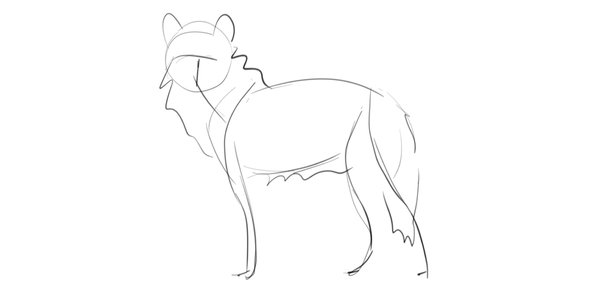
When you want to draw something from scratch, it’s very important to create a base first. This way it will be easier to keep the correct proportions and pose during the process. Such a base may take the form of a very simple sketch, a shadow of the final drawing you have in mind.
Step 2
Let’s build the basic skeleton for this sketch now. First, the chest.
Step 3
Draw the back and turn gently to create the outline of the fluffy rump.
Step 4
Add the shoulder blade in the front.
Step 5
Correct proportions are very important if you want to draw a specific animal. Wolves have long legs, so the distance between the chest and the ground should be slightly longer than the height of the chest.
Step 6
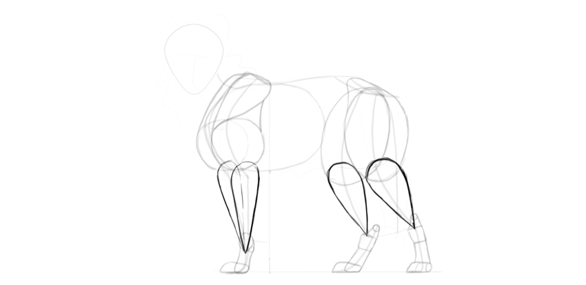
Once you have the ground established, you can build the limbs out of simple lines:
Step 7
The other pair of limbs must have the same proportions, even if they have a different position. To achieve this, create curvy paths across the joints.
Step 8
The joints of the other pair of limbs must follow these paths.
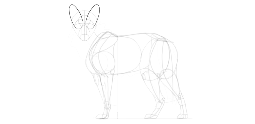
Step 9
Add the general shape of the head.
Step 10
Add the neck and the tail in a typical wolf position.
2. How to Draw a Wolf’s Body
Step 1
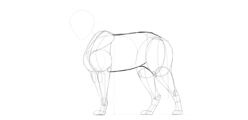
Time to add some body to this skeleton. First, the big muscle mass of the arm: the biceps and triceps.
Step 2
Add the mass of the shoulder above it.
Step 3
Close the shape of this mass with a gentle curve.
Step 4
The shoulders seem to be slightly rotated, so we should see another one, too.
Step 5
Draw an oval in place of the thigh. No muscles needed—they would be covered with fluff anyway!
Step 6
Connect the thigh with the hips.
Step 7
Give a special, detailed shape to the wrist and ankle joints.
Step 8
Time for the paws. Wolves have them quite big and flat.
Step 9
The upper part („hands” and feet) should be slim, because they’re not very furry.
Step 10
Add some muscle mass between the upper body and the paws.
Step 11
Some more details will be useful here.
Step 12
Finish the outline around these simple shapes to create a nice outline of the limbs.
Step 13
Outline the main body, too.
3. How to Draw a Wolf’s Head
Step 1
The proportions of the head are even more important than those of the body, because we’re very good at recognizing faces. We have a clear image of a wolf’s face in our mind, and the drawing must match it! Let’s add the details of the head carefully then.
Draw a cross on the head to show the middle and the eyebrow line.
Step 2
Draw a teardrop shape under the eyebrow line for the muzzle.
Step 3
Mark the front of the muzzle. This will add a little perspective.
Step 4
Put „upside-down glasses” on top of the wolf’s nose. This will be the space for the eyes.
Step 5
Draw the nasal bridge.
Step 6
Draw the forehead.
Step 7
Draw the ears behind the eyes. They’re long and rounded on tips.
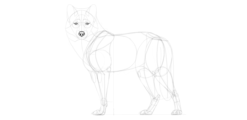
Step 8
Draw the nose.
Step 9
Draw the circular eyes.
Step 10
Draw the mouth.
Step 11
The eyes need some more details to be fully wolf-like:
Step 12
Add more detail to the nose as well.
Step 13
Give a detailed shape to the ears.
Step 14
Don’t forget about the fur! It really adds to a wolf’s head shape.
Step 15
Add fur to other places, too.
4. How to Draw a Wolf’s Paws
Step 1
We already have the base for the paws, so now we need to add the details. First, draw the middle toe (there are two toes in the middle, but in this perspective only one is visible).
Step 2
Draw the outer toes. In wolves, the middle toes are visibly longer than the outer ones.
Step 3
Connect them with the rest of the limb, creating a little hump right before the toes. This will give them a more accurate look.
Step 4
Draw the paw pads.
Step 5
Draw the claws. They’re long, slightly curved, and blunt.
Step 6
Draw the back of each paw with the big pad beneath.
Step 7
That third paw is in perspective, so it needs a different treatment. Draw all the toes…
… then the paw pads…
… and the claws.
Step 8
There are special „wrist pads” on the front legs as well, and dew claws (thumb claws) which are not visible in this pose.
5. How to Finish a Drawing of a Wolf
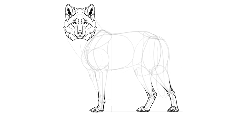
Step 1
The guide lines are all drawn, and we can create the final lines now. If you’ve been drawing traditionally, you can use a darker tool for this final outline, or put a new sheet of paper over the sketch.
Outline the nose.
Step 2
Outline the eyes.
Step 3
The eyes get their special wolf expression mainly from the details around them.
Step 4
Draw the muzzle.
Step 5
Draw the ears.
Step 6
Outline the fur around the face. Don’t try to draw all the single hairs—instead, focus on the clumps and tufts.
Step 7
Outline the paws.
Step 8
Outline the feet. Can you see how the guide lines can be used to create additional detail?
Step 9
Cover the neck with fur.
Step 10
The forelegs are skinny, so we need to add more details to them.
Step 11
Add the fluff on the thigh…
… and the belly.
Step 12
Add some fur here and there.
Step 13
When you’re done, darken the outer outline and thicken some lines to give them variety.
Good Job!
You’ve learned how to draw a wolf! If you want to keep drawing, don’t forget to check these out:
This tutorial was originally published in July 2012 as a Tuts+
Premium tutorial. It is now available free to view. Although this
tutorial does not use the latest version of Adobe Photoshop, its
techniques and process are still relevant.
In this tutorial, we’ll start with a photographic reference, then through some manipulation in Photoshop and careful tracing by hand, pare it down to its essential elements. The result is a stylized mark that is representative, yet bold and graphic. Let’s get started!
Do you love animal logos? Then we’re sure you’ll love our Animal Logo Designs available through GraphicRiver. Or enlist the help of a design professional from Envato Studio for custom logo designs.
1. How to Create the Initial Concept
Step 1
When approaching any logo assignment, it’s best to do a fair amount of research before you even put pencil to paper. Sometimes you’ll get a detailed creative brief, and other times, the client will have a vague notion of what they’re after, and let you do the rest. Regardless of the scenario, research should be the first step in the process. Even if the client already has as logo basically done and wants you to polish it, I believe that the more knowledge you bring to the job, the more successful it will be.
For this imaginary assignment, the client wanted a lion’s head for their logo. Lions often represent royalty, pride, strength and leadership. I decided on a proud lion in profile, and made a few very rough thumbnail sketches. I decided to do something that was more realistic than stylized, yet bold and graphic.
My sketches looked like a cross between a sheep and a kitten, so it was time to do some research. I hit up the usual image searches for a lion in profile. At this point, I was just looking at images and absorbing visual information. I wanted to get a good sense of what a lion actually looks like, and carry that with me when working on the logo.
In order to make a realistic vector logo, I wanted to find a good photograph on which to base my design. I want to state emphatically that you should always get the photographer’s permission when using a photo as a source image. Even though your end result will be quite stylized, it’s simply not OK to use a copyrighted photo without permission. There was a case several years ago regarding the logo used on the Kentucky license plates. A German photographer claimed the logo was based on his photograph. He sued and the license plates had to be changed. So stay on the right side of the law and get permission.
Step 2
The other aspect of logo research involves seeing what’s already been done. It can be tricky to look at lots of logos and try not to be influenced by them, but it’s also good to know what’s already out there. You don’t want to spend hours on a logo only to find that it looks very similar to another one. I first did a Google image search for „lion head logo.” It’s a popular motif, and the designs run the gamut from realistic and detailed to stylistic or cartoony.
I didn’t see anything quite like what I had in mind, so it was on to the initial prep work.
2. How to Prepare the Reference Image
Step 1
I found an excellent source photo at PhotoDune, and got permission to use it. Since this is an imaginary assignment and no money is changing hands, the photographer was kind enough to let me use it for demonstration.
Since my logo will be high contrast, I first want to adjust the photo so I can more easily see the highlights and shadows.
Open the photo in Photoshop, and go to Image > Adjustments > Black & White. Since my image consisted of mainly yellow tones, I chose the Yellow Filter preset. Using the Black & WhiteAdjustment rather than simply converting to Grayscale gives you more control over how the gray tones will look. You can start with a preset and fine tune the color sliders.
Step 3
Now convert the image to grayscale. Go to Image > Adjustments > Levels. Adjust the sliders to add contrast to the image.
Step 4
Now that your image is prepared, print it, then use tracing paper to draw out the lines and shapes by hand with pencil. You may think it would be faster to just start drawing in Illustrator, but drawing by hand allows you to make decisions about which shapes and lines are important to keep and which can be discarded. Keep your pencil strokes smooth and deliberate. In my tracing, I’ve added hatch marks to larger areas of black, just as a reminder when I’m creating the vector shapes later. The finished pencil trace is below.
3. How to Draw Vector Shapes
Step 1
Begin drawing the lines and shapes with the Pen Tool. You could use the Pencil Tool, the Brush tool, or even the Blob Brush Tool, but we’re going for precise paths, with only the essential points.
It can help to increase the line weight of your paths. Doing so can help you more easily see potential problems. In the examples below, sharp angles and points stand out better on a thicker stroke. Carefully adjust the handles to correct issues like this.
Step 2
Continue working in this manner, smoothing and simplifying paths along the way.
4. How to Add Color
Step 1
Fill in the shapes with solid color. Keep simplifying paths where necessary, and smoothing points.
Step 2
Draw a path for the white area. This will eventually be cut out of the overall logo, or will be filled with a different color. The path is shown in green below.
Step 3
Draw in the highlights. Again, these may be eventually cut out, but for now keep them a lighter color.
5. How to Refine the Logo
Step 1
At this point, it’s down to miniscule decisions. Take away everything that’s not necessary for the image to read as a lion. Simplify!
Some changes I made were simplifying the ear shape and removing some of the shapes on the mane. I also enlarged the eye a bit so it would still be visible at smaller sizes, and I made the dots on the muzzle larger and more uniform.
Step 2
When you’ve made all of the tweaks and refinement and you’re certain it’s done, you can reduce the illustration to only the paths that make up the highlights. Use the Divide function on the Pathfinder panel, or the Shape Builder tool to remove all but the lighter colors, creating one compound path. The finished logo is shown in Outline mode below. This step is optional, you can always keep bother colors. WIth a highlights-only vector shape, however, you can easily place the object on a differently-colored background to create different color schemes.
Conclusion
Tweaking and perfecting each path is important and can take hours to get everything in its optimum place. Be sure to view the image at different sizes along the way. Building a solid foundation through hand drawing can make the process a little easier and faster.
Stunning Animal Logos From GraphicRiver
Are you a budding entrepreneur in need of a good logo? Then browse our selection of incredible Animal Logos right on GraphicRiver. These amazing designs have been handcrafted by a community of talented designers. And check out one of the gorgeous designs below!
Enjoy this stunning lion logo design full of vibrant colors. This design is inspired by modern geometric logos that slice up the lion for an interesting style. Download this logo today to get access to this 100% fully editable and scalable design.
British photographer Jonathan Smith traveled to Patagonia and Iceland to take photos of the glaciers glaciers, revealing the beauty of the cold elements. A series that could have been titled “A song of water and ice”.
What’s it really like to go through an intensive „bootcamp” course online?
To find out, we asked School of Motion for one seat in their Design Bootcamp class, which we would award to a lucky student. In turn, that student would share an honest journal of their experience on Motionographer.
This tutorial will show you how to use Photoshop’s layer styles, filters, and layer masks to create a quick and easy digital glitch text effect. Let’s get started!
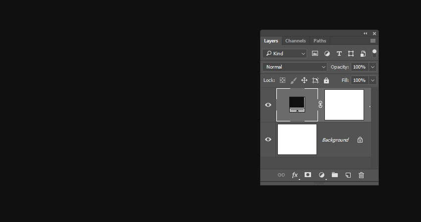
Create a 900 x 700 pxNew Document, click the Create new fill or adjustment layer icon at the bottom of the Layers panel, choose Solid Color, and use the Color#101010.
Step 2
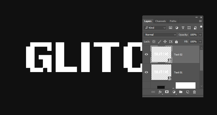
Create the text in White using the font Pixel Digivolve, and set the Size to 170 pt.
Step 3
Rename the text layer to Text 01, right-click it, and choose Convert to Smart Object.
Step 4
Duplicate the Text 01 layer, and rename the copy to Text 02.
Step 5
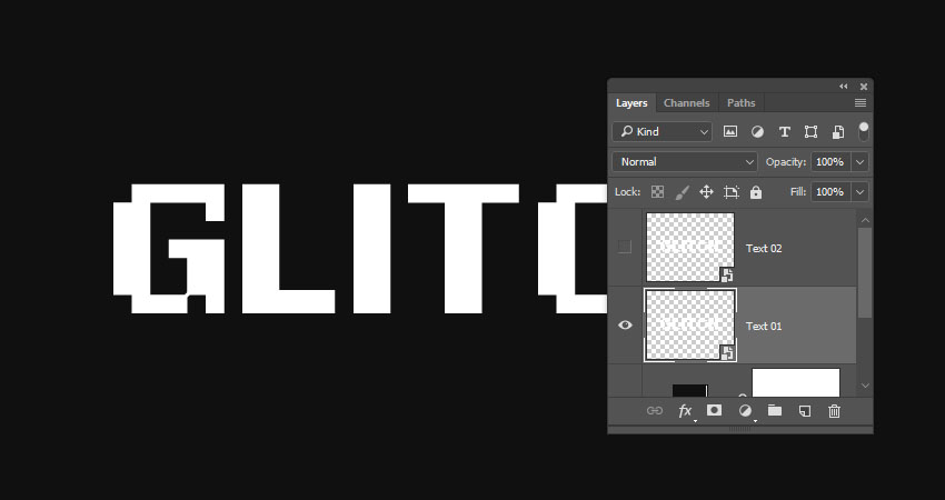
Hide the Text 02 layer by clicking the eye icon next to it.
2. How to Apply Layer Styles
Double-click the Text 01 layer to apply the following Layer Style:
Step 1
Under Blending Options go to Advanced Blending, and uncheck the G and BChannels’ boxes.
Step 2
Add an Outer Glow with these settings:
Opacity: 50%
Color: #ffffff
Size: 10
This will style the red part of the text.
Show the Text 02 layer, and double-click to apply the following Layer Style:
Step 3
Under Blending Options, go to Advanced Blending, and uncheck the R Channels box.
Step 4
Add an Outer Glow with these settings:
Opacity: 50%
Color: #ffffff
Size: 10
This will style the blue part, which will not be visible now, but we’ll work on it next.
3. How to Create a Basic Glitch Effect
Step 1
Pick the Move Tool, and use the Arrow Keys to slightly nudge the Text 01 and Text 02 layers in opposite directions to show the red and blue colors, and get a result you like.
Step 2
Duplicate both the Text 01 and Text 02 layers.
Step 3
Create a New Layer on top of all layers, name it Filters 01, and press the Option-Command-Shift-E keys to create a stamp of all the layers you have.
Right-click the Filters 01 layer, and choose Convert to Smart Object.
Step 4
Press-hold the Option key and click the Add layer mask icon at the bottom of the Layers panel to add an inverted layer mask.
Step 5
Duplicate the Filters 01 layer and rename the copy to Filters 02.
4. How to Work With Layer Masks
Step 1
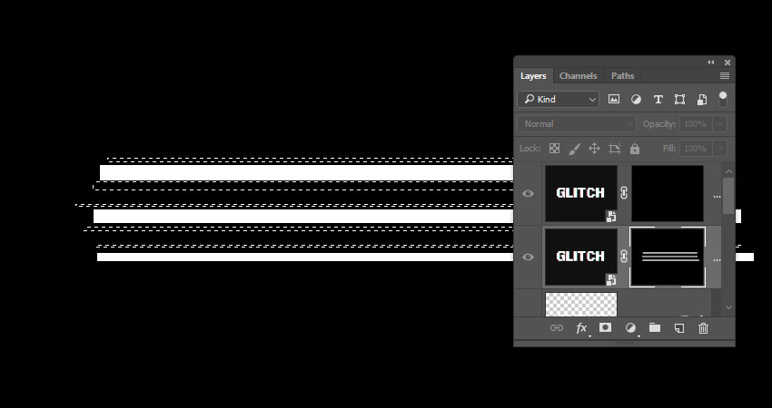
Pick the Rectangular Marquee Tool, create some random selections that cover parts of the text, and make sure to extend the selections to reach outside the left and right sides of the text.
Keep enough vertical space between the selections as we’re going to create some more selections between them.
Step 2
Select the Filters 01 layer mask’s thumbnail, and Fill the selection with White.
Press Command-D to Deselect.
Step 3
Press-hold the Option key and click the Filters 01 layer mask’s thumbnail to show it. We will use this as a reference to create the selections between the lines we already have.
Step 4
Use the Rectangular Marquee Tool again to create narrower lines between the ones you have, but keep some unselected areas as well.
Step 5
Press-hold the Option key and click the Filters 01 layer mask’s thumbnail again to get the original content, select the Filters 02 layer mask’s thumbnail, and Fill the new selection with White.
Deselect when you’re done.
5. How to Apply Glitch Effect Filters
Step 1
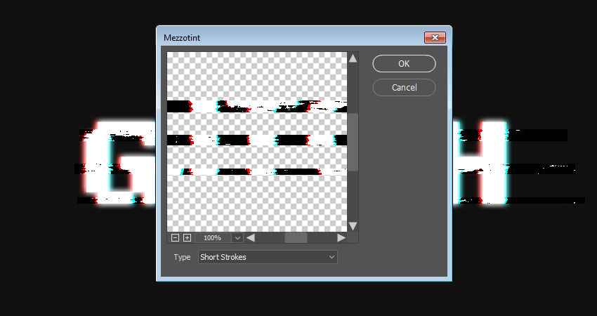
Select the Filters 01 layer, go to Filter > Pixelate > Mezzotint, and set the Type to Short Strokes.
Step 2
Select the Filters 02 layer, and go to Filter > Distort > Wave. This can be a tricky filter to apply, so you might need to try different values until you get a result you like.
The values used here are:
Number of Generators: 1
Wavelength:
Min. 1
Max. 106
Amplitude:
Min. 90
Max. 133
Scale:
Horiz. 6
Vert. 1
Type: Sine
Undefined Areas: Repeat Edges Pixels
Step 3
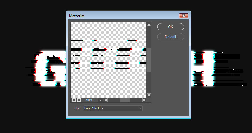
Go to Filter > Pixelate > Mezzotint, and set the Type to Long Strokes.
Step 4
Go to Filter > Stylize > Wind, set the Method to Wind, and the Direction to From the Right.
Step 5
If you need to remove any unwanted parts, select the layer mask’s thumbnail, pick the Brush Tool, and choose a soft round tip.
Set the Foreground Color to Black, and paint over the unwanted areas to hide them.
6. How to Add Scanlines
Step 1
Click the Create new fill or adjustment layer icon at the bottom of the Layers panel, and choose Color Lookup.
Choose the Fuji ETERNA 250D Fuji 3510 (by Adobe).cube table from the 3DLUT File menu.
Step 2
Create a New Layer on top of all layers, Fill it with White, name it Scanlines, and convert it to a Smart Object.
Make sure that the Foreground and Background Colors are set to Black and White.
Step 3
Go to Filter > Filter Gallery > Sketch > Halftone Pattern, and use these settings:
Size: 1
Contrast: 5
Pattern Type: Line
Step 4
Change the Scanlines layer’s Blend Mode to Soft Light and its Opacity to 50%.
Step 5
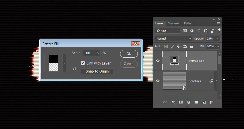
Click the Create new fill or adjustment layer icon at the bottom of the Layers panel, choose Pattern, and use the Pattern 1 Fill from the basic scanline patterns pack.
Change the layer’s Opacity to 25%.
7. How to Create a Noise Overlay
Step 1
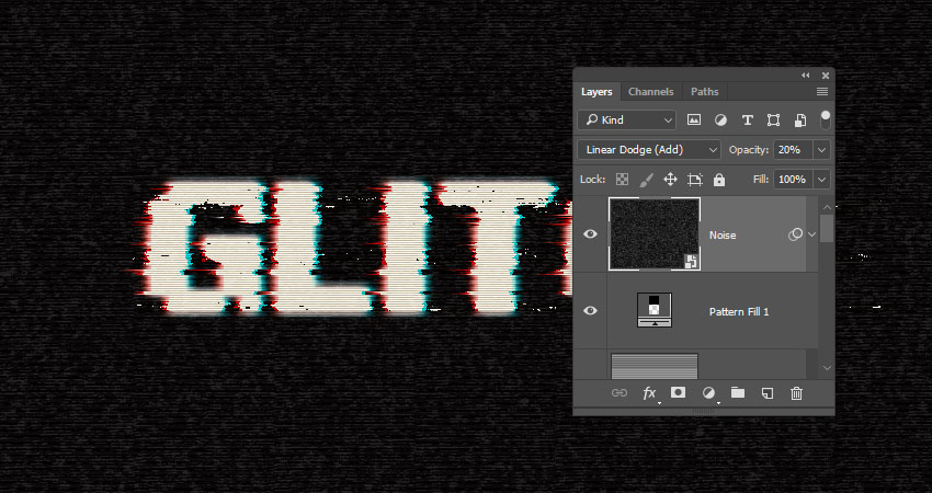
Create a New Layer on top of all layers, fill it with Black, name it Noise, and convert it to a Smart Object.
Step 2
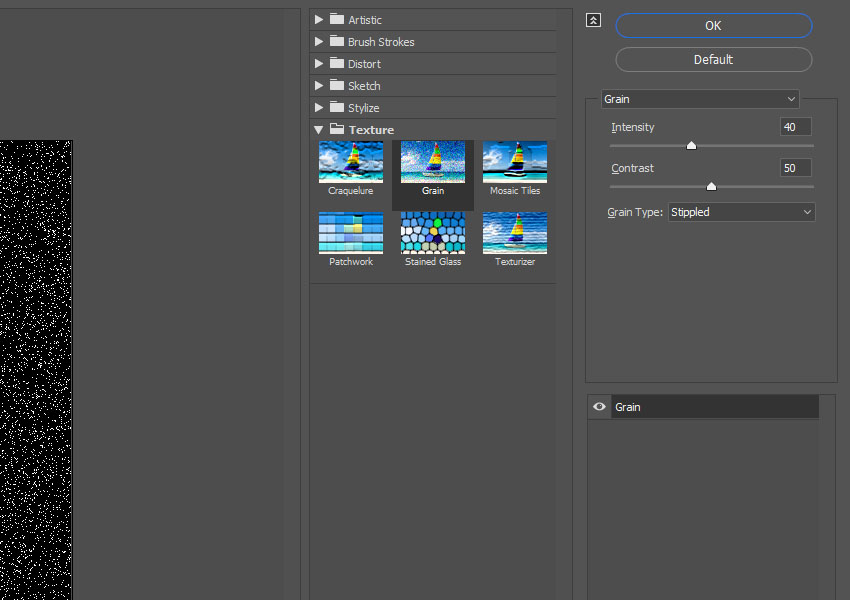
Go to Filter > Texture > Grain, and use these settings:
Intensity: 40
Contrast: 50
Grain Type: Stippled
Step 3
Click OK, and go again to Filter > Texture > Grain and use the same values as the previous step.
Step 4
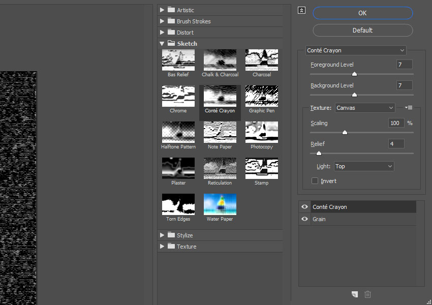
Click the New effect layer icon in the bottom right corner, go to Sketch > Conté Crayon, and use these settings:
Foreground Level: 7
Background Level: 7
Texture: Canvas
Scaling: 100%
Relief: 4
Light: Top
Step 5
Change the Noise layer’s Blend Mode to Linear Dodge (Add), and its Opacity to 20%.
Step 6
Use the Rectangular Marquee Tool to create random selections all over the document, but try to avoid creating big selections over the text.
Step 7
Press Command-J to Duplicate the selection in a New Layer, rename it to Noise Lines, and change its Blend Mode to Color Dodge.
Congratulations! You’re Done
In this tutorial, we created a couple of text layer smart objects, and used blending options and layer styles to create the main glitch effect.
Then, we created filter layers, and adjusted their layer masks.
Finally, we used a bunch of filters to finish off the glitch effect, as well as added a quick noise overlay to make it more realistic.
Please feel free to leave your comments, suggestions, and outcomes below.
Agregator najlepszych postów o designie, webdesignie, cssie i Internecie