Every week, we’ll give you an overview of the best deals for designers, make sure you don’t miss any by subscribing to our deals feed. You can also follow the recently launched website Type Deals if you are looking for free fonts or font deals.
25% off the Toffee range + free worldwide delivery (over $75 USD)
Toffee’s range of high quality bags and lifestyle accessories are purposefully designed to take care of your essentials, with plenty of clever, thoughtful touches making them perfect for the modern creative professional.
Get 25% OFF the entire Toffee range. Use coupon code: DESIGNER at checkout.
The Delightful Font Bundle
The Delightful Font Bundle is here! Jam packed with 30 fonts from 19 different font families all for JUST $19. The fully accessible craft friendly fonts come with extra’s, swirls and swashes and all included in the price.
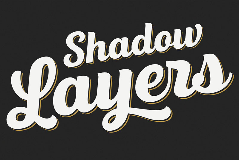
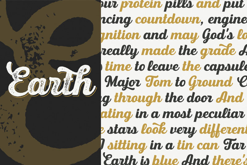
If classic Americana scripts are your thing, then you need to meet the UT Triumph Font Family. Made up of 3 unique weights, this professional script font also features a shadow layer for each, resulting in 6 total fonts. With loads of OpenType features, you’ll have the perfect typeface for everything from menus to logos.
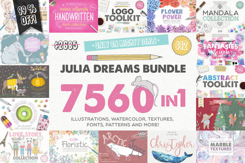
Julia Dreams Bundle of 7500+ Professional Graphics
More than 7,500 different graphic elements including illustrations, watercolors, textures, fonts, patterns and more. From food to holidays, this bundle has you covered for whatever project you’re currently undertaking.
Smartmockups App: The #1 Tool for Creating Stunning Marketing Images
The Smartmockups App gives you the power to create stunning marketing materials, even if you’re not a skilled designer and with the brand new version of this amazing app (for both Window and Mac), you can enjoy over 400 professional templates for your digital and print projects at one place!
This year again, TISDC (Taiwan International Student Design Competition) launches its design student competition, the largest in the world. In 2016, the TISDC attracted students from 882 schools in 69 countries joined the competition. A new record was broken with a total number of 14’858 registrations.
The event, organized by the Taiwan Ministry of Education, executed by Asia University, and sponsored by Sayling Wen Cultural & Educational Foundation and iSee Taiwan Foundation, is in its 9th year of existence.
Theme of the 2017 edition: Opportunity
This year, the participating design students will have to tackle a broad subject: Opportunity. A challenging topic that can be approached through the four categories of the contest: Product Design, Visual Design, Digital Animation, and Brand Specified.
There is a Grand Prix for the overall winner, but also 1 Gold Prize, 1 Silver Prize, and 3 Bronze Prizes for each category of the competition. These prizes are sponsored by Sayling Wen Cultural & Educational Foundation, and there are 15 other special prizes endorsed by international design associations. The total Prize Money is up to the stunning amount of $160,000.
Enter the competition!
For more info and participation (no registration fee), please visit: www.tisdc.org
In many Japanese stores like rice or miso shops, you could find that the people working traditionally wear a special type of apron, these are called Maekake. For their apron packaging, Anything, a company established in Japan, hired Nosigner to design a creative packaging. The designers made a tremendous job of creating a reference to the product in the packaging.
We’ve just wrapped up a great series of posts from Chris Ferdinandi on modern form validation. It starts here. These days, browsers have quite a few built-in tools for handling form validation including HTML attributes that can do quite a bit on their own, and a JavaScript API that can do even more. Chris even showed us that with a litttttle bit more work we can get down to IE 9 support with ideal UX.
So what’s up with third-party form validation libraries? Why would you use a library for something you can get for free?
You need deeper browser support.
All „modern” browsers + IE 9 down is pretty good, especially when you’ve accounted for cross-browser differences nicely as Chris did. But it’s not inconcievable that you need to go even deeper.
Libraries like Parsley go down a smidge further, to IE 8.
You’re using a JavaScript framework that doesn’t want you touching the DOM yourself.
When you’re working with a framework like React, you aren’t really attaching event handlers or inserting anything into the DOM manually at all. You might be passing values to a form element via props and setting error data in state.
You can absolutely do all that with native form validation and native constraint validation, but it also makes sense why you might reach for an add-on designed for that. You might reach for a package like react-validation that helps out in that world. Or Formik, which looks to be built just for this kind of thing:
The hope is that these libraries are nice and lightweight because the take advantage of the native API’s when they can. I’ll leave that to you to look into when you need to reach for this kind of thing.
You’re compelled by the API.
One of the major reasons any framework enjoys success is because of API nicety. If it makes your code easy to understand and work on, that’s a big deal.
Sometimes the nicest JavaScript API’s start with HTML attributes for activation and configuration. Remember that native HTML constraint validation is all about HTML attributes controlling form validation, so ideally any third-party form validation library would use them in the spirit of progressive enhancement.
You’re compelled by the integrations.
They promised you it „Works with Bootstrap!” and your project uses Bootstrap, so that seemed like a good fit. I get it, but this is my least favorite reason. In this context, the only thing Bootstrap would care about is a handful of class names and where you stick the divs.
It validates more than the browser offers.
The browser can validate if an email address is technically valid, but not if it bounces or not. The browser can validate if a zip code looks like a real zip code, but not if it actually exists or not. The browser can validate if a URL is a proper URL, but not if it resolves or not. A third-party lib could potentially do stuff like this.
You’re compelled by fancy features.
Perhaps the library offers a feature where when there is an error, it scrolls the form to that first error.
Perhaps the library offers a captcha feature, which is a related concept to form validation, and you need it.
Perhaps the library offers an event system that you like. It publishes events when certain things happen on the form, and that’s useful to you.
Perhaps the library not only validates the form, but creates a summary of all the errors to show the user.
These things are a little above and beyond straight up form validation. You could do all of this with native validation, but I could see how this would drive appoption of a third-party library.
You need translation.
Native browser validation messages (the default kind that come with the HTML attributes) are in the language that browser is in. So the French version of Firefox spits out messages in French, despite the language of the page itself:
Third-party form validation libraries can ship with language packs that help with this. FormValidation is an example.
Conclusion
I’m not recommending a form validation library. In fact, if anything, the opposite.
I imagine that third-party form validation libraries are going to fall away a bit as browser support and UX gets better and better for the native APIs.
Or (and I imagine many already do this), internally they start using native APIs more and more, then offer nice features on top of the validation itself.
I bought this mug recently for use at work. Being a professional web developer, I decided it would establish me as the office’s king of irony. The joke on it isn’t unique, of course. I’ve seen it everywhere from t-shirts to conference presentations.
Most of you reading this have probably encountered this image at least once. It’s a joke we can all relate to, right? You try and do something simple with CSS, and the arcane ways in which even basic properties interact inevitably borks it up.
If this joke epitomizes the collective frustration that developers have with CSS, then at the risk of ruining the fun, I thought it would be interesting to dissect the bug at its heart, as a case study in why people get frustrated with CSS.
There are three conditions that have to be met for this problem to occur:
The content can’t shrink to fit the container
The container can’t expand to fit the content
The container doesn’t handle overflow gracefully
In real-world scenarios, the second condition is most likely the thing that needs to be fixed, but we’ll explore all three.
Fixing the content size
This is little bit unfair to the box’s content because the word AWESOME can’t fit on one line at the given font size and container width. By default, text wraps at white space and doesn’t break up words. But let’s assume for a moment that we absolutely cannot afford to change the container’s size. Perhaps, for instance, the text is a blown-up header on a site that’s being viewed on an especially small phone.
Breaking up words
To get a continuous word to wrap, we have to use the CSS property word-break. Setting it to break-all will instruct the browser to break up words if necessary to wrap text content within its container.
In this case, the only way to make the content more responsive was to enable word breaking. But there are other kinds of content that might be overflowing. If word-wrap were set to nowrap, the text wouldn’t even wrap in-between words. Or, the content could be a block-level element, whose width or min-width is set to be greater than the container’s width.
Fixing the container size
There are many possible ways the container element might have been forced to not grow. For example: width, max-width, and flex. But the thing they all have in common, is that the width is being determined by something other than its content. This isn’t inherently bad, especially since there is no fixed height, which in most cases would cause the content to simply expand downwards. But if you run into a variation on this situation, it’s worth considering whether you really need to be controlling the width, or whether it can be left up to the page to determine.
Alternatives to setting width
More often than not, if you set an element’s width, and you set it in pixels, you really meant to set either min-width or max-width. Ask yourself what you really care about. Was this element disappearing entirely when it lacked content because it shrunk to a width of 0? Set min-width, so that it has dimension but still has room to grow. Was it getting so wide that a whole paragraph fit on one line and was hard to read? Set max-width, so it won’t go beyond a certain limit, but also won’t extend beyond the edge of the screen on small devices. CSS is like an assistant: you want to guide it, not dictate its every move.
Overflow caused by flexbox
If one of your flex items has overflowing content, things get a little more complicated. The first thing you can do is check if you’re specifying its width, as in the previous section. If you aren’t, probably what’s happening is the element is „flex-shrinking”. Flex items first get sized following the normal rules; width, content, etc. The resulting size is called their flex-basis (which can also be set explicitly with a property of the same name). After establishing the flex basis for each item, flex-grow and flex-shrink are applied (or flex, which specifies both at once). The items grow and shrink in a weighted way, based on these two values and the container’s size.
Setting flex-shrink: 0 will instruct the browser that this item should never get smaller than its flex basis. If the flex basis is determined by content (the default), this should solve your problem. be careful with this, though. You could end up running into the same problem again in the element’s parent. If this flex item refuses to shrink, even when the flex container is smaller than it, it’ll overflow and you’re back to square one.
Handling overflow
Sometimes there’s just no way around it. Maybe the container width is limited by the screen size itself. Maybe the content is a table of data, with rows that can’t be wrapped and columns that can’t be collapsed any further. We can still handle the overflow more gracefully than just having it spill out wherever.
overflow: hidden;
The most straightforward solution is to hide the content that’s overflowing. Setting overflow: hidden; will simply cut things off where they reach the border of the container element. If the content is of a more aesthetic nature and doesn’t include critical info, this might be acceptable.
If the content is text, we can make this a little more visually appealing by adding text-overflow: ellipsis;, which automatically adds a nice little „…” to text that gets cut off. It is worth noting, though, that you’ll see slightly less of the actual content to make room for the ellipsis. Also note that this requires overflow: hidden; to be set.
The preferable remedy is usually going to be setting overflow-x: auto;. This gives the browser the go-ahead to add a scroll bar if the content overflows, allowing the user to scroll the container in that direction.
This is a particularly graceful fallback, because it means that no matter what, the user will be able to access all of the content. Plus, the scrollbar will only appear if it’s needed, which means it’s not a bad idea to add this property in key places, even if you don’t expect it to come into play.
Why does this conundrum resonate so universally with people who have used CSS?
CSS is hard because its properties interact, often in unexpected ways. Because when you set one of them, you’re never just setting that one thing. That one thing combines and bounces off of and contradicts with a dozen other things, including default things that you never actually set yourself.
One rule of thumb for mitigating this is, never be more explicit than you need to be. Web pages are responsive by default. Writing good CSS means leveraging that fact instead of overriding it. Use percentages or viewport units instead of a media query if possible. Use min-width instead of width where you can. Think in terms of rules, in terms of what you really mean to say, instead of just adding properties until things look right. Try to get a feel for how the browser resolves layout and sizing, and make your changes and additions on top of that judiciously. Work with CSS, instead of against it.
Another rule of thumb is to let either width or height be determined by content. In this case, that wasn’t enough, but in most cases, it will be. Give things an avenue for expansion. When you’re setting rules for how your elements get sized, especially if those elements will contain text content, think through the edge cases. „What if this content was pared down to a single character? What if this content expanded to be three paragraphs? It might not look great, but would my layout be totally broken?”
CSS is weird. It’s unlike any other code, and that makes a lot of programmers uncomfortable. But used wisely it can, in fact, be awesome.
If you are looking for a truly unique ring, you should pay attention to this cool Kickstarter projet by Enchanted Soul. The project owner can already rejoice, because its Kickstarter was funding within two days, and still progressing.
The project started out of frustration when purchasing a wooden ring that wasn’t as good as advertised online. Challenge was taken to create a better quality ring, which was achieved very well. You can see the results on the Kickstarter page here.
French ballet shoe company Repetto is running “Ce monde parle ballet” (The World Speaks Ballet), an advertising campaign in which young women turn their lives into dramatic stages. The first commercial in the Repetto World Speaks Ballet campaign, “Drama”, features a smartphone-powered public display of choreography. The second commercial, “Escape”, plunges into the imagination of young woman who has only one desire, to escape the bed of her one-night stand conquest. The third commercial in the series is yet to be revealed.
Repetto World Speaks Ballet Credits
The Repetto World Speaks Ballet campaign was developed at Marcel Paris by creative director Rémy Aboukrat, copywriter Kevin Salembier, art director Julien Boissinot, agency producer Rémy Guizerix.
Filming was shot by director Edouard Le Scouarnec via Ubiquity Films with director of photography Kaname Onoyama, producers Clément Gaucher Holmann and Gautier Lacaille, director of production Pierre-Arnaud Andrieu, choreographers Sébastien Bertaud and Maxime Thomas.
The campaign features dancers Marion Barbeau and Marion Gautier de Charnacé and actress Nadia Tereszkiewicz.
Colourist was Emiliano Serantoni at Firm Studio. Post production was done at Prodigious. Sound was produced by Clemens Hourriere.
Music for Escape is “Sexy World” by Norma Gladys. Music for Drama is an original song composed for the campaign.
We made it a decade! It’s our tenth birthday! 🎉 This is an extra-special one, as we hit those double digits. Each year on July 4th we mark the occasion with a post. In that tradition, allow me to ramble on a bit about the past and present.
The very first post ever on this site was literally a CSS trick. It’s a classic, too. „Header Text Image Replacement”:
Funny, I just used that trick a couple of days ago.
The post is interesting to me for a number of reasons. For one, I certainly didn’t come up with that technique. At the time, I was just learning CSS myself and writing down interesting stuff I’d come across and used in my own work. I think I felt like I learned it a little more deeply by writing it out as an explanation like that.
For another, at the time, I was entirely unaware of where a trick like that fit into CSS history and larger discussions about CSS and semantics and accessibility and all that. A year later, I started getting interested in stuff like that and did stuff like rounded up many possible techniques for image replacement. Ultimately, even making a „museum” for it.
Before I go too much further here, I gotta mention the fact that we just re-opened the shop in honor of this anniversary. We made up some nerdy web related T-Shirts, and would love it if you would pick one up to help support the site:
CSS-Tricks was a WordPress site running on PHP and MySQL back then. Today, it’s… a WordPress site running on PHP and MySQL. Although WordPress was 2.0.1 back then and 4.8 now. PHP was 5.2 then and 7.1 now. MySQL 5.0 then and 5.7 now. All those seem fairly small version bumps for a 10-year span, but really they are quite significant technological advances.
Back then we made sites with HTML, CSS, and JavaScript. These days, sites are… HTML, CSS, and JavaScript.
I try to keep a design history the best I can. Let’s do a little blast-to-the-past of header styles:
This one isn’t to be underestimated: it takes serious work to keep a website running. There is always something that needs to be done.
There is always some bit of software that needs to be updated.
There is always some weird bug that needs attention.
There is always some business opportunity that needs work to get going.
There is always some part of the design that really needs a look.
There is always some SSL certificate to worry about.
There is always some server or DevOps thing to think about.
I have a whole section of my TODO’s called „Site Work” that is full of things I need to get done around here. For example, right this second, I know there are some assets that are loading in a way I don’t want them to and I need to look at it for performance reasons. I’d like to do some stuff with embedded Pens to make them a bit wider by default, but need to be careful not to screw up any layout. I know markdown is behaving weird in the forums for the 692nd time, and that a private forum is showing publicly in a place I don’t want. That’s like 5% of the list!
I shudder to think what would happen if all this work wasn’t done constantly. The site would fall to pieces.
And that doesn’t include what you might actually think is the hard work involved in running a website:
Writing new content
Editing submitted content
Updating old content
Managing the publishing schedule and planning future content
Community management
Promoting and marketing the site
Finding sponsors
Make sure sponsors are happy
Social media
If you do all that work, on both lists, the hope is that you just keep to keep on keeping on. Everyone gets paid for their effort. This is not a hockey-stick growth kind of site. It’s a modest publication.
Speaking of slow growth, that’s the deal:
That’s not representative of just doing the same ol’ same ol’ year in and year out. That’s representative of more and more people working on the site and more and more money being invested back into the site.
One interesting aspect of this is how the bulk of that traffic is generated by search. Of course, I have no problem with that. I’m very happy that this site shows up in search results and can be useful to people that way. At the same time, having an active readership is a very valuable thing. Not just people who show up in search, but people who read the site regularly like they do the news. Definitely a balance there. That’s why we do things like invest in the newsletter, to make sure we have ways to read CSS-Tricks that come to you and are worth your time.
On a personal note, I’m still living in Milwaukee, back here after a 7-month stint in Miami. My fiance Miranda got a job down there at FIU and we took the opportunity to move down, skip the Wisconsin winter, and be close to our Florida friends. I don’t post publicly all that much about personal life stuff, but this will be a huge year for me. The Miami move to and back was big! Miranda and I are getting married this summer! We’re also expecting a baby in the fall! And we’re also planning to move to Oregon in late summer! Crazy times. There almost couldn’t possibly be more going on, especially factoring in all this running multiple businesses stuff and a fairly aggressive speaking schedule this year.
My main focus is CodePen, which has had a tremendous last year. After taking funding, hiring an amazing team, and releasing lots of big stuff, we’ve got ourselves to that wonderful spot all businesses desire: profitability. The roadmap of ideas on CodePen is absolutely never ending. I’ve never felt like we have more work in front of us as strongly as I do right now.
I’d like to give special thanks to all the sponsors that make the site possible. I can’t thank every single one, but I will give a special shout out to Media Temple, who has been a long time sponsor and supporter of CSS-Tricks.
And of course the heartiest of thanks to all you readers, without whom there would be no reason to have a site at all. The discourse that happens here is top notch and I couldn’t be happier to facilitate it. And lastly, as you likely know, this site is by front-end developers for front-end developers, so if you have something to say, feel free to reach out.
Staggered animation, also known as „follow through” or „overlapping action” is one of the twelve Disney principles of animation as defined by Ollie Johnston and Frank Thomas in their 1981 book „The Illusion of Life”. At its core, the concept deals with animating objects in delayed succession to produce fluid motion.
The technique doesn’t only apply to cute character animations though. The Motion design aspect of a digital interface has significant implications on UX, user perception and „feel”. Google even makes a point to mention staggered animation in its Motion Choreography page, as part of the Material Design guide:
While the topic of motion design is truly vast, I often find myself applying bits and pieces even in smallest of projects. During the design process of the Interactive Coke ad on Eko I was tasked with creating some animation to be shown as the interactive video is loading, and so this mockup was born:
At a first glance, this animation seems trivial to implement in CSS, but turns out that is not that case! While it might be simpler with GSAP and the shiny new Web Animations API, doing so with CSS requires a few tricks which I’m going to explain in this post. Why use CSS at all then? In this case — as the animation was meant to run while the user waits for assets to load, it didn’t make much sense to load an animation library just to display a loading spinner.
First, a bit about the anatomy of the animation.
There are four circles, absolutely positioned within a container with overflow: hidden to frame and crop the edges of the two outermost circles. Why four and not three? Because the first one is offscreen, waiting to enter stage left and the last one exists the frame stage right. The other two are always in the frame. This way, the end state of the animation iteration looks exactly like its beginning state. Circle 1 takes circle 2’s place, circle 2 takes circle 3’s place and so on.
Looks kind of weird and robotic, right? That’s because we’re missing one major component: Staggered animation. That is, each circle’s animation needs to start a bit after its predecessor. „No problem!”, you might think to yourself, „let’s use the animation-delay” property. „We’ll give the 4th circle a value of 0s, the 3rd of 0.15s and so on”. Alright, let’s try that:
Hmm… What just happened? The property animation-delay affects only the initial delay before the animations starts. It doesn’t add additional delays between every iteration so the animation goes out of sync like in the following diagram:
Math to the rescue
To overcome this, I baked the delay into the animation. CSS keyframe animations are specified in percents, and with some calculation, you can use those to define how much delay should the animation include. For example, if you set an animation-duration of 1s, and specify your start keyframe at 0%, the same values at 20%, your end at 80% and the same end values at 100%, your animation will wait 0.2 seconds, run for 0.6 seconds, then wait for another 0.2 seconds.
In my case, I wanted each circle to wait with a stagger time of 0.15 seconds before performing the actual animation taking 0.5 seconds, with the entire process taking 1 second. This means that the 4th circle animation waits 0 seconds, then animates for 0.5 seconds and waits for another 0.5 seconds. The second circle waits 0.15 seconds, then animates 0.5 seconds and waits for 0.35 seconds and so forth.
To achieve this, you need four keyframes (or three keyframe pairs): 1 and 2 account for the stagger wait, 2 and 3 for the actual animation time while 3 and 4 account for the final wait. The „trick” is to understand how to convert the required timings into keyframe percentages, but that’s a relatively simple calculation. For example, the 2nd circle needs to wait 0.15 * 2 = 0.3 seconds, then animate for 0.5 seconds. I know the total time for the animation is one second, so the keyframe percentages are calculated like so:
With the entire animation, including stagger time and wait baked into the CSS keyframes taking exactly one second, the animation doesn’t go out of sync.
Luckily, Sass allows us automate this process with a simple for loop and some inline math, which ultimately compiles into a series of keyframe animations. This way you can manipulate the timing variables to experiment and test whatever works best for your animation:
First, you need to make sure the defined stagger time/animation time isn’t too long that it overlaps the total animation time, otherwise the math (and the animation) will break.
Second, this method does generate some hefty amount of CSS code, especially if you’re using Sass to emit all the prefixes for browser compatibility. In my example, I had only four items to animate, but if yours has more items, the amount of code generated might not be worth the effort, and you probably want to stick with JS based animation libraries such as GSAP. Still, doing this entirely in CSS is pretty cool.
Making life easier
To contrast the verbosity of the Sass solution, I’d like to show you how the same can be easily achieved with the use of GSAP’s Timeline, and staggerTo function:
There are two interesting bits here. First, the last parameter of staggerTo, which defines the wait time between animating elements is set to a negative value (-0.15). This allows the elements to stagger in reverse order (circle 4–3–2–1 instead of 1–2–3–4). Cool, huh?
Second, see the bit with tl.set({}, {}, "1");? What’s this weird syntax all about? That’s a neat hack to implement the wait time at the end each circle’s animation. Essentially by setting an empty object to an empty object at time 1, the Timeline animation will now repeat after the 1-second mark, rather than after the circle animation had ended.
Looking forwards to the future
The Web Animations API is the new and exciting kid on the block, but out of scope for this article. I couldn’t resist providing you with a sample implementation though, which uses the same math as the CSS implementation: