Stuck making „a few easy changes” to the website for someone? Component IO makes it quick and simple for you or your team to make edits (even for non-technical users).
You can manage content with a WYSIWYG editor or instantly update HTML, CSS, and JavaScript right from your website. Make changes faster, empower your team, and avoid redeployment bugs. Works with every web technology, from WordPress to Rails to React.
Join hundreds of projects already using Component IO, with a free tier and plans from $7.95/mo. It’s built to make web development easier for everyone.
Nothing grabs you more than an awesome movie title. And you can achieve the same dramatic effect with a Photoshop layer style. Explore this amazing selection of unique text effects from GraphicRiver and Envato Elements.
22 Photoshop Text Effects
Photoshop’s layer styles help you apply one or more effects to a particular layer or layer group. These effects translate to mind-blowing results like 3D text and more.
Need a fun way to bump up your marketing? Check out this collection of Photoshop text effects from Envato Market and Envato Elements. Subscribe to unlock unlimited, high-quality templates, photos, and actions for one monthly fee!
Some projects need a more hands-on approach. Enlist the help of a professional from Envato Studio for all your text effect needs.
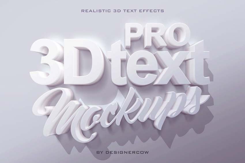
Create professional designs with this 3D text mockup kit. This kit includes four Photoshop files with Smart Objects already prepared with the right settings. Just drop your text into the respective smart object for a customized design fast.
Mimic the look of realistic embroidery for a beautiful text effect. Decorate your stationery or website with lovely gold threads and multi-colored combinations. This suite contains four separate actions with varying materials and styles.
Get 3D text effects fast with this professional 3D generator. This generator gives you a one-click shortcut to easy text effects. It works with just about anything from text to vector shapes, but supports only Photoshop CS5 and under.
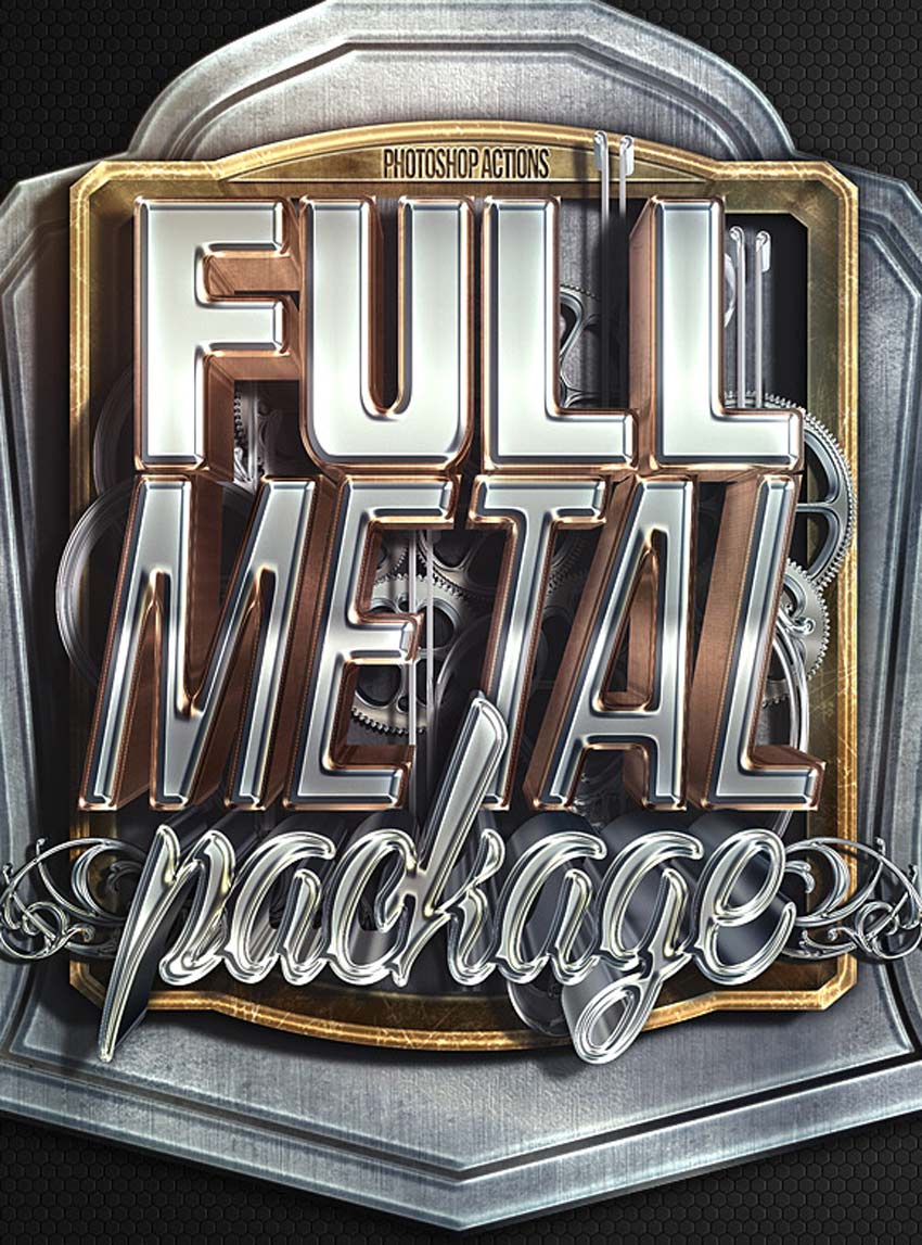
Create epic metal text effects with the click of a button! A supreme Photoshop Action with insane details, this full metal package allows for realistic metal text effects. Enjoy premium effects without all the extra hassle.
Or choose a pressed or embossed look for your designs! This is the type of effect that looks great on just about anything. For everything from apps to websites and more, you’ll definitely want this download. Grab it today to access ten professional letterpress and embossed styles.
One of the hottest trends dominating the design industry is 80s-inspired design. And you can get super nostalgic with this text mockup kit. This package contains ten Photoshop files with various 80s text effects. A help file is also included for more instruction.
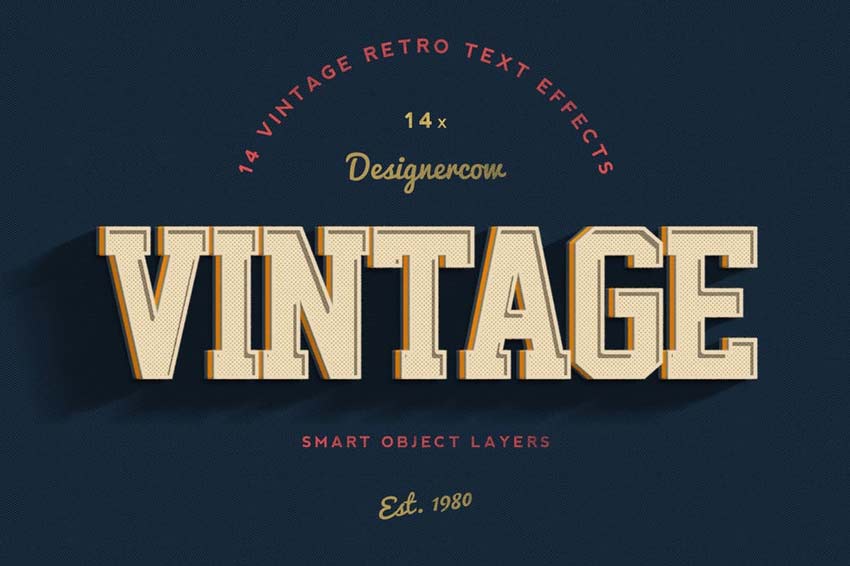
Celebrate your favorite vintage styles with these awesome retro text effects. Choose from ten vintage styles to apply retro effects to your text in Adobe Photoshop. Also included are well-organized layers that are easy to customize.
Become the life of the party with these balloon-inspired text effects. Create funny quotes and banners with these impressive smart objects. Simply insert your text into the appropriate smart object to enjoy this effect right away!
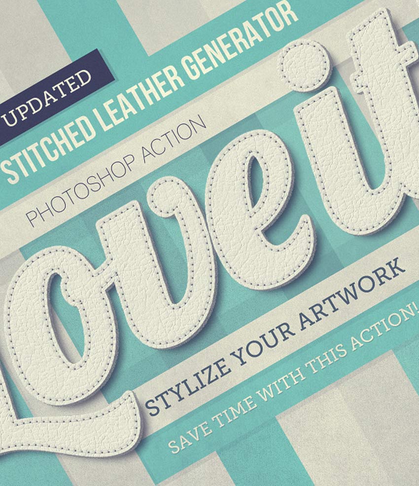
Stitch together your favorite quotes with this realistic stitched leather generator. It features unlimited color options, interactive actions, and so much more. Apply a realistic leather texture to your designs for amazing results!
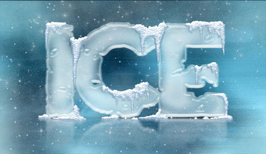
Turn your text layers into frozen icicles with this awesome pack of layer styles. No expertise is required—just download the file, and then load the layer styles to get ice-cold effects with one click! Experiment with texture and color for more options.
Upgrade your futuristic designs with epic chrome and crystal text effects. Great for movie trailers, game titles and more, this set of Photoshop layer styles contains hyper-realistic details made with incredible precision. You’ll absolutely love the realistic shine!
Create jaw-dropping headlines reminiscent of your favorite movies with this set of cinematic text effects. From Marvel movie titles to HBO shows and more, this pack contains eight fully layered Photoshop files with each separate effect. Download it today to see how your favorite movie titles were made!
Recreate the look of fire and chrome with these helpful layer styles. Inspired by medieval designs, this pack contains 15 amazing Photoshop layer styles that are exclusive to the marketplace. Create unique text effects that will wow any audience.
Apply a 3D metal or gold effect to your text for a fantastic result. Get ten amazing effects when you subscribe to Envato Elements. Not only do they work well at high resolution, but they truly shine with stunning rose gold and metal textures.
Take advantage of incredible mockup kits for your headlines and logos. Included with this kit is a super convenient pack of 20 bonus text effects. Create 3D effects fast with Photoshop layer styles made by the best professionals.
Creating retro-inspired text effects just got a whole lot easier! In only a few seconds, you’ll step back in time with this set of vintage text effects. Inspired by years like 1980 and 2014, this pack features 14 cool text effects we know you’ll love.
Recreate your favorite comic book styles with this amazing download! Smash into this fantastic pack of 12 text styles that are fully editable. Customize your text easily by adjusting the well-organized smart objects. Test it out today!
Are you a budding game developer? Save time creating a custom logo with these game-inspired layer styles. Perfect for graphic designers and app developers, this pack contains 12 game logos in completely different styles. Just pick a genre and enjoy the effect!
Achieve the look of traditional watercolor paintings with this pack of Photoshop layer styles. Ideal for wedding invitations, greeting cards, or any pretty stationery, this pack contains 15 layer styles created by hand. Each style is made up of carefully scanned watercolor strokes converted into layer styles.
Or add a phenomenal abstract marbling effect to your work. Marble is a huge trend in the industry, although many trends only feature the white and gray versions. Stand out from the crowd with this set of six marbling text effects packed with color.
Things might get a little messy with this salt and sugar text generator. Created to mimic the look of realistic condiments, this generator lets you apply wicked texture in a matter of moments. It’s super fun and easy to use for any headline or logo.
Concrete is a material that many designers adore. And you can incorporate this material into your work with a cool Photoshop layer style. Choose from three different high-quality concrete textures for any creative project.
Conclusion
This list features exciting
resources for the avid designer
familiar with Adobe Photoshop. For
additional help with all your text effect needs, enlist the skills of a
talented
professional by choosing one of the amazing designers from Envato Studio.
And with loads of text effects available at your fingertips, chances are we’ve missed a few to add to your personal collection. Be sure to browse Envato Elements and Envato Market for more resources, and let us know your favorites in the comments below!
You’ll need the following resources in order to complete this tutorial project:
Two sheets of paper
A graphite pencil (I recommend an HB or B type)
An eraser
And pencils of different colors:
Light grey
Medium brown
Light green
Bright blue
Medium blue
Dark blue
Dark brown
Black
1. How to Draw a Bird With a Graphite Pencil
Step 1
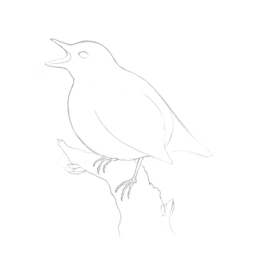
I start with a graphite pencil sketch. I draw two rounded shapes for the bird’s head and body.
Step 2
I draw the rough shape of the beak.
Step 3
I draw the stylized framework of the feet, marking the joints with small circles and adding the claws.
Step 4
I draw the rough shape of the tail; it resembles a triangle.
Step 5
I add the stylized figure of the tree, imagining that the bird is sitting on it. Then I mark the eye of the bird.
Step 6
I refine the bird, joining the head and the body with a smooth, curved line. I also mark the wing and add the back side of the open beak.
Step 7
I refine the shapes of the bird’s feet, based on the framework.
Step 8
I create an outline of the tree, using irregular, organic lines.
I also add two groups of small leaves; they will vary the composition and make the drawing more interesting.
Step 9
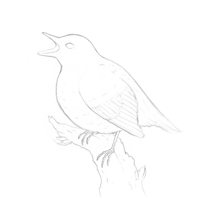
I add some details to my sketch, like the feathers in the wing and the nuances of the bark.
This is not an obligatory step; it’s just useful to think over the drawing before delving into the colored pencil part.
2. How to Draw a Bird With Colored Pencils
Step 1
I transfer the main contours of the drawing onto a blank sheet of paper, using a window.
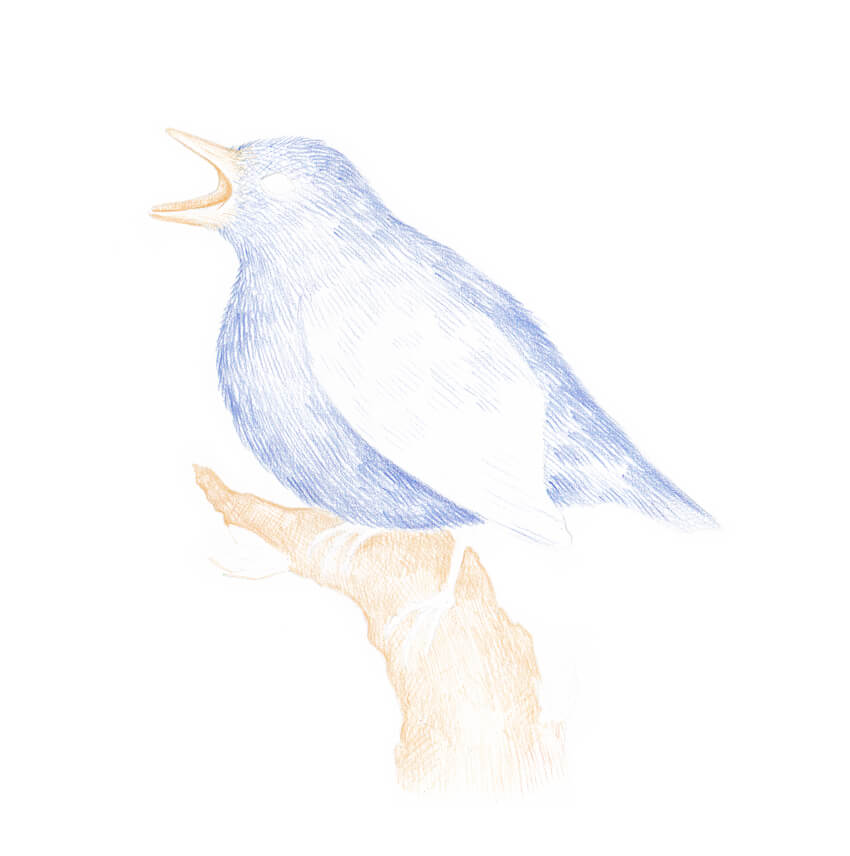
For this step, I recommend using a light grey pencil from your colored pencils set; this will help to keep the hues in your artwork clean, without the impurity of the graphite strokes.
The lines of the underdrawing are barely visible.
Step 2
With the medium blue pencil, I create the base color layer of the bird’s feathering. I draw long hatches resembling hair or fur.
Step 3
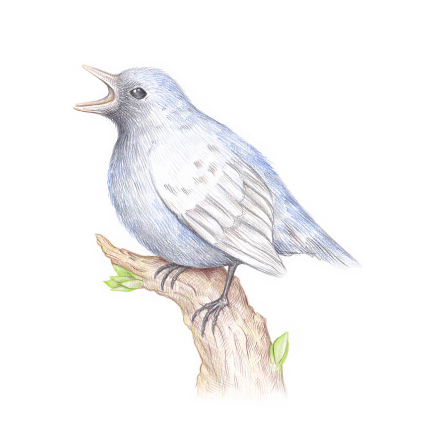
I mark the figure of the tree, using the medium brown pencil. I also add some strokes to the bird’s beak, accenting the inner part of the mouth.
Step 4
I draw the leaves, using the light green pencil. To create a unified look for the artwork, I also add several green hatches to the tree.
Step 5
I use the black pencil to refine the head of the bird, darkening the eye and the area of the mouth.
I also accent the wing’s feathers and the feet, and add some black hatches to the tail. The drawing instantly looks as if we’ve already worked on it for a long time!
Step 6
With the dark brown pencil, I add hatches to the tree, accenting the sides and creating the drop shadow under the bird.
Step 7
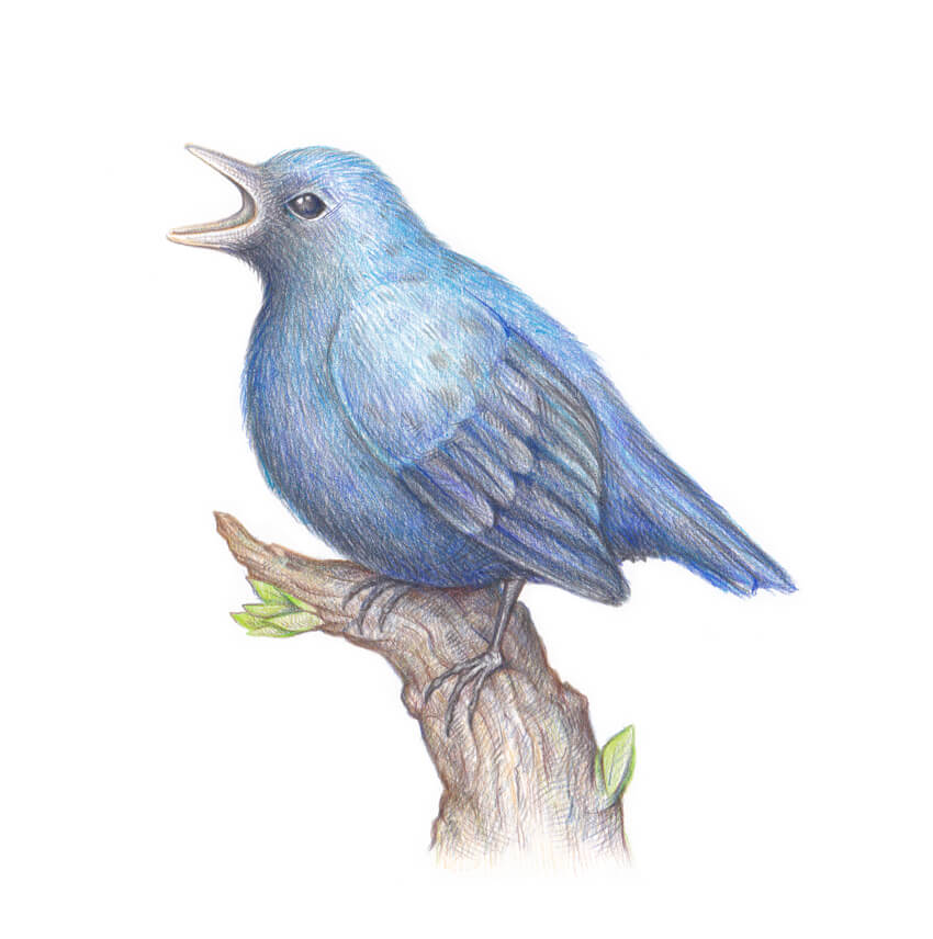
I use the bright blue pencil to create beautiful nuances of the feathering. I add the strokes to the bird’s head, back, wing, and tail.
Step 8
I add strokes to the feathering and the drop shadow on the tree, using the dark blue pencil.
Step 9
Using the black pencil again, I add the hatches to the sides of the bird, accenting its three-dimensional look.
I also accentuate the details of the bark and the shadow under the bird’s wing.
Step 10
I add more dark blue strokes to the bird’s feathering to make the color layer thicker.
Step 11
With the dark brown pencil, I add the finishing touches to the artwork, accenting the sides of the tree.
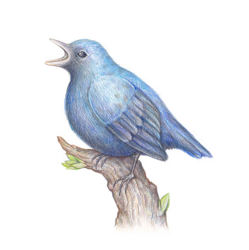
Your Drawing Is Complete
Congratulations! You’ve created an amazing artwork, and I hope you enjoyed the process. May good luck and inspiration always be with you!
In this tutorial I’ll show you how to use photo manipulation techniques in Adobe Photoshop to create a dreamy scene featuring a medieval woman with a dove carrying a letter.
First we’ll add the sky and landscape, import the bridge, model and castle and blend all of these elements together using adjustment layers, masking, and brushes. After that, we’ll work with the flowers, dove, rose, and scroll using a similar method. Later, we’ll create some flying petals and paint some dreamy light using brushes and blending modes. We’ll use several adjustment layers to enhance the final result.
Tutorial Assets
The following assets were used during the production of this tutorial:
Create a new 2000 x 1333 px document in Photoshop with the given settings:
Step 2
Open the sky image. Use the Rectangular Marquee Tool (M) to select the
sky only and drag it into the white canvas using the Move Tool (V).
Place it in the upper half.
Step 3
Go to Layer > New Adjustment Layer > Color Balance and change the Midtones settings:
Step 4
Create a Photo Filter adjustment layer and pick the color #00ecd3. On
this layer mask, activate the Brush Tool (B) and choose a soft round
brush with black color and opacity about 40-45% to reduce the effect on
the top.
Step 5
Make a Curves adjustment layer to brighten the sky a bit. On this layer
mask, use a soft black brush with a lowered opacity (30-35%) to paint on both sides of the canvas.
Step 6
Open the landscape image and place it over the canvas using the Move Tool.
Use a layer mask to erase its sky and reveal the existing one.
Step 7
Go to Filter > Blur > Gaussian Blur and set the Radius to 14 px:
Step 8
Create a Color Balance adjustment layer and set it as Clipping Mask.
Change the Midtones settings to match the landscape’s color with the
sky.
Step 9
Use a Curves adjustment layer to make the landscape a bit brighter:
2. How to Import the Bridge
Step 1
Cut out the bridge from the background and place it in the lower half of the canvas.
Step 2
Add a Color Balance adjustment layer and alter the Midtones values:
Step 3
Use a Photo Filter adjustment layer and pick the color #fb5757. This is to
give some pink light reflected on the surface of the bridge.
Step 4
Make a Curves adjustment layer and increase the lightness. Paint on the
lower area of the bridge to remove the light effect there as it’s hidden
from the sky.
Step 5
Use another Curves adjustment layer to decrease the contrast and sharpness of the bridge to fit the dreamy light of the sky.
Step 6
To make a shadow for the lower part of the right parapet, use the Lasso
Tool (L) to make a long shape below this area following its shape and
then fill this selection with black.
Lower the Opacity of this layer to 60% and apply a Gaussian Blur of 6 px to it.
Step 7
Add a mask to this layer to reduce the shadow on the lower area.
3. How to Add the Model
Step 1
Isolate the model and place her above the bridge.
Step 2
Use a layer mask to remove the bottom of her dress, making her look as if she’s standing on the bridge.
Step 3
Create a new layer and set it as Clipping Mask. Activate the Clone Tool (S) to remove the tattoo on her back and arm.
Step 4
Make a Color Balance adjustment layer and change the Midtones settings:
Step 5
Add a Curves adjustment layer to brighten the model as she looks too dark at the moment.
Step 6
Make a new layer, change the mode to Overlay 100%, and fill with 50% gray:
Select the Dodge and Burn Tool (O) with Midtones Range, Exposure about 15-20% to refine the light and shadow on the model. You can see how I
did it with Normal mode and the result with Overlay mode:
4. How to Add the Castle
Step 1
Cut out the castle from the background and add it to the left side of the canvas. Set this layer below the bridge layer.
Step 2
Apply a Gaussian Blur of 12 px as it’s in the blurred area.
Step 3
Make a Hue/Saturation adjustment layer and change the Master settings:
Step 4
Use a Color Balance adjustment layer and alter the Midtones values:
Step 5
Create another Hue/Saturation adjustment layer to change the castle’s color.
Step 6
Make a Curves adjustment layer to increase the light on the castle. On
this layer mask, use a soft black brush to reduce the effect on the
shadow areas (to lighten them).
Step 7
Create a new layer, change the mode to Overlay 100%, and fill with 50%
gray. Use the Dodge and Burn Tool to refine the light and shadow on the
castle, especially to lighten the shadow and reduce the contrast.
5. How to Add the Flower Branches
Step 1
Cut out the flowers 1 image and add it to the top right of the canvas.
Step 2
Apply a Gaussian Blur of 4 px to these flowers.
Step 3
Use a Hue/Saturation adjustment layer to change the flowers’ color:
Step 4
Add a Curves adjustment layer to make the flowers brighter.
Step 5
Place the flowers 2 image in the bottom left of the scene after isolating, and
apply a Gaussian Blur of 14 px to it. Set this layer above the model’s
one.
Step 6
Use a Hue/Saturation to desaturate the flowers.
Step 7
The flowers look too dark, so use a Curves adjustment layer to brighten them.
Step 8
Create a Levels adjustment layer to increase the light more for these
flowers. Paint on the details which are too bright (the front).
Step 9
Add the flowers 3 image to the bottom right of the bridge and apply a Gaussian Blur of 14 px to this layer.
Step 10
Match the flowers’ color with the rest using a Hue/Saturation adjustment layer.
Step 11
Make a Curves adjustment layer and decrease the lightness. The aim is to
create some shadow on these flowers. On the layer mask, use a soft
black brush to erase the front of the petals which are illuminated by
the light.
6. How to Add the Dove, Rose, and Scroll
Step 1
Cut out the dove and place her in line with the direction of the model’s look.
Step 2
Make a Hue/Saturation adjustment layer and reduce the Saturation value to nearly the minimum.
Step 3
Use a Color Balance adjustment layer to add some pink to the dove.
Step 4
Create a Curves adjustment layer to decrease the light on the dove.
Paint on the top of the wings so it won’t be affected by this adjustment
layer.
Step 5
Activate the Dodge and Burn Tool on a new layer and refine the light and shadow of the dove.
Step 6
Extract the rose from the dark background and place it in the area of
the dove’s beak. Use a layer mask to remove some of the leaves and
detail to make the rose branch clean and put it in the dove’s beak.
Step 7
Make a Hue/Saturation adjustment layer to alter the rose’s color. Adjust the Reds and Yellows settings:
Step 8
Add a Curves adjustment layer to brighten the rose’s branch.
Step 9
Place the scroll below the claws of the dove after cutting it out from the white background.
Step 10
Use a Color Balance adjustment layer to change the scroll’s color:
Step 11
Make a Curves adjustment layer to give some light for the scroll. Paint
on the lower part of the scroll as it’s hidden from the main light
source.
Step 12
Create another Curves adjustment layer to increase the shadow for the
lower part of the scroll. Paint on the upper part so it won’t be
affected by this adjustment layer.
7. How to Make the Flying Petals
Step 1
Open the petal image. Use the Quick Selection Tool (W) to select one petal in
the middle and add it to the lower corner on the right. Use the Free
Transform Tool (Control-T) with the Warp mode to bend it a little as shown below:
Step 2
Apply a Gaussian Blur of 8 px to this petal:
Step 3
Duplicate this layer many times and arrange them over the canvas. Make
some bigger petals on the foreground and vary the size of the petal as
well as the Radius of the Gaussian Blur filter to increase the depth of
field.
Step 4
Select all the petals layers and hit Control-G to make a group for them.
Change the group mode to Normal 100% and use a Hue/Saturation
adjustment layer within this group to change the petals’ color.
Step 5
Make a Curves adjustment layer to give the petals some shaded details.
Paint on some of their front and left so they won’t be affected by this adjustment layer.
Step 6
Create another Curves adjustment layer to brighten the petals. The dark areas show where to paint on the layer mask.
8. How to Paint the Light
Step 1
Make a new layer on top of the layers and use a dark brush with the
color #2a011d to paint on the top right of the sky where the light is located, and also paint on the front of the model and the surfaces of the castle and bridge.
Change this layer mode to Linear Dodge 100%, and use a layer mask to
reduce the light on the castle.
Step 2
Use another color for the brush (#eba498) to paint more warm light for
the model, castle, and some other details. Change this layer mode to Screen 100%. You can use a layer mask to refine the light effect on the unwanted details.
9. How to Make the Final Adjustments
Step 1
Create a Photo Filter adjustment layer on top of the layers and pick the color #fff373:
Step 2
Make a Color Fill layer and pick the color #280404. Alter this layer mode to Exclusion 100%.
Step 3
Add a Color Balance adjustment layer and alter the Midtones and Highlights values:
Step 4
Use a Vibrance adjustment layer to enhance the final effect. On the
layer mask, use a soft black brush to paint on the skin of the model’s
back so it won’t be too saturated.
Congratulations, You’re Done!
I hope that you’ve enjoyed my tutorial and learned something new. Feel
free to share your ideas or comments in the box below—I’d love to see
them. Enjoy Photoshopping!
Let’s say we draw the same vector graphic in different design applications and export each one as SVG for use on the web. Should we expect the same SVG file from each application?
On the one hand, we might expect each file to be the same because of our past history with exporting images. Applications have typically been consistent at saving JPGs, PNGs, and GIFs with perhaps minor differences to the overall file size.
On the other hand, SVG is different than our typical image file and our expectations might need to adapt to those differences. The output of SVG might be visual, but what we’re really talking about is math and code. That means an SVG file is a little more comparable to a CSS file that has been compiled from a preprocessor. Your results may vary based on the method used to compile the code.
I decided to draw the same illustration in Illustrator, Sketch, and Figma and compare exported SVG code. This post will summarize those results.
About the Illustration
It’s nothing fancy. A basic plus sign with a white fill on top of a circle with a black fill. The idea was to use something that’s close to an icon that would be common on any site.
The illustration was drawn three times, once in each application. Making the icon in one application then copying and pasting it in another didn’t seem like a fair comparison. This allowed each application to interpret the SVG from its own native tools. I’m not the most skilled illustrator, so I made the illustration once, then traced it in the other applications to ensure everything was to scale and that all the points were nearly identical.
About the Comparison
It’s worth noting that this post is not at all concerned about the „best” export of the group. What’s more interesting is (1) whether there are differences in how SVG code is compiled and (2) how those possible difference might affect a front-end workflow or even influence which application is better suited for a particular project.
Here’s what is being compared:
File Size
Code Structure
Naming Standards
One more thing with mentioning is that we’re assuming default export options in this comparison. Illustrator has a robust set of options that can completely change how an SVG file is saved, where the others do not. I decided to use the default Illustrator export settings, with the minor exception of not minifying the code on export.
Organized by Page Name, Artboard, Group, then Layer
Organized by Frame, Group, then Layer
Includes Use (<use>)
No
No
Yes
Comparison Summary
Those are some pretty interesting results. Like I mentioned earlier, the goal here is not to declare a winner of who does things best™ but to gauge whether there are differences — and there certainly are differences!
File Size
One huge benefit of SVG, in general, is its small file size versus raster images. That benefit shines in all three cases. For example, the same icon exported as a PNG in Sketch came out to 12KB. Sketch’s SVG output is 97% savings from its PNG counterpart.
I’m not particularly sure that the differences in file sizes between the three results here are all that crucial, despite the fact that Illustrator’s output results in a file size that is ~30% smaller than Figma’s output. I only say that because it’s likely that the SVG file that gets used in production gets minified and cached in the same fashion that makes it all very negligible.
That said, the fact that there is a file size difference at all might influence which build tools you use for your SVG workflow and how the settings for that build tool are configured.
Code Structure
The difference in file size really comes down to how each application structures the code it compiles. For example, where Figma is super into grouping and defining shapes and paths for the sake of making them more reusable in different contexts, Illustrator avoids them altogether and tends to make the file easier to drop inline.
Again, the goal is not to determine whether one approach is better than the other, but recognize that there are different philosophies going into the generated file and let that help determine the right tool for the current job. You might get a smaller file size in one instance, but perhaps more flexibility in another, depending on your needs and priorities.
Naming Standards
Another case in point is how Illustrator uses unique generated IDs on the <svg> element by default. That makes dropping the file inline much less likely to conflict with other inline files where a designer may have used the same file, artboard or layer names across multiple files. By contrast, neither Sketch nor Figma uses an ID directly on the SVG element.
There are build tools that will help craft ID and class names but, if you are tasked with editing an SVG file manually or have to use a file as it’s provided to you for some reason, then knowing how an application names things might influence how you approach your work.
Wrapping Up
The biggest takeaway for me from this comparison is a reminder that SVG is code at the end of the day. The applications we use to illustration vector graphics are simply a GUI for creating code and the way that code gets written is likely to be different based on who is writing it.
It’s really no different than something like the CodePen Rodeo (when is the next one, by the way?) where a single design is provided and many people go off to code it in their own ways. There is no „right” way to code it, but it’s fun to see how different people take different paths to achieve the same deliverable.
The bottom line underscored by this comparison is that we can’t take the assets we have for granted. As much as we may enjoy the fact that machines are willing to make decisions on our behalf, a front-end workflow is still overwhelmingly a subjective task and influences how we do our jobs.
The humble post box has been our connection to people around the world for decades. They come in all different shapes and sizes, but the pillar shape is arguably the most iconic. In this tutorial, you will learn the step-by-step process of how to create the classic pillar-shaped red post box.
Some of the skills you will learn will include creating basic 2D shapes, manipulating anchor points, and using the Pathfinder tool. I hope you enjoy the process and learn something new along the way. Let’s begin!
Open up your Adobe Illustrator and create a New Document (File > New). For this tutorial we’ll create a custom document at 700 x 1000 px, but you can choose different dimensions for your own project.
Step 2
Now that we have the new document open, we can begin to create the body of the post box. Start by selecting the Rectangle Tool (M). Choose a nice red color to fill your rectangle with.
Step 3
Using the Rectangle Tool (M), draw a rectangular shape. We will use this rectangle as the main body for our post box.
Step 4
Using the Color Picker Tool again, select a new color for the base of your post box.
Step 5
Use the Rectangle Tool (M) again to create the base of our post box. Make a box shape slightly wider than the width of the red rectangle, and place it at the bottom.
2. How to Create the Post Box Head
Step 1
Using the same red color as before, select the Pen Tool (P) and start to create the wave shape on the right, which will make up part of the top of your post box. You can use the Direct Selection Tool (A) to manipulate your anchor points and handles to create the shape you want.
Step 2
Use the Selection Tool (V) and make sure that your new shape has been selected. Duplicate the shape and Paste it in place by using the shortcut keys Control-C (Copy) and then Control-Shift-V (Paste in Place). This will place your new shape directly on top of the previous one.
Move the new shape over to the left (you can hold the Shift key on your keyboard while you move the shape to ensure that it moves in a straight line).
Step 3
Right-click on the duplicate shape, and choose Transform and then Reflect. Then make sure you have Vertical selected and click OK. This will flip the shape.
Step 4
Using the Selection Tool (V), move the flipped shape so that it lines up correctly with your previous shape. With both shapes selected, press Control-G to Group the shapes together. This will make moving your shapes around easier.
Step 5
Choose a brighter red color and use the Rectangle Tool (M) to create a thin rectangle. Place it on top of your new shape.
Step 6
Choose the previous red color again and use the Ellipse Tool (L) to create a long red circular shape.
Step 7
Using the Rectangle Tool (M), draw a rectangle on top of the circular shape and place it just after the horizontal mid-section.
Step 8
Use the Selection Tool (V) and, making sure both shapes are selected, use the Pathfinder paneland select Minus Front. This will remove the top shape and anything else that it was overlapping (in this case, the bottom of the circular shape).
Step 9
Now use a combination of the Rectangle Tool (M) and the Ellipse Tool (L) to create a thin rectangle to place on the bottom and a small circle to place on top.
To make an even circle, draw an oval using the Ellipse Tool (L) while holding down the Shift key.
Step 10
Now combine all the shapes together to create the base shape for the top of the post box. Place this new shape on top of the body.
3. How to Create the Post Box Letter Hole
Step 1
For the letter hole, we will create the right side first and then mirror it to create the left side. This will make sure that our final shapes are symmetrical. Let’s start by creating choosing a new dark grey color for the hole using the Color Picker.
Step 2
Use the Rectangle Tool (M) to create the small rectangle. This will be the left side of our letter hole.
Step 3
Now using Rectangle Tool (M) creating two small rectangles on the top and on the right-hand side of the box. Then, using the Direct Selection Tool (A), move the bottom corners of the rectangles so that they match with the dark grey box.
Step 4
Using the same steps above, create a pink shape at the bottom. Select all these shapes and press Control-G to Group them all together.
Step 5
Create a new bright red box and use the Add Anchor Point Tool (+) to add a new anchor point on the bottom edge of the box. This will allow you to use the Direct Selection Tool (A) to pull down the bottom right corner and create a small triangle.
Step 6
Now combine both shapes by placing the first group of objects on top of this one. Make sure you right click the bright red object and send it to back (Right Click > Arrange > Send to Back).
Step 7
Now, with all the shapes in the correct order, select them all and Control-G to Group them. Now Duplicate the group and Flip the second group horizontally. Line them up to create the letter hole.
Step 8
Use the Rectangle Tool (M) to create the notice plate. To do this you can create two rectangles where one is larger than the other. Then place the smaller rectangle on top of the larger rectangle. Press Control-G to combine all the shapes together.
Step 9
Place the new group of objects on top of the post box body.
4. How to Create the Details of the Post Box
Step 1
Using the Rectangle Tool (M) create some thin shadow lines between the shapes to add some depth to the top of the post box. Use a dark red color. You can also add a slight opacity if you want to.
Step 2
Use the Rectangle Tool (M) again to create some dark grey grooves on the bottom of the post box.
To make an even square, draw a rectangle using the Rectangle Tool (M) while holding down the Shift key.
Step 3
Select the Rounded Rectangle Tool and create a row of capsule shapes. Then Delete the bottom half of all of them using the Direct Selection Tool (A). To do this, make sure that only the bottom half anchor points have been selected before hitting the Delete button.Select them all and press Control-G to Group them all together.
Remember that you can make the corners of your rounded rectangle curvier by pressing the up or down arrow keys on your keyboard while you are drawing the shape.
Step 4
Now place the group on top of your post box to create some grooves.
5. How to Create the Royal Crown
Step 1
Now let’s create the crown! Using the Rounded Rectangle Tool, create the bottom of the crown.
Step 2
Use the Pen Tool (P) to create the middle portion of the crown. You can use a Stroke for this and choose a thickness that you like.
Step 3
Use a combination of the Ellipse Tool and the Rectangle Tool (M) to complete the top of the crown and place it on the post box.
To create the cross of the crown, choose the Star Tool. Click and drag on the canvas to create the star, but before you release the mouse button, press the Down button on the keyboard a few times to create a triangle.
Step 4
Create a circle using the Ellipse Tool and place the triangle over it. Duplicate the triangle so that you end up with one on top and one at the bottom.
To make an even circle, draw an oval using the Ellipse Tool (L) while holding down the Shift key.
Step 5
Select all the shapes and group them together. Duplicate this new shape and Paste it in place (Control-Shift-V). Rotate it by 90 Degrees.
Step 6
Create another circle using the Ellipse Tool and place the cross on top. Place the new cross and circle on top of the crown.
6. How to Create the Post Box Highlights
Step 1
Now that you have all the details on your post box, select all your shapes and press Control-G to Group everything together.
Step 2
Press Control-C to Copy the whole group and then press Control-Shift-V to Paste it in place. With the duplicate post box selected, go to the Pathfinder paneland select Unite. This will combine all the shapes into a single shape.
Step 3
Now, using the Direct Selection Tool (A), Delete half of the duplicate post box. To do this, use the mouse to click and drag the selection across only half the shape (making sure that half of the anchor points have been selected). If you have missed some points, simply select them and delete them.
Once you have deleted half of the shape, choose a bright pink color for it using the color picker.
Step 4
With the pink shape selected, go to Transparency and select an Opacity of 30%. Then on the drop-down menu select Overlay.
7. How to Create a Postcard & Stamp
Step 1
For the postcard, let’s start by using the Rectangle Tool (M). Create a light grey boxin the shape of a postcard. You can also create a 2 pt grey Stroke to prepare for the postcard details.
Step 2
Next, you’ll need to use the Pen Tool (P) or the Line Segment Tool (\) to create the lines of the postcard.
Step 3
For the stamp, create two squares using the Rectangle Tool (M), one smaller than the other, and place them on top of each other. Then use the Ellipse Tool to create small circles around the outer square. Once that is done, select all the circles and Group them together by pressing Control-G.
Step 4
Select both the group of circles and the white square underneath. Making sure that they are both selected, go to Pathfinder and select Minus Front.
Step 5
Create a dashed line on top of the grey box. You can do this by Duplicating the grey box, removing the grey fill, and keeping the stroked line (as mentioned in previous steps). Then go inside the Stroke options and choose Dashed Line 4 pt.
Step 6
Select the dashed line and go to the top menu. Then select Object > Expand. Make sure both Fill and Stroke is selected. This will create shapes out of your dashed line.
Step 7
Use the Direct Selection Tool (A) to select the shapes of your dashed line. Right-click and select Isolate Selected Group.
Step 8
You can now use the Direct Selection Tool (A) to select the shapes individually. Select the shapes you want and use the color picker to change the color.
8. How to Create the Background
Step 1
Now it’s time to wrap up our illustration! Let’s create a New Layer for our background so that it is separate from our post box. You can do this by clicking on the New Layer button on the bottom right of the Layers tab.
Step 2
Create a background using a color of your choice by using the Rectangle Tool (M) and drawing it around the artboard.
Step 3
Then use the Ellipse Tool to create a shadow underneath your post box.
Awesome! You’re Finished!
Congratulations! You have successfully completed this tutorial. Feel free to share your own creations below! I hope you found this tutorial helpful and that you’ve learned many new tips and tricks that you can use for your future illustrations. See you next time!
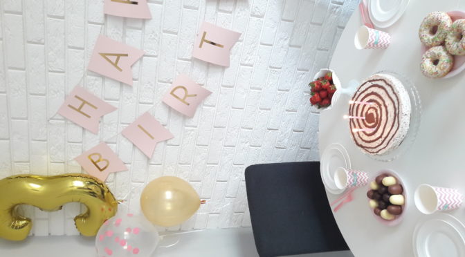
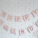
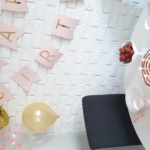
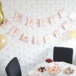
PartyBoom to sklep internetowy, w którym kupisz wszystko, co niezbędne do organizacji przyjęć. Wśród bogatego asortymentu sklepu znajdziesz m. in. dekoracje urodzinowe, dekoracje ślubne, dekoracje do domu, a także balony z helem. Dzięki ogromnemu wyborowi rozmaitych akcesoriów przygotujesz także idealnie wyglądający stół na przyjęcie twoich gości. PartyBoom proponuje ci talerzyki, kubki, słomki papierowe, a także pudełka na popcorn. Wszystko to doskonale sprawdzi się jako dekoracja stołu na każdej rodzinnej i nie tylko imprezie. Jeśli natomiast w najbliższym czasie planujesz ślub, wybierz oferty sklepu piękne i oryginalne dekoracje weselne. Z PartyBoom zorganizujesz także niezapomniane przyjęcie urodzinowe. Idealne dekoracje na urodziny to nie tylko balony i ozdoba stołu, twoje przyjęcie uświetnić może także oryginalna girlanda happy birthday oraz kolorowe pompony. Jeśli chcesz kupić najlepsze balony z helem Białystok to oferta PartyBoom nie ma sobie równych!