
Archiwum miesiąca: sierpień 2017

Volkswagen Arteon as sensed by blind photographer Pete Eckert
Post pobrano z: Volkswagen Arteon as sensed by blind photographer Pete Eckert
Volkswagen is promoting the new Arteon 4-door fastback with an advertising campaign featuring blind photographer Pete Eckart. At the centre of the campaign is an inspiring mini documentary exploring Eckert’s unique creative vision. Pete Eckert trained in sculpture and industrial design before becoming blind through retinitis pigmentosa, an eye disease in which the back wall of the eye (retina) is damaged. He transformed his disability into an art form to allow sighted people a glimpse into the world of the blind. The Volkswagen Arteon short film highlights Eckert’s creative ability to leverage his aural and touch senses to capture striking abstract visuals that showcase his unconventional photography techniques while also capturing the unique beauty of the Volkswagen Arteon, the replacement for the up-market Volkswagen CC. Photographs from the campaign, featured below, are presented on the microsite arteon.volkswagen.com, in anticipation of the 2018 Arteon’s launch to the market.

To encapsulate Eckert’s technique as it unfolded in real time, film director O’Grady Peyton took an unorthodox and artistic approach, embracing the shoot’s unstructured and intimate setting to discover the most authentic moments. “Those moments of magic can’t be something that you plan for all the time,” notes O’Grady Peyton. “You need to allow yourself the opportunity to find and capture them on the spot as they happen. We also had a very small crew to maintain an intimate atmosphere on set. The lack of control which is often the case with small numbers was definitely a constant challenge.”


About Peter Eckert
Pete Eckert is a blind photographer. He was born sighted but halfway through his life he went totally blind. He works with his other senses: sound, touch and memory. Through these senses, he builds images in his mind. He uses long exposures and colored light to create unique effects, known as light painting photography.
”I am a visual person. I just can’t see.” says the photographer about himself. Before he went blind, he was preparing his master’s degree in architecture at Yale. But the diagnosis and the ultimate loss of his sight didn’t stop him from teaching himself photography. With the help of his analog camera, different flash lights and his color palette, he developed a unique visual language.
For his amazing artworks of the new Arteon he started by approaching the car very sensitively. Slowly, almost reverently, he traced the lines from the exterior to the interior and internalized every square centimetre of the bodywork, until he had captured the complete Arteon in his mind. Or, as he puts it: “The Arteon emerges before my mind’s eye.”
With all his senses he envisioned the new Arteon and his beauty. The movements with his light color palette were caught by long time exposure – they create a unique imagination of the new Arteon in every single photo. The results are breathtaking visualizations of the car and his mind’s eye.


Volkswagen Arteon Blind Photographer Credits
The Blind Photographer campaign was developed at Grabarz & Partner Hamburg by chief creative officer Ralf Heuel, creative group director Tobias Ahrens, creative team Svein Olsen, Sandra Kemmer, Navid Shahabi, Tim Berger, Vanessa Barz, Artur Schäfer, Tim Heller, Felix Otterski, Erwin Lorenz, Felix Albers, Phillip von Schwerin, Ann-Katrin Erich, group head digital Dirk Lanio, digital creative directors Julijus Rebic and Roman Jonsson, digital director Ina Croissier, head of TV Axel Deeper, art buyers Garnet Matthiesen, Anusha Atreya, and strategy team Oliver Waldmann and Valerie Gast.
Photography art work was by Pete Eckert.
Filming was shot by director TJ O’Grady Peyton via Bubbles Film, Berlin, with director of photography Stephan Fallucchi, producers Barbara Kranz and Frank Hasselbach. Filming was shot on an Arri Alexa camera.
Online grading was by Felix Drawe.
Sound and music were produced at Blut Audio, Hamburg.
Photography was produced at WIDE Production, Hamburg.
Social media photography was by David Daub at Wildfox Running.
Washed Out: Floating By
Post pobrano z: Washed Out: Floating By

Step by Step: Andrew Vucko
Post pobrano z: Step by Step: Andrew Vucko

Sit back and takes notes as we get a behind the scenes look at how one of the best 2D animators in the game works in this month’s Step by Step with Andrew Vucko.
Parabella & The Great British Bake Off
Post pobrano z: Parabella & The Great British Bake Off

Amazing work from Parabella and Blinkink on the trailer for The Great British Bake Off.
The Evolution of Trust
Post pobrano z: The Evolution of Trust
Nicky Case’s games are a damn treasure in this world. Most importantly, they are fun and compelling to play. They also make gameplay the vehicle for education on tricky, intricate, and important issues. Issues that would be much harder to learn about by just reading. They are also a masterclass in design: clear calls to action, clear onboarding, meaningful interactions and animations, and good copy.
This latest one is no different.
Direct Link to Article — Permalink
The Evolution of Trust is a post from CSS-Tricks
All About React Router 4
Post pobrano z: All About React Router 4
I met Michael Jackson for the first time at React Rally 2016, soon after writing an article on React Router 3. Michael is one of the principal authors of React Router along with Ryan Florence. It was exciting to meet someone who built a tool I liked so much, but I was shocked when he said. „Let me show you our ideas React Router 4, it’s way different!” Truthfully, I didn’t understand the new direction and why it needed such big changes. Since the router is such a big part of an application’s architecture, this would potentially change some patterns I’ve grown to love. The idea of these changes gave me anxiety. Considering community cohesiveness and being that React Router plays a huge role in so many React applications, I didn’t know how the community would accept the changes.
A few months later, React Router 4 was released, and I could tell just from the Twitter buzz there was mixed feelings on the drastic re-write. It reminded me of the push-back the first version of React Router had for its progressive concepts. In some ways, earlier versions of React Router resembled our traditional mental model of what an application router „should be” by placing all the routes rules in one place. However, the use of nested JSX routes wasn’t accepted by everyone. But just as JSX itself overcame its critics (at least most of them), many came around to believe that a nested JSX router was a pretty cool idea.
So, I learned React Router 4. Admittedly, it was a struggle the first day. The struggle was not with the API, but more so the patterns and strategy for using it. My mental model for using React Router 3 wasn’t migrating well to v4. I would have to change how I thought about the relationship between the router and the layout components if I was going to be successful. Eventually, new patterns emerged that made sense to me and I became very happy with the router’s new direction. React Router 4 allowed me to do everything I could do with v3, and more. Also, at first, I was over-complicating the use of v4. Once I gained a new mental model for it, I realized that this new direction is amazing!
My intentions for this article aren’t to rehash the already well-written documentation for React Router 4. I will cover the most common API concepts, but the real focus is on patterns and strategies that I’ve found to be successful.
Here are some JavaScript concepts you need to be familiar with for this article:
- React (Stateless) Functional Components
- ES2015 Arrow Functions and their „implicit returns”
- ES2015 Destructuring
- ES2015 Template Literals
If you’re the type that prefers jumping right to a working demo, here you go:
A New API and A New Mental Model
Earlier versions of React Router centralized the routing rules into one place, keeping them separate from layout components. Sure, the router could be partitioned and organized into several files, but conceptually the router was a unit, and basically a glorified configuration file.
Perhaps the best way to see how v4 is different is to write a simple two-page app in each version and compare. The example app has just two routes for a home page and a user’s page.
Here it is in v3:
import { Router, Route, IndexRoute } from 'react-router'

const PrimaryLayout = props => (
  <div className="primary-layout">
    <header>
      Our React Router 3 App
    </header>
    <main>
      {props.children}
    </main>
  </div>
)

const HomePage =() => <div>Home Page</div>
const UsersPage = () => <div>Users Page</div>

const App = () => (
  <Router history={browserHistory}>
    <Route path="/" component={PrimaryLayout}>
      <IndexRoute component={HomePage} />
      <Route path="/users" component={UsersPage} />
    </Route>
  </Router>
)

render(<App />, document.getElementById('root'))
Here are some key concepts in v3 that are not true in v4 anymore:
- The router is centralized to one place.
- Layout and page nesting is derived by the nesting of
<Route>components. - Layout and page components are completely naive that they are a part of a router.
React Router 4 does not advocate for a centralized router anymore. Instead, routing rules live within the layout and amongst the UI itself. As an example, here’s the same application in v4:
import { BrowserRouter, Route } from 'react-router-dom'

const PrimaryLayout = () => (
  <div className="primary-layout">
    <header>
      Our React Router 4 App
    </header>
    <main>
      <Route path="/" exact component={HomePage} />
      <Route path="/users" component={UsersPage} />
    </main>
  </div>
)

const HomePage =() => <div>Home Page</div>
const UsersPage = () => <div>Users Page</div>

const App = () => (
  <BrowserRouter>
    <PrimaryLayout />
  </BrowserRouter>
)

render(<App />, document.getElementById('root'))
New API Concept: Since our app is meant for the browser, we need to wrap it in <BrowserRouter> which comes from v4. Also notice we import from react-router-dom now (which means we npm install react-router-dom not react-router). Hint! It’s called react-router-dom now because there’s also a native version.
The first thing that stands out when looking at an app built with React Router v4 is that the „router” seems to be missing. In v3 the router was this giant thing we rendered directly to the DOM which orchestrated our application. Now, besides <BrowserRouter>, the first thing we throw into the DOM is our application itself.
Another v3-staple missing from the v4 example is the use of {props.children} to nest components. This is because in v4, wherever the <Route> component is written is where the sub-component will render to if the route matches.
Inclusive Routing
In the previous example, you may have noticed the exact prop. So what’s that all about? V3 routing rules were „exclusive” which meant that only one route would win. V4 routes are „inclusive” by default which means more than one <Route> can match and render at the same time.
In the previous example, we’re trying to render either the HomePage or the UsersPage depending on the path. If the exact prop were removed from the example, both the HomePage and UsersPage components would have rendered at the same time when visiting `/users` in the browser.
To understand the matching logic better, review path-to-regexp which is what v4 now uses to determine whether routes match the URL.
To demonstrate how inclusive routing is helpful, let’s include a UserMenu in the header, but only if we’re in the user’s part of our application:
const PrimaryLayout = () => (
  <div className="primary-layout">
    <header>
      Our React Router 4 App
      <Route path="/users" component={UsersMenu} />
    </header>
    <main>
      <Route path="/" exact component={HomePage} />
      <Route path="/users" component={UsersPage} />
    </main>
  </div>
)
Now, when the user visits `/users`, both components will render. Something like this was doable in v3 with certain patterns, but it was more difficult. Thanks to v4’s inclusive routes, it’s now a breeze.
Exclusive Routing
If you need just one route to match in a group, use <Switch> to enable exclusive routing:
const PrimaryLayout = () => (
  <div className="primary-layout">
    <PrimaryHeader />
    <main>
      <Switch>
        <Route path="/" exact component={HomePage} />
        <Route path="/users/add" component={UserAddPage} />
        <Route path="/users" component={UsersPage} />
        <Redirect to="/" />
      </Switch>
    </main>
  </div>
)
Only one of the routes in a given <Switch> will render. We still need exact on the HomePage route though if we’re going to list it first. Otherwise the home page route would match when visiting paths like `/users` or `/users/add`. In fact, strategic placement is the name-of-the-game when using an exclusive routing strategy (as it always has been with traditional routers). Notice that we strategically place the routes for /users/add before /users to ensure the correct matching. Since the path /users/add would match for `/users` and `/users/add`, putting the /users/add first is best.
Sure, we could put them in any order if we use exact in certain ways, but at least we have options.
The <Redirect> component will always do a browser-redirect if encountered, but when it’s in a <Switch> statement, the redirect component only gets rendered if no other routes match first. To see how <Redirect> might be used in a non-switch circumstance, see Authorized Route below.
„Index Routes” and „Not Found”
While there is no more <IndexRoute> in v4, using <Route exact> achieves the same thing. Or if no routes resolved, then use <Switch> with <Redirect> to redirect to a default page with a valid path (as I did with HomePage in the example), or even a not-found page.
Nested Layouts
You’re probably starting to anticipate nested sub layouts and how you might achieve them. I didn’t think I would struggle with this concept, but I did. React Router v4 gives us a lot of options, which makes it powerful. Options, though, means the freedom to choose strategies that are not ideal. On the surface, nested layouts are trivial, but depending on your choices you may experience friction because of the way you organized the router.
To demonstrate, let’s imagine that we want to expand our users section so we have a „browse users” page and a „user profile” page. We also want similar pages for products. Users and products both need sub-layout that are special and unique to each respective section. For example, each might have different navigation tabs. There are a few approaches to solve this, some good and some bad. The first approach is not very good but I want to show you so you don’t fall into this trap. The second approach is much better.
For the first, let’s modify our PrimaryLayout to accommodate the browsing and profile pages for users and products:
const PrimaryLayout = props => {
  return (
    <div className="primary-layout">
      <PrimaryHeader />
      <main>
        <Switch>
          <Route path="/" exact component={HomePage} />
          <Route path="/users" exact component={BrowseUsersPage} />
          <Route path="/users/:userId" component={UserProfilePage} />
          <Route path="/products" exact component={BrowseProductsPage} />
          <Route path="/products/:productId" component={ProductProfilePage} />
          <Redirect to="/" />
        </Switch>
      </main>
    </div>
  )
}
While this does technically work, taking a closer look at the two user pages starts to reveal the problem:
const BrowseUsersPage = () => (
  <div className="user-sub-layout">
    <aside>
      <UserNav />
    </aside>
    <div className="primary-content">
      <BrowseUserTable />
    </div>
  </div>
)

const UserProfilePage = props => (
  <div className="user-sub-layout">
    <aside>
      <UserNav />
    </aside>
    <div className="primary-content">
      <UserProfile userId={props.match.params.userId} />
    </div>
  </div>
)
New API Concept: props.match is given to any component rendered by <Route>. As you can see, the userId is provided by props.match.params. See more in v4 documentation. Alternatively, if any component needs access to props.match but the component wasn’t rendered by a <Route> directly, we can use the withRouter() Higher Order Component.
Each user page not only renders its respective content but also has to be concerned with the sub layout itself (and the sub layout is repeated for each). While this example is small and might seem trivial, repeated code can be a problem in a real application. Not to mention, each time a BrowseUsersPage or UserProfilePage is rendered, it will create a new instance of UserNav which means all of its lifecycle methods start over. Had the navigation tabs required initial network traffic, this would cause unnecessary requests — all because of how we decided to use the router.
Here’s a different approach which is better:
const PrimaryLayout = props => {
  return (
    <div className="primary-layout">
      <PrimaryHeader />
      <main>
        <Switch>
          <Route path="/" exact component={HomePage} />
          <Route path="/users" component={UserSubLayout} />
          <Route path="/products" component={ProductSubLayout} />
          <Redirect to="/" />
        </Switch>
      </main>
    </div>
  )
}
Instead of four routes corresponding to each of the user’s and product’s pages, we have two routes for each section’s layout instead.
Notice the above routes do not use the exact prop anymore because we want /users to match any route that starts with /users and similarly for products.
With this strategy, it becomes the task of the sub layouts to render additional routes. Here’s what the UserSubLayout could look like:
const UserSubLayout = () => (
  <div className="user-sub-layout">
    <aside>
      <UserNav />
    </aside>
    <div className="primary-content">
      <Switch>
        <Route path="/users" exact component={BrowseUsersPage} />
        <Route path="/users/:userId" component={UserProfilePage} />
      </Switch>
    </div>
  </div>
)
The most obvious win in the new strategy is that the layout isn’t repeated among all the user pages. It’s a double win too because it won’t have the same lifecycle problems as with the first example.
One thing to notice is that even though we’re deeply nested in our layout structure, the routes still need to identify their full path in order to match. To save yourself the repetitive typing (and in case you decide to change the word „users” to something else), use props.match.path instead:
const UserSubLayout = props => (
  <div className="user-sub-layout">
    <aside>
      <UserNav />
    </aside>
    <div className="primary-content">
      <Switch>
        <Route path={props.match.path} exact component={BrowseUsersPage} />
        <Route path={`${props.match.path}/:userId`} component={UserProfilePage} />
      </Switch>
    </div>
  </div>
)
Match
As we’ve seen so far, props.match is useful for knowing what userId the profile is rendering and also for writing our routes. The match object gives us several properties including match.params, match.path, match.url and several more.
match.path vs match.url
The differences between these two can seem unclear at first. Console logging them can sometimes reveal the same output making their differences even more unclear. For example, both these console logs will output the same value when the browser path is `/users`:
const UserSubLayout = ({ match }) => {
  console.log(match.url)   // output: "/users"
  console.log(match.path)  // output: "/users"
  return (
    <div className="user-sub-layout">
      <aside>
        <UserNav />
      </aside>
      <div className="primary-content">
        <Switch>
          <Route path={match.path} exact component={BrowseUsersPage} />
          <Route path={`${match.path}/:userId`} component={UserProfilePage} />
        </Switch>
      </div>
    </div>
  )
}
ES2015 Concept: match is being destructured at the parameter level of the component function. This means we can type match.path instead of props.match.path.
While we can’t see the difference yet, match.url is the actual path in the browser URL and match.path is the path written for the router. This is why they are the same, at least so far. However, if we did the same console logs one level deeper in UserProfilePage and visit `/users/5` in the browser, match.url would be "/users/5" and match.path would be "/users/:userId".
Which to choose?
If you’re going to use one of these to help build your route paths, I urge you to choose match.path. Using match.url to build route paths will eventually lead a scenario that you don’t want. Here’s a scenario which happened to me. Inside a component like UserProfilePage (which is rendered when the user visits `/users/5`), I rendered sub components like these:
const UserComments = ({ match }) => (
  <div>UserId: {match.params.userId}</div>
)

const UserSettings = ({ match }) => (
  <div>UserId: {match.params.userId}</div>
)

const UserProfilePage = ({ match }) => (
  <div>
    User Profile:
    <Route path={`${match.url}/comments`} component={UserComments} />
    <Route path={`${match.path}/settings`} component={UserSettings} />
  </div>
)
To illustrate the problem, I’m rendering two sub components with one route path being made from match.url and one from match.path. Here’s what happens when visiting these pages in the browser:
- Visiting `/users/5/comments` renders „UserId: undefined”.
- Visiting `/users/5/settings` renders „UserId: 5”.
So why does match.path work for helping to build our paths and match.url doesn’t? The answer lies in the fact that {${match.url}/comments} is basically the same thing as if I had hard-coded {'/users/5/comments'}. Doing this means the subsequent component won’t be able to fill match.params correctly because there were no params in the path, only a hardcoded 5.
It wasn’t until later that I saw this part of the documentation and realized how important it was:
match:
- path – (string) The path pattern used to match. Useful for building nested
<Route>s- url – (string) The matched portion of the URL. Useful for building nested
<Link>s
Avoiding Match Collisions
Let’s assume the app we’re making is a dashboard so we want to be able to add and edit users by visiting `/users/add` and `/users/5/edit`. But with the previous examples, users/:userId already points to a UserProfilePage. So does that mean that the route with users/:userId now needs to point to yet another sub-sub-layout to accomodate editing and the profile? I don’t think so. Since both the edit and profile pages share the same user-sub-layout, this strategy works out fine:
const UserSubLayout = ({ match }) => (
  <div className="user-sub-layout">
    <aside>
      <UserNav />
    </aside>
    <div className="primary-content">
      <Switch>
        <Route exact path={props.match.path} component={BrowseUsersPage} />
        <Route path={`${match.path}/add`} component={AddUserPage} />
        <Route path={`${match.path}/:userId/edit`} component={EditUserPage} />
        <Route path={`${match.path}/:userId`} component={UserProfilePage} />
      </Switch>
    </div>
  </div>
)
Notice that the add and edit routes strategically come before the profile route to ensure there the proper matching. Had the profile path been first, visiting `/users/add` would have matched the profile (because „add” would have matched the :userId.
Alternatively, we can put the profile route first if we make the path ${match.path}/:userId(\\d+) which ensures that :userId must be a number. Then visiting `/users/add` wouldn’t create a conflict. I learned this trick in the docs for path-to-regexp.
Authorized Route
It’s very common in applications to restrict the user’s ability to visit certain routes depending on their login status. Also common is to have a „look-and-feel” for the unauthorized pages (like „log in” and „forgot password”) vs the „look-and-feel” for the authorized ones (the main part of the application). To solve each of these needs, consider this main entry point to an application:
class App extends React.Component {
  render() {
    return (
      <Provider store={store}>
        <BrowserRouter>
          <Switch>
            <Route path="/auth" component={UnauthorizedLayout} />
            <AuthorizedRoute path="/app" component={PrimaryLayout} />
          </Switch>
        </BrowserRouter>
      </Provider>
    )
  }
}
Using react-redux works very similarly with React Router v4 as it did before, simply wrap <BrowserRouter> in <Provider> and it’s all set.
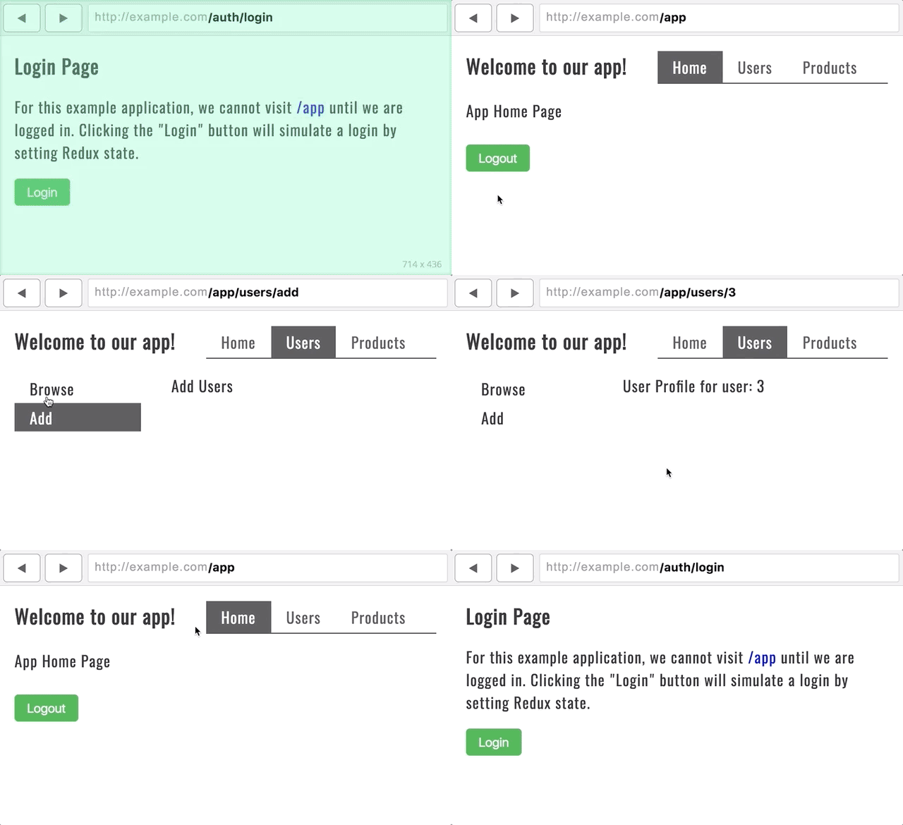
There are a few takeaways with this approach. The first being that I’m choosing between two top-level layouts depending on which section of the application we’re in. Visiting paths like `/auth/login` or `/auth/forgot-password` will utilize the UnauthorizedLayout — one that looks appropriate for those contexts. When the user is logged in, we’ll ensure all paths have an `/app` prefix which uses AuthorizedRoute to determine if the user is logged in or not. If the user tries to visit a page starting with `/app` and they aren’t logged in, they will be redirected to the login page.
AuthorizedRoute isn’t a part of v4 though. I made it myself with the help of v4 docs. One amazing new feature in v4 is the ability to create your own routes for specialized purposes. Instead of passing a component prop into <Route>, pass a render callback instead:
class AuthorizedRoute extends React.Component {
  componentWillMount() {
    getLoggedUser()
  }

  render() {
    const { component: Component, pending, logged, ...rest } = this.props
    return (
      <Route {...rest} render={props => {
        if (pending) return <div>Loading...</div>
        return logged
          ? <Component {...props} />
          : <Redirect to="/auth/login" />
      }} />
    )
  }
}

const stateToProps = ({ loggedUserState }) => ({
  pending: loggedUserState.pending,
  logged: loggedUserState.logged
})

export default connect(stateToProps)(AuthorizedRoute)
While your login strategy might differ from mine, I use a network request to getLoggedUser() and plug pending and logged into Redux state. pending just means the request is still in route.
Click here to see a fully working Authentication Example at CodePen.
Other mentions
There’s a lot of other cool aspects React Router v4. To wrap up though, let’s be sure to mention a few small things so they don’t catch you off guard.
<Link> vs <NavLink>
In v4, there are two ways to integrate an anchor tag with the router: <Link> and <NavLink>
<NavLink> works the same as <Link> but gives you some extra styling abilities depending on if the <NavLink> matches the browser’s URL. For instance, in the example application, there is a <PrimaryHeader> component that looks like this:
const PrimaryHeader = () => (
  <header className="primary-header">
    <h1>Welcome to our app!</h1>
    <nav>
      <NavLink to="/app" exact activeClassName="active">Home</NavLink>
      <NavLink to="/app/users" activeClassName="active">Users</NavLink>
      <NavLink to="/app/products" activeClassName="active">Products</NavLink>
    </nav>
  </header>
)
The use of <NavLink> allows me to set a class of active to whichever link is active. But also, notice that I can use exact on these as well. Without exact the home page link would be active when visiting `/app/users` because of the inclusive matching strategies of v4. In my personal experiences, <NavLink> with the option of exact is a lot more stable than the v3 <Link> equivalent.
URL Query Strings
There is no longer way to get the query-string of a URL from React Router v4. It seems to me that the decision was made because there is no standard for how to deal with complex query strings. So instead of v4 baking an opinion into the module, they decided to just let the developer choose how to deal with query strings. This is a good thing.
Personally, I use query-string which is made by the always awesome sindresorhus.
Dynamic Routes
One of the best parts about v4 is that almost everything (including <Route>) is just a React component. Routes aren’t magical things anymore. We can render them conditionally whenever we want. Imagine an entire section of your application is available to route to when certain conditions are met. When those conditions aren’t met, we can remove routes. We can even do some crazy cool recursive route stuff.
React Router 4 is easier because it’s Just Components™
All About React Router 4 is a post from CSS-Tricks
How We Solve CSS Versioning Conflicts Here at New Relic
Post pobrano z: How We Solve CSS Versioning Conflicts Here at New Relic
At first the title made me think of Git conflicts, but that’s not what this is about. It’s about namespacing selectors for components. Ultimately, they decided to use a Webpack loader (not open source, it doesn’t appear) to prefix every single class with a hashed string representing the version. I guess that must happen in both the HTML and CSS so they match. Lots of folks landing on style-scoping in one way or another to solve their problems.
It makes me think about another smaller-in-scope issue. Say you have an alternate version of a header that you’re going to send to 5% of your users. It has different HTML and CSS. Easy enough to send different HTML to users from the server. But CSS tends to be bundled, and it seems slightly impractical to make an entirely different CSS bundle for a handful of lines of CSS. One solution: add an additional attribute to the new header and ship the new CSS with artificially-boosted specificity to avoid all the old CSS. Then when you go live, remove the new attribute from both.
.header[new] {
}
Direct Link to Article — Permalink
How We Solve CSS Versioning Conflicts Here at New Relic is a post from CSS-Tricks
How to Use an Animal Skull for an Art Study
Post pobrano z: How to Use an Animal Skull for an Art Study

If you’re an aspiring creature artist, you may know the struggle of trying to draw a head in a specific view from imagination. It’s so easy to lose the proportions when adding all the details to some crazy 3D view! Even if you study hundreds of photos, you may still have trouble imagining the 3D form of what you’re drawing.
That’s why it’s good to study skulls—you can hold them in your hand, you can touch and rotate them, and this way you can find the set of guide lines that will work for every view. In this tutorial, I will show you how to study skulls to become better at drawing animals from imagination.
What You Will Need
Obviously, a skull. You can buy a real skull from a local hunter, but be careful. Some animals are hunted as a part of the population control (in Poland, that’s foxes) or as an effort to get rid of invasive species (in Poland, raccoon dogs), so getting a skull acquired this way is fine.
However, some animals are hunted illegally, and by buying a skull from this kind of hunter you support this practice. Before you buy a skull, do some research to find out if the animal you want to study is under protection in your area. In that case, even buying such a skull may be illegal!
In many cases, the safest way is to buy a high-quality replica. The only difference lies in the smallest details, so they’re perfectly fine to study, and they’re also often much cheaper than the real thing!

1. How to Draw the Upper Jaw
Step 1
We want to establish the proportions as completely and as early as possible, to create a support for more lines. I prefer to start with the width of the forehead—it’s a part of the „top cross” that creates an impression of a plane with only two lines.


Step 2
The other arm of the cross is the line going along the longer axis of the skull. It should bend according to the profile of the head.

See? Only two lines, and we already see the top of the skull.

Step 3
The eyes are another important element that should be established early. Attach the eye sockets to the shorter arm of the cross, paying attention to the perspective.


Step 4
The nose is another thing that captures our attention, and it can be simplified to a nice, regular shape. Its position will help us imagine the end of the muzzle.


Step 5
The basic proportions are established, and now we can slowly build the form on them. First, the top of the muzzle. The nasal bridge is usually flat, keeping a constant width on its way towards the forehead. You can also elongate it to create the front of the muzzle, slightly protruding to close on the food.


Step 6
The muzzle has a variable width along its length, so it’s important to divide it into simpler parts. For example, the very front of the muzzle has a pretty constant width. Sketch it as a simple three-dimensional form.


Step 7
Here’s where things get slightly more difficult, because we can’t draw everything as simple forms. But we can try! There’s a wide part in front of the eye sockets—define its width, and then connect it to that simple front form.


Step 8
That was only the upper part of the skull, but there’s also another part below, with the teeth attached to it. Sketch its side, turning a bit towards the middle line.


Step 9
Outline the side. It’s hard to see it in the photo, but the part right below the eye socket turns towards the skull and, in many cases, away from the view.


Step 10
Time for the actual forehead. This will give the eye sockets some more definition as well.


Step 11
We’ve drawn the eye sockets as simple ovals, but they’re a little more complicated than that. Fix their shape now.


Step 12
The zygomatic arch—the cheekbone—can be tricky to draw because of its curvy shape. In most cases, it helps to imagine it like this:


Step 13
Finish the form of the bone by adding some width to it.


Step 14
The braincase is not simply a sphere on the back of the skull—it has the shape of a teardrop attached under the forehead.


Step 15
The eye sockets are not hollow. Draw a wall between the muzzle and the braincase (it’s very hard to explain it with a photo only, but if you have a skull in front of you, you’ll know what I mean!).


Step 16
Time for the canines! Foxes have them very long and curved.


Step 17
Sketch all the teeth—just their general form, without any details.


2. How to Draw the Lower Jaw
Step 1
The upper jaw is finished, so we can take care of the lower one now. Studying them separately like this will help you draw the jaws open in the future.
Start by finding the jaw joint—the point of attachment and rotation.


Step 2
Sketch the line of the lower jaw, keeping it in proportion to the upper one.


Step 3
The lower jaw has a width and a special shape. Sketch it.


Step 4
Outline the front part of the lower jaw.


Step 5
The back of the lower jaw has a complex shape. Start with a gentle arch coming towards the joint.


Step 6
Create a smaller arch between these two parts.


Step 7
Draw a line between the joint and the bottom line of the jaw.


Step 8
There’s an additional structure to the back of the lower jaw. Add it by drawing a line going away from the rhythm of the jaw.


Step 9
Finish its shape.


Step 10
Add the shape of the lower canines, fitting right between the upper incisors and upper canines.


Step 11
Outline the rest of the teeth.


3. How to Finish Drawing a 3D Study of a Skull
Step 1
Our sketch is done, and now we only need to stress some lines to make the form clearer. Start with the nasal bridge.

Step 2
Add the forehead.

Step 3
Outline the form of the muzzle, with all its 2D planes.

Step 4
Outline the teeth in the front.

Step 5
Outline the cheekbones.

Step 6
Outline the teeth, giving them only a basic form.

Step 7
Outline the lower jaw.

Step 8
Define the hollow in the back of the lower jaw.

Step 9
Draw lines on the side of the lower jaw to show its 3D form.

Step 10
Outline the lower teeth.

Step 11
Add some form lines to the back of the head as well.

Step 12
When you’re done, you can darken some of the main lines to make them stand out among all these form-establishing ones.

Step 13
You can also shade the skull to make its 3D form even more pronounced.

Good Job!
You have drawn your first skull study! But that’s not all. Studying is about practicing and experimenting. Draw the same skull in other views, testing your set of guide lines on each of them, until you are ready to draw such a skull entirely from imagination. This will help you draw the head of the animal in all the views you wish without any reference, and will be also helpful for designing new, realistic creatures.


How to Create a Seamless Facebook Cover and Profile Picture in Adobe Photoshop
Post pobrano z: How to Create a Seamless Facebook Cover and Profile Picture in Adobe Photoshop

Want a new fresh look for your Facebook profile? In this tutorial, we’ll design a template to create a custom Facebook cover photo and profile picture that interact seamlessly with each other. We’re going to do this by making your profile and cover photos overlap so the two appear as one whole image. Many have tried to achieve this polished look, but they don’t always succeed due to sizing issues. Well, let’s see if we can get this right.
Feel lazy? Check out my plugin for Photoshop to get an amazing result in seconds! “Seamless Identity Action for Facebook” is a Photoshop plugin that allows you to create an eye-catching cover and profile picture for your Facebook page.

Tutorial Asset
The following asset has been used during the production of this tutorial:
1. How to Create a Facebook Template
Step 1
Create a new document specifying the following options for the selected preset:
- Width and Height: Specify the size of the document. Type 1630 px for width and 734 px for height.
- Orientation: Specify a page orientation for the document. Select Landscape.
- Color Mode: Specify a color mode for the document. Select RGB.
- Resolution: Specify the fineness of detail in a bitmap image measured in pixels/inch or pixels/centimetre. Since we’re using this template for web images, the resolution is irrelevant. Keep the default resolution 72 Pixel/Inch.
- Background contents: Specify a background color for the document. Select White.

Step 2
With the Rectangle Tool (U), click somewhere on the canvas to create a new 1630 x 605 px rectangle.
Open the Properties panel by selecting in the top menu Window > Properties, and set the rectangle position to 0 for X and Y axis, and then set the Stroke and the Fill to No color.

In the Layers panel, rename the layer just created by double-clicking on the layer’s name and typing „Cover Photo„.
Step 3
With the Rectangle Tool (U), click somewhere on the canvas to create a new 307 x 307 px rectangle. In the Properties panel, set its position to 38 for X and 341 for Y axis and then set the Stroke and the Fill to No color.

In the Layers panel, rename the layer just created by double-clicking on the layer’s name and typing „Profile Picture„.
Step 4
Right-click on the layer „Profile Picture” and choose Duplicate Layer and then press OK. Rename this new layer „Frame„.

Step 5
Add a new Layer Style to the „Frame” layer by double-clicking on the layer, outside the layer name or thumbnail.
Add a new Stroke effect. This outlines the object on the current layer using color, a gradient, or a pattern.
Set Size to 8 px, Position to Outside, and Fill Type to White Color. Keep Opacity to 100% and Blend Mode to Normal.

Now add a new Drop Shadow. This adds a shadow that falls behind the contents on the layer. Set Blend Mode to Normal, Color Black, Opacity 22 px, Distance 0, Spread 100%, Size 10 px. Keep the other options like the image below:

Step 6
Select the layer „Profile Picture” and then with the Rectangle Tool (U) click somewhere on the canvas to create a new 1630 x 129 px rectangle. In the Properties panel, set its position to 0 for X and 605 for Y axis and then set the shape Fill to White and the Stroke to No color.

Rename this new layer „Base„.
Step 7
Select the layer „Profile Picture” and choose in the top menu Layer > New Fill Layer > Solid Color. Press OK and choose any color. Rename this layer „Fill„.

Step 8
Now we’re going to add some new anchor points to modify the path.
In the Layers panel, select the layer „Base” and then, to select the path, choose the Path Selection tool, and click anywhere inside the path component.

Selecting a path component or path segment displays all of the anchor points on the selected portion. Selected anchor points appear as filled squares and unselected anchor points as hollow squares.
Select the Add Anchor Point Tool.

To add an anchor point, position the pointer over the path segment and click. Add four anchor points like the image below:

Step 9
Select the Convert Point Tool and click on each of the four points we just created to convert them.

Step 10
Select the Direct Selection Tool.

Click on point 2 and drag the segment to its new position behind the frame. Do the same with point 3. Now the path of the „Base” layer should be similar to this:

Step 11
Double-click on the „Base” layer, outside the layer name or thumbnail, and add a new Layer Style. Add a new Drop Shadow, setting the Blend Mode to Normal, Opacity to 35%, Color to Black, Angle to 90°, Distance to 0 px, Spread to 40%, and Size to 200 px.

Step 12
Now we need to edit the „Base” effect separately from the layer. To do this, we can ask Photoshop to put the layer style on its own separate layer (or layers if necessary). Click on the „Base” layer, and then move down your mouse on the „Drop Shadow” effect, open the contextual menu by right-clicking on it, and choose Create Layers. Your effect will now appear on its own layer beneath the „Base” layer.

A message may alert you that: „Some aspects of the Effects cannot be reproduced with layers„. If so, press OK.
Step 13
In the Layers panel, select the layer just created. For an English version of Photoshop, its name should be „Base’s Drop Shadow„. With the layer selected, Command-Click (Mac) on the thumbnail of the layer „Frame” to select the shape.

Step 14
Our purpose now is to delete the shadow inside the profile picture frame. Choose Edit > Cut (Command-X) and deselect by choosing Select > Deselect.

Step 15
Select the layers „Base’s Drop Shadow„, „Base„, and „Frame„. To select multiple contiguous layers, click the „Frame” layer and then Shift-click the „Base’s Drop Shadow” layer.
Right-click on one of the layers and select „Merge Layers” to combine them all into one.
Step 16
It’s time to save our progress. Choose File > Save As. Choose the PSD format from the Format menu. Specify a filename (Facebook-Frame.psd) and location and click Save.

Your Facebook frame is ready! Go forward and discover how to add a photo to the Facebook frame, and save a new ready-to-upload profile picture and cover photo!
2. How to Add a Photo to the Template
Step 1
Locate the Layers panel on the right side of your workspace and notice that we made four layers:
- „Frame”: This layer is the preview of the real Facebook page and will help you to position correctly your photo and see how your profile will look once uploaded to Facebook.
- „Fill”: This layer contains a placeholder fill. Position your photo above it.
- „Profile picture”: This layer will be used to crop and export your profile picture.
- „Cover Photo”: This layer will be used to crop and export your cover photo.

Step 2
Select a photo that you want to use as your profile picture and cover photo. If you’re following along with the sample photo, download this. Open it with Photoshop.
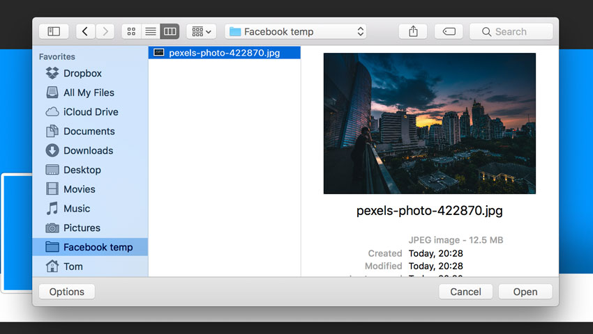
Try to use a photo that is at least 2,000 pixels wide so that you can easily place it into the template.
Learn to choose the best photo for this purpose. The profile picture will be in the bottom left corner of the photo. In the photo I’m using for this tutorial, the subject is in the bottom left corner of the composition so that it’s easier to reposition. A good photo will have the subject small or in the distance. Perfect for this purpose are photos with a landscape behind the subject.
Step 3
Locate the file tabs at the top of the workspace and click on the photo file. Go to Select > All. Press Command-C (Mac) on your keyboard to copy the photo.

Go back to the template by clicking on „Facebook-Frame.psd” from the file tabs at the top of the workspace. Click the „Fill” layer from the Layers panel to make it active, and press Command-V (Mac) on your keyboard. This will paste the photo above the Facebook frame layer.
Step 4
Click on the layer with the photo just imported in the Layers panel to make it active.
Go to Edit > Free Transform, or press Command-T (Mac) on your keyboard. A bounding box will appear around the edges of the photo.
To Scale, drag a handle on the bounding box. Press Shift as you drag a corner handle to scale proportionately. When positioned over a handle, the pointer becomes a double arrow.
To Reposition, click and drag anywhere within the bounding box.
To Rotate, move the pointer outside the bounding border (it becomes a curved, two-sided arrow), and then drag. Press Shift to constrain the rotation to 15° increments.
You can also flip your photo by choosing Edit > Transform > Flip Horizontal.
When you transform a bitmap image (versus a shape or path), the image becomes slightly less sharp each time you commit a transformation; therefore, performing multiple commands before applying the cumulative transformation is preferable to applying each transformation separately.
Make sure to position the photo so that it fills both the cover photo and profile picture areas. When you’re done, press Enter on your keyboard.

Step 5
Once you’ve positioned the photo, click on the small eye icon to the left of the „Frame” layer in the Layers panel to hide the layer.

3. How to Save the Profile and Cover Image
Step 1
In the Layers panel, locate the „Profile picture” layer thumbnail. Hold down Command (Mac) on your keyboard and click on the layer thumbnail. This will select the area of the profile picture, a square image of 307 x 307 px.
Go to Image > Crop to crop the image to the profile picture area.

Step 2
Go to File > Export > Save for Web (Photoshop CC 2015) or File > Save for Web & Device (before Photoshop CC 2015).
From the Format dropdown, choose JPEG. From the Quality dropdown, choose Very High.
When you’re done, click Save. Choose a name for the profile picture and click OK.

Step 3
Click on the History panel from the right side of your workspace. If you can’t see it, go to Window > History.
Click on the previous step in the History panel. This will reload the uncropped image.

Step 4
In the Layers panel, locate the „Cover Photo” layer thumbnail. Hold down Command (Mac) on your keyboard and click on the layer thumbnail. This will select the area of the Cover Photo, a rectangular image of 1630 x 605 px. Go to Image > Crop to crop the image to the cover photo area.

Step 5
After cropping, go to File > Export > Save for Web (Photoshop CC 2015) or File > Save for Web & Device (before Photoshop CC 2015).
From the Format dropdown, choose JPEG. From the Quality dropdown, choose Very High.
When you’re done, click Save. Choose a name for the cover photo and click OK.

4. How to Upload Your Photos to Facebook
Step 1
To add a profile picture or change your current profile picture:
Go to your profile and hover over your profile picture. Click Update Profile Picture. Now you can:
- Upload a photo from your computer.
- Take a new photo.
- Select a photo you’ve already uploaded or one you’re tagged in.
Choose „Upload a photo from your computer„. Select the Profile Picture just created. Don’t crop your photo! Click Skip Cropping in the bottom left, and click Save.

Step 2
To add or change your cover photo:
- Go to your profile.
- Hover over Update Cover Photo in the top-left of your current cover photo.
- Click Update Cover Photo. If you don’t currently have a cover photo, click Add Cover Photo.
- Select Choose from my photo and navigate to the cover photo just created.
- Once you choose the photo, you could reposition it by clicking the image and dragging it up or down. Don’t reposition the photo, don’t drag the image in this step!
- Click Save Changes.
Remember that the images created with this tutorial are sized in proportion to the display dimensions on Facebook, so you don’t need to reposition or crop the images when uploading them.

5. Facebook Pages and Mobile Layout
Unfortunately, Facebook made bold changes to the layout for pages, and the images created with this tutorial won’t work with Facebook pages. Facebook has removed the profile picture from the cover image territory. Now the profile picture has moved to the left-hand column of the layout. At the moment, it is possible to create a seamless profile picture and cover photo only for personal profiles.
The same problem exists with the mobile layout. If you’ve visited any Facebook pages on your iPhone, you might have noticed that the cover photo isn’t displayed the same way it is on desktop—only the middle section will appear on mobile, while the profile picture will move significantly towards the centre.

Anyway, we can optimize our images to look good on mobile devices.
In order to avoid ugly discrepancies, don’t place important information on the right of the profile picture, especially if you know that the majority of your page users are mobile users.
Congratulations, You’re Now Done!
Great job! Our seamless profile picture and cover photo are finished. You can use your imagination and continue playing around and adding details until you are fully satisfied with the result. I hope you’ve discovered some new tips and tricks that you can use for creating wonderful projects in future. Feel free to share your results in the comments below!

If you need more control over your images, my advice is to download the “Seamless Identity Action for Facebook”, a Photoshop plugin that allows you to create an eye-catching cover and profile picture for your Facebook profile with some premium options such as bigger profile images, parallel updates with the Facebook layout changes, and more.
