Post pobrano z: Jeonju International Film Festival 2017

Post pobrano z: Jeonju International Film Festival 2017
Post pobrano z: Robot & The Robots

Post pobrano z: Using ES2017 Async Functions
ES2017 was finalized in June, and with it came wide support for my new favorite JavaScript feature: async functions! If you’ve ever struggled with reasoning about asynchronous JavaScript, this is for you. If you haven’t, then, well, you’re probably a super-genius.
Async functions more or less let you write sequenced JavaScript code, without wrapping all your logic in callbacks, generators, or promises. Consider this:
function logger() {
    let data = fetch('http://sampleapi.com/posts')
    console.log(data)
}

logger()
This code doesn’t do what you expect. If you’ve built anything in JS, you probably know why.
But this code does do what you’d expect.
async function logger() {
    let data = await fetch('http:sampleapi.com/posts')
    console.log(data)
}

logger()
That intuitive (and pretty) code works, and its only two additional words!
Before we dive into async and await, it’s important that you understand promises. And to appreciate promises, we need go back one more step to just plain ol’ callbacks.
Promises were introduced in ES6, and made great improvements to writing asynchronous code in JavaScript. No more „callback hell”, as it is sometimes affectionately referred to.
A callback is a function that can be passed into a function and called within that function as a response to any event. It’s fundamental to JS.
function readFile('file.txt', (data) => {
  // This is inside the callback function
  console.log(data)
}
That function is simply logging the data from a file, which isn’t possible until the file is finished being read. It seems simple, but what if you wanted to read and log five different files in sequence?
Before promises, in order to execute sequential tasks, you would need to nest callbacks, like so:
// This is officially callback hell
function combineFiles(file1, file2, file3, printFileCallBack) {
    let newFileText = ''
    readFile(string1, (text) => {
        newFileText += text
        readFile(string2, (text) => {
            newFileText += text
            readFile(string3, (text) => {
                newFileText += text
                printFileCallBack(newFileText)
            }
        }
    }
}
It hard to reason about and difficult to follow. This doesn’t even include error handling for the entirely possible scenario that one of the files doesn’t exist.
This is where a Promise can help. A Promise is a way to reason about data that doesn’t yet exist, but you know it will. Kyle Simpson, author of You Don’t Know JS series, is well known for giving async JavaScript talks. His explanation of promises from this talk is spot on: It’s like ordering food a fast-food restaurant.
As he points out, you may not be able to eat your food while you’re waiting for it, but you can think about it, and you can prepare for it. You can proceed with your day knowing that food is going to come, even if you don’t have it yet, because the food has been „promised” to you. That’s all a Promise is. An object that represents data that will eventually exist.
readFile(file1)
  .then((file1-data) => { /* do something */ })
  .then((previous-promise-data) => { /* do the next thing */ })
  .catch( /* handle errors */ )
That’s the promise syntax. Its main benefit is that it allows an intuitive way to chain together sequential events. This basic example is alright, but you can see that we’re still using callbacks. Promises are just thin wrappers on callbacks that make it a bit more intuitive.
A couple years ago, async functions made their way into the JavaScript ecosystem. As of last month, its an official feature of the language and widely supported.
The async and await keywords are a thin wrapper built on promises and generators. Essentially, it allows us to „pause” our function anywhere we want, using the await keyword.
async function logger() {
  // pause until fetch returns
  let data = await fetch('http://sampleapi.com/posts')
  console.log(data)
}
This code runs and does what you’d want. It logs the data from the API call. If your brain didn’t just explode, I don’t know how to please you.
The benefit to this is that it’s intuitive. You write code the way your brain thinks about it, telling the script to pause where it needs to.
The other advantages are that you can use try and catch in a way that we couldn’t with promises:
async function logger ()  {
    try {
        let user_id = await fetch('/api/users/username')
        let posts = await fetch('/api/`${user_id}`')
        let object = JSON.parse(user.posts.toString())
        console.log(posts)
    } catch (error) {
        console.error('Error:', error)
    }
}
This is a contrived example, but it proves a point: catch will catch the error that occurs in any step during the process. There are at least 3 places that the try block could fail, making this by far the cleanest way to handle errors in async code.
We can also use async functions with loops and conditionals without much of a headache:
async function count() {
    let counter = 1
    for (let i = 0; i < 100; i++) {
        counter += 1
        console.log(counter)
        await sleep(1000)
    }
}
This is a silly example, but that will run how you’d expect and it’s easy to read. If you run this in the console, you’ll see that the code will pause on the sleep call, and the next loop iteration won’t start for one second.
Now that you’re convinced of the beauty of async and await, lets dive into the details:
async and await are built on promises. A function that uses async will always itself return a promise. This is important to keep in mind, and probably the biggest „gotcha” you’ll run into.await, it pauses the function, not the entire code.async and await are non-blocking.Promise helpers such as Promise.all(). Here’s our earlier example:
async function logPosts ()  {
    try {
        let user_id = await fetch('/api/users/username')
        let post_ids = await fetch('/api/posts/<code>${user_id}')
        let promises = post_ids.map(post_id => {
            return  fetch('/api/posts/${post_id}')
        }
        let posts = await Promise.all(promises)
        console.log(posts)
    } catch (error) {
        console.error('Error:', error)
    }
}await in the global scope.
// throws an error
function logger (callBack) {
    console.log(await callBack)
}

// works!
async function logger () {
    console.log(await callBack)
}The async and await keywords are available in almost every browser as of June 2017. Even better, to ensure your code works everywhere, use Babel to preprocess your JavaScript into and older syntax that older browsers do support.
If you’re interested in more of what ES2017 has to offer, you can see a full list of ES2017 features here.
Using ES2017 Async Functions is a post from CSS-Tricks
Post pobrano z: Long Distance
A podcast (turns out to be a 2-parter) from Reply All in which Alex Goldman gets a scam phone call about his iCloud account being compromised. He goes pretty far into investigating it, speaking regularly with the people who run these scams.
Especially resonant for me, as someone who also spoke directly with a hacker who’s goal was doing me harm. I’ve long struggled with thinking rationally about stuff like this.
Direct Link to Article — Permalink
Long Distance is a post from CSS-Tricks
Post pobrano z: How to Draw a Flat Designer Character in Adobe Illustrator

In this tutorial we’ll be creating a designer character at work, sitting at his desk and drawing on a tablet. In order to maintain a trendy flat style, we’ll be using a lot of basic geometric shapes, combining and transforming them with the help of Warp Effects, Pathfinder panel, Shape Builder Tool and other useful instruments that actually help us to create an illustration without using the graphic tablet and don’t require any outstanding drawing skills.
As you can see in the image below, we can actually add some more objects of the interior to our illustration, making it more detailed. Check out the expanded version of the Hipster Designer illustration on Envato Elements, where you’ll find additional elements and alternative color versions!

So let’s start!
Let’s start by making a tabletop. Take the Rounded Rectangle Tool and create a 540 x 10 px light-brown shape with rounded corners.
We can adjust the Corner Radius of the shape if we select it with the Direct Selection Tool (A) and then either set the desired value (5 px) in the control panel on top or by dragging the circle marker of the Live Corners manually.
Copy the shape and Paste in Front (Control-C > Control-F). Make the new shape shorter (450 x 10 px) by moving its left edge to the right. Make its Fill color a bit lighter.

Now let’s grab the Pencil Tool (N) and create a simple wooden texture on the table. Double-click the Pencil Tool (N) to adjust the settings and start to draw flowing wavy lines across the light-brown part of the tabletop.
Select all the lines, Group (Control-G) them and set the Weight to 1 px in the Stroke panel (Window > Stroke). Edit the Stroke color of the lines in the Color panel, making them slightly darker than the tabletop.

Now let’s hide the unneeded tips of the lines with a Clipping Mask.
Duplicate (Control-C > Control-F) the light-brown shape of the tabletop and Bring to Front (Shift-Control-]).
Set the Fill and Stroke color of the top shape to None and select it together with the lines. Click the right mouse button and Make Clipping Mask. Here you go! Now all the lines are hidden inside the top shape.
Do the same for the darker part of the tabletop.

Let’s proceed to the table-legs. Take the Rectangle Tool (M) and create two dark-grey 12 x 85 px pillars under the left side of the tabletop.
Duplicate (Control-C > Control-F) both shapes, make them darker and shrink them, moving the bottom side up, thus forming a shadow from the tabletop.
Duplicate the pillars again, hold Alt, and shrink the shapes to make them narrower. Pull the bottom edge down to make the legs taller (7 x 215 px).

Create a 100 x 10 px rounded rectangle at the bottom of the table-legs. Duplicate it and make the top copy lighter and shorter (80 x 20 px), thus adding some dimension to our flat image.

Group (Control-G) all the parts of the table-legs, hold Alt-Shift, and drag the shape to the opposite side of the table, making a copy.
Great work! Our table is ready. Let’s move on!

Let’s start by making a monitor. Grab the Rounded Rectangle Tool and let’s make a 135 x 85 px shape with 10 px Corner Radius.
Copy the shape and Paste in Front twice (Control-C > Control-F > Control-F). Move the top shape to the right, using the Right Arrow key or by dragging it with the Selection Tool (V) while holding down Shift.
Now select the top shape and the one beneath it. Take the Shape Builder Tool (Shift-M), hold down Alt, and hover the mouse over those parts we need to delete. Click the unwanted pieces, leaving only a narrow stripe at the left edge of the rectangle. Make the shape a bit lighter, forming a highlight.

Now that the display is ready, let’s add a stand. Use the Rectangle Tool (M) to make a 45 x 55 px rectangle, slightly darker than the display.
Select the top right anchor point with the Direct Selection Tool (A) and make the corner rounded, setting its Radius to about 15 px.

Duplicate (Control-C > Control-F) the stand and move the copy far to the left. Select both shapes and use the Shape Builder Tool (Shift-M) while holding Alt to delete the top shape and the piece where both copies overlap.
Add a highlight to the stand as we did for the display in Step 1.

Place a dark-grey rectangle on the monitor, making a shadow from the stand. Press Control-[ a few times to Send the shape Backward.
Use the Rectangle Tool (M) to place a 60 x 5 px shape at the bottom of the stand. Make its left corners fully rounded.
Finish the computer by decorating it with a 20 x 20 px circle label with the help of the Ellipse Tool (L). Hold down Shift while making a circle to make it even.

Now let’s depict a graphics tablet. Start by making a 100 x 50 px rounded rectangle with 10 px Corner Radius.
Keeping the shape selected, double-click the Shear Tool (you can find it in the same drop-down menu as the Scale Tool (S)) and set the Shear Angle to 40 degrees. Click OK to apply the changes.
Make a lighter stripe for the highlight on the left edge of the shape.
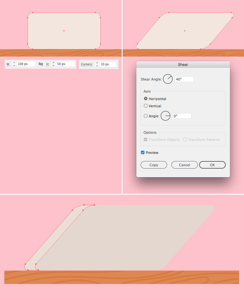
Now let’s make a thin stand. Take the Rectangle Tool (M) and create a 60 x 33 px shape with dark-grey thin Stroke and no Fill.
Select the bottom anchor points with the Direct Selection Tool (A) and hit Enter to open the Move window. Set the Horizontal Position to 10 px, Vertical to 0 px and click OK to move the bottom edge of the shape to the right.

Keeping the bottom anchor points selected with the Direct Selection Tool (A), make the corners 8 px rounded. Finish the tablet by adding a squashed elliptical label to its center.
Looks like the devices are finished! Let’s move on!

Let’s make a cup from a rectangle. Create a 32 x 25 px green shape. Make its top corners slightly rounded, and then move to the bottom corners and set the Radius to 9 px.
Create a light-green highlight on the left edge of the mug.

Let’s add a handle. Create a 12 x 15 px rectangle. Select its top and bottom left anchor points with the Direct Selection Tool (A) and make the corners 5 px rounded.
Duplicate (Control-C > Control-F) the shape, hold Alt-Shift and make the copy smaller. Select both shapes and use the Minus Front function of the Pathfinder to cut the top shape out, making a hole in the center of the handle.
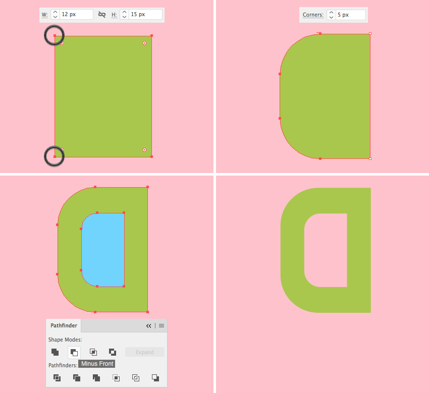
Attach the handle to the mug and Send to Back (Shift-Control-[). Finish the mug by adding a small narrow rectangle to its bottom edge.

Let’s create a 67 x 12 px dark-grey rectangle and make its left corners fully rounded. Go to Object > Path > Offset Path and set the Offset value to 2 px. Make the outer shape slightly lighter.
Duplicate the smaller shape twice (Control-C > Control-F > Control-F) and fill both copies with white color. Move the top copy to the right, making it overlap the right edge of the book.

Select both the top copy and the larger light-grey shape and use Minus Front function of the Pathfinder to cut out a hole in the grey shape.
Make the tips of the book cover rounded.

Use the Pen Tool (P) or the Line Segment Tool (\) and hold down Shift to make straight horizontal lines for the paper sheets. Hide the unwanted pieces inside the Clipping Mask as we did with the wooden texture of the tabletop.
Make a subtle shadow by duplicating the paper shape and moving it to the right. Delete the unwanted piece with the help of the Shape Builder Tool (Shift-M) while holding Alt.
And there we have it! Our book is ready!

Now we can place all the objects on the table. You can add some more books if you like, and vary their size and colors.

Let’s start with the head. Make a 50 x 80 px rounded rectangle. Set the Corner Radius of its top corners to 19 px and the bottom corners to 23 px.
Use the Rounded Rectangle Tool and the Ellipse Tool (L) to add eyes, brows, and nose to the face.

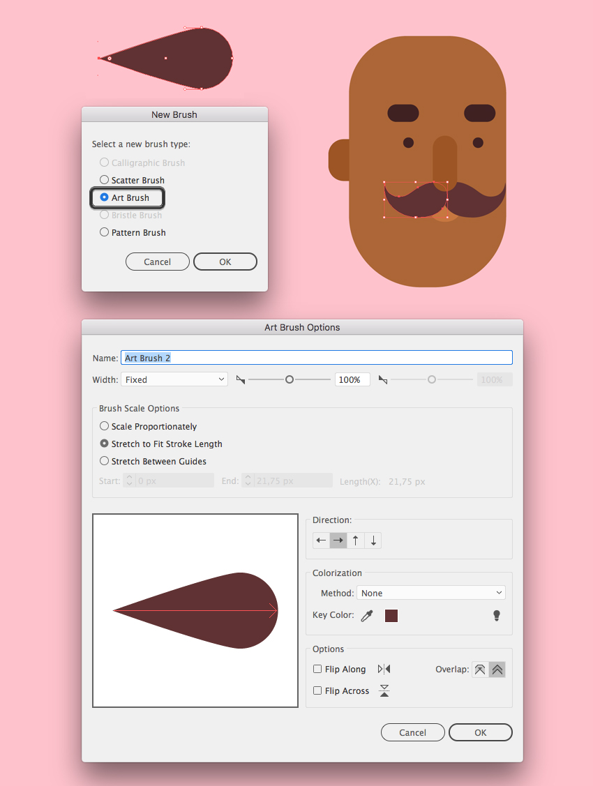
Now let’s create a brush to draw a hipster mustache! Start by making a small circle of about 10 x 10 px size. Select its left anchor point with the Direct Selection Tool (A) and drag it far to the left. Convert selected anchor point to corner from the control panel on top.

Drag and drop the created shape to the Brushes panel (Window > Brushes) and make an Art Brush. Leave all the options as default. You can always return to this Options window by double-clicking the brush in the Brushes panel to adjust the settings.
Now take the Paintbrush Tool (B) and draw a curled mustache. Adjust the Stroke Weight if needed and Object > Expand Appearance of the shape once you’re happy with it. Press Control-[ a few times to place the mustache beneath the nose.
Now let’s add some hair. Copy the head shape and Paste in Front twice (Control-C > Control-F > Control-F). Move the top copy down and to the right, as shown in the image below (the blue shape).
Select the top copy and the one beneath it and apply the Minus Front function in the Pathfinder panel. Fill the remaining shape with the same dark-brown color as we have for the mustache.
The sideburn is way too long, so let’s trim it. Take the Eraser Tool (Shift-E), hold Alt, and cut off the bottom part.

Now let’s draw the beard, using the same technique. Duplicate the face shape twice and move the top copy up and to the right. Use the Minus Front function to get rid of the unneeded part. Make the beard darker than the hair.

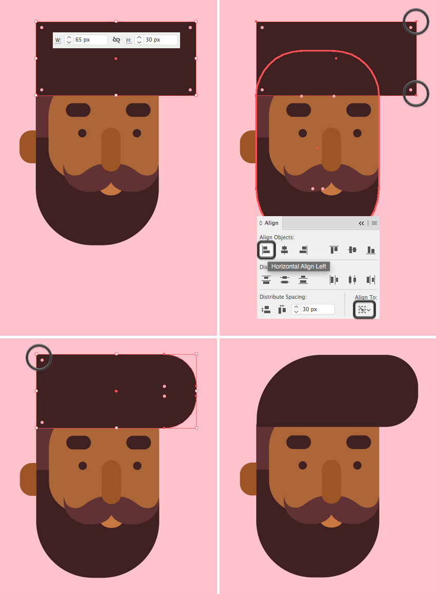
Let’s style our character’s hair. Take the Rectangle Tool (M) and make a 65 x 30 px dark-brown rectangle. We can use the Eyedropper Tool (I) to pick the color from the beard.
Let’s use the Align panel to attach the left edge of the hair to the left side of the head. Select both the hair shape and the head and click the head once again to make it a Key Object (you will see a thicker selection around it). Click Horizontal Align Left to align the hair to the head.
Select the top and bottom right corners of the hair with the Direct Selection Tool (A) and make them fully rounded.
Finally, select the top left anchor point and make this corner rounded as well.
Now that the head is ready, let’s move on to the body! Start by making a shirt from a 70 x 135 px dark-blue rectangle. Double-click the Shear Tool and set the Shear Angle to 20 degrees. Make the corners 20 px rounded.

Add a small dark-brown rectangle with a rounded bottom for the neck. Add a larger pink rounded rectangle for the neckband. Press Control-[ to place it beneath the neck shape.

Now let’s form the arms. Create a rectangle of about 17 x 96 px size. It doesn’t have to be of exactly the same height; just make sure that it fits between the top edge of the shirt and the top edge of the table.
Select its bottom left anchor point and make the corner fully rounded, forming an elbow. Duplicate the created shape and rotate it 90 degrees while holding Shift.
Add a small circle for the fist and hide it beneath the drawing tablet.

Create a white stylus from a narrow rectangle with rounded corners. Rotate it and place in the character’s hand.
Let’s add a sleeve to the top part of the arm. Duplicate the vertical element of the arm and use the Eraser Tool (Shift-E) while holding Alt to delete the bottom half of the copy. Fill the remaining shape with a bright pink color.
Let’s add the opposite arm. Select the vertical elements of the arm and double-click the Reflect Tool (O). Flip the shape over the Vertical Axis and click Copy. Attach the second arm to the body and Send to Back (Shift-Control-[), beneath the shirt.

Duplicate the body shape and use the Eraser Tool (Shift-E) to delete the top part, leaving only a narrow piece under the table. Fill it with a darker color, depicting a shadow. Duplicate the new piece and erase again, filling the remaining part with dark-blue color for the jeans.

Now let’s make the legs. Create a 23 x 130 px rectangle of a slightly lighter blue color. Select its top right anchor point and both bottom corners with the Direct Selection Tool (A) and make them fully rounded.
Add a smaller rectangle to the top part of the leg and make it fully rounded. This way we depict a bent knee.

Duplicate the leg and use the Eraser Tool (Shift-E) to erase the copy from its top part, leaving only a small piece in the bottom. Fill it with brown skin tone color. Depict a rolled up trouser leg by adding a lighter blue rounded rectangle across the leg.
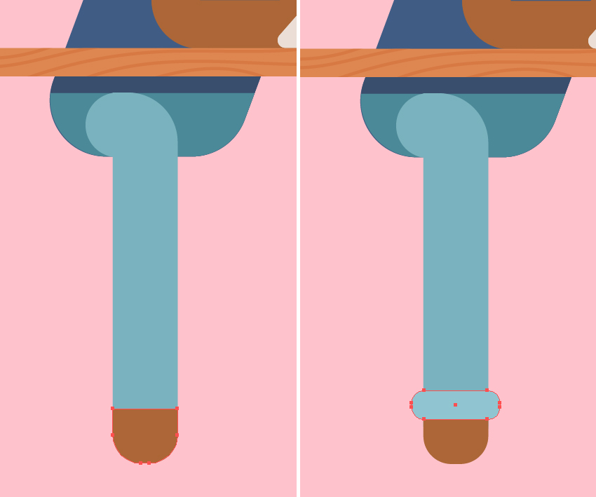
Now let’s add a shoe. Start with a 40 x 20 px dark-blue rectangle, Send it to Back (Shift-Control-[) and attach it to the leg.
Make a 25 x 25 px white rectangle for the boot tip and attach it to the right edge of the dark-blue shape. Select its top corners and make them 12 px rounded.
Grab the Pencil Tool (N) and draw a few lines along the boot tip. Use the Clipping Mask to hide the unwanted pieces of the lines.
Finish the shoe by adding a narrow white rectangle in the bottom for the sole. Make its bottom left corner rounded and decorate the sole with a narrow dark-grey stripe.

Now let’s add the second leg! Attach an 80 x 23 px rectangle to the bottom part of our character. Add a smaller rectangle of the lighter color on top, aligning it to the left edge of the previous shape.
Make the left corners of the new shape fully rounded.
Now let’s bend the leg in the knee by adding a rotated narrow rectangle. I just duplicated it from the first leg and used the Selection Tool (V) to rotate it to about 250 degrees, making it fit the knee area.

Add a second shoe and make all the elements of the leg slightly darker, making the image a bit more three-dimensional.
Awesome! Looks like our character is finished. Let’s move to the final part of our tutorial.

Our character is still floating in the air, so let’s add a chair to make him sit comfortably.
Start by creating an 87 x 105 px brown rectangle for the back of the chair. Select its bottom left corner and hit Enter to open the Move window. Set the Horizontal Position value to 7 px, Vertical to 0 px, and click OK to move the anchor point 7 px to the right.
Repeat the same for the opposite anchor point, but this time set the Horizontal value to -7 px, moving the point to the left.
Finally, select both top corners and make them fully rounded.

Keeping the shape selected, go to Object > Path > Offset Path and set the Offset value to -8 px. Select both shapes and click Minus Front to cut out a hole in the center.
Use the Eraser Tool (Shift-E) and hold down Alt to erase the bottom part of the frame.
Add three vertical wooden planks to the chair back, placing them beneath the frame (Shift-Control-[).

Add the back of the chair and a wooden bottom. Decorate them with a simple wooden texture, using the same technique as we did for the wooden tabletop.

Now we need to add a leg to our chair. I wanted to depict a tall chair like those in a bar. Use the Rectangle Tool (M) to form the elements, using the table legs as a reference for the shapes and colors.
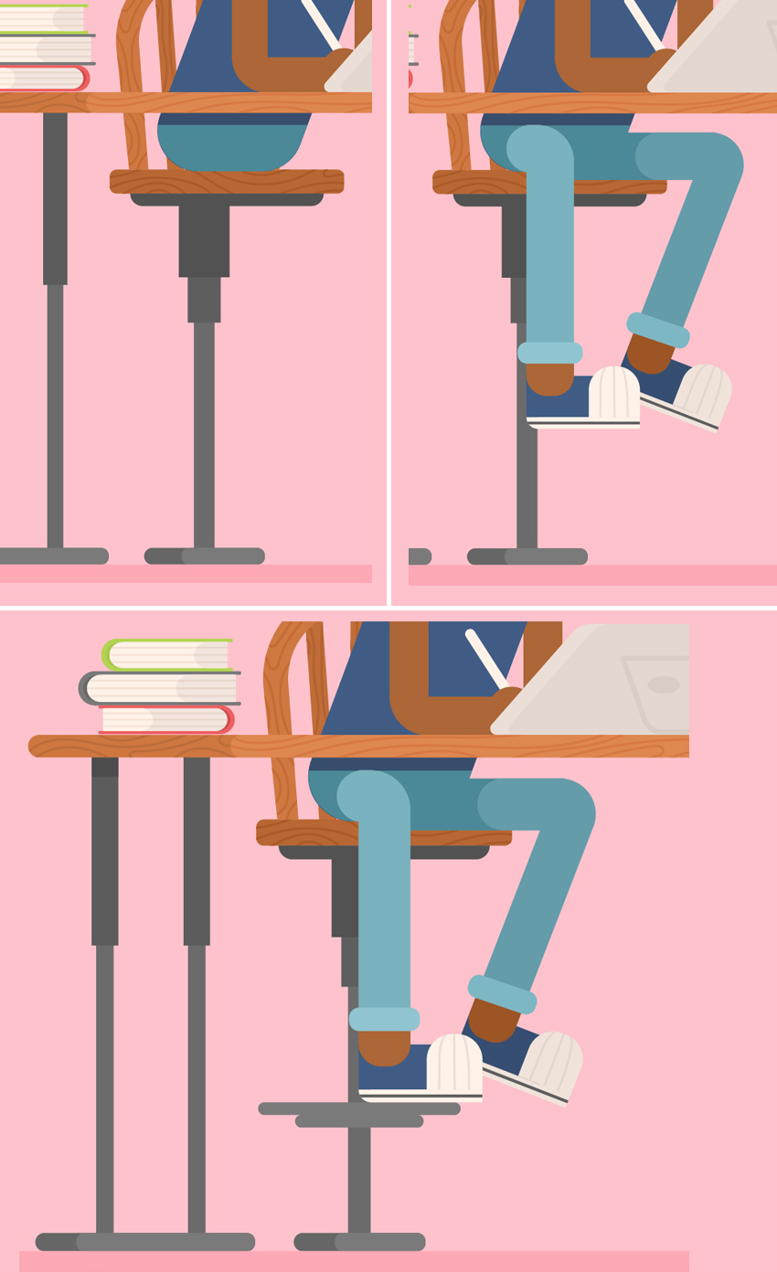
Great job! I hope you’ve enjoyed following this tutorial and discovered some new tips and tricks that will inspire you to create more flat style illustrations!

Don’t forget to download the Flat Hipster Designer Set on Envato Elements with all the additional elements and alternative blond character!
If you love to create flat characters and interiors, I have another interesting tutorial for you! Make sure you don’t miss this one:

Have fun!

Post pobrano z: How to Model a Low Poly Wolf in Cinema 4D: Part 1

Follow this tutorial step-by-step to create a low poly wolf model that you can use in video games, graphic design and illustration projects whilst learning Cinema 4D quickly.
Some of the skills you’ll learn in this tutorial include creating basic 3D modelling, importing reference images, adding lighting to the scene and basic rendering techniques.
In this, the first part of the two-part tutorial, I’ll show you how to:
1. How to Import Reference Images
Open Follow this tutorial step-by-step to create a low poly wolf model that you can use in video games, graphic design and illustration projects whilst learning Cinema 4D quickly. and use the middle mouse button to click anywhere on the viewport. This will display all four views. From there, use the middle mouse button to select the Right view.

In the Attributes tab select Mode > View Settings.

In Viewport [Right] select the Back button and click on the button next to Image.

Select your reference image from the finder and open it. In this tutorial we will use the side profile of a wolf to help us.

Increase the transparency of your reference image by entering a percentage or using the bar next to the transparency option. For this tutorial we have set the percentage to 70%.

To create the model of our wolf we need to create a Loft. Select Subdivision Surface > Loft.

Delete the Phong Tag from your Loft. This will remove any smoothing from your model and will ensure that it maintains the Low Poly look.

Select Pen > n-Side. This will create the polygons that we will use to model the Low Poly Wolf.

Move the n-Side below the Loft. This will enable the option to edit the polygon.

Use the Move Tool to position the n-Side so that it is in line with the left side of the wolf in your reference image.

Make sure that you have n-Side selected on your side panel.

Use the Move Tool and hold the Control button on your keyboard then hover over the arrow. The mouse pointer should change to indicate that you can duplicate the polygons. From there, simply click and drag to create polygons for your wolf.

Use the Scale Tool to scale the shape of your polygon down or up so that it matches your reference image as it reaches specific points in the body. For example, scale the polygon down as your reach the start of the hip as shown in the image below.

Use the Rotate Tool to change the direction of your polygon so that it follows the shape of the wolfs body according to the reference image.

Continue to use a combination of the Move Tool, Rotate Tool and the Scale Tool, until you have completely mapped out the body of your wolf.

Return to perspective mode by using the middle mouse button and selecting the perspective view.

Make sure that Loft is selected. This will enable new options in the bottom right corner.

Tick the box for Linear Interpolation. Now adjust the three top options (Mesh Subdivision U, Mesh Subdivision V and Isoparm Subdivision U) in order to create a low poly look that is to your liking.

Repeat the steps above to create other parts of the body like the tail.

Repeat the steps above, using a combination of the Move Tool, Rotate Tool and the Scale Tool, to create the head of the wolf.

Create a Pyramid by selecting Cube > Pyramid. This will be used to create the ears of the wolf.

Use the Scale Tool to scale down your pyramid to a size which is suitable for the wolf’s ear.

Use the Move Tool and the Rotation Tool to place the pyramid on top of the Wolf’s head.

Return to Perspective View (using the middle mouse button) and move the pyramid to the correct part of the Wolf’s head. You can use the Move Tool and the Rotation Tool to do this. Make sure that the base of your pyramid is embedded inside the Wolf’s head.

Once you are happy with the position of the ear, click the Make Editable button on the top left corner of the viewport (make sure that the pyramid is selected).

Click on the Points button. This will enable you to edit and move the vertices of an object you have selected (in this case the Pyramid).

Select the top point of the Pyramid and use the Move Tool, to extend the height of the ear.

Click on the Polygons button. This will enable you to edit and move the polygons of an object you have selected (in this case the Pyramid).

Use the Move Tool and push the front face back so that the ear appears thinner. You can also use the Rotation Tool to rotate and edit the shape of the ear. Once you finished editing the ear make sure you select Model Mode again (located below the Make Editable button).

Make sure that you have the Pyramid selected. At the top of the screen, hover over the Array button and click and hold to expand the menu. Select the Symmetry button. Then move the Pyramid inside Symmetry.

Use the Move Tool to make sure the ears appear in the correct place.

In the second part of the the tutorial series, I’ll show you how to:

Post pobrano z: How to Draw a Skull
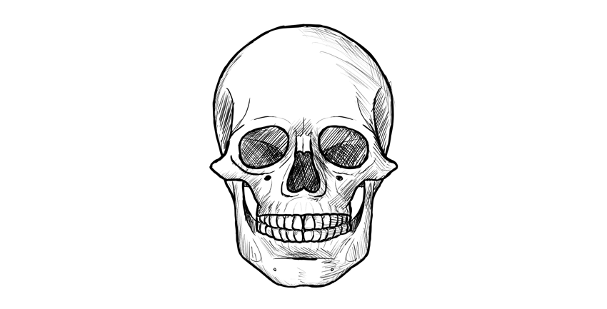
Recently, I showed you how to draw a skull in profile. This time, I’ll show you the more interesting view, perfect for tattoos and scary illustrations. This view is also very simple, so you don’t need to be a skilled artist to follow this tutorial!
A hint before you start: it’s easier to keep the proportions right when you’re drawing small.
Draw a circle. It doesn’t need to be perfect, and feel free to draw it with many lines. Find its center, too.

Draw a line under the circle, using the length of its radius.

Divide this line into three sections.

Draw a square „bucket” under the circle.
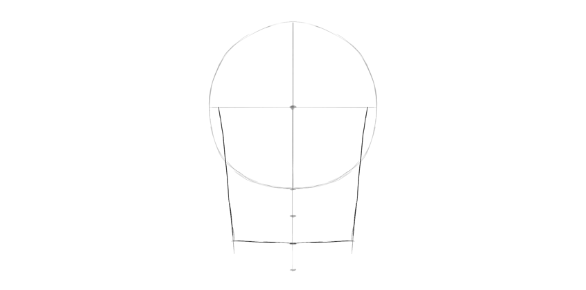
Draw two ovals in the bottom third of this line. This will be the chin.

Connect the ovals with the rest of the lines.

Draw two huge leaning ovals in the lower half of the circle.

These ovals are not eye sockets yet—their shape is too simple for this. Let’s fix it. Draw a curve crossing both ovals, leaving some space for the eyebrow area.
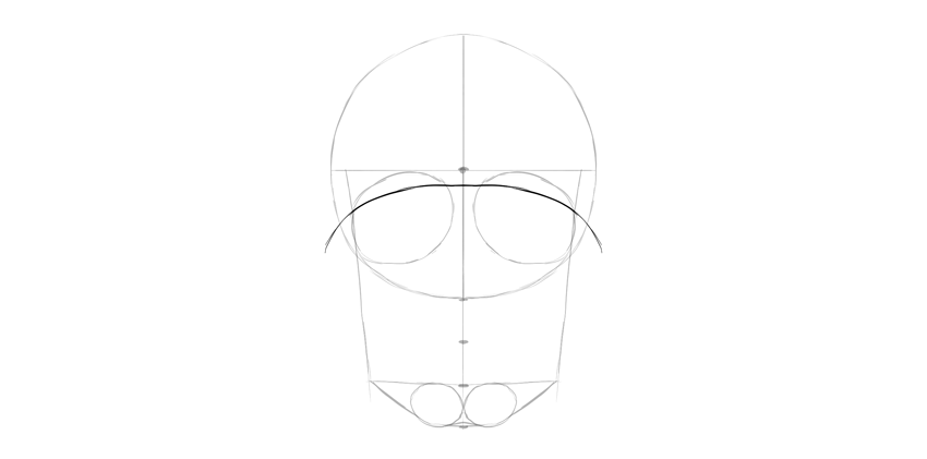
Connect this curve with the sides of the skull.

Draw another curve on the bottom, leaving a similar amount of space below.

You can outline the eye sockets now by giving them some space on the sides.

Draw a curve from the corner of the eye socket towards the other socket, going through the chin. This will be the mouth area.

Draw a teardrop shape between the eye sockets, at the bottom of the circle. This will be the nose.

Make the nose more detailed.

Draw a curve across the mouth, through the mark between the first two thirds.

We need to add more details to the mouth. First, define the front of the upper jaw with two curves.

Draw the border of the lower teeth.
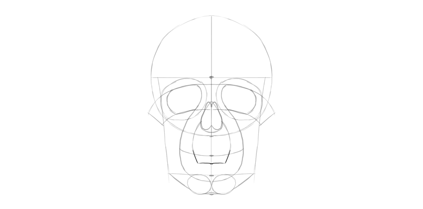
Connect the teeth area to the chin.

Draw the border of the upper teeth now.

Finish the borders of the teeth area with these curves.

We need to add the details to the lower jaw, too.


Add the final curves to the skull.

Divide the teeth area into separate teeth.

Let’s finish the drawing. If you’re drawing traditionally, you can put a new sheet of paper over it, or simply draw with a darker medium now.
Outline the eye sockets.
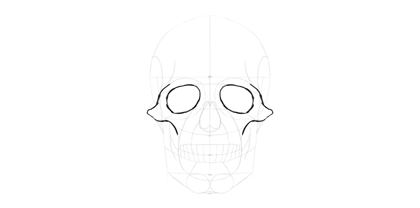
Outline the nose. Don’t forget about the nasal bridge on top.

Add more detail to the edges of the eye sockets.

Outline the teeth. They’re slightly tapered towards the bone.

Add some details under and over the teeth.

Outline the lower jaw.

Outline the upper part of the skull.

Add more fancy details, if you want to be even more accurate.

You can shade the drawing, if you want. Start by darkening the darkest parts…
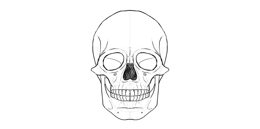
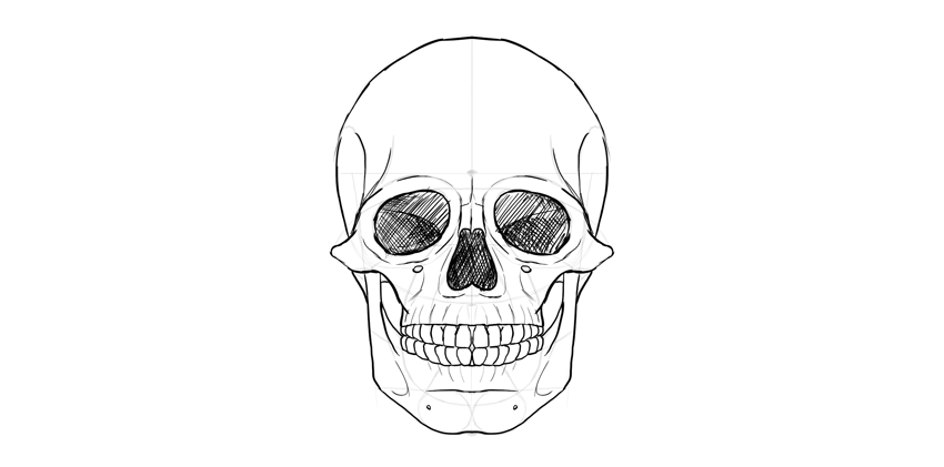
… then cross-hatch the shadow areas.

Finally, thicken some of the lines to make the effect more interesting.

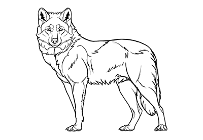
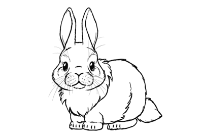
Do you want to try some other simple drawing tutorials? We’ve got you covered:


Post pobrano z: How to Create a Selective Animated Glitch Photo Effect in Adobe Photoshop
Glitch effects are still popular these days and appear in many variations. Using the animation feature in Photoshop, we are going to turn a simple image into a short movie.
In this tutorial, I will teach you how to lift an object from its background using the automated Content Aware Fill and the good old copy and paste technique. Finally, we will add subtle animation into the scene.
Get more inspiration sources for glitch effects from GraphicRiver.
To follow this tutorial, we are going to use this resource:
Let’s start by analyzing the image. We have a bus and two trucks in the scene. Before we can animate them, we need to lift them from their background. We can do it using the old way, i.e. manual Clone Stamp Tool, or using the automated Content Aware Fill feature. For better results, I suggest you use the biggest image resolution available. With a larger image, you can see all the detail and make the cloning process easier.

First, we are going to cut the furthest truck from the background. Duplicate the background by pressing Control-J. Make a selection around the truck using the Lasso Tool. Click Edit > Fill. Select Contents: Content-Aware.

Click OK to let Photoshop automatically fill the selection with suitable pixels. Photoshop did a nice job, but not perfect. If you look closer, there are some flaws that we have to fix.

We’ll continue using a simple copy and paste technique. Copy (Control-C) a part of the road, and paste (Control-V) it on top of the previous road segment made by the Content-Aware Fill. You may need to rotate and transform its shape. You can also bend the new road shape to match the road perspective by right clicking inside the transformation bounding box and selecting Warp.


Add a layer mask into the new road segment. Activate the Brush Tool with low Hardness (0%) and set the foreground color to black.


Paint the edge of the road until it fades into the background.


We also need to add road markings to keep it identical to the other road segment. Select the road marking and copy it using the shortcut Control-Shift-C. Paste it (Control-V) on the desired area. You can use a warp transformation to bend the road marking shape. Pull one of the boxes to change the direction of the road marking.


Add a mask into the layer and then paint its edge with black using a soft Brush Tool until it fades naturally into the background.

Next, we need to reveal the truck again. We can simply copy the truck from the original background onto a new layer and place it on top.

Add a layer mask and paint its edge with black until the truck fades into the background.

Let’s continue with the second truck. Start by making a path around the truck. Hit Control-Enter to convert the path into a selection. Hit Control-J to duplicate it as a new layer.


Next, we need to cover the truck. Select part of the road segment and copy it. You can directly copy the content of the selection using the shortcut Control-Shift-C. If you want to use regular Control-C, you will need to activate the corresponding layer first.

Move it until the truck is covered. Obviously, you will need to use the Stamp Tool to remove the electricity pole.

Load the previous selection covering the truck and save it as a layer mask. As you can see, we still need to fix its edge.

Add another copy of the road segment and delete its edge using a soft Brush Tool.


Make a new layer. Use the Brush Tool to draw a thin line for the electricity cable. For its color, sample the available cable by Alt-clicking it while the Brush Tool is active.

Copy the truck and paste it between the cable and the road.

We are going to move the truck through the street above it. So select the street and copy it to a new layer (Control-C and then Control-V).


The road segment should be placed above the truck so that when it moves, it is hidden by the road. For now, place the truck in its original place.


Next, we’ll work on the bus. Duplicate the background and select the bus manually using the Lasso Tool. We’ll try to remove the bus automatically using the Content-Aware Fill feature. Click Edit > Fill and select Contents: Content-Aware. Click OK.

In this case, Content Aware Fill isn’t good enough. You will need to polish the result.

Depending on your situation, you may want to try manual cloning. Here, I select some parts of the road behind the bus and then copy (Control-Shift-C). Then, paste the road segment on top of the bus. Hit Control-T and then rotate it until it matches the road perspective. Right click and select Warp for a more advanced transformation. Pull the corresponding boxes until the new road aligns nicely to the original one.


Add a layer mask and paint its edge with black until the new road blends seamlessly into the original road.


Try to remove any similarity to the original clone source by making it overlap with another part of the image.


Reveal the original bus image again by duplicating it onto a new layer. Place it on top of the new road.

Let’s move on to prepare the glitch animation. We don’t want to have a huge-sized GIF animation. It’s just not effective. We need to scale down its size. Click Image > Image Size. In the next dialog box, make sure the Resample checkbox is activated. Set the image width to 800 pixels. Click the OK button.

Our glitch animation will be very short, only half a second. For this, we only need 5 or at most 6 frames, with each frame lasting for 0.1 second. Duplicate the bus layer five times and keep them in a separate group layer.

Activate one of the bus layers and apply a Wave filter. Click Filter > Distort > Wave. In this tutorial, we set a short Wavelength with minimum Vertical Scale: 1%.


Move on to the next bus layer. Apply the same Wave filter. Hit Control-Alt-F. To differentiate the result, hit Randomize. You can also change some of the available settings if needed.


Keep on adding this to the other buses on different layers.

Repeat the same steps on the furthest truck. Duplicate it five times and then apply the Wave filter, but this time with lower settings to keep its result subtle.


We are now ready to start animating the scene. Open up the Timeline panel. Click Create Frame Animation. We will make the animation frame by frame.

For the first frame, return the scene to its original position. Every truck and bus should be stationary in its place. Set the frame duration to 1 second.

Click the New Frame button in the lower part of the panel to add the next frame. In this frame, make sure that the layer which has the truck going under the street is active. Hit the Down Arrow and then the Left Arrow button once to move its position one pixel down and one pixel left. Set its duration to 0.1 second.

Make another frame. Again, move the truck one pixel down and one pixel left. As in the last frame, set its frame duration to 0.1 second.

You already know the drill. Add a new frame and then move the truck one pixel down and one pixel left. Keep on doing this until the truck is hidden out of sight, covered by the street. To see the result, click the Plays animation button. Below, you can see the animation.

Let’s move on to the bus animation. Add another frame. Hide the original bus layer and reveal one of the layers that contains the bus altered with the wave filter. Set its duration to 0.1 second.

Add another frame. Hide the previous layer and reveal another layer that contains the bus altered with the wave layer. The duration should be 0.1 second.

Another new frame and another layer. Go on, you know the drill.

After half a second, put back the original bus.

Set its frame duration to 2.0 seconds. This will add another „silence” into the scene. Below, you can see the animation we have so far.


Add another frame. This time, we’re going to animate the furthest truck. Hide the original truck and reveal the one that has been altered with the Wave filter. Set the frame duration to 0.1 second.

Add another frame. Hide the last layer that contains the altered truck and reveal the next. Continue doing this until we have half a second animation of the truck glitching.


Our final step is exporting the animation. You can use the Save for Web command to save the animation as a GIF file. Make sure you have selected Looping Options: Forever to keep the animation running.
To save file size, try to decrease the number of colors used in the final file. By decreasing the number of colors, you may risk losing contrast, brightness, and so on. So keep experimenting to get a sensible proportion between file size and image quality.

You can also export the animation directly from Photoshop as a video by clicking File > Export > Render Video.

Awesome Work, You’re Done!
As you can see in this tutorial, we can get unlimited variations of glitch effects by combining them using different types of distortion. Check out other Envato Tuts+ tutorials on glitch effects for more inspiration.
If you follow this tutorial, don’t forget to share your final result in the comment section below. I’d love to see it.

Post pobrano z: A Poll About Pattern Libraries and Hiring
I was asked (by this fella on Twitter) a question about design patterns. It has an interesting twist though, related to hiring, which I hope makes for a good poll.
Note: There is a poll embedded within this post, please visit the site to participate in this post’s poll.
I’ll let this run for a week or two. Then (probably) instead of writing a new post with the results, I’ll update this one with the results. Feel free to comment with the reasoning for your vote.
A Poll About Pattern Libraries and Hiring is a post from CSS-Tricks
