Good rant. Thankfully it’s a tweetstorm not some readable blog post. 😉
I think about this kind of thing with cable box TV UX. At my parent’s house, changing the channel takes like 4-5 seconds for the new channel to come in with all the overlays and garbage. You used to be able to turn a dial and the new channel was instantly there.
You’d like to think performance is a steady march forward. Computers are so fast these days! But it might just be a steady march backward.
Want to know more about Sketch? In this video from my course, Up and Running With Sketch, I’ll give you an introduction to this useful design app. You’ll learn who it’s for, why you should consider using it, and what you can do with it.
What Is Sketch?
Why Use Sketch?
Sketch is a digital design app from Mac. You can use it for UI, mobile, web and even icon design.
If you’ve been using Photoshop for these things, then you should know that Sketch is a very capable replacement. If you want more detail on switching from Photoshop to Sketch, see my Coffee Break Course:
Here are the top three reasons that I use Sketch from a web designer’s perspective.
1. The Licensing System
Basically, you pay for the app once, and you can use it for as long as you want. Now, while it’s true that you only buy the app once, that license that you buy lasts for one year, and in that year, you have all the updates included.
After your license expires, you can still use the app, but you won’t get any new updates. You will have to purchase a new license for that.
Fortunately, renewing a license is a bit cheaper. While a new license costs $99, renewing one is $69 a year, which is not that much.
2. Sketch Is a Vector-Based App
Being vector-based means that every shape you draw can be resized to any dimension without losing sharpness. So your designs will look great, even on a retina or very high DPI screen.
3. Ease of Use
Sketch is just so much easier to use than an app like Photoshop. I cannot tell you just how much time it has saved me.
And speaking from a web designer’s point of view, one thing that I also love about Sketch is the quality of the render, which means the designs that you can create are very, very close to a finished HTML/CSS result or web page. And because of that, you can really perfect a design, even on the coded version. It’s just great.
Who Is Sketch For?
Now, who is this app for? Well, first of all it’s a Mac app. So, if you don’t have a Mac, unfortunately you are not be going to be able to use it.
There is a Windows app that can interpret Sketch files. So you can open Sketch files in that app, but you cannot edit them—you can only work in Sketch on a Mac.
Now Sketch is actually very lightweight, so you don’t need a monster PC to run it. For example, I’m running it on a four-year-old MacBook Pro. It’s top spec, 16GB of RAM, i7, all that stuff, but I bet this app would work just fine even on the cheapest Mac available, which right now is, I believe, a $500 Mac Mini.
Really anyone with a design background can use Sketch. As I said earlier, you can use it for web design, UI design, mobile, icon design, and pretty much anything you want—except maybe things like heavy 3D renders.
You can even use Sketch for wireframing, or with the help of some plugins you can use it for prototyping, which is very, very cool.
Watch the Full Course
In the full course, Up and Running With Sketch, you’ll learn everything you need to get started with Sketch. From a tour of the user interface to more advanced features like shared styles and symbols, it’s all there for you. By the end, you’ll be confident in using Sketch for all your design projects.
You can take this course straight away with a subscription to Envato Elements. For a single low monthly fee, you get access not only to this course, but also to our growing library of over 1,000 video courses and industry-leading eBooks on Envato Tuts+.
Plus you now get unlimited downloads from the huge Envato Elements library of 300,000+ creative assets. Create with unique fonts, photos, graphics and templates, and deliver better projects faster.
With CSS filter effects and blend modes, we can now leverage various techniques for styling images directly in the browser. However, creating aesthetic theming isn’t all that filter effects are good for. You can use filters to indicate hover state, hide passwords, and now—for web performance.
While playing with profiling performance wins of using blend modes for duotone image effects (I’ll write up an article on this soon), I discovered something even more exciting. A major image optimization win! The idea is to reduce image contrast in the source image, reducing its file size, then boosting the contrast back up with CSS filters!
Start with your image, then remove the contrast, and then reapply it with CSS filters.
How It Works
Let’s put a point on exactly how this works:
Reduce image contrast using a linear transform function (Photoshop can do this)
Apply a contrast filter in CSS to the image to make up for the contrast removal
Step one involves opening your image in a program that lets you linearly reduce contrast in a linear way. Photoshop’s legacy mode does a good job at this (Image > Adjustments > Brightness/Contrast):
You get to this screen via Image > Adjustments > Brightness/Contrast in Photoshop CC.
Not all programs use the same functions to apply image transforms (for example, this would not work with the macOS default image editor, since it uses a different technique to reduct contrast). A lot of the work done to build image effects into the browser was initially done by Adobe, so it makes sense that Photoshop’s Legacy Mode aligns with browser image effects.
Then, we apply some CSS filters to our image. The filters we’ll be using are contrast and (a little bit of) brightness. With the 50% Legacy Photoshop reduction, I applied filter: contrast(1.75) brightness(1.2); to each image.
Major Savings
This technique is very effective for reducing image size and therefore the overall weight of your page. In the following study, I used 4 vibrant photos taken on an iPhone, applied a 50% reduction in contrast using Photoshop Legacy Mode, saved each photo at Maximum quality (10), and then applied filter: contrast(1.75) brightness(1.2); to each image. These are the results:
You can play with thelive demo hereto check it out for yourself!
In each of the above cases, we saved between 23% and 28% in image size by reducing and reapplying the contrast using CSS filters. This is with saving each of the images at maximum quality.
If you look closely, you can see some legitimate losses in image quality. This is especially true with majority-dark images. so this technique is not perfect, but it definitely proves image savings in an interesting way.
Browser Support Considerations
Be aware that browser support for CSS filters is „pretty good”.
This browser support data is from Caniuse, which has more detail. A number indicates that browser supports the feature at that version and up.
Desktop
Chrome
Opera
Firefox
IE
Edge
Safari
18*
15*
35
No
16
6*
Mobile / Tablet
iOS Safari
Opera Mobile
Opera Mini
Android
Android Chrome
Android Firefox
6.0-6.1*
37*
No
4.4*
61
56
As you can see, Internet Explorer and Opera Mini lack support. Edge 16 (the current latest version) supports CSS filters and this technique works like a charm. You’ll have to decide if a reduced-contrast image as a fallback is acceptable or not.
What About Repainting?
You may be thinking: „but while we’re saving in image size, we’re putting more work on the browser, wouldn’t this affect performance?” That’s a great question! CSS filters do trigger a repaint because they set off window.getComputedStyle(). Let’s profile our example.
What I did was open an incognito window in Chrome, disable JavaScript (just to be certain for the extensions I have), set the network to „Slow 3G” and set the CPU to a 6x slowdown:
With a 6x CPU slowdown, the longest Paint Raster took 0.27 ms, AKA 0.00027 seconds.
While the images took a while to load in, the actual repaint was pretty quick. With a 6x CPU slowdown, the longest individual Rasterize Paint took 0.27 ms, AKA 0.00027 seconds.
CSS filters originated from SVG filters, and are relatively browser optimized versions of the most popular SVG filter effect transformations. So I think its pretty safe to use as progressive enhancement at this point (being aware of IE users and Opera Mini users!).
Conclusion and the Future
There are still major savings to be had when reducing image quality (again, in this small study, the images were saved at high qualities for more of a balanced result). Running images through optimizers like ImageOptim, and sending smaller image file sizes based on screen sized (like responsive images in HTML or CSS) will give you even bigger savings.
In the web performance optimization world, I find image performance the most effective thing we can do to reduce web cruft and data for our users, since images are the largest chunk of what we send on the web (by far). If we can start leveraging modern CSS to help lift some of the weight of our images, we can look into a whole new world of optimization solutions.
For example, this could potentially be taken even further, playing with other CSS filters such as saturate and brightness. We could leverage automation tools like Gulp and Webpack to apply the image effects for us, just as we use automation tools to run our images through optimizers. Blending this technique with other best practices for image optimization, can lead to major savings in the pixel-based assets we’re sending our users.
Richard Rutter, in support of his new book Web Typography, shares loads of great advice on data table design. Here’s a good one:
You might consider making all the columns an even width. This too does nothing for the readability of the contents. Some table cells will be too wide, leaving the data lost and detached from its neighbours. Other table cells will be too narrow, cramping the data uncomfortably. Table columns should be sized according to the data they contain.
I was excited to be reminded of the possibility for aligning numbers with decimals:
td { text-align: "." center; }
But the support for that is non-existent as best I can tell. Another tip, using font-variant-numeric: lining-nums tabular-nums;does have some support.
Tables can be beautiful but they are not works of art. Instead of painting and decorating them, design tables for your reader.
In this short tutorial you’ll learn how to create an icy effect which you can apply to any text. Guaranteed to give your designs an instant wintry vibe, this is also a quick introduction to InDesign effects for beginners.
If you want to add a unique touch to your text effect, you can easily switch up the font to create a very different look. Head over to GraphicRiver or Envato Elements to source fab fonts for your next project.
Ready to create our icy effect? Let’s get started!
What You’ll Need to Create Your Frozen Effect
As well as having access to Adobe InDesign, you’ll also need to download the following images and font files to create your effect:
* If you’d like to use a different font for your text effect, go ahead!
1. How to Create a Frozen Backdrop for Your Text Effect
Step 1
Open up InDesign and go to File > New > Document. You can create the type effect at any size you wish, but here I’m going to set up an A3 landscape page with the Intent set to Print.
Once you’ve set up the specs for your document, go ahead and click OK.
Expand the Layers panel (Window > Layers) and double-click on the Layer 1 name. In the Options window, change the name to Background and click OK.
Click on the Create New Layer button at the bottom of the panel and rename the new layer Typography. Finally, create a third layer and name it Texture.
Lock both the Texture and Typography layers, clicking on the Background layer to activate it.
Step 2
Take the Rectangle Frame Tool (F) and drag across the whole page. Go to File > Place and choose the ice background image you downloaded earlier. Click Open and allow it to fill up the whole frame.
Step 3
Expand the Swatches panel (Window > Color > Swatches) and choose New Color Swatch from the panel’s top-right drop-down menu.
Name the swatch Blue and set the levels to C=60 M=26 Y=9 K=0. Click Add and then OK.
Use the Rectangle Tool (M) to create a rectangle shape that extends across the whole page and past the left and right edges, as shown below. Set the Fill to Blue.
With the rectangle selected, go to Object > Effects > Transparency. Set the Mode to Multiply and reduce the Opacity to 25%.
Click on Gradient Feather at the bottom of the panel’s left-hand menu. Set the Type to Radial, and allow the gradient to move from a paler center to darker outer edges, before clicking OK to exit.
2. How to Create Your Icy Text Effect
Step 1
Lock the Background layer and unlock the layer above, Typography.
Take the Type Tool (T) and drag onto the center of the page, before typing in the text you want to apply the effect to.
From the Character panel (Window > Type & Tables > Character) or the Controls panel at the top of the workspace, set the Font to Charlevoix Pro (or a font of your choice) and make the Font Size big and generous.
Step 2
Make sure you are completely happy with the formatting of your text, because we’ll be vectorising the design before we apply the effects to it. You don’t have to do this, but it can be easier to move the text around and play with the scale of the design once it’s vectorised.
To vectorise the text, go to Type > Create Outlines.
Edit > Copy the vectorised text, and Edit > Paste a copy onto the pasteboard. We’ll come back to this later, in Step 6.
From the Swatches panel, set the Fill of the vectorised text to [None], and then go to File > Place. Navigate to the same ice background image you used earlier, and Open, allowing it to fill up the text shape.
Step 3
Now you’re ready to start building up effects on your text, such as shadowing and 3D elements.
With the text shape selected, go to Object > Effects > Outer Glow. With the Mode set to Normal, bring the Opacity down to about 40%. Set the Technique to Precise, Size to about 0.7 in, Noise to about 15%, and Spread to about 40%.
Tweak the levels of each setting individually until you have a nice diffuse glow around the edge of the text.
Step 4
Click on Bevel and Emboss in the Effect window’s left-hand menu. Set the Style to Inner Bevel and Size to about 0.4 in. Set the Technique to Smooth and Soften to about 0.2 in. Increase the Depth to 100%.
Adjust the Shading options to create a subtle shadow. For the Shadow color, click on the colored square and choose your Blue swatch.
Click OK to exit the Effects window.
Step 5
Create a new CMYK swatch, C=94 M=69 Y=27 K=11, and name it Dark Blue.
Lock the Typography layer and unlock the layer above, Texture.
Step 6
Select the copy of the vectorised text which you placed earlier onto the pasteboard (see Step 2, above), and Edit > Copy, Edit > Paste it, moving the new copy on top of the text sitting on the page.
Go to File > Place and choose the ice texture image you downloaded earlier. Click Open and allow the texture to fill up the vector.
Step 7
With the vector selected, go to Object > Effects > Transparency. Set the Mode to Overlay and Opacity to 80%.
Click on Inner Shadow in the window’s menu, and set the Mode to Darken and Effect Color to Dark Blue (click on the colored square to edit this). Increase the Opacity to 100%.
From the Options section at the bottom, increase the Size to about 0.2 in and Choke to about 30%.
Click OK to exit.
Step 8
We can deepen the engraved shadow effect of the text by bringing over the vector copy still sitting on the pasteboard and laying it over the top of the other text vectors. Set the Fill to Dark Blue.
Go to Object > Effects > Transparency and set the Mode to Overlay.
Then click on Gradient Feather and add a Linear 90 degree gradient, going from darker at the top to lighter towards the bottom of the text.
Click OK to exit the window.
Conclusion: Your Finished Ice Text Effect
Your type effect’s looking awesome—great job! You can now incorporate it into another layout or simply enjoy it as it is.
In this tutorial, you will learn how to turn your photos into frozen
winter images inspired by white walkers from the Game of Thrones TV series. I
will try to explain everything in so much detail that everyone can do
it, even those who have just opened Photoshop for the first time.
The
effect shown above is the one I will show you how to create here in
this tutorial. If you would like to create the effect shown below, a
more advanced effect with animated snow and mist, and just using a
single click, then check out my Snow Walker Photoshop Action.
What You’ll Need
To recreate the design above, you will need the following photo:
First, open the photo that you want to work with. To open your photo, go to File > Open, choose your photo, and click Open. Now, before we get started, just check a couple of things:
Your photo should be in RGB Color mode, 8 Bits/Channel. To check this, go to Image > Mode.
For best results, your photo size should be 2000–4000 px wide/high. To check this, go to Image > Image Size.
Your photo should be the Background layer. If it is not, go to Layer > New > Background from Layer.
2. How to Select the Subject
Step 1
In this section we are going to make a selection of our subject and copy the subject to a separate layer. Select the Magic Wand Tool (W), set the Tolerance to 32, and click once on the white background to make a selection of it. Then press Control-Shift-I on your keyboard to invert the selection and get a selection around the subject.
Step 2
Now go to Select > Modify > Smooth and set the Sample Radius to 5 px. Next, go to Select > Modify > Contract and set Contract By to 3 px. Finally, go to Select > Modify > Feather and set Feather Radius to 2 px.
Step 3
Press Control-J on your keyboard to create a new layer using a selection, and name this new layer Subject.
3. How to Make the Eyes Glow
Step 1
In this section, we are going to change the eye color and make the eyes glow. Go to Layer > New > Layer to create a new layer and name it Temp.
Step 2
Now choose the Brush Tool (B), pick a soft brush, and brush over the iris of both eyes. The color doesn’t matter.
Step 3
Control-click on this layer thumbnail to make a selection of it, and then select the Subject layer and press Control-J on your keyboard to create a new layer using the selection. After that, Right-click on the Temp layer and choose Delete Layer to delete it.
Step 4
Now go to Image > Adjustment > Hue/Saturation, check the Colorize option, and set Hue to 206, Saturation to 82 and Lightness to 21 as shown below:
Step 5
Change the Blending Mode of this layer to Linear Dodge, set the Opacity to 59%, and name it Eyes_Glow_1.
Step 6
Now go to Layer > Layer Mask > Reveal All to create a blank layer mask. Then set the foreground color to #000000, choose the Brush Tool (B), pick a soft brush, and brush over the pupils of both eyes.
Step 7
Select the Subject layer, go to Layer > New > Layer to create a new layer, and name it Eyes_Glow_2.
Step 8
Set the foreground color to #808080, choose the Brush Tool (B), pick a soft brush, and brush over both eyes of your subject.
Step 9
Now go to Image > Adjustment > Hue/Saturation, check the Colorize option, and set Hue to 206, Saturation to 82 and Lightness to 21 as shown below:
Step 10
Change the Blending Mode of this layer to Color.
Step 11
Now press Control-J on your keyboard to duplicate the current layer, name this new layer Eyes_Glow_3, and drag it just above the Subject layer.
Step 12
Choose the Lasso Tool (L) and make a selection around the left eye of the subject. Right-click anywhere inside the canvas, choose Free Transform, and set the Width of the layer to 200% and the Height to 400%, as shown below:
Step 13
Now press Control-D on your keyboard to deselect. Then choose the Lasso Tool (L), make a selection around the right eye of the subject, Right-click anywhere inside the canvas, choose Free Transform, and set the Width of the layer to 200% and the Height to 400%, as shown below:
Step 14
Press Control-D on your keyboard to deselect, and then go to Filter > Blur > Gaussian Blur and set the Radius to 50 px as shown below:
Step 15
Now set the Opacity of this layer to 84% and then Shift-click on the Eyes_Glow_1 layer to select all glow layers at once. After that, go to Layer > New > Group from Layers to create a new group from the selected layers and name it Eyes Glow.
4. How to Create the Background and Texture
Step 1
In this section, we are going to create the background and also add some texture. Select the Background layer and go to Layer > New Fill Layer > Solid Color to create a new solid color fill layer, name it Background Color, and set the color to #000000 as shown below:
Step 2
Now we are going to add a small light source behind the subject. Press Control-J on your keyboard to duplicate the current layer, and name this new layer Middle Light.
Step 3
Right-click on this layer, choose Blending Options, check Gradient Overlay, and use the settings below:
Step 4
Now set the Opacity of this layer to 20%.
Step 5
Go to Layer > New > Layer to create a new layer and name it Background Texture.
Step 6
Now press D on your keyboard to reset the swatches and go to Filter > Render > Clouds.
Step 7
Press Control-T on your keyboard and set the Width and Height of the layer to 200% as shown below:
Step 8
Now go to Image > Adjustments > Levels and enter the settings below:
Step 9
Set the Opacity of this layer to 25%.
5. How to Blend the Subject
Step 1
In this section, we are going to blend our subject more with the background. Select the Subject layer and go to Layer > Layer Mask > Reveal All to add a blank layer mask.
Step 2
Now set the foreground color to #000000, choose the Brush Tool (B), pick a small soft brush, and brush over the white areas that are left from the background.
Step 3
Pick a large soft brush and brush over the bottom area of the subject to fade it.
6. How to Create Snow and Mist
Step 1
In this section, we are going to create snow and mist. Go to Layer > New > Layer to create a new layer, name it Snow_1, and drag it to the top of the layers in the Layers panel.
Step 2
Now set the foreground color to #000000, go to Edit > Fill, and set Contents to Foreground Color, Mode to Normal, and Opacity to 100%.
Step 3
Go to Filter > Noise > Add Noise, and set the Amount to 100% and Distribution to Uniform. Check the Monochromatic option, and then go to Filter > Blur > Gaussian Blur and set the Radius to 2 px as shown below:
Step 4
Now go to Image > Adjustments > Curves and use the settings below:
Step 5
Press Control-T on your keyboard and set the Width and Height of the layer to 200% as shown below:
Step 6
Now go to Filter > Blur > Motion Blur, and set Angle to 45 and Distance to 10 as shown below:
Step 7
Set the Blending Mode of this layer to Screen.
Step 8
Now go to Layer > New > Layer to create a new layer, name it Snow_2, and drag it just below the Snow_1 layer in the Layers panel.
Step 9
Set the foreground color to #000000, go to Edit > Fill, and set Contents to Foreground Color, Mode to Normal and Opacity to 100% as shown below:
Step 10
Go to Filter > Noise > Add Noise, and set the Amount to 100% and Distribution to Uniform. Check the Monochromatic option, and then go to Filter > Blur > Gaussian Blur and set the Radius to 2 px as shown below:
Step 11
Now go to Image > Adjustments > Curves and use the settings below:
Step 12
Press Control-T on your keyboard and set the Width and Height of the layer to 200% as shown below:
Step 13
Now press Control-A on your keyboard to make a selection of the canvas and go to Layer > Layer Mask > Reveal Selection to add a layer mask that reveals the selected area of the layer.
Step 14
Right-click on the layer mask and choose Apply Layer Mask. Then press Control-T on your keyboard and set the Width and Height of the layer to 500% as shown below:
Step 15
Now go to Filter > Blur > Motion Blur, and the set Angle to 60 and Distance to 50 as shown below:
Step 16
Change the Blending Mode of this layer to Screen. Then go to Layer > Layer Mask > Reveal All to add a blank layer mask. After that, press D on your keyboard to reset the swatches and X to exchange them, and then go to Filter > Render > Clouds.
Step 17
Now go to Image > Auto Tone, and then go to Image > Adjustments > Levels and enter the settings below:
Step 18
Inside the Properties panel, set the Density of the layer mask to 60%.
Step 19
Now we are going to do the same for the other snow layer. Select the Snow_1 layer, go to Layer > Layer Mask > Reveal All to add a blank layer mask, and then go to Filter > Render > Clouds.
Step 20
Now go to Image > Auto Tone, and then go to Image > Adjustments > Levels and enter the settings below:
Step 21
Inside the Properties panel, set the Density of the layer mask to 60%.
Step 22
Now we are going to create some mist. Go to Layer > New > Layer to create a new layer, name it Snow Mist, and drag it just below the Snow_2 layer in the Layers panel.
Step 23
Press D on your keyboard to reset the swatches and go to Filter > Render > Clouds.
Step 24
Now press Control-T on your keyboard and set the Width and Height of the layer to 200% as shown below:
Step 25
Change the Blending Mode of this layer to Screen and set the Opacity to 45%.
Step 26
Now go to Layer > Layer Mask > Reveal All to add a blank layer mask. Then set the foreground color to #000000, choose the Brush Tool (B), pick a soft brush, and brush over the face of your subject to remove the mist from this area.
Step 27
Inside the Properties panel, set the Density of the layer mask to 80%.
7. How to Make the Final Adjustments
Step 1
In this section, we are going to make the final adjustments to the design. Select the Snow_1 layer and go to Layer > New Adjustment Layer > Color Balance to create a new color balance adjustment layer, and name it Color Look.
Step 2
Now Double-click on this layer thumbnail and in the Properties panel, enter the settings below:
Step 3
Go to Layer > New Adjustment Layer > Vibrance/Saturation to create a new vibrance/saturation adjustment layer and name it Overall Vibrance/Saturation.
Step 4
Now Double-click on this layer thumbnail and in the Properties panel, enter the settings below:
Step 5
Control-click on the Eyes_Glow_2 layer thumbnail to make a selection of that layer, set the foreground color to #000000, go to Edit > Fill, and set Contents to Foreground Color, Blending to Normal, and Opacity to 100% as shown below:
Step 6
Now press D on your keyboard to reset the swatches and X to exchange them. Then go to Layer > New Adjustment Layer > Gradient Map to create a new gradient map adjustment layer and name it Overall Contrast.
Step 7
Change the Blending Mode of this layer to Soft Light and set the Opacity to 40%.
Step 8
Now press Control-Alt-Shift-E on your keyboard to make a screenshot, and then Control-Shift-U to desaturate this layer. After that, go to Filter > Other > High Pass and set the Radius to 2 px as shown below:
Step 9
Change the Blending Mode of this layer to Hard Light and name it Overall Sharpening.
You Made It!
Congratulations, you have succeeded! Here is our final result:
If you would like to create the effect shown below, a
more advanced effect with animated snow and mist, and just using a
single click, then check out my Snow Walker Photoshop Action.
The action works so that you just fill in your subject with a color and play the
action, and the action will do everything for you, giving you fully
layered and customizable results.
The action comes with a detailed video tutorialthat demonstrates how to use and customize the results to get the most out of the effect.
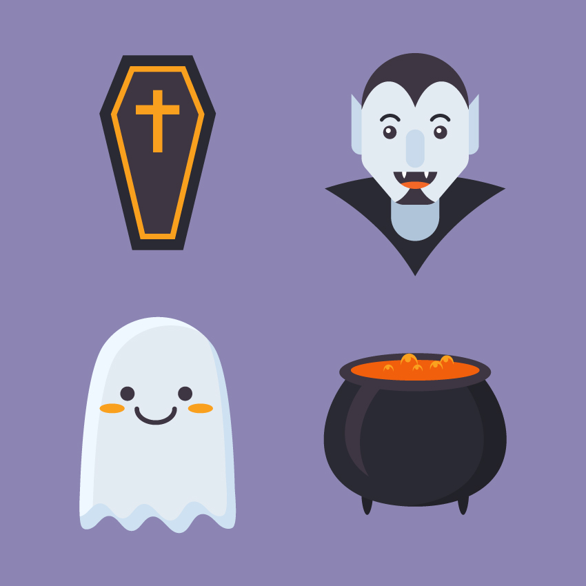
In this tutorial we’ll go through a fun and simple process to create a set of flat Halloween icons, using simple geometric shapes, the Shape Builder Tool, and various Warp effects to modify and transform the elements.
If you want to check out the source file and see how the icons are made, you can always get the full set of Flat Halloween Icons at Envato Elements. As a bonus, you’ll get additional icons in this expanded collection for your personal or commercial use!
1. How to Make a Magic Cauldron Icon
Step 1
Start by making a 120 x 30 px dark-purple oval using the Ellipse Tool (L). Create a smaller 100 x 17 px oval on top of it and fill it with orange.
Step 2
Now let’s make the body of the cauldron. Make a 140 x 140 px dark-purple circle. Select its side anchor points with the Direct Selection Tool (A) and drag them down a bit to make the bottom of the cauldron flatter.
Take the Eraser Tool (Shift-E), hold down Alt, and erase the top part of the circle, making it hidden beneath the top ellipses.
Step 3
Let’s add some details. Copy (Control-C) the body of the cauldron and Paste in Front (Control-F). Move the top copy to the left a bit and make the bottom copy darker.
Select both copies and take the Shape Builder Tool (Shift-M). Hold down Alt and click the unwanted piece on the left to delete it.
Great! Now we have only a crescent shape left.
Step 4
Create another crescent shape using the same technique and make it smaller. Fill it with lighter purple to make a highlight on the surface of the cauldron.
Step 5
Let’s create a pair of legs. Use the Ellipse Tool (L) to make a 9 x 20 px dark-purple oval. Take the Direct Selection Tool (A) and move its side anchor points up to make the shape more pointed.
Step 6
Duplicate the leg to the opposite side of the cauldron.
Step 7
Now we’ll make a simple bubble. Create an orange circle, Copy it, and Paste in Front (Control-C > Control-F). Move the top copy down a bit and fill the circle behind it with lighter orange color.
Finally, use the Shape Builder Tool (Shift-M) while holding Alt to delete the unwanted piece at the bottom.
Finish off the bubble by adding a small light-orange circle for the highlight.
Step 8
Now we can Group (Control-G) all the pieces of the bubble and speckle the bubbles on top of the orange liquid in the cauldron. Change their size and position to make it look more natural.
Step 9
And that’s it for our magic cauldron! Let’s move on to the next icon.
2. How to Design a Cartoon Coffin Icon
Step 1
Take the Rectangle Tool (M) and start with a 55 x 155 px dark-purple rectangle. Go to Object > Path > Add Anchor Points to add a point in the middle of each side. We will need only the left and the right one.
Step 2
Select the left anchor point with the Direct Selection Tool (A) and hit the Enter key to open the Move options window.
Set the Horizontal Position value to -15 px and Vertical to 0 px.
Click OK to move the point 15 px to the left.
Step 3
Now let’s move the other point in the opposite direction. This time set the Horizontal value to 15 px,Vertical value to 0 px.
Step 4
Let’s make the bottom edge of the coffin narrower. Select its bottom left anchor point with the Direct Selection Tool (A) and open the Move window. Set the Horizontal value to 10 px, Vertical to 0 px.
Do the same for the opposite side, but set the Horizontal value to -10 px.
Step 5
Keeping the shape selected, go to Object > Path > Offset Path and set the Offset value to -7 px.
Make the color of the top shape lighter.
Step 6
Duplicate (Control-C > Control-F) the top shape and set its Fill color to None.
Apply a bright orange Stroke and open the Stroke panel (Window > Stroke). Set the Weight of the line to 4 pt and Align Stroke to Inside.
Step 7
Take the Rectangle Tool (M) and make a 7 x 50 px orange shape. Add a 33 x 7 px rectangle on top of it to make a cross.
And there we have it! Our coffin icon is finished. Let’s move on!
3. How to Draw a Cute Ghost Icon
Step 1
Start by creating the body of our ghost from a 90 x 165 px light-blue rectangle.
Select its bottom left anchor point and use the Move function to move it 20 px to the left. The do the same for the bottom right anchor point and move it in the opposite direction, making the bottom edge wider.
Step 2
Now select both top anchor points and make the top of the body rounded with the Live Corners feature by dragging the circle markers down. You can also adjust the radius manually by setting the Corners value to 50 px in the control panel on top.
Step 3
Let’s make the bottom part wavy. Grab the Scissors Tool (C) and click the bottom left and right anchor points to split the shape. Now the horizontal bottom line is separated from the rest of the body.
Step 4
Keeping the line selected, go to Effect > Distort & Transform > Zig Zag.
Set the following Options:
Size to 6 px
Absolute
Ridges per Segment to 5
Points to Smooth
And click OK.
Go to Object > Expand Appearance to apply the effect.
Step 5
Use the Lasso Tool (Q) to select the bottom left anchor point of the body together with the left side of the wave. Click the right mouse button and Join the points. Repeat the same for the opposite bottom points to unite the shape.
Step 6
Now we can Convert selected anchor points to smooth, using the Convert function in the control panel on top.
Use the Direct Selection Tool (A) to move some anchor handles, making the shape more balanced and smooth.
Step 7
Let’s add details. Duplicate the shape and move the top copy down and to the right. Use the Shape Builder Tool (Shift-M) while holding down the Alt key to delete the unwanted piece. Use the remaining piece to make a highlight.
Create a subtle shadow at the bottom of the ghost, using the same technique.
Step 8
Now let’s add some facial features to our ghostly fellow. Use the Ellipse Tool (L) to make a pair of 11 x 11 px dark-purple circles for the eyes.
Step 9
Add a larger ellipse for the mouth right in the center of the face. Take the Scissors Tool (C) and click both side anchor points to split the ellipse.
Delete its top half, leaving only the bottom arc to form a smile. Set the Weight to 3 pt and Cap to Round Cap in the Stroke panel.
Step 10
Finish the ghost by adding two orange ovals on the cheeks.
There we have it! Let’s make our last icon!
4. How to Create a Flat Vampire Icon
Step 1
Let’s use a character from another tutorial as a base for our scary Dracula. I choose a construction worker flat avatar to make this transformation. You can either create it following Part 1, Step 1 and onwards of this descriptive tutorial:
In this tutorial we’ll be making a set of flat-style portraits, depicting people of different professions and occupations. Basic shapes and tools of Adobe…
Let’s right click on the icon, Release Clipping Mask, and delete the circle base and the shadow.
Step 2
Delete the clothes and some unneeded facial features. Select the bottom part of the neck using the Direct Selection Tool (A) and make it rounded with the help of the Live Corners function:
Step 3
Now let’s recolor the skin of our character to give him a pale vampiric look. Fill the elements of the head with pale-blue tints and make his eyes and eyebrows dark.
Step 4
Already looks scary enough! Let’s add a mouth. Make a 35 x 23 px circle and split it using the Scissors Tool (C).
Step 5
Take the Ellipse Tool (L) and make two 5 x 10 px white ovals for the fangs. Select the bottom points and Convert selected anchor points to corner from the control panel on top to make the fangs sharp.
Step 6
Add an orange oval for the tongue. Select all the elements of the mouth and take the Shape Builder Tool (Shift-M). Hold down Alt and click the unneeded pieces to delete them.
Step 7
Let’s add a hairdo and a small stylish beard.
Duplicate the face shape. Take the Ellipse Tool (L) and place two large ellipses so that they cover the face, making the ellipses overlap. The uncovered parts of the face will form the hair. Now we can delete the unwanted pieces using the Shape Builder Tool (Shift-M) and fill the hair parts with dark color.
Step 8
We also need to change the shape of the ears. First of all, make the top of the ear squared either by dragging the markers of the Live Corners up or by setting the Corners value to 0 px in the control panel on top.
Then select the top left corner with the Direct Selection Tool (A) and drag it up, making the ear pointed.
Step 9
Let’s add a final touch to our vampire: a high collar. Take the Polygon Tool and single-click anywhere on the Artboard to open the options window. Set the Sides value to 3 and create a dark-purple triangle, rotating it upside down.
Keeping the shape selected, go to Effect > Warp > Arc and set the Horizontal Bend value to 20%. Click OK and Object > Expand Appearance to apply the effect.
Step 10
And there we have it! Our vampire icon is ready!
Boo! Have A Spooky Halloween!
Great work! Now we’re ready for Halloween with our set of creepily cute flat icons! I hope you’ve enjoyed following this tutorial and got inspired by its simple and fun techniques.