Post pobrano z: Drip
Archiwum miesiąca: listopad 2017
Billie
Post pobrano z: Billie
V6: Typography and Proportions
Post pobrano z: V6: Typography and Proportions
Here’s a good ol’ fashion blog post by Rob Weychert where he looks into the new design system that he implemented on his personal website and specifically the typographic system that ties everything together:
According to the OED, a scale is “a graduated range of values forming a standard system for measuring or grading something.” A piece of music using a particular scale—a limited selection of notes with a shared mathematic relationship—can effect a certain emotional tenor. Want to write a sad song? Use a minor scale. Changed your mind? Switch to a major scale and suddenly that same song is in a much better mood.
Spatial relationships can likewise achieve a certain visual harmony using similar principles, and the constraints a scale provides take a lot of the arbitrary guesswork out of the process of arranging elements in space. Most of what I design that incorporates type has a typographic scale as its foundation, which informs the typeface choices and layout proportions. The process of creating that scale begins by asking what the type needs to do, and what role contrasting sizes will play in that.
Direct Link to Article — Permalink
V6: Typography and Proportions is a post from CSS-Tricks
An Idea for a Simple Responsive Spreadsheet
Post pobrano z: An Idea for a Simple Responsive Spreadsheet
How do you make a spreadsheet-like interface responsive without the use of any JavaScript? This is the question I’ve been asking myself all week as I’ve been working on a new project and trying to figure out how to make the simplest spreadsheet possible. I wanted to avoid using a framework and instead, I decided to experiment with some new properties in order to use nothing but a light touch of CSS.
Spoilers! This is what I’ve come up with so far (oh and please note that this demo currently works in the latest version of Chrome). Try scrolling around a little bit:
See the Pen A Simple Responsive Spreadsheet – Final by Robin Rendle (@robinrendle) on CodePen.
Notice how the first column sticks to the left and the heading sticks to the top of the spreadsheet? This lets us scan lots of data without having to keep scrolling to figure out which column or row we’re in — in a lot of interfaces like this it’s pretty easy to get lost.
So how did I go about making this thing? Let’s jump in!
Adding the markup
First we need to add our markup for the table and, just to make sure that this example is as realistic as possible, we’re going to add a lot of rows and columns here:
See the Pen A Simple Responsive Spreadsheet – 1st by Robin Rendle (@robinrendle) on CodePen.
There’s nothing really complex going on. We just have a regular ol’ table with a <thead> and a <tbody>, but we do wrap the whole table in the table-wrapper div which I’ll explain in just a little bit.
Next, we’ll add basic styling to that wrapper element to move it into the center of the page and also give it a max-width. We also need to make sure that the .table-wrapper has overflow set to scroll, although at larger screen sizes we won’t need that just yet:
body {
  display: flex;
  font-family: -apple-system;
  font-size: 90%;
  color: #333;
  justify-content: center;
}

.table-wrapper {
  max-width: 700px;
  overflow: scroll;
}
See the Pen A Simple Responsive Spreadsheet – 2nd by Robin Rendle (@robinrendle) on CodePen.
Nifty! Now we can add styles for the first column of our table and the thead element as well as basic styling for each of the table cells:
table {
  border: 1px solid #ddd;
  border-collapse: collapse;
}

td, th {
  white-space: nowrap;
  border: 1px solid #ddd;
  padding: 20px;
}
See the Pen A Simple Responsive Spreadsheet – 3 by Robin Rendle (@robinrendle) on CodePen.
The problem here is that we’ve now made a pretty inaccessible table; although we can scroll around in the spreadsheet we can’t read which column or row is associated to which bit of data. This can lead to a table that is almost completely illegible and if we were to populate this with real data then it would be even worse:

position: sticky to the rescue!
position: sticky is a wonderfully handy CSS trick that I’ve started experimenting with a great deal lately. It lets you stick child elements to their parent containers so that as you scroll around the child element is always visible. And this is exactly what we need here for the first column and the heading of our table element.
We can use this relatively new feature with CSS like this:
// The heading of our table
th {
  background-color: #eee;
  position: sticky;
  top: -1px;
  z-index: 2;

  // The first cell that lives in the top left of our spreadsheet
  &:first-of-type {
    left: 0;
    z-index: 3;
  }
}

// The first column that we want to stick to the left
tbody tr td:first-of-type {
  background-color: #eee;
  position: sticky;
  left: -1px;
  z-index: 1;
}
This z-index values are important here because we want the header to overlap the first left hand column that will also be sticky. However! We also want that empty cell at the top left to overlap both our header and our left hand column, like this:
See the Pen A Simple Responsive Spreadsheet – Final by Robin Rendle (@robinrendle) on CodePen.
But there we have it! A simple responsive spreadsheet where you can view both the heading and the first column no matter where you are in the table. Although, it’s worth noting that your mileage may vary. position: sticky has relatively patchy support right now and so it’s worth thoroughly testing before you start using it. Or you could use something like Stickybits that would act as a lightweight polyfill.
Also, if you need to dig into tables in more depth then we’ve made a rather handy Complete Guide to the Table Element.
An Idea for a Simple Responsive Spreadsheet is a post from CSS-Tricks
Introducing minmax()
Post pobrano z: Introducing minmax()
It’s relatively easy to get lost in all the new features of CSS Grid because there’s just so much to learn and familiarize ourselves with; it’s much easier to learn it chunk by chunk in my opinion.
And so you might already be familiar with Rachel Andrew’s Grid By Example which contains a whole bunch of tutorials with new layout tips and tricks about CSS Grid. But the minmax() tutorial is one small chunk of Grid that you can learn today and thankfully Rachel has made a rather handy two minute long video that dives straight into it.
In fact, it’s pretty darn impressive how many opportunities just one new CSS feature can give us.
Direct Link to Article — Permalink
Introducing minmax() is a post from CSS-Tricks
The Internet is under attack
Post pobrano z: The Internet is under attack

Design deals for the week
Post pobrano z: Design deals for the week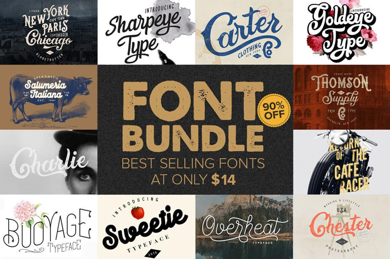
Every week, we’ll give you an overview of the best deals for designers, make sure you don’t miss any by subscribing to our deals feed. You can also follow the recently launched website Type Deals if you are looking for free fonts or font deals.
10+ Best-Selling Premium Fonts
Make room in your typeface toolbox! It’s time to grab this sweet deal full of more than 10 premium best-selling font families. From Charlie to Sweetie to Sharpeye Type, you’ll get a wonderful variety of fun, curvy fonts that will work perfectly with your latest designs. Use them on everything from T-shirts to logos.
$14 instead of $114 – Get it now!
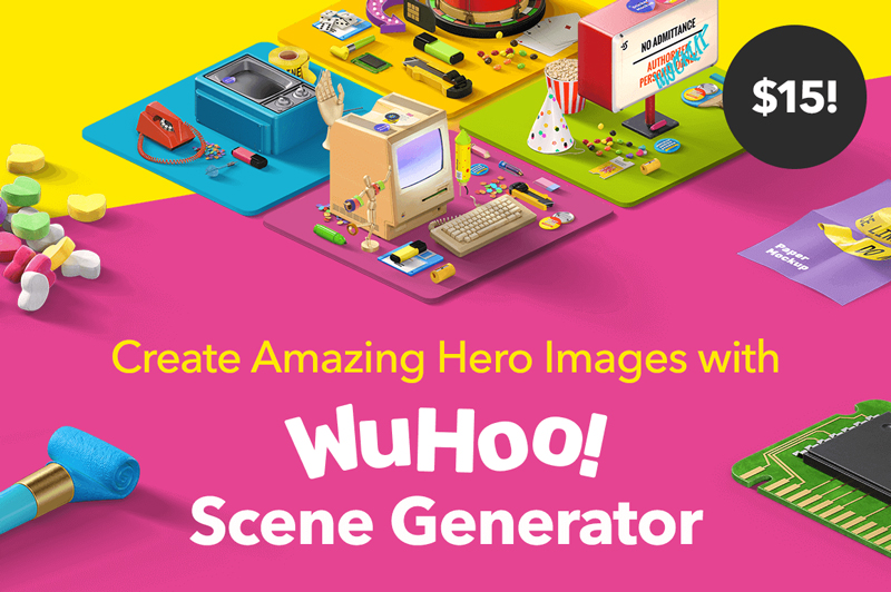
Create Amazing Hero Images with WuHoo! Scene Generator
Attract attention to your website with powerful Hero Images. Thanks to the WuHoo! Scene Generator, you can now easily whip up colorful, fun professional Hero Images in no time flat. It couldn’t be easier too, thanks to a simple drag-and-drop feature, along with a variety of text editing tools.
$15 instead of $39 – Get it now!
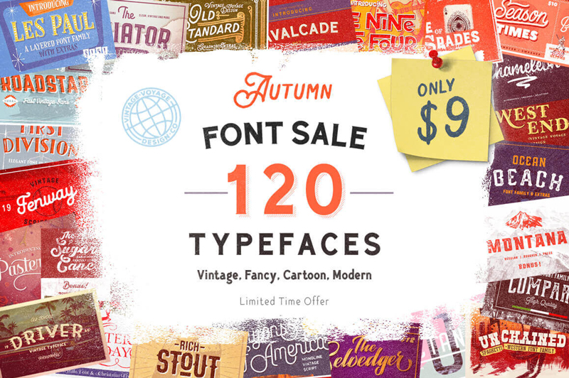
120+ Unique, Premium Typefaces – 31 Font Families
It’s time to fall into a fantastic font sale! This Autumn Font Sale is overloaded with more than 120 gorgeous typefaces, culled from 31 different font families. You’ll be privy to a wide variety of styles ranging from vintage to cartoony, not to mention a slew of extras like alternates. No matter your latest project, you’re bound to find the perfect font in this collection.
$9 instead of $1550 – Get it now!
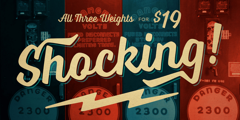
Laura Worthington’s Industrial Typeface Voltage
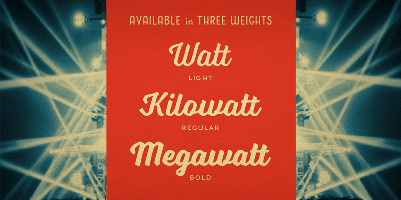
Reach back to the Industrial Age, full of big, bold words and cars! The Voltage Font Family by Laura Worthington offers up a practical typeface that’s both assertive yet down to earth. Loaded with hundreds of OpenType Features from swashes to ligatures, this is one charged-up font family that you won’t want to miss out on.
$9 instead of $35 – Get it now!
80 Beautiful, Liquid Style Brushes
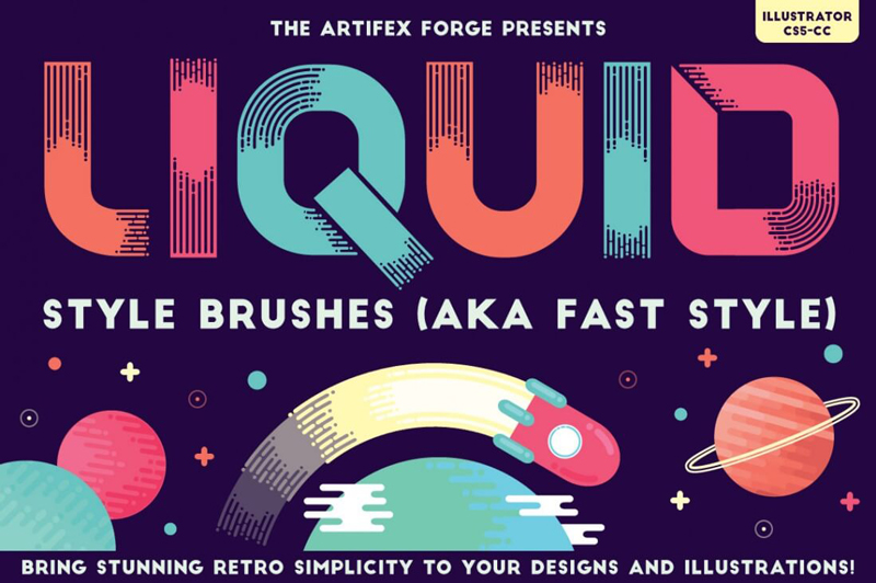
Want to add a bit of motion to your designs? Consider a Fast Style approach using this collection of 80 Liquid Style Brushes. These brushes feature a modern-yet-retro digital style that creates round-ended lines giving off an almost dripping appearance. Use the handy reference guide to quickly choose the right brush to whip up a clean illustration or icon.
$9 instead of $15 – Get it now!
Essential design subreddits you have to check out
Post pobrano z: Essential design subreddits you have to check out
When working in the world of design, you often need to call upon a pool of different resources. Whether it’s to find the correct tool or maybe for some inspiration, the internet is a wonderful place to find these resources. However, given the breadth and depth of everything that’s out there on the web, finding what you’re looking for can be a challenge, to say the least. A salvation and a massive time saver can be found within the subsections of Reddit – called subreddits to those who lurk its pages daily. These subreddits are filled with thousands of active users who either work within or admire the design industry.
Whether you’re designing a logo or laying out a user interface, there exists within a specific subreddit those with the knowledge and wherewithal to help you out or put you in the correct direction. Don’t end up on one of these lists, instead, peruse some of the best subreddits for designers.
/r/design
The granddaddy of everything to do with design, /r/design boasts almost 200,000 users. The content features everything from graphic design to comic book sketching all the way to furniture and architecture. It’s a very general subreddit that is a good starting point if you’re looking for more niche design-related content, and if you can’t find what you’re looking for, merely create your own post and wait for someone in the know to correct your course.
/r/graphic_design
For anything and everything related to graphic design. It’s the perfect subreddit for those who are looking for news, theory, resources and inspirations for their respective projects. This includes anything that has to do with quality design such as logos, magazines, posters and illustrations.
/r/photoshopbattles
The place where the internet dukes it out, not with words or bullets, but with Photoshop edits. A lot of people prefer using other programs in lieu of Adobe’s popular software, but the concept remains the same: make something funny and sharable. You’ll need to have a good sense of humor and an eye for the uncanny and ridiculous, but when people start commenting, liking and sharing your work, you know you’ve hit the big time.
/r/designthought
For more in-depth academic posts that delve into the how and why of design, /r/designthoughts is the place for you. It’s a much smaller community than the other subreddits listed here, but the topics discussed tend to be much deeper, more thoughtful conversations than you would find listed elsewhere. Expect links to longer articles discussing the context of design, the societies that it reflects and how terminology can be used to shape the culture surrounding design.
Salvator Mundi Viewers awestruck
Post pobrano z: Salvator Mundi Viewers awestruck
Christies, the British auction house, have made sure that members of the public have had a chance to view the Leonardo da Vinci masterpiece, “Salvator Mundi”, before it heads back into private hands for $450 million. More than 20,000 people from all walks of life have come to gaze at Leonardo da Vinci’s Salvator Mundi. After centuries in the hands of royal and private owners, its return to the public consciousness has resulted in queues wrapping around Christie’s exhibition spaces in London, Hong Kong, San Francisco, and New York. The experience of setting eyes on a work described as the ‘Divine Mona Lisa’ — one of fewer than 20 paintings acknowledged as being from the Renaissance master’s hand — is one that has moved people in many different ways, with those experiences being shared myriad times via social media. But what if the tables were turned and the Salvator Mundi (Saviour of the World) could share with us what he has seen these last few weeks? Having witnessed the most intimate details in the lives of successive French and English kings, what would the figure of Christ, depicted holding the well-being of the world in the palm of his left hand, now make of us?

Within the beautifully lit Christie’s exhibition space in Rockefeller Center, a camera was set up beneath the Salvator Mundi to record a video portrait of those who came to spend time with it. Using the wide range of responses to the masterpiece, a single piece of film has been created that shows the divine moment of connection between this powerful, mysterious, enigmatic portrayal of Christ and those who have felt compelled to observe it.
The Salvator Mundi World Is Watching film is cut to four minutes and 14 seconds to reflect the fact that in his painting, Leonardo presents Christ as he is characterised in the Gospel of John 4:14: ‘And we have seen and testify that the Father has sent his Son as the Saviour of the World.’

Salvator Mundi World Is Watching Credits
The World Is Watching campaign was developed at Droga5, New York, by creative directors Toby Treyer-Evans and Laurie Howell, senior copywriter George McQueen, senior art director Tom McQueen, senior producer Jen Chen, and producer Isabella Lebovitz.
Filming was shot by director Nadav Kander via Chelsea Pictures, executive producer Pat McGoldrick.
Editor was Gary Knight at Cut + Run, with assistant editor Natalie Kasling, executive producer Lauren Hertzberg, producer Eytan Gutman. Post production was done at Jogger Studios by online producer Yoko Lytle and editor Joey Grosso.
Colourist was James Bamford at The Mill.
Sound was mixed at Sonic Union by David Papa. Music, “On the Nature of Daylight”, was composed by Max Richter.
FREITAG
Post pobrano z: FREITAG
