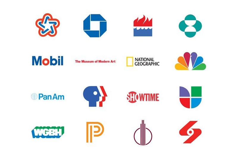
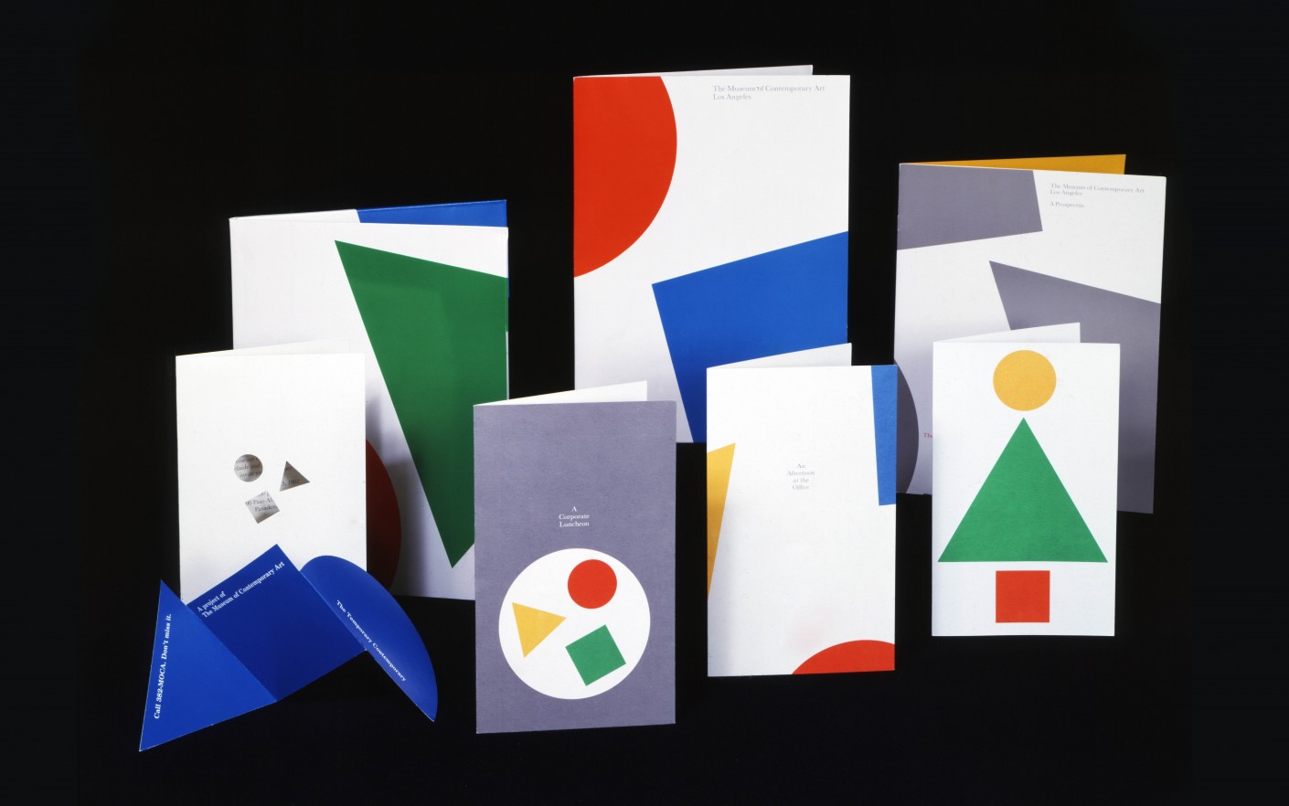
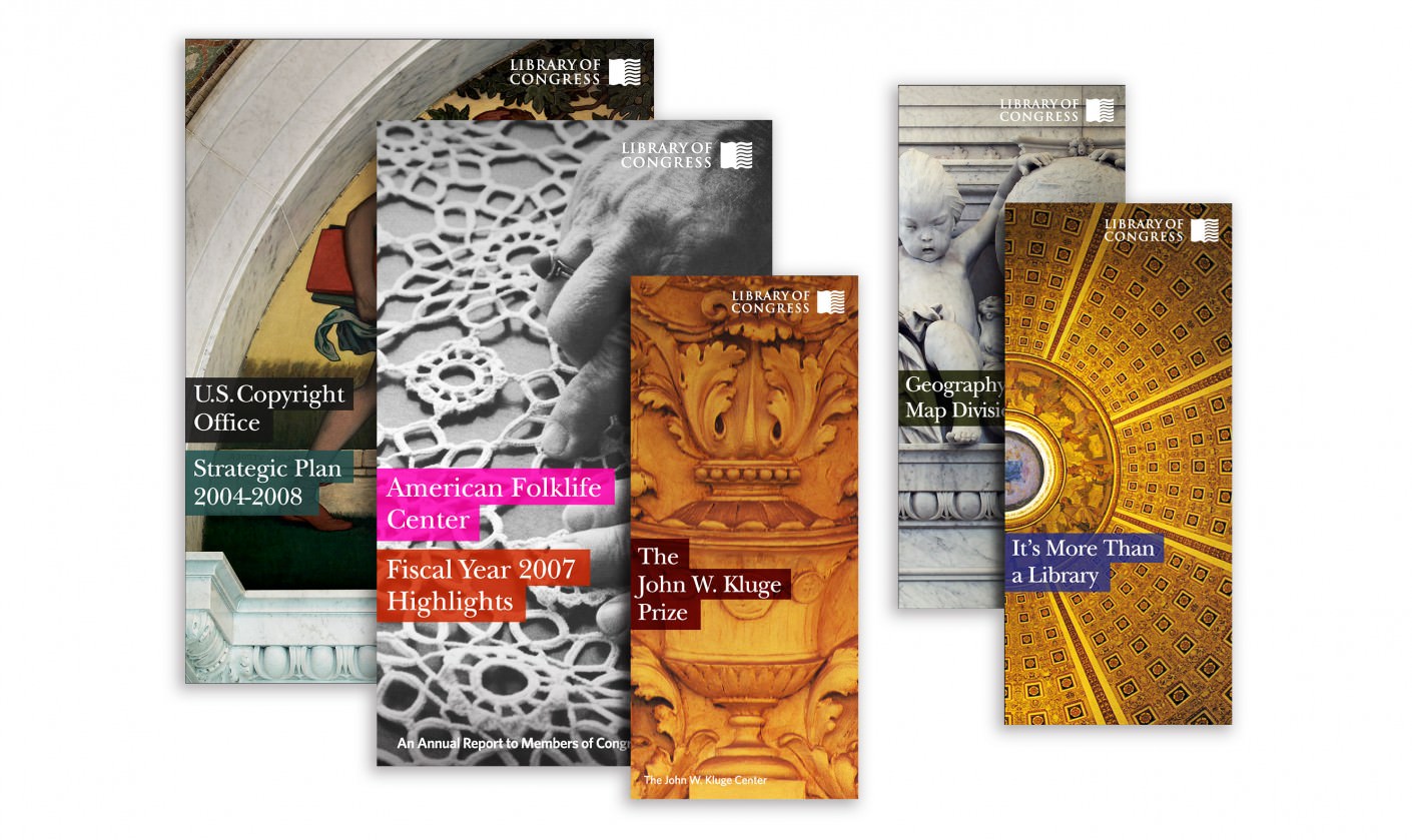
You may never have heard his name, but Ivan Chermayeff was one of the most influential designers of the 20th century. Unfortunately, I must write “was”, because the logo design expert died last week at the age of eighty-five. In his over 60 years career, Chermayeff designed some of the most memorable logos, many of which became iconic, such as the NBC, PanAm, Chase Bank, or National Geographic logos. In this post you can find a tiny sample of his work, you’ll see more on his professional website.
This tutorial will show you how to use brush settings, layer styles, healing tools, adjustment layers, and some tips and tricks to create a shiny, bright, fun tinsel text effect. Let’s get started!
Create a new 1613 x 1075 px document, and go to File > Place Linked to open the Background Image.
Resize the Background Image to fit within the document and hit the Return key to commit the changes.
Step 2
Create the text in All Caps using the font Quicksand Bold. Change the Size to 300 pt, the Kerning to Optical, and the Leading value to 325 pt if you have multiple lines of text.
Place the text however you like, and don’t worry about the background as we’ll fix it at the end of the tutorial.
2. How to Create Inner Work Paths
Next, we are going to create work paths inside the letters we have.
You can do that using the Pen Tool, but in this tutorial, we are going to use Photoshop’s new Curvature Pen Tool.
Step 1
Pick the Curvature Pen Tool, make sure to choose the Path option in the Options bar, and click once in the center of the first letter where you want to start creating the work path.
The Curvature Pen Tool is different from the Pen Tool. So to create corner points, you need to double-click when you add the point, and to create a curve, you can either click once or create a straight line instead, and then click on that line to add a point and drag it to create the curve.
When you finish creating the path, Command-click anywhere outside it.
Step 2
You can also use any other shape tools to help you easily create the work path for some of the letters. For example, you can use the Ellipse Tool, with the Path option active, to create the work path for the letter O.
Step 3
Make sure to create all the work paths needed to fill all the letters you have.
Step 4
It is very important to save the paths created. To do so, open the Paths panel, double-click the Work Path tab, and type Center in the Name field.
This will save the work paths so that you can go back to them and use them any time.
Step 5
Right-click the text layer and choose Create Work Path to create the outer stroke path.
The dots on top of the letter E are a bit too big and will overlap with the letter when stroked with the tinsel brushes, so we’ll create smaller ones.
To do so, pick the Direct Selection Tool, select the dots, and hit the Delete key to delete them.
Step 6
Then, use the Ellipse Tool to create smaller circular paths.
Once you’re done, double-click the new Work Path tab and name it Stroke.
3. How to Create a Tinsel Brush Tip
Step 1
Pick the Rectangle Tool, choose the Shape option in the Options bar, and create a small 3 x 30 pxBlack rectangle.
Step 2
Pick the Add Anchor Point Tool, and click once in the middle of each of the rectangle’s vertical sides to add two anchor points.
Step 3
Use the Direct Selection Tool to select both added points, and click the Left Arrow key three times to nudge the points 3 px to the left.
Step 4
Command-click the Rectangle shape layer’s thumbnail to load the selection.
Step 5
Go to Edit > Define Brush Preset, and type Tinsel Brush in the Name field.
4. How to Modify and Save Brush Tip Settings
Step 1
Pick the Brush Tool, choose the Tinsel Brush tip, and open the Brush panel to modify the settings:
Brush Tip Shape
Shape Dynamics
Scattering
Color Dynamics
Step 2
Click the Create new brush icon in the bottom right corner of the Brush panel, and change the Name to Brush 01.
Step 3
Modify the same tip’s settings to create another variation:
Brush Tip Shape
Shape Dynamics
Scattering
Color Dynamics
Step 4
Click the Create new brush icon, and change the Name to Brush 02.
Step 5
This is optional, but it’s a cool new feature in Photoshop that will help keep things a bit more organized.
Click the Brush Preset Picker icon in the Options bar, Command-click the icons of the three brush tips you’ve created for this tutorial (Tinsel Brush, Brush 01, and Brush 02), click the flyout menu icon, and choose New Brush Group.
Name the group Tinsel Brushes, and click OK.
5. How to Stroke Work Paths
Step 1
We will create six new layers that will be used to create the main tinsel effect, and we will name them according to what they will contain. So it is important to name the layers as mentioned below to follow the tutorial easily.
The names from bottom to top are:
Stroke – Brush 01
Center – Brush 01
Center – Brush 02
Stroke – Brush 01 – White FG
Center – Brush 02 – White FG
Center – Brush 01 – Desaturated
Step 2
Put all the new layers in a group and call it Tinsel, and set the Foreground Color to #d9001f and the Background Color to #300600.
Step 3
Open the Paths panel, and for each layer, select the path in the layer’s name, and stroke it with the brush tip mentioned along with it.
So if you select the Stroke – Brush 01 layer, you’ll need to click the Stroke work path in the Paths panel, pick the Brush Tool and choose the Brush 01 tip, and hit the Return key to stroke the path.
Step 4
To quickly switch between the brush tips, you can right-click anywhere to get the preset and choose the tip you need.
Step 5
Make sure to set the Foreground Color to White before you stroke the two layers that have White FG in their name.
Step 6
Change the Foreground Color back to #d9001f before creating the Center – Brush 01 – Desaturated layer’s stroke.
6. How to Add Glow and Shadow Effects
Double-click the Stroke – Brush 01 layer to apply the following layer style:
Step 1
Add an Inner Glow with these settings:
Blend Mode: Linear Light
Opacity: 50%
Color: #a7a7a7
Size: 10
Step 2
Add a Drop Shadow with these settings:
Opacity: 36%
Distance: 10
Size: 5
This will style the first layer.
Step 3
Double-click the Center – Brush 01 layer to apply an Inner Glow effect with these settings:
Blend Mode: Linear Light
Opacity: 74%
Color: #a7a7a7
Size: 10
This will help build the glow effect to add more dimension to the tinsel.
You can hide the top layers to see the effects you apply, and then show them again.
Double-click the Center – Brush 02 layer to apply the following layer style:
Step 4
Add an Inner Glow with these settings:
Blend Mode: Linear Light
Opacity: 74%
Color: #a7a7a7
Size: 10
Step 5
Add a Drop Shadow with these settings:
Opacity: 50%
Distance: 0
Size: 5
Step 6
Change the Center – Brush 02 layer’s Blend Mode to Overlay.
7. How to Style Layers
Step 1
Change the Stroke – Brush 01 – White FG layer’s Blend Mode to Linear Light and its Opacity to 60%.
Double-click the Center – Brush 02 – White FG layer to apply the following layer style:
Step 2
Add a Pattern Overlay with these settings:
Blend Mode: Vivid Light
Opacity: 70%
Pattern: FDR Glitter Pattern 02
Step 3
Add a Drop Shadow with these settings:
Blend Mode: Linear Burn
Color: #8e8e8e
Opacity: 35%
Distance: 0
Size: 5
Step 4
Change the Center – Brush 02 – White FG layer’s Blend Mode to Linear Light.
Step 5
Select the Center – Brush 01 – Desaturated layer, and go to Image > Adjustments > Desaturate.
Step 6
Double-click the Center – Brush 01 – Desaturated layer to apply an Inner Glow effect with these settings:
Blend Mode: Linear Light
Opacity: 60%
Color: #a7a7a7
Source: Center
Size: 7
Step 7
Change the Center – Brush 01 – Desaturated layer’s Blend Mode to Soft Light.
8. How to Colorize a Layer Group
Double-click the Tinsel group to apply the following layer style:
Step 1
Add a Color Overlay with these settings:
Color: #c29816
Blend Mode: Hue
Step 2
Add another Color Overlay effect instance with these settings:
Color: #cecece
Blend Mode: Divide
Step 3
Add a Drop Shadow with these settings:
Blend Mode: Linear Burn
Color: #1e0700
Opacity: 10%
Distance: 30
Size: 5
This will create the final tinsel effect.
9. How to Create a Texture Overlay Using Filters
Step 1
Create a new layer on top of all layers, name it Texture Overlay, fill it with White, and right-click it to choose Convert to Smart Object.
Set the Foreground and Background Colors to Black and White.
Step 2
Go to Filter > Render > Fibers, and change the Variance to 30 and the Strength to 3.
Step 3
Go to Filter > Filter Gallery > Sketch > Bas Relief, and use these settings:
Detail: 13
Smoothness: 3
Light: Bottom
Step 4
Click the New effect layer icon in the bottom right corner, go to Texture > Grain, and use these settings:
Intensity: 40
Contrast: 50
Grain Type: Regular
Step 5
Clip the Texture Overlay layer to the Tinsel group, and change its Blend Mode to Soft Light and its Opacity to 50%.
10. How to Add Global Adjustments
Step 1
Add a Selective Color adjustment layer with these settings:
Yellows
Cyan: -10
Magenta: -2
Black: -5
Step 2
Add a Color Lookup adjustment layer, choose the Fuji ETERNA 250D Kodak 2395 (by Adobe).cube table from the 3DLUT File menu, and change its Opacity to 15%.
Step 3
Add a Solid Color fill layer with the Color#150806 and change its Blend Mode to Soft Light and its Opacity to 20%.
Step 4
Use the Elliptical Marquee Tool to create an elliptical selection around the text, select the Solid Color layer mask’s thumbnail, and fill the selection with Black.
Step 5
With the mask’s thumbnail still selected, open the Properties panel, and change the Feather value to 52% to create a quick simple vignette effect.
11. How to Add Glitter Using Brush Settings
Step 1
Create a new layer on top of the Background Image layer, and name it Background Glitter.
Double-click the Background Glitter layer to apply the following layer styles:
Step 2
Add a Pattern Overlay with these settings:
Pattern: FDR Glitter Pattern 16
Step 3
Add a Drop Shadow with these settings:
Blend Mode: Linear Burn
Color: #0a1119
Opacity: 15%
Distance: 1
Size: 2
Step 4
Pick the Brush Tool, choose the Airbrush Hard Low Density Grainy tip, and open the Brush panel to change the Scattering settings as needed.
The important thing for this to work is to use a big, 300px brush tip Size.
Step 5
Click-drag slightly to add the glitter behind the text. You can change the brush settings to get a result you like.
12. How to Modify a Background Image
Step 1
Double-click the Background Image Smart Object’s thumbnail to open its file.
Pick the Content-Aware Move Tool, and set the Mode to Move in the Options bar.
Select the object you want to move and place somewhere else, and make sure to include some empty space around it within the selection.
You can check the Transform on Drop box if you want to transform the object after moving it.
Step 2
Move the selected object to its new position, transform it if needed, and then hit Return.
Step 3
After that, you can use any of the other Healing Tools to better blend the object’s edges with the new background.
You can also use the Dodge, Burn, and Sponge Tools wherever needed.
Step 4
If there are any parts you want to remove completely, select them using any selection tool, and go to Edit > Fill and choose Content-Aware from the Content menu.
Step 5
Again, use the Healing Tools to make any further adjustment to the area after removing the object.
Step 6
Make any other adjustment needed to the background using the same tools.
Step 7
You can save the file and go back to the original document to see the changes there and make any necessary adjustments.
13. How to Add Finishing Touches
Step 1
Add a Hue/Saturation adjustment layer and clip it to the Background Image layer.
Choose the Yellows channel, and change the Saturation value to -25.
Step 2
We need the Hue/Saturation layer to affect only the bells in the image.
So fill the Hue/Saturation layer mask with Black, set the Foreground Color to White, and use a soft round brush tip to brush over the bells.
Step 3
Select the Background Glitter layer and click the Add layer mask icon at the bottom of the Layers panel.
Set the Foreground Color to Black, and paint over the areas you want to remove the glitter from, like the bells and the trees, since the glitter is supposed to be under them.
Congratulations! You’re Done
In this tutorial, we created a simple brush tip and adjusted its settings to create the main tinsel effect.
Then, we styled the many layers used in creating the effect to achieve the final result. After that, we added glitter, modified the background image, and added global adjustments to the effect.
Finally, we used some more adjustment layers and layer masks to add final touches.
Please feel free to leave your comments, suggestions, and outcomes below.
If you’re a true Star Trek fan, then you’re going to love this tutorial
since we’re going to be recreating the iconic NCC-1701 starship, using a step-by-step
process based on some basic geometric shapes and tools.
That being said, grab a hot cup of the energizing space juice, and let’s get started!
1. How to Set Up a New Project File
Since I’m hoping you already have
Illustrator up and running in the background, bring it up and let’s set up a New Document (File > New or Control-N)
for our project using the following settings:
Number
of Artboards: 1
Width: 800
px
Height: 600
px
Units: Pixels
And from the Advanced tab:
Color
Mode: RGB
Raster
Effects: Screen (72ppi)
Preview Mode: Default
2. How to Set Up a Custom Grid
Even though today we’re not working on
icons, we’ll still want to create the illustration using a pixel-perfect
workflow, so let’s set up a nice little Grid so that we can have full control
over our shapes.
Step 1
Go to the Edit > Preferences > Guides & Grid submenu, and adjust
the following settings:
Once we’ve set up our custom grid, all we
need to do in order to make sure our shapes look crisp is enable the Snap to Grid option found under the View menu (that’s if you’re using an
older version of Illustrator).
Now, if you’re new to
the whole “pixel-perfect workflow”, I strongly recommend you go through my How
to Create Pixel-Perfect Artwork tutorial, which will help you widen your
technical skills in no time.
3. How to Set Up the Layers
Once we’ve finished setting up our project
file, it would be a good idea to structure our document using a few layers, since this way we can maintain a steady workflow by focusing on one
section of the illustration at a time.
That being said, bring up the Layers panel and create a total of four
layers, which we will rename as follows:
layer
1: background
layer
2: starship
layer
3: warp lines
layer 4: texture
Quick tip: I’ve colored all of my layers using the same
green value, since it’s the easiest one to view when used to highlight your
selected shapes (whether they’re closed or open paths).
4. How to Create
the Background
We’re going to kick off the
project by quickly creating the interstellar background, so make sure you’re on
the right layer (that would be the first one), and then lock all the other ones
so that we can get started.
Step 1
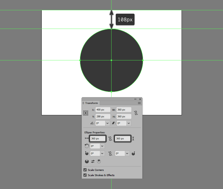
Create a 360 x 360 px circle,
which we will color using #343434 and then center align to the underlying
Artboard, positioning it 108
px from its top edge.
Step 2
Take a couple of moments and add the static stars using a couple of 4 x 4 px circles, which we will color
using a lighter orange (#EFC36C) and a slightly darker one (#EF986C) and
position on the background as seen in the reference image. Once you’re done,
select and group all of them together using the Control-G keyboard shortcut.
Step 3
Start working on the first of the moving objects by creating its tail
using a 4 x 16 px rectangle, to
which we will apply a 90ºLinear Gradient using #6FCDE2 for both
color stops. Set the right color’s Opacity
to 0%, positioning the resulting
shape next to one of the static stars.
Step 4
Add the head section using a 4 x 4 px circle, which we will color
using #6FCDE2 and then position onto the tail as seen in the reference image.
Once you have the shape in place, select and group (Control-G) the two together before moving on to the next step.
Step 5
Add a few more moving objects using copies (Control-C > Control-F) of the one that we’ve just finished
working on, which we will position on the sides of the background as seen in
the reference image. Once you’re done, don’t forget to select and group (Control-G) all of them together.
Step 6
As soon as you’ve finished working on the background, you can select and
group (Control-G) all its composing
shapes together, locking its layer before moving on to the next one.
5. How to Create
the Starship
Assuming you’ve
finished working on the background, make your way to the next layer (that would
be the second one) and let’s start building the iconic USS Enterprise NCC-1701
starship!
Step 1
Create the main shape for the ship’s secondary hull using a 28 x 64 px rectangle, which we will
color using #AAAAAA and then center align to the underlying background,
positioning it 140 px from its top edge.
Step 2
Add the hull’s center section
using a 28 x 80 px rectangle (#AAAAAA),
which we will adjust by individually selecting its bottom anchor points using
the Direct Selection Tool (A), and
then pushing them to the inside by 4 px using the Move tool
(right click > Transform > Move
> Horizontal > +/- 4 px depending on which side you start with).
Once you’re done, position the resulting shape as seen in the reference image.
Step 3
Position another smaller 20 x 4
px rectangle (#AAAAAA) beneath the one that we’ve just adjusted, and then
select and unite all three shapes into a single larger one using Pathfinder’s Unite Shape Mode.
Step 4
Create the hangar’s entry section using a 12 x 4 px rectangle (#7F7F7F), which we
will adjust by setting the Radius of
its bottom corners to 4 px from
within the Transform panel’s Rectangle Properties. Position the
resulting shape beneath the larger hull, making sure to leave a 4 px gap between them, which will act
as a hard shadow.
Step 5
Start adding details to the current section of the ship by creating an 8 x 8 px circle (#7F7F7F), on top of
which we’ll add a smaller 4 x 4 px one
(#F2A16B), which we will group (Control-G)
and then position at a distance of 2 px from
its bottom edge.
Step 6
Add the vertical detail line using a 2 x 56 px rounded rectangle (#7F7F7F)
with a 1 px Corner Radius, which we
will center align to the hull, positioning it at a distance of 2 px from its circular detail.
Step 7
Create a slightly bigger 8 x 24
px rounded rectangle (#7F7F7F) with a 4
px Corner Radius, which we will position on the vertical detail line so
that it overlaps its bottom section by 4 px.
Step 8
Next, take a couple of moments and add the
little rectangular details using fourteen 2
x 4 px rectangles (#7F7F7F), which we will position onto the sides of the
hull as seen in the reference image. Once you’re done, make sure
you select and group all of them together using the Control-G keyboard shortcut.
Step 9
Add the shadow cast by the ship’s main hull
using a 152 x 152 px circle, which
we will color using #343434 and then center align to the current section’s top
edge.
Step 10
Mask the shadow that we’ve just created using a
copy (Control-C) of the ship’s
secondary hull (highlighted with red), which we will paste in front (Control-F), and then with both shapes
selected, right click > Make Clipping
Mask. Once you’re done, select and group (Control-G) all of the current section’s composing shapes together,
before moving on to the next step.
Step 11
Star working on the ship’s main hull by creating
a 136 x 136 px circle, which we will
color using #D8D8D8 and then center align to the previous section’s top edge.
Step 12
Add a subtle highlight by creating two copies
(Control-C > Control-F twice) of
the circle that we’ve just positioned, and then pushing the top
one to the bottom by 4 px,
cutting it out from the one from underneath afterwards using Pathfinder’s Minus Front Shape Mode. Color the resulting shape using white
(#FFFFFF), before moving on to the next step.
Step 13
Add the ring
sections using five 2 px thick
circles (#AAAAAA), with the following Width
and Height values:
first circle: 126 x 126 px
second circle: 106 x 106 px
third circle: 86 x 86 px
fourth circle: 66 x 66 px
fifth circle: 46 x 46 px
Position the shapes as seen in the reference image, making sure to select
and group all of them together afterwards using the Control-G keyboard shortcut.
Step 14
Start working on the detail lines by creating the vertical one using a 140 px tall 2 px thick Stroke (#AAAAAA),
which we will center align to the ship’s main hull.
Step 15
Create the second line using the Rotate tool, by selecting the one that we’ve already have and then right click > Transform > Rotate >
Angle >360 / 16 (which gives
you a 22.5º angle), making sure to
use the Copy function. The first
value is the actual circumference of the circle, while the second one is the
number of segments that we want to delimit after adding all the line details.
Step 16
Gradually add the remaining strokes using
Illustrator’s repeatfunction, by pressing Control-D six times, until you have the same result as in the reference image.
Step 17
Make sure that all of the lines’ anchor points
are snapped to the underlying pixel grid, by turning on Pixel Preview mode (Alt-Control-Y) and then manually
selecting and repositioning them with the help of the Direct Selection Tool (A). Take your time, and once you’re done, select and group all of the adjusted strokes together using the Control-G keyboard shortcut.
Step 18
Create an 8
x 6 px rectangle, which we will color using #7F7F7F and then center align
to the circle’s bottom edge.
Step 19
Add a 4 x
24 px rectangle (#7F7F7F) above the shape that we’ve just created,
adjusting it afterwards by setting the Radius
of its top corners to 2 px from
within the Transform panel’s Rectangle Properties.
Step 20
Select and group all of the main hull’s details, masking them afterwards using a copy (Control-C > Control-F) of the larger underlying circle (right click > Make Clipping Mask).
Step 21
Start working on the bridge section by creating
a 28 x 28 px circle, which we will
color using #EDEDED and then center align to the larger underlying circle.
Step 22
Adjust the shape that we’ve just created by selecting its bottom anchor point using the Direct Selection Tool (A), and then
pushing it to the bottom by 12 px using the Move tool (right click > Transform > Move > Vertical > 12 px).
Step 23
As we did with the ship’s main hull, give the bridge section a 2 px tall highlight which we
will color using #FFFFFF.
Step 24
Add the hard shadow using a copy (Control-C
> Control-B) of the shape that we adjusted a few steps ago, which we
will color using #343434 and then push to the bottom by 4 px using either the keyboard’s
directional arrows or the Move tool (right click > Transform > Move >
Vertical > 4 px).
Step 25
Create the center section of the bridge using a 12 x 12 px circle (#7F7F7F), on top of which we will add a smaller 4 x 4 px one (#EDEDED), which we will
group (Control-G) and then center
align to the larger underlying shape.
Step 26
Add some of the bridge’s details using a few rectangles (#7F7F7F)
and a circle (#7F7F7F), which we will position as seen in the reference image.
Take your time, and once you’re done, select and group (Control-G) all of the current
section’s composing shapes before moving on to the next step.
Step 27
Create the rectangular details sitting on top of the hull’s second ring
section, using four 8 x 4 px rectangles
(#AAAAAA), which we will rotate using a 45º
angle (right click > Transform >
Rotate > 45º), making sure to snap their anchors back to the Pixel Grid.
Step 28
Finish off the hull by adding the two circular details using an 8 x 8 px circle (#7F7F7F), on top of
which we will add a smaller 4 x 4 px one
(#F2A16B), which we will group (Control-G), duplicate (Control-C > Control-F), and then position onto the sides of the ship as seen in the reference image.
Once you’re done, select and group (Control-G)
all of the current section’s composing shapes, before moving on to the next
step.
Step 29
Start working on the left propulsion unit’s wing by creating a 24 x 12 px rectangle (#D8D8D8), which we
will position at a distance of 22 px from
the secondary hull’s bottom edge and 6
px from its vertical detail line.
Step 30
Give the shape that we’ve just created a subtle highlight using a 24 x 2 px rectangle, which we will
color using #FFFFFF and then center align to its top edge.
Step 31
Add three 4 x 4 px detail
squares (#7F7F7F) positioned 2 px from
one another, which we will group (Control-G)
and then position 2 px from
the wing’s left edge and its top highlight. Once you have them in place, select
and group (Control-G) all of the
current section’s composing shapes before moving on to the next step.
Step 32
Create the main shape for the ship’s left warp engine using a 16 x
128 px rectangle, which we will color using #EDEDED, and then position at a
distance of 4 px from the smaller
wing and 28 px from the ship’s main
hull.
Step 33
Add the tip using a 12 x 12 px circle
(#F2A16B), which we will center align to the taller rectangle, positioning it
at a distance of 8 px from its top
edge.
Step 34
Create a 16 x 8 px rectangle
(#EDEDED), which we will adjust as seen in the reference image, positioning the
resulting shape on the lower half of the tip.
Step 35
Fill in the gap between the warp engine’s main body and its tip by
positioning a 16 x 2 px rectangle, which we will color using #EDEDED.
Step 36
Add some of the current section’s highlights (#FFFFFF) using the reference image as your main guide.
Take your time, and once you’re done, move on to the next step.
Step 37
Create the left wing segment using a 4 x 32 px rectangle (#AAAAAA), which we will adjust by setting the Radius of its left corners to 2 px from within the Transform panel’s Rectangle Properties. Center align a 2 x 12 px rectangle (#7F7F7F) to the resulting shape’s right edge,
grouping (Control-G) and then
positioning the two at a distance of 2
px from the current section’s bottom edge.
Step 38
Add the right wing using a copy (Control-C
> Control-F) of the one that we’ve just created, which we will
vertically reflect (right click >
Transform > Reflect > Vertical) and then position on the opposite
side of the warp engine.
Step 39
Create a 16 x 4 px rectangle,
which we will color using #636363 and then position below the warp engine’s
main body.
Step 40
Add the rear end of the engine using a 16 x 16 px square (#7F7F7F), which we will adjust by setting the Radius of its bottom corners to 6 px.
Step 41
Give the shape that we’ve just created a set of four 2 x 16 px rectangles (#636363)
positioned 2 px from one another,
which we will group (Control-G) and
then mask. Once you’re done, select and group (Control-G) all of the left warp engine’s composing shapes together,
before moving on to the next step.
Step 42
Finish up the ship by creating the right warp engine using a copy of
the one that we’ve just finished working on, which we will vertically reflect (right click > Transform > Reflect
> Vertical), and then position on the opposite side. Once you’re done,
select and group all of its composing sections using the Control-G keyboard shortcut.
6. How to Create
the Warp Lines
Assuming you’ve locked
the previous layer and already moved on to the next one (that would be the
third one), let’s take a couple of moments and add the little warp lines that help
create the illusion of movement.
Step 1
Create the left-sided warp lines using five 2 px wide rounded rectangles (#FFFFFF)
with a 1 px Corner Radius and
varying heights, which we will position as seen in the reference image, making
sure to select and group (Control-G)
them together afterwards.
Step 2
Add the right-sided warp line using a copy (Control-C > Control-F) of the ones
that we’ve just finished working on, which we will vertically reflect (right click > Transform > Reflect
> Vertical) and then position on the opposite side of the ship.
Step 3
Finish off the current section by adding the
bottom warp lines (#FFFFFF), making sure to select and group all of them
together afterwards using the Control-G keyboard
shortcut.
7. How to Create the Texture
Since we’re pretty much done working on our starship, we can now move on to
the fourth and last layer, where we will create the subtle texture covering the
entire illustration.
Step 1
Unlock the first two layers and then quickly grab
a copy (Control-C) of the background
and the ship’s sections that go outside of its surface, which we will paste (Control-F) back onto the texture layer,
making sure to color them using black (#000000) afterwards.
Step 2
Select all of the shapes that we’ve just pasted, and make them behave
like a single larger one by using Pathfinder’s Make Compound Shape advanced option.
Step 3
Select the resulting compound shape and turn it into a texture by going
to Effect > Photoshop Effects >
Texture > Grain and setting the Intensity to 58, making sure to set the Grain Type to Sprinkles.
Step 4
Finally, set the resulting texture’s Blending Mode to Soft Light,
lowering its Opacity all the way
down to 20%.
Live Long and
Prosper!
It might have taken us a while to get here, but I truly believe the end
result makes it all worth it. That being said, I hope you’ve managed to follow
each and every step, and if you have any questions, feel free to post them
within the comments area and I’ll get back to you as soon as I can!
Jingle Genie is a free IOS app that allows you to create a customized jingle for any business you choose, using a variety of templates that have been composed in-house by our audio production company. Answer the fill-in-the-blank questions by recording your voice into your microphone, choose a template, and rub the lamp to create your very own jingle. The results can then be shared on social media and can be used as a fun promo for your company.This app is purely for entertainment purposes, and is not for creating serious jingles.
Being fat sometimes has benefits if you have a positive point of view. However, communication in fitness category is based on deficiency of fat people. In this campaign, we aimed not to follow this path and position fat people as daily heroes.
I love the unpredictability of watercolour and gouache, and in this tutorial I will introduce you to the materials I use while painting and the effect they have on the paints I use.
Why Use Paint Effects?
Painting
is fun. Part of that fun is experimenting, and part of that experimentation
is not knowing what is going to happen with a painting as you work on it. I find
all of this very exciting.
Texture adds a great deal of interest to a painting,
and watching someone walk up close to one of my pieces because they want to see what I have done more
clearly is thrilling.
What You Will Need
Your
imagination. Anything goes—you just need your usual paper and paint and patience to see if your ideas work.
Here are just some of the things I’ve been known to use in my paintings:
silicone
alcohol
salt
bleach
thread
clingfilm
gesso
Water-Based Effects
Like every artist, I use plain water with my watercolour and gouache, but you don’t have to do that all the time. I like to add a few things to it, resulting in different appearances. Below is a mix of watercolour and gouache with just plain tap water.
All the examples below are of a water mix put down
on clean paper and then adding the paint in after.
1. Water Plus Salt
If I sprinkle a good helping of salt in my water, swirling it until it has dissolved, the paint spreads more and becomes granular.
2. Water Plus Bleach
I love this effect. The colours are so soft, and they feather at the edges. Experiment with how much bleach you mix into your water—it’s up to you, of course.
3. Water Plus Alcohol
I use either vodka (I’m a non-drinker, so I don’t have any qualms about using it to paint with) or rubbing alcohol (bought online) for this. The alcohol puts a stop to the spreading of my paint.
Clingfilm
Depending on where you are from, you may call this stuff something different—cellophane, cling wrap, or saran wrap are all different names
for what I know as clingfilm. But it all does the same thing with watercolour
and gouache.
Lay down your paint first, and while it is wet,
place a strip of clingfilm on top. I move it around to get the patterns and
shapes I want, and to get the direction I want them to be moving in.
When the paint is dry, lift the clingfilm and you will be left with this…
Occasionally,
I leave the dried paint and clingfilm and feed a new, more watery colour down inside
while moving my paper at different angles, forcing the paint to spread about as
it desires. I then wait until this is dry before lifting the clingfilm.
Gesso
Gesso is wonderful. It can be watered down to any consistency you prefer. I like painting it onto my paper and leaving the brush strokes in it. When it’s dry, it is easy to paint over and scrape into (using a knife, nail, or pin), and it dries quickly.
You can also build it up into shapes you want (below), and if you make a huge mistake with something you are working on, you can use gesso to paint over it and start again.
Salt
A lot of watercolour artists swear by this, but I have to admit I find it a bit hit or miss (it just means I get to do more experimenting). The effects can be spectacular, but I find that although I do get a 2D texture, it isn’t enough for me. I thought I should include it, though, because you may have more luck. I may have to look at the type of paper I use—I prefer to use rough, but smooth may work better. However, I have found that the type of salt does make a difference. I sprinkle the salt onto wet watercolour, and it does its magic as it dries.
This is what dried paint looks like without salt…
1. Table Salt
This tends to be the least successful as I find the grains are too fine.
Wait until the paint is dry before brushing off the salt. Some is likely to remain stuck to your paper, though.
You will end up with a slightly granulated effect and an uneven spread of colour, but that’s what I tend to be looking for when I use salt.
2. Flaked Salt
This works better than table salt, and is easier to remove when it dries.
3. Rock Salt
My favourite. It soaks up the colour, leaving little star effects in the dried paint, and it’s easily removed.
Just be patient when letting it dry as shaking it off your painting too early could leave you with wet paint trails where the salt has moved.
Bleach
I use this as pure bleach or watered down. I sprinkle it or paint it into my work. I use it on wet paint or dry. Something always happens, and the higher the concentration of the bleach, the more colour you lose. It’s smelly but exciting stuff. Just be careful not to splash it on your clothes.
Below is bleach dropped onto dry paint. I have used pure bleach here, without watering it down.
Below is bleach dropped onto wet paint—there is more of a spread into the colour.
Blowing
It’s not all about what you can add to your paint. Sometimes, just blowing and manipulating the directions you blow your paint in makes all the difference. You can also change the angle of your board, tilting it as you work to move the paint around your paper.
Crackle Glaze
I rather like this one. It dries clear, so it can be painted on top of what you have already done and can also be painted over.
Or you can rub into it, leaving a different colour in the cracks (below), and wiping off the excess on top, which allows the colour underneath to shine through.
PVA Glue
You can use this in a couple of ways. There’s the obvious use as, well, glue, sticking papers and whatever else you wish to your work. I tend to thin it a bit with water when I do this as I use tissue or handmade paper that I can manipulate into the shapes that I want, like trees. It is then easy to paint on top of.
And then there is the option of mixing the glue directly into the paint. It gives it a soft sheen when it’s dry…
… but it is not easy to paint on top of. I like the effect, though.
You can also mix sand into the glue for added texture—I’ve circled the effect below. In this example, I then did a thin coat of gesso on top, which allowed me to add paint without any problems. You could add sand to the gesso too.
Thread
You can either just drop the thread directly onto your paper or lay down a layer of paint first. The thread can be dipped in paint before placing it on paper or dabbed with paint after putting it on your paper. Or both.
Wait until the paint is dry and then lift the thread off. You can also use straw or hair for this.
Splashing
There are so many ways you can do this. Use a small brush, a large one, or a toothbrush. Splash onto dry paint, splash onto wet paint, or onto just water (or water with bleach, salt, or alcohol in it). Bang on the side of your brush’s handle, or flick the loaded brush bristles themselves. Hold your brush high or very low, near to the paper. Whatever you do, the result always looks good.
Silicone
I’ve only just started to experiment with this, so who knows what I’ll discover over the next while. Just make sure you wash your brush thoroughly with soap and water after use.
Here, the image above is split into two. I put down a layer of silicone, and on the left, I painted into it while it was still wet. The right was painted when the silicone dried.
Granulation Medium
I use granulation medium straight from the bottle instead of water. I mix it into my watercolour (it doesn’t work with gouache) as I paint and angle my board, moving the paint around my paper. It breaks the pigment into tiny granules, giving added texture. It’s wonderful layered on top of contrasting colours.
Conclusion
As I write this, I am coming up with all sorts of ideas I haven’t yet tried or noting down ideas for future experimentation. What if I watered down silicone and used that as a water mix? Or what if I try mixing colour directly into the silicone? I need to try painting with pure alcohol and not mixing it with any water.
Your ideas may not always work, but the ones that do will be a wonderful surprise and make experimenting more than worthwhile. You are only limited by your own imagination.
We only want this div to be visible when it’s hovered, so:
div:hover {
  opacity: 1;
}
We need focus styles as well, for accessibility, so:
div:hover,
div:focus {
  opacity: 1;
}
But div’s can’t be focused on their own, so we’ll need:
<div tabindex="0">
</div>
There is content in this div. Not just text, but links as well.
<div tabindex="0">
  <p>This little piggy went to market.</p>
  <a href="#market">Go to market</a>
</div>
This is where it gets tricky.
As soon as focus moves from the div to the anchor link inside it, the div is no longer in focus, which leads to this weird and potentially confusing situation:
In this example, :hover reveals the div, including the link inside. Focusing the div also works, but as soon as you tab to move focus to the link, everything disappears. The link inside can recieve focus, but it’s visually hidden because the div parent is visually hidden.
One solution here is to ensure that the div remains visible when anything inside of it is focused. New CSS has our back here:
But browser support isn’t great for :focus-within. If it was perfect, this is all we would need. In fact we wouldn’t even need :focus because :focus-within handles that also.
But until then, we might need JavaScript to help. How you actually approach this depends, but the idea would be something like…
When a element comes into focus…
If the parent of that element is also focusable, make sure it is visible
When the link leaves focus…
Whatever you did to make sure the parent visible is reversed
There is a lot to consider here, like which elements you actually want to watch, how to make them visible, and how far up the tree you want to go.
Something like this is a very basic approach:
var link = document.querySelector(".deal-with-focus-with-javascript");

link.addEventListener("focus", function() {
  link.parentElement.classList.add("focus");
});
link.addEventListener("blur", function() {
  link.parentElement.classList.remove("focus");
});
Mobile App development industry is expanding by the day, transforming the way businesses operate worldwide. The ever-increasing number of smartphone users in the global market has resulted in this tremendous popularity of the mobile applications. Could this be the reason why every enterprise is investing in a mobile app? Certainly, Yes.
Designing mobile apps have become more streamlined and simple these days – credits to the various easy-to-use design tools. Once you are clear with your mobile app idea, you need to select an appropriate design tool that will help you design user-friendly apps for your end users. If you are a mobile app designer and want to refine your design toolkit then we have got you covered.
This blog post shares 5 best tools for designing a mobile app. I am sure, you will find the right tool as per the type and functionality of your app.
PhoneGap is an open source platform great for building cross-platform mobile apps, this tool is easier to use and is widely used by professional designers. The interesting thing is, this tool is best suited for mobile apps that do not completely rely on phone’s built-in features for performance.
This free tool is a product of Adobe and is in great demand among developers due to the features, functionality, and overall support it offers. Again, it is a versatile platform that allows designers to design app for all the popular platforms such as Android, iPhone, Windows, and Blackberry.
The only limitation with this tool is, if you are thinking of designing a graphic-intensive app then this may not be a good option as performance issues may occur.
Xamarin is a versatile tool that shines at creating native apps for multiple platforms. Surprisingly, with this tool designers can create an app from start to finish using only c# code base. It allows develops to design great apps quickly using the same Apis, language, and IDE. Another major benefit of using Xamarin is, it allows developers to share 75% of created code across all major mobile platforms. And this dramatically reduces the cost of app development and the app can be created in relatively less time.
If you want to design an app exclusively using C# then this tool is your best bet. This platform is quite popular and has been used by many big brands as well like Foursquare, Microsoft and IBM to name a few.
If you want to create fully interactive mobile apps and looking for an easy to use the tool then let your search rest here. Axure allows designers to create mobile applications and wireframing websites without any need for coding. The tool also consists of all the documentation tools that are required to make the design choices and record the layouts.
It is an elaborative application that has been devised for advance level prototyping solutions.It offers great functionality and gives the option to add interactions, ready-to-use components, patterns, make master pages and more. It surely helps designers to create more impressive mobile app designs. And, if you are a code freak then the good news is, it gives you an option to code as well.
For Axure, you have the option to either go for the Standard edition or the Pro edition with advanced features.
Monocross is an open source mobile framework that allows designers to create mobile applications for all popular platforms. This tool supports C#, mono framework, Microsoft, and .net. The interesting thing about this tool is, while still coding in C# designers can enjoy full access to the native device APIs.
Moreover, this tool reduces development time to a great extent as developers are not required to struggle with the minor intricacies of every platform. However, there is one downside of this tool especially for beginners or first-time users as there is only very limited material or support material is available online.
Kony is the first choice of enterprises who are in search of a tool that can help them meet with their growing demand of mobile applications. It is an integrated, cross-platform mobile app development tool that is widely used by developers with the sound knowledge of javascript.
Kony is loaded with many impressive features such as API connection, app preview facility, automatic coding, drag-and-drop functionality, and more. Another impressive thing about this tool is, it comes with pre-built apps that provide enough support material to educate beginners and it accelerates the development process.
Despite being packed with such amazing features there is not enough material available for first time-users or novice developers that have made learning curve steep.
Wrapping up
These tools pave the way for designing high-performance apps but you need to take right design decisions. Each tool mentioned here has its own strengths and limitations, pick the one that matches your design needs seamlessly and give life to your mobile app idea. Happy Designing!
Agregator najlepszych postów o designie, webdesignie, cssie i Internecie