Animating Border

Post pobrano z: Animating Border

Transitioning border for a hover state. Simple, right? You might be unpleasantly surprised.

The Challenge

The challenge is simple: building a button with an expanding border on hover.

This article will focus on genuine CSS tricks that would be easy to drop into any project without having to touch the DOM or use JavaScript. The methods covered here will follow these rules

  • Single element (no helper divs, but psuedo-elements are allowed)
  • CSS only (no JavaScript)
  • Works for any size (not restricted to a specific width, height, or aspect ratio)
  • Supports transparent backgrounds
  • Smooth and performant transition

I proposed this challenge in the Animation at Work Slack and again on Twitter. Though there was no consensus on the best approach, I did receive some really clever ideas by some phenomenal developers.

Method 1: Animating border

The most straightforward way to animate a border is… well, by animating border.

.border-button {
  border: solid 5px #FC5185;
  transition: border-width 0.6s linear;
}

.border-button:hover { border-width: 10px; }

See the Pen CSS writing-mode experiment by Shaw (@shshaw) on CodePen.

Nice and simple, but there are some big performance issues.

Since border takes up space in the document’s layout, changing the border-width will trigger layout. Nearby elements will shift around because of the new border size, making browser reposition those elements every frame of the animation unless you set an explicit size on the button.

As if triggering layout wasn’t bad enough, the transition itself feels “stepped”. I’ll show why in the next example.

Method 2: Better border with outline

How can we change the border without triggering layout? By using outline instead! You’re probably most familiar with outline from removing it on :focus styles (though you shouldn’t), but outline is an outer line that doesn’t change an element’s size or position in the layout.

.border-button {
  outline: solid 5px #FC5185;
  transition: outline 0.6s linear;
  margin: 0.5em; /* Increased margin since the outline expands outside the element */
}

.border-button:hover { outline-width: 10px; }

A quick check in Dev Tools’ Performance tab shows the outline transition does not trigger layout. Regardless, the movement still seems stepped because browsers are rounding the border-width and outline-width values so you don’t get sub-pixel rendering between 5 and 6 or smooth transitions from 5.4 to 5.5.

Strangely, Safari often doesn’t render the outline transition and occasionally leaves crazy artifacts.

border artifact in safari

Method 3: Cut it with clip-path

First implemented by Steve Gardner, this method uses clip-path with calc to trim the border down so on hover we can transition to reveal the full border.

.border-button {  
  /* Full width border and a clip-path visually cutting it down to the starting size */
  border: solid 10px #FC5185; 
  clip-path: polygon( 
    calc(0% + 5px) calc(0% + 5px), /* top left */
    calc(100% - 5px) calc(0% + 5px), /* top right */
    calc(100% - 5px) calc(100% - 5px), /* bottom right */
    calc(0% + 5px) calc(100% - 5px) /* bottom left */
  );
  transition: clip-path 0.6s linear;
}

.border-button:hover {
  /* Clip-path spanning the entire box so it's no longer hiding the full-width border. */
  clip-path: polygon(0 0, 100% 0, 100% 100%, 0 100%);
}

clip-path technique is the smoothest and most performant method so far, but does come with a few caveats. Rounding errors may cause a little unevenness, depending on the exact size. The border also has to be full size from the start, which may make exact positioning tricky.

Unfortunately there’s no IE/Edge support yet, though it seems to be in development. You can and should encourage Microsoft’s team to implement those features by voting for masks/clip-path to be added.

Method 4: linear-gradient background

We can simulate a border using a clever combination of multiple linear-gradient backgrounds properly sized. In total we have four separate gradients, one for each side. The background-position and background-size properties get each gradient in the right spot and the right size, which can then be transitioned to make the border expand.

.border-button {
  background-repeat: no-repeat;
  
  /* background-size values will repeat so we only need to declare them once */
  background-size: 
    calc(100% - 10px) 5px, /* top & bottom */
    5px calc(100% - 10px); /* right & left */
  
  background-position: 
    5px 5px, /* top */
    calc(100% - 5px) 5px, /* right */
    5px calc(100% - 5px), /* bottom */
    5px 5px; /* left */
  
  /* Since we're sizing and positioning with the above properties, we only need to set up a simple solid-color gradients for each side */
  background-image: 
    linear-gradient(0deg, #FC5185, #FC5185),
    linear-gradient(0deg, #FC5185, #FC5185),
    linear-gradient(0deg, #FC5185, #FC5185),
    linear-gradient(0deg, #FC5185, #FC5185);
  
  transition: all 0.6s linear;
  transition-property: background-size, background-position;
}

.border-button:hover {
  background-position: 0 0, 100% 0, 0 100%, 0 0;
  background-size: 100% 10px, 10px 100%, 100% 10px, 10px 100%;
}

This method is quite difficult to set up and has quite a few cross-browser differences. Firefox and Safari animate the faux-border smoothly, exactly the effect we’re looking for. Chrome’s animation is jerky and even more stepped than the outline and border transitions. IE and Edge refuse to animate the background at all, but they do give the proper border expansion effect.

Method 5: Fake it with box-shadow

Hidden within box-shadow’s spec is a fourth value for spread-radius. Set all the other length values to 0px and use the spread-radius to build your border alternative that, like outline, won’t affect layout.

.border-button {
  box-shadow: 0px 0px 0px 5px #FC5185;
  transition: box-shadow 0.6s linear;
  margin: 0.5em; /* Increased margin since the box-shado expands outside the element, like outline */
}

.border-button:hover { box-shadow: 0px 0px 0px 10px #FC5185; }

The transition with box-shadow is adequately performant and feels much smoother, except in Safari where it’s snapping to whole-values during the transition like border and outline.

Pseudo-Elements

Several of these techniques can be modified to use a pseudo-element instead, but pseudo-elements ended up causing some additional performance issues in my tests.

For the box-shadow method, the transition occasionally triggered paint in a much larger area than necessary. Reinier Kaper pointed out that a pseudo-element can help isolate the paint to a more specific area. As I ran further tests, box-shadow was no longer causing paint in large areas of the document and the complication of the pseudo-element ended up being less performant. The change in paint and performance may have been due to a Chrome update, so feel free to test for yourself.

I also could not find a way to utilize pseudo-elements in a way that would allow for transform based animation.

Why not transform: scale?

You may be firing up Twitter to helpfully suggest using transform: scale for this. Since transform and opacity are the best style properties to animate for performance, why not use a pseudo-element and have the border scale up & down?

.border-button {
  position: relative;
  margin: 0.5em;
  border: solid 5px transparent;
  background: #3E4377;
}

.border-button:after {
  content: '';
  display: block;
  position: absolute;
  top: 0; right: 0; bottom: 0; left: 0;
  border: solid 10px #FC5185;
  margin: -15px;
  z-index: -1;
  transition: transform 0.6s linear;
  transform: scale(0.97, 0.93);
}

.border-button:hover::after { transform: scale(1,1); }

There are a few issues:

  1. The border will show through a transparent button. I forced a background on the button to show how the border is hiding behind the button. If your design calls for buttons with a full background, then this could work.
  2. You can’t scale the border to specific sizes. Since the button’s dimensions vary with the text, there’s no way to animate the border from exactly 5px to 10px using only CSS. In this example I’ve done some magic-numbers on the scale to get it to appear right, but that won’t be universal.
  3. The border animates unevenly because the button’s aspect ratio isn’t 1:1. This usually means the left/right will appear larger than the top/bottom until the animation completes. This may not be an issue depending on how fast your transition is, the button’s aspect ratio, and how big your border is.

If your button has set dimensions, Cher pointed out a clever way to calculate the exact scales needed, though it may be subject to some rounding errors.

Beyond CSS

If we loosen our rules a bit, there are many interesting ways you can animate borders. Codrops consistently does outstanding work in this area, usually utilizing SVGs and JavaScript. The end results are very satisfying, though they can be a bit complex to implement. Here are a few worth checking out:

Conclusion

There’s more to borders than simply border, but if you want to animate a border you may have some trouble. The methods covered here will help, though none of them are a perfect solution. Which you choose will depend on your project’s requirements, so I’ve laid out a comparison table to help you decide.

My recommendation would be to use box-shadow, which has the best overall balance of ease-of-implementation, animation effect, performance and browser support.

Do you have another way of creating an animated border? Perhaps a clever way to utilize transforms for moving a border? Comment below or reach me on Twitter to share your solution to the challenge.

Special thanks to Martin Pitt, Steve Gardner, Cher, Reinier Kaper, Joseph Rex, David Khourshid, and the Animation at Work community.


Animating Border is a post from CSS-Tricks

How to Create a Flat Winter Scene in Adobe Illustrator

Post pobrano z: How to Create a Flat Winter Scene in Adobe Illustrator

Final product image
What You’ll Be Creating

In this tutorial we’ll be creating a cozy
winter forest scene in a trendy flat style. We’ll be using various basic shapes
and Pathfinder operations of Adobe Illustrator, building a lovely scene that
can be used as a header for your blog or website, as a greeting card or an
illustration for print. The process is very easy and comprehensive.

Flat vector scenery has become a very popular design
element that is widespread in advertisement banners, website layouts and brochure
templates. You can find plenty of it on Envato Market and combine several
different concepts into a series. In this tutorial we will make one piece of such a set of scenes: a flat winter forest. 

If you’re interested, you can purchase the end result and the different variants of this flat style forest vector illustration, you can buy it on GraphicRiver.

Flat Style Forest Vector Illustration

1. How to Make a Flat Fir Tree

Step 1

Let’s start by making a trunk for our first
tree. Take the Rectangle Tool (M) and
make a thin stripe of 7 x 90 px size. 

Fill
it with brown color. Use the Live
Corners
feature to make the corners of the stripe fully rounded by pulling
the circle markers to the center. If you’re using an earlier version of Adobe
Illustrator, feel free to use Effect
> Stylize > Round Corners.

Add another thin shape with rounded corners
of 7 x 60 px for the fir branch, and
fill it with light-blue color.

make a tree trunk with rectangle tool

Step 2

Hold Alt-Shift
and drag the created blue shape to the right to make a copy. Press Control-D a few times to make more copies. And let’s add some
diversity to the branches. Copy the
first one and Paste it in Front
(Control-C > Control-F).
Squash the shape, making it shorter, but
preserving the initial width of 7 px.

make a fir branch with rectangle tool

Step 3

Make each stripe a bit longer then the
other by selecting their bottom anchor points with the Direct Selection Tool (A) and dragging them down. Leave the width
the same for all the shapes. Add shorter copies on top of each stripe.
Recolor the stripes, gradually darkening the lower shapes, as shown in the
screenshot below.

make a fir branch with rectangle tool 2

Step 4

Group
(Control-G)
the pieces of each stripe to form the branches, and place our
stripes vertically. And now let’s select the upper branch and double-click the Rotate Tool (R) to open the Options menu. Set the Angle value to 30 degrees and repeat the same action for every stripe, rotating it
at the same angle.

rotate the branches

Step 5

Place the rotated branches on the left side
of the tree, Group (Control-G) them
and double-click the Reflect Tool (O)
to open the Options menu. Select the
Vertical Axis and click Copy to flip the mirrored group to the
other side of the trunk.

reflect the branches

Step 6

Finally, let’s make the trunk a bit more
detailed. Copy the trunk shape and Paste it in Front (Control-C>Control-F). Make the copy a bit lighter. Take the Scissors Tool (C) and click the top and bottom anchor points to split
the shape into two halves. Delete the left half of the copy.

Wonderful! Our first tree—the winter fir—is ready! Let’s move on to the next one!

use the scissors tool for the trunk

2. How to Render the Second Tree

Step 1

Let’s make the second tree taller. Start by
forming a two-colored trunk. You can make a new shape, changing its length and width to your liking, or
just copy the trunk from our first tree and make it taller.

Take the Rounded Rectangle Tool and make two small light-blue shapes on top
of the trunk, forming a stylized crown of the tree.

Select the blue shapes together with the
trunk, and use the Align panel to
align the shapes, selecting Align to Key
Object
and clicking Horizontal Align
Center.

make a rounded rectangle tree crown

Step 2

Duplicate both blue shapes (Control-C > Control-F) and make their color a bit darker.
Then use the Scissors Tool (C) to
split the upper copies apart by clicking their side anchor points and deleting
the unneeded halves.

Here is how the second tree should look in comparison with our first tree. We make it taller in order to make the whole composition more diverse. 

use scissors tool on the rounded rectangle shapes

Step 3

And let’s add a couple of branches to this
tree as well. First of all, duplicate one of the rounded pieces from the crown
and place it at the right side of the trunk. Then take the Pen Tool (P) or the Line Segment
Tool (\)
and make a squared shape.

Set the Stroke color to brown in the Color
panel, and head to the Stroke panel.
From here, set the Cap and Corner to the middle positions, making
the corner and the ends of the line a bit rounded. And set the Stroke Weight to 3 pt.

use strokes lines to make branches

You can make the corner even more rounded
using the Live Corners feature.

make the corners rounded with live corners feature

Step 4

Let’s add some more branches here.
Duplicate the one that we’ve made and vary the sizes and positions of the
copies. We may need to make the tree even taller to have more space for the additional branches.

copy and add more branches

Step 5

Let’s add a small, rounded bush, consisting
of two circles made with the Ellipse
Tool (L).
 Attach a dark-brown trunk. This little fellow will help us to fill in some blank spaces of our illustration.

make a circle tree

3. How to Make a Bushy Oak

Step 1

We’ll start by making the crown of our oak.
Form a 90 x 45 px rectangle of a
light-blue color and make its corners fully rounded. Make two more rounded
rectangles of a smaller size and form a pyramid, placing one on top of the
other.

form the oak crown from rectangles

Step 2

Group
(Control-G)
the shapes and duplicate them (Control-C > Control-F), making the
top copy a bit darker. Keeping the top group of shapes selected, take the Eraser Tool (Shift-E), hold down Alt, and stretch the selection over the
right half of the tree-crown to delete it.

add a shadow with the eraser tool

Step 3

Add a dark-brown tree-trunk in front. Take the Polygon Tool and set the Sides value to 3 to make a tiny triangle. Copy the created triangle and spread
the copies over the left side of the crown and over the trunk, making the tree
textured.

add a trunk and triangle details

4. How to Make a Fancy Pine

Step 1

Let’s use the very first tree that we made in this tutorial—the fir—to form a tall, detailed pine. First of all, make its
trunk much taller, dragging its bottom anchor points down with the Direct Selection Tool (A). 

Then select all the branches,
except the top ones, and press Enter
to open the Move window. Set the Horizontal value to 0 px and the Vertical value to 10 px
in order to move the selected group of branches 10 px down.

Deselect the upper branches from the group
that we’ve just moved and repeat the same action, moving the rest of the branches 10 px down.

move the branches down

Step 2

Now recolor the branches, applying a brown tint to make them fit the trunk. And let’s start forming the pine
needles. Use the Rounded Rectangle Tool to
place a tiny vertical shape at the left side of the upper branch.

add pine needles with rounded rectangle tool

Step 3

Move the created needle beneath the branch (Shift-Control-[). Hold Alt-Shift and
drag it to the right and up a bit, making a copy. Press Control-D
several more times, filling the upper branch with stylized needles. Vary the
shades of blue, making the branch more diverse.

add pine needles with rounded rectangle tool 2

Step 4

Group
(Control-G)
the needles that we’ve made for the
upper branch, copy the group and paste it multiple times to fill all the empty branches. Make
the bottom needles a bit longer by selecting their bottom anchor points with the Lasso Tool (Q) and moving them down with the Down Arrow key.

You can make the left side of the pine a
bit darker to make it look more detailed. And let’s move to our last tree!

add details to the pine

5. How to Make a Stylized Fir

Step 1

Finally, let’s make another needle-leaved
tree, but this time it will be very simple and stylized. To start with, make
three triangles, using the Polygon Tool.
Vary the size and the color of the triangles, making the top one small and
light blue and the bottom one large and dark blue.

Combine the triangles, placing them one
beneath the other, forming a pyramid.

make a fir tree from triangles

Step 2

Add a trunk and Send it to Back
(Shift-Control-[).
Finally, make a set of tiny dark-blue triangles and
speckle them above the blue shapes of the fir-tree, adding a textured touch.

add texture to the fir tree with triangles

6. How to Make a Winter Forest Scene

Step 1

Let’s place our trees in a row, duplicating
some of them and varying the sizes to form a well-balanced composition. Add a long horizontal stripe with the Rounded Rectangle Tool at the bottom of the forest, forming the ground.

You can
rearrange the trees, placing one object above the other by using the Control-[ and Control-] key combinations.

Select all the trees and head to the Align panel. From here, select Align to Key Object and click Vertical
Align Bottom
.

align the trees to key object

Now all the trees are aligned evenly to the ground! 

make a balanced composition

Step 2

Let’s add a light-beige rectangle for the
background beneath the trees so that we’ll be able to make some white, snowy
details. Recolor the horizontal ground to white and add a small white
circle at the left side of the ground shape. Press Alt-Shift and drag the white circle to the right, making a copy.
Press Control-D several times to
create more copies, covering all the ground shape with circles.

add white circles for the ground

Step 3

Keeping the circles selected, Unite them in Pathfinder. Take the Eraser
Tool (Shift-E)
, hold Alt and drag the selection rectangle over the bottom half
of the circled shape in order to delete it.

unite the circles in pathfinder

If you combine the circles with the ground
stripe, it should look like this.

flat forest scene composition

Step 4

And now let’s add a few finishing details
to the sky to fill the empty space of our composition. Use the Rounded Rectangle Tool to form a 50 x 15 px shape. Place a smaller shape on top, moving it to the left
and thus forming a stylized cloud.

Make more clouds and distribute them at the
top part of our illustration. Now it looks complete!

add clouds with rounded rectangle tool

Congratulations! Our Winter Forest Flat
Illustration Is Finished!

Great job, everyone! Our flat-style winter
forest scene is ready! We’ve added a tiny finishing touch here: snowflakes
falling from the clouds to make the illustration look more detailed. I hope you’ve discovered some new tips and tricks that you can use in your future work.

flat forest scene composition

You can get the source file for this flat winter forest vector illustration to check out how it was made and see what other color schemes you can apply to it in order to make the image more diverse and to expand its field of use. Following this example, you can try recoloring the image, depicting various seasons of the year or different lighting, or showing day and night scenes.

Flat Style Forest

Illustrations of microbes as a form of art, a look at Ernst Haeckel’s work

Post pobrano z: Illustrations of microbes as a form of art, a look at Ernst Haeckel’s work
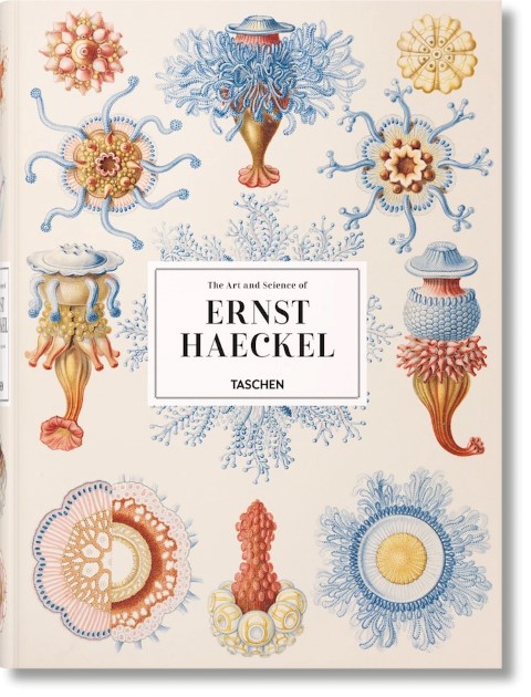
first image of the post

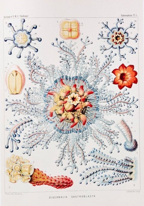
When Ernst Haeckel drew the illustrations of microbes, he was doing it for science, to help to introduce the world to micro-organisms. Little did he know that his illustrations would be compiled in a book by one of the largest art publishers in the world: Taschen.

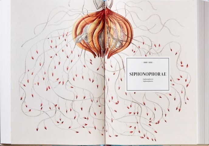
However, once you take a look at pages from the book and discover the beautiful illustrations of Haeckel, you quickly understand that scientific illustration can be a real art form. The work of the scientist is combined in a fascinating book of 450 plates with his drawings.