Keith Grant discusses how HTML 5.2 has introduced a peculiar new element: <dialog>. This is an absolutely positioned and horizontally centered modal that appears on top of other content on a page. Keith looks at how to style this new element, the basic opening/closing functionality in JavaScript and, of course, the polyfills that we’ll need to get cross-browser support right.
Also, I had never heard of the ::backdrop pseudo element before. Thankfully the MDN documentation for this pseudo element digs into it a little bit more.
When I saw the original article on how to recreate this animation, my first thought was that it could all be simplified with the use of preprocessors and especialy CSS variables. So let’s dive into it and see how!
The result we want to reproduce.
The structure
We keep the exact same structure.
In order to avoid writing the same thing multiple times, I chose to use a preprocessor.
My choice of preprocessor always depends on what I want to do, as, in a lot of cases, something like Pug offers more flexibility, but other times, Haml or Slim allow me to write the least amount of code, without even having to introduce a loop variable I wouldn’t be needing later anyway.
Until recently, I would have probably used Haml in this case. However, I’m currently partial to another technique that lets me avoid setting the number of items both in the HTML and CSS preprocessor code, which means I avoid having to modify it in both if I need to use a different value at some point.
To better understand what I mean, consider the following Haml and Sass:
- 6.times do
  .item
$n: 6; // number of items

/* set styles depending on $n */
In the example above, if I change the number of items in the Haml code, then I need to also change it in the Sass code, otherwise things break. In a more or less obvious manner, the result is not the intended one anymore.
So we can go around that by setting the number of circles as the value of a CSS variable we later use in the Sass code. And, in this situation, I feel better using Pug:
- var nc = 6; // number of circles

.watch-face(style=`--nc: ${nc}`)
  - for(var i = 0; i < nc; i++)
    .circle(style=`--i: ${i}`)
We’ve also set the index for every .circle element in a similar manner.
The basic styles
We keep the exact same styles on the body, no change there.
Just like for the structure, we use a preprocessor in order to avoid writing almost the same thing multiple times. My choice is Sass because that’s what I’m most comfortable with, but for something simple like this demo, there’s nothing in particular about Sass that makes it the best choice – LESS or Stylus do the job just as well. It’s just faster for me to write Sass code, that’s all.
But what do we use a preprocessor for?
Well, first of all, we use a variable $d for the diameter of the circles, so that if we want to make them bigger or smaller and also control how far out they go during the animation, we only have to change the value of this variable.
In case anyone is wondering why not use CSS variables here, it’s because I prefer to only take this path when I need my variables to be dynamic. This is not the case with the diameter, so why write more and then maybe even have to come up with workarounds for CSS variable bugs we might run into?
$d: 8em;

.circle {
  width: $d; height: $d;
}
Note that we are not setting any dimensions on the wrapper (.watch-face). We don’t need to.
In general, if the purpose of an element is just to be a container for absolutely positioned elements, a container on which we apply group transforms (animated or not) and this container has no visible text content, no backgrounds, no borders, no box shadows… then there’s no need to set explicit dimensions on it.
A side effect of this is that, in order to keep our circles in the middle, we need to give them a negative margin of minus the radius (which is half the diameter).
Well, we get the above in WebKit browsers and Firefox, as Edge doesn’t yet support mix-blend-mode (though you can vote for implementation and please do that if you want to see it supported because your votes do count), so it shows us something a bit ugly:
The Edge result doesn’t look that good.
To get around this, we use @supports:
.circle {
  /* same styles as before */

  @supports not (mix-blend-mode: screen) {
    opacity: .75
  }
}
Not perfect, but much better:
Using @supports and opacity to fix the lack of mix-blend-mode support in Edge (live demo).
Now let’s look a bit at the result we want to get:
The desired result.
We have six circles in total, three of them in the left half and three others in the right half. They all have a background that’s some kind of green, those in the left half a bit more towards yellow and those in the right half a bit more towards blue.
If we number our circles starting from the topmost one in the right half and then going clockwise, we have that the first three circles are in the right half and have a bluish green background and the last three are in the left half and have a yellowish green background.
At this point, we’ve set the background for all the circles to be the yellowish blue one. This means we need to override it for the first half of the six circles. Since we cannot use CSS variables in selectors, we do this from the Pug code:
- var nc = 6; // number of circles

style .circle:nth-child(-n + #{.5*nc}) { background: #529ca0 }
.watch-face(style=`--nc: ${nc}`)
  - for(var i = 0; i < nc; i++)
    .circle(style=`--i: ${i}`)
In case you need a refresher on this, :nth-child(-n + a) selects the items at the valid indices we get for n ≥ 0 integer values. In our case, a = .5*nc = .5*6 = 3, so our selector is :nth-child(-n + 3).
If we replace n with 0, we get 3, which is a valid index, so our selector matches the third circle.
If we replace n with 1, we get 2, also a valid index, so our selector matches the second circle.
If we replace n with 2, we get 1, again valid, so our selector matches the first circle.
If we replace n with 3, we get 0, which isn’t a valid index, as indices are not 0-based here. At this point, we stop as it becomes clear we won’t be getting any other positive values if we continue.
The following Pen illustrates how this works – the general rule is that :nth-child(-n + a) selects the first a items:
In order to understand what we need to do next, let’s take a look at the following illustration:
The rightmost circle going from its initial to its final position (live).
The central points of the circles in the initial position are on the same horizontal line and a radius away from the rightmost circle. This means we can get to this final position by a translation of a radius $r along the x axis.
But what about the other circles? Their central points in the final position are also a radius away from their initial position, only along other lines.
All circles: initial position (dead in the middle) is a radius away from the final one for each and every one of them (live).
This means that, if we first rotate their system of coordinates until their x axis coincides with the line between the initial and final position of the central points and then translate them by a radius, we can get them all in the correct final position in a very similar manner.
We have six circles distributed evenly, so the rotation difference between any two consecutive ones is 360°/6 = 60°. Since we don’t need to rotate the rightmost .circle (the second one), that one’s at 0°, which puts the one before (the first one) at -60°, the one after (the second one) at 60° and so on.
Note that -60° and 300° = 360° - 60° occupy the same position on the circle, so whether we get there by a clockwise (positive) rotation of 300° or by going 60° the other way around the circle (which gives us the minus sign) doesn’t matter. We’ll be using the -60° option in the code because it makes it easier to spot a convenient pattern in our case.
However, it’s very repetitive code that can easily be compacted. For any of them, the rotation angle can be written as a function of the current index and the total number of items:
This works in WebKit browsers and Firefox 57+, but fails in Edge and older Firefox browsers due to the lack of support for using calc() inside rotate() functions.
Fortunately, in this case, we have the option of computing and setting the individual rotation angles in the Pug code and then using them as such in the Sass code:
- var nc = 6, ba = 360/nc;

style .circle:nth-child(-n + #{.5*nc}) { background: #529ca0 }
.watch-face
  - for(var i = 0; i < nc; i++)
    .circle(style=`--ca: ${(i - 1)*ba}deg`)
Note that we don’t need both the 0% (from) and 100% (to) keyframes. Whenever these are missing, their values for the animated properties (just the transform property in our case) are generated from the values we’d have on the animated elements without the animation.
In the circle animation case, that’s rotate(var(--ca)). In the pulse animation case, scale(1) gives us the same matrix as none, which is the default value for transform so we don’t even need to set it on the .watch-face element.
We make the animation-duration a Sass variable, so that, if we ever want to change it, we only need to change it in one place. And finally, we set the animation property on both the .watch-face element and the .circle elements.
$t: 4s;

.watch-face {
  position: relative;
  animation: pulse $t cubic-bezier(.5, 0, .5, 1) infinite alternate
}

.circle {
  /* same as before */

  animation: circle $t infinite alternate
}
Note that we’re not setting a timing function for the circle animation. This is ease in the original demo and we don’t set it explicitly because it’s the default value.
We could also tweak the translation distance so that it’s not exactly $r, but a slightly smaller value (something like .95*$r for example). This can also make the mix-blend-mode effect a bit more interesting:
The above is for six .circle petals in particular. Now we’ll see how we can adapt it so that it works for any number of petals. Wait, do we need to do more than just change the number of circle elements from the Pug code?
Well, let’s see what happens if we do just that:
The result for nc equal to 6 (left), 8 (middle) and 9 (right).
The results don’t look bad, but they don’t fully follow the same pattern – having the first half of the circles (the bluish green ones) on the right side of a vertical symmetry line and the second half (yellowish green) on the left side.
We’re pretty close in the nc = 8 case, but the symmetry line isn’t vertical. In the nc = 9 case however, all our circles have a yellowish green background.
So let’s see why these things happen and how we can get the results we actually want.
Making :nth-child() work for us
First off, remember we’re making half the number of circles have a bluish green background with this little bit of code:
But in the nc = 9 case, we have that .5*nc = .5*9 = 4.5, which makes our selector :nth-child(-n + 4.5). Since 4.5 is not an integer, the selector isn’t valid and the background doesn’t get applied. So the first thing we do here is floor the .5*nc value:
This is better, as for a nc value of 9, the selector we get is .circle:nth-child(-n + 4), which gets us the first 4 items to apply a bluish green background on them:
However, we still don’t have the same number of bluish green and yellowish green circles if nc is odd. In order to fix that, we make the circle in the middle (going from the first to the last) have a gradient background.
By „the circle in the middle” we mean the circle that’s an equal number of circles away from both the start and the end. The following interactive demo illustrates this, as well as the fact that, when the total number of circles is even, we don’t have a middle circle.
Mathematically, this is the intersection between the set containing the first ceil(.5*nc) items and the set containing all but the first floor(.5*nc) items. If nc is even, then floor(.5*nc) and ceil(.5*nc) are equal and our intersection is the empty set∅. This is illustrated by the following Pen:
If we have 3 items, our selector is :nth-child(n + 2):nth-child(-n + 2), which gets us the second item (the intersection between the {2, 3, 4, ...} and {2, 1} sets)
If we have 4 items, our selector is :nth-child(n + 3):nth-child(-n + 2), which doesn’t catch anything (the intersection between the {3, 4, 5, ...} and {2, 1} sets is the empty set ∅)
If we have 5 items, our selector is :nth-child(n + 3):nth-child(-n + 3), which gets us the third item (the intersection between the {3, 4, 5, ...} and {3, 2, 1} sets)
If we have 6 items, our selector is :nth-child(n + 4):nth-child(-n + 3), which doesn’t catch anything (the intersection between the {4, 5, 6, ...} and {3, 2, 1} sets is the empty set ∅)
If we have 7 items, our selector is :nth-child(n + 4):nth-child(-n + 4), which gets us the fourth item (the intersection between the {4, 5, 6, ...} and {4, 3, 2, 1} sets)
If we have 8 items, our selector is :nth-child(n + 5):nth-child(-n + 4), which doesn’t catch anything (the intersection between the {5, 6, 7, ...} and {4, 3, 2, 1} sets is the empty set ∅)
If we have 9 items, our selector is :nth-child(n + 5):nth-child(-n + 5), which gets us the fifth item (the intersection between the {5, 6, 7, ...} and {5, 4, 3, 2, 1} sets)
Now that we can select the item in the middle when we have an odd number of them in total, let’s give it a gradient background:
The reason why we use a top to bottom gradient is that, ultimately, we want this item to be at the bottom, split into two halves by the vertical symmetry line of the assembly. This means we first need to rotate it until its x axis points down and then translate it down along this new direction of its x axis. In this position, the top of the item is in the right half of the assembly and the bottom of the item is in the left half of the assembly. So, if we want a gradient from the right side of the assembly to the left side of the assembly, this is a top to bottom gradient on that actual .circle element.
Now all that’s left to do is make the symmetry axis vertical.
Taming the angles
In order to see what we need to do here, let’s focus on the desired positioning in the top part. There, we want to always have two circles (the first in DOM order on the right and the last in DOM order on the left) symmetrically positioned with respect to the vertical axis that splits our assembly into two halves that mirror each other.
The fact that they’re symmetrical means the vertical axis splits the angular distance between them ba (which is 360° divided by the total number of circles nc) into two equal halves.
Angles formed by vertical symmetry line and the radial lines to the central points of the top angles are both equal to half a base angle (live).
So both are half a base angle (where the base angle ba is 360° divided by the total number of circles nc) away from the vertical symmetry axis, one in the clockwise direction and the other one the other way.
The upper half of the symmetry axis is at -90° (which is equivalent to 270°).
So in order to get to the first circle in DOM order (the one at the top on the right), we start from 0°, go by 90° in the negative direction and then by half a base angle back in the positive direction (clockwise). This puts the first circle at .5*ba - 90 degrees.
How to get the angle the first circle is placed at (live).
After that, every other circle is at the angle of the previous circle plus a base angle. This way, we have:
the first circle (index 0, selector :nth-child(1)) is at ca₀ = .5*ba - 90 degrees
the second circle (index 1, selector :nth-child(2)) is at ca₁ = ca₀ + ba = ca₀ + 1*ba degrees
the third circle (index 2, selector :nth-child(3)u) is at ca₂ = ca₁ + ba = ca₀ + ba + ba = ca₀ + 2*ba degrees
in general, the circle of index k is at caₖ = caₖ₋₁ + ba = ca₀ + k*ba degrees
So the the current angle of the circle at index i is .5*ba - 90 + i*ba = (i + .5)*ba - 90 degrees:
- var nc = 6, ba = 360/nc;

//- same as before
.watch-face(style=`--c0: #529ca0; --c1: #61bea2`)
  - for(var i = 0; i < nc; i++)
    .circle(style=`--ca: ${(i + .5)*ba - 90}deg`)
This gives our final Pen, where we only need to change nc from the Pug code to change the result:
Tropical and botanical design is one of the most popular trends in the industry right now. Let’s find out why below!
Trend Watch: Floral, Tropical, & Botanical Design
There is nothing more cathartic than nature. It has a serene, calming effect that is both enjoyable and soothing.
For creatives, nature is one of our biggest inspirations. Not only do we tend to capture the beauty of the natural world around us, but we can also bring the same calm feeling we experience to the observer.
Today we’ll take a look at one of the most popular trends to hit the industry: floral, botanical, and tropical design. Let’s take a look at its key features and a few of our favorite resources!
Designers everywhere love this trend! Here are just a few of its key features:
Vibrant colors. Green is the color of vitality, wealth, and nature. And this natural trend instantly freshens up any design with a joyful, vibrant look. Try out bold, vibrant colors for an instant happy design.
Stunning leaves and flowers. Areca Palms, Split-Leaf Philodendrons, and Banana Leaves are a few of the most popular plants seen in tropical designs, while floral designs usually stick with blooming roses and daises. Integrate both into your work for a fresh, minimalist-friendly alternative.
Inspiring seasonal themes. You can couple your designs with a fun seasonal theme. Try out a summer sunset idea for a beautiful color palette!
Fun Floral & Tropical-Themed Lessons
Do you love this trend too? Check out these tutorials for more inspiration. Learn how to incorporate beautiful botanical leaves and flowers into your work.
Let’s start with this stunning tropical background. You can drape it around you as a lovely fabric design or incorporate it into a website header. And since it’s a vector file, you’ll be able to enjoy the natural watercolor appearance with a completely lossless design!
Spell out your favorite quotes with this awesome floral alphabet. This amazing collage of letters includes gray and pink flowers made into a decorative font. Download it today to create inspiring messages and more.
Summer-themed flyers are one of the hottest ways to show off your love for the tropics. This design incorporates a mixture of botanical leaves with a vibrant green color palette that your party-goers will definitely love. Enjoy high-quality graphics on a pristine 4×6 inch template.
Need a few floral elements to complete your work? Then try out this pretty pack of abstract floral patterns. Inspired by a warm summer theme, this pack contains four total patterns available in several standard formats.
This classy invite set is simply divine! It’s inspired by traditional tropical leaves and incorporates a few into the design. Included in this set is a massive pack of dazzling invites, RSVP cards, and so much more!
Or celebrate your love for the tropics with an inspiring, chic logo. A perfect companion to any luxury brand, this logo template is simple and easy to use. It’s available in 100% vector format and can be easily adapted to any business with the help of Adobe Illustrator.
Sometimes a toolkit of the essentials is just what you need to kick-start a new project. Try out this watercolor and elements toolkit for a fun alternative to design burnout. Enjoy 75 custom shapes, 90 watercolor brushes, and 12 unique styles of patterns.
If this is the year you’ve ignited your passion for writing, then consider a calming botanical-themed magazine template. Designed with a crisp, clean appearance, this template offers two industry sizes all wrapped up in a 40-page InDesign document.
A stunning business card always leaves a great first impression! This stylish package offers an attractive wild flower theme with plenty of room for your contact details. Download it today for a fun, professional alternative.
Weddings are a time for love and fresh, lively flowers! So check out this vintage floral invitation set, perfect for the next bride to be. Aside from a phenomenal collection of colorful invites, you’ll also get access to this stylish black set! Make your invites pop with super pretty flowers!
There’s no better way to stand out than with a creative resume. This professional suite includes not only an elegant resume, but an accompanying letterhead template as well. You’ll love the fresh botanical accents like palm leaves and a cute office plant!
Every designer should have at least one pack of flower assets. This amazing pack of floral clipart includes 20 PNG files of individual flowers and six flower combinations. They’re ideal for wedding invites, handmade crafts, and scrapbooking projects.
If minimalism is your forte, consider a delightful foliage pattern. This tropical leaf design features hand-drawn patterns that are organic-looking and simple. Use it for a package design or to help your interior spaces shine!
This cool effect is achieved in just a few moments with the help of a Photoshop action. Floral Faces lets you transform your face into a beautiful tropical garden by working with premade colors and layout orientations. You’ll love this effect!
Invite your friends to a fun luau with this striking summer flyer. Featuring a creative guitar design covered in tropical flowers, this flyer comes available in two standard sizes. Switch out the details for your own, and even get access to free fonts!
Green isn’t the only color you’re stuck with for the tropical/botanical trend. This floral breeze Photoshop action applies colorful flowers to your photos with just a few steps. Choose from four different flower types to freshen up your portraits.
Photoshop brushes take the work out of creating certain shapes and textures by hand. This massive pack contains 75 high-resolution watercolor brushes with wonderful styles to choose from. Enjoy 60 impressive flowers with helpful extras like wreaths and garlands.
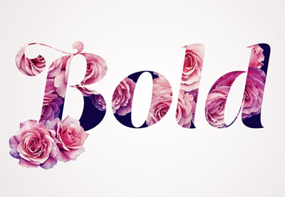
You can, of course, go full on glam with this rose and flowers text effect. A Photoshop action that does all the work for you, this action transforms your text with just one click. It’s super easy to use, so beginners to Photoshop will love the simple process!
Still
working on your Illustrator skills? Then complete your designs with a
vibrant island illustration like the one below. Featuring two palm
trees, an energetic ocean, and a beaming sun in the background, this 100% vector illustration is perfect for brochures and more.
Lastly, we have this delightful spring flyer great for any tropical-themed party. Featuring jungle leaves and an exotic flowers pattern, this template also offers a creative double exposure effect. Enjoy a neat twist on the botanical theme and download it today!
Show Us Your Designs!
If you’re as fond of the tropical and floral trend as we are, show us your work! Post a result showing us how you work with the tropical/botanical theme, and let us know your favorite styles in the comments below.
Celebrate the Easter weekend with this cheerful flyer design. Inspired by mid-century style, this would make a lovely promotional flyer for an Easter egg hunt or other spring-themed event.
We’ll put together the flyer layout in Adobe InDesign, and dip into Illustrator to create our egg graphics. This is a simple design that would be a great introduction to print design for beginners.
Save the texture file to a folder you can easily come back to, and install the font files on your system. Then you’re ready to start designing your flyer.
1. How to Create a Color Palette for Your Flyer
Step 1
Open up InDesign and go to File > New > Document.
Make sure the Intent is set to Print and uncheck the Facing Pages box. Set the Width of the page to 8.5 in and Height to 11 in.
Keep the Margins to their default value, and add a Bleed of 0.25 in to all edges of the page. Then click OK.
Step 2
Expand the Layers panel (Window > Layers) and double-click on the Layer 1 name to open the Options window. Rename the layer Background and click OK.
Choose New Layer from the panel’s drop-down menu (accessible at the top-right corner), and rename this second layer Shadows. Click OK.
Create a further three new layers in this order: Eggs, Typography, and finally Texture at the top of the sequence.
Then lock all layers except Background at the bottom.
Step 3
Expand the Swatches panel (Window > Color > Swatches), and select New Color Swatch from the panel’s drop-down menu.
Name this new swatch Sky Blue, and set the Type to Process and the Mode to CMYK. Then adjust the percentage levels below to C=62 M=4 Y=13 K=0.
Step 4
Repeat the process, building up a palette of 17 CMYK swatches in total:
Mink: C=33 M=33 Y=44 K=14
Orange: C=0 M=68 Y=75 K=0
Lime: C=19 M=10 Y=81 K=1
Pink: C=0 M=51 Y=20 K=0
Mustard: C=3 M=13 Y=93 K=0
Blush: C=3 M=27 Y=25 K=0
Chocolate: C=33 M=70 Y=92 K=40
Yolk Yellow: C=3 M=36 Y=92 K=0
Tomato: C=0 M=93 Y=83 K=0
Pea Green: C=68 M=0 Y=88 K=0
Burnt Red: C=0 M=85 Y=94 K=0
Sage: C=58 M=17 Y=50 K=2
Green: C=58 M=17 Y=85 K=2
Pink White: C=0 M=5 Y=0 K=0
Slate: C=65 M=50 Y=44 K=36
Brown Black: C=52 M=53 Y=56 K=52
Step 5
With the Background layer still unlocked, take the Rectangle Tool (M) and drag across the whole page, extending the shape up to the edge of the bleed on all sides.
From the Swatches panel, set the Fill Color to Slate.
2. How to Create Colorful Easter Eggs for Your Flyer
Step 1
For this stage, we’ll need to move over to Illustrator for a moment. Minimize but don’t close your InDesign window, and open up Illustrator.
Go to File > New, and create a new document at any size.
Take the Arc Tool (from the Line Segment Tool pop-out menu), and draw a rough ‘C’-shaped curve onto the page. Try to make the lower part of the curve more generous than the top, to mimic the shape of a half-egg.
Step 2
Right-Click > Copy the curved line and Edit > Paste it. Right-Click on the copy and Transform > Reflect.
In the Reflect window, check Vertical to flip the curve and click OK to exit.
Then position the curve perfectly against the original, to create a whole egg shape. Select both curves and Right-Click > Join to unite the lines into a single vector shape.
Then Copy the egg shape, and minimize Illustrator.
Step 3
Head back to your InDesign document and lock the Background layer. Unlock the layer above, Eggs.
Edit > Paste to drop the egg vector directly onto the page. Holding Shift while you resize it, scale it to a width of around 1.77 in (visible in the Controls panel running along the top of your workspace), and position it in the top-left corner of the page.
From the Swatches panel, change the Fill Color of the egg to Sky Blue.
Step 4
Expand the Stroke panel (Window > Stroke). With the egg selected, set the Width of the stroke to 0.75 pt and choose Dashed from the Type drop-down menu. This will add a little bit of texture to the edge of the shape, softening it.
From the Stroke panel, set the Stroke Color of the egg to Sky Blue to match the fill.
Step 5
Edit > Copy, Edit > Paste the egg shape, moving the copy over to the right of the original. Adjust the Fill and Stroke Color to Mink.
Paste two more eggs, moving them over to the right, creating a row of four eggs in total. Tweak the spacing and position to ensure they are evenly spaced.
Set the Fill and Stroke Color of the third egg to Orange, and the fourth to Yolk Yellow.
Step 6
Select all four eggs, and Right-Click > Copy, and Paste.
Position the four copies in a row below the first, adjusting the color of each, from left to right, to Lime, Pink, Mustard, and Sky Blue.
Repeat, creating a third row, set in Blush, Chocolate, Yolk Yellow, and Tomato.
Paste in a final row, setting the colors to Pea Green, Burnt Red, Sage, and Green.
3. How to Format Retro-Inspired Typography on Your Flyer
Step 1
Lock the Eggs layer and unlock the layer above, Typography.
Take the Type Tool (T), and drag to create a text frame over the top of the egg shape in the top-left corner of the page.
Type in ‘e’, and from the Character panel (Window > Type & Tables > Character), set the Font to Compass Rose CPC Bold, Size 140 pt.
From the Swatches panel, set the Font Color to Pink White.
Step 2
Select the text frame and Right-Click > Copy, and Paste.
Edit the text to read ‘a’, and position it over the top of the second egg along.
Paste another copy of the text frame, adjusting the text to ‘s’, and placing it over the top of the third egg in the row.
Step 3
Select all three text frames and Copy and Paste.
Move over the second row of eggs, adjusting the letters to read ‘t’, ‘e’, and ‘r’.
Then Paste another row of text frames onto the third row, shifting them to the right, with the pale pink egg blank. Edit the text to read ‘e’, ‘g’, and ‘g’.
And Paste another sequence of frames over the top of the final row, adding an extra text frame, and changing the text to read ‘h’, ‘u’, ‘n’, and ‘t’.
Step 4
Use the Type Tool (T) to create another text frame over the top of the egg in the top-right of the flyer.
Type in the day, date, and time of the event, and set the Font to Compass Rose CPC Bold, Size 23 pt.
Set the text to Align Center from the Controls panel at the top, and adjust the Font Color to Brown Black.
You can separate lines of text, such as the time shown here, by highlighting a line and increasing the Leading (line-spacing) in the Character panel.
Click on the Superscript button in the Controls panel to make the ‘st’ or ‘nd’ of a date smaller, as shown below.
Step 5
Copy and Paste the date text frame, moving it over the blank blue egg below. Adjust the text to read the location of your event, and tweak the Font Size so that the text is large and legible.
You can also add another text frame, perhaps listing the price of the event, over the top of the pale pink egg on the third row.
4. How to Add Collage Effects and Vintage Texture to Your Flyer
Step 1
Lock the Typography layer and unlock the Shadows layer. Zoom in on the top-left corner of the flyer, and switch to the Pen Tool (P).
We’re going to create a collage-style vintage effect behind each egg, which will give the shapes a rough cut-out pale shadow. Trace very roughly around the perimeter of the blue egg…
… taking it around the whole shape and meeting at the beginning.
Step 2
Set the Stroke Color of the shadow to [None] and the Fill to Pink White.
Repeat the process for the next egg, looping a rough shadow around the shape and setting the Fill to Pink White.
Do the same for the third egg along, too, and the fourth as well.
Step 3
Copy and Paste the shadows, moving them behind each egg. Vary the scale and position of them slightly to add variation.
Step 4
Lock the Shadows layer and unlock the top layer, Texture.
Take the Rectangle Frame Tool (F) and drag over the top of the whole flyer. Go to File > Place, and choose the PNG version of ‘Texture-8’ in the vintage textures pack you downloaded earlier. Click Open, and allow the texture to fill the whole image frame.
Step 5
Click on the texture image frame and head up to Object > Effects > Transparency. Set the Mode to Screen and click OK.
Select the image frame and Edit > Copy, Edit > Paste in Place.
With the copy of the frame selected, head back to Object > Effects > Transparency, and pull down the Opacity to 45%, before clicking OK.
Your flyer artwork is finished—great job! All that’s left to do now is export it as a PDF ready for printing.
5. How to Export Your Flyer for Print
Step 1
First, make sure to File > Save all of your hard work. Then go to File > Export. Name your file, and choose Adobe PDF (Print) from the Format drop-down menu. Then click Save.
In the Export Adobe PDF window that opens, choose [Press Quality] from the Preset menu at the top.
Step 2
Click on Marks and Bleeds in the window’s left-hand menu.
Check All Printer’s Marks and Use Document Bleed Settings.
Then click Export to create your PDF.
Conclusion: Your Finished Flyer
Your PDF file is ready to send off for professional printing—great job! All you need to do now is post it up on noticeboards and spread the word about your fun Easter event.
In this tutorial, we’ve covered several techniques for creating print designs in InDesign, including how to set up a flyer layout and format typography. We’ve also looked at how to use fonts, textures, and colors to bring a vintage, mid-century vibe to your design.
Every week, we’ll give you an overview of the best deals for designers, make sure you don’t miss any by subscribing to our deals feed. You can also follow the recently launched website Type Deals if you are looking for free fonts or font deals.
The Delightful Bundle Vol II
Jam-packed with 25 fonts from 20 different font families, this amazing font bundle comes in at JUST $0.80 per font.
Time to extend your family! With the Madelyn Handwritten Script Font Family, you’ll be bringing home two unique font styles: Madelyn Script and Madelyn Black. These handwritten script fonts is a masterful blend of calligraphy pen and casual dry strokes. Packed with 500+ letters, over 100 ligatures and 70+ ornaments, Madelyn can bring your latest designs to a whole new level.
Whether you’re starting from scratch or looking to bolster your artistic toolbox, this Mighty Deal is just magnificent! A Designer’s Dream, you’ll start with 8 premium fonts ranging from the curvaceously glamorous to the quirky and cool. But you’ll also get 8 graphic resource packs full to the brim with more than 575 professional floral elements, frames, arrows, wreaths, patterns, clipart, icons and so much more.
MOTOPRESS: WordPress Page Builder with Premium Extensions
Thousands of customers already use WordPress the MotoPress way. MotoPress is a powerful WordPress Page Builder plugin, which makes it possible to create and customize websites for diverse niches, with no coding skills. Assemble a full-blown WordPress website with just one Page Builder plugin – MotoPress Content Editor and its highly-functional addons. No need to compare and choose extra plugins for different purposes for you or your client, no need to wait for updates from dozens of providers, no need to fuss with compatibility issues.
Whether you’ve been a web designer for a decade or just a couple of months, the early days of getting started on a web development and design project can be nerve-wracking. There are numerous moving parts and clients, no matter their size or budget, expect high quality of work.
The design lifecycle incorporates requirement specification, scope definition, wireframe and sitemap creation, content development, interface design and testing (including penetration testing as provided by firms such as CBI). So much could go wrong. Yet, it doesn’t have to as long as there’s robust planning and preparation.
The following design tips will help you stay the course and deliver to the customer’s satisfaction.
1. Define Expectations
You cannot really meet the client’s expectations unless you know what those expectations are. If you are working with a client who has commissioned one or more websites before, defining targets and outcomes will be a fairly straightforward process. However, if your client has no previous experience, they may find it difficult to articulate exactly what they need.
When it comes to web design, few things are more depressing than a client realizing halfway that what you are building is not what they wanted. That’s why setting expectations and goals is the single most important phase of the entire project. Develop a simple questionnaire that you’ll use to extract the requisite information from the client.
Questions should seek to establish the purpose of the website, who its target audience is, what it aims to achieve and how its success will be measured. With these answers, prepare a document outlining your understanding of the client’s expectations and share it with them for final verification. Going through this process will drastically reduce the likelihood of surprises later on.
2. Prioritize Content
One of the biggest mistakes web designers make is to take the word ‘design’ as a license to concentrate on aesthetics. Content is still king. No amount of beautiful design can replace great content. Good content stimulates engagement while engagement triggers action.
Find out what content the client would like to share on the site and then design with the intention of making the content stand out and appeal to the target audience. For instance, if you are creating an e-commerce store, focus on highlighting the products as opposed to blending them in with everything else on the page.
3. Adhere to Web Standards
Being unconventional is fun, but when it comes to web standards, that’s not something you can afford to do. Your client’s audience has already gotten used to existing standards and you do not want to make things difficult for them. Successful websites are intuitive and following convention is one way to achieve that.
There’s no reason for users to have to learn a new design model in order to navigate the site. For example, nearly every e-commerce store places the shopping cart in the top right corner of the page. It’s not because that’s the most attractive place to put it. Rather, visitors have grown accustomed to finding the shopping cart there.
Other examples of web design convention include placing the logo in the top left corner, contact in the top right, the search box in the header and consistent branding throughout the website.
4. Make it Easy to Navigate
If visitors cannot quickly move from one section to another, they’re likely to lose enthusiasm and this means the website will have failed to achieve its goals. Navigation design must minimize the amount of information and steps required for users to move between sections and pages.
You have to put yourself in the shoes of the audience and lay out the most logical steps a typical visitor would follow in their journey across the site. Help them do what they want to do as opposed to forcing them along a path they aren’t interested in. Familiarize yourself with navigation best practices, including the most common patterns of mobile navigation.
5. Prioritize Mobile
The way the average person accesses the internet has changed radically over the last decade. Desktop PCs have lost their dominance. The exponential growth of smartphones and tablets means the majority of the world’s population today accesses the web primarily through a mobile device.
From watching videos, posting on social media, shopping and just general searches, mobile is where it’s all happening now. Optimizing a website for the mobile experience used to be an afterthought. Nowadays, it’s a critical requirement. The site must be fully operational on mobile which means text, images, calls to action and shopping carts must work as flawlessly on mobile as they do on a desktop browser.
6. Integrate Social Media
Just like mobile, social media has moved from the early days of MySpace when it was on the fringes of internet conversations to a colossus that has its tentacles in every nook and cranny of the world wide web. Facebook, the behemoth in this space, has more than 2 billion active users.
Social media is where the bulk of internet users spend the most time on the internet. The website must leverage that to its advantage. By integrating the site with social media, you increase the likelihood of visitors sharing the product and contents with their network thus increasing visitor traffic.
The above tips are useful in getting you moving in the right direction, but do not cover everything you need to build a successful website. Web design is an art and there’s only so much you can learn from books or on the web. In reality, you’ll make some mistakes and experiment with different options before you eventually perfect your craft.
Stephen is an influencer marketing pro with brownboxbranding.com who is passionate about building authentic relationships and helping businesses connect with their ideal online audience. She keeps her finger on the pulse of the ever-evolving digital marketing world by writing on the latest marketing advancements and focuses on developing customized blogger outreach plans based on industry and competition.
I wasn’t at this conference, so I have very little context. Normally, I’d consider it a sin to weigh in on a subject brought up by looking at two out-of-context slides, but I’m only weighing in out of interest and to continue the conversation.
The idea seems to be that if you need to select an element in the DOM with JavaScript, don’t use the same selector as you would in CSS.
So if you have…
<article class="article">
</article>
…and you need to apply an event listener to that article for some reason, then don’t use…
$(".article")
(or querySelector or whatever, I assume.)
Instead, apply an attribute intended just for the JavaScript to target, like…
The idea is that you can separate jobs. The class has the job of styling, and the data attribute has the job of JavaScripting. Both can change without affecting each other.
Seems reasonable to me.
Also seems like there is plenty to talk about here. Performance, I suppose, but that’s probably the least-interesting thing since selectors are generally pretty damn fast these days. We could continue the conversation by talking about:
What naming convention?
Should you be naming events?
What if it needs to be selected for different reasons multiple times?
Can you or should you use IDs?
Is it worth avoiding DOM selection at all if you can?
Color blindness is a vision deficiency that affects a large number of people around the world. Whether we know it or not, we as designers have a great impact on their daily lives through the work that we create and put out all around us. That being the case, I believe that we should take a few moments and explore some simple yet effective solutions that could help improve their situation and thus the quality of their lives.
1. What Is Color? A Brief Definition
Before we can
completely understand what color blindness is, we should first take a couple of
moments and talk about color, what it is, and how it behaves.
According to Google, the noun color is defined as:
“the property possessed by an object
of producing different sensations on the eye as a result of the way it reflects
or emits light”.
Now, light itself
is made out of multiple colors that have different wavelengths, where red is
the longest one that humans can see, while violet is the shortest.
We know this since in 1666 Sir Isaac Newton put together a little experiment in which he
took a beam of white sunlight and passed it through a glass prism. What he
observed must have been incredible at that moment since the prism split the
beam into a band of seven composing colors which he called the “spectrum”. The
order of these colors from the lower end of the spectrum is violet (V), indigo (I), blue (B), green (G), yellow (Y), orange (O),
and red (R)—which we now call ROYGBIV.
Quick tip: you can see Newton’s prism experiment in action by
heading over to MITK12Videos’ YouTube channel where they give you an in-depth explanation of the cause of the light dispersion phenomenon.
2. How Do Our Eyes „See” Color?
Depending on its physical
properties (light absorption, emission spectra, etc.), an object can
individually reflect or absorb these seven colors more or less, giving it the
property that we call color.
So when we say we
see a specific color, we actually see the amount of color reflected by the
surface of an object when it’s being hit by a light source. When an object
reflects all the wavelengths, we see it as being white; when it absorbs them
all, it is black.
We’re able to visualize these properties due to the millions of
light-sensitive cells found within our retinas, which process the light into
nerve impulses and then pass them to the cortex of the brain via the optic
nerve.
These cells come
in two different shapes: rods and cones. The rods are highly concentrated around the edge of the retina
(somewhere around 90 million cells for humans), and transmit mostly black and
white information due to the fact that they contain a single photopigment,
being the ones that help us adjust to a darker environment.
The cones, on the other hand, are
concentrated in the middle of the retina (4.5–6 million cells), and are able
to capture three different wavelengths: S (short), M (medium), and L (long).
Short cones are
usually referred to as “blue” due to the fact that they provide color
information for that specific wavelength of light. Medium cones are referred to
as “green”, while long ones are known as “red”.
Normal color
vision uses all three types of light cones (red, green, and blue), and is known as trichromacy.
In fact, the RGB color
space that we work and interact with on a daily basis is created around our trichromatic vision determined by
these three types of cones, where each and every image is built using a combination of just three colors.
3. What Is Color Blindness?
We now have a
basic idea of what color is, but what is color blindness?
Well, many people think that being color blind means you see the world in black and white, but that’s not actually true.
As the online version of the Medical Dictionary points out, color blindness is:
“an abnormal
condition characterized by the inability to clearly distinguish different
colors of the spectrum”.
A person that is color blind is usually born with this condition, which is
determined by a faulty gene found within the X chromosome. According to the American Academy of Ophthalmology, „color blindness can occur when one or more of the color cone cells are absent, non functioning, or detect a different color than normal”.
Colour Blind Awarenessstates that the condition affects approximately 1 in every 12 men (8%) and 1 in every 200 women around the world.
4. What Are the
Different Types of Color Blindness?
As we learned a few moments ago, our eyes have three types of cone cells. Depending on which
of them is affected, a person can suffer from one of three conditions:
4.1. Red-Green Color Blindness
According to the National Eye Institute (NEI), the most common type of color blindness is due to „the loss or limited function of the red cone (known as protan) or green cone (deutran) photopigments” that depending on their severity can lead to:
Protanomaly: when the person’s red cone photopigment is abnormal, causing red, orange, and yellow colors to appear greener.
Protanopia: when there are no working red cone cells, causing red to appear as black, and certain shades of orange, yellow, and green to appear as yellow.
Deuteranomaly: when the person’s green
cone photopigment is abnormal, causing yellow and green to appear redder, making
it difficult to tell violet apart from blue.
Deuteranopia: when there are no working green cone cells, causing reds to appear as brownish-yellow
and greens as beige.
4.2. Blue-Yellow Color Blindness
Compared to red-green color blindness, blue-yellow color blindness is rarer, and it appears when the blue cone photopigments are either missing or have limited function.
Depending on the case, we can have:
Tritanomaly:
when the person’s blue cone cells have limited function, causing blue to appear
greener and making it difficult to tell yellow and red apart from pink.
Tritanopia: when the person’s blue cone cells are missing, causing blue to appear
green and yellow violet or light grey.
4.3. Complete Color Blindness
For those who don’t experience any color at all, they suffer from what is called monochromacy,which is when they see the world in shades of grey ranging from black to white.
5. How Do You Know If You’re Color Blind?
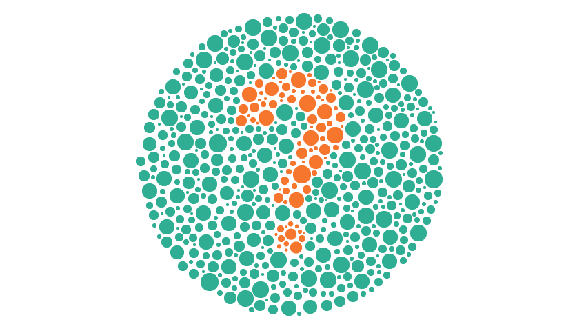
If you want to make sure that your eyes are functioning correctly, you should always go visit an optometrist, who will apply a simple color perception test called the „Ishihara Color Test”. The name comes from its creator Dr. Shinobu Ishihara, who in 1917 published a simple yet ingenious method of determining if a person is color blind or not using colored plates (ishihara plates). Each plate contains multiple dots that vary in color and size and are displayed within a circular pattern, forming a number at the center.
If you can distinguish the number correctly then it means you have normal color vision. If you’re having problems seeing the shape of the numbers, then you might be suffering from one of the color blindness types that we talked about a few moments ago.
If you don’t really want to go to an eye doctor just yet, you can take the test online using any of the following sites:
6. How Can You See What a Color Blind Person Sees?
As a designer and visual creative, you must understand that your work will need to be visible not only to people with normal vision but also to those that suffer from one type of color blindness.
The first step to finding a solution to the problem is understanding how it manifests itself, by trying to see what a color blind person would see.
Luckily, there are a couple of solutions out there that allow you to take a normal image and apply filters to it in order to get an idea of what a certain vision deficiency would look like.
6.1 Online Color Blindness Simulators
If you’re dealing with regular images, these color blindness simulators can quickly generate a picture of what a person suffering from a specific condition would see:
Coblis by Colorblindness.com is probably the most exhaustive solution out there since it generates images for all types of color blindness.
Vischeck is a simpler generator that gives you the ability to preview a side-by-side picture of both the original and the simulated color vision deficiency.
If you’re a web designer and want to see what your project would look like for a person suffering from color blindness, Toptal has put together a smart little Color Blind Filter that takes any website and converts it using one of the four available filters.
6.2. Local Color Blindness Simulators
Since uploading your project to the web and then comparing the images back and forward can be a little time-consuming, there are a couple of software solutions out there that can help you achieve the same result faster.
Adobe Illustrator: if you didn’t know, Illustrator actually comes with two color proofs (Protanopia and Deuteranopia) within its View menu (View > Proof Setup), that help you quickly see what your project would look like when viewed by a color blind person.
Adobe Photoshop: the same color proofs are included within Photoshop (View > Proof Setup), helping you identify and correct the final result.
Stark is a free plugin created for Sketch that helps you select from eight color profiles and preview your design as a color blind person.
Color Oracle is another free color blindness simulator developed by Bernie Jenny that can be installed and used on Windows, Mac, and Linux and was created to work independent of the creative software that you’re using.
7. How Does Color Blindness Affect the Quality of One’s Life?
Even though for color blind people the world around them seems „normal”, since most of the time that’s the only way they’ve experienced it, the reality is that they usually face difficulties in what we think of as being simple, everyday tasks. From cooking food to driving a car or choosing what clothes to wear, what they see does affect their reactions and behavior, directly influencing their life.
Imagine that you would like to drive a car, but can never tell if the traffic lights are green or red without knowing the position of each of the three states. Or maybe you would like to cook a nice piece of meat that you bought from the local market, but you can’t tell if it’s rare or well done.
Also, think of all the creative jobs out there that you would love to do but could never apply for since you can’t really see what everybody else is seeing.
These are just a couple of the situations that a color blind person has to deal with on a daily basis, so why not try and learn how we can help them even just a little bit by following some of the simple solutions presented below.
8. How Can You Adjust Your Designs and Illustrations for the Color Blind?
So at this point, we know what color blindness is and have a basic idea what it can look like, which means that we can now talk about finding and implementing solutions meant to adjust our projects for people affected by these vision deficiencies.
8.1. What Colors Work Best?
The first thing that we need to ask ourselves when working on a project (whether it’s an existing or new one) is what color combinations work best. And the answer is that we really don’t have a generalized list, since it all depends on the Saturation and Brightness levels used for each and every color.
What we do know is that there is a set of color combinations that should be avoided, since it might be hard for a color blind person to tell them apart:
red and green
red and brown
red and orange
red and violet
red and black
green and brown
green and orange
light green and yellow
blue and green
blue and purple
blue and yellow
The problem usually arises when a design is based on colors that have close hue, saturation, or brightness levels, making them seem like shades of the same color.
So our goal is not to create a color scheme that is clearly identifiable by a person suffering from color blindness, but to make it possible for them to distinguish one color from another, even though they might not be sure what that color is.
8.2. How Can You Fix Bad Color Combinations?
The first step to fixing a bad color combination is noticing it. This is where the color simulation tools come in handy, since you can quickly observe if you have indistinguishable overlapping sections or elements that are either identical or simply not visible, by going through the different available filters.
Depending on the type of creative project that you’re working on, whether it’s an illustration, a mobile app, or a type of graphical data representation (bar chart, line chart, or pie chart), you can use the following suggestions to adjust the final result for those suffering from this condition.
Use a Different Hue
If you take a look at this illustration of a classic Game Boy, you might notice that when using a Deuteranopia filter, the upper section of the device looks as if it has a cutout since the hue of the background and that of the screen are really close in terms of saturation (57.83% for the red hue and 42.96% for the green one).
We could adjust the saturation of the screen section in order to increase the hue’s intensity, but as you can see, in this particular situation that won’t help as much as we’d like.
What we want to do is adjust the hue of the background from red to purple, which as you can see will create a clear separation between the two sections.
Aim for High Contrast
We’ve fixed the background problem, but as you can see, some sections of the console (such as the front and the side) are really hard to distinguish, since they use the same hue value (0%), and similar brightness levels (92.94% for the front and 86.67% for the side). The same thing can be said about the d-pad button, where the cross-section uses a 45.88%brightness level while the center dot uses a similar 40.78% value.
When this happens, you can quickly address the situation by selecting the respective shapes and adjusting their saturation and/or brightnesslevels until they start standing out.
The general rule would be to use as few tints and shades as possible, and have the artwork stand out, using high contrast whenever you can.
Since in real life the console’s shell is made out of white plastic, it seems fair to use a few tints and shades if we want to represent it more accurately, but if the project allows, you can always achieve higher contrast by using different hues.
Separate Your Shapes Using Outlines
If you tried some of the previous solutions but couldn’t get the desired result, you can sometimes isolate the different sections of a badly colored composition using thick, dark outlines. In the case of our Game Boy, we could turn some of its shapes into outlines and add new ones to those that support them, thus giving us a more defined result.
Add or Remove Colors
Adding or removing colors can make or break a design, especially one viewed by a person that can’t distinguish all of them. If we take a look at the outlined version of our console, you might have noticed that the circular buttons are now blending in with their outlines.
We can easily fix this by introducing two new hues (a light yellow and blue) as long as we know what colors can be seen by a person suffering from a specific vision deficiency (in our case, Deuteranopia).
In other situations, you might find that removing colors will improve the overall design since sometimes simpler is better.
Adhere to a Monochromatic Color Scheme
Sometimes colors might prove to be your biggest enemy, especially when dealing with a vision deficiency such as Deuteranopia, so it might be a good idea to reduce your palette to a monochromatic color scheme.
Often, people confuse a monochromaticcolor scheme with a grayscale one consisting of only blacks, grays, and whites, but they’re actually two completely different things.
According to Wikipedia, a monochromaticcolor scheme is derived from „a single base hue and extended using its shades, tones, and tints”.
As you can see below, by adhering to a monochromatic scheme, you can eliminate the whole rigorous color matching process, and focus on just one hue from which you can create shades and tints using different saturation and brightness levels.
Go Grayscale
Another solution to avoiding color completely is to go fully grayscale. By doing so, you eliminate almost all of the above steps, which means you can focus on the artwork itself.
Add Texture
One last method of making sure your design is clearly understandable by those suffering from vision deficiency is that of adding texture. Whether it’s grain, horizontal lines, or any other type, texture can easily separate and highlight a specific section of an image, helping you break any color boundary.
Conclusion
Whether we realize it or not, color blindness is a condition that affects a large number of people out there, making their daily lives harder by limiting the things they can see and understand through the filter of color.
Luckily, as we’ve seen, there are several things that we as designers can do in order to improve the quality of their life, thus making things a little easier one step at a time.
I really hope that this article has opened your eyes to an area of design that is often overlooked, and managed to teach you a few key notions that you can implement in future projects.
That being said, you can further expand your knowledge on color by checking out these awesome articles:
Color blindness is a mild disability through which the affected experience a decreased ability to distinguish colors from others. This can be a real drawback…
Tints, tones and shades are terms you’ll hear used when discussing color. A “tint” is the result of mixing a color with white. A “shade” is the resultant…
Artists seek to stand out in a variety of ways. One way that you can accomplish this is by using a recognizable color palette throughout your work. In this…
There comes a time in any young app’s life when it will have to monetize. There are a number of ways to become profitable, but accepting cash is a surefire way to make this more direct. In this four-part tutorial, we’ll go over how to set up a serverless function, make it talk to the Stripe API, and connect it to a checkout form that is setup as a Vue application. This may sound daunting, but it’s actually pretty straightforward! Let’s dig in.
We’ve covered serverless concepts before but, in case you haven’t read that article, let’s talk for a minute about what we mean by „serverless” because it’s a bit of a misnomer.
The promise of serverless is to spend less time setting up and maintaining a server. You’re essentially letting the service handle maintenance and scaling for you, and you boil what you need down to functions that run certain code when a request is made. For this reason, people may refer to this as FaaS. This is really useful because you pay for what you use, rather than a large container that you might not need in its entirety. You also primarily hunker down and focus just on the code you need to run instead of babysitting a server, which really appeals to a lot of people who’d like to get up and running quickly.
But FaaS isn’t always the right tool for the job. It’s really useful for small executions but, if you have processes that might hold up resources or a ton of computation, being able to communicate with a server as you normally do might be more efficient.
What we’re going to make is a perfect use case for going serverless. Stripe checkouts are pretty seamless to integrate on both the client and server side, but we do actually need to execute some logic on the server, so we’ll use Azure to help us with this. The portal and Github integration are pretty quick to manipulate, as long as you know where to go. So by all means, let’s make it happen!
Sign up for Stripe
First, we’ll create a Stripe account. We verify our new account via email and then we’ll head over to the API section, where we can retrieve two keys. You’ll note that we’re in test mode right now, which is good! We’ll keep it like that for testing, and unveil the testing key token to use while we set up the application.
Once you’re signed in, go to the API section of your dashboard to retrieve your key.
Setting up Our Serverless Function in the Azure Portal
First, we’ll head over to the portal, (or if you don’t already have an account, you can sign up for a free trial here) and select New > Serverless Function
Setting up a new Servless Function in Azure
When we click on the Serverless Function app, we’ll be taken to a panel that asks for details to help with the setup. As you can see in the screenshot above, it will autofill most of the fields just from the app name, but let’s go over some of these options quickly:
Add in a unique name
A Resource Group (if you don’t already have one, create one)
I use the Windows OS because the Linux is still in preview, so Windows will be more stable
I use the Consumption Plan because this is the one that will have payments that scale with the use, and it will also scale automatically. The other option, App Service Plan, is good for people who prefer everything to be a bit more manual.
Choose a location that is close to your customer base, or a midpoint between two customer bases
Choose a storage, or create one as I’ve done
I’ll also check Pin to Dashboard because I want to be able to retrieve my function quickly later
This will bring you back to the main portal dashboard and let you know that your function is deploying. Once it’s done, it take you to a main screen that has all of your options. From here, we’ll want to create our function, and it will be an HTTP trigger.
We’ll select Functions under our function name, and you’ll see a little table with a plus that says “New Function”:
Once we click here, we have a few options on what we can create. We’ll pick HTTP Trigger:
We’ll be able to select the language (pick „JavaScript”) and then „Create”:
The Default Testing Function
From here, we’re given a default testing function which helps us see how this all works. If we open all of these panels and hit the Run button, we’ll see the output in logs.
Running the function in a test environment
Here’s the code we were given:
module.exports = function(context, req) {
  context.log('JavaScript HTTP trigger function processed a request.');

  if (req.query.name || (req.body && req.body.name)) {
    context.res = {
      // status: 200, /* Defaults to 200 */
      body: 'Hello ' + (req.query.name || req.body.name)
    };
  } else {
    context.res = {
      status: 400,
      body: 'Please pass a name on the query string or in the request body'
    };
  }
  context.done();
};
You’ll see here that we’re passing in the context. That allows us to log, which will be shown in the lowest panel below. In the Test panel on the right, we can pass in a request body that can be used to test our application. When it runs, we see the output with a 200 status and know that everything is working. We also have a context.log for the case that it gives us a 400 error. If you’d like to play around with a serverless function and see it in action for yourself, you can create one with a free trial account.
Next Up…
Now that we have the base of our serverless function, let’s set up what we’ll need to communicate with Stripe! More to come in the next post in this series.