2018 is finally here and design is hotter and more complex than ever. To make it through the ever-changing jungle of pixels, vectors, stock images and what not, we handpicked the top graphic design resources that you’ll need this year to save time, optimize your work and improve your design quality. Whether you’re just starting out or a veteran pixel champion, all these resources are a must-have in your design toolbox for this year and forever.
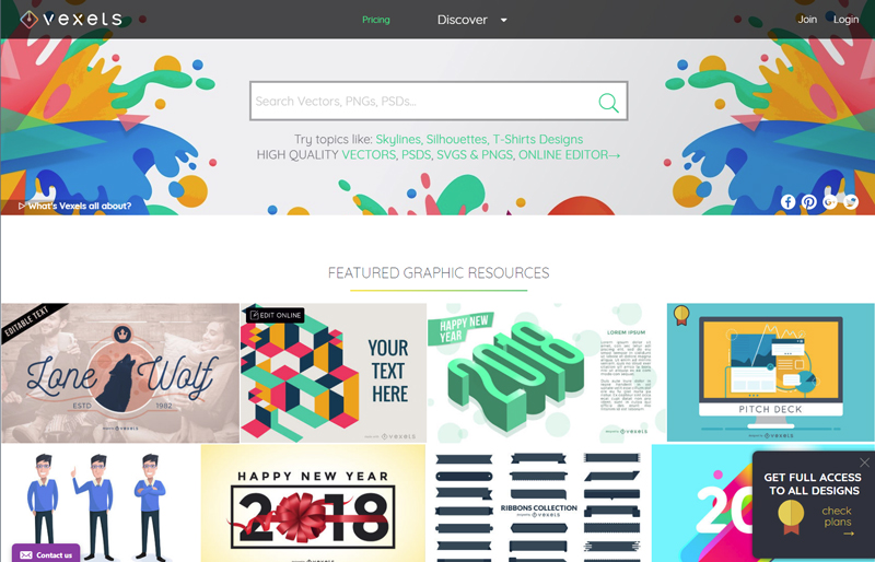
The hottest site dedicated to vector graphics has got it all: well over 20,000 PNG & SVG items, free vectors for the casual user, premium content for seasoned designers, and if you’re in a hurry or lacking inspiration, you can take up their online editor and choose among hundreds of ready-to-edit designs. Still can’t find what you need? Ask them to make a custom design specially for you! They’re big on skylines, silhouettes and cartoons, and have a wide range of exclusive trendy designs you won’t find anywhere else. While their content is affordable and cost-efficient, they also offer free download options depending on the use you’ll give the design.
Whatever your project is, Pexels is a must when it comes to high quality free stock photography. Self-proclaimed as the website that gathers “the best free stock photos in one place”, they add five photos per day, all of them are creative common 0 (can be used without attribution) and ready for commercial use.
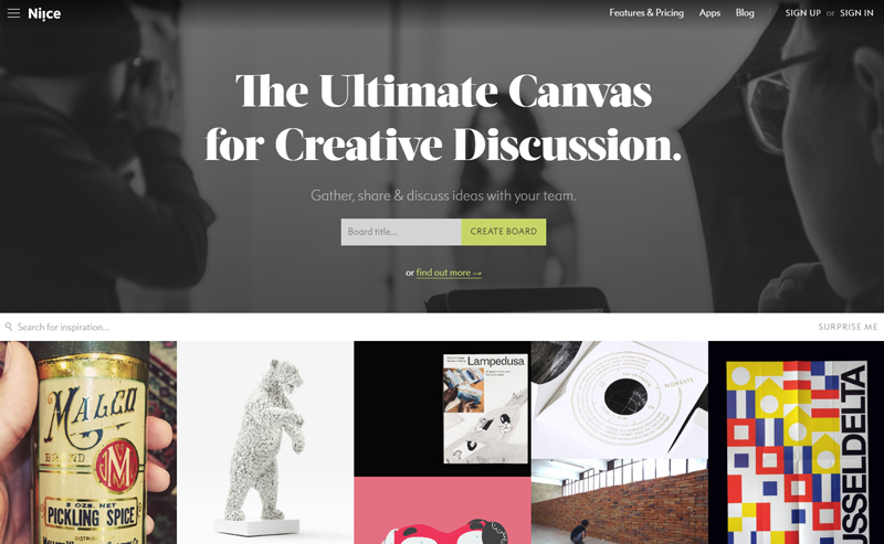
Niice is a design inspiration hub meant for teams. What started as a carefully curated inspiration site is now a team-focused platform for creative discussion where team members can gather up, share and discuss creative ideas. They make it really easy to share visual boards and get all members on the same page. If you’re a lone wolf, you can find awesome inspiration for yourself.
If you are a Chrome user and haven’t heard about Piktab, you’re in for a treat. A handy extension, Piktab allows you to discover free graphic resources every time you open a new tab. Finding awesome free content can’t get any easier than this. It gathers content from the top design sites out there, and you can customize your experience any way you want.
With a modern interface, high quality icons, and affordable prices, Noun Project is a globally-powered icon factory that hosts over a million designs from artists and designers from all over the world. If budget is too restrictive, you can pay with attribution. You are guaranteed to find anything here.
Keeping up with the latest design trends and news can be mind-numbing, as there are plenty of options to pick from, but we found DesignTAXI as a daily hub of informative and engaging design-related content where you can find pretty much anything, from film, art and graphic design news all the way to fashion and product design.
When it comes to finding top quality free editable graphics, look no further than Pixeden. Armed with free web graphics, background graphics, textures, PSD mockups and tons of more features, they make any graphic designer’s life easier when it’s time to present a project or show your client how awesome your design looks on various formats
Arguably the ruler of all font sites, FontSquirrel is everything we look for: free and 100% ready for commercial use. If by “free” you think “low quality”, think again. The hottest and trendiest fonts are there for the taking. Did we mention all their fonts are handpicked? That means you’ll surely get a great font regardless of your choice.
Skillshare is a heaven-sent for anyone who’s eager to either learn new skills or improve their craft from the best in the biz. With over 18,000 design classes available (and counting), this is by and large one of the most resourceful sites you’ll ever come across with.
When color matters, it’s time for Adobe Color CC, a super-useful tool which allows you to create your own color palette from scratch or draw inspiration from a massive library of palettes, all of which are human-made. Originally as a stand-alone Adobe product, it’s now embedded into Illustrator for a seamless design experience. The best thing about it: it’s totally free.
You’re now officially set for your design journey, so get those creative juices flowing and your design skills going. Did you find these useful? Do you have a pick of your own? Let us know!
How do we convince web developers that React Native has already solved many of the hardest GUI problems for them? Go back in time and release React Native before React DOM? Is there an easier way…
Like a lot of people in this Twitter thread, I didn’t really understand that React Native was even for building on the web. I thought it was a way to write React to build native mobile apps. Nicolas has a whole „React Native for Web” repo though, explaining otherwise. Plus a conference talk.
It probably doesn’t help that the tagline is „Build native mobile apps using JavaScript and React.” I suppose, it does do that (e.g. build an iOS or Android app), but it also can build your web app, which could mean… single code base?
Several of the replies suggest „a better DOM” which is interesting. Or, as Nicolas points out, it’s kinda like „web: the good parts” as much of it is an intentionally limited subset of the involved platforms in order to simplify things and make them interoperable.
Obviously, this isn’t for every project. But, if you have a React-based website already, and either have or want a native mobile app, then it seems like this is worth exploring.
Using custom fonts in a performant way is becoming far easier. Let’s take a peek at some things we can do when using custom fonts to make sure we’re being as performant as we can be.
1) Reduce the File Size
Far from containing only numbers, the Latin alphabet and common punctuation, many fonts support multiple languages and include thousands of additional glyphs, adding significantly to the file size.
The Mac tool Font Book can display all the available glyphs in a font.
In these cases, subsetting is useful. Subsetting is the removal of characters you don’t need. You can do this using the command line tool pyftsubset, which can be downloaded as part of FontTools. (The website FontSquirrel offers a GUI for subsetting. Its a popular alternative thats also worth considering – but be aware that it isn’t compatible with variable fonts). The easiest way to specify the characters you want to keep is with unicode. Unicode is a standard that provides a unique code to every character from the world’s languages.
Unicode has assigned a number to many thousands of characters. We are interested in a very limited subset.
The pyftsubset command is followed by the name of your font file and the unicode specifying your chosen unicode range. The following is a subset that caters to the English language.
You can then reduce the size of the font further by compressing to a woff2 file format. You could do this with a separate command line utility from Google, or just add some extra options when you run the pyftsubset command:
If you’re confident you’re not going to use any of the characters you’ve removed from the font, this is all you need to do — you’ve radically lowered the size of the font, and you can now use it in @font-face as usual. But what if some of the pages on your site make use of additional glyphs that have been removed from the font? You’ll want to avoid any characters being displayed with a fallback typeface. To solve this potential issue, be sure to note the range you use when creating your subset with pyftsubset. You’ll want to specify it within the @font-face block.
@font-face {
  font-family: 'Source Sans Pro';
  src: url('/fonts/SourceSansPro.woff2') format('woff2');
  unicode-range: U+0020-007F; /* The bare minimum for the English Language */
}
The above unicode-range is specifying characters that are likely to be used across all pages of the site. This font will therefore be downloaded on every page.
Firefox has the best font-related dev-tooling. Look in the Fonts tab of Firefox to find out which fonts are being used. In other browsers look in the Network tab to find out which font files are being downloaded.
I’ll also create another file with pyftsubset. This won’t repeat any of the characters from the the first file. Rather, it will only contain glyphs that are rarely used on the site.
By again specifying a unicode-range within another @font-face declaration, we ensure the file will be downloaded only when its needed — when a character on the page matches against the specified range.
How many fonts would the browser download? One hundred? The answer is, just one. Fonts are lazy loaded by default. This is a smart move by browser vendors — only download what is actually needed. There is, however, a downside. To know what font variants are being used, the browser must parse all the HTML and all the CSS. Only after all of that will any font files be requested. If we want to kick things off more quickly, we have to use preloading.
Preloading is as simple as adding a link tag into the head of the document:
The preloaded font is the first resource to download after the HTML document itself.
It’s not a good idea to preload too many resources, or wastefully preload any resource that might not be used on the page. For this reason I stick to preloading only the normal weight, non-italic file. I’m less concerned about a late-loading bold or italic file as those styles are used less often across the site. A flash of unstyled text (FOUT) for these font files is less disruptive than a FOUT of the regular Roman font, which makes up the bulk of the text. If you’re using a variable font, this is a non-issue. However, preloading variable fonts currently presents its own problem.
Should You Preload a Variable Font?
It’s clearly wasteful to send a browser a resource it can’t use. That’s why we include a type attribute that specifies the MIME type of the resource. If the resource isn’t supported by the browser, it won’t be downloaded. In the case of fonts, we specify type="font/woff2". Edge, Safari and Firefox are implementing both variable fonts and preload at the same time, so there isn’t an issue for those browsers. Chrome and Opera, however, have supported preload since 2016. Variable fonts are a brand new addition, whereas woff2 has been supported since 2014. For that reason, preloading a variable woff2 will force older versions of Chrome and Opera to download a resource they won’t know what to do with.
Ideally, we’d be able to specify the resource as a variable font within the type attribute, but this is largely unnecessary. Chrome is evergreen. There’s a new release every six weeks and it automatically updates in the background. Relatively few visitors will be using an ancient version. Once variable fonts have been around in Chrome for several versions, it will be safe to preload.
3) Managing FOUT and FOIT
So far we’ve looked at speeding up font loading. A good user experience is not just about the total loading time of a page or a font — it’s about how users experience the site while it’s loading. If you want users to stick around, you need to think about perceived performance. The different browsers aren’t consistent in how they manage font loading. We can now easily decide the loading strategy for ourselves using the CSS font-display property.
The font-display property is defined within an @font-face block.
The available options are block, optional, swap and fallback. Which should you pick?
The optional value sounds like a good bet — fonts are a nice-to-have enhancement, but not a strict necessity. In practice, I’ve found it a bad choice. Seeing the typeface of a page change upon navigation or reload is unexpected for users, and somewhat disconcerting. The window of time given for the custom font to load is incredibly small. If you’re preloading the font, it’s likely to load within this narrow timeframe. If not, users will often experience the fallback web safe font — even on a good connection with an expensive computer. That’s not great for brand consistency. If you’ve put much time into finding a similar fallback font, this might be an acceptable option, but if it’s that similar and performance is paramount, then maybe you should reconsider why you’re using a custom font at all.
The swap value is a better option. The web safe fallback font is shown immediately and replaced by the custom font once it’s loaded. Unfortunately, the swap period is infinite, so on a slow connection, the font could change after the user has already become immersed in the text, creating a jarring and disconcerting experience.
The fallback value is similar to the default behavior of most browsers — a short block period of invisible text followed by a fallback font if the custom font still hasn’t loaded. Unlike swap, there is a timeout period. If the custom font doesn’t load within three seconds, the font doesn’t change — the user is left with the fallback. You can read a whole article on CSS-Tricks about font-display and decide which option works best for you.
Wrapping Up
Text makes up the majority of content on most websites. Font-loading is therefore an important piece in the performance puzzle. If you want to keep up with font loading developments, Zach Leatherman just started a newletter about the subject.
Moog Audio is a popular audio hi-fi shop known for high-end speakers and sound equipment, based out of Montreal and Toronto. To illustrate the difference in sound quality that high-end speaker deliver compared to average speakers, we created a illustrated campaign that highlights the main drawback of mediocre speakers: they filter out much of the richness of the sound, and you end up only hearing a fraction of the actual song.