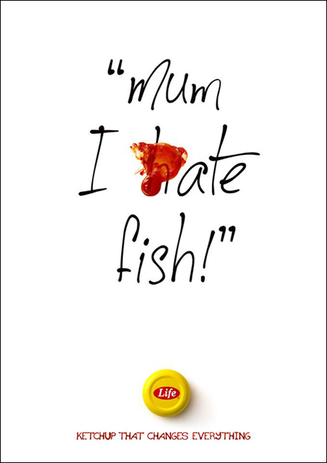
Branding goes beyond the logo. It also transcends the product or service and creates an emotional resonance with the public. Typography assists with creating a brand.
As we move into a digital world, new products or brands are being given the opportunity to shine.
If you’re looking at building a brand which stands out amongst the competition, focus on the role typography plays in creating a deep emotional resonance with your audience.
Designers today work with digital and web technology. This includes video, illustration and social media. However, text-based website content plays an important role in building a relationship with an audience.
Once a video has been played, the audience will interact with the text of a website. In fact, there is probably more text on a website than anything else. As a designer, you can ensure this makes an impact.
Typeface helps to identify a brand
There are many free fonts available online, but if you’re looking at identifying your brand, paid fonts or unique font designs have their place. Companies such as The New York Times and Coca-Cola are immediately recognizable by the fonts they use.
Using a single identifiable font gives your page a clean feel. As a page is not simply made up of headers or titles, you can use other fonts as well. Limiting your number while creating a neat feel to your page helps to create an identifiable brand which is familiar to readers.
Classic brands have used digital imagery to create an online presence. This means that their brands remain easy to identify both online and off. The quality of the design creates a positive experience for online viewers.
What do fonts add to a brand?
Fonts are expressive and give words a visual representation or language. They are also durable because they help to create an identity for a brand that will remain in the minds of the public.
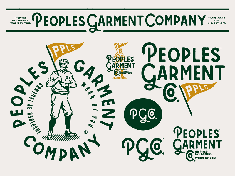
Brands such as Coca-Cola, American Eagle, Apple, Vogue, Disney and Calvin Klein all use distinctive fonts that help to identify their products and communicate their message. It is no wonder companies pay such large quantities of money to have a logo designed.
Through using typography, brands communicate a message. Think of Disney’s typeface logo, which communicates fun, imagination, vibrancy and nostalgia. However, branding goes beyond the typeface used for a logo.
Aligning you’re the typeface on a website with a company’s message helps to add another layer to the brand.
Which typeface should you use?
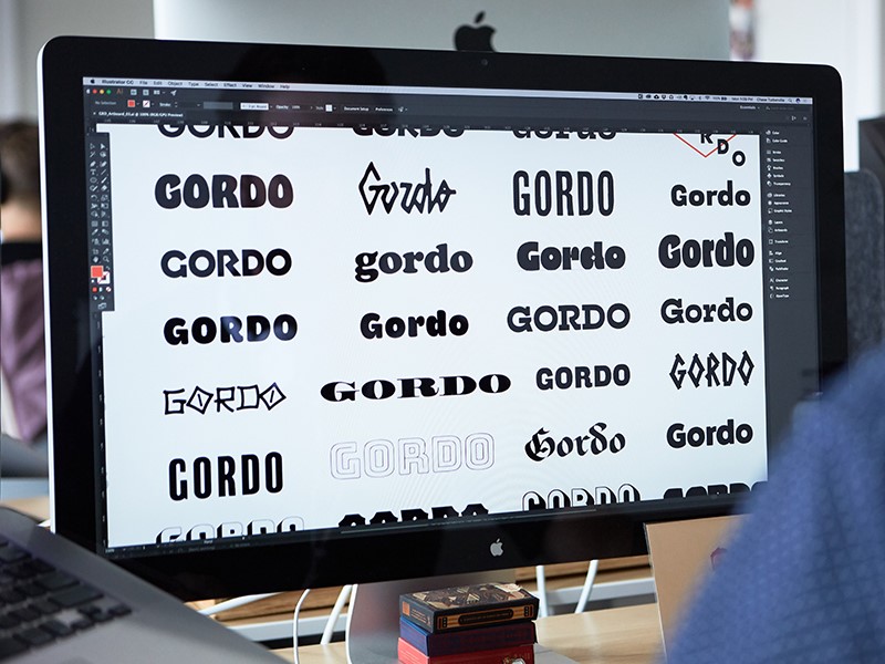
There are a great number of different typeface fonts in the world. Some are wonderful, some terrible, and opinion is sometimes personal. However, there are some basic design principles to take into account when choosing a font.
Body fonts
When selecting your body font choose lettering which is simple and easy to read. Some fonts come with serifs or finishing strokes (serifs) between letters, such as Times New Roman. Others are without these strokes and are sans serifs.
In the printing industry, serifs are often used for text. Online, however, the copy is often sans serif, and fonts like Helvetica are popular choices.
Fonts for headings
When selecting headings, fonts can be dramatic or full of flourish. It should also be bold enough to command attention. Display fonts break up your page, add contrast and direct the user’s attention. You can use fonts which are eccentric, elegant, beautiful or full of flourish.
The font does have to be easy to read, however. This is because headings often give a site user quick insight into the contents of a page. If the font is difficult to read, it will lose its design purpose.
When working with a font, it is often helpful to limit your choice to two options, but vary the weight and height in order to create emphasis or hierarchy within the text. This will help to create a sense of consistency as well as keep your page uncluttered.
When selecting a typeface, take the following into consideration:
Legibility: Does your typeface feel familiar to your readers? Are the letters easily distinguished? Look at the spacing between the typeface. Does it flow, so that readers can follow easily?
Readability: Is it easy to make sense of the text? Each letter should disappear into the background as the reader recognizes the overall shape of the words. This makes the text enjoyable for the reader.
Suitability: Look for a font which is suitable for the product or brand. Apple, for example, uses a slick, clean-lined and modern typeface as a part of its brand. Remember to pick a typeface which fits the purpose of your design as well.
Free versus paid for typeface
Many people use the term typeface and font interchangeably. However, from a technical perspective, typeface refers to the name of the lettering (such as Helvetica or Arial) whereas font refers to the variation within the lettering, such as Bold or Light.
A typeface which is freely available online often comes in only one font. This means it doesn’t come with a variety of weights and styles. This might limit your options as a designer.
Many free fonts are also untested, which means that they do not always look the same across web browsers. This can limit your ability to design your page according to the message you would like to portray.
Quality fonts which have been tested and which are helpful to the design industry are not normally free. There is a range of typefaces which are fairly inexpensive (between $35 and $75) which will give you a range of options and weights in order to create a cohesive and well-designed site.
There are, however, some designers who charge a great deal for their lettering. Determine your client’s budget in order to establish how much you have to spend on a typeface.
Services such as Adobe Typekit are helpful to access fonts across the web. Typekit obtains fonts from different artists, testing them across different browsers to ensure uniformity and quality. Users can obtain typeface from Typekit.
Creative Cloud is a desktop application which enables you to sync fonts available from Typekit onto your computer.
If you’d like to build up a library of font purchases on your own computer, you can use sites such as fonts.com or myfonts.com.
These fonts can be purchased by you for a set fee. If you do choose to purchase your fonts, ensure that everybody who will need access to them will have a license to do so if you’re working in a team. Otherwise, this might exclude certain members of your team from working on a project.
Digitalization adds new options to design
In the past, printing relied on letter setting. When a book or pamphlet was about to go to press, blocks of letters were arranged in a printing press. Lettering options were limited. It was also harder to make changes because this would mean rearranging all of the letters in the typeset.
These days, it is much easier to make changes to a page as you go along. This means making copy easier to read. You can add or subtract headlines and break up the text. You can also try out a number of different lettering styles until you are happy with your design.
How does your font speak to your audience?
Each typeface has its own personality. Some fonts are clean-lined, sleek and modern. Others speak of elegance and heritage. They bring a sense of trustworthiness and reliability.
The personality of your typeface should combine with the message behind a brand in order to send out the correct message. This is particularly true with a logo.
Your design should send out a message or first impression to a potential client or customer. This message will be clear before the client purchases a product.
What meaning will the audience take from it?
A typeface will have to mean to your reader. If a font is familiar, it will often feel as trustworthy as an old friend. This doesn’t mean you have to limit your choices. Instead, consider carefully what your brand is portraying.
Fonts are often related to products we’ve seen in the past and will remind viewers of a range of products, from pickles to candy. Some fonts are associated with ceremony while others with technology or creativity.
When it comes to font, consider the size, weight and height of your typeface as well. This will enable your font to whisper, shout or make a simple, bold statement.
As a designer, you have the ability to use type to create a statement. And to ensure you are putting across the right message.
Understand how your message is received
The choice you make in selecting your font will determine how your readers determine a brand or product. Are you contemporary, innovative, trustworthy or old fashioned?
How you present a brand will determine audience response.
Although some responses are subjective, it is often helpful to determine how an audience sees a design or product before making a final commitment.
Selecting the best choice for a brand often means determining how the audience interprets your design.
Researching or understanding public perceptions of a typeface will help you to establish the meanings you create for a product and the way that your brand speaks to the audience.
Your design should be invisible
If your design is doing its job, your audience shouldn’t notice your typeface. This is because the whole is more than the sum of its parts.
You want your audience to gain an overall impression of a brand which transcends both your design and the product.
This might be one of creativity, honesty, reliability, innovation or even intelligence. This is because it’s the emotional resonance with a brand which motivates a client to make a purchase.
An effective design assists clients to understand a product, organize information, easily digest what is being said and it attracts attention.
This enables the audience to build a story. In effect, a good design is like the backstage work in a theatre which ensures the audience is able to resonate with the production.
Summary
The story we absorb, or the end product we perceive (form) follows a process of careful and practical planning or creation. As designers, we want our work to be attractive.
However, it is the thought and creativity we put into it which will result in the emotional resonance with a brand or product. It is therefore crucial that this is well thought through. Without it, we simply create an attractive image.
Typography, when used with care, can turn a product into a brand which has a deep emotional resonance with its audience.
And by that, it’s usually some kind of CSS experiment, often an elaborate drawing or interaction.
For example, have you seen Lynn Fisher’s extraordinary A Single Div project? Not only are all these graphics drawn in just HTML and CSS, they are all created with (you guessed it) a single <div></div>.
Why would she do that? Here’s one pertinent possibility: it’s none of our business. We’re free to wonder, or even ask if it’s done respectfully enough. But does it really matter? Let’s stop short of assuming she doesn’t know what’s she’s doing, assuming it’s a twisted form of pain, or that she’s unaware of other technologies. Check out the example where she drew the official SVG logo with CSS and a single div. Woke.
I even kinda get it. I wrote a whole book about SVG because I think it’s underused. Are there „CSS drawings” that I think would be better as SVG for a production site meant to last? Sure.
Jeepers creepers that’s something else. I would have guessed GreenSock was behind this at a quick glance. Speaking of, GreenSock has advocated right here on CSS-Tricks some techniques for smart animations. Part of that is breaking animations into parts and stitching them together into larger timelines for maintenance ease and „without getting bogged down by the process.”
So, did Julia Muzafarova do it wrong? Of course not. If there is a wrong way to animate a cartoon hipster on a bike in this world, I don’t wanna live here anymore. It’s 2,100 lines of meticulous positioning, coloring, and animating. Heck, it’ll work in some email clients if you really need to latch onto something „practical.”
Sasha Tran, a UI developer at Apple, shared her story of creating drawings in CSS last year. She drew something new everyday for 20 days during Codevember.
Even if I am not talented in hand illustrations, there is a way to express myself through other mediums. I found that medium to be in HTML and CSS. To level up and get to a point where I could create cute artwork, I focused on two things: the basics, and consistency. Working with basic CSS shapes like rectangles and basic properties like border-radius overtime gave me the muscle memory to progress into more intricate illustrations.
Significantly leveled up in a month and developed better CSS muscle memory. Huh. Speaking of shapes, there are plenty of ways to get tricky with those in CSS!
You could argue that pushing boundaries toward the impractical is what hones our skills for all that other work we have to do.
In today’s quick tutorial you will learn how to create a pussy willow and chick illustration. We will basically create one branch and then turn it into many. We will then make three compositions using these branches. At the end, we will cheer up our illustration by creating a little chick.
This is a quick and easy illustration that is perfect for beginners. To create this image, we will be using basic shapes in Adobe Illustrator and deforming them to create a cute illustration.
After opening Adobe Illustrator, create a new document with 850 x 850 px Width and Height.
Let’s start with the catkin of the willow. Set the fill color as you see in the image below. Now take the Ellipse Tool (L) and create a grey ellipse. Then we will transform this ellipse by going to Effect > Distort and Transform > Roughen. You can play with the options for the rough effect (Size and Detail) to get a result close to the one shown below or whatever you like. Expand this shape (Object > Expand Appearance).
Now create a copy of the rough ellipse in the front (Control-C, Control-F) and shift it to the upper left side. In the image below, the black stroke color of these ellipses is used only for better visibility.
Next, create another copy of the first ellipse in front (Control-C, Control-F) and, while keeping this copy and the shifted one selected, press the Minus Front button on the Pathfinder panel (Window > Pathfinder). This action leaves us with a new crescent shape. Change the color of the crescent shape to a darker grey.
After this, add a light colored ellipse on the top left side to show the volume of the catkin. To finish the catkin, add small yellowish circles of different sizes all over it. It is better to group the whole catkin now, as it will be easier to move it later (right-click > Group).
Step 2
Using the Rounded Rectangle Tool, create a thin, vertical rounded rectangle for the stem. Place the catkins on both sides of the stem. Rotate and change the size of some catkins to get a result similar to the image shown below. Do not place each catkin evenly, but place them more randomly.
Step 3
To make the stem look more realistic and not so perfectly straight, we will roughen its surface by using the Warp Tool. Double-click on the Warp Tool (Shift-R) and enter Width and Height dimensions for the brush of around 20-30 px, Intensity 100% and hit OK. Place the rounded rectangle in front the catkins (Control-C, Control-F), and select it before you use the Warp Tool (Shift-R), otherwise you will affect the other objects surrounding it.
Move your mouse over the stem (as shown in the image) to create the part where the catkin sits on a branch.
In a similar way, create another stem, which should be smaller and should have a different number of catkins. Group each stem (right-click > Group). Later in this tutorial we will combine them in different ways, so it’s important to have at least two different stems.
Step 4
In this step we will create a set of stems, which will be used for the three different compositions. Therefore make a few copies of the large and small stems and combine them.
First, we will select one stem and warp it. Go to Effect > Warp > Arc. For your convenience, select Preview while adjusting the options to get a result you like. In the new dialogue window, select Vertical, Bend -20%, Distortion Horizontal 0%, Vertical 0%, and hit OK. Do the same warping process for each branch, just by varying the Bend percentage.
Expand each branch (Object > Expand Appearance).
2.How to Create the Compositions of Pussy Willow
Step 1
First, let’s create our first composition. Draw a blue circle (use the Ellipse Tool (L) while holding down the Shift key for an even circle).
Add a set of willow branches on the left side of the circle. Now select all of the stems, right-click the mouse, and select Transform > Reflect. This will bring up the Reflect dialogue window, where you should enter Axis Vertical, Angle 90 degrees, and press Copy. Move the copy of the newly created stems to the right. You’ll end up with a composition similar to the one shown below.
Step 2
Now we will create our second composition.
Make another copy of the blue circle created in the previous step, and place a set of pussy willows on the circle as shown in the image below. Notice that the willow is overlapping the sides of the circle.
Next, select the circle and make a copy of it in front of the willows (Control-C, Control-F), cut it off (Control-X), and place it in front of everything (Control-F). To be able to see the willows under the circle, we will remove its fill color and add a black stroke color.
Now, as we want to make the top part of the willows visible, we have to distort the top circle so as to be able to cover the willow on top. Move the handles of the anchor points of this circle by using the Direct Selection Tool (A) to achieve the result you need. You want to place the black stroke color inside the top part of the willow.
After that, select the willow and the front shape, and then go to Object > Clipping Mask > Make (Control-7). This action will cut the part of the willow beyond the blue circle.
Step 3
For the third composition, create a copy of the blue circle again. Place the willow branches around the circle to have a wreath look as shown below.
Step 4
Place all three compositions together.
3.How to Create the Chick
Step 1
We will start by drawing the head of the chick. Using the Ellipse Tool (L), draw an oval. In the image below, you can see which fill color you need. Then go to Effect > Warp > Inflate to shape the head. Enter the options you see below.
For the eyes, create a brown ellipse and add a tiny white circle to brighten up the eye. Place this eye on the left side of the head. While keeping the eye selected, take the Reflect Tool (O). Hold down the Alt key and click in the middle of the head. In the new dialogue window, select Vertical, Angle 90 degrees, and press Copy. You should now have two eyes.
Step 2
Let’s add the chick’s beak. In the middle of the head, add a pink oval and modify it with a warp effect: go to Effect > Warp > Inflate. Select the required options and expand the shape.
Next, select the pink shape, and create a copy behind it (Control-C, Control-B). Using the Direct Selection Tool (A), select the bottom anchor point of the upper copy. Then move this anchor point a little bit upward.
Change the fill color of the bottom copy to a darker color. The beak of our chick is ready!
Step 3
For the chick’s body, add an ellipse below the head and distort it with the warp effect: Effect > Warp > Inflate. After adjusting the options as shown, expand the resulting shape.
Step 4
In this step, we will create the chick’s wing. Start with an ellipse and modify it with the Arc effect (Effect > Warp > Arc). Enter the options shown below. Expand the shape.
Next, add four ellipses that should be slightly rotated to the right, and place them over the deformed ellipse. For better visibility, I added a black stroke color which should not be present in the final image. In the end, group the whole wing (right-click > Group).
Step 5
Put the wing on the left side of the chick’s body. Then make a vertically reflected copy of this wing to get another one. To do so, while keeping the wing selected, right-click your mouse and select Transform > Reflect. Once you get the dialogue box, select Axis Vertical, Angle 90 degrees, and press Copy. Move the new wing to the right.
Step 6
To create the chick’s leg, start with a pink ellipse. Next, use the Direct Selection Tool (A) to select the left and right anchor points and move them up.
Then, create a copy of the shape, place it on the left side, and rotate it to the left. Make another copy and rotate it to the right to get the three toes of the chick’s leg.
Finally, add a fourth copy of the shape, make it smaller, and place it as the fourth toe.
Step 7
Below the chick’s body, add two circles to start creating the legs. Place the foot (which should be grouped together) below the chicken, and slightly rotate it to the left as shown below.
Next, we will add chick’s leg. First, we will delete the fill color and set the stroke color. To do so, hit the double arrow Swap Fill and Stroke (Shift X) in the Tools panel. You should now have the same pink fill color as you had for the toes. Increase the stroke Weight and check Round Cap on the Stroke panel (Window > Stroke). Now, create an arc which will connect the two legs (you should rotate the arc) and place it behind the chick’s body. Move the handles of the arc by using the Direct Selection Tool (A) until you get the necessary result.
Make a vertical copy of the chick’s toes and attach them to the right leg.
Step 8
Place the chick in the middle of the two compositions, as shown below.
4. How to Create the Background
Step 1
Create a blue square with Width and Height of 850 px, send it to the back (Control-X, Control-B), and center it to the artboard. For the alignment, select this square and on the Align panel (Window > Align) from the pop-up menu, choose Align to: Align to Artboard, and hit the Horizontal Align Center and Vertical Align Center buttons.
Step 2
Arrange the created compositions on the background to get the complete image.
Conclusion
Good job! I hope you had fun creating these cute compositions. To make them brighter, you can add some bows. If you want to know how to create such a bow, you can follow the instructions from one of my previous tutorials. You can also add other details if you wish. Just be creative and enjoy the process! See you again in my next tutorial!
In this tutorial I will show you how to create an ornate gold text effect in Adobe Photoshop CC. And as a bonus, you will learn how to create seamless textures.
I know that many readers of Envato Tuts+ are from Indonesia, so I decided to create this tutorial using an Indonesian word. „Mulia” means „noble” in Indonesian, and I think that it works very well with the text effect that we are going to create.
This text effect is part of Epic Metallic Styles 3. The complete pack
has 15 different text effects and works with shapes and text.
pattern and gradient inside the zip file attached to this tutorial (optional)
1. How to Create the Ornamental Pattern
Step 1
Create a new 2000 x 2000 px 300 dpi document and name it Ornamental Pattern.
Step 2
Press Shift-Backspace to open the Fill panel. Choose Color… and set the color to #1a1515.
Step 3
Pick the Brush Tool (B) with these settings:
Brush: Hard Round
Size: 35
Hardness: 100%
Mode: Normal
Opacity: 100%
Flow: 100%
Smoothing: 100% (only available in Adobe Photoshop CC)
Step 4
Press Control-Shift-N to create a new layer. Name it Brush and click on OK. Then go to Window > Brush Settings and use these settings:
Brush: Hard Round
Size: 35 px
Roundness: 100%
Hardness: 100%
Spacing: 1%
Step 5
Now starts the relaxing part (at least for me). With the Brush Tool selected, choose a color that you like and start drawing some abstract curves.
The secret here is to maintain a constant speed with the mouse, and try to maintain the same space between the lines. But it’s OK if you make some lines closer or farther than others; sometimes it looks better this way.
Please do not touch the borders of the document while drawing; we will deal with that later. Don’t worry if you have shaky hands, because the 100% of smoothness on the Brush Tool will help you with that.
Step 6
Continue drawing the lines. If you don´t like the result, press Control-Z and try again. Take your time!
Sometimes you will have to draw some branches. Remember to start the branch precisely from the middle of the previous line, so that your drawing will look smooth and natural.
Step 7
This is what I came up with. You can try to copy, but I don’t recommend that you do that. It’s important that you create your own pattern if you want to learn how to do it.
Step 8
Now we’re going to make this pattern seamless using the Offset filter. This filter can move the corners of the document to the center, making it a lot easier for you to complete the texture in a seamless way.
Go to Filter > Other > Offset… and use these settings:
Horizontal: +956
Vertical: +949
Wrap Around: Checked
Step 9
With the same brush settings that we used before, continue drawing more lines and filling the empty spaces. Remember to not touch the border of the document.
In the next image, you can see how I did it. I changed the color to red, so you can see the new lines.
Step 10
Now turn off the visibility of the background layer, and then go to Edit > Define Pattern and click OK.
Step 11
Now activate the visibility of the background layer again. After that, press Control-R to activate the rulers in Photoshop. Then click on the rulers and drag four margins to the borders of the document.
Step 12
Go to Image > Canvas Size and use the following settings:
Width: 2665 px
Height: 2665 px
Relative: Unchecked
Anchor: Center
Canvas extension color: Other
Color: #1a1515
Step 13
Select the Brush layer and press Shift-Backspace to open the Fill panel. Then choose the following settings:
Contents: Color…
Color: #262626 (any color will do)
Mode: Normal
Opacity: 100%
Preserve Transparency: Unchecked
Step 14
With the Brush layer still selected, set its Fill to 0%. After that, go to Layer > Layer Style > Blending Options and add a Pattern Overlay with these settings:
Blend Mode: Normal
Opacity: 100%
Pattern: Ornamental Pattern.psd (The one we just saved)
Scale: 100%
Link with Layer: Checked
… and click OK.
Note that we have a seamless texture inside the margins, so no matter where you move the pattern overlay, it will always be seamless.
Step 15
Now right-click the Brush layer and choose Rasterize layer. Then go to Layer > Layer Style > Blending Options and add a Color Overlay with these settings:
Blend Mode: Normal
Color: #ff8400
Opacity: 100%
Step 16
Add a Bevel & Emboss with these settings:
Style: Inner Bevel
Technique: Smooth
Depth: 1000%
Direction: Up
Size: 16 px
Soften:0 px
Shading Angle: 20°
Shading Altitude: 26°
Use Global Light: Off
Anti-aliased:On
Highlight Mode: Lighter Color
Highlight Mode Color: #ffd179
Highlight Mode Opacity: 66%
Shadow Mode: Darken
Shadow Mode Color: #1c1505
Shadow Mode Opacity: 100%
Click on the thumbnail of the Gloss Contour to edit it with the following settings:
Point 1: Input: 0% Output: 100% Corner: Off
Point 2: Input: 13% Output: 29% Corner: Off
Point 3:Input: 38% Output: 45% Corner: Off
Point 4: Input: 44% Output: 76% Corner: Off
Point 5:Input: 76% Output: 100% Corner: Off
Point 6: Input: 87% Output: 1% Corner: Off
Point 7: Input: 100% Output: 0% Corner: Off
After that, click OK.
Step 17
Activate the Contour option of Bevel & Emboss with these settings:
Contour: Rolling Slope – Descending
Anti-aliased: On
Range: 74%
Step 18
Add an Outer Glow with these settings:
Blend Mode: Darken
Opacity: 74%
Noise: 0%
Color: #000000
Technique: Softer
Spread: 0%
Size: 59%
Contour: Linear
Anti-aliased: On
Range: 48%
Jitter: 0%
After that, click OK to close the Layer Style panel.
Step 19
Now hold down the Control key and click on both layers (Brush and Background) to select them. Then right-click on any layer and select Convert to Smart Object.
Step 20
Go to Filter > Filter Gallery and add a Plastic Wrap effect with these settings:
Highlight Strength: 4
Detail: 1
Smoothness: 9
Step 21
Now pick the Rectangular Marquee Tool (M) and select a small square.
Step 22
Right-Click on that selected square and select Transform Selection. Then scale up the selection to match the margins that we previously created. It has to be perfectly aligned with the margins.
Step 23
Now pick the Crop Tool (C) and press Enter twice to crop the image. Then go to Edit > Define Pattern and name it Ornamental Pattern Final.
You can close the document after doing that.
Note that we first expanded the document size, and then we contracted it again. That was necessary because we don’t want the layer style being cut by the borders of the document.
2. How to Create the Secondary Pattern (Optional)
You can install the optional pattern (it is inside the zip file) and skip to „3. How to Create the Text Effect” if you don’t want to learn how to create the secondary pattern. The secondary pattern is a radial metallic texture that goes on the top of the ornamental pattern. This texture is optional on the final text effect too.
Step 1
Create a new 980 x 1696 px 300 dpi document with a red background #d11212 and name it Radial Pattern. Then pick the Ellipse Tool (U) and set it to Shape mode.
Step 2
With the Ellipse Tool selected, click on the middle of the document and create a 980 x 980 px ellipse.
Step 3
Press Control-A to select the entire document, and then pick the Move Tool (V) and click on Align Horizontal and Vertical Centers. This will place the ellipse exactly in the center of the document.
Step 4
Turn off the visibility of the Ellipse layer and create a new layer called Noise. After that, press Control-Backspace and fill this layer with the color #797979. This color will help us when we start moving the radial shapes. We don’t want to see any red in the final texture.
Step 5
Go to Filter > Noise > Add Noise and use these settings:
Amount: 400 %
Distribution: Gaussian
Monochromatic: On
Step 6
Go to Filter > Blur > Radial Blur and use these settings:
Amount: 100
Blur Method: Spin
Quality: Best
Step 7
Press Alt-Control-F to apply the same radial blur again. Then Control-Click on the thumbnail of the Ellipse layer to create a selection. After that, press Control-C and Control-V to create a new layer, name this layer Radial, and convert it to a Smart Object. After that, you can delete the noise layer.
Step 8
Control-Click on the thumbnail of the Radial layer to create another selection, and then click on the Add vector mask icon.
Step 9
With the Radial layer selected, go to Layer > Layer Style > Blending Options to open the Layer Style panel. Then add a Color Overlay with these settings:
Step 10
Now add a Gradient Overlay with these settings.
Blend Mode: Color Dodge
Dither: Off
Opacity: 87%
Gradient: Radial gradient (inside the zip file attached to this tutorial)
Reverse: Off
Style: Angle
Align with Layer: On
Angle: -90°
Scale: 100%
To install the gradient file, click on the drop-down menu of the Gradient option, and then click on the little gear icon in the top-right corner and choose Load Gradients…
Step 11
Add a Bevel & Emboss with these settings:
Style: Inner Bevel
Technique: Smooth
Depth: 834%
Direction: Up
Size: 250 px
Soften: 16 px
Use Global Light: Off
Angle: 73°
Altitude: 37°
Anti-aliased: On
Highlight Mode: Color Dodge
Highlight Opacity: 25%
Highlight Color: #ffffff
Shadow Mode: Multiply
Shadow Opacity: 34%
Shadow Color: #000000
Click on the thumbnail of the Gloss Contour to edit it with the following settings:
Point 1: Input: 0% Output: 0% Corner: Off
Point 2: Input: 15% Output: 89% Corner: Off
Point 3: Input: 22% Output: 24% Corner: Off
Point 4: Input: 33% Output: 99% Corner: Off
Point 5: Input: 58% Output: 37% Corner: Off
Point 6: Input: 100% Output: 53% Corner: Off
Step 12
Activate the Contour option of the Bevel & Emboss and use these settings:
Contour: Rolling Slope – Descending
Anti-Aliased: On
Range: 56%
Then click OK to close the Layer Style panel.
Step 13
Go to Image > Adjustments > Curves to add a curve filter with these settings:
Show Amount of: Light (0-255)
Channel: RGB
Point 1: Input: 0% Output: 0%
Point 2: Input: 56% Output: 43%
Point 3: Input: 181% Output: 167%
Point 4: Input: 255% Output: 183%
Step 14
Go to Filter > Sharpen > Sharpen to add a sharpen filter. Then Right-click on the Radial layer and transform it into a Smart Object again.
Step 15
Create four copies of the Radial layer and place one copy in each corner of the document, aligning the center of the ellipses with the corners of the document.
Step 16
Select the first Radial layer and create four more copies, and then move these copies to the back of the original Radial layer. You can change the colors of the layer and group them to make it easier for you to identify the layers.
Step 17
Click on the rulers and drag two margins to the center of the document. Place one copy of the Radial layer on each edge of the document, aligning the center of the ellipses with the margins and the edges of the document. (The small circles in the next image represent the center of the ellipses).
Step 18
Go to Edit > Define Pattern and name it Radial Pattern. After that, you can save and close the document.
3. How to Create the Text Effect
Step 1
Create a new 2160 x 1025 px 300 dpi document with a dark blue background #132125. I’m going to name it Mulia, but you can choose any name you want.
Step 2
Double-click on the Background layer to unlock it. Then pick the Brush Tool (B) with the Soft Round brush and set its size to 2173 px and color to #365861.
Step 3
With the Brush Tool selected, click on the center of the document. Then go to Filter > Noise > Add Noise to apply a noise effect with these settings:
Amount: 1%
Distribution: Gaussian
Monochromatic: On
Step 4
Go to Layer > Layer Style > Blending Options and add a Pattern overlay with these settings:
Blend Mode: Luminosity
Opacity: 5%
Pattern: Ornamental Pattern Final
Scale: 10%
Link with Layer: On
Step 5
Convert the layer to Smart Object, and then go to Filter > Sharpen > Sharpen. After that, go to Window > Adjustments and add a new Gradient Map layer.
Step 6
Double-click on the thumbnail of the Gradient Map layer to open the Properties panel. Then click on the gradient bar to open the Gradient Editor.
Step 7
You can use any color that you like here, but I’m going to make a red background. These squares with small triangles pointing to the gradient bar are called Stops. You can create new Stops by clicking just below the gradient bar. Create a new gradient with these settings:
Stop 1:Location: 0% Color: #020007
Stop 2:Location: 66% Color: #c61717
Stop 3:Location: 100% Color: #ffdbdb
Step 8
Pick the Horizontal Type Tool (T) and set the size of the text to 160 pt. Then choose the font Titania and write your text.
Step 9
Double-click on the text layer to open the Layer Style panel (don’t click on the name or thumbnail of the layer). Add a Pattern Overlay with these settings:
Blend Mode: Normal
Opacity: 100%
Pattern: Ornamental Pattern Final
Scale: 50%
Link with Layer: On
Tip: If you have the Pattern Overlay selected on the Layers panel, you can click on the text and drag to move the texture to a better position.
Step 10
Add a Bevel & Emboss with these settings:
Style: Stroke Emboss
Technique: Smooth
Depth: 100%
Direction: Up
Size: 24 px
Soften: 0 px
Use Global Light: On
Shading Angle: 90°
Altitude: 30°
Anti-Aliased: Off
Highlight Mode: Screen
Highlight Mode Color: #ffffff
Highlight Mode Opacity: 50%
Shadow Mode: Multiply
Shadow Mode Color: #000000
Shadow Mode Opacity: 50%
Click on the Gloss Contour and create a new contour with these settings:
Point 1: Input: 0% Output: 0% Corner: On
Point 2: Input: 46% Output: 69% Corner: On
Point 3: Input: 50% Output: 0% Corner: On
Point 4: Input: 94% Output: 73% Corner: On
Point 5: Input: 100% Output: 0% Corner: On
Step 11
Add a Stroke with these settings:
Size: 28 px
Position: Center
Blend Mode: Normal
Opacity: 100%
Overprint: Off
Fill Type: Pattern
Pattern: Ornamental Pattern Final
Scale: 25%
Link with Layer: On
Step 12
Add an Inner Shadow with these settings:
Blend Mode: Color Dodge
Color: #ffffff
Opacity: 96%
Use Global Light: Off
Angle: 0°
Distance: 18 px
Choke: 28 %
Size: 6 px
Contour: Choose Linear, then move the second point to Input 100% and output 71 %
Anti-Aliased: Off
Noise: 0%
Step 13
Add an Inner Glow with these settings:
Blend Mode: Darken
Opacity: 69%
Noise: 0%
Color: #000000
Technique: Precise
Source: Edge
Choke: 66%
Size: 21 px
Contour: Linear
Anti-aliased: On
Range: 55%
Jitter: 0%
Step 14
Add a Drop Shadow with these settings:
Blend Mode: Normal
Color: #000000
Opacity: 57%
Use Global Light: Off
Angle: 0°
Distance: 27 px
Spread: 33%
Size: 16 px
Contour: Linear
Anti-aliased: Off
Noise: 0%
Layer Knocks Out Drop Shadow: On
After that, click OK.
Step 15
Create a copy of the text layer and name it Mulia TOP, and then right-click on it and choose Clear Layer Style.
Step 16 (Optional)
This step adds a very subtle effect to the text, and sometimes the text looks better without it.
Double click on the Mulia TOP layer to open the Layer Style panel. Then add a Pattern Overlay with these settings:
Blend Mode: Overlay
Opacity: 100%
Pattern: Radial Pattern (you can move this texture just like the first one)
Scale: 25%
Link with Layer: On
Step 17
Add a Bevel & Emboss with these settings:
Style: Inner Bevel
Technique: Smooth
Depth: 240 %
Direction: Up
Size: 68 px
Soften: 0 px
Use Global Light: Off
Shading Angle: 90°
Altitude: 37°
Anti-aliased: On
Highlight Mode: Lighter Color
Highlight Color: #ffdb95
Highlight Opacity: 7%
Shadow Mode: Darken
Shadow Color: #000000
Shadow Opacity: 26%
Click on the Gloss Contour and edit the contour with these settings:
Point 1: Input: 0% Output: 9% Corner: Off
Point 2: Input: 35% Output: 25% Corner: Off
Point 3: Input: 52% Output: 23% Corner: Off
Point 4: Input: 60% Output: 97% Corner: Off
Point 5: Input: 100% Output: 0% Corner: Off
Step 18
Add a Stroke with these settings:
Size: 24 px
Position: Center
Blend Mode: Normal
Opacity: 0%
Overprint: Off
Fill Type: Any type
Color: Any color
This Stroke effect is here just to show the Stroke from the first layer; that’s why the Fill type and Color don’t matter. Note that the Opacity is set to 0%.
Step 19
Add an Outer Glow with these settings:
Blend Mode: Normal
Opacity: 100%
Noise: 0%
Color:#1a1a1d
Technique: Softer
Spread: 90%
Size: 14 px
Contour: Linear
Anti-aliased: On
Range: 100%
Jitter: 0%
Step 20
Add a Drop Shadow with these settings:
Blend Mode: Normal
Color: #0c0b0c
Opacity: 100%
Use Global Light: Off
Angle: 0°
Distance: 8 px
Spread: 100%
Size: 14 px
Contour: Linear
Anti-aliased: Off
Noise: 0%
Layer Knocks Out Drop Shadow: On
After that, click on OK.
Step 21
We’re almost done; it just needs a few tweaks. Select both text layers and convert them to one Smart Object. Then press Control-T and resize it to 55%.
Step 22
Go to Filter > Sharpen > Sharpen. Then Double-click on the text layer to open the Layer Style panel. Add a Drop Shadow with these settings:
Blend Mode: Normal
Color:#000000
Opacity: 23%
Use Global Light: Off
Angle: -1%
Distance: 21%
Spread: 8 %
Size: 6 px
Contour: Linear
Anti-aliased: Off
Noise: 0%
Layer Knocks Out Drop Shadow: On
Step 23
Create a new layer and set its mode to Screen. Then pick the Brush Tool (B) and select the Soft Round brush with a size of 473 px.
Select the color #120202 and start clicking on the text to add some lights to it. The small circles in the next image represent where I clicked.
Step 24
Create another layer and leave the layer mode as normal. Then change the brush size to 213 px and color to #170c00.
Start clicking on the text to add more lights (it will look ugly, but don’t worry).
Step 25
Change the Fill of the second light layer to 0%. Then Double-Click on the layer to open the Layer Style panel and add a Color Overlay with these settings:
Blend Mode: Screen
Color: #390300
Opacity: 41%
After that, click on OK.
You just learned two ways to add a simple light effect to the image. The first option is faster, and the second one gives you more control over the effect.
Step 26
Now we need to add a shadow to the bottom of the text. Create a new layer and name it Simple Shadow, and then move this layer on the layer panel and place it below the text.
After that, pick the Ellipse Tool (U) and set the color to black #000000. Then click below the start of the first letter and drag the mouse to the end of the last letter, drawing a very elongated oval shape below the text.
Step 27
Convert the Simple Shadow layer to a Smart Object. Then go to Filter > Blur > Gaussian Blur and add a blur with 6.4 px. After that, change the layer Opacity to 55%.
And We’re Done!
In this tutorial, you learned how to create seamless textures using the Offset filter.
You also learned that increasing the size of the document can help you when you want to add continuity to the layer
style effect, avoiding layer styles being „ended” by the borders. You also learned how to use textures with layer styles and complement that with another layer.
If
you completed the second part of this tutorial, you may have noticed
how good smart objects are for performance. You can try to repeat those steps using groups instead of smart objects, and you’ll see that your
computer will soon become slow.
Remember that this text effect is completely editable.
This one uses the Radial pattern as the stroke:
To change the text color, I recommend opening the text smart object and adding some Color Overlays or Gradient Map layers with Layer Masks.
I hope that you’ve learned something useful with this tutorial!
Dave Rupert shows us all how to animate radial progress bars in SVG with a tiny script alongside the stroke-dasharray and stroke-dashoffset properties:
For a client project we tasked ourselves with building out one of those cool radial progress bars. In the past, we’ve used entire Canvas-based charting libraries (156k/44k gzip), but that seemed like overkill. I looked at Airbnb’s Lottie project where you export After Effects animations as JSON. This is cool for complex animations, but the dependencies seemed heavy (248k/56k gzip) for one micro-animation.
Per the usual, I tried my hand at a minimal custom SVG with CSS animation and a small bit of JavaScript (~223b gzip). I’m pleased with the results.
Here’s another example Jeremias Menichelli posted here on CSS-Tricks with the added twist of making them components in React and Vue.
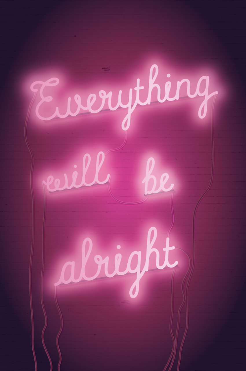
Everyone needs a bit of optimism in their lives, and this neon sign poster is the perfect pick-me-up. Pop it on the office noticeboard, set it as your phone background, or share it on social media to spread the good vibes.
We’ll create the poster layout in Adobe InDesign and prepare the design for either printing or online circulation. This is a great all-round introduction to graphic poster design for beginners.
1.How to Prepare Your InDesign Document for Designing
Step 1
Open InDesign and go to File > New > Document.
With the Intent set to Print, deselect Facing Pages.
Set the Width of the page to 24 in and Height to 36 in. Keep the Margins to their default width, and add a Bleed of 0.25 in to all edges of the page. Then click OK.
Step 2
Expand the Layers panel (Window > Layers). Double-click on Layer 1 to rename the layer Brick, and click OK.
Choose New Layer from the panel’s top-right menu. Name this second layer Wires and click OK. Create a further two new layers: Backs and then Neon.
Lock all layers except the bottom layer, Brick.
Step 3
Expand the Swatches panel (Window > Color > Swatches). Choose New Color Swatch from the panel’s top-right menu.
Name the swatch Deep Pink, and set the Color Type to Process and Color Mode to CMYK. Set the levels below to C=10 M=100 Y=0 K=16. Click Add, and then OK.
Repeat the process to create five more new CMYK swatches, with the following names and values:
Hot Pink: C=10 M=100 Y=0 K=0
Pale Pink: C=5 M=12 Y=0 K=0
Shadow: C=88 M=95 Y=50 K=74
Dark Pink: C=10 M=100 Y=0 K=38
Maroon: C=39 M=97 Y=40 K=55
2. How to Create a Brick Backdrop for Your Poster
Step 1
Working on the Brick layer, use the Rectangle Frame Tool (F) to create an image frame over the top half of the page, extending the edge up to the bleed.
Go to File > Place, navigate to the brick wall image you downloaded earlier, and Open.
Allow the brick texture to fill the frame completely.
Select the image frame and Edit > Copy, Edit > Paste. On the copy, Right-Click > Transform > Flip Vertical.
Move the copy below, covering the bottom half of the page and creating a solid brick texture across the whole page.
Step 2
In the Swatches panel, click on New Gradient Swatch in the panel’s drop-down menu.
Name the swatch Background Pink Gradient, set the Type to Radial, and choose Swatches from the Stop Color menu.
On the Gradient Ramp, set the left-hand stop to Deep Pink and the right-hand stop to Shadow. Click on the ramp to add a third stop in the center, setting this to Maroon.
Step 3
Use the Rectangle Tool (M) to create a shape across the whole page, setting the Fill (from the Swatches panel) to Background Pink Gradient.
With the rectangle selected, head up to Object on the main menu, and Effects > Transparency. Set the Mode to Multiply and reduce the Opacity to 90%, before clicking OK.
3. How to Create Neon Type on Your Layout
Step 1
Lock the Brick layer and unlock the top layer, Neon.
Use the Line Tool (\) to draw a slightly diagonal line across the top half of the page, as shown below.
Step 2
Select the Type on a Path Tool (Shift-T) and click once on the left side of the line, to transform it into a text path.
Type in ‘Everything’. Highlight the text and, from either the top Controls panel or the Character panel (Window > Type & Tables > Character), set the Font to Balham to Brooklyn and Font Size to 450 pt.
Step 3
Switch to the Selection Tool (V, Escape) and select the line. From the Swatches panel, set the Stroke Color to [None].
Switch back to the Type Tool (T), highlight the text, and set the Font Color to Hot Pink.
Step 4
With the line selected, head up to Object > Effects > Outer Glow.
Click on the colored square next to the Mode menu, and choose Hot Pink for the Effect Color.
Set the Opacity of the glow to 80% and Spread to around 40%, before clicking OK.
Step 5
Select the line and Edit > Copy, Edit > Paste, moving the copy below. Adjust the text to read ‘will’ and reduce the Font Size a little.
Edit > Paste the line again, editing this text to read ‘be’ and moving it over to the bottom-right of ‘will’, as shown below.
Paste again, moving this copy to the bottom of the group, and adjusting the text to read ‘alright’. Increase the Font Size a little.
Step 6
Select all four text lines and Right-Click > Group.
With the group selected, Edit > Copy and Edit > Paste in Place.
Adjust the Font Color of this pasted group to Pale Pink.
Step 7
With the pasted Pale Pink group selected, go to Object > Effects > Transparency. Set the Mode to Screen and Opacity to 70%.
Click on Drop Shadow in the menu’s left-hand menu. Set the Effect Color to Hot Pink and pull down the Opacity to around 40%.
Click on Outer Glow in the left-hand menu. Set the Effect Color to Pale Pink and bring the Opacity down to around 65%.
Finally, click on Gradient Feather at the bottom of the menu. Set the Type to Radial, and click OK to exit the window.
Step 8
Edit > Paste in Place to drop another group of text lines onto the page. We’ll use this copy as a highlight, to give the text effect some extra glow.
Set the Mode to Screen and bring the Opacity down to 50%.
Click on Outer Glow in the panel’s menu, and set the Effect Color to Pale Pink. Set the Opacity to around 55%, add about 10% Noise, and set the Spread to 40%.
Click OK to exit.
4. How to Add Wires and Backs to Your Neon Sign
To make your sign look more realistic, we can add trailing wires and ‘backs’ behind the words.
Step 1
Lock the Neon layer and unlock the Wires layer.
Use the Pencil Tool (N) to draw an imperfect line from the edge of the ‘a’ of ‘alright’ down past the bottom edge of the page.
Use the Smooth Tool to stroke over the line, smoothing out any jaunty edges to the line.
From the Stroke panel (Window > Stroke), set the Weight of the line to 12 pt.
Then adjust the Stroke Color of the line to Maroon.
Step 2
Use the Pencil Tool (N) to draw more lines leading from the outlying edges of each word, trailing down to the bottom of the page. Repeat the same Stroke Weight and Color as described in the step above.
Add a few looped lines between the words in the center of the layout, setting the Stroke Color to Dark Pink, to indicate the increased amount of light at the center of the poster.
Select all the pencil-drawn ‘wires’ on the poster, and go to Object > Effects > Drop Shadow.
Set the Effect Color to Hot Pink, bring the Opacity down to around 65%, and add about 20% Noise.
Click on Inner Glow, and set the Opacity to around 40%. Then click OK.
Step 3
Lock the Wires layer and unlock the Backs layer above.
Use the Line Tool (\) to create a line under the baseline of the top word, ‘Everything’. Set the Stroke Color of the line to Shadow and set the Weight (from the Stroke panel) to 11 pt.
Edit > Copy, Edit > Paste the line, shortening it to fit under ‘will’. Repeat two more times, placing copies of the line under ‘be’ and ‘alright’.
Step 4
Select all four lines sitting under the words, and go to Object > Effects > Drop Shadow.
Set the Effect Color to Dark Pink, Opacity to 75%, Spread to 27% and Noise to 15%.
Click OK to exit the window. Then step back and admire your hard work!
With your artwork now finished, you can export your poster to a print- or online-friendly format. Go to File > Export, and choose Adobe PDF (Print) from the Format menu for a press-ready file. To share your poster online, choose PNG, JPEG or Adobe PDF (Interactive) from the Format options.
Conclusion
Your neon sign poster is finished—great job!
In this tutorial we’ve covered a wide range of skills for creating poster work and special typographic effects. You now know how to:
Create a moody gradient backdrop for your posters.
Format advanced neon text effects by building up layers of type.
Create a ‘lit-up’ effect by adjusting glows, gradients, transparencies, and shadows.
Add extra photorealistic details, like wires and backs, using InDesign’s drawing tools.
If you’re on the hunt for more poster designs, a poster template is a quick and easy-to-edit alternative. You can find tons of fantastic event, infographic and motivational posters over on GraphicRiver and Envato Elements.
Looking for more poster tutorials? Make sure to check these out:
2018 marks a hundred years since women won the right to vote in Britain, due to the remarkable efforts of the suffragist movement. This poster design takes…
Tackle a fun photo manipulation inspired by old Western wanted posters. In this tutorial, I’ll show you how to create the poster design itself before nailing…
Whether you’re planning to host your own festival event or looking for inspiration to help with a design project, these top design tips will help you create…
When I saw Chris’ article on notched boxes, I remembered that I got a challenge a while ago to CSS a design like the one below in a cross-browser manner:
What the challenge looked like.
It looks pretty similar to the concept of notched boxes, except the corners are now scooped and we only have to worry about one corner per box. So let’s see how we can do it, how we can expand the technique to multiple corners, what issues we run into and how we can get around them with or without making browser support compromises.
The initial idea: box-shadow!
We start with a box element:
<div class='box'></div>
We can give this some dimensions or let its dimensions be decided by the content—it doesn’t really matter. For simplicity, we’re just setting a max-width and a min-height on it. We’re also giving it an outline so we can see its boundaries.
Next, we absolutely position a square ::before pseudo-element whose edge length is equal to the diameter (or twice the radius $r) of the scoop in the corner. We also give this pseudo-element a reddish box-shadow and a dummy background (that we’ll remove later) just so that we can see it better:
$r: 2em;

.box {
  position: relative;
  /* same styles as before */

  &:before {
    position: absolute;
    padding: $r;
    box-shadow: 0 0 7px #b53;
    background: #95a;
    content: ''
  }
}
Well, it doesn’t look too exciting… yet! So let’s move on and make this square a disc by setting border-radius: 50% on it and give it a negative margin equal to its radius $r, so that its central point coincides with the (0,0) point (top left corner) of its parent box. We also set overflow: hidden on the parent box, so that whatever of this pseudo-element is outside the .box gets cut out.
$r: 2em;

.box {
  overflow: hidden;
  /* same styles as before */

  &:before {
    /* same styles as before */
    margin: -$r;
    border-radius: 50%
  }
}
Now we’re starting to see the shape we’ve been aiming for:
But it’s still not quite what we want. In order to get there, we use the fourth length value for the box-shadow property: the spread radius. If you need a refresher on how box-shadow works with these four values, you can check out the interactive demo below:
You may have already guessed what we do next. We remove the dummy background, we zero the first three box-shadow values (the x and y offsets and the blur radius) and use a pretty big number for the last one (the spread radius):
box-shadow: 0 0 0 300px;
The interactive demo below shows how increasing the spread radius makes it cover up more and more of its parent .box:
So, the trick here is having a spread radius sufficiently large so that it covers the rest of the parent element. The cool thing about this is that we can make the box-shadow semi-transparent or have rounded corners on the parent .box:
.box {
  /* same styles as before */
  border-radius: 1em;

  &:before {
    /* same styles as before */
    box-shadow: 0 0 0 300px rgba(#95a, .75);
  }
}
Of course, just like Chris pointed out in the article on notched boxes, we can make the scoop radius a CSS variable and then easily modify that from the JavaScript. Then everything updates nicely, even with text content in our box:
:root { --r: 50px }

.box {
  /* same styles as before */
  padding: var(--r);

  &:before {
    /* same styles as before */
    margin: calc(-1*var(--r));
    padding: inherit;
}
Note that when we also have text content, we need to set a negative z-index on the ::before pseudo-element and explicitly position it in the corner as we now also have a padding on the .box to compensate for the scoop.
.box {
  /* same styles as before */

  &:before {
    /* same styles as before */
    z-index: -1;
    top: 0;
    left: 0
}
Now, let’s move further and see how we can apply this concept in order to reproduce the design I showed at the beginning. In this particular case, the central points of the pseudo-element discs don’t coincide with box corners, but are outside, in the middle of the space in between boxes.
The structure used is pretty straightforward, just a <header> element followed by four <article> elements I’ve generated in a Pug loop:
while n--
  article
    h3 #{data[n].name}
    section
      p #{data[n].quote}
      a(href='#') go
We use a wrapping flexbox layout on the <body> with the <header> really wide and with one or two <article> elements on each row, depending on how wide the viewport is.
Landscape (left) vs. portrait (right) mode.
If we have a single <article> on each row, we don’t have scooped corners, so their radius is 0px. Otherwise, we give this radius --r a non-zero value.
$min-w: 15rem; /* min width of an article element */
$m: 1rem; /* margin of such an element */

html { --r: 0px; }

article {
  margin: $m;
  min-width: $min-w;
  width: 21em;
}

@media (min-width: 2*($min-w + 2*$m) /* enough for 2 per row */) {
  html { --r: 4rem; }

  article { width: 40%; }
}
Let’s now consider just the situation when we have two <article> elements per row (and of course a scooped corner for each because that’s what’s of interest to us).
In the case of the first one, we start with the leftmost limit of the disc along the right edge of its parent. That’s left: 100% so far. To move the x coordinate of the disc’s central point on the right edge of its parent, we subtract the disc’s radius, which brings us to left: calc(100% - var(--r)). But we don’t want it on the right edge, we want it offset to the right by the <article> margin $m, which brings us to the final value:
Along the y axis, we start with the topmost limit of the disc along the bottom edge of its parent—that’s top: 100%. To put the disc’s central point on the bottom edge of the parent box, we move it up by one radius, which gives us top: calc(100% - var(--r)). Finally, we want this central point to be $m below the parent’s bottom edge, which gives us the final vertical offset of:
Horizontally however, we start with the disc’s left limit being along its parent’s left edge—that’s left: 0%. To put the disc’s central point on its parent’s left edge, we move it left by a radius --r, thus getting left: calc(0% - var(--r)). However, the final position is $m to the left of the parent’s left edge:
Vertically, we start with the disc’s top limit along the top edge of its parent—that’s top: 0%. To put the disc’s central point on the parent’s top edge, we move it up by a radius --r, thus getting top: calc(0% - var(--r)). But we want to have it $m above the parent’s top edge, so the final top offset is:
For the final one (second on the last row), we have the same horizontal offset as in the case of the one above it and the same vertical offset as for the one to its left on the same row.
This means the positions of the central points of the discs depend on the gap in between our <article> elements (this gap is twice the margin: $m we set on them), on the disc radius r and on a couple of horizontal and vertical multipliers (--i and --j respectively). Both these multipliers are initially -1.
For the first two <article> elements (on the first row of the 2x2 grid), we change the vertical multiplier --j to 1 because we want the y coordinate of the discs’ central points to be below the bottom edge, while for the odd ones (on the first column), we change the horizontal multiplier --i to 1 because we want the x coordinate to be to the right of the right edge.
html { --i: -1; --j: -1 } /* multipliers initially set to -1 */

h3, section {
  &:before {
    /* set generic offsets */
    top:  calc((1 + var(--j))*50% - var(--r) + var(--j)*#{$m});
    left: calc((1 + var(--i))*50% - var(--r) + var(--i)*#{$m});
  }
}

@media (min-width: 2*($min-w + 2*$m)) {
  article {
    /* change vertical multiplier for first two (on 1st row of 2x2 grid) */
    &:nth-of-type(-n + 2) { --j: 1 }

    /* change horizontal multiplier for odd ones (on 1st column) */
    &:nth-of-type(odd) { --i: 1 }
}
Note that we only have visible disc cutouts on the <section> element for the first two <article> elements and only on the <h3> for the last two. So for the first two <article> elements, the radius --r on the heading’s ::before pseudo-element is 0, while for the last two, this radius is 0 for the section’s ::before pseudo:
The above demo works in current versions of all major browsers and, if we can do with some repetition instead of using CSS variables, we can extend support all the way back to IE9.
Potential issues with the above method
While this was a quick and easy cross-browser way to get the desired result in this particular case, we may not always be so lucky with this approach.
First off, we need a pseudo-element for each scooped corner, so if we want this effect for all corners, we need to bring in an extra element. Sad panda.
Secondly, we may not always want a solid background. We may want a semi-transparent one (which becomes a pain to get if we want to have more than one scooped corner), a gradient one (while we can emulate some radial gradients with box-shadow, it’s a less than ideal solution) or even an image background (hardly doable with the only solution being to use mix-blend-mode which cuts out Edge support without an elegant fallback).
And how about really large boxes for which the spread we’ve set is not enough? Ugh.
So, let’s explore other, more reliable approaches with various degrees of browser support.
Flexibility and good browser support? SVG it!
This is probably no surprise, but the full SVG solution fares best if we want something flexible and reliably cross-browser today. It’s a solution that involves using an SVG element before the content of our box. This SVG contains a <circle> on which we’ve set a radius r attribute.
<div class='box'>
  <svg>
    <circle r='50'/>
  </svg>
  TEXT CONTENT OF BOX GOES HERE
</div>
We absolutely position this SVG within the box and size it such that it fully covers its parent:
Alright, but what we’ve done here is create circles in the corners and what we actually want is… the exact opposite! What we do next is put these circles within a <mask>, on top of a white, full-size (covering the whole SVG) rectangle and then we use this mask on another full size rectangle:
If we have text, we need to adapt the box padding to our corner radius, setting the it to the same value as we’ve set the radius of the SVG circle, using JavaScript to keep them in sync:
Of course, the fill of our background rectangle doesn’t need to be a solid one. It may well be semi-transparent (as it is in the demo above), or we can use an SVG gradient or pattern for it. The latter would also allow us to use one or more background images.
Well, glad you asked! There are a number of things we can do here to shift the weight of the masking method from SVG to CSS.
Sadly, none of these is cross-browser, but they simplify things and they’re definitely something to keep a watch for in the near or more distant future.
Use CSS masking on HTML elements instead
What we do here is remove everything outside the mask from the SVG. Then, from the CSS, we set a background (which can be semi-transparent, a CSS gradient, an image, a combination of multiple backgrounds… anything that CSS has to offer) and the mask property on the .box element:
.box {
  /* any kind of background we wish */
  mask: url(#m);
}
Note that setting an inline SVG mask on an HTML element only works in Firefox for now!
Version using CSS masking directly on our .box (live demo, Firefox only).
Set the circle radius from the CSS
This means removing the r attribute from our <circle> and setting it in the CSS to the same variable as the box padding:
This way, when we change the value of --r, both the scoop radius and the padding around the .box content get updated!
Note that setting geometry properties for SVG elements from the CSS only works in Blink browsers for now!
Version using a CSS variable for the <circle> radius (live demo, Blink only).
Combine the previous two methods
While this would be cool, it’s sadly not possible in practice in any browser at the moment. But the good news is we can do even better than that!
Use CSS gradients for masking
Note that CSS masking on HTML elements doesn’t work at all in Edge at this point, though it’s listed as „In Development” and a flag for it (that doesn’t do anything for now) has already shown up in about:flags.
We ditch the SVG part completely and start building our CSS gradient mask. We create the circles at the corners using radial gradients. The following CSS creates a circle of radius --r in the top left corner of a box:
.box {
  /* same as before */
  /* any CSS background we wish */
  mask: radial-gradient(circle at 0 0, #000 var(--r, 50px), transparent 0);
}
Note that WebKit browsers still need the -webkit- prefix for the mask properties.
We then add the circles at the other corners:
$grad-list: radial-gradient(circle at   0    0 , #000 var(--r, 50px), transparent 0),
            radial-gradient(circle at 100%   0 , #000 var(--r, 50px), transparent 0),
            radial-gradient(circle at   0  100%, #000 var(--r, 50px), transparent 0),
            radial-gradient(circle at 100% 100%, #000 var(--r, 50px), transparent 0);
.box {
  /* same as before */
  /* any CSS background we wish */
  mask: $grad-list
}
That’s insanely repetitive, either a lot of writing or a lot of copy-pasting, so let’s see what we can do about that.
First off, we use a CSS variable for the stop list. This eliminates repetition in the generated CSS.
$grad-list: radial-gradient(circle at   0    0 , var(--stop-list)),
            radial-gradient(circle at 100%   0 , var(--stop-list)),
            radial-gradient(circle at   0  100%, var(--stop-list)),
            radial-gradient(circle at 100% 100%, var(--stop-list));

.box {
  /* same as before */
  /* any CSS background we wish */
  --stop-list: #000 var(--r, 50px), transparent 0;
  mask: $grad-list;
}
But it’s still not much better, so let’s generate the corners within a loop:
$grad-list: ();

@for $i from 0 to 4 {
  $grad-list: $grad-list,
    radial-gradient(circle at ($i%2)*100% floor($i/2)*100%, var(--stop-list));
}

.box {
  /* same as before */
  /* any CSS background we wish */
  --stop-list: #000 var(--r, 50px), transparent 0;
  mask: $grad-list;
}
Much better as far as the code goes because now we don’t have to write anything multiple times and run the risk of not updating everywhere later. But the result so far isn’t what we were going for:
Result of the code above (live demo, no Edge support for now).
Here, we’re cutting out everything but the corners, which is the opposite of what we want.
One thing we can do is reverse the gradients, make the corner circles transparent and the rest black with:
--stop-list: transparent var(--r, 50px), #000 0;
This does the trick when we use just one gradient for just one corner:
Result when using just one gradient (live demo, no Edge support for now).
However, when we stack up all four of them (or just even two), we get a black rectangle the size of our box for the mask, which means nothing actually gets masked out anymore.
Layering mask gradients (live demo, no Edge support for now).
So, we restrict each of these gradients to a quarter of our box – 50% of the width and 50% of the height, thus getting 25% (a quarter) of the area for each:
This means we also need to set a mask-size of 50% 50%, a mask-repeat of no-repeat, and position each mask-image into the desired corner:
$grad-list: ();

@for $i from 0 to 4 {
  $x: ($i%2)*100%;
  $y: floor($i/2)*100%;
  $grad-list: $grad-list
              radial-gradient(circle at $x $y, var(--stop-list)) /* mask image */
              $x $y; /* mask position */
}

.box {
  /* same as before */
  /* any CSS background we wish */
  --stop-list: transparent var(--r, 50px), #000 0;
  mask: $grad-list;
  mask-size: 50% 50%;
  mask-repeat: no-repeat;
}
Note that WebKit browsers still need the -webkit- prefix for mask properties.
But the big problem here is… the problem with division and rounding in general—our four quarters put together don’t always manage to make up a whole again, so we end up with gaps in between them.
Sadly, we may get gaps in between the four quarters (live demo).
Oh well, it’s not like we can’t cover up those gaps with thin linear-gradient() strips or increase the mask-size to let’s say 51%:
Increasing the mask-size for each gradient layer fixes the problem of gaps (live demo).
But isn’t there a more elegant way?
Well, there’s a mask-composite property that can help us if we set it to intersect when reverting back to the full size gradient layers.
$grad-list: ();

@for $i from 0 to 4 {
  $grad-list: $grad-list,
              radial-gradient(circle at ($i%2)*100% floor($i/2)*100%, var(--stop-list));
}

.box {
  /* same as before */
  /* any CSS background we wish */
  --stop-list: transparent var(--r, 50px), #000 0;
  mask: $grad-list;
  mask-composite: exclude;
}
This is extremely cool because it’s a pure CSS, no SVG solution, but the not-so-good news is that support is limited to Firefox 53+ here.
Result using mask-composite: intersect (live demo).
However, it’s still better than support for the final option we have when it comes to scooped corners.
The corner-shape option
Lea Verou came up with this idea some five years ago and even created a preview page for it. Sadly, not only is it not implemented by any browser yet, but the spec hasn’t advanced much in the meanwhile. It’s still something to keep in mind for the future, as it offers a lot of flexibility with very little code – recreating our effect would only require the following:
There have long been multiple implementations of Sass. Most notably, the canonical Ruby version, now at 3.5.6. Then there is LibSass, the C++ version, which is at version 3.4 and…
Current LibSass 3.4 should be compatible with Sass 3.4.
LibSass is notable because it powers the majority of Sass ports. Over 30 of them, apparently, including the most popular one: node-sass, which provides Sass for the bajillion projects out there that wanna run an npm-y JavaScript-based dev environment and avoid the Ruby dependency.
It’s a little unfortunate LibSass isn’t up-to-date with current canonical Sass, but I think it’s on freeze as it’s been stated that LibSass will never be canonical Sass. Update: it’s not on freeze. It was actually Ruby Sass that was once on freeze with the intention of allowing LibSass to catch up. As I write, LibSass is at 3.5.2, so it’s close.
Dart Sass just went 1.0.0, and is now 100% compatible with Ruby Sass 3.5.6. They announced that Ruby Sass has now begun deprecation and—after March 26th, 2019—will no longer be maintained.
The future of Dart Sass looks pretty good:
Another big announcement: as of today, I'm working full-time on @SassCSS. This has been a goal for my entire career and I'm thrilled that it's finally happening
The Dart Sass compatibility is also great, because node-sass can now switch to Dart Sass bindings and become entirely up to date. Will it? I have no idea. The maintainer of LibSass and node-sass is the same person (Michael Mifsud), and with 30+ bindings to LibSass, I can’t imagine LibSass just going away. I guess we’ll just have to wait and see a while. I gotta imagine someone will jump on making a node version of Dart Sass one way or another.
I, for one, would love to see a Web Worker version.