1 HTML Element + 5 CSS Properties = Magic!

Post pobrano z: 1 HTML Element + 5 CSS Properties = Magic!

Let’s say I told you we can get the results below with just one HTML element and five CSS properties for each. No SVG, no images (save for the background on the root that’s there just to make clear that our one HTML element has some transparent parts), no JavaScript. What would you think that involves?

Screenshots. On the left, a screenshot of equal radial slices of a pie with transparent slices (gaps) in between them. The whole assembly has a top to bottom gradient (orange to purple). On the right, the XOR operation between what we have on the left and a bunch of concentric ripples. Again, the whole assembly has the same top to bottom gradient.
The desired results.

Well, this article is going to explain just how to do this and then also show how to make things fun by adding in some animation.

CSS-ing the Gradient Rays

The HTML is just one <div>.

<div class='rays'></div>

In the CSS, we need to set the dimensions of this element and we need to give it a background so that we can see it. We also make it circular using border-radius:

.rays {
  width: 80vmin; height: 80vmin;
  border-radius: 50%;
  background: linear-gradient(#b53, #f90);
}

And… we’ve already used up four out of five properties to get the result below:

See the Pen by thebabydino (@thebabydino) on CodePen.

So what’s the fifth? mask with a repeating-conic-gradient() value!

Let’s say we want to have 20 rays. This means we need to allocate $p: 100%/20 of the full circle for a ray and the gap after it.

Illustration. Shows how we slice the disc to divide it into equal rays and gaps.
Dividing the disc into rays and gaps (live).

Here we keep the gaps in between rays equal to the rays (so that’s .5*$p for either a ray or a space), but we can make either of them wider or narrower. We want an abrupt change after the ending stop position of the opaque part (the ray), so the starting stop position for the transparent part (the gap) should be equal to or smaller than it. So if the ending stop position for the ray is .5*$p, then the starting stop position for the gap can’t be bigger. However, it can be smaller and that helps us keep things simple because it means we can simply zero it.

SVG illustration. Connects the stop positions from the code to the actual corresponding points on the circle defining the repeating conic gradient.
How repeating-conic-gradient() works (live).
$nr: 20; // number of rays
$p: 100%/$nr; // percent of circle allocated to a ray and gap after

.rays {
  /* same as before */
  mask: repeating-conic-gradient(#000 0% .5*$p, transparent 0% $p);
}

Note that, unlike for linear and radial gradients, stop positions for conic gradients cannot be unitless. They need to be either percentages or angular values. This means using something like transparent 0 $p doesn’t work, we need transparent 0% $p (or 0deg instead of 0%, it doesn’t matter which we pick, it just can’t be unitless).

Screenshot of equal radial slices of a pie with transparent slices (gaps) in between them. The whole assembly has a top to bottom gradient (orange to purple).
Gradient rays (live demo, no Edge support).

There are a few things to note here when it comes to support:

  • Edge doesn’t support masking on HTML elements at this point, though this is listed as In Development and a flag for it (that doesn’t do anything for now) has already shown up in about:flags.
    Screenshot showing the about:flags page in Edge, with the 'Enable CSS Masking' flag highlighted.
    The Enable CSS Masking flag in Edge.
  • conic-gradient() is only supported natively by Blink browsers behind the Experimental Web Platform features flag (which can be enabled from chrome://flags or opera://flags). Support is coming to Safari as well, but, until that happens, Safari still relies on the polyfill, just like Firefox.
    Screenshot showing the Experimental Web Platform Features flag being enabled in Chrome.
    The Experimental Web Platform features flag enabled in Chrome.
  • WebKit browsers still need the -webkit- prefix for mask properties on HTML elements. You’d think that’s no problem since we’re using the polyfill which relies on -prefix-free anyway, so, if we use the polyfill, we need to include -prefix-free before that anyway. Sadly, it’s a bit more complicated than that. That’s because -prefix-free works via feature detection, which fails in this case because all browsers do support mask unprefixed… on SVG elements! But we’re using mask on an HTML element here, so we’re in the situation where WebKit browsers need the -webkit- prefix, but -prefix-free won’t add it. So I guess that means we need to add it manually:
    $nr: 20; // number of rays
    $p: 100%/$nr; // percent of circle allocated to a ray and gap after
    $m: repeating-conic-gradient(#000 0% .5*$p, transparent 0% $p); // mask
    
    .rays {
      /* same as before */
      -webkit-mask: $m;
              mask: $m;
    }

    I guess we could also use Autoprefixer, even if we need to include -prefix-free anyway, but using both just for this feels a bit like using a shotgun to kill a fly.

Adding in Animation

One cool thing about conic-gradient() being supported natively in Blink browsers is that we can use CSS variables inside them (we cannot do that when using the polyfill). And CSS variables can now also be animated in Blink browsers with a bit of Houdini magic (we need the Experimental Web Platform features flag to be enabled for that, but we also need it enabled for native conic-gradient() support, so that shouldn’t be a problem).

In order to prepare our code for the animation, we change our masking gradient so that it uses variable alpha values:

$m: repeating-conic-gradient(
      rgba(#000, var(--a)) 0% .5*$p, 
      rgba(#000, calc(1 - var(--a))) 0% $p);

We then register the alpha --a custom property:

CSS.registerProperty({
  name: '--a', 
  syntax: '<number>', 
  initialValue: 1;
})

And finally, we add in an animation in the CSS:

.rays {
  /* same as before */
  animation: a 2s linear infinite alternate;
}

@keyframes a { to { --a: 0 } }

This gives us the following result:

Animated gif. We animate the alpha of the gradient stops, such that the rays go from fully opaque to fully transparent, effectively becoming gaps, while the opposite happens for the initial gaps, they go from fully transparent to fully opaque, thus becoming rays. At any moment, the alpha of either of them is  1 minus the alpha of the other, so they complement each other.
Ray alpha animation (live demo, only works in Blink browsers with the Experimental Web Platform features flag enabled).

Meh. Doesn’t look that great. We could however make things more interesting by using multiple alpha values:

$m: repeating-conic-gradient(
      rgba(#000, var(--a0)) 0%, rgba(#000, var(--a1)) .5*$p, 
      rgba(#000, var(--a2)) 0%, rgba(#000, var(--a3)) $p);

The next step is to register each of these custom properties:

for(let i = 0; i < 4; i++) {
  CSS.registerProperty({
    name: `--a${i}`, 
    syntax: '<number>', 
    initialValue: 1 - ~~(i/2)
  })
}

And finally, add the animations in the CSS:

.rays {
  /* same as before */
  animation: a 2s infinite alternate;
  animation-name: a0, a1, a2, a3;
  animation-timing-function: 
    /* easings from easings.net */
    cubic-bezier(.57, .05, .67, .19) /* easeInCubic */, 
    cubic-bezier(.21, .61, .35, 1); /* easeOutCubic */
}

@for $i from 0 to 4 {
  @keyframes a#{$i} { to { --a#{$i}: #{floor($i/2)} } }
}

Note that since we’re setting values to custom properties, we need to interpolate the floor() function.

Animated gif. This time, the alpha of each and every stop (start and end of ray, start and end of gap) is animated independently via its own CSS variable. The alphas at the start and end of the ray both go from 1 to 0, but using different timing functions. The alphas at the start and end of the gap both go from 0 to 1, but, again, using different timing functions.
Multiple ray alpha animations (live demo, only works in Blink browsers with the Experimental Web Platform features flag enabled).

It now looks a bit more interesting, but surely we can do better?

Let’s try using a CSS variable for the stop position between the ray and the gap:

$m: repeating-conic-gradient(#000 0% var(--p), transparent 0% $p);

We then register this variable:

CSS.registerProperty({
  name: '--p', 
  syntax: '<percentage>', 
  initialValue: '0%'
})

And we animate it from the CSS using a keyframe animation:

.rays {
  /* same as before */
  animation: p .5s linear infinite alternate
}

@keyframes p { to { --p: #{$p} } }

The result is more interesting in this case:

Animated gif. The stop position between the ray an the gap animates from 0 (when the ray is basically reduced to nothing) to the whole percentage $p allocated for a ray and the gap following it (which basically means we don't have a gap anymore) and then back to 0 again.
Alternating ray size animation (live demo, only works in Blink browsers with the Experimental Web Platform features flag enabled).

But we can still spice it up a bit more by flipping the whole thing horizontally in between every iteration, so that it’s always flipped for the reverse ones. This means not flipped when --p goes from 0% to $p and flipped when --p goes back from $p to 0%.

The way we flip an element horizontally is by applying a transform: scalex(-1) to it. Since we want this flip to be applied at the end of the first iteration and then removed at the end of the second (reverse) one, we apply it in a keyframe animation as well—in one with a steps() timing function and double the animation-duration.

 $t: .5s;

.rays {
  /* same as before */
  animation: p $t linear infinite alternate, 
    s 2*$t steps(1) infinite;
}

@keyframes p { to { --p: #{$p} } }

@keyframes s { 50% { transform: scalex(-1); } }

Now we finally have a result that actually looks pretty cool:

Animated gif. We have the same animation as before, plus a horizontal flip at the end of every iteration which creates the illusion of a circular sweep instead of just increasing and then decreasing rays, as the rays seems to now decrease from the start after they got to their maximum size incresing from the end.
Alternating ray size animation with horizontal flip in between iterations (live demo, only works in Blink browsers with the Experimental Web Platform features flag enabled).

CSS-ing Gradient Rays and Ripples

To get the rays and ripples result, we need to add a second gradient to the mask, this time a repeating-radial-gradient().

SVG illustration. Connects the stop positions from the code to the actual corresponding points on the circle defining the repeating radial gradient.
How repeating-radial-gradient() works (live).
$nr: 20;
$p: 100%/$nr;
$stop-list: #000 0% .5*$p, transparent 0% $p;
$m: repeating-conic-gradient($stop-list), 
    repeating-radial-gradient(closest-side, $stop-list);

.rays-ripples {
  /* same as before */
  mask: $m;
}

Sadly, using multiple stop positions only works in Blink browsers with the same Experimental Web Platform features flag enabled. And while the conic-gradient() polyfill covers this for the repeating-conic-gradient() part in browsers supporting CSS masking on HTML elements, but not supporting conic gradients natively (Firefox, Safari, Blink browsers without the flag enabled), nothing fixes the problem for the repeating-radial-gradient() part in these browsers.

This means we’re forced to have some repetition in our code:

$nr: 20;
$p: 100%/$nr;
$stop-list: #000, #000 .5*$p, transparent 0%, transparent $p;
$m: repeating-conic-gradient($stop-list), 
    repeating-radial-gradient(closest-side, $stop-list);

.rays-ripples {
  /* same as before */
  mask: $m;
}

We’re obviously getting closer, but we’re not quite there yet:

Screenshot. We have the same radial slices with equal gaps in between, and over them, a layer of ripples - concentric rings with gaps equal to their width in between them. The whole thing has a top to bottom gradient (orange to purple) with transparent parts where the gaps of the two layers intersect.
Intermediary result with the two mask layers (live demo, no Edge support).

To get the result we want, we need to use the mask-composite property and set it to exclude:

$m: repeating-conic-gradient($stop-list) exclude, 
    repeating-radial-gradient(closest-side, $stop-list);

Note that mask-composite is only supported in Firefox 53+ for now, though Edge should join in when it finally supports CSS masking on HTML elements.

Screenshot. We have the same result as before, except now we have performed a XOR operation between the two layers (rays and ripples).
XOR rays and ripples (live demo, Firefox 53+ only).

If you think it looks like the rays and the gaps between the rays are not equal, you’re right. This is due to a polyfill issue.

Adding in Animation

Since mask-composite only works in Firefox for now and Firefox doesn’t yet support conic-gradient() natively, we cannot put CSS variables inside the repeating-conic-gradient() (because Firefox still falls back on the polyfill for it and the polyfill doesn’t support CSS variable usage). But we can put them inside the repeating-radial-gradient() and even if we cannot animate them with CSS keyframe animations, we can do so with JavaScript!

Because we’re now putting CSS variables inside the repeating-radial-gradient(), but not inside the repeating-conic-gradient() (as the XOR effect only works via mask-composite, which is only supported in Firefox for now and Firefox doesn’t support conic gradients natively, so it falls back on the polyfill, which doesn’t support CSS variable usage), we cannot use the same $stop-list for both gradient layers of our mask anymore.

But if we have to rewrite our mask without a common $stop-list anyway, we can take this opportunity to use different stop positions for the two gradients:

// for conic gradient
$nc: 20;
$pc: 100%/$nc;
// for radial gradient
$nr: 10;
$pr: 100%/$nr;

The CSS variable we animate is an alpha --a one, just like for the first animation in the rays case. We also introduce the --c0 and --c1 variables because here we cannot have multiple positions per stop and we want to avoid repetition as much as possible:

$m: repeating-conic-gradient(#000 .5*$pc, transparent 0% $pc) exclude, 
    repeating-radial-gradient(closest-side, 
        var(--c0), var(--c0) .5*$pr, 
        var(--c1) 0, var(--c1) $pr);

body {
  --a: 0;
  /* layout, backgrounds and other irrelevant stuff */
}

.xor {
  /* same as before */
  --c0: #{rgba(#000, var(--a))};
  --c1: #{rgba(#000, calc(1 - var(--a)))};
  mask: $m;
}

The alpha variable --a is the one we animate back and forth (from 0 to 1 and then back to 0 again) with a little bit of vanilla JavaScript. We start by setting a total number of frames NF the animation happens over, a current frame index f and a current animation direction dir:

const NF = 50;

let f = 0, dir = 1;

Within an update() function, we update the current frame index f and then we set the current progress value (f/NF) to the current alpha --a. If f has reached either 0 of NF, we change the direction. Then the update() function gets called again on the next refresh.

(function update() {
  f += dir;
  
  document.body.style.setProperty('--a', (f/NF).toFixed(2));
	  
  if(!(f%NF)) dir *= -1;
  
  requestAnimationFrame(update)
})();

And that’s all for the JavaScript! We now have an animated result:

Animated gif. We animate the alpha of the gradient stops, such that the ripples go from fully opaque to fully transparent, effectively becoming gaps, while the opposite happens for the initial gaps, they go from fully transparent to fully opaque, thus becoming ripples. At any moment, the alpha of either of them is  1 minus the alpha of the other, so they complement each other. In this case, the animation is linear, the alpha changing at the same rate from start to finish.
Ripple alpha animation, linear (live demo, only works in Firefox 53+).

This is a linear animation, the alpha value --a being set to the progress f/NF. But we can change the timing function to something else, as explained in an earlier article I wrote on emulating CSS timing functions with JavaScript.

For example, if we want an ease-in kind of timing function, we set the alpha value to easeIn(f/NF) instead of just f/NF, where we have that easeIn() is:

function easeIn(k, e = 1.675) {
  return Math.pow(k, e)
}

The result when using an ease-in timing function can be seen in this Pen (working only in Firefox 53+). If you’re interested in how we got this function, it’s all explained in the previously linked article on timing functions.

The exact same approach works for easeOut() or easeInOut():

function easeOut(k, e = 1.675) {
  return 1 - Math.pow(1 - k, e)
};

function easeInOut(k) {
  return .5*(Math.sin((k - .5)*Math.PI) + 1)
}

Since we’re using JavaScript anyway, we can make the whole thing interactive, so that the animation only happens on click/tap, for example.

In order to do so, we add a request ID variable (rID), which is initially null, but then takes the value returned by requestAnimationFrame() in the update() function. This enables us to stop the animation with a stopAni() function whenever we want to:

 /* same as before */

let rID = null;

function stopAni() {
  cancelAnimationFrame(rID);
  rID = null
};

function update() {
  /* same as before */
  
  if(!(f%NF)) {
    stopAni();
    return
  }
  
  rID = requestAnimationFrame(update)
};

On click, we stop any animation that may be running, reverse the animation direction dir and call the update() function:

addEventListener('click', e => {
  if(rID) stopAni();
  dir *= -1;
  update()
}, false);

Since we start with the current frame index f being 0, we want to go in the positive direction, towards NF on the first click. And since we’re reversing the direction on every click, it results that the initial value for the direction must be -1 now so that it gets reversed to +1 on the first click.

The result of all the above can be seen in this interactive Pen (working only in Firefox 53+).

We could also use a different alpha variable for each stop, just like we did in the case of the rays:

$m: repeating-conic-gradient(#000 .5*$pc, transparent 0% $pc) exclude, 
    repeating-radial-gradient(closest-side, 
        rgba(#000, var(--a0)), rgba(#000, var(--a1)) .5*$pr, 
        rgba(#000, var(--a2)) 0, rgba(#000, var(--a3)) $pr);

In the JavaScript, we have the ease-in and ease-out timing functions:

const TFN = {
  'ease-in': function(k, e = 1.675) {
    return Math.pow(k, e)
  }, 
  'ease-out': function(k, e = 1.675) {
    return 1 - Math.pow(1 - k, e)
  }
};

In the update() function, the only difference from the first animated demo is that we don’t change the value of just one CSS variable—we now have four to take care of: --a0, --a1, --a2, --a3. We do this within a loop, using the ease-in function for the ones at even indices and the ease-out function for the others. For the first two, the progress is given by f/NF, while for the last two, the progress is given by 1 - f/NF. Putting all of this into one formula, we have:

(function update() {
  f += dir;
  
  for(var i = 0; i < 4; i++) {
    let j = ~~(i/2);
		
    document.body.style.setProperty(
      `--a${i}`, 
      TFN[i%2 ? 'ease-out' : 'ease-in'](j + Math.pow(-1, j)*f/NF).toFixed(2)
    )
  }
	  
  if(!(f%NF)) dir *= -1;
  
  requestAnimationFrame(update)
})();

The result can be seen below:

Animated gif. This time, the alpha of each and every stop (start and end of ripple, start and end of gap) is animated independently via its own CSS variable. The alphas at the start and end of the ripple both go from 1 to 0, but using different timing functions. The alphas at the start and end of the gap both go from 0 to 1, but, again, using different timing functions.
Multiple ripple alpha animations (live demo, only works in Firefox 53+).

Just like for conic gradients, we can also animate the stop position between the opaque and the transparent part of the masking radial gradient. To do so, we use a CSS variable --p for the progress of this stop position:

$m: repeating-conic-gradient(#000 .5*$pc, transparent 0% $pc) exclude, 
    repeating-radial-gradient(closest-side, 
        #000, #000 calc(var(--p)*#{$pr}), 
        transparent 0, transparent $pr);

The JavaScript is almost identical to that for the first alpha animation, except we don’t update an alpha --a variable, but a stop progress --p variable and we use an ease-in-out kind of function:

/* same as before */

function easeInOut(k) {
  return .5*(Math.sin((k - .5)*Math.PI) + 1)
};

(function update() {
  f += dir;
  
  document.body.style.setProperty('--p', easeInOut(f/NF).toFixed(2));
	  
  /* same as before */
})();
Animated gif. The stop position between the ripple an the gap animates from 0 (when the ripple is basically reduced to nothing) to the whole percentage $pr allocated for a ripple and the gap following it (which basically means we don't have a gap anymore) and then back to 0 again.
Alternating ripple size animation (live demo, only works in Firefox 53+).

We can make the effect more interesting if we add a transparent strip before the opaque one and we also animate the progress of the stop position --p0 where we go from this transparent strip to the opaque one:

$m: repeating-conic-gradient(#000 .5*$pc, transparent 0% $pc) exclude, 
    repeating-radial-gradient(closest-side, 
        transparent, transparent calc(var(--p0)*#{$pr}), 
        #000, #000 calc(var(--p1)*#{$pr}), 
        transparent 0, transparent $pr);

In the JavaScript, we now need to animate two CSS variables: --p0 and --p1. We use an ease-in timing function for the first and an ease-out for the second one. We also don’t reverse the animation direction anymore:

const NF = 120, 
      TFN = {
        'ease-in': function(k, e = 1.675) {
          return Math.pow(k, e)
        }, 
        'ease-out': function(k, e = 1.675) {
          return 1 - Math.pow(1 - k, e)
        }
      };

let f = 0;

(function update() {
  f = (f + 1)%NF;
	
  for(var i = 0; i < 2; i++)
    document.body.style.setProperty(`--p${i}`, TFN[i ? 'ease-out' : 'ease-in'](f/NF);
  
  requestAnimationFrame(update)
})();

This gives us a pretty interesting result:

Animated gif. We now have one extra transparent circular strip before the opaque and transparent ones we previously had. Initially, both the start and end stop positions of this first strip and the following opaque one are 0, so they're both reduced to nothing and the whole space is occupied by the last transparent strip. The end stop positions of both strips then animate from 0 to the whole percentage $pr allocated for one repetition of our radial gradient, but with different timing functions. The end stop position of the first opaque strip animates slowly at first and faster towards the end (ease-in), while the end stop position of the opaque strip animates faster at first and slower towards the end (ease-out). This makes the opaque strip in the middle grow from nothing at first as its end stop position increases faster than that of the first transparent strip (which determines the start stop position of the opaque strip), then shrink back to nothing as its end stop position ends up being equal to $pr, just like the end stop position of the first transparent strip. The whole cycle then repeats itself.
Double ripple size animation (live demo, only works in Firefox 53+).

The post 1 HTML Element + 5 CSS Properties = Magic! appeared first on CSS-Tricks.

Museum of Websites

Post pobrano z: Museum of Websites

The team at Kapwing has collected a lot of images from the Internet Archive’s Wayback Machine and presented a history of how the homepage of popular websites like Google and the New York Times have changed over time. It’s super interesting.

I particularly love how Amazon has evolved from a super high information dense webpage that sort of looks like a blog to basically a giant carousel that takes over the whole screen.

A screenshot of the Amazon.com homepage from 1999 showing a lot of text next to another screenshot of the homepage in 2018 showing a clean design with a focus on product images.

Direct Link to ArticlePermalink

The post Museum of Websites appeared first on CSS-Tricks.

Creating a Panning Effect for SVG

Post pobrano z: Creating a Panning Effect for SVG

Earlier this month on the Animation at Work Slack, we had a discussion about finding a way to let users pan inside an SVG.

I made this demo below to show how I’d approach this question:

See the Pen Demo – SVG Panning by Louis Hoebregts (@Mamboleoo) on CodePen.

Here are the four steps to make the above demo work:

  1. Get mouse and touch events from the user
  2. Calculate the mouse offsets from its origin
  3. Save the new viewBox coordinates
  4. Handle dynamic viewport

Let’s check those steps one by one more thoroughly.

1. Mouse & Touch Events

To get the mouse or touch position, we first need to add event listeners on our SVG. We can use the Pointer Events to handle all kind of pointers (mouse/touch/stylus/…) but those events are not yet supported by all browsers. We will need to add some fallback to make sure all users will be able to drag the SVG.

// We select the SVG into the page
var svg = document.querySelector('svg');

// If browser supports pointer events
if (window.PointerEvent) {
  svg.addEventListener('pointerdown', onPointerDown); // Pointer is pressed
  svg.addEventListener('pointerup', onPointerUp); // Releasing the pointer
  svg.addEventListener('pointerleave', onPointerUp); // Pointer gets out of the SVG area
  svg.addEventListener('pointermove', onPointerMove); // Pointer is moving
} else {
  // Add all mouse events listeners fallback
  svg.addEventListener('mousedown', onPointerDown); // Pressing the mouse
  svg.addEventListener('mouseup', onPointerUp); // Releasing the mouse
  svg.addEventListener('mouseleave', onPointerUp); // Mouse gets out of the SVG area
  svg.addEventListener('mousemove', onPointerMove); // Mouse is moving

  // Add all touch events listeners fallback
  svg.addEventListener('touchstart', onPointerDown); // Finger is touching the screen
  svg.addEventListener('touchend', onPointerUp); // Finger is no longer touching the screen
  svg.addEventListener('touchmove', onPointerMove); // Finger is moving
}

Because we could have touch events and pointer events, we need to create a tiny function to returns to coordinates either from the first finger either from a pointer.

// This function returns an object with X & Y values from the pointer event
function getPointFromEvent (event) {
  var point = {x:0, y:0};
  // If event is triggered by a touch event, we get the position of the first finger
  if (event.targetTouches) {
    point.x = event.targetTouches[0].clientX;
    point.y = event.targetTouches[0].clientY;
  } else {
    point.x = event.clientX;
    point.y = event.clientY;
  }
  
  return point;
}

Once the page is ready and waiting for any user interactions, we can start handling the mousedown/touchstart events to save the original coordinates of the pointer and create a variable to let us know if the pointer is down or not.

// This variable will be used later for move events to check if pointer is down or not
var isPointerDown = false;

// This variable will contain the original coordinates when the user start pressing the mouse or touching the screen
var pointerOrigin = {
  x: 0,
  y: 0
};

// Function called by the event listeners when user start pressing/touching
function onPointerDown(event) {
  isPointerDown = true; // We set the pointer as down
  
  // We get the pointer position on click/touchdown so we can get the value once the user starts to drag
  var pointerPosition = getPointFromEvent(event);
  pointerOrigin.x = pointerPosition.x;
  pointerOrigin.y = pointerPosition.y;
}

2. Calculate Mouse Offsets

Now that we have the coordinates of the original position where the user started to drag inside the SVG, we can calculate the distance between the current pointer position and its origin. We do this for both the X and Y axis and we apply the calculated values on the viewBox.

// We save the original values from the viewBox
var viewBox = {
  x: 0,
  y: 0,
  width: 500,
  height: 500
};

// The distances calculated from the pointer will be stored here
var newViewBox = {
  x: 0,
  y: 0
};

// Function called by the event listeners when user start moving/dragging
function onPointerMove (event) {
  // Only run this function if the pointer is down
  if (!isPointerDown) {
    return;
  }
  // This prevent user to do a selection on the page
  event.preventDefault();

  // Get the pointer position
  var pointerPosition = getPointFromEvent(event);

  // We calculate the distance between the pointer origin and the current position
  // The viewBox x & y values must be calculated from the original values and the distances
  newViewBox.x = viewBox.x - (pointerPosition.x - pointerOrigin.x);
  newViewBox.y = viewBox.y - (pointerPosition.y - pointerOrigin.y);

  // We create a string with the new viewBox values
  // The X & Y values are equal to the current viewBox minus the calculated distances
  var viewBoxString = `${newViewBox.x} ${newViewBox.y} ${viewBox.width} ${viewBox.height}`;
  // We apply the new viewBox values onto the SVG
  svg.setAttribute('viewBox', viewBoxString);
  
  document.querySelector('.viewbox').innerHTML = viewBoxString;
}

If you don’t feel comfortable with the concept of viewBox, I would suggest you first read this great article by Sara Soueidan.

3. Save Updated viewBox

Now that the viewBox has been updated, we need to save its new values when the user stops dragging the SVG.

This step is important because otherwise we would always calculate the pointer offsets from the original viewBox values and the user will drag the SVG from the starting point every time.

function onPointerUp() {
  // The pointer is no longer considered as down
  isPointerDown = false;

  // We save the viewBox coordinates based on the last pointer offsets
  viewBox.x = newViewBox.x;
  viewBox.y = newViewBox.y;
}

4. Handle Dynamic Viewport

If we set a custom width on our SVG, you may notice while dragging on the demo below that the bird is moving either faster or slower than your pointer.

See the Pen Dynamic viewport – SVG Panning by Louis Hoebregts (@Mamboleoo) on CodePen.

On the original demo, the SVG’s width is exactly matching its viewBox width. The actual size of your SVG may also be called viewport. In a perfect situation, when the user is moving their pointer by 1px, we want the viewBox to translate by 1px.

But, most of the time, the SVG has a responsive size and the viewBox will most likely not match the SVG viewport. If the SVG’s width is twice as big than the viewBox, when the user moves their pointer by 1px, the image inside the SVG will translate by 2px.

To fix this, we need to calculate the ratio between the viewBox and the viewport and apply this ratio while calculating the new viewBox. This ratio must also be updated whenever the SVG size may change.

// Calculate the ratio based on the viewBox width and the SVG width
var ratio = viewBox.width / svg.getBoundingClientRect().width;
window.addEventListener('resize', function() {
  ratio = viewBox.width / svg.getBoundingClientRect().width;
});

Once we know the ratio, we need to multiply the mouse offsets by the ratio to proportionally increase or reduce the offsets.

function onMouseMove (e) {
  [...]
  newViewBox.x = viewBox.x - ((pointerPosition.x - pointerOrigin.x) * ratio);
  newViewBox.y = viewBox.y - ((pointerPosition.y - pointerOrigin.y) * ratio);
  [...]
}

Here’s how this works with a smaller viewport than the viewBox width:

See the Pen Smaller viewport – SVG Panning by Louis Hoebregts (@Mamboleoo) on CodePen.

And another demo with a viewport bigger than the viewBox width:

See the Pen Bigger viewport – SVG Panning by Louis Hoebregts (@Mamboleoo) on CodePen.

[Bonus] Optimizing the code

To make our code a bit shorter, there are two very useful concepts in SVG we could use.

SVG Points

The first concept is to use SVG Points instead of basic Javascript objects to save the pointer’s positions. After creating a new SVG Point variable, we can apply some Matrix Transformation on it to convert the position relative to the screen to a position relative to the current SVG user units.

Check the code below to see how the functions getPointFromEvent() and onPointerDown() have changed.

// Create an SVG point that contains x & y values
var point = svg.createSVGPoint();

function getPointFromEvent (event) {
  if (event.targetTouches) {
    point.x = event.targetTouches[0].clientX;
    point.y = event.targetTouches[0].clientY;
  } else {
    point.x = event.clientX;
    point.y = event.clientY;
  }
  
  // We get the current transformation matrix of the SVG and we inverse it
  var invertedSVGMatrix = svg.getScreenCTM().inverse();
  
  return point.matrixTransform(invertedSVGMatrix);
}

var pointerOrigin;
function onPointerDown(event) {
  isPointerDown = true; // We set the pointer as down
  
  // We get the pointer position on click/touchdown so we can get the value once the user starts to drag
  pointerOrigin = getPointFromEvent(event);
}

By using SVG Points, you don’t even have to handle transformations applied on your SVG! Compare the following two examples where the first is broken when a rotation is applied on the SVG and the second example uses SVG Points.

See the Pen Demo + transformation – SVG Panning by Louis Hoebregts (@Mamboleoo) on CodePen.

See the Pen Demo Bonus + transform – SVG Panning by Louis Hoebregts (@Mamboleoo) on CodePen.

SVG Animated Rect

The second unknown concept in SVG we can use to shorten our code, is the usage of Animated Rect.

Because the viewBox is actually considered as an SVG Rectangle (x, y, width, height), we can create a variable from its base value that will automatically update the viewBox if we update this variable.

See how easier it is now to update the viewBox of our SVG!

// We save the original values from the viewBox
var viewBox = svg.viewBox.baseVal;

function onPointerMove (event) {
  if (!isPointerDown) {
    return;
  }
  event.preventDefault();

  // Get the pointer position as an SVG Point
  var pointerPosition = getPointFromEvent(event);

  // Update the viewBox variable with the distance from origin and current position
  // We don't need to take care of a ratio because this is handled in the getPointFromEvent function
  viewBox.x -= (pointerPosition.x - pointerOrigin.x);
  viewBox.y -= (pointerPosition.y - pointerOrigin.y);
}

And here is the final demo. See how much shorter the code is now? 😀

See the Pen Demo Bonus – SVG Panning by Louis Hoebregts (@Mamboleoo) on CodePen.

Conclusion

This solution is definitely not the only way to go to handle such behavior. If you are already using a library to deal with your SVGs, it may already have a built-in function to handle it.

I hope this article may help you to understand a bit more how powerful SVG can be! Feel free to contribute to the code by commenting with your ideas or alternatives to this solution.

Credits

The post Creating a Panning Effect for SVG appeared first on CSS-Tricks.

How to Create a Poster Using Layer Masks in Adobe Photoshop

Post pobrano z: How to Create a Poster Using Layer Masks in Adobe Photoshop

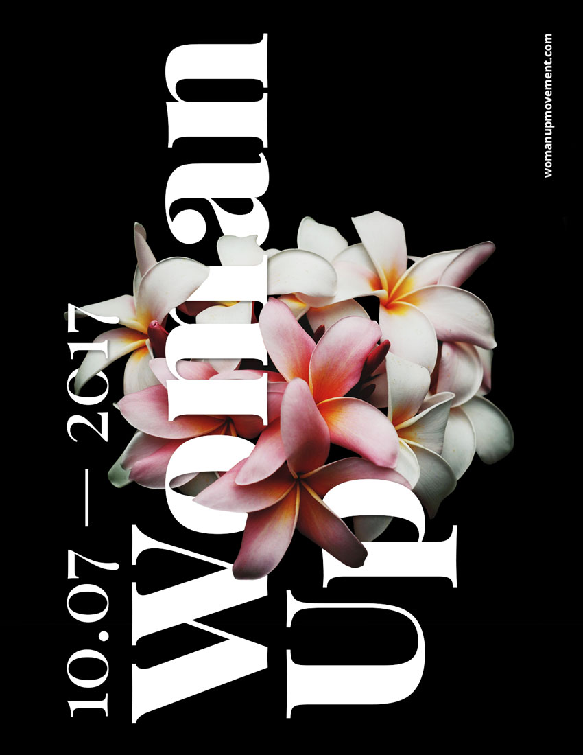
Final product image
What You’ll Be Creating

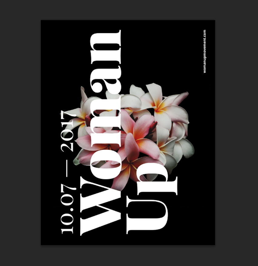
For this tutorial we will design an empowering poster using typography interwoven into flowers using the Layer Mask tool in Adobe Photoshop.

For poster and flyer inspiration, head on over to GraphicRiver.

What Will You Need

You will also need to download and install the following font file and image: 

Install the font on your system and you are ready to get started! 

1. How to Prepare the Flower Image

Step 1

Open the flower photo in Photoshop.

Open the image in photoshop

Step 2

We need to remove the background before using the flowers on the poster. To do this, on the Layers panel, Duplicate the Background layer by pressing Command-J and Hide the visibility of the original Background layer.

Duplicate the background image

Step 3

While selecting the new layer on the Layers panel, click on the Vector Mask button to add a Layer Mask to Background copy.

Add a layer mask to the new background layer

Step 4

While selecting the new Layer Mask, use the Brush Tool (B). Reset the foreground/background colours by pressing and X to switch between them. Use black as the foreground color and paint over the image to erase the background.

Use the brush tool to eliminate the flower background

Step 5

Once we have painted over with the Brush Tool, we can zoom in and work on the details. Tap the backslash key (\) to display a red overlay on the layer mask. This is useful to see if we are erasing the right parts on an image.

Use the backlash  key to see the red overlay and work on details

We should have something like this:

Flower image cleaned up and ready to use on our poster

2. How to Set Up a New Document and Create Guides

Step 1

In Photoshop, go to File > New. Name the document Woman Up and set the Width to 1275 px and Height to 1650 px. I am using this composition as an online pamphlet, so I will be using 72 dpi. Click OK to create the document. 

Create a new document

Step 2

Select the Background Layer and paint the layer using the Paint Bucket Tool (G) and black as the foreground colour.

Paint the page with black using the bucket tool

Step 3

Activate the rulers by pressing Command-R. I am using inches—you can change this by going to Photoshop > Preferences > Units and Rulers.

Activate rulers and change units if desired

Step 4

Click on the rulers and drag towards the page to create guidelines. I’ve set mine to 1 inch on each side. Hold Shift to drag the guideline to an even number.

Hold Shift to create even number guides

3. How to Duplicate Layers

Step 1

We will duplicate the cleaned-up flower layer into the new file. To do so, select the layer Right Click > Duplicate Layer, under As: change the name to Flowers, and select Document > Woman Up. Click OK to continue.

Duplicate flower layer

Step 2

The flowers will appear larger than we need, so let’s resize by pressing Command-T while selecting the flowers layer. Head over to the options bar, on the Reference Point Location select the top left corner, and also select the Maintain Aspect Ratio icon. Change the Width to 30% and press Enter.

Resize the flower layer on the new document

Step 3

Let’s centre the image on the poster by selecting the Background layer, pressing Shift, and clicking on the flowers layer. Head over to the options bar and click on Align Vertical Centre. Then visually align the flowers layer to the poster.

Optically centre flower layer on the new document

4. How to Add Text Layers

Step 1

Bring up the Characters panel by going to Window > Character. Press T to add a new text layer. One the first layer, add a date, and on the second layer, add Woman Up.

Bring up the Character Panel and add text

Step 2

Select the text layers by holding Command and clicking on both. Let’s rotate these two layers vertically by pressing Command-T, head over to one of the corners until the rotation symbol appears, and hold down Shift to make an even rotation.  

Select both text layers and hold Shift to rotate evenly

Step 3

We want to fill up the whole poster to create something with impact. Bring up the guides by pressing Command-;. Resize both text layers by pressing Command-T to fill the poster, vertically, from guide to guide. The goal is to have the title and date interact with the flower.

Use guides to resize the text layers

Step 4

Let’s add a website to balance the poster. I used Open Sans, at 25 pt, white in colour, and placed it in the top right corner, leaving about an inch margin. I used something different because Playfair Display is used, as its name suggests, for display settings and doesn’t read well in small sizes.

Add a website to create balance on the poster

5. How to Add Mask Layers

Step 1

We want to create an illusion that the text is interwoven with the flowers. Let’s duplicate the flower layer by pressing Command-J and place it at the very top of our Layers panel.

Duplicate the flower layer and move to the top of the layers panel

Step 2

We want to work on the new flower layer and more specifically on the layer mask. Start by setting the Brush Tool (B) followed by Right-Click to a size of 30 px and Hardness of 100%

You can interchange between black and white colours to hide or reveal parts of the image. Pressing X will interchange between these two colours, making it easier to work on the details.

We also want to pay attention to the petals that are in the foreground and background for these to make sense in terms of what is covering the text and what is behind the text. The final file and layers should be looking like the image below:

On the layer mask of the new flower layer use the brush tool to reveal parts of the flower

Step 3

Do the same with the date on the very left.

Do the same as the above with the date text layer

6. How to Add Effects to a Text Layer

Step 1

To create a depth of field, we will add a Drop Shadow layer style to the main text. Select the Woman Up text layer on the Layers panel. Click on Effects > Drop Shadow.

Add a drop shadow effect to the Woman Up text layer

Step 2

A Layer Style window will pop up, and you will notice that on our poster, the text will have a shadow. We want a softer look, so let’s change to the values in the image below and click OK.

The Layer Style window will open up Tweak the settings to create a soft shadow

Step 3

Our text layer now will have an “fx” symbol next to it. We want to copy the drop shadow effect onto the date text layer. Select the Woman Up text layer and Right click > Copy Layer Style. On the date text layer, Right click > Paste Layer Style. The layers and the image should be looking like the image below:

Copy and paste the effects onto the date layer

7. How to Add Adjustment Layers

Step 1

At the bottom of the Layers panel, click on Add Adjustment Layer > Brightness/Contrast.

Add a new Adjustment Layer on top of all the layers

Step 2

The Properties panel for this new layer will open. We want to add more contrast and some brightness to the image to make it stand out. I added the following values; Brightness: +15 and Contrast: +20.

Tweak the brightness and contrast to make the poster stand out

8. How to Save the Poster as .PSD and for Web

Step 1

Click File > Save As to save the file as a .PSD to edit it later. 

Save the poster as a PSD file

Step 2

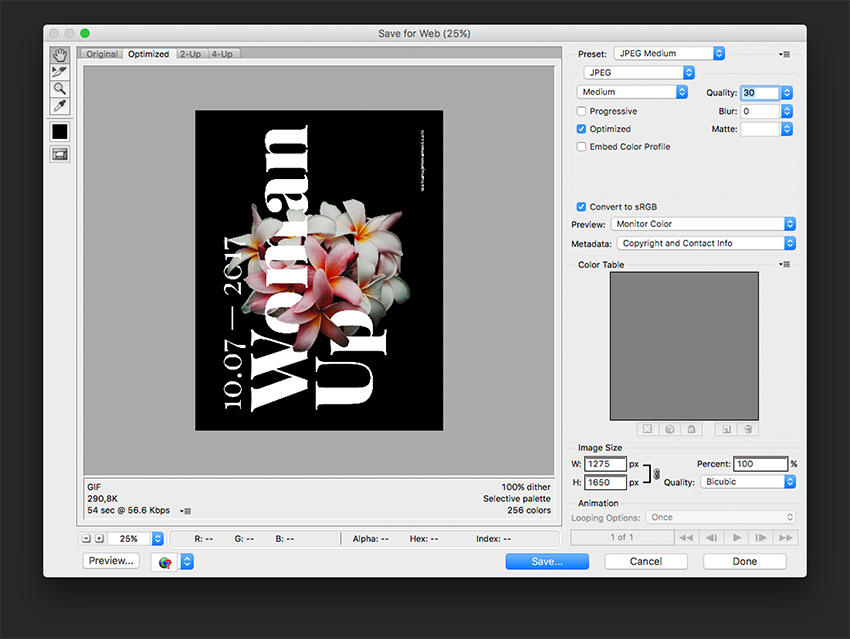
For a lower-resolution web jpeg and smaller file size, click File > Save for web (Shift-Option-Command-S). Here you can alter the quality of the image and the image size. Click on Save … and save the file.

Save the poster for web for a lower file size and lower resolution poster

Congratulations on Finishing This Tutorial!

We have covered an interesting skill for putting together typography poster that interacts with an image. Today we’ve learned to:

  • Use Layer Masks to hide and reveal parts of an image.
  • Use Adjustment Layers to add Brightness/Contrast to an image.
  • Format typography and use it in different directions to interact with the image.
  • Use the image’s levels of focus to our advantage to create a poster with depth.
  • Use Effects layers to add drop shadows to a text layer to create depth of field.
End result

How to Warp Text in Adobe Illustrator

Post pobrano z: How to Warp Text in Adobe Illustrator

Final product image
What You’ll Be Creating

Want to warp some text? In this video from my course, 10 Essential Design Tips in Adobe Illustrator, you’ll learn all the ins and outs of distorting and warping text in Adobe Illustrator.

How to Warp Text in Adobe Illustrator


Prepare the Text for Warping

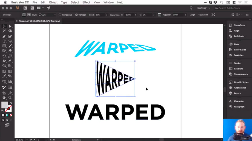
So we’re going to learn how to warp stuff. Let’s grab our Type Tool, left click anywhere on the artboard, and type some text. Let’s type „WARPED”. And we can go to the Character panel at the top, and we can pick a font—let’s go for Gotham Bold

Then I’m going to go to the alignment options and select Align Center so that it’s in the middle. Now let’s create a couple of copies by holding Alt-Shift and dragging. So your screen should look like this:

Plain text ready for warping

Create a Bulge Effect

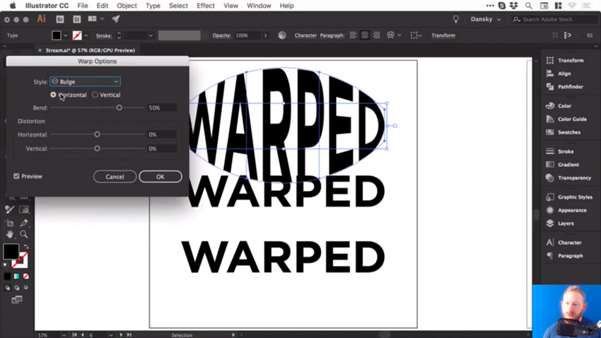
We’ll select the first piece of text, and go to Object > Envelope Distort > Make with Warp. We’ve got the Preview option checked, and we can choose the Style as well. There are lots of presets to choose from, so let’s go for Bulge, and see how that looks. 

Bulge effect

So at the moment, we are bulging this text horizontally, and we can adjust that Bend slider. So, of course, we can go up a few percent and you’ll see it starts to bulge outwards. Or we can go ever so slightly into the negatives and it will go inwards.

You could also bulge this vertically, so it’ll behave slightly differently. It really does depend what you’re going for.

Vertical bulge

Add Distortion

We could also distort this both horizontally and vertically, using the slider. So you could make one side appear larger by dragging the Horizontal Distortion slider to -100

Horizontal distortion

But let’s go for something more subtle. Choose the following values:

  • Horizontal Bend: -2%
  • Horizontal Distortion: -54%
  • Vertical Distortion: 25%

Then click OK, you can see that we’ve warped the text.

Bulge effect final

And if we click on it, we still have all of these options along the top, where you can change the preset and other values. 

Adjust the Bulge Effect

Now, at the moment, if I press Command-Y to go into outline mode, you can see that it’s still got a box and lines around it, and I can’t change the fill color or anything. 

Unexpanded text

So what I recommend is once you’ve done your warp, and you’re happy with your text, go to Object > Expand. Leave Object and Fill selected, click OK, and then we can switch into outline mode again, and you’ll be able to see your text. 

Expanded text

Now remember, when you expand anything in Illustrator, essentially what you see becomes the paths of the shape. So this is now made up of lots of different anchor points, and we can go in and adjust these if we want to fine tune that warp. 

Adjusting anchor points of warp text

But also, when we select it, it now has a fill color, and we can easily change it if we want to.

Create an Arc Effect

So let’s go and warp something else. 

Click on the second piece of text and, as before, go to Object > Envelope Distort > Make with Warp. This time, for the Style, let’s choose Arc. So we’ll set the Distortion back to 0, and then we can bend this up or down, and of course, you can adjust the Bend to Vertical as well. 

Let’s try these settings:

  • Vertical Bend: -72%
  • Horizontal Distortion: -100%
  • Vertical Distortion: 0%

And it should look like this:  

Arc effect

Adjust the Arc Effect

Once you’re happy with your warp, and you’d like to start adding color to it, or possibly getting creative and adding some strokes or brushes, you can go to Object > Expand. Leave Object and Fill selected, click OK, and now we can get creative with this. 

Let’s add some brushes. We’ll start by swapping the fill and the stroke, so we now have an outline. And from the Brushes panel, let’s choose a pencil brush with an orange color. 

Arc with orange pencil brush

So those are a few ways to warp text in Illustrator, and now I’ll leave you to go and have a lot of fun experimenting with them.

Final results of warped text in lllustrator

Watch the Full Course

In the full course, 10 Essential Design Tips in Adobe Illustrator, you’ll learn about ten essential design tips to help you bring your creative ideas to life in Adobe Illustrator. You’ll master a variety of different techniques, helping you to boost your creativity and transfer your ideas to a digital canvas.

You can take this course straight away with a subscription to Envato Elements. For a single low monthly fee, you get access not only to this course, but also to our growing library of over 1,000 video courses and industry-leading eBooks on Envato Tuts+. 

Plus you now get unlimited downloads from the huge Envato Elements library of 490,000+ creative assets. Create with unique fonts, photos, graphics and templates, and deliver better projects faster.

Hey hey `font-display`

Post pobrano z: Hey hey `font-display`

Y’all know about font-display? It’s pretty great. It’s a CSS property that you can use within @font-face blocks to control how, visually, that font loads. Font loading is really pretty damn complicated. Here’s a guide from Zach Leatherman to prove it, which includes over 10 font loading strategies, including strategies that involve critical inline CSS of subsets of fonts combined with loading the rest of the fonts later through JavaScript. It ain’t no walk in the park.

Using font-display is kinda like a walk in the park though. It’s just a single line of CSS. It doesn’t solve everything that Zach’s more exotic demos do, but it can go a long way with that one line. It’s notable to bring up right now, as support has improved a lot lately. It’s now in Firefox 58+, Chrome 60+, Safari 11.1+, iOS 11.3+, and Chrome on Android 64+. Pretty good.

What do you get from it? The ability to control FOUT and FOIT as is right for your project, two things that both kinda suck in regards to font loading. We’ve got a couple posts on it around here:

Reminder:

FOUT = Flash of Unstyled Text
FOIT = Flash of Invisible Text

Neither is great. In a perfect world, our custom fonts just show up immediately. But since that’s not a practical possibility, we pick based on our priorities.

The best resource out there about it is Monica Dinculescu’s explainer page:

i’d summarize those values choices like this:

  • If you’re OK with FOUT, you’re probably best off with font-display: swap; which will display a fallback font fairly fast, but swap in your custom font when it loads.
  • If you’re OK with FOIT, you’re probably best off with font-display: block; which is fairly similar to current browser behavior, where it shows nothing as it waits for the custom font, but will eventually fall back.
  • If you only want the custom font to show at all if it’s there immediately, font-display: optional; is what you want. It’ll still load in the background and be there next page load probably.

Those are some pretty decent options for a single line of CSS. But again, remember if you’re running a major text-heavy site with custom fonts, Zach’s guide can help you do more.

I’d almost go out on a limb and say: every @font-face block out there should have a font-display property. With the only caveat being you’re doing something exotic and for some reason want the browser default behavior.

Wanna hear something quite unfortunate? We already mentioned font-display: block;. Wouldn’t you think it, uh, well, blocked the rendering of text until the custom font loads? It doesn’t. It’s still got a swap period. It would be the perfect thing for something like icon fonts where the icon (probably) has no meaning unless the custom font loads. Alas, there is no font-display solution for that.

And, hey gosh, wouldn’t it be nice if Google Fonts allowed us to use it?

The post Hey hey `font-display` appeared first on CSS-Tricks.

How to Create a 3D Floral Collage in Adobe Photoshop & Lightroom

Post pobrano z: How to Create a 3D Floral Collage in Adobe Photoshop & Lightroom

Final product image
What You’ll Be Creating

In this tutorial I’ll show you how to use Adobe Photoshop to create a colorful 3D floral collage featuring a beautiful woman.

First, we’ll isolate the model from the background. After that, we’ll add our background. Then we will cut out the model to create a 3D effect. Later, we will add the flowers and crystals. Next, we will import the waves, the jewelry, and the crow on the model. Then, we will the tribal marks and geometrical shapes to keep the collage balanced. Finally, we will adjust the contrast, vibration, and saturation using Adobe Lightroom. Let’s get started!

Tutorial Assets

The following assets were used during the production of this tutorial:

1. How to Isolate the Model and Prepare the Base Background

Step 1

Create a new 2160 by 1440 px document in Photoshop with the given settings:

Setting up the canvas

Step 2

Open the model image. Cut out the image using the Pen Tool (P). Find a spot on the main image to start drawing the outline. As we’re drawing, we want to zoom in closer to the subject. Press Control-(+) or Control-(–) to zoom in and out.

Outlining the model to remove background
End result of outline

Step 3

Now that we have drawn the outline, we want to soften the edges of the hair before removing the background. Right-click, Make Selection, and then select the Marquee Tool (M). Once the option bar pops up, choose Select Inverse and click on Select and Mask. This will open the Select and Mask Workspace.

Select and masking the picture

Step 4

Then, activate the Refine Edge Brush Tool (R). Brush over any detailed hair areas that are missing from your selection with this tool (we can change the brush size and hardness from the brush drop-down in the top left). This will select the detailed hair areas and remove the contrasting background. When you are done, click OK.

Refining the edges of thair

Step 5

Now we want to remove the background. Select the Marquee Tool (M)Right-click and Select Inverse. Then hit Delete.

2. How to Bring the Image Into the Main Canvas

Drag the image into the main canvas using the Move Tool (V).Then, resize by pressing Control-T. This will bring up the transformation tools you want. We do not want the image to deform or stretch, so press Shift while resizing. Then press Enter.

Bringing the main image into the canvas

3. How to Create a Colorful Background

Step 1

Press Control-Shift-N to make a new layer. Name the layer “Background”. Set this layer under the model’s one.

Step 2

Activate the Rectangle Tool (U) fill it with the blue color #1caeb3 and drag the rectangle over the whole background.

Adding the background

4. How to Create the 3D Cuts on the Model

Step 1

We want to cut out the model’s top head and a little bit of the forehead. Activate the Pen Tool (P), and then outline the top part as shown below. 

Outlining the forehead

Step 2

After drawing the outline, Right-click and select Make Selection. Make sure the model’s layer is selected. Then press Delete on the keyboard.

Selecting the outlined part
Removing the outlined part

Step 3

Next, we want to cut out the bottom part of the model. Activate the Pen Tool (P), and then outline the bottom part, following the body shape as shown below.

Outlining the bottom part

Step 4

After drawing the outline, Right-click and select Make Selection. Make sure the model’s layer is selected, and then press Delete on the keyboard.

Removing the bottom part

Step 5

Now we want to create the 3D effect. Activate the circle Ellipse Tool (U), fill it with black #000000, and then draw a circle on top of the model’s head and place the layer under the model’s layer. Next, name the layer head ellipse.

Creating the 3D effect on top of the head

Step 6

Next, we want to do the same for the bottom part. Activate the Ellipse Tool (U), fill it with black #000000, and then draw a circle on the bottom part and place the layer under the model’s layer. Next, name the layer body ellipse.

Creating the 3D effect on the bottom part
Bringing the ellipse layer under the models layer

5. How to Add the Flowers and Crystals

Step 1

Drag the flower onto the main canvas. Then, Press Control-T to resize the image. We do not want the image to deform or stretch, so press Shift while resizing, and then press Enter. Use the Move Tool (V) to center the image. Next, place the flower’s layer under the model’s layer.

Adding flower in the models head

Step 2

Now, press Control-J to duplicate the flower. Activate the Move Tool (V) to bring the flower onto the bottom part.

Step 3

Then, we want to make the flower slightly bigger. Press Control-T to resize the image, holding Shift while resizing. Right-click and select Flip Horizontal, and then press Enter. Use the Move Tool (V) to center the image. Then, place the flower’s layer under the model’s layer. 

Next, we want to change the flower’s hue.

Adding flowers on the bottom part

Step 4

Now we want to change the flower’s hue. Select both layers, Right-click, and Merge Layers. Then, Press Control-U to bring out the Hue/saturation adjustment layer. Then change the Hue to -61 and the Saturation to +31.

Step 5

Now we want to add the crystals. Drag the crystal onto the main canvas. Then, press Control-T to resize the image, holding Shift while resizing, and then press Enter. Use the Move Tool (V) to place the crystals on the right.

Step 6

Now, we want to add another small crystal in the head. Press Control-J to duplicate the crystal and press Control-T to resize the image, holding Shift while resizing. Use the Move Tool (V) to place the duplicated crystal as shown below. 

End result of hue changed and crytals added

6. How to Add the Waves, the Jewelry, and the Crow

Step 1

Import the waves onto the main canvas. Place the layer above the model’s layer, and then press Alt and click on the adjustment layer to place the image on the model only.

Adding the waves

Step 2

Open the mirror picture in Photoshop. Use the Pen Tool (P) to cut the crown and remove the background. Drag the jewelry into the main file on top of the model’s neck. Press Control-T, holding Shift while resizing the image.

Cutting out the mirrors crown
Isolating the outlined part from the background

Step 3

Drag the crow image into the main file. Resize the image. Press Control-T, holding the Shift key while resizing. Use the Move Tool (V) and bring the crow onto the model’s left shoulder.

Isolating the crow from the background
End result after adding the crow and jewelry

7. How to Make the Model Black and White and Add the Circle and Tribal Marks

Step 1

Now we want to turn the model black and white. Select the Model layer in the Layers panel and turn it to black and white. Click on Image > Adjustments > Black and white, and then click OK or Alt-Shift-Control-B.

Switching the model in black and white

Step 2

Now that we’ve turned the model black and white, we want to add a colorful circle behind to make her pop. Activate the Ellipse Tool (U), make the fill color of the circle sky blue (#00fcff), and place the layer right above the background layer.

Adding the circle behind the model

Step 3

Now we want to add some tribal marks. Use the Ellipse Tool (U), make sure the fill color is white, draw a circle, and use the Move Tool (V) to place it on the model’s forehead. Then press Control-J to duplicate the circle and use the Move Tool (V) to place the duplicated circle on the chin.

Adding tribal marks

Step 4

We want to add the remaining marks on the model’s chest. Use the Ellipse Tool (U), make sure the fill color is white, draw a small circle, and duplicate the layer four times by pressing Control-J. Select all four layers, Right-click, and Merge Layers. Then duplicate the merged layers three times and use the Move Tool (V) to place them as shown below.

Adding more tribal marks

8. How to Add Lines, More Flowers, and Additional Elements

Step 1

Activate the Rectangle Tool (U). Fill it in sky blue (#00fcff) and drag a thin rectangle on top of the model. Then, press Control-J to duplicate the rectangle three times. Place one rectangle under the model’s layer and use the Move Tool (V) to place it under the shoulder. Now we want to make this line thicker. Press Control-T and drag the rectangle vertically to make it thicker.

Step 2

Next, we want to add two circles at the end of the thin lines to balance it. Activate the Ellipse Tool (U), fill it in sky blue (#00fcff) and draw a small circle on the left side, on top of the rectangles. Then, press Control-J to duplicate the circle and use the Move Tool (V) to place the duplicated circle on the right side as shown below.

Step 3

Now that we’ve added the lines, we want to add more flowers. Select the flowers layer and press Control-J to duplicate it. Then activate the Move Tool (V) to slightly move it to the right side as shown below.

Adding the lines and more flowers

Step 4

Now we want to add a colorful line on the model’s hair to make it pop more. Activate the Rectangle Tool (U), fill the color in purple (#ff00d2) and draw a thin, medium rectangle. Then press Control-T to rotate the rectangle. Then, use the Move Tool (V) to place it on the right edge as shown below.

Adding a line on the right edge to make the hair stand out

9. How to Do the Final Retouching in Adobe Lightroom

Step 1

Now we want to make the entire image pop out more. Export the photo as a JPEG from Photoshop. Import the picture in Lightroom. Then click develop. Boost the Temperature to +5, Clarity to +33, Vibrance to +14, and Saturation to +7.

Adjusting the contrast exposure clarity and vibrance

Step 2

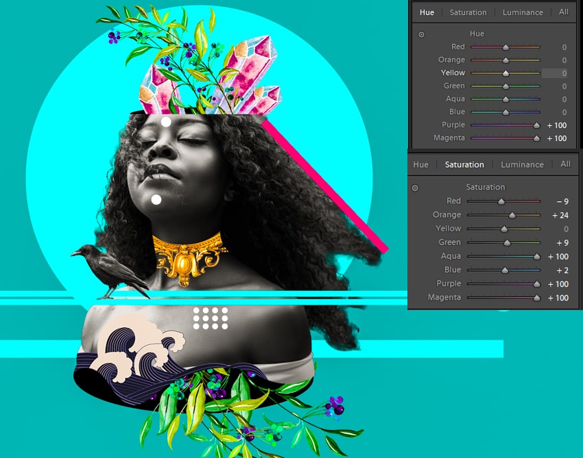
We want to play more with the hue and saturation. Go to the hue palette. Bring the Purple hue to +100 and the Magenta hue to +100. Then click on the Saturation panel. Set the Red hue to -9, the Orange hue to +24, the Aqua hue to +100, the Blue hue to +2, and the Purple and Magenta hue to +100.

Adjusting the hue and saturation

10. How to Export the Final Artwork From Adobe Lightroom

Now that we are finished, we want to export our artwork as a JPEG. Click File, and then Export. Select in which folder we want to save our image. Then click Export.

Before and After

Awesome Work, You’re Done!

I hope that you’ve enjoyed the tutorial and learned something new for your own projects. Feel free to share your results or leave comments in the box below. Keep creating!

End result

Tips that Graphic Designers Should Follow

Post pobrano z: Tips that Graphic Designers Should Follow

As children, many of us used to draw or doodle to express our thoughts.  Perhaps we doodled during lessons when work felt tedious and we no longer wanted to pay attention.

Some of may have doodles while thinking, creating a pattern or texture on the page.  Perhaps we were discouraged by our early results and believed that we would never make it as a designer.  As a result, we might have chosen a different profession.

Now, however, there is a whole new digital realm – which can assist us with bringing drawings or doodles to life.  This has opened up a wide range of opportunities for many people to work in digital art or design.

Many people are taking the opportunity to learn about graphic design, even without a formal education.  It’s possible to take part in online tutorials which can guide you on programs such as Illustrator, Photoshop or InDesign.  There is a multitude of books available to teach the principles of design.

This is often a helpful path to follow.  However, learning the foundations of graphic design, acquiring new skills or tools and developing your own personal artistic style can be a complex process.  The following tips will guide you in your development as a graphic designer who combines beautifully edited images, fonts, and ideas to convey information to an audience, especially to produce a specific effect.

Listen to the influencers


Influencers are people with a strong online presence who develop and market a concept.  This could be anything from an online concept such as a capsule wardrobe (which uses design to advertise products) to online artists who share skills or products which appeal to their audiences.

By speaking with influencers, you’ll gain insight into the online world and how it works.  This can help you gain insight into how to follow trends.  You might also learn the language often used online and gain tips on how to market products.

If you’re looking for influencers to engage with, turn to social media.  Instagram and Twitter.  Chat with the influencers who inspire you.  They might respond to you, and you can begin a conversation.  This will help you to learn from them.

Alternatively, you can follow the conversations and exchanges which exist between influencers and yourself.  This will enable you to become a part of the design community.

You’ll be able to find support throughout your journey.  Some influencers even work alongside other designers or people in the industry in order to host events or guest posts.

Search for inspiration

Once you’ve committed to becoming a graphic designer, start searching for work which inspires you.  This can be as simple as searching the web and bookmarking artists or websites which inspire you.  You could also build a Pinterest board with images which inspire you.

As you build your collection, you’ll begin to find the patterns or styles in the images which inspire you.  This will assist you to begin creating your own works of art.  If you’re constantly saving art deco images or cartoon designs, you could find resources on how to create them.

Create a hierarchy

The graphic design uses hierarchy in order to make content simple, digestible and easy to understand.  This page is evidence of this – there are larger headings, subheadings and bold type which enables you to easily scan the page.

Hierarchy helps you to capture your viewers’ attention and makes your site easy to understand.

In order to create hierarchy on your pages, you can use different techniques, including:

  1. Size
  2. Color
  3. Spacing
  4. Grouping

It’s usually best to use one dominant aspect of your design when you’d like to create an interesting page.  You could use an attractive logo or a dominant header in order to draw attention to the most important aspect of your page.

However, if your page is very well balanced, you might be able to focus on two different areas (such as a heading and a call to action button).

The element you give dominance to should be the most important part of your site or message.  This will help you to create attention in the place that you need it most.

Spatial awareness

When you’re designing, it helps to acknowledge both positive and negative (white) space.  Positive space is the space you use for your design or content and is how you fill the page.  Negative space is the empty space which hasn’t been filled.  At their best, these two different elements need to be in harmony with each other.

This will keep your design looking clean, simple and orderly.  Used consciously, negative space can send a very effective message.

How do know when you’ve achieved the perfect balance between positive and negative space?  There are no simple answers.  It isn’t about the amount of space you use in your design, as much as it’s about eliminating anything superfluous so that your page is as clean as possible.

Go back to the foundations

When taken apart, every design is about simple elements which have been constructed to send a greater message.  When you take a design apart (like un – baking a cake) you get to see the core elements that are used in the mix.

Once you’ve taken a design apart and reduced it to its simplest terms, you’ll find that you can use these principles to create your own designs.  If you’re a beginner, you might want to start slowly, but as an advanced designer, you can begin to incorporate more complex techniques.

If you’re not sure how to combine the different elements to produce the effect you would like, you can experiment.  You’ll learn each step of the way.

When you experiment with a design you:

Learn that you know more than you think you do.

You’ll learn where you are skilled, and where you could acquire new knowledge.

There are multiple ways to approach any design or problem in order to achieve the results you’d like.

Analyze your inspirations

If you’re a beginner and you’ve begun to grasp the basic concepts and use them effectively, it’s time to move on to the designs that inspired you and learn to analyze them.   By taking your inspirations apart, you’ll begin to see how they were formed, and how you can begin to work in a similar way.

If your inspirations are websites, explore how they have been put together and the way that text, color, shape, symmetry, line and space have been used to create the look that appeals to you most.  You’ll notice that although effective design can make a big impact, the concepts are very simple.

Pay attention to alignment

You might notice that the way you lay out your page or align your fonts makes a massive difference.  This is because of the role symmetry plays in page composition.  A single flourish or well-placed element can add just what you need to make your design stand out

Your designs might range from simple to complex, but your goal is to always strive for balance.  Use symmetry as your guide to create a page which works.

Work with text


When you’re working as a designer, your goal is to get your message across.  Whether you’re creating an attractive logo or working towards making a magazine’s copy readable, your goal is to work towards clarity.  This doesn’t mean your fonts need to be boring.  There is a wide range of fonts which will add visual appeal to your design or page.

Summary

When you’re working hard at becoming a graphic designer, your goal is to practice, practice, practice.  Although you might feel intimidated by the skill of experienced designers and worry about ever being able to work to this standard.  However, even the most skilled designers were once beginners learning the foundations.

In the creative field, everyone embarks on a unique journey, developing their own style in individual ways.  There’s no single way to approach design and the majority of the time, you’ll learn through practice.

As you keep learning and developing, you’ll find out which skills are strong within your work, and which are lacking.

If you practice and develop new skills, you’ll develop as a designer.  Over time, work which took you ages to manage will become intuitive and you’ll be able to manage to achieve results quickly.  Mastering new projects will give you confidence as a designer.