Post pobrano z: HIDDEN

Post pobrano z: HIDDEN
Post pobrano z: TFX – Pubs

Post pobrano z: Weapon of Choice: Building a GPU PC

As a follow-up to the popular Render Wars article, contributor Sekani Solomon is back with a new article focusing on how to build the right PC for today’s GPU-intensive workflows.
Post pobrano z: How to Draw a Star (Multiple Points!)

Drawing a star may seem simple and overwhelming at the same time. For example, how to construct a five- or a seven-pointed star and make your drawing technically correct? If this theme is something you’re interested in, let’s dive into the fascinating world of stars and geometry.
In this tutorial, I’ll show you the way to design different kinds of stars, from a three-pointed to an eight-pointed one. We’ll use ordinary tools like a ruler, a graphite pencil, compasses, and a protractor.
As a fun bonus, we’ll also explore a way to draw a five-pointed star in a casual way, without any serious measurements.
I recommend following this tutorial from start to finish; every part demonstrates the common basic features, but an understanding of the simpler examples will help you to master more complex methods.
If you’re interested in this type of tutorial, we have a whole series of Geometric Drawing tutorials which you may also enjoy.
You will need the following equipment to complete this project:

I mark the central point with a graphite pencil, and then draw a small circle of an arbitrary radius, using the compass. It’s important to leave enough space around this circle.
Keep your pencil marks light, just in case you decide to erase the subsidiary lines later on.

I draw a bigger circle, using the central point as a reference.

I draw a straight line that is going upwards from the center of the circumference. If you need perfectly even lines, make sure you use a ruler.

A circle has 360 degrees. To draw a three-pointed star, we should create three equal sectors; 360 divided by 3 is 120.
With a protractor, I construct a sector that has an angle of 120°. The central point and the vertical line are our references for the measurements.

I create another sector of the circle with the angle of 120°. Now we have three lines; the points where they meet the bigger circumference are the apexes of our star.

It’s time to divide each sector in two. With the protractor, I find the angles of 60° and mark the segments with dashed lines.
I also mark the points of intersection where these lines cross the small circle.

I connect the points with the apexes. Now we have a beautiful three-pointed star!

I outline the contours of the star, using an ink pen.
This step isn’t obligatory; it’s just useful to emphasize the main lines of the figure. You can erase all subsidiary pencil lines or leave them—it’s completely up to you.

I draw a small circle of an arbitrary radius, using a pencil and a compass.

I add a bigger circle that is encircling the existing one.

I add a straight vertical line going from the center of the circle.

With the protractor, I find a 90° angle and create the first sector.

I add two more lines, based on the same method; now we have four sectors, each with an angle of 90°. The points where the lines cross the bigger circumference are the apexes of our star.

Let’s divide each sector in half. To do that, I find the angle of 45° within each sector and mark the new segments with dashed lines.
I also mark the points of intersection, where these lines cross the small circle.

I connect the points with the apexes, using straight lines. The four-pointed star is complete!

I outline the contours of the star, using the ink pen.

I mark the central point with a pencil, and then draw a relatively big circle of an arbitrary radius, using the compass.

I add a vertical line that is going from the central point of the circle.

Let’s find the first sector with a protractor; its angle should be 72°.

Using the same principle, I add more lines. Now we have five sectors; the points where the lines cross the circumference will be the apexes of our star.
I also name these points with letters, just to simplify the process and make it visually clear.

I connect the points A and B with a straight line.

I connect the points A and C with a line.

In the same manner, I join the point B and the point D.

I connect the point E with the points D and C. The shape is complete!

With an ink pen, I outline the contours of the star, and then erase the unnecessary captions.

I mark the central point and draw a relatively big circle of an arbitrary radius, using the compass.

I add a straight vertical line from the center of the circle.

To draw a six-pointed star, we need to create six equal sectors, each with an angle of 60°.
I create the first sector, using the protractor.

I add the sectors, using the same principle, and name the points of intersection with letters.

I connect the points A and B.

Now I connect the points B and C.

I connect another pair of points, this time A and C. Now we have a triangle.

I connect the points D and E with a straight line.

I join the points E and F.

I connect the points D and F; now we have another triangle, and the shape of the hexagram is complete.

I outline the contours of the star with black ink pen lines.

By the way, there is another method of drawing a six-pointed star, this time without a protractor. Let’s try this option!
I draw a circumference of an arbitrary radius, using the compass.

I add the lines (a vertical and a horizontal one) that are going right through the central point of the circle. Let’s agree that the upper point of intersection is the point A.

Put the needle point of your compass right into the point A, and measure the distance between this point and the center of the circle.
Then, without removing the needle point, measure the same distance on the circumference. You’ll get the point C on the right side and the point B on the left side.
Repeat this action several times, shifting the needle point of the compass, and name the points you get with letters.

I connect the points A and D, A and E, and D and E with straight lines. Now we have the first triangle.

I connect the points B and C, C and F, and F and B with straight lines. We get the second triangle, and the star is complete!

I draw a circumference of an arbitrary radius, using the compass.

I draw a straight vertical line that is going downwards from the central point of the circle.
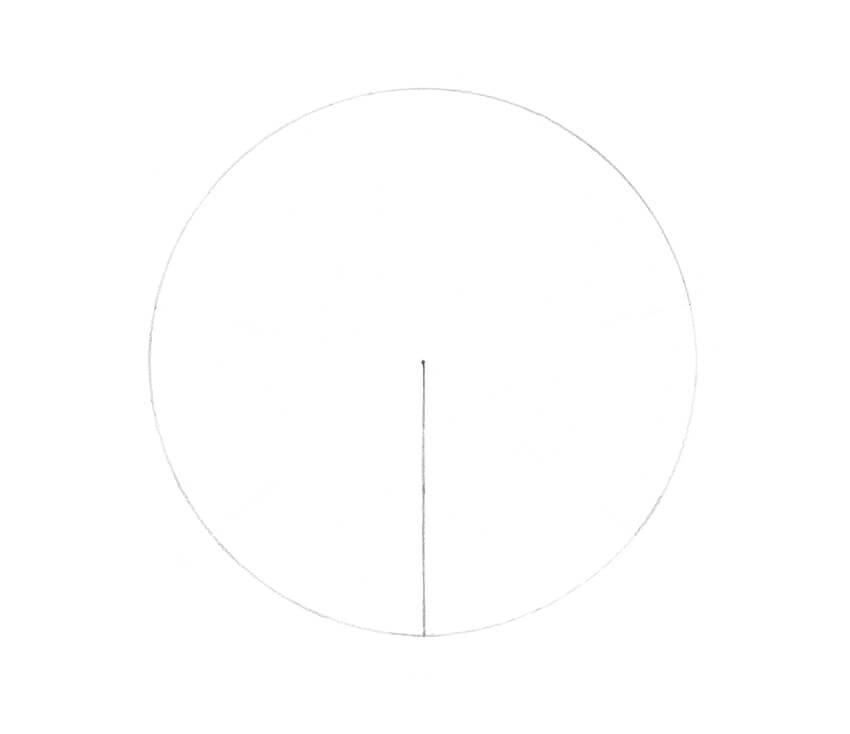
When 360 is divided by 7, we get a fractional number, so we have to pick the closest value (51°). I create a set of sectors that have angles of 51°, using the vertical line as a reference.
I also name the points of intersection with letters.

I connect the point A with the points B and C.

I join the points B and D.

I connect the points D and E.

I join the points E and F.

I connect the points F and G.

I connect the points G and C. The shape is complete!

I outline the contours of the heptagram, using the ink pen.

I draw a circumference of an arbitrary radius, using the compass.

I add a straight vertical line that is going upwards from the center of the circle.
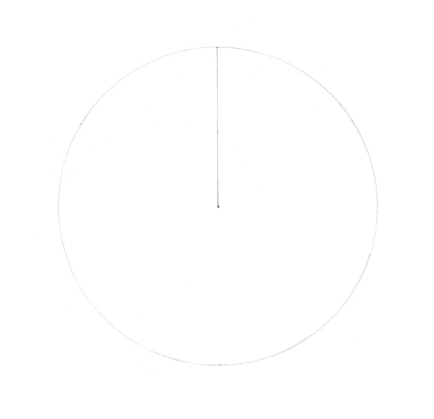
360 divided by 8 is 45, so we have to construct the sectors that have angles of 45° each. I create the first sector, using the existing vertical line as a reference.

I complete the set of sectors and name the points of intersection.

I connect the points A and D with a straight line.

I connect the points D and G.

I join the points G and B.

I connect the points B and E.

I connect the points E and H. Do you foresee where the next line will be?

I join the points H and C.

I connect the points C and F.
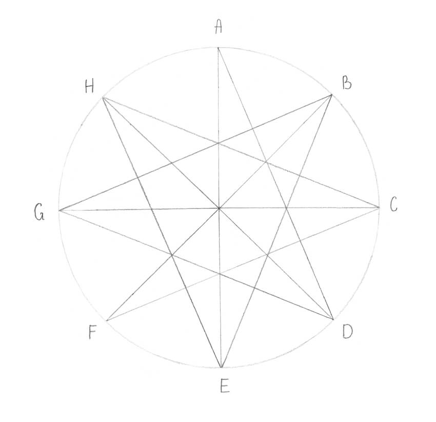
I connect the points F and A. The octagram is complete!

I outline the contours of the star with ink lines.

Are you tired of making calculations and measuring everything? The serious part is over, so let’s relax and draw a pentagram in a casual way.
I draw a straight inclined line, using a pencil and a ruler. You can use a ruler, too, or draw the lines just by hand.

I draw another inclined line, starting from the top point of the existing one. Now we have a contour resembling an upturned “v” letter.

I add another line going to the left-hand side.

I add a straight horizontal line.

I complete the shape of the star, connecting the points with a finishing line.
By the way, it’s possible to draw a star following the same method, by marking all five points beforehand and then connecting them with lines.

Congratulations—you did it! Now you can draw different kinds of stars. I hope the compass and protractor became your best friends, and together you’ll create many more geometrical objects.
Creating technically perfect figures requires skill and patience, so if your stars came out slightly uneven at the first attempt, don’t give up—just try again. Sometimes the tools we use allow imperfections, like the inaccuracy of the protractor’s grid.
At the same time, remember to have fun and enjoy the process!


Post pobrano z: The Tchip-est april fool of 2018 / Le poisson d’avril le + Tchip
 |
 |
| THE ORIGINAL? Eurostar Railways – 2010 “Catch the London virus : Fish & Chips” Source : Ad Forum, Coloribus Agency : TBWA Brussels (Belgium) |
LESS ORIGINAL Tchip Hairdressers – 2018 “April fool! It’s better in the hair than in the back” Source : Facebook Tchip Page Agency : Unknown (France) |
Post pobrano z: Grab 15 Freshest WordPress Templates Of This Spring [WITH 35% DISCOUNT!]
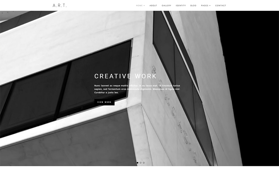
The ultimate sleekness and magnetism of this new template would resonate with the tastes of the most demanding auditory. The theme brings you four impressive homepages that feature four most appealing, present-day layouts based on mosaic grids. What’s more, this Retina-ready template contains unlimited color presets, handy custom widgets, advanced typography options, and 700+ Google fonts. Like most Photography WordPress Themes Art contains a functional portfolio gallery for presenting pieces.

Mechanicum theme employs the classy red, white and dark grey color palette as its basis and jazzes it up with trendy gradients. Its customization becomes way simpler thanks to Elementor drag-n-drop editor, enhanced by the collection of more than 20 widgets. With the purpose of incorporating the latest functionality to your site in mind, designers pre-built Mechanicum with an adjustable Mega Menu, empowered its visual awe with JetElements pack and designed a number of unique professional layouts. All this makes Mechanicum one of the most advanced and prolific car repair templates out there.

This iconic template lets you build a compelling web presence for a construction company. The theme is equipped with all the needed trust signals to persuade new clients to go for your company rather than for your competitors. In this vein, the theme brings you the impressive ‘Testimonials’ and ‘Our Team’ sections, pinpoints your physical location on Google map, lets people connect with your profiles on social media, etc. What’s more, all the construction-related imagery that you see on Live Demo also becomes yours once you purchase this exemplary template.
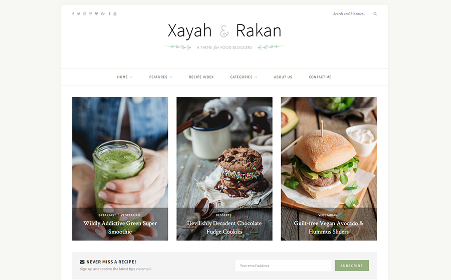
Charming and minimal, the YummBlog template will make your food blog exceptional and engaging. The template comes with the library of built-in layouts, including 8 ready-made homepage layouts for choosing the right style for your blog’s main page. Moreover, YummBlog theme comes with 10 pre-defined color schemes and allows you to create your own color scheme without touching any code. The theme is responsive and cross-browser compatible, providing for perfect display on different screens and in different browsers.

Blogging will be a pleasure and a true creativity outlet if you go for Love Life theme. The clear and trendy design of this theme is totally responsive, which means that your blog will be a pleasant read even on mobile. What’s more, social options make sharing your posts on Facebook, Twitter and other platforms as easy as cake. Additionally, you can use this template to power a designer portfolio as all the tools needed for this come handy.
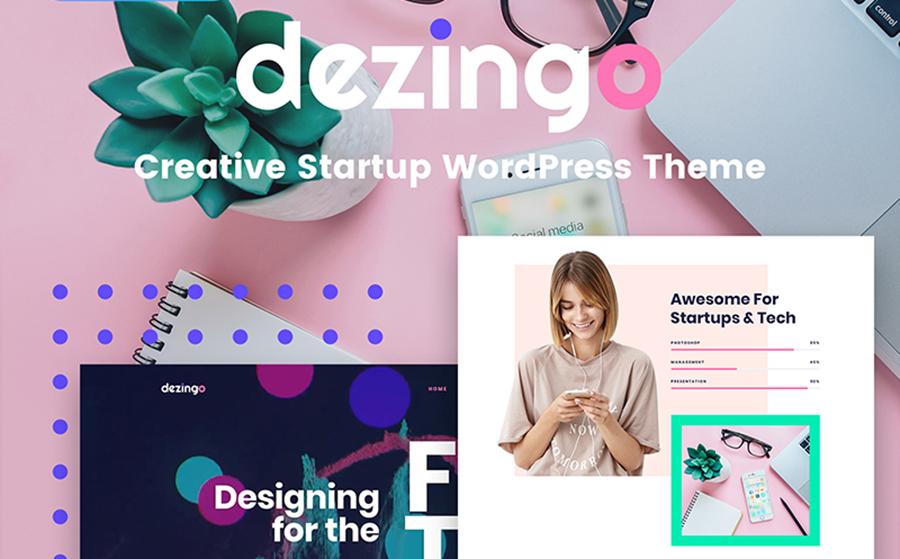
If you’re after eye-candy grid-breaking layouts and artsy typography, Dezigno theme would make an ideal creative web presence for you. The neat, material-design inspired homepage of this theme becomes quite engaging thanks to intricate microinteractions that users see when scrolling it down. Dezigno theme is SEO-optimized to let you fit Google guidelines for websites and improve your position in search engine search results.

MediaTel is the theme that lets you built an impressive, media-rich website. It’s powered by the reliable Unyson framework and brings you a custom visual page builder. The template is ready to harbor intense video integration, still remaining responsive and fast-performing. What’s more, it brings you a number of custom widgets and advanced customizer options.
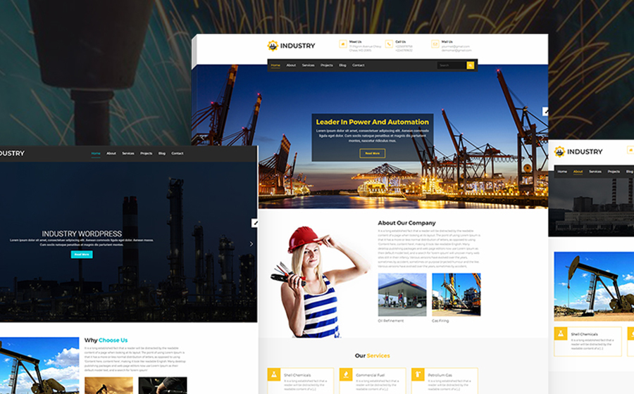
Do you represent an architect business, building company, chemical factory or machinery business? With the multipurpose Industry theme, your website will hit home with a lot of site guests. Industry theme provides for showcasing your popular services and some details about your company, introducing your craftsmen and team members, presenting your accomplished projects, etc. Moreover, all your website sections will look stunning thanks to added Parallax and Smooth Transition effects.

Amenity is an impressive one-pager for businesses of any kind. Its ultra-modern UI is underpinned by Parallax backgrounds, trendsetting color palettes, asymmetrical dividers, mosaic image grids, animated counters and more. This theme runs on polished-to-perfection Redux Framework and provides for streamlined customization with Elementor builder. What’s more, Amenity theme offers you a number of ready-made header and footer styles, sidebar variations, unlimited Google Fonts, custom handpicked color schemes, etc.
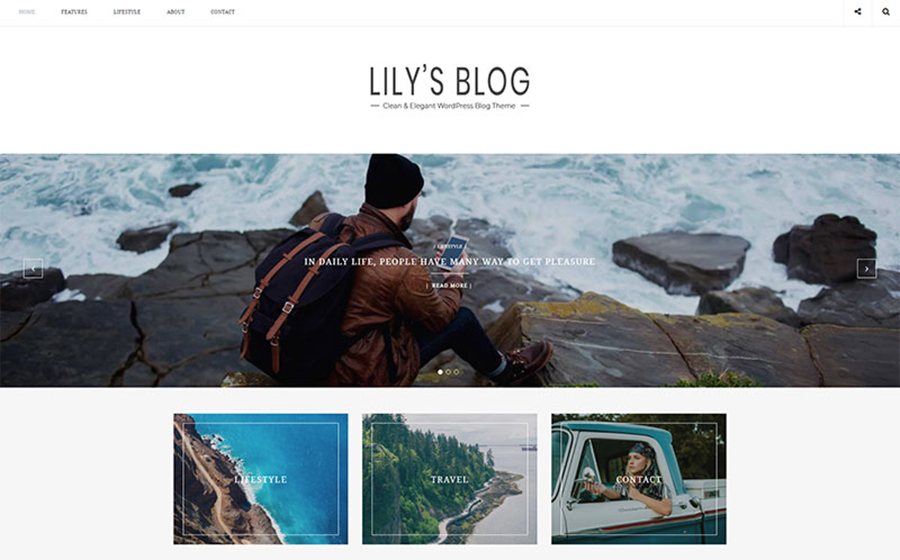
Lily is one of the best new themes for personal blogging. It delivers you improved performance, cleaner design, faster loading and sleeker UX. Lily lets you choose from 10 different layouts for your homepage. Moreover, this blog theme brings you a number of advanced customization options that let you fine-tune the appearance of tags and categories, as well as search results and archives on your website.

Are you searching for a company website design that will truly inspire your clients? Lanterno is just what you need for your case. This theme looks light as a feather thanks to blue-and-white color scheme and sophisticated font choice. The powerful Elementor page builder allows you to set up the main website content without any coding skills. Lanterno also brings you JetElements add-on that adds a number of custom site blocks to your layouts.
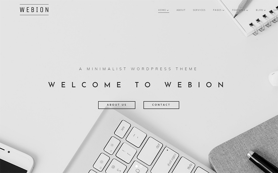
Webion template stands on the verge of web design innovation and brings you a sleek UI that resonates with 2018 web design trends. Thanks to Elementor and JetElements, creating intricate layouts and adding diverse content blocks is a non-issue even if you’re completely unfamiliar with coding. Moreover, Webion template is loaded with Cherry plugins, different Blog and footer layouts, custom widgets and more. Also, it lets you power an Ecwid-based e-store section in case you need e-commerce functionality.

DeepMind would constitute the basis of a perfect present-day psychology clinic’s web presence. Template interface emphasizes informativeness and lets you tell everything your clients need to know about the clinic and services you provide. DeepMind theme brings you an exhaustive set of astonishing and elegant ready-made pages for your easy site customization. Customize the theme on the fly with Elementor and WordPress Live Customizer and launch your new web presence in record time!
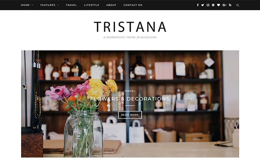
Tristana is a sleek and elegant WordPress blogging theme that’s impossible not to fall in love with. It features grid-based galleries, asymmetrical layouts, trendsetting pixel-perfect fonts and prolific social options. For example, social icons are placed above the fold both in PC and mobile viewports and allow you to grow the audience of devoted followers. Moreover, the Instagram-powered gallery, situated on the home page, projects best flicks from your lively profile in this social network and invites to follow you there.
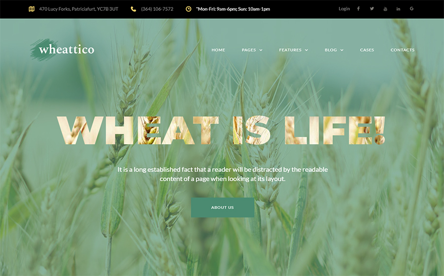
If you work in the agriculture niche, you can power an aesthetically pleasing, nature-inspired website with Wheattico template. This theme opens up with an immersive Parallax-enhanced hero image that instantly catches visitors’ attention and streamlines them to learn more about your company. Thanks to Elementor visual editor, you can get astonishing customization results effortlessly. No doubt, Wheattico template is SEO-optimized, responsive and cross-browser compatible, so that there won’t be a single obstacle on your way to online prominence!
You’ve just reviewed the 15 newest and most inspiring WordPress templates of this spring. Hurry up to get hold of any of them on April 9 – 11 with an impressive 35% discount!
What is the theme that appeals to you most? Let us know about your preferences in the Comments section below.
Stay tuned for more!
Post pobrano z: DINA: the lamp you need to pay to get some light
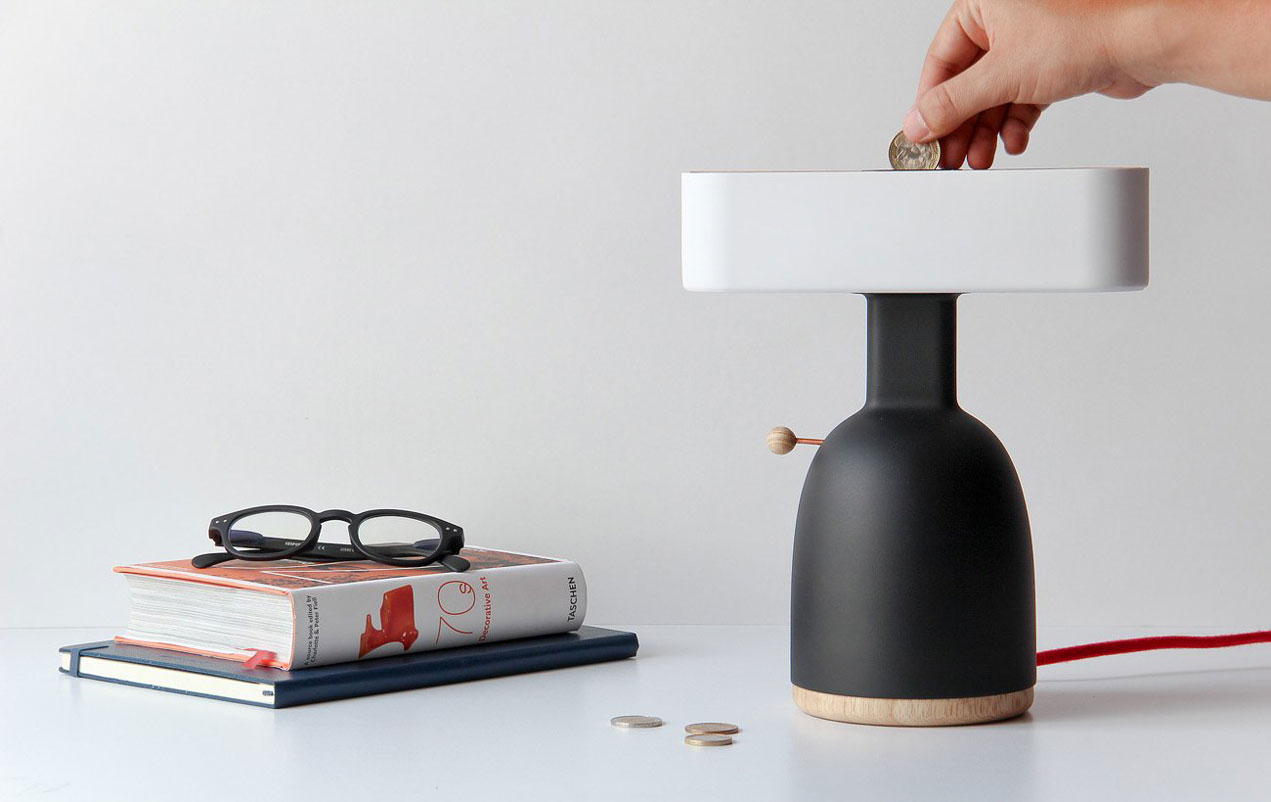
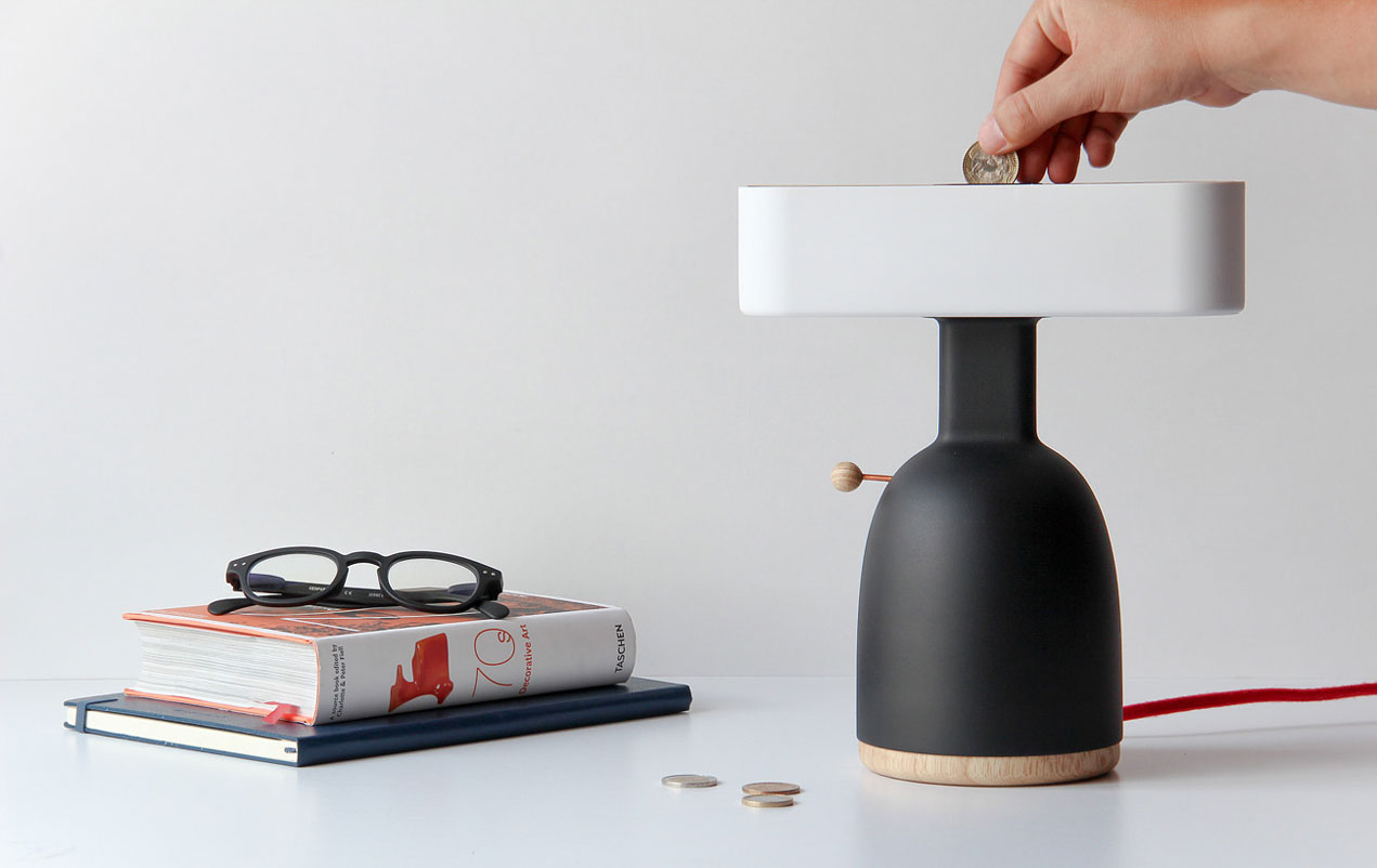
When you stop for a moment and think about it for a second, technology is amazing. Take lamps for example, all you need is to hit a button and you get some light. It’s almost too simple and maybe the reason why we spend so much electricity unnecessarily.
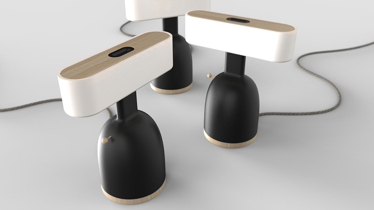
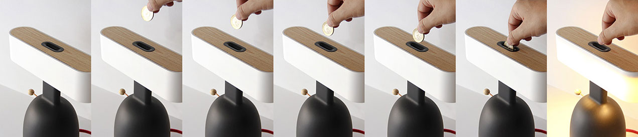
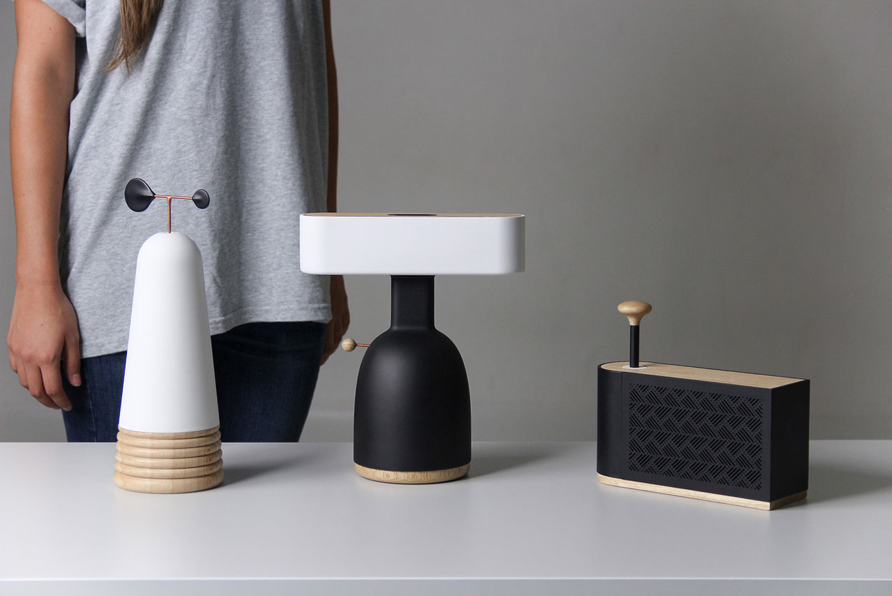
This could have been the thought process behind the creation of DINA, a lamp that requires that you insert a coin before you can use it. Although you can get your money back easily, the fact that you need to pay when using the light is a recurring reminder that cool technology comes with an energy price.
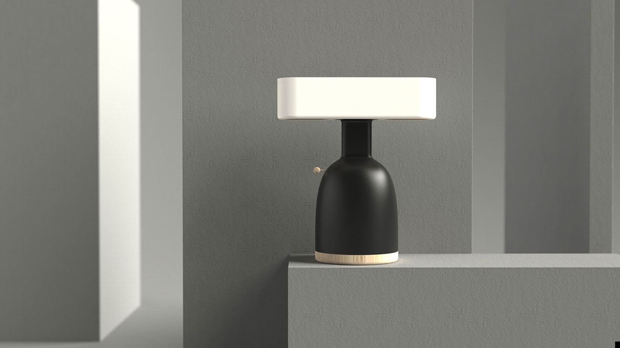
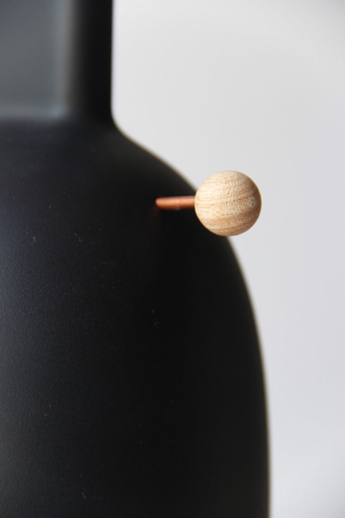
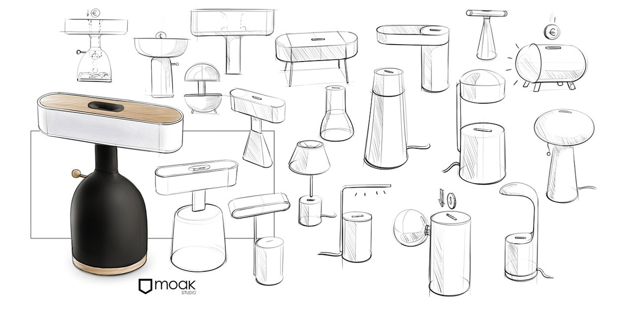
This cool modern desk lamp was designed by MOAK, a design studio from Cali in Colombia who specializes in lighting and furniture.
Post pobrano z: Brilliant Ways To Advertise Inspiration Resources Daily Work
To make your brand stand out while advertising, you need to find the perfect elements to include in your campaigns. As you can learn from AuthorityAdviser, every marketer wants to create eye-catching advertising that can be noticed by many people, and for this they will struggle to include the most interesting information that will get viewers thinking about the message hidden in the advert. There are brilliant ways you could create inspirational messages that will improve the impact of your advertising. Here are some of the tactics you could apply that are effective.
While creating an advertising campaign, one of the things you want to take care of is presentation. Crafting a perfect message includes using tools of communication like imagery and juxtaposition to help create visualization in the minds of your audience. The good thing about this technique is that it often results in adverts that are interesting and many people will want to get more information about what the presentation is all about. It is one of the best ways to stand out and capture the attention of the audience.
Proportion is another aspect of advertising that you can use to create impactful ads. In this case, you try to make some parts of the advertisement louder and eye-catching in a manner that no one can ignore. However, using proportion may not always offer a beautiful outcome, but the advantage is that it creates an unusual image that will trigger the attention of the audience.
You can also apply exaggeration in some concepts while advertising. The purpose of this is to ensure the advert does not look obvious and is unique in the eyes of the viewer. Exaggeration will help you to present a message in a manner that is different and intended to help the audience understand what you are communicating more profoundly.
Don’t always give people the obvious while presenting your message through photos. You can edit them to add special effects that create a dramatic result. Such messaging sticks better in the minds of the audience and could carry more impact if shared well. You should stretch your creativity, but also be careful not to reach limits where some people will be made to feel offended by the way you craft the message.
Scale helps mostly when you want to show how convenient something can be to the user. It is a form of exaggeration that will help to show the audience how the item could be useful to them. It’s a subtle formula of saying a lot with little.
Marketing is a field filled with many possibilities and you should explore all of them to bring out the results you desire for your projects. There are many tactics you could employ to make your messages more impactful including using exaggeration and proportion to illustrate what you are saying. The idea is to be different and stand out from the competition. See some ideas you could employ above.
Post pobrano z: Simple Swipe With Vanilla JavaScript
I used to think implementing swipe gestures had to be very difficult, but I have recently found myself in a situation where I had to do it and discovered the reality is nowhere near as gloomy as I had imagined.
This article is going to take you, step by step, through the implementation with the least amount of code I could come up with. So, let’s jump right into it!
We start off with a .container that has a bunch of images inside:
<div class='container'>
  <img src='img1.jpg' alt='image description'/>
  ...
</div>We use display: flex to make sure images go alongside each other with no spaces in between. align-items: center middle aligns them vertically. We make both the images and the container take the width of the container’s parent (the body in our case).
.container {
  display: flex;
  align-items: center;
  width: 100%;

  img {
    min-width: 100%; /* needed so Firefox doesn't make img shrink to fit */
    width: 100%; /* can't take this out either as it breaks Chrome */
  }
}
The fact that both the .container and its child images have the same width makes these images spill out on the right side (as highlighted by the red outline) creating a horizontal scrollbar, but this is precisely what we want:

Given that not all the images have the same dimensions and aspect ratio, we have a bit of white space above and below some of them. So, we’re going to trim that by giving the .container an explicit height that should pretty much work for the average aspect ratio of these images and setting overflow-y to hidden:
.container {
  /* same as before */
  overflow-y: hidden;
  height: 50vw;
  max-height: 100vh;
}
The result can be seen below, with all the images trimmed to the same height and no empty spaces anymore:

overflow-y on the .container (see live demo).Alright, but now we have a horizontal scrollbar on the .container itself. Well, that’s actually a good thing for the no JavaScript case.
Otherwise, we create a CSS variable --n for the number of images and we use this to make .container wide enough to hold all its image children that still have the same width as its parent (the body in this case):
.container {
  --n: 1;
  width: 100%;
  width: calc(var(--n)*100%);

  img {
    min-width: 100%;
    width: 100%;
    width: calc(100%/var(--n));
  }
}
Note that we keep the previous width declarations as fallbacks. The calc() values won’t change a thing until we set --n from the JavaScript after getting our .container and the number of child images it holds:
const _C = document.querySelector('.container'),
      N = _C.children.length;

_C.style.setProperty('--n', N)
Now our .container has expanded to fit all the images inside:
Next, we get rid of the horizontal scrollbar by setting overflow-x: hidden on our container’s parent (the body in our case) and we create another CSS variable that holds the index of the currently selected image (--i). We use this to properly position the .container with respect to the viewport via a translation (remember that % values inside translate() functions are relative to the dimensions of the element we have set this transform on):
body { overflow-x: hidden }

.container {
  /* same styles as before */
  transform: translate(calc(var(--i, 0)/var(--n)*-100%));
}
Changing the --i to a different integer value greater or equal to zero, but smaller than --n, brings another image into view, as illustrated by the interactive demo below (where the value of --i is controlled by a range input):
See the Pen by thebabydino (@thebabydino) on CodePen.
Alright, but we don’t want to use a slider to do this.
The basic idea is that we’re going to detect the direction of the motion between the "touchstart" (or "mousedown") event and the "touchend" (or "mouseup") and then update --i accordingly to move the container such that the next image (if there is one) in the desired direction moves into the viewport.
function lock(e) {};

function move(e) {};

_C.addEventListener('mousedown', lock, false);
_C.addEventListener('touchstart', lock, false);

_C.addEventListener('mouseup', move, false);
_C.addEventListener('touchend', move, false);
Note that this will only work for the mouse if we set pointer-events: none on the images.
.container {
  /* same styles as before */

  img {
    /* same styles as before */
    pointer-events: none;
  }
}
Also, Edge needs to have touch events enabled from about:flags as this option is off by default:

Before we populate the lock() and move() functions, we unify the touch and click cases:
function unify(e) { return e.changedTouches ? e.changedTouches[0] : e };Locking on "touchstart" (or "mousedown") means getting and storing the x coordinate into an initial coordinate variable x0:
let x0 = null;

function lock(e) { x0 = unify(e).clientX };
In order to see how to move our .container (or if we even do that because we don’t want to move further when we have reached the end), we check if we have performed the lock() action, and if we have, we read the current x coordinate, compute the difference between it and x0 and resolve what to do out of its sign and the current index:
let i = 0;

function move(e) {
  if(x0 || x0 === 0) {
    let dx = unify(e).clientX - x0, s = Math.sign(dx);

    if((i > 0 || s < 0) && (i < N - 1 || s > 0))
      _C.style.setProperty('--i', i -= s);

    x0 = null
  }
};
The result on dragging left/ right can be seen below:

The above is the expected result and the result we get in Chrome for a little bit of drag and Firefox. However, Edge navigates backward and forward when we drag left or right, which is something that Chrome also does on a bit more drag.

In order to override this, we need to add a "touchmove" event listener:
_C.addEventListener('touchmove', e => {e.preventDefault()}, false)Alright, we now have something functional in all browsers, but it doesn’t look like what we’re really after… yet!
The easiest way to move towards getting what we want is by adding a transition:
.container {
  /* same styles as before */
  transition: transform .5s ease-out;
}
And here it is, a very basic swipe effect in about 25 lines of JavaScript and about 25 lines of CSS:
Sadly, there’s an Edge bug that makes any transition to a CSS variable-depending calc() translation fail. Ugh, I guess we have to forget about Edge for now.
With all the cool swipe effects out there, what we have so far doesn’t quite cut it, so let’s see what improvements can be made.
First off, nothing happens while we drag, all the action follows the "touchend" (or "mouseup") event. So, while we drag, we have no indication of what’s going to happen next. Is there a next image to switch to in the desired direction? Or have we reached the end of the line and nothing will happen?
To take care of that, we tweak the translation amount a bit by adding a CSS variable --tx that’s originally 0px:
transform: translate(calc(var(--i, 0)/var(--n)*-100% + var(--tx, 0px)))We use two more event listeners: one for "touchmove" and another for "mousemove". Note that we were already preventing backward and forward navigation in Chrome using the "touchmove" listener:
function drag(e) { e.preventDefault() };

_C.addEventListener('mousemove', drag, false);
_C.addEventListener('touchmove', drag, false);
Now let’s populate the drag() function! If we have performed the lock() action, we read the current x coordinate, compute the difference dx between this coordinate and the initial one x0 and set --tx to this value (which is a pixel value).
function drag(e) {
  e.preventDefault();

  if(x0 || x0 === 0)
    _C.style.setProperty('--tx', `${Math.round(unify(e).clientX - x0)}px`)
};
We also need to make sure to reset --tx to 0px at the end and remove the transition for the duration of the drag. In order to make this easier, we move the transition declaration on a .smooth class:
.smooth { transition: transform .5s ease-out; }In the lock() function, we remove this class from the .container (we’ll add it again at the end on "touchend" and "mouseup") and also set a locked boolean variable, so we don’t have to keep performing the x0 || x0 === 0 check. We then use the locked variable for the checks instead:
let locked = false;

function lock(e) {
  x0 = unify(e).clientX;
  _C.classList.toggle('smooth', !(locked = true))
};

function drag(e) {
  e.preventDefault();
  if(locked) { /* same as before */ }
};

function move(e) {
  if(locked) {
    let dx = unify(e).clientX - x0, s = Math.sign(dx);

    if((i > 0 || s < 0) && (i < N - 1 || s > 0))
    _C.style.setProperty('--i', i -= s);
    _C.style.setProperty('--tx', '0px');
    _C.classList.toggle('smooth', !(locked = false));
    x0 = null
  }
};
The result can be seen below. While we’re still dragging, we now have a visual indication of what’s going to happen next:
transition-durationAt this point, we’re always using the same transition-duration no matter how much of an image’s width we still have to translate after the drag. We can fix that in a pretty straightforward manner by introducing a factor f, which we also set as a CSS variable to help us compute the actual animation duration:
.smooth { transition: transform calc(var(--f, 1)*.5s) ease-out; }In the JavaScript, we get an image’s width (updated on "resize") and compute for what fraction of this we have dragged horizontally:
let w;

function size() { w = window.innerWidth };

function move(e) {
  if(locked) {
    let dx = unify(e).clientX - x0, s = Math.sign(dx),
        f = +(s*dx/w).toFixed(2);

    if((i > 0 || s < 0) && (i < N - 1 || s > 0)) {
      _C.style.setProperty('--i', i -= s);
      f = 1 - f
    }

    _C.style.setProperty('--tx', '0px');
    _C.style.setProperty('--f', f);
    _C.classList.toggle('smooth', !(locked = false));
    x0 = null
  }
};

size();

addEventListener('resize', size, false);
This now gives us a better result.
Let’s say that we don’t want to move on to the next image if we only drag a little bit below a certain threshold. Because now, a 1px difference during the drag means we advance to the next image and that feels a bit unnatural.
To fix this, we set a threshold at let’s say 20% of an image’s width:
function move(e) {
  if(locked) {
    let dx = unify(e).clientX - x0, s = Math.sign(dx),
        f = +(s*dx/w).toFixed(2);

    if((i > 0 || s < 0) && (i < N - 1 || s > 0) && f > .2) {
      /* same as before */
    }

    /* same as before */
  }
};
The result can be seen below:
This is something that I’m not sure was a good idea, but I was itching to try anyway: change the timing function so that we introduce a bounce. After a bit of dragging the handles on cubic-bezier.com, I came up with a result that seemed promising:
![Animated gif. Shows the graphical representation of the cubic Bézier curve, with start point at (0, 0), end point at (1, 1) and control points at (1, 1.59) and (.61, .74), the progression on the [0, 1] interval being a function of time in the [0, 1] interval. Also illustrates how the transition function given by this cubic Bézier curve looks when applied on a translation compared to a plain ease-out.](https://cdn.css-tricks.com/wp-content/uploads/2018/03/bounce_css.gif)
ease-out.transition: transform calc(var(--f)*.5s) cubic-bezier(1, 1.59, .61, .74);We could achieve a better degree of control over more natural-feeling and more complex bounces by taking the JavaScript route for the transition. This would also give us Edge support.
We start by getting rid of the transition and the --tx and --f CSS variables. This reduces our transform to what it was initially:
transform: translate(calc(var(--i, 0)/var(--n)*-100%));The above code also means --i won’t necessarily be an integer anymore. While it remains an integer while we have a single image fully into view, that’s not the case anymore while we drag or during the motion after triggering the "touchend" or "mouseup" events.

--i is 0. While we have the second one fully in view, --i is 1. When we’re midway between the first and the second, --i is .5. When we have a quarter of the first one and three quarters of the second one in view, --i is .75.We then update the JavaScript to replace the code parts where we were updating these CSS variables. First, we take care of the lock() function, where we ditch toggling the .smooth class and of the drag() function, where we replace updating the --tx variable we’ve ditched with updating --i, which, as mentioned before, doesn’t need to be an integer anymore:
function lock(e) {
  x0 = unify(e).clientX;
  locked = true
};

function drag(e) {
  e.preventDefault();

  if(locked) {
    let dx = unify(e).clientX - x0,
      f = +(dx/w).toFixed(2);

    _C.style.setProperty('--i', i - f)
  }
};
Before we also update the move() function, we introduce two new variables, ini and fin. These represent the initial value we set --i to at the beginning of the animation and the final value we set the same variable to at the end of the animation. We also create an animation function ani():
let ini, fin;

function ani() {};

function move(e) {
  if(locked) {
    let dx = unify(e).clientX - x0,
        s = Math.sign(dx),
        f = +(s*dx/w).toFixed(2);

    ini = i - s*f;

    if((i > 0 || s < 0) && (i < N - 1 || s > 0) && f > .2) {
      i -= s;
      f = 1 - f
    }

    fin = i;
    ani();
    x0 = null;
    locked = false;
  }
};
This is not too different from the code we had before. What has changed is that we’re not setting any CSS variables in this function anymore but instead set the ini and the fin JavaScript variables and call the animation ani() function.
ini is the initial value we set --i to at the beginning of the animation that the "touchend"/ "mouseup" event triggers. This is given by the current position we have when one of these two events fires.
fin is the final value we set --i to at the end of the same animation. This is always an integer value because we always end with one image fully into sight, so fin and --i are the index of that image. This is the next image in the desired direction if we dragged enough (f > .2) and if there is a next image in the desired direction ((i > 0 || s < 0) && (i < N - 1 || s > 0)). In this case, we also update the JavaScript variable storing the current image index (i) and the relative distance to it (f). Otherwise, it’s the same image, so i and f don’t need to get updated.
Now, let’s move on to the ani() function. We start with a simplified linear version that leaves out a change of direction.
const NF = 30;

let rID = null;

function stopAni() {
  cancelAnimationFrame(rID);
  rID = null
};

function ani(cf = 0) {
  _C.style.setProperty('--i', ini + (fin - ini)*cf/NF);

  if(cf === NF) {
    stopAni();
    return
  }

  rID = requestAnimationFrame(ani.bind(this, ++cf))
};
The main idea here is that the transition between the initial value ini and the final one fin happens over a total number of frames NF. Every time we call the ani() function, we compute the progress as the ratio between the current frame index cf and the total number of frames NF. This is always a number between 0 and 1 (or you can take it as a percentage, going from 0% to 100%). We then use this progress value to get the current value of --i and set it in the style attribute of our container _C. If we got to the final state (the current frame index cf equals the total number of frames NF, we exit the animation loop). Otherwise, we just increment the current frame index cf and call ani() again.
At this point, we have a working demo with a linear JavaScript transition:
However, this has the problem we initially had in the CSS case: no matter the distance, we have to have to smoothly translate our element over on release ("touchend" / "mouseup") and the duration is always the same because we always animate over the same number of frames NF.
Let’s fix that!
In order to do so, we introduce another variable anf where we store the actual number of frames we use and whose value we compute in the move() function, before calling the animation function ani():
function move(e) {
  if(locked) {
    let dx = unify(e).clientX - x0,
      s = Math.sign(dx),
      f = +(s*dx/w).toFixed(2);

    /* same as before */

    anf = Math.round(f*NF);
    ani();

    /* same as before */
  }
};
We also need to replace NF with anf in the animation function ani():
function ani(cf = 0) {
  _C.style.setProperty('--i', ini + (fin - ini)*cf/anf);

  if(cf === anf) { /* same as before */ }

  /* same as before */
};
With this, we have fixed the timing issue!
linear JavaScript transition at constant speed (live demo).Alright, but a linear timing function isn’t too exciting.
We could try the JavaScript equivalents of CSS timing functions such as ease-in, ease-out or ease-in-out and see how they compare. I’ve already explained in a lot of detail how to get these in the previously linked article, so I’m not going to go through that again and just drop the object with all of them into the code:
const TFN = {
  'linear': function(k) { return k },
  'ease-in': function(k, e = 1.675) {
    return Math.pow(k, e)
  },
  'ease-out': function(k, e = 1.675) {
    return 1 - Math.pow(1 - k, e)
  },
  'ease-in-out': function(k) {
    return .5*(Math.sin((k - .5)*Math.PI) + 1)
  }
};
The k value is the progress, which is the ratio between the current frame index cf and the actual number of frames the transition happens over anf. This means we modify the ani() function a bit if we want to use the ease-out option for example:
function ani(cf = 0) {
  _C.style.setProperty('--i', ini + (fin - ini)*TFN['ease-out'](cf/anf));

  /* same as before */
};ease-out JavaScript transition (live demo).We could also make things more interesting by using the kind of bouncing timing function that CSS cannot give us. For example, something like the one illustrated by the demo below (click to trigger a transition):
See the Pen by thebabydino (@thebabydino) on CodePen.
The graphic for this would be somewhat similar to that of the easeOutBounce timing function from easings.net.

The process for getting this kind of timing function is similar to that for getting the JavaScript version of the CSS ease-in-out (again, described in the previously linked article on emulating CSS timing functions with JavaScript).
We start with the cosine function on the [0, 90°] interval (or [0, π/2] in radians) for no bounce, [0, 270°] ([0, 3·π/2]) for 1 bounce, [0, 450°] ([0, 5·π/2]) for 2 bounces and so on… in general it’s the [0, (n + ½)·180°] interval ([0, (n + ½)·π]) for n bounces.
See the Pen by thebabydino (@thebabydino) on CodePen.
The input of this cos(k) function is in the [0, 450°] interval, while its output is in the [-1, 1] interval. But what we want is a function whose domain is the [0, 1] interval and whose codomain is also the [0, 1] interval.
We can restrict the codomain to the [0, 1] interval by only taking the absolute value |cos(k)|:
See the Pen by thebabydino (@thebabydino) on CodePen.
While we got the interval we wanted for the codomain, we want the value of this function at 0 to be 0 and its value at the other end of the interval to be 1. Currently, it’s the other way around, but we can fix this if we change our function to 1 - |cos(k)|:
See the Pen by thebabydino (@thebabydino) on CodePen.
Now we can move on to restricting the domain from the [0, (n + ½)·180°] interval to the [0, 1] interval. In order to do this, we change our function to be 1 - |cos(k·(n + ½)·180°)|:
See the Pen by thebabydino (@thebabydino) on CodePen.
This gives us both the desired domain and codomain, but we still have some problems.
First of all, all our bounces have the same height, but we want their height to decrease as k increases from 0 to 1. Our fix in this case is to multiply the cosine with 1 - k (or with a power of 1 - k for a non-linear decrease in amplitude). The interactive demo below shows how this amplitude changes for various exponents a and how this influences the function we have so far:
See the Pen by thebabydino (@thebabydino) on CodePen.
Secondly, all the bounces take the same amount of time, even though their amplitudes keep decreasing. The first idea here is to use a power of k inside the cosine function instead of just k. This manages to make things weird as the cosine doesn’t hit 0 at equal intervals anymore, meaning we don’t always get that f(1) = 1 anymore which is what we’d always need from a timing function we’re actually going to use. However, for something like a = 2.75, n = 3 and b = 1.5, we get a result that looks satisfying, so we’ll leave it at that, even though it could be tweaked for better control:

This is the function we try out in the JavaScript if we want some bouncing to happen.
const TFN = {
  /* the other function we had before */
  'bounce-out': function(k, n = 3, a = 2.75, b = 1.5) {
    return 1 - Math.pow(1 - k, a)*Math.abs(Math.cos(Math.pow(k, b)*(n + .5)*Math.PI))
  }
};
Hmm, seems a bit too extreme in practice:
Maybe we could make n depend on the amount of translation we still need to perform from the moment of the release. We make it into a variable which we then set in the move() function before calling the animation function ani():
const TFN = {
  /* the other function we had before */
  'bounce-out': function(k, a = 2.75, b = 1.5) {
    return 1 - Math.pow(1 - k, a)*Math.abs(Math.cos(Math.pow(k, b)*(n + .5)*Math.PI))
  }
};

var n;

function move(e) {
  if(locked) {
    let dx = unify(e).clientX - x0,
      s = Math.sign(dx),
      f = +(s*dx/w).toFixed(2);

    /* same as before */

    n = 2 + Math.round(f)
    ani();
    /* same as before */
  }
};
This gives us our final result:
There’s definitely still room for improvement, but I don’t have a feel for what makes a good animation, so I’ll just leave it at that. As it is, this is now functional cross-browser (without have any of the Edge issues that the version using a CSS transition has) and pretty flexible.
The post Simple Swipe With Vanilla JavaScript appeared first on CSS-Tricks.
Post pobrano z: List Rendering and Vue’s v-for Directive
List rendering is one of the most commonly used practices in front-end web development. Dynamic list rendering is often used to present a series of similarly grouped information in a concise and friendly format to the user. In almost every web application we use, we can see lists of content in numerous areas of the app.
In this article we’ll gather an understanding of Vue’s v-for directive in generating dynamic lists, as well as go through some examples of why the key attribute should be used when doing so.
Since we’ll be explaining things thoroughly as we start to write code, this article assumes you’ll have no or very little knowledge with Vue (and/or other JavaScript frameworks).
We’re going to use Twitter as the case study for this article.
When logged in and in the main index route of Twitter we’re presented with a view similar to this:

On the homepage, we’ve become accustomed to seeing a list of trends, a list of tweets, a list of potential followers, etc. The content displayed in these lists depends on a multitude of factors—our Twitter history, who we follow, our likes, etc. As a result, we can say all this data is dynamic.
Though this data is dynamically obtained, the way this data is shown remains the same. This is in part due to using reusable web components.
For example; we can see the list of tweets as a list of single tweet-component items. We can think of tweet-component as a shell that takes data of sorts, such as the username, handle, tweet and avatar, among other pieces, and that simply displays those pieces in a consistent markup.

Let’s say we wanted to render a list of components (e.g. a list of tweet-component items) based on a large data source obtained from a server. In Vue, the first thing that should come to mind to accomplish this is the v-for directive.
The v-for directive is used to render a list of items based on a data source. The directive can be used on a template element and requires a specific syntax along the lines of:

Let’s see an example of this in practice. First, we’ll assume we’ve already obtained a collection of tweet data:
const tweets = [
  {
    id: 1,
    name: 'James',
    handle: '@jokerjames',
    img: 'https://semantic-ui.com/images/avatar2/large/matthew.png',
    tweet: "If you don't succeed, dust yourself off and try again.",
    likes: 10,
  },
  {
    id: 2,
    name: 'Fatima',
    handle: '@fantasticfatima',
    img: 'https://semantic-ui.com/images/avatar2/large/molly.png',
    tweet: 'Better late than never but never late is better.',
    likes: 12,
  },
  {
    id: 3,
    name: 'Xin',
    handle: '@xeroxin',
    img: 'https://semantic-ui.com/images/avatar2/large/elyse.png',
    tweet: 'Beauty in the struggle, ugliness in the success.',
    likes: 18,
  }
]
tweets is a collection of tweet objects with each tweet containing details of that particular tweet—a unique identifier, the name/handle of the account, tweet message, etc. Let’s now attempt to use the v-for directive to render a list of tweet components based on this data.
First and foremost, we’ll create the Vue instance—the heart of the Vue application. We’ll mount/attach our instance to a DOM element of id app and assign the tweets collection as part of the instance’s data object.
new Vue({
  el: '#app',
  data: {
    tweets
  }
});
We’ll now go ahead and create a tweet-component that our v-for directive will use to render a list. We’ll use the global Vue.component constructor to create a component named tweet-component:
Vue.component('tweet-component', {
  template: `
    <div class="tweet">
      <div class="box">
        <article class="media">
          <div class="media-left">
            <figure class="image is-64x64">
              <img :src="tweet.img" alt="Image">
            </figure>
          </div>
          <div class="media-content">
            <div class="content">
              <p>
                <strong>{{tweet.name}}</strong> <small>{{tweet.handle}}</small>
                <br>
                {{tweet.tweet}}
              </p>
            </div>
              <div class="level-left">
                <a class="level-item">
                  <span class="icon is-small"><i class="fas fa-heart"></i></span>
                  <span class="likes">{{tweet.likes}}</span>
                </a>
              </div>
          </div>
        </article>
      </div>
    </div>
  `,
  props: {
    tweet: Object
  }
});
A few interesting things to note here.
tweet-component expects a tweet object prop as seen in the prop validation requirement (props: {tweet: Object}). If the component is rendered with a tweet prop that is not an object, Vue will emit warnings.{{ }}.In the HTML template, we’ll need to create the markup where our Vue app will be mounted (i.e. the element with the id of app). Within this markup, we’ll use the v-for directive to render a list of tweets. Since tweets is the data collection we’ll be iterating over, tweet will be an appropriate alias to use in the directive. In each rendered tweet-component, we’ll also pass in the iterated tweet object as props for it to be accessed in the component.
<div id="app" class="columns">
  <div class="column">
    <tweet-component v-for="tweet in tweets" :tweet="tweet"/>
  </div>
</div>
Regardless of how many more tweet objects would be introduced to the collection; or how they’ll change over time—our set up will always render all the tweets in the collection in the same markup we expect.
With the help of some custom CSS, our app will look something like this:
See the Pen Simple Twitter Feed #1 by Hassan Dj (@itslit) on CodePen.
Though everything works as expected, we may be prompted with a Vue tip in our browser console:
[Vue tip]: <tweet-component v-for="tweet in tweets">: component lists rendered with v-for should have explicit keys...You may not be able to see the warning in the browser console when running the code through CodePen.
Why is Vue telling us to specify explicit keys in our list when everything works as expected?
It’s common practice to specify a key attribute for every iterated element within a rendered v-for list. This is because Vue uses the key attribute to create unique bindings for each node’s identity.
Let’s explain this some more—if there were any dynamic UI changes to our list (e.g. order of list items gets shuffled), Vue will opt towards changing data within each element instead of moving the DOM elements accordingly. This won’t be an issue in most cases. However, in certain instances where our v-for list depends on DOM state and/or child component state, this can cause some unintended behavior.
Let’s see an example of this. What if our simple tweet component now contained an input field that will allow the user to directly respond to the tweet message? We’ll ignore how this response could be submitted and simply address the new input field itself:

We’ll include this new input field on to the template of tweet-component:
Vue.component('tweet-component', {
  template: `
    <div class="tweet">
      <div class="box">
        // ...
      </div>
      <div class="control has-icons-left has-icons-right">
        <input class="input is-small" placeholder="Tweet your reply..." />
        <span class="icon is-small is-left">
          <i class="fas fa-envelope"></i>
        </span>
      </div>
    </div>
  `,
  props: {
    tweet: Object
  }
});
Assume we wanted to introduce another new feature into our app. This feature would involve allowing the user to shuffle a list of tweets randomly.
To do this; we can first include a “Shuffle!” button in our HTML template:
<div id="app" class="columns">
  <div class="column">
    <button class="is-primary button" @click="shuffle">Shuffle!</button>
    <tweet-component  v-for="tweet in tweets" :tweet="tweet"/>
  </div>
</div>
We’ve attached a click event listener on the button element to call a shuffle method when triggered. In our Vue instance; we’ll create the shuffle method responsible in randomly shuffling the tweets collection in the instance. We’ll use lodash’s _shuffle method to achieve this:
new Vue({
  el: '#app',
  data: {
    tweets
  },
  methods: {
    shuffle() {
      this.tweets = _.shuffle(this.tweets)
    }
  }
});
Let’s try it out! If we click shuffle a few times; we’ll notice our tweet elements get randomly assorted with each click.
See the Pen Simple Twitter Feed #2 by Hassan Dj (@itslit) on CodePen.
However, if we type some information in the input of each component then click shuffle; we’ll notice something peculiar happening:

Since we haven’t opted to using the key attribute, Vue has not created unique bindings to each tweet node. As a result, when we’re aiming to reorder the tweets, Vue takes the more performant saving approach to simply change (or patch) data in each element. Since the temporary DOM state (i.e. the inputted text) remains in place, we experience this unintended mismatch.
Here’s a diagram that shows us the data that gets patched on to each element and the DOM state that remains in place:

To avoid this; we’ll have to assign a unique key to every tweet-component rendered in the list. We’ll use the id of a tweet to be the unique identifier since we should safely say a tweet’s id shouldn’t be equal to that of another. Because we’re using dynamic values, we’ll use the v-bind directive to bind our key to the tweet.id:
<div id="app" class="columns">
  <div class="column">
    <button class="is-primary button" @click="shuffle">Shuffle!</button>
    <tweet-component  v-for="tweet in tweets" :tweet="tweet" :key="tweet.id" />
  </div>
</div>
Now, Vue recognizes each tweet’s node’s identity; and thus will reorder the components when we intend on shuffling the list.

Since each tweet component is now being moved accordingly, we can take this a step further and use Vue’s transition-group to show how the elements are being reordered.
To do this, we’ll add the transition-group element as a wrapper to the v-for list. We’ll specify a transition name of tweets and declare that the transition group should be rendered as a div element.
<div id="app" class="columns">
  <div class="column">
    <button class="is-primary button" @click="shuffle">Shuffle!</button>
    <transition-group name="tweets" tag="div">
      <tweet-component  v-for="tweet in tweets" :tweet="tweet" :key="tweet.id" />
    </transition-group>
  </div>
</div>
Based on the name of the transition, Vue will automatically recognize if any CSS transitions/animations have been specified. Since we aim to invoke a transition for the movement of items in the list; Vue will look for a specified CSS transition along the lines of tweets-move (where tweets is the name given to our transition group). As a result, we’ll manually introduce a .tweets-move class that has a specified type and time of transition:
#app .tweets-move {
  transition: transform 1s;
}
This is a very brief look into applying list transitions. Be sure to check out the Vue docs for detailed information on all the different types of transitions that can be applied!
Our tweet-component elements will now transition appropriately between locations when a shuffle is invoked. Give it a try! Type some information in the input fields and click “Shuffle!” a few times.
See the Pen Simple Twitter Feed #3 by Hassan Dj (@itslit) on CodePen.
Pretty cool, right? Without the key attribute, the transition-group element can’t be used to create list transitions since the elements are patched in place instead of being reordered.
Should the key attribute always be used? It’s recommended. The Vue docs specify that the key attribute should only be omitted if:
And there we have it! Hopefully this short article portrayed how useful the v-for directive is as well as provided a little more context to why the key attribute is often used. Let me know if you may have any questions/thoughts whatsoever!
If you liked my style of writing and are potentially interested in learning how to build apps with Vue.js, you may like the book Fullstack Vue: The Complete Guide to Vue.js that I helped publish! The book covers numerous facets of Vue including but not restricted to routing, simple state management, form handling, Vuex, server persistence, and testing. If you’re interested, you can get more information from our website, https://fullstack.io/vue.
The post List Rendering and Vue’s v-for Directive appeared first on CSS-Tricks.