Dermodex Unphotographed Album for Late Adopters

Post pobrano z: Dermodex Unphotographed Album for Late Adopters

Reckitt Benckiser nappy rash brand Dermodex has launched the Unphotographed Album (O Álbum Nunca Fotografado), in association with Brazilian National Adoption Day (May 25). Late adoption in Brazil is still rare in Brazil, often associated with various myths and prejudices. Today, 92% of children who are waiting for adoption are over 7 years old. However, of the 37,000 parents who want to adopt, only 9% welcome children of that age or older, according to data from the National Justice Council. Dermodex brand worked with BETC São Paulo to run an experiment with three Brazilian families, allowing late-adoption parents to see themselves, for the first time, with their children in what would have been special moments from their birth day to the present.

Dermodex Unphotographed Album

Three couples – Ester and Moacir, Cacalo and Zé Antônio, and Malu and Joachim – were honored with The UnPhotographed Album. Through an album of memories, these parents had the opportunity to see themselves next to their children, since each of their child’s birth day. After months of detailed research, studying the past of those families before the adoption, BETC São Paulo found out which moments and stories the parents and their children would like to have lived together. From this, in partnership with Studio Ícone, they created customized albums full of realistic illustrations, bringing unforgettable images of those families, from moments that would have happened before they met: diaper changing, birthday parties, weddings, garden games, among many other situations.

“If I could choose a moment, I would like them to be my little bridesmaids, so they would enter the church hall with me on my wedding day. They would be two little ones!”. comments Ester, who, along with Moacir, adopted Sabrina at age 7 and then Ketelyn at age 11, and had one of the illustrations materializing this desired moment.

The activation also brings the love at first sight of Cacalo and Zé Antônio with Matheus, who was born with a serious vision problem that did not stop him from reaching a new home at age 7. “This translates all my thoughts of all those years. Everything I thought I could have lived with him” says Cacalo on the film.

“All the time we did not have is here, on this album” says Malu, next to her husband Joachim. The couple adopted the three biological sisters Gabriela, Rafaela and Emily, who were 6, 4 and 3 years old, respectively, at that time.

With the message “They were already a family. They just hadn’t met yet”, the film can be seen in Dermodex’s social networks, and it also invites people to form new families inspired by those stories.

Dermodex Unphotographed Album Credits

The Unphotographed Album was developed for Reckitt Benckiser at BETC São Paulo by chief creative officer Erh Ray, executive creative director Rodolfo Barreto, creative director Daniel Schiavon, copywriters Americo Vizer, Chico Lucas, Fillipe Abreu, Pedro Rosas, art director/typographer José Pedro Bortolini, art directors Michel Morem, Gabriel Marcondes, Savio Hatherly, brand and business team Daniela Keller and Luana Gregorio, communication/PR officer Camila Nakagawa, strategist Utymo Oliveira, channels team Carlinha Gagliardi, Felippe Sobrinho and Artur Martins, production team Mariane Goebel, Ana Lucia Marques and Tiago Hasegawa, graphic production team Gilmar Mendes, Renata Germani, Juliana Arantes, Carlos Valeriano and Plínio Junior, working with Reckitt Benckiser marketing team Alan Kirszenwurcel, Fernanda Inoguti and Márcio Aguiar.

Filming was shot by director Claudio Cinelli via Trator Filmes. Sound and music were produced at Jamute.

Illustration was produced at Estúdio Ícone. Printing was done at Gráfica P+E.

How to Create Vintage Photos With Faded Effect Photoshop Actions

Post pobrano z: How to Create Vintage Photos With Faded Effect Photoshop Actions

Final product image
What You’ll Be Creating

In this tutorial, you will learn how to create a vintage photo effect using brushes and adjustment layers in Adobe Photoshop.
I created a Vintage Photo Press with different vintage effects using the same method for my GraphicRiver portfolio.

Tutorial Assets

You will need the following in order to complete this tutorial: 

  • Any photo you want to use for this manipulation. You can find some free photos on Unsplash and Pixabay or buy high-quality photos on PhotoDune. I chose this photo from Unsplash.
  • A free brush created by me specifically for this tutorial.

1. How to Prepare the Document

Step 1

Go to File > New and create a new file to work with. Use the following settings: Width: 2000 px; Height: 1500 px; 300 dpi.

Creating new document

Step 2

Go to File > Place and put your image inside the document.

Placing the image to the document

Step 3

Right-Click on the layer, and then click Convert to Smart Object.

Creating smart object

Step 4

Select your background layer and then go to Layer > New Fill Layer > Solid Color and chose #ebebeb color.

Creating background fill layer

Step 5

Now we need to delete the background layer by clicking on the Delete Layer icon.

Deleting background layer

Step 6

Create a new layer above the image using the Shift-Control-N shortcut.

Creating texture layer

Step 7

Select the image and the texture layers while holding Shift, and then click on the Create a New Group icon.

Creating a group of layers

2. How to Create the Texture

Step 1

Select the smart object and then go to Filter > Noise > Add Noise. Use the following settings: Amount: 5%; Distribution: Uniform; Monochromatic: On.

Adding noise to the smart object

Step 2

Now let’s create a texture with our free brush. Select the texture layer and then click B to activate the Brush Tool and draw the texture you want to use for this manipulation.

Creating a texture

Step 3

Change the Fill of the texture to 0%.

Changing the fill of the layer

Step 4

Double Click on the texture layer and use the following settings: Knockout: Shallow.

Changing knockout settings

Now the color of the texture depends on the first fill layer. If you change the color of the fill layer, your texture will also change color.

Step 5

Change the Opacity of the texture to 35%.

Changing the opacity of the layer

3. How to Create a Vintage Color Correction

Step 1

Now let’s create color correction layers. Go to Layer > New Adjustment Layer > Gradient Map and create a black and white gradient.

Creating adjustment layer

Step 2

Change the Blending Mode of the gradient map to Soft Light and the Opacity of the layer to 25%.

Changing the blending mode and the opacity

Step 3

Go to Layer > New Adjustment Layer > Brightness/Contrast and create a new layer with the following settings: Brightness: -5; Contrast: -15.

Creating adjustment layer

Step 4

Create another gradient map as we did before, and use the following colors: #564e63 and #8c96a2.

Creating gradient map layer

Step 5

Change the Blending Mode of the layer to Hard Light.

Changing the blending mode

Step 6

Go to Layer > New Adjustment Layer > Exposure and create a new layer with the following settings: Offset: +0,0500.

Creating exposure adjustments layer

Step 7

Now let’s go to Layer > New Adjustment Layer > Hue/Saturation and create a new layer with the following settings: Saturation: -25.

Creating huesaturation adjustments

Step 8

After that, we need to create the last adjustment layer. Go to Layer > New Adjustment Layer > Photo Filter and use the following settings: Color: #e49d16.

Adding photo-filter to the document

Step 9

Change the Blending Mode of the layer to Color and the Opacity to 70%.

Changing the opacity and the blending mode

Step 10

Now we can add a vignette using the gradient fill layer. Go to Layer > New Fill Layer > Gradient and create a black and white gradient with the following settings: Style: Radial; Scale: 100%; Reverse: On.

Creating gradient fill layer

Step 11

Change the Blending Mode of the layer to Soft Light and the Opacity to 20%.

Changing the blending mode and the opacity of the layer

Awesome Work, You’re Now Done!

In this way, we can create a vintage photo manipulation with a fade effect and a texture overlay using Adobe Photoshop.

Final result

If you would like to create similar effects in a few simple clicks, then check out my Vintage Photo Press item in my GraphicRiver portfolio.

httpsgraphicrivernetitemvintage-photo-press-vol-0111321649

Extra strong lookalike / Un peu fort de café?

Post pobrano z: Extra strong lookalike / Un peu fort de café?

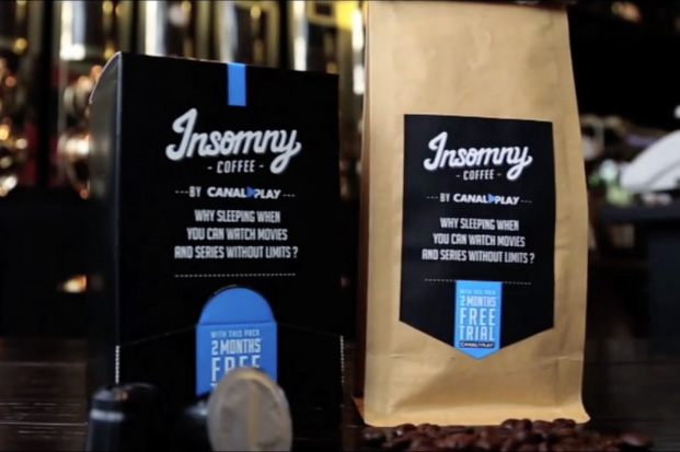
THE ORIGINAL?
CanalPlay “Insomny Coffee” extra strong – 2013
“Why sleeping when you can watch movies all night?”
Source : Cristal Awards GOLD

Agency : Buzzman, Paris (France)
LESS ORIGINAL
HBO Nordic “Monday roast” – 2018
“Extra strong coffee for the day HBO
releases the most TV show episodes”
Agency : Nord DDB, Copenhagen (Denmark)

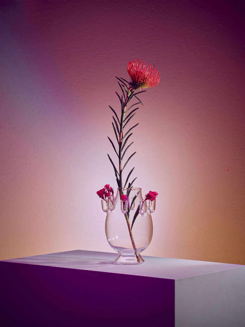
Da Vetro: a limited edition glass collection of vases inspired by human gestures

Post pobrano z: Da Vetro: a limited edition glass collection of vases inspired by human gestures

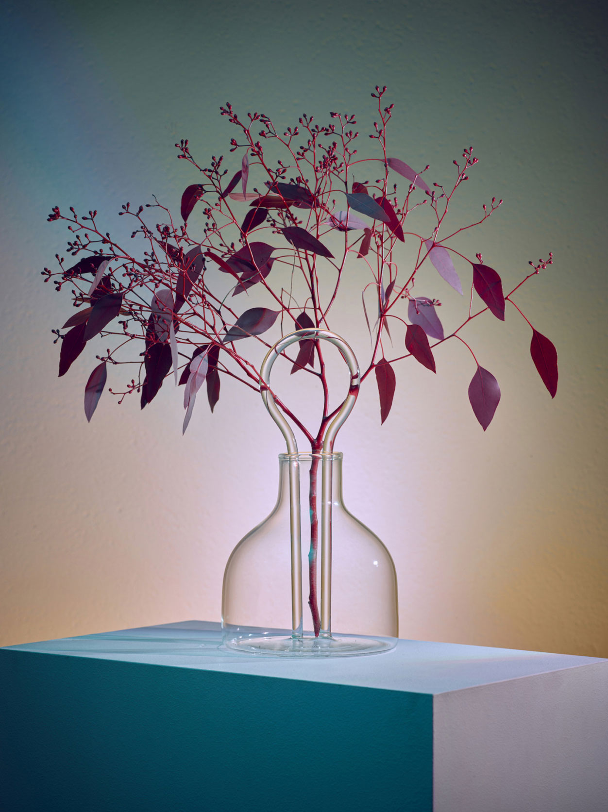
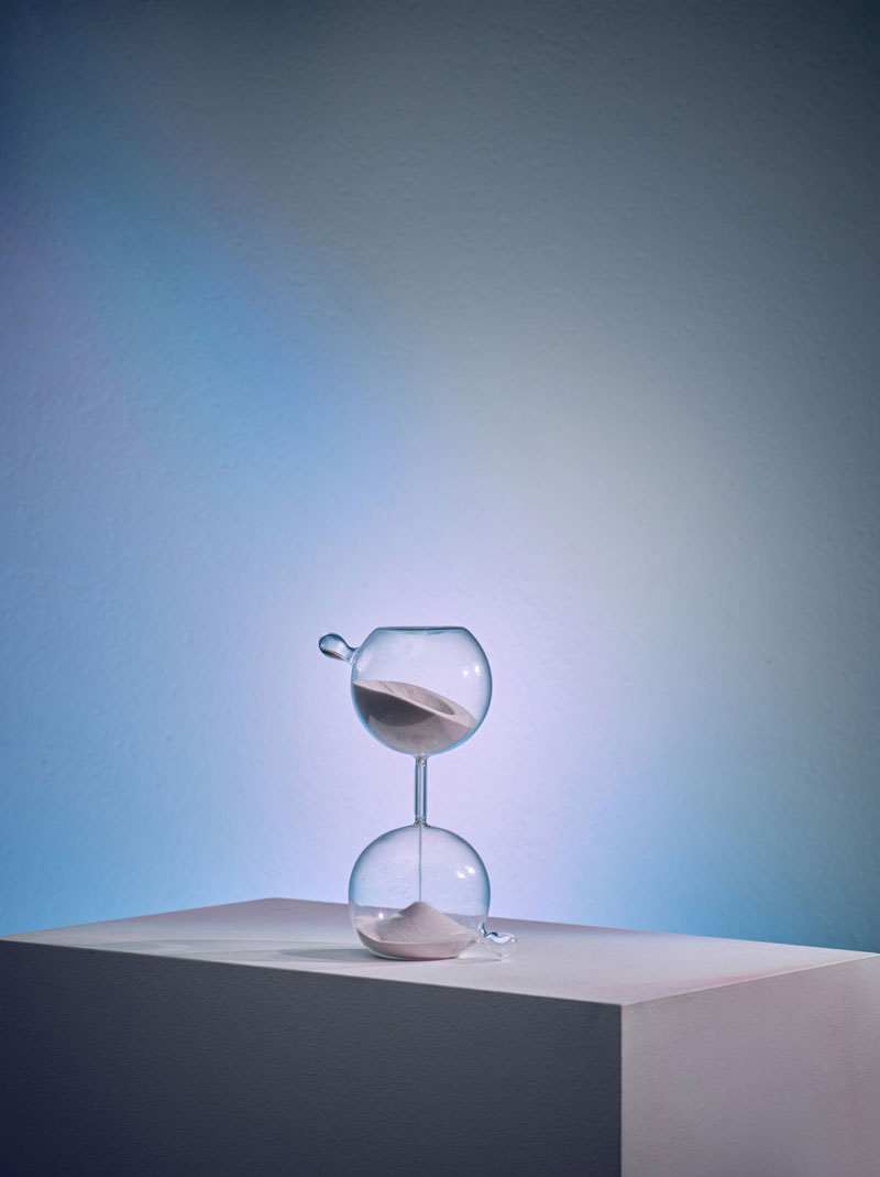
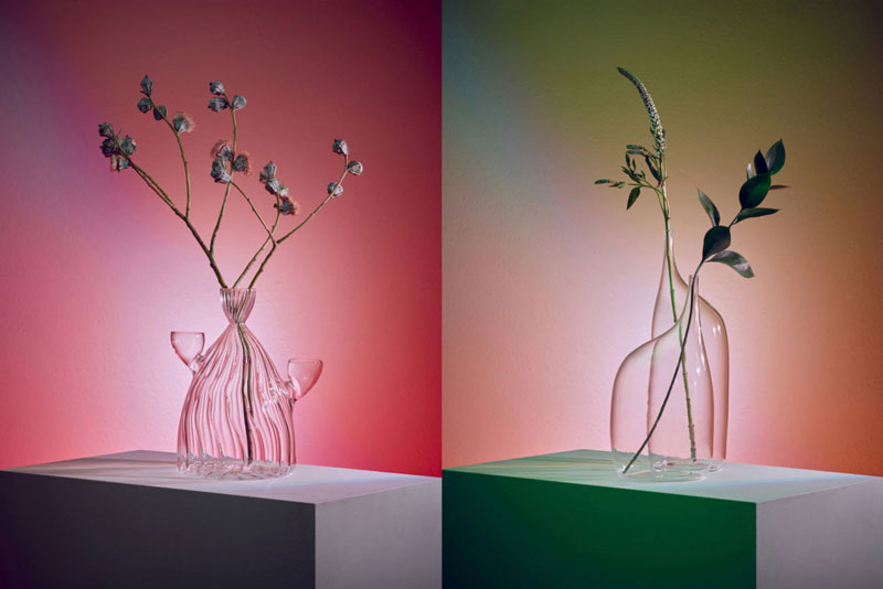
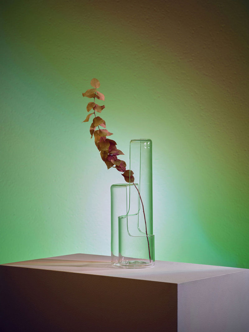
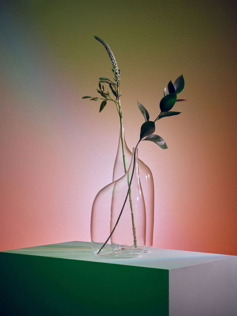
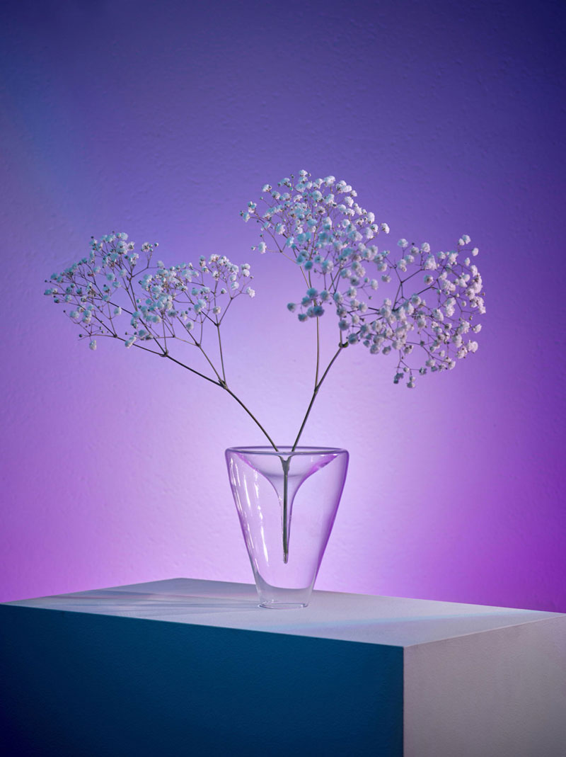
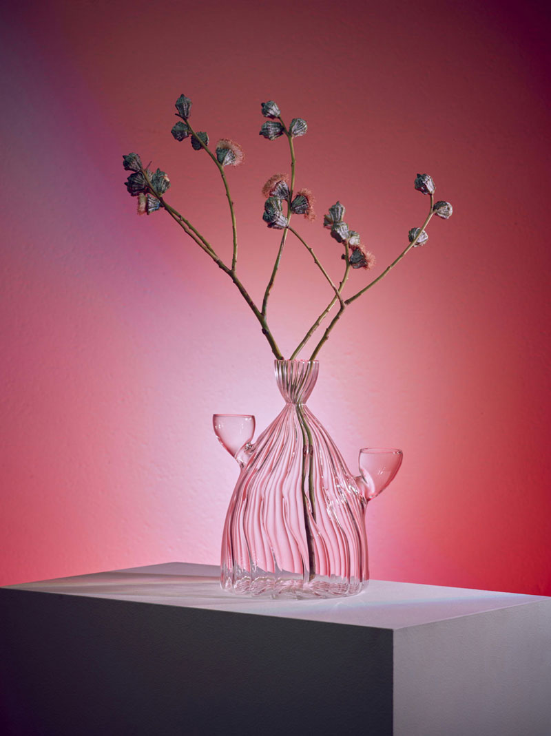
Da Vetro is the name of a series of vases, carafes, and containers designed with glass by a group of young designers from Fabrica, the research center based in Italy. The work was commissioned by Do Not Enter, a luxury retail and exhibition space in Los Angeles. The eight designs of the collection were hand-blown in Italy by glass blower Massimo Lunardon. Only a limited edition of 30 pieces are made for each design.

Design fail: this is what happens when you don’t proofread

Post pobrano z: Design fail: this is what happens when you don’t proofread

Sometimes, when focusing on designing things, we forget the obvious and let horrible mistake slip through. In this post, you can find examples of what happens when you forget to proofread and go to print carelessly.

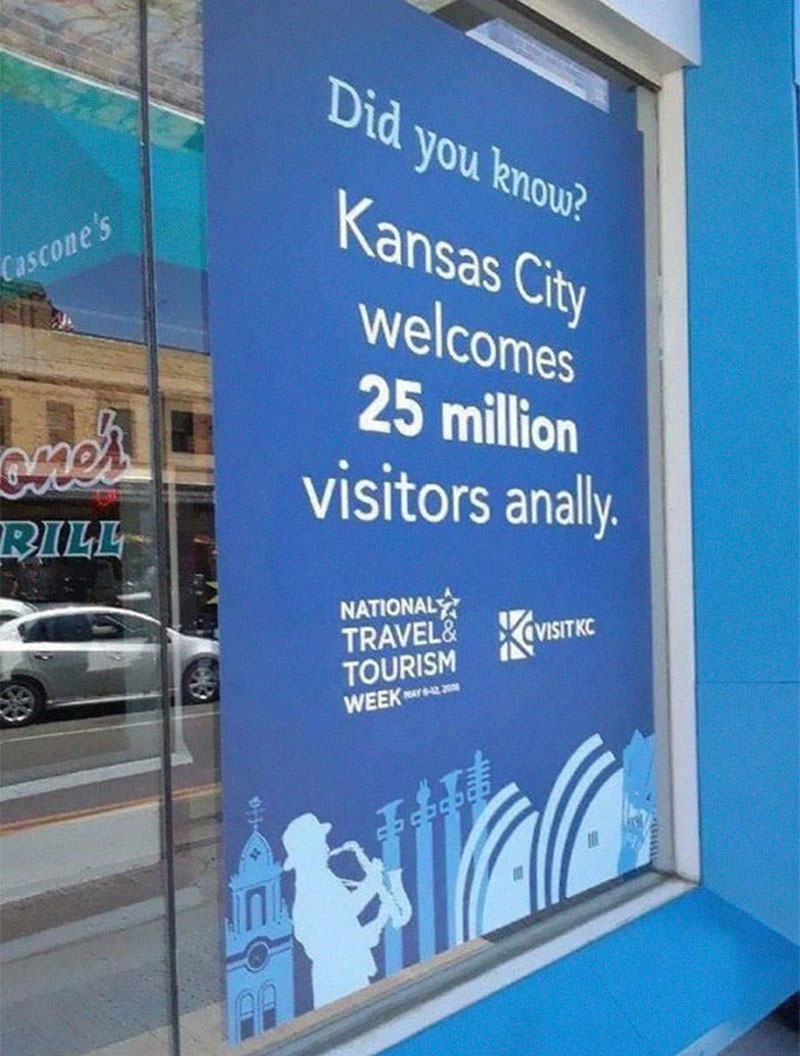
Welcome to Kansas City

What was meant to be a welcoming statement becomes a warning for most.

Not Lorem Ipsum

But not much better, looks like somebody slammed the keyboard.

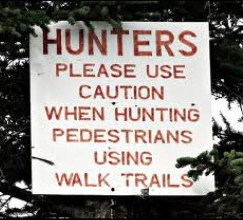
Pedestrian hunters

The lack of punctuation and spacing turns this message in a different one.

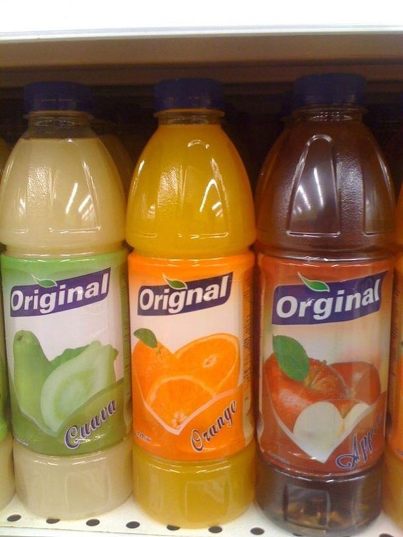
Orignal

Making typos may be a way to be original, but it will not make you look more professional.

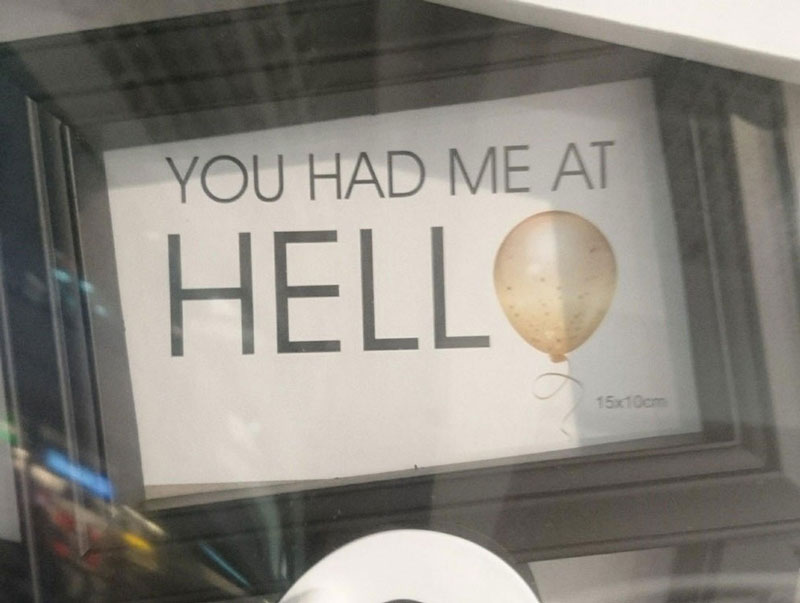
Hell

Sometimes replacing a letter with a picture can be a good idea, sometimes not.

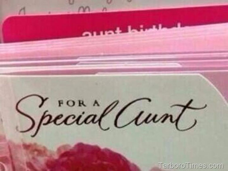
For a special aunt

Some fonts are more readable than others.

Flicks

Some mistakes are not typos, but bad kerning can change the meaning of words as well.

Shitake

Bad kerning again, with too much space this time.

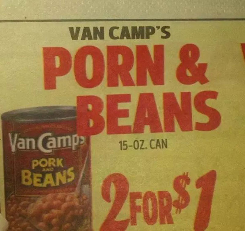
Porn & Beans

This looks like something autocorrect would do, but I doubt the designer was working with his phone.

School too easy for graphic designers

In this graphic designer’s defense, working for TV as a designer must be quite stressful as you need to always be producing new work quickly.

A Better America

This campaign slogan for Mitt Romney had a typo in the word America, which is a shame.

Adobe announces that it will acquire Magento for 1.68 billion

Post pobrano z: Adobe announces that it will acquire Magento for 1.68 billion

After last week’s announcement of a freemium business model for its UX tool Adobe XD, the design software giant makes another big move towards the web design industry. In fact, Adobe will acquire Magento Commerce, a key player in the eCommerce field.

With this acquisition, Adobe is aiming to add another essential tool to its Experience Cloud ecosystem. While the amount announced seems very high, it’s worth noting that Magento is a leader in its industry with over 250’000 platforms developed with its cloud solution, which generate an average of 155 billion dollars in annual sales.

On the practical side, Magento’s current CEO, Mark Lavelle, will stay in charge of operations in the new branch at Adobe. He shared his excitement of working with Adobe in a recent blog post. The Magento community, which represents 300’000 developers who will probably be happy about the news.

Developing a design environment

Post pobrano z: Developing a design environment

Jules Forrest discusses some of the work that her team at Credit Karma has been up to when it comes to design systems. Jules writes:

…in most engineering organizations, you spend your whole first day setting up your development environment so you can actually ship code. It’s generally pretty tedious and no one likes doing it, but it’s this thing you do to contribute meaningful work to production. Which got me thinking, what would it look like to make it easier for designers to design for production?

That’s what Jules calls a “design environment” and she’s even written a whole bunch of documentation in Thread, Credit Karma’s design system, for designers on their team to get that design environment up and running. That’s stuff like fonts, Sketch plugins, and other useful assets:

These problems have certainly been tackled by other teams in the past but this is the first time I’ve heard the phrase “design environment” before and I sort of love the heck out of it. Oh, and this post reminds me of a piece by Jon Gold where he wrote about Painting with Code.

Direct Link to ArticlePermalink

The post Developing a design environment appeared first on CSS-Tricks.

What does the ‘h’ stand for in Vue’s render method?

Post pobrano z: What does the ‘h’ stand for in Vue’s render method?

If you’ve been working with Vue for a while, you may have come across this way of rendering your app — this is the default in the latest version of the CLI, in main.js:

new Vue({
 render: h => h(App)
}).$mount('#app')

Or, if you’re using a render function, possibly to take advantage of JSX:

Vue.component('jsx-example', {
  render (h) {
    return <div id="foo">bar</div>
  }
})

You may be wondering, what does that h do? What does it stand for? The h stands for hyperscript. It’s a riff of HTML, which means Hypertext Markup Language: since we’re dealing with a script, it’s become convention in virtual DOM implementations to use this substitution. This definition is also addressed in the documentation of other frameworks as well. Here it is, for example, in Cycle.js.

In this issue, Evan describes that:

Hyperscript itself stands for „script that generates HTML structures”

This is shortened to h because it’s easier to type. He also describes it a bit more in his Advanced Vue workshop on Frontend Masters.

Really, you can think of it as being short for createElement. Here would be the long form:

render: function (createElement) {
  return createElement(App);
}

If we replace that with an h, then we first arrive at:

render: function (h) {
  return h(App);
}

…which can then be shortened with the use of ES6 to:

render: h => h (App)

The Vue version takes up to three arguments:

render(h) {
  return h('div', {}, [...])
}
  1. The first is type of the element (here shown as div).
  2. The second is the data object. We nest some fields here, including: props, attrs, dom props, class and style.
  3. The third is an array of child nodes. We’ll then have nested calls and eventually return a tree of virtual DOM nodes.

There’s more in-depth information in the Vue Guide here.

The name hyperscript may potentially be confusing to some people, given the fact that hyperscript is actually the name of a library (what isn’t updated these days) and it actually has a small ecosystem. In this case, we’re not talking about that particular implementation.

Hope that clears things up for those who are curious!

The post What does the ‘h’ stand for in Vue’s render method? appeared first on CSS-Tricks.

Serta Mattresses: Passengers

Post pobrano z: Serta Mattresses: Passengers
Print
Serta Mattresses

Advertising Agency:Ogilvy & Mather, Honduras
Advertising Agency:Ogilvy & Mather, Bogota, Colombia
Regional Creative Director:John Raul Forero
General Creative Director:Sebastian Bullorini, Juan Pablo Alvarez
Head Of Art:Camilo Ruano
Creative Director:Cesar Chinchilla
Art Director:César Miralda, Camilo Ruano
Media Director:Andrea Urtecho
Account Executive:Maria Fernanda Andino
Production Company:Rocket to the Moon
Photographer:Mateo Medina
Agency Producer:Lina Villamil