Post pobrano z: How to Draw & Paint a Galaxy Afro Portrait in Adobe Photoshop

Afros are beautiful—and so is space! Let’s put them together in this galaxy-inspired portrait tutorial for Adobe Photoshop.
In this tutorial, we’re going to draw in Adobe Photoshop, from start to finish. You should have a basic understanding of Photoshop—for example, creating new documents, selecting content, and creating new layers should be familiar to you.
Looking for Photoshop resources? Why not pop over to GraphicRiver for Photoshop Brushes and more!
1. How to Create the Sketch
Step 1
First, start by creating a New Document. For this illustration, I’m going to work at 8 inches by 10 inches, at 300 dpi.

Step 2
When sketching, I always draw on a New Layer—separate from the Background. This helps keep these two aspects independent.
Start with basic shapes to help establish your subject. I like to use Photoshop’s basic Hard Round Brush when drawing my initial sketches.
Note the variable transparency in my lines—this is because my Opacity Jitter and Flow Jitter are set to Pen Pressure. You can find these settings in your Brush panel (located under Windows > Brush), and we will discuss them further, after creating a Custom Brush, in this tutorial.

Step 3
I often like to draw on top of my initial sketch, using it as a guide—on a New Layer.
When drawing afro textured hair, I like to focus on soft, round shapes. No two afros are exactly the same, so looking at reference is a strong idea! In this case, I wanted the hair to have some weight, as well as thickness.

2. How to Create a Custom Brush
Step 1
Before we get too far into this illustration, let’s take a look at our Brushes.
I often use Photoshop’s default Brushes when I draw and paint, but for this illustration, I’d like to use a Custom Brush. I could probably get away with using a Soft Round Brush for the afro, but I know I’m going to want a little extra texture in there. So let’s create a basic textured brush together.
Please keep in mind that creating Custom Brushes is potentially a tutorial all its own. There is a lot that can be done and customized!
First, we’ll need to create a second New Document. I chose to work at 100 pixels wide by 100 pixels high.
Then, create a black circle on a New Layer. I used the Ellipse Tool to do so (hold down the Shift key while using the Ellipse Tool to create a perfect circle).
Then I chose Rasterize Layer so it would no longer be a vector-based Layer. To do this, Right Click and select Rasterize Layer.

Step 2
Now, we need to add some texture to our circle. First, make sure to Lock Transparent Pixels in your Layers panel, so the Filters we apply stay within the circle. I applied both the Sponge and Film Grain Filters via the Filters Gallery to add some texture (you can find these via Filter > Filter Gallery).

Step 3
Next, I adjusted the Exposure (found via Image > Adjustments > Exposure) and hand drew some imperfections, both inside and around the circumference of the circle (remember to turn off Lock Transparent Pixels to do so, because we no longer want to stay inside the boundaries of our circle).
My goal was to lighten the circle and make the primary contours look more organic (instead of a clean, perfect circle).

Step 4
Keep in mind that yours won’t look exactly like mine—and that’s fine! The goal is to create a brush with some texture and variation.
Finally, apply a Gaussian Blur to the circle (I chose around 2.5%) and clean up any stray markings that you don’t want included in your Brush. You can find Gaussian Blur under Filters > Blur > Gaussian Blur.

Step 5
To turn this circle into a Brush Preset, go to Edit > Define Brush Preset. You will then be prompted to give your Brush a name—any name will do! I normally choose a name that will help me remember what I created and/or what purpose I intended.

3. How to Add Initial Color and Values
Step 1
Now that we’ve created our Custom Brush, let’s go ahead and start working with color.
Personally, I like to apply base colors on top of my lines, in a New Layer with the Blending Mode set to Multiply.
I chose a brown color, a little darker in value than the skin tone, as my base. For the eyes, accessories, and clothing, I decided to start with a purple color.

Step 2
If you haven’t already, make sure to Save your work! I regularly Flatten my Layers when I’m painting; it’s a personal preference, but it’s also why I tend to save regularly and save multiple versions of my work.
In this case, once I’m happy with my initial color choices, I Flatten my artwork Layers, keeping the Background independent.
I also chose a new Background Color via the Color Picker in the Tools panel. In this case, I know I want to go with something dark and space-like, so I chose a dark, cool gray.

Step 3
I’m happy with my color choices, but I decided I might like to give everything a purple hue, since the character is going to be set in space.
I created a New Layer and set the Blending Mode to Hue. Setting the Opacity to 32% gives it a slight hue, rather than an entirely purple hue. I used the same purple that I used in other parts of the illustration.

Step 4
Now, let’s experiment with our light source.
Create a New Layer on top of your artwork Layers and set it to Clipping Mask (Right Click on the Layer and choose Clipping Mask from the available options). This way, when we apply color, it will be confined to the area the artwork occupies (we’ll automatically „stay in the lines”).
I experimented with a light purple here, with the Layer’s Blending Mode set to Multiply.

Step 5
With my initial colors and values selected, it’s time to start blending and refining the artwork.
When painting the face, I tend to stick to a Soft Round Brush, especially in the rounder parts of the face. When there’s a harsher shadow, I will often start with a Hard Round Brush and then blend using a Soft Round Brush.
Some artists may prefer painting on top of their work on a New Layer—and this may be what you prefer, especially if you’re leery about making mistakes.

Step 6
In my opinion, it is very important to keep an eye on your Brush Settings. If you’re not getting the results you want with your Brush Strokes, adjusting these settings would likely be a step in the right direction.
For example, I almost always draw with the Opacity Jitter and Flow Jitter set to Pen Pressure. Opacity is generally the amount of transparency, and Flow can be considered how much color „comes out”.
You can find these settings in your Brush panel (located under Windows > Brush).

Step 7
You can also experiment with the Opacity and Flow in your Options panel when you have the Paint Brush selected.
So, for example, when I want a smooth transition on the face area, I might lower my Opacity and Flow considerably—versus when I’m drawing hard lines and I know I want a bold, hard contour.

Here is an example of overlapping Brush Strokes with varied Opacity and Flow, to further illustrate this concept in an isolated example.

Step 8
Personally, I like to add highlights and additional shadows later in my process, following the same techniques described. For example, for the eye area, I used a New Layer with a Blending Mode set to Multiply.

Step 9
Now let’s take what we’ve learned and apply this to our Custom Brush. We’re going to use it for my favorite part—the afro!
I would recommend keeping the Brush Spacing between 5% to 10% for this Brush and the purpose of this tutorial. Again, you can open the Brush panel by going to Window > Brush.
Brush Spacing is the space between your Defined Brush. Remember the circle we created as the basis of our Custom Brush? Turn the Brush Spacing up high, and it’ll start to resemble the circle we originally created.

However, we don’t want to draw a line of fuzzy circles—we want a relatively fluid stroke that has some texture to it. Here is an example of the texture we can create with this Custom Brush versus a standard Hard Round Brush.

Personally, when I’m painting afro textured hair, I like to apply color in a circular motion. I often think about clouds in terms of shape, as my guide.

4. How to Create Your Galaxy Background
Step 1
However, we’re not going for clouds in this tutorial—we’re going to work with galaxy colors! Now that I have the basics of my portrait figured out, I’m going to skip to the background. I want the background to feature similar, galaxy-inspired patterns and colors.
You may want to Hide your artwork Layer(s) so you can focus on the Background, for now. You can do this by toggling visibility on and off.
First, create a New Layer above the Background Layer and Fill it with black. This is going to be the start of our starry sky.

Step 2
We’re going to apply a Filter to this New Layer. There are many ways you could approach this—the goal is simply to create a background full of stars. For this tutorial, we’re going to use the Sponge Filter in the Filter Gallery (found via Filters > Filter Gallery)

Step 3
Next, apply a Gaussian Blur (found via Filter > Blur > Gaussian Blur). I chose to apply a radius of 3.5 pixels.

Step 4
Then, we need to adjust the Curves. Go to Image > Adjustments > Curves, to open this panel.
Our goal is to manipulate the Input points so they are close together.

Step 5
Next, let’s Create a New Layer, on top of the one we were just working on. We’re going to apply a Cloud Filter to this layer, using the colors black and white.
Set this Cloud Layer’s Blending Mode to Color Dodge.

Step 6
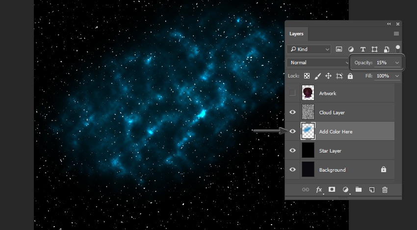
Now, for the fun part! We need to create a New Layer between the Cloud Layer (set to Color Dodge) and the Star Layer (the one right above the Background Layer). Set this New Layer’s Opacity to 15%.
Once you’ve created this Layer, take a Soft Round Brush and choose any color you’d like. I chose to start with a light blue color, because I know this is one I’d like in my galaxy.
As you paint, you’ll notice it starts to look like clouds of color in the stars!
Step 7
You can add additional Layers of color here, if desired. Try adding different colors, using a Soft Round Brush. In this case, I stuck to blue, purple, and violet hues until I had pretty splashes of color.
It’s also a good idea to turn your Artwork layer back on, so you can get an idea of how your galaxy visually relates to the artwork.

5. How to Paint Galaxy Colors in the Hair
Step 1
We’re going to apply these galaxy colors we’ve created to the hair, using a Clipping Mask and Blending Modes.
First, create a New Layer above your artwork and set it as a Clipping Mask (as described earlier in this tutorial). I like to use a Hard Round Brush to fill in the area I want to work with—in this case, the hair area.

Step 2
Once you’re happy with the area you’ve defined, set the Layer’s Blending Mode to Color. Make sure to toggle Lock Transparent Pixels on, so we are confined to the area we’ve just established when we’re drawing.
Now, using a Soft Round Brush, start applying colors inspired by the galaxy in the background. You’ll notice that it changes the color of the hair.

Step 3
At this point, I like to draw on top of my work and add small refinements. For example, using the same Custom Brush from earlier, I added some lighter blues and variations in the hair.

6. How to Add Finishing Touches
Step 1
I also wanted to put sparkles in the hair, to push the galaxy aesthetic further. I started by drawing simple shapes—little dots and crosses—where I wanted to see stars.

Step 2
Then, I Duplicated this Layer and added a Gaussian Blur to it, to give them a glow.
Lower the Opacity of the original Layer to 20%, and then create a New Layer on top of both of the Layers of sparkles. I drew small dots in the center of each sparkle, on this Layer, to push them further.

Step 3
Finally, it’s time for some finishing touches. For the eyes and earrings, I used a Hard Round Brush to add some extra details and shine. My light source is coming from the viewer’s left, so I made sure to keep that in mind.
I also added a cute star shape to her cheek! Notice how it looks soft against the skin—this can be achieved by lowering the Opacity of the layer you’re drawing on.
I also thought a touch of galaxy-inspired eye shadow would help push things further! I did so using the same technique we used earlier, when adding colors to the hair. Create a New Layer, set the Blending Mode to Color, and add color using a Soft Round Brush. If the color seems too intense, try lowing the Opacity.

Step 4
One last thing and we’re done! Using a Soft Round Eraser, I removed some of the base of the artwork, so the character blends into the starry background.

Awesome Work!
We’ve drawn a lovely, galaxy-themed portrait. As a woman of color with afro textured hair myself, I’d love to rock this look—but until I can get in touch with my inner space princess, painting this out-of-this-world style will have to do!
Good luck experimenting with your own galaxy-themed portraits!