This isn’t a comprehensive guide to centering things. We have that!
This is just a little observation about old and new. One of the trickier things related to centering in CSS is when you need to center both vertically and horizontally and you don’t know the width or height of what you are centering. Vertical centering being the extra tricky of the two.
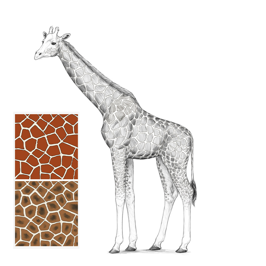
If you want to learn how to draw a giraffe, you’ve come to the right place! In this tutorial I will show you how to draw these amazing animals from scratch: first by establishing the guidelines of the skeleton, then by adding simplified muscle masses, and then by adding all the necessary details.
Even if you’re a beginner at drawing, you can draw a realistic giraffe with me! And if you want something simpler, I will also show you how to draw the characteristic giraffe pattern.
This is a simple step-by-step tutorial on how to draw a giraffe in a single pose. If you want to learn more about drawing giraffes, especially about their anatomy, try this tutorial instead:
The main body of a giraffe has a characteristic shape—the shoulders are much higher than the hips, and the whole torso is quite short. Sketch this shape to create a basic outline of the body.
Step 2
Divide this shape into thirds.
Step 3
Draw a circle in the first two thirds. This will help us see the ribcage.
Step 4
Add two circles in the front for the shoulder, and a tilted oval in the back for the hips.
Step 5
We’ll need more details to use these pieces of anatomy. Add the front of the shoulder, the front of the ribcage, and tips of the hips—all drawn as simple circles.
Step 6
Draw the sacrum right over the hips.
Step 7
Add the tail.
Step 8
Outline the silhouette of the body as the guidelines suggest.
2. How to Draw a Giraffe’s Legs
Step 1
Giraffes have very long legs—but how long, exactly? It’s all about proportions. Measure the torso in the middle, and then add twice this length below, plus some extra space for the hooves.
Step 2
Sketch basic curves for the front and hind legs.
Step 3
Legs can only be legs if they have joints in the correct places. Here’s how you can find them:
Step 4
Let’s add some depth to the drawing by adding another pair of legs slightly in the background. Draw the line of the ground above the previous one…
… and draw another pair of legs here.
Step 5
Mark their joints, too.
Step 6
The joints have a special shape that is very visible on these skinny legs. First, draw circles to create the joints over the hooves.
Step 7
Now, add semicircles for the „wrists” and „ankles”.
Step 8
Finish these joints by adding more shapes.
Step 9
Finally, the arm and the knee.
Step 10
Draw the top of the hooves by „cutting” the line right over them.
Step 11
Outline the hooves. They should be quite flat.
Step 12
Add some muscle masses.
Step 13
Outline the whole legs.
3. How to Draw a Giraffe’s Neck and Head
Step 1
To find the proper length for the giraffe’s neck, use the length of the front limbs (without the hooves). You don’t have to use a ruler—these lengths just need to be visually similar.
Step 2
To give this neck the proper volume, draw three ovals across it.
Step 3
Outline the neck, merging it gently with the torso.
Step 4
Add an oval for the head. It should be quite small.
Step 5
The simplest way to quickly set the proportions of the head is to draw a cross made of the eye line and a line going along the whole head. This cross must be adjusted to the perspective.
Step 6
Add the muzzle in the front.
Step 7
Add the cheeks.
Step 8
Add the „eye sockets”. If you draw them bigger than the intended eyes, you get a better visual idea of where they should be placed.
Step 9
Draw the top of the muzzle.
Step 10
Add the long nostrils.
Step 11
Add the ears.
Step 12
Some giraffes have a bump on their forehead—this is where males store additional calcium.
Step 13
Sketch the two little horns.
Step 14
Draw the oval lines.
Step 15
Draw the bump over the eyes.
Step 16
Draw the long upper lip of the giraffe.
Step 17
Finish the shape of the head by connecting some of the guidelines.
4. How to Finish the Drawing of a Giraffe
Step 1
The guidelines are all done, so it’s time to draw the final lines over them. You can use a darker tool now, erase the sketch to an extent, or put a new sheet of paper over it—it’s up to you.
Outline the body as the guidelines suggest.
Step 2
Outline the head and all its details.
Step 3
Add some details to the body.
Step 4
Some elements should be darker—the eyes, the nostrils, the mane, the tail, and the hooves.
Step 5
To better show the 3D form of the body, shade it in a simple way.
5. How to Draw a Giraffe Pattern
Step 1
Let’s practice it on the side first. The pattern is pretty chaotic, but it has a special rhythm we have to follow. You can simulate it by drawing a lot of ovals/circles of similar size.
Step 2
Now you need to create borders between these ovals. First with long curves…
… then with simple lines, wherever necessary. Your goal is to keep all the ovals separate.
Step 3
Clean up these borders to create a regular mesh of polygons.
Step 4
Finally, draw patches inside the polygons, creating some distance between them. Make the lines a little wobbly to create a more natural shape.
When it comes to web design trends and technologies, the only constant is change. Those much sought after comfort zones usually don’t stay that way all that long. It’s hard to keep up with those competitors who always address new technologies.
It’s not always that way of course. Most designers often find themselves scrambling to keep up with the times. There’s good news, however. Technologies change and create new challenges. Then, the new tools and resources generally come into play. They aim to meet and overcome those challenges.
Maybe this is a good time for you to take stock of your tools and resources. See where pursuing some updates or tools might be in order.
This list of 15 of 2018’s best tools and resources should help you get started.
Requirements, like technologies, also have a habit of changing, and much more often. Getting a software product out the door can bring with it enough problems. When requirements change, or updates are needed, whether during design and development or during maintenance, it means even more work. In the latter case changes sometimes require repetitive deployment cycles.
Mason is a software design, development, maintenance, and collaboration tool that will enable you to avoid facing these repetitive deployment cycles and help speed up the design/development process as well.
Mason, with its wealth of software product design features, enables you to build, edit, and manage your products from a single platform. It’s pre-packaged building blocks address common requirements and are continuously updated.
What Mason does differently is to allow others, including end users, to make changes, even after your product has been signed off and deployed. Thanks to Mason’s login and user registration security features, you maintain complete control over what happens. Approved individuals can make maintenance changes or updates without having to repeat the deployment cycle.
The ability to create mobile-friendly websites has become practically mandatory for themes and web designers alike. Most WordPress themes advertise mobile friendly, device friendly, or responsive as one of these features, and for good reason. Mobirise on the other hand is a free website builder that was created with mobile devices in mind.
Mobirise can be used for personal or commercial use, free and without restrictions. Since it is an offline app, you’re not tied down to the theme, you have total control over your website or mobile app design, and you can host it wherever and however you choose to.
This is a great tool for anyone who works on multiple small projects such as small websites, promo sites, portfolios, or landing pages. It has all the features and design elements you’re likely to need, and no coding is necessary.
Elementor is a feature-rich, open source frontend website builder that can justifiably claim to be the best page-building tool on the market. The numbers would seem to bear that out as more than 900,000 users have signed up to use Elementor in just under 2 years. Signing up is not at all complicated since Elementor is yours to use for free.
Part of Elementor’s popularity is no doubt due to its superior workflow features, its menu and visual form builders, custom CSS and superior integrations. Ease of use and excellent performance are other key factors.
This page-building machine is only going to get better, given what has been added in the latest release, Elementor 2.0. Features include new eCommerce page-building capabilities, enhanced WooCommerce shop product pages, single post page builders, and more. Several of these new features have already been released, with the remaining features to follow throughout 2018.
A2’s managed WordPress hosting features can easily be customized to fit your exact needs. Not only will you get the hosting experience you want and need, but you’ll get it for much less than you would typically pay elsewhere.
A2 Hosting’s servers are blazing fast, and services include automated backups and WordPress updates, free CDN, and excellent customer support.
Goodiewebsite is a development agency that’s been in business since 2006. Their specialty is smaller websites (1 to 10 page) and simple WordPress websites. The Goodiewebsite staff can help you with your design work as well as your coding needs.
You can always expect Goodiewebsite’s cost effective services to be accomplished reliably and professionally.
This high-performance team management tool will serve you equally well whether your team consists of yourself and one other, or of several thousand individuals dispersed around the globe. monday.com offers an excellent opportunity to dispense with multiple spreadsheets displaying project status and expenses and planning and strategy exercises done on whiteboards.
Lengthy and all-too frequent meetings can be minimized, if not avoided. monday.com is easy to use, it promotes team transparency and can empower team members.
In addition to providing various listings options, advanced property search capabilities, and payment options, Houzez has added a custom fields builder and search composer to make it easier for individuals and agencies alike to administrate the real estate marketplace, coordinate activities among agents, and accept submissions; all within the confines of their business model.
Additionally, Houzez provides a great level of customer support.
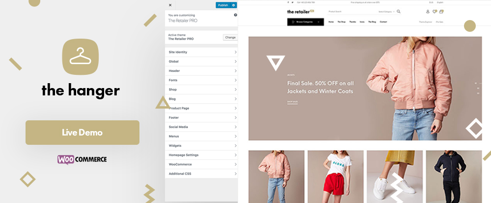
If establishing a modern-classic shop is your objective, or that of your client’s, your best approach would be to use a modern-classic specialized WordPress theme to get you there. The Hanger is easy to set up and use.
You can build a high-quality online shop in no time at all, while customizing it to fit your client’s brand or the brands of the merchandise.
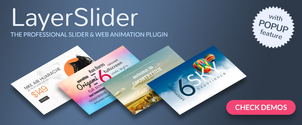
LayerSlider is a responsive, multipurpose animation platform from which you can create everything from slideshows and sliders, to image galleries, landing pages, and even complete websites. LayerSlider’s builder is drag and drop with no coding required. It is supported by a large hand-crafted template library and a whole host of design elements.
Detailed documentation comes with the package and you can expect top-notch customer support.
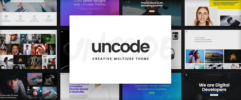
The saying that all good things take time isn’t always true. With Uncode, you can build an awesome portfolio to showcase your work in a few short hours. You don’t have to start from scratch, and there’s no coding involved.
Uncode makes it easy and its new features like Shape Dividers, Slides Scroll and a powerful Gallery Manager make it even easier – and fun as well.
Trying to locate a font that you simply cannot do without, but you don’t know its name can be like searching for the proverbial needle in a haystack; which is the reason to add WhatFontis.com to your toolkit.
It’s simply a matter of submitting an image and letting WhatFontis.com search its 450,000 font database with its AI search tool. You can usually expect your answer in less than a minute.
If you build multiple websites for multiple clients you’re likely to need a variety of font types or styles in the process. If that’s the case, FFonts.net’s directory of 75,000 free fonts will serve you well.
The fonts have been judiciously categorized to save you time, and when you find the font you need, or a font style of interest, you can use it in a string of text to see how it will appear in actual use.
You can put Fluid UI’s prototyping capabilities to good use to speed up your design workflow and enhance team collaboration by creating colorful and informative interactive prototypes, wireframes, or mockups.
Fluid UI enables you and your team to collaborate via chat or video in real time from both desktops and mobile devices. Built-in design components for desktop, Android, and iOS prototyping applications come with the package.
Designed for creative professionals, Pixpa delivers pixel-perfect portfolio websites, features a built-in eCommerce store to get you up and running in record time, and also offers client proofing and blogging tools to make the package complete.
You can do everything from one platform, powered by Pixpa’s best in class hosting and 24×7 support, instead of having to rely on multiple tools or resources to showcase your work. Get started for free with the 15-day trial.
Trying to condense huge volumes of complex data to present in a table or chart can be a scary proposition; even more so if a table is to be interactive, responsive, and editable. wpDataTables can do all these things, and quickly.
This #1 WordPress table and chart-building plugin has become so popular, and made it so easy to build colorful, informative tables and charts, that more than a few designers have switched to WordPress for the opportunity to use it.
Conclusion
Changing technologies can take a toll on design workflow time and team collaboration. Website hosting and even product deployment can also be affected. This is the case if the tools and resources you’re using aren’t up to the task.
The tools and resources listed here were chosen to help you update your design toolkit. Picking one or more should be more than enough to brighten your day, and that of your team’s and your clients’.
If you love unashamedly brash and bold colors and patterns, you’ll be very happy to hear that the Memphis Style, the design style pioneered by the 1980s Memphis Group, is very much back in vogue.
Here we’ll take a look at the background of the Memphis Group and look at how you can emulate the Memphis Style in your own design work.
What Was the Memphis Group?
In 1981, Italian designer Ettore Sottsass founded a group of artists and designers called Memphis. Bob Dylan’s song ’Stuck Inside of Mobile with the Memphis Blues Again’ was playing on repeat during the group’s first meeting, which led to the group being named 'Memphis’.
After the inaugural meeting, the group decided that they would meet again in February 1981. The members brought over 100 drawings with them, picturing a variety of bold, colorful designs with multiple stylistic influences.
The Memphis Group went on to create furniture, fabrics, patterns, ceramics and other products in a distinctly Postmodern style that blended stylistic traits of 1950s kitsch, Art Deco, and Pop Art.
A room containing furniture and other items designed in the Memphis Style, as part of a Memphis-Milano design collection. CC Wikipedia.
Initial critical reaction to the designs produced by the Memphis Group was not positive. The group’s use of conventionally ‘bad-taste’ plastic laminate and clashing colors didn’t resonate with the more widely accepted design standards of the time.
However, we can now reflect on the designs created by the Memphis Group and recognise that they were groundbreaking. They marked a complete separation from the dark, overly tasteful and serious design styles of the 1970s.
Memphis’s fresh approach to design, which was characterised by creativity and humor, came to be a lasting stylistic hallmark of the 1980s.
After six years of creative productivity, in 1987 the Memphis Group disbanded. Despite being described as a fad at the time, the group’s trademark style is now experiencing a revival.
Use Photoshop’s 3D tools and settings to create an abstract 3D displaced text effect, with a touch of a Retro/Memphis Style feel.
One of the members of the Memphis Group, Nathalie Du Pasquier, recently collaborated with Danish design company HAY to create Memphis-inspired products. The world of fashion has been one of the quickest design fields to revitalise the style, with houses such as Dior and Missoni creating collections and show sets that take inspiration from the Memphis Group.
What Is the Memphis Style?
The Memphis Style is one of the most instantly recognisable design styles. It’s known for its use of bright neon, primary and pastel colors, geometric shapes, and bold, repetitive patterns. The style is experiencing a resurgence in graphic design and illustration, as the trend for reviving all things eighties and maximalist continues to feel fresh and relevant.
As the Memphis Style is a mish-mash of various design styles that were popular during the 1980s, it can look a little confused at best, and downright bonkers at worst! It’s a real Marmite design style—individuals tend to either completely love it or loathe it.
Whether you think the outlandish designs of the Memphis Style are awesome or simply bad taste, you can’t deny the influence of the Memphis Group on graphic design and interior design today.
‘Casablanca Cabinet’, designed by Ettore Sottsass in 1982. CC Wikipedia.
Graphic design has allowed the Memphis Style to be recreated for a contemporary audience, with designers creating patterns, textures, color fonts and posters using its trademark geometric shapes and bold colors.
How Can I Emulate the Memphis Style in My Own Work?
While the out-there furniture style of the Memphis Group might not be everyone’s cup of tea, luckily the revival of the style in graphic design and illustration is a little more pared back.
A good starting point is to create a vector pattern using repeated shapes, such as triangles, circles, and wavy lines, to give any background a Memphis flavor.
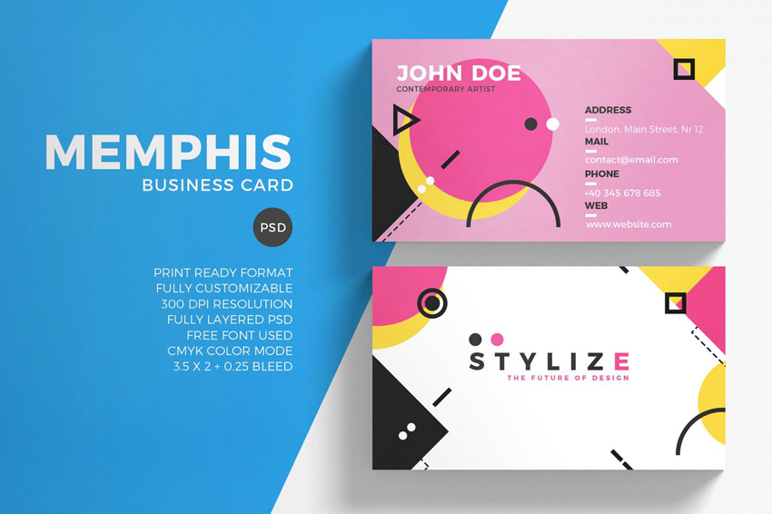
You can apply your background to print media, such as business cards or invitations. Team it with simple, minimal sans serif typography in black to anchor the style and stop it all looking a bit too zany.
You don’t need to be a Memphis purist to extract the best elements of the style. Blending Memphis influences with other retro design traits can make patterns look nicely off-beat and relevant for now. These retro-style patterns borrow influences from 1970s design and the Memphis Style, as well as mixing in pastel neons for a contemporary twist.
Ultimately, the Memphis Style is all about taking a bold and brash approach to design. So get experimental! Try pairing pastels and neons together, rotate shapes into jaunty positions, and keep everything you create looking playful.
Try to add a contemporary twist to your designs that keeps the style looking on-trend. In this tutorial, the Memphis Style is given a 3D update and a fresh pastel palette.
Have ten minutes to spare? This eye-catching effect gives any text an instant dose of nostalgic color and style.
Conclusion
Even though the Memphis Group’s ethos was considered to be in poor taste by the critics of the day, the style they pioneered has proven to have lasting relevance for designers, who look to its off-beat, humorous approach to give freshness and life to their designs.
What makes the Memphis Style so fun is the lack of rules and regulations associated with it. It really is a style that embraces eclectic and truly creative design. It’s also an inherently optimistic design style, which perhaps is why designers and illustrators are discovering a fresh relevance to the style today.
Although the Memphis Style had its heyday during the 1980s, its influence filtered down into 90s-era design too. Check out these retro-themed tutorials to embrace the optimistic, brightly colored design style of the 1990s:
Nineties patterns are recognizable from their use of vibrant color and simple geometric shapes. Learn how to make a 90s geometric pattern in Photoshop.
Nineties style is making a big comeback in fashion and design at the moment. Tap into the trend with this flyer design, perfect for clubs and music events.
I don’t think this is an epidemic or anything, but I’ve seen it done a few times and even advocated for. This is what I mean…
You go to Google Fonts and pick a font like Open Sans, and it gives you either a <link> or an @import with a URL there in which to ready this font for usage on your site.
You can take a peek in there and see what it returns…
It’s just some @font-face declarations, of course!
Now your performance-minded brain kicks off. Wait. So, I make one HTTP request for this stylesheet, and then it makes more HTTP requests for those woff2 files it’s linking up. Screw the middle man here, why not just copy those @font-face blocks right out of here and use them.
You can! But!
The issue is that Google does fancy Google things here and the contents of that original stylesheet changes based on the browser requesting it. That screenshot above is Chrome 66. Here’s Firefox 20 on Windows 7:
It’s different! It’s only got woff, not woff2. If we open that URL in IE 8, we’d get an @font-face block that includes the eot format!
The point is, what that URL gives is very specific to what the current browser needs. That’s a pretty cool thing to abstract away and not worry about. Should new browsers have new formats and new CSS syntax needed, that’ll just come along for the ride.
Not that Google Fonts is perfect with this stuff. For example, by not controlling your own @font-face blocks, you can’t take advantage of font-display, which is a shame. Maybe we’ll get that someday, or maybe it’s worth self-hosting your Google Fonts, which is another whole thing we’ll get into someday.
We’ve been working with Jetpack around here as a sponsor. It’s a great match because as someone with a bunch of self-hosted WordPress sites, Jetpack is one of those no-brainer plugins for me. Jetpack can do a ton of good things for any site in a variety of very different ways. Here’s one way to think about it: it brings the power of WordPress’ own massive servers to you.
For now, let’s just focus on one angle of what Jetpack can do for you: image performance. Jetpack does a ton for you in this regard, solving some non-trivial performance upgrades. Let’s take a look at what I see as the four big boosts you get from Jetpack on your images.
1) WordPress does responsive images for you
OK, I cheated with the first one because you don’t actually need Jetpack to benefit from this. But it’s an important and foundational concept for fast images. Just by using WordPress, you get basic responsive images for free.
If you already know what I’m talking about, here’s an example of the output you’ll see in the DOM of a published WordPress post with an image in it uploaded via the Media Uploader:
It’s wonderful to get this for free, as writing out responsive images syntax by hand is quite cumbersome.
If you are new to the idea of responsive images, the big idea is this: rather than a single image going to any browser visiting your website, you have multiple images in different sizes and the most-correct one is delivered. Imagine instead of a mobile phone downloading a 1600 pixel wide image (way bigger than it needs), it only downloads a 320-pixel wide image, saving a ton of downloading time.
Read a bit about web performance and you’ll be unanimously told: „use a CDN.” A CDN is a Content Delivery Network, essentially web servers designed specifically to make serving assets like images super fast. They call it a network because it isn’t just one server, it’s many servers physically located all over the world so that when your website is requested from different locations all around the world, the files being sent back come from geographically closer locations (faster!). Not to mention it does other clever things like not requiring cookies for each web request like your own server probably does.
Literally, flip a switch in Jetpack and you’ll be using an image CDN:
Site speed is impacted by many factors and one of them is content delivery. Using what is referred to as a content delivery network (or CDN) helps by:
Delivering your content from high-speed and dedicated data centers.
More files can be downloaded simultaneously by the browser.
Distributed data centers (ie in different geographic locations) improve download speeds and provide redundancy.
By distributing load and save bandwidth you reduce your existing hosting costs (or keep them in check).
3) You get optimization
Una Kravets calls image optimization an easy performance win for designers. It’s an easy thing to see. Try taking a screenshot of something, exporting something from Photoshop, or grabbing some stock photography. Then drop it onto a tool like ImageOptim and watch the bytes fall away as it optimizes it. Massive savings.
But wouldn’t it be nice if it wasn’t on you to manually optimize all your images before using them? Computers are supposed to help us with menial tasks, right?! When you flip on the CDN feature of Jetpack, your images are now hosted on Photon, and you can see in the Photon docs how it handles things like resizing and quality for you.
4) You get lazy loading
Lazy loading is the idea that you don’t load anything at all unless you need it. In the case of images, don’t download the image unless it’s visible on the page. As in, don’t download an image that is three quarter down an article that a user might never scroll down to, but if they do, then download it.
You know what they say, the fastest web request is one that is never made.Jeremy Wagner, for Google, says:
When we lazy load images and video, we reduce initial page load time, initial page weight, and system resource usage, all of which have positive impacts on performance.
This is another flip-a-switch feature that works on any theme. Turn it on, you got lazy loading.
All Together Now
You get responsive images with WordPress, which by itself can be a major performance win.
With Jetpack, those responsive images are CDN-hosted, providing a speed boost and great caching for the images that are downloaded.
Just because you’re using responsive images and a CDN doesn’t automatically mean those images are optimized, but they are on Photon.
Last, nothing is downloaded at all unless the images are in view (lazy loading), which is the most efficient thing you can do.
Welcome to Part 2 of this mini-series on building a RSS viewer with Vue. In the last post, I walked through how I built my demo using Vue.js and Vuetify on the front end and Webtask on the back end. When I built that initial version, I knew it was exactly thatmdash;an „initial” version. I took some time to work on a few updates, and while I won’t dare call this a „perfect” version, I do think I’ve made some improvements and I’d like to share them with you.
Starting to switch to components in the layout. (Well, I was already using Vuetify components, but I meant custom components for my application.)
Using IndexedDB to store feed items for quicker access and offline support.
That was the plan, and like most plans, I wasn’t necessarily able to hit everything in this update (and I’ll explain why at the end). But hopefully you’ll see the improvements as a general „moving in the right direction” for the application. With that out of the way, let’s get started!
Implementing Vuex
I’ll start off discussing the biggest change to the application, the addition of Vuex. As I said in the previous post, Vuex describes itself as a „state management pattern + library” on their „What is Vuex” page. No offense to their documentation, but I had a difficult time wrapping my head around exactly what this meant, from a practical sense.
After having using it in a few small projects now, I’m coming to appreciate what it provides. To me, the core benefit is providing a central interface to your data. If I’ve got a basic Vue app working with an array of values, I may have multiple different methods that modify it. What happens when I begin to have certain rules that must be applied before the data changes? As a simple example, imagine an array of RSS feeds. Before I add a new one, I want to ensure it doesn’t already exist in the list. If I have one method that adds to the feed list, that isn’t a problem, but if I have more, it may become cumbersome to keep that logic in sync across the different methods. I could simply build a utility to do this, but what happens when I have other components in play as well?
While it is absolutely not a one-to-one comparison, I feel like Vuex reminds me of how Providers or Services work in Angular. If I ever want to do work with any data, I’ll ensure I use a central provider to handle all access to that data. That’s how I look at Vuex.
So the big change in this application was to migrate all the data related items to a store. I began by adding the library to my HTML:
<script src="https://unpkg.com/vuex"></script>
Woot! Half-way done! (OK maybe not.)
I then created an instance of my store in my JavaScript file:
const feedStore = new Vuex.Store({
  // lots of stuff here
});
and included it in my Vue app:
let app = new Vue({
  el: '#app',
  store:feedStore,
  // lots of stuff here too...
});
Now comes the interesting part. Any time my Vue application needs data, which primarily consists of the list of feeds and the items from those feeds, it’s going to ask the store for them. So, for example, my feeds value is now computed:
feeds() {
  return feedStore.state.feeds;
},
This is now defined in the state portion of my store:
Notice that feeds defaults to an empty array. I had previously used the created event of my Vue app to read in the data from localStorage. Now, I ask the store to do that:
Back in the store, the logic is pretty much the same:
restoreFeeds(context) {
  let feedsRaw = window.localStorage.getItem('feeds');
  if(feedsRaw) {
    try {
    let feeds = JSON.parse(feedsRaw);
    context.state.feeds = feeds;
    context.state.feeds.forEach(f => {
      context.dispatch('loadFeed', f);
    });
    } catch(e) {
      console.error('Error restoring feed json'+e);
      // bad json or other issue, nuke it
      window.localStorage.removeItem('feeds');
    }
  }
},
I say „pretty much the same” except now I’m doing a bit of error-checking on the value read in from localStorage. But here’s the crucial bit. I already said I failed in terms of switching to IndexedDB, but in theory, I could build a third version of this application with an updated store and my Vue app won’t know the difference. And that’s where I started to get really excited. The more I worked, the more „dumb” my Vue app became and the less tied it was to any particular implementation of storage. Let’s look at the complete Vue app now:
What you’ll notice is that pretty much all of the actual logic is now gone and all I’m really doing here is UI stuff. Open a modal here, add an error there, and so forth.
You can view the complete store here, although I apologize for lumping everything together in one file.
Adding a Component
One of the other changes I mentioned was beginning to „component-ize” the view layer. I ended up only making one component, feed-item. This reduced the total number of lines in the HTML a bit:
It isn’t a huge change by any means, but it did make it bit easier for me when I started working on the feed display. As I’m not using a fancy builder yet, I defined my component straight in JavaScript like so:
I’m not doing anything at all fancy in heremdash;there’s no dynamic logic or events or anything like that, but I could certainly add that later where it makes sense. I did finally get around to adding the date and time of posting. If you’re curious about how I built the formatter used for it, read my article Build A i18n Filter Using Vue.js & Native Web Specs.”
The Power of Delete!
Oh, and I finally added a way to delete feeds:
Trash can icon, FTW!
This just fires off a method on the Vue object that, in turn, fires off a call to the store that takes care of removing the feed and items from the UI and then persisting it. A small thing, but, wow, did I wish I had that in the first version when testing. And here is a final shot of everything:
The awesome app in all it’s awesomeness
Next Steps… and What Happened to IndexedDB?
As I said in the beginning, this version is still not perfect but I definitely feel better about it. I highly encourage you to share tips, suggestions, and bug reports in the comments below or on the GitHub repo.
So what happened to IndexedDB support? The issue I ran into was how to properly initialize the database. Vuex stores don’t have a concept of a created process. I could have done something like this:
// dummy code for getting feeds
dispatch('getDB')
.then(() =>
  // do stuff
);
Where the getDB action returns a promise and handles doing a one-time IndexedDB opening and storing the value in the state. I may give this a shot later, and again, what I love about Vuex is that I know I can safely do that without interfering with the rest of the application.
Open the 71.jpg image from the Realistic Textile Backgrounds 5 pack. Go to Image > Image Size, change the Width value to 1170, and click OK.
Step 2
Go to Edit > Define Pattern, and click OK.
Do that for the rest of the pattern images to add them to the Patterns preset.
2. How to Create the Background and Text Shape Layers
Step 1
Create a new 1000 x 1000 px document. Click the Create new fill or adjustment layer icon at the bottom of the Layers panel, choose Solid Color, and use the Color#d6dbdb.
Step 2
Create the text using the font The Next Font. Set the Size to 550 pt and the Tracking to 50.
Step 3
Duplicate the text layer and hide it, and right-click the copy to choose Convert to Shape.
Rename the shape layer to Text Shape.
Step 4
Duplicate the Text Shape layer 3 times and hide it.
Rename the copy layers from top to bottom to Fill, Outer Stroke, and Stroke.
Keep in mind that you can turn these layers’ visibility on and off during the tutorial to better see what you’re doing with each one of them.
Step 5
For both the Stroke and Outer Stroke layers, select each of them, and pick the Direct Selection Tool (A) to adjust their shape attributes in the Options bar.
Change the Fill to None, the Stroke Color to any bright color, and the Size to 35. Then click the Set shape stroke type icon to change the Align to Center and the Corners to Round.
3. How to Style the Stroke Layer
Double-click the Stroke layer to apply the following layer style:
Step 1
Add a Bevel and Emboss with these settings:
Size: 0
Uncheck the Use Global Light box
Angle: 40
Altitude: 48
Check the Anti-aliased box
Highlight Mode: Overlay
Opacity: 60%
Shadow Mode: Linear Burn
Opacity: 35%
Step 2
Add a Texture with these settings:
Pattern: Rough Cloth
Scale: 100%
Depth: 1000%
Check the Invert box
Step 3
Add a Pattern Overlay with these settings:
Pattern: 71.jpg
Step 4
Change the Stroke layer’s Fill value to 0.
4. How to Style the Outer Stroke Layer
Double-click the Outer Stroke layer to apply the following layer style:
Step 1
Add a Bevel and Emboss with these settings:
Style: Stroke Emboss
Size: 29
Check the Anti-aliased box
Highlight Mode: Soft Light
Opacity: 35%
Shadow Mode: Linear Burn
Opacity: 35%
Step 2
Add a Contour with these settings:
Contour: Cove – Deep
Check the Anti-aliased box.
Step 3
Add a Texture with these settings:
Pattern: Project Papper
Check the Invert box
Step 4
Add a Stroke with these settings:
Size: 3
Position: Outside
Fill Type: Pattern
Pattern: 71.jpg
Step 5
Change the Outer Stroke layer’s Fill value to 0.
5. How to Style the Text Shape Layer
Make the Text Shape layer visible, and double-click it to apply the following layer style:
Step 1
Add a Pattern Overlay with these settings:
Pattern: Human Skin
Scale: 50%
Step 2
Add a Color Overlay with these settings:
Color: #edece9
Blend Mode: Multiply
You can use any other color you like depending on the result you want.
This will style the Text Shape layer.
6. How to Create and Style Eyelets
Step 1
Pick the Ellipse Tool and create a 30 x 30 px circle where you want to place the first eyelet.
Then, press-hold the Option key, and create a smaller 17 x 17 px circle inside the one you already have to subtract it and get the main eyelet shape.
You can use the Path Selection Tool to separately select and move the smaller circle inside the bigger one if needed.
Right-click the shape layer and choose Convert to Smart Object.
Double-click the eyelet shape layer to apply the following layer style:
Step 2
Add a Bevel and Emboss with these settings:
Size: 7
Uncheck the Use Global Light box
Angle: 40
Altitude: 48
Check the Anti-aliased box
Highlight Mode: Linear light
Opacity: 60%
Shadow Mode: Linear Burn
Opacity: 35%
Step 3
Add a Contour with these settings:
Contour: Cone
Check the Anti-aliased box.
Step 4
Add a Color Overlay with these settings:
Color: #969c9d
Step 5
Add a Drop Shadow with these settings:
Opacity: 100%
Distance: 2
Size: 3
Step 6
Add another Drop Shadow effect instance with these settings:
Opacity: 60%
Distance: 3
Size: 7
Step 7
Press-hold the Option key and click-drag the styled eyelet shape to duplicate it. You can press-hold the Shift key while doing so to constrain the movement.
7. How to Modify a Ribbon Image
Step 1
Open the Ribbons image, and use the Quick Selection Tool to select the black ribbon.
Step 2
Press Command-J to duplicate the selected ribbon into a new layer, and use the Rectangular Marquee Tool to select a portion you like of the duplicated ribbon.
Press Command-J again to duplicate that portion in a new layer, and hide the other layers you have.
Step 3
Use the Rectangular Marquee Tool to select the right half of the ribbon, pick the Move Tool, and press the Left Arrow key a couple of times to move the selected part inwards, making the ribbon thinner without losing texture or details.
You might need to repeat the process a couple of times to get the result you like.
Once you do, duplicate the layer to the original text document.
8. How to Add a Ribbon to an Eyelet
Step 1
The ribbon should be thin enough to fit inside the eyelet shape you have. If it’s not, keep selecting one half of it and moving it inwards until you get the right size.
Step 2
Double-click the ribbon layer to apply an Inner Shadow effect with these settings:
Color: #020302
Opacity: 100%
Distance: 0
Size: 5
Step 3
Convert the ribbon layer to a Smart Object.
Step 4
Press Command-T to enter Free Transform Mode, rotate the ribbon to an angle you like based on the distance you want to create between the eyelet rows, and place one of its ends inside the first eyelet.
You can also resize the ribbon slightly if needed.
Step 5
Press the Warp icon in the Options bar to enter Warp Mode, and click-drag the ribbon’s tip to create a small arc and give the illusion of it being folded into the eyelet.
Press the Return key to commit the changes.
9. How to Build a Laced-Up Effect
Step 1
Duplicate both eyelet shape layers and drag them downwards. Adjust their position as well as the ribbon’s end so that they meet where you’d like them to.
Step 2
Duplicate the ribbon layer, and go to Edit > Transform > Flip Horizontal.
Place the flipped ribbon’s tip inside the empty top eyelet.
Step 3
With the ribbon layer selected, click the Add layer mask icon at the bottom of the Layers panel, and select the mask’s thumbnail.
Pick the Brush Tool, set the Foreground Color to Black, choose a hard round brush tip with the same Size as the eyelet, and click on the bottom eyelet to erase the ribbon covering it.
Then, erase the extra parts of the ribbon, and repeat that for the other one.
Step 4
Double-click the ribbon’s Smart Object thumbnail to open it, add a Hue/Saturation adjustment layer, and change both the Hue and Saturation values to -60.
Save and close the file.
Step 5
To continue building the laced-up effect, select both the ribbon layers and the bottom eyelet layers, duplicate them, and drag them downwards.
Step 6
Keep doing that for the straight parts of the letters. Once you reach a curved area, duplicate one of the ribbon layers, rotate it so that it’s horizontal again, and place it on top of the last pair of eyelets you have.
You might need to delete the layer mask in order to transform the ribbon, so do that, and add in a new mask to get rid of any extra parts.
Step 7
Take the time to build up the effect, and play around with the placement of the elements to fit each letter’s shape.
Step 8
Once you’re done, put all the eyelet and ribbon layers in a group and name it Lace.
10. How to Cover Empty Text Areas
Step 1
Select the Fill layer and change its Fill value to 0.
Step 2
Pick the Rectangle Tool, press-hold the Option key, and create rectangles that cover the laced-up parts of the letters you have to remove them.
Step 3
Change the Fill layer’s Fill value back to 100%, and click the Path operations icon in the Options bar to choose Merge Shape Components.
Step 4
Pick the Add Anchor Point Tool, and click where you want to extend the shape to cover any more areas.
Step 5
Pick the Convert Point Tool and click any anchor points you added to convert them to corner points.
Step 6
Use the Direct Selection Tool to select and drag the anchor points to create a final shape you like.
Step 7
Duplicate the Fill shape layer and rename the copy to Stitches.
Step 8
In the Options bar, change the Fill to None, the Stroke Size to 2, click the Set shape stroke type icon, and choose the dashed preset.
11. How to Style Stitches
Step 1
Right-click the Stroke layer, choose Copy Layer Style, right-click the Fill layer, and choose Paste Layer Style.
Double-click the Stitches layer to apply the following layer style:
Step 2
Add a Bevel and Emboss with these settings:
Size: 1
Check the Anti-aliased box
Highlight Mode: Linear Light
Opacity: 82%
Shadow Mode: Linear Burn
Opacity: 35%
Step 3
Add a Contour with these settings:
Contour: Gaussian
Check the Anti-aliased box.
Step 4
Add a Color Overlay with these settings:
Color: #b5b4b2
Step 5
Add a Drop Shadow with these settings:
Opacity: 100%
Distance: 2
Spread: 5
Size: 5
This will style the stitches.
12. How to Add Edges
Step 1
Duplicate the Outer Stroke Layer and change its Fill value to 100%.
Step 2
Convert the copy layer to a Smart Object and Command-click its thumbnail to load a selection.
Step 3
Open the Paths panel, Option-click the Make work path from selection icon at the bottom of the panel, set the Radius to 0.8, and click OK.
Step 4
Hide the Outer Stroke copy layer, and create a new layer on top of it with the name Edges.
13. How to Create an Edges Brush
Step 1
Pick the Brush Tool and open the Brush Settings panel.
Choose the Dune Grass tip and adjust its settings as below:
Brush Tip Shape
Shape Dynamics
Scattering
Color Dynamics
Step 2
Set the Foreground Color to #212121 and the Background Color to #3f3f3f, and hit the Return key a couple of times until you like the stroke.
Step 3
Place all the layers you have, except for the Background and Solid Color layers, in a group and name it Text.
14. How to Add Drop Shadow and Noise
Step 1
Double-click the Text group to apply Drop Shadow effects with these settings:
Opacity: 50%
Distance: 2
Spread: 5
Size: 5
Step 2
Opacity: 30%
Distance: 30
Size: 50
This will add the final shadows.
Step 3
Place the 1.jpg image from the Abstract Spotlight Backgrounds pack on top of the Solid Color layer, and resize it to fit within the document so that its bottom part isn’t showing.
Rename the layer to BG Texture and change its Blend Mode to Soft Light.
Step 4
Create a new layer, name it BG Noise, and go to Edit > Fill.
Change the Contents to 50% Gray and click OK.
Step 5
Convert the BG Noise layer to a Smart Object, and change its Blend Mode to Soft Light.
Step 6
Go to Filter > Noise > Add Noise, change the Amount to 10 and the Distribution to Uniform, and check the Monochromatic box.
15. How to Make the Final Changes
Step 1
Add a Levels adjustment layer on top of the Text group, change its Blend Mode to Luminosity, and change the Shadows value to 5 and the Highlights to 237.
Step 2
Add another Levels adjustment layer on top of all layers, choose the Blue channel, and change the Output Shadows value to 7.
Step 3
Create a new layer on top of all layers, name it High Pass, and press Command-Option-Shift-E to create a stamp.
Convert the layer to a Smart Object and change its Blend Mode to Soft Light.
Step 4
Go to Filter > Other > High Pass, and change the Radius value to 1.
Step 5
Duplicate the BG Noise layer, place the copy on top of all layers, expand the Smart Filters list, and double-click the Noise tab to change the Amount to 7.
Congratulations, You’re Done!
In this tutorial, we created a couple of shape layers and adjusted their shape attributes to create the different text parts.
Then, we styled the layers, created the eyelets, and added the ribbon.
After that, we worked with the different elements to build the laced-up effect, and created a brush tip to add some fuzzy edges.
Finally, we made some final adjustments to finish off the effect.
Please feel free to leave your comments, suggestions, and outcomes below.
Agregator najlepszych postów o designie, webdesignie, cssie i Internecie