Post pobrano z: Animade Showreel
Archiwum miesiąca: lipiec 2018
Featured Freebie with Jorge Canedo Estrada
Post pobrano z: Featured Freebie with Jorge Canedo Estrada
Motionographer and Holdframe are teaming up to bring you the Featured Freebie series, short and sweet interviews and project files from some of the top talents in our field.
Things you hate to hear as a designer
Post pobrano z: Things you hate to hear as a designer
So, it all starts with your dream of being a designer. You learn the craft, you create a personal logo, a portfolio for yourself, some demo work, and you are off to your designer career. But, there’s still something that you didn’t prepare for: clients.
As a designer, you’re always open to feedback, and you want to develop open and flexible relationships with your clients. However, there are those dreaded statements you hear which make your hair stand on end.
These are statements that make you feel devalued or ask for a great deal without the promise of reciprocation.
This article looks at some real-world comments and how you can handle them with grace.
I don’t like what you have done
This comment is limiting because it doesn’t offer up constructive feedback. If your client simply shares that s/he doesn’t like what you have done, you have no way of knowing how to change it.
In order to determine how to rework your project, you will have to find out more information. Ask your client what feels wrong about the project. Are the colours to bold/not bold enough/out of sync with the mood the client would like? How about the typeface? Would the client like to use a different imagery? Does the site feel chaotic or too empty?
By focusing on specifics, you may be able to get the client to acknowledge what is right or wrong with the design.
I don’t have a budget
If your client doesn’t have the income to pay for your designs, think carefully about accepting their job. While you may be willing to offer up free time for a charity or pro bono project you believe in, many people are more appreciative of work they actually pay for. A client who is looking for a design will only truly be worth working for if s/he understands the value of that design and acknowledges that it is worth paying for.

If your client is trying to offer you either experience or free publicity in place of payment, try to share with them how much a great design actually costs to create. You will need to use your knowledge or expertise to create the design. You will also need to use software that has to be paid for. If your client doesn’t understand or value what you have to offer, it is usually worth declining the job.
We haven’t finished writing the copy but can you design the site?
When it comes to website design, content is often king. When you have the content needed for a site, you will understand how to present it to its full effect. This means spacing the content so that it is clear and easy to read. It also means designing a page around headings, subheadings and chunks of information that are easy to digest.
When a site is designed around content it can offer a simplicity and legibility that leaves that content clear and easy to read. However, when a site has been designed and content is forced to fit in with this design, it may appear squashed or chaotic.
Going back to recreate a design based on newly acquired content can cost time and money. It is far more effective to provide a designer with the final draft of content before starting to work on a site.
Can you do something quick for me?
Designers are always happy to make changes, particularly if this will increase your levels of contentment with their work. However, not all adjustments are quick or easy to fix. If you are asking for changes, however small they may appear, let your designer share how much time they will take (and invoice you accordingly). This way any changes you make will meet both your needs
Can you create a format that can be edited?
Why would you want to edit a project that has been carefully and precisely crafted to meet your individual needs? As a designer, each and every step of the process has been carefully planned and developed to achieve an aesthetic yet effective result. Without this knowledge, you risk making changes which may not be in your best interests.
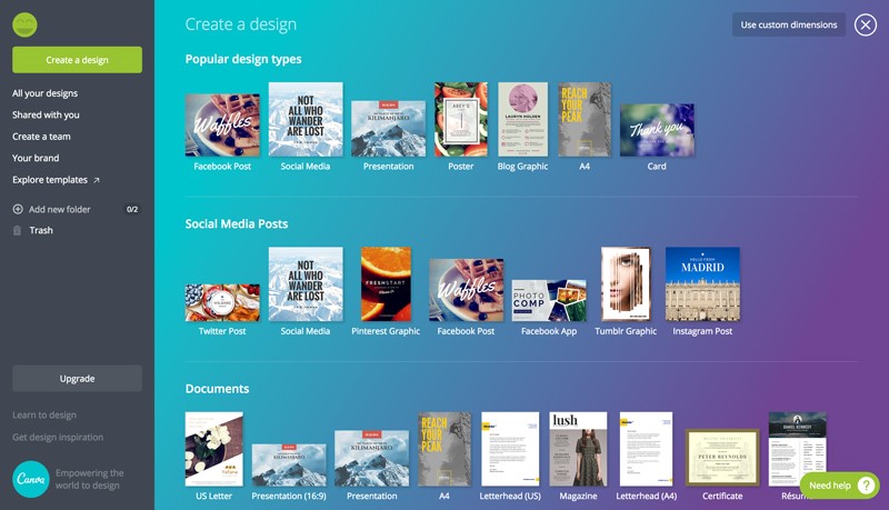
If you have a blog or site which will need regular edits, you can use a DIY program such as Canya, where you can use designer templates. You will be able to tweak or make changes to your site any time you need to without sacrificing the design.
Can you create many different versions of my design? That way I can choose my favourite
Although it seems as if many different choices would help you to make a suitable selection, design often works best when it is carefully planned or brainstormed. This means assessing your target market, your goals and what you would like to communicate via your design.
By carefully planning and constructing your site together while working towards a specific goal, we will have more of a chance of creating a suitable final product. Although a wide range of options may seem more appropriate, they will not be as specific or goal-directed as a carefully planned design would be.
Can you Photoshop it?
What would you like to achieve by using Photoshop? Image manipulation can be very effective if you are looking to create a superimposed image or dual impact photograph. However, simply adjusting or tampering with an image can reduce its natural appeal. We’ve all seen sites where the imagery has been Photoshopped to such an extent that it looks awkward. A person’s arm may appear may look crooked, or their limbs no longer look proportionate.
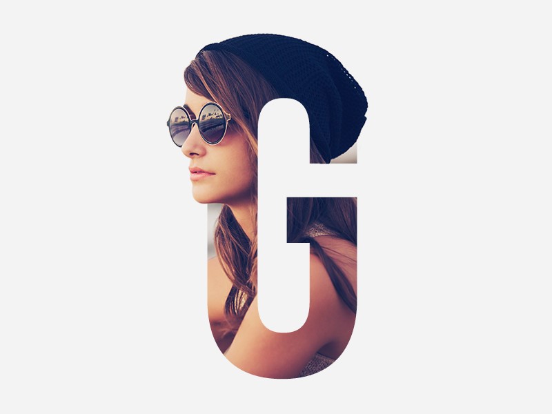
While some images will improve by being Photoshopped and it is worth the time and effort it will create to create an impact, others will not.
As a designer, offer up your professional opinion to your clients. Share the advantages and disadvantages (from an aesthetic, time and cost perspective) of manipulating an image.
Can I make one last change?
Designers are always happy to tweak a site to meet a client’s needs. However, if you have made a number of changes in the past, it will be unlikely that this is your last one. Let’s openly acknowledge that changes take time, and that time is money when it comes to design. Instead of making continual tweaks, create a list of changes you’d like to your final design.
By sharing the changes you’d like to make and offering up any extra payment needed to make these changes, your designer would be happy to help you. After all, a satisfied customer is a designer’s end goal.
I have a huge opportunity and I know you will love it
Many clients have big dreams. Without dreams, we wouldn’t be able to bring our goals into reality. However, not all of these dreams pan out. A client who is sure they are onto the next big thing may believe they will be soon offering you the chance for great publicity.
However, your client’s dreams may never come to fruition and you cannot pay your bills on a future promise. Share the practicalities of running a design business and leave it at that.
Can I get my friends’/family’s/partner’s opinion?
You can, but as a designer, I am an expert in my field and I have a proven history of knowing how to translate a goal into a design or visual message. Your friends do not have this experience. You can ask your 12-year-old nephew what he thinks of any design which excludes Batman, but you shouldn’t bet your business on his answer!
This is easy, why does it cost so much money?
Every skilled designer will make a job look easy. This is because the process of creating an excellent design will be both smooth and efficient. Hiring a professional costs money because you pay for the experience. It is this knowledge that will result in a great design tailored specifically towards your needs.
Cheaper designers are available but the process of creating a design which has been tailored to your specific needs will not be as easy or smooth. When it comes down to it, knowledge, experience and reputation are worth paying for.
Create a mockup or concept drawing for me, and if I like your design I’ll pick you.
A great design is not that simple to create. Each tailor-made design will take time, planning, effort and a lot of brainstorming. Although in the digital realm you can find designers who will compete based on a basic concept which is pulled together quickly, these designs won’t be unique or tailor-made specifically for your business.
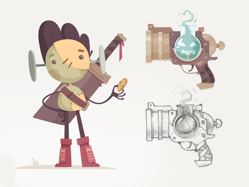
Designers who pull a concept together very quickly are offering you generic concepts which might be attractive, but might not be well thought through in order to meet the precise needs of your site.
If you are looking for a great concept which will stand out from the crowd, it is often well worth hiring a professional designer. The cost will be once off, and the results will be well worth it.
Summary
As a professional designer, we put a great deal of thought, effort and time into our work. We aim to meet the needs of our clients and will often make adjustments to ensure our projects are both effective and visually appealing.
Our clients often understand the value of our work (which is why they have approached a professional for assistance). However, they often don’t understand the time, thought and skill which goes into creating an effective design. Sharing how to work effectively in the field of design often helps to communicate and build relationships with our clients.
The making of Tend
Post pobrano z: The making of Tend
In this Motionographer Guest Post, we’re excited to bring you some insight from Tom Judd and Ed Barrett of Animade regarding the making of their recent film, Tend.
How to Create a Design-Inspired Photo Manipulation for Twitter/Facebook Banners
Post pobrano z: How to Create a Design-Inspired Photo Manipulation for Twitter/Facebook Banners
Are you an aspiring designer with a special gift? Show off your levitation skills with a photo manipulation. Make a creative banner you can apply to all your social accounts.
In this tutorial, we’ll learn how to build a designer-inspired photo manipulation using a few stocks and 3D objects in Adobe Photoshop.
Get inspired! Find more amazing design resources on Envato Market.
See a larger view of this banner.
Tutorial Assets
The following assets were used in the production of this tutorial:
- Designer Stock #1
- Designer Stock #2
- Camera
- Molecule
- Laptop
- Plant
- Wood Table
- Gray Background
- Cue Ball
- Facebook Charity Cover Set
1. How to Use 3D Objects
You can make any object levitate easily in Photoshop. And the best way to do it is to take advantage of 3D objects.
3D objects generate still images of the angle you desire. I can make the office plant, for instance, fall off the table in this manipulation (for more dimension) by choosing a good angle.
So before you get started, take a good look at the stocks we’ll be using. In order to make this scene work, I’ll need a few 3D assets from Envato Elements.
For a more in-depth look at how I use 3D objects, check out this tutorial:
Once you’re ready to get started, download all the angles you’ll need for each 3D object.
Here are the specific views I’ll be using in this tutorial.
Hit View 360 Render for each object and try your best to match these angles. Then download them with your subscription.
Now that we have all the resources, let’s get started!
2. How to Build the Manipulation
Social media banners, especially the ones on Twitter, are stretched wide. If you use a normal photo for the banner, it gets compressed pretty badly and cropped even worse.
Here are some possible scenarios I’d hate to go with in headers #1 and #2.
Normal photos just won’t crop well.
For this manipulation, I’ll be warping the scene to make something similar to a panorama shot like in #3.
This will allow me to bypass some of the cropping problems by creating an entire composition from scratch that stretches, or pans from one side of the banner to the other.
To do this, I’ll need to take the original Designer Stock and break it apart. Then I’ll rebuild the scene with the main character and other elements using a few new stocks for filler.
Step 1
Create a New Document in Photoshop at 1500 x 500 px.
Copy and Paste Designer Stock #1 onto a New Layer towards the middle of the banner. Make ample room for the other details.
See how much space we have to fill?
Step 2
Let’s break the image apart. Remove the designer first.
Select the stock and use the Polygonal Lasso Tool (L) to make a selection. Then hit Control-J to Paste the selection onto a New Layer above it. Add a Layer Mask and refine the edges of the designer with a Hard Round Brush.
Step 3
Next, I’ll remove the main computer. We’ll create an entirely new background with just these two pieces from the original stock.
Follow the same steps as before to remove the computer. Add a Layer Mask and refine the edges.
- Use the Polygonal Tool (L) to select the computer.
- Control-J to Paste it onto its own New Layer.
- The stand might get awkwardly cut here. Use the Polygonal Tool (L) again to select it, and then switch to the Move Tool (V) to center the stand more. In future shots, you’ll see that I painted over the hand and pen with colors from the computer using the Brush Tool (B).
Step 4
Let’s start building the composition again with the new pieces. Hide the computer layer.
Since the model gets cut off, we’ll rebuild him using a different photo from this stock series.
Make a selection of the designer from Designer Stock #2 and Copy and Paste it onto a New Layer beneath the designer layer. Add a Layer Mask to refine the edges and position him to match up with the old photo.
Step 5
Create a simple wooden desk.
- Select the Rectangular Marquee Tool (M) and make a selection of the wood from this Wood Table stock. Copy and Paste it onto a New Layer below the designer layer. Hold Control-T to Free Transform and Skew the perspective of the wood for a much longer desk.
- Position the desk as shown. Continue to adjust the perspective if necessary.
Note: This desk will be skewed to help the panorama vibe. But feel free to create your own desk setup.
Step 6
Unhide the computer layer.
Use the Free Transform Tool (Control-T) to make it smaller. Position the computer in the center of the desk. Don’t worry about any rough edges—we’ll clean them up later.
Step 7
Let’s add a background. Copy and Paste the Gray Background onto a New Layer.
Flip it by going to Edit > Transform > Flip Horizontal.
Then resize it and position it behind the computer.
Add a slight blur. Select the layer and go to Filter > Blur > Gaussian Blur, adding a Radius of 2.5 px.
3. How to Make 3D Objects Levitate
Step 1
Now that the majority of our scene is built, we need to add the levitating objects.
First, add the Molecule.
Copy and Paste the molecule angle you’ve downloaded onto a New Layer above the rest. Use the Free Transform Tool (Control-T) to rotate the angle and place it floating next to the designer.
Add a Layer Mask to remove the parts of the molecule that would be covered by his arm. This will help create more depth of field.
Step 2
Move on to the other 3D objects.
Next, we’ll add the Camera, Laptop, and Cue Ball.
Follow the same steps as before. This time, position the camera below the designer’s eye level. Then add the laptop on the right.
Balance everything out with the cue ball on the far left. Then go to Filter > Blur > Gaussian Blur and add a Radius of 4 px.
Step 3
The last 3D object we’ll add is the Office Plant.
Extract the plant and Paste it onto a New Layer above the rest. Free Transform (Control-T) to Rotate the angle so that the plant appears to be falling off the desk.
Add a slight Gaussian Blur of 2 px.
Looking great so far!
4. How to Adjust the Lighting and Colors
Now that the majority of our objects are set in place, we can add Adjustment Layers and more to fix the colors, light, and shadows.
Here is our composition so far.
Step 1
Let’s begin with the lighting.
Create a New Adjustment Layer of Curves above all the others.
Adjust the curve for the RGB Channel as shown. Make the overall scene darker.
Step 2
Next, add a New Adjustment Layer of Color Lookup.
Set the 3D LUTFile to 2Strip.look and the Layer Blend Mode to Hue. Lower the Opacity to 60% for a much warmer tone.
Step 3
Now add a New Adjustment Layer of Selective Color.
Add the following adjustments for the Greens, Reds, Whites, and Neutral colors.
Here’s the result so far.
Step 4
The entire lighting of the scene has been adjusted for a more sunset appearance, so now we have to tweak the lighting of some objects individually—starting with the man.
Select the designer 2 layer. Set a new Curves Adjustment Layer as a Clipping Mask to the designer. Adjust the curves for the RGB, Green and Blue Channels as shown.
Try to match the lighting of his body from the original photo.
Step 5
Next, set a New Adjustment Layer of Hue and Saturation as a Clipping Mask to the molecule.
Adjust the values as shown for a darker molecule. This will create a slight silhouette appearance.
Step 6
Do the same for the camera.
Set a new Adjustment Layer of Hue and Saturation as a Clipping Mask to the camera. Adjust the values as shown for a darker look.
Step 7
Now darken the laptop.
Set a New Adjustment Layer of Curves as a Clipping Mask to the laptop. Adjust the curves for the RGB, Blue and Green Channels as shown below.
5. How to Finish the Manipulation
Great job so far!
To finish up this manipulation, we’ll continue to tweak the lighting while adding smart brand elements for your website.
By changing the screen, you can switch out the photo for your website screenshot for better marketing appeal.
Step 1
Let’s customize the screen!
We need to trace over the grass photo so we can swap it out for different websites.
Select the Pen Tool (P) and set it to Shape. Trace over the grass field photo with a white sold Fill. Then Right-click and go to Define Custom Shape. Name the new shape Screen.
By creating a new custom shape of the computer screen, you’ll have it in your preset shape settings for the future, whenever you want to switch the photo.
Then Right-click the screen shape layer and go to Convert to Smart Object.
Turning this shape into a smart object means we can update the website screenshot at any time.
Double-click the smart object and Paste a screenshot of your website onto a New Layer. It will appear at the wrong angle at first, so make sure to use the Free Transform Tool (Control-T) to adjust the perspective.
Here, I used the Envato Tuts+ main website.
Then use a Layer Mask to mask out the bottom right window from your screenshot.
Step 2
Next, customize the laptop screen.
Here I’ll use the Envato Elements website. Follow the same steps as before. First, create a new custom shape, and then Convert it to a Smart Object. Update the smart object with a website screenshot at the right perspective. If necessary, apply a blur.
This one is a little tricky, so keep playing with the perspective until it works.
Here is the composition with both screens replaced.
Step 3
Great!
Once you’ve replaced the screens, we can concentrate on cleaning up these details.
Create a New Layer above the rest.
Clean up the line that separates the designer’s pictures. Set the Foreground Color to various parts of his skin, shirt, and outfit using the Eyedropper Tool (E). Then paint over those areas to blend the photos together with a Soft Round Brush (B).
Step 4
On that same layer, paint some shadows around the office environment.
Try not to over-complicate the shadows. Just choose a tone that is a shade darker than the colors in that area.
Use a mixture of Hard and Soft Brushes to paint shadows behind the computer behind the laptop, and on the desk.
Step 5
Brighten up the main computer screen.
Select the Custom Shape Tool (U) and select the screen shape you created earlier. Create a new shape that covers the website with a bright yellow color #e9efde. Then set the Layer Blend Mode to Overlay.
That should do the trick!
Continue working on the light.
Step 6
Create a New Layer above the rest. Set the Layer Blend Mode to Overlay. Use a Soft Round Brush with 30% Opacity to paint bright yellow #f6f9f2 around the screens, objects, and designer. Adjust the Layer Opacity as needed.
Step 7
Let’s start to wrap things up with a few more color adjustments. Give the scene a blueish tone.
Add a New Adjustment Layer of Selective Color above the rest.
Adjust the values for the Reds, Neutrals, and Whites as shown below.
For a slightly faded effect, add a New Adjustment Layer of Color Lookup.
Set the 3DLUT File to FoggyNight.3DL.
Then set the Layer Blend Mode to Lighten and the Opacity to 25%.
Step 8
Darken the table for a richer tone.
Add a New Adjustment Layer of Curves, and Right-click to set it as a Clipping Mask to the table layer. Lower the curve for the RGB Channel for a darker wood.
Step 9
Take this opportunity to make one last New Layer.
Use this layer to paint over any mistakes and add highlights or any remaining details. I mostly needed to fix the computer stand since it was originally cut off by the man’s hand.
Check out the final variations below!
6. How to Make Banner Variations
Now that you’ve got your Twitter/Facebook banner, how does it look?
Twitter/Facebook
Here’s the final result below. I applied it to my Twitter background (at a compressed size of 1252×417 pixels) to see it in action.
For Facebook covers, feel free to resize to 851×315 pixels. Crop if necessary.
Without Websites
Don’t want to change the screens? Here is the how the banner will look without the screen changes.
More Branding
Another variation you can take is to add additional branding. Here I added more Envato Tuts+ branding elements by using one of the PSD templates from this Facebook Charity Cover Set.
See a Larger Version
If you haven’t already, check out this larger version.
All Done! Great Job!
Social media banners are a fantastic way to show off your skills as a designer. Personalize any account with an intriguing banner to gain more influence.
I hope you’ve enjoyed this tutorial! Share your comments and results below.
For more photo manipulation tutorials like this one, check out these links:
- Photo ManipulationHow to Create a Sci-Fi, Robot Photo Manipulation in Adobe PhotoshopMelody Nieves
- Photo ManipulationHow to Create a Vintage Portrait Photo Manipulation in Adobe PhotoshopMelody Nieves

What bit of advice would you share with someone new to your field?
Post pobrano z: What bit of advice would you share with someone new to your field?
The most FA of all the FAQs.
Here’s Laura Kalbag:
Find what you love. Don’t worry about needing to learn every language, technique or tool. Start with what interests you, and carve your own niche. And then use your powers for good!
And my own:
Buy a domain name. Figure out how to put an HTML file up there. Isn’t that a powerful feeling? Now you’ve got table stakes. Build something.
Definitely, go read other A Book Apart author answers because they are all great. My other favorite is just three words.
Direct Link to Article — Permalink
The post What bit of advice would you share with someone new to your field? appeared first on CSS-Tricks.
Automate Your Workflow with Node
Post pobrano z: Automate Your Workflow with Node
You know those tedious tasks you have to do at work: Updating configuration files, copying and pasting files, updating Jira tickets.
Time adds up after a while. This was very much the case when I worked for an online games company back in 2016. The job could be very rewarding at times when I had to build configurable templates for games, but about 70% of my time was spent on making copies of those templates and deploying re-skinned implementations.
What is a reskin?
The definition of a reskin at the company was using the same game mechanics, screens and positioning of elements, but changing the visual aesthetics such as color and assets. So in the context of a simple game like ‘Rock Paper Scissors,’ we would create a template with basic assets like below.
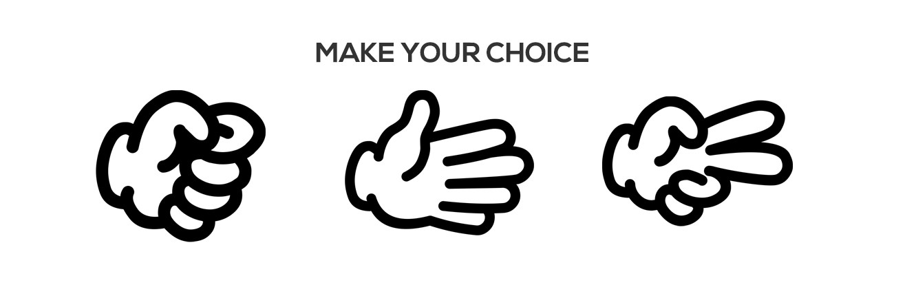
But when we create a reskin of this, we would use different assets and the game would still work. If you look at games like Candy Crush or Angry Birds, you’ll find that they have many varieties of the same game. Usually Halloween, Christmas or Easter releases. From a business perspective it makes perfect sense.
Now… back to our implementation. Each of our games would share the same bundled JavaScript file, and load in a JSON file that had different content and asset paths. The result?
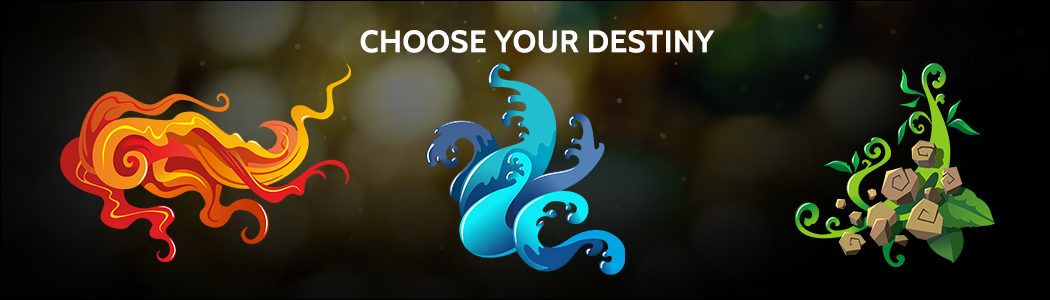
The good thing about extracting configurable values into a JSON file is that you can modify the properties without having to recompile/build the game again. Using Node.js and the original breakout game created by Mozilla, we will make a very simple example of how you can create a configurable template, and make releases from it by using the command line.
Our game
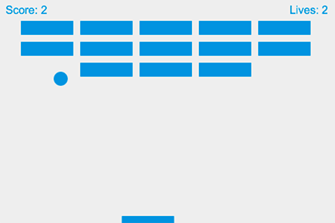
This is the game we’ll be making. Reskins of MDN Breakout, based on the existing source code.
The primary color will paint the text, paddle, ball and blocks, and the secondary color will paint the background. We will proceed with an example of a dark blue background and a light sky blue for the foreground objects.
Prerequisites
You will need to ensure the following:
- You have Git installed – https://git-scm.com/downloads
- You have Node installed – https://nodejs.org/en/download
- You have a GitHub account – https://github.com
- You have cloned the repository locally – https://github.com/smks/nobot-examples.git
- You have ran
npm installin the root of thenobot-examplesproject. - Finally, you run the local server by running
npm run gameServein the root of the project via a terminal.
We have tweaked the original Firefox implementation so that we first read in the JSON file and then build the game using HTML Canvas. The game will read in a primary color, and a secondary color from our game.json file.
{
  "primaryColor": "#fff",
  "secondaryColor": "#000"
}
We will be using example 20 from the book Automating with Node.js. The source code can be found here.
Open up a new command line (CMD for Windows, Terminal for Unix-like Operating systems) and change into the following directory once you have cloned the repository locally.
$ cd nobot-examples/examples/020Remember the game server should be running in a separate terminal.
Our JSON file sits beside an index.html file inside a directory called template. This is the directory that we will copy from whenever we want to do a new release/copy.
<!DOCTYPE html>
<html>
<head>
  <meta charset="utf-8" />
  <meta name="viewport" content="width=device-width, initial-scale=1">
  <title>Paddle Game</title>
  <style>
    * {
      padding: 0;
      margin: 0;
    }
    canvas {
      background: #eee;
      display: block;
      margin: 0 auto;
    }
  </style>
</head>
<body>
  <canvas id="game" width="480" height="320"></canvas>
  <script type="text/javascript" src="../../core/game-1.0.0.js"></script>
</body>
</html>
You see above that every game we release will point to the same core bundle JavaScript file. Let’s have a look at our JavaScript implementation under the core directory.
Don’t look too much into the mechanics of how the game works, more so how we inject values into the game to make it configurable.
(function boot(document) {
  function runGame(config) {
    const canvas = document.getElementById('game');
    canvas.style.backgroundColor = config.secondaryColor;
    // rest of game source code gets executed... hidden for brevity
    // source can be found here: https://git.io/vh1Te
  }

  function loadConfig() {
    fetch('game.json')
      .then(response => response.json())
      .then(runGame);
  }

  document.addEventListener('DOMContentLoaded', () => {
    loadConfig();
  });
}(document));
The source code is using ES6 features and may not work in older browsers. Run through Babel if this is a problem for you.
You can see that we are waiting for the DOM content to load, and then we are invoking a method called loadConfig. This is going to make an AJAX request to game.json, fetch our JSON values, and once it has retrieved them, it will initiate the game and assign the styles in the source code.
Here is an example of the configuration setting the background color.
const canvas = document.getElementById('game');
canvas.style.backgroundColor = config.secondaryColor; // overriding color here
So, now that we have a template that can be configurable, we can move on to creating a Node.js script that will allow the user to either pass the name of the game and the colors as options to our new script, or will prompt the user for: the name of the game, the primary color, and then the secondary color. Our script will enforce validation to make sure that both colors are in the format of a hex code (e.g. #101b6b).
When we want to create a new game reskin, we should be able to run this command to generate it:
$ node new-reskin.js --gameName='blue-reskin' --gamePrimaryColor='#76cad8' --gameSecondaryColor='#10496b'The command above will build the game immediately, because it has the three values it needs to release the reskin.
We will create this script new-reskin.js, and this file carries out the following steps:
- It will read in the options passed in the command line and store them as variables. Options can be read in by looking in the process object (
process.argv). - It will validate the values making sure that the game name, and the colors are not undefined.
- If there are any validation issues, it will prompt the user to re-enter it correctly before proceeding.
- Now that it has the values, it will make a copy of the template directory and place a copy of it into the releases directory and name the new directory with the name of the game we gave it.
- It will then read the JSON file just recently created under the releases directory and override the values with the values we passed (the colors).
- At the end, it will prompt the user to see if they would like to open the game in a browser. It adds some convenience, rather than us trying to remember what the URL is.
Here is the full script. We will walk through it afterwards.
require('colors');
const argv = require('minimist')(process.argv.slice(2));
const path = require('path');
const readLineSync = require('readline-sync');
const fse = require('fs-extra');
const open = require('opn');
const GAME_JSON_FILENAME = 'game.json';

let { gameName, gamePrimaryColor, gameSecondaryColor } = argv;

if (gameName === undefined) {
  gameName = readLineSync.question('What is the name of the new reskin? ', {
    limit: input => input.trim().length > 0,
    limitMessage: 'The project has to have a name, try again'
  });
}

const confirmColorInput = (color, colorType = 'primary') => {
  const hexColorRegex = /^#([A-Fa-f0-9]{6}|[A-Fa-f0-9]{3})$/;
  if (hexColorRegex.test(color)) {
    return color;
  }
  return readLineSync.question(`Enter a Hex Code for the game ${colorType} color `, {
    limit: hexColorRegex,
    limitMessage: 'Enter a valid hex code: #efefef'
  });
};

gamePrimaryColor = confirmColorInput(gamePrimaryColor, 'primary');
gameSecondaryColor = confirmColorInput(gameSecondaryColor, 'secondary');

console.log(`Creating a new reskin '${gameName}' with skin color: Primary: '${gamePrimaryColor}' Secondary: '${gameSecondaryColor}'`);

const src = path.join(__dirname, 'template');
const destination = path.join(__dirname, 'releases', gameName);
const configurationFilePath = path.join(destination, GAME_JSON_FILENAME);
const projectToOpen = path.join('http://localhost:8080', 'releases', gameName, 'index.html');

fse.copy(src, destination)
  .then(() => {
    console.log(`Successfully created ${destination}`.green);
    return fse.readJson(configurationFilePath);
  })
  .then((config) => {
    const newConfig = config;
    newConfig.primaryColor = gamePrimaryColor;
    newConfig.secondaryColor = gameSecondaryColor;
    return fse.writeJson(configurationFilePath, newConfig);
  })
  .then(() => {
    console.log(`Updated configuration file ${configurationFilePath}`green);
    openGameIfAgreed(projectToOpen);
  })
  .catch(console.error);

const openGameIfAgreed = (fileToOpen) => {
  const isOpeningGame = readLineSync.keyInYN('Would you like to open the game? ');
  if (isOpeningGame) {
    open(fileToOpen);
  }
};
At the top of the script, we require the packages needed to carry out the process.
colorsto be used to signify success or failure using green or red text.minimistto make it easier to pass arguments to our script and to parse them optionally. Pass input without being prompted to enter.pathto construct paths to the template and the destination of the new game.readline-syncto prompt user for information if it’s missing.fs-extraso we can copy and paste our game template. An extension of the nativefsmodule.opnis a library that is cross platform and will open up our game in a browser upon completion.
The majority of the modules above would’ve been downloaded/installed when you ran npm install in the root of the nobot-examples repository. The rest are native to Node.
We check if the game name was passed as an option through the command line, and if it hasn’t been, we prompt the user for it.
// name of our JSON file. We store it as a constant
const GAME_JSON_FILENAME = 'game.json';

// Retrieved from the command line --gameName='my-game' etc.
let { gameName, gamePrimaryColor, gameSecondaryColor } = argv;

// was the gameName passed?
if (gameName === undefined) {
  gameName = readLineSync.question('What is the name of the new reskin? ', {
    limit: input => input.trim().length > 0,
    limitMessage: 'The project has to have a name, try again'
  });
}
Because two of our values need to be hex codes, we create a function that can do the check for both colors: the primary and the secondary. If the color supplied by the user does not pass our validation, we prompt for the color until it does.
// Does the color passed in meet our validation requirements?
const confirmColorInput = (color, colorType = 'primary') => {
  const hexColorRegex = /^#([A-Fa-f0-9]{6}|[A-Fa-f0-9]{3})$/;
  if (hexColorRegex.test(color)) {
    return color;
  }
  return readLineSync.question(`Enter a Hex Code for the game ${colorType} color `, {
    limit: hexColorRegex,
    limitMessage: 'Enter a valid hex code: #efefef'
  });
};
We use the function above to obtain both the primary and secondary colors.
gamePrimaryColor = confirmColorInput(gamePrimaryColor, 'primary');
gameSecondaryColor = confirmColorInput(gameSecondaryColor, 'secondary');
In the next block of code, we are printing to standard output (console.log) to confirm the values that will be used in the process of building the game. The statements that follow are preparing the paths to the relevant files and directories.
The src will point to the template directory. The destination will point to a new directory under releases. The configuration file that will have its values updated will reside under this new game directory we are creating. And finally, to preview our new game, we construct the URL using the path to the local server we booted up earlier on.
console.log(`Creating a new reskin '${gameName}' with skin color: Primary: '${gamePrimaryColor}' Secondary: '${gameSecondaryColor}'`);
const src = path.join(__dirname, 'template');
const destination = path.join(__dirname, 'releases', gameName);
const configurationFilePath = path.join(destination, GAME_JSON_FILENAME);
const projectToOpen = path.join('http://localhost:8080', 'releases', gameName, 'index.html');
In the code following this explanation, we:
- Copy the template files to the releases directory.
- After this is created, we read the JSON of the original template values.
- With the new configuration object, we override the existing primary and secondary colors provided by the user’s input.
- We rewrite the JSON file so it has the new values.
- When the JSON file has been updated, we ask the user if they would like to open the new game in a browser.
- If anything went wrong, we catch the error and log it out.
fse.copy(src, destination)
  .then(() => {
    console.log(`Successfully created ${destination}`green);
    return fse.readJson(configurationFilePath);
  })
  .then((config) => {
    const newConfig = config;
    newConfig.primaryColor = gamePrimaryColor;
    newConfig.secondaryColor = gameSecondaryColor;
    return fse.writeJson(configurationFilePath, newConfig);
  })
  .then(() => {
    console.log(`Updated configuration file ${configurationFilePath}`green);
    openGameIfAgreed(projectToOpen);
  })
  .catch(console.error);
Below is the function that gets invoked when the copying has completed. It will then prompt the user to see if they would like to open up the game in the browser. The user responds with y or n
const openGameIfAgreed = (fileToOpen) => {
  const isOpeningGame = readLineSync.keyInYN('Would you like to open the game? ');
  if (isOpeningGame) {
    open(fileToOpen);
  }
};
Let’s see it in action when we don’t pass any arguments. You can see it doesn’t break, and instead prompts the user for the values it needs.
$ node new-reskin.js
What is the name of the new reskin? blue-reskin
Enter a Hex Code for the game primary color #76cad8
Enter a Hex Code for the game secondary color #10496b
Creating a new reskin 'blue-reskin' with skin color: Primary: '#76cad8' Secondary: '#10496b'
Successfully created nobot-examples\examples\020\releases\blue-reskin
Updated configuration file nobot-examples\examples\020\releases\blue-reskin\game.json
Would you like to open the game? [y/n]: y
(opens game in browser)
My game opens on my localhost server automatically and the game commences, with the new colors. Sweet!
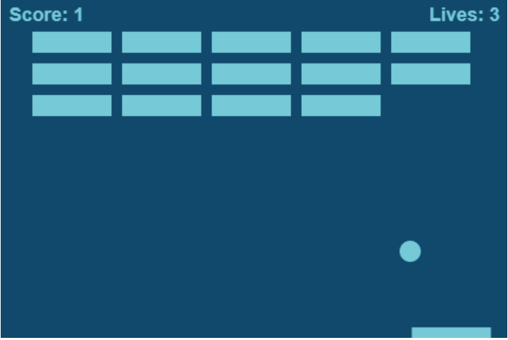
Oh… I’ve lost a life already. Now if you navigate to the releases directory, you will see a new directory called blue-reskin This contains the values in the JSON file we entered during the script execution.
Below are a few more releases I made by running the same command. You can imagine if you were releasing games that could configure different: images, sounds, labels, content and fonts, you would have a rich library of games based on the same mechanics.
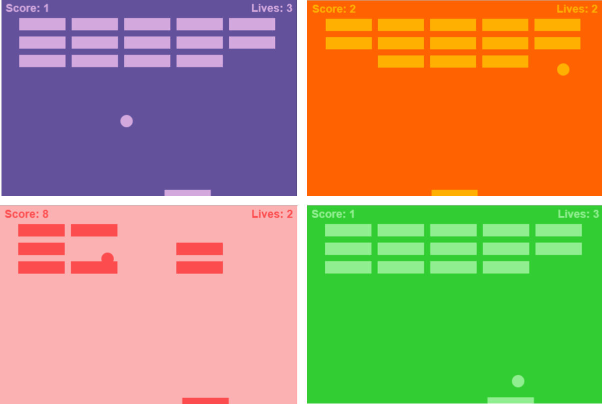
Even better, if the stakeholders and designers had all of this information in a Jira ticket, you could integrate the Jira API into the Node script to inject these values in without the user having to provide any input. Winning!
This is one of many examples that can be found in Automating with Node.js. In this book, we will be looking at a more advanced example using „Rock Paper Scissors” as the basis of a build tool created from scratch.
- Color Print: http://amzn.eu/aA0cSnu
- Kindle: https://amzn.to/2JPTk7q
- Kobo: https://www.kobo.com/gb/en/ebook/automating-with-node-js
- Leanpub: https://leanpub.com/automatingwithnodejs
The post Automate Your Workflow with Node appeared first on CSS-Tricks.
How to Create an Easy Ice Text Effect in Adobe Photoshop
Post pobrano z: How to Create an Easy Ice Text Effect in Adobe Photoshop
This tutorial will show you how to use layer styles, with simple shapes and textures, to create an easy ice effect in Photoshop.
This text effect was inspired by the many Layer Styles available on GraphicRiver, like this 3D Ice Cool, Freeze and Snow Effects Styles pack.
Let’s get started!
Tutorial Assets
The following assets were used during the production of this tutorial:
- Kornik font
- Textures – Golds, Whites, And Greys by snowmanjester
- Heavy Snow Texture by incolor16
- Free Pack 6000 photoshop gradients by Supertuts007 (Load the CSP True Sky Gradients.grd file.)
1. Create the Background Shape
Step 1
Create a new 1000 x 650 px document.
Step 2
Pick the Rectangle Tool, and create a rectangle that covers the bottom part of the document. Rename the rectangle layer to Ground.
Step 3
Create another rectangle that covers the upper part, and rename its layer to Back.
2. How to Style a Ground Shape
Double-click the Ground layer to apply the following layer style:
Step 1
Add an Inner Shadow with these settings:
- Blend Mode: Linear Burn
-
Color:
#9cb0be - Opacity: 15%
- Distance: 0
- Size: 250
Step 2
Add a Gradient Overlay with these settings:
- Check the Dither box
- Blend Mode: Linear Burn
- Opacity: 20%
- Style: Radial
- Scale: 150%
- Create a Transparent to Fill Color gradient fill using
Blackon both sides.
Step 3
Click the + icon next to the Gradient Overlay tab to add another Gradient Overlay effect with these settings:
- Check the Dither box.
- Check the Reverse box.
- Use the shown Gradient fill from the CSP True Sky Gradients file.
Step 4
Click the first Gradient Overlay tab again, and then click-drag inside the document to move the gradient so that the light is near the upper part of the rectangle.
This is how the first rectangle should look.
3. How to Copy and Paste Layer Styles
Step 1
Right-click the Ground layer, choose Copy Layer Style, and then right-click the Back layer and choose Paste Layer Style.
Double-click the Back layer to uncheck the Reverse box in the second Gradient Overlay effect.
Step 2
This will style the back rectangle. If needed, move any gradient fills as you did before.
4. How to Adjust a Background
Step 1
Click the Create new fill or adjustment layer icon at the bottom of the Layers panel and choose Hue/Saturation.
Step 2
Change the Hue to -3, the Saturation to -25, and the Lightness to -20.
Step 3
Add a Gradient fill layer. Create a Transparent to Fill Color gradient fill using a Black color on both sides.
Then, change the Style to Radial and the Scale to 200, and check the Dither box.
Step 4
Change the Gradient layer’s Blend Mode to Soft Light.
Step 5
Place the Textures – Golds, Whites, And Greys image on top of all layers, rename its layer to BG Texture, and resize it as needed.
Step 6
Go to Image > Adjustments > Desaturate, and then change the BG Texture layer’s Blend Mode to Soft Light.
5. How to Create Text Layers
Step 1
Create the text in All Caps using the font Kornik.
Then, set the Color to #367497, the Size to 250 pt, and the Tracking value to 25.
Step 2
Duplicate the text layer, change the copy’s Fill value to 0, and then duplicate the copy layer.
6. How to Style the Original Text Layer
Double-click the original text layer to apply the following layer style:
Step 1
Add a Bevel and Emboss with these settings:
- Style: Emboss
- Technique: Chisel Soft
- Depth: 200
- Size: 10
- Uncheck the Use Global Light box
- Angle: 60
- Altitude: 50
- Gloss Contour: Sawtooth 1
- Check the Anti-aliased box
-
Highlight Mode:
- Opacity: 20%
-
Shadow Mode: Screen
-
Color:
#ffffff - Opacity: 80%
-
Color:
Step 2
Add a Contour with these settings:
- Contour: Rolling Slope – Ascending
- Check the Anti-aliased box.
- Range: 100%
Step 3
Add an Inner Glow with these settings:
- Blend Mode: Linear Light
- Opacity: 50%
-
Color:
#edf1f4 - Technique: Precise
- Source: Center
- Size: 90
- Contour: Gaussian
- Check the Anti-aliased box
Step 4
Add a Satin with these settings:
- Blend Mode: Screen
-
Color:
#afcbea - Opacity: 50%
- Angle: 30
- Distance: 38
- Size: 50
- Contour: Cone – Inverted
- Check the Anti-aliased box
- Check the Invert box
Step 5
Add a Gradient Overlay with these settings:
- Blend Mode: Multiply
- Opacity: 70%
- Create a Fill Color to Transparent gradient fill using the colors
#275c8dto the left and#274a71to the right.
Step 6
Add an Outer Glow with these settings:
- Blend Mode: Soft Light
- Opacity: 50%
-
Color:
#b9dfff - Spread: 20
- Size: 10
- Contour: Cove – Deep
- Check the Anti-aliased box
- Range: 80%
Step 7
Change the text layer’s Fill value to 20%.
7. How to Style the First Copy Text Layer
Double-click the first copy text layer to apply the following layer style:
Step 1
Add a Bevel and Emboss with these settings:
- Technique: Chisel Hard
- Size: 50
- Gloss Contour: Ring
- Check the Anti-aliased box
-
Highlight Mode: Soft Light
- Opacity: 50%
-
Shadow Mode: Soft Light
-
Color:
#f4ffff - Opacity: 70%
-
Color:
Step 2
Add a Contour with these settings:
- Contour: Cove – Deep
- Check the Anti-aliased box.
Step 3
Add an Inner Shadow with these settings:
- Blend Mode: Linear Burn
-
Color:
#8699a6 - Opacity: 100%
- Distance: 0
- Size: 35
This will style the second text layer.
8. How to Style the Second Copy Text Layer
Double-click the second copy text layer to apply the following layer style:
Step 1
Add a Bevel and Emboss with these settings:
- Technique: Chisel Hard
- Size: 50
- Uncheck the Use Global Light box
- Angle: -158
- Altitude: 64
- Check the Anti-aliased box
-
Highlight Mode: Linear Light
- Opacity: 50%
-
Shadow Mode: Linear Burn
-
Color:
#90abc8 - Opacity: 100%
-
Color:
Step 2
Add a Contour with these settings:
- Contour: Cove – Deep
- Check the Anti-aliased box.
Step 3
Add a Texture with these settings:
- Pattern: Molecular
- Depth: 5%
Step 4
Add a Pattern Overlay with these settings:
- Blend Mode: Soft Light
- Pattern: Satin
Step 5
Add an Outer Glow with these settings:
- Opacity: 35%
-
Color:
#7ab6ef - Spread: 20
- Size: 30
This will finish off the ice effect.
9. How to Create a Reflection
Step 1
Duplicate all three text layers you have, go to Layer > Merge Layers, and rename the merged layer to Reflection.
Step 2
Press Command-T to enter the Free Transform Mode, and then right-click the bounding box and choose Flip Vertical.
Step 3
Move the reflection text right below the original text, and hit the Return key to accept the changes.
Step 4
Right-click the Reflection layer, choose Convert to Smart Object, and then change its Blend Mode to Soft Light and place it below the original text layer.
Step 5
Go to Filter > Blur > Motion Blur, and change the Angle to 90 and the Distance to 10.
Step 6
Click the Add layer mask icon at the bottom of the Layers panel to add a mask.
Step 7
Pick the Gradient Tool, set the Foreground and Background Colors back to Black and White, and select the Reflection layer mask’s thumbnail.
Choose the Foreground to Transparent fill in the Options bar, and make sure that the Linear Gradient icon is active.
Now hold the Shift key and drag from about over the top of the original text to right outside the document’s bottom, in order to fill the mask and hide the lower part of the reflection.
You might need to retry or repeat this step a couple of times in order to get a result you like.
10. How to Create a Simple Shadow
Step 1
Duplicate the original text layer, drag the copy below it, and rename it to Shadow.
Step 2
Right-click the Shadow layer and choose Rasterize Type.
Press Command-T, and scale the text down vertically to get the basic shadow shape.
Step 3
Use the Move Tool to reposition the Shadow below the text.
Step 4
Go to Filter > Blur > Gaussian Blur, and set the Radius to 10.
Step 5
Change the Shadow layer’s Blend Mode to Multiply and its Opacity to 70%.
11. How to Add a Snow Texture Overlay
Step 1
Place the Heavy Snow Texture image on top of all layers, rename its layer to Snow Texture, change its Blend Mode to Screen, and resize the texture as needed.
Step 2
Pick the Spot Healing Brush Tool, and make sure that the Sample All Layers box in the Options bar is unchecked.
Use a soft round tip to paint over unwanted spots and get rid of them.
Congratulations! You’re Done
In this tutorial, we created a simple background using shapes, layer styles, and adjustment layers. Then, we created three text layers, and styled all of them to achieve the ice effect.
After that, we created a reflection and a shadow for the ice text. Finally, we added a snow texture overlay to finish the effect off.
Please feel free to leave your comments, suggestions, and outcomes below.

Design deals for the week
Post pobrano z: Design deals for the week
Every week, we’ll give you an overview of the best deals for designers, make sure you don’t miss any by subscribing to our deals feed. You can also follow the recently launched website Type Deals if you are looking for free fonts or font deals.
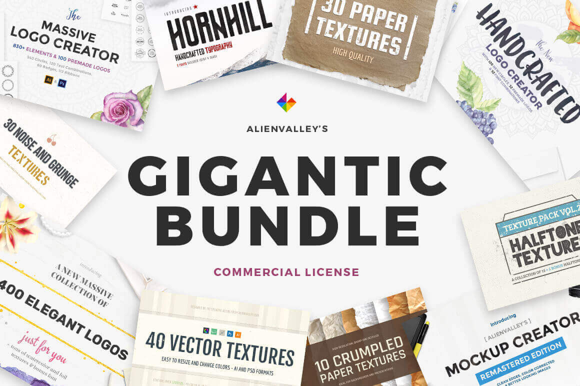
Gigantic Bundle of 1000+ Logos, Elements, Mockups, Textures
When a Mighty Deal is called a Gigantic Bundle, you just know it’s going to be big. And that’s exactly what this Alienvalley deal is: Chock full of 1000s of design graphics. You’ll get 400 premade elegant logos, 200+ textures, multiple typefaces and both a nifty Logo Creator and Mockup Creator to quickly and easily whip up hundreds (or is that thousands?) of creative results.
$19 instead of $110 – Get it now!
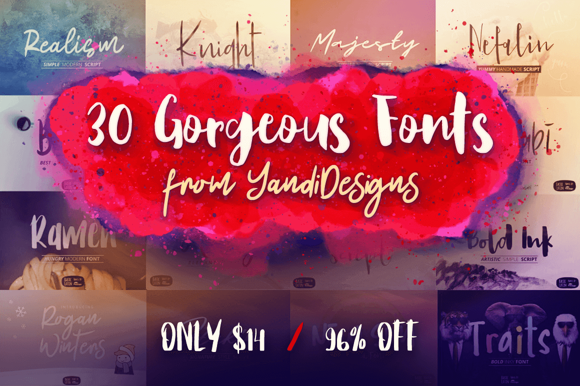
30 Gorgeous Fonts from YandiDesigns
If your projects are desperately in need of a fresh look, then cast your eyes on this collection of 30 gorgeous fonts created by YandiDesigns. Mix and match styles with these beautiful brush stroke typefaces that are the perfect answer to any project from logo design to wedding invitations.
$14 instead of $362 – Get it now!
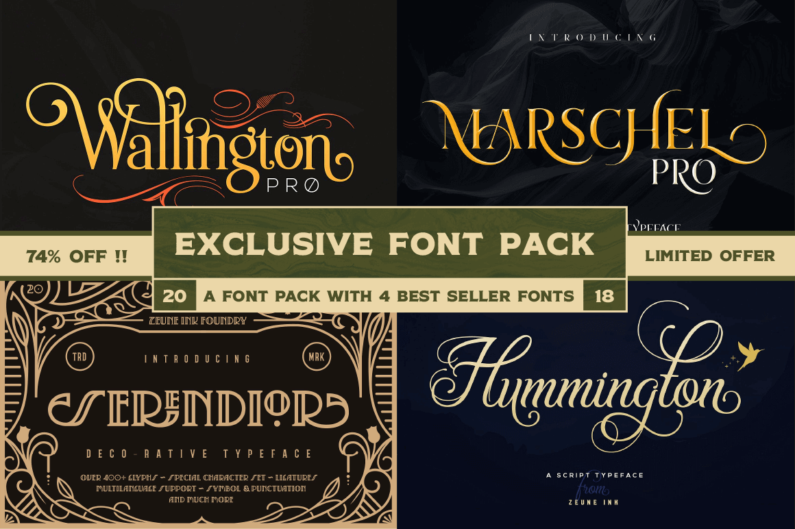
Exclusive! 4 High-Quality Fonts from Zeune Ink Foundry
Another Mighty Deals exclusive coming your way! Zeune Ink Foundry is offering up a fantastic font collection of 4 High-Quality Classy Typefaces at one incredibly discounted price. Designed to create elegant typographic works, this collection is overflowing with OpenType features and characters so you certainly don’t want to miss it. Especially considering they all come with an extended license of use!
$9 instead of $94 – Get it now!
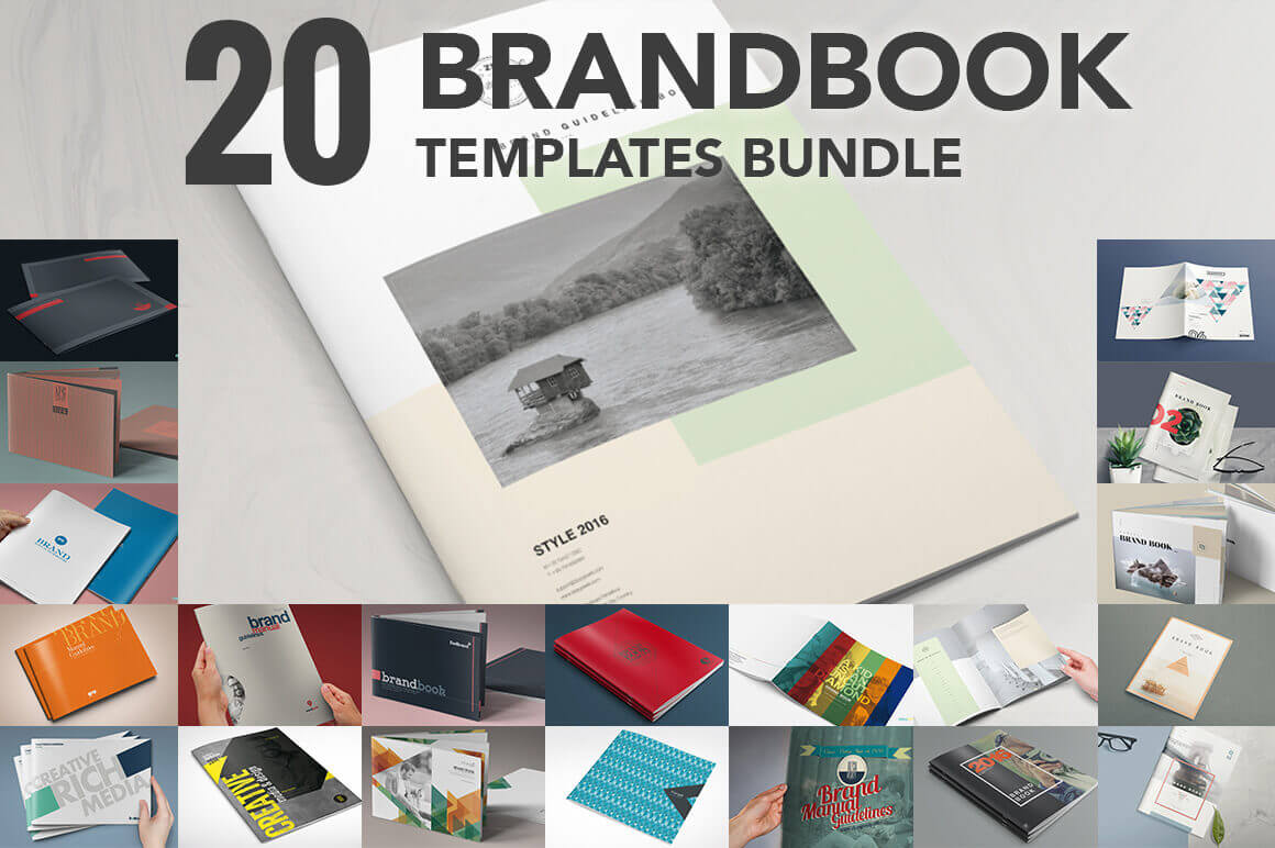
Bundle of 20 Brand Book Templates from ZippyPixels
Showing off a logo or stationery design is standard fare for most graphic designers. But if you really want to blow your clients away, you’ll offer them up a slew of brand designs in a full-fledged brand book! Get higher value for your work without spending days putting it all together. Instead, use these gorgeous Brand Book templates from ZippyPixels to present your designs in a truly stunning manner. And it only takes a few hours! With this incredible Mighty Deal, you’ll get 20 High-Quality Brand Book Templates that are print ready and simple to customize with your info and designs.
$17 instead of $39 – Get it now!
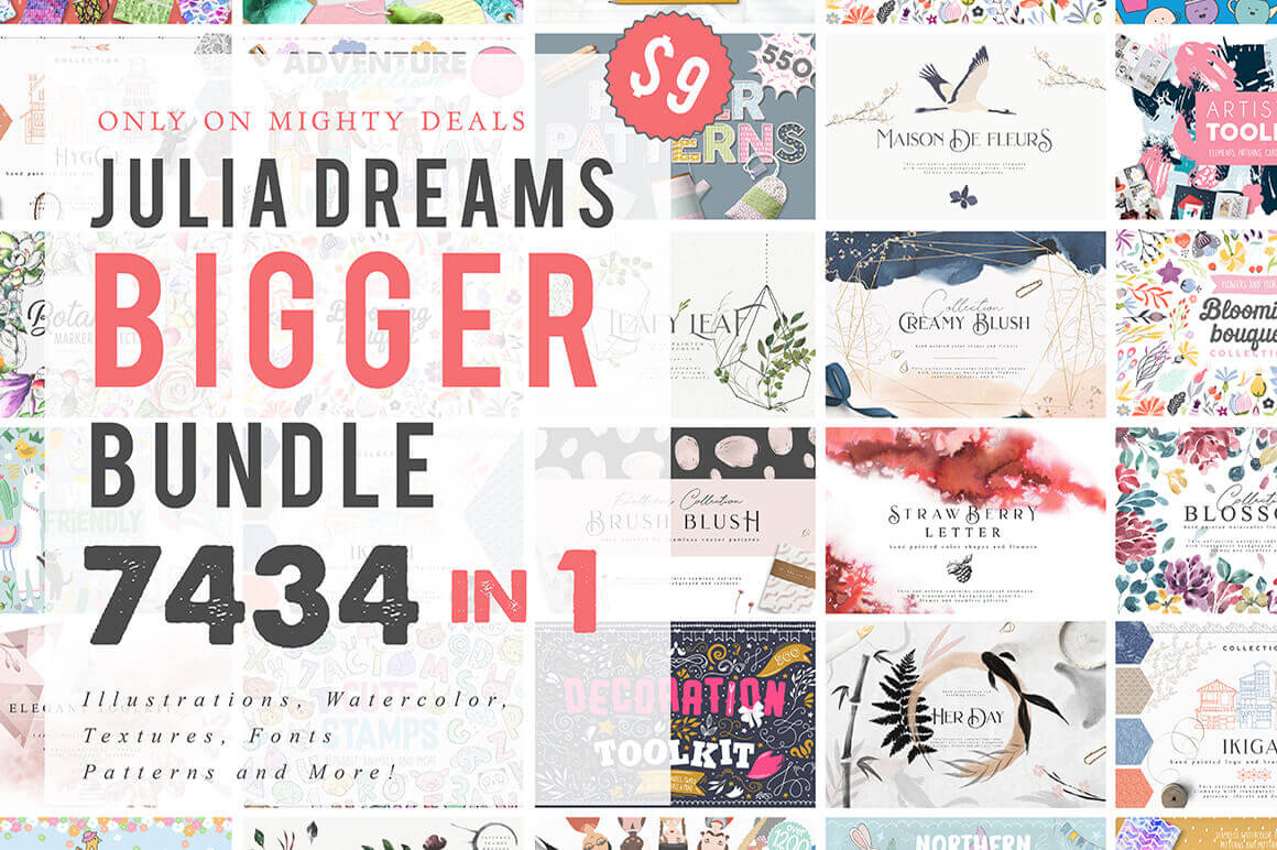
Julia Dreams Bigger Bundle of 7400+ Elements
Exclusive! You won’t find this amazing deal anywhere else on the Interweb! So stop looking. Instead, feast your eyes on the Julia Dreams Bigger Bundle, which is just bursting with more than 7400 professional design elements. We’re talking illustrations, textures, fonts, toolkits, watercolors and more. From adorable to colorful to realistically detailed, this set has you covered literally from head to toe. And at only $9, you’ll be kicking yourselves tomorrow if you pass this one up today.
$9 instead of $1800 – Get it now!
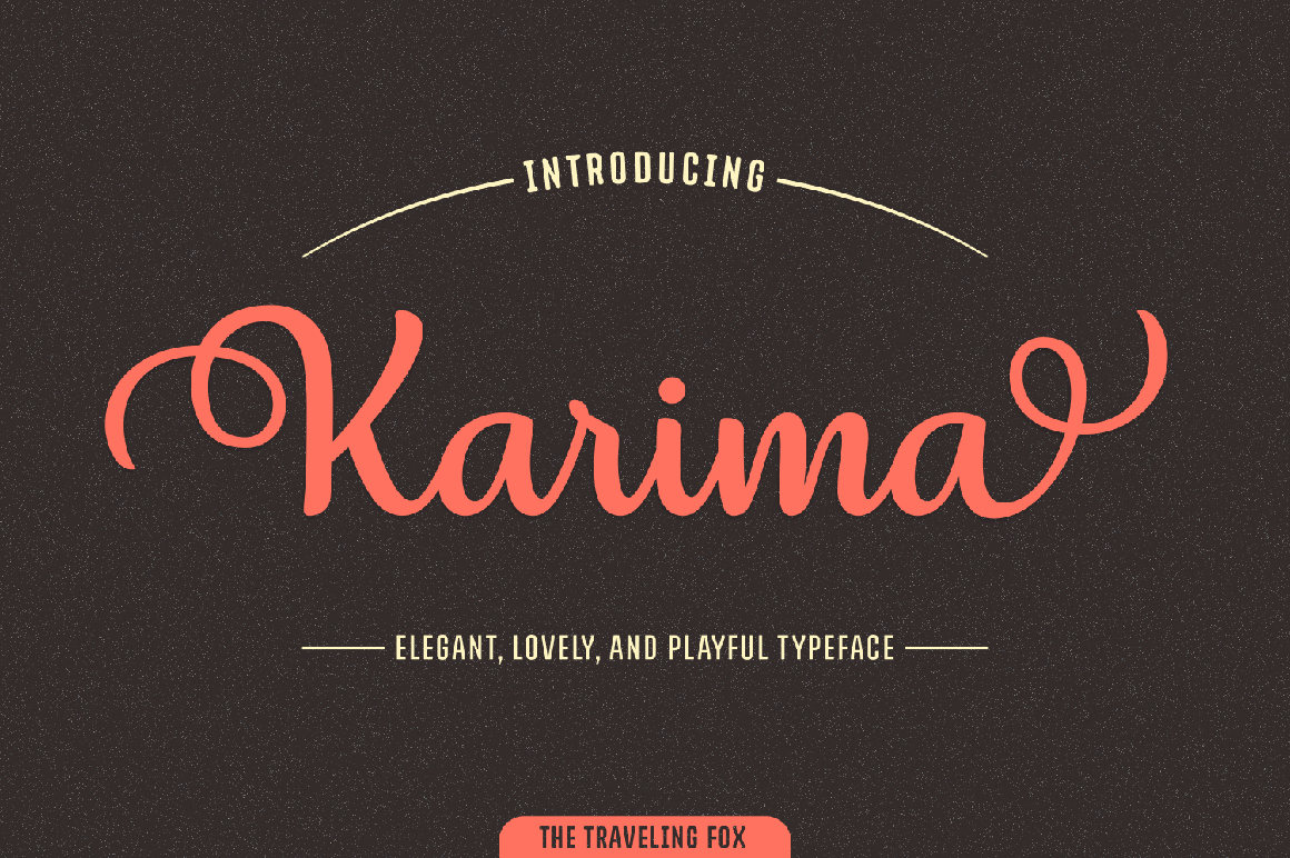
1000+ Unique Characters in Stunning Karima Script Font
If you want to impress your typeface toolbox (and your clients, of course!), grab hold of this discounted deal today! The stunning Karima Script is as elegant as it is curvy. Flowing with smooth, legible letters, Karmia features a regular and italics version, alternates, swashes and ligatures and more, all adding up to more than 1,000 unique glyphs. That’s some serious flexibility in a font.
$7 instead of $20 – Get it now!
How to Create a Cactus Text Effect in Adobe Illustrator
Post pobrano z: How to Create a Cactus Text Effect in Adobe Illustrator
In the following steps, you will learn how to create a cactus text effect in Adobe Illustrator. For starters, you will learn how to set up a simple grid and how to create a pattern brush.
Moving on, you will learn how to create and save a pretty complex pattern. Taking full advantage of the Appearance panel, you will learn how to create the first piece of your cactus and how to save its attributes. Using two simple shapes and some effects, you will learn how to create the pots. Finally, for the background, you will learn how to apply a radial gradient a built-in pattern.
For more inspiration on how to adjust or improve your final text effect, you can find plenty of resources at GraphicRiver.
1. How to Create a New Document and Set Up Grid
Hit Control-N to create a new document. Select Pixels from the Units drop-down menu, enter 850 in the width box and 500 in the height box, and then click that More Settings button. Select RGB for the Color Mode, set the Raster Effects to Screen (72 ppi), and then click Create Document.
Enable the Grid (View > Show Grid) and Snap to Grid (View > Snap to Grid). You will need a grid every 1 px, so simply go to Edit > Preferences > Guides & Grid, and enter 1 in the Gridline every box and 1 in the Subdivisions box. Try not to get discouraged by all that grid—it will make your work easier, and keep in mind that you can easily enable or disable it using the Control-„ keyboard shortcut.
You can learn more about Illustrator’s grid system in this short tutorial from Andrei Stefan: Understanding Adobe Illustrator’s Grid System.
You should also open the Info panel (Window > Info) for a live preview with the size and position of your shapes. Don’t forget to set the unit of measurement to pixels from Edit > Preferences > Units. All these options will significantly increase your work speed.
2. How to Create a Pattern Brush
Step 1
Pick the Rectangle Tool (M) and focus on your toolbar. Remove the color from the stroke, and then select the fill and set its color to R=255 G=188 B=53. Move to your artboard and simply create a 25 x 14 px shape—the grid and the Snap to Grid should make it easier.
Step 2
Change the fill color to R=93 G=74 B=27 and pick the Ellipse Tool (L). Create the five squeezed circles shown below and place them exactly as shown in the following image.
Once you’re done, select all these new shapes and turn them into a compound path (Control-8).
Step 3
Pick the Rectangle Tool (M), create a 25 x 7 px shape, and place it as shown in the first image. Select this new rectangle along with your compound path and click the Minus Front button from the Pathfinder panel (Window > Pathfinder).
Step 4
Pick the Anchor Point Tool (Shift-C), focus on your brown shapes, and simply click the top anchor points as shown in the first image.
Select the yellow rectangle and remove the fill color.
Step 5
Select all the shapes made so far, open the Brushes panel (Window > Brushes), and click the New Brush button. Check the Pattern Brush box and click OK to open the Pattern Brush Options window. Type a name for your new brush, enter all the attributes shown below, and click OK to save your new brush.
3. How to Create a Pattern
Step 1
Using the Rectangle Tool (M), create a 50 px square and fill it with yellow.
Step 2
Using the Pen Tool (P), draw two simple paths and place them on the right edge of your yellow square as shown below. Make sure that both paths are selected and open the Appearance panel (Window > Appearance).
Remove the fill color, set the stroke color to R=93 G=74 B=27, and open the Stroke fly-out panel. Increase the Weight to 2 px and select Width Profile 1.
With one of these shapes still selected, open the Graphic Styles (Window > Graphic Styles). Click the New Graphic Style button to save the appearance of your selected path.
Step 3
Make sure that the two paths made in the previous step are still selected and go to Effect > Distort & Transform > Transform. Enter the attributes shown below and click OK.
Step 4
Using the Pen Tool (P), draw five simple paths and place them on the top edge of your yellow square as shown below. Apply your graphic style from the Graphic Styles panel to all these paths.
Select only the second and the fourth paths from this set of new paths. Go to the Appearance panel and change the Weight to 1 px, and then go to the Graphic Styles panel and save a new graphic style.
Step 5
Make sure that the two paths made in the previous step are still selected and go to Effect > Distort & Transform > Transform. Enter the attributes shown below and click OK.
Step 6
Using the Pen Tool (P), create the five paths shown in the first image and apply your first graphic style from the Graphic Styles panel.
Using the same tool, create the eight paths shown in the second image, and apply your second graphic style from the Graphic Styles panel.
Step 7
Select all your tiny brown shapes and go to Object > Path > Outline Stroke, and then turn the resulting shapes into a compound path (Control-8).
Step 8
Select your yellow square along with the brown compound path and click the Intersect button from the Pathfinder panel. Simply drag the resulting shapes inside the Swatches panel (Window > Swatches) to save them as a pattern.
4. How to Create a Graphic Style
Step 1
Disable the Grid (Control-„) and the Snap to Grid (Shift-Control-„).
Pick the Type Tool (T) and open the Character panel (Window > Type > Character). Select the Insaniburger font and set the size to 200 px.
Simple click on your artboard, add the „Cactus” piece of text, and set the color to R=78 G=174 B=99. Place your text as shown below, and then go to the Layers panel and lock it.
Step 2
Focus on the first letter of your text. Using the Pen Tool (P) or the Brush Tool (B), draw a simple path roughly as shown in the following image. Make sure that it stays selected and focus on the Appearance panel.
Be sure that there’s no fill color and select the stroke. Set its color to R=93 G=58 B=20, increase the Weight to 4 px, and select Width Profile 1 from the Stroke fly-out panel.
Step 3
Make sure that your round path stays selected, focus on the Appearance panel, and set the fill color to R=75 G=147 B=106.
Step 4
Make sure that your round path stays selected, keep focusing on the Appearance panel, and add a second fill using the Add New Fill button. Select it, set the color to R=78 G=174 B=99, and go to Effect > Distort & Transform > Transform. Enter the attributes shown below and click OK.
Step 5
Make sure that your round path stays selected, keep focusing on the Appearance panel, and add a third fill. Select it and set the color to white (R=255 G=255 B=255). Lower its Opacity to 30%, change the Blending Mode to Overlay, and go to Effect > Distort & Transform > Transform. Enter the attributes shown below, click OK, and go to Effect > Pathfinder > Add, and then go to Effect > Path > Offset Path. Enter a -7 px Offset and click OK.
Step 6
Make sure that your round path stays selected, keep focusing on the Appearance panel, and add a fourth fill. Select it, apply your pattern from the Swatches panel, and go to Effect > Distort & Transform > Transform. Enter the attributes shown below and click OK.
Step 7
Make sure that your round path stays selected, keep focusing on the Appearance panel, and add a second stroke using the Add New Stroke button. Select this new stroke and apply your pattern brush from the Brushes panel, and then drag it below the other stroke.
With your round path still selected, go to the Graphic Styles panel and save a new graphic style.
5. How to Create the Cactus Text
Step 1
Using the Pen Tool (P) or the Brush Tool (B), draw a new path roughly as shown in the first image. Make sure that it stays selected and apply your last graphic style from the Graphic Styles panel.
Step 2
Make sure that the path made in the previous step stays selected, and focus on the Appearance panel. First, select the bottom two fills and replace the existing colors with the ones shown below, and then click the Transform effect applied for the top fill and adjust the Rotate Angle as shown below.
With this path still selected, go to the Graphic Styles panel and save a new graphic style.
Step 3
Keep focusing on the first letter from your text and draw more round paths along that letter, as shown below.
Step 4
Select those new round paths and apply the last two graphic styles from the Graphic Styles panel. Try not to have two paths with identical styles one after the other. Also, select these paths one by one, open the Transform effect applied for the top fill (in the Appearance panel), and adjust the Rotate Angle to match the orientation of the selected path.
Step 5
Select the smaller cactus pieces and focus on the Appearance panel. Open the Transform effect applied for the top fill, drag both Scale sliders to 50%, and click OK.
Step 6
Move on to the other letters from your text and follow the same techniques used for the first letter. First, create the round paths and apply the graphic styles, and then adjust the pattern rotation and the pattern scale for the smaller paths.
6. How to Create the Cactus Flowers
Step 1
Using the Pen Tool (P) or the Brush Tool (B), draw three simple paths as shown in the first image. Fill them with R=239 G=75 B=74 and add a 3 px stroke. Set its color to R=93 G=58 B=20, increase the Weight to 3 px, and don’t forget to select Width Profile 1. Once you’re done, save these attributes as a graphic style.
Step 2
Using the Pen Tool (P) or the Brush Tool (B) along with the graphic style saved in the previous step, add the cactus flower for the other letters. Once you’re done, go to the Layers panel, unlock your piece of text, and delete it.
7. How to Create the Pot
Step 1
Enable the Grid (Control-„) and the Snap to Grid (Shift-Control-„). For the following steps, you will need a grid every 5 px. Just go to Edit > Preferences > Guides & Grid and enter 5 in the Gridline every box.
Pick the Rectangle Tool (M), create a 75 x 20 px shape, fill it with yellow, and place it as shown in the following image.
Step 2
Using the Rectangle Tool (M), create a 65 x 40 px shape, fill it with blue, and place it as shown in the first image.
Switch to the Direct Selection Tool (A) and focus on the bottom side of this new rectangle. Select both anchor points, go to the control panel, and enter 20 px in that Corners box. Once you’re done, send this shape to back (Shift-Control-[).
Step 3
Select your yellow shape and focus on the Appearance panel. Replace the yellow with R=188 G=117 B=71 and then add a second fill. Select it, set the color to R=214 G=146 B=97, and go to Effect > Distort & Transform > Transform. Enter the attributes shown below and click OK.
Step 4
Make sure that your rectangle stays selected and keep focusing on the Appearance panel. Add a third fill and select it. Set the color to white, lower its Opacity to 25%, change the Blending Mode to Overlay, and then go to Effect > Path > Offset Path. Enter a -8 px Offset, click OK, and go to Effect > Distort & Transform > Transform. Enter the attributes shown below and click OK.
Step 5
Make sure that your rectangle stays selected and keep focusing on the Appearance panel. Add a 4 px stroke and set its color to R=92 G=59 B=28.
Step 6
Make sure that your rectangle stays selected and keep focusing on the Appearance panel. Select the entire path (simply click that „Path” piece of text from the top of the panel) and go to Effect > Stylize > Rounded Corners. Enter a 5 px Radius, click OK, and go to Effect > Distort & Transform > Roughen. Enter the attributes shown below and click OK.
Step 7
Select your blue shape and focus on the Appearance panel. Replace the blue with R=188 G=117 B=71 and then add a second fill. Select it, set the color to R=214 G=146 B=97, and go to Effect > Distort & Transform > Transform. Enter the attributes shown below and click OK.
Step 8
Make sure that your bottom shape stays selected and keep focusing on the Appearance panel. Add a third fill and select it. Set the color to white, lower its Opacity to 25%, change the Blending Mode to Overlay, and then go to Effect > Distort & Transform > Transform. Enter the attributes shown below and click OK.
Step 9
Make sure that your bottom shape stays selected and keep focusing on the Appearance panel. Add a 4 px stroke and set its color to R=92 G=59 B=28.
Step 10
Make sure that your bottom shape stays selected and keep focusing on the Appearance panel. Add a new fill and drag it to the bottom of the panel. Set the color to black, lower its Opacity to 60%, change the Blending Mode to Soft Light, and then go to Effect > Convert to Shape > Ellipse. Enter the attributes shown below, click OK, and go to Effect > Distort & Transform > Transform. Enter the settings shown in the following image and click OK.
Step 11
Make sure that your bottom shape stays selected and keep focusing on the Appearance panel. Select the entire path and go to Effect > Stylize > Rounded Corners. Enter a 5 px Radius, click OK, and go to Effect > Distort & Transform > Roughen. Enter the attributes shown below and click OK.
8. How to Multiply Your Pot
Step 1
Duplicate the two shapes that make up your pot and place the copies as shown in the first image. Using the Direct Selection Tool (A), select the anchor points highlighted in the first image, and drag them to the right as shown in the second image.
Keep focusing on these copies, select only the bottom shapes, and focus on the Appearance panel. Open the Transform effect applied to the top fill and the Ellipse effect applied to the bottom fill and adjust the settings as shown below.
Step 2
Create another four copies of your smaller pot, and place them as shown in the following image.
9. How to Create the Background
Step 1
Using the Rectangle Tool (M), create an 860 x 510 px shape, and fill it with R=195 G=224 B=177. Make sure that this rectangle covers your entire artboard and send it to back (Shift-Control-[).
Step 2
Open the fly-out menu from the Swatches panel and go to Open Swatch Library > Patterns > Basic Graphics > Basic Graphics_Textures.
Using the Rectangle Tool (M), create a new 860 x 510 px shape and place it on top of the existing rectangle, as shown in the following image. Fill this new shape with the USHS 22 Gravel Beach pattern, lower its Opacity to 50%, change the Blending Mode to Soft Light, and then go to Effect > Artistic > Film Grain. Enter the attributes shown below and click OK.
Step 3
Make sure that the rectangle made in the previous step is still selected and keep focusing on the Appearance panel. Add a second fill and select it. Lower its Opacity to 50% and change the Blending Mode to Overlay, and then apply the radial gradient shown below. Use the Gradient Tool (G) to stretch your gradient as shown below.
Congratulations! You’re Done!
Here is how it should look. I hope you’ve enjoyed this tutorial and can apply these techniques in your future projects. Don’t hesitate to share your final result in the comments section.
Feel free to adjust the final design and make it your own. You can find some great sources of inspiration at GraphicRiver, with interesting solutions to improve your design.
