Post pobrano z: Showcase: Optics by Maxim Zhestkov
Centered around light, refraction, and the visual spectrum Optics is a beautiful example of abstraction and animation’s innate ability to create an experience that can feel so foreign yet familiar at the same time.
Archiwum miesiąca: wrzesień 2018
How to Use Grids in Photoshop to Create a Typographic Poster
Post pobrano z: How to Use Grids in Photoshop to Create a Typographic Poster

In this tutorial, we will create a powerful typographic poster by using grids. We will also learn to use layer masks and adjustment layers to edit images. Are you ready to get started?
What You Will Need
You’ll need access to Adobe Photoshop. If you don’t have the software, you can download a trial from the Adobe website. You’ll also need the following resources:
Download the images and install the font, and you are ready to start!
1. Setting Up a New Photoshop File
Step 1
In Photoshop, go to File > New. Name the document Snowboarding Poster. Set the Width to 1270 px and Height to 1600 px. Set the Resolution to 72 Pixels/Inch. Click OK.

Step 2
Press Command-R to bring up the rules around the document. Head over to View > New Guide. On the New Guide option window, select Horizontal and set the guide to 70 px. Click OK.
Do the same for the other sides of the document by subtracting 70 px from the final size. To activate and deactivate the guides, press Command-;.

Step 3
For this poster, we will create a 5:3 grid (width x height). This means that we will divide the poster vertically into five sections and horizontally into three sections. Experimenting with grids is a great way to create an unusual layout.
Head over to View > New Guide. In the New Guide option window, select Vertical and set the guide to 254 px. Click OK.
Let’s set the vertical guides to 254 px, 508 px, 762 px, and 1016 px. Click OK.
Let’s set the horizontal guides to 533 px and 1066 px. Click OK.

Step 4
On the Layers panel, click on Create a new Fill or Adjustment Layer > Solid Color. Select a black color in the Color Picker option window. Click OK.

2. How to Edit the Ski Slopes Image
Step 1
Drag the Ski slopes image into the Snowboarding Poster document.
Press Command-T to Transform. Head over to the control bar and activate the Maintain Aspect Ratio button. Set the Width and Height to 75%. Press Enter to proceed. Don’t worry about the placement—we will play with that later.

Step 2
Activate the guides by pressing Command-;. On the toolbar, select the Marquee Tool (M). Select the first two columns from the left. Use the guides for this.
On the Layers panel, make sure you are selecting the Ski slopes image. Click on the Add Layer Mask button.

Step 3
On the Layers panel, click on the link button between the thumbnails. This will unlink the image from the layer mask. This is useful when you want to keep the position of the layer mask but want to move the image.
Make sure you are selecting the smart object thumbnail and not the layer mask. Using the Move Tool (V), move the image anywhere you desire. In the image below, I want the slope details to be concentrated in the middle section. I know I want to add text to the top and bottom on the slopes, so I’ll try to leave these two sections as clean as possible.

Step 4
To neutralize the image, we’ll add an Adjustment Layer. This is helpful when we are using multiple images in a poster where the colors don’t go together.
On the Layers panel, click on Create a New Fill or Adjustment Layer > Black & White.

Step 5
Select the new Black & White adjustment layer, and Right Click > Create Clipping Mask.
The shortcut for this is: hold down Option, hover over the layer until the arrow pointing down appears, and click. A clipping mask is useful when we want to apply a Fill Layer or Adjustment Layer only to the layer below. This way, we won’t compromise the rest of the poster.

Step 6
To open the Properties panel, click on the Layer Thumbnail. On the Properties panel, move the color stoppers to tweak the color intensity. This particular image is composed of blues and cyans. Feel free to play with these.

Step 7
To keep the layers tidy, select the ski slope layer and the Adjustment Layer. Drag these two layers towards the Create New Group button. Double click on the Group 1 folder to change the name; I renamed it Slopes.

3. How to Edit the Snowboarder Image
Step 1
Open the Snowboarder image in Photoshop. Make sure you are not dragging it into the document. We need to open it separately.
Click on the Layer Mask button to create a new Layer Mask.

Step 2
Let’s start by working on the sky section. Make sure you have the Layer Mask selected.
On the toolbar, select the Magic Wand Tool (W) and select the sky portion of the image. Hold down Shift to add to the selection. Once you’ve selected all of the sky, press Command-I to Inverse the selection. Press Command-D to deselect.

Step 3
Press \ to activate the red overlay; this will make it easier to see what parts of the image still need work.
Select the Brush Tool (B). Right click on the document, and set the Size to 500 px and the Hardness to 0. Press [ to decrease and ] to increase the Brush Size. Set the Fill color to black and start brushing the snow off the photo.

Step 4
On the Layers panel, select the Layer Mask thumbnail and Right Click > Refine Mask.
In the Refine Mask option window, we can change the View Mode. I have On Black (B) selected. Set the Radius to 7.5 px, Feather to 0.5 px, and Shift Edge to -25%. Click OK.

Step 5
Right click on the layer and select Duplicate Layer. Name the layer snowboarder and set the Destination to Snowboarding poster.

Step 6
Switch back to the Snowboarding poster. Select the Snowboarder layer, and press Command-T to Transform. Head to the control bar, and activate the Maintain Aspect Ratio button. Set the Width and Height to 40%. Press Enter to proceed.
While grids are used for creating order in a poster, they are also used for breaking rules. By doing so, we are creating something that is different. A great way to break the grid is to place the snowboarder image on a grid guide. Move the image to the bottom left side of the poster, as shown in the image below.

Step 7
On the Layers panel, click on Create a New Fill or Adjustment Layer > Hue/Saturation. Repeat this action, but this time add a Brightness/Contrast layer.
To create a Clipping Mask, select both Adjustment Layers and Right Click > Create Clipping Mask.

Step 8
Click on the Brightness/Contrast thumbnail layer. This will bring up the Properties panel. Set the Brightness to 36 and the Contrast to -4.
Click on the Hue/Saturation layer thumbnail to bring up the Properties panel. Here, we can alter the color of the whole image or specific colors. For this tutorial, we will tweak the colors separately. Click on the Master dropdown menu, select Red, and set the Hue to +25. This time, select the Yellow option and set the Saturation to -100. Select the Cyan option and set the Hue to +35.

Step 9
You will notice that the gloves, beanie and face of the snowboarder are blue. We can fix this by working on the Layer Mask.
Select the Layer Mask on the Hue/Saturation adjustment layer. Select the Brush Tool (B). Right click on the document, and set the Size to 100 px and Hardness to 0. Brush over the winter hat, face, and gloves. Perfect!
Select the snowboarder and the two adjustment layers. Drag these three layers to the Group button. Rename the group Snowboarder.

4. How to Add Text
Step 1
On the Tools panel, select the Text Tool (T). I used white text to contrast with the background.
The typeface I used is Schmalfette.
Bring up the Tools panel by going to Type > Panels > Character Panel. Below are the details I added, with the type size and specific font weight on separate layers.
- STATION DE SKI
MONT-TREMBLANT
QUEBEC
(Schmalfette, Regular, Size: 100 pt, 80 pt and 200 pt,Tracking: 100 pt, Leading: play with the leading options as it will be different for each line).
- 02
—
28
OCTOBRE
(Schmalfette, Regular, Size: 180 pt and 50 pt, Tracking: 100 pt. I altered the scale of the em-dash to fit the width of the numbers. You can do this by using the Horizontal Scale on the Characters panel).
Place these two text blurbs at the top and bottom on the left side of the poster.

Step 2
Let’s add text to the black background. Using the Text Tool (T), add JOIE DE VIE. On the Characters panel, set the Size to 630 pt and Leading to 505 pt, and set the color to #eb5d08. On the control bar, activate the Right Align Text button. Place the text on the right side of the poster.
On the Layers panel, move the layer between the Snowbarder and Ski slopes groups. This is so that the snowboarder is over the letters, adding dimension.

Step 3
Let’s add strokes between the words. On the toolbar, select the Line Tool (U). Head over to the control bar and set the Stroke color to #eb5d08 and 3 pt. Set the Width to 665 px and the Height to 5 px.
Hold Option-Shift and drag the stroke to multiply. Place both strokes between the words. On the Layers panel, move the strokes under the Snowboarder group.

5. How to Save a File for Web
Head over to File > Save and save the file as you would normally.
To save a JPEG file for web, head over to File > Save for Web or Shift-Option-Command-S. Select the file type you want to save the document in—I am choosing JPEG—and set 100 for Quality. Under Image size, you can change the pixel size of the image if you have any size constraints.
On the bottom left-hand side, you can see a preview of the size of the file. This is useful when there are size constraints on a website and you need to lower the quality or the size of the image.
Click on Save… to choose the location in the new window, and click on Save again.

Congratulations! You’ve Finished This Tutorial!
In this tutorial, we’ve learned to use grids to create a powerful typographic poster. While grids are used for creating clean and neat posters, they are also made to be broken! Be sure to post your poster in the comments below!
Today, we’ve learned to:
- Use grids to create order and to create a unique poster.
- Use grids to break composition rules.
- Use Layer Masks to clean up images and refine them using the Refine Mask option.
- Use Adjustment Layers to neutralize and change the color of an image.

If you liked this tutorial, you might like these:
 Poster DesignHow to Create a Bauhaus Poster in Adobe InDesignGrace Fussell
 Adobe IllustratorIllustrator in 60 Seconds: The Perspective GridAndrei Stefan
 Non-Destructive EditingNon-Destructive Photo Editing in 60 SecondsHarry Guinness
 Text EffectsHow to Create a 3D Gold Layered Text Effect in Adobe PhotoshopRose

How to Use Grids in Photoshop to Create a Typographic Poster
Post pobrano z: How to Use Grids in Photoshop to Create a Typographic Poster
In this tutorial, we will create a powerful typographic poster by using grids. We will also learn to use layer masks and adjustment layers to edit images. Are you ready to get started?
What You Will Need
You’ll need access to Adobe Photoshop. If you don’t have the software, you can download a trial from the Adobe website. You’ll also need the following resources:
Download the images and install the font, and you are ready to start!
1. Setting Up a New Photoshop File
Step 1
In Photoshop, go to File > New. Name the document Snowboarding Poster. Set the Width to 1270 px and Height to 1600 px. Set the Resolution to 72 Pixels/Inch. Click OK.
Step 2
Press Command-R to bring up the rules around the document. Head over to View > New Guide. On the New Guide option window, select Horizontal and set the guide to 70 px. Click OK.
Do the same for the other sides of the document by subtracting 70 px from the final size. To activate and deactivate the guides, press Command-;.
Step 3
For this poster, we will create a 5:3 grid (width x height). This means that we will divide the poster vertically into five sections and horizontally into three sections. Experimenting with grids is a great way to create an unusual layout.
Head over to View > New Guide. In the New Guide option window, select Vertical and set the guide to 254 px. Click OK.
Let’s set the vertical guides to 254 px, 508 px, 762 px, and 1016 px. Click OK.
Let’s set the horizontal guides to 533 px and 1066 px. Click OK.
Step 4
On the Layers panel, click on Create a new Fill or Adjustment Layer > Solid Color. Select a black color in the Color Picker option window. Click OK.
2. How to Edit the Ski Slopes Image
Step 1
Drag the Ski slopes image into the Snowboarding Poster document.
Press Command-T to Transform. Head over to the control bar and activate the Maintain Aspect Ratio button. Set the Width and Height to 75%. Press Enter to proceed. Don’t worry about the placement—we will play with that later.
Step 2
Activate the guides by pressing Command-;. On the toolbar, select the Marquee Tool (M). Select the first two columns from the left. Use the guides for this.
On the Layers panel, make sure you are selecting the Ski slopes image. Click on the Add Layer Mask button.
Step 3
On the Layers panel, click on the link button between the thumbnails. This will unlink the image from the layer mask. This is useful when you want to keep the position of the layer mask but want to move the image.
Make sure you are selecting the smart object thumbnail and not the layer mask. Using the Move Tool (V), move the image anywhere you desire. In the image below, I want the slope details to be concentrated in the middle section. I know I want to add text to the top and bottom on the slopes, so I’ll try to leave these two sections as clean as possible.
Step 4
To neutralize the image, we’ll add an Adjustment Layer. This is helpful when we are using multiple images in a poster where the colors don’t go together.
On the Layers panel, click on Create a New Fill or Adjustment Layer > Black & White.
Step 5
Select the new Black & White adjustment layer, and Right Click > Create Clipping Mask.
The shortcut for this is: hold down Option, hover over the layer until the arrow pointing down appears, and click. A clipping mask is useful when we want to apply a Fill Layer or Adjustment Layer only to the layer below. This way, we won’t compromise the rest of the poster.
Step 6
To open the Properties panel, click on the Layer Thumbnail. On the Properties panel, move the color stoppers to tweak the color intensity. This particular image is composed of blues and cyans. Feel free to play with these.
Step 7
To keep the layers tidy, select the ski slope layer and the Adjustment Layer. Drag these two layers towards the Create New Group button. Double click on the Group 1 folder to change the name; I renamed it Slopes.
3. How to Edit the Snowboarder Image
Step 1
Open the Snowboarder image in Photoshop. Make sure you are not dragging it into the document. We need to open it separately.
Click on the Layer Mask button to create a new Layer Mask.
Step 2
Let’s start by working on the sky section. Make sure you have the Layer Mask selected.
On the toolbar, select the Magic Wand Tool (W) and select the sky portion of the image. Hold down Shift to add to the selection. Once you’ve selected all of the sky, press Command-I to Inverse the selection. Press Command-D to deselect.
Step 3
Press \ to activate the red overlay; this will make it easier to see what parts of the image still need work.
Select the Brush Tool (B). Right click on the document, and set the Size to 500 px and the Hardness to 0. Press [ to decrease and ] to increase the Brush Size. Set the Fill color to black and start brushing the snow off the photo.
Step 4
On the Layers panel, select the Layer Mask thumbnail and Right Click > Refine Mask.
In the Refine Mask option window, we can change the View Mode. I have On Black (B) selected. Set the Radius to 7.5 px, Feather to 0.5 px, and Shift Edge to -25%. Click OK.
Step 5
Right click on the layer and select Duplicate Layer. Name the layer snowboarder and set the Destination to Snowboarding poster.
Step 6
Switch back to the Snowboarding poster. Select the Snowboarder layer, and press Command-T to Transform. Head to the control bar, and activate the Maintain Aspect Ratio button. Set the Width and Height to 40%. Press Enter to proceed.
While grids are used for creating order in a poster, they are also used for breaking rules. By doing so, we are creating something that is different. A great way to break the grid is to place the snowboarder image on a grid guide. Move the image to the bottom left side of the poster, as shown in the image below.
Step 7
On the Layers panel, click on Create a New Fill or Adjustment Layer > Hue/Saturation. Repeat this action, but this time add a Brightness/Contrast layer.
To create a Clipping Mask, select both Adjustment Layers and Right Click > Create Clipping Mask.
Step 8
Click on the Brightness/Contrast thumbnail layer. This will bring up the Properties panel. Set the Brightness to 36 and the Contrast to -4.
Click on the Hue/Saturation layer thumbnail to bring up the Properties panel. Here, we can alter the color of the whole image or specific colors. For this tutorial, we will tweak the colors separately. Click on the Master dropdown menu, select Red, and set the Hue to +25. This time, select the Yellow option and set the Saturation to -100. Select the Cyan option and set the Hue to +35.
Step 9
You will notice that the gloves, beanie and face of the snowboarder are blue. We can fix this by working on the Layer Mask.
Select the Layer Mask on the Hue/Saturation adjustment layer. Select the Brush Tool (B). Right click on the document, and set the Size to 100 px and Hardness to 0. Brush over the winter hat, face, and gloves. Perfect!
Select the snowboarder and the two adjustment layers. Drag these three layers to the Group button. Rename the group Snowboarder.
4. How to Add Text
Step 1
On the Tools panel, select the Text Tool (T). I used white text to contrast with the background.
The typeface I used is Schmalfette.
Bring up the Tools panel by going to Type > Panels > Character Panel. Below are the details I added, with the type size and specific font weight on separate layers.
- STATION DE SKI
MONT-TREMBLANT
QUEBEC
(Schmalfette, Regular, Size: 100 pt, 80 pt and 200 pt,Tracking: 100 pt, Leading: play with the leading options as it will be different for each line).
- 02
—
28
OCTOBRE
(Schmalfette, Regular, Size: 180 pt and 50 pt, Tracking: 100 pt. I altered the scale of the em-dash to fit the width of the numbers. You can do this by using the Horizontal Scale on the Characters panel).
Place these two text blurbs at the top and bottom on the left side of the poster.
Step 2
Let’s add text to the black background. Using the Text Tool (T), add JOIE DE VIE. On the Characters panel, set the Size to 630 pt and Leading to 505 pt, and set the color to #eb5d08. On the control bar, activate the Right Align Text button. Place the text on the right side of the poster.
On the Layers panel, move the layer between the Snowbarder and Ski slopes groups. This is so that the snowboarder is over the letters, adding dimension.
Step 3
Let’s add strokes between the words. On the toolbar, select the Line Tool (U). Head over to the control bar and set the Stroke color to #eb5d08 and 3 pt. Set the Width to 665 px and the Height to 5 px.
Hold Option-Shift and drag the stroke to multiply. Place both strokes between the words. On the Layers panel, move the strokes under the Snowboarder group.
5. How to Save a File for Web
Head over to File > Save and save the file as you would normally.
To save a JPEG file for web, head over to File > Save for Web or Shift-Option-Command-S. Select the file type you want to save the document in—I am choosing JPEG—and set 100 for Quality. Under Image size, you can change the pixel size of the image if you have any size constraints.
On the bottom left-hand side, you can see a preview of the size of the file. This is useful when there are size constraints on a website and you need to lower the quality or the size of the image.
Click on Save… to choose the location in the new window, and click on Save again.
Congratulations! You’ve Finished This Tutorial!
In this tutorial, we’ve learned to use grids to create a powerful typographic poster. While grids are used for creating clean and neat posters, they are also made to be broken! Be sure to post your poster in the comments below!
Today, we’ve learned to:
- Use grids to create order and to create a unique poster.
- Use grids to break composition rules.
- Use Layer Masks to clean up images and refine them using the Refine Mask option.
- Use Adjustment Layers to neutralize and change the color of an image.
If you liked this tutorial, you might like these:
-
Poster DesignHow to Create a Bauhaus Poster in Adobe InDesignGrace Fussell
-
Adobe IllustratorIllustrator in 60 Seconds: The Perspective GridAndrei Stefan
-
Non-Destructive EditingNon-Destructive Photo Editing in 60 SecondsHarry Guinness
-
Text EffectsHow to Create a 3D Gold Layered Text Effect in Adobe PhotoshopRose
How to Use Grids in Photoshop to Create a Typographic Poster
Post pobrano z: How to Use Grids in Photoshop to Create a Typographic Poster
In this tutorial, we will create a powerful typographic poster by using grids. We will also learn to use layer masks and adjustment layers to edit images. Are you ready to get started?
What You Will Need
You’ll need access to Adobe Photoshop. If you don’t have the software, you can download a trial from the Adobe website. You’ll also need the following resources:
Download the images and install the font, and you are ready to start!
1. Setting Up a New Photoshop File
Step 1
In Photoshop, go to File > New. Name the document Snowboarding Poster. Set the Width to 1270 px and Height to 1600 px. Set the Resolution to 72 Pixels/Inch. Click OK.
Step 2
Press Command-R to bring up the rules around the document. Head over to View > New Guide. On the New Guide option window, select Horizontal and set the guide to 70 px. Click OK.
Do the same for the other sides of the document by subtracting 70 px from the final size. To activate and deactivate the guides, press Command-;.
Step 3
For this poster, we will create a 5:3 grid (width x height). This means that we will divide the poster vertically into five sections and horizontally into three sections. Experimenting with grids is a great way to create an unusual layout.
Head over to View > New Guide. In the New Guide option window, select Vertical and set the guide to 254 px. Click OK.
Let’s set the vertical guides to 254 px, 508 px, 762 px, and 1016 px. Click OK.
Let’s set the horizontal guides to 533 px and 1066 px. Click OK.
Step 4
On the Layers panel, click on Create a new Fill or Adjustment Layer > Solid Color. Select a black color in the Color Picker option window. Click OK.
2. How to Edit the Ski Slopes Image
Step 1
Drag the Ski slopes image into the Snowboarding Poster document.
Press Command-T to Transform. Head over to the control bar and activate the Maintain Aspect Ratio button. Set the Width and Height to 75%. Press Enter to proceed. Don’t worry about the placement—we will play with that later.
Step 2
Activate the guides by pressing Command-;. On the toolbar, select the Marquee Tool (M). Select the first two columns from the left. Use the guides for this.
On the Layers panel, make sure you are selecting the Ski slopes image. Click on the Add Layer Mask button.
Step 3
On the Layers panel, click on the link button between the thumbnails. This will unlink the image from the layer mask. This is useful when you want to keep the position of the layer mask but want to move the image.
Make sure you are selecting the smart object thumbnail and not the layer mask. Using the Move Tool (V), move the image anywhere you desire. In the image below, I want the slope details to be concentrated in the middle section. I know I want to add text to the top and bottom on the slopes, so I’ll try to leave these two sections as clean as possible.
Step 4
To neutralize the image, we’ll add an Adjustment Layer. This is helpful when we are using multiple images in a poster where the colors don’t go together.
On the Layers panel, click on Create a New Fill or Adjustment Layer > Black & White.
Step 5
Select the new Black & White adjustment layer, and Right Click > Create Clipping Mask.
The shortcut for this is: hold down Option, hover over the layer until the arrow pointing down appears, and click. A clipping mask is useful when we want to apply a Fill Layer or Adjustment Layer only to the layer below. This way, we won’t compromise the rest of the poster.
Step 6
To open the Properties panel, click on the Layer Thumbnail. On the Properties panel, move the color stoppers to tweak the color intensity. This particular image is composed of blues and cyans. Feel free to play with these.
Step 7
To keep the layers tidy, select the ski slope layer and the Adjustment Layer. Drag these two layers towards the Create New Group button. Double click on the Group 1 folder to change the name; I renamed it Slopes.
3. How to Edit the Snowboarder Image
Step 1
Open the Snowboarder image in Photoshop. Make sure you are not dragging it into the document. We need to open it separately.
Click on the Layer Mask button to create a new Layer Mask.
Step 2
Let’s start by working on the sky section. Make sure you have the Layer Mask selected.
On the toolbar, select the Magic Wand Tool (W) and select the sky portion of the image. Hold down Shift to add to the selection. Once you’ve selected all of the sky, press Command-I to Inverse the selection. Press Command-D to deselect.
Step 3
Press \ to activate the red overlay; this will make it easier to see what parts of the image still need work.
Select the Brush Tool (B). Right click on the document, and set the Size to 500 px and the Hardness to 0. Press [ to decrease and ] to increase the Brush Size. Set the Fill color to black and start brushing the snow off the photo.
Step 4
On the Layers panel, select the Layer Mask thumbnail and Right Click > Refine Mask.
In the Refine Mask option window, we can change the View Mode. I have On Black (B) selected. Set the Radius to 7.5 px, Feather to 0.5 px, and Shift Edge to -25%. Click OK.
Step 5
Right click on the layer and select Duplicate Layer. Name the layer snowboarder and set the Destination to Snowboarding poster.
Step 6
Switch back to the Snowboarding poster. Select the Snowboarder layer, and press Command-T to Transform. Head to the control bar, and activate the Maintain Aspect Ratio button. Set the Width and Height to 40%. Press Enter to proceed.
While grids are used for creating order in a poster, they are also used for breaking rules. By doing so, we are creating something that is different. A great way to break the grid is to place the snowboarder image on a grid guide. Move the image to the bottom left side of the poster, as shown in the image below.
Step 7
On the Layers panel, click on Create a New Fill or Adjustment Layer > Hue/Saturation. Repeat this action, but this time add a Brightness/Contrast layer.
To create a Clipping Mask, select both Adjustment Layers and Right Click > Create Clipping Mask.
Step 8
Click on the Brightness/Contrast thumbnail layer. This will bring up the Properties panel. Set the Brightness to 36 and the Contrast to -4.
Click on the Hue/Saturation layer thumbnail to bring up the Properties panel. Here, we can alter the color of the whole image or specific colors. For this tutorial, we will tweak the colors separately. Click on the Master dropdown menu, select Red, and set the Hue to +25. This time, select the Yellow option and set the Saturation to -100. Select the Cyan option and set the Hue to +35.
Step 9
You will notice that the gloves, beanie and face of the snowboarder are blue. We can fix this by working on the Layer Mask.
Select the Layer Mask on the Hue/Saturation adjustment layer. Select the Brush Tool (B). Right click on the document, and set the Size to 100 px and Hardness to 0. Brush over the winter hat, face, and gloves. Perfect!
Select the snowboarder and the two adjustment layers. Drag these three layers to the Group button. Rename the group Snowboarder.
4. How to Add Text
Step 1
On the Tools panel, select the Text Tool (T). I used white text to contrast with the background.
The typeface I used is Schmalfette.
Bring up the Tools panel by going to Type > Panels > Character Panel. Below are the details I added, with the type size and specific font weight on separate layers.
- STATION DE SKI
MONT-TREMBLANT
QUEBEC
(Schmalfette, Regular, Size: 100 pt, 80 pt and 200 pt,Tracking: 100 pt, Leading: play with the leading options as it will be different for each line).
- 02
—
28
OCTOBRE
(Schmalfette, Regular, Size: 180 pt and 50 pt, Tracking: 100 pt. I altered the scale of the em-dash to fit the width of the numbers. You can do this by using the Horizontal Scale on the Characters panel).
Place these two text blurbs at the top and bottom on the left side of the poster.
Step 2
Let’s add text to the black background. Using the Text Tool (T), add JOIE DE VIE. On the Characters panel, set the Size to 630 pt and Leading to 505 pt, and set the color to #eb5d08. On the control bar, activate the Right Align Text button. Place the text on the right side of the poster.
On the Layers panel, move the layer between the Snowbarder and Ski slopes groups. This is so that the snowboarder is over the letters, adding dimension.
Step 3
Let’s add strokes between the words. On the toolbar, select the Line Tool (U). Head over to the control bar and set the Stroke color to #eb5d08 and 3 pt. Set the Width to 665 px and the Height to 5 px.
Hold Option-Shift and drag the stroke to multiply. Place both strokes between the words. On the Layers panel, move the strokes under the Snowboarder group.
5. How to Save a File for Web
Head over to File > Save and save the file as you would normally.
To save a JPEG file for web, head over to File > Save for Web or Shift-Option-Command-S. Select the file type you want to save the document in—I am choosing JPEG—and set 100 for Quality. Under Image size, you can change the pixel size of the image if you have any size constraints.
On the bottom left-hand side, you can see a preview of the size of the file. This is useful when there are size constraints on a website and you need to lower the quality or the size of the image.
Click on Save… to choose the location in the new window, and click on Save again.
Congratulations! You’ve Finished This Tutorial!
In this tutorial, we’ve learned to use grids to create a powerful typographic poster. While grids are used for creating clean and neat posters, they are also made to be broken! Be sure to post your poster in the comments below!
Today, we’ve learned to:
- Use grids to create order and to create a unique poster.
- Use grids to break composition rules.
- Use Layer Masks to clean up images and refine them using the Refine Mask option.
- Use Adjustment Layers to neutralize and change the color of an image.
If you liked this tutorial, you might like these:
-
Poster DesignHow to Create a Bauhaus Poster in Adobe InDesignGrace Fussell
-
Adobe IllustratorIllustrator in 60 Seconds: The Perspective GridAndrei Stefan
-
Non-Destructive EditingNon-Destructive Photo Editing in 60 SecondsHarry Guinness
-
Text EffectsHow to Create a 3D Gold Layered Text Effect in Adobe PhotoshopRose
How to Use Grids in Photoshop to Create a Typographic Poster
Post pobrano z: How to Use Grids in Photoshop to Create a Typographic Poster
In this tutorial, we will create a powerful typographic poster by using grids. We will also learn to use layer masks and adjustment layers to edit images. Are you ready to get started?
What You Will Need
You’ll need access to Adobe Photoshop. If you don’t have the software, you can download a trial from the Adobe website. You’ll also need the following resources:
Download the images and install the font, and you are ready to start!
1. Setting Up a New Photoshop File
Step 1
In Photoshop, go to File > New. Name the document Snowboarding Poster. Set the Width to 1270 px and Height to 1600 px. Set the Resolution to 72 Pixels/Inch. Click OK.
Step 2
Press Command-R to bring up the rules around the document. Head over to View > New Guide. On the New Guide option window, select Horizontal and set the guide to 70 px. Click OK.
Do the same for the other sides of the document by subtracting 70 px from the final size. To activate and deactivate the guides, press Command-;.
Step 3
For this poster, we will create a 5:3 grid (width x height). This means that we will divide the poster vertically into five sections and horizontally into three sections. Experimenting with grids is a great way to create an unusual layout.
Head over to View > New Guide. In the New Guide option window, select Vertical and set the guide to 254 px. Click OK.
Let’s set the vertical guides to 254 px, 508 px, 762 px, and 1016 px. Click OK.
Let’s set the horizontal guides to 533 px and 1066 px. Click OK.
Step 4
On the Layers panel, click on Create a new Fill or Adjustment Layer > Solid Color. Select a black color in the Color Picker option window. Click OK.
2. How to Edit the Ski Slopes Image
Step 1
Drag the Ski slopes image into the Snowboarding Poster document.
Press Command-T to Transform. Head over to the control bar and activate the Maintain Aspect Ratio button. Set the Width and Height to 75%. Press Enter to proceed. Don’t worry about the placement—we will play with that later.
Step 2
Activate the guides by pressing Command-;. On the toolbar, select the Marquee Tool (M). Select the first two columns from the left. Use the guides for this.
On the Layers panel, make sure you are selecting the Ski slopes image. Click on the Add Layer Mask button.
Step 3
On the Layers panel, click on the link button between the thumbnails. This will unlink the image from the layer mask. This is useful when you want to keep the position of the layer mask but want to move the image.
Make sure you are selecting the smart object thumbnail and not the layer mask. Using the Move Tool (V), move the image anywhere you desire. In the image below, I want the slope details to be concentrated in the middle section. I know I want to add text to the top and bottom on the slopes, so I’ll try to leave these two sections as clean as possible.
Step 4
To neutralize the image, we’ll add an Adjustment Layer. This is helpful when we are using multiple images in a poster where the colors don’t go together.
On the Layers panel, click on Create a New Fill or Adjustment Layer > Black & White.
Step 5
Select the new Black & White adjustment layer, and Right Click > Create Clipping Mask.
The shortcut for this is: hold down Option, hover over the layer until the arrow pointing down appears, and click. A clipping mask is useful when we want to apply a Fill Layer or Adjustment Layer only to the layer below. This way, we won’t compromise the rest of the poster.
Step 6
To open the Properties panel, click on the Layer Thumbnail. On the Properties panel, move the color stoppers to tweak the color intensity. This particular image is composed of blues and cyans. Feel free to play with these.
Step 7
To keep the layers tidy, select the ski slope layer and the Adjustment Layer. Drag these two layers towards the Create New Group button. Double click on the Group 1 folder to change the name; I renamed it Slopes.
3. How to Edit the Snowboarder Image
Step 1
Open the Snowboarder image in Photoshop. Make sure you are not dragging it into the document. We need to open it separately.
Click on the Layer Mask button to create a new Layer Mask.
Step 2
Let’s start by working on the sky section. Make sure you have the Layer Mask selected.
On the toolbar, select the Magic Wand Tool (W) and select the sky portion of the image. Hold down Shift to add to the selection. Once you’ve selected all of the sky, press Command-I to Inverse the selection. Press Command-D to deselect.
Step 3
Press \ to activate the red overlay; this will make it easier to see what parts of the image still need work.
Select the Brush Tool (B). Right click on the document, and set the Size to 500 px and the Hardness to 0. Press [ to decrease and ] to increase the Brush Size. Set the Fill color to black and start brushing the snow off the photo.
Step 4
On the Layers panel, select the Layer Mask thumbnail and Right Click > Refine Mask.
In the Refine Mask option window, we can change the View Mode. I have On Black (B) selected. Set the Radius to 7.5 px, Feather to 0.5 px, and Shift Edge to -25%. Click OK.
Step 5
Right click on the layer and select Duplicate Layer. Name the layer snowboarder and set the Destination to Snowboarding poster.
Step 6
Switch back to the Snowboarding poster. Select the Snowboarder layer, and press Command-T to Transform. Head to the control bar, and activate the Maintain Aspect Ratio button. Set the Width and Height to 40%. Press Enter to proceed.
While grids are used for creating order in a poster, they are also used for breaking rules. By doing so, we are creating something that is different. A great way to break the grid is to place the snowboarder image on a grid guide. Move the image to the bottom left side of the poster, as shown in the image below.
Step 7
On the Layers panel, click on Create a New Fill or Adjustment Layer > Hue/Saturation. Repeat this action, but this time add a Brightness/Contrast layer.
To create a Clipping Mask, select both Adjustment Layers and Right Click > Create Clipping Mask.
Step 8
Click on the Brightness/Contrast thumbnail layer. This will bring up the Properties panel. Set the Brightness to 36 and the Contrast to -4.
Click on the Hue/Saturation layer thumbnail to bring up the Properties panel. Here, we can alter the color of the whole image or specific colors. For this tutorial, we will tweak the colors separately. Click on the Master dropdown menu, select Red, and set the Hue to +25. This time, select the Yellow option and set the Saturation to -100. Select the Cyan option and set the Hue to +35.
Step 9
You will notice that the gloves, beanie and face of the snowboarder are blue. We can fix this by working on the Layer Mask.
Select the Layer Mask on the Hue/Saturation adjustment layer. Select the Brush Tool (B). Right click on the document, and set the Size to 100 px and Hardness to 0. Brush over the winter hat, face, and gloves. Perfect!
Select the snowboarder and the two adjustment layers. Drag these three layers to the Group button. Rename the group Snowboarder.
4. How to Add Text
Step 1
On the Tools panel, select the Text Tool (T). I used white text to contrast with the background.
The typeface I used is Schmalfette.
Bring up the Tools panel by going to Type > Panels > Character Panel. Below are the details I added, with the type size and specific font weight on separate layers.
- STATION DE SKI
MONT-TREMBLANT
QUEBEC
(Schmalfette, Regular, Size: 100 pt, 80 pt and 200 pt,Tracking: 100 pt, Leading: play with the leading options as it will be different for each line).
- 02
—
28
OCTOBRE
(Schmalfette, Regular, Size: 180 pt and 50 pt, Tracking: 100 pt. I altered the scale of the em-dash to fit the width of the numbers. You can do this by using the Horizontal Scale on the Characters panel).
Place these two text blurbs at the top and bottom on the left side of the poster.
Step 2
Let’s add text to the black background. Using the Text Tool (T), add JOIE DE VIE. On the Characters panel, set the Size to 630 pt and Leading to 505 pt, and set the color to #eb5d08. On the control bar, activate the Right Align Text button. Place the text on the right side of the poster.
On the Layers panel, move the layer between the Snowbarder and Ski slopes groups. This is so that the snowboarder is over the letters, adding dimension.
Step 3
Let’s add strokes between the words. On the toolbar, select the Line Tool (U). Head over to the control bar and set the Stroke color to #eb5d08 and 3 pt. Set the Width to 665 px and the Height to 5 px.
Hold Option-Shift and drag the stroke to multiply. Place both strokes between the words. On the Layers panel, move the strokes under the Snowboarder group.
5. How to Save a File for Web
Head over to File > Save and save the file as you would normally.
To save a JPEG file for web, head over to File > Save for Web or Shift-Option-Command-S. Select the file type you want to save the document in—I am choosing JPEG—and set 100 for Quality. Under Image size, you can change the pixel size of the image if you have any size constraints.
On the bottom left-hand side, you can see a preview of the size of the file. This is useful when there are size constraints on a website and you need to lower the quality or the size of the image.
Click on Save… to choose the location in the new window, and click on Save again.
Congratulations! You’ve Finished This Tutorial!
In this tutorial, we’ve learned to use grids to create a powerful typographic poster. While grids are used for creating clean and neat posters, they are also made to be broken! Be sure to post your poster in the comments below!
Today, we’ve learned to:
- Use grids to create order and to create a unique poster.
- Use grids to break composition rules.
- Use Layer Masks to clean up images and refine them using the Refine Mask option.
- Use Adjustment Layers to neutralize and change the color of an image.
If you liked this tutorial, you might like these:
-
Poster DesignHow to Create a Bauhaus Poster in Adobe InDesignGrace Fussell
-
Adobe IllustratorIllustrator in 60 Seconds: The Perspective GridAndrei Stefan
-
Non-Destructive EditingNon-Destructive Photo Editing in 60 SecondsHarry Guinness
-
Text EffectsHow to Create a 3D Gold Layered Text Effect in Adobe PhotoshopRose
How to Use Grids in Photoshop to Create a Typographic Poster
Post pobrano z: How to Use Grids in Photoshop to Create a Typographic Poster
In this tutorial, we will create a powerful typographic poster by using grids. We will also learn to use layer masks and adjustment layers to edit images. Are you ready to get started?
What You Will Need
You’ll need access to Adobe Photoshop. If you don’t have the software, you can download a trial from the Adobe website. You’ll also need the following resources:
Download the images and install the font, and you are ready to start!
1. Setting Up a New Photoshop File
Step 1
In Photoshop, go to File > New. Name the document Snowboarding Poster. Set the Width to 1270 px and Height to 1600 px. Set the Resolution to 72 Pixels/Inch. Click OK.
Step 2
Press Command-R to bring up the rules around the document. Head over to View > New Guide. On the New Guide option window, select Horizontal and set the guide to 70 px. Click OK.
Do the same for the other sides of the document by subtracting 70 px from the final size. To activate and deactivate the guides, press Command-;.
Step 3
For this poster, we will create a 5:3 grid (width x height). This means that we will divide the poster vertically into five sections and horizontally into three sections. Experimenting with grids is a great way to create an unusual layout.
Head over to View > New Guide. In the New Guide option window, select Vertical and set the guide to 254 px. Click OK.
Let’s set the vertical guides to 254 px, 508 px, 762 px, and 1016 px. Click OK.
Let’s set the horizontal guides to 533 px and 1066 px. Click OK.
Step 4
On the Layers panel, click on Create a new Fill or Adjustment Layer > Solid Color. Select a black color in the Color Picker option window. Click OK.
2. How to Edit the Ski Slopes Image
Step 1
Drag the Ski slopes image into the Snowboarding Poster document.
Press Command-T to Transform. Head over to the control bar and activate the Maintain Aspect Ratio button. Set the Width and Height to 75%. Press Enter to proceed. Don’t worry about the placement—we will play with that later.
Step 2
Activate the guides by pressing Command-;. On the toolbar, select the Marquee Tool (M). Select the first two columns from the left. Use the guides for this.
On the Layers panel, make sure you are selecting the Ski slopes image. Click on the Add Layer Mask button.
Step 3
On the Layers panel, click on the link button between the thumbnails. This will unlink the image from the layer mask. This is useful when you want to keep the position of the layer mask but want to move the image.
Make sure you are selecting the smart object thumbnail and not the layer mask. Using the Move Tool (V), move the image anywhere you desire. In the image below, I want the slope details to be concentrated in the middle section. I know I want to add text to the top and bottom on the slopes, so I’ll try to leave these two sections as clean as possible.
Step 4
To neutralize the image, we’ll add an Adjustment Layer. This is helpful when we are using multiple images in a poster where the colors don’t go together.
On the Layers panel, click on Create a New Fill or Adjustment Layer > Black & White.
Step 5
Select the new Black & White adjustment layer, and Right Click > Create Clipping Mask.
The shortcut for this is: hold down Option, hover over the layer until the arrow pointing down appears, and click. A clipping mask is useful when we want to apply a Fill Layer or Adjustment Layer only to the layer below. This way, we won’t compromise the rest of the poster.
Step 6
To open the Properties panel, click on the Layer Thumbnail. On the Properties panel, move the color stoppers to tweak the color intensity. This particular image is composed of blues and cyans. Feel free to play with these.
Step 7
To keep the layers tidy, select the ski slope layer and the Adjustment Layer. Drag these two layers towards the Create New Group button. Double click on the Group 1 folder to change the name; I renamed it Slopes.
3. How to Edit the Snowboarder Image
Step 1
Open the Snowboarder image in Photoshop. Make sure you are not dragging it into the document. We need to open it separately.
Click on the Layer Mask button to create a new Layer Mask.
Step 2
Let’s start by working on the sky section. Make sure you have the Layer Mask selected.
On the toolbar, select the Magic Wand Tool (W) and select the sky portion of the image. Hold down Shift to add to the selection. Once you’ve selected all of the sky, press Command-I to Inverse the selection. Press Command-D to deselect.
Step 3
Press \ to activate the red overlay; this will make it easier to see what parts of the image still need work.
Select the Brush Tool (B). Right click on the document, and set the Size to 500 px and the Hardness to 0. Press [ to decrease and ] to increase the Brush Size. Set the Fill color to black and start brushing the snow off the photo.
Step 4
On the Layers panel, select the Layer Mask thumbnail and Right Click > Refine Mask.
In the Refine Mask option window, we can change the View Mode. I have On Black (B) selected. Set the Radius to 7.5 px, Feather to 0.5 px, and Shift Edge to -25%. Click OK.
Step 5
Right click on the layer and select Duplicate Layer. Name the layer snowboarder and set the Destination to Snowboarding poster.
Step 6
Switch back to the Snowboarding poster. Select the Snowboarder layer, and press Command-T to Transform. Head to the control bar, and activate the Maintain Aspect Ratio button. Set the Width and Height to 40%. Press Enter to proceed.
While grids are used for creating order in a poster, they are also used for breaking rules. By doing so, we are creating something that is different. A great way to break the grid is to place the snowboarder image on a grid guide. Move the image to the bottom left side of the poster, as shown in the image below.
Step 7
On the Layers panel, click on Create a New Fill or Adjustment Layer > Hue/Saturation. Repeat this action, but this time add a Brightness/Contrast layer.
To create a Clipping Mask, select both Adjustment Layers and Right Click > Create Clipping Mask.
Step 8
Click on the Brightness/Contrast thumbnail layer. This will bring up the Properties panel. Set the Brightness to 36 and the Contrast to -4.
Click on the Hue/Saturation layer thumbnail to bring up the Properties panel. Here, we can alter the color of the whole image or specific colors. For this tutorial, we will tweak the colors separately. Click on the Master dropdown menu, select Red, and set the Hue to +25. This time, select the Yellow option and set the Saturation to -100. Select the Cyan option and set the Hue to +35.
Step 9
You will notice that the gloves, beanie and face of the snowboarder are blue. We can fix this by working on the Layer Mask.
Select the Layer Mask on the Hue/Saturation adjustment layer. Select the Brush Tool (B). Right click on the document, and set the Size to 100 px and Hardness to 0. Brush over the winter hat, face, and gloves. Perfect!
Select the snowboarder and the two adjustment layers. Drag these three layers to the Group button. Rename the group Snowboarder.
4. How to Add Text
Step 1
On the Tools panel, select the Text Tool (T). I used white text to contrast with the background.
The typeface I used is Schmalfette.
Bring up the Tools panel by going to Type > Panels > Character Panel. Below are the details I added, with the type size and specific font weight on separate layers.
- STATION DE SKI
MONT-TREMBLANT
QUEBEC
(Schmalfette, Regular, Size: 100 pt, 80 pt and 200 pt,Tracking: 100 pt, Leading: play with the leading options as it will be different for each line).
- 02
—
28
OCTOBRE
(Schmalfette, Regular, Size: 180 pt and 50 pt, Tracking: 100 pt. I altered the scale of the em-dash to fit the width of the numbers. You can do this by using the Horizontal Scale on the Characters panel).
Place these two text blurbs at the top and bottom on the left side of the poster.
Step 2
Let’s add text to the black background. Using the Text Tool (T), add JOIE DE VIE. On the Characters panel, set the Size to 630 pt and Leading to 505 pt, and set the color to #eb5d08. On the control bar, activate the Right Align Text button. Place the text on the right side of the poster.
On the Layers panel, move the layer between the Snowbarder and Ski slopes groups. This is so that the snowboarder is over the letters, adding dimension.
Step 3
Let’s add strokes between the words. On the toolbar, select the Line Tool (U). Head over to the control bar and set the Stroke color to #eb5d08 and 3 pt. Set the Width to 665 px and the Height to 5 px.
Hold Option-Shift and drag the stroke to multiply. Place both strokes between the words. On the Layers panel, move the strokes under the Snowboarder group.
5. How to Save a File for Web
Head over to File > Save and save the file as you would normally.
To save a JPEG file for web, head over to File > Save for Web or Shift-Option-Command-S. Select the file type you want to save the document in—I am choosing JPEG—and set 100 for Quality. Under Image size, you can change the pixel size of the image if you have any size constraints.
On the bottom left-hand side, you can see a preview of the size of the file. This is useful when there are size constraints on a website and you need to lower the quality or the size of the image.
Click on Save… to choose the location in the new window, and click on Save again.
Congratulations! You’ve Finished This Tutorial!
In this tutorial, we’ve learned to use grids to create a powerful typographic poster. While grids are used for creating clean and neat posters, they are also made to be broken! Be sure to post your poster in the comments below!
Today, we’ve learned to:
- Use grids to create order and to create a unique poster.
- Use grids to break composition rules.
- Use Layer Masks to clean up images and refine them using the Refine Mask option.
- Use Adjustment Layers to neutralize and change the color of an image.
If you liked this tutorial, you might like these:
-
Poster DesignHow to Create a Bauhaus Poster in Adobe InDesignGrace Fussell
-
Adobe IllustratorIllustrator in 60 Seconds: The Perspective GridAndrei Stefan
-
Non-Destructive EditingNon-Destructive Photo Editing in 60 SecondsHarry Guinness
-
Text EffectsHow to Create a 3D Gold Layered Text Effect in Adobe PhotoshopRose
How to Use Grids in Photoshop to Create a Typographic Poster
Post pobrano z: How to Use Grids in Photoshop to Create a Typographic Poster
In this tutorial, we will create a powerful typographic poster by using grids. We will also learn to use layer masks and adjustment layers to edit images. Are you ready to get started?
What You Will Need
You’ll need access to Adobe Photoshop. If you don’t have the software, you can download a trial from the Adobe website. You’ll also need the following resources:
Download the images and install the font, and you are ready to start!
1. Setting Up a New Photoshop File
Step 1
In Photoshop, go to File > New. Name the document Snowboarding Poster. Set the Width to 1270 px and Height to 1600 px. Set the Resolution to 72 Pixels/Inch. Click OK.
Step 2
Press Command-R to bring up the rules around the document. Head over to View > New Guide. On the New Guide option window, select Horizontal and set the guide to 70 px. Click OK.
Do the same for the other sides of the document by subtracting 70 px from the final size. To activate and deactivate the guides, press Command-;.
Step 3
For this poster, we will create a 5:3 grid (width x height). This means that we will divide the poster vertically into five sections and horizontally into three sections. Experimenting with grids is a great way to create an unusual layout.
Head over to View > New Guide. In the New Guide option window, select Vertical and set the guide to 254 px. Click OK.
Let’s set the vertical guides to 254 px, 508 px, 762 px, and 1016 px. Click OK.
Let’s set the horizontal guides to 533 px and 1066 px. Click OK.
Step 4
On the Layers panel, click on Create a new Fill or Adjustment Layer > Solid Color. Select a black color in the Color Picker option window. Click OK.
2. How to Edit the Ski Slopes Image
Step 1
Drag the Ski slopes image into the Snowboarding Poster document.
Press Command-T to Transform. Head over to the control bar and activate the Maintain Aspect Ratio button. Set the Width and Height to 75%. Press Enter to proceed. Don’t worry about the placement—we will play with that later.
Step 2
Activate the guides by pressing Command-;. On the toolbar, select the Marquee Tool (M). Select the first two columns from the left. Use the guides for this.
On the Layers panel, make sure you are selecting the Ski slopes image. Click on the Add Layer Mask button.
Step 3
On the Layers panel, click on the link button between the thumbnails. This will unlink the image from the layer mask. This is useful when you want to keep the position of the layer mask but want to move the image.
Make sure you are selecting the smart object thumbnail and not the layer mask. Using the Move Tool (V), move the image anywhere you desire. In the image below, I want the slope details to be concentrated in the middle section. I know I want to add text to the top and bottom on the slopes, so I’ll try to leave these two sections as clean as possible.
Step 4
To neutralize the image, we’ll add an Adjustment Layer. This is helpful when we are using multiple images in a poster where the colors don’t go together.
On the Layers panel, click on Create a New Fill or Adjustment Layer > Black & White.
Step 5
Select the new Black & White adjustment layer, and Right Click > Create Clipping Mask.
The shortcut for this is: hold down Option, hover over the layer until the arrow pointing down appears, and click. A clipping mask is useful when we want to apply a Fill Layer or Adjustment Layer only to the layer below. This way, we won’t compromise the rest of the poster.
Step 6
To open the Properties panel, click on the Layer Thumbnail. On the Properties panel, move the color stoppers to tweak the color intensity. This particular image is composed of blues and cyans. Feel free to play with these.
Step 7
To keep the layers tidy, select the ski slope layer and the Adjustment Layer. Drag these two layers towards the Create New Group button. Double click on the Group 1 folder to change the name; I renamed it Slopes.
3. How to Edit the Snowboarder Image
Step 1
Open the Snowboarder image in Photoshop. Make sure you are not dragging it into the document. We need to open it separately.
Click on the Layer Mask button to create a new Layer Mask.
Step 2
Let’s start by working on the sky section. Make sure you have the Layer Mask selected.
On the toolbar, select the Magic Wand Tool (W) and select the sky portion of the image. Hold down Shift to add to the selection. Once you’ve selected all of the sky, press Command-I to Inverse the selection. Press Command-D to deselect.
Step 3
Press \ to activate the red overlay; this will make it easier to see what parts of the image still need work.
Select the Brush Tool (B). Right click on the document, and set the Size to 500 px and the Hardness to 0. Press [ to decrease and ] to increase the Brush Size. Set the Fill color to black and start brushing the snow off the photo.
Step 4
On the Layers panel, select the Layer Mask thumbnail and Right Click > Refine Mask.
In the Refine Mask option window, we can change the View Mode. I have On Black (B) selected. Set the Radius to 7.5 px, Feather to 0.5 px, and Shift Edge to -25%. Click OK.
Step 5
Right click on the layer and select Duplicate Layer. Name the layer snowboarder and set the Destination to Snowboarding poster.
Step 6
Switch back to the Snowboarding poster. Select the Snowboarder layer, and press Command-T to Transform. Head to the control bar, and activate the Maintain Aspect Ratio button. Set the Width and Height to 40%. Press Enter to proceed.
While grids are used for creating order in a poster, they are also used for breaking rules. By doing so, we are creating something that is different. A great way to break the grid is to place the snowboarder image on a grid guide. Move the image to the bottom left side of the poster, as shown in the image below.
Step 7
On the Layers panel, click on Create a New Fill or Adjustment Layer > Hue/Saturation. Repeat this action, but this time add a Brightness/Contrast layer.
To create a Clipping Mask, select both Adjustment Layers and Right Click > Create Clipping Mask.
Step 8
Click on the Brightness/Contrast thumbnail layer. This will bring up the Properties panel. Set the Brightness to 36 and the Contrast to -4.
Click on the Hue/Saturation layer thumbnail to bring up the Properties panel. Here, we can alter the color of the whole image or specific colors. For this tutorial, we will tweak the colors separately. Click on the Master dropdown menu, select Red, and set the Hue to +25. This time, select the Yellow option and set the Saturation to -100. Select the Cyan option and set the Hue to +35.
Step 9
You will notice that the gloves, beanie and face of the snowboarder are blue. We can fix this by working on the Layer Mask.
Select the Layer Mask on the Hue/Saturation adjustment layer. Select the Brush Tool (B). Right click on the document, and set the Size to 100 px and Hardness to 0. Brush over the winter hat, face, and gloves. Perfect!
Select the snowboarder and the two adjustment layers. Drag these three layers to the Group button. Rename the group Snowboarder.
4. How to Add Text
Step 1
On the Tools panel, select the Text Tool (T). I used white text to contrast with the background.
The typeface I used is Schmalfette.
Bring up the Tools panel by going to Type > Panels > Character Panel. Below are the details I added, with the type size and specific font weight on separate layers.
- STATION DE SKI
MONT-TREMBLANT
QUEBEC
(Schmalfette, Regular, Size: 100 pt, 80 pt and 200 pt,Tracking: 100 pt, Leading: play with the leading options as it will be different for each line).
- 02
—
28
OCTOBRE
(Schmalfette, Regular, Size: 180 pt and 50 pt, Tracking: 100 pt. I altered the scale of the em-dash to fit the width of the numbers. You can do this by using the Horizontal Scale on the Characters panel).
Place these two text blurbs at the top and bottom on the left side of the poster.
Step 2
Let’s add text to the black background. Using the Text Tool (T), add JOIE DE VIE. On the Characters panel, set the Size to 630 pt and Leading to 505 pt, and set the color to #eb5d08. On the control bar, activate the Right Align Text button. Place the text on the right side of the poster.
On the Layers panel, move the layer between the Snowbarder and Ski slopes groups. This is so that the snowboarder is over the letters, adding dimension.
Step 3
Let’s add strokes between the words. On the toolbar, select the Line Tool (U). Head over to the control bar and set the Stroke color to #eb5d08 and 3 pt. Set the Width to 665 px and the Height to 5 px.
Hold Option-Shift and drag the stroke to multiply. Place both strokes between the words. On the Layers panel, move the strokes under the Snowboarder group.
5. How to Save a File for Web
Head over to File > Save and save the file as you would normally.
To save a JPEG file for web, head over to File > Save for Web or Shift-Option-Command-S. Select the file type you want to save the document in—I am choosing JPEG—and set 100 for Quality. Under Image size, you can change the pixel size of the image if you have any size constraints.
On the bottom left-hand side, you can see a preview of the size of the file. This is useful when there are size constraints on a website and you need to lower the quality or the size of the image.
Click on Save… to choose the location in the new window, and click on Save again.
Congratulations! You’ve Finished This Tutorial!
In this tutorial, we’ve learned to use grids to create a powerful typographic poster. While grids are used for creating clean and neat posters, they are also made to be broken! Be sure to post your poster in the comments below!
Today, we’ve learned to:
- Use grids to create order and to create a unique poster.
- Use grids to break composition rules.
- Use Layer Masks to clean up images and refine them using the Refine Mask option.
- Use Adjustment Layers to neutralize and change the color of an image.
If you liked this tutorial, you might like these:
-
Poster DesignHow to Create a Bauhaus Poster in Adobe InDesignGrace Fussell
-
Adobe IllustratorIllustrator in 60 Seconds: The Perspective GridAndrei Stefan
-
Non-Destructive EditingNon-Destructive Photo Editing in 60 SecondsHarry Guinness
-
Text EffectsHow to Create a 3D Gold Layered Text Effect in Adobe PhotoshopRose
Developing With Automad
Post pobrano z: Developing With Automad
Selecting the right CMS for a blog or website can be difficult. Every web project has its own needs and requirements, meaning one CMS may be a better fit for one site but not so much for a different site. Simple solutions might be lacking some essential features, while more complex systems can create easily overhead for a given task.
I want to cover Automad, a CMS that is less-known than, say, a behemoth like WordPress, but still offers some powerful features like it while maintaining the nimbleness of smaller, simpler solutions, like static site generators.
Specifically, Automad fills a gap between larger and smaller offerings in a few key ways:
- It is file-based, but does not require a database. This ensures quick setup, portability, security, speed, and easy deployment.
- Even without a database, it offers database features like searching, tagging, filtering, and sorting.
- A multi-layer caching engine caches content stored in the file system efficiently.
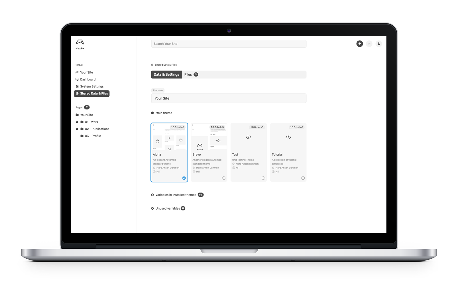
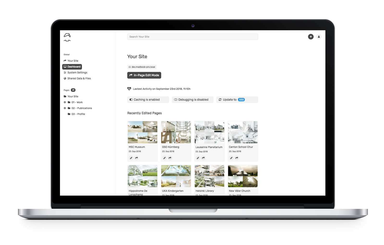
- The browser-based dashboard and the in-page (“live”) edit mode allows for intuitive content management.
But what makes Automad really different, is its integrated template engine. Templating is a core requirement for may CMSs because it creates and sets the base for a site’s visual display. Since Automad’s template engine is so close to the core, it allows you to create templates with complex navigations and to batch process images using a clean and short syntax. You’ll feel the difference once you get your hands on it, and we’ll walk through an example together in just a bit.
But first, a quick overview of templating
As a designer or a developer, you’re probably curious about how to develop themes and templates for Automad. I mean, it’s the crux for why any of us really use a CMS in the first place. If you’ve done any level of theming with WordPress, then working with Automad will feel vaguely familiar, and perhaps even easier.
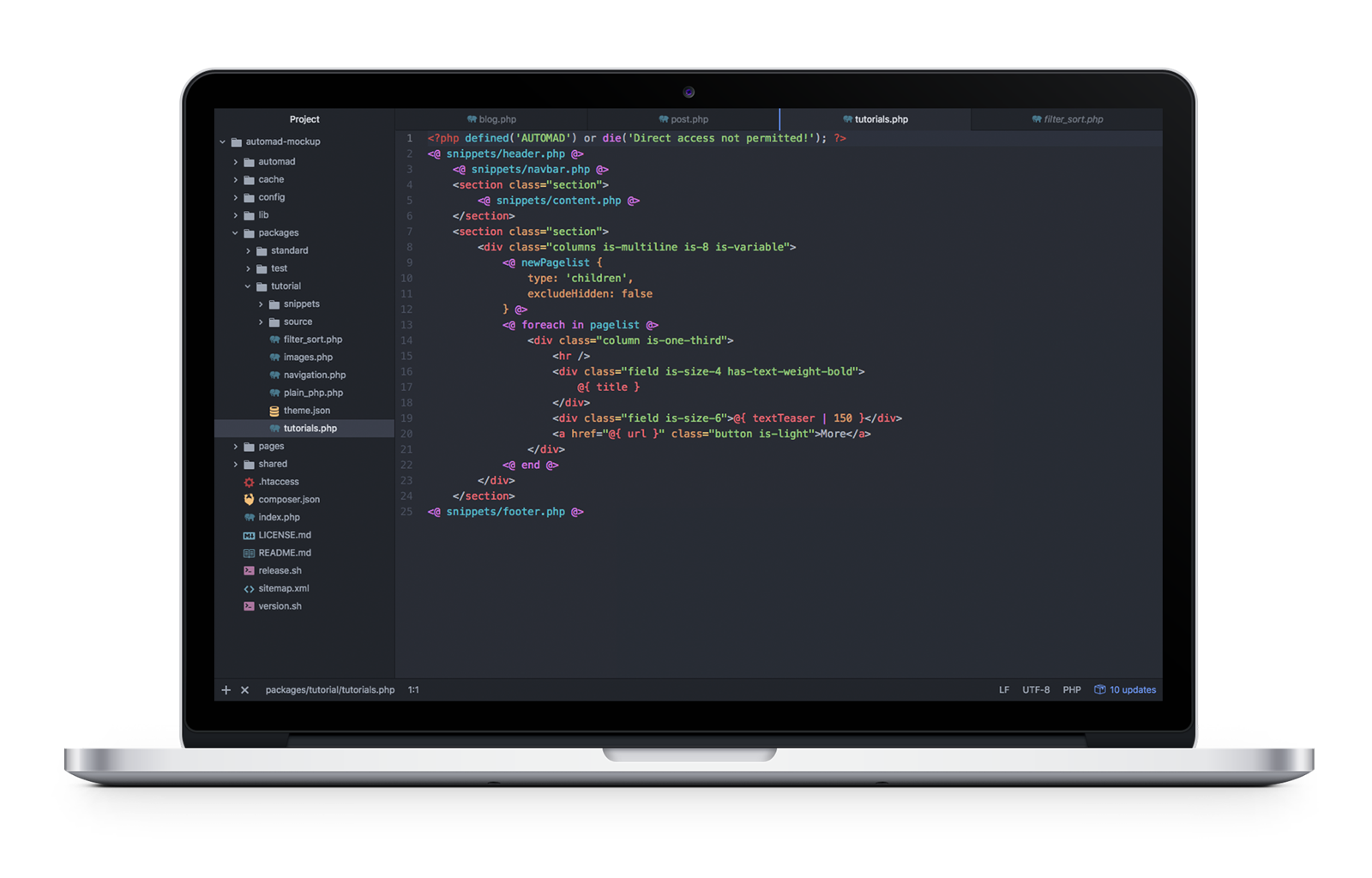
The minimal requirement for creating an Automad theme is a single .php file and a theme.json file bundled together in a subdirectory you create inside the top-level /packages directory in a default Automad installation:
packages/
  yourTheme/
    yourTemplate.php
    theme.json
The tutorial package shipped with Automad provides a good starting point for understanding the basic concepts of themes.
A look at the syntax used in Automad templates
While it is possible to write templates in plain PHP, it is not required and actually not recommended. The reason is that Automad’s own template syntax is shorter, more readable, and integrates well with the user interface by automatically listing all of the used variables in the dashboard. It can be seamlessly mixed into HTML markup.
Basically, the syntax can be split into two groups:
- Echoing content:
@{ variable } - Statements, like functions, loops and conditionals:
<@ function @>or<@ statement @>…<@ end @>
Echo content
Let’s say we want to pull the body content for a post into a template and we have a variable set up for that called text. In WordPress, this would be a global variable (the_content) that is called in PHP:
<?php the_content(); ?>In Automad, we can do the same without PHP:
<p>@{ text }</p>It is possible to manipulate the output of variables by passing the value to a function using the pipe (|) operator. The following example shows how to shorten a given text to a maximum of 100 characters without cutting words:
@{ text | shorten (100) }This would be the same of thing you might do to define the excerpt of a post in WordPress using a function:
/* Limit excerpt to 20 words */
function my_custom_excerpt_length( $length ) {
    return 20;
}
add_filter( 'excerpt_length', 'wpdocs_custom_excerpt_length', 999 )
}
One of the key benefits of some CMS solutions, like Jeykll, is that using Markdown to create site content is a native feature. Automad can do the same. Let’s say we want to convert Markdown text to HTML. It’s pretty darn simple (and efficient) using the pipe operator:
@{ text | markdown }Using statements
Statements are a handy way to define content and display it conditionally. Unlike variables, statements are wrapped in <@ … @> delimiters. The following example can be used to create a simple top level menu by using the nav function:
<@ nav { context: "/", class: "nav" } @>Let’s say you want to display your post content by default but display a fallback if that content does not exist for some reason. That’s where we can put conditional statements and control structures to use:
<# If the post content exists then display... #>
<@ if @{ text } @>
  <p>...</p>

<# Otherwise, display this... #>
<@ else @>
  <p>Sorry, no content here!</p>

<# OK, no more conditions. #>
<@ end @>
Want to create a loop? This is where display a list of posts or any repeatable content that matches a condition is super useful. We can do that in Automad by providing one or more glob patterns in a foreach loop.
For example, let’s display all JPG and PNG images for a post cropped at 400x300 with their captions:
<@ foreach in "*.jpg, *.png" { width: 400, height: 300, crop: true } @>
  <img src="@{:fileResized}" width="@{:widthResized}" height="@{:heightResized}">
  <p>@{:caption}</p>
<@ end @>
Did you catch that?! As shown by this example, a remarkable Automad feature is the ability to embed resizing options for each matching file inside the loop statement. No more complicated functions to register sizes that then need to be called in the template!
It’s worth noting that foreach loops can also be used to iterate over objects. Automad knows multiple types of objects. One of the most important objects is pagelist because of its ability to output all of the pages on the site, like you might want to do when building navigation. When iterating a pagelist, the context changes with every iteration to the current page in the loop. That way, it is possible to use page variables within the loop’s code block.
To configure the pagelist, we can use the newPagelist function like this:
<@ newPagelist { context: "/", type: "children" } @>
<ul>
  <@ foreach in pagelist @>
    <li><a href="@{ url }">@{ title }</a></li>
  <@ end @>
</ul>
A sneak peek behind the scenes for you super geeks 🤓
Automad’s template interpreter is written in pure PHP and it processes templates on the fly. Therefore, no extra build process is required at all. The list of system requirements is also rather short. A web server (Apache or Nginx) and PHP 5.4+ is already enough to run a site. Pages are only rendered when content has changed or after system updates.
Automad’s multi-layer caching engine stores the rendered pages in separate .html files as well as all crawled data in the file system as a kind of content object. That object is also used to speed up page searching and filtering.
Due to that mechanism, it is possible to either edit the content of a site directly in production online using the browser-based dashboard or edit a site locally and deploy it via Git or plain rsync.
Let’s write some code!
The best way to get acquainted with anything on the web is to just build websites. Here are some examples of how we’d get started with that using Automad.
Example 1: Recursive navigation
Creating a site-tree navigation is a good example for using recursion in templates. Conceptually, creating such a recursive navigation can be split into three steps:
- Defining a reusable snippet of code to create a single branch of the site-tree which calls itself conditionally
- Configuring a dynamic pagelist which automatically only contains children of its current context
- Defining the root page of the site-tree (for instance the homepage) and call the recursive snippet initially
Let’s break those steps down into greater detail…
Defining a reusable snippet of code
In Automad, blocks of code can be defined to be reused at a later point by using the snippet keyword. Regarding this example, the following snippet will call itself conditionally when looping through a pagelist and the active page of the current iteration itself has children pages:
<@ snippet navigation @>
  <ul class="menu-list">
    <@ foreach in pagelist @>
      <li>
        <a href="@{ url }">@{ title }</a>
        <# Call snippet recursively. #>
        <@ navigation @>
      </li>
    <@ end @>
  </ul>
<@ end @>
Configuring a dynamic pagelist
The pagelist has to be configured a children type. The context (or parent page) will always change recursively within the snippet defined above in that way. The pagelist will automatically only contain children pages of the currently processed page.
<@ newPagelist {
  type: 'children'
} @>
Defining the root page
In the last step, the root context of the navigation tree has to be defined and the snippet has to be called once to initiate the recursion. The with statement is used here to change the context to the homepage.
<div class="menu">
  <@ with '/' @>
    <@ navigation @>
  <@ end @>
</div>
A complete working tutorial template is already included in Automad.
Example 2: Working with files
Since images are super important for content management, working with them should be as easy and intuitive as possible. Automad’s template language provides handy methods for basic image processing, like resizing and cropping. When using a single image or iterating a set of images, resizing options can be passed to a with statement or foreach loop. Check out the <a href="https://dev.automad.org/tutorials/working-with-images"Working with Images tutorial that ships with Automad to get started quickly.
<@ foreach in '*.jpg, *.png' { width: 400, height: 300, crop: true } @>
  <# Code to be used for each image in the filelist. #>
  <img
  src="@{ :fileResized }"
  alt="@{ :basename }"
  title="@{ :file }"
  width="@{ :widthResized }"
  height="@{ :heightResized }"
  >
  <p>@{ :caption | markdown }</p>
<@ else @>
  <# Code to be used when the list of images is empty. #>
<@ end @>
Instead of using a glob pattern in the foreach loop, it is also possible to use the filelist object.
If you look at the example code above, you will notice the use of certain runtime variables to access image properties within a code block. While the :file variable represents the original file, :fileResized refers to path of the resized and cached version. The :caption variable enables you to get the caption text stored along with the file.
What will you build?
We merely scratched the surface of Automad here, but hopefully everything we covered gives you a good idea of the possibilities it provides for content management. While there is no one-size-fits-all mold in the CMS world, there will likely be scenarios where a CMS that sits somewhere between the robust and slimmed-down options will come in handy.
Additional Resources
The post Developing With Automad appeared first on CSS-Tricks.
Developing With Automad
Post pobrano z: Developing With Automad
Selecting the right CMS for a blog or website can be difficult. Every web project has its own needs and requirements, meaning one CMS may be a better fit for one site but not so much for a different site. Simple solutions might be lacking some essential features, while more complex systems can create easily overhead for a given task.
I want to cover Automad, a CMS that is less-known than, say, a behemoth like WordPress, but still offers some powerful features like it while maintaining the nimbleness of smaller, simpler solutions, like static site generators.
Specifically, Automad fills a gap between larger and smaller offerings in a few key ways:
- It is file-based, but does not require a database. This ensures quick setup, portability, security, speed, and easy deployment.
- Even without a database, it offers database features like searching, tagging, filtering, and sorting.
- A multi-layer caching engine caches content stored in the file system efficiently.
- The browser-based dashboard and the in-page (“live”) edit mode allows for intuitive content management.
But what makes Automad really different, is its integrated template engine. Templating is a core requirement for may CMSs because it creates and sets the base for a site’s visual display. Since Automad’s template engine is so close to the core, it allows you to create templates with complex navigations and to batch process images using a clean and short syntax. You’ll feel the difference once you get your hands on it, and we’ll walk through an example together in just a bit.
But first, a quick overview of templating
As a designer or a developer, you’re probably curious about how to develop themes and templates for Automad. I mean, it’s the crux for why any of us really use a CMS in the first place. If you’ve done any level of theming with WordPress, then working with Automad will feel vaguely familiar, and perhaps even easier.
The minimal requirement for creating an Automad theme is a single .php file and a theme.json file bundled together in a subdirectory you create inside the top-level /packages directory in a default Automad installation:
packages/
  yourTheme/
    yourTemplate.php
    theme.json
The tutorial package shipped with Automad provides a good starting point for understanding the basic concepts of themes.
A look at the syntax used in Automad templates
While it is possible to write templates in plain PHP, it is not required and actually not recommended. The reason is that Automad’s own template syntax is shorter, more readable, and integrates well with the user interface by automatically listing all of the used variables in the dashboard. It can be seamlessly mixed into HTML markup.
Basically, the syntax can be split into two groups:
- Echoing content:
@{ variable } - Statements, like functions, loops and conditionals:
<@ function @>or<@ statement @>…<@ end @>
Echo content
Let’s say we want to pull the body content for a post into a template and we have a variable set up for that called text. In WordPress, this would be a global variable (the_content) that is called in PHP:
<?php the_content(); ?>In Automad, we can do the same without PHP:
<p>@{ text }</p>It is possible to manipulate the output of variables by passing the value to a function using the pipe (|) operator. The following example shows how to shorten a given text to a maximum of 100 characters without cutting words:
@{ text | shorten (100) }This would be the same of thing you might do to define the excerpt of a post in WordPress using a function:
/* Limit excerpt to 20 words */
function my_custom_excerpt_length( $length ) {
    return 20;
}
add_filter( 'excerpt_length', 'wpdocs_custom_excerpt_length', 999 )
}
One of the key benefits of some CMS solutions, like Jeykll, is that using Markdown to create site content is a native feature. Automad can do the same. Let’s say we want to convert Markdown text to HTML. It’s pretty darn simple (and efficient) using the pipe operator:
@{ text | markdown }Using statements
Statements are a handy way to define content and display it conditionally. Unlike variables, statements are wrapped in <@ … @> delimiters. The following example can be used to create a simple top level menu by using the nav function:
<@ nav { context: "/", class: "nav" } @>Let’s say you want to display your post content by default but display a fallback if that content does not exist for some reason. That’s where we can put conditional statements and control structures to use:
<# If the post content exists then display... #>
<@ if @{ text } @>
  <p>...</p>

<# Otherwise, display this... #>
<@ else @>
  <p>Sorry, no content here!</p>

<# OK, no more conditions. #>
<@ end @>
Want to create a loop? This is where display a list of posts or any repeatable content that matches a condition is super useful. We can do that in Automad by providing one or more glob patterns in a foreach loop.
For example, let’s display all JPG and PNG images for a post cropped at 400x300 with their captions:
<@ foreach in "*.jpg, *.png" { width: 400, height: 300, crop: true } @>
  <img src="@{:fileResized}" width="@{:widthResized}" height="@{:heightResized}">
  <p>@{:caption}</p>
<@ end @>
Did you catch that?! As shown by this example, a remarkable Automad feature is the ability to embed resizing options for each matching file inside the loop statement. No more complicated functions to register sizes that then need to be called in the template!
It’s worth noting that foreach loops can also be used to iterate over objects. Automad knows multiple types of objects. One of the most important objects is pagelist because of its ability to output all of the pages on the site, like you might want to do when building navigation. When iterating a pagelist, the context changes with every iteration to the current page in the loop. That way, it is possible to use page variables within the loop’s code block.
To configure the pagelist, we can use the newPagelist function like this:
<@ newPagelist { context: "/", type: "children" } @>
<ul>
  <@ foreach in pagelist @>
    <li><a href="@{ url }">@{ title }</a></li>
  <@ end @>
</ul>
A sneak peek behind the scenes for you super geeks 🤓
Automad’s template interpreter is written in pure PHP and it processes templates on the fly. Therefore, no extra build process is required at all. The list of system requirements is also rather short. A web server (Apache or Nginx) and PHP 5.4+ is already enough to run a site. Pages are only rendered when content has changed or after system updates.
Automad’s multi-layer caching engine stores the rendered pages in separate .html files as well as all crawled data in the file system as a kind of content object. That object is also used to speed up page searching and filtering.
Due to that mechanism, it is possible to either edit the content of a site directly in production online using the browser-based dashboard or edit a site locally and deploy it via Git or plain rsync.
Let’s write some code!
The best way to get acquainted with anything on the web is to just build websites. Here are some examples of how we’d get started with that using Automad.
Example 1: Recursive navigation
Creating a site-tree navigation is a good example for using recursion in templates. Conceptually, creating such a recursive navigation can be split into three steps:
- Defining a reusable snippet of code to create a single branch of the site-tree which calls itself conditionally
- Configuring a dynamic pagelist which automatically only contains children of its current context
- Defining the root page of the site-tree (for instance the homepage) and call the recursive snippet initially
Let’s break those steps down into greater detail…
Defining a reusable snippet of code
In Automad, blocks of code can be defined to be reused at a later point by using the snippet keyword. Regarding this example, the following snippet will call itself conditionally when looping through a pagelist and the active page of the current iteration itself has children pages:
<@ snippet navigation @>
  <ul class="menu-list">
    <@ foreach in pagelist @>
      <li>
        <a href="@{ url }">@{ title }</a>
        <# Call snippet recursively. #>
        <@ navigation @>
      </li>
    <@ end @>
  </ul>
<@ end @>
Configuring a dynamic pagelist
The pagelist has to be configured a children type. The context (or parent page) will always change recursively within the snippet defined above in that way. The pagelist will automatically only contain children pages of the currently processed page.
<@ newPagelist {
  type: 'children'
} @>
Defining the root page
In the last step, the root context of the navigation tree has to be defined and the snippet has to be called once to initiate the recursion. The with statement is used here to change the context to the homepage.
<div class="menu">
  <@ with '/' @>
    <@ navigation @>
  <@ end @>
</div>
A complete working tutorial template is already included in Automad.
Example 2: Working with files
Since images are super important for content management, working with them should be as easy and intuitive as possible. Automad’s template language provides handy methods for basic image processing, like resizing and cropping. When using a single image or iterating a set of images, resizing options can be passed to a with statement or foreach loop. Check out the <a href="https://dev.automad.org/tutorials/working-with-images"Working with Images tutorial that ships with Automad to get started quickly.
<@ foreach in '*.jpg, *.png' { width: 400, height: 300, crop: true } @>
  <# Code to be used for each image in the filelist. #>
  <img
  src="@{ :fileResized }"
  alt="@{ :basename }"
  title="@{ :file }"
  width="@{ :widthResized }"
  height="@{ :heightResized }"
  >
  <p>@{ :caption | markdown }</p>
<@ else @>
  <# Code to be used when the list of images is empty. #>
<@ end @>
Instead of using a glob pattern in the foreach loop, it is also possible to use the filelist object.
If you look at the example code above, you will notice the use of certain runtime variables to access image properties within a code block. While the :file variable represents the original file, :fileResized refers to path of the resized and cached version. The :caption variable enables you to get the caption text stored along with the file.
What will you build?
We merely scratched the surface of Automad here, but hopefully everything we covered gives you a good idea of the possibilities it provides for content management. While there is no one-size-fits-all mold in the CMS world, there will likely be scenarios where a CMS that sits somewhere between the robust and slimmed-down options will come in handy.
Additional Resources
The post Developing With Automad appeared first on CSS-Tricks.
What Is Art Nouveau?
Post pobrano z: What Is Art Nouveau?
The ornamental Art Nouveau design style emerged in France in the late 19th century and became widely popular across Europe, with the style applied to art, architecture, posters, jewelry, furniture, and textiles.

Although Art Nouveau had fallen out of fashion by 1910, contemporary designers and illustrators are now revisiting and modernising the style to bring an emotive, romantic quality to their work.
Here, we’ll look at the defining characteristics of the Art Nouveau movement and how you can emulate the style in your own designs.
Love the Art Nouveau style? Make a head start on creating your own decorative designs by picking up borders, patterns and fonts in the Art Nouveau style from GraphicRiver and Envato Elements.
What Is Art Nouveau?
Towards the end of the 19th century, some artists felt limited by the style of ‘academic art’ which had been popular for many decades. Initially in France, a few artists broke away from the rigours of the old academic style and started to create art that explored organic, highly decorative forms in a more stylized and sensual way.
In 1895, the art dealer Siegfried Bing opened the Maison de l’Art Nouveau, a new art gallery in Paris. Through the gallery, Bing sold fabrics designed by William Morris and glassware by Tiffany, and showcased paintings and furniture in the Art Nouveau style.

The style became hugely popular, not only in France but across Europe and America too. Artists like Alphonse Mucha helped to popularise the style by creating advertisements and postcards in the Art Nouveau style, promoting cigarettes, alcohol, and confectionery.

Art Nouveau was a total art form, meaning that its influence could be seen across a wide range of fine and decorative arts, including architecture, furniture, and illustration. Inspired by the curved, organic forms of plants and flowers, Art Nouveau is a highly decorative, romantic and ornate style which is undeniably very beautiful to look at.

How You Can Create Your Own Art Nouveau Designs and Illustrations
While the minimal lines of modernism or the geometric symmetry of Art Deco hold a lot of appeal for designers today, many illustrators and designers are choosing to revisit the more organic style of Art Nouveau. Perhaps in line with the current trend for maximalism in design, Art Nouveau suddenly feels fresher and more relevant for now.
Here we’ll look at some tips for creating your own Art Nouveau-inspired designs and illustrations.
1. Look to the Greats for Inspiration
If you’re new to working with an Art Nouveau style, it’s always a good idea to seek out some inspiration first.
If you look at the work of some of the best-known Art Nouveau artists, you can start to spot common traits and identify some of the key defining characteristics of the style, which you can then apply to your own work.

The Czech painter Alphonse Mucha is probably the most widely known Art Nouveau artist, with his poster artwork being an elegant symbol of cafe culture the world over. Mucha’s paintings have a very distinctive style which remains a popular influence for illustrators and graphic artists today.
The main hallmark of Mucha’s style is often a central female figure, pictured in a sensual, relaxed pose and dressed in classical costume. The hair is often a key element of the design, creating a long, curving point of focus around the figure and emphasising movement. For illustrators, a simple tip for emulating Mucha’s style is to create a thicker line around the silhouette of the figure and the edge of the hair, which pulls the central figure forward from the rest of the image.
The figure is often surrounded by a highly decorative border, filled with nature-inspired elements like plants, flowers, seashells, or peacock feathers. Rounded, ornate typography is placed behind the figure, giving an almost three-dimensional quality to the design.
The colors used in the design are also inspired by nature, with warm, earthy tones like terracotta, peach and orange being used alongside leafy greens and sky blues.
This tutorial is a great introduction to how to emulate Mucha’s style in vector illustration.
-

Create an Art Nouveau Poster in Illustrator
Alphonse Mucha is notably the most influential artist from the Art Nouveau era. I’m going to gain inspiration from his work and show you how to create your…
2. Borders and Dividers Should Be Ornate and Symmetrical
Art Nouveau is a maximalist design style, so aim to fill any white space on your layout with decorative elements like borders, frames, and dividers.
Look for vector ornaments which use flowing lines, curved edges, and decorative corners. Organic and nature-inspired elements like vines, feathers and flowers will add to the overall Art Nouveau look.
This ornament pack is really versatile, allowing you to combine different elements to create a nod to Nouveau style or build up an elaborate design with vine and leaf embellishments.

This set of frames and banners features plenty of natural elements like flowers and leaves to help you create a vintage look.

How can you ensure your design looks beautiful and not overly busy? Art Nouveau designs still use a high degree of symmetry to pull the design together, so make sure to flip your borders to create a pleasing mirrored effect.
3. Look for Belle-Epoque-Inspired Fonts
Typography is a key part of any Art Nouveau-style layout. The original Art Nouveau type styles were developed and drawn by hand, giving them a curved, natural design.
Typefaces which are inspired directly by the Art Nouveau movement retain this hand-drawn feel. De Arloy is an authentic replication of Art Nouveau script styles. Delicate serifs and curved ligatures make this a beautiful font choice for poster designs or branding.


You can find other typefaces which make a nod to the Art Nouveau era, while retaining a contemporary feel. Naive Inline wouldn’t look out of place on a vintage postcard or in a Wes Anderson movie.

4. Try the Style on Stationery and Invitations
The Art Nouveau style isn’t limited to illustrations. You can also emulate the style on simple, type-only layouts by selecting the right font, borders, and colors.

Because Art Nouveau is romantic and emotive, it works particularly well for wedding stationery. Try creating an Art Nouveau design for an invitation or save-the-date card to play up the romantic sensibilities of the style. Touches of metallic foil on borders and typography can make the design feel luxurious and extra special.
In this tutorial, you’ll learn how to create a wedding invitation in InDesign which uses a stripped-back Art Nouveau style.
-

How to Create an Art Nouveau Wedding Invite in Adobe InDesign
Art Nouveau is a romantic, decorative design style that works beautifully for wedding stationery. Here, we’ll give a modern update to this ornate style with…
Looking for a quick fix? This business card template demonstrates how the Art Nouveau style can really suit luxury branding. Why not try adapting the design to a wine, food or restaurant business?

5. Use Highlights and Shadows to Create a Modern Effect
Art Nouveau can easily stray into stuffy or old-fashioned territory, particularly if you stick rigidly to an authentic Nouveau style. Some of the best examples of modern Art Nouveau design give the style a unique twist, which keeps the style looking fresh and exciting.
Try switching a muted color palette for bright neons or pastels. Or incorporate an unexpected subject into your design, like the quirky robot in this vector tutorial.
Traditional Art Nouveau artwork uses flat design, which creates a collage-style effect. A 3D look was given to the designs through the creation of layers of flat artwork, overlapping elements, and thickly-drawn silhouettes.
Now that we have access to digital software, it’s much easier to break away from the flat style of authentic Art Nouveau and add textures, highlights and shadows to cultivate a more modern 3D look. This tutorial shows how blending a modern vector illustration style with Art Nouveau traits can give an illustration an immersive, pop-culture style.

Conclusion: The 'New’ Art Nouveau Style
Art Nouveau fell out of fashion in Europe after 1910, with Art Deco and later Modernism becoming the defining design styles of the 20th century. However, although Art Nouveau’s heyday was short-lived (spanning about 20 years), its influence on graphic design and illustration since has been considerable, and many contemporary graphic artists are now revisiting the style for its beauty, ornamental qualities, and romance.
Here, we’ve looked at a few tips for how you can emulate the Art Nouveau style in your own work, as well as suggesting some ideas for giving the style a modern twist.
To recap, authentic Art Nouveau graphic art and illustration is defined by:
- organic, curved lines and graphics, inspired by natural forms like plants and flowers
- symmetrical layouts and heavy embellishment
- earthy, nature-inspired colors
- romantic, often female, subjects, inspired by classical mythology
- hand-drawn, rounded typography, which is often placed inside decorative banners or borders
You can bring a modern update to the Art Nouveau style by experimenting with a more unconventional color palette, incorporating unusual subjects into your designs, or stripping back your design to create a more minimal layout.
You can find plenty of Art Nouveau and Belle Epoque borders, patterns and fonts over on GraphicRiver and Envato Elements to use on your designs.

