How to Create a Stylish Magazine Layout in Affinity Publisher

Post pobrano z: How to Create a Stylish Magazine Layout in Affinity Publisher

Final product image
What You’ll Be Creating

In this tutorial, you’ll learn how to create a simple and stylish magazine spread using Affinity Publisher, the great-value and easy-to-use alternative to Adobe InDesign. 

You’ll pick up some versatile editorial design skills, as well as getting to know your way around the Publisher workspace. Although currently available only as a beta download, Affinity Publisher is slated for release later in the year, so watch this space. 

Need a quick solution for creating your own magazine designs? You can find a wide range of easy-to-edit magazine templates on Envato Elements and GraphicRiver.

What You’ll Need to Create Your Magazine Layout

You can download a free beta version of Affinity Publisher from the Serif website. You’ll also need to download the following fonts and photo from Envato Elements to create the design of the spread pictured: 

Install the fonts on your computer, and you’re ready to get started!

1. How to Set Up a Magazine Document in Affinity Publisher

Step 1

Open up Affinity Publisher, and go to File > New.

With the Type set to Print, choose Letter from the Page Preset menu.

letter page size

With Facing Pages checked, choose Left from the Start on menu. Normally, if you were creating a full magazine, you would choose to start the document on a right page, but for our purposes here of creating one spread, a left-hand page start will suit us. 

left page start

From the Color Format menu, choose CMYK/8.

cmyk color

Check the Include Margins box, and set the Inner and Bottom Margin to 1.25 in, and the Top and Outer Margin to 1 in. 

Then click OK

margins

Step 2

With your document created, you’ll need to add a bleed to the pages. 

Go to File > Document Setup, and click on Bleed from the trio of menu options in the middle of the window. Set the Bleed to 0.25 in, and then click OK

document bleed

Step 3

On the left side of the workspace, you can see the Pages panel. 

Click on the Add Pages button at the top of the panel, and add one more page to the document. 

add pages
extra page

Step 4

From the Master Pages panel above, click on the Add Master button. 

add master

Name the master Spread Master and select Facing. All of the remaining options should match the existing settings for the other pages in your document, so keep them as they are and click OK.

new master

Drag the Spread Master down onto Pages 1 and 2 in the Pages panel, to apply the master to both pages in your document. 

spread master

Step 5

To help you guide text and content into the right position, it’s a good idea to at least have the margins visible. 

Go to View > Show Margins. 

show margins

Step 6

We’re going to use a very simple color palette in our design—just yellow and black. 

In the Swatches panel (docked on the right side of the workspace), choose Add Global Color from the dropdown menu. 

add global color

In the window that opens, name the color Yellow and choose CMYK Sliders from the menu below this. 

cmyk sliders

Set the levels to C=2 M=24 Y=95 and K=0, before clicking Add

global color

2. How to Format Elements on Your Master Spread

Step 1

Double-click on the Spread Master icon in the Master Pages panel to bring it up on screen.

Choose the Frame Text Tool (T) from the Tools panel, and drag across the bottom-left corner of the left-hand master page to create a small text frame.

text frame

Type in two forward slashes (//), highlight the text, and from the Character panel (on the right side of the workspace), set the Font to Bw Modelica Bold, Size 10 pt. Set the Font Color to Yellow

yellow font color

Step 2

With your text tool cursor set in the text frame, after the slashes, go to Text > Insert > Page Number. 

insert page number

Adjust the Font Color of this page number to Black

black page number

Step 3

Select the whole text frame with the Move Tool (V) and Edit > Copy and Edit > Paste the frame, moving the copy over to the right corner of the right-hand master page. 

From the top Controls panel, adjust the text to Right Align.

page number pasted

Step 4

Use the Frame Text Tool (T) to create a frame across the top-left corner of the left-hand master page. 

Here you can type in a running header, such as the magazine title and issue number.

Mix up the fonts for interest, setting some text in a sans serif, like Bw Modelica, and some in a serif, like Addington CF

addington font

Highlight some of the words and change the Font Color to Yellow

font color yellow

Step 5

Switch to the Pen Tool and, while holding down Shift, click once on the pasteboard to the left of the running header, and once again where the header begins. 

From the top Controls panel, set the Stroke Color to Yellow and the Weight of the stroke to 0.9 pt. 

weight stroke

Step 6

Copy and Paste the yellow line, positioning the copy to the right of the header text. 

pasted line

Then extend the right edge of the line so that it extends across the remainder of the left page and right page, across the whole spread. 

line extended

Select the Transparency Tool and click once about a third of the way along the left side of the longer line. Click again at the far-right edge of the line, creating a gradual gradient effect across the line.

transparency tool
master spread

3. How to Build Up Typography on Your Magazine Spread

Step 1

Double-click on Page 1 in the Pages panel to bring it up on screen. 

Use the Frame Text Tool (T) to create a single tall text frame resting against the left and bottom margin. 

text frame

Step 2

Click on the small triangle shape on the bottom-right of the text frame to create a linked text frame. 

Click and drag to the right of the first text frame to create a second linked column. A ‘thread’ will appear between the two frames, showing that they are linked. 

linked frames

Step 3

You can either type in text directly, paste it over from a Word document, or go to Text > Insert Filler Text to create temporary text for your columns. 

Set the Font to Addington CF Regular, Size 10.5 pt, and set the Leading to 15 pt. 

text frames

You can add more interest to your column text by pulling out the first line in a Yellow Font Color, a Bold weight, and a larger 14 pt Font Size. 

yellow font color

Step 4

Create a very large text frame, matching the height of the columns, overlapping the right column and extending across the width of the right page. 

Type in ‘GO’, setting the Font to Bw Modelica Medium, Size 610 pt, and Font Color to Yellow. 

font modelica

Step 5

From the Layers panel (on the right side of the workspace) bring the Opacity of the text frame down to 95%.

layers panel

Use the Transparency Tool to create a gradient effect across the right side of the text frame. 

transparency tool

Step 6

With the text frame selected, click on the Move to Back button in the top Controls panel, to bring the column text forward and make it more legible. 

move to back
gradient effect

4. How to Add an Image to Your Magazine Spread

Step 1

Select the Picture Frame Tool and drag across the right-hand page, creating a frame just shy of the height of the columns. 

image frame

Go to File > Place. Navigate to the image of the racing greyhound you downloaded earlier, and click Open

Use Shift to scale the image inside the frame, before clicking Flip Horizontal in the top Controls panel to flip the image so that the dog is facing towards the center of the spread.

flip horizontal

Step 2

With the image frame selected, click on Move to Back at the top of the workspace.

image frame

5. How to Add a Pull Quote to Your Layout

Step 1

Use the Frame Text Tool (T) to create a text frame across the top-right of Page 2

frame text tool

Type in a pull quote, only typing an apostrophe at the end of the quote. Set the Font to Addington CF, Medium Italic, Size 45 pt.

medium italic

Switch the font weight of some of the text, such as pulling out certain phrases in Thin Italic, to create contrast and improve readability.

thin italic

Step 2

Highlight some of the text and switch the Font Color to Yellow.

yellow color

Create a separate small text frame at the top-left corner of the pull quote frame, and type in an opening apostrophe (“). Set the Font to Addington CF Thin Italic, Size 160 pt, and the Font Color to Yellow. 

apostrophe

6. How to Export Your Magazine Artwork

Whether you create a single spread or a whole magazine, the process of exporting your artwork in Affinity Publisher for printing is quick and simple.

Go to File > Export. 

Click on PDF from the options running along the top of the window.

Choose PDF (for print) from the Preset menu, before clicking Export

pdf export

Conclusion: Your Finished Magazine Layout

Your magazine spread is finished and exported, ready to be printed. Great job!

final magazine

In this tutorial, you’ve picked up a range of techniques and skills you can apply to editorial projects and other work using Affinity Publisher. 

Looking for a quick and easy way to get started with creating your own magazine? Discover a huge range of easy-to-edit magazine templates on Envato Elements and GraphicRiver.

If you’re on the hunt for more magazine design tips, don’t miss these other tutorials:

How to Create a Stylish Magazine Layout in Affinity Publisher

Post pobrano z: How to Create a Stylish Magazine Layout in Affinity Publisher

Final product image
What You’ll Be Creating

In this tutorial, you’ll learn how to create a simple and stylish magazine spread using Affinity Publisher, the great-value and easy-to-use alternative to Adobe InDesign. 

You’ll pick up some versatile editorial design skills, as well as getting to know your way around the Publisher workspace. Although currently available only as a beta download, Affinity Publisher is slated for release later in the year, so watch this space. 

Need a quick solution for creating your own magazine designs? You can find a wide range of easy-to-edit magazine templates on Envato Elements and GraphicRiver.

What You’ll Need to Create Your Magazine Layout

You can download a free beta version of Affinity Publisher from the Serif website. You’ll also need to download the following fonts and photo from Envato Elements to create the design of the spread pictured: 

Install the fonts on your computer, and you’re ready to get started!

1. How to Set Up a Magazine Document in Affinity Publisher

Step 1

Open up Affinity Publisher, and go to File > New.

With the Type set to Print, choose Letter from the Page Preset menu.

letter page size

With Facing Pages checked, choose Left from the Start on menu. Normally, if you were creating a full magazine, you would choose to start the document on a right page, but for our purposes here of creating one spread, a left-hand page start will suit us. 

left page start

From the Color Format menu, choose CMYK/8.

cmyk color

Check the Include Margins box, and set the Inner and Bottom Margin to 1.25 in, and the Top and Outer Margin to 1 in. 

Then click OK

margins

Step 2

With your document created, you’ll need to add a bleed to the pages. 

Go to File > Document Setup, and click on Bleed from the trio of menu options in the middle of the window. Set the Bleed to 0.25 in, and then click OK

document bleed

Step 3

On the left side of the workspace, you can see the Pages panel. 

Click on the Add Pages button at the top of the panel, and add one more page to the document. 

add pages
extra page

Step 4

From the Master Pages panel above, click on the Add Master button. 

add master

Name the master Spread Master and select Facing. All of the remaining options should match the existing settings for the other pages in your document, so keep them as they are and click OK.

new master

Drag the Spread Master down onto Pages 1 and 2 in the Pages panel, to apply the master to both pages in your document. 

spread master

Step 5

To help you guide text and content into the right position, it’s a good idea to at least have the margins visible. 

Go to View > Show Margins. 

show margins

Step 6

We’re going to use a very simple color palette in our design—just yellow and black. 

In the Swatches panel (docked on the right side of the workspace), choose Add Global Color from the dropdown menu. 

add global color

In the window that opens, name the color Yellow and choose CMYK Sliders from the menu below this. 

cmyk sliders

Set the levels to C=2 M=24 Y=95 and K=0, before clicking Add

global color

2. How to Format Elements on Your Master Spread

Step 1

Double-click on the Spread Master icon in the Master Pages panel to bring it up on screen.

Choose the Frame Text Tool (T) from the Tools panel, and drag across the bottom-left corner of the left-hand master page to create a small text frame.

text frame

Type in two forward slashes (//), highlight the text, and from the Character panel (on the right side of the workspace), set the Font to Bw Modelica Bold, Size 10 pt. Set the Font Color to Yellow

yellow font color

Step 2

With your text tool cursor set in the text frame, after the slashes, go to Text > Insert > Page Number. 

insert page number

Adjust the Font Color of this page number to Black

black page number

Step 3

Select the whole text frame with the Move Tool (V) and Edit > Copy and Edit > Paste the frame, moving the copy over to the right corner of the right-hand master page. 

From the top Controls panel, adjust the text to Right Align.

page number pasted

Step 4

Use the Frame Text Tool (T) to create a frame across the top-left corner of the left-hand master page. 

Here you can type in a running header, such as the magazine title and issue number.

Mix up the fonts for interest, setting some text in a sans serif, like Bw Modelica, and some in a serif, like Addington CF

addington font

Highlight some of the words and change the Font Color to Yellow

font color yellow

Step 5

Switch to the Pen Tool and, while holding down Shift, click once on the pasteboard to the left of the running header, and once again where the header begins. 

From the top Controls panel, set the Stroke Color to Yellow and the Weight of the stroke to 0.9 pt. 

weight stroke

Step 6

Copy and Paste the yellow line, positioning the copy to the right of the header text. 

pasted line

Then extend the right edge of the line so that it extends across the remainder of the left page and right page, across the whole spread. 

line extended

Select the Transparency Tool and click once about a third of the way along the left side of the longer line. Click again at the far-right edge of the line, creating a gradual gradient effect across the line.

transparency tool
master spread

3. How to Build Up Typography on Your Magazine Spread

Step 1

Double-click on Page 1 in the Pages panel to bring it up on screen. 

Use the Frame Text Tool (T) to create a single tall text frame resting against the left and bottom margin. 

text frame

Step 2

Click on the small triangle shape on the bottom-right of the text frame to create a linked text frame. 

Click and drag to the right of the first text frame to create a second linked column. A ‘thread’ will appear between the two frames, showing that they are linked. 

linked frames

Step 3

You can either type in text directly, paste it over from a Word document, or go to Text > Insert Filler Text to create temporary text for your columns. 

Set the Font to Addington CF Regular, Size 10.5 pt, and set the Leading to 15 pt. 

text frames

You can add more interest to your column text by pulling out the first line in a Yellow Font Color, a Bold weight, and a larger 14 pt Font Size. 

yellow font color

Step 4

Create a very large text frame, matching the height of the columns, overlapping the right column and extending across the width of the right page. 

Type in ‘GO’, setting the Font to Bw Modelica Medium, Size 610 pt, and Font Color to Yellow. 

font modelica

Step 5

From the Layers panel (on the right side of the workspace) bring the Opacity of the text frame down to 95%.

layers panel

Use the Transparency Tool to create a gradient effect across the right side of the text frame. 

transparency tool

Step 6

With the text frame selected, click on the Move to Back button in the top Controls panel, to bring the column text forward and make it more legible. 

move to back
gradient effect

4. How to Add an Image to Your Magazine Spread

Step 1

Select the Picture Frame Tool and drag across the right-hand page, creating a frame just shy of the height of the columns. 

image frame

Go to File > Place. Navigate to the image of the racing greyhound you downloaded earlier, and click Open

Use Shift to scale the image inside the frame, before clicking Flip Horizontal in the top Controls panel to flip the image so that the dog is facing towards the center of the spread.

flip horizontal

Step 2

With the image frame selected, click on Move to Back at the top of the workspace.

image frame

5. How to Add a Pull Quote to Your Layout

Step 1

Use the Frame Text Tool (T) to create a text frame across the top-right of Page 2

frame text tool

Type in a pull quote, only typing an apostrophe at the end of the quote. Set the Font to Addington CF, Medium Italic, Size 45 pt.

medium italic

Switch the font weight of some of the text, such as pulling out certain phrases in Thin Italic, to create contrast and improve readability.

thin italic

Step 2

Highlight some of the text and switch the Font Color to Yellow.

yellow color

Create a separate small text frame at the top-left corner of the pull quote frame, and type in an opening apostrophe (“). Set the Font to Addington CF Thin Italic, Size 160 pt, and the Font Color to Yellow. 

apostrophe

6. How to Export Your Magazine Artwork

Whether you create a single spread or a whole magazine, the process of exporting your artwork in Affinity Publisher for printing is quick and simple.

Go to File > Export. 

Click on PDF from the options running along the top of the window.

Choose PDF (for print) from the Preset menu, before clicking Export

pdf export

Conclusion: Your Finished Magazine Layout

Your magazine spread is finished and exported, ready to be printed. Great job!

final magazine

In this tutorial, you’ve picked up a range of techniques and skills you can apply to editorial projects and other work using Affinity Publisher. 

Looking for a quick and easy way to get started with creating your own magazine? Discover a huge range of easy-to-edit magazine templates on Envato Elements and GraphicRiver.

If you’re on the hunt for more magazine design tips, don’t miss these other tutorials:

How to Create a Stylish Magazine Layout in Affinity Publisher

Post pobrano z: How to Create a Stylish Magazine Layout in Affinity Publisher

Final product image
What You’ll Be Creating

In this tutorial, you’ll learn how to create a simple and stylish magazine spread using Affinity Publisher, the great-value and easy-to-use alternative to Adobe InDesign. 

You’ll pick up some versatile editorial design skills, as well as getting to know your way around the Publisher workspace. Although currently available only as a beta download, Affinity Publisher is slated for release later in the year, so watch this space. 

Need a quick solution for creating your own magazine designs? You can find a wide range of easy-to-edit magazine templates on Envato Elements and GraphicRiver.

What You’ll Need to Create Your Magazine Layout

You can download a free beta version of Affinity Publisher from the Serif website. You’ll also need to download the following fonts and photo from Envato Elements to create the design of the spread pictured: 

Install the fonts on your computer, and you’re ready to get started!

1. How to Set Up a Magazine Document in Affinity Publisher

Step 1

Open up Affinity Publisher, and go to File > New.

With the Type set to Print, choose Letter from the Page Preset menu.

letter page size

With Facing Pages checked, choose Left from the Start on menu. Normally, if you were creating a full magazine, you would choose to start the document on a right page, but for our purposes here of creating one spread, a left-hand page start will suit us. 

left page start

From the Color Format menu, choose CMYK/8.

cmyk color

Check the Include Margins box, and set the Inner and Bottom Margin to 1.25 in, and the Top and Outer Margin to 1 in. 

Then click OK

margins

Step 2

With your document created, you’ll need to add a bleed to the pages. 

Go to File > Document Setup, and click on Bleed from the trio of menu options in the middle of the window. Set the Bleed to 0.25 in, and then click OK

document bleed

Step 3

On the left side of the workspace, you can see the Pages panel. 

Click on the Add Pages button at the top of the panel, and add one more page to the document. 

add pages
extra page

Step 4

From the Master Pages panel above, click on the Add Master button. 

add master

Name the master Spread Master and select Facing. All of the remaining options should match the existing settings for the other pages in your document, so keep them as they are and click OK.

new master

Drag the Spread Master down onto Pages 1 and 2 in the Pages panel, to apply the master to both pages in your document. 

spread master

Step 5

To help you guide text and content into the right position, it’s a good idea to at least have the margins visible. 

Go to View > Show Margins. 

show margins

Step 6

We’re going to use a very simple color palette in our design—just yellow and black. 

In the Swatches panel (docked on the right side of the workspace), choose Add Global Color from the dropdown menu. 

add global color

In the window that opens, name the color Yellow and choose CMYK Sliders from the menu below this. 

cmyk sliders

Set the levels to C=2 M=24 Y=95 and K=0, before clicking Add

global color

2. How to Format Elements on Your Master Spread

Step 1

Double-click on the Spread Master icon in the Master Pages panel to bring it up on screen.

Choose the Frame Text Tool (T) from the Tools panel, and drag across the bottom-left corner of the left-hand master page to create a small text frame.

text frame

Type in two forward slashes (//), highlight the text, and from the Character panel (on the right side of the workspace), set the Font to Bw Modelica Bold, Size 10 pt. Set the Font Color to Yellow

yellow font color

Step 2

With your text tool cursor set in the text frame, after the slashes, go to Text > Insert > Page Number. 

insert page number

Adjust the Font Color of this page number to Black

black page number

Step 3

Select the whole text frame with the Move Tool (V) and Edit > Copy and Edit > Paste the frame, moving the copy over to the right corner of the right-hand master page. 

From the top Controls panel, adjust the text to Right Align.

page number pasted

Step 4

Use the Frame Text Tool (T) to create a frame across the top-left corner of the left-hand master page. 

Here you can type in a running header, such as the magazine title and issue number.

Mix up the fonts for interest, setting some text in a sans serif, like Bw Modelica, and some in a serif, like Addington CF

addington font

Highlight some of the words and change the Font Color to Yellow

font color yellow

Step 5

Switch to the Pen Tool and, while holding down Shift, click once on the pasteboard to the left of the running header, and once again where the header begins. 

From the top Controls panel, set the Stroke Color to Yellow and the Weight of the stroke to 0.9 pt. 

weight stroke

Step 6

Copy and Paste the yellow line, positioning the copy to the right of the header text. 

pasted line

Then extend the right edge of the line so that it extends across the remainder of the left page and right page, across the whole spread. 

line extended

Select the Transparency Tool and click once about a third of the way along the left side of the longer line. Click again at the far-right edge of the line, creating a gradual gradient effect across the line.

transparency tool
master spread

3. How to Build Up Typography on Your Magazine Spread

Step 1

Double-click on Page 1 in the Pages panel to bring it up on screen. 

Use the Frame Text Tool (T) to create a single tall text frame resting against the left and bottom margin. 

text frame

Step 2

Click on the small triangle shape on the bottom-right of the text frame to create a linked text frame. 

Click and drag to the right of the first text frame to create a second linked column. A ‘thread’ will appear between the two frames, showing that they are linked. 

linked frames

Step 3

You can either type in text directly, paste it over from a Word document, or go to Text > Insert Filler Text to create temporary text for your columns. 

Set the Font to Addington CF Regular, Size 10.5 pt, and set the Leading to 15 pt. 

text frames

You can add more interest to your column text by pulling out the first line in a Yellow Font Color, a Bold weight, and a larger 14 pt Font Size. 

yellow font color

Step 4

Create a very large text frame, matching the height of the columns, overlapping the right column and extending across the width of the right page. 

Type in ‘GO’, setting the Font to Bw Modelica Medium, Size 610 pt, and Font Color to Yellow. 

font modelica

Step 5

From the Layers panel (on the right side of the workspace) bring the Opacity of the text frame down to 95%.

layers panel

Use the Transparency Tool to create a gradient effect across the right side of the text frame. 

transparency tool

Step 6

With the text frame selected, click on the Move to Back button in the top Controls panel, to bring the column text forward and make it more legible. 

move to back
gradient effect

4. How to Add an Image to Your Magazine Spread

Step 1

Select the Picture Frame Tool and drag across the right-hand page, creating a frame just shy of the height of the columns. 

image frame

Go to File > Place. Navigate to the image of the racing greyhound you downloaded earlier, and click Open

Use Shift to scale the image inside the frame, before clicking Flip Horizontal in the top Controls panel to flip the image so that the dog is facing towards the center of the spread.

flip horizontal

Step 2

With the image frame selected, click on Move to Back at the top of the workspace.

image frame

5. How to Add a Pull Quote to Your Layout

Step 1

Use the Frame Text Tool (T) to create a text frame across the top-right of Page 2

frame text tool

Type in a pull quote, only typing an apostrophe at the end of the quote. Set the Font to Addington CF, Medium Italic, Size 45 pt.

medium italic

Switch the font weight of some of the text, such as pulling out certain phrases in Thin Italic, to create contrast and improve readability.

thin italic

Step 2

Highlight some of the text and switch the Font Color to Yellow.

yellow color

Create a separate small text frame at the top-left corner of the pull quote frame, and type in an opening apostrophe (“). Set the Font to Addington CF Thin Italic, Size 160 pt, and the Font Color to Yellow. 

apostrophe

6. How to Export Your Magazine Artwork

Whether you create a single spread or a whole magazine, the process of exporting your artwork in Affinity Publisher for printing is quick and simple.

Go to File > Export. 

Click on PDF from the options running along the top of the window.

Choose PDF (for print) from the Preset menu, before clicking Export

pdf export

Conclusion: Your Finished Magazine Layout

Your magazine spread is finished and exported, ready to be printed. Great job!

final magazine

In this tutorial, you’ve picked up a range of techniques and skills you can apply to editorial projects and other work using Affinity Publisher. 

Looking for a quick and easy way to get started with creating your own magazine? Discover a huge range of easy-to-edit magazine templates on Envato Elements and GraphicRiver.

If you’re on the hunt for more magazine design tips, don’t miss these other tutorials:

An interview with James Lewis, type designer

Post pobrano z: An interview with James Lewis, type designer

How did you discover typography and decide that it could become your job?

I first came into practising typography at the age of only 14. I was looking for something, anything, to do other than play video games which I had become completely bored of. I begin by learning copperplate calligraphy, then hand lettering, and  finally type design and graphic design at University here in Cardiff, UK.

Do you have some advice for a young designer who would like to get started with font design?

I get this question on Instagram almost everyday and my advise is always the same: follow your interest and fully immerse yourself into the process of type design and the culture surrounding it. Read books, take courses, and fall in love.

Where do you find inspiration for new typeface creation?

Inspiration can come from anywhere, you just have to be open to receiving it. I’ve been exploring 3D lettering for over 2 years now and I continually got asked if there were any font’s out there similar to what I was drawing. VERSA was borne to fill that void whilst being versatile enough to be used across a multitude of applications. 

You made yourself a reputation for layered font, what do you like about layered fonts in particular?

The layered font gives the user a whole other lever ( pun intended 😉 ) of creative options. Seeing the font used by designers all over the world in creative ways I didn’t even think of during production has been so rewarding. 

You recently released Versa, a 3D font family, can you tell us more about it?

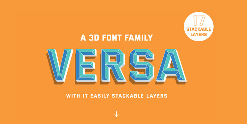
Versa is a seventeen layered font family. It’s the first font ever that includes a variable depth, meaning it’s not only 3D but the user can decide just how much they want the word to pop of the page! The 3D design follows a tradition rooted in sign painting whilst its geometric forms allows the font to be very versatile, hence the name VERSA. The font is available in three packages Basic, Pro, & Advanced, each providing a different amount of font files at a corespoinding price making the font accessible to everyone from lettering hobbyists to multinational creative agencies.  https://www.versafont.com/

What are the challenges of starting your own type foundry?

There are many challenges to starting your own type foundry. Similar to a vineyard it takes a while to produce just one product and even longer to build a reputation for quality products. It’s definitely a long game but I enjoy the process and find typeface design a great project to work on between lettering & logo design client projects.

And now for a classic question, any favorite typeface?

My favourite font of all time is akzidenz grotesk. Despite being released in the late 1800’s it remains a workhorse of a sans serif and influenced the most famous font ever Helvetica. 

An interview with James Lewis, type designer

Post pobrano z: An interview with James Lewis, type designer

How did you discover typography and decide that it could become your job?

I first came into practising typography at the age of only 14. I was looking for something, anything, to do other than play video games which I had become completely bored of. I begin by learning copperplate calligraphy, then hand lettering, and  finally type design and graphic design at University here in Cardiff, UK.

Do you have some advice for a young designer who would like to get started with font design?

I get this question on Instagram almost everyday and my advise is always the same: follow your interest and fully immerse yourself into the process of type design and the culture surrounding it. Read books, take courses, and fall in love.

Where do you find inspiration for new typeface creation?

Inspiration can come from anywhere, you just have to be open to receiving it. I’ve been exploring 3D lettering for over 2 years now and I continually got asked if there were any font’s out there similar to what I was drawing. VERSA was borne to fill that void whilst being versatile enough to be used across a multitude of applications. 

You made yourself a reputation for layered font, what do you like about layered fonts in particular?

The layered font gives the user a whole other lever ( pun intended 😉 ) of creative options. Seeing the font used by designers all over the world in creative ways I didn’t even think of during production has been so rewarding. 

You recently released Versa, a 3D font family, can you tell us more about it?

Versa is a seventeen layered font family. It’s the first font ever that includes a variable depth, meaning it’s not only 3D but the user can decide just how much they want the word to pop of the page! The 3D design follows a tradition rooted in sign painting whilst its geometric forms allows the font to be very versatile, hence the name VERSA. The font is available in three packages Basic, Pro, & Advanced, each providing a different amount of font files at a corespoinding price making the font accessible to everyone from lettering hobbyists to multinational creative agencies.  https://www.versafont.com/

What are the challenges of starting your own type foundry?

There are many challenges to starting your own type foundry. Similar to a vineyard it takes a while to produce just one product and even longer to build a reputation for quality products. It’s definitely a long game but I enjoy the process and find typeface design a great project to work on between lettering & logo design client projects.

And now for a classic question, any favorite typeface?

My favourite font of all time is akzidenz grotesk. Despite being released in the late 1800’s it remains a workhorse of a sans serif and influenced the most famous font ever Helvetica. 

All Fired Up About Specificity

Post pobrano z: All Fired Up About Specificity

You never know where the next Grand Debate™ in front-end is going to come from! Case in point: we just saw one recently based on a little Twitter poll by Max Stoiber in which 57% of people got it wrong. There were reactions ranging from the innocuous hey fun a little brain teaser! to the state of web education is in shambles and beyond.

I heard from a number of folks that they just felt sad that so many people don’t know the answer to a fairly simple question. To be fair, it was (intentionally, I’m sure) rather tricky! It wasn’t really a question about CSS — it was more about the idea that the order of HTML attributes doesn’t matter. It’s the order of CSS that does.

One extreme response I saw said that front-end stuff like this is needlessly complicated and getting it wrong is almost a point of pride. This sentiment was so strong that I heard it suggested that people who know the answer have filled their brains with useless information and that somehow makes them a worse developer. Equally extreme were suggestions that writing HTML and CSS raw like that should always be avoided in favor of tooling abstractions to „fix” these „problems.”

(Excuse the quotes there, I’m not trying to pick a side so much as to emphasize that not everyone considers these problems that need to be fixed.)

Another take was that the vibe would be different if something similar happened in JavaScript-land. The perception is that it’s embarrassing or bad not to know JavaScript basics, but not knowing HTML and CSS basics is the fault of the language, or that the value of knowing it is not worth bothering to understand.

At the same time, this poll became the perfect mirror to see the strong opinions people have about front-end practices. Fascinating, really.

Here are a few more takes from folks who chimed from their own blogs:

Keith Grant:

I hate that this has somehow become some “old guard” vs. “new guard” thing.

The problem with drawing lines like this: whichever side you find yourself on, there are some whackos out there throwing ridiculous arguments into the mix. And now people on the other side associate that viewpoint with you.

Tim Kadlec:

It doesn’t bother me too much that people are getting the question wrong. Everyone is at different stages in their career and everyone has different problems they’re facing in their daily tasks, so sure, not everyone is going to know this yet.

I do find it a bit alarming just how many folks got it wrong though.

John Allsopp:

One the one hand (and this will somewhat simplify each ‘side’, for the sake of brevity, not disrespect to either), we have those, and I’d on balance probably include myself in this camp, who’d argue that the core technologies of the Web are precisely that–foundational, and a deep understanding of them conceptually (not necessarily an encyclopedic knowledge of every syntactic aspect) is fundamental working knowledge for professional Web developers.

Kevin Ball:

With the growth of the importance of front-end development, we’re seeing the story play out again.

The systematic devaluation of CSS, and more, the people who use CSS.

The constant „mansplaining” of CSS features to women who literally are the reason it exists.

Conference speakers asked questions about whether „there is any value in people who cannot write JavaScript?”.

All of this at a time when CSS is improving faster than ever and enabling dramatic changes in web design.

This isn’t about better technology, it’s about exclusion.


Have you seen any other takes or have any of your own?

The post All Fired Up About Specificity appeared first on CSS-Tricks.

Introducing the YOOtheme Pro Page Builder

Post pobrano z: Introducing the YOOtheme Pro Page Builder

(This is a sponsored post.)

YOOtheme Pro is a powerful theme and page builder developed by YOOtheme that provides a new experience of building websites in WordPress. Designers will get an easy and exciting way to design and create websites due to premium layouts and an intuitive page builder, and developers will especially appreciate its extendability and clean and semantic code. YOOtheme has been known as a leading theme provider for over 10 years, and now with YOOtheme Pro they created the next page builder to be watched for on the WordPress market.

The Page Builder

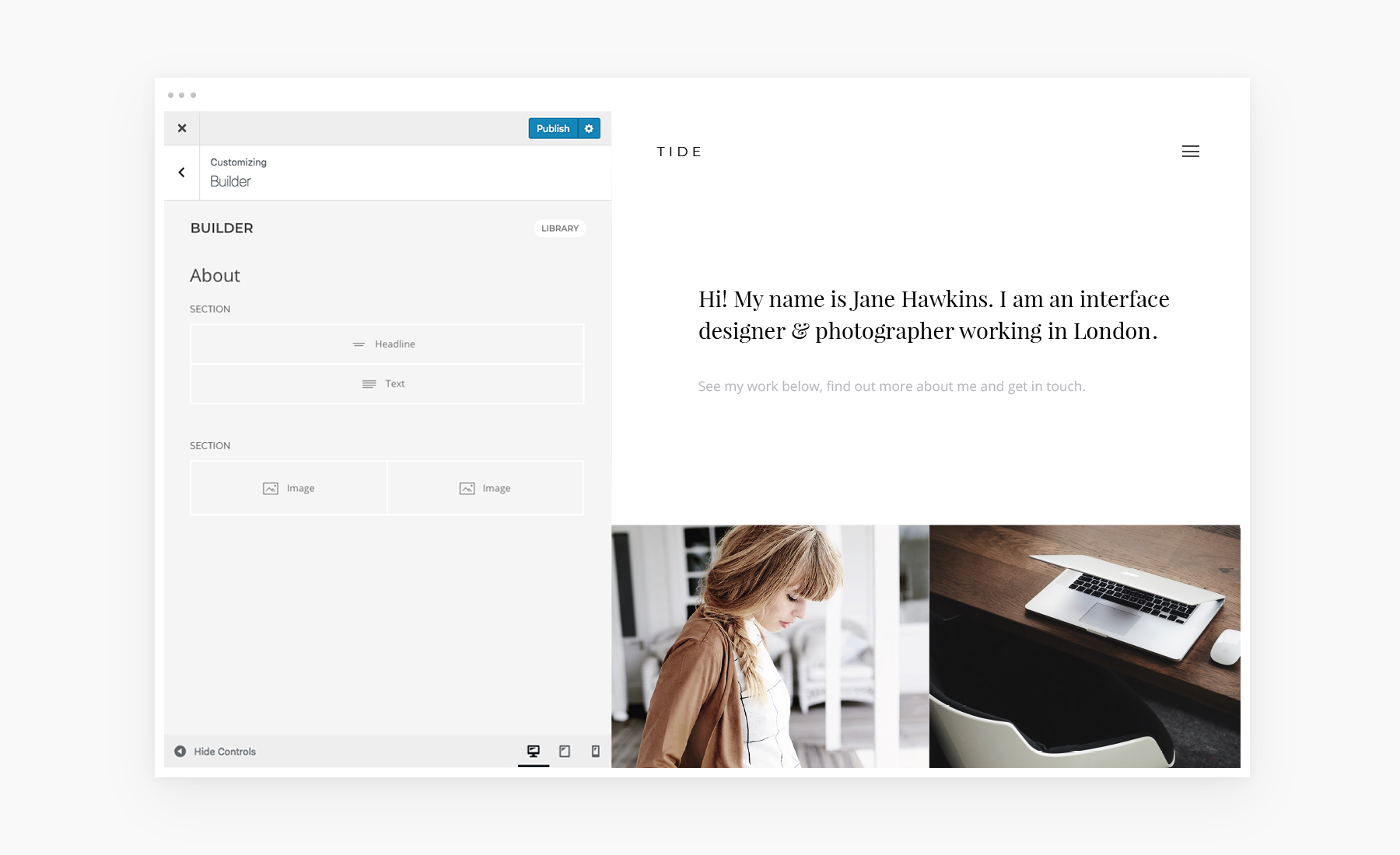
If you are familiar with WordPress, YOOtheme Pro is a perfect choice for you since it is seamlessly integrated into the native WordPress customizer. You can easily create your layouts by dividing your content into sections, rows and grids. And thanks to the drag and drop interface, you can design beautiful responsive page layouts without even having to code. All your changes will be instantly shown in live preview.

Arrange Your Content With Ease

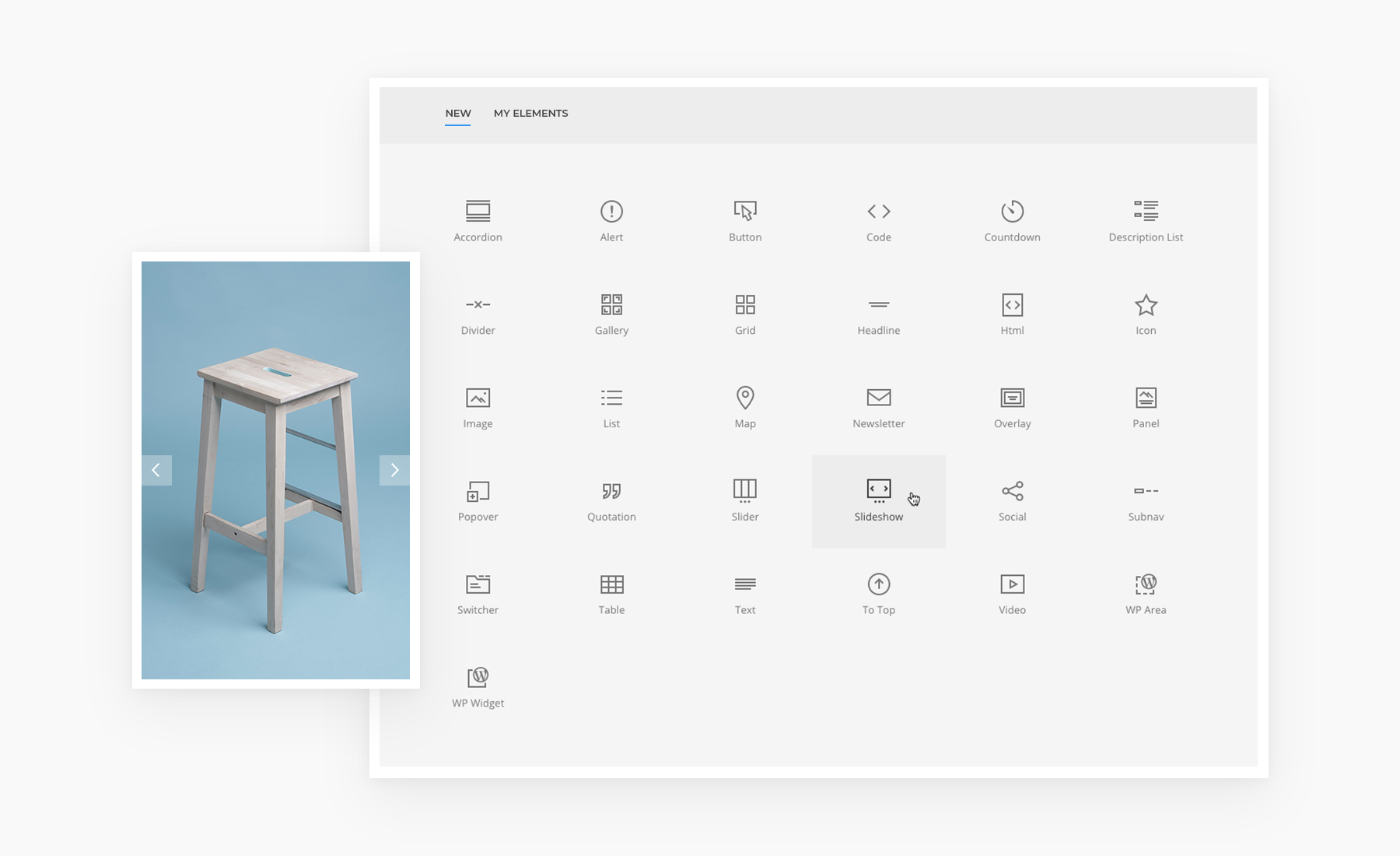
YOOtheme Pro has a growing library of over 30 content elements. Here you can find both common elements like the Video, Panel, Image or Heading, but you can also expect some advanced elements such as the Slider, Slideshow or Gallery with the masonry effect and filter option and even more. YOOtheme Pro also allows you to place WordPress widgets anywhere in your layout. All elements are built with the popular front-end framework UIkit that provides modern codebase with fast and sleek JavaScript.

Sophisticated Layouts for Your Website

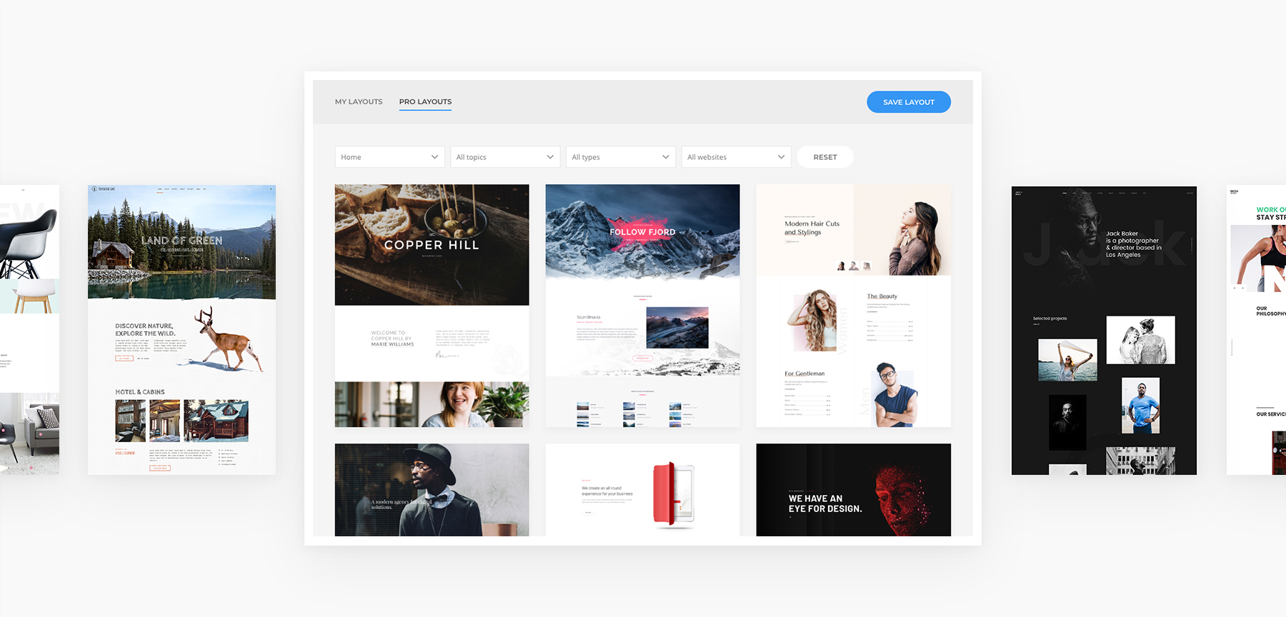
YOOtheme invests a lot of time and effort into the development of their layouts. A team of professional designers regularly creates complete website concepts with a thought-out content structure and focus on modern design trends. They already have over 100 layouts with free-to-use images and even hand-made illustrations that can be found in the Layout Library. You can filter layouts according to topics and types, mix and match them, save your own layouts to reuse them later. This provides you with unlimited possibilities and makes creating websites in WordPress as easy as can be.

A Library of Over 70 Beautiful Styles

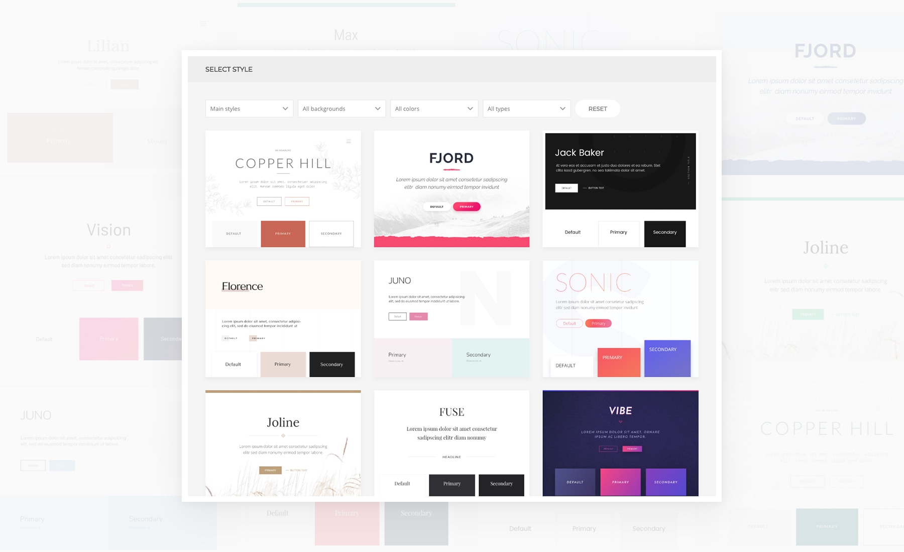
What makes YOOtheme Pro stand out even more is the Style Library that includes over 70 handcrafted styles. One click, and the look of your website changes completely. Whether you are looking for a minimalistic or a bold style, this substantial collection represents all trends. You can customize next to anything with YOOtheme Pro, from changing the style of each item separately to applying changes globally. This gives you all the power to style your WordPress website with none of the coding.

Integrated Unsplash Image Library

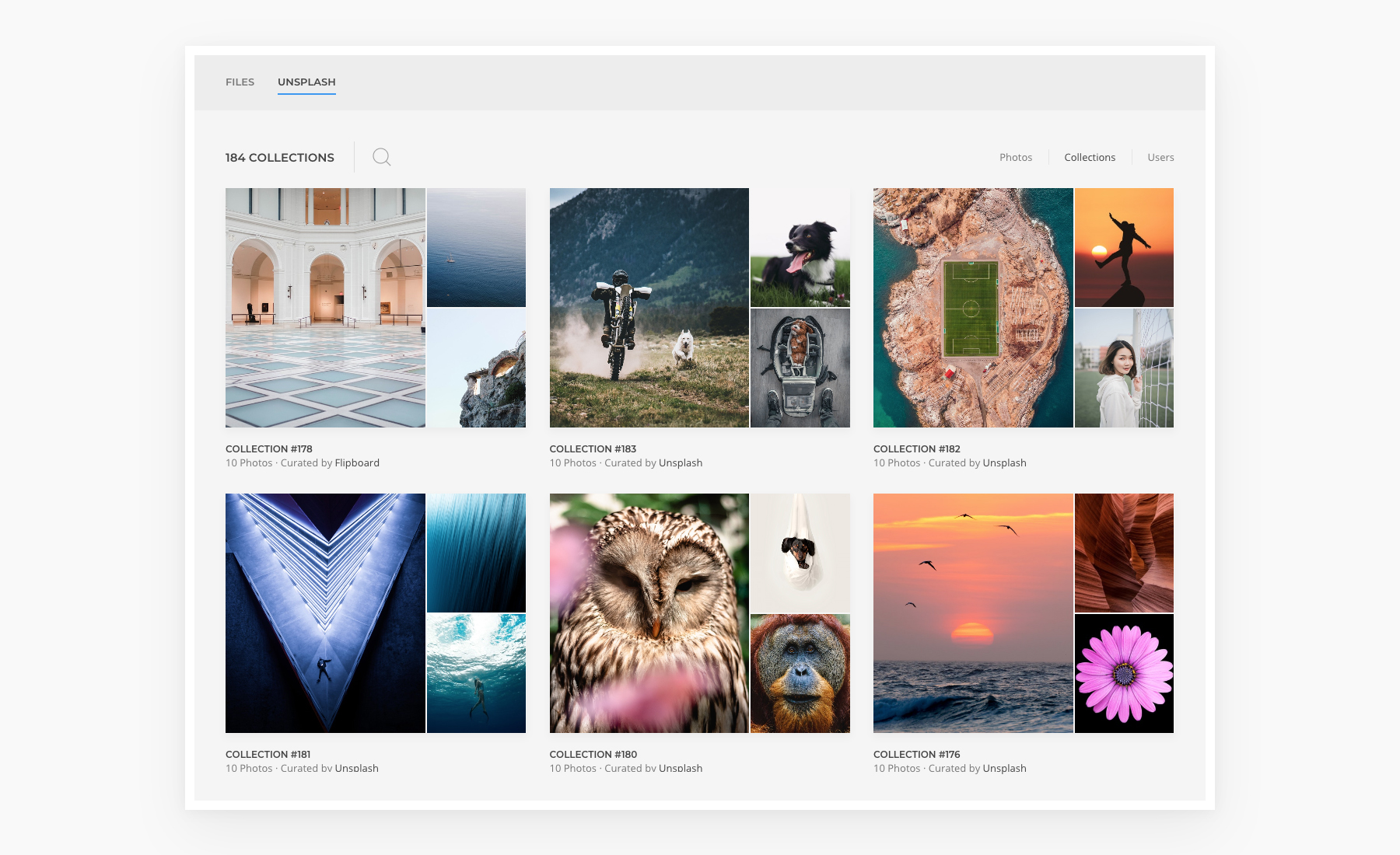
The popular Unsplash library that provides quality and free-to-use photos is seamlessly integrated into YOOtheme Pro. Due to this integration you can search through the library and try out images directly on your website without having to leave YOOtheme Pro. Use filter, browse through collections and users and insert images directly into your layouts. The images will only be downloaded after your click Save. This feature is a real time-saver for every designer.

Lightning-fast and Developer-friendly

YOOtheme Pro is a true piece of German engineering, it is fast, lightweight and easy like no other page builder. Powered by Vue.js and Uikit, it provides a great user experience. YOOtheme Pro also cares about speed. The small code size as well as the latest web technologies ensure the first meaningful paint gets quickly on the screen. And with auto-generated srcsets, lazy loading images and next-gen image formats like WebP YOOtheme Pro will boost the Google PageSpeed rank for your WordPress website. What’s more, Google Fonts are stored locally, which saves the request to Google and ensures GDPR compliance.

A modular and extendable architecture makes YOOtheme Pro extremely developer-friendly. It allows you to override everything, add custom elements, CSS, JavaScript and new themes settings. An extensive documentation including video tutorials and a section specifically written for developers will help you get started in no time.

Get YOOtheme Pro

YOOtheme Pro both simplifies and empowers website building. Regular release of theme packages including sophisticated layouts on a specific topic, six style variations and free-to-use images will make YOOtheme Pro the only thing you’ll need to create a website. And while we could talk more about how YOOtheme Pro supports WooCommerce and has a a Footer Builder and many desktop and mobile header layouts, we’d rather let you see for yourself. Get YOOtheme Pro and experience the future of website building today.

Direct Link to ArticlePermalink

The post Introducing the YOOtheme Pro Page Builder appeared first on CSS-Tricks.