How to Create a Hand-Lettered T-Shirt Design in Adobe Illustrator

Post pobrano z: How to Create a Hand-Lettered T-Shirt Design in Adobe Illustrator

Final product image
What You’ll Be Creating

In this tutorial, I would like to share with you the artistic process of creating a unique, personalised hand-lettering design and transforming it digitally into a ready-to-print T-shirt design. We will begin with a concept sketch and move on to learn how to vector the design in Adobe Illustrator.

Along the way, you will learn some lettering tips and techniques that will enhance your lettering skills. This tutorial is for beginners who want to start the art of hand lettering, not just for t-shirt design, but also for anything else, like a book cover, mug design, or art print.

If you want to find hand-lettering images or get inspired, please visit GraphicRiver.

1. How to Sketch & Plot the Hand Lettering

Step 1

To kickstart the process, let’s whip up a quick rough sketch. 

You can use a traditional pen or ink and paper to sketch and scan, or you can use your choice of digital pen and tablet. I prefer to use either Adobe Photoshop or Procreate for sketching, cleaning pencil marks, correcting, spacing, alignment, and adjusting proportions. 

In celebration of Envato’s France culture week, we’re going to draw the French phrase „Fou D’amour” meaning „Crazy in Love”. 

The sketch will be used just as reference material. You will be able to adjust the thickness, curves, and balance of the design later on. As a beginner, start by quickly sketching out the concept ideas through thumbnail sketches. Experiment with lettering shapes, angles, and compositions.

I played around with my natural cursive handwriting, which I will turn into a thick brush-like script.

natural cursive hand ettering sketch  thumbnails curves composition

Step 2

Select one of the sketches that you think is best for your tshirt design. Replicate the concept in the thumbnail on an A4 (8.5″ x 11″) sheet of paper or digital file.

Start by placing the center alignment cross-lines, and then add the cap-height, x-height, and baseline where the text will be placed.

Afterwards, write in your own natural, simple, cursive handwriting: „Fou D’amour”.

It doesn’t need to be perfectly aligned as we want to create a personalized feel.

sketch pencil simple text alignment cap hieght baseline xheight adobe photoshop

Step 3

Next, we’re going to go over the simple hand-lettered line and build around it. At this stage, you can manipulate the lettering in any direction you want. I went towards a fluid and thick brush-like feel. 

Take the time to sketch around to add weight, refine, and apply contrast to the lettering. 

The idea is to sketch around the lines of the initial sketch, experimenting with thick and thin strokes, edges, and tips. Pay attention to negative spacing, kerning, and the connectors between letters.

Decorate it with some stars, drops, and hearts all around, to give it a „love-pop” effect, as I have done below.

sketch build up on simple handwriting stars drops hearts rough piece

Step 4

Before we begin working on the computer, you need to trace over the sketch in order to refine the letters, making it a bit cleaner and more precise.

When you’re roughly satisfied and done with the tracing over the lettering, then you need to plot out where the vector points will be placed. Plotting is like adding guide points to simplify the vector process later. That means we add dots where the anchor points are, and a line to show the anchor handle direction. 

This simple process of plotting out the placement of anchor points and horizontal and vertical anchor point handles will give you cleaner shapes and more precise letterforms, once turned into vector.

Keep in mind the following:

  • Plotting is usually placed on the 0°, 45° and 90° angles, or where there’s a change in the direction of a curve. 
  • Place anchor points on the top, side, wall, and floor of letterforms. So the top and bottom and the far left and right of letters will have anchor points. 
  • Letter edges will always have a point.
  • Add as few anchor points as possible to get natural-looking curves.
  • Knowing the placement of these anchor points and handles will save you hours of work.
  • You shouldn’t worry about placing them right or wrong; with time, you will get the hang of it and have better judgment.
Add anchor points vector cleaner shapes precise letterform

2. How to Vectorise the Letterforms

Step 1

Let’s upload our artwork into Adobe Illustrator.

Note: If you’ve sketched it out on paper, scan your hand-lettered sketch and save as JPG.

Set up a New Document (File > New or Control-N) using the following settings:

  • Blank Document Presets: A4 
  • Name: Fou_Damour
  • Number of Artboards: 1
  • Width: 8.5″
  • Height: 11″
  • Orientation: Landscape
  • Units: Inches

Open the Advanced tab:

  • Color Mode: CMYK

And click Create.

adobe illustrator new document set up artboard name size width height orientation units color mode

Step 2

Next, you need to set your layers.

Open the Layers panel (Window > Layers). Rename 'Layer 1′ as ’Sketch’.

Then click the Create New Layer icon, create another layer, and rename it ’Lettering’. Click Place (Command-Shift-P) to add the sketch to the Artboard.

Open the Layers panel: Window > Layers. Double-click the ’Sketch’ layer to open the sub-menu of the Layers panel:

  1. NameSketch
  2. Select Lock
  3. Dim Images to: 20%
  4. OK

File > Save (Command-S)

layer panel create new layer place command shift P Lock and Dim file save

Step 3

Let’s get to vectoring!

First, make sure you are on the 'Lettering’ layer.

We will begin tracing, piece by piece. I will show you how to break down the vector process, so you can go about vectoring it easily.

Select the Pen Tool (P). From the Control panel, select null Fill and black Stroke of 1 pt.

Begin by vectoring the word ’Fou’, starting with the stem of the ’F’. The letter shapes tend to guide you where to begin. I always work from left to right.

Follow the plotted sketch points, and use the Anchor Point Tool (Shift-C) to vertically and horizontally align the anchor handles equally. 

pen tool hora point tool to vertically and horizontally align handles equally stroke black 1pt

Step 4

Trace every piece of the lettering as if it is broken down into separate shapes. This will help you edit each piece rather than the entire text.

  • Don’t cross the directional handles.
  • Don’t pressure one anchor point to do all the curving.
  • Make sure the curves flow beautifully and the edges are clean.

For the ’F’ crossbar, make the tips pointy. Then use the Direct Selection Tool (A) to select the two edge corners. This will automatically turn the anchor points to Live Corner widgets.

Click the Corners option in the Control panel (Window > Control), and set the Radius to 0.03 in. 

F select tips with direct selection tool turn on live corner widgets and set radius 003 in

Step 5

Continue tracing the ’ou’ with the Pen Tool (P), and use the Anchor Point Tool (Shift-C) to adjust the handles. 

Trace the crossover of the ’o’ loop as shown below. It’s okay if everything overlaps. Make sure to trace your letters individually so you can make space adjustments later in the process. Later we will edit and merge everything together.

Afterwards, separately trace the ’u’.

You will notice that some anchor points need to be added, and anchor handles need a change of direction. Plot the points and align the handles as perfectly as possible. There is a lot of trial and error, but eventually you will get the hang of it.

Trace fou pen tool

Step 6

After vectoring the ’Fou’, apply the crossover technique to each vector, piece by piece, to the word 'D’amour’. This technique helps control each letter intersection, width, and angle. 

To ensure a clean result, work with horizontal and vertical point handles. It’s a bit complicated at first. You may need additional 45° angles, depending on the typography and the angle of the design.

Try to maintain the same width between connectors.

Take the Direct Selection Tool (A), select the anchor points, and drag while holding down the Shift key to equally stretch the vertical and horizontal handles. The further you stretch the handles, the longer the curves are going to be.

cross over technique damour text trace pen tool and anchor point tool

Step 7

The last to vector are the decorative elements around the lettering.

Use the Ellipse Tool (L) to draw the ellipse, but otherwise manually eye and trace the other shapes with the Pen Tool (P) to give them an organic feel.

trace lettering shapes and forms ellipse tool for ellipses

Step 8

After you’ve vectored the whole piece, Delete the ’Sketch’ layer from the Layers panel.

Select All (Command-A), and Swap Fill & Stroke (Shift-X), to give the lettering a fill instead of a stroke.

So now you can view the positive and negative spaces more clearly and see where the flaws lie.
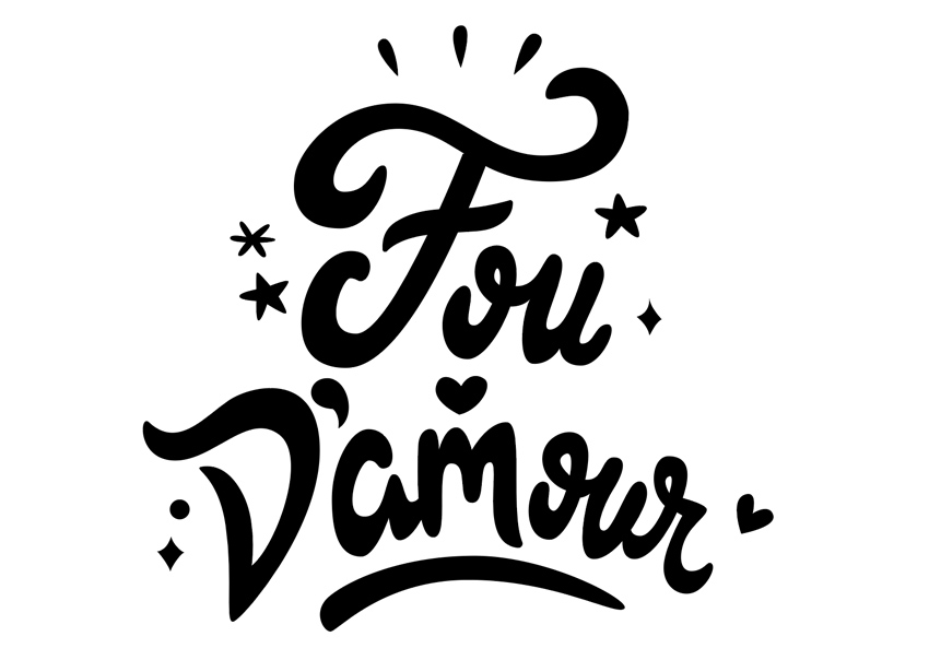
negative positive space analysis swap fil and stroke select all

3. How to Edit & Color the Lettering

Step 1

Now it’s time to adjust the shapes and edit the sizing. Take the time to tune the curves and correct the anchor handles. 

First, edit each letterform by adjusting the handlebars using the Shift key. 

Then tweak by transforming, rotating, aligning or stretching the letters, so they are in visual harmony.

To scale, take the Selection Tool (V) and select the Free Transform Tool (E), holding down Shift to scale proportionally.

To move, just select the letterforms using the Selection Tool (V) and align the text properly.

tweak text using direct selection tool and free transform tool shortcuts

Step 2

Afterwards, you need to analyse the negative and positive space. 

The negative space is the white or empty space between the elements. The filled space is referred to as positive. The negative space basically helps define what the positive space is, and it supports readability.

To fix the space interaction, keep consistency within the element spacing, and keep your design uncluttered, readable, and clean. See what needs more kerning or more curving, alignment, etc. I made minor edits so that the text is readable and aligned.

The skill of being able to precisely convert a sketch to a vector is valuable. Being able to do that enables you to scale your lettering up without losing detail and the feel of the text
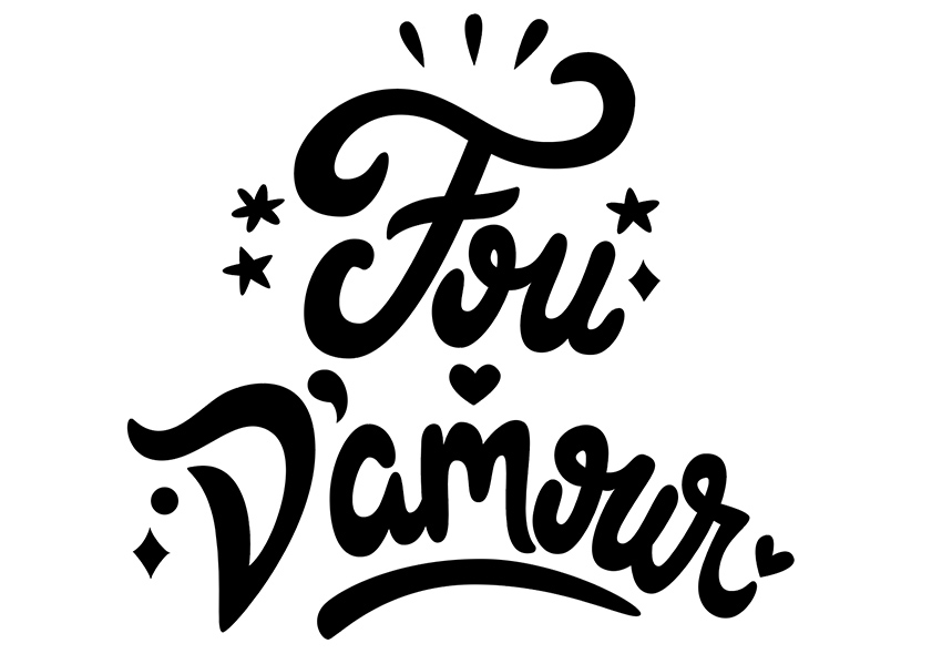
fou damour text editing curves kerning spacing negative positive space

Step 3

Once you are satisfied with the overall look, it’s time to join the overlapping paths.

Open the Pathfinder panel: Windows > Pathfinder. Then, for example, take the Selection Tool (V), select the elements of ’F’, and select the option Shape Modes: Unite.

Go on to select all the overlapping shapes you want to merge, and click on Unite from the Pathfinder panel.

fou damouir french text  window pathfinder unite selection tool

Step 4

We’re almost finished! 

Jump over to a color scheme generator like Coolor.co or Adobe Color CC, and select a 'love’ inspired palette.

Chose what HEX palette colors you want and apply them to fill the lettering.

I worked with the following palette, and I gave each element a color fill I found fitting:

  • Rose Red: HEX color #E73938
  • Pumpkin: HEX color #ED6E31
  • Orange: HEX color #f18924
  • Yolk: HEX color #EFBBB1E
  • Cyclamen: HEX color #EB5f9E
  • Sinopia: HEX color #D31216
coolor adobe color palette generator apply fillcolor

4. How to Export the Image for Print

In order to export the vector images to be ready for print, you need PNG files.

Go to File > Export.

Choose PNG format with a resolution of 300 ppi, and make sure you are exporting it with a background set at Transparent.

file export fou damour png format options 300ppi transparent format

Crazy in Love! Great Job

Now you can use your finalized hand-lettering file to print and sell your new T-shirt design or use it on other merchandise, for web, or whatever else you decide on!

I’ve used Placeit to show you how your hand-lettered design would look on a T-shirt.

I hope this tutorial was helpful and explained some tips for digitising your lettering in a way that is helpful and easy to understand.

Thanks for going through this tutorial with me. Feel free to share your hand-lettered designs in the comments section below, and if you have any issues or questions, let me know. See you next time!

final fou damour french crazy in love france tshirt design by miss chatz

If you liked this tutorial, feel free to check my other tutorials.

How to Create a Hand-Lettered T-Shirt Design in Adobe Illustrator

Post pobrano z: How to Create a Hand-Lettered T-Shirt Design in Adobe Illustrator

Final product image
What You’ll Be Creating

In this tutorial, I would like to share with you the artistic process of creating a unique, personalised hand-lettering design and transforming it digitally into a ready-to-print T-shirt design. We will begin with a concept sketch and move on to learn how to vector the design in Adobe Illustrator.

Along the way, you will learn some lettering tips and techniques that will enhance your lettering skills. This tutorial is for beginners who want to start the art of hand lettering, not just for t-shirt design, but also for anything else, like a book cover, mug design, or art print.

If you want to find hand-lettering images or get inspired, please visit GraphicRiver.

1. How to Sketch & Plot the Hand Lettering

Step 1

To kickstart the process, let’s whip up a quick rough sketch. 

You can use a traditional pen or ink and paper to sketch and scan, or you can use your choice of digital pen and tablet. I prefer to use either Adobe Photoshop or Procreate for sketching, cleaning pencil marks, correcting, spacing, alignment, and adjusting proportions. 

In celebration of Envato’s France culture week, we’re going to draw the French phrase „Fou D’amour” meaning „Crazy in Love”. 

The sketch will be used just as reference material. You will be able to adjust the thickness, curves, and balance of the design later on. As a beginner, start by quickly sketching out the concept ideas through thumbnail sketches. Experiment with lettering shapes, angles, and compositions.

I played around with my natural cursive handwriting, which I will turn into a thick brush-like script.

natural cursive hand ettering sketch  thumbnails curves composition

Step 2

Select one of the sketches that you think is best for your tshirt design. Replicate the concept in the thumbnail on an A4 (8.5″ x 11″) sheet of paper or digital file.

Start by placing the center alignment cross-lines, and then add the cap-height, x-height, and baseline where the text will be placed.

Afterwards, write in your own natural, simple, cursive handwriting: „Fou D’amour”.

It doesn’t need to be perfectly aligned as we want to create a personalized feel.

sketch pencil simple text alignment cap hieght baseline xheight adobe photoshop

Step 3

Next, we’re going to go over the simple hand-lettered line and build around it. At this stage, you can manipulate the lettering in any direction you want. I went towards a fluid and thick brush-like feel. 

Take the time to sketch around to add weight, refine, and apply contrast to the lettering. 

The idea is to sketch around the lines of the initial sketch, experimenting with thick and thin strokes, edges, and tips. Pay attention to negative spacing, kerning, and the connectors between letters.

Decorate it with some stars, drops, and hearts all around, to give it a „love-pop” effect, as I have done below.

sketch build up on simple handwriting stars drops hearts rough piece

Step 4

Before we begin working on the computer, you need to trace over the sketch in order to refine the letters, making it a bit cleaner and more precise.

When you’re roughly satisfied and done with the tracing over the lettering, then you need to plot out where the vector points will be placed. Plotting is like adding guide points to simplify the vector process later. That means we add dots where the anchor points are, and a line to show the anchor handle direction. 

This simple process of plotting out the placement of anchor points and horizontal and vertical anchor point handles will give you cleaner shapes and more precise letterforms, once turned into vector.

Keep in mind the following:

  • Plotting is usually placed on the 0°, 45° and 90° angles, or where there’s a change in the direction of a curve. 
  • Place anchor points on the top, side, wall, and floor of letterforms. So the top and bottom and the far left and right of letters will have anchor points. 
  • Letter edges will always have a point.
  • Add as few anchor points as possible to get natural-looking curves.
  • Knowing the placement of these anchor points and handles will save you hours of work.
  • You shouldn’t worry about placing them right or wrong; with time, you will get the hang of it and have better judgment.
Add anchor points vector cleaner shapes precise letterform

2. How to Vectorise the Letterforms

Step 1

Let’s upload our artwork into Adobe Illustrator.

Note: If you’ve sketched it out on paper, scan your hand-lettered sketch and save as JPG.

Set up a New Document (File > New or Control-N) using the following settings:

  • Blank Document Presets: A4 
  • Name: Fou_Damour
  • Number of Artboards: 1
  • Width: 8.5″
  • Height: 11″
  • Orientation: Landscape
  • Units: Inches

Open the Advanced tab:

  • Color Mode: CMYK

And click Create.

adobe illustrator new document set up artboard name size width height orientation units color mode

Step 2

Next, you need to set your layers.

Open the Layers panel (Window > Layers). Rename 'Layer 1′ as ’Sketch’.

Then click the Create New Layer icon, create another layer, and rename it ’Lettering’. Click Place (Command-Shift-P) to add the sketch to the Artboard.

Open the Layers panel: Window > Layers. Double-click the ’Sketch’ layer to open the sub-menu of the Layers panel:

  1. NameSketch
  2. Select Lock
  3. Dim Images to: 20%
  4. OK

File > Save (Command-S)

layer panel create new layer place command shift P Lock and Dim file save

Step 3

Let’s get to vectoring!

First, make sure you are on the 'Lettering’ layer.

We will begin tracing, piece by piece. I will show you how to break down the vector process, so you can go about vectoring it easily.

Select the Pen Tool (P). From the Control panel, select null Fill and black Stroke of 1 pt.

Begin by vectoring the word ’Fou’, starting with the stem of the ’F’. The letter shapes tend to guide you where to begin. I always work from left to right.

Follow the plotted sketch points, and use the Anchor Point Tool (Shift-C) to vertically and horizontally align the anchor handles equally. 

pen tool hora point tool to vertically and horizontally align handles equally stroke black 1pt

Step 4

Trace every piece of the lettering as if it is broken down into separate shapes. This will help you edit each piece rather than the entire text.

  • Don’t cross the directional handles.
  • Don’t pressure one anchor point to do all the curving.
  • Make sure the curves flow beautifully and the edges are clean.

For the ’F’ crossbar, make the tips pointy. Then use the Direct Selection Tool (A) to select the two edge corners. This will automatically turn the anchor points to Live Corner widgets.

Click the Corners option in the Control panel (Window > Control), and set the Radius to 0.03 in. 

F select tips with direct selection tool turn on live corner widgets and set radius 003 in

Step 5

Continue tracing the ’ou’ with the Pen Tool (P), and use the Anchor Point Tool (Shift-C) to adjust the handles. 

Trace the crossover of the ’o’ loop as shown below. It’s okay if everything overlaps. Make sure to trace your letters individually so you can make space adjustments later in the process. Later we will edit and merge everything together.

Afterwards, separately trace the ’u’.

You will notice that some anchor points need to be added, and anchor handles need a change of direction. Plot the points and align the handles as perfectly as possible. There is a lot of trial and error, but eventually you will get the hang of it.

Trace fou pen tool

Step 6

After vectoring the ’Fou’, apply the crossover technique to each vector, piece by piece, to the word 'D’amour’. This technique helps control each letter intersection, width, and angle. 

To ensure a clean result, work with horizontal and vertical point handles. It’s a bit complicated at first. You may need additional 45° angles, depending on the typography and the angle of the design.

Try to maintain the same width between connectors.

Take the Direct Selection Tool (A), select the anchor points, and drag while holding down the Shift key to equally stretch the vertical and horizontal handles. The further you stretch the handles, the longer the curves are going to be.

cross over technique damour text trace pen tool and anchor point tool

Step 7

The last to vector are the decorative elements around the lettering.

Use the Ellipse Tool (L) to draw the ellipse, but otherwise manually eye and trace the other shapes with the Pen Tool (P) to give them an organic feel.

trace lettering shapes and forms ellipse tool for ellipses

Step 8

After you’ve vectored the whole piece, Delete the ’Sketch’ layer from the Layers panel.

Select All (Command-A), and Swap Fill & Stroke (Shift-X), to give the lettering a fill instead of a stroke.

So now you can view the positive and negative spaces more clearly and see where the flaws lie.

negative positive space analysis swap fil and stroke select all

3. How to Edit & Color the Lettering

Step 1

Now it’s time to adjust the shapes and edit the sizing. Take the time to tune the curves and correct the anchor handles. 

First, edit each letterform by adjusting the handlebars using the Shift key. 

Then tweak by transforming, rotating, aligning or stretching the letters, so they are in visual harmony.

To scale, take the Selection Tool (V) and select the Free Transform Tool (E), holding down Shift to scale proportionally.

To move, just select the letterforms using the Selection Tool (V) and align the text properly.

tweak text using direct selection tool and free transform tool shortcuts

Step 2

Afterwards, you need to analyse the negative and positive space. 

The negative space is the white or empty space between the elements. The filled space is referred to as positive. The negative space basically helps define what the positive space is, and it supports readability.

To fix the space interaction, keep consistency within the element spacing, and keep your design uncluttered, readable, and clean. See what needs more kerning or more curving, alignment, etc. I made minor edits so that the text is readable and aligned.

The skill of being able to precisely convert a sketch to a vector is valuable. Being able to do that enables you to scale your lettering up without losing detail and the feel of the text

fou damour text editing curves kerning spacing negative positive space

Step 3

Once you are satisfied with the overall look, it’s time to join the overlapping paths.

Open the Pathfinder panel: Windows > Pathfinder. Then, for example, take the Selection Tool (V), select the elements of ’F’, and select the option Shape Modes: Unite.

Go on to select all the overlapping shapes you want to merge, and click on Unite from the Pathfinder panel.

fou damouir french text  window pathfinder unite selection tool

Step 4

We’re almost finished! 

Jump over to a color scheme generator like Coolor.co or Adobe Color CC, and select a 'love’ inspired palette.

Chose what HEX palette colors you want and apply them to fill the lettering.

I worked with the following palette, and I gave each element a color fill I found fitting:

  • Rose Red: HEX color #E73938
  • Pumpkin: HEX color #ED6E31
  • Orange: HEX color #f18924
  • Yolk: HEX color #EFBBB1E
  • Cyclamen: HEX color #EB5f9E
  • Sinopia: HEX color #D31216
coolor adobe color palette generator apply fillcolor

4. How to Export the Image for Print

In order to export the vector images to be ready for print, you need PNG files.

Go to File > Export.

Choose PNG format with a resolution of 300 ppi, and make sure you are exporting it with a background set at Transparent.

file export fou damour png format options 300ppi transparent format

Crazy in Love! Great Job

Now you can use your finalized hand-lettering file to print and sell your new T-shirt design or use it on other merchandise, for web, or whatever else you decide on!

I’ve used Placeit to show you how your hand-lettered design would look on a T-shirt.

I hope this tutorial was helpful and explained some tips for digitising your lettering in a way that is helpful and easy to understand.

Thanks for going through this tutorial with me. Feel free to share your hand-lettered designs in the comments section below, and if you have any issues or questions, let me know. See you next time!

final fou damour french crazy in love france tshirt design by miss chatz

If you liked this tutorial, feel free to check my other tutorials.

How to Create a Hand-Lettered T-Shirt Design in Adobe Illustrator

Post pobrano z: How to Create a Hand-Lettered T-Shirt Design in Adobe Illustrator

Final product image
What You’ll Be Creating

In this tutorial, I would like to share with you the artistic process of creating a unique, personalised hand-lettering design and transforming it digitally into a ready-to-print T-shirt design. We will begin with a concept sketch and move on to learn how to vector the design in Adobe Illustrator.

Along the way, you will learn some lettering tips and techniques that will enhance your lettering skills. This tutorial is for beginners who want to start the art of hand lettering, not just for t-shirt design, but also for anything else, like a book cover, mug design, or art print.

If you want to find hand-lettering images or get inspired, please visit GraphicRiver.

1. How to Sketch & Plot the Hand Lettering

Step 1

To kickstart the process, let’s whip up a quick rough sketch. 

You can use a traditional pen or ink and paper to sketch and scan, or you can use your choice of digital pen and tablet. I prefer to use either Adobe Photoshop or Procreate for sketching, cleaning pencil marks, correcting, spacing, alignment, and adjusting proportions. 

In celebration of Envato’s France culture week, we’re going to draw the French phrase „Fou D’amour” meaning „Crazy in Love”. 

The sketch will be used just as reference material. You will be able to adjust the thickness, curves, and balance of the design later on. As a beginner, start by quickly sketching out the concept ideas through thumbnail sketches. Experiment with lettering shapes, angles, and compositions.

I played around with my natural cursive handwriting, which I will turn into a thick brush-like script.

natural cursive hand ettering sketch  thumbnails curves composition

Step 2

Select one of the sketches that you think is best for your tshirt design. Replicate the concept in the thumbnail on an A4 (8.5″ x 11″) sheet of paper or digital file.

Start by placing the center alignment cross-lines, and then add the cap-height, x-height, and baseline where the text will be placed.

Afterwards, write in your own natural, simple, cursive handwriting: „Fou D’amour”.

It doesn’t need to be perfectly aligned as we want to create a personalized feel.

sketch pencil simple text alignment cap hieght baseline xheight adobe photoshop

Step 3

Next, we’re going to go over the simple hand-lettered line and build around it. At this stage, you can manipulate the lettering in any direction you want. I went towards a fluid and thick brush-like feel. 

Take the time to sketch around to add weight, refine, and apply contrast to the lettering. 

The idea is to sketch around the lines of the initial sketch, experimenting with thick and thin strokes, edges, and tips. Pay attention to negative spacing, kerning, and the connectors between letters.

Decorate it with some stars, drops, and hearts all around, to give it a „love-pop” effect, as I have done below.

sketch build up on simple handwriting stars drops hearts rough piece

Step 4

Before we begin working on the computer, you need to trace over the sketch in order to refine the letters, making it a bit cleaner and more precise.

When you’re roughly satisfied and done with the tracing over the lettering, then you need to plot out where the vector points will be placed. Plotting is like adding guide points to simplify the vector process later. That means we add dots where the anchor points are, and a line to show the anchor handle direction. 

This simple process of plotting out the placement of anchor points and horizontal and vertical anchor point handles will give you cleaner shapes and more precise letterforms, once turned into vector.

Keep in mind the following:

  • Plotting is usually placed on the 0°, 45° and 90° angles, or where there’s a change in the direction of a curve. 
  • Place anchor points on the top, side, wall, and floor of letterforms. So the top and bottom and the far left and right of letters will have anchor points. 
  • Letter edges will always have a point.
  • Add as few anchor points as possible to get natural-looking curves.
  • Knowing the placement of these anchor points and handles will save you hours of work.
  • You shouldn’t worry about placing them right or wrong; with time, you will get the hang of it and have better judgment.
Add anchor points vector cleaner shapes precise letterform

2. How to Vectorise the Letterforms

Step 1

Let’s upload our artwork into Adobe Illustrator.

Note: If you’ve sketched it out on paper, scan your hand-lettered sketch and save as JPG.

Set up a New Document (File > New or Control-N) using the following settings:

  • Blank Document Presets: A4 
  • Name: Fou_Damour
  • Number of Artboards: 1
  • Width: 8.5″
  • Height: 11″
  • Orientation: Landscape
  • Units: Inches

Open the Advanced tab:

  • Color Mode: CMYK

And click Create.

adobe illustrator new document set up artboard name size width height orientation units color mode

Step 2

Next, you need to set your layers.

Open the Layers panel (Window > Layers). Rename 'Layer 1′ as ’Sketch’.

Then click the Create New Layer icon, create another layer, and rename it ’Lettering’. Click Place (Command-Shift-P) to add the sketch to the Artboard.

Open the Layers panel: Window > Layers. Double-click the ’Sketch’ layer to open the sub-menu of the Layers panel:

  1. NameSketch
  2. Select Lock
  3. Dim Images to: 20%
  4. OK

File > Save (Command-S)

layer panel create new layer place command shift P Lock and Dim file save

Step 3

Let’s get to vectoring!

First, make sure you are on the 'Lettering’ layer.

We will begin tracing, piece by piece. I will show you how to break down the vector process, so you can go about vectoring it easily.

Select the Pen Tool (P). From the Control panel, select null Fill and black Stroke of 1 pt.

Begin by vectoring the word ’Fou’, starting with the stem of the ’F’. The letter shapes tend to guide you where to begin. I always work from left to right.

Follow the plotted sketch points, and use the Anchor Point Tool (Shift-C) to vertically and horizontally align the anchor handles equally. 

pen tool hora point tool to vertically and horizontally align handles equally stroke black 1pt

Step 4

Trace every piece of the lettering as if it is broken down into separate shapes. This will help you edit each piece rather than the entire text.

  • Don’t cross the directional handles.
  • Don’t pressure one anchor point to do all the curving.
  • Make sure the curves flow beautifully and the edges are clean.

For the ’F’ crossbar, make the tips pointy. Then use the Direct Selection Tool (A) to select the two edge corners. This will automatically turn the anchor points to Live Corner widgets.

Click the Corners option in the Control panel (Window > Control), and set the Radius to 0.03 in. 

F select tips with direct selection tool turn on live corner widgets and set radius 003 in

Step 5

Continue tracing the ’ou’ with the Pen Tool (P), and use the Anchor Point Tool (Shift-C) to adjust the handles. 

Trace the crossover of the ’o’ loop as shown below. It’s okay if everything overlaps. Make sure to trace your letters individually so you can make space adjustments later in the process. Later we will edit and merge everything together.

Afterwards, separately trace the ’u’.

You will notice that some anchor points need to be added, and anchor handles need a change of direction. Plot the points and align the handles as perfectly as possible. There is a lot of trial and error, but eventually you will get the hang of it.

Trace fou pen tool

Step 6

After vectoring the ’Fou’, apply the crossover technique to each vector, piece by piece, to the word 'D’amour’. This technique helps control each letter intersection, width, and angle. 

To ensure a clean result, work with horizontal and vertical point handles. It’s a bit complicated at first. You may need additional 45° angles, depending on the typography and the angle of the design.

Try to maintain the same width between connectors.

Take the Direct Selection Tool (A), select the anchor points, and drag while holding down the Shift key to equally stretch the vertical and horizontal handles. The further you stretch the handles, the longer the curves are going to be.

cross over technique damour text trace pen tool and anchor point tool

Step 7

The last to vector are the decorative elements around the lettering.

Use the Ellipse Tool (L) to draw the ellipse, but otherwise manually eye and trace the other shapes with the Pen Tool (P) to give them an organic feel.

trace lettering shapes and forms ellipse tool for ellipses

Step 8

After you’ve vectored the whole piece, Delete the ’Sketch’ layer from the Layers panel.

Select All (Command-A), and Swap Fill & Stroke (Shift-X), to give the lettering a fill instead of a stroke.

So now you can view the positive and negative spaces more clearly and see where the flaws lie.

negative positive space analysis swap fil and stroke select all

3. How to Edit & Color the Lettering

Step 1

Now it’s time to adjust the shapes and edit the sizing. Take the time to tune the curves and correct the anchor handles. 

First, edit each letterform by adjusting the handlebars using the Shift key. 

Then tweak by transforming, rotating, aligning or stretching the letters, so they are in visual harmony.

To scale, take the Selection Tool (V) and select the Free Transform Tool (E), holding down Shift to scale proportionally.

To move, just select the letterforms using the Selection Tool (V) and align the text properly.

tweak text using direct selection tool and free transform tool shortcuts

Step 2

Afterwards, you need to analyse the negative and positive space. 

The negative space is the white or empty space between the elements. The filled space is referred to as positive. The negative space basically helps define what the positive space is, and it supports readability.

To fix the space interaction, keep consistency within the element spacing, and keep your design uncluttered, readable, and clean. See what needs more kerning or more curving, alignment, etc. I made minor edits so that the text is readable and aligned.

The skill of being able to precisely convert a sketch to a vector is valuable. Being able to do that enables you to scale your lettering up without losing detail and the feel of the text

fou damour text editing curves kerning spacing negative positive space

Step 3

Once you are satisfied with the overall look, it’s time to join the overlapping paths.

Open the Pathfinder panel: Windows > Pathfinder. Then, for example, take the Selection Tool (V), select the elements of ’F’, and select the option Shape Modes: Unite.

Go on to select all the overlapping shapes you want to merge, and click on Unite from the Pathfinder panel.

fou damouir french text  window pathfinder unite selection tool

Step 4

We’re almost finished! 

Jump over to a color scheme generator like Coolor.co or Adobe Color CC, and select a 'love’ inspired palette.

Chose what HEX palette colors you want and apply them to fill the lettering.

I worked with the following palette, and I gave each element a color fill I found fitting:

  • Rose Red: HEX color #E73938
  • Pumpkin: HEX color #ED6E31
  • Orange: HEX color #f18924
  • Yolk: HEX color #EFBBB1E
  • Cyclamen: HEX color #EB5f9E
  • Sinopia: HEX color #D31216
coolor adobe color palette generator apply fillcolor

4. How to Export the Image for Print

In order to export the vector images to be ready for print, you need PNG files.

Go to File > Export.

Choose PNG format with a resolution of 300 ppi, and make sure you are exporting it with a background set at Transparent.

file export fou damour png format options 300ppi transparent format

Crazy in Love! Great Job

Now you can use your finalized hand-lettering file to print and sell your new T-shirt design or use it on other merchandise, for web, or whatever else you decide on!

I’ve used Placeit to show you how your hand-lettered design would look on a T-shirt.

I hope this tutorial was helpful and explained some tips for digitising your lettering in a way that is helpful and easy to understand.

Thanks for going through this tutorial with me. Feel free to share your hand-lettered designs in the comments section below, and if you have any issues or questions, let me know. See you next time!

final fou damour french crazy in love france tshirt design by miss chatz

If you liked this tutorial, feel free to check my other tutorials.

How to Create a Hand-Lettered T-Shirt Design in Adobe Illustrator

Post pobrano z: How to Create a Hand-Lettered T-Shirt Design in Adobe Illustrator

Final product image
What You’ll Be Creating

In this tutorial, I would like to share with you the artistic process of creating a unique, personalised hand-lettering design and transforming it digitally into a ready-to-print T-shirt design. We will begin with a concept sketch and move on to learn how to vector the design in Adobe Illustrator.

Along the way, you will learn some lettering tips and techniques that will enhance your lettering skills. This tutorial is for beginners who want to start the art of hand lettering, not just for t-shirt design, but also for anything else, like a book cover, mug design, or art print.

If you want to find hand-lettering images or get inspired, please visit GraphicRiver.

1. How to Sketch & Plot the Hand Lettering

Step 1

To kickstart the process, let’s whip up a quick rough sketch. 

You can use a traditional pen or ink and paper to sketch and scan, or you can use your choice of digital pen and tablet. I prefer to use either Adobe Photoshop or Procreate for sketching, cleaning pencil marks, correcting, spacing, alignment, and adjusting proportions. 

In celebration of Envato’s France culture week, we’re going to draw the French phrase „Fou D’amour” meaning „Crazy in Love”. 

The sketch will be used just as reference material. You will be able to adjust the thickness, curves, and balance of the design later on. As a beginner, start by quickly sketching out the concept ideas through thumbnail sketches. Experiment with lettering shapes, angles, and compositions.

I played around with my natural cursive handwriting, which I will turn into a thick brush-like script.

natural cursive hand ettering sketch  thumbnails curves composition

Step 2

Select one of the sketches that you think is best for your tshirt design. Replicate the concept in the thumbnail on an A4 (8.5″ x 11″) sheet of paper or digital file.

Start by placing the center alignment cross-lines, and then add the cap-height, x-height, and baseline where the text will be placed.

Afterwards, write in your own natural, simple, cursive handwriting: „Fou D’amour”.

It doesn’t need to be perfectly aligned as we want to create a personalized feel.

sketch pencil simple text alignment cap hieght baseline xheight adobe photoshop

Step 3

Next, we’re going to go over the simple hand-lettered line and build around it. At this stage, you can manipulate the lettering in any direction you want. I went towards a fluid and thick brush-like feel. 

Take the time to sketch around to add weight, refine, and apply contrast to the lettering. 

The idea is to sketch around the lines of the initial sketch, experimenting with thick and thin strokes, edges, and tips. Pay attention to negative spacing, kerning, and the connectors between letters.

Decorate it with some stars, drops, and hearts all around, to give it a „love-pop” effect, as I have done below.

sketch build up on simple handwriting stars drops hearts rough piece

Step 4

Before we begin working on the computer, you need to trace over the sketch in order to refine the letters, making it a bit cleaner and more precise.

When you’re roughly satisfied and done with the tracing over the lettering, then you need to plot out where the vector points will be placed. Plotting is like adding guide points to simplify the vector process later. That means we add dots where the anchor points are, and a line to show the anchor handle direction. 

This simple process of plotting out the placement of anchor points and horizontal and vertical anchor point handles will give you cleaner shapes and more precise letterforms, once turned into vector.

Keep in mind the following:

  • Plotting is usually placed on the 0°, 45° and 90° angles, or where there’s a change in the direction of a curve. 
  • Place anchor points on the top, side, wall, and floor of letterforms. So the top and bottom and the far left and right of letters will have anchor points. 
  • Letter edges will always have a point.
  • Add as few anchor points as possible to get natural-looking curves.
  • Knowing the placement of these anchor points and handles will save you hours of work.
  • You shouldn’t worry about placing them right or wrong; with time, you will get the hang of it and have better judgment.
Add anchor points vector cleaner shapes precise letterform

2. How to Vectorise the Letterforms

Step 1

Let’s upload our artwork into Adobe Illustrator.

Note: If you’ve sketched it out on paper, scan your hand-lettered sketch and save as JPG.

Set up a New Document (File > New or Control-N) using the following settings:

  • Blank Document Presets: A4 
  • Name: Fou_Damour
  • Number of Artboards: 1
  • Width: 8.5″
  • Height: 11″
  • Orientation: Landscape
  • Units: Inches

Open the Advanced tab:

  • Color Mode: CMYK

And click Create.

adobe illustrator new document set up artboard name size width height orientation units color mode

Step 2

Next, you need to set your layers.

Open the Layers panel (Window > Layers). Rename 'Layer 1′ as ’Sketch’.

Then click the Create New Layer icon, create another layer, and rename it ’Lettering’. Click Place (Command-Shift-P) to add the sketch to the Artboard.

Open the Layers panel: Window > Layers. Double-click the ’Sketch’ layer to open the sub-menu of the Layers panel:

  1. NameSketch
  2. Select Lock
  3. Dim Images to: 20%
  4. OK

File > Save (Command-S)

layer panel create new layer place command shift P Lock and Dim file save

Step 3

Let’s get to vectoring!

First, make sure you are on the 'Lettering’ layer.

We will begin tracing, piece by piece. I will show you how to break down the vector process, so you can go about vectoring it easily.

Select the Pen Tool (P). From the Control panel, select null Fill and black Stroke of 1 pt.

Begin by vectoring the word ’Fou’, starting with the stem of the ’F’. The letter shapes tend to guide you where to begin. I always work from left to right.

Follow the plotted sketch points, and use the Anchor Point Tool (Shift-C) to vertically and horizontally align the anchor handles equally. 

pen tool hora point tool to vertically and horizontally align handles equally stroke black 1pt

Step 4

Trace every piece of the lettering as if it is broken down into separate shapes. This will help you edit each piece rather than the entire text.

  • Don’t cross the directional handles.
  • Don’t pressure one anchor point to do all the curving.
  • Make sure the curves flow beautifully and the edges are clean.

For the ’F’ crossbar, make the tips pointy. Then use the Direct Selection Tool (A) to select the two edge corners. This will automatically turn the anchor points to Live Corner widgets.

Click the Corners option in the Control panel (Window > Control), and set the Radius to 0.03 in. 

F select tips with direct selection tool turn on live corner widgets and set radius 003 in

Step 5

Continue tracing the ’ou’ with the Pen Tool (P), and use the Anchor Point Tool (Shift-C) to adjust the handles. 

Trace the crossover of the ’o’ loop as shown below. It’s okay if everything overlaps. Make sure to trace your letters individually so you can make space adjustments later in the process. Later we will edit and merge everything together.

Afterwards, separately trace the ’u’.

You will notice that some anchor points need to be added, and anchor handles need a change of direction. Plot the points and align the handles as perfectly as possible. There is a lot of trial and error, but eventually you will get the hang of it.

Trace fou pen tool

Step 6

After vectoring the ’Fou’, apply the crossover technique to each vector, piece by piece, to the word 'D’amour’. This technique helps control each letter intersection, width, and angle. 

To ensure a clean result, work with horizontal and vertical point handles. It’s a bit complicated at first. You may need additional 45° angles, depending on the typography and the angle of the design.

Try to maintain the same width between connectors.

Take the Direct Selection Tool (A), select the anchor points, and drag while holding down the Shift key to equally stretch the vertical and horizontal handles. The further you stretch the handles, the longer the curves are going to be.

cross over technique damour text trace pen tool and anchor point tool

Step 7

The last to vector are the decorative elements around the lettering.

Use the Ellipse Tool (L) to draw the ellipse, but otherwise manually eye and trace the other shapes with the Pen Tool (P) to give them an organic feel.

trace lettering shapes and forms ellipse tool for ellipses

Step 8

After you’ve vectored the whole piece, Delete the ’Sketch’ layer from the Layers panel.

Select All (Command-A), and Swap Fill & Stroke (Shift-X), to give the lettering a fill instead of a stroke.

So now you can view the positive and negative spaces more clearly and see where the flaws lie.

negative positive space analysis swap fil and stroke select all

3. How to Edit & Color the Lettering

Step 1

Now it’s time to adjust the shapes and edit the sizing. Take the time to tune the curves and correct the anchor handles. 

First, edit each letterform by adjusting the handlebars using the Shift key. 

Then tweak by transforming, rotating, aligning or stretching the letters, so they are in visual harmony.

To scale, take the Selection Tool (V) and select the Free Transform Tool (E), holding down Shift to scale proportionally.

To move, just select the letterforms using the Selection Tool (V) and align the text properly.

tweak text using direct selection tool and free transform tool shortcuts

Step 2

Afterwards, you need to analyse the negative and positive space. 

The negative space is the white or empty space between the elements. The filled space is referred to as positive. The negative space basically helps define what the positive space is, and it supports readability.

To fix the space interaction, keep consistency within the element spacing, and keep your design uncluttered, readable, and clean. See what needs more kerning or more curving, alignment, etc. I made minor edits so that the text is readable and aligned.

The skill of being able to precisely convert a sketch to a vector is valuable. Being able to do that enables you to scale your lettering up without losing detail and the feel of the text

fou damour text editing curves kerning spacing negative positive space

Step 3

Once you are satisfied with the overall look, it’s time to join the overlapping paths.

Open the Pathfinder panel: Windows > Pathfinder. Then, for example, take the Selection Tool (V), select the elements of ’F’, and select the option Shape Modes: Unite.

Go on to select all the overlapping shapes you want to merge, and click on Unite from the Pathfinder panel.

fou damouir french text  window pathfinder unite selection tool

Step 4

We’re almost finished! 

Jump over to a color scheme generator like Coolor.co or Adobe Color CC, and select a 'love’ inspired palette.

Chose what HEX palette colors you want and apply them to fill the lettering.

I worked with the following palette, and I gave each element a color fill I found fitting:

  • Rose Red: HEX color #E73938
  • Pumpkin: HEX color #ED6E31
  • Orange: HEX color #f18924
  • Yolk: HEX color #EFBBB1E
  • Cyclamen: HEX color #EB5f9E
  • Sinopia: HEX color #D31216
coolor adobe color palette generator apply fillcolor

4. How to Export the Image for Print

In order to export the vector images to be ready for print, you need PNG files.

Go to File > Export.

Choose PNG format with a resolution of 300 ppi, and make sure you are exporting it with a background set at Transparent.

file export fou damour png format options 300ppi transparent format

Crazy in Love! Great Job

Now you can use your finalized hand-lettering file to print and sell your new T-shirt design or use it on other merchandise, for web, or whatever else you decide on!

I’ve used Placeit to show you how your hand-lettered design would look on a T-shirt.

I hope this tutorial was helpful and explained some tips for digitising your lettering in a way that is helpful and easy to understand.

Thanks for going through this tutorial with me. Feel free to share your hand-lettered designs in the comments section below, and if you have any issues or questions, let me know. See you next time!

final fou damour french crazy in love france tshirt design by miss chatz

If you liked this tutorial, feel free to check my other tutorials.

How to Create a Tous-Les-Memes-Inspired, Isometric Scene Effect in Photoshop

Post pobrano z: How to Create a Tous-Les-Memes-Inspired, Isometric Scene Effect in Photoshop

Final product image
What You’ll Be Creating

In this entry to our series of crafting effects inspired by music videos, we tackle the mesmerizing and beautiful 3D kaleidoscope effect featured near the 3:22 mark of the video for Tous Les Mêmes by Stromae.

Tutorial Assets

In order for the background street scene to appear to be part of the cubes, it needs to have a similar perspective angle as the cubes. It is nearly impossible to find images that line up exactly, but these three images come close enough.

1. Set Up the Document

Due to the very geometric nature of the piece, the size of the actual pixel size of the document is very important, as is the grid of guidelines. 

Step 1

Open Photoshop and go to File > New. Set the document’s Width to 1232 pixels and the Height to 540 pixels.

Create a new document

Step 2

Go to View > New Guide Layout. Check the Columns option box and set the Number to 16 and the Width to 77 px. Check the Rows option box and set the Number to 12 and the Height to 45 px. This will create a grid of guidelines that will be used to align the design elements.

Create a grid of cusom guideline

 2. Create the 3D Cube Pattern

An integral part of this effect is the pseudo 3D appearance. The piece appears to be contained with a field of three-dimensional blocks. To create this, we will define and use a custom pattern to fill the canvas.

Step 1

Make sure the Snap in enabled through the View menu, as this will make it easier to use the guidelines. Then use the Pen Tool (P) in Shape mode with no Stroke and Fill set to a dark green (#1f2c21). Then draw out a diamond shape using the guidelines as shown here.

Draw a diamond shape

Step 2

Use the Pen Tool (P) to draw out a parallelogram that is adjacent to the bottom right of the diamond shape. Use the guidelines to ensure the points all align perfectly. Set the Fill for this shape to be a mid-tone green (#3f6054).

Draw one side of the cube

Step 3

Use the Pen Tool (P) to draw out the same shape again, but reflected to fit onto the left side of the cube. Set the Fill color for this shape to be a blueish-green (#1e605e).

Draw the second side of the cube

Step 4

Select all three shape layers by Shift-clicking them in the Layers panel. Then go to Layer > Smart Objects > Convert to Smart Object. This creates a single layer of the three colored shapes without combining them into a single shape. Rename the smart object to Cube.

Create a smart object from the drawn cube

Step 5

Use the Move Tool (V) and hold down the Alt key to click and drag on the cube to produce a copy of it. Create three copies and position them as shown here. Be sure the shapes snap onto the guidelines so everything aligns just right.  

Make three copies of the cube

Step 6

Use the Rectangular Marquee Tool (M) to create a selection of the intersection of the four cubes. Be sure the selection is two grids wide by six grids high and positioned exactly as shown here, otherwise the pattern will not repeat properly. Then go to Edit > Define Pattern and name the pattern 3D Cube Pattern.

Define a pattern

Step 7

Cancel the selection with Select > Deselect (Control-D). Then create a new layer above the cube layers and call it Cube Pattern. Then go to Edit > Fill and set the Contents to Pattern. Set the Custom Pattern to the 3D Cube Pattern created in the last step. 

Fill a layer with the cube pattern

Step 8

Hide the cube layers that were used to create the pattern. Then set the Cube Pattern layer’s blending mode to Multiply and reduce the Opacity to 89%.

Adjust blending mode and opacity

3. Set the Background Scene

The inspirational effect from the video has the camera pulling back to reveal the streetscape all intertwined and fitting together into the three-dimensional grid of the cubes. It’s a trippy effect that is both visually confusing and beautiful at the same time.

Step 1

Open one of the apartment stock images. Use the Polygonal Lasso Tool (L) to create a selection around the front room of the apartment. Then go to Layer > New > Layer Via Copy (Control-J) to create a new layer of just that room. 

Create a selection of one room of an apartment image

Step 2

Return to the main project file and drag the original cube smart object over onto the stock image. Then use Edit > Transform > Scale to scale up the cube to be approximately the same size as the room layer. Then lower the Opacity to 75%. Take note of how the room doesn’t match the same perspective as the cube.

Copy a cube layer onto the room to use as a reference

Step 3

Hide the background layer and make sure the copied room layer is the active one. Go to Edit > Perspective Warp. Click on the canvas to deposit an adjustable grid. Then reposition the corners’ control points to align with one of the apartment walls.

Define one wall using perspective warp

Step 4

Draw out a second grid shape to connect with the first at the corner of the room. Reposition the points on this grid to align with the second wall. 

Draw a second wall of the perspective warp

Step 5

Once both walls are defined, press the Enter key to switch the tool to Warp mode. Use the control points of the Perspective Warp tool to adjust the apparent perspective of the room image. The goal is it get it to match the same perspective as the cube overlay, while keeping the elements that get curved or badly distorted outside the bounds to the cube.

Warp the room image to fit the cube perspective

Step 6

After applying the Perspective Warp, Control-click on the cube layer to create a selection in that shape. Then make sure the warped apartment layer is active and go to Edit > Copy (Control-C). Switch back over to the main project file and go to Edit > Paste. Rename the pasted layer Apartment 1 and position it just below the Cube Pattern layer. 

Copy teh room image into the main design

Step 7

Scale the apartment image with Edit > Free Transform (Control-T) to fit into one of the cube shapes. Consider fitting it into the negative shape so the floor of the apartment image aligns with the top face of a cube. Use the guidelines to ensure perfect positioning.

Fit teh room image into a cube shape

Step 8

Make several copies of the apartment layer and distribute them randomly throughout the design. Make sure the layers pop to the guidelines so there are no overlapping pixels between adjacent images.

Make several duplicates of the apartment cubes and randomly distribute them throughout the deisgn

Step 9

Select all the apartment layers in the Layers panel and group them into a Layer Group with Layer > Group Layers (Control-G).

Group all the apartment cubes together

Step 10

Use the same technique to create additional rooms from the other stock images until the design is fully populated. In this example, there are four different rooms that have been created and duplicated to fill out the final design.

Use several different room images to populate the design

4. Add the Heart Effect

With the basic pattern work complete, it’s time to turn our attention to the secondary effect, which creates geometric heart shapes from the cubic pattern. 

Step 1

Make sure the Cube Pattern is the active layer and go to Layer > Layer Style > Blending Options. Near the bottom of the dialogue box is a gradient bar labeled Underlying Layer. Hold down the Alt key and drag on the white handle to split it, and then set the first side to 198 and leave the second side at 255. This allows the brightest parts of the rooms to shine through the cube pattern layer. 

Use the advanced blending for the layer style

Step 2

Add a Hue/Saturation adjustment layer and set the Hue to -10, Saturation to +65, and Lightness to -3. This will further enhance the greenish hue of the design.

Add a huesaturation adjustment layer to further enahnce the green color

Step 3

Add a New Layer and name it Heart Shape. Then use the Polygonal Lasso Tool (L) to create a selection, using the guidelines to make the selection precise. Start with the far right and work clockwise, clicking at these points:

  1. All the way to the right and four grid spaces down from the top
  2. Down four grid spaces from the first point
  3. Down four grid spaces (to the bottom of the design) and left four grid spaces
  4. Up four and left four grid spaces
  5. Straight up four grid spaces
  6. Up two and right two grid spaces
  7. Down two and right two grid spaces
  8. Up two and right two grid spaces
  9. Down two and right two to connect back with the first point

Then use Edit > Fill to fill the selection with Black.

Create a heart shape that fits within the gridlines

Step 4

Cancel the selection with Select > Deselect. Then create a copy of the heart shape by using the Move Tool (V) and holding down the Alt key while dragging on the original heart shape layer. Move the copy so the bottom point is exactly four grid spaces to the left of the top left point of the original. 

Create a copy of the heart shape and move it over

Step 5

Duplicate the copied layer and move this new copy straight down until the point of the „valley” of the heart sits at the bottom edge of the canvas.

Move a second copy straight down from the first

Step 6

Hide the heart layers and Control-Click on each heart thumbnail to create a selection of all three. Then add a Hue/Saturation adjustment layer. Check the Colorize option box and set the Hue to 327, the Saturation to 68, and the Lightness to 17. This will give the hearts a rosy tint!

And You Are Done!

Enjoy your wonderfully cubic-kaleidoscope inspired design, inspired by the Tous Les Memes music video effect.

Even though the perspectives of the stock images were all different, and the design required dozens of cube shapes, Photoshop’s widely varied tool set allows for the easy creation of even the most unique effects. How did your effect turn out? Share it in the comments below.

How to Create a Tous-Les-Memes-Inspired, Isometric Scene Effect in Photoshop

Post pobrano z: How to Create a Tous-Les-Memes-Inspired, Isometric Scene Effect in Photoshop

Final product image
What You’ll Be Creating

In this entry to our series of crafting effects inspired by music videos, we tackle the mesmerizing and beautiful 3D kaleidoscope effect featured near the 3:22 mark of the video for Tous Les Mêmes by Stromae.

Tutorial Assets

In order for the background street scene to appear to be part of the cubes, it needs to have a similar perspective angle as the cubes. It is nearly impossible to find images that line up exactly, but these three images come close enough.

1. Set Up the Document

Due to the very geometric nature of the piece, the size of the actual pixel size of the document is very important, as is the grid of guidelines. 

Step 1

Open Photoshop and go to File > New. Set the document’s Width to 1232 pixels and the Height to 540 pixels.

Create a new document

Step 2

Go to View > New Guide Layout. Check the Columns option box and set the Number to 16 and the Width to 77 px. Check the Rows option box and set the Number to 12 and the Height to 45 px. This will create a grid of guidelines that will be used to align the design elements.

Create a grid of cusom guideline

 2. Create the 3D Cube Pattern

An integral part of this effect is the pseudo 3D appearance. The piece appears to be contained with a field of three-dimensional blocks. To create this, we will define and use a custom pattern to fill the canvas.

Step 1

Make sure the Snap in enabled through the View menu, as this will make it easier to use the guidelines. Then use the Pen Tool (P) in Shape mode with no Stroke and Fill set to a dark green (#1f2c21). Then draw out a diamond shape using the guidelines as shown here.

Draw a diamond shape

Step 2

Use the Pen Tool (P) to draw out a parallelogram that is adjacent to the bottom right of the diamond shape. Use the guidelines to ensure the points all align perfectly. Set the Fill for this shape to be a mid-tone green (#3f6054).

Draw one side of the cube

Step 3

Use the Pen Tool (P) to draw out the same shape again, but reflected to fit onto the left side of the cube. Set the Fill color for this shape to be a blueish-green (#1e605e).

Draw the second side of the cube

Step 4

Select all three shape layers by Shift-clicking them in the Layers panel. Then go to Layer > Smart Objects > Convert to Smart Object. This creates a single layer of the three colored shapes without combining them into a single shape. Rename the smart object to Cube.

Create a smart object from the drawn cube

Step 5

Use the Move Tool (V) and hold down the Alt key to click and drag on the cube to produce a copy of it. Create three copies and position them as shown here. Be sure the shapes snap onto the guidelines so everything aligns just right.  

Make three copies of the cube

Step 6

Use the Rectangular Marquee Tool (M) to create a selection of the intersection of the four cubes. Be sure the selection is two grids wide by six grids high and positioned exactly as shown here, otherwise the pattern will not repeat properly. Then go to Edit > Define Pattern and name the pattern 3D Cube Pattern.

Define a pattern

Step 7

Cancel the selection with Select > Deselect (Control-D). Then create a new layer above the cube layers and call it Cube Pattern. Then go to Edit > Fill and set the Contents to Pattern. Set the Custom Pattern to the 3D Cube Pattern created in the last step. 

Fill a layer with the cube pattern

Step 8

Hide the cube layers that were used to create the pattern. Then set the Cube Pattern layer’s blending mode to Multiply and reduce the Opacity to 89%.

Adjust blending mode and opacity

3. Set the Background Scene

The inspirational effect from the video has the camera pulling back to reveal the streetscape all intertwined and fitting together into the three-dimensional grid of the cubes. It’s a trippy effect that is both visually confusing and beautiful at the same time.

Step 1

Open one of the apartment stock images. Use the Polygonal Lasso Tool (L) to create a selection around the front room of the apartment. Then go to Layer > New > Layer Via Copy (Control-J) to create a new layer of just that room. 

Create a selection of one room of an apartment image

Step 2

Return to the main project file and drag the original cube smart object over onto the stock image. Then use Edit > Transform > Scale to scale up the cube to be approximately the same size as the room layer. Then lower the Opacity to 75%. Take note of how the room doesn’t match the same perspective as the cube.

Copy a cube layer onto the room to use as a reference

Step 3

Hide the background layer and make sure the copied room layer is the active one. Go to Edit > Perspective Warp. Click on the canvas to deposit an adjustable grid. Then reposition the corners’ control points to align with one of the apartment walls.

Define one wall using perspective warp

Step 4

Draw out a second grid shape to connect with the first at the corner of the room. Reposition the points on this grid to align with the second wall. 

Draw a second wall of the perspective warp

Step 5

Once both walls are defined, press the Enter key to switch the tool to Warp mode. Use the control points of the Perspective Warp tool to adjust the apparent perspective of the room image. The goal is it get it to match the same perspective as the cube overlay, while keeping the elements that get curved or badly distorted outside the bounds to the cube.

Warp the room image to fit the cube perspective

Step 6

After applying the Perspective Warp, Control-click on the cube layer to create a selection in that shape. Then make sure the warped apartment layer is active and go to Edit > Copy (Control-C). Switch back over to the main project file and go to Edit > Paste. Rename the pasted layer Apartment 1 and position it just below the Cube Pattern layer. 

Copy teh room image into the main design

Step 7

Scale the apartment image with Edit > Free Transform (Control-T) to fit into one of the cube shapes. Consider fitting it into the negative shape so the floor of the apartment image aligns with the top face of a cube. Use the guidelines to ensure perfect positioning.

Fit teh room image into a cube shape

Step 8

Make several copies of the apartment layer and distribute them randomly throughout the design. Make sure the layers pop to the guidelines so there are no overlapping pixels between adjacent images.

Make several duplicates of the apartment cubes and randomly distribute them throughout the deisgn

Step 9

Select all the apartment layers in the Layers panel and group them into a Layer Group with Layer > Group Layers (Control-G).

Group all the apartment cubes together

Step 10

Use the same technique to create additional rooms from the other stock images until the design is fully populated. In this example, there are four different rooms that have been created and duplicated to fill out the final design.

Use several different room images to populate the design

4. Add the Heart Effect

With the basic pattern work complete, it’s time to turn our attention to the secondary effect, which creates geometric heart shapes from the cubic pattern. 

Step 1

Make sure the Cube Pattern is the active layer and go to Layer > Layer Style > Blending Options. Near the bottom of the dialogue box is a gradient bar labeled Underlying Layer. Hold down the Alt key and drag on the white handle to split it, and then set the first side to 198 and leave the second side at 255. This allows the brightest parts of the rooms to shine through the cube pattern layer. 

Use the advanced blending for the layer style

Step 2

Add a Hue/Saturation adjustment layer and set the Hue to -10, Saturation to +65, and Lightness to -3. This will further enhance the greenish hue of the design.

Add a huesaturation adjustment layer to further enahnce the green color

Step 3

Add a New Layer and name it Heart Shape. Then use the Polygonal Lasso Tool (L) to create a selection, using the guidelines to make the selection precise. Start with the far right and work clockwise, clicking at these points:

  1. All the way to the right and four grid spaces down from the top
  2. Down four grid spaces from the first point
  3. Down four grid spaces (to the bottom of the design) and left four grid spaces
  4. Up four and left four grid spaces
  5. Straight up four grid spaces
  6. Up two and right two grid spaces
  7. Down two and right two grid spaces
  8. Up two and right two grid spaces
  9. Down two and right two to connect back with the first point

Then use Edit > Fill to fill the selection with Black.

Create a heart shape that fits within the gridlines

Step 4

Cancel the selection with Select > Deselect. Then create a copy of the heart shape by using the Move Tool (V) and holding down the Alt key while dragging on the original heart shape layer. Move the copy so the bottom point is exactly four grid spaces to the left of the top left point of the original. 

Create a copy of the heart shape and move it over

Step 5

Duplicate the copied layer and move this new copy straight down until the point of the „valley” of the heart sits at the bottom edge of the canvas.

Move a second copy straight down from the first

Step 6

Hide the heart layers and Control-Click on each heart thumbnail to create a selection of all three. Then add a Hue/Saturation adjustment layer. Check the Colorize option box and set the Hue to 327, the Saturation to 68, and the Lightness to 17. This will give the hearts a rosy tint!

And You Are Done!

Enjoy your wonderfully cubic-kaleidoscope inspired design, inspired by the Tous Les Memes music video effect.

Even though the perspectives of the stock images were all different, and the design required dozens of cube shapes, Photoshop’s widely varied tool set allows for the easy creation of even the most unique effects. How did your effect turn out? Share it in the comments below.

How to Create a Tous-Les-Memes-Inspired, Isometric Scene Effect in Photoshop

Post pobrano z: How to Create a Tous-Les-Memes-Inspired, Isometric Scene Effect in Photoshop

Final product image
What You’ll Be Creating

In this entry to our series of crafting effects inspired by music videos, we tackle the mesmerizing and beautiful 3D kaleidoscope effect featured near the 3:22 mark of the video for Tous Les Mêmes by Stromae.

Tutorial Assets

In order for the background street scene to appear to be part of the cubes, it needs to have a similar perspective angle as the cubes. It is nearly impossible to find images that line up exactly, but these three images come close enough.

1. Set Up the Document

Due to the very geometric nature of the piece, the size of the actual pixel size of the document is very important, as is the grid of guidelines. 

Step 1

Open Photoshop and go to File > New. Set the document’s Width to 1232 pixels and the Height to 540 pixels.

Create a new document

Step 2

Go to View > New Guide Layout. Check the Columns option box and set the Number to 16 and the Width to 77 px. Check the Rows option box and set the Number to 12 and the Height to 45 px. This will create a grid of guidelines that will be used to align the design elements.

Create a grid of cusom guideline

 2. Create the 3D Cube Pattern

An integral part of this effect is the pseudo 3D appearance. The piece appears to be contained with a field of three-dimensional blocks. To create this, we will define and use a custom pattern to fill the canvas.

Step 1

Make sure the Snap in enabled through the View menu, as this will make it easier to use the guidelines. Then use the Pen Tool (P) in Shape mode with no Stroke and Fill set to a dark green (#1f2c21). Then draw out a diamond shape using the guidelines as shown here.

Draw a diamond shape

Step 2

Use the Pen Tool (P) to draw out a parallelogram that is adjacent to the bottom right of the diamond shape. Use the guidelines to ensure the points all align perfectly. Set the Fill for this shape to be a mid-tone green (#3f6054).

Draw one side of the cube

Step 3

Use the Pen Tool (P) to draw out the same shape again, but reflected to fit onto the left side of the cube. Set the Fill color for this shape to be a blueish-green (#1e605e).

Draw the second side of the cube

Step 4

Select all three shape layers by Shift-clicking them in the Layers panel. Then go to Layer > Smart Objects > Convert to Smart Object. This creates a single layer of the three colored shapes without combining them into a single shape. Rename the smart object to Cube.

Create a smart object from the drawn cube

Step 5

Use the Move Tool (V) and hold down the Alt key to click and drag on the cube to produce a copy of it. Create three copies and position them as shown here. Be sure the shapes snap onto the guidelines so everything aligns just right.  

Make three copies of the cube

Step 6

Use the Rectangular Marquee Tool (M) to create a selection of the intersection of the four cubes. Be sure the selection is two grids wide by six grids high and positioned exactly as shown here, otherwise the pattern will not repeat properly. Then go to Edit > Define Pattern and name the pattern 3D Cube Pattern.

Define a pattern

Step 7

Cancel the selection with Select > Deselect (Control-D). Then create a new layer above the cube layers and call it Cube Pattern. Then go to Edit > Fill and set the Contents to Pattern. Set the Custom Pattern to the 3D Cube Pattern created in the last step. 

Fill a layer with the cube pattern

Step 8

Hide the cube layers that were used to create the pattern. Then set the Cube Pattern layer’s blending mode to Multiply and reduce the Opacity to 89%.

Adjust blending mode and opacity

3. Set the Background Scene

The inspirational effect from the video has the camera pulling back to reveal the streetscape all intertwined and fitting together into the three-dimensional grid of the cubes. It’s a trippy effect that is both visually confusing and beautiful at the same time.

Step 1

Open one of the apartment stock images. Use the Polygonal Lasso Tool (L) to create a selection around the front room of the apartment. Then go to Layer > New > Layer Via Copy (Control-J) to create a new layer of just that room. 

Create a selection of one room of an apartment image

Step 2

Return to the main project file and drag the original cube smart object over onto the stock image. Then use Edit > Transform > Scale to scale up the cube to be approximately the same size as the room layer. Then lower the Opacity to 75%. Take note of how the room doesn’t match the same perspective as the cube.

Copy a cube layer onto the room to use as a reference

Step 3

Hide the background layer and make sure the copied room layer is the active one. Go to Edit > Perspective Warp. Click on the canvas to deposit an adjustable grid. Then reposition the corners’ control points to align with one of the apartment walls.

Define one wall using perspective warp

Step 4

Draw out a second grid shape to connect with the first at the corner of the room. Reposition the points on this grid to align with the second wall. 

Draw a second wall of the perspective warp

Step 5

Once both walls are defined, press the Enter key to switch the tool to Warp mode. Use the control points of the Perspective Warp tool to adjust the apparent perspective of the room image. The goal is it get it to match the same perspective as the cube overlay, while keeping the elements that get curved or badly distorted outside the bounds to the cube.

Warp the room image to fit the cube perspective

Step 6

After applying the Perspective Warp, Control-click on the cube layer to create a selection in that shape. Then make sure the warped apartment layer is active and go to Edit > Copy (Control-C). Switch back over to the main project file and go to Edit > Paste. Rename the pasted layer Apartment 1 and position it just below the Cube Pattern layer. 

Copy teh room image into the main design

Step 7

Scale the apartment image with Edit > Free Transform (Control-T) to fit into one of the cube shapes. Consider fitting it into the negative shape so the floor of the apartment image aligns with the top face of a cube. Use the guidelines to ensure perfect positioning.

Fit teh room image into a cube shape

Step 8

Make several copies of the apartment layer and distribute them randomly throughout the design. Make sure the layers pop to the guidelines so there are no overlapping pixels between adjacent images.

Make several duplicates of the apartment cubes and randomly distribute them throughout the deisgn

Step 9

Select all the apartment layers in the Layers panel and group them into a Layer Group with Layer > Group Layers (Control-G).

Group all the apartment cubes together

Step 10

Use the same technique to create additional rooms from the other stock images until the design is fully populated. In this example, there are four different rooms that have been created and duplicated to fill out the final design.

Use several different room images to populate the design

4. Add the Heart Effect

With the basic pattern work complete, it’s time to turn our attention to the secondary effect, which creates geometric heart shapes from the cubic pattern. 

Step 1

Make sure the Cube Pattern is the active layer and go to Layer > Layer Style > Blending Options. Near the bottom of the dialogue box is a gradient bar labeled Underlying Layer. Hold down the Alt key and drag on the white handle to split it, and then set the first side to 198 and leave the second side at 255. This allows the brightest parts of the rooms to shine through the cube pattern layer. 

Use the advanced blending for the layer style

Step 2

Add a Hue/Saturation adjustment layer and set the Hue to -10, Saturation to +65, and Lightness to -3. This will further enhance the greenish hue of the design.

Add a huesaturation adjustment layer to further enahnce the green color

Step 3

Add a New Layer and name it Heart Shape. Then use the Polygonal Lasso Tool (L) to create a selection, using the guidelines to make the selection precise. Start with the far right and work clockwise, clicking at these points:

  1. All the way to the right and four grid spaces down from the top
  2. Down four grid spaces from the first point
  3. Down four grid spaces (to the bottom of the design) and left four grid spaces
  4. Up four and left four grid spaces
  5. Straight up four grid spaces
  6. Up two and right two grid spaces
  7. Down two and right two grid spaces
  8. Up two and right two grid spaces
  9. Down two and right two to connect back with the first point

Then use Edit > Fill to fill the selection with Black.

Create a heart shape that fits within the gridlines

Step 4

Cancel the selection with Select > Deselect. Then create a copy of the heart shape by using the Move Tool (V) and holding down the Alt key while dragging on the original heart shape layer. Move the copy so the bottom point is exactly four grid spaces to the left of the top left point of the original. 

Create a copy of the heart shape and move it over

Step 5

Duplicate the copied layer and move this new copy straight down until the point of the „valley” of the heart sits at the bottom edge of the canvas.

Move a second copy straight down from the first

Step 6

Hide the heart layers and Control-Click on each heart thumbnail to create a selection of all three. Then add a Hue/Saturation adjustment layer. Check the Colorize option box and set the Hue to 327, the Saturation to 68, and the Lightness to 17. This will give the hearts a rosy tint!

And You Are Done!

Enjoy your wonderfully cubic-kaleidoscope inspired design, inspired by the Tous Les Memes music video effect.

Even though the perspectives of the stock images were all different, and the design required dozens of cube shapes, Photoshop’s widely varied tool set allows for the easy creation of even the most unique effects. How did your effect turn out? Share it in the comments below.

How to Create a Tous-Les-Memes-Inspired, Isometric Scene Effect in Photoshop

Post pobrano z: How to Create a Tous-Les-Memes-Inspired, Isometric Scene Effect in Photoshop

Final product image
What You’ll Be Creating

In this entry to our series of crafting effects inspired by music videos, we tackle the mesmerizing and beautiful 3D kaleidoscope effect featured near the 3:22 mark of the video for Tous Les Mêmes by Stromae.

Tutorial Assets

In order for the background street scene to appear to be part of the cubes, it needs to have a similar perspective angle as the cubes. It is nearly impossible to find images that line up exactly, but these three images come close enough.

1. Set Up the Document

Due to the very geometric nature of the piece, the size of the actual pixel size of the document is very important, as is the grid of guidelines. 

Step 1

Open Photoshop and go to File > New. Set the document’s Width to 1232 pixels and the Height to 540 pixels.

Create a new document

Step 2

Go to View > New Guide Layout. Check the Columns option box and set the Number to 16 and the Width to 77 px. Check the Rows option box and set the Number to 12 and the Height to 45 px. This will create a grid of guidelines that will be used to align the design elements.

Create a grid of cusom guideline

 2. Create the 3D Cube Pattern

An integral part of this effect is the pseudo 3D appearance. The piece appears to be contained with a field of three-dimensional blocks. To create this, we will define and use a custom pattern to fill the canvas.

Step 1

Make sure the Snap in enabled through the View menu, as this will make it easier to use the guidelines. Then use the Pen Tool (P) in Shape mode with no Stroke and Fill set to a dark green (#1f2c21). Then draw out a diamond shape using the guidelines as shown here.

Draw a diamond shape

Step 2

Use the Pen Tool (P) to draw out a parallelogram that is adjacent to the bottom right of the diamond shape. Use the guidelines to ensure the points all align perfectly. Set the Fill for this shape to be a mid-tone green (#3f6054).

Draw one side of the cube

Step 3

Use the Pen Tool (P) to draw out the same shape again, but reflected to fit onto the left side of the cube. Set the Fill color for this shape to be a blueish-green (#1e605e).

Draw the second side of the cube

Step 4

Select all three shape layers by Shift-clicking them in the Layers panel. Then go to Layer > Smart Objects > Convert to Smart Object. This creates a single layer of the three colored shapes without combining them into a single shape. Rename the smart object to Cube.

Create a smart object from the drawn cube

Step 5

Use the Move Tool (V) and hold down the Alt key to click and drag on the cube to produce a copy of it. Create three copies and position them as shown here. Be sure the shapes snap onto the guidelines so everything aligns just right.  

Make three copies of the cube

Step 6

Use the Rectangular Marquee Tool (M) to create a selection of the intersection of the four cubes. Be sure the selection is two grids wide by six grids high and positioned exactly as shown here, otherwise the pattern will not repeat properly. Then go to Edit > Define Pattern and name the pattern 3D Cube Pattern.

Define a pattern

Step 7

Cancel the selection with Select > Deselect (Control-D). Then create a new layer above the cube layers and call it Cube Pattern. Then go to Edit > Fill and set the Contents to Pattern. Set the Custom Pattern to the 3D Cube Pattern created in the last step. 

Fill a layer with the cube pattern

Step 8

Hide the cube layers that were used to create the pattern. Then set the Cube Pattern layer’s blending mode to Multiply and reduce the Opacity to 89%.

Adjust blending mode and opacity

3. Set the Background Scene

The inspirational effect from the video has the camera pulling back to reveal the streetscape all intertwined and fitting together into the three-dimensional grid of the cubes. It’s a trippy effect that is both visually confusing and beautiful at the same time.

Step 1

Open one of the apartment stock images. Use the Polygonal Lasso Tool (L) to create a selection around the front room of the apartment. Then go to Layer > New > Layer Via Copy (Control-J) to create a new layer of just that room. 

Create a selection of one room of an apartment image

Step 2

Return to the main project file and drag the original cube smart object over onto the stock image. Then use Edit > Transform > Scale to scale up the cube to be approximately the same size as the room layer. Then lower the Opacity to 75%. Take note of how the room doesn’t match the same perspective as the cube.

Copy a cube layer onto the room to use as a reference

Step 3

Hide the background layer and make sure the copied room layer is the active one. Go to Edit > Perspective Warp. Click on the canvas to deposit an adjustable grid. Then reposition the corners’ control points to align with one of the apartment walls.

Define one wall using perspective warp

Step 4

Draw out a second grid shape to connect with the first at the corner of the room. Reposition the points on this grid to align with the second wall. 

Draw a second wall of the perspective warp

Step 5

Once both walls are defined, press the Enter key to switch the tool to Warp mode. Use the control points of the Perspective Warp tool to adjust the apparent perspective of the room image. The goal is it get it to match the same perspective as the cube overlay, while keeping the elements that get curved or badly distorted outside the bounds to the cube.

Warp the room image to fit the cube perspective

Step 6

After applying the Perspective Warp, Control-click on the cube layer to create a selection in that shape. Then make sure the warped apartment layer is active and go to Edit > Copy (Control-C). Switch back over to the main project file and go to Edit > Paste. Rename the pasted layer Apartment 1 and position it just below the Cube Pattern layer. 

Copy teh room image into the main design

Step 7

Scale the apartment image with Edit > Free Transform (Control-T) to fit into one of the cube shapes. Consider fitting it into the negative shape so the floor of the apartment image aligns with the top face of a cube. Use the guidelines to ensure perfect positioning.

Fit teh room image into a cube shape

Step 8

Make several copies of the apartment layer and distribute them randomly throughout the design. Make sure the layers pop to the guidelines so there are no overlapping pixels between adjacent images.

Make several duplicates of the apartment cubes and randomly distribute them throughout the deisgn

Step 9

Select all the apartment layers in the Layers panel and group them into a Layer Group with Layer > Group Layers (Control-G).

Group all the apartment cubes together

Step 10

Use the same technique to create additional rooms from the other stock images until the design is fully populated. In this example, there are four different rooms that have been created and duplicated to fill out the final design.

Use several different room images to populate the design

4. Add the Heart Effect

With the basic pattern work complete, it’s time to turn our attention to the secondary effect, which creates geometric heart shapes from the cubic pattern. 

Step 1

Make sure the Cube Pattern is the active layer and go to Layer > Layer Style > Blending Options. Near the bottom of the dialogue box is a gradient bar labeled Underlying Layer. Hold down the Alt key and drag on the white handle to split it, and then set the first side to 198 and leave the second side at 255. This allows the brightest parts of the rooms to shine through the cube pattern layer. 

Use the advanced blending for the layer style

Step 2

Add a Hue/Saturation adjustment layer and set the Hue to -10, Saturation to +65, and Lightness to -3. This will further enhance the greenish hue of the design.

Add a huesaturation adjustment layer to further enahnce the green color

Step 3

Add a New Layer and name it Heart Shape. Then use the Polygonal Lasso Tool (L) to create a selection, using the guidelines to make the selection precise. Start with the far right and work clockwise, clicking at these points:

  1. All the way to the right and four grid spaces down from the top
  2. Down four grid spaces from the first point
  3. Down four grid spaces (to the bottom of the design) and left four grid spaces
  4. Up four and left four grid spaces
  5. Straight up four grid spaces
  6. Up two and right two grid spaces
  7. Down two and right two grid spaces
  8. Up two and right two grid spaces
  9. Down two and right two to connect back with the first point

Then use Edit > Fill to fill the selection with Black.

Create a heart shape that fits within the gridlines

Step 4

Cancel the selection with Select > Deselect. Then create a copy of the heart shape by using the Move Tool (V) and holding down the Alt key while dragging on the original heart shape layer. Move the copy so the bottom point is exactly four grid spaces to the left of the top left point of the original. 

Create a copy of the heart shape and move it over

Step 5

Duplicate the copied layer and move this new copy straight down until the point of the „valley” of the heart sits at the bottom edge of the canvas.

Move a second copy straight down from the first

Step 6

Hide the heart layers and Control-Click on each heart thumbnail to create a selection of all three. Then add a Hue/Saturation adjustment layer. Check the Colorize option box and set the Hue to 327, the Saturation to 68, and the Lightness to 17. This will give the hearts a rosy tint!

And You Are Done!

Enjoy your wonderfully cubic-kaleidoscope inspired design, inspired by the Tous Les Memes music video effect.

Even though the perspectives of the stock images were all different, and the design required dozens of cube shapes, Photoshop’s widely varied tool set allows for the easy creation of even the most unique effects. How did your effect turn out? Share it in the comments below.

How to Create a Tous-Les-Memes-Inspired, Isometric Scene Effect in Photoshop

Post pobrano z: How to Create a Tous-Les-Memes-Inspired, Isometric Scene Effect in Photoshop

Final product image
What You’ll Be Creating

In this entry to our series of crafting effects inspired by music videos, we tackle the mesmerizing and beautiful 3D kaleidoscope effect featured near the 3:22 mark of the video for Tous Les Mêmes by Stromae.

Tutorial Assets

In order for the background street scene to appear to be part of the cubes, it needs to have a similar perspective angle as the cubes. It is nearly impossible to find images that line up exactly, but these three images come close enough.

1. Set Up the Document

Due to the very geometric nature of the piece, the size of the actual pixel size of the document is very important, as is the grid of guidelines. 

Step 1

Open Photoshop and go to File > New. Set the document’s Width to 1232 pixels and the Height to 540 pixels.

Create a new document

Step 2

Go to View > New Guide Layout. Check the Columns option box and set the Number to 16 and the Width to 77 px. Check the Rows option box and set the Number to 12 and the Height to 45 px. This will create a grid of guidelines that will be used to align the design elements.

Create a grid of cusom guideline

 2. Create the 3D Cube Pattern

An integral part of this effect is the pseudo 3D appearance. The piece appears to be contained with a field of three-dimensional blocks. To create this, we will define and use a custom pattern to fill the canvas.

Step 1

Make sure the Snap in enabled through the View menu, as this will make it easier to use the guidelines. Then use the Pen Tool (P) in Shape mode with no Stroke and Fill set to a dark green (#1f2c21). Then draw out a diamond shape using the guidelines as shown here.

Draw a diamond shape

Step 2

Use the Pen Tool (P) to draw out a parallelogram that is adjacent to the bottom right of the diamond shape. Use the guidelines to ensure the points all align perfectly. Set the Fill for this shape to be a mid-tone green (#3f6054).

Draw one side of the cube

Step 3

Use the Pen Tool (P) to draw out the same shape again, but reflected to fit onto the left side of the cube. Set the Fill color for this shape to be a blueish-green (#1e605e).

Draw the second side of the cube

Step 4

Select all three shape layers by Shift-clicking them in the Layers panel. Then go to Layer > Smart Objects > Convert to Smart Object. This creates a single layer of the three colored shapes without combining them into a single shape. Rename the smart object to Cube.

Create a smart object from the drawn cube

Step 5

Use the Move Tool (V) and hold down the Alt key to click and drag on the cube to produce a copy of it. Create three copies and position them as shown here. Be sure the shapes snap onto the guidelines so everything aligns just right.  

Make three copies of the cube

Step 6

Use the Rectangular Marquee Tool (M) to create a selection of the intersection of the four cubes. Be sure the selection is two grids wide by six grids high and positioned exactly as shown here, otherwise the pattern will not repeat properly. Then go to Edit > Define Pattern and name the pattern 3D Cube Pattern.

Define a pattern

Step 7

Cancel the selection with Select > Deselect (Control-D). Then create a new layer above the cube layers and call it Cube Pattern. Then go to Edit > Fill and set the Contents to Pattern. Set the Custom Pattern to the 3D Cube Pattern created in the last step. 

Fill a layer with the cube pattern

Step 8

Hide the cube layers that were used to create the pattern. Then set the Cube Pattern layer’s blending mode to Multiply and reduce the Opacity to 89%.

Adjust blending mode and opacity

3. Set the Background Scene

The inspirational effect from the video has the camera pulling back to reveal the streetscape all intertwined and fitting together into the three-dimensional grid of the cubes. It’s a trippy effect that is both visually confusing and beautiful at the same time.

Step 1

Open one of the apartment stock images. Use the Polygonal Lasso Tool (L) to create a selection around the front room of the apartment. Then go to Layer > New > Layer Via Copy (Control-J) to create a new layer of just that room. 

Create a selection of one room of an apartment image

Step 2

Return to the main project file and drag the original cube smart object over onto the stock image. Then use Edit > Transform > Scale to scale up the cube to be approximately the same size as the room layer. Then lower the Opacity to 75%. Take note of how the room doesn’t match the same perspective as the cube.

Copy a cube layer onto the room to use as a reference

Step 3

Hide the background layer and make sure the copied room layer is the active one. Go to Edit > Perspective Warp. Click on the canvas to deposit an adjustable grid. Then reposition the corners’ control points to align with one of the apartment walls.

Define one wall using perspective warp

Step 4

Draw out a second grid shape to connect with the first at the corner of the room. Reposition the points on this grid to align with the second wall. 

Draw a second wall of the perspective warp

Step 5

Once both walls are defined, press the Enter key to switch the tool to Warp mode. Use the control points of the Perspective Warp tool to adjust the apparent perspective of the room image. The goal is it get it to match the same perspective as the cube overlay, while keeping the elements that get curved or badly distorted outside the bounds to the cube.

Warp the room image to fit the cube perspective

Step 6

After applying the Perspective Warp, Control-click on the cube layer to create a selection in that shape. Then make sure the warped apartment layer is active and go to Edit > Copy (Control-C). Switch back over to the main project file and go to Edit > Paste. Rename the pasted layer Apartment 1 and position it just below the Cube Pattern layer. 

Copy teh room image into the main design

Step 7

Scale the apartment image with Edit > Free Transform (Control-T) to fit into one of the cube shapes. Consider fitting it into the negative shape so the floor of the apartment image aligns with the top face of a cube. Use the guidelines to ensure perfect positioning.

Fit teh room image into a cube shape

Step 8

Make several copies of the apartment layer and distribute them randomly throughout the design. Make sure the layers pop to the guidelines so there are no overlapping pixels between adjacent images.

Make several duplicates of the apartment cubes and randomly distribute them throughout the deisgn

Step 9

Select all the apartment layers in the Layers panel and group them into a Layer Group with Layer > Group Layers (Control-G).

Group all the apartment cubes together

Step 10

Use the same technique to create additional rooms from the other stock images until the design is fully populated. In this example, there are four different rooms that have been created and duplicated to fill out the final design.

Use several different room images to populate the design

4. Add the Heart Effect

With the basic pattern work complete, it’s time to turn our attention to the secondary effect, which creates geometric heart shapes from the cubic pattern. 

Step 1

Make sure the Cube Pattern is the active layer and go to Layer > Layer Style > Blending Options. Near the bottom of the dialogue box is a gradient bar labeled Underlying Layer. Hold down the Alt key and drag on the white handle to split it, and then set the first side to 198 and leave the second side at 255. This allows the brightest parts of the rooms to shine through the cube pattern layer. 

Use the advanced blending for the layer style

Step 2

Add a Hue/Saturation adjustment layer and set the Hue to -10, Saturation to +65, and Lightness to -3. This will further enhance the greenish hue of the design.

Add a huesaturation adjustment layer to further enahnce the green color

Step 3

Add a New Layer and name it Heart Shape. Then use the Polygonal Lasso Tool (L) to create a selection, using the guidelines to make the selection precise. Start with the far right and work clockwise, clicking at these points:

  1. All the way to the right and four grid spaces down from the top
  2. Down four grid spaces from the first point
  3. Down four grid spaces (to the bottom of the design) and left four grid spaces
  4. Up four and left four grid spaces
  5. Straight up four grid spaces
  6. Up two and right two grid spaces
  7. Down two and right two grid spaces
  8. Up two and right two grid spaces
  9. Down two and right two to connect back with the first point

Then use Edit > Fill to fill the selection with Black.

Create a heart shape that fits within the gridlines

Step 4

Cancel the selection with Select > Deselect. Then create a copy of the heart shape by using the Move Tool (V) and holding down the Alt key while dragging on the original heart shape layer. Move the copy so the bottom point is exactly four grid spaces to the left of the top left point of the original. 

Create a copy of the heart shape and move it over

Step 5

Duplicate the copied layer and move this new copy straight down until the point of the „valley” of the heart sits at the bottom edge of the canvas.

Move a second copy straight down from the first

Step 6

Hide the heart layers and Control-Click on each heart thumbnail to create a selection of all three. Then add a Hue/Saturation adjustment layer. Check the Colorize option box and set the Hue to 327, the Saturation to 68, and the Lightness to 17. This will give the hearts a rosy tint!

And You Are Done!

Enjoy your wonderfully cubic-kaleidoscope inspired design, inspired by the Tous Les Memes music video effect.

Even though the perspectives of the stock images were all different, and the design required dozens of cube shapes, Photoshop’s widely varied tool set allows for the easy creation of even the most unique effects. How did your effect turn out? Share it in the comments below.