THE ORIGINAL? Anti-Smoking awareness – Roche – 2017
“The protector bear” – Watch the Case Study
Source : Coloribus
Agency : Integer TBWA Milan (Italy)
LESS ORIGINAL Air Pollution awareness – Breezometer –2018 “The Toxic Toby” – Watch the Case Study
Source : Ad Forum
Agency : McCann, London (United Kingdom)
THE ORIGINAL? Anti-Smoking awareness – Roche – 2017
“The protector bear” – Watch the Case Study
Source : Coloribus
Agency : Integer TBWA Milan (Italy)
LESS ORIGINAL Air Pollution awareness – Breezometer –2018 “The Toxic Toby” – Watch the Case Study
Source : Ad Forum
Agency : McCann, London (United Kingdom)
Any professional web designer knows that a responsive web design is a must for modern websites. However, in reality, not all website owners are ready and/or eager to add the responsive mode to their website’ toolkit. “Why neglecting a responsive web design means going downhill?” and “How can your website benefit from small-screen devices?” are the two questions that we want to cover in this post.
What is a Responsive Web Design?
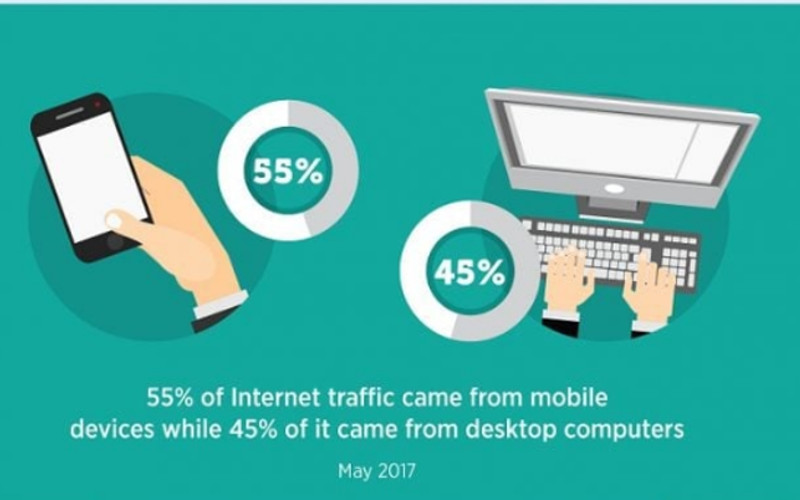
In short, a responsive web design is a set of tools that allow your website to look smart on any modern device. It means that regardless of how big a screen of that device is, your prospective online visitor will have the smooth experience while browsing your website. As this data from the responsive website infographic below demonstrates, the share of the traffic coming from devices other than a desktop computer was already 54% in May 2017. In other words, a number of users of small-screen devices is constantly growing, and responsive web design may be your best business investment this year.
So, if a responsive web design is such a living miracle, why would some website owners neglect the importance of small-screen devices? The most common reasons include:
a website owner does not feel threatened by competitors as (s)he believes that their website has a solid online presence;
a website owner is not competent enough to recognize the benefits of a professional responsive web design website;
a website owner has not had enough time to develop a responsive website design as their website has been recently launched.
If when reading this post, you start wondering how you can get a responsive web design too, then here is great news. There are two ways to make sure that your website follows the latest tendencies in the web design in terms of being responsive. One way is to hire a web agency. The agency can either come up with a mobile-friendly version of your website or develop a mobile app (for more details on the difference between the two options, see the section below).
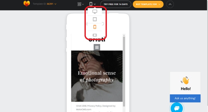
Another way is to opt for website builder templates that are already 100% responsive. This is a perfect way for non-programmers who do not want to bother with details about a responsive web design. Usually, with pre-populated website templates, you can see right away what your future online project will look like on modern devices. To do so, just switch between different modes, i.e. a desktop, a tablet, and a mobile (horizontal and vertical options) in the live demo.
Responsive Web Design vs. Mobile Website vs. Mobile Application: Key Differences
A responsive web design. The top reasons why it has become the top choice for the majority of website owners include the universality, one URL-address, the better SEO potential, and the high manageability.
A mobile website, which is best when it comes to the loading speed and targeting mobile users intensively.
A mobile app. There are lots of benefits of a mobile app, especially in terms of promoting the brand and the safety issues.
Which option to choose depends solely on the type of a website you own. While you are still considering ways to deal with mobile users, have a look at our collection of templates that demonstrate the real beauty of responsive websites.
Best Examples of Responsive Web Design
Arctic Startup Website Template
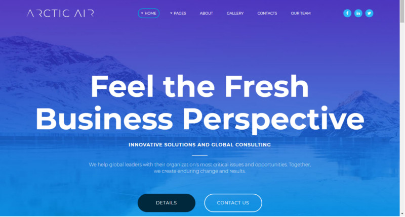
Not only is Arctic Air responsive, but it is also lightning fast. In practice, it means that your prospective visitors will get to enjoy browsing your website from any device. No matter how much heavy data, i.e. videos and/or high-resolution images, you are planning to use on your website, the quality of the data and the loading speed will remain excellent.
Skyline Multipurpose Website Template
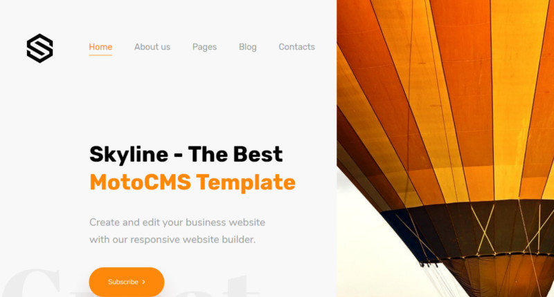
Skyline is the responsive website design that allows you to choose between several child themes. View the live demo to get amazed by the professionally developed Homepages for a dentistry, a house construction company, and a travel agency. On top of that, Skyline contains 15 pages, each aimed at a specific content section of your future website, e.g. Careers, Testimonials, Projects etc.
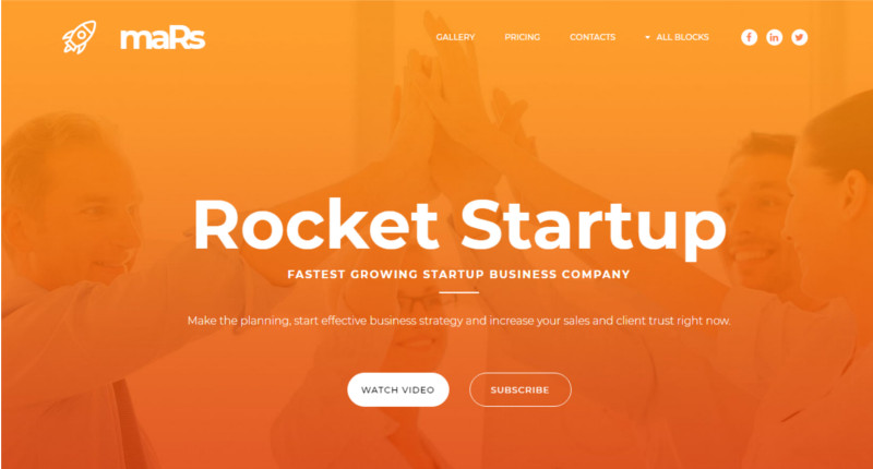
maRs Startup Landing Page Template
The imagery used in maRs is proof that a professional web design can look eye-catching and serious at the same time. The color palette of maRs is dynamic, easy to customize, and can be applied to startups in different market niches. In addition, this template is 100% user-friendly thanks to the intuitive admin panel and the 24/7 tech support available via a mobile or a live chat.
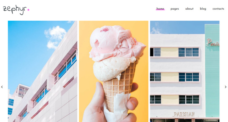
Zephyr Photo Gallery Website Template
Zephyr is your top choice for presenting creative projects online. Feel free to choose between five professionally developed Homepages, add your content, and go online within the shortest terms. As you see in the live demo, even though the imagery plays the key role in this responsive web design, it does not compromise the loading speed
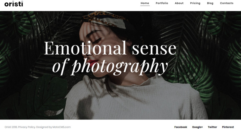
Oristi Photographer Portfolio Website Template
Designed as a responsive personal portfolio for photographers, this template is available for a 14-day free trial. Have a look at gorgeous the pre-populated pages of Oristi that look perfect in different modes, i.e. a desktop, a tablet, and a mobile. Feel free to experiment with the drag-and-drop website creator in this website template to create the unique online project!
To Sum Up
A responsive web design is a universal way to satisfy the demands for the better user experience for small-screen devices. Although a responsive website is not the only way to handle mobiles and tablets (as there are also mobile websites and mobile apps), being responsive considerably increases the chances of your website’s success on the web.
Any professional web designer knows that a responsive web design is a must for modern websites. However, in reality, not all website owners are ready and/or eager to add the responsive mode to their website’ toolkit. “Why neglecting a responsive web design means going downhill?” and “How can your website benefit from small-screen devices?” are the two questions that we want to cover in this post.
What is a Responsive Web Design?
In short, a responsive web design is a set of tools that allow your website to look smart on any modern device. It means that regardless of how big a screen of that device is, your prospective online visitor will have the smooth experience while browsing your website. As this data from the responsive website infographic below demonstrates, the share of the traffic coming from devices other than a desktop computer was already 54% in May 2017. In other words, a number of users of small-screen devices is constantly growing, and responsive web design may be your best business investment this year.
So, if a responsive web design is such a living miracle, why would some website owners neglect the importance of small-screen devices? The most common reasons include:
a website owner does not feel threatened by competitors as (s)he believes that their website has a solid online presence;
a website owner is not competent enough to recognize the benefits of a professional responsive web design website;
a website owner has not had enough time to develop a responsive website design as their website has been recently launched.
If when reading this post, you start wondering how you can get a responsive web design too, then here is great news. There are two ways to make sure that your website follows the latest tendencies in the web design in terms of being responsive. One way is to hire a web agency. The agency can either come up with a mobile-friendly version of your website or develop a mobile app (for more details on the difference between the two options, see the section below).
Another way is to opt for website builder templates that are already 100% responsive. This is a perfect way for non-programmers who do not want to bother with details about a responsive web design. Usually, with pre-populated website templates, you can see right away what your future online project will look like on modern devices. To do so, just switch between different modes, i.e. a desktop, a tablet, and a mobile (horizontal and vertical options) in the live demo.
Responsive Web Design vs. Mobile Website vs. Mobile Application: Key Differences
A responsive web design. The top reasons why it has become the top choice for the majority of website owners include the universality, one URL-address, the better SEO potential, and the high manageability.
A mobile website, which is best when it comes to the loading speed and targeting mobile users intensively.
A mobile app. There are lots of benefits of a mobile app, especially in terms of promoting the brand and the safety issues.
Which option to choose depends solely on the type of a website you own. While you are still considering ways to deal with mobile users, have a look at our collection of templates that demonstrate the real beauty of responsive websites.
Best Examples of Responsive Web Design
Arctic Startup Website Template
Not only is Arctic Air responsive, but it is also lightning fast. In practice, it means that your prospective visitors will get to enjoy browsing your website from any device. No matter how much heavy data, i.e. videos and/or high-resolution images, you are planning to use on your website, the quality of the data and the loading speed will remain excellent.
Skyline Multipurpose Website Template
Skyline is the responsive website design that allows you to choose between several child themes. View the live demo to get amazed by the professionally developed Homepages for a dentistry, a house construction company, and a travel agency. On top of that, Skyline contains 15 pages, each aimed at a specific content section of your future website, e.g. Careers, Testimonials, Projects etc.
maRs Startup Landing Page Template
The imagery used in maRs is proof that a professional web design can look eye-catching and serious at the same time. The color palette of maRs is dynamic, easy to customize, and can be applied to startups in different market niches. In addition, this template is 100% user-friendly thanks to the intuitive admin panel and the 24/7 tech support available via a mobile or a live chat.
Zephyr Photo Gallery Website Template
Zephyr is your top choice for presenting creative projects online. Feel free to choose between five professionally developed Homepages, add your content, and go online within the shortest terms. As you see in the live demo, even though the imagery plays the key role in this responsive web design, it does not compromise the loading speed
Oristi Photographer Portfolio Website Template
Designed as a responsive personal portfolio for photographers, this template is available for a 14-day free trial. Have a look at gorgeous the pre-populated pages of Oristi that look perfect in different modes, i.e. a desktop, a tablet, and a mobile. Feel free to experiment with the drag-and-drop website creator in this website template to create the unique online project!
To Sum Up
A responsive web design is a universal way to satisfy the demands for the better user experience for small-screen devices. Although a responsive website is not the only way to handle mobiles and tablets (as there are also mobile websites and mobile apps), being responsive considerably increases the chances of your website’s success on the web.
Any professional web designer knows that a responsive web design is a must for modern websites. However, in reality, not all website owners are ready and/or eager to add the responsive mode to their website’ toolkit. “Why neglecting a responsive web design means going downhill?” and “How can your website benefit from small-screen devices?” are the two questions that we want to cover in this post.
What is a Responsive Web Design?
In short, a responsive web design is a set of tools that allow your website to look smart on any modern device. It means that regardless of how big a screen of that device is, your prospective online visitor will have the smooth experience while browsing your website. As this data from the responsive website infographic below demonstrates, the share of the traffic coming from devices other than a desktop computer was already 54% in May 2017. In other words, a number of users of small-screen devices is constantly growing, and responsive web design may be your best business investment this year.
So, if a responsive web design is such a living miracle, why would some website owners neglect the importance of small-screen devices? The most common reasons include:
a website owner does not feel threatened by competitors as (s)he believes that their website has a solid online presence;
a website owner is not competent enough to recognize the benefits of a professional responsive web design website;
a website owner has not had enough time to develop a responsive website design as their website has been recently launched.
If when reading this post, you start wondering how you can get a responsive web design too, then here is great news. There are two ways to make sure that your website follows the latest tendencies in the web design in terms of being responsive. One way is to hire a web agency. The agency can either come up with a mobile-friendly version of your website or develop a mobile app (for more details on the difference between the two options, see the section below).
Another way is to opt for website builder templates that are already 100% responsive. This is a perfect way for non-programmers who do not want to bother with details about a responsive web design. Usually, with pre-populated website templates, you can see right away what your future online project will look like on modern devices. To do so, just switch between different modes, i.e. a desktop, a tablet, and a mobile (horizontal and vertical options) in the live demo.
Responsive Web Design vs. Mobile Website vs. Mobile Application: Key Differences
A responsive web design. The top reasons why it has become the top choice for the majority of website owners include the universality, one URL-address, the better SEO potential, and the high manageability.
A mobile website, which is best when it comes to the loading speed and targeting mobile users intensively.
A mobile app. There are lots of benefits of a mobile app, especially in terms of promoting the brand and the safety issues.
Which option to choose depends solely on the type of a website you own. While you are still considering ways to deal with mobile users, have a look at our collection of templates that demonstrate the real beauty of responsive websites.
Best Examples of Responsive Web Design
Arctic Startup Website Template
Not only is Arctic Air responsive, but it is also lightning fast. In practice, it means that your prospective visitors will get to enjoy browsing your website from any device. No matter how much heavy data, i.e. videos and/or high-resolution images, you are planning to use on your website, the quality of the data and the loading speed will remain excellent.
Skyline Multipurpose Website Template
Skyline is the responsive website design that allows you to choose between several child themes. View the live demo to get amazed by the professionally developed Homepages for a dentistry, a house construction company, and a travel agency. On top of that, Skyline contains 15 pages, each aimed at a specific content section of your future website, e.g. Careers, Testimonials, Projects etc.
maRs Startup Landing Page Template
The imagery used in maRs is proof that a professional web design can look eye-catching and serious at the same time. The color palette of maRs is dynamic, easy to customize, and can be applied to startups in different market niches. In addition, this template is 100% user-friendly thanks to the intuitive admin panel and the 24/7 tech support available via a mobile or a live chat.
Zephyr Photo Gallery Website Template
Zephyr is your top choice for presenting creative projects online. Feel free to choose between five professionally developed Homepages, add your content, and go online within the shortest terms. As you see in the live demo, even though the imagery plays the key role in this responsive web design, it does not compromise the loading speed
Oristi Photographer Portfolio Website Template
Designed as a responsive personal portfolio for photographers, this template is available for a 14-day free trial. Have a look at gorgeous the pre-populated pages of Oristi that look perfect in different modes, i.e. a desktop, a tablet, and a mobile. Feel free to experiment with the drag-and-drop website creator in this website template to create the unique online project!
To Sum Up
A responsive web design is a universal way to satisfy the demands for the better user experience for small-screen devices. Although a responsive website is not the only way to handle mobiles and tablets (as there are also mobile websites and mobile apps), being responsive considerably increases the chances of your website’s success on the web.
Any professional web designer knows that a responsive web design is a must for modern websites. However, in reality, not all website owners are ready and/or eager to add the responsive mode to their website’ toolkit. “Why neglecting a responsive web design means going downhill?” and “How can your website benefit from small-screen devices?” are the two questions that we want to cover in this post.
What is a Responsive Web Design?
In short, a responsive web design is a set of tools that allow your website to look smart on any modern device. It means that regardless of how big a screen of that device is, your prospective online visitor will have the smooth experience while browsing your website. As this data from the responsive website infographic below demonstrates, the share of the traffic coming from devices other than a desktop computer was already 54% in May 2017. In other words, a number of users of small-screen devices is constantly growing, and responsive web design may be your best business investment this year.
So, if a responsive web design is such a living miracle, why would some website owners neglect the importance of small-screen devices? The most common reasons include:
a website owner does not feel threatened by competitors as (s)he believes that their website has a solid online presence;
a website owner is not competent enough to recognize the benefits of a professional responsive web design website;
a website owner has not had enough time to develop a responsive website design as their website has been recently launched.
If when reading this post, you start wondering how you can get a responsive web design too, then here is great news. There are two ways to make sure that your website follows the latest tendencies in the web design in terms of being responsive. One way is to hire a web agency. The agency can either come up with a mobile-friendly version of your website or develop a mobile app (for more details on the difference between the two options, see the section below).
Another way is to opt for website builder templates that are already 100% responsive. This is a perfect way for non-programmers who do not want to bother with details about a responsive web design. Usually, with pre-populated website templates, you can see right away what your future online project will look like on modern devices. To do so, just switch between different modes, i.e. a desktop, a tablet, and a mobile (horizontal and vertical options) in the live demo.
Responsive Web Design vs. Mobile Website vs. Mobile Application: Key Differences
A responsive web design. The top reasons why it has become the top choice for the majority of website owners include the universality, one URL-address, the better SEO potential, and the high manageability.
A mobile website, which is best when it comes to the loading speed and targeting mobile users intensively.
A mobile app. There are lots of benefits of a mobile app, especially in terms of promoting the brand and the safety issues.
Which option to choose depends solely on the type of a website you own. While you are still considering ways to deal with mobile users, have a look at our collection of templates that demonstrate the real beauty of responsive websites.
Best Examples of Responsive Web Design
Arctic Startup Website Template
Not only is Arctic Air responsive, but it is also lightning fast. In practice, it means that your prospective visitors will get to enjoy browsing your website from any device. No matter how much heavy data, i.e. videos and/or high-resolution images, you are planning to use on your website, the quality of the data and the loading speed will remain excellent.
Skyline Multipurpose Website Template
Skyline is the responsive website design that allows you to choose between several child themes. View the live demo to get amazed by the professionally developed Homepages for a dentistry, a house construction company, and a travel agency. On top of that, Skyline contains 15 pages, each aimed at a specific content section of your future website, e.g. Careers, Testimonials, Projects etc.
maRs Startup Landing Page Template
The imagery used in maRs is proof that a professional web design can look eye-catching and serious at the same time. The color palette of maRs is dynamic, easy to customize, and can be applied to startups in different market niches. In addition, this template is 100% user-friendly thanks to the intuitive admin panel and the 24/7 tech support available via a mobile or a live chat.
Zephyr Photo Gallery Website Template
Zephyr is your top choice for presenting creative projects online. Feel free to choose between five professionally developed Homepages, add your content, and go online within the shortest terms. As you see in the live demo, even though the imagery plays the key role in this responsive web design, it does not compromise the loading speed
Oristi Photographer Portfolio Website Template
Designed as a responsive personal portfolio for photographers, this template is available for a 14-day free trial. Have a look at gorgeous the pre-populated pages of Oristi that look perfect in different modes, i.e. a desktop, a tablet, and a mobile. Feel free to experiment with the drag-and-drop website creator in this website template to create the unique online project!
To Sum Up
A responsive web design is a universal way to satisfy the demands for the better user experience for small-screen devices. Although a responsive website is not the only way to handle mobiles and tablets (as there are also mobile websites and mobile apps), being responsive considerably increases the chances of your website’s success on the web.
Any professional web designer knows that a responsive web design is a must for modern websites. However, in reality, not all website owners are ready and/or eager to add the responsive mode to their website’ toolkit. “Why neglecting a responsive web design means going downhill?” and “How can your website benefit from small-screen devices?” are the two questions that we want to cover in this post.
What is a Responsive Web Design?
In short, a responsive web design is a set of tools that allow your website to look smart on any modern device. It means that regardless of how big a screen of that device is, your prospective online visitor will have the smooth experience while browsing your website. As this data from the responsive website infographic below demonstrates, the share of the traffic coming from devices other than a desktop computer was already 54% in May 2017. In other words, a number of users of small-screen devices is constantly growing, and responsive web design may be your best business investment this year.
So, if a responsive web design is such a living miracle, why would some website owners neglect the importance of small-screen devices? The most common reasons include:
a website owner does not feel threatened by competitors as (s)he believes that their website has a solid online presence;
a website owner is not competent enough to recognize the benefits of a professional responsive web design website;
a website owner has not had enough time to develop a responsive website design as their website has been recently launched.
If when reading this post, you start wondering how you can get a responsive web design too, then here is great news. There are two ways to make sure that your website follows the latest tendencies in the web design in terms of being responsive. One way is to hire a web agency. The agency can either come up with a mobile-friendly version of your website or develop a mobile app (for more details on the difference between the two options, see the section below).
Another way is to opt for website builder templates that are already 100% responsive. This is a perfect way for non-programmers who do not want to bother with details about a responsive web design. Usually, with pre-populated website templates, you can see right away what your future online project will look like on modern devices. To do so, just switch between different modes, i.e. a desktop, a tablet, and a mobile (horizontal and vertical options) in the live demo.
Responsive Web Design vs. Mobile Website vs. Mobile Application: Key Differences
A responsive web design. The top reasons why it has become the top choice for the majority of website owners include the universality, one URL-address, the better SEO potential, and the high manageability.
A mobile website, which is best when it comes to the loading speed and targeting mobile users intensively.
A mobile app. There are lots of benefits of a mobile app, especially in terms of promoting the brand and the safety issues.
Which option to choose depends solely on the type of a website you own. While you are still considering ways to deal with mobile users, have a look at our collection of templates that demonstrate the real beauty of responsive websites.
Best Examples of Responsive Web Design
Arctic Startup Website Template
Not only is Arctic Air responsive, but it is also lightning fast. In practice, it means that your prospective visitors will get to enjoy browsing your website from any device. No matter how much heavy data, i.e. videos and/or high-resolution images, you are planning to use on your website, the quality of the data and the loading speed will remain excellent.
Skyline Multipurpose Website Template
Skyline is the responsive website design that allows you to choose between several child themes. View the live demo to get amazed by the professionally developed Homepages for a dentistry, a house construction company, and a travel agency. On top of that, Skyline contains 15 pages, each aimed at a specific content section of your future website, e.g. Careers, Testimonials, Projects etc.
maRs Startup Landing Page Template
The imagery used in maRs is proof that a professional web design can look eye-catching and serious at the same time. The color palette of maRs is dynamic, easy to customize, and can be applied to startups in different market niches. In addition, this template is 100% user-friendly thanks to the intuitive admin panel and the 24/7 tech support available via a mobile or a live chat.
Zephyr Photo Gallery Website Template
Zephyr is your top choice for presenting creative projects online. Feel free to choose between five professionally developed Homepages, add your content, and go online within the shortest terms. As you see in the live demo, even though the imagery plays the key role in this responsive web design, it does not compromise the loading speed
Oristi Photographer Portfolio Website Template
Designed as a responsive personal portfolio for photographers, this template is available for a 14-day free trial. Have a look at gorgeous the pre-populated pages of Oristi that look perfect in different modes, i.e. a desktop, a tablet, and a mobile. Feel free to experiment with the drag-and-drop website creator in this website template to create the unique online project!
To Sum Up
A responsive web design is a universal way to satisfy the demands for the better user experience for small-screen devices. Although a responsive website is not the only way to handle mobiles and tablets (as there are also mobile websites and mobile apps), being responsive considerably increases the chances of your website’s success on the web.
Websites
are businesses’ online window to the world. And just like real windows, these
online windows look worn out and rusty with time. Meaning, website redesigning
shouldn’t be a nice-to-have strategy. It should be a necessity.
Even
so, you cannot simply undertake website redesigning just because your
competitor has done so, or just because you feel like it. Given the kind of
money involved, (the average cost of web redesign is
$43,000), a lot of thinking and re-thinking needs to be done before you could go ahead with your website re-designing plans.
According to a Hubspot report, 38% of the companies did
not experience any improvement in their performance after a redesign. Turned
out, the dissatisfaction stemmed from the fact that the re-designing was
undertaken for all the wrong reasons.
So, are you planning to redesign your website
in the future? If so, no matter what, don’t do it for the below-mentioned
reasons.
1. To Add Sparkling New Features
To use a cliche, everything that glitters is not gold. So, if you think those sliders, parallax scrolling, rotating images, scrolling logos and more are a must for your site, think again. Hot new trends keep invading the website landscape every single year. That doesn’t mean every trend is good for your site. For example, sliders are clicked by as few as 1% of visitors. Even with regards to parallax scrolling people may not like to scroll infinitely on a homepage.
To cut to the chase, find out what works for
your audience and stick with it. You could even think of running user tests
through software such as HotJar for existing users and UsabilityHub for new
users, before introducing new features to your website. User tests will help you
decide whether or not a redesign is required.
2. To Make it more SEO-Optimized
Majority
of the time businesses redesign to SEO-optimize their website, which, in turn, helps
draw more traffic to the traffic. Of course, traffic is paramount. However, the
question is: Whether this traffic is getting converted into more subscribers,
leads, and customers?
No
doubt, the launch of a search-optimized website could lead to a good jump in
Google rankings. But according to SEO experts, such jumps are typically
flash-in-the-pan types.
For
your rankings to climb and last longer on Google, the focus should be on
building quality content on a consistent basis.
Search engines love websites that offer fresh content, fresh offers and are
written for people and not for robots.
3. To Make Visitors Stick around your Site Longer
If visitors are finding it hard to stick
around your site, then obviously the first thing that crosses your mind is that
your website design is not good enough.
However, the fact is, just addressing design
issues is just not enough. There could be other problems as well such as navigation,
badly written copy and so on.
Long story short, go back to your Web Design
101 fundamentals to make sure whether you have taken care of the fundamentals
before planning a full-fledged design overhaul. Or, you could even consult top web design companies
to know whether your site needs a redesign or not.
4. To Beat Competitor Hands Down
Tell me one thing: Will you overhaul your wardrobe just because the colleague sitting next to you just did the same. No, right. You have budget constraints and, more importantly, you may not be such a clotheshorse like your colleague.
Likewise, if your competitor is overhauling
their website, doesn’t mean you too follow in their footsteps. Sure, you need
to keep a watch on your competitors. But like a monkey, you don’t mimic
everything that comes your way. The design overhaul may have worked out for
your competitor, but then there’s no surety that it will work for your site as
well.
Simply put, focus on building high-value
content that brings in thousands of leads rather than aping your competitors
blindly without knowing whether it would bring in the desired results or not.
To generate lead-worthy content, you could take help of some top content marketing agencies.
5. To make Website more Product-centric
Are you witnessing slow sales? If yes, the
first thing most businesses undertake is redesigning their product pages.
However, the fact is, most websites are
already product-centric. And, let’s face it, being product-centric doesn’t help
accelerate sales. Rather, the sites should be more customer-centric. The goal
of any website should be to be as customer-friendly as possible by offering
visitors the information they need wherever they are in the customer journey.
It helps to remember, people don’t remember
the content they read on the product pages; however, they do remember the
experience. So, think of delighting your customers rather than focussing on
re-designing your product pages.
6. To Launch PR Campaigns
You have decided to relaunch your website
with sparkling new features and all so that you could be in the public eye. And
so that you could be the talk of the town. So that you could come up with a
press release announcing all the big bang changes you have made to your site.
The fact is, just making your PR factory work
around-the-clock won’t get you the desired results There’s more to an
authoritative website than meets the eye. And it has more to do with creating
valuable content that people love to consume and also transforming yourself
into an educational hub that each one in the industry is interested in to find
information from.
7. To Attract More Leads
If anything, generating leads is also one of
the most important reasons that make businesses think about redesigning every
so often.
However, focussing on generating more and more leads won’t really help convert into sales. Rather focus on generating fewer leads of a higher quality than wasting time on useless ones.
8. For a Complete Business Facelift
More often than not businesses are not happy
with the way things are moving. They wish to re-start from the scratch and work
toward a new beginning.
However, thinking of redesigning the website,
as the first step toward recreating a company, may not bring you the desired
results. In other words, outside appearances only matter so much. You may need
to work on the inside as well to get the desired results. In other words, you
may have to re-visit your values, company culture, vision, mission and so on
rather than giving your website a facelift.
Putting it all together
There you are! 8 nonsensical reasons for getting
your website
designed. And, believe me, whether these reasons seem sensible to
you or not, businesses do undertake web redesigning for the above-mentioned
reasons. So, if you intend to redesign your website, go beyond looks and see
how it works as well. And, more than anything else focus on creating valuable
content for each buyer persona.
Websites
are businesses’ online window to the world. And just like real windows, these
online windows look worn out and rusty with time. Meaning, website redesigning
shouldn’t be a nice-to-have strategy. It should be a necessity.
Even
so, you cannot simply undertake website redesigning just because your
competitor has done so, or just because you feel like it. Given the kind of
money involved, (the average cost of web redesign is
$43,000), a lot of thinking and re-thinking needs to be done before you could go ahead with your website re-designing plans.
According to a Hubspot report, 38% of the companies did
not experience any improvement in their performance after a redesign. Turned
out, the dissatisfaction stemmed from the fact that the re-designing was
undertaken for all the wrong reasons.
So, are you planning to redesign your website
in the future? If so, no matter what, don’t do it for the below-mentioned
reasons.
1. To Add Sparkling New Features
To use a cliche, everything that glitters is not gold. So, if you think those sliders, parallax scrolling, rotating images, scrolling logos and more are a must for your site, think again. Hot new trends keep invading the website landscape every single year. That doesn’t mean every trend is good for your site. For example, sliders are clicked by as few as 1% of visitors. Even with regards to parallax scrolling people may not like to scroll infinitely on a homepage.
To cut to the chase, find out what works for
your audience and stick with it. You could even think of running user tests
through software such as HotJar for existing users and UsabilityHub for new
users, before introducing new features to your website. User tests will help you
decide whether or not a redesign is required.
2. To Make it more SEO-Optimized
Majority
of the time businesses redesign to SEO-optimize their website, which, in turn, helps
draw more traffic to the traffic. Of course, traffic is paramount. However, the
question is: Whether this traffic is getting converted into more subscribers,
leads, and customers?
No
doubt, the launch of a search-optimized website could lead to a good jump in
Google rankings. But according to SEO experts, such jumps are typically
flash-in-the-pan types.
For
your rankings to climb and last longer on Google, the focus should be on
building quality content on a consistent basis.
Search engines love websites that offer fresh content, fresh offers and are
written for people and not for robots.
3. To Make Visitors Stick around your Site Longer
If visitors are finding it hard to stick
around your site, then obviously the first thing that crosses your mind is that
your website design is not good enough.
However, the fact is, just addressing design
issues is just not enough. There could be other problems as well such as navigation,
badly written copy and so on.
Long story short, go back to your Web Design
101 fundamentals to make sure whether you have taken care of the fundamentals
before planning a full-fledged design overhaul. Or, you could even consult top web design companies
to know whether your site needs a redesign or not.
4. To Beat Competitor Hands Down
Tell me one thing: Will you overhaul your wardrobe just because the colleague sitting next to you just did the same. No, right. You have budget constraints and, more importantly, you may not be such a clotheshorse like your colleague.
Likewise, if your competitor is overhauling
their website, doesn’t mean you too follow in their footsteps. Sure, you need
to keep a watch on your competitors. But like a monkey, you don’t mimic
everything that comes your way. The design overhaul may have worked out for
your competitor, but then there’s no surety that it will work for your site as
well.
Simply put, focus on building high-value
content that brings in thousands of leads rather than aping your competitors
blindly without knowing whether it would bring in the desired results or not.
To generate lead-worthy content, you could take help of some top content marketing agencies.
5. To make Website more Product-centric
Are you witnessing slow sales? If yes, the
first thing most businesses undertake is redesigning their product pages.
However, the fact is, most websites are
already product-centric. And, let’s face it, being product-centric doesn’t help
accelerate sales. Rather, the sites should be more customer-centric. The goal
of any website should be to be as customer-friendly as possible by offering
visitors the information they need wherever they are in the customer journey.
It helps to remember, people don’t remember
the content they read on the product pages; however, they do remember the
experience. So, think of delighting your customers rather than focussing on
re-designing your product pages.
6. To Launch PR Campaigns
You have decided to relaunch your website
with sparkling new features and all so that you could be in the public eye. And
so that you could be the talk of the town. So that you could come up with a
press release announcing all the big bang changes you have made to your site.
The fact is, just making your PR factory work
around-the-clock won’t get you the desired results There’s more to an
authoritative website than meets the eye. And it has more to do with creating
valuable content that people love to consume and also transforming yourself
into an educational hub that each one in the industry is interested in to find
information from.
7. To Attract More Leads
If anything, generating leads is also one of
the most important reasons that make businesses think about redesigning every
so often.
However, focussing on generating more and more leads won’t really help convert into sales. Rather focus on generating fewer leads of a higher quality than wasting time on useless ones.
8. For a Complete Business Facelift
More often than not businesses are not happy
with the way things are moving. They wish to re-start from the scratch and work
toward a new beginning.
However, thinking of redesigning the website,
as the first step toward recreating a company, may not bring you the desired
results. In other words, outside appearances only matter so much. You may need
to work on the inside as well to get the desired results. In other words, you
may have to re-visit your values, company culture, vision, mission and so on
rather than giving your website a facelift.
Putting it all together
There you are! 8 nonsensical reasons for getting
your website
designed. And, believe me, whether these reasons seem sensible to
you or not, businesses do undertake web redesigning for the above-mentioned
reasons. So, if you intend to redesign your website, go beyond looks and see
how it works as well. And, more than anything else focus on creating valuable
content for each buyer persona.
Websites
are businesses’ online window to the world. And just like real windows, these
online windows look worn out and rusty with time. Meaning, website redesigning
shouldn’t be a nice-to-have strategy. It should be a necessity.
Even
so, you cannot simply undertake website redesigning just because your
competitor has done so, or just because you feel like it. Given the kind of
money involved, (the average cost of web redesign is
$43,000), a lot of thinking and re-thinking needs to be done before you could go ahead with your website re-designing plans.
According to a Hubspot report, 38% of the companies did
not experience any improvement in their performance after a redesign. Turned
out, the dissatisfaction stemmed from the fact that the re-designing was
undertaken for all the wrong reasons.
So, are you planning to redesign your website
in the future? If so, no matter what, don’t do it for the below-mentioned
reasons.
1. To Add Sparkling New Features
To use a cliche, everything that glitters is not gold. So, if you think those sliders, parallax scrolling, rotating images, scrolling logos and more are a must for your site, think again. Hot new trends keep invading the website landscape every single year. That doesn’t mean every trend is good for your site. For example, sliders are clicked by as few as 1% of visitors. Even with regards to parallax scrolling people may not like to scroll infinitely on a homepage.
To cut to the chase, find out what works for
your audience and stick with it. You could even think of running user tests
through software such as HotJar for existing users and UsabilityHub for new
users, before introducing new features to your website. User tests will help you
decide whether or not a redesign is required.
2. To Make it more SEO-Optimized
Majority
of the time businesses redesign to SEO-optimize their website, which, in turn, helps
draw more traffic to the traffic. Of course, traffic is paramount. However, the
question is: Whether this traffic is getting converted into more subscribers,
leads, and customers?
No
doubt, the launch of a search-optimized website could lead to a good jump in
Google rankings. But according to SEO experts, such jumps are typically
flash-in-the-pan types.
For
your rankings to climb and last longer on Google, the focus should be on
building quality content on a consistent basis.
Search engines love websites that offer fresh content, fresh offers and are
written for people and not for robots.
3. To Make Visitors Stick around your Site Longer
If visitors are finding it hard to stick
around your site, then obviously the first thing that crosses your mind is that
your website design is not good enough.
However, the fact is, just addressing design
issues is just not enough. There could be other problems as well such as navigation,
badly written copy and so on.
Long story short, go back to your Web Design
101 fundamentals to make sure whether you have taken care of the fundamentals
before planning a full-fledged design overhaul. Or, you could even consult top web design companies
to know whether your site needs a redesign or not.
4. To Beat Competitor Hands Down
Tell me one thing: Will you overhaul your wardrobe just because the colleague sitting next to you just did the same. No, right. You have budget constraints and, more importantly, you may not be such a clotheshorse like your colleague.
Likewise, if your competitor is overhauling
their website, doesn’t mean you too follow in their footsteps. Sure, you need
to keep a watch on your competitors. But like a monkey, you don’t mimic
everything that comes your way. The design overhaul may have worked out for
your competitor, but then there’s no surety that it will work for your site as
well.
Simply put, focus on building high-value
content that brings in thousands of leads rather than aping your competitors
blindly without knowing whether it would bring in the desired results or not.
To generate lead-worthy content, you could take help of some top content marketing agencies.
5. To make Website more Product-centric
Are you witnessing slow sales? If yes, the
first thing most businesses undertake is redesigning their product pages.
However, the fact is, most websites are
already product-centric. And, let’s face it, being product-centric doesn’t help
accelerate sales. Rather, the sites should be more customer-centric. The goal
of any website should be to be as customer-friendly as possible by offering
visitors the information they need wherever they are in the customer journey.
It helps to remember, people don’t remember
the content they read on the product pages; however, they do remember the
experience. So, think of delighting your customers rather than focussing on
re-designing your product pages.
6. To Launch PR Campaigns
You have decided to relaunch your website
with sparkling new features and all so that you could be in the public eye. And
so that you could be the talk of the town. So that you could come up with a
press release announcing all the big bang changes you have made to your site.
The fact is, just making your PR factory work
around-the-clock won’t get you the desired results There’s more to an
authoritative website than meets the eye. And it has more to do with creating
valuable content that people love to consume and also transforming yourself
into an educational hub that each one in the industry is interested in to find
information from.
7. To Attract More Leads
If anything, generating leads is also one of
the most important reasons that make businesses think about redesigning every
so often.
However, focussing on generating more and more leads won’t really help convert into sales. Rather focus on generating fewer leads of a higher quality than wasting time on useless ones.
8. For a Complete Business Facelift
More often than not businesses are not happy
with the way things are moving. They wish to re-start from the scratch and work
toward a new beginning.
However, thinking of redesigning the website,
as the first step toward recreating a company, may not bring you the desired
results. In other words, outside appearances only matter so much. You may need
to work on the inside as well to get the desired results. In other words, you
may have to re-visit your values, company culture, vision, mission and so on
rather than giving your website a facelift.
Putting it all together
There you are! 8 nonsensical reasons for getting
your website
designed. And, believe me, whether these reasons seem sensible to
you or not, businesses do undertake web redesigning for the above-mentioned
reasons. So, if you intend to redesign your website, go beyond looks and see
how it works as well. And, more than anything else focus on creating valuable
content for each buyer persona.
Agregator najlepszych postów o designie, webdesignie, cssie i Internecie