5 Ways You can Use Pre-Built Websites to Improve Your Designs – Instantly

Post pobrano z: 5 Ways You can Use Pre-Built Websites to Improve Your Designs – Instantly

It’s a good feeling when a client is satisfied with your work. But there are times when you think that the client is just being nice. Perhaps, he or she doesn’t know the difference between a high-quality deliverable and a poor one.

You’d like the chance for a do-over, but it’s too late. The deadline was the priority item. Your problem might simply be that you’re more than capable of doing excellent work. But you aren’t always given the time to do so.

We’ve put together a checklist to help you improve your designs and quickly. You can do so by using pre-built websites. See for yourself how it can work for you.

Introducing Pre-built Websites & Their Number One Provider

Maybe pre-built websites aren’t for you because you prefer to do your own designs. That would make sense if they weren’t customizable. Also, if they didn’t keep pace with the latest trends or adhere to industry standards. Or, if they were nothing more than static yet attractive images.

If that were the case, all websites created using these design aides would be almost the same. Be Theme’s websites do oh so much more for you. They give you a solid base to build your designs on and they help you improve the quality of your designs.

BeTheme has more than 390 of them and counting; and all for a one-time fee of $59.

They’re nicely organized by industry, business niche, and content type.  The library is constantly increasing in size to keep abreast of the latest design trends.

Checklist: 5 Ways Pre-Built Websites Can Enrich Your Designs

1. Am I in sync with this specific industry’s trends?

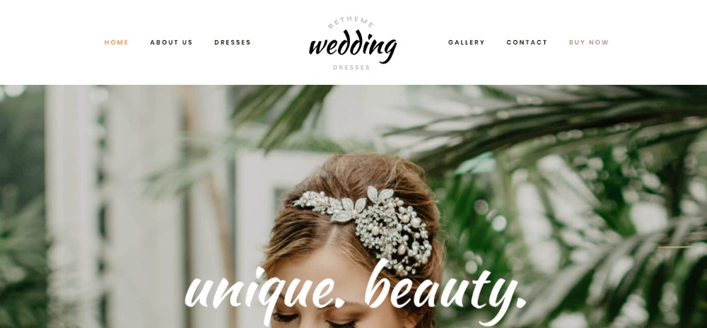
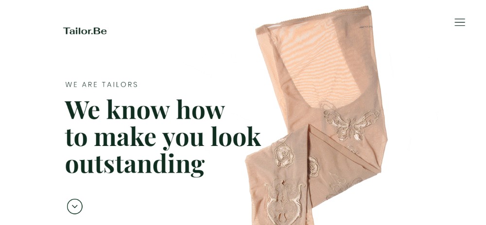
The fashion industry is an excellent example of how design trends can change. Luxurious images, rich textures, and colors were always a must-use here. In addition, closely-spaced bold visuals have been the norm forever. Suddenly in 2018, fashion sites have taken on a minimalist look. Bold visuals have been replaced with simple black and white sketches. Generous use of white space is the rule.

As you can see from the following examples, Be Theme has more than kept up with these changes.
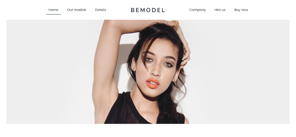
BeModel2

BeWeddingDresses

BeTailor2

2. How can I make sure I know what NEEDS to be on the Homepage?

This is always a tough one for designers. Not getting it right can make your best efforts less effective. They can get in effective enough to break your design and by extension your website. Trying to find the right mix of art and science when creating a design isn’t easy. You could wave a magic wand, but they’re in awfully short supply.

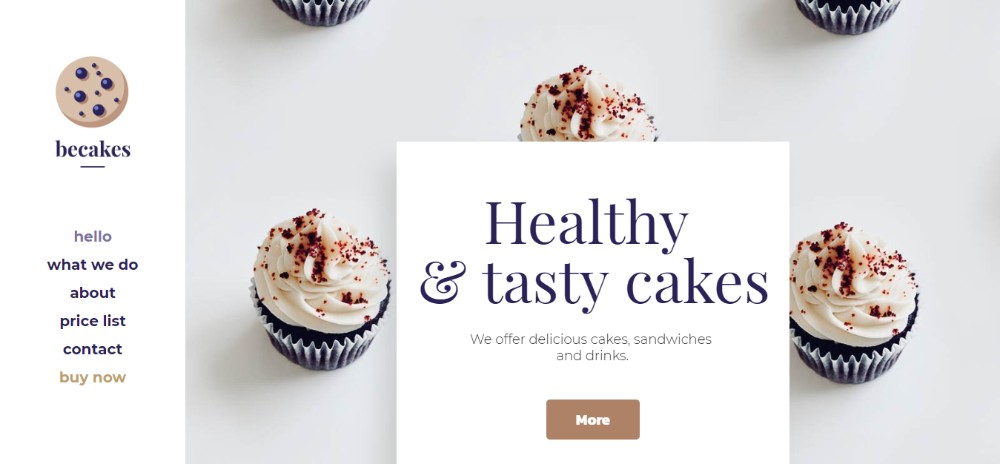
What you can do, is use a pre-built website to help your design effort along. You’ll have no trouble creating a tried and tested homepage designed to capture and engage users.

The secret? A structure that fits the industry, which is what users are looking for.
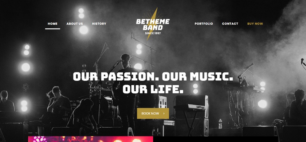
BeBand3

BeGunRange

BeCakes

3. Should I Follow or Disrupt?

If you’re a man (or a woman) of action, you probably don’t cast yourself as a follower. In fact, risk-taking definitely has its rewards. There is just one problem with creating a disruptive (read “super innovative”) design. It is that there’s a set of clients it won’t play well with. This is a rather large set that includes corporations and large businesses. So is any small business that prefers to go with a safe or conservative marketing approach.

Pre-built websites give you a stable design base that will please almost any client. You can customize it with your own creative touch – as much as you like or dare.
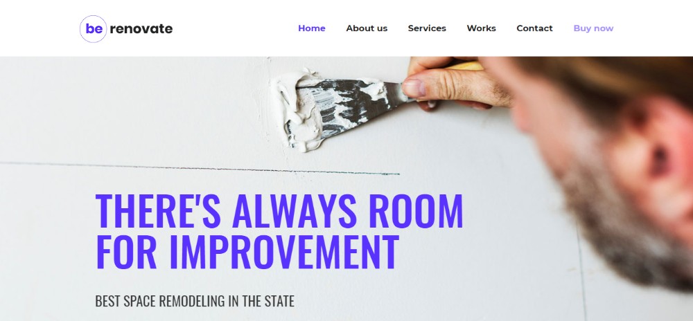
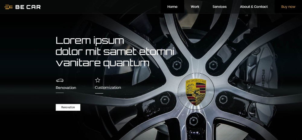
BeRenovate3

BeCar2

BeSpa3

4. Which of these 5 different ideas goes best with this project?

Having 5 great ideas might seem to be a good problem to have, but it’s not. Noone likes to discard a great idea. After all, would you ever get a chance to use it in the future?

So, you try to incorporate two or more great ideas into your design and you end up with an unholy mess. It happens almost every time.

A better approach:

  • Browse our comprehensive catalog of pre-built websites.
  • Search by content or industry type.
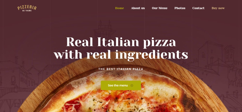
  • Pick a template that matches your design and/or your client’s needs.
  • Having done so, customize.

Do that, and you’re on the way to implement your creative vision on a tried and proven structure.
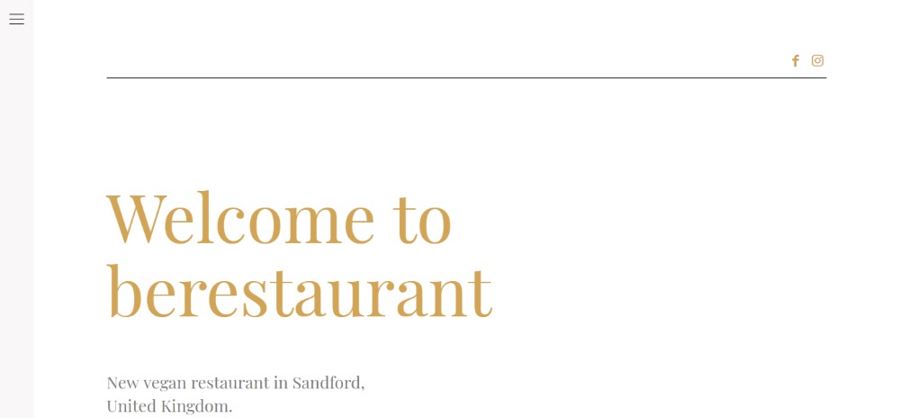
BeRestaurant3

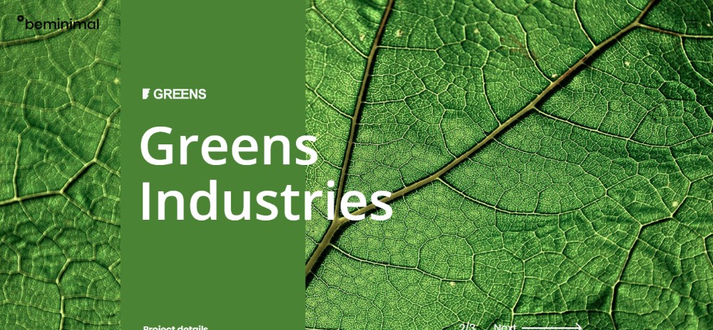
BeMinimal2

BePizza3

5. Is the client right or should I stick to my ideas?

Clients who don’t know quite what they want or need can at times be difficult to work with. Clients who use the “expert” argument to get what they want can be even more so. They may be 100% right because they know their business. They also know best how to market their product or service.

Or, they might not be. Anyway, a pre-built website that addresses your client’s industry is a sound option. By doing so, you’ll be in sync with the client who knows the business inside out. You’ll beable to convince uncertain clients that you’ve placed them on the right path.
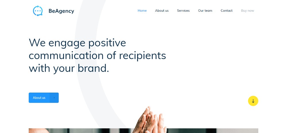
BeAgency3

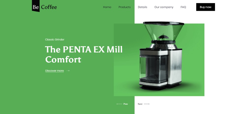
BeCoffee3

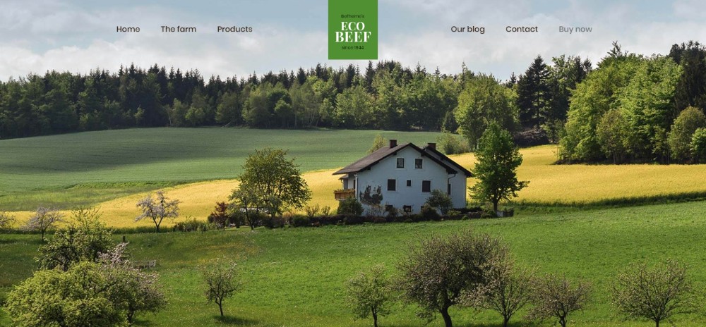
BeEcoBeef

Conclusion

Pre-built websites put you on the right track to improve your designs; from the get-go. They help you stay in sync with the latest design trends and industry website standards. And they help you deliver products that offer a pleasing UX; every time.

These cool design tools help you choose the best idea for a design.  This is because of what they present. In addition, you can customize them to incorporate your ideas. They also help you deal with clients who can’t make up their minds or have made them up prematurely.

You want to deliver high-quality work every time. Otherwise, you wouldn’t be in this business. Why not give pre-built websites a try? 390+ of them are yours for only $59.

4 Ways a Poor Web Design Can Hurt Your Business

Post pobrano z: 4 Ways a Poor Web Design Can Hurt Your Business

In this day and age, every business has a website that it
uses to enable it to sell products or services to customers in different
places. The problem is that most businesses rush into creating websites without
paying attention to various elements of web design. As a matter of fact, a
website is not one of those things that you invest in just for the sake of
flowing with the trend. It’s better to continue doing your business offline
than to have a website that doesn’t increase conversions. In fact, such a website
is a waste of time and resources. Here is a list of how a poorly designed
website can drag down your enterprise.

1. Increased Bounce
Rate

This one goes without saying. When your website has a poor
design, it becomes difficult for visitors to navigate through the various tabs.
Besides that, it loads at a speed of a snail. Such poor user experience causes
visitors to leave your portal without buying anything. Keep in mind that
internet users, especially the millennials are very mean with their time. They
actually prefer websites that load at lightning speeds because they usually
have busy schedules either at work or in school. If your website takes ages to
load, you will definitely lose customers to your competitors that have websites
that load at a much faster speed. If you want o experience an improvement in
conversions, you must work on the speed of your website and make it more user
friendly.

2. Poor Search Engine
Ranking

The websites that appear in the first pages of search engineresults usually contain content that has been optimized for SEO (Search EngineOptimization).This means that such content has phrases that are commonly usedby people while looking for information on the internet. Content that is highlyoptimized increases the visibility of your business. Lest you forget, customerstrust brands that appear in the first pages of search results. If your websiteis not optimized for SEO, it’s hard for your brand to be noticed, consideringthat a single search has millions of answers. This is because it will appear inthe last pages of search engine results. Most customers don’t bother to checkanything that’s beyond the first two pages. You must therefore hire a website design company that willoptimize the content that’s on your portal.

3. Device
Incompatibility

A few decades a go, people could only browse the internet
using a computer. Those who didn’t own a computer had to go to the nearest
cyber café. Things have now changed. Smartphones have made it easier for
everyone to access the internet. The good thing is that mobile devices enable
people to browse from anywhere even while on the go. In fact, there are very
few people that access the internet via computers. This means that businesses
have to create websites that are optimized for mobile devices. If your website
can’t be navigated using a mobile device, you will definitely experience a
decline in conversions.

4. Customers Lose
Confidence in your  Brand

When the content on your website is not of high quality,
your business will rank poorly in the search engines. This is because search
engines consider the quality of content before allocating any spot position to
a website. Even if you use paid ads to drive traffic to your website, customers
will not have the confidence of buying anything from your business when they
find content that’s not based on true facts. High quality content will actually
continue to generate traffic for your business even while you sleep. This is
due to the fact that people will first see your website when they search for
information.

4 Ways a Poor Web Design Can Hurt Your Business

Post pobrano z: 4 Ways a Poor Web Design Can Hurt Your Business

In this day and age, every business has a website that it
uses to enable it to sell products or services to customers in different
places. The problem is that most businesses rush into creating websites without
paying attention to various elements of web design. As a matter of fact, a
website is not one of those things that you invest in just for the sake of
flowing with the trend. It’s better to continue doing your business offline
than to have a website that doesn’t increase conversions. In fact, such a website
is a waste of time and resources. Here is a list of how a poorly designed
website can drag down your enterprise.

1. Increased Bounce
Rate

This one goes without saying. When your website has a poor
design, it becomes difficult for visitors to navigate through the various tabs.
Besides that, it loads at a speed of a snail. Such poor user experience causes
visitors to leave your portal without buying anything. Keep in mind that
internet users, especially the millennials are very mean with their time. They
actually prefer websites that load at lightning speeds because they usually
have busy schedules either at work or in school. If your website takes ages to
load, you will definitely lose customers to your competitors that have websites
that load at a much faster speed. If you want o experience an improvement in
conversions, you must work on the speed of your website and make it more user
friendly.

2. Poor Search Engine
Ranking

The websites that appear in the first pages of search engineresults usually contain content that has been optimized for SEO (Search EngineOptimization).This means that such content has phrases that are commonly usedby people while looking for information on the internet. Content that is highlyoptimized increases the visibility of your business. Lest you forget, customerstrust brands that appear in the first pages of search results. If your websiteis not optimized for SEO, it’s hard for your brand to be noticed, consideringthat a single search has millions of answers. This is because it will appear inthe last pages of search engine results. Most customers don’t bother to checkanything that’s beyond the first two pages. You must therefore hire a website design company that willoptimize the content that’s on your portal.

3. Device
Incompatibility

A few decades a go, people could only browse the internet
using a computer. Those who didn’t own a computer had to go to the nearest
cyber café. Things have now changed. Smartphones have made it easier for
everyone to access the internet. The good thing is that mobile devices enable
people to browse from anywhere even while on the go. In fact, there are very
few people that access the internet via computers. This means that businesses
have to create websites that are optimized for mobile devices. If your website
can’t be navigated using a mobile device, you will definitely experience a
decline in conversions.

4. Customers Lose
Confidence in your  Brand

When the content on your website is not of high quality,
your business will rank poorly in the search engines. This is because search
engines consider the quality of content before allocating any spot position to
a website. Even if you use paid ads to drive traffic to your website, customers
will not have the confidence of buying anything from your business when they
find content that’s not based on true facts. High quality content will actually
continue to generate traffic for your business even while you sleep. This is
due to the fact that people will first see your website when they search for
information.

Mastering Small Details in Branding Projects

Post pobrano z: Mastering Small Details in Branding Projects

We all know this piece of popular wisdom: “The devil is in the details”. Designers all know how true it is. Obviously, a poorly designed project will not be saved by thoughtfully designed details, but a well-designed project can be ruined by overlooked details.

This is particularly true for branding projects, that’s the reason why we have to hire a professional brand design agency for important projects. This kind of agency knows the importance of consistency and carefulness in branding design.

Don’t go wild in your font choice

Ask any graphic designer, he will tell you that typography is crucial to any good printed design. This also goes for digital projects, of course.

When you choose the typefaces that you will use in your branding project, make sure that you don’t go over two fonts, maximum three. You can make some tests to see how well they match, then stick to it. Having different fonts on packages than on your letterheads or banners is out of question.

Remember, your clients should be able to recognize your brand at first look, even if your design is in black-and-white.

Stay consistent with colors

The advice given above about font use can also apply to colors. Yes, you can use crazy and bold colors, but you should use it consistently and make sure you stay recognizable.

Clients associate a brand with colors. To be more accurate, they associate a brand with a color AND a color scheme. This means that you should be careful when adding new colors to your branding’s color scheme, as it can have a big impact on the brand.

Stick to your narrative

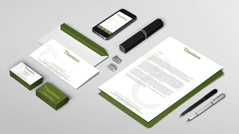
Your brand tells a story that your clients and prospects should instantly understand by the messages you are sending them. For example, nothing says environment-friendly like craft or recycled paper.

Each choice you are making, whether it’s the way you package your product or the medium chosen communicate, should follow that narrative and assure your clients of your branding.

Mastering Small Details in Branding Projects

Post pobrano z: Mastering Small Details in Branding Projects

We all know this piece of popular wisdom: “The devil is in the details”. Designers all know how true it is. Obviously, a poorly designed project will not be saved by thoughtfully designed details, but a well-designed project can be ruined by overlooked details.

This is particularly true for branding projects, that’s the reason why we have to hire a professional brand design agency for important projects. This kind of agency knows the importance of consistency and carefulness in branding design.

Don’t go wild in your font choice

Ask any graphic designer, he will tell you that typography is crucial to any good printed design. This also goes for digital projects, of course.

When you choose the typefaces that you will use in your branding project, make sure that you don’t go over two fonts, maximum three. You can make some tests to see how well they match, then stick to it. Having different fonts on packages than on your letterheads or banners is out of question.

Remember, your clients should be able to recognize your brand at first look, even if your design is in black-and-white.

Stay consistent with colors

The advice given above about font use can also apply to colors. Yes, you can use crazy and bold colors, but you should use it consistently and make sure you stay recognizable.

Clients associate a brand with colors. To be more accurate, they associate a brand with a color AND a color scheme. This means that you should be careful when adding new colors to your branding’s color scheme, as it can have a big impact on the brand.

Stick to your narrative

Your brand tells a story that your clients and prospects should instantly understand by the messages you are sending them. For example, nothing says environment-friendly like craft or recycled paper.

Each choice you are making, whether it’s the way you package your product or the medium chosen communicate, should follow that narrative and assure your clients of your branding.

Scaling CSS: Two Sides of a Spectrum

Post pobrano z: Scaling CSS: Two Sides of a Spectrum

The subject of scaling CSS came up a lot in a recent ShopTalk Show with Ben Frain. Ben has put a lot of thought into the subject, even writing a complete book on it, Enduring CSS, which is centered around a whole ECSS methodology.

He talked about how there are essentially two solutions for styling at scale:

  1. Total isolation
  2. Total abstraction

Total isolation is some version of writing styles scoped to some boundary that you’ve set up (like a component) in which those styles don’t leak in or out.

Total abstraction is some version of writing styles that are global, yet so generic and re-usable, that they have no unintended side effects.

Total isolation might come from <style scoped> in a .vue file, CSS modules in which CSS class selectors and HTML class attributes are dynamically generated gibberish, or a CSS-in-JS project, like glamerous. Even strictly-followed naming conventions like BEM can be a form of total isolation.

Total abstraction might come from a project, like Tachyons, that gives you a fixed set of class names to use for styling (Tailwind is like a configurable version of that), or a programmatic tool (like Atomizer) that turns specially named HTML class attributes into a stylesheet with exactly what it needs.

It’s the middle ground that has problems. It’s using a naming methodology, but not holding strictly to it. It’s using some styles in components, but also having a global stylesheet that does random other things. Or, it’s having lots of developers contributing to a styling system that has no strict rules and mixes global and scoped styles. Any stylesheet that grows and grows and grows. Fighting it by removing some unused styles isn’t a real solution (and here’s why).

Note that the web is a big place and not all projects need a scaling solution. A huge codebase with hundreds of developers that needs to be maintained for decades absolutely does. My personal site does not. I’ve had my fair share of styling problems, but I’ve never been so crippled by them that I’ve needed to implement something as strict as Atomic CSS (et al.) to get work done. Nor at at any job I’ve had so far. I see the benefits though.

Imagine the scale of Twitter.com over a decade! Nicolas has a great thread where he compares Twitter’s PWA against Twitter’s legacy desktop website.

The legacy site’s CSS is what happens when hundreds of people directly write CSS over many years. Specificity wars, redundancy, a house of cards that can’t be fixed. The result is extremely inefficient and error-prone styling that punishes users and developers alike.

The post Scaling CSS: Two Sides of a Spectrum appeared first on CSS-Tricks.

GraphQL is Everywhere!

Post pobrano z: GraphQL is Everywhere!

I find GraphQL extremely fun and empowering tech to work with, even as a novice just getting started. You’ve probably heard the elevator pitch before: it allows you to ask for exactly the data you need whenever you need it (probably at the component level), and it arrives as lovely JSON data for your usage.

I see it used as part of modern website builds all the dang time. The overall vibe is, „I want to do whatever I want on the front end, and that actually allows for more back-end choices as well.” And by „whatever” on the front end, that generally means a fancy SPA-ish JavaScript-powered thing or a static-site generator-ish thing.

Here’s a quick smattering of articles that are everywhere these days. Instead of the actual article titles, I’ll rename with the stack parts.

GraphQL is certainly in the new-and-hip category, but as ever, everything old is new again. Check out Query by Example, a language from the 1970’s:

.....Name: Bob
..Address:
.....City:
....State: TX
..Zipcode:

Resulting SQL:

SELECT * FROM Contacts WHERE Name='Bob' AND State='TX';

The post GraphQL is Everywhere! appeared first on CSS-Tricks.

GraphQL is Everywhere!

Post pobrano z: GraphQL is Everywhere!

I find GraphQL extremely fun and empowering tech to work with, even as a novice just getting started. You’ve probably heard the elevator pitch before: it allows you to ask for exactly the data you need whenever you need it (probably at the component level), and it arrives as lovely JSON data for your usage.

I see it used as part of modern website builds all the dang time. The overall vibe is, „I want to do whatever I want on the front end, and that actually allows for more back-end choices as well.” And by „whatever” on the front end, that generally means a fancy SPA-ish JavaScript-powered thing or a static-site generator-ish thing.

Here’s a quick smattering of articles that are everywhere these days. Instead of the actual article titles, I’ll rename with the stack parts.

GraphQL is certainly in the new-and-hip category, but as ever, everything old is new again. Check out Query by Example, a language from the 1970’s:

.....Name: Bob
..Address:
.....City:
....State: TX
..Zipcode:

Resulting SQL:

SELECT * FROM Contacts WHERE Name='Bob' AND State='TX';

The post GraphQL is Everywhere! appeared first on CSS-Tricks.

An Overview of Render Props in React

Post pobrano z: An Overview of Render Props in React

An Overview of Render Props in React

Using render props in React is a technique for efficiently re-using code. According to the React documentation, „a component with a render prop takes a function that returns a React element and calls it instead of implementing its own render logic.” To understand what that means, let’s take a look at the render props pattern and then apply it to a couple of light examples.

The render props pattern

In working with render props, you pass a render function to a component that, in turn, returns a React element. This render function is defined by another component, and the receiving component shares what is passed through the render function.

This is what this looks like:

class BaseComponent extends Component {
  render() {
    return <Fragment>{this.props.render()}</Fragment>;
  }
}

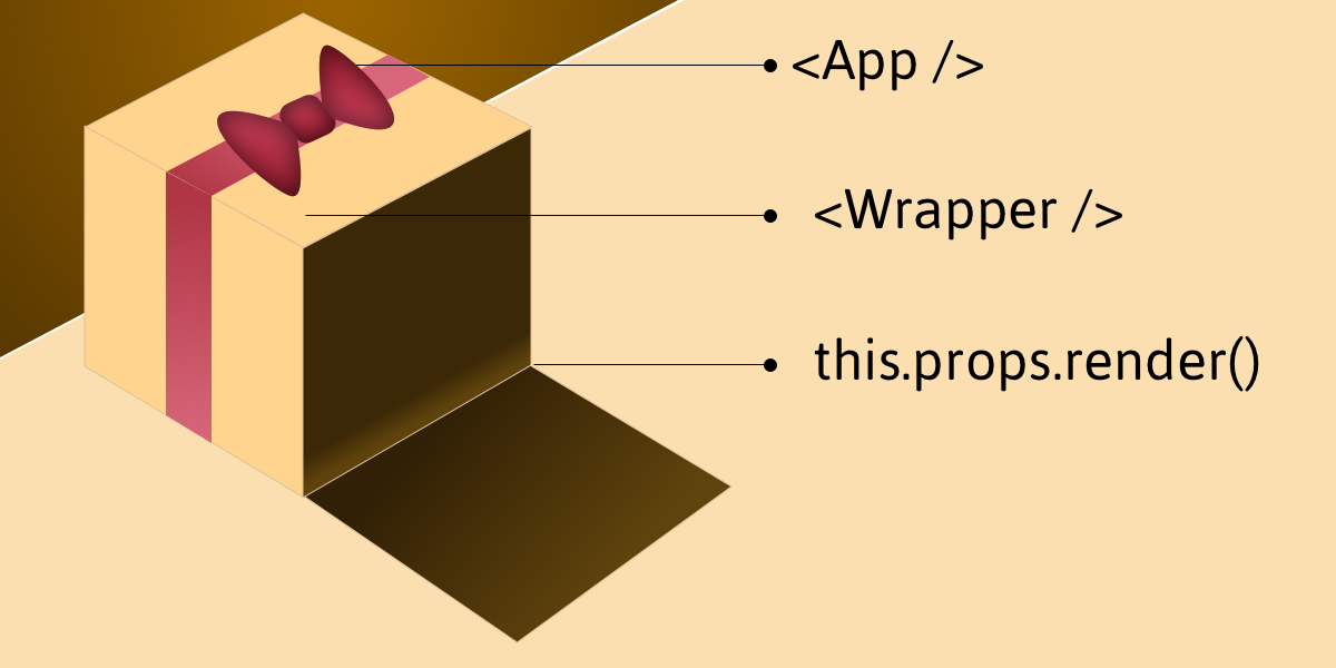
Imagine, if you will, that our App is a gift box where App itself is the bow on top. If the box is the component we are creating and we open it, we’ll expose the props, states, functions and methods needed to make the component work once it’s called by render().

The render function of a component normally has all the JSX and such that form the DOM for that component. Instead, this component has a render function, this.props.render(), that will display a component that gets passed in via props.

Example: Creating a counter

See the Pen React Render Props by Kingsley Silas Chijioke (@kinsomicrote) on CodePen.

Let’s make a simple counter example that increases and decreases a value depending on the button that is clicked.

First, we start by creating a component that will be used to wrap the initial state, methods and rendering. Creatively, we’ll call this Wrapper:

class Wrapper extends Component {
  state = {
    count: 0
  };

  // Increase count
  increment = () => {
    const { count } = this.state;
    return this.setState({ count: count + 1 });
  };

  // Decrease count
  decrement = () => {
    const { count } = this.state;
    return this.setState({ count: count - 1 });
  };

  render() {
    const { count } = this.state;

    return (
      <div>
        {this.props.render({
          increment: this.increment,
          decrement: this.decrement,
          count: count
        })}
      </div>
    );
  }
}

In the Wrapper component, we specify the methods and state what gets exposed to the wrapped component. For this example, we need the increment and decrement methods. We have our default count set as 0. The logic is to either increment or decrement count depending on the method that is triggered, starting with a zero value.

If you take a look at the return() method, you’ll see that we are making use of this.props.render(). It is through this function that we pass methods and state from the Wrapper component so that the component that is being wrapped by it will make use of it.

To use it for our App component, the component will look like this:

class App extends React.Component {
  render() {
    return (
      <Wrapper
        render={({ increment, decrement, count }) => (
          <div>
            <div>
              <h3>Render Props Counter</h3>
            </div>
            <div>
              <p>{count}</p>
              <button onClick={() => increment()}>Increment</button>
              <button onClick={() => decrement()}>Decrement</button>
            </div>
          </div>
        )}
      />
    );
  }
}

Example: Creating a data list

The gain lies in the reusable power of render props, let’s create a component that can be used to handle a list of data which is obtainable from an API.

See the Pen React Render Props 2 by Kingsley Silas Chijioke (@kinsomicrote) on CodePen.

What do we want from the wrapper component this time? We want to pass the source link for the data we want to render to it, then make a GET request to obtain the data. When the data is obtained we then set it as the new state of the component and render it for display.

class Wrapper extends React.Component {
  state = {
    isLoading: true,
    error: null,
    list: []
  };

  fetchData() {
    axios.get(this.props.link)
      .then((response) => {
        this.setState({
          list: response.data,
          isLoading: false
        });
    })
    .catch(error => this.setState({ error, isLoading: false }));
  }

  componentDidMount() {
    this.setState({ isLoading: true }, this.fetchData);
  }

  render() {
    return this.props.render(this.state);
  }
}

The data link will be passed as props to the Wrapper component. When we get the response from the server, we update list using what is returned from the server. The request is made to the server after the component mounts.

Here is how the Wrapper gets used:

class App extends React.Component {
  render() {
    return (
      <Wrapper
        link="https://jsonplaceholder.typicode.com/users"
        render={({ list, isLoading, error }) => (
          <div>
            <h2>Random Users</h2>
            {error ? <p>{error.message}</p> : null}
            {isLoading ? (
              <h2>Loading...</h2>
            ) : (
              <ul>{list.map(user => <li key={user.id}>{user.name}</li>)}</ul>
            )}
          </div>
        )}
      />
    );
  }
}

You can see that we pass the link as a prop, then we use ES6 de-structuring to get the state of the Wrapper component which is then rendered. The first time the component loads, we display loading text, which is replaced by the list of items once we get a response and data from the server.

The App component here is a class component since it does not manage state. We can transform it into a functional stateless component.

const App = () => {
  return (
    <Wrapper
      link="https://jsonplaceholder.typicode.com/users"
      render={({ list, isLoading, error }) => (
        <div>
          <h2>Random Users</h2>
          {error ? <p>{error.message}</p> : null}
          {isLoading ? (
            <h2>Loading...</h2>
          ) : (
            <ul>{list.map(user => <li key={user.id}>{user.name}</li>)}</ul>
          )}
        </div>
      )}
    />
  );
}

That’s a wrap!

People often compare render props with higher-order components. If you want to go down that path, I suggest you check out this post as well as this insightful talk on the topic by Michael Jackson.

The post An Overview of Render Props in React appeared first on CSS-Tricks.