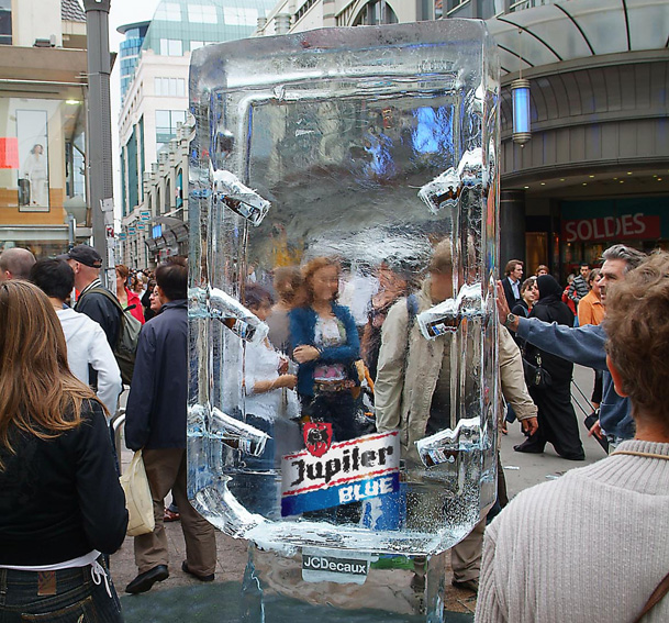
THE ORIGINAL? Jupiler Beer “ice poster” – 2008
(Bottles of beer inside an ice block)
Source : Coloribus
Agency : Famous & JC Decaux (Belgium)
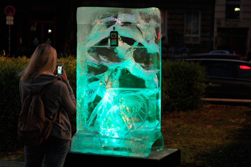
LESS ORIGINAL Jägermeister “ice poster” –2018 (Bottles of Jägermeister stuck inside an ice block)
Source : Dirk & Philip
Agency : Dirk und Philip (Germany)
Download the file MetalKid_assets.zip and extract both files inside. Install the Pattern file named Dark_Pattern.pat and the Contour file pack named CustomContoursMK.shc. To install, you have to double-click the icons. It’s that simple.
Download and install the Strasua font.
Let’s get started!
1. How to Create the Background
Step 1
Create a new document (File > New).
Width: 850 px
Height: 500 px
Resolution: 72 PPI
Step 2
Duplicate the background (go to Layer > Duplicate Layer > OK) and rename the new layer as „Background Pattern„.
Step 3
Now we are going to add a texture to the background layer.
Double-click on „Background Pattern layer” to open the layer style window. Go to Pattern Overlay, and then click on the Pattern box and select the new added Dark Pattern. Press OK.
Step 4
To make the background look even better, we are going to add an inner shadow. You have to double-click on Background Pattern layer and, once the layer style window appears, set the following values.
Blend Mode: Normal
Color: #000000
Opacity: 100%
Angle: 90º
Use Global Light checkbox: Unchecked
Distance: 0 px
Choke: 0%
Size: 250 px
Noise: 0%
2. How to Create the Text and Align It
Step 1
Type the word „Metalkid” using the Strasua font.
Font Size: 100 pt
Tracking: 20 pt
Anti-aliasing mode: Sharp
Color: #ffffff
Step 2
Using the Move Tool, select the text layer and background layer and then click the align commandson the top menu to center the text.
Align Horizontal: Center
Align Vertical: Center
3. How to Create the Text Effect
Step 1
Add a layer style to the text—you have to right click on the layer in your Layers menu and choose Blending Options. Make sure you use the following values and press OK.
Step 2
Let’s start with the text effect! First, we are going to add some shadows to separate the text from the background. Go to Layer Style > Drop Shadow and use the values shown in the image below.
Blend Mode: Normal
Color: #000000
Opacity: 70%
Angle: 90º
Use Global Light: Unchecked
Distance: 10 px
Spread: 20 px
Size: 10 px
Contour: Default
Noise: 0%
Layer Knocks Out Drop Shadow: Checked
Step 3
Now we are going to create a gradient overlay, which will give a base to the metal effect. Open the Layer Style again and modify the Gradient Overlay setting to the following values.
Blend Mode: Normal
Opacity: 100%
Reverse: Unchecked
Style: Linear
Align with Layer: Checked
Angle 90º
Scale: 150%
Click on the Gradient Bar and make a gradient with these settings:
Tip: To create a new point in the gradient, you have to click under the gradient bar. Clicking each one of the color stops allows you to modify the Location and Color.
First Stop Color: #0d1117
First Stop Position: 0%
Second Stop Color: #a0a0a0
Second Stop Position: 25%
Third Stop Color: #161a20
Third Stop Position: 50%
Fourth Stop Color: #a0a0a0
Fourth Stop Position: 75%
Fifth Stop Color: #0d1117
Fifth Stop Position: 110%
Step 4
Go to LayerStyle > Inner Glow and use the settings shown below to brighten up the edges.
Blend Mode: Normal
Opacity: 100%
Noise: 0%
Color: #ffffff
Technique: Softer
Edge: Checked
Choke: 40%
Size: 2 px
Contour: Default
Anti-aliased: Unchecked
Range: 50%
Jitter: 0%
Step 5
To start creating the 3D look, go to Layer Style > Bevel & Emboss and use the following values.
Style: Inner Bevel
Technique: Smooth
Depth: 100%
Direction: Up
Size: 10 px
Soften: 1 px
Angle: 90º
Use Global Light: Unchecked
Altitude: 30º
Now, we are going to add the previously installed „custom contour”. Click on the Gloss Contour drop-down icon and then select the contour named „CustomContourMK01„
Now we can continue:
Anti-aliased: Unchecked
Highlight Mode: Screen
Highlight Color: #ffffff
Highlight Opacity: 75%
Shadow Mode: Multiply
Shadow Color: #000000
Shadow Opacity: 75%
Step 6
Now we are going to emphasize the highlights and shadows to give more realism to the metal effect. Go to Layer Style > Satin and use the settings shown below.
Blend Mode: Color Dodge
Color: #ffffff
Opacity: 50%
Angle 20º
Distance: 45 px
Size: 8 px
Anti-aliased checkbox: Unchecked
Invert checkbox: Checked
We are going to add the second „custom contour” we installed. Click on the Gloss Contour drop-down icon and then select the contour named „CustomContourMK02” and press OK.
Step 7
It’s almost done. In this final step, we are going to accentuate the edges and corners, giving the text the final 3D look. Go to Layer Style > Stroke, and use the values shown in the image below.
Size: 2 px
Position: Outside
Blend Mode: Normal
Opacity: 100%
Fill Type: Gradient
Click on the Gradient Bar and make a gradient with these settings:
First Stop Color: #1a1b1e
First Stop Position: 0%
Second Stop Color: #7f7f7f
Second Stop Position: 50%
Third Stop Color: #1a1b1e
Third Stop Position: 100%
Style: Reflected
Align with Layer checkbox: Checked
Angle 90º
Scale: 100%
Final Image
Great Job, You’re Done!
In this tutorial, I showed you how to create a metal text effect using only style options. I hope that you enjoyed this tutorial and can use what you’ve learned for your own projects. Please feel free to comment and show me your results.
In this tutorial, you’ll learn how to create a hot concrete text effect using two layers to get a central vanishing point in Adobe Photoshop. Let’s get started!
Download the file MetalKid_assets.zip and extract both files inside. Install the Pattern file named Dark_Pattern.pat and the Contour file pack named CustomContoursMK.shc. To install, you have to double-click the icons. It’s that simple.
Download and install the Strasua font.
Let’s get started!
1. How to Create the Background
Step 1
Create a new document (File > New).
Width: 850 px
Height: 500 px
Resolution: 72 PPI
Step 2
Duplicate the background (go to Layer > Duplicate Layer > OK) and rename the new layer as „Background Pattern„.
Step 3
Now we are going to add a texture to the background layer.
Double-click on „Background Pattern layer” to open the layer style window. Go to Pattern Overlay, and then click on the Pattern box and select the new added Dark Pattern. Press OK.
Step 4
To make the background look even better, we are going to add an inner shadow. You have to double-click on Background Pattern layer and, once the layer style window appears, set the following values.
Blend Mode: Normal
Color: #000000
Opacity: 100%
Angle: 90º
Use Global Light checkbox: Unchecked
Distance: 0 px
Choke: 0%
Size: 250 px
Noise: 0%
2. How to Create the Text and Align It
Step 1
Type the word „Metalkid” using the Strasua font.
Font Size: 100 pt
Tracking: 20 pt
Anti-aliasing mode: Sharp
Color: #ffffff
Step 2
Using the Move Tool, select the text layer and background layer and then click the align commandson the top menu to center the text.
Align Horizontal: Center
Align Vertical: Center
3. How to Create the Text Effect
Step 1
Add a layer style to the text—you have to right click on the layer in your Layers menu and choose Blending Options. Make sure you use the following values and press OK.
Step 2
Let’s start with the text effect! First, we are going to add some shadows to separate the text from the background. Go to Layer Style > Drop Shadow and use the values shown in the image below.
Blend Mode: Normal
Color: #000000
Opacity: 70%
Angle: 90º
Use Global Light: Unchecked
Distance: 10 px
Spread: 20 px
Size: 10 px
Contour: Default
Noise: 0%
Layer Knocks Out Drop Shadow: Checked
Step 3
Now we are going to create a gradient overlay, which will give a base to the metal effect. Open the Layer Style again and modify the Gradient Overlay setting to the following values.
Blend Mode: Normal
Opacity: 100%
Reverse: Unchecked
Style: Linear
Align with Layer: Checked
Angle 90º
Scale: 150%
Click on the Gradient Bar and make a gradient with these settings:
Tip: To create a new point in the gradient, you have to click under the gradient bar. Clicking each one of the color stops allows you to modify the Location and Color.
First Stop Color: #0d1117
First Stop Position: 0%
Second Stop Color: #a0a0a0
Second Stop Position: 25%
Third Stop Color: #161a20
Third Stop Position: 50%
Fourth Stop Color: #a0a0a0
Fourth Stop Position: 75%
Fifth Stop Color: #0d1117
Fifth Stop Position: 110%
Step 4
Go to LayerStyle > Inner Glow and use the settings shown below to brighten up the edges.
Blend Mode: Normal
Opacity: 100%
Noise: 0%
Color: #ffffff
Technique: Softer
Edge: Checked
Choke: 40%
Size: 2 px
Contour: Default
Anti-aliased: Unchecked
Range: 50%
Jitter: 0%
Step 5
To start creating the 3D look, go to Layer Style > Bevel & Emboss and use the following values.
Style: Inner Bevel
Technique: Smooth
Depth: 100%
Direction: Up
Size: 10 px
Soften: 1 px
Angle: 90º
Use Global Light: Unchecked
Altitude: 30º
Now, we are going to add the previously installed „custom contour”. Click on the Gloss Contour drop-down icon and then select the contour named „CustomContourMK01„
Now we can continue:
Anti-aliased: Unchecked
Highlight Mode: Screen
Highlight Color: #ffffff
Highlight Opacity: 75%
Shadow Mode: Multiply
Shadow Color: #000000
Shadow Opacity: 75%
Step 6
Now we are going to emphasize the highlights and shadows to give more realism to the metal effect. Go to Layer Style > Satin and use the settings shown below.
Blend Mode: Color Dodge
Color: #ffffff
Opacity: 50%
Angle 20º
Distance: 45 px
Size: 8 px
Anti-aliased checkbox: Unchecked
Invert checkbox: Checked
We are going to add the second „custom contour” we installed. Click on the Gloss Contour drop-down icon and then select the contour named „CustomContourMK02” and press OK.
Step 7
It’s almost done. In this final step, we are going to accentuate the edges and corners, giving the text the final 3D look. Go to Layer Style > Stroke, and use the values shown in the image below.
Size: 2 px
Position: Outside
Blend Mode: Normal
Opacity: 100%
Fill Type: Gradient
Click on the Gradient Bar and make a gradient with these settings:
First Stop Color: #1a1b1e
First Stop Position: 0%
Second Stop Color: #7f7f7f
Second Stop Position: 50%
Third Stop Color: #1a1b1e
Third Stop Position: 100%
Style: Reflected
Align with Layer checkbox: Checked
Angle 90º
Scale: 100%
Final Image
Great Job, You’re Done!
In this tutorial, I showed you how to create a metal text effect using only style options. I hope that you enjoyed this tutorial and can use what you’ve learned for your own projects. Please feel free to comment and show me your results.
In this tutorial, you’ll learn how to create a hot concrete text effect using two layers to get a central vanishing point in Adobe Photoshop. Let’s get started!
Download the file MetalKid_assets.zip and extract both files inside. Install the Pattern file named Dark_Pattern.pat and the Contour file pack named CustomContoursMK.shc. To install, you have to double-click the icons. It’s that simple.
Download and install the Strasua font.
Let’s get started!
1. How to Create the Background
Step 1
Create a new document (File > New).
Width: 850 px
Height: 500 px
Resolution: 72 PPI
Step 2
Duplicate the background (go to Layer > Duplicate Layer > OK) and rename the new layer as „Background Pattern„.
Step 3
Now we are going to add a texture to the background layer.
Double-click on „Background Pattern layer” to open the layer style window. Go to Pattern Overlay, and then click on the Pattern box and select the new added Dark Pattern. Press OK.
Step 4
To make the background look even better, we are going to add an inner shadow. You have to double-click on Background Pattern layer and, once the layer style window appears, set the following values.
Blend Mode: Normal
Color: #000000
Opacity: 100%
Angle: 90º
Use Global Light checkbox: Unchecked
Distance: 0 px
Choke: 0%
Size: 250 px
Noise: 0%
2. How to Create the Text and Align It
Step 1
Type the word „Metalkid” using the Strasua font.
Font Size: 100 pt
Tracking: 20 pt
Anti-aliasing mode: Sharp
Color: #ffffff
Step 2
Using the Move Tool, select the text layer and background layer and then click the align commandson the top menu to center the text.
Align Horizontal: Center
Align Vertical: Center
3. How to Create the Text Effect
Step 1
Add a layer style to the text—you have to right click on the layer in your Layers menu and choose Blending Options. Make sure you use the following values and press OK.
Step 2
Let’s start with the text effect! First, we are going to add some shadows to separate the text from the background. Go to Layer Style > Drop Shadow and use the values shown in the image below.
Blend Mode: Normal
Color: #000000
Opacity: 70%
Angle: 90º
Use Global Light: Unchecked
Distance: 10 px
Spread: 20 px
Size: 10 px
Contour: Default
Noise: 0%
Layer Knocks Out Drop Shadow: Checked
Step 3
Now we are going to create a gradient overlay, which will give a base to the metal effect. Open the Layer Style again and modify the Gradient Overlay setting to the following values.
Blend Mode: Normal
Opacity: 100%
Reverse: Unchecked
Style: Linear
Align with Layer: Checked
Angle 90º
Scale: 150%
Click on the Gradient Bar and make a gradient with these settings:
Tip: To create a new point in the gradient, you have to click under the gradient bar. Clicking each one of the color stops allows you to modify the Location and Color.
First Stop Color: #0d1117
First Stop Position: 0%
Second Stop Color: #a0a0a0
Second Stop Position: 25%
Third Stop Color: #161a20
Third Stop Position: 50%
Fourth Stop Color: #a0a0a0
Fourth Stop Position: 75%
Fifth Stop Color: #0d1117
Fifth Stop Position: 110%
Step 4
Go to LayerStyle > Inner Glow and use the settings shown below to brighten up the edges.
Blend Mode: Normal
Opacity: 100%
Noise: 0%
Color: #ffffff
Technique: Softer
Edge: Checked
Choke: 40%
Size: 2 px
Contour: Default
Anti-aliased: Unchecked
Range: 50%
Jitter: 0%
Step 5
To start creating the 3D look, go to Layer Style > Bevel & Emboss and use the following values.
Style: Inner Bevel
Technique: Smooth
Depth: 100%
Direction: Up
Size: 10 px
Soften: 1 px
Angle: 90º
Use Global Light: Unchecked
Altitude: 30º
Now, we are going to add the previously installed „custom contour”. Click on the Gloss Contour drop-down icon and then select the contour named „CustomContourMK01„
Now we can continue:
Anti-aliased: Unchecked
Highlight Mode: Screen
Highlight Color: #ffffff
Highlight Opacity: 75%
Shadow Mode: Multiply
Shadow Color: #000000
Shadow Opacity: 75%
Step 6
Now we are going to emphasize the highlights and shadows to give more realism to the metal effect. Go to Layer Style > Satin and use the settings shown below.
Blend Mode: Color Dodge
Color: #ffffff
Opacity: 50%
Angle 20º
Distance: 45 px
Size: 8 px
Anti-aliased checkbox: Unchecked
Invert checkbox: Checked
We are going to add the second „custom contour” we installed. Click on the Gloss Contour drop-down icon and then select the contour named „CustomContourMK02” and press OK.
Step 7
It’s almost done. In this final step, we are going to accentuate the edges and corners, giving the text the final 3D look. Go to Layer Style > Stroke, and use the values shown in the image below.
Size: 2 px
Position: Outside
Blend Mode: Normal
Opacity: 100%
Fill Type: Gradient
Click on the Gradient Bar and make a gradient with these settings:
First Stop Color: #1a1b1e
First Stop Position: 0%
Second Stop Color: #7f7f7f
Second Stop Position: 50%
Third Stop Color: #1a1b1e
Third Stop Position: 100%
Style: Reflected
Align with Layer checkbox: Checked
Angle 90º
Scale: 100%
Final Image
Great Job, You’re Done!
In this tutorial, I showed you how to create a metal text effect using only style options. I hope that you enjoyed this tutorial and can use what you’ve learned for your own projects. Please feel free to comment and show me your results.
In this tutorial, you’ll learn how to create a hot concrete text effect using two layers to get a central vanishing point in Adobe Photoshop. Let’s get started!
In this tutorial, I would like to show you how to create a cartoon map illustration in Adobe Illustrator. The continents won’t look real as you’d usually see on a map—they’ll have a funny, simple, cartoon-like style instead. We will use basic shapes and deform them using some effects or by moving anchor points. You can print out the finished illustration on a large piece of paper and hang it up on a wall.
If you would like to, you can add some animals to your map by following these tutorials:
Feel free to check the GraphicRiveranimals collection if you want to add ready-to-use images of animals. Or maybe you’re creating a map infographic and need some icons? Anyway, GraphicRiver is a good solution.
1. How to Create the Continents on the Cartoon Map
Step 1
After you’ve opened Adobe Illustrator, create a new document (File > New) with 850 px Width and Height.
Hit the Ellipse Tool (L) and add a few ellipses of any shape. Make sure that the fill color is R=229, G=217, B=180. These are going to be your future continents.
Step 2
Take the Warp Tool (Shift-R), and then drag and stretch the ellipses however you want. Just remember to select the object that you want to deform, otherwise you will deform the surrounding objects.
The options of the Warp Tool (Shift-R) do not matter here, but if you don’t like the options you have (for example the stretching brush diameter is too big or too small) you can double-click on this tool and a new dialogue window, the Warp Tool Options window, will appear. There you can change the Global Brush Dimensions and Intensity and check Show Brush Size.
Step 3
If you want to deform your continents even more in order to make them more realistic, you can do it by going to Effect > Distort & Transform > Roughen. In the new dialogue window, you can play around with the options to achieve the result you want. If you check the Preview box, you can see all the changes in real time on your artboard. You can do the continents one by one, or all together. Whenever you are happy how they look, press OK.
Expand all the lands (Object > Expand Appearance).
Step 4
Select all your continents and go to Object > Path > Offset Path… In the new dialogue window, enter Offset around 10 px, but it depends on the size of your continent. Press OK. A new piece of land will appear evenly around each one. Change this new land’s fill color to R=234, G=224, B=195.
Create a new board for your continents again (Object > Path > Offset Path…), with an even lighter fill color (R=234, G=224, B=195). With the lighter parts on our map, we are trying to show the land surface lowering into the sea.
Step 5
Using the Ellipse Tool (L), create more ellipses on the continents with the fill color R=232, G=221, B=190. Change the fill color again (R=235, G=226, B=199) and add smaller ellipses over the bigger ones.
Step 6
To deform the new ellipses, you have two options: you can use the Warp Tool (Shift-R) or go to Effect > Distort & Transform > Roughen… Choose either one, and then expand these shapes (Object > Expand Appearance).
Step 7
The last things we want to add to our continents are lakes. Draw a few light blue (R=167, G=214, B=210) ellipses where you want your lakes to be located. Take the Warp Tool (Shift-R) and distort them. Remember to select each object before distortion.
Add smaller and darker ellipses (R=150, G=204, B=200) over the bigger and lighter ones. Distort them using the Warp Tool (Shift-R).
Add even smaller and darker ellipses (R=141, G=198, B=195) over the bigger and lighter ones. Distort them using the Warp Tool (Shift-R).
2. How to Create the Ocean on the Cartoon Map
Step 1
Take the Rectangle Tool (M) and click on your artboard. In the new dialogue window, enter Width and Height 850 px and press OK. A big square will appear on your artboard, which is going to be the water or ocean on our map. Make sure the water stays in the middle of your artboard and change its fill color to R=141, G=198, B=195.
Step 2
Select the lightest border of one continent, and make a copy behind (Control-C, Control-B). Make it a bit bigger and change its fill color to R=167, G=214, B=210. While keeping it selected, distort it using the Warp Tool (Shift-R). Repeat this for each continent.
Step 3
Select the light blue shape around the continent, and create a copy behind (Control-C, Control-B). Make it a bit bigger and change its fill color to R=150, G=204, B=200. While keeping it selected, distort it using the Warp Tool (Shift-R). Repeat this for each continent.
Step 4
Delete the fill color and set the stroke color to R=167, G=214, B=210. Take the Pencil Tool (N). On the Stroke panel (Window > Stroke), check Round Cap and Round Joint.
Now for the fun part: draw waves all over the ocean. If you see that the stroke is too thin, increase its Weight on the Stroke panel (Window > Stroke).
3. How to Create the Landmark Objects on the Cartoon Map
Step 1
Let’s start with the tree. As our map is in a cartoon style, the tree will be very simple, and the same will be true for the creation part. Take the Rectangle Tool (M) and draw a long vertical rectangle with the fill color R=191, G=157, B=106. Then add a few ellipses on top of it for the tree foliage (fill color R=193, G=191, B=111). Group the whole tree (right-click > Group).
Make a few copies of the tree you just created in different sizes, and spread them all over the continents.
Step 2
To create a spruce, start with a rectangle again (fill color R=162, G=124, B=102).
To create a triangle, take the Polygon Tool and draw a polygon. It will have six sides by default. If you have the newer version of AI, when your polygon is selected, on the right side of the selection you’ll able to see a tiny rhombus. If you drag this tiny rhombus counterclockwise, the polygon will have fewer sides, and if you drag it clockwise, the polygon will gain sides. So make a triangle from the polygon by dragging the tiny rhombus counterclockwise.
If your AI is not very new, take the Polygon Tool and click on your artboard. In the new dialogue window, enter Sides 3 with any Radius and click OK. That’s your triangle, which you’ll use to build the spruce.
Create two more copies of the green triangle (fill color has to be R=168, G=168, B=108) and place them over each other, thus forming the spruce. Group the whole spruce (right-click > Group).
Make a few copies of the spruce and spread them over all the continents.
Step 3
Now, let’s add some mountains. Create three brown (R=162, G=124, B=102) triangles of different sizes. They must overlap, and their bottom line has to be on one level. Go to the Pathfinder panel (Window > Pathfinder) and, while all three triangles are selected, press the Unite button.
Then, create a few more white triangles and turn them upside-down. We are creating the snow on the mountains. Add white triangles overlapping the brown ones, as shown below. The white triangles should also overlap each other. While all the white triangles are selected, press the Unite button in Pathfinder (Window > Pathfinder).
After that, select the brown triangles again (they should be one shape now) and make a new copy in front (Control-C, Control-F). Keep this selection and, while holding the Shift button, also select white the triangles (they should also be joined together as one shape). Finally, press the Intersect button in Pathfinder. You should end up with snowy mountains. Make sure to group it.
Create more copies of the mountains and spread them across the continents.
Step 4
So far, we’ve been creating nature, and now we need more signs of human habitation, so we need houses. Start with a white rectangle (use the Rectangle Tool (M)) with no stroke color (it is there just for better visibility).
Add a tiny grey rectangle for the window (fill color is R=168, G=193, B=192). While holding the Shift and Alt buttons together, move this tiny grey rectangle to the right. The Shift button allows you to move it straight, and Alt creates a copy.
Select the two tiny grey rectangles and, while holding the Shift and Alt buttons, move them down. You should now have four windows. Press Control-D as many times as you need to fill your house with windows vertically. The Control-D combination allows you to repeat your last movement.
Let’s add the basement: this will be a blueish grey rectangle at the bottom of the house.
The last thing every house needs is a roof. Create a long, horizontal, red (R=219, G=134, B=97) rectangle on top of the house, and then add one more that should be a bit narrower and taller. Keep the last red rectangle selected, and go to Effect > Warp > Bulge. In the new dialogue window, enter the options you see below. The first house is ready!
Here are the options for the Bulge effect:
Make sure your house is grouped, make a few copies of it, and spread them around.
Step 5
It would be nice to have more than one type of house, so let’s create one more. Start with a white rectangle with no stroke. Then draw a window with the same fill color as on the previous house. While keeping the window selected, go to Effect > Warp > Arc Upper, and in the new dialogue window, enter the options you see below.
Using the same method as before, when we multiplied the windows, create a few windows now.
Then add the basement and the roof. To get the fill color you want (and you want to take the red fill color from the previous house), use the Eyedropper Tool (I).
While keeping the roof selected, go to Effect > Warp > Arc and enter the options you see below. The second house is done!
Here are the options for the Arc Upper effect:
And here are the options for the Arc effect:
Make sure the second house is grouped, and make a few copies of it and spread them around the continents.
Step 6
To add an even greater variety of buildings, I decided to add a church. It’s optional, so it is your choice. I think now you know how to create such a house, so you can try to make it by yourself.
Place the churches where you want to on the land.
Step 7
The last thing we want for our map is a boat. Start with a white rectangle with no stroke color. Add one small grey circle (all of the windows in all the houses share the same fill color as you can see). While holding down the Shift and Alt keys, create a few more windows.
Add a long tube on the top of the boat with two red stripes on it using rectangles.
After that, just continue to create the boat following the image below.
At the end, if you want to distort the bottom part of the boat, take the Direct Selection Tool (A) and move the upper anchor points of the red rectangle. Group the finished boat.
Create a few copies of the boat and place them on the ocean.
Conclusion
I hope you enjoyed going through this tutorial with me. If you have any questions, leave them in the comments section below. I really hope you thought that this tutorial was helpful and you enjoyed it as well.
In this tutorial, I would like to show you how to create a cartoon map illustration in Adobe Illustrator. The continents won’t look real as you’d usually see on a map—they’ll have a funny, simple, cartoon-like style instead. We will use basic shapes and deform them using some effects or by moving anchor points. You can print out the finished illustration on a large piece of paper and hang it up on a wall.
If you would like to, you can add some animals to your map by following these tutorials:
Feel free to check the GraphicRiveranimals collection if you want to add ready-to-use images of animals. Or maybe you’re creating a map infographic and need some icons? Anyway, GraphicRiver is a good solution.
1. How to Create the Continents on the Cartoon Map
Step 1
After you’ve opened Adobe Illustrator, create a new document (File > New) with 850 px Width and Height.
Hit the Ellipse Tool (L) and add a few ellipses of any shape. Make sure that the fill color is R=229, G=217, B=180. These are going to be your future continents.
Step 2
Take the Warp Tool (Shift-R), and then drag and stretch the ellipses however you want. Just remember to select the object that you want to deform, otherwise you will deform the surrounding objects.
The options of the Warp Tool (Shift-R) do not matter here, but if you don’t like the options you have (for example the stretching brush diameter is too big or too small) you can double-click on this tool and a new dialogue window, the Warp Tool Options window, will appear. There you can change the Global Brush Dimensions and Intensity and check Show Brush Size.
Step 3
If you want to deform your continents even more in order to make them more realistic, you can do it by going to Effect > Distort & Transform > Roughen. In the new dialogue window, you can play around with the options to achieve the result you want. If you check the Preview box, you can see all the changes in real time on your artboard. You can do the continents one by one, or all together. Whenever you are happy how they look, press OK.
Expand all the lands (Object > Expand Appearance).
Step 4
Select all your continents and go to Object > Path > Offset Path… In the new dialogue window, enter Offset around 10 px, but it depends on the size of your continent. Press OK. A new piece of land will appear evenly around each one. Change this new land’s fill color to R=234, G=224, B=195.
Create a new board for your continents again (Object > Path > Offset Path…), with an even lighter fill color (R=234, G=224, B=195). With the lighter parts on our map, we are trying to show the land surface lowering into the sea.
Step 5
Using the Ellipse Tool (L), create more ellipses on the continents with the fill color R=232, G=221, B=190. Change the fill color again (R=235, G=226, B=199) and add smaller ellipses over the bigger ones.
Step 6
To deform the new ellipses, you have two options: you can use the Warp Tool (Shift-R) or go to Effect > Distort & Transform > Roughen… Choose either one, and then expand these shapes (Object > Expand Appearance).
Step 7
The last things we want to add to our continents are lakes. Draw a few light blue (R=167, G=214, B=210) ellipses where you want your lakes to be located. Take the Warp Tool (Shift-R) and distort them. Remember to select each object before distortion.
Add smaller and darker ellipses (R=150, G=204, B=200) over the bigger and lighter ones. Distort them using the Warp Tool (Shift-R).
Add even smaller and darker ellipses (R=141, G=198, B=195) over the bigger and lighter ones. Distort them using the Warp Tool (Shift-R).
2. How to Create the Ocean on the Cartoon Map
Step 1
Take the Rectangle Tool (M) and click on your artboard. In the new dialogue window, enter Width and Height 850 px and press OK. A big square will appear on your artboard, which is going to be the water or ocean on our map. Make sure the water stays in the middle of your artboard and change its fill color to R=141, G=198, B=195.
Step 2
Select the lightest border of one continent, and make a copy behind (Control-C, Control-B). Make it a bit bigger and change its fill color to R=167, G=214, B=210. While keeping it selected, distort it using the Warp Tool (Shift-R). Repeat this for each continent.
Step 3
Select the light blue shape around the continent, and create a copy behind (Control-C, Control-B). Make it a bit bigger and change its fill color to R=150, G=204, B=200. While keeping it selected, distort it using the Warp Tool (Shift-R). Repeat this for each continent.
Step 4
Delete the fill color and set the stroke color to R=167, G=214, B=210. Take the Pencil Tool (N). On the Stroke panel (Window > Stroke), check Round Cap and Round Joint.
Now for the fun part: draw waves all over the ocean. If you see that the stroke is too thin, increase its Weight on the Stroke panel (Window > Stroke).
3. How to Create the Landmark Objects on the Cartoon Map
Step 1
Let’s start with the tree. As our map is in a cartoon style, the tree will be very simple, and the same will be true for the creation part. Take the Rectangle Tool (M) and draw a long vertical rectangle with the fill color R=191, G=157, B=106. Then add a few ellipses on top of it for the tree foliage (fill color R=193, G=191, B=111). Group the whole tree (right-click > Group).
Make a few copies of the tree you just created in different sizes, and spread them all over the continents.
Step 2
To create a spruce, start with a rectangle again (fill color R=162, G=124, B=102).
To create a triangle, take the Polygon Tool and draw a polygon. It will have six sides by default. If you have the newer version of AI, when your polygon is selected, on the right side of the selection you’ll able to see a tiny rhombus. If you drag this tiny rhombus counterclockwise, the polygon will have fewer sides, and if you drag it clockwise, the polygon will gain sides. So make a triangle from the polygon by dragging the tiny rhombus counterclockwise.
If your AI is not very new, take the Polygon Tool and click on your artboard. In the new dialogue window, enter Sides 3 with any Radius and click OK. That’s your triangle, which you’ll use to build the spruce.
Create two more copies of the green triangle (fill color has to be R=168, G=168, B=108) and place them over each other, thus forming the spruce. Group the whole spruce (right-click > Group).
Make a few copies of the spruce and spread them over all the continents.
Step 3
Now, let’s add some mountains. Create three brown (R=162, G=124, B=102) triangles of different sizes. They must overlap, and their bottom line has to be on one level. Go to the Pathfinder panel (Window > Pathfinder) and, while all three triangles are selected, press the Unite button.
Then, create a few more white triangles and turn them upside-down. We are creating the snow on the mountains. Add white triangles overlapping the brown ones, as shown below. The white triangles should also overlap each other. While all the white triangles are selected, press the Unite button in Pathfinder (Window > Pathfinder).
After that, select the brown triangles again (they should be one shape now) and make a new copy in front (Control-C, Control-F). Keep this selection and, while holding the Shift button, also select white the triangles (they should also be joined together as one shape). Finally, press the Intersect button in Pathfinder. You should end up with snowy mountains. Make sure to group it.
Create more copies of the mountains and spread them across the continents.
Step 4
So far, we’ve been creating nature, and now we need more signs of human habitation, so we need houses. Start with a white rectangle (use the Rectangle Tool (M)) with no stroke color (it is there just for better visibility).
Add a tiny grey rectangle for the window (fill color is R=168, G=193, B=192). While holding the Shift and Alt buttons together, move this tiny grey rectangle to the right. The Shift button allows you to move it straight, and Alt creates a copy.
Select the two tiny grey rectangles and, while holding the Shift and Alt buttons, move them down. You should now have four windows. Press Control-D as many times as you need to fill your house with windows vertically. The Control-D combination allows you to repeat your last movement.
Let’s add the basement: this will be a blueish grey rectangle at the bottom of the house.
The last thing every house needs is a roof. Create a long, horizontal, red (R=219, G=134, B=97) rectangle on top of the house, and then add one more that should be a bit narrower and taller. Keep the last red rectangle selected, and go to Effect > Warp > Bulge. In the new dialogue window, enter the options you see below. The first house is ready!
Here are the options for the Bulge effect:
Make sure your house is grouped, make a few copies of it, and spread them around.
Step 5
It would be nice to have more than one type of house, so let’s create one more. Start with a white rectangle with no stroke. Then draw a window with the same fill color as on the previous house. While keeping the window selected, go to Effect > Warp > Arc Upper, and in the new dialogue window, enter the options you see below.
Using the same method as before, when we multiplied the windows, create a few windows now.
Then add the basement and the roof. To get the fill color you want (and you want to take the red fill color from the previous house), use the Eyedropper Tool (I).
While keeping the roof selected, go to Effect > Warp > Arc and enter the options you see below. The second house is done!
Here are the options for the Arc Upper effect:
And here are the options for the Arc effect:
Make sure the second house is grouped, and make a few copies of it and spread them around the continents.
Step 6
To add an even greater variety of buildings, I decided to add a church. It’s optional, so it is your choice. I think now you know how to create such a house, so you can try to make it by yourself.
Place the churches where you want to on the land.
Step 7
The last thing we want for our map is a boat. Start with a white rectangle with no stroke color. Add one small grey circle (all of the windows in all the houses share the same fill color as you can see). While holding down the Shift and Alt keys, create a few more windows.
Add a long tube on the top of the boat with two red stripes on it using rectangles.
After that, just continue to create the boat following the image below.
At the end, if you want to distort the bottom part of the boat, take the Direct Selection Tool (A) and move the upper anchor points of the red rectangle. Group the finished boat.
Create a few copies of the boat and place them on the ocean.
Conclusion
I hope you enjoyed going through this tutorial with me. If you have any questions, leave them in the comments section below. I really hope you thought that this tutorial was helpful and you enjoyed it as well.
In this tutorial, I would like to show you how to create a cartoon map illustration in Adobe Illustrator. The continents won’t look real as you’d usually see on a map—they’ll have a funny, simple, cartoon-like style instead. We will use basic shapes and deform them using some effects or by moving anchor points. You can print out the finished illustration on a large piece of paper and hang it up on a wall.
If you would like to, you can add some animals to your map by following these tutorials:
Feel free to check the GraphicRiveranimals collection if you want to add ready-to-use images of animals. Or maybe you’re creating a map infographic and need some icons? Anyway, GraphicRiver is a good solution.
1. How to Create the Continents on the Cartoon Map
Step 1
After you’ve opened Adobe Illustrator, create a new document (File > New) with 850 px Width and Height.
Hit the Ellipse Tool (L) and add a few ellipses of any shape. Make sure that the fill color is R=229, G=217, B=180. These are going to be your future continents.
Step 2
Take the Warp Tool (Shift-R), and then drag and stretch the ellipses however you want. Just remember to select the object that you want to deform, otherwise you will deform the surrounding objects.
The options of the Warp Tool (Shift-R) do not matter here, but if you don’t like the options you have (for example the stretching brush diameter is too big or too small) you can double-click on this tool and a new dialogue window, the Warp Tool Options window, will appear. There you can change the Global Brush Dimensions and Intensity and check Show Brush Size.
Step 3
If you want to deform your continents even more in order to make them more realistic, you can do it by going to Effect > Distort & Transform > Roughen. In the new dialogue window, you can play around with the options to achieve the result you want. If you check the Preview box, you can see all the changes in real time on your artboard. You can do the continents one by one, or all together. Whenever you are happy how they look, press OK.
Expand all the lands (Object > Expand Appearance).
Step 4
Select all your continents and go to Object > Path > Offset Path… In the new dialogue window, enter Offset around 10 px, but it depends on the size of your continent. Press OK. A new piece of land will appear evenly around each one. Change this new land’s fill color to R=234, G=224, B=195.
Create a new board for your continents again (Object > Path > Offset Path…), with an even lighter fill color (R=234, G=224, B=195). With the lighter parts on our map, we are trying to show the land surface lowering into the sea.
Step 5
Using the Ellipse Tool (L), create more ellipses on the continents with the fill color R=232, G=221, B=190. Change the fill color again (R=235, G=226, B=199) and add smaller ellipses over the bigger ones.
Step 6
To deform the new ellipses, you have two options: you can use the Warp Tool (Shift-R) or go to Effect > Distort & Transform > Roughen… Choose either one, and then expand these shapes (Object > Expand Appearance).
Step 7
The last things we want to add to our continents are lakes. Draw a few light blue (R=167, G=214, B=210) ellipses where you want your lakes to be located. Take the Warp Tool (Shift-R) and distort them. Remember to select each object before distortion.
Add smaller and darker ellipses (R=150, G=204, B=200) over the bigger and lighter ones. Distort them using the Warp Tool (Shift-R).
Add even smaller and darker ellipses (R=141, G=198, B=195) over the bigger and lighter ones. Distort them using the Warp Tool (Shift-R).
2. How to Create the Ocean on the Cartoon Map
Step 1
Take the Rectangle Tool (M) and click on your artboard. In the new dialogue window, enter Width and Height 850 px and press OK. A big square will appear on your artboard, which is going to be the water or ocean on our map. Make sure the water stays in the middle of your artboard and change its fill color to R=141, G=198, B=195.
Step 2
Select the lightest border of one continent, and make a copy behind (Control-C, Control-B). Make it a bit bigger and change its fill color to R=167, G=214, B=210. While keeping it selected, distort it using the Warp Tool (Shift-R). Repeat this for each continent.
Step 3
Select the light blue shape around the continent, and create a copy behind (Control-C, Control-B). Make it a bit bigger and change its fill color to R=150, G=204, B=200. While keeping it selected, distort it using the Warp Tool (Shift-R). Repeat this for each continent.
Step 4
Delete the fill color and set the stroke color to R=167, G=214, B=210. Take the Pencil Tool (N). On the Stroke panel (Window > Stroke), check Round Cap and Round Joint.
Now for the fun part: draw waves all over the ocean. If you see that the stroke is too thin, increase its Weight on the Stroke panel (Window > Stroke).
3. How to Create the Landmark Objects on the Cartoon Map
Step 1
Let’s start with the tree. As our map is in a cartoon style, the tree will be very simple, and the same will be true for the creation part. Take the Rectangle Tool (M) and draw a long vertical rectangle with the fill color R=191, G=157, B=106. Then add a few ellipses on top of it for the tree foliage (fill color R=193, G=191, B=111). Group the whole tree (right-click > Group).
Make a few copies of the tree you just created in different sizes, and spread them all over the continents.
Step 2
To create a spruce, start with a rectangle again (fill color R=162, G=124, B=102).
To create a triangle, take the Polygon Tool and draw a polygon. It will have six sides by default. If you have the newer version of AI, when your polygon is selected, on the right side of the selection you’ll able to see a tiny rhombus. If you drag this tiny rhombus counterclockwise, the polygon will have fewer sides, and if you drag it clockwise, the polygon will gain sides. So make a triangle from the polygon by dragging the tiny rhombus counterclockwise.
If your AI is not very new, take the Polygon Tool and click on your artboard. In the new dialogue window, enter Sides 3 with any Radius and click OK. That’s your triangle, which you’ll use to build the spruce.
Create two more copies of the green triangle (fill color has to be R=168, G=168, B=108) and place them over each other, thus forming the spruce. Group the whole spruce (right-click > Group).
Make a few copies of the spruce and spread them over all the continents.
Step 3
Now, let’s add some mountains. Create three brown (R=162, G=124, B=102) triangles of different sizes. They must overlap, and their bottom line has to be on one level. Go to the Pathfinder panel (Window > Pathfinder) and, while all three triangles are selected, press the Unite button.
Then, create a few more white triangles and turn them upside-down. We are creating the snow on the mountains. Add white triangles overlapping the brown ones, as shown below. The white triangles should also overlap each other. While all the white triangles are selected, press the Unite button in Pathfinder (Window > Pathfinder).
After that, select the brown triangles again (they should be one shape now) and make a new copy in front (Control-C, Control-F). Keep this selection and, while holding the Shift button, also select white the triangles (they should also be joined together as one shape). Finally, press the Intersect button in Pathfinder. You should end up with snowy mountains. Make sure to group it.
Create more copies of the mountains and spread them across the continents.
Step 4
So far, we’ve been creating nature, and now we need more signs of human habitation, so we need houses. Start with a white rectangle (use the Rectangle Tool (M)) with no stroke color (it is there just for better visibility).
Add a tiny grey rectangle for the window (fill color is R=168, G=193, B=192). While holding the Shift and Alt buttons together, move this tiny grey rectangle to the right. The Shift button allows you to move it straight, and Alt creates a copy.
Select the two tiny grey rectangles and, while holding the Shift and Alt buttons, move them down. You should now have four windows. Press Control-D as many times as you need to fill your house with windows vertically. The Control-D combination allows you to repeat your last movement.
Let’s add the basement: this will be a blueish grey rectangle at the bottom of the house.
The last thing every house needs is a roof. Create a long, horizontal, red (R=219, G=134, B=97) rectangle on top of the house, and then add one more that should be a bit narrower and taller. Keep the last red rectangle selected, and go to Effect > Warp > Bulge. In the new dialogue window, enter the options you see below. The first house is ready!
Here are the options for the Bulge effect:
Make sure your house is grouped, make a few copies of it, and spread them around.
Step 5
It would be nice to have more than one type of house, so let’s create one more. Start with a white rectangle with no stroke. Then draw a window with the same fill color as on the previous house. While keeping the window selected, go to Effect > Warp > Arc Upper, and in the new dialogue window, enter the options you see below.
Using the same method as before, when we multiplied the windows, create a few windows now.
Then add the basement and the roof. To get the fill color you want (and you want to take the red fill color from the previous house), use the Eyedropper Tool (I).
While keeping the roof selected, go to Effect > Warp > Arc and enter the options you see below. The second house is done!
Here are the options for the Arc Upper effect:
And here are the options for the Arc effect:
Make sure the second house is grouped, and make a few copies of it and spread them around the continents.
Step 6
To add an even greater variety of buildings, I decided to add a church. It’s optional, so it is your choice. I think now you know how to create such a house, so you can try to make it by yourself.
Place the churches where you want to on the land.
Step 7
The last thing we want for our map is a boat. Start with a white rectangle with no stroke color. Add one small grey circle (all of the windows in all the houses share the same fill color as you can see). While holding down the Shift and Alt keys, create a few more windows.
Add a long tube on the top of the boat with two red stripes on it using rectangles.
After that, just continue to create the boat following the image below.
At the end, if you want to distort the bottom part of the boat, take the Direct Selection Tool (A) and move the upper anchor points of the red rectangle. Group the finished boat.
Create a few copies of the boat and place them on the ocean.
Conclusion
I hope you enjoyed going through this tutorial with me. If you have any questions, leave them in the comments section below. I really hope you thought that this tutorial was helpful and you enjoyed it as well.
The first issue of iconic music magazine Rolling Stone was put on sale on 7 November 1967. Featuring John Lennon on the cover, the San Francisco-founded publication went on to become the go-to magazine for music fans worldwide.
In this tutorial, we’ll pay tribute to the iconic graphic style of Rolling Stone, which was created by the original art directors, John Williams and Lloyd Ziff. The script-style logo and red, white and black color palette have become synonymous with the magazine and have remained largely unchanged for many decades, with only a few minor modernisations.
Here you’ll learn how to create a tribute magazine cover in Adobe InDesign and replicate the iconic style of classic Rolling Stone covers.
As well as access to Adobe InDesign, you’ll also need to use Adobe Photoshop to edit the image used in the design. You’ll also need to download the following image and fonts from Envato Elements:
Install the fonts on your computer, and you’re ready to get started.
1. How to Set Up Your Cover Document in InDesign
Step 1
Open InDesign and go to File > New > Document. Set the Width of the page to 8.5 in and Height to 11 in, a standard US magazine cover size.
Uncheck Facing Pages to create a single page. Add 0.3125 in Margins and a 0.25 in Bleed, and then click Create.
Step 2
Expand the Layers panel (Window > Layers) and double-click on Layer 1 to rename it Photo Behind.
Create three more new layers in this order—Type Behind, Photo in Front and, at the top of the pile, Type in Front.
Then lock all the layers except the Type Behind layer.
Step 3
Expand the Swatches panel (Window > Color > Swatches), and choose New Color Swatch from the panel’s drop-down menu.
Name the swatch Rolling Stone Red, and set the levels below to C=0 M=100 Y=93 =0. Click Add, and then Done.
2. How to Create a Masthead for Your Cover
Step 1
Working on the Type Behind layer, use the Type Tool (T) to create a text frame across the top of the page.
Type in the title of your magazine, and from either the top Controls panel or the Character panel (Window > Type & Tables > Character), set the Font to Redoura Bold.
Increase the Font Size so that the logo extends across the width of the page, and tweak the Tracking (letter-spacing) and Kerning (spacing between individual letters) to pull letters together and create a more logo-like effect.
Step 2
From the Swatches panel, switch the Font Color to Rolling Stone Red.
Click on the ‘T’ symbol sitting behind the ‘T’ Fill Color symbol at the top-left of the Swatches panel, to bring up the Stroke Color option. Add a [Paper] Stroke Color.
From the Stroke panel (Window > Stroke), increase the Weight of the stroke to 5 pt.
Step 3
Select the text frame and Edit > Copy, Edit > Paste in Place. Use the arrow keys to shuffle the new text frame slightly down and to the right.
Switch the Font Color and Stroke Color of the text in this frame to [Black].
On the frame, Right-Click > Arrange > Send to Back.
Step 4
Add a long text frame above the logo, listing some of the artists featured in the issue.
Set the Font to Karoll Bold Round.
3. How to Add a 3D Photo to Your Cover
Step 1
Open the portrait photo in Photoshop, and duplicate the Background layer.
Working on the Background copy layer, use the Lasso Tool (L) to trace the silhouette of the person, working your way around the whole edge and looping it across the bottom to create an enclosed selection.
Step 2
Click on the Refine Edge button on the top Controls panel.
In the window that opens, check Smart Radius and adjust the Radius slider until the selection is more accurate around the silhouette. When you’re happy with the result, click OK.
Copy and Paste the selection onto a new layer.
Step 3
Switch off the two background layers so that only the top layer is visible, and go to File > Save As, saving this as a Photoshop file named ‘Portrait_no bg.psd’.
Switch the Background layer back on, and File > Save As as a Photoshop file named ‘Portrait_with bg.psd’.
Step 4
Head back to InDesign and lock the Type Behind layer. Unlock the layer below, Photo Behind.
Use the Rectangle Frame Tool (F) to create an image frame across the whole page, extending it up to the edge of the bleed on all sides.
Go to File > Place and choose the ‘Portrait_with bg.psd’ image, and Open. Make sure you’re happy with the position and scale of the image before moving on to the next step.
Step 5
In the Layers panel, click on the arrow to the left of the Photo Behind name to expand the layer.
Drag the ‘Portrait_with bg’ element down onto the Create New Layer button to duplicate it.
Unlock the Photo in Front layer, before dragging the copy of ‘Portrait_with bg’ up onto this layer.
Then lock the Photo Behind layer.
Step 6
Select the image frame now sitting on the Photo in Front layer, and go to File > Place.
Choose the ‘Portrait_no bg.psd’ file and Open.
4. How to Add Article Teasers to Your Magazine Cover
Step 1
Lock the Photo in Front layer and unlock the top layer, Type in Front.
First, focus on creating a large-size article teaser, to tie in with the image you’ve used on the cover.
Choose a space on the cover (here I’ve opted for the bottom-right corner) and use the Type Tool (T) to create large text frames, setting the Font to Black Velvet 2.
Set the Font Color to attention-grabbing Rolling Stone Red.
Step 2
You can make the text more legible by applying a subtle drop shadow.
Select the text frame(s) and go to Object > Effects > Drop Shadow. Set the Opacity to around 30%, and add about 15% Noise. Play around with the Size and Spread options until you’re happy with the shadow, and then click OK.
Step 3
Add supporting text around the main title, set in Velasco Serif and a [Paper] Font Color.
Set the other supporting text in Addington CF Medium Italic.
Make sure to add a subtle drop shadow effect (Object > Effects > Drop Shadow) to these text frames too.
Step 4
Create more text frames down the right side of the image, setting the Font to Karoll Bold Round and a [Black] Font Color.
Step 5
You can create a divider to separate items of text using the Line Tool (\).
Use the Stroke panel (Window > Stroke) to set the Weight to 13 pt and the Type to Thin-Thick.
Step 6
Populate the space around the edges of the image with more text frames, varying the fonts, but sticking to a [Black] Font Color.
Step 7
You can use quirky type techniques to emphasise the theme of the article. In this example, I Copy and Paste ‘Get’ and ‘Reflective’ into individual text frames…
I line up the text frames underneath the original text…
… before going to Object > Effects > Transparency, and bringing the Opacity down to 75%.
Step 8
Magazine covers sometimes feature pull-quotes set in frames, to make a feature of a particular article or the fact that the magazine is a special issue.
You can create a frame using the Rectangle Tool (M), and adjust the Weight and Type from the Stroke panel (choose a Thin-Thick Type to match the style of the dividers).
Set text frames inside the frame, setting the main text in Velasco Serif.
Highlighting key words in a bright color, like Rolling Stone Red, helps to draw attention to particular pieces of text.
5. How to Share Your Magazine Cover
You can share your magazine cover as an image online, on social media for example, or export it as a PDF for printing.
To do either, head up to File > Export.
For online, choose JPEG or PNG from the Format menu at the bottom of the window. For printing, choose Adobe PDF (Print).
Click Save, and follow the options in the windows that open, before clicking Export to create a shareable version of your cover artwork.
Conclusion: Your Finished Magazine Cover
In this tutorial, we’ve covered a wide range of techniques for creating effective magazine covers. You now know how to:
Create layers and CMYK swatches in your InDesign document.
Create a masthead for your magazine cover.
Edit a photo to give your cover a three-dimensional effect.
Format typography to create stylish article teasers on your cover.
Export your cover to create an image you can share online or have professionally printed.
In this tutorial, you’ll learn how to create a simple and stylish magazine spread using Affinity Publisher, the great-value and easy-to-use alternative to…
This back-to-school guide will show you how to get started designing your own magazines, from adapting templates to creating your own contents pages. You’ll…
In this tutorial, I’ll show you how to make a magazine by editing an existing InDesign magazine template and create something that looks completely special…
The first issue of iconic music magazine Rolling Stone was put on sale on 7 November 1967. Featuring John Lennon on the cover, the San Francisco-founded publication went on to become the go-to magazine for music fans worldwide.
In this tutorial, we’ll pay tribute to the iconic graphic style of Rolling Stone, which was created by the original art directors, John Williams and Lloyd Ziff. The script-style logo and red, white and black color palette have become synonymous with the magazine and have remained largely unchanged for many decades, with only a few minor modernisations.
Here you’ll learn how to create a tribute magazine cover in Adobe InDesign and replicate the iconic style of classic Rolling Stone covers.
As well as access to Adobe InDesign, you’ll also need to use Adobe Photoshop to edit the image used in the design. You’ll also need to download the following image and fonts from Envato Elements:
Install the fonts on your computer, and you’re ready to get started.
1. How to Set Up Your Cover Document in InDesign
Step 1
Open InDesign and go to File > New > Document. Set the Width of the page to 8.5 in and Height to 11 in, a standard US magazine cover size.
Uncheck Facing Pages to create a single page. Add 0.3125 in Margins and a 0.25 in Bleed, and then click Create.
Step 2
Expand the Layers panel (Window > Layers) and double-click on Layer 1 to rename it Photo Behind.
Create three more new layers in this order—Type Behind, Photo in Front and, at the top of the pile, Type in Front.
Then lock all the layers except the Type Behind layer.
Step 3
Expand the Swatches panel (Window > Color > Swatches), and choose New Color Swatch from the panel’s drop-down menu.
Name the swatch Rolling Stone Red, and set the levels below to C=0 M=100 Y=93 =0. Click Add, and then Done.
2. How to Create a Masthead for Your Cover
Step 1
Working on the Type Behind layer, use the Type Tool (T) to create a text frame across the top of the page.
Type in the title of your magazine, and from either the top Controls panel or the Character panel (Window > Type & Tables > Character), set the Font to Redoura Bold.
Increase the Font Size so that the logo extends across the width of the page, and tweak the Tracking (letter-spacing) and Kerning (spacing between individual letters) to pull letters together and create a more logo-like effect.
Step 2
From the Swatches panel, switch the Font Color to Rolling Stone Red.
Click on the ‘T’ symbol sitting behind the ‘T’ Fill Color symbol at the top-left of the Swatches panel, to bring up the Stroke Color option. Add a [Paper] Stroke Color.
From the Stroke panel (Window > Stroke), increase the Weight of the stroke to 5 pt.
Step 3
Select the text frame and Edit > Copy, Edit > Paste in Place. Use the arrow keys to shuffle the new text frame slightly down and to the right.
Switch the Font Color and Stroke Color of the text in this frame to [Black].
On the frame, Right-Click > Arrange > Send to Back.
Step 4
Add a long text frame above the logo, listing some of the artists featured in the issue.
Set the Font to Karoll Bold Round.
3. How to Add a 3D Photo to Your Cover
Step 1
Open the portrait photo in Photoshop, and duplicate the Background layer.
Working on the Background copy layer, use the Lasso Tool (L) to trace the silhouette of the person, working your way around the whole edge and looping it across the bottom to create an enclosed selection.
Step 2
Click on the Refine Edge button on the top Controls panel.
In the window that opens, check Smart Radius and adjust the Radius slider until the selection is more accurate around the silhouette. When you’re happy with the result, click OK.
Copy and Paste the selection onto a new layer.
Step 3
Switch off the two background layers so that only the top layer is visible, and go to File > Save As, saving this as a Photoshop file named ‘Portrait_no bg.psd’.
Switch the Background layer back on, and File > Save As as a Photoshop file named ‘Portrait_with bg.psd’.
Step 4
Head back to InDesign and lock the Type Behind layer. Unlock the layer below, Photo Behind.
Use the Rectangle Frame Tool (F) to create an image frame across the whole page, extending it up to the edge of the bleed on all sides.
Go to File > Place and choose the ‘Portrait_with bg.psd’ image, and Open. Make sure you’re happy with the position and scale of the image before moving on to the next step.
Step 5
In the Layers panel, click on the arrow to the left of the Photo Behind name to expand the layer.
Drag the ‘Portrait_with bg’ element down onto the Create New Layer button to duplicate it.
Unlock the Photo in Front layer, before dragging the copy of ‘Portrait_with bg’ up onto this layer.
Then lock the Photo Behind layer.
Step 6
Select the image frame now sitting on the Photo in Front layer, and go to File > Place.
Choose the ‘Portrait_no bg.psd’ file and Open.
4. How to Add Article Teasers to Your Magazine Cover
Step 1
Lock the Photo in Front layer and unlock the top layer, Type in Front.
First, focus on creating a large-size article teaser, to tie in with the image you’ve used on the cover.
Choose a space on the cover (here I’ve opted for the bottom-right corner) and use the Type Tool (T) to create large text frames, setting the Font to Black Velvet 2.
Set the Font Color to attention-grabbing Rolling Stone Red.
Step 2
You can make the text more legible by applying a subtle drop shadow.
Select the text frame(s) and go to Object > Effects > Drop Shadow. Set the Opacity to around 30%, and add about 15% Noise. Play around with the Size and Spread options until you’re happy with the shadow, and then click OK.
Step 3
Add supporting text around the main title, set in Velasco Serif and a [Paper] Font Color.
Set the other supporting text in Addington CF Medium Italic.
Make sure to add a subtle drop shadow effect (Object > Effects > Drop Shadow) to these text frames too.
Step 4
Create more text frames down the right side of the image, setting the Font to Karoll Bold Round and a [Black] Font Color.
Step 5
You can create a divider to separate items of text using the Line Tool (\).
Use the Stroke panel (Window > Stroke) to set the Weight to 13 pt and the Type to Thin-Thick.
Step 6
Populate the space around the edges of the image with more text frames, varying the fonts, but sticking to a [Black] Font Color.
Step 7
You can use quirky type techniques to emphasise the theme of the article. In this example, I Copy and Paste ‘Get’ and ‘Reflective’ into individual text frames…
I line up the text frames underneath the original text…
… before going to Object > Effects > Transparency, and bringing the Opacity down to 75%.
Step 8
Magazine covers sometimes feature pull-quotes set in frames, to make a feature of a particular article or the fact that the magazine is a special issue.
You can create a frame using the Rectangle Tool (M), and adjust the Weight and Type from the Stroke panel (choose a Thin-Thick Type to match the style of the dividers).
Set text frames inside the frame, setting the main text in Velasco Serif.
Highlighting key words in a bright color, like Rolling Stone Red, helps to draw attention to particular pieces of text.
5. How to Share Your Magazine Cover
You can share your magazine cover as an image online, on social media for example, or export it as a PDF for printing.
To do either, head up to File > Export.
For online, choose JPEG or PNG from the Format menu at the bottom of the window. For printing, choose Adobe PDF (Print).
Click Save, and follow the options in the windows that open, before clicking Export to create a shareable version of your cover artwork.
Conclusion: Your Finished Magazine Cover
In this tutorial, we’ve covered a wide range of techniques for creating effective magazine covers. You now know how to:
Create layers and CMYK swatches in your InDesign document.
Create a masthead for your magazine cover.
Edit a photo to give your cover a three-dimensional effect.
Format typography to create stylish article teasers on your cover.
Export your cover to create an image you can share online or have professionally printed.
In this tutorial, you’ll learn how to create a simple and stylish magazine spread using Affinity Publisher, the great-value and easy-to-use alternative to…
This back-to-school guide will show you how to get started designing your own magazines, from adapting templates to creating your own contents pages. You’ll…
In this tutorial, I’ll show you how to make a magazine by editing an existing InDesign magazine template and create something that looks completely special…
The first issue of iconic music magazine Rolling Stone was put on sale on 7 November 1967. Featuring John Lennon on the cover, the San Francisco-founded publication went on to become the go-to magazine for music fans worldwide.
In this tutorial, we’ll pay tribute to the iconic graphic style of Rolling Stone, which was created by the original art directors, John Williams and Lloyd Ziff. The script-style logo and red, white and black color palette have become synonymous with the magazine and have remained largely unchanged for many decades, with only a few minor modernisations.
Here you’ll learn how to create a tribute magazine cover in Adobe InDesign and replicate the iconic style of classic Rolling Stone covers.
As well as access to Adobe InDesign, you’ll also need to use Adobe Photoshop to edit the image used in the design. You’ll also need to download the following image and fonts from Envato Elements:
Install the fonts on your computer, and you’re ready to get started.
1. How to Set Up Your Cover Document in InDesign
Step 1
Open InDesign and go to File > New > Document. Set the Width of the page to 8.5 in and Height to 11 in, a standard US magazine cover size.
Uncheck Facing Pages to create a single page. Add 0.3125 in Margins and a 0.25 in Bleed, and then click Create.
Step 2
Expand the Layers panel (Window > Layers) and double-click on Layer 1 to rename it Photo Behind.
Create three more new layers in this order—Type Behind, Photo in Front and, at the top of the pile, Type in Front.
Then lock all the layers except the Type Behind layer.
Step 3
Expand the Swatches panel (Window > Color > Swatches), and choose New Color Swatch from the panel’s drop-down menu.
Name the swatch Rolling Stone Red, and set the levels below to C=0 M=100 Y=93 =0. Click Add, and then Done.
2. How to Create a Masthead for Your Cover
Step 1
Working on the Type Behind layer, use the Type Tool (T) to create a text frame across the top of the page.
Type in the title of your magazine, and from either the top Controls panel or the Character panel (Window > Type & Tables > Character), set the Font to Redoura Bold.
Increase the Font Size so that the logo extends across the width of the page, and tweak the Tracking (letter-spacing) and Kerning (spacing between individual letters) to pull letters together and create a more logo-like effect.
Step 2
From the Swatches panel, switch the Font Color to Rolling Stone Red.
Click on the ‘T’ symbol sitting behind the ‘T’ Fill Color symbol at the top-left of the Swatches panel, to bring up the Stroke Color option. Add a [Paper] Stroke Color.
From the Stroke panel (Window > Stroke), increase the Weight of the stroke to 5 pt.
Step 3
Select the text frame and Edit > Copy, Edit > Paste in Place. Use the arrow keys to shuffle the new text frame slightly down and to the right.
Switch the Font Color and Stroke Color of the text in this frame to [Black].
On the frame, Right-Click > Arrange > Send to Back.
Step 4
Add a long text frame above the logo, listing some of the artists featured in the issue.
Set the Font to Karoll Bold Round.
3. How to Add a 3D Photo to Your Cover
Step 1
Open the portrait photo in Photoshop, and duplicate the Background layer.
Working on the Background copy layer, use the Lasso Tool (L) to trace the silhouette of the person, working your way around the whole edge and looping it across the bottom to create an enclosed selection.
Step 2
Click on the Refine Edge button on the top Controls panel.
In the window that opens, check Smart Radius and adjust the Radius slider until the selection is more accurate around the silhouette. When you’re happy with the result, click OK.
Copy and Paste the selection onto a new layer.
Step 3
Switch off the two background layers so that only the top layer is visible, and go to File > Save As, saving this as a Photoshop file named ‘Portrait_no bg.psd’.
Switch the Background layer back on, and File > Save As as a Photoshop file named ‘Portrait_with bg.psd’.
Step 4
Head back to InDesign and lock the Type Behind layer. Unlock the layer below, Photo Behind.
Use the Rectangle Frame Tool (F) to create an image frame across the whole page, extending it up to the edge of the bleed on all sides.
Go to File > Place and choose the ‘Portrait_with bg.psd’ image, and Open. Make sure you’re happy with the position and scale of the image before moving on to the next step.
Step 5
In the Layers panel, click on the arrow to the left of the Photo Behind name to expand the layer.
Drag the ‘Portrait_with bg’ element down onto the Create New Layer button to duplicate it.
Unlock the Photo in Front layer, before dragging the copy of ‘Portrait_with bg’ up onto this layer.
Then lock the Photo Behind layer.
Step 6
Select the image frame now sitting on the Photo in Front layer, and go to File > Place.
Choose the ‘Portrait_no bg.psd’ file and Open.
4. How to Add Article Teasers to Your Magazine Cover
Step 1
Lock the Photo in Front layer and unlock the top layer, Type in Front.
First, focus on creating a large-size article teaser, to tie in with the image you’ve used on the cover.
Choose a space on the cover (here I’ve opted for the bottom-right corner) and use the Type Tool (T) to create large text frames, setting the Font to Black Velvet 2.
Set the Font Color to attention-grabbing Rolling Stone Red.
Step 2
You can make the text more legible by applying a subtle drop shadow.
Select the text frame(s) and go to Object > Effects > Drop Shadow. Set the Opacity to around 30%, and add about 15% Noise. Play around with the Size and Spread options until you’re happy with the shadow, and then click OK.
Step 3
Add supporting text around the main title, set in Velasco Serif and a [Paper] Font Color.
Set the other supporting text in Addington CF Medium Italic.
Make sure to add a subtle drop shadow effect (Object > Effects > Drop Shadow) to these text frames too.
Step 4
Create more text frames down the right side of the image, setting the Font to Karoll Bold Round and a [Black] Font Color.
Step 5
You can create a divider to separate items of text using the Line Tool (\).
Use the Stroke panel (Window > Stroke) to set the Weight to 13 pt and the Type to Thin-Thick.
Step 6
Populate the space around the edges of the image with more text frames, varying the fonts, but sticking to a [Black] Font Color.
Step 7
You can use quirky type techniques to emphasise the theme of the article. In this example, I Copy and Paste ‘Get’ and ‘Reflective’ into individual text frames…
I line up the text frames underneath the original text…
… before going to Object > Effects > Transparency, and bringing the Opacity down to 75%.
Step 8
Magazine covers sometimes feature pull-quotes set in frames, to make a feature of a particular article or the fact that the magazine is a special issue.
You can create a frame using the Rectangle Tool (M), and adjust the Weight and Type from the Stroke panel (choose a Thin-Thick Type to match the style of the dividers).
Set text frames inside the frame, setting the main text in Velasco Serif.
Highlighting key words in a bright color, like Rolling Stone Red, helps to draw attention to particular pieces of text.
5. How to Share Your Magazine Cover
You can share your magazine cover as an image online, on social media for example, or export it as a PDF for printing.
To do either, head up to File > Export.
For online, choose JPEG or PNG from the Format menu at the bottom of the window. For printing, choose Adobe PDF (Print).
Click Save, and follow the options in the windows that open, before clicking Export to create a shareable version of your cover artwork.
Conclusion: Your Finished Magazine Cover
In this tutorial, we’ve covered a wide range of techniques for creating effective magazine covers. You now know how to:
Create layers and CMYK swatches in your InDesign document.
Create a masthead for your magazine cover.
Edit a photo to give your cover a three-dimensional effect.
Format typography to create stylish article teasers on your cover.
Export your cover to create an image you can share online or have professionally printed.
In this tutorial, you’ll learn how to create a simple and stylish magazine spread using Affinity Publisher, the great-value and easy-to-use alternative to…
This back-to-school guide will show you how to get started designing your own magazines, from adapting templates to creating your own contents pages. You’ll…
In this tutorial, I’ll show you how to make a magazine by editing an existing InDesign magazine template and create something that looks completely special…
Agregator najlepszych postów o designie, webdesignie, cssie i Internecie