Coca-Cola: Christmas Rules

Post pobrano z: Coca-Cola: Christmas Rules

Film
Coca-Cola

Advertising Agency:DAVID, São Paulo, Brazil
Managing Director:Sylvia Panico
Creative Vp:Rafael Donato
Creative Director:Edgard Gianesi
Copywriters:Lucas Silva, Lucas Vigliar, Fernanda Machado
Art Directors:Fabio Natan, Thiago Ferreira, Christiano Vellutini
Producers DAVID:Fabiano Beraldo, Fernanda Peixoto, Gustavo Viola
Editor:Leonardo Nichida
Account:Carolina Vieira, Stefane Rosa, Cacá Franklin, Fernanda Feldmann, Camila Coelho, Pedro Zetune, Fernanda Germek, Márcia Guimarães
Head Of Innovation:Toni Ferreirap
Planning:Daniela Bombonato, Carolina Silva, Bruno Gomiero
Social Media:Lucas Patrício
Media:Marcia Mendonça, Camila Fiuza, Diego Rolim, Leila Pereira, Manuela Cintra
Production Company:Vetor Zero
Director:Alton
Executive Producers:Alberto Lopes, Sergio Salles
Editors:Eduardo Silva, Ricardo Vaz
Producers:Eduardo Silva, Ricardo Vaz, James Pinto, Leck Gomes
Sound Production:Jamute
Voice:Luiza Caspary
Client’s approval:Selman Careaga, Beatriz Bottesi, Keila Marconi, Augusto Veríssimo, Flávio Reghini, Poliana Tonelli

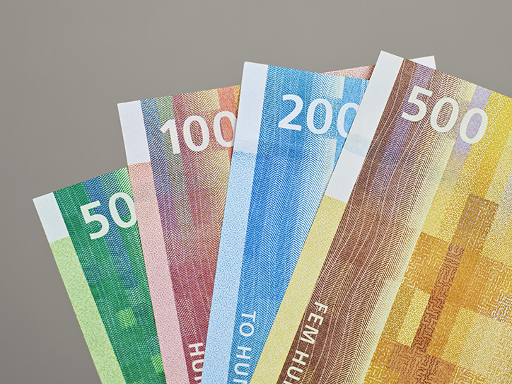
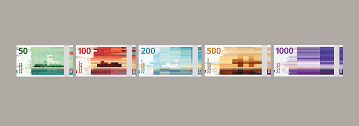
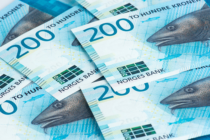
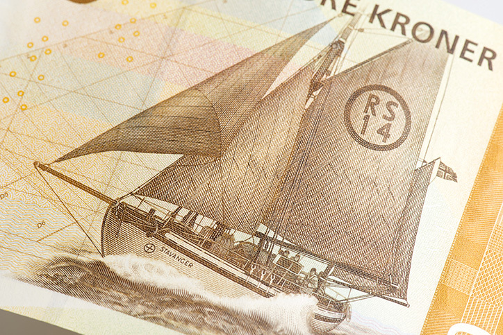
Norway puts it new gorgeous banknotes in circulation

Post pobrano z: Norway puts it new gorgeous banknotes in circulation

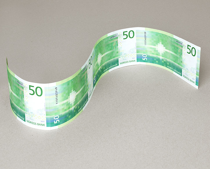
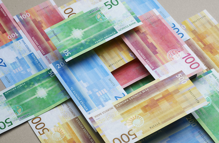
We shared on Designer Daily the concept of the new Norway bank notes when it was announced. We are now glad to see that the new currency is in circulation. Mixing traditional visuals on one side with more abstract, “pixel art” like, art on the other side, the notes are a good compromise between tradition and modernity.

An interesting point to mention is that in Norway, only 10% of all financial transactions are made using cash money, so redesigning the Country’s currency could be perceived as a useless investment as the trend goes towards less and less physical money used. It shows how the design of a nation’s currency is a powerful symbol in the image of a nation.

This great work was produced by the Oslo-based design studio Snohetta, make sure to check out more of their work on their website.

Norway puts it new gorgeous banknotes in circulation

Post pobrano z: Norway puts it new gorgeous banknotes in circulation

We shared on Designer Daily the concept of the new Norway bank notes when it was announced. We are now glad to see that the new currency is in circulation. Mixing traditional visuals on one side with more abstract, “pixel art” like, art on the other side, the notes are a good compromise between tradition and modernity.

An interesting point to mention is that in Norway, only 10% of all financial transactions are made using cash money, so redesigning the Country’s currency could be perceived as a useless investment as the trend goes towards less and less physical money used. It shows how the design of a nation’s currency is a powerful symbol in the image of a nation.

This great work was produced by the Oslo-based design studio Snohetta, make sure to check out more of their work on their website.

SearchCam: the App that adds live OCR capabilities to your smartphone

Post pobrano z: SearchCam: the App that adds live OCR capabilities to your smartphone

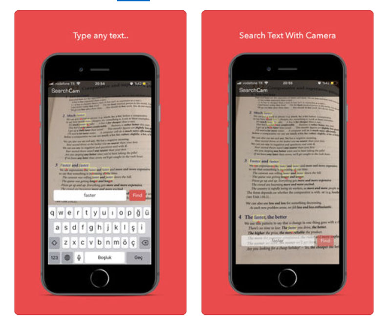
SearchCam is a very promising iPhone app that could prove amazingly useful. It allows you to film some text with your iPhone, detect the texts automatically, recognize the letters, and capture the texts.

Although it seems for now that the app is more of a demo than really useful in real-life situations, it already works in real-life situations. I can already see myself using it on a big, complicated board of information to find my way. However, it is for now only available for iPhone, there is no Android version.

Check out the video demo below to see it in action.

SearchCam: the App that adds live OCR capabilities to your smartphone

Post pobrano z: SearchCam: the App that adds live OCR capabilities to your smartphone

SearchCam is a very promising iPhone app that could prove amazingly useful. It allows you to film some text with your iPhone, detect the texts automatically, recognize the letters, and capture the texts.

Although it seems for now that the app is more of a demo than really useful in real-life situations, it already works in real-life situations. I can already see myself using it on a big, complicated board of information to find my way. However, it is for now only available for iPhone, there is no Android version.

Check out the video demo below to see it in action.

Why It Is Time to Create a Kick-Ass Portfolio (and How to Do It)

Post pobrano z: Why It Is Time to Create a Kick-Ass Portfolio (and How to Do It)

Not too long ago, we discussed the many reasons why a web redesign is a good idea. A website that appears dated and old, with features that no longer work properly, isn’t going to attract many leads and incite confidence in the hearts of potential customers. It is also not a secret that businesses with less-than-stellar websites are not performing so well online. Customers have more options these days, so delivering the best customer experience online is how you stay ahead.

For many designers (and web developers in this matter), working on clients’ websites and projects is seen as a priority. Many of them have old portfolios and websites that haven’t been updated in a while. This may not seem like a big deal at first, but not maintaining your online presence properly can soon hurt your bottom line and your ability to win new clients online.

The same applies to designers in other fields, including those trying to sell their work of art, illustrations, and merchandises. A kick-ass portfolio is absolutely necessary for a number of reasons.

Everyone’s Looking

Your online presence will be one of the first things that potential clients turn to when they are trying to review your work as a designer. Without a strong and fresh online presence, you will be left having to explain your past work in some other ways.

A strong online presence and a portfolio that wows potential customers, on the other hand, is the key to success. You can easily push potential clients forward in their decision-making process when they love what they see in your portfolio.

There is also the fact that the demand for good design services and works of art is on a steep rise this past year. Design is something that people appreciate more and more, and not capitalizing on this market growth would be such a waste.

Organizing Your Best Work

Your online portfolio is the perfect platform for showcasing your best work. Sure, you can post them on Instagram for others to see, but you have little control over how the designs and artwork are displayed on the platform. You can also share them through LinkedIn or Medium, but once again you lose a lot of control over the way your designs are shown.

An online portfolio is perfect for storing, organizing, and showcasing your past work and personal projects you did along the way. The online portfolio is meant to last; as long as the website is active and well-maintained, you don’t need to worry about losing it or the artworks it displays. At the same time, you also have more options when it comes to the look and feel of the online portfolio.

A Way to Review Your Progress

As a designer, learning new things and continuously improving yourself is essential. The only way you can keep up with market changes and continue to lead the pack is by improving yourself, picking up new skills, and expanding your horizon. This means reviewing your past designs and finding new ways to improve.

In this respect, the online portfolio is perfect. As you add more artwork to the portfolio and expand its size, you also get the ability to review your progress with every project. Did you do something different with the latest website you designed? Are your illustrations incorporating the latest skills and tools that you acquired recently? More importantly, how can your next designs be even better?

At the same time, you also get the ability to see what you haven’t accomplished as a designer. This is a valuable insight that isn’t always easy to get; it is clear that the online portfolio can be much more valuable than you think.

A Pet Project

The online portfolio itself is a representation of yourself as a designer. The way the portfolio is designed and set up can greatly affect how others feel about your work. Many designers now take the design of their portfolios seriously; those extra options you get with setting up your own portfolio will certainly make it fun to turn the site into a personal project.

Just like other designs and artworks, you can do so much to your portfolio. Channel your creative freedom and do incredible things with the way you display your finest work. The process starts with choosing a good platform for an online art portfolio, and then finding themes, making adjustments, and completing other steps.

Curation is also a big part of the process. Curating which designs you add to the portfolio is a must. It allows you to feature the best side of you and makes marketing yourself as a designer a lot easier. Don’t forget to arrange the designs in the correct order based on the typical impact they can produce when seen by potential customers.

Sell Your Art

There is another big advantage of having your own portfolio, and that is gaining the ability to sell your art and design directly. You can add a set of ecommerce features – such as a searchable catalogue and a shopping cart – to the online art portfolio just as easily, allowing potential clients and customers to make purchases right away.

It is even possible to integrate payment options and fully automate the delivery of ordered designs and artworks. In the case of digital designs ordered by customers, you can set up a way to securely deliver the work, all while making the online portfolio richer and more up to date.

Tell Your Story

One last reason why an online portfolio is crucial is storytelling. Telling your side of the story as a designer is important. Potential customers and the audience in general are more likely to connect with you on a personal level when you have a compelling story to tell.

Aside from visuals, you can add text and titles to the images and designs you post on the site. This means you can share what you feel about the project, how it progressed, and the way you explore ideas that lead to the final designs.

Portfolio from Everywhere

So, how can you set up an online portfolio without going through the usual complex process of developing the site from scratch? The first step is finding the right platform to use. Find an online portfolio platform or web-based designers that allow you to customize everything about your portfolio. At the same time, you want to be able to work on the portfolio from everywhere, including from the mobile devices you use.

With a platform selected, the rest is actually quite easy. You continue by working on the layout of the portfolio, choosing titles and typography for the site, and adding other design elements to make the online portfolio visually appealing. At the very least, you need to add your own brand and branding elements to the new website.

Once the site is created, you can start adding your best designs and your latest work to the new site. Once again, this is an easy step to complete, especially since you can use a web-based media upload and management tools to simplify the whole process. What you want to focus on at this stage is optimizing your designs for web use, including making sure they can be loaded quickly.

With these tips, you will have a kick-ass online portfolio in no time, and you should. There are thousands of potential clients online and a good portfolio will help you get discovered even more.

State of Houdini (Chrome Dev Summit 2018)

Post pobrano z: State of Houdini (Chrome Dev Summit 2018)

Here’s a great talk by Das Surma where he looks into what Houdini is and how much of it is implemented in browsers. If you’re unfamiliar with that, Houdini is a series of technologies and APIs that gives developers low level access to how CSS properties work in a fundamental way. Check out Ana Tudor’s deep dive into its impact on animations for some incredible examples of it in practice.

What I particularly like about this video is the way Das mentions the CSS Paint API which lets you do a bunch of bizarre things with CSS, such as creating „squircle” shapes and changing how borders work. It looks wonderfully robust and it should give us super powers in the near future. Ruth John wrote up this extensive overview on the topic earlier this year and it’s worth a read as well.

Direct Link to ArticlePermalink

The post State of Houdini (Chrome Dev Summit 2018) appeared first on CSS-Tricks.

Add Instant awesomeness to your interfaces with this insanely large icon set

Post pobrano z: Add Instant awesomeness to your interfaces with this insanely large icon set

(This is a sponsored post.)

When you need to add icons to your interface, the whole process can really suck. “Should I use all these default bootstrap icons? Maybe I’ll just use the same Google Material icons for the hundredth time?”

Some important yet often overlooked things to consider when choosing an icon set includes, the size of the icons, style, consistency, and quantity. It’s frustrating to find icons that only cover half of the use cases you need.

We constantly felt this frustration too and decided to do something about it. This ultimately led to creating Streamline icon set.

Now in version 3.0, Streamline contains a whopping 30,000 icons in three distinct weights, similar to a font family. There are tons of options to pick the perfect icon for any interface you’re working with, whether it’s a big web application, documentation, or a marketing site.

„I own several icon sets but the one that I return to over and over is the copious Streamline pack, which almost always seems to have just the pictogram I need when I dig into its catalog.”

—Khoi Vinh, Adobe

Easy to Use

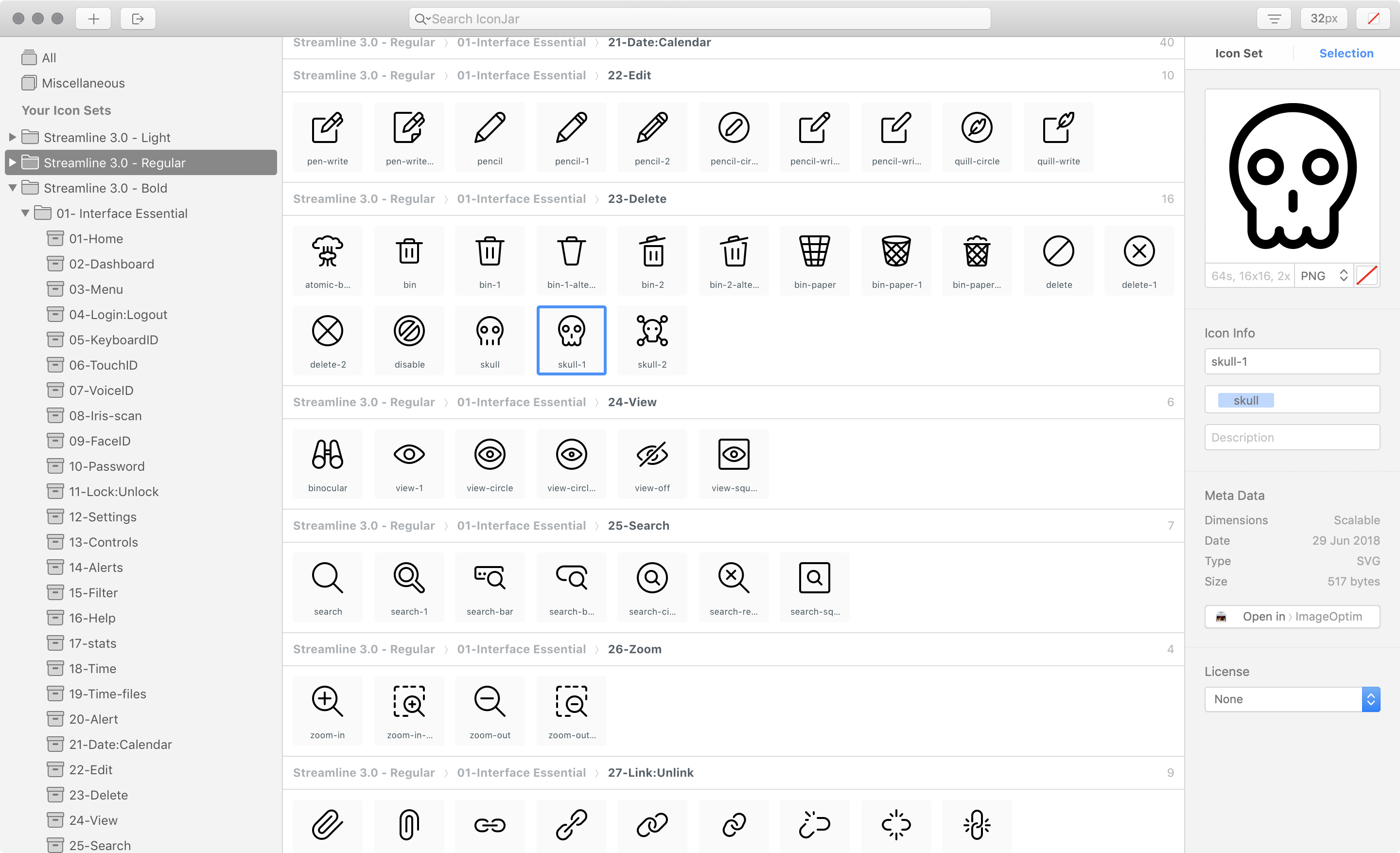
Streamline has also been meticulously organized into easy-to-navigate categories. You can see all of the categories in our handy dandy web-based icon viewer.

If you’re an IconJar user, you can also search for icons by name and drag and drop them into your project folder. We’re currently under development on this functionality for our web viewer too.

Every Streamline Icon pack comes with the following file types: .svg, .iconjar, .sketch, .fig, .ai, .pdf, .png, .xd.

So now matter how you like to work with icons, you have the file types you need.

„Streamline 3.0 is one of the most versatile and detailed icon packs I’ve ever used. The structure and hierarchy make it super easy to work with. This is an amazing product. Bravo, Vincent.”

—Stephanie Walter, UX & UI Designer

Optimized SVG

The SVG versions of Streamline is already dev-ready with proper viewbox tags in place and currentColor set as the color properties for all strokes and fills. You can pop in Streamline using your favorite SVG technique and start changing the color of the icons with CSS right out of the gate.

See the Pen QJQjMm by Matt D. Smith (@mds) on CodePen.

Weights

Every weight—light, regular, and bold—was designed with a very consistent style to give you tons of consistency within your interface.

Light

The classic Streamline style with bits of detail here and there. Designed with 1px stroke on a 24px grid. The Light icons are great for interfaces that need lots of fun personality. They also work well scaled up to 48px as small illustrations.

Regular

A new minimal and geometric style. Designed with a 1.5px stroke on a 24px grid. These are perfect to use on clean and modern web interfaces.

Bold

A new solid style akin to the latest iOS guidelines. Designed with fills and a 2px stroke on a 24px grid. The bold style gives a little more punch for an iOS style interface.

Put Streamline to work for you

There are two different package types available—Essential and Ultimate.

Essential contains 14 categories all related to interfaces and web design, whereas the Ultimate pack contains all 53 categories, including things like Pets, Weather, Finance, Outdoors, Transportation, and so much more.

👉 Check out the Streamline site to soak in all of the icon glory.

„Vincent’s icons are unique, versatile, and easy to work with. I’ve found them to be super useful across a range of projects.”

—Daniel Burka, Resolve to Save Lives

🤓 Some nerdy facts about the Streamline site:

  • Initials designs created in Figma
  • Coded from scratch with .pug, .sass, and .js
  • CodeKit for compiling all of the code
  • Grunt to create a sprite with all of the SVG assets
  • Animations created in After Effects, exported from AE with Lottie into an icon-animation.json format, and added to the site using bodymovin.js
  • Scrollmagic.js was used to manipulate the DOM based on scroll positions for the large icon parallax sections
  • jQuery.js was used to make our lives easier since we’re building a marketing site and not a full-scale application

Direct Link to ArticlePermalink

The post Add Instant awesomeness to your interfaces with this insanely large icon set appeared first on CSS-Tricks.