How to Create a Fun Felt Photoshop Text Effect

Post pobrano z: How to Create a Fun Felt Photoshop Text Effect

Final product image
What You’ll Be Creating

Learn how to create a stitched felt Photoshop text effect in just a few easy steps. This effect is great for the winter holidays.

This felt text effect is a part of the Felt Effect Photoshop Actions from my portfolio on Envato Market.

Felt Photoshop Action
Felt Effect Photoshop Action

The stitched felt effect action is also included in my new Christmas Photoshop Actions Bundle. The bundle contains 10 useful actions for the winter holidays.

Tutorial Assets

To create this Photoshop text effect, I will use the following assets:

1. How to Create the Felt Background

Step 1

Create a new document in Photoshop. The size of the canvas is 850 x 600px, resolution 72 dpi. If you use another canvas size, you have to adjust the layer styles.

Create new Photoshop document

Step 2

Add a new layer and call it Felt Background. Fill the layer with any color you like.

Fill Layer with Color

Step 3 

Add a Pattern Overlay layer style. Click on the arrow to Load Patterns and choose the felt-pattern.pat file. 

How to Load Patterns in Photoshop

Step 4

Add a Color Overlay (color #428fc7) to the Felt Background layer. 

Add Color Overlay in Photoshop

2. How to Create the Felt Photoshop Text Effect

Step 1

I will create the text in a new document. So make a new file and add your text. Set the size to 320 pt.

Add Text Layer in Photoshop

Step 2

Toggle the Character and Paragraph panels and set the tracking for the selected characters to around 200.  

Character and Paragraph Panels in Photoshop

Step 3

Press Control-J to make two copies of the text layer. 

Duplicate layers in Photoshop

Step 4

Add a Stroke layer style of 15 px to the Felt Text 1 layer. The color of the border is not important, so you can choose any color you want. 

Stroke Layer Style

Step 5

Add a Stroke layer style of 10 px to the Felt Text 2 layer. The color of the border is not important, so you can choose any color you want. 

Stroke Layer Style

Step 6

Set the Fill of the Felt Text 3 layer to 0%.

Add a Bevel and Emboss layer style (color #ffffff and #000000) to the Felt Text 3 layer.

Bevel and Emboss Layer Style

Step 7

Go to the Felt Text 1 layer, right-click and choose Convert to Smart Object. Do the same for the Felt Text 2 and Felt Text 3 layers.

Convert to Smart Object in Photoshop

Step 8

I will hide the Felt Text 2 and Felt Text 3 layers for now. 

Go to the Felt Text 1 smart object and add these layer styles:

  • Drop Shadow (color #000000)
  • Color Overlay (color #328f1f)
  • Pattern Overlay (felt-pattern)
  • Bevel and Emboss (color #ffffff and #000000)
Drop Shadow Layer Style
Color Overlay Layer Style
Pattern Overlay Layer Style
Bevel and Emboss Layer Style

Step 9

To expand the text, go to Filter > Other > Minimum and set the Radius to 10 px

Minimum Filter in Photoshop

Step 10

Go to the Felt Text 2 smart object and add these layer styles:

  • Drop Shadow (color #000000)
  • Color Overlay (color #c11a1a)
  • Pattern Overlay (felt-pattern)
  • Bevel and Emboss (color #ffffff and #000000)
Drop Shadow Layer Style
Color Overlay Layer Style
Pattern Overlay Layer Style
Bevel and Emboss Layer Style

Step 11

Go to the Felt Text 3 smart object and set the blend mode to Overlay

Blend Mode Overlay

Step 12

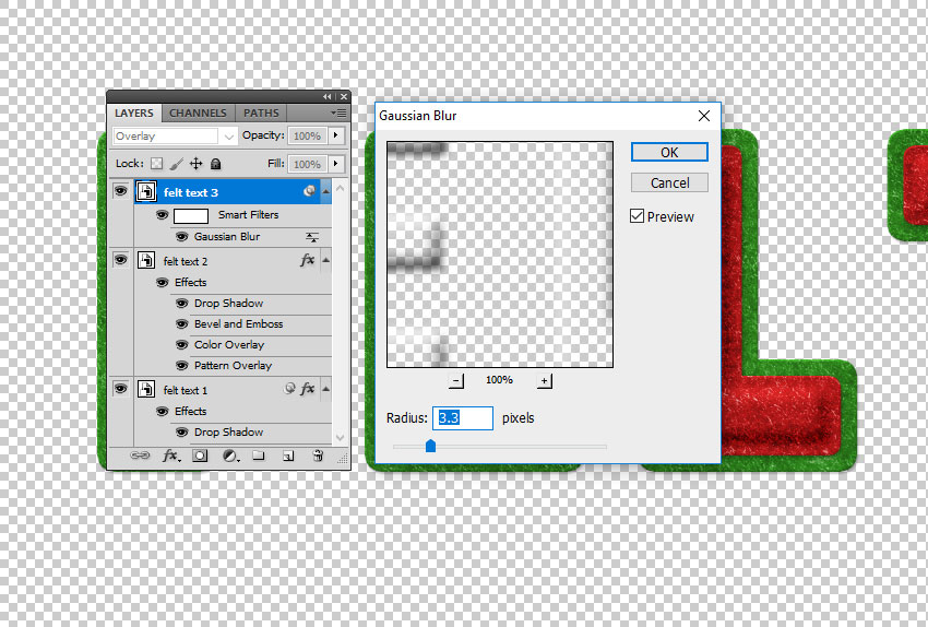
Go to Filter > Blur > Gaussian Blur and set the Radius to around 3.3 px

Gaussian Blur Photoshop Filter

Step 13

The felt text effect should now look like this. You can, of course, choose any colors you like for the felt pattern. 

Felt Text Effect in Photoshop

3. Create a Stitch Brush in Photoshop

Step 1

Let’s create a stitch brush for the felt Photoshop text effect.

Create a new PSD file, size 27 x 5 pxFill the canvas with color black. Go to Edit > Define Brush Preset. Set the brush name to „stitch” and click OK

Define Brush Preset in Photoshop

Step 2

Choose the Brush Tool and select the „stitch” brush from the Brush Preset Picker. Toggle the Brush panel and make the following settings: Spacing 750% and set the Angle Jitter to Direction.

Create Dashed Brush in Photoshop

Step 3

Click on the top right corner of the Brush panel and choose New Brush Preset. Name the new brush „stitch2”

Create Stitch Brush in Photoshop

You can now close the file in which you created the brush.

4. Add a Stitch Effect in Photoshop

Step 1

Press Shift-Control-N to create a new layer called Stitch Effect

Keep the Control key pressed and click on the thumbnail of the Felt Text 2 smart object to make a selection.

Make a Selection in Photoshop

Step 2

Go to Select > Modify > Contract and contract by 12 pixels.

Contract Selection in Photoshop

Step 3

Go to the Path tab and choose Make Work Path from the selection. 

Make Work Path in Photoshop

Step 4

Create a new layer above the Felt Text 3 layer and call it Stitch Effect

Pick the Brush Tool and select the stitch brush. 

Pick the Brush Tool

Step 5

Go to the Path tab and choose Stroke Work Path

Stroke Work Path
Stroke Work Path

Step 6

Press Delete to remove the work path.

Stitch Effect in Photoshop

Step 7

Add these layer styles to the Stitch Effect layer:

  • Drop Shadow (color #000000)
  • Color Overlay (color #e3dbc2)
  • Bevel and Emboss (color #ffffff and #000000)
Drop Shadow
Color Overlay
Bevel and Emboss

5. Create the Felt Letters

Step 1

Select all the layers and right-click to Convert to Smart Object

Select Layers and Convert to Smart Object

Step 2

Right-click on the Felt Text smart object and choose Duplicate Layer. For the Destination, choose the initial document, the one with the felt background.

Duplicate layer in Another Document

Step 3

Make a copy of the Felt Text smart object and hide it. That way, you have the original text intact.

Rasterize the Felt Text smart object. 

Rasterize a Smart Object in Photoshop

Step 4

Use the Rectangular Marquee Tool to select the letter F. Press Control-X and Control-V to cut and paste the letter F onto another layer.

Cut and Paste in Photoshop

Step 5

Do the same for all the letters. Now you have the felt text letters on separate layers.

Text to Letters in Photoshop

Step 6

Press Control-T to Rotate and Move the letters as you like.

Rotate Layers in Photoshop

6. How to Make a Shadow in Photoshop

Step 1

As you can see, the letters look a little flat and have the same shadow. So to make them look more realistic, add different Drop Shadow layer styles to each letter.

Start with the F layer. 
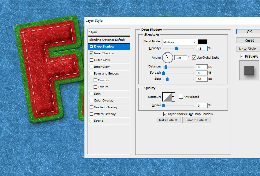
Drop Shadow Layer Style in Photoshop

Step 2

Add a Drop Shadow layer style to the E layer. 

Drop Shadow Layer Style in Photoshop

Step 3

Add a Drop Shadow layer style to the L layer. 

Drop Shadow Layer Style in Photoshop

Step 4

Add a Drop Shadow layer style to the T layer. 

Drop Shadow Layer Style in Photoshop

You can also add an Inner Shadow layer style to each layer. 

Inner Shadow Layer Style

7. Change the Color of the Felt Photoshop Text Effect

If you want to change the color of the felt letters, add a Hue/Saturation adjustment layer for the letter that you want to modify. If you want to change the red color, choose the Reds channel. 

Click the Clip to Layer button to add the adjustment only for that layer. 

HueSaturation Adjustment Layer

In the same way, you can change any letter you want.

Felt Photoshop Text Effect

8. Add Felt Ornaments

Step 1

Use the Pen Tool to add shapes like trees and clouds. 

Create Shapes Using the Pen Tool

Step 2

Click on the Add to Shape Area if you want to create multiple shapes on the same layer. 

I made two separate layers with tree shapes and one separate layer with cloud shapes. I did that because I want to add different colors to the shapes.

Step 3

For each layer, add these layer styles:

  • Drop Shadow (color #000000)
  • Color Overlay (choose the color that you like)
  • Pattern Overlay (felt-pattern)
  • Bevel and Emboss (color #ffffff and #000000)
Drop Shadow
Color Overlay
Pattern Overlay
Bevel and Emboss

Step 4

You can also create a new layer and use the Brush Tool to add some stitch effects using the stitch brush.

Photoshop Felt Text with Stitch Effects

9. Create Clothes Buttons in Photoshop

Step 1

To create the clothes button, I use the Ellipse Tool. Keep the Shift key pressed and draw to create a circle. 

Create a Circle in Photoshop

Step 2

Click on the Subtract from Shape Area button and add a circle inside the first circle to make a hole. Do this three more times.

Create a Circle in Photoshop

Step 3

Add these layer styles to the Clothes Button layer: 

  • Drop Shadow (color #000000)
  • Color Overlay (color #c8350d or choose the color that you like)
  • Bevel and Emboss (color #ffffff and #000000)
Drop Shadow
Bevel and Emboss
Color Overlay

Step 4

Create a new circle shape layer. Click on the Subtract from Shape Area button and add a large circle inside the first circle to make a hole. 

Subtract from Shape Area

Step 5

Go to the Clothes Button 1 layer, right-click and choose Copy Layer Style. Go to the Clothes Button 2 layer, right-click and choose Paste Layer Style.

Copy Layer Style in Photoshop

You can modify the layer style as you wish to create endless results. Change the Color Overlay, the Bevel and Emboss settings, etc.

Step 6

Create a new layer and call it Thread. Use the Brush Tool to create a thread.

Brush Tool

Create another layer and call it Thread. Use the Brush Tool to create another thread.

Brush Tool

Step 7

Add these layer styles to the Thread layers: 

  • Drop Shadow (color #000000)
  • Color Overlay (color #b9b9b9)
  • Inner Shadow (color #000000)
  • Bevel and Emboss (color #ffffff and #000000)
Drop Shadow
Color Overlay
Inner Shadow
Bevel and Emboss

Step 8

In the same way, you can create more buttons with different colors and sizes.  

Congratulations! You’re Done!

In this tutorial, you’ve learned how to create a felt text effect in Photoshop from scratch using brushes and patterns. Photoshop text effects are really useful, so I hope you’ve enjoyed this tutorial.  

Create a Felt Text Effect in Photoshop

This Photoshop text effect is a part of the Felt Photoshop Actions pack from my portfolio on Envato Market

The new Christmas Photoshop Actions Bundle contains 10 actions that you can use for the winter festive holidays. The stitched felt effect action is also included in the bundle.

Christmas Photoshop Actions Bundle

Animating Between Views in React

Post pobrano z: Animating Between Views in React

You know how some sites and web apps have that neat native feel when transitioning between two pages or views? Sarah Drasner has shown some good examples and even a Vue library to boot.

These animations are the type of features that can turn a good user experience into a great one. But to achieve this in a React stack, it is necessary to couple crucial parts in your application: the routing logic and the animation tooling.

Let’s start with animations. We’ll be building with React, and there are great options out there for us to leverage. Notably, the react-transition-group is the official package that handles elements entering and leaving the DOM. Let’s explore some relatively straightforward patterns we can apply, even to existing components.

Transitions using react-transition-group

First, let’s get familiar with the react-transition-group library to examine how we can use it for elements entering and leaving the DOM.

Single components transitions

As a simple example of a use case, we can try to animate a modal or dialog — you know, the type of element that benefits from animations that allow it enter and leave smoothly.

A dialog component might look something like this:

import React from "react";

class Dialog extends React.Component {
  render() {
    const { isOpen, onClose, message } = this.props;
    return (
      isOpen && (
        <div className="dialog--overlay" onClick={onClose}>
          <div className="dialog">{message}</div>
        </div>
      )
    );
  }
}

Notice we are using the isOpen prop to determine whether the component is rendered or not. Thanks to the simplicity of the recently modified API provided by react-transition-group module, we can add a CSS-based transition to this component without much overhead.

First thing we need is to wrap the entire component in another TransitionGroup component. Inside, we keep the prop to mount or unmount the dialog, which we are wrapping in a CSSTransition.

import React from "react";
import { TransitionGroup, CSSTransition } from "react-transition-group";

class Dialog extends React.Component {
  render() {
    const { isOpen, onClose, message } = this.props;
    return (
      <TransitionGroup component={null}>
        {isOpen && (
          <CSSTransition classNames="dialog" timeout={300}>
            <div className="dialog--overlay" onClick={onClose}>
              <div className="dialog">{message}</div>
            </div>
          </CSSTransition>
        )}
      </TransitionGroup>
    );
  }
}

Every time isOpen is modified, a sequence of class names changes will happen in the dialog’s root element.

If we set the classNames prop to "fade", then fade-enter will be added immediately before the element mounts and then fade-enter-active when the transition kicks off. We should see fade-enter-done when the transition finishes, based on the timeout that was set. Exactly the same will happen with the exit class name group at the time the element is about to unmount.

This way, we can simply define a set of CSS rules to declare our transitions.

.dialog-enter {
  opacity: 0.01;
  transform: scale(1.1);
}

.dialog-enter-active {
  opacity: 1;
  transform: scale(1);
  transition: all 300ms;
}

.dialog-exit {
  opacity: 1;
  transform: scale(1);
}

.dialog-exit-active {
  opacity: 0.01;
  transform: scale(1.1);
  transition: all 300ms;
}

JavaScript Transitions

If we want to orchestrate more complex animations using a JavaScript library, then we can use the Transition component instead.

This component doesn’t do anything for us like the CSSTransition did, but it does expose hooks on each transition cycle. We can pass methods to each hook to run calculations and animations.

<TransitionGroup component={null}>
  {isOpen && (
    <Transition
      onEnter={node => animateOnEnter(node)}
      onExit={node => animateOnExit(node)}
      timeout={300}
    >
      <div className="dialog--overlay" onClick={onClose}>
        <div className="dialog">{message}</div>
      </div>
    </Transition>
  )}
</TransitionGroup>

Each hook passes the node to the callback as a first argument — this gives control for any mutation we want when the element mounts or unmounts.

Routing

The React ecosystem offers plenty of router options. I’m gonna use react-router-dom since it’s the most popular choice and because most React developers are familiar with the syntax.

Let’s start with a basic route definition:

import React, { Component } from 'react'
import { BrowserRouter, Switch, Route } from 'react-router-dom'
import Home from '../views/Home'
import Author from '../views/Author'
import About from '../views/About'
import Nav from '../components/Nav'

class App extends Component {
  render() {
    return (
      <BrowserRouter>
        <div className="app">
          <Switch>
            <Route exact path="/" component={Home}/>
            <Route path="/author" component={Author} />
            <Route path="/about" component={About} />
          </Switch>
        </div>
      </BrowserRouter>
    )
  }
}

We want three routes in this application: home, author and about.

The BrowserRouter component handles the browser’s history updates, while Switch decides which Route element to render depending on the path prop. Here’s that without any transitions:

Don’t worry, we’ll be adding in page transitions as we go.

Oil and water

While both react-transition-group and react-router-dom are great and handy packages for their intended uses, mixing them together can break their functionality.

For example, the Switch component in react-router-dom expects direct Route children and the TransitionGroup components in react-transition-group expect CSSTransition or Transition components to be direct children of it too. So, we’re unable to wrap them the way we did earlier.

We also cannot toggle views with the same boolean approach as before since it’s handled internally by the react-router-dom logic.

React keys to the rescue

Although the solution might not be as clean as our previous examples, it is possible to use the libraries together. The first thing we need to do is to move our routes declaration to a render prop.

<BrowserRouter>
  <div className="app">
    <Route render={(location) => {
      return (
        <Switch location={location}>
          <Route exact path="/" component={Home}/>
          <Route path="/author" component={Author} />
          <Route path="/about" component={About} />
        </Switch>
      )}
    />
</BrowserRouter>

Nothing has changed as far as functionality. The difference is that we are now in control of what gets rendered every time the location in the browser changes.

Also, react-router-dom provides a unique key in the location object every time this happens.

In case you are not familiar with them, React keys identify elements in the virtual DOM tree. Most times, we don’t need to indicate them since React will detect which part of the DOM should change and then patch it.

<Route render={({ location }) => {
  const { pathname, key } = location

  return (
    <TransitionGroup component={null}>
      <Transition
        key={key}
        appear={true}
        onEnter={(node, appears) => play(pathname, node, appears)}
        timeout={{enter: 750, exit: 0}}
      >
        <Switch location={location}>
          <Route exact path="/" component={Home}/>
          <Route path="/author" component={Author} />
          <Route path="/about" component={About} />
        </Switch>
      </Transition>
    </TransitionGroup>
  )
}}/>

Constantly changing the key of an element — even when its children or props haven’t been modified — will force React to remove it from the DOM and remount it. This helps us emulate the boolean toggle approach we had before and it’s important for us here because we can place a single Transition element and reuse it for all of our view transitions, allowing us to mix routing and transition components.

Inside the animation function

Once the transition hooks are called on each location change, we can run a method and use any animation library to build more complex scenes for our transitions.

export const play = (pathname, node, appears) => {
  const delay = appears ? 0 : 0.5
  let timeline

  if (pathname === '/')
    timeline = getHomeTimeline(node, delay)
  else
    timeline = getDefaultTimeline(node, delay)

  timeline.play()
}

Our play function will build a GreenSock timeline here depending on the pathname, and we can set as many transitions as we want for each different routes.

Once the timeline is built for the current pathname, we play it.

const getHomeTimeline = (node, delay) => {
  const timeline = new Timeline({ paused: true });
  const texts = node.querySelectorAll('h1 > div');

  timeline
    .from(node, 0, { display: 'none', autoAlpha: 0, delay })
    .staggerFrom(texts, 0.375, { autoAlpha: 0, x: -25, ease: Power1.easeOut }, 0.125);

  return timeline
}

Each timeline method digs into the DOM nodes of the view and animates them. You can use other animation libraries instead of GreenSock, but the important detail is that we build the timeline beforehand so that our main play method can decide which one should run for each route.

Success!

I’ve used this approach on lots of projects, and though it doesn’t present obvious performance issues for inner navigations, I did notice a concurrency issue between the browser’s initial DOM tree build and the first route animation. This caused a visual lag on the animation for the first load of the application.

To make sure animations are smooth in each stage of the application, there’s one last thing we can do.

Profiling the initial load

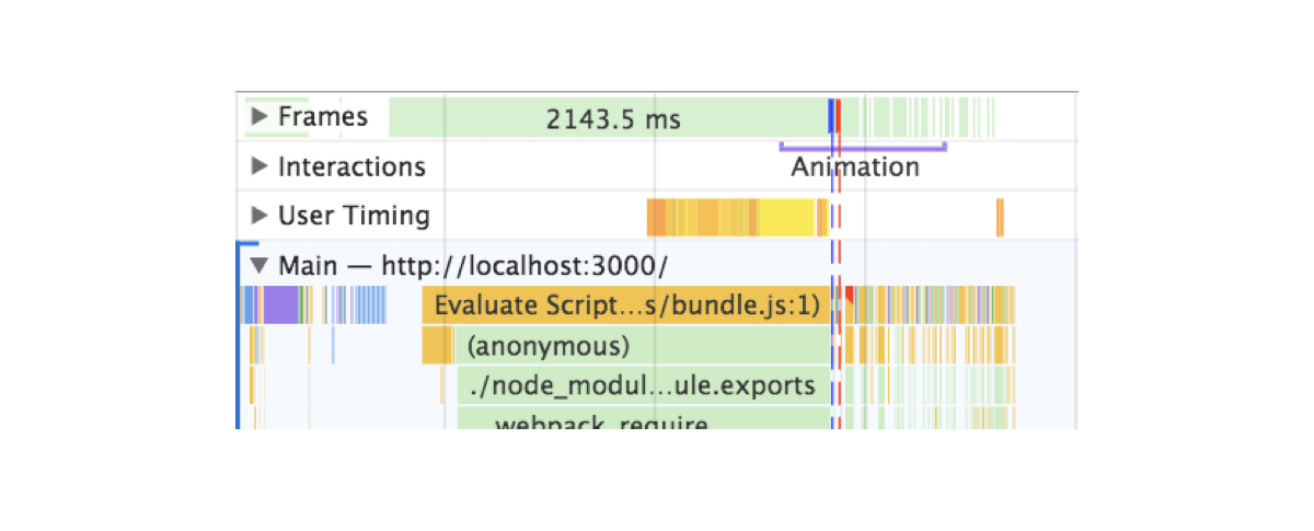
Here’s what I found when auditing the application in Chrome DevTools after a hard refresh:

You can see two lines: one blue and one red. Blue represents the load event and red the DOMContentLoaded. Both intersect the execution of the initial animations.

These lines are indicating that elements are animating while the browser hasn’t yet finished building the entire DOM tree or it’s parsing resources. Animations account for big performance hits. If we want anything else to happen, we’d have to wait for the browser to be ready with these heavy and important tasks before running our transitions.

After trying a lot of different approaches, the solution that actually worked was to move the animation after these events — simple as that. The issue is that we can’t rely on event listeners.

window.addEventListener(‘DOMContentLoaded’, () => {
  timeline.play()
})

If for some reason, the event occurs before we declare the listener, the callback we pass will never run and this could lead to our animations never happening and an empty view.

Since this is a concurrency and asynchronous issue, I decided to rely on promises, but then the question became: how can promises and event listeners be used together?

By creating a promise that gets resolved when the event takes place. That’s how.

window.loadPromise = new Promise(resolve => {
  window.addEventListener(‘DOMContentLoaded’, resolve)
})

We can put this in the document head or just before the script tag that loads the application bundle. This will make sure the event never happens before the Promise is created.

Plus, doing this allows us to use the globally exposed loadPromise to any animation in our application. Let’s say that we don’t only want to animate the entry view but a cookie banner or the header of the application. We can simply call each of these animations after the promise has resolved using then along with our transitions.

window.loadPromise.then(() => timeline.play())

This approach is reusable across the entire codebase, eliminating the issue that would result when an event gets resolved before the animations run. It will defer them until the browser DOMContentLoaded event has passed.

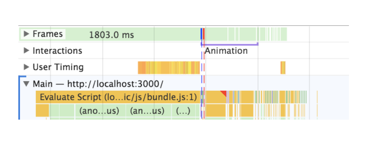
See now that the animation is not kicking off until the red line appears.

The difference is not only on the profiling report — it actually solves an issue we had in a real project.

Wrapping up

In order to act as reminders, I created a list of tips for me that you might find useful as you dig into view transitions in a project:

  • When an animation is happening nothing else should be happening. Run animations after all resources, fetching and business logic have completed.
  • No animation is better than crappy animations If you can’t achieve a good animation, then removing it is a fair sacrifice. The content is more important and showing it is the priority until a good animation solution is in place.
  • Test on slower and older devices. They will make it easier for you to catch spots with weak performance.
  • Profile and base your improvements in metrics. Instead of guessing as you go, like I did, see if you can spot where frames are being dropped or if something looks off and attack that issue first.

That’s it! Best of luck with animating view transitions. Please post a comment if this sparked any questions or if you have used transitions in your app that you’d like to share!

The post Animating Between Views in React appeared first on CSS-Tricks.

Animating Between Views in React

Post pobrano z: Animating Between Views in React

You know how some sites and web apps have that neat native feel when transitioning between two pages or views? Sarah Drasner has shown some good examples and even a Vue library to boot.

These animations are the type of features that can turn a good user experience into a great one. But to achieve this in a React stack, it is necessary to couple crucial parts in your application: the routing logic and the animation tooling.

Let’s start with animations. We’ll be building with React, and there are great options out there for us to leverage. Notably, the react-transition-group is the official package that handles elements entering and leaving the DOM. Let’s explore some relatively straightforward patterns we can apply, even to existing components.

Transitions using react-transition-group

First, let’s get familiar with the react-transition-group library to examine how we can use it for elements entering and leaving the DOM.

Single components transitions

As a simple example of a use case, we can try to animate a modal or dialog — you know, the type of element that benefits from animations that allow it enter and leave smoothly.

A dialog component might look something like this:

import React from "react";

class Dialog extends React.Component {
  render() {
    const { isOpen, onClose, message } = this.props;
    return (
      isOpen && (
        <div className="dialog--overlay" onClick={onClose}>
          <div className="dialog">{message}</div>
        </div>
      )
    );
  }
}

Notice we are using the isOpen prop to determine whether the component is rendered or not. Thanks to the simplicity of the recently modified API provided by react-transition-group module, we can add a CSS-based transition to this component without much overhead.

First thing we need is to wrap the entire component in another TransitionGroup component. Inside, we keep the prop to mount or unmount the dialog, which we are wrapping in a CSSTransition.

import React from "react";
import { TransitionGroup, CSSTransition } from "react-transition-group";

class Dialog extends React.Component {
  render() {
    const { isOpen, onClose, message } = this.props;
    return (
      <TransitionGroup component={null}>
        {isOpen && (
          <CSSTransition classNames="dialog" timeout={300}>
            <div className="dialog--overlay" onClick={onClose}>
              <div className="dialog">{message}</div>
            </div>
          </CSSTransition>
        )}
      </TransitionGroup>
    );
  }
}

Every time isOpen is modified, a sequence of class names changes will happen in the dialog’s root element.

If we set the classNames prop to "fade", then fade-enter will be added immediately before the element mounts and then fade-enter-active when the transition kicks off. We should see fade-enter-done when the transition finishes, based on the timeout that was set. Exactly the same will happen with the exit class name group at the time the element is about to unmount.

This way, we can simply define a set of CSS rules to declare our transitions.

.dialog-enter {
  opacity: 0.01;
  transform: scale(1.1);
}

.dialog-enter-active {
  opacity: 1;
  transform: scale(1);
  transition: all 300ms;
}

.dialog-exit {
  opacity: 1;
  transform: scale(1);
}

.dialog-exit-active {
  opacity: 0.01;
  transform: scale(1.1);
  transition: all 300ms;
}

JavaScript Transitions

If we want to orchestrate more complex animations using a JavaScript library, then we can use the Transition component instead.

This component doesn’t do anything for us like the CSSTransition did, but it does expose hooks on each transition cycle. We can pass methods to each hook to run calculations and animations.

<TransitionGroup component={null}>
  {isOpen && (
    <Transition
      onEnter={node => animateOnEnter(node)}
      onExit={node => animateOnExit(node)}
      timeout={300}
    >
      <div className="dialog--overlay" onClick={onClose}>
        <div className="dialog">{message}</div>
      </div>
    </Transition>
  )}
</TransitionGroup>

Each hook passes the node to the callback as a first argument — this gives control for any mutation we want when the element mounts or unmounts.

Routing

The React ecosystem offers plenty of router options. I’m gonna use react-router-dom since it’s the most popular choice and because most React developers are familiar with the syntax.

Let’s start with a basic route definition:

import React, { Component } from 'react'
import { BrowserRouter, Switch, Route } from 'react-router-dom'
import Home from '../views/Home'
import Author from '../views/Author'
import About from '../views/About'
import Nav from '../components/Nav'

class App extends Component {
  render() {
    return (
      <BrowserRouter>
        <div className="app">
          <Switch>
            <Route exact path="/" component={Home}/>
            <Route path="/author" component={Author} />
            <Route path="/about" component={About} />
          </Switch>
        </div>
      </BrowserRouter>
    )
  }
}

We want three routes in this application: home, author and about.

The BrowserRouter component handles the browser’s history updates, while Switch decides which Route element to render depending on the path prop. Here’s that without any transitions:

Don’t worry, we’ll be adding in page transitions as we go.

Oil and water

While both react-transition-group and react-router-dom are great and handy packages for their intended uses, mixing them together can break their functionality.

For example, the Switch component in react-router-dom expects direct Route children and the TransitionGroup components in react-transition-group expect CSSTransition or Transition components to be direct children of it too. So, we’re unable to wrap them the way we did earlier.

We also cannot toggle views with the same boolean approach as before since it’s handled internally by the react-router-dom logic.

React keys to the rescue

Although the solution might not be as clean as our previous examples, it is possible to use the libraries together. The first thing we need to do is to move our routes declaration to a render prop.

<BrowserRouter>
  <div className="app">
    <Route render={(location) => {
      return (
        <Switch location={location}>
          <Route exact path="/" component={Home}/>
          <Route path="/author" component={Author} />
          <Route path="/about" component={About} />
        </Switch>
      )}
    />
</BrowserRouter>

Nothing has changed as far as functionality. The difference is that we are now in control of what gets rendered every time the location in the browser changes.

Also, react-router-dom provides a unique key in the location object every time this happens.

In case you are not familiar with them, React keys identify elements in the virtual DOM tree. Most times, we don’t need to indicate them since React will detect which part of the DOM should change and then patch it.

<Route render={({ location }) => {
  const { pathname, key } = location

  return (
    <TransitionGroup component={null}>
      <Transition
        key={key}
        appear={true}
        onEnter={(node, appears) => play(pathname, node, appears)}
        timeout={{enter: 750, exit: 0}}
      >
        <Switch location={location}>
          <Route exact path="/" component={Home}/>
          <Route path="/author" component={Author} />
          <Route path="/about" component={About} />
        </Switch>
      </Transition>
    </TransitionGroup>
  )
}}/>

Constantly changing the key of an element — even when its children or props haven’t been modified — will force React to remove it from the DOM and remount it. This helps us emulate the boolean toggle approach we had before and it’s important for us here because we can place a single Transition element and reuse it for all of our view transitions, allowing us to mix routing and transition components.

Inside the animation function

Once the transition hooks are called on each location change, we can run a method and use any animation library to build more complex scenes for our transitions.

export const play = (pathname, node, appears) => {
  const delay = appears ? 0 : 0.5
  let timeline

  if (pathname === '/')
    timeline = getHomeTimeline(node, delay)
  else
    timeline = getDefaultTimeline(node, delay)

  timeline.play()
}

Our play function will build a GreenSock timeline here depending on the pathname, and we can set as many transitions as we want for each different routes.

Once the timeline is built for the current pathname, we play it.

const getHomeTimeline = (node, delay) => {
  const timeline = new Timeline({ paused: true });
  const texts = node.querySelectorAll('h1 > div');

  timeline
    .from(node, 0, { display: 'none', autoAlpha: 0, delay })
    .staggerFrom(texts, 0.375, { autoAlpha: 0, x: -25, ease: Power1.easeOut }, 0.125);

  return timeline
}

Each timeline method digs into the DOM nodes of the view and animates them. You can use other animation libraries instead of GreenSock, but the important detail is that we build the timeline beforehand so that our main play method can decide which one should run for each route.

Success!

I’ve used this approach on lots of projects, and though it doesn’t present obvious performance issues for inner navigations, I did notice a concurrency issue between the browser’s initial DOM tree build and the first route animation. This caused a visual lag on the animation for the first load of the application.

To make sure animations are smooth in each stage of the application, there’s one last thing we can do.

Profiling the initial load

Here’s what I found when auditing the application in Chrome DevTools after a hard refresh:

You can see two lines: one blue and one red. Blue represents the load event and red the DOMContentLoaded. Both intersect the execution of the initial animations.

These lines are indicating that elements are animating while the browser hasn’t yet finished building the entire DOM tree or it’s parsing resources. Animations account for big performance hits. If we want anything else to happen, we’d have to wait for the browser to be ready with these heavy and important tasks before running our transitions.

After trying a lot of different approaches, the solution that actually worked was to move the animation after these events — simple as that. The issue is that we can’t rely on event listeners.

window.addEventListener(‘DOMContentLoaded’, () => {
  timeline.play()
})

If for some reason, the event occurs before we declare the listener, the callback we pass will never run and this could lead to our animations never happening and an empty view.

Since this is a concurrency and asynchronous issue, I decided to rely on promises, but then the question became: how can promises and event listeners be used together?

By creating a promise that gets resolved when the event takes place. That’s how.

window.loadPromise = new Promise(resolve => {
  window.addEventListener(‘DOMContentLoaded’, resolve)
})

We can put this in the document head or just before the script tag that loads the application bundle. This will make sure the event never happens before the Promise is created.

Plus, doing this allows us to use the globally exposed loadPromise to any animation in our application. Let’s say that we don’t only want to animate the entry view but a cookie banner or the header of the application. We can simply call each of these animations after the promise has resolved using then along with our transitions.

window.loadPromise.then(() => timeline.play())

This approach is reusable across the entire codebase, eliminating the issue that would result when an event gets resolved before the animations run. It will defer them until the browser DOMContentLoaded event has passed.

See now that the animation is not kicking off until the red line appears.

The difference is not only on the profiling report — it actually solves an issue we had in a real project.

Wrapping up

In order to act as reminders, I created a list of tips for me that you might find useful as you dig into view transitions in a project:

  • When an animation is happening nothing else should be happening. Run animations after all resources, fetching and business logic have completed.
  • No animation is better than crappy animations If you can’t achieve a good animation, then removing it is a fair sacrifice. The content is more important and showing it is the priority until a good animation solution is in place.
  • Test on slower and older devices. They will make it easier for you to catch spots with weak performance.
  • Profile and base your improvements in metrics. Instead of guessing as you go, like I did, see if you can spot where frames are being dropped or if something looks off and attack that issue first.

That’s it! Best of luck with animating view transitions. Please post a comment if this sparked any questions or if you have used transitions in your app that you’d like to share!

The post Animating Between Views in React appeared first on CSS-Tricks.

National Down Syndrome Society: C21

Post pobrano z: National Down Syndrome Society: C21

Media
National Down Syndrome Society

Advertising Agency:Saatchi & Saatchi, New York, USA
Production Company:Tool
Editorial:Cosmo Street
Music Studio:Beacon Street Studios
Managing Partners:Oliver Fuselier, Dustin Callif
Executive Producers:Oliver Fuselier, Dustin Callif, Maura Woodward, Tom Scherma, Leslie Dilullo, Adrea Lavezzoli
Director:Danielle Levitt
Photographer:Danielle Levitt
Executive Producer:Brad Johns, Diane Burton
Producer:Patti Getker, Anne Lai
Chief Creative Officer:Javier Campopiano
Chief Executive Officer:Andrea Díquez
Executive Creative Director:Mike Pierantozzi, Alex Lea
Executive Creative Directors:Chris Moreira, Mark Scholler
Associate Creative Director:Max McKeon
Associate Creative Directors:Cristián Costa, Tomas Almuna
Art Director:Erin Evon
Junior Art Director:Jill Archibold
Junior Copywriter:Carlota Serra
Digital Strategy Director:Melissa Hochman
Account Director:Ciara Siegel
Account Manager:Page Perkinson
Integrated Production Manager:Dennis Marchesiello
Project Management:Cara Muzik
Business Affairs:Robin Oksenhendler
Editor:David Otte
Head Of Production:Anne Lai
Managing Partner:Maura Woodward, Tom Scherma
Principals:Andrew Feltenstein, John Nau, Danny Dunlap

National Down Syndrome Society: C21

Post pobrano z: National Down Syndrome Society: C21

Media
National Down Syndrome Society

Advertising Agency:Saatchi & Saatchi, New York, USA
Production Company:Tool
Editorial:Cosmo Street
Music Studio:Beacon Street Studios
Managing Partners:Oliver Fuselier, Dustin Callif
Executive Producers:Oliver Fuselier, Dustin Callif, Maura Woodward, Tom Scherma, Leslie Dilullo, Adrea Lavezzoli
Director:Danielle Levitt
Photographer:Danielle Levitt
Executive Producer:Brad Johns, Diane Burton
Producer:Patti Getker, Anne Lai
Chief Creative Officer:Javier Campopiano
Chief Executive Officer:Andrea Díquez
Executive Creative Director:Mike Pierantozzi, Alex Lea
Executive Creative Directors:Chris Moreira, Mark Scholler
Associate Creative Director:Max McKeon
Associate Creative Directors:Cristián Costa, Tomas Almuna
Art Director:Erin Evon
Junior Art Director:Jill Archibold
Junior Copywriter:Carlota Serra
Digital Strategy Director:Melissa Hochman
Account Director:Ciara Siegel
Account Manager:Page Perkinson
Integrated Production Manager:Dennis Marchesiello
Project Management:Cara Muzik
Business Affairs:Robin Oksenhendler
Editor:David Otte
Head Of Production:Anne Lai
Managing Partner:Maura Woodward, Tom Scherma
Principals:Andrew Feltenstein, John Nau, Danny Dunlap

National Down Syndrome Society: C21

Post pobrano z: National Down Syndrome Society: C21

Media
National Down Syndrome Society

Advertising Agency:Saatchi & Saatchi, New York, USA
Production Company:Tool
Editorial:Cosmo Street
Music Studio:Beacon Street Studios
Managing Partners:Oliver Fuselier, Dustin Callif
Executive Producers:Oliver Fuselier, Dustin Callif, Maura Woodward, Tom Scherma, Leslie Dilullo, Adrea Lavezzoli
Director:Danielle Levitt
Photographer:Danielle Levitt
Executive Producer:Brad Johns, Diane Burton
Producer:Patti Getker, Anne Lai
Chief Creative Officer:Javier Campopiano
Chief Executive Officer:Andrea Díquez
Executive Creative Director:Mike Pierantozzi, Alex Lea
Executive Creative Directors:Chris Moreira, Mark Scholler
Associate Creative Director:Max McKeon
Associate Creative Directors:Cristián Costa, Tomas Almuna
Art Director:Erin Evon
Junior Art Director:Jill Archibold
Junior Copywriter:Carlota Serra
Digital Strategy Director:Melissa Hochman
Account Director:Ciara Siegel
Account Manager:Page Perkinson
Integrated Production Manager:Dennis Marchesiello
Project Management:Cara Muzik
Business Affairs:Robin Oksenhendler
Editor:David Otte
Head Of Production:Anne Lai
Managing Partner:Maura Woodward, Tom Scherma
Principals:Andrew Feltenstein, John Nau, Danny Dunlap

National Down Syndrome Society: C21

Post pobrano z: National Down Syndrome Society: C21

Media
National Down Syndrome Society

Advertising Agency:Saatchi & Saatchi, New York, USA
Production Company:Tool
Editorial:Cosmo Street
Music Studio:Beacon Street Studios
Managing Partners:Oliver Fuselier, Dustin Callif
Executive Producers:Oliver Fuselier, Dustin Callif, Maura Woodward, Tom Scherma, Leslie Dilullo, Adrea Lavezzoli
Director:Danielle Levitt
Photographer:Danielle Levitt
Executive Producer:Brad Johns, Diane Burton
Producer:Patti Getker, Anne Lai
Chief Creative Officer:Javier Campopiano
Chief Executive Officer:Andrea Díquez
Executive Creative Director:Mike Pierantozzi, Alex Lea
Executive Creative Directors:Chris Moreira, Mark Scholler
Associate Creative Director:Max McKeon
Associate Creative Directors:Cristián Costa, Tomas Almuna
Art Director:Erin Evon
Junior Art Director:Jill Archibold
Junior Copywriter:Carlota Serra
Digital Strategy Director:Melissa Hochman
Account Director:Ciara Siegel
Account Manager:Page Perkinson
Integrated Production Manager:Dennis Marchesiello
Project Management:Cara Muzik
Business Affairs:Robin Oksenhendler
Editor:David Otte
Head Of Production:Anne Lai
Managing Partner:Maura Woodward, Tom Scherma
Principals:Andrew Feltenstein, John Nau, Danny Dunlap