If you’re interested in Photoshop text effects, in this tutorial I’ll show you how to create a 3D text in Photoshop in just a few steps. We’re going to adjust its shape, set the light sources, create a material, and then render it all. Just keep in mind you need Photoshop CC or CS6 Extended for this.
Create a New File. Type some text in a big, bold font. If you like, you can download the one I used, Streetwear.
Step 2
With the text layer selected, go to 3D > New 3D Extrusion From Selected Layer.
Step 3
Your text will be turned into a 3D object with some default settings. Before we start changing them, let’s set the scene first. Click the 3D text and go to the Coordinates tab in the Properties panel. Change the X angle to 90 degrees.
Step 4
Select the first tool in the upper bar, and click somewhere outside of the object to move the camera. Drag it until you see a red-blue cross.
Step 5
Go to the Coordinates tab and adjust the second column to only include a 90-degree rotation on the X axis.
Step 6
If needed, drag the cross more to the center and place the 3D text in the center, too.
Step 7
Let’s add a background that our object will be interacting with. Go back to the layers and draw a rectangular shape.
Step 8
Go to 3D > New Mesh from Layer > Depth Map to > Plane.
Step 9
Select both layers and go to 3D > Merge 3D Layers.
Step 10
Select the last tool in the upper bar and resize the rectangular shape to fill the whole scene. You can adjust the thickness of the letters by dragging the shape up by its Z axis (the blue arrow)
Step 11
Let’s adjust the setting of the 3D text now. Go to the first tab in the Properties panel and click Shape Presets. Select one from the list, keeping in mind that they can all still be adjusted.
Step 12
To adjust the shape, go to the Cap tab. Here you have access to many settings to achieve the result you need. I decided to use a simple contour with a very thin bevel and a slight indentation.
Step 13
Time to set the lights! Scroll down the list to find Infinite Light. Drag it to cast a nice shadow under the letters.
Step 14
You can change the Softness of the shadow and the Intensity of the light in the Properties panel.
Step 15
Let’s add one more light. Click the white card on the bottom of the 3D panel and select New Infinite Light.
Step 16
Turn off the first light for a moment and drag the new light so as to illuminate mostly the contours of the letters. Keep the shadow
soft, too.
Step 17
Go to the Materials tab now. Select all the materials of the text and add some colors to them. Diffuse is the main color of the object. Specular is the color of the highlights and shine. Ambient is the color of the shadow. Keep these colors in the same hue range for a natural effect.
Step 18
Once you’ve set all the colors, create a New Material.
Step 19
Click the Rectangle on the list and add the material to it.
Step 20
If you want to make the shadows brighter, you can also add some ambient light to the scene. Find Environment on the 3D list and change Global Ambient to a bright color. You can increase the intensity of the ambient light, too.
Step 21
When you’re done, click Render to see how your scene really looks. It can take a while to finish rendering, but even a few passes can show you what to expect.
Step 22
If you noticed something you want to fix, just hit Escape to stop rendering and adjust the settings that you want to change, like the intensity of light, the direction of the light sources, or the properties of the material. Feel free to repeat this until you’re completely happy with the end result.
3D Text Effects
Cinematic 3D Text Effects
So now you know how to create a basic 3D text effect, but it still takes a lot of effort to create something more complex. If you want to save time, there are plenty of ready-made 3D text effects available on Envato Elements.
For example, this pack contains eight text effects based on popular movie titles. Just pick the one that you want to edit, type your own text, and see the magic happen.
If you want something more original, this set contains six simple but very effective text effects. You can easily add realistic materials to your letters, and the background will complement the text nicely. You can create text for a flyer or a poster this way—just add your text, change the font, and enjoy the end result.
Was that too simple? Maybe you want something more ornate? This set offers eight text effects that will turn your letters into gold. The texture, the shine, and the details of the shape will all be adjusted to create a realistic effect of golden metal. Just think how much time it would take to create such an effect on your own!
You can also create a unique double-3D text with this set. It offers three variations of the same effect: nice, softly shaded letters that bring rubber to mind. You can change the text, font, and even color in this effect.
If you’re interested in Photoshop text effects, in this tutorial I’ll show you how to create a 3D text in Photoshop in just a few steps. We’re going to adjust its shape, set the light sources, create a material, and then render it all. Just keep in mind you need Photoshop CC or CS6 Extended for this.
Create a New File. Type some text in a big, bold font. If you like, you can download the one I used, Streetwear.
Step 2
With the text layer selected, go to 3D > New 3D Extrusion From Selected Layer.
Step 3
Your text will be turned into a 3D object with some default settings. Before we start changing them, let’s set the scene first. Click the 3D text and go to the Coordinates tab in the Properties panel. Change the X angle to 90 degrees.
Step 4
Select the first tool in the upper bar, and click somewhere outside of the object to move the camera. Drag it until you see a red-blue cross.
Step 5
Go to the Coordinates tab and adjust the second column to only include a 90-degree rotation on the X axis.
Step 6
If needed, drag the cross more to the center and place the 3D text in the center, too.
Step 7
Let’s add a background that our object will be interacting with. Go back to the layers and draw a rectangular shape.
Step 8
Go to 3D > New Mesh from Layer > Depth Map to > Plane.
Step 9
Select both layers and go to 3D > Merge 3D Layers.
Step 10
Select the last tool in the upper bar and resize the rectangular shape to fill the whole scene. You can adjust the thickness of the letters by dragging the shape up by its Z axis (the blue arrow)
Step 11
Let’s adjust the setting of the 3D text now. Go to the first tab in the Properties panel and click Shape Presets. Select one from the list, keeping in mind that they can all still be adjusted.
Step 12
To adjust the shape, go to the Cap tab. Here you have access to many settings to achieve the result you need. I decided to use a simple contour with a very thin bevel and a slight indentation.
Step 13
Time to set the lights! Scroll down the list to find Infinite Light. Drag it to cast a nice shadow under the letters.
Step 14
You can change the Softness of the shadow and the Intensity of the light in the Properties panel.
Step 15
Let’s add one more light. Click the white card on the bottom of the 3D panel and select New Infinite Light.
Step 16
Turn off the first light for a moment and drag the new light so as to illuminate mostly the contours of the letters. Keep the shadow
soft, too.
Step 17
Go to the Materials tab now. Select all the materials of the text and add some colors to them. Diffuse is the main color of the object. Specular is the color of the highlights and shine. Ambient is the color of the shadow. Keep these colors in the same hue range for a natural effect.
Step 18
Once you’ve set all the colors, create a New Material.
Step 19
Click the Rectangle on the list and add the material to it.
Step 20
If you want to make the shadows brighter, you can also add some ambient light to the scene. Find Environment on the 3D list and change Global Ambient to a bright color. You can increase the intensity of the ambient light, too.
Step 21
When you’re done, click Render to see how your scene really looks. It can take a while to finish rendering, but even a few passes can show you what to expect.
Step 22
If you noticed something you want to fix, just hit Escape to stop rendering and adjust the settings that you want to change, like the intensity of light, the direction of the light sources, or the properties of the material. Feel free to repeat this until you’re completely happy with the end result.
3D Text Effects
Cinematic 3D Text Effects
So now you know how to create a basic 3D text effect, but it still takes a lot of effort to create something more complex. If you want to save time, there are plenty of ready-made 3D text effects available on Envato Elements.
For example, this pack contains eight text effects based on popular movie titles. Just pick the one that you want to edit, type your own text, and see the magic happen.
If you want something more original, this set contains six simple but very effective text effects. You can easily add realistic materials to your letters, and the background will complement the text nicely. You can create text for a flyer or a poster this way—just add your text, change the font, and enjoy the end result.
Was that too simple? Maybe you want something more ornate? This set offers eight text effects that will turn your letters into gold. The texture, the shine, and the details of the shape will all be adjusted to create a realistic effect of golden metal. Just think how much time it would take to create such an effect on your own!
You can also create a unique double-3D text with this set. It offers three variations of the same effect: nice, softly shaded letters that bring rubber to mind. You can change the text, font, and even color in this effect.
If you’re interested in Photoshop text effects, in this tutorial I’ll show you how to create a 3D text in Photoshop in just a few steps. We’re going to adjust its shape, set the light sources, create a material, and then render it all. Just keep in mind you need Photoshop CC or CS6 Extended for this.
Create a New File. Type some text in a big, bold font. If you like, you can download the one I used, Streetwear.
Step 2
With the text layer selected, go to 3D > New 3D Extrusion From Selected Layer.
Step 3
Your text will be turned into a 3D object with some default settings. Before we start changing them, let’s set the scene first. Click the 3D text and go to the Coordinates tab in the Properties panel. Change the X angle to 90 degrees.
Step 4
Select the first tool in the upper bar, and click somewhere outside of the object to move the camera. Drag it until you see a red-blue cross.
Step 5
Go to the Coordinates tab and adjust the second column to only include a 90-degree rotation on the X axis.
Step 6
If needed, drag the cross more to the center and place the 3D text in the center, too.
Step 7
Let’s add a background that our object will be interacting with. Go back to the layers and draw a rectangular shape.
Step 8
Go to 3D > New Mesh from Layer > Depth Map to > Plane.
Step 9
Select both layers and go to 3D > Merge 3D Layers.
Step 10
Select the last tool in the upper bar and resize the rectangular shape to fill the whole scene. You can adjust the thickness of the letters by dragging the shape up by its Z axis (the blue arrow)
Step 11
Let’s adjust the setting of the 3D text now. Go to the first tab in the Properties panel and click Shape Presets. Select one from the list, keeping in mind that they can all still be adjusted.
Step 12
To adjust the shape, go to the Cap tab. Here you have access to many settings to achieve the result you need. I decided to use a simple contour with a very thin bevel and a slight indentation.
Step 13
Time to set the lights! Scroll down the list to find Infinite Light. Drag it to cast a nice shadow under the letters.
Step 14
You can change the Softness of the shadow and the Intensity of the light in the Properties panel.
Step 15
Let’s add one more light. Click the white card on the bottom of the 3D panel and select New Infinite Light.
Step 16
Turn off the first light for a moment and drag the new light so as to illuminate mostly the contours of the letters. Keep the shadow
soft, too.
Step 17
Go to the Materials tab now. Select all the materials of the text and add some colors to them. Diffuse is the main color of the object. Specular is the color of the highlights and shine. Ambient is the color of the shadow. Keep these colors in the same hue range for a natural effect.
Step 18
Once you’ve set all the colors, create a New Material.
Step 19
Click the Rectangle on the list and add the material to it.
Step 20
If you want to make the shadows brighter, you can also add some ambient light to the scene. Find Environment on the 3D list and change Global Ambient to a bright color. You can increase the intensity of the ambient light, too.
Step 21
When you’re done, click Render to see how your scene really looks. It can take a while to finish rendering, but even a few passes can show you what to expect.
Step 22
If you noticed something you want to fix, just hit Escape to stop rendering and adjust the settings that you want to change, like the intensity of light, the direction of the light sources, or the properties of the material. Feel free to repeat this until you’re completely happy with the end result.
3D Text Effects
Cinematic 3D Text Effects
So now you know how to create a basic 3D text effect, but it still takes a lot of effort to create something more complex. If you want to save time, there are plenty of ready-made 3D text effects available on Envato Elements.
For example, this pack contains eight text effects based on popular movie titles. Just pick the one that you want to edit, type your own text, and see the magic happen.
If you want something more original, this set contains six simple but very effective text effects. You can easily add realistic materials to your letters, and the background will complement the text nicely. You can create text for a flyer or a poster this way—just add your text, change the font, and enjoy the end result.
Was that too simple? Maybe you want something more ornate? This set offers eight text effects that will turn your letters into gold. The texture, the shine, and the details of the shape will all be adjusted to create a realistic effect of golden metal. Just think how much time it would take to create such an effect on your own!
You can also create a unique double-3D text with this set. It offers three variations of the same effect: nice, softly shaded letters that bring rubber to mind. You can change the text, font, and even color in this effect.
Space is vast. Space is awesome. Space is difficult to understand — or so people tend to think. But in this tutorial I am going to show you that this is not the case. Quite the contrary; the laws that govern the motion of the stars, planets, asteroids and even entire galaxies are incredibly simple. You could argue that if our Universe was created by a developer, she sure was concerned about writing clean code that would be easy to maintain and scale.
What we are going to do is create a simulation of the inner region of our solar system using nothing but plain old JavaScript. It will be a gravitational n-body simulation where every mass feels the gravity of all the other masses being simulated. To spice things up, I will also show how you can enable users of your simulator to add planets of their own to the simulation with nothing but a little bit of mouse drag action, and in doing so, cause all sorts of cosmic mayhem. A gravity or space simulator would not be worthy of its name without motion trails, so I will show you how to create some fancy looking trails, too, in addition to some other shenanigans that will make the simulator a little bit more fun for the average user.
You will find the complete source code for this project in the Pen above. There is nothing fancy going on there. No bundling of modules, or transpilation of TypeScript or JSX into JavaScript; just HTML markup, CSS, and a healthy dose of JavaScript.
I came up with the idea for this while working on a project that is close to my heart, namely Harmony of the Spheres. Harmony of the Spheres is open source and very much a work in progress, so if you enjoy this tutorial and got your appetite for all things space and physics related going, check out the repository and fire away a pull request if you find a bug or have a cool new feature that you would like to see implemented.
For this tutorial, it is assumed that you have a basic grasp of JavaScript and the syntax and features that were introduced with ES6. Also, if you are able to draw a rectangle onto a canvas element, that would help, too. If you are not yet in possession of this knowledge, I suggest you head over to MDN and start reading up on ES6 classes, arrow functions, shorthand notation for defining key-value pairs for object literals and const and let. If you are not quite sure how to set up a canvas animation, go check out the documentation on the Canvas API on MDN.
Part 1: Writing a Gravitational N-Body Algorithm
To achieve the goal outlined above, we are going to draw on numerical integration, which is an approach to solving gravitational n-body problems where you take the positions and velocities of all objects at a given time (T), calculate the gravitational force they exert on each other and update their velocities and positions at time (T + dt, dt being shorthand for delta time), or in other words, the change in time between iterations. Repeating this process, we can trace the trajectories of a set of masses through space and time.
We will use a Cartesian coordinate system for our simulation. The Cartesian coordinate system is based on three mutually perpendicular coordinate axes: the x-axis, the y-axis, and the z-axis. The three axes intersect at the point called the origin, where x, y and z are equal to 0. An object in a Cartesian space has a unique position that is defined by its x, y and z values. The benefit of using the Cartesian coordinate system for our simulation is that the Canvas API, with which we will visualize our simulation, uses it, too.
For the purpose of writing an algorithm for solving the gravitational n-body problem, it is necessary to have an understanding of what is meant by velocity and acceleration. Velocity is the change in position of an object with time, while acceleration is the change in an object’s velocity with time. Newton’s first law of motion stipulates that every object will remain at rest or in uniform motion in a straight line unless compelled to change its state by the action of an external force. The Earth does not move in a straight line, but orbits the Sun, so clearly it is accelerating, but what is causing this acceleration? As you have probably guessed, given the subject matter of this tutorial, the answer is the gravitational forces exerted on Earth by the Sun, the other planets in our solar system and every other celestial object in the Universe.
Before we discuss gravity, let us write some pseudo code for updating the positions and velocities of a set of masses in Cartesian space. We store our masses as objects in an array where each object represents a mass with x, y and z position and velocity vectors. Velocity vectors are prefixed with a v — v for velocity!
Looking at the code above, we can see that — as outlined in our discussion on numerical integration — every time we advance the simulation by a given time step, dt, we update the velocities of the masses being simulated and, with those velocities, we update the positions of the masses. The relationship between position and velocity is also made clear in the code above, as we can see that in one step of our simulation, the change in, for example, the x position vector of our mass is equal to the product of the mass’s x velocity vector and dt. Similarly, we can make out the relationship between velocity and acceleration.
How, then, do we get the x, y and z acceleration vectors for a mass so that we can calculate the change in its velocity vectors? To get the contribution of massJ to the x acceleration vector of massI, we need to calculate the gravitational force exerted by massJ on massI, and then, to obtain the x acceleration vector, we simply calculate the product of this force and the distance between the two masses on the x axis. To get the y and z acceleration vectors, we follow the same procedure. Now we just have to figure out how to calculate the gravitational force exerted by massJ on massI to be able to write some more pseudo code. The formula we are interested in looks like this:
f = g * massJ.m / dSq * (dSq + s)^1/2
The formula above tells us that the gravitational force exerted by massJ on massI is equal to the product of the gravitational constant (g) and the mass of massJ (massJ.m) divided by the product of the sum of the squares of the distance between massI and massJ on the x, y and z axises (dSq) and the square root of dSq + s, where s is what is referred to as a softening constant (softeningConstant). Including a softening constant in our gravity calculations prevents a situation where the gravitational force exerted by massJ becomes infinite because it is too close to massI. This „bug,” if you will, in the Newtonian theory of gravity arises for the reason that Newtonian gravity treats masses as point objects, which they are not in reality. Moving on, to get the net acceleration of massI along, for example, the x axis, we simply sum the acceleration induced on it by every other mass in the simulation.
Let us transform the above into code for updating the acceleration vectors of all the masses in the simulation.
const updateAccelerationVectors = (masses, g, softeningConstant) => {
  const massesLen = masses.length;

  for (let i = 0; i < massesLen; i++) {
    let ax = 0;
    let ay = 0;
    let az = 0;

    const massI = masses[i];

    for (let j = 0; j < massesLen; j++) {
      if (i !== j) {
        const massJ = masses[j];

        const dx = massJ.x - massI.x;
        const dy = massJ.y - massI.y;
        const dz = massJ.z - massI.z;

        const distSq = dx * dx + dy * dy + dz * dz;

        f = (g * massJ.m) / (distSq * Math.sqrt(distSq + softeningConstant));

        ax += dx * f;
        ay += dy * f;
        az += dz * f;
      }
    }

    massI.ax = ax;
    massI.ay = ay;
    massI.az = az;
  }
};
We iterate over all the masses in the simulation, and for every mass we calculate the contribution to its acceleration by the other masses in a nested loop and increment the acceleration vectors accordingly. Once we are out of the nested loop, we update the acceleration vectors of massI, which we can then use to calculate its new velocity vectors! Whowie. That was a lot. We now know how to update the position, velocity and acceleration vectors of n bodies in a gravity simulation using numerical integration.
But wait; there is something missing. That is right, we have talked about distance, mass and time, but we have never specified what units we ought to use for these quantities. As long as we are consistent, the choice is arbitrary, but generally speaking, it is a good idea to go for units that are suitable for the scales under consideration, so as to avoid awkwardly long numbers. In the context of our solar system, scientists tend to use astronomical units for distance, solar masses for mass and years for time. Adopting this set of units, the value of the gravitational constant (g in the formula for calculating the gravitational force exerted by massJ on massI) is 39.5. For the position and velocity vectors of the Sun and planets of the inner solar system — Mercury, Venus, Earth and Mars — we turn to NASA JPL’s HORIZONS Web-Interface where we change the output setting to vector tables and the units to astronomical units and days. For whatever reason, Horizons does not serve vectors with years as the unit of time, so we have to multiply the velocity vectors by 365.25, the number of days in a year, to obtain velocity vectors that are consistent with our choice of years as the unit of time.
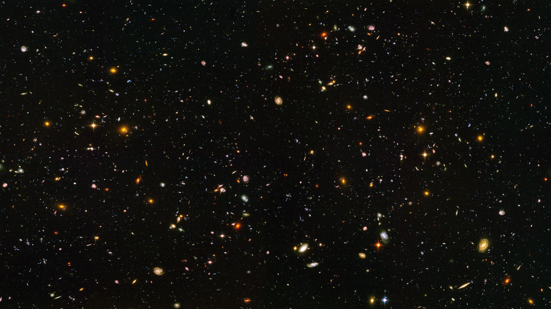
To think, that with the simple equations and laws discussed above, we can calculate the motion of every galaxy, star, planet and moon contained within this dazzling cosmic panorama captured by the Hubble Telescope, is nothing short of awe-inspiring. It is not for nothing Newton’s theory of gravity is referred to as „Newton’s law of universal gravitation.”
A JavaScript class seems like an excellent way of encapsulating the methods we wrote above together with the data on the masses and the constants we need for our simulation, so let us do some refactoring:
class nBodyProblem {
  constructor(params) {
    this.g = params.g;
    this.dt = params.dt;
    this.softeningConstant = params.softeningConstant;

    this.masses = params.masses;
  }

  updatePositionVectors() {
    const massesLen = this.masses.length;

    for (let i = 0; i < massesLen; i++) {
      const massI = this.masses[i];

      massI.x += massI.vx * this.dt;
      massI.y += massI.vy * this.dt;
      massI.z += massI.vz * this.dt;
    }

    return this;
  }

  updateVelocityVectors() {
    const massesLen = this.masses.length;

    for (let i = 0; i < massesLen; i++) {
      const massI = this.masses[i];

      massI.vx += massI.ax * this.dt;
      massI.vy += massI.ay * this.dt;
      massI.vz += massI.az * this.dt;
    }
  }

  updateAccelerationVectors() {
    const massesLen = this.masses.length;

    for (let i = 0; i < massesLen; i++) {
      let ax = 0;
      let ay = 0;
      let az = 0;

      const massI = this.masses[i];

      for (let j = 0; j < massesLen; j++) {
        if (i !== j) {
          const massJ = this.masses[j];

          const dx = massJ.x - massI.x;
          const dy = massJ.y - massI.y;
          const dz = massJ.z - massI.z;

          const distSq = dx * dx + dy * dy + dz * dz;

          const f =
            (this.g * massJ.m) /
            (distSq * Math.sqrt(distSq + this.softeningConstant));

          ax += dx * f;
          ay += dy * f;
          az += dz * f;
        }
      }

      massI.ax = ax;
      massI.ay = ay;
      massI.az = az;
    }

    return this;
  }
}
That looks much nicer! Let us create an instance of this class. To do so, we need to specify three constants, namely the gravitational constant (g), the time step of the simulation (dt) and the softening constant (softeningConstant). We also need to populate an array with mass objects. Once we have all of those, we can create an instance of the nBodyProblem class, which we will call the innerSolarSystem, since, well, our simulation is going to be of the inner solar system!
const g = 39.5;
const dt = 0.008; // 0.008 years is equal to 2.92 days
const softeningConstant = 0.15;

const masses = [{
    name: "Sun", // We use solar masses as the unit of mass, so the mass of the Sun is exactly 1
    m: 1,
    x: -1.50324727873647e-6,
    y: -3.93762725944737e-6,
    z: -4.86567877183925e-8,
    vx: 3.1669325898331e-5,
    vy: -6.85489559263319e-6,
    vz: -7.90076642683254e-7
  }
  // Mercury, Venus, Earth and Mars data can be found in the pen for this tutorial
];

const innerSolarSystem = new nBodyProblem({
  g,
  dt,
  masses: JSON.parse(JSON.stringify(masses)),
  softeningConstant
});
At this moment, you are probably looking at how I instantiated the nBodyProblem class and asking yourself what is up with the JSON parsing and string-ifying nonsense. The reason for why I went about passing the data contained in the masses array to the nBodyProblem constructor in this way is that we want our users to be able to reset the simulation. However, if we pass the masses array itself to the constructor of the nBodyProblem class when we create an instance of it, and then set the value of the masses property of this instance to be equal to the masses array when the user clicks the reset button, the simulation would not have been reset; the state of the masses from the end of the previous simulation run would still be there, and so would any masses the user had added. To solve this problem, we need to pass a clone of the masses array when we instantiate the nBodyProblem class or reset the simulation, so as to avoid modifying the masses array, which we need to keep pristine and untouched, and the easiest way of cloning it is to simply parse a string-ified version of it.
Okay, moving on: to advance the simulation by one step, we simply call:
Congratulations. You are now one step closer to collecting a Nobel prize in physics!
Part 2: Creating a Visual Manifestation for our Masses
We could represent our masses with cute little circles created with the Canvas API’s arc method, but that would look kind of dull, and we would not get a sense of the trajectories of our masses through space and time, so let us write a JavaScript class that will be our template for how our masses manifest themselves visually. It will create a circle that leaves a predetermined number of smaller and faded circles where it has been before, which conveys a sense of motion and direction to the user. The farther you get from the current position of the mass, the smaller and more faded out the circles will become. In this way, we will have created a pretty looking motion trail for our masses.
The constructor accepts three arguments, namely the drawing context for our canvas element (ctx), the length of the motion trail (trailLength) that represents the number of previous positions of our mass that the trail will visualize and finally the radius (radius) of the circle that represents the current position of our mass. In the constructor we will also initialize an empty array that we will call positions, which will — quell surprise — store the current and previous positions of the mass that are included in the motion trail.
At this point, our manifestation class looks like this:
How do we go about populating the positions array with positions and making sure that we do not store more positions than the number specified by the trailLength property? The answer is that we add a method to our class that accepts the x and y coordinates of the mass’s position as arguments and stores them in an object in the array using the array push method, which appends an element to an array. This means that the current position of the mass will be the last element in the positions array. To make sure we do not store more positions than specified when we instantiated the class, we check if the length of the positions array is greater than the trailLength property. If it is, we use the array shift method to remove the first element, which represents the oldest stored position of the positions array.
class Manifestation {

  constructor() { /* The code for the constructor outlined above */ }

  storePosition(x, y) {
    this.positions.push({ x, y });

    if (this.positions.length > this.trailLength)
      this.positions.shift();
  }

}
Okay, let us write a method that draws our motion trail. As you have probably guessed, it will accept two arguments, namely the x and y positions of the mass we are drawing the trail for. The first thing we need to do is to store the new position in the positions array and discard any superfluous positions stored in it. Then we iterate over the positions array and draw a circle for every position and voilà, we have ourselves a motion trail! But it does not look very nice, and I promised you that our trail would be pretty with circles that would become increasingly smaller and faded out according to how close they were to the current position of our mass in time.
What we need is, clearly, a scale factor whose size depends on how far away the position we are drawing is from the current position of our mass in time! An excellent way of obtaining an appropriate scale factor, for our intents and purposes, is to simply divide the index (i) of the circle being drawn by the length of the positions array. For example, if the number of elements allowed in the positions array is 25, element number 23 in that array will get a scale factor of 23 / 25, which gives us 0.92. Element number 5, on the other hand, will get a scale factor of 5 / 25, which gives us 0.2; the scale factor decreases the further we get from the current position of our mass, which is the relationship we want! Do note that we need a condition that makes sure that if the circle being drawn represents the current position, the scale factor is set to 1, as we do not want that circle to be either faded or smaller, for that matter. With all this in mind, let us write the code for the draw method of our Manifestation class.
class Manifestation {

  constructor() { /* The code for the constructor outlined above */ }

  storePosition() { /* The code for the storePosition method discussed above */ }

  draw(x, y) {
    this.storePosition(x, y);

    const positionsLen = this.positions.length;

    for (let i = 0; i < positionsLen; i++) {
      let transparency;
      let circleScaleFactor;

      const scaleFactor = i / positionsLen;

      if (i === positionsLen - 1) {
        transparency = 1;
        circleScaleFactor = 1;
      } else {
        transparency = scaleFactor / 2;
        circleScaleFactor = scaleFactor;
      }

      this.ctx.beginPath();
      this.ctx.arc(
        this.positions[i].x,
        this.positions[i].y,
        circleScaleFactor * this.radius,
        0,
        2 * Math.PI
      );
      this.ctx.fillStyle = `rgb(0, 12, 153, ${transparency})`;

      this.ctx.fill();
    }
  }

}
Part 3: Visualizing Our Simulation
Let us write some canvas boilerplate and bind it together with the gravitational n-body algorithm and the motion trails, so that we can get an animation of our inner solar system simulation up and running. As mentioned in the introduction to this tutorial, I do not discuss the Canvas API in any great depth, as this is not an introductory tutorial on the Canvas API, so if you find yourself looking rather bemused and or perplexed, make haste and change this state of affairs by heading over to MDN’s documentation on the subject.
Before we continue, though, here is the HTML markup for our simulator:
Now, we turn to the interesting part: the JavaScript. We start by getting a reference to the canvas element and then we proceed by getting its drawing context. Next, we set the dimensions of our canvas element. When it comes to canvas animations on the web, I do not spare any expenses in terms of screen real estate, so let us set the width and height properties of the canvas element to the width and height of the browser window, respectively. You will notice that I have drawn on a peculiar syntax for setting the width and height of the canvas element in that I have declared, in one statement, that the width variable is equal to the width property of the canvas element which, in turn, is equal to the width of the window. Some developers frown upon the use of this syntax, but I find it to be semantically beautiful. If you do not feel the same way, you can deconstruct that statement into two statements. Generally speaking, do whatever you feel most comfortable with, or if you find yourself collaborating with others, what the team has agreed on.
At this point, we are going to declare some constants for our animation. More specifically, there are three of them. The first is the radius (radius) of the circle, which represents the current position of a mass, in pixels. The second is the length of our motion trail (trailLength), which is the number of previous positions that it includes. Last, but not least, we have the scale (scale) constant, which represents the number of pixels per astronomical unit; Earth is one astronomical unit from the Sun, so if we did not introduce this scale factor, our inner solar system would look very claustrophobic, to say the least.
Let us now turn to the visual manifestations of the masses we are simulating. We have written a class that encapsulates their behavior, but how do we instantiate and work with these manifestations in our code? The most convenient and elegant way would be to populate every element of the masses array we are simulating with an instance of the Manifestation class, so let us write a simple method that iterates over these masses and does just that, which we then invoke.
const populateManifestations = masses => {
  masses.forEach(
    mass =>
    (mass["manifestation"] = new Manifestation(
      ctx,
      trailLength,
      radius
    ))
  );
};

populateManifestations(innerSolarSystem.masses);
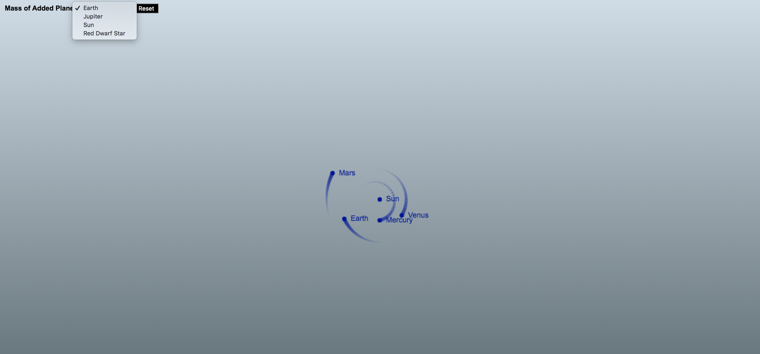
Our simulator is meant to be a playful affair, so it is only to be expected that users will spawn masses left and right and that after a minute, or so, the inner solar system will look like an unrecognizable cosmic mess, which is why I think it would be decent of us to provide them with the ability to reset the simulation. To achieve this goal, we start by attaching an event listener to the reset button, and then we write a callback for this event listener that sets the value of the masses property of the innerSolarSystem object to a clone of the masses array. As we cloned the masses array, we no longer have the manifestations of our masses in it, so we call the populateManifestations method to make sure that our users have something to look at after having reset the simulation.
Okay, enough setting things up. Let us breathe some life into the inner solar system by writing a method that, with the help of the requestAnimationFrame API, will run 60 steps of our simulation a second and animate the results with motion trails and labels for the planets of the inner solar system and the Sun.
The first thing this method does is advance the inner solar system by one step and it does so by updating the position, acceleration and velocity vectors of its masses. Then we prepare the canvas element for the next animation cycle by clearing it of what was drawn in the preceding animation cycle using the Canvas API’s clearRect method.
Next, we iterate over the masses array and invoke the draw method of each mass manifestation. Moreover, if the mass being drawn has a name, we draw it onto the canvas, so that the user can see where the original planets are after things have gone haywire. Looking at the code in the loop, you will probably notice that we are not setting, for example, the value of the mass’s x coordinate on the canvas to massI times scale, and that we are in fact setting it to the width of the viewport divided by two plus massI times scale. Why is this? The answer is that the origin (x = 0, y = 0) of the canvas coordinate system is set to the top left corner of the canvas element, so to center our simulation on the canvas where it is clearly visible to the user, we must include this offset.
After the loop, at the end of the animate method, we call requestAnimationFrame with the animate method as the callback, and then the whole process discussed above is repeated again, creating yet another frame — and run in quick succession, these frames have brought the inner solar system to life. But wait, we have missed something! If you were to run the code I have walked you through thus far, you would not see anything at all. Fortunately, all we have to do to change this sad state of affairs is to proverbially give the inner solar system a kick in its rear end (no, I am not going to fall for the temptation of inserting a Uranus joke here; grow up!) by invoking the animate method!
const animate = () => {
  innerSolarSystem
    .updatePositionVectors()
    .updateAccelerationVectors()
    .updateVelocityVectors();

  ctx.clearRect(0, 0, width, height);

  const massesLen = innerSolarSystem.masses.length;

  for (let i = 0; i < massesLen; i++) {
    const massI = innerSolarSystem.masses[i];

    const x = width / 2 + massI.x * scale;
    const y = height / 2 + massI.y * scale;

    massI.manifestation.draw(x, y);

    if (massI.name) {
      ctx.font = "14px Arial";
      ctx.fillText(massI.name, x + 12, y + 4);
      ctx.fill();
    }
  }

  requestAnimationFrame(animate);
};

animate();
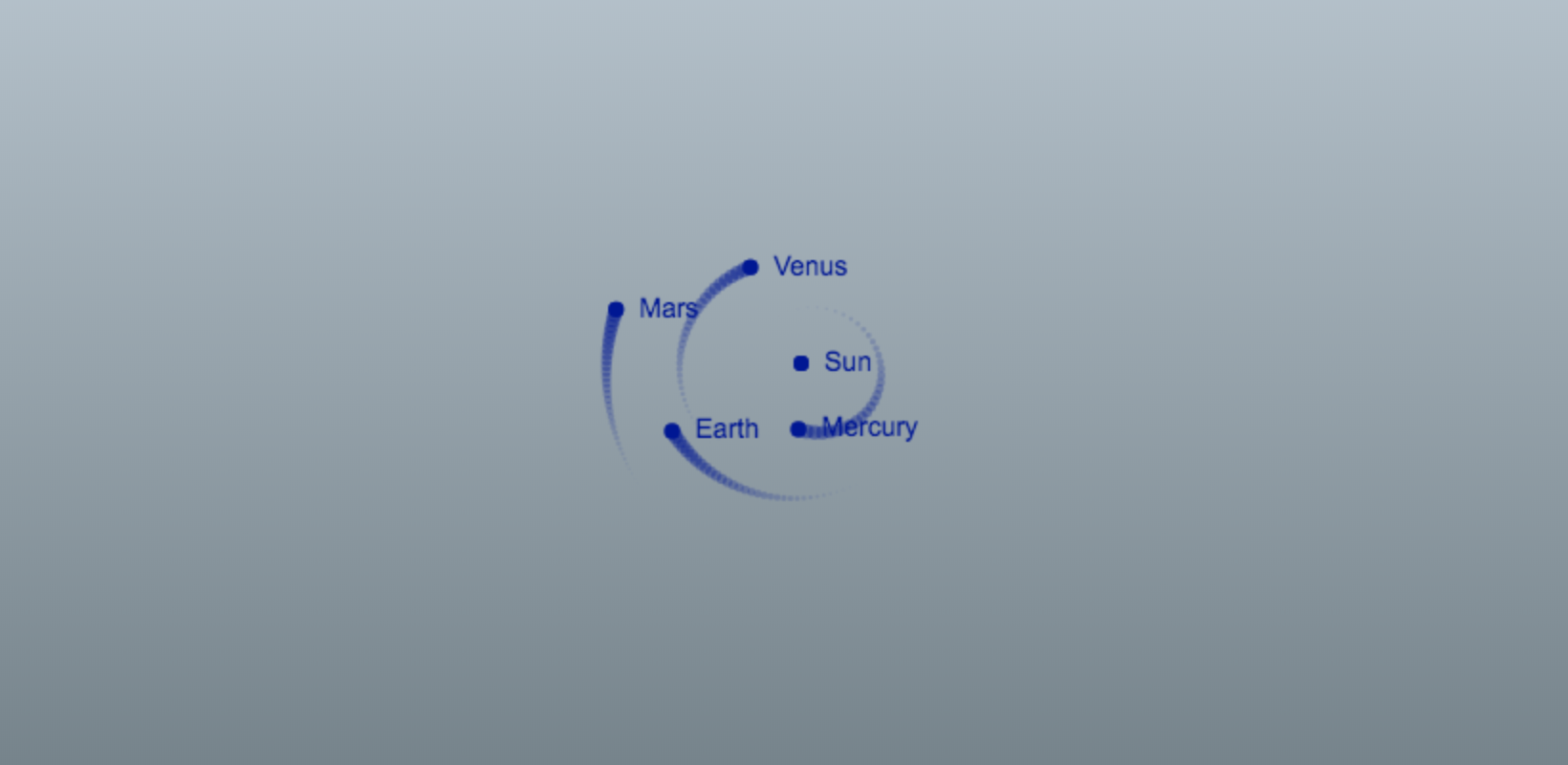
Our visualization of Mercury, Venus, Earth and Mars going about their day-to-day business of running circles around the sun. Looks pretty neat.
Woah! We have now gotten to the point where our simulation is animated, with the masses represented by dainty little blue circles stalked by marvelous looking motion trails. That is pretty cool in itself, if you were to ask me; but I did promise to also show how you can enable the user to add masses of their own to the simulation with a little bit of mouse drag action, so we are not done quite yet!
Part 4: Adding Masses with the Mouse
The idea here is that the user should be able to press down on the mouse button and draw a line by dragging it; the line will start where the user pressed down and end at the current position of the mouse cursor. When the user releases the mouse button, a new mass is spawned at the position of the screen where the user pressed down the mouse button, and the direction the mass will move is determined by the direction of the line; the length of the line determines the velocity vectors of the mass. So, how do we go about implementing this? Let us run through what we need to do, step by step. The code for steps one through six go above the animate method, while the code for step seven is a small addition to the animate method.
1. We need two variables that will store the x and y coordinates where the user pressed down the mouse button on the screen.
let mousePressX = 0;
let mousePressY = 0;
2. We need two variables that store the current x and y coordinates of the mouse cursor on the screen.
let currentMouseX = 0;
let currentMouseY = 0;
3. We need one variable that keeps track of whether the mouse is being dragged or not. The mouse is being dragged in the time that passes from when the user has pressed down the mouse button to the point where he releases it.
let dragging = false;
4. We need to attach a mousedown listener to the canvas element that logs the x and y coordinates of where the mouse was pressed down and sets the dragging variable to true.
6. We need to attach a mouseup listener to the canvas element that sets the drag variable to false, and pushes a new object representing a mass into the innerSolarSystem.masses array where the x and y position vectors are the point where the user pressed down the mouse button divided by value of the scale variable.
If we did not divide these vectors by the scale variable, the added masses would end up way out in the solar system, which is not what we want. The z position vector is set to zero and so is the z velocity vector. The x velocity vector is set to the x coordinate where the mouse was released subtracted by the x coordinate where the mouse was pressed down, and then you divide this number by 35. I will be honest and admit that 35 is a magical number that just happens to give you reasonable velocities when you add masses with the mouse to the inner solar system. Same procedure for the y velocity vector. The mass (m) of the mass we are adding is set by the user with a select element that we have populated with the masses of some famous celestial objects in the HTML markup. Last, but not least, we populate the object representing our mass with an instance of the Manifestation class so that the user can see it on the screen!
7. In the animate function, after the loop where we draw our manifestations and, before we call requestAnimationFrame, check if the mouse is being dragged. If that is the case, we’ll draw a line between the position where the mouse was pressed down and the mouse cursors current position.
const animate = () => {
  // Preceding code in the animate method down to and including the loop where we draw our mass manifestations

  if (dragging) {
    ctx.beginPath();
    ctx.moveTo(mousePressX, mousePressY);
    ctx.lineTo(currentMouseX, currentMouseY);
    ctx.strokeStyle = "red";
    ctx.stroke();
  }

  requestAnimationFrame(animate);
};
The inner solar system is about to get a lot more interesting — we can now add masses to our simulation!
Adding masses to our simulation with your mouse is not more difficult than that! Now, grab your mouse and unleash some mayhem on the inner solar system.
Part 5: Fencing off the Inner Solar System
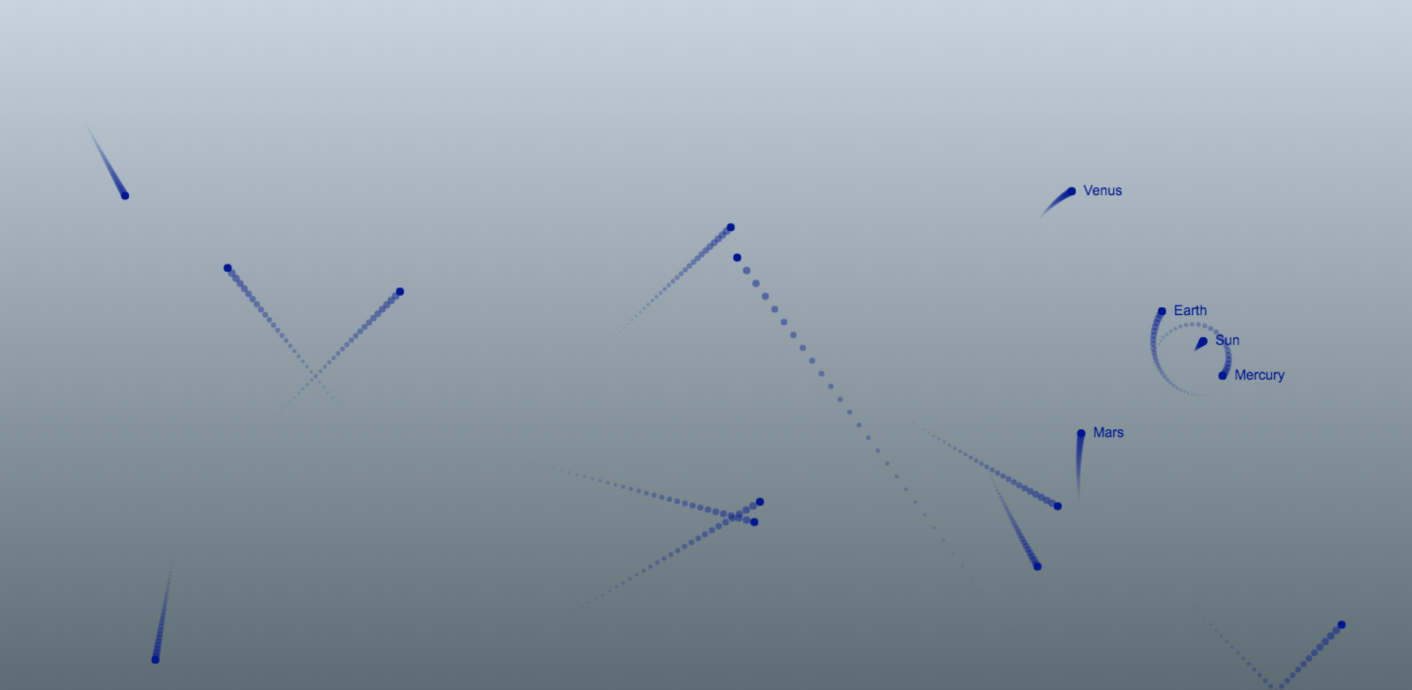
As you will probably have noticed after adding some masses to the simulation, celestial objects are very shenanigan-prone in that they have a tendency to dance their way out of the viewport, especially if the added masses are very massive or they have too high of a velocity, which is kind of annoying. The natural solution to this problem is, of course, to fence off the inner solar system so that if a mass reaches the edge of the viewport, it will bounce back in! Sounds like quite a project, implementing this functionality, but fortunately doing so is a rather simple affair. At the end of the loop where we iterate over the masses and draw them in the animate method, we have insert two conditions: one that checks if our mass is outside the bounds of the viewport on the x-axis, and another that does the same check for the y axis. If the position of our mass is outside of the viewport on the x axis we reverse its x velocity vector so that it bounces back into the viewport, and the same logic applies if our mass is outside of the viewport on the y axis. With these two conditions, the animate method will look like so:
const animate = () => {
  // Advance the simulation by one step; clear the canvas

  for (let i = 0; i < massesLen; i++) {

    // Preceding loop code

    if (x < radius || x > width - radius) massI.vx = -massI.vx;

    if (y < radius || y > height - radius) massI.vy = -massI.vy;
  }

  requestAnimationFrame(animate);
};
Absolute madness! Venus, you silly planet, what are you doing out there?! You are supposed to be orbiting the Sun!
Ping, pong! It is almost as though we are playing a game of cosmic billiards with all those masses bouncing off the fence that we have built for the inner solar system!
Concluding Remarks
People have a tendency to think of orbital mechanics — which is what we have played around with in this tutorial — as something that is beyond the understanding of mere mortals such as yours truly. Truth, though, is that orbital mechanics follows a very simple and elegant set of rules, as this tutorial is a testament to. With a little bit of JavaScript and high-school mathematics and physics, we have reconstructed the inner solar system to a reasonable degree of accuracy, and gone beyond that to make things a little bit more spicy and, therefore, more interesting. With this simulator, you can answer silly what-if questions along the lines of, „What would happen if I flung a star with the mass of the Sun into our inner solar system?” or develop a feeling for Kepler’s laws of planetary motion by, for example, observing the relationship between the distance of a mass from the Sun and its velocity.
I sure had fun writing this tutorial, and it is my sincere hope that you had as much fun reading it!
Looking to impress your customers with your next marketing campaign? In this tutorial, we’ll create an eye-catching and professional brochure template that is easy to customize.
Brochures are a staple marketing tool—they get the job done. Visually appealing, versatile and easy to edit: that’s what many look for in a pamphlet template. In this tutorial, we’ll show you how to cover all of those in our brochure design. We will touch on key tools that will make it easier for you or your clients to edit a template. If you dabble in InDesign, this tutorial is easy to follow.
You’ll need access to Adobe InDesign and Adobe Illustrator—if you don’t have the software, you can download a trial from the Adobe website. You’ll also need the following assets:
Download the assets and make sure the font is installed on your system before starting. When you are ready, we can dive in!
1.Setting Up a Trifold Brochure InDesign File
Step 1
In InDesign, go to File > New. Name the document Pamphlet Template. We will create a DL trifold brochure template.Set the file to the following dimensions:
Width to 98 mm
Height to 210 mm
Orientation to Portrait
Units to Millimetres
Uncheck Facing Pages
Margins to 10 mm
Bleeds to 3 mm (it’s best to seek your professional printer’s preference)
Click Create.
Step 2
A trifold brochure has a panel that folds in, and this panel is shorter by 1 mm. We will create a second Master Page with this new size.
Head over to the Pages panel. If you don’t have it active, head over to Windows > Pages. The top portion of the panel contains the Master Pages. Right-click on A-Master > New Master. On the New Master window, make sure Based on Master is set to [Master]. Set the Width to 97 mm. Click OK.
Step 3
On the Pages panel, right-click on the B-Master we just created and select Apply Master. In the Apply Master window, under To Pages, enter 1, 6 (this is to specify that we are changing Pages 1 and 6). Click OK.
In the Master Page Size Conflict window, click Use Master Page Size.
Step 4
Now that we have the page sizes set up, we can move the pages to set up the spreads. Pages 1-3 will be the outside spread, and Pages 4-6 will be the inside spreads.
On the Main Menu of the Pages panel, make sure that Allow Document Pages to Shuffle is unchecked. Drag Page 2 towards Page 1 to combine them. Combine Pages 1-3 as one spread and Pages 4-6 as a second spread. Make sure that you have the BAA and AABMaster Pages configuration, as shown in the image below.
To exit the Master Pages mode, double-click on the regular pages thumbnail.
Step 5
For this trifold brochure template tutorial, we will work with three layers. This will make it easier to update the template when it needs new information.
Bring up the Layers panel by going to Window > Layers. Double-click on Layer 1 and rename it Vectors. In the Layers panel main menu, select New Layer. Name it Images. Click OK.
Create a new Layer named Text. Click OK.
Step 6
Adding color swatches will make it easier to change up the colors to adjust to brand guidelines. Head over to Window > Color > Swatches to expand the Swatches panel. Choose New Color Swatch button from the main menu. Add the following three colors:
Purple: C=80 M=100 Y=0 K=15
Yellow:C=0 M=25 Y=90 K=0
Orange:C=10 M=80 Y=90 K=0
Click Add and OK after you input each color value.
Step 7
Open up the Paragraph Styles panel by going to Windows > Styles > Paragraph Styles. From the main menu, select New Paragraph Style.
In the New Paragraph Style option window, set the Style Name to Title. Select Basic Character Formats from the left side menu and use the following settings:
Font Family:Bw Stretch
Font Style:Heavy
Size:24 pt
Perfect! Now let’s create a few more styles, and then we will be ready to format text boxes. Use the following settings for Copy:
Font Family:Addington CF
Font Style:Regular
Size:10 pt
Use the following settings for Pull-quote:
Font Family:Bw Stretch
Font Style:Heavy
Size:30 pt
Tracking: -15
Perfect! Now you are all set to start the design. Remember that the steps above are key when you want to create a template. It will be easier for your clients or you to edit the brochure in the future with new colors and fonts.
2.How to Create Vectors in Your Pamphlet Design
Step 1
On the Layers panel, select the Vector layer. Using the Rectangle Tool (M) todraw a rectangle on Page 2 of the pamphlet.
On the Swatches panel, set the color to orange.
Step 2
Using the Rectangle Tool (M), draw two rectangles on Page 3. It is not necessary for the page to be divided exactly in half—we can come back to this later.
On the Swatches panel, set the top object to yellow and the bottom object to purple.
Step 3
Draw two rectangles that cover the whole panel on Page 4. Using the Swatches panel, color the top object purple and the bottom object yellow.
Using the Direct Selection Tool (A), select the top right corner of the bottom object. Using the Up Arrow key on your keyboard, move the point upwards until you’ve created a steep slope. It doesn’t have to be the same measurements as the image below—you can add your own spin to it.
Step 4
Repeat the same action on Page 6. This time, the slope should be on the opposite side and at a different height. I’ve set the color of the top object to orange and the bottom object to purple.
Perfect! Let’s lock these by going to the Layers panel and locking the Vectors layer.
3.How to Add Images to Your Pamphlet Design
Step 1
On the Layers panel, select the Images layer.
On the toolbar,select the Rectangle Frame Tool (F). Draw a rectangle that fits Page 1, making sure you are also including the bleeds on the top, left, and bottom sides.
Step 2
With the frame selected, press Command-D to Place an image. Locate the African elementary school girl image and click Open.
Using the Direct Selection Tool (A), select the image within the frame. Head over to the Control panel and activate the Constrain Proportion for Scaling button. Set the Percentage to 70%. Move the image until you’ve placed the subject in the center of the panel.
Step 3
Often, images won’t have the same color grading. It is useful to have an overlay to achieve an even look throughout the project. Using the Rectangle Tool (M), create a rectangle over the image.
Using the Swatches panel, set the color to purple. Head over to the Effects panel (Windows > Effects) and set the Blending Mode to Color.
Step 4
Head over to the inside panels, and let’s start on Page 4. Select the Ellipse Frame Tool (F) from the toolbar.Click on the document to open the Ellipse option window. Set the Width and Height to 60 mm. Click OK.
On the Swatches panel, set the color of the Stroke to [Paper]. Head over to the Control panel, and set the Stroke Weight to 5 pt.
Step 5
Select the circle and press Command-D to Place an image. Locate the School girl writing in class .jpg and click Open.
Using the Direct Selection Tool (A), select the image within the circle. You can resize the image by dragging any of the eight points around the image. Press Shift as you drag to resize the image proportionally. In the image below, you can see I’ve resized it just enough to fit the circle.
Step 6
Using the Ellipse Tool (L), draw another circle measuring 6 mm in Width and Height. Place this ellipse over the circular image we added above.
On the Swatches panel, set the color of the Stroke to [Paper]. Press X to switch to the Fill color and set the color to Black. Head over to the Control panel, and set the Stroke Weight to 5 pt.
Head over to the Effects panel, and set the Blending Mode to Color.
Step 7
Using the Align panel, select both images and press the Align Horizontal Center button and the Align Vertical Center button. To Group both of these ellipses, press Command-G.
To align the grouped objects to the center of the panel, head over to the Align panel. Set the Align To: option to Page and click the Align Horizontal Center button.
Step 8
Duplicate the grouped ellipses by pressing Option and dragging to Page 6. Ungroup the ellipses by pressing Shift-Command-G, and move the overlay ellipse to the side.
Select the circular image and press Command-D to Place another image. In the Place option window, select the Young family with kidsimage. Head over to the bottom and check the Replace Selected Item option. Click Open.
Using the Direct Selection Tool (A), resize and move the image. Remember to press Shift to resize the image proportionally.
When you are done, align both ellipses with the Align panel. Group them by pressing Command-G and align them again to the panel. Head over to the Align panel. Set the Align To: option to Page and click the Align Horizontal Center button.
Step 9
Add a logo to Pages 2 and 3 by pressing Command-D and locating the logo you wish to add. For this tutorial, I will be adding the Xavier logo template. To resize the vector proportionally, press Shift and drag one of the points. Place both logos in the bottom left portion of the page.
4.How to Add Text to Your Pamphlet Design
Step 1
On the Layers panel, lock the Photos layer and select the Text layer.
Using the Text Tool (T), create two text boxes. Add a title to the top text box and a smaller tagline to the bottom text box. Head over to the Character panel and use the following settings:
Font: Bw Stretch
Font Family: Heavy
Size: 80 pt
Leading: 70
Tracking: -10
On the Swatches panel, set the top text box to purple and the bottom text box to orange. Place both text boxes on top of each other, right at the edge of both rectangles we drew earlier.
Feel free to unlock the Vectors layer and move the rectangles to fit the text.
Step 2
Head over to the interior of the pamphlet (Pages 4-6). Using the Text Tool (T), draw a text box at the top of Page 3, and using the Paragraph panel, format the text box to Title.
Draw another text box under the circular image, add text, and format it to Copy on the Paragraph panel.
Step 3
On Page 5, create a text box that fits the top half of the page. Use the Paragraph panel to format the text and the Swatches panel to change the colors.
For the statistics, use the Ellipse Tool (L). Click on the page to open the Ellipse option window, and set the Width and Height to 20 mm. Draw a second ellipse that measures 23 mm.
On the Swatches panel, select the purple Fill color for the smaller circle and the purple Stroke color for the bigger circle. Select this last circle and head over to the Control bar. Set the Stroke Weight to 1 pt and the Stroke Type to Dotted.
Select the Type Tool (T) from the toolbar.Click on the filled circle to add text, and set the format to the Pull-quote style. Head over to the Control bar and select the Align Center button.
Step 4
Select both circles and Group them by pressing Command-G. Duplicate the group twice by pressing Shift-Command and dragging down.
Select all three groups and head over to the Align panel. Set the Align To: Selection option, and select the Distribute Vertical Center button.
Using the Type Tool (T), create a text box to the right of each statistic. Format the text as Copy on the Paragraph panel.
Step 5
Let’s work on Page 6. Create a text box using the Type Tool (T) at the top of the page. Format the type with the Paragraph panel and change the color to [Paper] on the Swatches panel.
Add a text box under the image. Set the Paragraph panel to Pull-quote and the Swatches panel to [Paper]. The quote caption can be set independently on the Control bar or the Character panel. I’ve set the Font Family to a combination of Heavy and Book and a Size 10 pt.
Step 6
Let’s head over to Page 2. Using the Type Tool (T), add a text box on the top of the page.
To create a table, create a text box and double-click to activate it. While selecting it, head over to Table > Insert Table. In the Insert Table option window, set the Body Rows to 10 and the Columns to 2. Click OK.
Double-click on the table to activate it and select all the rows and columns. Head over to the Control bar, and you will notice a small window showing a table. To edit this, you have to choose which parts of the table you’d like to edit. In this case, click on the horizontal lines to deactivate them. Set the Stroke Color to [None].
Deactivate the three vertical lines and activate the three horizontal lines. Set Stroke Color to [Paper] and the Stroke Weight to 0.5 pt.
Head over to Window > Type & Tables > Table to open the Table panel. Select all of the first column and set the Row Height to At least and 10 mm. Set the Column Width to 15 mm and select the Align Center button.
Select the second column, set the Column Width to 63 mm, and select the Align Center button.
Add text using the Type Tool (T), using the Paragraph panel set the text to Copy. Feel free to change the color on the Swatches panel to [Paper].
5.How to Export a File for Printing
Before exporting a file for printing, it’s useful to take a look around all the edges of the brochure. This is to make sure all the images and vectors bleeding out are touching the bleeds.
Remember that each fold will be represented by a crop mark. Let your professional printer know to avoid confusion.
Step 1
To export the file, go to File > Export. Name the file Pamphlet Templateand choose Adobe PDF (Print) from the Format dropdown menu. Click Save.
Step 2
In the Export Adobe PDF window, set the Adobe PDF Preset to Press Quality. Under Pages, set Export As Spreads.
On the left side of the panel, select Marks and Bleeds. Check All Printer’s Marks and Use Document Bleed Settings. Click Export. You will have a PDF file ready to be printed.
Great Job! You’ve Finished This Tutorial!
In this tutorial, we learned how to make a brochure template. We covered key tools that will help anyone edit a template quickly and easily. Today, we learned to:
set up a ready-to-print InDesign file
use the Layers panel to divide the elements in a file
add color swatches, which can be changed easily to match any brand
Looking to impress your customers with your next marketing campaign? In this tutorial, we’ll create an eye-catching and professional brochure template that is easy to customize.
Brochures are a staple marketing tool—they get the job done. Visually appealing, versatile and easy to edit: that’s what many look for in a pamphlet template. In this tutorial, we’ll show you how to cover all of those in our brochure design. We will touch on key tools that will make it easier for you or your clients to edit a template. If you dabble in InDesign, this tutorial is easy to follow.
You’ll need access to Adobe InDesign and Adobe Illustrator—if you don’t have the software, you can download a trial from the Adobe website. You’ll also need the following assets:
Download the assets and make sure the font is installed on your system before starting. When you are ready, we can dive in!
1.Setting Up a Trifold Brochure InDesign File
Step 1
In InDesign, go to File > New. Name the document Pamphlet Template. We will create a DL trifold brochure template.Set the file to the following dimensions:
Width to 98 mm
Height to 210 mm
Orientation to Portrait
Units to Millimetres
Uncheck Facing Pages
Margins to 10 mm
Bleeds to 3 mm (it’s best to seek your professional printer’s preference)
Click Create.
Step 2
A trifold brochure has a panel that folds in, and this panel is shorter by 1 mm. We will create a second Master Page with this new size.
Head over to the Pages panel. If you don’t have it active, head over to Windows > Pages. The top portion of the panel contains the Master Pages. Right-click on A-Master > New Master. On the New Master window, make sure Based on Master is set to [Master]. Set the Width to 97 mm. Click OK.
Step 3
On the Pages panel, right-click on the B-Master we just created and select Apply Master. In the Apply Master window, under To Pages, enter 1, 6 (this is to specify that we are changing Pages 1 and 6). Click OK.
In the Master Page Size Conflict window, click Use Master Page Size.
Step 4
Now that we have the page sizes set up, we can move the pages to set up the spreads. Pages 1-3 will be the outside spread, and Pages 4-6 will be the inside spreads.
On the Main Menu of the Pages panel, make sure that Allow Document Pages to Shuffle is unchecked. Drag Page 2 towards Page 1 to combine them. Combine Pages 1-3 as one spread and Pages 4-6 as a second spread. Make sure that you have the BAA and AABMaster Pages configuration, as shown in the image below.
To exit the Master Pages mode, double-click on the regular pages thumbnail.
Step 5
For this trifold brochure template tutorial, we will work with three layers. This will make it easier to update the template when it needs new information.
Bring up the Layers panel by going to Window > Layers. Double-click on Layer 1 and rename it Vectors. In the Layers panel main menu, select New Layer. Name it Images. Click OK.
Create a new Layer named Text. Click OK.
Step 6
Adding color swatches will make it easier to change up the colors to adjust to brand guidelines. Head over to Window > Color > Swatches to expand the Swatches panel. Choose New Color Swatch button from the main menu. Add the following three colors:
Purple: C=80 M=100 Y=0 K=15
Yellow:C=0 M=25 Y=90 K=0
Orange:C=10 M=80 Y=90 K=0
Click Add and OK after you input each color value.
Step 7
Open up the Paragraph Styles panel by going to Windows > Styles > Paragraph Styles. From the main menu, select New Paragraph Style.
In the New Paragraph Style option window, set the Style Name to Title. Select Basic Character Formats from the left side menu and use the following settings:
Font Family:Bw Stretch
Font Style:Heavy
Size:24 pt
Perfect! Now let’s create a few more styles, and then we will be ready to format text boxes. Use the following settings for Copy:
Font Family:Addington CF
Font Style:Regular
Size:10 pt
Use the following settings for Pull-quote:
Font Family:Bw Stretch
Font Style:Heavy
Size:30 pt
Tracking: -15
Perfect! Now you are all set to start the design. Remember that the steps above are key when you want to create a template. It will be easier for your clients or you to edit the brochure in the future with new colors and fonts.
2.How to Create Vectors in Your Pamphlet Design
Step 1
On the Layers panel, select the Vector layer. Using the Rectangle Tool (M) todraw a rectangle on Page 2 of the pamphlet.
On the Swatches panel, set the color to orange.
Step 2
Using the Rectangle Tool (M), draw two rectangles on Page 3. It is not necessary for the page to be divided exactly in half—we can come back to this later.
On the Swatches panel, set the top object to yellow and the bottom object to purple.
Step 3
Draw two rectangles that cover the whole panel on Page 4. Using the Swatches panel, color the top object purple and the bottom object yellow.
Using the Direct Selection Tool (A), select the top right corner of the bottom object. Using the Up Arrow key on your keyboard, move the point upwards until you’ve created a steep slope. It doesn’t have to be the same measurements as the image below—you can add your own spin to it.
Step 4
Repeat the same action on Page 6. This time, the slope should be on the opposite side and at a different height. I’ve set the color of the top object to orange and the bottom object to purple.
Perfect! Let’s lock these by going to the Layers panel and locking the Vectors layer.
3.How to Add Images to Your Pamphlet Design
Step 1
On the Layers panel, select the Images layer.
On the toolbar,select the Rectangle Frame Tool (F). Draw a rectangle that fits Page 1, making sure you are also including the bleeds on the top, left, and bottom sides.
Step 2
With the frame selected, press Command-D to Place an image. Locate the African elementary school girl image and click Open.
Using the Direct Selection Tool (A), select the image within the frame. Head over to the Control panel and activate the Constrain Proportion for Scaling button. Set the Percentage to 70%. Move the image until you’ve placed the subject in the center of the panel.
Step 3
Often, images won’t have the same color grading. It is useful to have an overlay to achieve an even look throughout the project. Using the Rectangle Tool (M), create a rectangle over the image.
Using the Swatches panel, set the color to purple. Head over to the Effects panel (Windows > Effects) and set the Blending Mode to Color.
Step 4
Head over to the inside panels, and let’s start on Page 4. Select the Ellipse Frame Tool (F) from the toolbar.Click on the document to open the Ellipse option window. Set the Width and Height to 60 mm. Click OK.
On the Swatches panel, set the color of the Stroke to [Paper]. Head over to the Control panel, and set the Stroke Weight to 5 pt.
Step 5
Select the circle and press Command-D to Place an image. Locate the School girl writing in class .jpg and click Open.
Using the Direct Selection Tool (A), select the image within the circle. You can resize the image by dragging any of the eight points around the image. Press Shift as you drag to resize the image proportionally. In the image below, you can see I’ve resized it just enough to fit the circle.
Step 6
Using the Ellipse Tool (L), draw another circle measuring 6 mm in Width and Height. Place this ellipse over the circular image we added above.
On the Swatches panel, set the color of the Stroke to [Paper]. Press X to switch to the Fill color and set the color to Black. Head over to the Control panel, and set the Stroke Weight to 5 pt.
Head over to the Effects panel, and set the Blending Mode to Color.
Step 7
Using the Align panel, select both images and press the Align Horizontal Center button and the Align Vertical Center button. To Group both of these ellipses, press Command-G.
To align the grouped objects to the center of the panel, head over to the Align panel. Set the Align To: option to Page and click the Align Horizontal Center button.
Step 8
Duplicate the grouped ellipses by pressing Option and dragging to Page 6. Ungroup the ellipses by pressing Shift-Command-G, and move the overlay ellipse to the side.
Select the circular image and press Command-D to Place another image. In the Place option window, select the Young family with kidsimage. Head over to the bottom and check the Replace Selected Item option. Click Open.
Using the Direct Selection Tool (A), resize and move the image. Remember to press Shift to resize the image proportionally.
When you are done, align both ellipses with the Align panel. Group them by pressing Command-G and align them again to the panel. Head over to the Align panel. Set the Align To: option to Page and click the Align Horizontal Center button.
Step 9
Add a logo to Pages 2 and 3 by pressing Command-D and locating the logo you wish to add. For this tutorial, I will be adding the Xavier logo template. To resize the vector proportionally, press Shift and drag one of the points. Place both logos in the bottom left portion of the page.
4.How to Add Text to Your Pamphlet Design
Step 1
On the Layers panel, lock the Photos layer and select the Text layer.
Using the Text Tool (T), create two text boxes. Add a title to the top text box and a smaller tagline to the bottom text box. Head over to the Character panel and use the following settings:
Font: Bw Stretch
Font Family: Heavy
Size: 80 pt
Leading: 70
Tracking: -10
On the Swatches panel, set the top text box to purple and the bottom text box to orange. Place both text boxes on top of each other, right at the edge of both rectangles we drew earlier.
Feel free to unlock the Vectors layer and move the rectangles to fit the text.
Step 2
Head over to the interior of the pamphlet (Pages 4-6). Using the Text Tool (T), draw a text box at the top of Page 3, and using the Paragraph panel, format the text box to Title.
Draw another text box under the circular image, add text, and format it to Copy on the Paragraph panel.
Step 3
On Page 5, create a text box that fits the top half of the page. Use the Paragraph panel to format the text and the Swatches panel to change the colors.
For the statistics, use the Ellipse Tool (L). Click on the page to open the Ellipse option window, and set the Width and Height to 20 mm. Draw a second ellipse that measures 23 mm.
On the Swatches panel, select the purple Fill color for the smaller circle and the purple Stroke color for the bigger circle. Select this last circle and head over to the Control bar. Set the Stroke Weight to 1 pt and the Stroke Type to Dotted.
Select the Type Tool (T) from the toolbar.Click on the filled circle to add text, and set the format to the Pull-quote style. Head over to the Control bar and select the Align Center button.
Step 4
Select both circles and Group them by pressing Command-G. Duplicate the group twice by pressing Shift-Command and dragging down.
Select all three groups and head over to the Align panel. Set the Align To: Selection option, and select the Distribute Vertical Center button.
Using the Type Tool (T), create a text box to the right of each statistic. Format the text as Copy on the Paragraph panel.
Step 5
Let’s work on Page 6. Create a text box using the Type Tool (T) at the top of the page. Format the type with the Paragraph panel and change the color to [Paper] on the Swatches panel.
Add a text box under the image. Set the Paragraph panel to Pull-quote and the Swatches panel to [Paper]. The quote caption can be set independently on the Control bar or the Character panel. I’ve set the Font Family to a combination of Heavy and Book and a Size 10 pt.
Step 6
Let’s head over to Page 2. Using the Type Tool (T), add a text box on the top of the page.
To create a table, create a text box and double-click to activate it. While selecting it, head over to Table > Insert Table. In the Insert Table option window, set the Body Rows to 10 and the Columns to 2. Click OK.
Double-click on the table to activate it and select all the rows and columns. Head over to the Control bar, and you will notice a small window showing a table. To edit this, you have to choose which parts of the table you’d like to edit. In this case, click on the horizontal lines to deactivate them. Set the Stroke Color to [None].
Deactivate the three vertical lines and activate the three horizontal lines. Set Stroke Color to [Paper] and the Stroke Weight to 0.5 pt.
Head over to Window > Type & Tables > Table to open the Table panel. Select all of the first column and set the Row Height to At least and 10 mm. Set the Column Width to 15 mm and select the Align Center button.
Select the second column, set the Column Width to 63 mm, and select the Align Center button.
Add text using the Type Tool (T), using the Paragraph panel set the text to Copy. Feel free to change the color on the Swatches panel to [Paper].
5.How to Export a File for Printing
Before exporting a file for printing, it’s useful to take a look around all the edges of the brochure. This is to make sure all the images and vectors bleeding out are touching the bleeds.
Remember that each fold will be represented by a crop mark. Let your professional printer know to avoid confusion.
Step 1
To export the file, go to File > Export. Name the file Pamphlet Templateand choose Adobe PDF (Print) from the Format dropdown menu. Click Save.
Step 2
In the Export Adobe PDF window, set the Adobe PDF Preset to Press Quality. Under Pages, set Export As Spreads.
On the left side of the panel, select Marks and Bleeds. Check All Printer’s Marks and Use Document Bleed Settings. Click Export. You will have a PDF file ready to be printed.
Great Job! You’ve Finished This Tutorial!
In this tutorial, we learned how to make a brochure template. We covered key tools that will help anyone edit a template quickly and easily. Today, we learned to:
set up a ready-to-print InDesign file
use the Layers panel to divide the elements in a file
add color swatches, which can be changed easily to match any brand
Looking to impress your customers with your next marketing campaign? In this tutorial, we’ll create an eye-catching and professional brochure template that is easy to customize.
Brochures are a staple marketing tool—they get the job done. Visually appealing, versatile and easy to edit: that’s what many look for in a pamphlet template. In this tutorial, we’ll show you how to cover all of those in our brochure design. We will touch on key tools that will make it easier for you or your clients to edit a template. If you dabble in InDesign, this tutorial is easy to follow.
You’ll need access to Adobe InDesign and Adobe Illustrator—if you don’t have the software, you can download a trial from the Adobe website. You’ll also need the following assets:
Download the assets and make sure the font is installed on your system before starting. When you are ready, we can dive in!
1.Setting Up a Trifold Brochure InDesign File
Step 1
In InDesign, go to File > New. Name the document Pamphlet Template. We will create a DL trifold brochure template.Set the file to the following dimensions:
Width to 98 mm
Height to 210 mm
Orientation to Portrait
Units to Millimetres
Uncheck Facing Pages
Margins to 10 mm
Bleeds to 3 mm (it’s best to seek your professional printer’s preference)
Click Create.
Step 2
A trifold brochure has a panel that folds in, and this panel is shorter by 1 mm. We will create a second Master Page with this new size.
Head over to the Pages panel. If you don’t have it active, head over to Windows > Pages. The top portion of the panel contains the Master Pages. Right-click on A-Master > New Master. On the New Master window, make sure Based on Master is set to [Master]. Set the Width to 97 mm. Click OK.
Step 3
On the Pages panel, right-click on the B-Master we just created and select Apply Master. In the Apply Master window, under To Pages, enter 1, 6 (this is to specify that we are changing Pages 1 and 6). Click OK.
In the Master Page Size Conflict window, click Use Master Page Size.
Step 4
Now that we have the page sizes set up, we can move the pages to set up the spreads. Pages 1-3 will be the outside spread, and Pages 4-6 will be the inside spreads.
On the Main Menu of the Pages panel, make sure that Allow Document Pages to Shuffle is unchecked. Drag Page 2 towards Page 1 to combine them. Combine Pages 1-3 as one spread and Pages 4-6 as a second spread. Make sure that you have the BAA and AABMaster Pages configuration, as shown in the image below.
To exit the Master Pages mode, double-click on the regular pages thumbnail.
Step 5
For this trifold brochure template tutorial, we will work with three layers. This will make it easier to update the template when it needs new information.
Bring up the Layers panel by going to Window > Layers. Double-click on Layer 1 and rename it Vectors. In the Layers panel main menu, select New Layer. Name it Images. Click OK.
Create a new Layer named Text. Click OK.
Step 6
Adding color swatches will make it easier to change up the colors to adjust to brand guidelines. Head over to Window > Color > Swatches to expand the Swatches panel. Choose New Color Swatch button from the main menu. Add the following three colors:
Purple: C=80 M=100 Y=0 K=15
Yellow:C=0 M=25 Y=90 K=0
Orange:C=10 M=80 Y=90 K=0
Click Add and OK after you input each color value.
Step 7
Open up the Paragraph Styles panel by going to Windows > Styles > Paragraph Styles. From the main menu, select New Paragraph Style.
In the New Paragraph Style option window, set the Style Name to Title. Select Basic Character Formats from the left side menu and use the following settings:
Font Family:Bw Stretch
Font Style:Heavy
Size:24 pt
Perfect! Now let’s create a few more styles, and then we will be ready to format text boxes. Use the following settings for Copy:
Font Family:Addington CF
Font Style:Regular
Size:10 pt
Use the following settings for Pull-quote:
Font Family:Bw Stretch
Font Style:Heavy
Size:30 pt
Tracking: -15
Perfect! Now you are all set to start the design. Remember that the steps above are key when you want to create a template. It will be easier for your clients or you to edit the brochure in the future with new colors and fonts.
2.How to Create Vectors in Your Pamphlet Design
Step 1
On the Layers panel, select the Vector layer. Using the Rectangle Tool (M) todraw a rectangle on Page 2 of the pamphlet.
On the Swatches panel, set the color to orange.
Step 2
Using the Rectangle Tool (M), draw two rectangles on Page 3. It is not necessary for the page to be divided exactly in half—we can come back to this later.
On the Swatches panel, set the top object to yellow and the bottom object to purple.
Step 3
Draw two rectangles that cover the whole panel on Page 4. Using the Swatches panel, color the top object purple and the bottom object yellow.
Using the Direct Selection Tool (A), select the top right corner of the bottom object. Using the Up Arrow key on your keyboard, move the point upwards until you’ve created a steep slope. It doesn’t have to be the same measurements as the image below—you can add your own spin to it.
Step 4
Repeat the same action on Page 6. This time, the slope should be on the opposite side and at a different height. I’ve set the color of the top object to orange and the bottom object to purple.
Perfect! Let’s lock these by going to the Layers panel and locking the Vectors layer.
3.How to Add Images to Your Pamphlet Design
Step 1
On the Layers panel, select the Images layer.
On the toolbar,select the Rectangle Frame Tool (F). Draw a rectangle that fits Page 1, making sure you are also including the bleeds on the top, left, and bottom sides.
Step 2
With the frame selected, press Command-D to Place an image. Locate the African elementary school girl image and click Open.
Using the Direct Selection Tool (A), select the image within the frame. Head over to the Control panel and activate the Constrain Proportion for Scaling button. Set the Percentage to 70%. Move the image until you’ve placed the subject in the center of the panel.
Step 3
Often, images won’t have the same color grading. It is useful to have an overlay to achieve an even look throughout the project. Using the Rectangle Tool (M), create a rectangle over the image.
Using the Swatches panel, set the color to purple. Head over to the Effects panel (Windows > Effects) and set the Blending Mode to Color.
Step 4
Head over to the inside panels, and let’s start on Page 4. Select the Ellipse Frame Tool (F) from the toolbar.Click on the document to open the Ellipse option window. Set the Width and Height to 60 mm. Click OK.
On the Swatches panel, set the color of the Stroke to [Paper]. Head over to the Control panel, and set the Stroke Weight to 5 pt.
Step 5
Select the circle and press Command-D to Place an image. Locate the School girl writing in class .jpg and click Open.
Using the Direct Selection Tool (A), select the image within the circle. You can resize the image by dragging any of the eight points around the image. Press Shift as you drag to resize the image proportionally. In the image below, you can see I’ve resized it just enough to fit the circle.
Step 6
Using the Ellipse Tool (L), draw another circle measuring 6 mm in Width and Height. Place this ellipse over the circular image we added above.
On the Swatches panel, set the color of the Stroke to [Paper]. Press X to switch to the Fill color and set the color to Black. Head over to the Control panel, and set the Stroke Weight to 5 pt.
Head over to the Effects panel, and set the Blending Mode to Color.
Step 7
Using the Align panel, select both images and press the Align Horizontal Center button and the Align Vertical Center button. To Group both of these ellipses, press Command-G.
To align the grouped objects to the center of the panel, head over to the Align panel. Set the Align To: option to Page and click the Align Horizontal Center button.
Step 8
Duplicate the grouped ellipses by pressing Option and dragging to Page 6. Ungroup the ellipses by pressing Shift-Command-G, and move the overlay ellipse to the side.
Select the circular image and press Command-D to Place another image. In the Place option window, select the Young family with kidsimage. Head over to the bottom and check the Replace Selected Item option. Click Open.
Using the Direct Selection Tool (A), resize and move the image. Remember to press Shift to resize the image proportionally.
When you are done, align both ellipses with the Align panel. Group them by pressing Command-G and align them again to the panel. Head over to the Align panel. Set the Align To: option to Page and click the Align Horizontal Center button.
Step 9
Add a logo to Pages 2 and 3 by pressing Command-D and locating the logo you wish to add. For this tutorial, I will be adding the Xavier logo template. To resize the vector proportionally, press Shift and drag one of the points. Place both logos in the bottom left portion of the page.
4.How to Add Text to Your Pamphlet Design
Step 1
On the Layers panel, lock the Photos layer and select the Text layer.
Using the Text Tool (T), create two text boxes. Add a title to the top text box and a smaller tagline to the bottom text box. Head over to the Character panel and use the following settings:
Font: Bw Stretch
Font Family: Heavy
Size: 80 pt
Leading: 70
Tracking: -10
On the Swatches panel, set the top text box to purple and the bottom text box to orange. Place both text boxes on top of each other, right at the edge of both rectangles we drew earlier.
Feel free to unlock the Vectors layer and move the rectangles to fit the text.
Step 2
Head over to the interior of the pamphlet (Pages 4-6). Using the Text Tool (T), draw a text box at the top of Page 3, and using the Paragraph panel, format the text box to Title.
Draw another text box under the circular image, add text, and format it to Copy on the Paragraph panel.
Step 3
On Page 5, create a text box that fits the top half of the page. Use the Paragraph panel to format the text and the Swatches panel to change the colors.
For the statistics, use the Ellipse Tool (L). Click on the page to open the Ellipse option window, and set the Width and Height to 20 mm. Draw a second ellipse that measures 23 mm.
On the Swatches panel, select the purple Fill color for the smaller circle and the purple Stroke color for the bigger circle. Select this last circle and head over to the Control bar. Set the Stroke Weight to 1 pt and the Stroke Type to Dotted.
Select the Type Tool (T) from the toolbar.Click on the filled circle to add text, and set the format to the Pull-quote style. Head over to the Control bar and select the Align Center button.
Step 4
Select both circles and Group them by pressing Command-G. Duplicate the group twice by pressing Shift-Command and dragging down.
Select all three groups and head over to the Align panel. Set the Align To: Selection option, and select the Distribute Vertical Center button.
Using the Type Tool (T), create a text box to the right of each statistic. Format the text as Copy on the Paragraph panel.
Step 5
Let’s work on Page 6. Create a text box using the Type Tool (T) at the top of the page. Format the type with the Paragraph panel and change the color to [Paper] on the Swatches panel.
Add a text box under the image. Set the Paragraph panel to Pull-quote and the Swatches panel to [Paper]. The quote caption can be set independently on the Control bar or the Character panel. I’ve set the Font Family to a combination of Heavy and Book and a Size 10 pt.
Step 6
Let’s head over to Page 2. Using the Type Tool (T), add a text box on the top of the page.
To create a table, create a text box and double-click to activate it. While selecting it, head over to Table > Insert Table. In the Insert Table option window, set the Body Rows to 10 and the Columns to 2. Click OK.
Double-click on the table to activate it and select all the rows and columns. Head over to the Control bar, and you will notice a small window showing a table. To edit this, you have to choose which parts of the table you’d like to edit. In this case, click on the horizontal lines to deactivate them. Set the Stroke Color to [None].
Deactivate the three vertical lines and activate the three horizontal lines. Set Stroke Color to [Paper] and the Stroke Weight to 0.5 pt.
Head over to Window > Type & Tables > Table to open the Table panel. Select all of the first column and set the Row Height to At least and 10 mm. Set the Column Width to 15 mm and select the Align Center button.
Select the second column, set the Column Width to 63 mm, and select the Align Center button.
Add text using the Type Tool (T), using the Paragraph panel set the text to Copy. Feel free to change the color on the Swatches panel to [Paper].
5.How to Export a File for Printing
Before exporting a file for printing, it’s useful to take a look around all the edges of the brochure. This is to make sure all the images and vectors bleeding out are touching the bleeds.
Remember that each fold will be represented by a crop mark. Let your professional printer know to avoid confusion.
Step 1
To export the file, go to File > Export. Name the file Pamphlet Templateand choose Adobe PDF (Print) from the Format dropdown menu. Click Save.
Step 2
In the Export Adobe PDF window, set the Adobe PDF Preset to Press Quality. Under Pages, set Export As Spreads.
On the left side of the panel, select Marks and Bleeds. Check All Printer’s Marks and Use Document Bleed Settings. Click Export. You will have a PDF file ready to be printed.
Great Job! You’ve Finished This Tutorial!
In this tutorial, we learned how to make a brochure template. We covered key tools that will help anyone edit a template quickly and easily. Today, we learned to:
set up a ready-to-print InDesign file
use the Layers panel to divide the elements in a file
add color swatches, which can be changed easily to match any brand
Looking to impress your customers with your next marketing campaign? In this tutorial, we’ll create an eye-catching and professional brochure template that is easy to customize.
Brochures are a staple marketing tool—they get the job done. Visually appealing, versatile and easy to edit: that’s what many look for in a pamphlet template. In this tutorial, we’ll show you how to cover all of those in our brochure design. We will touch on key tools that will make it easier for you or your clients to edit a template. If you dabble in InDesign, this tutorial is easy to follow.
You’ll need access to Adobe InDesign and Adobe Illustrator—if you don’t have the software, you can download a trial from the Adobe website. You’ll also need the following assets:
Download the assets and make sure the font is installed on your system before starting. When you are ready, we can dive in!
1.Setting Up a Trifold Brochure InDesign File
Step 1
In InDesign, go to File > New. Name the document Pamphlet Template. We will create a DL trifold brochure template.Set the file to the following dimensions:
Width to 98 mm
Height to 210 mm
Orientation to Portrait
Units to Millimetres
Uncheck Facing Pages
Margins to 10 mm
Bleeds to 3 mm (it’s best to seek your professional printer’s preference)
Click Create.
Step 2
A trifold brochure has a panel that folds in, and this panel is shorter by 1 mm. We will create a second Master Page with this new size.
Head over to the Pages panel. If you don’t have it active, head over to Windows > Pages. The top portion of the panel contains the Master Pages. Right-click on A-Master > New Master. On the New Master window, make sure Based on Master is set to [Master]. Set the Width to 97 mm. Click OK.
Step 3
On the Pages panel, right-click on the B-Master we just created and select Apply Master. In the Apply Master window, under To Pages, enter 1, 6 (this is to specify that we are changing Pages 1 and 6). Click OK.
In the Master Page Size Conflict window, click Use Master Page Size.
Step 4
Now that we have the page sizes set up, we can move the pages to set up the spreads. Pages 1-3 will be the outside spread, and Pages 4-6 will be the inside spreads.
On the Main Menu of the Pages panel, make sure that Allow Document Pages to Shuffle is unchecked. Drag Page 2 towards Page 1 to combine them. Combine Pages 1-3 as one spread and Pages 4-6 as a second spread. Make sure that you have the BAA and AABMaster Pages configuration, as shown in the image below.
To exit the Master Pages mode, double-click on the regular pages thumbnail.
Step 5
For this trifold brochure template tutorial, we will work with three layers. This will make it easier to update the template when it needs new information.
Bring up the Layers panel by going to Window > Layers. Double-click on Layer 1 and rename it Vectors. In the Layers panel main menu, select New Layer. Name it Images. Click OK.
Create a new Layer named Text. Click OK.
Step 6
Adding color swatches will make it easier to change up the colors to adjust to brand guidelines. Head over to Window > Color > Swatches to expand the Swatches panel. Choose New Color Swatch button from the main menu. Add the following three colors:
Purple: C=80 M=100 Y=0 K=15
Yellow:C=0 M=25 Y=90 K=0
Orange:C=10 M=80 Y=90 K=0
Click Add and OK after you input each color value.
Step 7
Open up the Paragraph Styles panel by going to Windows > Styles > Paragraph Styles. From the main menu, select New Paragraph Style.
In the New Paragraph Style option window, set the Style Name to Title. Select Basic Character Formats from the left side menu and use the following settings:
Font Family:Bw Stretch
Font Style:Heavy
Size:24 pt
Perfect! Now let’s create a few more styles, and then we will be ready to format text boxes. Use the following settings for Copy:
Font Family:Addington CF
Font Style:Regular
Size:10 pt
Use the following settings for Pull-quote:
Font Family:Bw Stretch
Font Style:Heavy
Size:30 pt
Tracking: -15
Perfect! Now you are all set to start the design. Remember that the steps above are key when you want to create a template. It will be easier for your clients or you to edit the brochure in the future with new colors and fonts.
2.How to Create Vectors in Your Pamphlet Design
Step 1
On the Layers panel, select the Vector layer. Using the Rectangle Tool (M) todraw a rectangle on Page 2 of the pamphlet.
On the Swatches panel, set the color to orange.
Step 2
Using the Rectangle Tool (M), draw two rectangles on Page 3. It is not necessary for the page to be divided exactly in half—we can come back to this later.
On the Swatches panel, set the top object to yellow and the bottom object to purple.
Step 3
Draw two rectangles that cover the whole panel on Page 4. Using the Swatches panel, color the top object purple and the bottom object yellow.
Using the Direct Selection Tool (A), select the top right corner of the bottom object. Using the Up Arrow key on your keyboard, move the point upwards until you’ve created a steep slope. It doesn’t have to be the same measurements as the image below—you can add your own spin to it.
Step 4
Repeat the same action on Page 6. This time, the slope should be on the opposite side and at a different height. I’ve set the color of the top object to orange and the bottom object to purple.
Perfect! Let’s lock these by going to the Layers panel and locking the Vectors layer.
3.How to Add Images to Your Pamphlet Design
Step 1
On the Layers panel, select the Images layer.
On the toolbar,select the Rectangle Frame Tool (F). Draw a rectangle that fits Page 1, making sure you are also including the bleeds on the top, left, and bottom sides.
Step 2
With the frame selected, press Command-D to Place an image. Locate the African elementary school girl image and click Open.
Using the Direct Selection Tool (A), select the image within the frame. Head over to the Control panel and activate the Constrain Proportion for Scaling button. Set the Percentage to 70%. Move the image until you’ve placed the subject in the center of the panel.
Step 3
Often, images won’t have the same color grading. It is useful to have an overlay to achieve an even look throughout the project. Using the Rectangle Tool (M), create a rectangle over the image.
Using the Swatches panel, set the color to purple. Head over to the Effects panel (Windows > Effects) and set the Blending Mode to Color.
Step 4
Head over to the inside panels, and let’s start on Page 4. Select the Ellipse Frame Tool (F) from the toolbar.Click on the document to open the Ellipse option window. Set the Width and Height to 60 mm. Click OK.
On the Swatches panel, set the color of the Stroke to [Paper]. Head over to the Control panel, and set the Stroke Weight to 5 pt.
Step 5
Select the circle and press Command-D to Place an image. Locate the School girl writing in class .jpg and click Open.
Using the Direct Selection Tool (A), select the image within the circle. You can resize the image by dragging any of the eight points around the image. Press Shift as you drag to resize the image proportionally. In the image below, you can see I’ve resized it just enough to fit the circle.
Step 6
Using the Ellipse Tool (L), draw another circle measuring 6 mm in Width and Height. Place this ellipse over the circular image we added above.
On the Swatches panel, set the color of the Stroke to [Paper]. Press X to switch to the Fill color and set the color to Black. Head over to the Control panel, and set the Stroke Weight to 5 pt.
Head over to the Effects panel, and set the Blending Mode to Color.
Step 7
Using the Align panel, select both images and press the Align Horizontal Center button and the Align Vertical Center button. To Group both of these ellipses, press Command-G.
To align the grouped objects to the center of the panel, head over to the Align panel. Set the Align To: option to Page and click the Align Horizontal Center button.
Step 8
Duplicate the grouped ellipses by pressing Option and dragging to Page 6. Ungroup the ellipses by pressing Shift-Command-G, and move the overlay ellipse to the side.
Select the circular image and press Command-D to Place another image. In the Place option window, select the Young family with kidsimage. Head over to the bottom and check the Replace Selected Item option. Click Open.
Using the Direct Selection Tool (A), resize and move the image. Remember to press Shift to resize the image proportionally.
When you are done, align both ellipses with the Align panel. Group them by pressing Command-G and align them again to the panel. Head over to the Align panel. Set the Align To: option to Page and click the Align Horizontal Center button.
Step 9
Add a logo to Pages 2 and 3 by pressing Command-D and locating the logo you wish to add. For this tutorial, I will be adding the Xavier logo template. To resize the vector proportionally, press Shift and drag one of the points. Place both logos in the bottom left portion of the page.
4.How to Add Text to Your Pamphlet Design
Step 1
On the Layers panel, lock the Photos layer and select the Text layer.
Using the Text Tool (T), create two text boxes. Add a title to the top text box and a smaller tagline to the bottom text box. Head over to the Character panel and use the following settings:
Font: Bw Stretch
Font Family: Heavy
Size: 80 pt
Leading: 70
Tracking: -10
On the Swatches panel, set the top text box to purple and the bottom text box to orange. Place both text boxes on top of each other, right at the edge of both rectangles we drew earlier.
Feel free to unlock the Vectors layer and move the rectangles to fit the text.
Step 2
Head over to the interior of the pamphlet (Pages 4-6). Using the Text Tool (T), draw a text box at the top of Page 3, and using the Paragraph panel, format the text box to Title.
Draw another text box under the circular image, add text, and format it to Copy on the Paragraph panel.
Step 3
On Page 5, create a text box that fits the top half of the page. Use the Paragraph panel to format the text and the Swatches panel to change the colors.
For the statistics, use the Ellipse Tool (L). Click on the page to open the Ellipse option window, and set the Width and Height to 20 mm. Draw a second ellipse that measures 23 mm.
On the Swatches panel, select the purple Fill color for the smaller circle and the purple Stroke color for the bigger circle. Select this last circle and head over to the Control bar. Set the Stroke Weight to 1 pt and the Stroke Type to Dotted.
Select the Type Tool (T) from the toolbar.Click on the filled circle to add text, and set the format to the Pull-quote style. Head over to the Control bar and select the Align Center button.
Step 4
Select both circles and Group them by pressing Command-G. Duplicate the group twice by pressing Shift-Command and dragging down.
Select all three groups and head over to the Align panel. Set the Align To: Selection option, and select the Distribute Vertical Center button.
Using the Type Tool (T), create a text box to the right of each statistic. Format the text as Copy on the Paragraph panel.
Step 5
Let’s work on Page 6. Create a text box using the Type Tool (T) at the top of the page. Format the type with the Paragraph panel and change the color to [Paper] on the Swatches panel.
Add a text box under the image. Set the Paragraph panel to Pull-quote and the Swatches panel to [Paper]. The quote caption can be set independently on the Control bar or the Character panel. I’ve set the Font Family to a combination of Heavy and Book and a Size 10 pt.
Step 6
Let’s head over to Page 2. Using the Type Tool (T), add a text box on the top of the page.
To create a table, create a text box and double-click to activate it. While selecting it, head over to Table > Insert Table. In the Insert Table option window, set the Body Rows to 10 and the Columns to 2. Click OK.
Double-click on the table to activate it and select all the rows and columns. Head over to the Control bar, and you will notice a small window showing a table. To edit this, you have to choose which parts of the table you’d like to edit. In this case, click on the horizontal lines to deactivate them. Set the Stroke Color to [None].
Deactivate the three vertical lines and activate the three horizontal lines. Set Stroke Color to [Paper] and the Stroke Weight to 0.5 pt.
Head over to Window > Type & Tables > Table to open the Table panel. Select all of the first column and set the Row Height to At least and 10 mm. Set the Column Width to 15 mm and select the Align Center button.
Select the second column, set the Column Width to 63 mm, and select the Align Center button.
Add text using the Type Tool (T), using the Paragraph panel set the text to Copy. Feel free to change the color on the Swatches panel to [Paper].
5.How to Export a File for Printing
Before exporting a file for printing, it’s useful to take a look around all the edges of the brochure. This is to make sure all the images and vectors bleeding out are touching the bleeds.
Remember that each fold will be represented by a crop mark. Let your professional printer know to avoid confusion.
Step 1
To export the file, go to File > Export. Name the file Pamphlet Templateand choose Adobe PDF (Print) from the Format dropdown menu. Click Save.
Step 2
In the Export Adobe PDF window, set the Adobe PDF Preset to Press Quality. Under Pages, set Export As Spreads.
On the left side of the panel, select Marks and Bleeds. Check All Printer’s Marks and Use Document Bleed Settings. Click Export. You will have a PDF file ready to be printed.
Great Job! You’ve Finished This Tutorial!
In this tutorial, we learned how to make a brochure template. We covered key tools that will help anyone edit a template quickly and easily. Today, we learned to:
set up a ready-to-print InDesign file
use the Layers panel to divide the elements in a file
add color swatches, which can be changed easily to match any brand



 Layer StylesHow to Create a 3D Black and Gold Text and Logo MockupJan Stverak
 Text EffectsHow to Create a Glittering, Festive, 3D Text Effect in Adobe PhotoshopRose
 Text EffectsHow to Create a Flat, Faded 3D Text Effect in Adobe PhotoshopRose
 Photoshop ActionsHow to Create a 3D Text Effect Action: Photoshop in 60 SecondsMelody Nieves
 Text EffectsHow to Create a 3D Gold Layered Text Effect in Adobe PhotoshopRose