As you may know, the recent updates and additions to CSS are extremely powerful. From Flexbox to Grid, and — what we’re concerned about here — Custom Properties (aka CSS variables), all of which make robust and dynamic layouts and interfaces easier than ever while opening up many other possibilities we used to only dream of.
The other day, I was thinking that there must be a way to use Custom Properties to color an element’s background while maintaining a contrast with the foreground color that is high enough (using either white or black) to pass WCAG AA accessibility standards.
It’s astonishingly efficient to do this in JavaScript with a few lines of code:
var rgb = [255, 0, 0];

function setForegroundColor() {
  var sum = Math.round(((parseInt(rgb[0]) * 299) + (parseInt(rgb[1]) * 587) + (parseInt(rgb[2]) * 114)) / 1000);
  return (sum > 128) ? 'black' : 'white';
}
This takes the red, green and blue (RGB) values of an element’s background color, multiplies them by some special numbers (299, 587, and 144, respectively), adds them together, then divides the total by 1,000. When that sum is greater than 128, it will return black; otherwise, we’ll get white. Not too bad.
The only problem is, when it comes to recreating this in CSS, we don’t have access to a native if statement to evaluate the sum. So,how can we replicate this in CSS without one?
Luckily, like HTML, CSS can be very forgiving. If we pass a value greater than 255 into the RGB function, it will get capped at 255. Same goes for numbers lower than 0. Even negative integers will get capped at 0. So, instead of testing whether our sum is greater or less than 128, we subtract 128 from our sum, giving us either a positive or negative integer. Then, if we multiply it by a large negative value (e.g. -1,000), we end up with either very large positive or negative values that we can then pass into the RGB function. Like I said earlier, this will get capped to the browser’s desired values.
If my math is correct (and it’s very possible that it’s not) we get a total of 16,758, which is much greater than 255. Pass this total into the rgb() function for all three values, and the browser will set the text color to white.
At this point, everything seems to be working in both Chrome and Firefox, but Safari is a little cranky and gives a different result. At first, I thought this might be because Safari was not capping the large values I was providing in the function, but after some testing, I found that Safari didn’t like the division in my calculation for some reason.
Taking a closer look at the calc() function, I noticed that I could remove the division of 1,000 by increasing the value of 128 to 128,000. Here’s how that looks so far:
Throw in a few range sliders to adjust the color values, and there you have it: a dynamic UI element that can swap text color based on its background-color while maintaining a passing grade with WCAG AA.
Below is a Pen showing how this technique can be used to theme a user interface. I have duplicated and moved the --accessible-color variable into the specific CSS rules that require it, and to help ensure backgrounds remain accessible based on their foregrounds, I have multiplied the --accessible-color variable by -1 in several places. The colors can be changed by using the controls located at the bottom-right. Click the cog/gear icon to access them.
A little while back, Facundo Corradini explained how to do something very similar in this post. He uses a slightly different calculation in combination with the hsl function. He also goes into detail about some of the issues he was having while coming up with the concept:
Some hues get really problematic (particularly yellows and cyans), as they are displayed way brighter than others (e.g. reds and blues) despite having the same lightness value. In consequence, some colors are treated as dark and given white text despite being extremely bright.
What in the name of CSS is going on?
He goes on to mention that Edge wasn’t capping his large numbers, and during my testing, I noticed that sometimes it was working and other times it was not. If anyone can pinpoint why this might be, feel free to share in the comments.
Further, Ana Tudor explains how using filter + mix-blend-mode can help contrast text against more complex backgrounds. And, when I say complex, I mean complex. She even goes so far as to demonstrate how text color can change as pieces of the background color change — pretty awesome!
So, count this as yet another approach to throw into the mix. It’s incredibly awesome that Custom Properties open up these sorts of possibilities for us while allowing us to solve the same problem in a variety of ways.
Web animation is one of the factors that can strongly enhance your website’s look and feel. Sadly, unlike mobile apps, there aren’t as many websites using animation to their benefit as you would think. We don’t want to count yours among those, so this article is for you and anyone else looking for ways to use animation for a better user experience! Specifically, we’re going to learn how to make web interactions delightful using CSS animations.
Before we move ahead, it’s worth mentioning that I’m going to assume you have at least some familiarity with modern front-end frameworks and a basic understanding of CSS animations. If you don’t, then no fear! CSS-Tricks has a great guides on React and Vue, as well as a thorough almanac post on the CSSanimation property.
Good? OK, let’s talk about why we’d want to use animation in the first place and cover some baseline information about CSS animations.
Why would we to animate anything?
We could probably do an entire post on this topic alone. Oh, wait! Sarah Drasner already did that and her points are both poignant and compelling.
But, to sum things up based on my own experiences:
Animations enhance the way users interact with an interface. For example, smart animations can reduce cognitive load by giving users better context between page transitions.
They can provide clear cues to users, like where we want them to focus attention.
Animations serve as another design pattern in and of themselves, helping users to get emotionally attached to and engage with the interface.
Another benefit of using animations is that they can create a perception that a site or app loads faster than it actually does.
A couple of house rules with animations
Have you ever bumped into a site that animates all the things? Wow, those can be jarring. So, here’s a couple of things to avoid when working with animations so our app doesn’t fall into the same boat:
Avoid animating CSS properties other than transform and opacity. If other properties have to be animated, like width or height, then make sure there aren’t a lot of layout changes happening at the same time. There’s actually a cost to animations and you can see exactly how much by referring to CSS Triggers.
Also, just because animations can create perceived performance gains, there’s actually a point of diminishing return when it comes to using them. Animating too many elements at the same time may result in decreased performance.
Now we can get our hands dirty with some code!
Let’s build a music app
We’re going to build the music app we looked at earlier, which is inspired by Aurélien Salomon’s Dribbble shot. I chose this example so that we can focus on animations, not only within a component, but also between different routes. We’ll build this app using Vue and create animations using vanilla (i.e. no framework) CSS.
Animations should go hand-in-hand with UI development. Creating UI before defining their movement is likely to cost much more time. In this case, the Dribbble shot provides that scope for us.
Let’s start with the development.
Step 1: Spin up the app locally
First things first. We need to set up a new Vue project. Again, we’re assuming some base-level understanding of Vue here, so please check out the Learning Vue guide for more info on setting up.
We need a couple of dependencies for our work, notably vue-router for transitioning between views and sass-loader so we can write in Sass and compile to CSS. Here’s a detailed tutorial on using routes and Sass can be installed by pointing the command line at the project directory and using npm install -D sass-loader node-sass.
We have what we need!
Step 2: Setting up routes
For creating routes, we’re first going to create two bare minimum components — Artists.vue and Tracks.vue. We’ll drop a new file in the src folder called router.js and add routes for these components as:
import Vue from 'vue'
import Router from 'vue-router'
import Artists from './components/Artists.vue'
import Tracks from './components/Tracks.vue'

Vue.use(Router)
export default new Router({
	mode: 'history',
	routes: [
		{
			path: '/',
			name: 'artists',
			component: Artists
		},
		{
			path: '/:id',
			name: 'tracks',
			component: Tracks
		}
	]
})
Import router.js into the main.js and inject it to the Vue instance. Lastly, replace the content of your App.vue by <router-view/>.
Step 3: Create the components and content for the music app
We need two components that we’ll transition between with animation. Those are going to be:
Artists.vue: a grid of artists
Tracks.vue: An artist image with a back button
If you wanna jump ahead a bit, here are some assets to work with:
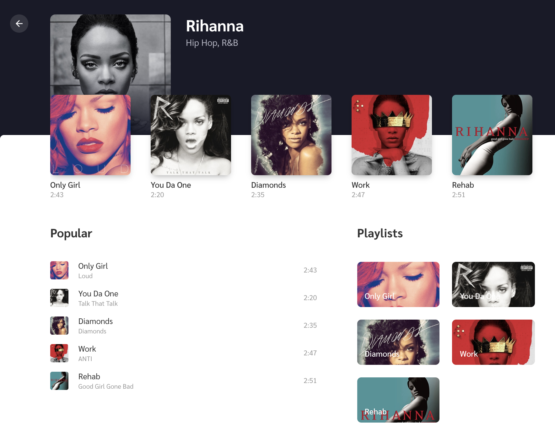
When all is said and done, the two views will come out to something like this:
Artists.vue (left) and Tracks.vue (right)
Step 4: Animate!
Here we are, the part we’ve really wanted to get to all this time. The most important animation in the app is transitioning from Artists to Tracks when clicking on an artist. It should feel seamless where clicking on an artist image puts that image in focus while transitioning from one view into the next. This is exactly the type of animation that we rarely see in apps but can drastically reduce cognitive load for users.
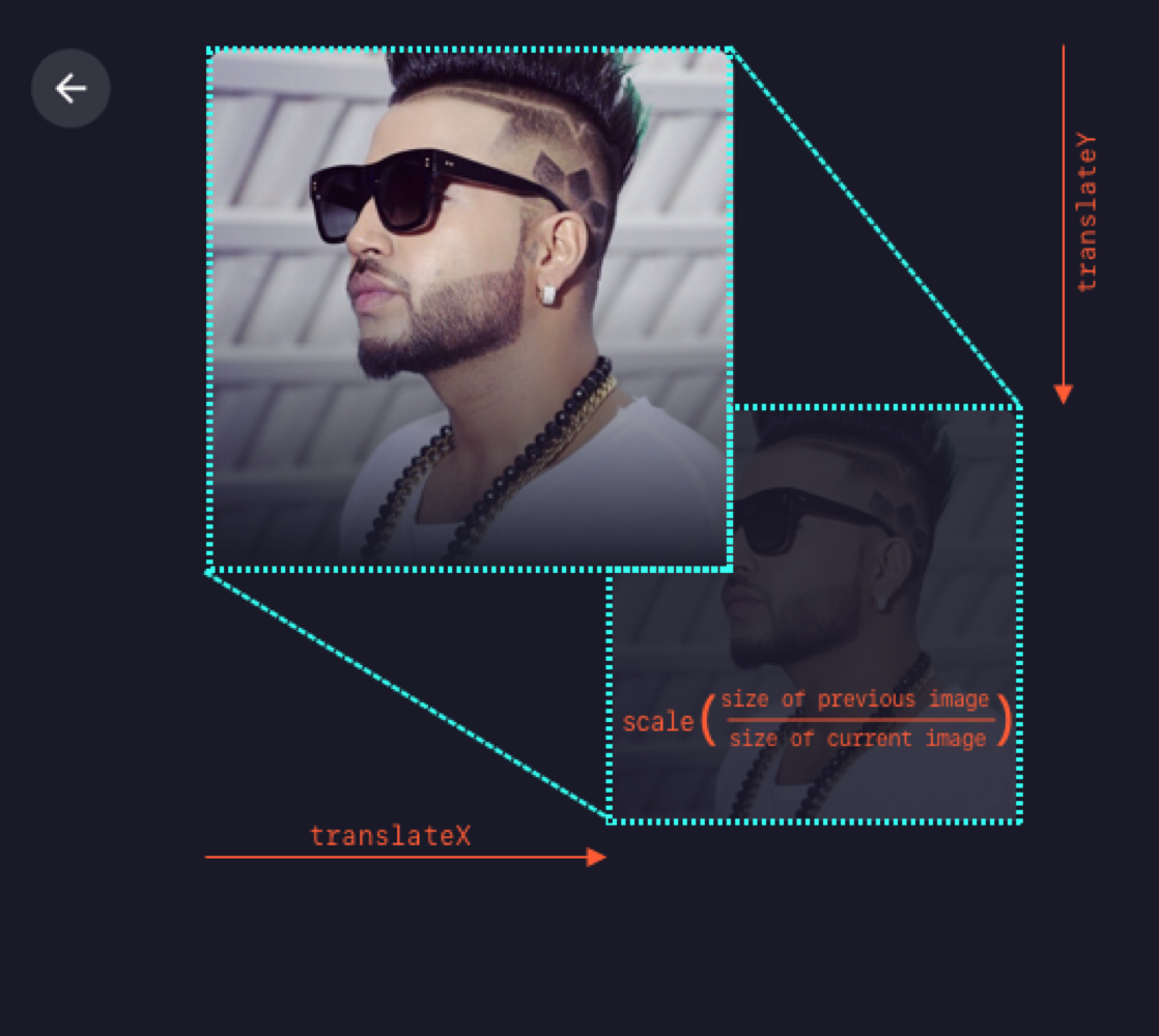
To make sure we’re all on the same page, we’re going to refer to the first image in the sequence as the “previous” image and the second one as the „current” image. Getting the effect down is relatively easy as long as we know the dimensions and position of the previous image in the transition. We can animate the current image by transforming it as per previous image.
The formula that I’m using is transform: translate(x, y) scale(n), where n is equal to the size of previous image divided by the size of current image. Note that we can use a static value of n since the dimensions are fixed for all the images. For example, the image size in the Artists view is 190x190 and 240x240 in the Tracks view. Thus, we can replace n by 190/240 = 0.791. That means the transform value becomes translate(x, y) scale(0.791) in our equation.
Animating from Artists to Tracks
Next thing is to find x and y. We can get these values though click event in the Artists view as:
…and then send these values to the Tracks view, all while switching the route. Since we aren’t using any state management library, the two components will communicate via their parent component, which is the top level component, App.vue. In App.vue, let’s create a method that switches the route and sends the image info as params.
Since we have received the position and ID of the image in Tracks, we have all the required data to show and animate it. We’ll first fetch artist information (specifically the name and image URL) using artist ID.
To animate the image, we need to calculate the transform value from the image’s starting position. To set the transform value, I’m using CSS custom properties, which can be done with CSS-in-JS techniques as well. Note that the image’s position that we received through props will be relative to window. Therefore we’ll have to subtract some fixed offset caused by the padding of the container <div> to even out our math.
We’ll use this value to create a keyframe animation to move the image:
@keyframes move-image {
	from {
		transform: var(--translate);
	}
}
This gets assigned to the CSS animation:
.image {
	animation: move-image 0.6s;
}
…and it will animate the image from this transform value to its original position on component load.
Transitioning from Artists to Tracks
We can use the same technique when going the opposite direction, Tracks to Artists. As we already have the clicked image’s position stored in the parent component, we can pass it to props for Artists as well.
Transitioning from Tracks to Artists
Step 5: Show the tracks!
It’s great that we can now move between our two views seamlessly, but the Tracks view is pretty sparse at the moment. So let’s add the track list for the selected artist.
We’ll create an empty white box and a new keyframe to slide it upwards on page load. Then we’ll add three subsections to it: Recent Tracks, Popular Tracks, and Playlist. Again, if you want to jump ahead, feel free to either reference or copy the final code from the repo.
The Tracks view with content
Recent Tracks is the row of thumbnails just below the artist image where each thumbnail includes the track name and track length below it. Since we’re covering animations here, we’ll create a scale-up animation, where the image starts invisible (opacity: 0) and a little smaller than it’s natural size (scale(0.7)), then is revealed (opacity: 1 )and scales up to its natural size (transform: none).
The Popular Tracks list and Playlist sit side-by-side below the Recent Tracks, where Popular tracks takes up most of the space. We can slide them up a bit on initial view with another set of keyframes:
To make the animation feel more natural, we’ll create a stagger effect so the Recent Tracks lead a little ahead of the Popular Tracks and Playlist using an incremental animation delay to each item.
@for $i from 1 to 5 {
	&:nth-child(#{$i + 1}) {
		animation-delay: #{$i * 0.05}s;
	}
}
The code above is basically looking for each child element, then adding a 0.05 second delay to each element it finds. So, for example, the first child gets a 0.05 second delay, the second child gets a 0.10 second delay and so on.
Check out how nice and natural this all looks:
Bonus: micro-interactions!
One of the fun things about working with animations is thinking through the small details because they’re what tie things together and add delight to the user experience. We call these micro-interactions and they serve a good purpose by providing visual feedback when an action is performed.
Depending on the complexity of the animations, we might need a library like anime.js or GSAP. This example is pretty straightforward, so we can accomplish everything we need by writing some CSS.
First micro-interaction: The volume icon
Let’s first get a volume icon in SVG format (Noun Project and Material Design are good sources). On click, we’ll animate-in and out its path element to show the level of volume. For this, we’ll create a method which switches its CSS class according to the volume level.
Do you like it when you click on Twitter’s heart button? That’s because it feels unique and special by the way it animates on click. We’ll make something similar but real quick. For this, we first get an SVG heart icon and add it to the the markup. Then we’ll add a bouncy animation to it that’s triggered on click.
Another fun thing we can do is add other small heart icons around it with random sizes and positions. Ideally, we’d add a few absolute-positioned HTML elements that a heart as the background. Let’s Arrange each of them as below by setting their left and bottom values.
We’ll also include a fade away effect so the icons appear to dissolve as they move upward by adding a keyframe animation on the same click event.
That’s all! I hope you find all this motivating to try animations on your own websites and projects.
While writing this, I also wanted to expand on the fundamental animation principles we glossed over earlier because I believe that they help choose animation durations, and avoid non-meaningful animations. That’s important to discuss because doing animations correctly is better than doing them at all. But this sounds like a whole another topic to be covered in a future article.
Web animation is one of the factors that can strongly enhance your website’s look and feel. Sadly, unlike mobile apps, there aren’t as many websites using animation to their benefit as you would think. We don’t want to count yours among those, so this article is for you and anyone else looking for ways to use animation for a better user experience! Specifically, we’re going to learn how to make web interactions delightful using CSS animations.
Before we move ahead, it’s worth mentioning that I’m going to assume you have at least some familiarity with modern front-end frameworks and a basic understanding of CSS animations. If you don’t, then no fear! CSS-Tricks has a great guides on React and Vue, as well as a thorough almanac post on the CSSanimation property.
Good? OK, let’s talk about why we’d want to use animation in the first place and cover some baseline information about CSS animations.
Why would we to animate anything?
We could probably do an entire post on this topic alone. Oh, wait! Sarah Drasner already did that and her points are both poignant and compelling.
But, to sum things up based on my own experiences:
Animations enhance the way users interact with an interface. For example, smart animations can reduce cognitive load by giving users better context between page transitions.
They can provide clear cues to users, like where we want them to focus attention.
Animations serve as another design pattern in and of themselves, helping users to get emotionally attached to and engage with the interface.
Another benefit of using animations is that they can create a perception that a site or app loads faster than it actually does.
A couple of house rules with animations
Have you ever bumped into a site that animates all the things? Wow, those can be jarring. So, here’s a couple of things to avoid when working with animations so our app doesn’t fall into the same boat:
Avoid animating CSS properties other than transform and opacity. If other properties have to be animated, like width or height, then make sure there aren’t a lot of layout changes happening at the same time. There’s actually a cost to animations and you can see exactly how much by referring to CSS Triggers.
Also, just because animations can create perceived performance gains, there’s actually a point of diminishing return when it comes to using them. Animating too many elements at the same time may result in decreased performance.
Now we can get our hands dirty with some code!
Let’s build a music app
We’re going to build the music app we looked at earlier, which is inspired by Aurélien Salomon’s Dribbble shot. I chose this example so that we can focus on animations, not only within a component, but also between different routes. We’ll build this app using Vue and create animations using vanilla (i.e. no framework) CSS.
Animations should go hand-in-hand with UI development. Creating UI before defining their movement is likely to cost much more time. In this case, the Dribbble shot provides that scope for us.
Let’s start with the development.
Step 1: Spin up the app locally
First things first. We need to set up a new Vue project. Again, we’re assuming some base-level understanding of Vue here, so please check out the Learning Vue guide for more info on setting up.
We need a couple of dependencies for our work, notably vue-router for transitioning between views and sass-loader so we can write in Sass and compile to CSS. Here’s a detailed tutorial on using routes and Sass can be installed by pointing the command line at the project directory and using npm install -D sass-loader node-sass.
We have what we need!
Step 2: Setting up routes
For creating routes, we’re first going to create two bare minimum components — Artists.vue and Tracks.vue. We’ll drop a new file in the src folder called router.js and add routes for these components as:
import Vue from 'vue'
import Router from 'vue-router'
import Artists from './components/Artists.vue'
import Tracks from './components/Tracks.vue'

Vue.use(Router)
export default new Router({
	mode: 'history',
	routes: [
		{
			path: '/',
			name: 'artists',
			component: Artists
		},
		{
			path: '/:id',
			name: 'tracks',
			component: Tracks
		}
	]
})
Import router.js into the main.js and inject it to the Vue instance. Lastly, replace the content of your App.vue by <router-view/>.
Step 3: Create the components and content for the music app
We need two components that we’ll transition between with animation. Those are going to be:
Artists.vue: a grid of artists
Tracks.vue: An artist image with a back button
If you wanna jump ahead a bit, here are some assets to work with:
When all is said and done, the two views will come out to something like this:
Artists.vue (left) and Tracks.vue (right)
Step 4: Animate!
Here we are, the part we’ve really wanted to get to all this time. The most important animation in the app is transitioning from Artists to Tracks when clicking on an artist. It should feel seamless where clicking on an artist image puts that image in focus while transitioning from one view into the next. This is exactly the type of animation that we rarely see in apps but can drastically reduce cognitive load for users.
To make sure we’re all on the same page, we’re going to refer to the first image in the sequence as the “previous” image and the second one as the „current” image. Getting the effect down is relatively easy as long as we know the dimensions and position of the previous image in the transition. We can animate the current image by transforming it as per previous image.
The formula that I’m using is transform: translate(x, y) scale(n), where n is equal to the size of previous image divided by the size of current image. Note that we can use a static value of n since the dimensions are fixed for all the images. For example, the image size in the Artists view is 190x190 and 240x240 in the Tracks view. Thus, we can replace n by 190/240 = 0.791. That means the transform value becomes translate(x, y) scale(0.791) in our equation.
Animating from Artists to Tracks
Next thing is to find x and y. We can get these values though click event in the Artists view as:
…and then send these values to the Tracks view, all while switching the route. Since we aren’t using any state management library, the two components will communicate via their parent component, which is the top level component, App.vue. In App.vue, let’s create a method that switches the route and sends the image info as params.
Since we have received the position and ID of the image in Tracks, we have all the required data to show and animate it. We’ll first fetch artist information (specifically the name and image URL) using artist ID.
To animate the image, we need to calculate the transform value from the image’s starting position. To set the transform value, I’m using CSS custom properties, which can be done with CSS-in-JS techniques as well. Note that the image’s position that we received through props will be relative to window. Therefore we’ll have to subtract some fixed offset caused by the padding of the container <div> to even out our math.
We’ll use this value to create a keyframe animation to move the image:
@keyframes move-image {
	from {
		transform: var(--translate);
	}
}
This gets assigned to the CSS animation:
.image {
	animation: move-image 0.6s;
}
…and it will animate the image from this transform value to its original position on component load.
Transitioning from Artists to Tracks
We can use the same technique when going the opposite direction, Tracks to Artists. As we already have the clicked image’s position stored in the parent component, we can pass it to props for Artists as well.
Transitioning from Tracks to Artists
Step 5: Show the tracks!
It’s great that we can now move between our two views seamlessly, but the Tracks view is pretty sparse at the moment. So let’s add the track list for the selected artist.
We’ll create an empty white box and a new keyframe to slide it upwards on page load. Then we’ll add three subsections to it: Recent Tracks, Popular Tracks, and Playlist. Again, if you want to jump ahead, feel free to either reference or copy the final code from the repo.
The Tracks view with content
Recent Tracks is the row of thumbnails just below the artist image where each thumbnail includes the track name and track length below it. Since we’re covering animations here, we’ll create a scale-up animation, where the image starts invisible (opacity: 0) and a little smaller than it’s natural size (scale(0.7)), then is revealed (opacity: 1 )and scales up to its natural size (transform: none).
The Popular Tracks list and Playlist sit side-by-side below the Recent Tracks, where Popular tracks takes up most of the space. We can slide them up a bit on initial view with another set of keyframes:
To make the animation feel more natural, we’ll create a stagger effect so the Recent Tracks lead a little ahead of the Popular Tracks and Playlist using an incremental animation delay to each item.
@for $i from 1 to 5 {
	&:nth-child(#{$i + 1}) {
		animation-delay: #{$i * 0.05}s;
	}
}
The code above is basically looking for each child element, then adding a 0.05 second delay to each element it finds. So, for example, the first child gets a 0.05 second delay, the second child gets a 0.10 second delay and so on.
Check out how nice and natural this all looks:
Bonus: micro-interactions!
One of the fun things about working with animations is thinking through the small details because they’re what tie things together and add delight to the user experience. We call these micro-interactions and they serve a good purpose by providing visual feedback when an action is performed.
Depending on the complexity of the animations, we might need a library like anime.js or GSAP. This example is pretty straightforward, so we can accomplish everything we need by writing some CSS.
First micro-interaction: The volume icon
Let’s first get a volume icon in SVG format (Noun Project and Material Design are good sources). On click, we’ll animate-in and out its path element to show the level of volume. For this, we’ll create a method which switches its CSS class according to the volume level.
Do you like it when you click on Twitter’s heart button? That’s because it feels unique and special by the way it animates on click. We’ll make something similar but real quick. For this, we first get an SVG heart icon and add it to the the markup. Then we’ll add a bouncy animation to it that’s triggered on click.
Another fun thing we can do is add other small heart icons around it with random sizes and positions. Ideally, we’d add a few absolute-positioned HTML elements that a heart as the background. Let’s Arrange each of them as below by setting their left and bottom values.
We’ll also include a fade away effect so the icons appear to dissolve as they move upward by adding a keyframe animation on the same click event.
That’s all! I hope you find all this motivating to try animations on your own websites and projects.
While writing this, I also wanted to expand on the fundamental animation principles we glossed over earlier because I believe that they help choose animation durations, and avoid non-meaningful animations. That’s important to discuss because doing animations correctly is better than doing them at all. But this sounds like a whole another topic to be covered in a future article.
Ready to take the next step in layout design? In this tutorial, we show you how to create a booklet in InDesign. For this stylish design, we’ll use essential tools for setting up pages that will help you in your future projects.
Booklets are a form of brochure containing more than four pages and not more than 48 pages (the page count should be divisible by four). This non-periodical publication is great for marketing purposes because it allows you or your client to show their business in detail.
In this tutorial, we show you how to make a booklet in InDesign. You can also keep this as a four-page document to create a brochure in InDesign. Regardless of which you choose to do, you will be learning essential tools that will help grow your layout skills. We will be touching on Master Pages, Paragraph Styles, Color Swatches, and many smaller tips and tricks.
You can use this tutorial to help you set up an InDesign template for distribution to your clients or to keep for yourself. If you are looking for specific tutorials on how to make a brochure in InDesign, we’ve got plenty of that! Scroll down past the tutorial and you’ll find some of our suggestions.
You’ll need access to Adobe InDesign; if you don’t have the software, you can download a trial from the Adobe website. You’ll also need the following assets:
Download the assets and make sure the font is installed on your system before starting. When you are ready, we can dive in!
1.How to Create a Booklet in InDesign
Step 1
In InDesign, go to File > New. Name the document Booklet. We will create a letter size newsletter template.Set the file to the following dimensions:
Width to 8.5 in
Height to 11 in
Orientation to Portrait
Units to Inches
Pages to 12
Check Facing Pages
Margins: 0.75 in
Bleeds to 0.125 in (it’s best to seek your professional printer’s preference)
Click Create.
Step 2
For this booklet tutorial, we will work with different Layers. Organising layers is an important practice to keep all the elements in the file organised.Bring up the Layers panel by going to Window > Layers. Double-click on Layer 1 and rename it Copy (Back).
In the Layers panel main menu, select New Layer. Name it Background. Click OK. Create two additional layers named Images and Copy (Front).
Step 3
Head over to Window > Color > Swatches to expand the Swatches panel. Choose New Color Swatch button from the main menu. Set the Swatch Name and values to the following:
Light: C=15 M=35 Y=45 K=0
Medium:C=35 M=80 Y=80 K=40
Dark:C=65 M=70 Y=70 K=75
Click Add and OK after you input each of the color values.
Step 4
For this tutorial, we will create a list of Paragraph Styles that we will use to format parts of the booklet.
Head over to Window > Styles > Paragraph Styles to open the Paragraph Styles panel. In the main menu, select New Paragraph Style, and set the Style Name to Title. Select the Basic Character Formats option from the left side menu. Use the following settings:
Font Family: Bw Modelica
Font Style: Black Condensed
Size: 30 pt
Tracking: 25
Case: All Caps
Select the Character Color option from the left side menu. Set the color to the Medium swatch. Click OK.
Create a New Paragraph Style, set the Style Name to Deck. In the Basic Character Formats option, use the following settings:
Font Family: Bw Modelica
Font Style: Regular Condensed
Size: 18 pt
Tracking: 25
Select the Character Color option from the left side menu. Set the color to the Medium swatch. Click OK.
Create a New Paragraph Style, set the Style Name to Copy. In the Basic Character Formats option, use the following settings:
Font Family: Bw Modelica
Font Style: Regular Condensed
Size: 9 pt
Leading: 12 pt
Tracking: 10
Select the Indents and Spacing option from menu on the left and set the Space Between Paragraphs Using Same Style: 0.1 in.
Select the Character Color option from the left side menu. Set the color to the Dark swatch. Click OK.
Create a New Paragraph Style, and set the Style Name to Pull-quote. In the Basic Character Formats option, use the following settings:
Font Family: Bw Modelica
Font Style: Bold Condensed
Size: 20 pt
Tracking: 10
Select the Character Color option from the left side menu. Set the color to the [Paper] swatch. Click OK.
Create a New Paragraph Style, set the Style Name to Folio-Page number. In the Basic Character Formats option, use the following settings:
Font Family: Bw Modelica
Font Style: Bold Condensed
Size: 8 pt
Tracking: 100
Select the Character Color option from the left side menu. Set the color to the Medium swatch. Click OK.
Create a New Paragraph Style, set the Style Name to Folio-Section. In the Basic Character Formats option, use the following settings:
Font Family: Bw Modelica
Font Style: Harline Condensed
Size: 420 pt
Tracking: 10
Select the Character Color option from the left side menu. Set the color to the Light swatch. Click OK.
2. Setting Up Guides and Master Pages for Your Booklet Design
Step 1
On the Pages panel, double-click on the A-Master pages. Head over to Layout > Create Guides. In the Create Guides option window, set the Rows Number to 5 and Gutter to 0. Set the Columns Number to 8 and the Gutter to 0.1875 in. Under Options, select Fit Guides to: Margins. Click OK.
Repeat this process on the opposite page.
Step 2
On the Layers panel, select the Copy (Front) layer.
Using the Text Tool (T) from the toolbar, create a text box under the bottom left corner margin. Right-click on the text box and select Insert Special Character > Markers > Current Page Number. A letter “A” will represent the page number. On the second line, you can add the title of your booklet.
Select the text and head over to the Paragraph Styles panel. Format the text with the Folio-page number style.
Select the text box and press Command-C to Copy and Command-V to Paste. Place this duplicated text box on the opposite page. Press T to activate the formatting tools on the Control panel. Select the paragraph formatting tool and set the text box to Align Right.
Step 3
On the Layers panel, select the Background layer. Using the Rectangle Tool (M), create a small rectangle with a Width of 0.7 in and Height of 0.4 in. Using the Swatches panel, set the color to the Medium swatch.
Place the rectangle on the left side margin of the left page. Duplicate it by pressing Option and drag. Place the newly duplicated element on the right margin of the right page. This is a great anchor for the title.
Step 4
Head over to the Pages panel, right-click on A-Master and select Apply Master to Pages. Under To Pages, type 2-11. Click OK. These are the pages the A-Master page will be applied to.
3. Creating a Cover of Your Booklet Design
Step 1
On the Layers panel, click on the Background layer.
Head over to Page 1. Using the Rectangle Tool (M), create a shape on the top portion of the cover.
While selecting the rectangle, press Command-D to Place the Close up of coffee seeds image. Select the image with the Direct Selection Tool (A) and resize the image on the Control bar to 20%.
Create another rectangle of the same size as above. Head over to the Swatches panel, select the Dark swatch and set the Tint to 60%.
Step 2
Create a rectangle for the bottom portion of the cover with the Rectangle Tool (M). Using the Swatches panel, set the color to the Dark swatch.
Using the Line Tool (\), create a line that goes across the width of the page. On the Swatches panel, set the stroke color to the Light color swatch. On the Control panel, set the Stroke Weight to 5 pt.
Place the line between the image and the bottom of the cover.
Step 3
On the Layers panel, lock all the layers and leave the Copy (Front) unlocked.
Using the Text Tool (T), add a title and a deck to the booklet and place it in the top left corner of the page.
Open the Character panel (Window > Type & Tables > Character). For the title, set the Font to Bw ModelicaBold Condensed, Size 55 pt, and Leading 50 pt.
For the deck, set the Font to Bw Modelica Light Condensed and Size 18 pt.
Step 4
Using the Text Tool (T), add a text box to fit the width of the page and place it over the bottom margin. While selecting the text box, press Command-B to open the Text Frame Options window. Under Columns, set the Number to 3. Click OK.
Add contact information to the text frame. On the Character panel, set the font to Bw Modelica Light Condensed and Size 9 pt.
4. Creating the Inside Spreads of Your Booklet Design
Step 1
Let’s work on Pages 2-3 of the booklet. On the Layers panel, unlock the Images layer.
Head over to Page 2 and using the Rectangle Tool (M), create a rectangle that measures 10 in in Width and 11.25 in in Height. This element will go over the gutter of the page.
Select the rectangle and press Command-D to place the Coffee cup with roasted beansimage inside it. Using the Direct Selection Tool (A), move the image to find a good placement.
To make the page number visible, we need to change the color. Press Shift-Command and click on the page number to unlock it from the Master Page. Using the Swatches panel, change the color of the type to [Paper].
Lock the text frame by pressing Command-L.
Step 2
On Page 3, add a text box using the Text Tool (T). Place the text box at the very top of the page, and add a title and a deck. Using the Paragraph Styles panel, format the title and the deck with their corresponding styles.
Create a text box using the Text Tool (T) for the bottom portion of the page—this will house the body copy. This text box should take the remaining width of the page. While selecting it, press Command-B to open the Text Frame Options window. Under Columns, set the Number to 2 and the Gutter to 0.1667 in. Click OK.
Add content and use the Paragraph Styles panel, to format it to the Copy style.
On the Layers panel, select the Copy (Back) layer (lock all the other layers if necessary). Using the Text Tool (T), draw a text box and add the section number. Using the Paragraph Styles panel, format the text box to the Folio-Section style. Place the section number anywhere on the page—I chose to display it near the title and deck.
Now we can use this spread as a base for the rest of the inside pages.
Step 3
For Pages 4-5, we will create a mirrored layout of what we created on Pages 2-3.
Select all the elements on Pages 2-3, and press Command-C to Copy. Head over to Pages 4-5 and press Shift-Option-Command-V to Paste in Place.
The elements will be pasted onto one layer, but it’s best to move the elements to their respective layers. You can do so by selecting an element on the page, heading over to the Layers panel, and dragging the square on the right to another layer.
Using the Selection Tool (V), move the image to the right. Select all the elements on the right side of the page and move them towards the left side.
Let’s start editing by changing up the image. Select the image and press Command-D to Place the All kinds of coffee on spoonsimage. Using the Direct Selection Tool (A), select the image followed by R to Rotate the image.
To add a pull-quote, create a text box using the Text Tool (T). While selecting the text box, press Command-B to open the Text Frame Options window. On the window, set the Inset Spacing to 0.375 in on all sides. Click OK.
Using the Paragraph Styles panel, format the text box with the Pull-quote style. For the quote credit, open the Character panel. Set the Font to Bw Modelica Light Condensed and Size 14 pt.
Use the Text Tool (T) to add your own copy on Page 4.
To add a pull-quote on the body copy, create a text box with the Text Tool (T). Format the text box on the Character panel, setting the Font to Bw Modelica Bold Condensed, Size 14 pt.
On the Swatches panel, set the color to Medium.
On the Text Wrap panel (Window > Text Wrap), select the Wrap around bounding box. Set all the Offset sides to 0.125 in.
Step 4
For Pages 6-7, we will create a resting spread to give the reader a visual break.
Press Shift-Command, select both of the rectangles on each side at the top of the page, and press Delete.
On the Layers panel, select the Background layer. Using the Rectangle Tool (M), cover the spread with a rectangle. Use the Swatches panel to set the color to the Dark swatch. Lock the Background layer on the Layers panel and select the Images layer.
Copy the pull-quote from Page 5 by pressing Command-C. Paste the element by pressing Command-V on Pages 6-7. Use the Text Tool (T) to edit the quotes.
Step 5
Pages 8-9 will have a different layout than the rest of the booklet. This interview style spread is a good visual contrast to the rest of the layout.
Press Shift-Command, select the rectangle on Page 9, and press Delete.
Using the Rectangle Tool (M), cover the spread with a rectangle and make sure this is on the Background layer. Use the Swatches panel to set the color to the Dark swatch. Lock the layer and select the Images layer.
Copy (Command-V) and Paste in Place (Shift-Option-Command-V) the title text box from Page 4 onto Page 8. Use the Text Tool (T) to edit the text. Using the Swatches panel, change the color of the text to the Light swatch.
Create a text box using the Text Tool (T). Head over to the Control bar, and set the Width to 2.9 in and the Height to 5.7 in.
Using the Text Tool (T), add copy and use the Paragraph Styles to format the text to the Copy style. Select the text and change the color on the Swatches panel to Light.
Select three words from the beginning of the text box, and head over to the Character panel. Set the Font to Bw Modelica Black Condensed. This is a great way to let the reader know where each interview starts.
Select the Ellipse Tool (L), and click on the document to open the Ellipse option window. Set the Width and Height to 1 in. Click OK. Place the ellipse over the text frame and use the Align panel to Center both elements.
Using the Text Tool (T), create a small text frame under the ellipse. This will serve as the name/title text. Use the Paragraph Styles to format the text to the Copy style. With the help of the Swatches panel and the Character panel, create your own combination of styles. Don’t forget to show us in the comments below!
Duplicate the text frame and circle three times by pressing Shift-Option and dragging. Repeat these elements on the opposite page.
For Pages 10-11, we will go back to the initial layout.
Copy (Command-C) and Paste in Place (Shift-Option-Command-V) the title, deck, section number and copy from Page 4 onto Page 10. Use the Text Tool (T) to edit the copy.
To create a copy that extends to the next page, we will use the threading option. Duplicate the text frame onto Page 11 by pressing Shift-Option and dragging. Delete the text in the new text box.
Select the text box on Page 10. If you have overflowing text, you will see a red plus symbol on the bottom right. If you don’t have any overflowing text, you’ll see an empty blue box. Click on the red plus symbol or blue box, followed by a click on the empty text box on Page 11. This will allow you to continue the text on the next page or anywhere you are threading the text box.
Press Command-D to place the Coffee image. Place the image in the bottom left corner of Page 10, and make sure it is bleeding out of the page. Head over to the Text Wrap panel (Window > Text Wrap) and select the Wrap around bounding box button.
Press Command-D to place the Barista at work image. This time, place the image in the top right corner of Page 11.Make sure it is bleeding out of the page and covering the first inside column of Page 10. Head over to the Text Wrap panel and select the Wrap around bounding box button. Set the Offset to 0.125 in—this will help with the text frame underneath.
Step 7
Using the Rectangle Tool (M), cover the back page. While selecting the rectangle, press Command-D to Place the Coffee beans image.
Create another rectangle of the same size as above. Head over to the Swatches panel, select the Dark swatch and set the Tint to 60%.
Copy (Command-C) and Paste (Command-V) the contact information from the front cover.
5.How to Export a File for Printing
Before exporting a file for printing, it’s useful to take a look around all the edges of the design. This is to make sure all the images and vectors bleeding out are touching the bleeds.
Step 1
To export the file, go to File > Export. Name the file Booklet and choose Adobe PDF (Print) from the Format dropdown menu. Click Save.
Step 2
In the Export Adobe PDF window, set the Adobe PDF Preset to Press Quality. Under Pages, select Export As Pages.
On the left side of the panel, select Marks and Bleeds. Check All Printer’s Marks and Use Document Bleed Settings. Click Export. You will have a ready-to-print PDF file.
Great Job! You’ve Finished Your Booklet Design!
In this tutorial, we learned how to make a booklet in InDesign. We covered important tools that will help you set up a multi-page InDesign template. If you lowered the page count, you can use this as an InDesign brochure template. Today, we learned to:
Ready to take the next step in layout design? In this tutorial, we show you how to create a booklet in InDesign. For this stylish design, we’ll use essential tools for setting up pages that will help you in your future projects.
Booklets are a form of brochure containing more than four pages and not more than 48 pages (the page count should be divisible by four). This non-periodical publication is great for marketing purposes because it allows you or your client to show their business in detail.
In this tutorial, we show you how to make a booklet in InDesign. You can also keep this as a four-page document to create a brochure in InDesign. Regardless of which you choose to do, you will be learning essential tools that will help grow your layout skills. We will be touching on Master Pages, Paragraph Styles, Color Swatches, and many smaller tips and tricks.
You can use this tutorial to help you set up an InDesign template for distribution to your clients or to keep for yourself. If you are looking for specific tutorials on how to make a brochure in InDesign, we’ve got plenty of that! Scroll down past the tutorial and you’ll find some of our suggestions.
You’ll need access to Adobe InDesign; if you don’t have the software, you can download a trial from the Adobe website. You’ll also need the following assets:
Download the assets and make sure the font is installed on your system before starting. When you are ready, we can dive in!
1.How to Create a Booklet in InDesign
Step 1
In InDesign, go to File > New. Name the document Booklet. We will create a letter size newsletter template.Set the file to the following dimensions:
Width to 8.5 in
Height to 11 in
Orientation to Portrait
Units to Inches
Pages to 12
Check Facing Pages
Margins: 0.75 in
Bleeds to 0.125 in (it’s best to seek your professional printer’s preference)
Click Create.
Step 2
For this booklet tutorial, we will work with different Layers. Organising layers is an important practice to keep all the elements in the file organised.Bring up the Layers panel by going to Window > Layers. Double-click on Layer 1 and rename it Copy (Back).
In the Layers panel main menu, select New Layer. Name it Background. Click OK. Create two additional layers named Images and Copy (Front).
Step 3
Head over to Window > Color > Swatches to expand the Swatches panel. Choose New Color Swatch button from the main menu. Set the Swatch Name and values to the following:
Light: C=15 M=35 Y=45 K=0
Medium:C=35 M=80 Y=80 K=40
Dark:C=65 M=70 Y=70 K=75
Click Add and OK after you input each of the color values.
Step 4
For this tutorial, we will create a list of Paragraph Styles that we will use to format parts of the booklet.
Head over to Window > Styles > Paragraph Styles to open the Paragraph Styles panel. In the main menu, select New Paragraph Style, and set the Style Name to Title. Select the Basic Character Formats option from the left side menu. Use the following settings:
Font Family: Bw Modelica
Font Style: Black Condensed
Size: 30 pt
Tracking: 25
Case: All Caps
Select the Character Color option from the left side menu. Set the color to the Medium swatch. Click OK.
Create a New Paragraph Style, set the Style Name to Deck. In the Basic Character Formats option, use the following settings:
Font Family: Bw Modelica
Font Style: Regular Condensed
Size: 18 pt
Tracking: 25
Select the Character Color option from the left side menu. Set the color to the Medium swatch. Click OK.
Create a New Paragraph Style, set the Style Name to Copy. In the Basic Character Formats option, use the following settings:
Font Family: Bw Modelica
Font Style: Regular Condensed
Size: 9 pt
Leading: 12 pt
Tracking: 10
Select the Indents and Spacing option from menu on the left and set the Space Between Paragraphs Using Same Style: 0.1 in.
Select the Character Color option from the left side menu. Set the color to the Dark swatch. Click OK.
Create a New Paragraph Style, and set the Style Name to Pull-quote. In the Basic Character Formats option, use the following settings:
Font Family: Bw Modelica
Font Style: Bold Condensed
Size: 20 pt
Tracking: 10
Select the Character Color option from the left side menu. Set the color to the [Paper] swatch. Click OK.
Create a New Paragraph Style, set the Style Name to Folio-Page number. In the Basic Character Formats option, use the following settings:
Font Family: Bw Modelica
Font Style: Bold Condensed
Size: 8 pt
Tracking: 100
Select the Character Color option from the left side menu. Set the color to the Medium swatch. Click OK.
Create a New Paragraph Style, set the Style Name to Folio-Section. In the Basic Character Formats option, use the following settings:
Font Family: Bw Modelica
Font Style: Harline Condensed
Size: 420 pt
Tracking: 10
Select the Character Color option from the left side menu. Set the color to the Light swatch. Click OK.
2. Setting Up Guides and Master Pages for Your Booklet Design
Step 1
On the Pages panel, double-click on the A-Master pages. Head over to Layout > Create Guides. In the Create Guides option window, set the Rows Number to 5 and Gutter to 0. Set the Columns Number to 8 and the Gutter to 0.1875 in. Under Options, select Fit Guides to: Margins. Click OK.
Repeat this process on the opposite page.
Step 2
On the Layers panel, select the Copy (Front) layer.
Using the Text Tool (T) from the toolbar, create a text box under the bottom left corner margin. Right-click on the text box and select Insert Special Character > Markers > Current Page Number. A letter “A” will represent the page number. On the second line, you can add the title of your booklet.
Select the text and head over to the Paragraph Styles panel. Format the text with the Folio-page number style.
Select the text box and press Command-C to Copy and Command-V to Paste. Place this duplicated text box on the opposite page. Press T to activate the formatting tools on the Control panel. Select the paragraph formatting tool and set the text box to Align Right.
Step 3
On the Layers panel, select the Background layer. Using the Rectangle Tool (M), create a small rectangle with a Width of 0.7 in and Height of 0.4 in. Using the Swatches panel, set the color to the Medium swatch.
Place the rectangle on the left side margin of the left page. Duplicate it by pressing Option and drag. Place the newly duplicated element on the right margin of the right page. This is a great anchor for the title.
Step 4
Head over to the Pages panel, right-click on A-Master and select Apply Master to Pages. Under To Pages, type 2-11. Click OK. These are the pages the A-Master page will be applied to.
3. Creating a Cover of Your Booklet Design
Step 1
On the Layers panel, click on the Background layer.
Head over to Page 1. Using the Rectangle Tool (M), create a shape on the top portion of the cover.
While selecting the rectangle, press Command-D to Place the Close up of coffee seeds image. Select the image with the Direct Selection Tool (A) and resize the image on the Control bar to 20%.
Create another rectangle of the same size as above. Head over to the Swatches panel, select the Dark swatch and set the Tint to 60%.
Step 2
Create a rectangle for the bottom portion of the cover with the Rectangle Tool (M). Using the Swatches panel, set the color to the Dark swatch.
Using the Line Tool (\), create a line that goes across the width of the page. On the Swatches panel, set the stroke color to the Light color swatch. On the Control panel, set the Stroke Weight to 5 pt.
Place the line between the image and the bottom of the cover.
Step 3
On the Layers panel, lock all the layers and leave the Copy (Front) unlocked.
Using the Text Tool (T), add a title and a deck to the booklet and place it in the top left corner of the page.
Open the Character panel (Window > Type & Tables > Character). For the title, set the Font to Bw ModelicaBold Condensed, Size 55 pt, and Leading 50 pt.
For the deck, set the Font to Bw Modelica Light Condensed and Size 18 pt.
Step 4
Using the Text Tool (T), add a text box to fit the width of the page and place it over the bottom margin. While selecting the text box, press Command-B to open the Text Frame Options window. Under Columns, set the Number to 3. Click OK.
Add contact information to the text frame. On the Character panel, set the font to Bw Modelica Light Condensed and Size 9 pt.
4. Creating the Inside Spreads of Your Booklet Design
Step 1
Let’s work on Pages 2-3 of the booklet. On the Layers panel, unlock the Images layer.
Head over to Page 2 and using the Rectangle Tool (M), create a rectangle that measures 10 in in Width and 11.25 in in Height. This element will go over the gutter of the page.
Select the rectangle and press Command-D to place the Coffee cup with roasted beansimage inside it. Using the Direct Selection Tool (A), move the image to find a good placement.
To make the page number visible, we need to change the color. Press Shift-Command and click on the page number to unlock it from the Master Page. Using the Swatches panel, change the color of the type to [Paper].
Lock the text frame by pressing Command-L.
Step 2
On Page 3, add a text box using the Text Tool (T). Place the text box at the very top of the page, and add a title and a deck. Using the Paragraph Styles panel, format the title and the deck with their corresponding styles.
Create a text box using the Text Tool (T) for the bottom portion of the page—this will house the body copy. This text box should take the remaining width of the page. While selecting it, press Command-B to open the Text Frame Options window. Under Columns, set the Number to 2 and the Gutter to 0.1667 in. Click OK.
Add content and use the Paragraph Styles panel, to format it to the Copy style.
On the Layers panel, select the Copy (Back) layer (lock all the other layers if necessary). Using the Text Tool (T), draw a text box and add the section number. Using the Paragraph Styles panel, format the text box to the Folio-Section style. Place the section number anywhere on the page—I chose to display it near the title and deck.
Now we can use this spread as a base for the rest of the inside pages.
Step 3
For Pages 4-5, we will create a mirrored layout of what we created on Pages 2-3.
Select all the elements on Pages 2-3, and press Command-C to Copy. Head over to Pages 4-5 and press Shift-Option-Command-V to Paste in Place.
The elements will be pasted onto one layer, but it’s best to move the elements to their respective layers. You can do so by selecting an element on the page, heading over to the Layers panel, and dragging the square on the right to another layer.
Using the Selection Tool (V), move the image to the right. Select all the elements on the right side of the page and move them towards the left side.
Let’s start editing by changing up the image. Select the image and press Command-D to Place the All kinds of coffee on spoonsimage. Using the Direct Selection Tool (A), select the image followed by R to Rotate the image.
To add a pull-quote, create a text box using the Text Tool (T). While selecting the text box, press Command-B to open the Text Frame Options window. On the window, set the Inset Spacing to 0.375 in on all sides. Click OK.
Using the Paragraph Styles panel, format the text box with the Pull-quote style. For the quote credit, open the Character panel. Set the Font to Bw Modelica Light Condensed and Size 14 pt.
Use the Text Tool (T) to add your own copy on Page 4.
To add a pull-quote on the body copy, create a text box with the Text Tool (T). Format the text box on the Character panel, setting the Font to Bw Modelica Bold Condensed, Size 14 pt.
On the Swatches panel, set the color to Medium.
On the Text Wrap panel (Window > Text Wrap), select the Wrap around bounding box. Set all the Offset sides to 0.125 in.
Step 4
For Pages 6-7, we will create a resting spread to give the reader a visual break.
Press Shift-Command, select both of the rectangles on each side at the top of the page, and press Delete.
On the Layers panel, select the Background layer. Using the Rectangle Tool (M), cover the spread with a rectangle. Use the Swatches panel to set the color to the Dark swatch. Lock the Background layer on the Layers panel and select the Images layer.
Copy the pull-quote from Page 5 by pressing Command-C. Paste the element by pressing Command-V on Pages 6-7. Use the Text Tool (T) to edit the quotes.
Step 5
Pages 8-9 will have a different layout than the rest of the booklet. This interview style spread is a good visual contrast to the rest of the layout.
Press Shift-Command, select the rectangle on Page 9, and press Delete.
Using the Rectangle Tool (M), cover the spread with a rectangle and make sure this is on the Background layer. Use the Swatches panel to set the color to the Dark swatch. Lock the layer and select the Images layer.
Copy (Command-V) and Paste in Place (Shift-Option-Command-V) the title text box from Page 4 onto Page 8. Use the Text Tool (T) to edit the text. Using the Swatches panel, change the color of the text to the Light swatch.
Create a text box using the Text Tool (T). Head over to the Control bar, and set the Width to 2.9 in and the Height to 5.7 in.
Using the Text Tool (T), add copy and use the Paragraph Styles to format the text to the Copy style. Select the text and change the color on the Swatches panel to Light.
Select three words from the beginning of the text box, and head over to the Character panel. Set the Font to Bw Modelica Black Condensed. This is a great way to let the reader know where each interview starts.
Select the Ellipse Tool (L), and click on the document to open the Ellipse option window. Set the Width and Height to 1 in. Click OK. Place the ellipse over the text frame and use the Align panel to Center both elements.
Using the Text Tool (T), create a small text frame under the ellipse. This will serve as the name/title text. Use the Paragraph Styles to format the text to the Copy style. With the help of the Swatches panel and the Character panel, create your own combination of styles. Don’t forget to show us in the comments below!
Duplicate the text frame and circle three times by pressing Shift-Option and dragging. Repeat these elements on the opposite page.
For Pages 10-11, we will go back to the initial layout.
Copy (Command-C) and Paste in Place (Shift-Option-Command-V) the title, deck, section number and copy from Page 4 onto Page 10. Use the Text Tool (T) to edit the copy.
To create a copy that extends to the next page, we will use the threading option. Duplicate the text frame onto Page 11 by pressing Shift-Option and dragging. Delete the text in the new text box.
Select the text box on Page 10. If you have overflowing text, you will see a red plus symbol on the bottom right. If you don’t have any overflowing text, you’ll see an empty blue box. Click on the red plus symbol or blue box, followed by a click on the empty text box on Page 11. This will allow you to continue the text on the next page or anywhere you are threading the text box.
Press Command-D to place the Coffee image. Place the image in the bottom left corner of Page 10, and make sure it is bleeding out of the page. Head over to the Text Wrap panel (Window > Text Wrap) and select the Wrap around bounding box button.
Press Command-D to place the Barista at work image. This time, place the image in the top right corner of Page 11.Make sure it is bleeding out of the page and covering the first inside column of Page 10. Head over to the Text Wrap panel and select the Wrap around bounding box button. Set the Offset to 0.125 in—this will help with the text frame underneath.
Step 7
Using the Rectangle Tool (M), cover the back page. While selecting the rectangle, press Command-D to Place the Coffee beans image.
Create another rectangle of the same size as above. Head over to the Swatches panel, select the Dark swatch and set the Tint to 60%.
Copy (Command-C) and Paste (Command-V) the contact information from the front cover.
5.How to Export a File for Printing
Before exporting a file for printing, it’s useful to take a look around all the edges of the design. This is to make sure all the images and vectors bleeding out are touching the bleeds.
Step 1
To export the file, go to File > Export. Name the file Booklet and choose Adobe PDF (Print) from the Format dropdown menu. Click Save.
Step 2
In the Export Adobe PDF window, set the Adobe PDF Preset to Press Quality. Under Pages, select Export As Pages.
On the left side of the panel, select Marks and Bleeds. Check All Printer’s Marks and Use Document Bleed Settings. Click Export. You will have a ready-to-print PDF file.
Great Job! You’ve Finished Your Booklet Design!
In this tutorial, we learned how to make a booklet in InDesign. We covered important tools that will help you set up a multi-page InDesign template. If you lowered the page count, you can use this as an InDesign brochure template. Today, we learned to:
Ready to take the next step in layout design? In this tutorial, we show you how to create a booklet in InDesign. For this stylish design, we’ll use essential tools for setting up pages that will help you in your future projects.
Booklets are a form of brochure containing more than four pages and not more than 48 pages (the page count should be divisible by four). This non-periodical publication is great for marketing purposes because it allows you or your client to show their business in detail.
In this tutorial, we show you how to make a booklet in InDesign. You can also keep this as a four-page document to create a brochure in InDesign. Regardless of which you choose to do, you will be learning essential tools that will help grow your layout skills. We will be touching on Master Pages, Paragraph Styles, Color Swatches, and many smaller tips and tricks.
You can use this tutorial to help you set up an InDesign template for distribution to your clients or to keep for yourself. If you are looking for specific tutorials on how to make a brochure in InDesign, we’ve got plenty of that! Scroll down past the tutorial and you’ll find some of our suggestions.
You’ll need access to Adobe InDesign; if you don’t have the software, you can download a trial from the Adobe website. You’ll also need the following assets:
Download the assets and make sure the font is installed on your system before starting. When you are ready, we can dive in!
1.How to Create a Booklet in InDesign
Step 1
In InDesign, go to File > New. Name the document Booklet. We will create a letter size newsletter template.Set the file to the following dimensions:
Width to 8.5 in
Height to 11 in
Orientation to Portrait
Units to Inches
Pages to 12
Check Facing Pages
Margins: 0.75 in
Bleeds to 0.125 in (it’s best to seek your professional printer’s preference)
Click Create.
Step 2
For this booklet tutorial, we will work with different Layers. Organising layers is an important practice to keep all the elements in the file organised.Bring up the Layers panel by going to Window > Layers. Double-click on Layer 1 and rename it Copy (Back).
In the Layers panel main menu, select New Layer. Name it Background. Click OK. Create two additional layers named Images and Copy (Front).
Step 3
Head over to Window > Color > Swatches to expand the Swatches panel. Choose New Color Swatch button from the main menu. Set the Swatch Name and values to the following:
Light: C=15 M=35 Y=45 K=0
Medium:C=35 M=80 Y=80 K=40
Dark:C=65 M=70 Y=70 K=75
Click Add and OK after you input each of the color values.
Step 4
For this tutorial, we will create a list of Paragraph Styles that we will use to format parts of the booklet.
Head over to Window > Styles > Paragraph Styles to open the Paragraph Styles panel. In the main menu, select New Paragraph Style, and set the Style Name to Title. Select the Basic Character Formats option from the left side menu. Use the following settings:
Font Family: Bw Modelica
Font Style: Black Condensed
Size: 30 pt
Tracking: 25
Case: All Caps
Select the Character Color option from the left side menu. Set the color to the Medium swatch. Click OK.
Create a New Paragraph Style, set the Style Name to Deck. In the Basic Character Formats option, use the following settings:
Font Family: Bw Modelica
Font Style: Regular Condensed
Size: 18 pt
Tracking: 25
Select the Character Color option from the left side menu. Set the color to the Medium swatch. Click OK.
Create a New Paragraph Style, set the Style Name to Copy. In the Basic Character Formats option, use the following settings:
Font Family: Bw Modelica
Font Style: Regular Condensed
Size: 9 pt
Leading: 12 pt
Tracking: 10
Select the Indents and Spacing option from menu on the left and set the Space Between Paragraphs Using Same Style: 0.1 in.
Select the Character Color option from the left side menu. Set the color to the Dark swatch. Click OK.
Create a New Paragraph Style, and set the Style Name to Pull-quote. In the Basic Character Formats option, use the following settings:
Font Family: Bw Modelica
Font Style: Bold Condensed
Size: 20 pt
Tracking: 10
Select the Character Color option from the left side menu. Set the color to the [Paper] swatch. Click OK.
Create a New Paragraph Style, set the Style Name to Folio-Page number. In the Basic Character Formats option, use the following settings:
Font Family: Bw Modelica
Font Style: Bold Condensed
Size: 8 pt
Tracking: 100
Select the Character Color option from the left side menu. Set the color to the Medium swatch. Click OK.
Create a New Paragraph Style, set the Style Name to Folio-Section. In the Basic Character Formats option, use the following settings:
Font Family: Bw Modelica
Font Style: Harline Condensed
Size: 420 pt
Tracking: 10
Select the Character Color option from the left side menu. Set the color to the Light swatch. Click OK.
2. Setting Up Guides and Master Pages for Your Booklet Design
Step 1
On the Pages panel, double-click on the A-Master pages. Head over to Layout > Create Guides. In the Create Guides option window, set the Rows Number to 5 and Gutter to 0. Set the Columns Number to 8 and the Gutter to 0.1875 in. Under Options, select Fit Guides to: Margins. Click OK.
Repeat this process on the opposite page.
Step 2
On the Layers panel, select the Copy (Front) layer.
Using the Text Tool (T) from the toolbar, create a text box under the bottom left corner margin. Right-click on the text box and select Insert Special Character > Markers > Current Page Number. A letter “A” will represent the page number. On the second line, you can add the title of your booklet.
Select the text and head over to the Paragraph Styles panel. Format the text with the Folio-page number style.
Select the text box and press Command-C to Copy and Command-V to Paste. Place this duplicated text box on the opposite page. Press T to activate the formatting tools on the Control panel. Select the paragraph formatting tool and set the text box to Align Right.
Step 3
On the Layers panel, select the Background layer. Using the Rectangle Tool (M), create a small rectangle with a Width of 0.7 in and Height of 0.4 in. Using the Swatches panel, set the color to the Medium swatch.
Place the rectangle on the left side margin of the left page. Duplicate it by pressing Option and drag. Place the newly duplicated element on the right margin of the right page. This is a great anchor for the title.
Step 4
Head over to the Pages panel, right-click on A-Master and select Apply Master to Pages. Under To Pages, type 2-11. Click OK. These are the pages the A-Master page will be applied to.
3. Creating a Cover of Your Booklet Design
Step 1
On the Layers panel, click on the Background layer.
Head over to Page 1. Using the Rectangle Tool (M), create a shape on the top portion of the cover.
While selecting the rectangle, press Command-D to Place the Close up of coffee seeds image. Select the image with the Direct Selection Tool (A) and resize the image on the Control bar to 20%.
Create another rectangle of the same size as above. Head over to the Swatches panel, select the Dark swatch and set the Tint to 60%.
Step 2
Create a rectangle for the bottom portion of the cover with the Rectangle Tool (M). Using the Swatches panel, set the color to the Dark swatch.
Using the Line Tool (\), create a line that goes across the width of the page. On the Swatches panel, set the stroke color to the Light color swatch. On the Control panel, set the Stroke Weight to 5 pt.
Place the line between the image and the bottom of the cover.
Step 3
On the Layers panel, lock all the layers and leave the Copy (Front) unlocked.
Using the Text Tool (T), add a title and a deck to the booklet and place it in the top left corner of the page.
Open the Character panel (Window > Type & Tables > Character). For the title, set the Font to Bw ModelicaBold Condensed, Size 55 pt, and Leading 50 pt.
For the deck, set the Font to Bw Modelica Light Condensed and Size 18 pt.
Step 4
Using the Text Tool (T), add a text box to fit the width of the page and place it over the bottom margin. While selecting the text box, press Command-B to open the Text Frame Options window. Under Columns, set the Number to 3. Click OK.
Add contact information to the text frame. On the Character panel, set the font to Bw Modelica Light Condensed and Size 9 pt.
4. Creating the Inside Spreads of Your Booklet Design
Step 1
Let’s work on Pages 2-3 of the booklet. On the Layers panel, unlock the Images layer.
Head over to Page 2 and using the Rectangle Tool (M), create a rectangle that measures 10 in in Width and 11.25 in in Height. This element will go over the gutter of the page.
Select the rectangle and press Command-D to place the Coffee cup with roasted beansimage inside it. Using the Direct Selection Tool (A), move the image to find a good placement.
To make the page number visible, we need to change the color. Press Shift-Command and click on the page number to unlock it from the Master Page. Using the Swatches panel, change the color of the type to [Paper].
Lock the text frame by pressing Command-L.
Step 2
On Page 3, add a text box using the Text Tool (T). Place the text box at the very top of the page, and add a title and a deck. Using the Paragraph Styles panel, format the title and the deck with their corresponding styles.
Create a text box using the Text Tool (T) for the bottom portion of the page—this will house the body copy. This text box should take the remaining width of the page. While selecting it, press Command-B to open the Text Frame Options window. Under Columns, set the Number to 2 and the Gutter to 0.1667 in. Click OK.
Add content and use the Paragraph Styles panel, to format it to the Copy style.
On the Layers panel, select the Copy (Back) layer (lock all the other layers if necessary). Using the Text Tool (T), draw a text box and add the section number. Using the Paragraph Styles panel, format the text box to the Folio-Section style. Place the section number anywhere on the page—I chose to display it near the title and deck.
Now we can use this spread as a base for the rest of the inside pages.
Step 3
For Pages 4-5, we will create a mirrored layout of what we created on Pages 2-3.
Select all the elements on Pages 2-3, and press Command-C to Copy. Head over to Pages 4-5 and press Shift-Option-Command-V to Paste in Place.
The elements will be pasted onto one layer, but it’s best to move the elements to their respective layers. You can do so by selecting an element on the page, heading over to the Layers panel, and dragging the square on the right to another layer.
Using the Selection Tool (V), move the image to the right. Select all the elements on the right side of the page and move them towards the left side.
Let’s start editing by changing up the image. Select the image and press Command-D to Place the All kinds of coffee on spoonsimage. Using the Direct Selection Tool (A), select the image followed by R to Rotate the image.
To add a pull-quote, create a text box using the Text Tool (T). While selecting the text box, press Command-B to open the Text Frame Options window. On the window, set the Inset Spacing to 0.375 in on all sides. Click OK.
Using the Paragraph Styles panel, format the text box with the Pull-quote style. For the quote credit, open the Character panel. Set the Font to Bw Modelica Light Condensed and Size 14 pt.
Use the Text Tool (T) to add your own copy on Page 4.
To add a pull-quote on the body copy, create a text box with the Text Tool (T). Format the text box on the Character panel, setting the Font to Bw Modelica Bold Condensed, Size 14 pt.
On the Swatches panel, set the color to Medium.
On the Text Wrap panel (Window > Text Wrap), select the Wrap around bounding box. Set all the Offset sides to 0.125 in.
Step 4
For Pages 6-7, we will create a resting spread to give the reader a visual break.
Press Shift-Command, select both of the rectangles on each side at the top of the page, and press Delete.
On the Layers panel, select the Background layer. Using the Rectangle Tool (M), cover the spread with a rectangle. Use the Swatches panel to set the color to the Dark swatch. Lock the Background layer on the Layers panel and select the Images layer.
Copy the pull-quote from Page 5 by pressing Command-C. Paste the element by pressing Command-V on Pages 6-7. Use the Text Tool (T) to edit the quotes.
Step 5
Pages 8-9 will have a different layout than the rest of the booklet. This interview style spread is a good visual contrast to the rest of the layout.
Press Shift-Command, select the rectangle on Page 9, and press Delete.
Using the Rectangle Tool (M), cover the spread with a rectangle and make sure this is on the Background layer. Use the Swatches panel to set the color to the Dark swatch. Lock the layer and select the Images layer.
Copy (Command-V) and Paste in Place (Shift-Option-Command-V) the title text box from Page 4 onto Page 8. Use the Text Tool (T) to edit the text. Using the Swatches panel, change the color of the text to the Light swatch.
Create a text box using the Text Tool (T). Head over to the Control bar, and set the Width to 2.9 in and the Height to 5.7 in.
Using the Text Tool (T), add copy and use the Paragraph Styles to format the text to the Copy style. Select the text and change the color on the Swatches panel to Light.
Select three words from the beginning of the text box, and head over to the Character panel. Set the Font to Bw Modelica Black Condensed. This is a great way to let the reader know where each interview starts.
Select the Ellipse Tool (L), and click on the document to open the Ellipse option window. Set the Width and Height to 1 in. Click OK. Place the ellipse over the text frame and use the Align panel to Center both elements.
Using the Text Tool (T), create a small text frame under the ellipse. This will serve as the name/title text. Use the Paragraph Styles to format the text to the Copy style. With the help of the Swatches panel and the Character panel, create your own combination of styles. Don’t forget to show us in the comments below!
Duplicate the text frame and circle three times by pressing Shift-Option and dragging. Repeat these elements on the opposite page.
For Pages 10-11, we will go back to the initial layout.
Copy (Command-C) and Paste in Place (Shift-Option-Command-V) the title, deck, section number and copy from Page 4 onto Page 10. Use the Text Tool (T) to edit the copy.
To create a copy that extends to the next page, we will use the threading option. Duplicate the text frame onto Page 11 by pressing Shift-Option and dragging. Delete the text in the new text box.
Select the text box on Page 10. If you have overflowing text, you will see a red plus symbol on the bottom right. If you don’t have any overflowing text, you’ll see an empty blue box. Click on the red plus symbol or blue box, followed by a click on the empty text box on Page 11. This will allow you to continue the text on the next page or anywhere you are threading the text box.
Press Command-D to place the Coffee image. Place the image in the bottom left corner of Page 10, and make sure it is bleeding out of the page. Head over to the Text Wrap panel (Window > Text Wrap) and select the Wrap around bounding box button.
Press Command-D to place the Barista at work image. This time, place the image in the top right corner of Page 11.Make sure it is bleeding out of the page and covering the first inside column of Page 10. Head over to the Text Wrap panel and select the Wrap around bounding box button. Set the Offset to 0.125 in—this will help with the text frame underneath.
Step 7
Using the Rectangle Tool (M), cover the back page. While selecting the rectangle, press Command-D to Place the Coffee beans image.
Create another rectangle of the same size as above. Head over to the Swatches panel, select the Dark swatch and set the Tint to 60%.
Copy (Command-C) and Paste (Command-V) the contact information from the front cover.
5.How to Export a File for Printing
Before exporting a file for printing, it’s useful to take a look around all the edges of the design. This is to make sure all the images and vectors bleeding out are touching the bleeds.
Step 1
To export the file, go to File > Export. Name the file Booklet and choose Adobe PDF (Print) from the Format dropdown menu. Click Save.
Step 2
In the Export Adobe PDF window, set the Adobe PDF Preset to Press Quality. Under Pages, select Export As Pages.
On the left side of the panel, select Marks and Bleeds. Check All Printer’s Marks and Use Document Bleed Settings. Click Export. You will have a ready-to-print PDF file.
Great Job! You’ve Finished Your Booklet Design!
In this tutorial, we learned how to make a booklet in InDesign. We covered important tools that will help you set up a multi-page InDesign template. If you lowered the page count, you can use this as an InDesign brochure template. Today, we learned to:
Ready to take the next step in layout design? In this tutorial, we show you how to create a booklet in InDesign. For this stylish design, we’ll use essential tools for setting up pages that will help you in your future projects.
Booklets are a form of brochure containing more than four pages and not more than 48 pages (the page count should be divisible by four). This non-periodical publication is great for marketing purposes because it allows you or your client to show their business in detail.
In this tutorial, we show you how to make a booklet in InDesign. You can also keep this as a four-page document to create a brochure in InDesign. Regardless of which you choose to do, you will be learning essential tools that will help grow your layout skills. We will be touching on Master Pages, Paragraph Styles, Color Swatches, and many smaller tips and tricks.
You can use this tutorial to help you set up an InDesign template for distribution to your clients or to keep for yourself. If you are looking for specific tutorials on how to make a brochure in InDesign, we’ve got plenty of that! Scroll down past the tutorial and you’ll find some of our suggestions.
You’ll need access to Adobe InDesign; if you don’t have the software, you can download a trial from the Adobe website. You’ll also need the following assets:
Download the assets and make sure the font is installed on your system before starting. When you are ready, we can dive in!
1.How to Create a Booklet in InDesign
Step 1
In InDesign, go to File > New. Name the document Booklet. We will create a letter size newsletter template.Set the file to the following dimensions:
Width to 8.5 in
Height to 11 in
Orientation to Portrait
Units to Inches
Pages to 12
Check Facing Pages
Margins: 0.75 in
Bleeds to 0.125 in (it’s best to seek your professional printer’s preference)
Click Create.
Step 2
For this booklet tutorial, we will work with different Layers. Organising layers is an important practice to keep all the elements in the file organised.Bring up the Layers panel by going to Window > Layers. Double-click on Layer 1 and rename it Copy (Back).
In the Layers panel main menu, select New Layer. Name it Background. Click OK. Create two additional layers named Images and Copy (Front).
Step 3
Head over to Window > Color > Swatches to expand the Swatches panel. Choose New Color Swatch button from the main menu. Set the Swatch Name and values to the following:
Light: C=15 M=35 Y=45 K=0
Medium:C=35 M=80 Y=80 K=40
Dark:C=65 M=70 Y=70 K=75
Click Add and OK after you input each of the color values.
Step 4
For this tutorial, we will create a list of Paragraph Styles that we will use to format parts of the booklet.
Head over to Window > Styles > Paragraph Styles to open the Paragraph Styles panel. In the main menu, select New Paragraph Style, and set the Style Name to Title. Select the Basic Character Formats option from the left side menu. Use the following settings:
Font Family: Bw Modelica
Font Style: Black Condensed
Size: 30 pt
Tracking: 25
Case: All Caps
Select the Character Color option from the left side menu. Set the color to the Medium swatch. Click OK.
Create a New Paragraph Style, set the Style Name to Deck. In the Basic Character Formats option, use the following settings:
Font Family: Bw Modelica
Font Style: Regular Condensed
Size: 18 pt
Tracking: 25
Select the Character Color option from the left side menu. Set the color to the Medium swatch. Click OK.
Create a New Paragraph Style, set the Style Name to Copy. In the Basic Character Formats option, use the following settings:
Font Family: Bw Modelica
Font Style: Regular Condensed
Size: 9 pt
Leading: 12 pt
Tracking: 10
Select the Indents and Spacing option from menu on the left and set the Space Between Paragraphs Using Same Style: 0.1 in.
Select the Character Color option from the left side menu. Set the color to the Dark swatch. Click OK.
Create a New Paragraph Style, and set the Style Name to Pull-quote. In the Basic Character Formats option, use the following settings:
Font Family: Bw Modelica
Font Style: Bold Condensed
Size: 20 pt
Tracking: 10
Select the Character Color option from the left side menu. Set the color to the [Paper] swatch. Click OK.
Create a New Paragraph Style, set the Style Name to Folio-Page number. In the Basic Character Formats option, use the following settings:
Font Family: Bw Modelica
Font Style: Bold Condensed
Size: 8 pt
Tracking: 100
Select the Character Color option from the left side menu. Set the color to the Medium swatch. Click OK.
Create a New Paragraph Style, set the Style Name to Folio-Section. In the Basic Character Formats option, use the following settings:
Font Family: Bw Modelica
Font Style: Harline Condensed
Size: 420 pt
Tracking: 10
Select the Character Color option from the left side menu. Set the color to the Light swatch. Click OK.
2. Setting Up Guides and Master Pages for Your Booklet Design
Step 1
On the Pages panel, double-click on the A-Master pages. Head over to Layout > Create Guides. In the Create Guides option window, set the Rows Number to 5 and Gutter to 0. Set the Columns Number to 8 and the Gutter to 0.1875 in. Under Options, select Fit Guides to: Margins. Click OK.
Repeat this process on the opposite page.
Step 2
On the Layers panel, select the Copy (Front) layer.
Using the Text Tool (T) from the toolbar, create a text box under the bottom left corner margin. Right-click on the text box and select Insert Special Character > Markers > Current Page Number. A letter “A” will represent the page number. On the second line, you can add the title of your booklet.
Select the text and head over to the Paragraph Styles panel. Format the text with the Folio-page number style.
Select the text box and press Command-C to Copy and Command-V to Paste. Place this duplicated text box on the opposite page. Press T to activate the formatting tools on the Control panel. Select the paragraph formatting tool and set the text box to Align Right.
Step 3
On the Layers panel, select the Background layer. Using the Rectangle Tool (M), create a small rectangle with a Width of 0.7 in and Height of 0.4 in. Using the Swatches panel, set the color to the Medium swatch.
Place the rectangle on the left side margin of the left page. Duplicate it by pressing Option and drag. Place the newly duplicated element on the right margin of the right page. This is a great anchor for the title.
Step 4
Head over to the Pages panel, right-click on A-Master and select Apply Master to Pages. Under To Pages, type 2-11. Click OK. These are the pages the A-Master page will be applied to.
3. Creating a Cover of Your Booklet Design
Step 1
On the Layers panel, click on the Background layer.
Head over to Page 1. Using the Rectangle Tool (M), create a shape on the top portion of the cover.
While selecting the rectangle, press Command-D to Place the Close up of coffee seeds image. Select the image with the Direct Selection Tool (A) and resize the image on the Control bar to 20%.
Create another rectangle of the same size as above. Head over to the Swatches panel, select the Dark swatch and set the Tint to 60%.
Step 2
Create a rectangle for the bottom portion of the cover with the Rectangle Tool (M). Using the Swatches panel, set the color to the Dark swatch.
Using the Line Tool (\), create a line that goes across the width of the page. On the Swatches panel, set the stroke color to the Light color swatch. On the Control panel, set the Stroke Weight to 5 pt.
Place the line between the image and the bottom of the cover.
Step 3
On the Layers panel, lock all the layers and leave the Copy (Front) unlocked.
Using the Text Tool (T), add a title and a deck to the booklet and place it in the top left corner of the page.
Open the Character panel (Window > Type & Tables > Character). For the title, set the Font to Bw ModelicaBold Condensed, Size 55 pt, and Leading 50 pt.
For the deck, set the Font to Bw Modelica Light Condensed and Size 18 pt.
Step 4
Using the Text Tool (T), add a text box to fit the width of the page and place it over the bottom margin. While selecting the text box, press Command-B to open the Text Frame Options window. Under Columns, set the Number to 3. Click OK.
Add contact information to the text frame. On the Character panel, set the font to Bw Modelica Light Condensed and Size 9 pt.
4. Creating the Inside Spreads of Your Booklet Design
Step 1
Let’s work on Pages 2-3 of the booklet. On the Layers panel, unlock the Images layer.
Head over to Page 2 and using the Rectangle Tool (M), create a rectangle that measures 10 in in Width and 11.25 in in Height. This element will go over the gutter of the page.
Select the rectangle and press Command-D to place the Coffee cup with roasted beansimage inside it. Using the Direct Selection Tool (A), move the image to find a good placement.
To make the page number visible, we need to change the color. Press Shift-Command and click on the page number to unlock it from the Master Page. Using the Swatches panel, change the color of the type to [Paper].
Lock the text frame by pressing Command-L.
Step 2
On Page 3, add a text box using the Text Tool (T). Place the text box at the very top of the page, and add a title and a deck. Using the Paragraph Styles panel, format the title and the deck with their corresponding styles.
Create a text box using the Text Tool (T) for the bottom portion of the page—this will house the body copy. This text box should take the remaining width of the page. While selecting it, press Command-B to open the Text Frame Options window. Under Columns, set the Number to 2 and the Gutter to 0.1667 in. Click OK.
Add content and use the Paragraph Styles panel, to format it to the Copy style.
On the Layers panel, select the Copy (Back) layer (lock all the other layers if necessary). Using the Text Tool (T), draw a text box and add the section number. Using the Paragraph Styles panel, format the text box to the Folio-Section style. Place the section number anywhere on the page—I chose to display it near the title and deck.
Now we can use this spread as a base for the rest of the inside pages.
Step 3
For Pages 4-5, we will create a mirrored layout of what we created on Pages 2-3.
Select all the elements on Pages 2-3, and press Command-C to Copy. Head over to Pages 4-5 and press Shift-Option-Command-V to Paste in Place.
The elements will be pasted onto one layer, but it’s best to move the elements to their respective layers. You can do so by selecting an element on the page, heading over to the Layers panel, and dragging the square on the right to another layer.
Using the Selection Tool (V), move the image to the right. Select all the elements on the right side of the page and move them towards the left side.
Let’s start editing by changing up the image. Select the image and press Command-D to Place the All kinds of coffee on spoonsimage. Using the Direct Selection Tool (A), select the image followed by R to Rotate the image.
To add a pull-quote, create a text box using the Text Tool (T). While selecting the text box, press Command-B to open the Text Frame Options window. On the window, set the Inset Spacing to 0.375 in on all sides. Click OK.
Using the Paragraph Styles panel, format the text box with the Pull-quote style. For the quote credit, open the Character panel. Set the Font to Bw Modelica Light Condensed and Size 14 pt.
Use the Text Tool (T) to add your own copy on Page 4.
To add a pull-quote on the body copy, create a text box with the Text Tool (T). Format the text box on the Character panel, setting the Font to Bw Modelica Bold Condensed, Size 14 pt.
On the Swatches panel, set the color to Medium.
On the Text Wrap panel (Window > Text Wrap), select the Wrap around bounding box. Set all the Offset sides to 0.125 in.
Step 4
For Pages 6-7, we will create a resting spread to give the reader a visual break.
Press Shift-Command, select both of the rectangles on each side at the top of the page, and press Delete.
On the Layers panel, select the Background layer. Using the Rectangle Tool (M), cover the spread with a rectangle. Use the Swatches panel to set the color to the Dark swatch. Lock the Background layer on the Layers panel and select the Images layer.
Copy the pull-quote from Page 5 by pressing Command-C. Paste the element by pressing Command-V on Pages 6-7. Use the Text Tool (T) to edit the quotes.
Step 5
Pages 8-9 will have a different layout than the rest of the booklet. This interview style spread is a good visual contrast to the rest of the layout.
Press Shift-Command, select the rectangle on Page 9, and press Delete.
Using the Rectangle Tool (M), cover the spread with a rectangle and make sure this is on the Background layer. Use the Swatches panel to set the color to the Dark swatch. Lock the layer and select the Images layer.
Copy (Command-V) and Paste in Place (Shift-Option-Command-V) the title text box from Page 4 onto Page 8. Use the Text Tool (T) to edit the text. Using the Swatches panel, change the color of the text to the Light swatch.
Create a text box using the Text Tool (T). Head over to the Control bar, and set the Width to 2.9 in and the Height to 5.7 in.
Using the Text Tool (T), add copy and use the Paragraph Styles to format the text to the Copy style. Select the text and change the color on the Swatches panel to Light.
Select three words from the beginning of the text box, and head over to the Character panel. Set the Font to Bw Modelica Black Condensed. This is a great way to let the reader know where each interview starts.
Select the Ellipse Tool (L), and click on the document to open the Ellipse option window. Set the Width and Height to 1 in. Click OK. Place the ellipse over the text frame and use the Align panel to Center both elements.
Using the Text Tool (T), create a small text frame under the ellipse. This will serve as the name/title text. Use the Paragraph Styles to format the text to the Copy style. With the help of the Swatches panel and the Character panel, create your own combination of styles. Don’t forget to show us in the comments below!
Duplicate the text frame and circle three times by pressing Shift-Option and dragging. Repeat these elements on the opposite page.
For Pages 10-11, we will go back to the initial layout.
Copy (Command-C) and Paste in Place (Shift-Option-Command-V) the title, deck, section number and copy from Page 4 onto Page 10. Use the Text Tool (T) to edit the copy.
To create a copy that extends to the next page, we will use the threading option. Duplicate the text frame onto Page 11 by pressing Shift-Option and dragging. Delete the text in the new text box.
Select the text box on Page 10. If you have overflowing text, you will see a red plus symbol on the bottom right. If you don’t have any overflowing text, you’ll see an empty blue box. Click on the red plus symbol or blue box, followed by a click on the empty text box on Page 11. This will allow you to continue the text on the next page or anywhere you are threading the text box.
Press Command-D to place the Coffee image. Place the image in the bottom left corner of Page 10, and make sure it is bleeding out of the page. Head over to the Text Wrap panel (Window > Text Wrap) and select the Wrap around bounding box button.
Press Command-D to place the Barista at work image. This time, place the image in the top right corner of Page 11.Make sure it is bleeding out of the page and covering the first inside column of Page 10. Head over to the Text Wrap panel and select the Wrap around bounding box button. Set the Offset to 0.125 in—this will help with the text frame underneath.
Step 7
Using the Rectangle Tool (M), cover the back page. While selecting the rectangle, press Command-D to Place the Coffee beans image.
Create another rectangle of the same size as above. Head over to the Swatches panel, select the Dark swatch and set the Tint to 60%.
Copy (Command-C) and Paste (Command-V) the contact information from the front cover.
5.How to Export a File for Printing
Before exporting a file for printing, it’s useful to take a look around all the edges of the design. This is to make sure all the images and vectors bleeding out are touching the bleeds.
Step 1
To export the file, go to File > Export. Name the file Booklet and choose Adobe PDF (Print) from the Format dropdown menu. Click Save.
Step 2
In the Export Adobe PDF window, set the Adobe PDF Preset to Press Quality. Under Pages, select Export As Pages.
On the left side of the panel, select Marks and Bleeds. Check All Printer’s Marks and Use Document Bleed Settings. Click Export. You will have a ready-to-print PDF file.
Great Job! You’ve Finished Your Booklet Design!
In this tutorial, we learned how to make a booklet in InDesign. We covered important tools that will help you set up a multi-page InDesign template. If you lowered the page count, you can use this as an InDesign brochure template. Today, we learned to:
Ready to take the next step in layout design? In this tutorial, we show you how to create a booklet in InDesign. For this stylish design, we’ll use essential tools for setting up pages that will help you in your future projects.
Booklets are a form of brochure containing more than four pages and not more than 48 pages (the page count should be divisible by four). This non-periodical publication is great for marketing purposes because it allows you or your client to show their business in detail.
In this tutorial, we show you how to make a booklet in InDesign. You can also keep this as a four-page document to create a brochure in InDesign. Regardless of which you choose to do, you will be learning essential tools that will help grow your layout skills. We will be touching on Master Pages, Paragraph Styles, Color Swatches, and many smaller tips and tricks.
You can use this tutorial to help you set up an InDesign template for distribution to your clients or to keep for yourself. If you are looking for specific tutorials on how to make a brochure in InDesign, we’ve got plenty of that! Scroll down past the tutorial and you’ll find some of our suggestions.
You’ll need access to Adobe InDesign; if you don’t have the software, you can download a trial from the Adobe website. You’ll also need the following assets:
Download the assets and make sure the font is installed on your system before starting. When you are ready, we can dive in!
1.How to Create a Booklet in InDesign
Step 1
In InDesign, go to File > New. Name the document Booklet. We will create a letter size newsletter template.Set the file to the following dimensions:
Width to 8.5 in
Height to 11 in
Orientation to Portrait
Units to Inches
Pages to 12
Check Facing Pages
Margins: 0.75 in
Bleeds to 0.125 in (it’s best to seek your professional printer’s preference)
Click Create.
Step 2
For this booklet tutorial, we will work with different Layers. Organising layers is an important practice to keep all the elements in the file organised.Bring up the Layers panel by going to Window > Layers. Double-click on Layer 1 and rename it Copy (Back).
In the Layers panel main menu, select New Layer. Name it Background. Click OK. Create two additional layers named Images and Copy (Front).
Step 3
Head over to Window > Color > Swatches to expand the Swatches panel. Choose New Color Swatch button from the main menu. Set the Swatch Name and values to the following:
Light: C=15 M=35 Y=45 K=0
Medium:C=35 M=80 Y=80 K=40
Dark:C=65 M=70 Y=70 K=75
Click Add and OK after you input each of the color values.
Step 4
For this tutorial, we will create a list of Paragraph Styles that we will use to format parts of the booklet.
Head over to Window > Styles > Paragraph Styles to open the Paragraph Styles panel. In the main menu, select New Paragraph Style, and set the Style Name to Title. Select the Basic Character Formats option from the left side menu. Use the following settings:
Font Family: Bw Modelica
Font Style: Black Condensed
Size: 30 pt
Tracking: 25
Case: All Caps
Select the Character Color option from the left side menu. Set the color to the Medium swatch. Click OK.
Create a New Paragraph Style, set the Style Name to Deck. In the Basic Character Formats option, use the following settings:
Font Family: Bw Modelica
Font Style: Regular Condensed
Size: 18 pt
Tracking: 25
Select the Character Color option from the left side menu. Set the color to the Medium swatch. Click OK.
Create a New Paragraph Style, set the Style Name to Copy. In the Basic Character Formats option, use the following settings:
Font Family: Bw Modelica
Font Style: Regular Condensed
Size: 9 pt
Leading: 12 pt
Tracking: 10
Select the Indents and Spacing option from menu on the left and set the Space Between Paragraphs Using Same Style: 0.1 in.
Select the Character Color option from the left side menu. Set the color to the Dark swatch. Click OK.
Create a New Paragraph Style, and set the Style Name to Pull-quote. In the Basic Character Formats option, use the following settings:
Font Family: Bw Modelica
Font Style: Bold Condensed
Size: 20 pt
Tracking: 10
Select the Character Color option from the left side menu. Set the color to the [Paper] swatch. Click OK.
Create a New Paragraph Style, set the Style Name to Folio-Page number. In the Basic Character Formats option, use the following settings:
Font Family: Bw Modelica
Font Style: Bold Condensed
Size: 8 pt
Tracking: 100
Select the Character Color option from the left side menu. Set the color to the Medium swatch. Click OK.
Create a New Paragraph Style, set the Style Name to Folio-Section. In the Basic Character Formats option, use the following settings:
Font Family: Bw Modelica
Font Style: Harline Condensed
Size: 420 pt
Tracking: 10
Select the Character Color option from the left side menu. Set the color to the Light swatch. Click OK.
2. Setting Up Guides and Master Pages for Your Booklet Design
Step 1
On the Pages panel, double-click on the A-Master pages. Head over to Layout > Create Guides. In the Create Guides option window, set the Rows Number to 5 and Gutter to 0. Set the Columns Number to 8 and the Gutter to 0.1875 in. Under Options, select Fit Guides to: Margins. Click OK.
Repeat this process on the opposite page.
Step 2
On the Layers panel, select the Copy (Front) layer.
Using the Text Tool (T) from the toolbar, create a text box under the bottom left corner margin. Right-click on the text box and select Insert Special Character > Markers > Current Page Number. A letter “A” will represent the page number. On the second line, you can add the title of your booklet.
Select the text and head over to the Paragraph Styles panel. Format the text with the Folio-page number style.
Select the text box and press Command-C to Copy and Command-V to Paste. Place this duplicated text box on the opposite page. Press T to activate the formatting tools on the Control panel. Select the paragraph formatting tool and set the text box to Align Right.
Step 3
On the Layers panel, select the Background layer. Using the Rectangle Tool (M), create a small rectangle with a Width of 0.7 in and Height of 0.4 in. Using the Swatches panel, set the color to the Medium swatch.
Place the rectangle on the left side margin of the left page. Duplicate it by pressing Option and drag. Place the newly duplicated element on the right margin of the right page. This is a great anchor for the title.
Step 4
Head over to the Pages panel, right-click on A-Master and select Apply Master to Pages. Under To Pages, type 2-11. Click OK. These are the pages the A-Master page will be applied to.
3. Creating a Cover of Your Booklet Design
Step 1
On the Layers panel, click on the Background layer.
Head over to Page 1. Using the Rectangle Tool (M), create a shape on the top portion of the cover.
While selecting the rectangle, press Command-D to Place the Close up of coffee seeds image. Select the image with the Direct Selection Tool (A) and resize the image on the Control bar to 20%.
Create another rectangle of the same size as above. Head over to the Swatches panel, select the Dark swatch and set the Tint to 60%.
Step 2
Create a rectangle for the bottom portion of the cover with the Rectangle Tool (M). Using the Swatches panel, set the color to the Dark swatch.
Using the Line Tool (\), create a line that goes across the width of the page. On the Swatches panel, set the stroke color to the Light color swatch. On the Control panel, set the Stroke Weight to 5 pt.
Place the line between the image and the bottom of the cover.
Step 3
On the Layers panel, lock all the layers and leave the Copy (Front) unlocked.
Using the Text Tool (T), add a title and a deck to the booklet and place it in the top left corner of the page.
Open the Character panel (Window > Type & Tables > Character). For the title, set the Font to Bw ModelicaBold Condensed, Size 55 pt, and Leading 50 pt.
For the deck, set the Font to Bw Modelica Light Condensed and Size 18 pt.
Step 4
Using the Text Tool (T), add a text box to fit the width of the page and place it over the bottom margin. While selecting the text box, press Command-B to open the Text Frame Options window. Under Columns, set the Number to 3. Click OK.
Add contact information to the text frame. On the Character panel, set the font to Bw Modelica Light Condensed and Size 9 pt.
4. Creating the Inside Spreads of Your Booklet Design
Step 1
Let’s work on Pages 2-3 of the booklet. On the Layers panel, unlock the Images layer.
Head over to Page 2 and using the Rectangle Tool (M), create a rectangle that measures 10 in in Width and 11.25 in in Height. This element will go over the gutter of the page.
Select the rectangle and press Command-D to place the Coffee cup with roasted beansimage inside it. Using the Direct Selection Tool (A), move the image to find a good placement.
To make the page number visible, we need to change the color. Press Shift-Command and click on the page number to unlock it from the Master Page. Using the Swatches panel, change the color of the type to [Paper].
Lock the text frame by pressing Command-L.
Step 2
On Page 3, add a text box using the Text Tool (T). Place the text box at the very top of the page, and add a title and a deck. Using the Paragraph Styles panel, format the title and the deck with their corresponding styles.
Create a text box using the Text Tool (T) for the bottom portion of the page—this will house the body copy. This text box should take the remaining width of the page. While selecting it, press Command-B to open the Text Frame Options window. Under Columns, set the Number to 2 and the Gutter to 0.1667 in. Click OK.
Add content and use the Paragraph Styles panel, to format it to the Copy style.
On the Layers panel, select the Copy (Back) layer (lock all the other layers if necessary). Using the Text Tool (T), draw a text box and add the section number. Using the Paragraph Styles panel, format the text box to the Folio-Section style. Place the section number anywhere on the page—I chose to display it near the title and deck.
Now we can use this spread as a base for the rest of the inside pages.
Step 3
For Pages 4-5, we will create a mirrored layout of what we created on Pages 2-3.
Select all the elements on Pages 2-3, and press Command-C to Copy. Head over to Pages 4-5 and press Shift-Option-Command-V to Paste in Place.
The elements will be pasted onto one layer, but it’s best to move the elements to their respective layers. You can do so by selecting an element on the page, heading over to the Layers panel, and dragging the square on the right to another layer.
Using the Selection Tool (V), move the image to the right. Select all the elements on the right side of the page and move them towards the left side.
Let’s start editing by changing up the image. Select the image and press Command-D to Place the All kinds of coffee on spoonsimage. Using the Direct Selection Tool (A), select the image followed by R to Rotate the image.
To add a pull-quote, create a text box using the Text Tool (T). While selecting the text box, press Command-B to open the Text Frame Options window. On the window, set the Inset Spacing to 0.375 in on all sides. Click OK.
Using the Paragraph Styles panel, format the text box with the Pull-quote style. For the quote credit, open the Character panel. Set the Font to Bw Modelica Light Condensed and Size 14 pt.
Use the Text Tool (T) to add your own copy on Page 4.
To add a pull-quote on the body copy, create a text box with the Text Tool (T). Format the text box on the Character panel, setting the Font to Bw Modelica Bold Condensed, Size 14 pt.
On the Swatches panel, set the color to Medium.
On the Text Wrap panel (Window > Text Wrap), select the Wrap around bounding box. Set all the Offset sides to 0.125 in.
Step 4
For Pages 6-7, we will create a resting spread to give the reader a visual break.
Press Shift-Command, select both of the rectangles on each side at the top of the page, and press Delete.
On the Layers panel, select the Background layer. Using the Rectangle Tool (M), cover the spread with a rectangle. Use the Swatches panel to set the color to the Dark swatch. Lock the Background layer on the Layers panel and select the Images layer.
Copy the pull-quote from Page 5 by pressing Command-C. Paste the element by pressing Command-V on Pages 6-7. Use the Text Tool (T) to edit the quotes.
Step 5
Pages 8-9 will have a different layout than the rest of the booklet. This interview style spread is a good visual contrast to the rest of the layout.
Press Shift-Command, select the rectangle on Page 9, and press Delete.
Using the Rectangle Tool (M), cover the spread with a rectangle and make sure this is on the Background layer. Use the Swatches panel to set the color to the Dark swatch. Lock the layer and select the Images layer.
Copy (Command-V) and Paste in Place (Shift-Option-Command-V) the title text box from Page 4 onto Page 8. Use the Text Tool (T) to edit the text. Using the Swatches panel, change the color of the text to the Light swatch.
Create a text box using the Text Tool (T). Head over to the Control bar, and set the Width to 2.9 in and the Height to 5.7 in.
Using the Text Tool (T), add copy and use the Paragraph Styles to format the text to the Copy style. Select the text and change the color on the Swatches panel to Light.
Select three words from the beginning of the text box, and head over to the Character panel. Set the Font to Bw Modelica Black Condensed. This is a great way to let the reader know where each interview starts.
Select the Ellipse Tool (L), and click on the document to open the Ellipse option window. Set the Width and Height to 1 in. Click OK. Place the ellipse over the text frame and use the Align panel to Center both elements.
Using the Text Tool (T), create a small text frame under the ellipse. This will serve as the name/title text. Use the Paragraph Styles to format the text to the Copy style. With the help of the Swatches panel and the Character panel, create your own combination of styles. Don’t forget to show us in the comments below!
Duplicate the text frame and circle three times by pressing Shift-Option and dragging. Repeat these elements on the opposite page.
For Pages 10-11, we will go back to the initial layout.
Copy (Command-C) and Paste in Place (Shift-Option-Command-V) the title, deck, section number and copy from Page 4 onto Page 10. Use the Text Tool (T) to edit the copy.
To create a copy that extends to the next page, we will use the threading option. Duplicate the text frame onto Page 11 by pressing Shift-Option and dragging. Delete the text in the new text box.
Select the text box on Page 10. If you have overflowing text, you will see a red plus symbol on the bottom right. If you don’t have any overflowing text, you’ll see an empty blue box. Click on the red plus symbol or blue box, followed by a click on the empty text box on Page 11. This will allow you to continue the text on the next page or anywhere you are threading the text box.
Press Command-D to place the Coffee image. Place the image in the bottom left corner of Page 10, and make sure it is bleeding out of the page. Head over to the Text Wrap panel (Window > Text Wrap) and select the Wrap around bounding box button.
Press Command-D to place the Barista at work image. This time, place the image in the top right corner of Page 11.Make sure it is bleeding out of the page and covering the first inside column of Page 10. Head over to the Text Wrap panel and select the Wrap around bounding box button. Set the Offset to 0.125 in—this will help with the text frame underneath.
Step 7
Using the Rectangle Tool (M), cover the back page. While selecting the rectangle, press Command-D to Place the Coffee beans image.
Create another rectangle of the same size as above. Head over to the Swatches panel, select the Dark swatch and set the Tint to 60%.
Copy (Command-C) and Paste (Command-V) the contact information from the front cover.
5.How to Export a File for Printing
Before exporting a file for printing, it’s useful to take a look around all the edges of the design. This is to make sure all the images and vectors bleeding out are touching the bleeds.
Step 1
To export the file, go to File > Export. Name the file Booklet and choose Adobe PDF (Print) from the Format dropdown menu. Click Save.
Step 2
In the Export Adobe PDF window, set the Adobe PDF Preset to Press Quality. Under Pages, select Export As Pages.
On the left side of the panel, select Marks and Bleeds. Check All Printer’s Marks and Use Document Bleed Settings. Click Export. You will have a ready-to-print PDF file.
Great Job! You’ve Finished Your Booklet Design!
In this tutorial, we learned how to make a booklet in InDesign. We covered important tools that will help you set up a multi-page InDesign template. If you lowered the page count, you can use this as an InDesign brochure template. Today, we learned to:
In this era
of inbound marketing, one could be forgiven for thinking that print is dead.
After all, landing pages, social media, emails and websites are a core part of
any successful small business’s marketing game plan.
Believe it
or not, there’s still impact and influence in traditional, old-school
marketing. Print is alive and well, with the Content Marketing
Institute declaring that print can complement your
digital-marketing strategy.
Small
businesses, creatives and agencies can pleasantly surprise their leads by
presenting them with longer content that they can turn over in their hands and
take their time with. Certainly, this is a great alternative to today’s
obsession with 280-character limits and multiple Facebook updates each day.
Those looking
for a marketing format that their leads can really sink their teeth into should
check out our best magazine templates on Envato Market.
You can use them for your next marketing campaign or to start your own publication. Then distribute them through print or digitally as PDFs. They are professionally designed and set up for quick customization to your project needs.
Unlimited Magazine Templates on Envato Elements
If you need a variety of different options to choose from, you can find some fantastic magazine templates on Envato Elements—and you can download as many as you want for a single monthly fee.
For example, check out this professional and clean InDesign magazine template. It’s ready to use and includes 25 pages for articles, interviews, etc.
On the other hand, if you’re just looking for a single magazine template, check out the fantastic selection below from Envato Market.
Creative Magazine Templates
Here are our 30 best-selling, recently released InDesign magazine templates with creative layout designs:
Taking a
minimalist approach to print design, this magazine template is ideal for any
small business that favors a bare-bones approach to its print marketing. With a
lot of room for feature articles, interviews, Q&As and striking images,
this template can become the centerpiece of your print-marketing strategy.
It
comes with InDesign INDD graphic files and features Montserrat, Varela Round
and Bebas Neue font styles. Overall, it’s 44 pages of canvas for your
content-marketing or creative print magazine vision.
Great value abounds in this magazine template that comes with 50 unique pages overall. That’s enough capacity to create a high-quality magazine to deliver to your leads and clients, complete with stories, features, interviews, and more!
With single and dual-column alignment, the template also showcases a card-based layout for easy reading and legibility. It comes with three premade cover templates and is print-ready for immediate use.
Readability
is very important for any magazine template, and this modern and clean magazine
doesn’t disappoint. Featuring a lot of strategically placed white space to
guide readers’ eyes to your most vital content, it offers a dual-column design
that brings your marketing message across with no uncertainty. Its 28 pages are
very easy to customize to your brand. It comes in both Letter and A4 sizes in InDesign.
Multipurpose design use is valued by everyone from creatives and agencies to small businesses, and this InDesign magazine template doesn’t disappoint. Ideal for any industry, this template features a clean, cutting-edge and crisp layout that brings your business’s marketing message straight into the hands of your leads and customers. With full customization and Adobe InDesign CS6, CS5 and CS4 formats, it lets you tell your brand story with total control.
When it
comes to print marketing, the simplest and most minimalistic is sometimes the
most effective. This magazine template epitomizes this design approach to a
tee.
It features generous white space and copious room for fonts and images to
complement each other on any page. It comes with InDesign INDD files
and a 24-page layout. It’s great for agencies and small businesses of all
shapes and sizes.
Multipurpose
magazine templates like this one are ideal for small businesses of all kinds.
Take control of your marketing message and impress your client base by giving
them a print magazine in their hands, which allows them to stay longer with
your marketing message.
Print-ready and available in A4 and Letter sizes, this
fantastic template comes with 40 pages overall. Each part of the layout designs can
be customized to your brand message.
Featuring
attractive-to-the-eye grid and column layouts, this magazine template is
well suited for agencies, small businesses and creatives looking to deliver a
print-based marketing message into their customers’ hands.
Its neat
organization and clean design ensures that you can put high-quality
information on paper. The template comes with InDesign INDD files, a
fully customizable layout, and 25 unique pages.
No matter
what creative agency or small business you run, you can make excellent use of
this fresh and multipurpose magazine template. It features various free fonts, automatic page numbering, and a column-based layout
for easy absorption of your brand storytelling.
Energetic magazine layout templates like
this allow you to put something more substantial in your clients’ hands.
Print-ready with full bleed, it also offers 30 unique page designs.
Small
business owners can’t go wrong with this clean column-based and paragraph-styled
template that uses print marketing to maximum value. Your readers will
thoroughly enjoy the generous word spacing; easy-to-read, chunked paragraphs; and beautiful typeface.
Fully customizable to your brand’s marketing message,
this magazine template is ideal for agencies that want to show off a clean and
minimalistic brand story. Print-ready, it features 30 pages and 12 InDesign CS4
and CS6 files to work with.
This attractive throwback to the magazine layout templates of a bygone era can hook and inspire your leads. Featuring a vintage look that evokes memories of a 1960s print magazine, this unique template is also clean and simply designed, so your marketing message can be clearly conveyed. With 33 pages and different image-display options, it’s print-ready and fully customizable for your creative or agency purposes.
Perfect for
creatives and agencies looking to show off their unique approach, this template
is characterized by a stylish layout. Adorned with graphic-design touches
galore, this magazine template demonstrates how effective a layout can be if it
combines simplicity with creativity. You’ll be thankful for its easy
customization and multipurpose applications! It’s ready to go with Adobe
InDesign CS4, CS5, CS5.5 and CS6 compatibility.
Superb value
and clean, easy-to-read minimalism combine in this amazing magazine template.
With InDesign INDD graphics files included, it’s ready to be used as a
complement to any well-structured content-marketing strategy.
Put a juicy,
long-form marketing message into your customers’ hands, as this format is
perfect for in-depth stories, interviews and feature articles. Fully
customizable, the template features Raleway, Bebas Neue and Tall Films fonts.
A great
value among our magazine templates, this design features rich and creative
content that’s going to make an impression on your reading audience. With
readable typeface, a clean and well-organized grid layout, and
attention-grabbing headlines, this magazine can make your marketing message
come to life in your prospects’ hands. Thanks to Adobe InDesign graphics files,
it’s a cinch to edit and customize to your needs!
55 pages and
four unique covers combine to create a magazine template that’s bound to put
rich, high-quality content into the hands of your leads and customers.
This
template provides your readers with a well-designed, chunked paragraph layout
that makes it easy for them to understand your brand story. It comes in A4 size
and features Salome Regular, Roboto, and Cheddar Jack font styles.
Print-ready
and bursting with style, this multipurpose magazine template can help small
businesses complement their content-marketing efforts with ease. Ideal for use
in any industry’s promotional materials, it features 30 pages that
are all fully customizable. This puts you in total control of your
brand story and marketing message. The template also features free fonts,
paragraph styles, and an A4 size.
Words that
best describe this magazine template are “stylish,” “elegant”, and “creative.”
Treat your audience to a 38-page read that can efficiently support your overall
marketing endeavors.
Whether it’s to sell your brand story or promote new
products, putting a beautifully designed magazine into your customers’ hands is
a recipe for success. This template comes with five different fonts, easy
customization, and a minimalistic design, and it’s print-ready out of the box.
Whatever
industry you’re in, this template will serve your overall marketing needs very
nicely. Not all magazine layout templates are as flexible and multipurpose as
this one is, which makes it a stunning complement to any well-thought-out
content-marketing strategy!
Small business owners will have an easy time using
its column-based layout to design the most readable magazine for their clients.
With full customization features, this template is print-ready and comes with
28 pages.
Few magazine
templates use minimalism as effectively and decisively as this gorgeous design.
Featuring a center-alignment format and plenty of generous room for
high-quality, professional images, this template is easy to pick up and read.
Your customers will enjoy its legibility, as they read through your marketing
messages with clarity. It boasts 26 InDesign pages in total.
Clear paragraph styles, clean layouts, and copious amounts of white space make for an effective magazine template. This design is characterized
by a forward-looking modernity that makes its content a pleasure to read.
Give
your leads and prospects some heavy-duty content that they can dig into. This template is ideal for creatives and small businesses. It is
print-ready and compatible with InDesign CS4 and up.
Magazine
templates like this brochure design are too good to pass up. Creatives,
agencies and small businesses can breathe easy knowing that its multipurpose
design makes it an ideal complement to any industry’s content-marketing
tactics.
All you have to do is just drop in your text and images, and it’s all
print-ready! It’s 28 pages long and comes in both A4 and Letter sizes in InDesign format.
How would you present the world to your readers? This next magazine template lets you venture into travel and nature interests with incredible creativity. You’ll get access to Adobe InDesign files in a standard A4 size, so you’ll be ready to print it at any local shop.
It also comes with fully editable layers you can use to swap out the presets for your choice of fonts and photos. Check it out!
Curating your own collection of fashion and design inspiration shouldn’t feel so hard. With this impressive template, you’ll be able to lay out your photos and products with ease. Enjoy 32 unique layouts that are all premade to make your workflow faster.
Update the cover with your special muse for an inspiring look. Add it to your collection!
Magazine lookbooks are a great way to express your individual side to your audience. Curate the best collections in photography, fashion and more with this beautiful magazine template. This magazine comes with a 24-page booklet that is printed as a standard bifold.
All the vector elements are included, and only free fonts have been used!
Need something that is elegant and stunning? This next magazine template might just be the right fit for your company. An InDesign template created in both US letter and A4 sizes, this template is simple and easy to use.
Edit the contents with your photos and information to use it for a variety of purposes. Try it out!
You can make your job a whole lot easier with a well-designed magazine template. This creative design features a bold, monochromatic color scheme with little pops of blue color. Edit the colors to your personal style using the fully editable layers in Adobe InDesign.
Want a new cover? Just swap it out for your favorite promotional material.
Want a larger magazine layout for your new cookbook or food recipes? Try this essential food magazine template. Compatible with Adobe InDesign versions CS4 and above, this template features a clean, minimalist style with master pages included.
Share your favorite recipes with your friends! Just drag and drop them into a high-quality magazine template like the one below!
Do you have an eye for pairing cool outfits together? Build the ultimate lookbook with this fantastic magazine template. Great for men’s and women’s fashion, this template features a warm, brown color scheme with simple details.
Edit it fast with Adobe InDesign versions CS4 and above. Check it out!
Professional magazine templates aren’t hard to come by if you know where to look. That’s why we’re presenting you with this awesome travel magazine for aspiring creatives and entrepreneurs. Quickly lay out your favorite hot spots within this fully editable Adobe InDesign template.
Get several print-ready files that are great for advertising and so much more. Add it to your design arsenal!
Minimal magazine layouts work well for practical designers who love a beautiful and clean aesthetic. You’ll definitely enjoy this fantastic template with 24 pages in a standard landscape orientation.
Not only is this template budget friendly at just under $15, but it also includes free fonts and paragraph styles. Try it today!
Love the look of architecture? If you’d like to dive into your very own architectural magazine then check out this wonderful template. This template is jam-packed with incredible, grid layouts you can quickly update with articles and more.
Pair your content with the perfect photos for a truly winning combination. Add it to your collection!
How to Design a Print Magazine
Anyone who
seriously believes that print is dead is simply not paying attention! In an era
of digital marketing and short attention spans, print is a breath of fresh air
and a pleasant surprise that your audience will appreciate. They’ll appreciate
longer-form content that’s palpable and gives them more in-depth info than a
simple landing page or tweet.
Even though
our deep selection of magazine templates on Envato Market will let
you effortlessly complement your inbound marketing with print advertising, you
still need to know how to design a readable magazine. Here are
some pointers:
Take care
of typography design. You’ll want to pay close attention to both the text size
and how your typography is set. Magazines aimed at a younger demographic can get away
with smaller typefaces, yet a print magazine generally tends to offer better
legibility and readability when you’re using serif fonts.
Make your
content readable and legible. This is a biggie! Without presenting your
magazine’s articles and other content clearly, you risk losing readers and your
audience because they’ll get frustrated with a format that’s illegible. To make
it easy to read, design your magazine text to be frequently broken up by
attractive and high-quality images. At the same time, ensure that your text is chunked into shorter paragraphs.
Do a
final check before printing. Before you’re ready to print your magazine template,
ensure that it’s totally perfect. This means going over everything—from the
text to the images to the cover—with a fine-toothed comb. There’s nothing worse
than printing your magazine, only to discover a glaring error that needs to be
corrected.
Here are more design tips to make an impact with your magazine:
Don’t let the
chance to buy magazine templates pass you by! They will help your
content-marketing strategy by giving your audience richer and more in-depth
content they can really sink their teeth into. Browse through our huge selection of creative magazine template designs today, and find just the right one for your business.
In this era
of inbound marketing, one could be forgiven for thinking that print is dead.
After all, landing pages, social media, emails and websites are a core part of
any successful small business’s marketing game plan.
Believe it
or not, there’s still impact and influence in traditional, old-school
marketing. Print is alive and well, with the Content Marketing
Institute declaring that print can complement your
digital-marketing strategy.
Small
businesses, creatives and agencies can pleasantly surprise their leads by
presenting them with longer content that they can turn over in their hands and
take their time with. Certainly, this is a great alternative to today’s
obsession with 280-character limits and multiple Facebook updates each day.
Those looking
for a marketing format that their leads can really sink their teeth into should
check out our best magazine templates on Envato Market.
You can use them for your next marketing campaign or to start your own publication. Then distribute them through print or digitally as PDFs. They are professionally designed and set up for quick customization to your project needs.
Unlimited Magazine Templates on Envato Elements
If you need a variety of different options to choose from, you can find some fantastic magazine templates on Envato Elements—and you can download as many as you want for a single monthly fee.
For example, check out this professional and clean InDesign magazine template. It’s ready to use and includes 25 pages for articles, interviews, etc.
On the other hand, if you’re just looking for a single magazine template, check out the fantastic selection below from Envato Market.
Creative Magazine Templates
Here are our 30 best-selling, recently released InDesign magazine templates with creative layout designs:
Taking a
minimalist approach to print design, this magazine template is ideal for any
small business that favors a bare-bones approach to its print marketing. With a
lot of room for feature articles, interviews, Q&As and striking images,
this template can become the centerpiece of your print-marketing strategy.
It
comes with InDesign INDD graphic files and features Montserrat, Varela Round
and Bebas Neue font styles. Overall, it’s 44 pages of canvas for your
content-marketing or creative print magazine vision.
Great value abounds in this magazine template that comes with 50 unique pages overall. That’s enough capacity to create a high-quality magazine to deliver to your leads and clients, complete with stories, features, interviews, and more!
With single and dual-column alignment, the template also showcases a card-based layout for easy reading and legibility. It comes with three premade cover templates and is print-ready for immediate use.
Readability
is very important for any magazine template, and this modern and clean magazine
doesn’t disappoint. Featuring a lot of strategically placed white space to
guide readers’ eyes to your most vital content, it offers a dual-column design
that brings your marketing message across with no uncertainty. Its 28 pages are
very easy to customize to your brand. It comes in both Letter and A4 sizes in InDesign.
Multipurpose design use is valued by everyone from creatives and agencies to small businesses, and this InDesign magazine template doesn’t disappoint. Ideal for any industry, this template features a clean, cutting-edge and crisp layout that brings your business’s marketing message straight into the hands of your leads and customers. With full customization and Adobe InDesign CS6, CS5 and CS4 formats, it lets you tell your brand story with total control.
When it
comes to print marketing, the simplest and most minimalistic is sometimes the
most effective. This magazine template epitomizes this design approach to a
tee.
It features generous white space and copious room for fonts and images to
complement each other on any page. It comes with InDesign INDD files
and a 24-page layout. It’s great for agencies and small businesses of all
shapes and sizes.
Multipurpose
magazine templates like this one are ideal for small businesses of all kinds.
Take control of your marketing message and impress your client base by giving
them a print magazine in their hands, which allows them to stay longer with
your marketing message.
Print-ready and available in A4 and Letter sizes, this
fantastic template comes with 40 pages overall. Each part of the layout designs can
be customized to your brand message.
Featuring
attractive-to-the-eye grid and column layouts, this magazine template is
well suited for agencies, small businesses and creatives looking to deliver a
print-based marketing message into their customers’ hands.
Its neat
organization and clean design ensures that you can put high-quality
information on paper. The template comes with InDesign INDD files, a
fully customizable layout, and 25 unique pages.
No matter
what creative agency or small business you run, you can make excellent use of
this fresh and multipurpose magazine template. It features various free fonts, automatic page numbering, and a column-based layout
for easy absorption of your brand storytelling.
Energetic magazine layout templates like
this allow you to put something more substantial in your clients’ hands.
Print-ready with full bleed, it also offers 30 unique page designs.
Small
business owners can’t go wrong with this clean column-based and paragraph-styled
template that uses print marketing to maximum value. Your readers will
thoroughly enjoy the generous word spacing; easy-to-read, chunked paragraphs; and beautiful typeface.
Fully customizable to your brand’s marketing message,
this magazine template is ideal for agencies that want to show off a clean and
minimalistic brand story. Print-ready, it features 30 pages and 12 InDesign CS4
and CS6 files to work with.
This attractive throwback to the magazine layout templates of a bygone era can hook and inspire your leads. Featuring a vintage look that evokes memories of a 1960s print magazine, this unique template is also clean and simply designed, so your marketing message can be clearly conveyed. With 33 pages and different image-display options, it’s print-ready and fully customizable for your creative or agency purposes.
Perfect for
creatives and agencies looking to show off their unique approach, this template
is characterized by a stylish layout. Adorned with graphic-design touches
galore, this magazine template demonstrates how effective a layout can be if it
combines simplicity with creativity. You’ll be thankful for its easy
customization and multipurpose applications! It’s ready to go with Adobe
InDesign CS4, CS5, CS5.5 and CS6 compatibility.
Superb value
and clean, easy-to-read minimalism combine in this amazing magazine template.
With InDesign INDD graphics files included, it’s ready to be used as a
complement to any well-structured content-marketing strategy.
Put a juicy,
long-form marketing message into your customers’ hands, as this format is
perfect for in-depth stories, interviews and feature articles. Fully
customizable, the template features Raleway, Bebas Neue and Tall Films fonts.
A great
value among our magazine templates, this design features rich and creative
content that’s going to make an impression on your reading audience. With
readable typeface, a clean and well-organized grid layout, and
attention-grabbing headlines, this magazine can make your marketing message
come to life in your prospects’ hands. Thanks to Adobe InDesign graphics files,
it’s a cinch to edit and customize to your needs!
55 pages and
four unique covers combine to create a magazine template that’s bound to put
rich, high-quality content into the hands of your leads and customers.
This
template provides your readers with a well-designed, chunked paragraph layout
that makes it easy for them to understand your brand story. It comes in A4 size
and features Salome Regular, Roboto, and Cheddar Jack font styles.
Print-ready
and bursting with style, this multipurpose magazine template can help small
businesses complement their content-marketing efforts with ease. Ideal for use
in any industry’s promotional materials, it features 30 pages that
are all fully customizable. This puts you in total control of your
brand story and marketing message. The template also features free fonts,
paragraph styles, and an A4 size.
Words that
best describe this magazine template are “stylish,” “elegant”, and “creative.”
Treat your audience to a 38-page read that can efficiently support your overall
marketing endeavors.
Whether it’s to sell your brand story or promote new
products, putting a beautifully designed magazine into your customers’ hands is
a recipe for success. This template comes with five different fonts, easy
customization, and a minimalistic design, and it’s print-ready out of the box.
Whatever
industry you’re in, this template will serve your overall marketing needs very
nicely. Not all magazine layout templates are as flexible and multipurpose as
this one is, which makes it a stunning complement to any well-thought-out
content-marketing strategy!
Small business owners will have an easy time using
its column-based layout to design the most readable magazine for their clients.
With full customization features, this template is print-ready and comes with
28 pages.
Few magazine
templates use minimalism as effectively and decisively as this gorgeous design.
Featuring a center-alignment format and plenty of generous room for
high-quality, professional images, this template is easy to pick up and read.
Your customers will enjoy its legibility, as they read through your marketing
messages with clarity. It boasts 26 InDesign pages in total.
Clear paragraph styles, clean layouts, and copious amounts of white space make for an effective magazine template. This design is characterized
by a forward-looking modernity that makes its content a pleasure to read.
Give
your leads and prospects some heavy-duty content that they can dig into. This template is ideal for creatives and small businesses. It is
print-ready and compatible with InDesign CS4 and up.
Magazine
templates like this brochure design are too good to pass up. Creatives,
agencies and small businesses can breathe easy knowing that its multipurpose
design makes it an ideal complement to any industry’s content-marketing
tactics.
All you have to do is just drop in your text and images, and it’s all
print-ready! It’s 28 pages long and comes in both A4 and Letter sizes in InDesign format.
How would you present the world to your readers? This next magazine template lets you venture into travel and nature interests with incredible creativity. You’ll get access to Adobe InDesign files in a standard A4 size, so you’ll be ready to print it at any local shop.
It also comes with fully editable layers you can use to swap out the presets for your choice of fonts and photos. Check it out!
Curating your own collection of fashion and design inspiration shouldn’t feel so hard. With this impressive template, you’ll be able to lay out your photos and products with ease. Enjoy 32 unique layouts that are all premade to make your workflow faster.
Update the cover with your special muse for an inspiring look. Add it to your collection!
Magazine lookbooks are a great way to express your individual side to your audience. Curate the best collections in photography, fashion and more with this beautiful magazine template. This magazine comes with a 24-page booklet that is printed as a standard bifold.
All the vector elements are included, and only free fonts have been used!
Need something that is elegant and stunning? This next magazine template might just be the right fit for your company. An InDesign template created in both US letter and A4 sizes, this template is simple and easy to use.
Edit the contents with your photos and information to use it for a variety of purposes. Try it out!
You can make your job a whole lot easier with a well-designed magazine template. This creative design features a bold, monochromatic color scheme with little pops of blue color. Edit the colors to your personal style using the fully editable layers in Adobe InDesign.
Want a new cover? Just swap it out for your favorite promotional material.
Want a larger magazine layout for your new cookbook or food recipes? Try this essential food magazine template. Compatible with Adobe InDesign versions CS4 and above, this template features a clean, minimalist style with master pages included.
Share your favorite recipes with your friends! Just drag and drop them into a high-quality magazine template like the one below!
Do you have an eye for pairing cool outfits together? Build the ultimate lookbook with this fantastic magazine template. Great for men’s and women’s fashion, this template features a warm, brown color scheme with simple details.
Edit it fast with Adobe InDesign versions CS4 and above. Check it out!
Professional magazine templates aren’t hard to come by if you know where to look. That’s why we’re presenting you with this awesome travel magazine for aspiring creatives and entrepreneurs. Quickly lay out your favorite hot spots within this fully editable Adobe InDesign template.
Get several print-ready files that are great for advertising and so much more. Add it to your design arsenal!
Minimal magazine layouts work well for practical designers who love a beautiful and clean aesthetic. You’ll definitely enjoy this fantastic template with 24 pages in a standard landscape orientation.
Not only is this template budget friendly at just under $15, but it also includes free fonts and paragraph styles. Try it today!
Love the look of architecture? If you’d like to dive into your very own architectural magazine then check out this wonderful template. This template is jam-packed with incredible, grid layouts you can quickly update with articles and more.
Pair your content with the perfect photos for a truly winning combination. Add it to your collection!
How to Design a Print Magazine
Anyone who
seriously believes that print is dead is simply not paying attention! In an era
of digital marketing and short attention spans, print is a breath of fresh air
and a pleasant surprise that your audience will appreciate. They’ll appreciate
longer-form content that’s palpable and gives them more in-depth info than a
simple landing page or tweet.
Even though
our deep selection of magazine templates on Envato Market will let
you effortlessly complement your inbound marketing with print advertising, you
still need to know how to design a readable magazine. Here are
some pointers:
Take care
of typography design. You’ll want to pay close attention to both the text size
and how your typography is set. Magazines aimed at a younger demographic can get away
with smaller typefaces, yet a print magazine generally tends to offer better
legibility and readability when you’re using serif fonts.
Make your
content readable and legible. This is a biggie! Without presenting your
magazine’s articles and other content clearly, you risk losing readers and your
audience because they’ll get frustrated with a format that’s illegible. To make
it easy to read, design your magazine text to be frequently broken up by
attractive and high-quality images. At the same time, ensure that your text is chunked into shorter paragraphs.
Do a
final check before printing. Before you’re ready to print your magazine template,
ensure that it’s totally perfect. This means going over everything—from the
text to the images to the cover—with a fine-toothed comb. There’s nothing worse
than printing your magazine, only to discover a glaring error that needs to be
corrected.
Here are more design tips to make an impact with your magazine:
Don’t let the
chance to buy magazine templates pass you by! They will help your
content-marketing strategy by giving your audience richer and more in-depth
content they can really sink their teeth into. Browse through our huge selection of creative magazine template designs today, and find just the right one for your business.
Agregator najlepszych postów o designie, webdesignie, cssie i Internecie