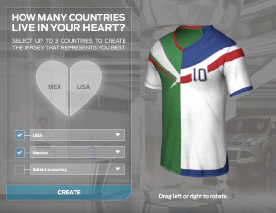
THE ORIGINAL? Ford “Camisetron” – 2014
Custom made soccer jerseys that are
a mix of several different countries.
Watch the Case Study
Agency : Zubiad, Florida, (USA)
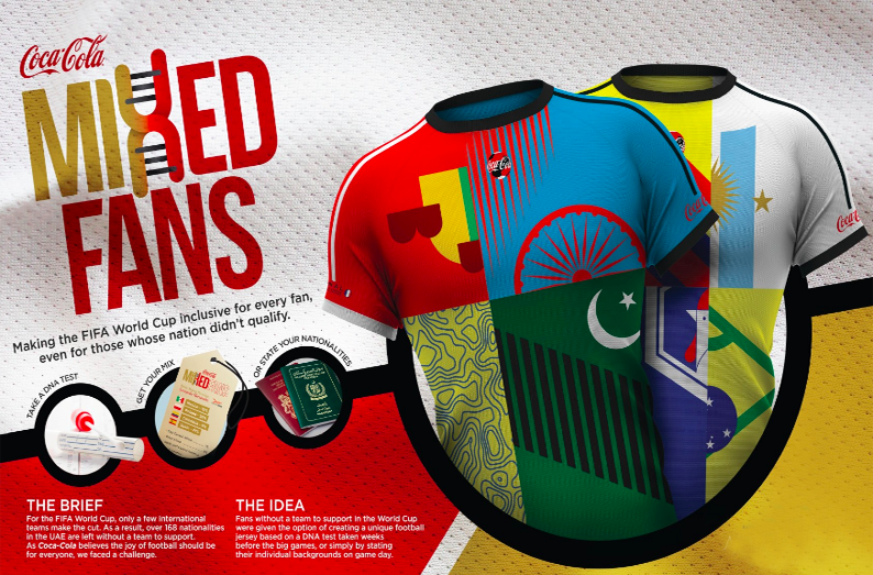
LESS ORIGINAL Coca-Cola “Mixed Fans” –2019
Custom made soccer jerseys that are a mix
of several different countries.
Source : Dubaï Lynx Direct BRONZE
Agency : Geometry Global, Dubaï (UAE)
THE ORIGINAL? Ford “Camisetron” – 2014
Custom made soccer jerseys that are
a mix of several different countries.
Watch the Case Study
Agency : Zubiad, Florida, (USA)
LESS ORIGINAL Coca-Cola “Mixed Fans” –2019
Custom made soccer jerseys that are a mix
of several different countries.
Source : Dubaï Lynx Direct BRONZE
Agency : Geometry Global, Dubaï (UAE)
Anytime a popular product undergoes a
change, especially when the name if the brand is impacted, it’s bound to create
a certain amount of confusion – especially among long-time users.
At least some of you may have noticed that
the Visual Composer Page Builder appears to have disappeared from the scene.
Highly popular page-building tools don’t simply go away, any more than
long-time favorite breakfast cereals simply vanish from the marketplace.
To add to the confusion, you still see the
Visual Composer Website Builder advertised, which could lead some to think that
the Page Builder was simply swallowed up by the Website Builder.
Nothing could be farther from the truth as
the two are quite different animals, although not totally different in some
respects, and we would like to apologize
to our users and our long-time partners for the confusion we’ve created.
Our apology and some clarification is the
purpose of this article. The Visual Composer Page Builder is still with us, but
under a different name. The Visual Composer Website Builder is still
with us too, and the name remains the same.
Why did we rename the Visual Composer Page
Builder?
We didn’t want to, but we really had no
choice. The problem we faced was caused by the emergence of our new product –
the Visual
Composer Website Builder, which is
entirely different from the Visual Composer Page Builder, and serves
a different purpose.
The Website Builder is not as some have
been led to believe, a souped-up version of the Page Builder.
The VC Page Builder is an Envato-exclusive
product that features a lifetime license; just like all the other products sold
by Envato.
The VC Website Builder is a much more
complex product whose development costs are simply too high to be supported by
a lifetime license. Because of these high costs, it made more sense to switch
the VC Website Builder to annual licensing.
Problem solved? Not quite. Marketplace
contract limitations would not allow us to sell a product outside the platform
using the VC name.
This left us with a couple of options:
Option 1. By changing the name of the VC
Page Builder, we could free ourselves of the contractual limitations involved
in selling it. Changing a familiar and popular name was something we were
naturally reluctant to do.
Option 2. We could slim down our new
product (the VC Website Builder) to the point that the lower development costs
would nicely fit in with the lifetime license model.
The problem with Option 2 was that the VC
Website Builder would be far less flexible and powerful than planned, which was
in direct opposition to the route we intended to take.
In the final analysis, we looked at Option
1 as the lesser of two evils, and we decided that a name change was more
palatable than compromising on the quality of our new product.
So – we changed the name
of the Visual Composer Page Builder to WP Bakery.
Check
out the following video if you’re interested in knowing about the name change
in greater detail.
We though
we solved our problem, but we failed to anticipate the confusion the name
change would cause.
Users
wondered where the VC Page Builder disappeared to.
They
wondered if VC Website Builder was the Page Builder under a new name, an
enhanced Page Builder, or something entirely different.
And,
they wondered what WP Bakery had to do with anything.
WP
Bakery is simply the new name for the Visual Composer Page Builder. Only the
name has changed. All the features you loved and worked with are still there.
What is the Visual Composer Website Builder?
The Visual Composer Website Builder is a brand new tool, and NOT a premium
version of the former Visual Composer Page Builder as some may have been led to
believe.
With
the VC Website Builder, you can create an entire website from scratch, and do
so easily thanks to its drag and drop features and a large and diverse
selection of WordPress templates to work with. There are templates for a
variety of page types, plus you can use the VC Website Builder with any
WordPress theme.
Pages
can be edited with the front-end editor and the tree view. The latter allows
you to see your changes in real time – a definite time-saver.
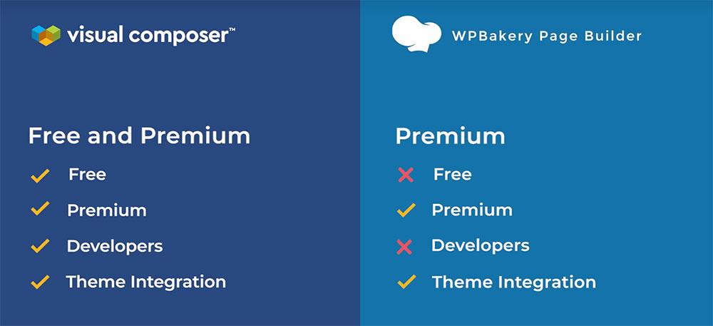
Both
a free and a Premium version of the VC Website Builder are available. The
Premium version has, as you would expect, several additional features including
one that really stands out as it allows you to access the header, footer, and
sidebar editor.
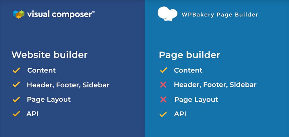
What’s the difference between WP Bakery and Visual
Composer Website Builder?
Also,
WP Bakery is shortcode-based, while the VC Website Builder is not. By not using
shortcodes it allows you to generate clean code and also avoid nuisance
problems when you disable the plugin.
You
can find the complete list of differences between WP Bakery and VC Website
Builder here.
Another
thing to like about the VC Website Builder is the cloud-based Hub where you’ll
find an array of interesting and useful design elements and add-ons to help you
turn your visions and ideas into realities.
Each
product comes with its own set of features and benefits. While we’ve worked
hard to develop VC Website Builder, we haven’t forgotten about WP Bakery. So
far, only the name has changed, but we’ll always be working hard to provide the
best customer experience possible – for both products.
Anytime a popular product undergoes a
change, especially when the name if the brand is impacted, it’s bound to create
a certain amount of confusion – especially among long-time users.
At least some of you may have noticed that
the Visual Composer Page Builder appears to have disappeared from the scene.
Highly popular page-building tools don’t simply go away, any more than
long-time favorite breakfast cereals simply vanish from the marketplace.
To add to the confusion, you still see the
Visual Composer Website Builder advertised, which could lead some to think that
the Page Builder was simply swallowed up by the Website Builder.
Nothing could be farther from the truth as
the two are quite different animals, although not totally different in some
respects, and we would like to apologize
to our users and our long-time partners for the confusion we’ve created.
Our apology and some clarification is the
purpose of this article. The Visual Composer Page Builder is still with us, but
under a different name. The Visual Composer Website Builder is still
with us too, and the name remains the same.
Why did we rename the Visual Composer Page
Builder?
We didn’t want to, but we really had no
choice. The problem we faced was caused by the emergence of our new product –
the Visual
Composer Website Builder, which is
entirely different from the Visual Composer Page Builder, and serves
a different purpose.
The Website Builder is not as some have
been led to believe, a souped-up version of the Page Builder.
The VC Page Builder is an Envato-exclusive
product that features a lifetime license; just like all the other products sold
by Envato.
The VC Website Builder is a much more
complex product whose development costs are simply too high to be supported by
a lifetime license. Because of these high costs, it made more sense to switch
the VC Website Builder to annual licensing.
Problem solved? Not quite. Marketplace
contract limitations would not allow us to sell a product outside the platform
using the VC name.
This left us with a couple of options:
Option 1. By changing the name of the VC
Page Builder, we could free ourselves of the contractual limitations involved
in selling it. Changing a familiar and popular name was something we were
naturally reluctant to do.
Option 2. We could slim down our new
product (the VC Website Builder) to the point that the lower development costs
would nicely fit in with the lifetime license model.
The problem with Option 2 was that the VC
Website Builder would be far less flexible and powerful than planned, which was
in direct opposition to the route we intended to take.
In the final analysis, we looked at Option
1 as the lesser of two evils, and we decided that a name change was more
palatable than compromising on the quality of our new product.
So – we changed the name
of the Visual Composer Page Builder to WP Bakery.
Check
out the following video if you’re interested in knowing about the name change
in greater detail.
We though
we solved our problem, but we failed to anticipate the confusion the name
change would cause.
Users
wondered where the VC Page Builder disappeared to.
They
wondered if VC Website Builder was the Page Builder under a new name, an
enhanced Page Builder, or something entirely different.
And,
they wondered what WP Bakery had to do with anything.
WP
Bakery is simply the new name for the Visual Composer Page Builder. Only the
name has changed. All the features you loved and worked with are still there.
What is the Visual Composer Website Builder?
The Visual Composer Website Builder is a brand new tool, and NOT a premium
version of the former Visual Composer Page Builder as some may have been led to
believe.
With
the VC Website Builder, you can create an entire website from scratch, and do
so easily thanks to its drag and drop features and a large and diverse
selection of WordPress templates to work with. There are templates for a
variety of page types, plus you can use the VC Website Builder with any
WordPress theme.
Pages
can be edited with the front-end editor and the tree view. The latter allows
you to see your changes in real time – a definite time-saver.
Both
a free and a Premium version of the VC Website Builder are available. The
Premium version has, as you would expect, several additional features including
one that really stands out as it allows you to access the header, footer, and
sidebar editor.
What’s the difference between WP Bakery and Visual
Composer Website Builder?
Also,
WP Bakery is shortcode-based, while the VC Website Builder is not. By not using
shortcodes it allows you to generate clean code and also avoid nuisance
problems when you disable the plugin.
You
can find the complete list of differences between WP Bakery and VC Website
Builder here.
Another
thing to like about the VC Website Builder is the cloud-based Hub where you’ll
find an array of interesting and useful design elements and add-ons to help you
turn your visions and ideas into realities.
Each
product comes with its own set of features and benefits. While we’ve worked
hard to develop VC Website Builder, we haven’t forgotten about WP Bakery. So
far, only the name has changed, but we’ll always be working hard to provide the
best customer experience possible – for both products.
Your website is often the first point of contact between your business and a potential client. As online competition heats up it’s becoming more important than ever to put your best digital foot forward online. Consumers have increasingly higher expectations of website quality and performance. You can ensure a great first impression by avoiding these common website design mistakes.
Mistake #1 – Websites That Are TOO MUCH
We’ve all
stumbled onto headache-inducing, cluttered sites. These busy looking sites are
jam-packed with images and text. There is just too much of everything going on
at once, your eye isn’t sure where to focus.
Common
contributing factors: Too many images. Big walls of text without paragraphs.
Too many things flashing, moving, autoplaying… you get the picture.
Do the world
a favor, don’t build an eyesore! Instead, learn
to use white space generously to separate your text and other elements on
the page. Embrace the idea that less is often more, your visitor’s eyes will
thank you.
Here are some rules of thumb for streamlined web design that you can build by:
Using more than two or three different fonts on a page is usually visually aggravating and distracting. As a general rule, you should choose one for heading text and one for body text and stick to them throughout your site.
Don’t overuse wacky novelty fonts, they can distract from the substance of what the text is actually saying. Also, these trendy type of fonts don’t tend to age well, people get sick of them pretty quickly. Stick to the classic fonts with clean lines for timeless style and the best readability.
Unless you are an old pro at color palettes, three or four colors for your palette is probably plenty. Don’t forget to include either white or another neutral to break things up visually on your page.
Lack of contrast. A site that is too monotone can quickly render your text unreadable. Make sure your text stands out strong and clear against the background you have chosen.
Mistake #2 – Websites That Are Not Doing Enough
Remember when
we said less is more? Well, that’s usually true unless your poor website
visitors are stumbling around in the dark trying to figure out what your site
is about.
Sure, edgy
minimalism might be your aesthetic but consider that according to
Statisticbrain.com the average person’s attention span is a paltry 8 seconds.
If your site is an enigma wrapped in a riddle shrouded in mystery well…
people may just leave without a second glance.
You can still
build a minimalistic site, just make sure that the most important information
that you want your visitors to see and know is immediately identifiable and
easily digestible.
Mistake #3 – Botched Navigation Menus
Navigation menus can be a hotbed of design sins and poor user experience. On the one hand, you have very minimalist, non-descriptive menus that don’t tell the user anything much less offer any compelling reason to explore the other pages on a site. On the other hand, you see massive phonebook type menus that list every page of the site in alphabetical order and manage to be both overwhelming and less than useful for moving throughout the site.
The happy medium is to create descriptive menu items and group them in a relevant way, using categories and whitespace as needed for easier reading. So instead of this alphabetical kitchen sink list as a dropdown menu:
Children’s Jackets
Children’s Pants
Children’s Shirts
Men’s Jackets
Men’s Pants
Men’s Shirts
Women’s Jackets
Women’s Pants
Women’s Shirts
You’d have something like this:
Children
Jackets
Pants
Shirts
Men
Jackets
Pants
Shirts
Women
Jackets
Pants
Shirts
Something
else to keep in mind when considering your site’s navigation: keep the format
simple; a fancy or quirky “non-traditional” menu might seem fun but if visitors
find it confusing to use they may just click away to another site
Mistake #4 – Dropping the Ball on The CTA
A solid call to action (CTA) is usually the “end zone” of your webpage. It’s often the reason for your page to exist. The CTA is where you get the visitor to perform an action that benefits you such as opting in to your mailing list or clicking on that blessed buy button.
If you get
just one thing right with your site, it has to be this yet too often the call
to action is hidden, confusing or easily overlooked. Considering that your CTA
might be directly related to the success of your website and/or business, this
can become the most deadly of our common website design mistakes.
So how can
you ensure that your call to action won’t go unanswered? Here are some
guidelines:
Your CTA should feature prominently on your page, it should be eye-catching and above the fold. When possible you should plan your page’s design around it. That usually works out better than to try to shoehorn a CTA into your existing (beautiful) design.
Keep it simple! If a second grader can’t figure out what to do on the page then you’ve failed. Give clear instructions and use actionable language like Click here, go here, buy now.
Make your buttons look like buttons! This applies to all of the UI web design elements on your page. People expect common elements like buttons, menus, and forms to work in predictable ways and look fairly standardized. Making UI elements easily identifiable leads to a better user experience every step of the way.
Keep your forms short and sweet and don’t make your visitors jump through more than two hoops if you don’t want to risk losing them along the way. If the action you are calling them to take is too time-consuming, confusing or complex they may bail out mid-conversion.
Mistake #5 – Website Maintenance Neglect
It is absolutely scandalous how common it is to see signs of visible neglect on a website. This type of decay affects high dollar corporate websites just as readily as it affects smaller sites. It usually presents itself as broken links, outdated content, non-functional UI elements like contact forms and other scariness such as visible error messages. The signs of neglect are not just ugly, they can cost you money, traffic, and credibility.
So what leads to this and how can we combat it? Things break over time and your website is no exception. Perhaps your hosting provider does an update to their software that subsequently breaks the slider on your homepage. Or maybe the contact form plugin you are using is outdated and stops working. Murphy’s law tells us that if something can go wrong it will and so we must be prepared and vigilant.
The best way
to ensure that your site stays beautiful and functional is to simply check it
regularly. Scheduling a weekly or bi-monthly check up is smart. Set aside the
time yourself or hire someone to regularly review each page of your site. Click
each link, test each form, make sure the videos play, test any payment
processes, etc. That way if there is a problem you are sure to catch it early.
Preventing and Correcting Common Website Design Mistakes
While it is
simpler to avoid making these costly common website design mistakes while building
a new website it is also possible to correct them on existing sites. One of the
best ways to measure the quality of the user’s experience on your website is to
ask users for feedback regularly. The people using your site are often the best
possible experts to advise you on your web interface design.
If you talk
to real visitors regularly, you’ll get insight into what may need to be updated
or reworked so that your website always stays a cut above the rest.
Your website is often the first point of contact between your business and a potential client. As online competition heats up it’s becoming more important than ever to put your best digital foot forward online. Consumers have increasingly higher expectations of website quality and performance. You can ensure a great first impression by avoiding these common website design mistakes.
Mistake #1 – Websites That Are TOO MUCH
We’ve all
stumbled onto headache-inducing, cluttered sites. These busy looking sites are
jam-packed with images and text. There is just too much of everything going on
at once, your eye isn’t sure where to focus.
Common
contributing factors: Too many images. Big walls of text without paragraphs.
Too many things flashing, moving, autoplaying… you get the picture.
Do the world
a favor, don’t build an eyesore! Instead, learn
to use white space generously to separate your text and other elements on
the page. Embrace the idea that less is often more, your visitor’s eyes will
thank you.
Here are some rules of thumb for streamlined web design that you can build by:
Using more than two or three different fonts on a page is usually visually aggravating and distracting. As a general rule, you should choose one for heading text and one for body text and stick to them throughout your site.
Don’t overuse wacky novelty fonts, they can distract from the substance of what the text is actually saying. Also, these trendy type of fonts don’t tend to age well, people get sick of them pretty quickly. Stick to the classic fonts with clean lines for timeless style and the best readability.
Unless you are an old pro at color palettes, three or four colors for your palette is probably plenty. Don’t forget to include either white or another neutral to break things up visually on your page.
Lack of contrast. A site that is too monotone can quickly render your text unreadable. Make sure your text stands out strong and clear against the background you have chosen.
Mistake #2 – Websites That Are Not Doing Enough
Remember when
we said less is more? Well, that’s usually true unless your poor website
visitors are stumbling around in the dark trying to figure out what your site
is about.
Sure, edgy
minimalism might be your aesthetic but consider that according to
Statisticbrain.com the average person’s attention span is a paltry 8 seconds.
If your site is an enigma wrapped in a riddle shrouded in mystery well…
people may just leave without a second glance.
You can still
build a minimalistic site, just make sure that the most important information
that you want your visitors to see and know is immediately identifiable and
easily digestible.
Mistake #3 – Botched Navigation Menus
Navigation menus can be a hotbed of design sins and poor user experience. On the one hand, you have very minimalist, non-descriptive menus that don’t tell the user anything much less offer any compelling reason to explore the other pages on a site. On the other hand, you see massive phonebook type menus that list every page of the site in alphabetical order and manage to be both overwhelming and less than useful for moving throughout the site.
The happy medium is to create descriptive menu items and group them in a relevant way, using categories and whitespace as needed for easier reading. So instead of this alphabetical kitchen sink list as a dropdown menu:
Children’s Jackets
Children’s Pants
Children’s Shirts
Men’s Jackets
Men’s Pants
Men’s Shirts
Women’s Jackets
Women’s Pants
Women’s Shirts
You’d have something like this:
Children
Jackets
Pants
Shirts
Men
Jackets
Pants
Shirts
Women
Jackets
Pants
Shirts
Something
else to keep in mind when considering your site’s navigation: keep the format
simple; a fancy or quirky “non-traditional” menu might seem fun but if visitors
find it confusing to use they may just click away to another site
Mistake #4 – Dropping the Ball on The CTA
A solid call to action (CTA) is usually the “end zone” of your webpage. It’s often the reason for your page to exist. The CTA is where you get the visitor to perform an action that benefits you such as opting in to your mailing list or clicking on that blessed buy button.
If you get
just one thing right with your site, it has to be this yet too often the call
to action is hidden, confusing or easily overlooked. Considering that your CTA
might be directly related to the success of your website and/or business, this
can become the most deadly of our common website design mistakes.
So how can
you ensure that your call to action won’t go unanswered? Here are some
guidelines:
Your CTA should feature prominently on your page, it should be eye-catching and above the fold. When possible you should plan your page’s design around it. That usually works out better than to try to shoehorn a CTA into your existing (beautiful) design.
Keep it simple! If a second grader can’t figure out what to do on the page then you’ve failed. Give clear instructions and use actionable language like Click here, go here, buy now.
Make your buttons look like buttons! This applies to all of the UI web design elements on your page. People expect common elements like buttons, menus, and forms to work in predictable ways and look fairly standardized. Making UI elements easily identifiable leads to a better user experience every step of the way.
Keep your forms short and sweet and don’t make your visitors jump through more than two hoops if you don’t want to risk losing them along the way. If the action you are calling them to take is too time-consuming, confusing or complex they may bail out mid-conversion.
Mistake #5 – Website Maintenance Neglect
It is absolutely scandalous how common it is to see signs of visible neglect on a website. This type of decay affects high dollar corporate websites just as readily as it affects smaller sites. It usually presents itself as broken links, outdated content, non-functional UI elements like contact forms and other scariness such as visible error messages. The signs of neglect are not just ugly, they can cost you money, traffic, and credibility.
So what leads to this and how can we combat it? Things break over time and your website is no exception. Perhaps your hosting provider does an update to their software that subsequently breaks the slider on your homepage. Or maybe the contact form plugin you are using is outdated and stops working. Murphy’s law tells us that if something can go wrong it will and so we must be prepared and vigilant.
The best way
to ensure that your site stays beautiful and functional is to simply check it
regularly. Scheduling a weekly or bi-monthly check up is smart. Set aside the
time yourself or hire someone to regularly review each page of your site. Click
each link, test each form, make sure the videos play, test any payment
processes, etc. That way if there is a problem you are sure to catch it early.
Preventing and Correcting Common Website Design Mistakes
While it is
simpler to avoid making these costly common website design mistakes while building
a new website it is also possible to correct them on existing sites. One of the
best ways to measure the quality of the user’s experience on your website is to
ask users for feedback regularly. The people using your site are often the best
possible experts to advise you on your web interface design.
If you talk
to real visitors regularly, you’ll get insight into what may need to be updated
or reworked so that your website always stays a cut above the rest.
There’s no secret, in 2019, you can build a responsive, visitor-friendly, and visually-pleasing website in hours. The days when we used to pay big money to launch a website are far behind. Today, you can set up, design, and feature the online project of your dream without trouble. No coding required and no extra skills needed! We live in times of smart technologies, so website building becomes more and more creator-friendly. The technology improves every day. Actually, all you need now is knowledge. And that’s why I decided to make this post. As the name of the article says, today, I’ll show you how to get access to all TemplateMonster’s products for less than $230!
What Is ONE Service?
For starters, I’m about to showcase you ONE by TemplateMonster. It is a fresh subscription service that furthers your working process and allows to save good money as well. How does it work? Basically, ONE provides you with access to any digital product you can see in the company’s gallery. The list contains not only single page templates but also such items as:
When it comes to ONE subscription, you won’t face any limits. There are products for any business niche as well as for any CMS. For example, here are just a few flagships you can use with ONE:
To start with, all the themes you will be able to use are quality. They come with trendy designs and have everything and anything to meet all recent requirements. For these simple reasons, all of them are SEO-ready, easy-to-customize, and 100% responsive. Obviously, these products are creator-friendly and mobile-friendly too.
So, using ONE, you can work with as many themes as you need. What is more, you can create as many domains as needed and use your templates as many times as needed. Actually, there are many reasons why you may need ONE. Buying the products one by one you simply overpay for them. And getting everything at once is not just faster and easier. ONE will save your budget as well!
By the way, ONE provides all its users with tech support. It’s free, friendly, and available anytime.
Now let’s take a look at the price of the service. To make a long story short, ONE subscription will cost you $229. It’s an amazing price comparing to the original cost of 1 premium theme. On average, it will cost you $70-80 but using ONE you get numerous platforms, hundreds of topics, and dozens of themes!
And Which License You Get With ONE Subscription?
Finally, it’s time to take a closer look at the license you get with ONE. To put it briefly, this subscription service provides users with an Unlimited Yearly License. It means that you will be able to download any theme from TM’s gallery for 1 year from the date of purchase. Moreover, all the sites you built with ONE will continue working even when the license expired. What is more, you will continue receiving free updates for such elements as plugins.
For Startups
Without a doubt, ONE subscription is a fantastic solution for everyone who wants to run a worthy site. And it doesn’t matter which business niche you are about to cover or how specific your topic is. Saving your budget is always a nice thing to do especially when it comes to startups or young companies.
For Web Designers
On the other hand, in case you are a web designer or web developer, ONE is exactly what you need! Just think about it. You pay only $229 (or even less if you choose pre-order option) and get 1-year-long access to all the groundbreaking ready-made digital products from TM. You can take as many as you want and build as many sites as needed. As a result, you will not just save good money but further the working process as well! Your customers won’t lose their projects when your license expires. Thus, these sites will still work even if you won’t renew the license. There will be no additional payments!
For Website Owners
I should also highlight that ONE will be a wonderful helper for skilled website owners. All in all, managing your site is much more than creating a domain name. You will need a lot of tools and here is how ONE subscription can help you. You will be able to choose from a wide list of stylish UI components, assets, plugins, etc.
Final Thoughts
Looks like it is time to sum everything up. Here are the main reasons why you should think of using ONE service from TemplateMonster.