How to Create a One-Page Newsletter Template in InDesign

Post pobrano z: How to Create a One-Page Newsletter Template in InDesign

Final product image
What You’ll Be Creating

In this tutorial, you’ll learn how to create a newsletter template. InDesign newsletter templates are quick and simple to put together and are perfect for informing customers or employees about your business. Coming up with great newsletter design ideas can take some thought, but this design cleverly combines style and function in a simple, one-page newsletter template.

This newsletter design has a single-page, US Letter format in a newspaper-style design, which can be easily customised with your own content. 

Discover more InDesign templates for newsletters on Envato Elements and GraphicRiver

Ready to create your newsletter layout? Let’s get started…

What You’ll Need to Create Your Newsletter Template

We’ll be using Adobe InDesign to put together the newsletter format, and you’ll also need to download and install the following fonts:

The images used in the newsletter design, as pictured here, are:

1. How to Set Up Your Newsletter Template in InDesign

Step 1

Open InDesign, and go to File > New > Document. 

Choose Letter for the page size, and deselect Facing Pages. Increase the number of Columns to 4, and set the Column Gutter to 0 in. Add a 0.2 in Margin Width and a Bleed of 0.125 in to the page. 

new indesign document

Then click Create.

new document

Step 2

Expand the Layers panel (Window > Layers) and double-click on Layer 1, renaming it Background

Create a new layer and name this Type

new layer

Then lock the Type layer, keeping the Background layer active. 

locked layer

Step 3

Expand the Swatches panel (Window > Color > Swatches) and choose New Color Swatch from the panel’s drop-down menu (at top right). 

Set the levels to C=0 M=80 Y=88 and K=0, before clicking Add and Done.

Create two more CMYK swatches:

  • C=73 M=72 Y=68 K=92
  • C=0 M=22 Y=29 K=0
new color swatch

Step 4

Working on the Background layer, use the Rectangle Tool (M) to create a shape across the whole page, setting the Fill Color to C=0 M=22 Y=29 K=0.

swatches panel background

2. How to Create a Grid for Your Newsletter Template

Step 1

Lock the Background layer and unlock the Type layer above. 

From the left-hand ruler (View > Show Rulers), pull out a guide to X: 2.5 in. 

guide line

Drop a second guide at X: 6.55 in. 

guide line

Step 2

Use the Line Tool (\) to create a vertical line between the right side of the first column and the guide line. 

From the Swatches panel, set the Stroke Color to C=0 M=80 Y=88 K=0. From the Stroke panel, increase the Weight of the line to 4 pt. 

column line

Step 3

Create a second line on the page, this time a horizontal one along the top margin line, reaching from the right side of the top of the vertical line. 

As before, set the Stroke Color to C=0 M=80 Y=88 K=0, but this time set the Weight to a thinner 2 pt. 

top line

Copy and Paste this thinner line, moving the copy directly below, to Y: 1.8 in. 

second line down

Paste again, moving this copy below to Y: 3.1 in.  

row sequence

Step 4

Use the Ellipse Tool (L) to create a circle between the ends of the two top horizontal lines. Set the Fill Color to C=0 M=80 Y=88 K=0.

ellipse tool

Create a long, rectangular shape inside the bottom two-thirds of the far-right column, setting the Fill, as before, to C=0 M=80 Y=88 K=0.

rectangle frame tool

3. How to Create a Headline for Your Newsletter Layout

Step 1

Use the Type Tool (T) to create a large text frame between the two lower horizontal lines. Type in the title of your newsletter, and set the Font to Bw Nista Grotesk Black and the Font Color to C=73 M=72 Y=68 K=92.

newsletter title

Add a text frame above this, typing in the issue number and date, and setting the Font to Karoll Round, Align Center. 

subtitle for date

Step 2

The headline story for your newsletter can be placed in the larger section directly below the title. 

Use the Rectangle Frame Tool (F) to create an image frame at the top of the section, going to File > Place and choosing an image to Open

Below this, create a text frame for the article title set in Bw Nista International Black. 

headline title

A subtitle below can be set in Bw Nista International Bold.

subtitle frame

Step 3

Create one text frame below the subtitle, on the left side, setting the body text in this to Bw Nista International Regular. 

body text frame

Thread the text over to a second text frame, to create two columns of even width in the space.

threaded column

Copy and Paste the orange circle from the top of the page, scaling this down (while holding Shift) and placing it at the end of the body text to indicate the end of the article. 

orange stop circle

Top tip: If you don’t yet have copy to fill your template with, you can go to Type > Fill with Placeholder Text to fill space with text temporarily.

4. How to Populate Your Newsletter Template

You can use the orange column on the right side as a space for highlighting important, need-to-know information, such as upcoming events. 

Step 1

Set a text frame at the top in Bw Nista International Black and a C=0 M=22 Y=29 K=0 Font Color for the main title. 

whats on title

Add a line below using the Line Tool (\), with a C=0 M=22 Y=29 K=0 Stroke Color.

line below

Step 2

Another title can be placed below this, in smaller Bw Nista International Black. Add a text frame with Bw Nista International Regular body text below this. 

body text

Copy and Paste this pair of text frames a couple of times to fill out the column if needed. You can also add an image frame to the column. 

Step 3

Focussing on the left-hand column, set a title at the top in Bw Nista International Black.

title frame

A subtitle can be placed below, set in Bw Nista International Bold. 

subtitle frame

Add body text below this in Bw Nista International Regular.

body text frame

Step 4

Statistics or key facts can be highlighted using a copy of the orange circle, and placed within this left-hand column. 

nista interantional

Copy and Paste the text frames you’ve created in Step 3, above, to populate the rest of the column, adding an image frame as well if you like. 

Step 5

Create a small title text frame in the remaining top row on the newsletter design, setting the Font to Bw Nista International Black and the Font Color to C=0 M=80 Y=88 K=0.

Add body text below set in Bw Nista International Regular.

item 1 title

Copy and Paste this pair of frames, and use these to fill up the row. 

5. How to Export Your Newsletter Template

You can export your finished newsletter design for print or online. Here, we’ll look at how to export your newsletter layout as an interactive PDF, ready to share online or attach to an email.

Step 1

Go to File > Export. Choose Adobe PDF (Interactive) from the Format drop-down menu (or choose Adobe PDF (Print) for a print-ready PDF). 

Name your file and click Save.

interactive pdf

Step 2

In the window that opens, click on Compression in the left-hand menu. Set the JPEG Quality to High and the Resolution to 72 ppi. 

72 ppi resolution

Then click Export to create your PDF. You can share this straight away with your readers!

Conclusion: Your Finished Newsletter Template

In this tutorial, you’ve learned how to create a one-page newsletter template in InDesign, and you’ve picked up some handy print design and typography skills along the way. 

final newsletter

If you want to give your newsletter a different look, this is easy to do by swapping in different images and fonts or by creating a different color palette. 

Looking for a completely new style of newsletter or flyer? You can find a huge range of stylish InDesign newsletter templates on Envato Elements and GraphicRiver

Discover how to create more of your own print design templates in InDesign with these tutorials:

How to Create a One-Page Newsletter Template in InDesign

Post pobrano z: How to Create a One-Page Newsletter Template in InDesign

Final product image
What You’ll Be Creating

In this tutorial, you’ll learn how to create a newsletter template. InDesign newsletter templates are quick and simple to put together and are perfect for informing customers or employees about your business. Coming up with great newsletter design ideas can take some thought, but this design cleverly combines style and function in a simple, one-page newsletter template.

This newsletter design has a single-page, US Letter format in a newspaper-style design, which can be easily customised with your own content. 

Discover more InDesign templates for newsletters on Envato Elements and GraphicRiver

Ready to create your newsletter layout? Let’s get started…

What You’ll Need to Create Your Newsletter Template

We’ll be using Adobe InDesign to put together the newsletter format, and you’ll also need to download and install the following fonts:

The images used in the newsletter design, as pictured here, are:

1. How to Set Up Your Newsletter Template in InDesign

Step 1

Open InDesign, and go to File > New > Document. 

Choose Letter for the page size, and deselect Facing Pages. Increase the number of Columns to 4, and set the Column Gutter to 0 in. Add a 0.2 in Margin Width and a Bleed of 0.125 in to the page. 

new indesign document

Then click Create.

new document

Step 2

Expand the Layers panel (Window > Layers) and double-click on Layer 1, renaming it Background

Create a new layer and name this Type

new layer

Then lock the Type layer, keeping the Background layer active. 

locked layer

Step 3

Expand the Swatches panel (Window > Color > Swatches) and choose New Color Swatch from the panel’s drop-down menu (at top right). 

Set the levels to C=0 M=80 Y=88 and K=0, before clicking Add and Done.

Create two more CMYK swatches:

  • C=73 M=72 Y=68 K=92
  • C=0 M=22 Y=29 K=0
new color swatch

Step 4

Working on the Background layer, use the Rectangle Tool (M) to create a shape across the whole page, setting the Fill Color to C=0 M=22 Y=29 K=0.

swatches panel background

2. How to Create a Grid for Your Newsletter Template

Step 1

Lock the Background layer and unlock the Type layer above. 

From the left-hand ruler (View > Show Rulers), pull out a guide to X: 2.5 in. 

guide line

Drop a second guide at X: 6.55 in. 

guide line

Step 2

Use the Line Tool (\) to create a vertical line between the right side of the first column and the guide line. 

From the Swatches panel, set the Stroke Color to C=0 M=80 Y=88 K=0. From the Stroke panel, increase the Weight of the line to 4 pt. 

column line

Step 3

Create a second line on the page, this time a horizontal one along the top margin line, reaching from the right side of the top of the vertical line. 

As before, set the Stroke Color to C=0 M=80 Y=88 K=0, but this time set the Weight to a thinner 2 pt. 

top line

Copy and Paste this thinner line, moving the copy directly below, to Y: 1.8 in. 

second line down

Paste again, moving this copy below to Y: 3.1 in.  

row sequence

Step 4

Use the Ellipse Tool (L) to create a circle between the ends of the two top horizontal lines. Set the Fill Color to C=0 M=80 Y=88 K=0.

ellipse tool

Create a long, rectangular shape inside the bottom two-thirds of the far-right column, setting the Fill, as before, to C=0 M=80 Y=88 K=0.

rectangle frame tool

3. How to Create a Headline for Your Newsletter Layout

Step 1

Use the Type Tool (T) to create a large text frame between the two lower horizontal lines. Type in the title of your newsletter, and set the Font to Bw Nista Grotesk Black and the Font Color to C=73 M=72 Y=68 K=92.

newsletter title

Add a text frame above this, typing in the issue number and date, and setting the Font to Karoll Round, Align Center. 

subtitle for date

Step 2

The headline story for your newsletter can be placed in the larger section directly below the title. 

Use the Rectangle Frame Tool (F) to create an image frame at the top of the section, going to File > Place and choosing an image to Open

Below this, create a text frame for the article title set in Bw Nista International Black. 

headline title

A subtitle below can be set in Bw Nista International Bold.

subtitle frame

Step 3

Create one text frame below the subtitle, on the left side, setting the body text in this to Bw Nista International Regular. 

body text frame

Thread the text over to a second text frame, to create two columns of even width in the space.

threaded column

Copy and Paste the orange circle from the top of the page, scaling this down (while holding Shift) and placing it at the end of the body text to indicate the end of the article. 

orange stop circle

Top tip: If you don’t yet have copy to fill your template with, you can go to Type > Fill with Placeholder Text to fill space with text temporarily.

4. How to Populate Your Newsletter Template

You can use the orange column on the right side as a space for highlighting important, need-to-know information, such as upcoming events. 

Step 1

Set a text frame at the top in Bw Nista International Black and a C=0 M=22 Y=29 K=0 Font Color for the main title. 

whats on title

Add a line below using the Line Tool (\), with a C=0 M=22 Y=29 K=0 Stroke Color.

line below

Step 2

Another title can be placed below this, in smaller Bw Nista International Black. Add a text frame with Bw Nista International Regular body text below this. 

body text

Copy and Paste this pair of text frames a couple of times to fill out the column if needed. You can also add an image frame to the column. 

Step 3

Focussing on the left-hand column, set a title at the top in Bw Nista International Black.

title frame

A subtitle can be placed below, set in Bw Nista International Bold. 

subtitle frame

Add body text below this in Bw Nista International Regular.

body text frame

Step 4

Statistics or key facts can be highlighted using a copy of the orange circle, and placed within this left-hand column. 

nista interantional

Copy and Paste the text frames you’ve created in Step 3, above, to populate the rest of the column, adding an image frame as well if you like. 

Step 5

Create a small title text frame in the remaining top row on the newsletter design, setting the Font to Bw Nista International Black and the Font Color to C=0 M=80 Y=88 K=0.

Add body text below set in Bw Nista International Regular.

item 1 title

Copy and Paste this pair of frames, and use these to fill up the row. 

5. How to Export Your Newsletter Template

You can export your finished newsletter design for print or online. Here, we’ll look at how to export your newsletter layout as an interactive PDF, ready to share online or attach to an email.

Step 1

Go to File > Export. Choose Adobe PDF (Interactive) from the Format drop-down menu (or choose Adobe PDF (Print) for a print-ready PDF). 

Name your file and click Save.

interactive pdf

Step 2

In the window that opens, click on Compression in the left-hand menu. Set the JPEG Quality to High and the Resolution to 72 ppi. 

72 ppi resolution

Then click Export to create your PDF. You can share this straight away with your readers!

Conclusion: Your Finished Newsletter Template

In this tutorial, you’ve learned how to create a one-page newsletter template in InDesign, and you’ve picked up some handy print design and typography skills along the way. 

final newsletter

If you want to give your newsletter a different look, this is easy to do by swapping in different images and fonts or by creating a different color palette. 

Looking for a completely new style of newsletter or flyer? You can find a huge range of stylish InDesign newsletter templates on Envato Elements and GraphicRiver

Discover how to create more of your own print design templates in InDesign with these tutorials:

How to Create a One-Page Newsletter Template in InDesign

Post pobrano z: How to Create a One-Page Newsletter Template in InDesign

Final product image
What You’ll Be Creating

In this tutorial, you’ll learn how to create a newsletter template. InDesign newsletter templates are quick and simple to put together and are perfect for informing customers or employees about your business. Coming up with great newsletter design ideas can take some thought, but this design cleverly combines style and function in a simple, one-page newsletter template.

This newsletter design has a single-page, US Letter format in a newspaper-style design, which can be easily customised with your own content. 

Discover more InDesign templates for newsletters on Envato Elements and GraphicRiver

Ready to create your newsletter layout? Let’s get started…

What You’ll Need to Create Your Newsletter Template

We’ll be using Adobe InDesign to put together the newsletter format, and you’ll also need to download and install the following fonts:

The images used in the newsletter design, as pictured here, are:

1. How to Set Up Your Newsletter Template in InDesign

Step 1

Open InDesign, and go to File > New > Document. 

Choose Letter for the page size, and deselect Facing Pages. Increase the number of Columns to 4, and set the Column Gutter to 0 in. Add a 0.2 in Margin Width and a Bleed of 0.125 in to the page. 

new indesign document

Then click Create.

new document

Step 2

Expand the Layers panel (Window > Layers) and double-click on Layer 1, renaming it Background

Create a new layer and name this Type

new layer

Then lock the Type layer, keeping the Background layer active. 

locked layer

Step 3

Expand the Swatches panel (Window > Color > Swatches) and choose New Color Swatch from the panel’s drop-down menu (at top right). 

Set the levels to C=0 M=80 Y=88 and K=0, before clicking Add and Done.

Create two more CMYK swatches:

  • C=73 M=72 Y=68 K=92
  • C=0 M=22 Y=29 K=0
new color swatch

Step 4

Working on the Background layer, use the Rectangle Tool (M) to create a shape across the whole page, setting the Fill Color to C=0 M=22 Y=29 K=0.

swatches panel background

2. How to Create a Grid for Your Newsletter Template

Step 1

Lock the Background layer and unlock the Type layer above. 

From the left-hand ruler (View > Show Rulers), pull out a guide to X: 2.5 in. 

guide line

Drop a second guide at X: 6.55 in. 

guide line

Step 2

Use the Line Tool (\) to create a vertical line between the right side of the first column and the guide line. 

From the Swatches panel, set the Stroke Color to C=0 M=80 Y=88 K=0. From the Stroke panel, increase the Weight of the line to 4 pt. 

column line

Step 3

Create a second line on the page, this time a horizontal one along the top margin line, reaching from the right side of the top of the vertical line. 

As before, set the Stroke Color to C=0 M=80 Y=88 K=0, but this time set the Weight to a thinner 2 pt. 

top line

Copy and Paste this thinner line, moving the copy directly below, to Y: 1.8 in. 

second line down

Paste again, moving this copy below to Y: 3.1 in.  

row sequence

Step 4

Use the Ellipse Tool (L) to create a circle between the ends of the two top horizontal lines. Set the Fill Color to C=0 M=80 Y=88 K=0.

ellipse tool

Create a long, rectangular shape inside the bottom two-thirds of the far-right column, setting the Fill, as before, to C=0 M=80 Y=88 K=0.

rectangle frame tool

3. How to Create a Headline for Your Newsletter Layout

Step 1

Use the Type Tool (T) to create a large text frame between the two lower horizontal lines. Type in the title of your newsletter, and set the Font to Bw Nista Grotesk Black and the Font Color to C=73 M=72 Y=68 K=92.

newsletter title

Add a text frame above this, typing in the issue number and date, and setting the Font to Karoll Round, Align Center. 

subtitle for date

Step 2

The headline story for your newsletter can be placed in the larger section directly below the title. 

Use the Rectangle Frame Tool (F) to create an image frame at the top of the section, going to File > Place and choosing an image to Open

Below this, create a text frame for the article title set in Bw Nista International Black. 

headline title

A subtitle below can be set in Bw Nista International Bold.

subtitle frame

Step 3

Create one text frame below the subtitle, on the left side, setting the body text in this to Bw Nista International Regular. 

body text frame

Thread the text over to a second text frame, to create two columns of even width in the space.

threaded column

Copy and Paste the orange circle from the top of the page, scaling this down (while holding Shift) and placing it at the end of the body text to indicate the end of the article. 

orange stop circle

Top tip: If you don’t yet have copy to fill your template with, you can go to Type > Fill with Placeholder Text to fill space with text temporarily.

4. How to Populate Your Newsletter Template

You can use the orange column on the right side as a space for highlighting important, need-to-know information, such as upcoming events. 

Step 1

Set a text frame at the top in Bw Nista International Black and a C=0 M=22 Y=29 K=0 Font Color for the main title. 

whats on title

Add a line below using the Line Tool (\), with a C=0 M=22 Y=29 K=0 Stroke Color.

line below

Step 2

Another title can be placed below this, in smaller Bw Nista International Black. Add a text frame with Bw Nista International Regular body text below this. 

body text

Copy and Paste this pair of text frames a couple of times to fill out the column if needed. You can also add an image frame to the column. 

Step 3

Focussing on the left-hand column, set a title at the top in Bw Nista International Black.

title frame

A subtitle can be placed below, set in Bw Nista International Bold. 

subtitle frame

Add body text below this in Bw Nista International Regular.

body text frame

Step 4

Statistics or key facts can be highlighted using a copy of the orange circle, and placed within this left-hand column. 

nista interantional

Copy and Paste the text frames you’ve created in Step 3, above, to populate the rest of the column, adding an image frame as well if you like. 

Step 5

Create a small title text frame in the remaining top row on the newsletter design, setting the Font to Bw Nista International Black and the Font Color to C=0 M=80 Y=88 K=0.

Add body text below set in Bw Nista International Regular.

item 1 title

Copy and Paste this pair of frames, and use these to fill up the row. 

5. How to Export Your Newsletter Template

You can export your finished newsletter design for print or online. Here, we’ll look at how to export your newsletter layout as an interactive PDF, ready to share online or attach to an email.

Step 1

Go to File > Export. Choose Adobe PDF (Interactive) from the Format drop-down menu (or choose Adobe PDF (Print) for a print-ready PDF). 

Name your file and click Save.

interactive pdf

Step 2

In the window that opens, click on Compression in the left-hand menu. Set the JPEG Quality to High and the Resolution to 72 ppi. 

72 ppi resolution

Then click Export to create your PDF. You can share this straight away with your readers!

Conclusion: Your Finished Newsletter Template

In this tutorial, you’ve learned how to create a one-page newsletter template in InDesign, and you’ve picked up some handy print design and typography skills along the way. 

final newsletter

If you want to give your newsletter a different look, this is easy to do by swapping in different images and fonts or by creating a different color palette. 

Looking for a completely new style of newsletter or flyer? You can find a huge range of stylish InDesign newsletter templates on Envato Elements and GraphicRiver

Discover how to create more of your own print design templates in InDesign with these tutorials:

How to Create a One-Page Newsletter Template in InDesign

Post pobrano z: How to Create a One-Page Newsletter Template in InDesign

Final product image
What You’ll Be Creating

In this tutorial, you’ll learn how to create a newsletter template. InDesign newsletter templates are quick and simple to put together and are perfect for informing customers or employees about your business. Coming up with great newsletter design ideas can take some thought, but this design cleverly combines style and function in a simple, one-page newsletter template.

This newsletter design has a single-page, US Letter format in a newspaper-style design, which can be easily customised with your own content. 

Discover more InDesign templates for newsletters on Envato Elements and GraphicRiver

Ready to create your newsletter layout? Let’s get started…

What You’ll Need to Create Your Newsletter Template

We’ll be using Adobe InDesign to put together the newsletter format, and you’ll also need to download and install the following fonts:

The images used in the newsletter design, as pictured here, are:

1. How to Set Up Your Newsletter Template in InDesign

Step 1

Open InDesign, and go to File > New > Document. 

Choose Letter for the page size, and deselect Facing Pages. Increase the number of Columns to 4, and set the Column Gutter to 0 in. Add a 0.2 in Margin Width and a Bleed of 0.125 in to the page. 

new indesign document

Then click Create.

new document

Step 2

Expand the Layers panel (Window > Layers) and double-click on Layer 1, renaming it Background

Create a new layer and name this Type

new layer

Then lock the Type layer, keeping the Background layer active. 

locked layer

Step 3

Expand the Swatches panel (Window > Color > Swatches) and choose New Color Swatch from the panel’s drop-down menu (at top right). 

Set the levels to C=0 M=80 Y=88 and K=0, before clicking Add and Done.

Create two more CMYK swatches:

  • C=73 M=72 Y=68 K=92
  • C=0 M=22 Y=29 K=0
new color swatch

Step 4

Working on the Background layer, use the Rectangle Tool (M) to create a shape across the whole page, setting the Fill Color to C=0 M=22 Y=29 K=0.

swatches panel background

2. How to Create a Grid for Your Newsletter Template

Step 1

Lock the Background layer and unlock the Type layer above. 

From the left-hand ruler (View > Show Rulers), pull out a guide to X: 2.5 in. 

guide line

Drop a second guide at X: 6.55 in. 

guide line

Step 2

Use the Line Tool (\) to create a vertical line between the right side of the first column and the guide line. 

From the Swatches panel, set the Stroke Color to C=0 M=80 Y=88 K=0. From the Stroke panel, increase the Weight of the line to 4 pt. 

column line

Step 3

Create a second line on the page, this time a horizontal one along the top margin line, reaching from the right side of the top of the vertical line. 

As before, set the Stroke Color to C=0 M=80 Y=88 K=0, but this time set the Weight to a thinner 2 pt. 

top line

Copy and Paste this thinner line, moving the copy directly below, to Y: 1.8 in. 

second line down

Paste again, moving this copy below to Y: 3.1 in.  

row sequence

Step 4

Use the Ellipse Tool (L) to create a circle between the ends of the two top horizontal lines. Set the Fill Color to C=0 M=80 Y=88 K=0.

ellipse tool

Create a long, rectangular shape inside the bottom two-thirds of the far-right column, setting the Fill, as before, to C=0 M=80 Y=88 K=0.

rectangle frame tool

3. How to Create a Headline for Your Newsletter Layout

Step 1

Use the Type Tool (T) to create a large text frame between the two lower horizontal lines. Type in the title of your newsletter, and set the Font to Bw Nista Grotesk Black and the Font Color to C=73 M=72 Y=68 K=92.

newsletter title

Add a text frame above this, typing in the issue number and date, and setting the Font to Karoll Round, Align Center. 

subtitle for date

Step 2

The headline story for your newsletter can be placed in the larger section directly below the title. 

Use the Rectangle Frame Tool (F) to create an image frame at the top of the section, going to File > Place and choosing an image to Open

Below this, create a text frame for the article title set in Bw Nista International Black. 

headline title

A subtitle below can be set in Bw Nista International Bold.

subtitle frame

Step 3

Create one text frame below the subtitle, on the left side, setting the body text in this to Bw Nista International Regular. 

body text frame

Thread the text over to a second text frame, to create two columns of even width in the space.

threaded column

Copy and Paste the orange circle from the top of the page, scaling this down (while holding Shift) and placing it at the end of the body text to indicate the end of the article. 

orange stop circle

Top tip: If you don’t yet have copy to fill your template with, you can go to Type > Fill with Placeholder Text to fill space with text temporarily.

4. How to Populate Your Newsletter Template

You can use the orange column on the right side as a space for highlighting important, need-to-know information, such as upcoming events. 

Step 1

Set a text frame at the top in Bw Nista International Black and a C=0 M=22 Y=29 K=0 Font Color for the main title. 

whats on title

Add a line below using the Line Tool (\), with a C=0 M=22 Y=29 K=0 Stroke Color.

line below

Step 2

Another title can be placed below this, in smaller Bw Nista International Black. Add a text frame with Bw Nista International Regular body text below this. 

body text

Copy and Paste this pair of text frames a couple of times to fill out the column if needed. You can also add an image frame to the column. 

Step 3

Focussing on the left-hand column, set a title at the top in Bw Nista International Black.

title frame

A subtitle can be placed below, set in Bw Nista International Bold. 

subtitle frame

Add body text below this in Bw Nista International Regular.

body text frame

Step 4

Statistics or key facts can be highlighted using a copy of the orange circle, and placed within this left-hand column. 

nista interantional

Copy and Paste the text frames you’ve created in Step 3, above, to populate the rest of the column, adding an image frame as well if you like. 

Step 5

Create a small title text frame in the remaining top row on the newsletter design, setting the Font to Bw Nista International Black and the Font Color to C=0 M=80 Y=88 K=0.

Add body text below set in Bw Nista International Regular.

item 1 title

Copy and Paste this pair of frames, and use these to fill up the row. 

5. How to Export Your Newsletter Template

You can export your finished newsletter design for print or online. Here, we’ll look at how to export your newsletter layout as an interactive PDF, ready to share online or attach to an email.

Step 1

Go to File > Export. Choose Adobe PDF (Interactive) from the Format drop-down menu (or choose Adobe PDF (Print) for a print-ready PDF). 

Name your file and click Save.

interactive pdf

Step 2

In the window that opens, click on Compression in the left-hand menu. Set the JPEG Quality to High and the Resolution to 72 ppi. 

72 ppi resolution

Then click Export to create your PDF. You can share this straight away with your readers!

Conclusion: Your Finished Newsletter Template

In this tutorial, you’ve learned how to create a one-page newsletter template in InDesign, and you’ve picked up some handy print design and typography skills along the way. 

final newsletter

If you want to give your newsletter a different look, this is easy to do by swapping in different images and fonts or by creating a different color palette. 

Looking for a completely new style of newsletter or flyer? You can find a huge range of stylish InDesign newsletter templates on Envato Elements and GraphicRiver

Discover how to create more of your own print design templates in InDesign with these tutorials:

How to Create a One-Page Newsletter Template in InDesign

Post pobrano z: How to Create a One-Page Newsletter Template in InDesign

Final product image
What You’ll Be Creating

In this tutorial, you’ll learn how to create a newsletter template. InDesign newsletter templates are quick and simple to put together and are perfect for informing customers or employees about your business. Coming up with great newsletter design ideas can take some thought, but this design cleverly combines style and function in a simple, one-page newsletter template.

This newsletter design has a single-page, US Letter format in a newspaper-style design, which can be easily customised with your own content. 

Discover more InDesign templates for newsletters on Envato Elements and GraphicRiver

Ready to create your newsletter layout? Let’s get started…

What You’ll Need to Create Your Newsletter Template

We’ll be using Adobe InDesign to put together the newsletter format, and you’ll also need to download and install the following fonts:

The images used in the newsletter design, as pictured here, are:

1. How to Set Up Your Newsletter Template in InDesign

Step 1

Open InDesign, and go to File > New > Document. 

Choose Letter for the page size, and deselect Facing Pages. Increase the number of Columns to 4, and set the Column Gutter to 0 in. Add a 0.2 in Margin Width and a Bleed of 0.125 in to the page. 

new indesign document

Then click Create.

new document

Step 2

Expand the Layers panel (Window > Layers) and double-click on Layer 1, renaming it Background

Create a new layer and name this Type

new layer

Then lock the Type layer, keeping the Background layer active. 

locked layer

Step 3

Expand the Swatches panel (Window > Color > Swatches) and choose New Color Swatch from the panel’s drop-down menu (at top right). 

Set the levels to C=0 M=80 Y=88 and K=0, before clicking Add and Done.

Create two more CMYK swatches:

  • C=73 M=72 Y=68 K=92
  • C=0 M=22 Y=29 K=0
new color swatch

Step 4

Working on the Background layer, use the Rectangle Tool (M) to create a shape across the whole page, setting the Fill Color to C=0 M=22 Y=29 K=0.

swatches panel background

2. How to Create a Grid for Your Newsletter Template

Step 1

Lock the Background layer and unlock the Type layer above. 

From the left-hand ruler (View > Show Rulers), pull out a guide to X: 2.5 in. 

guide line

Drop a second guide at X: 6.55 in. 

guide line

Step 2

Use the Line Tool (\) to create a vertical line between the right side of the first column and the guide line. 

From the Swatches panel, set the Stroke Color to C=0 M=80 Y=88 K=0. From the Stroke panel, increase the Weight of the line to 4 pt. 

column line

Step 3

Create a second line on the page, this time a horizontal one along the top margin line, reaching from the right side of the top of the vertical line. 

As before, set the Stroke Color to C=0 M=80 Y=88 K=0, but this time set the Weight to a thinner 2 pt. 

top line

Copy and Paste this thinner line, moving the copy directly below, to Y: 1.8 in. 

second line down

Paste again, moving this copy below to Y: 3.1 in.  

row sequence

Step 4

Use the Ellipse Tool (L) to create a circle between the ends of the two top horizontal lines. Set the Fill Color to C=0 M=80 Y=88 K=0.

ellipse tool

Create a long, rectangular shape inside the bottom two-thirds of the far-right column, setting the Fill, as before, to C=0 M=80 Y=88 K=0.

rectangle frame tool

3. How to Create a Headline for Your Newsletter Layout

Step 1

Use the Type Tool (T) to create a large text frame between the two lower horizontal lines. Type in the title of your newsletter, and set the Font to Bw Nista Grotesk Black and the Font Color to C=73 M=72 Y=68 K=92.

newsletter title

Add a text frame above this, typing in the issue number and date, and setting the Font to Karoll Round, Align Center. 

subtitle for date

Step 2

The headline story for your newsletter can be placed in the larger section directly below the title. 

Use the Rectangle Frame Tool (F) to create an image frame at the top of the section, going to File > Place and choosing an image to Open

Below this, create a text frame for the article title set in Bw Nista International Black. 

headline title

A subtitle below can be set in Bw Nista International Bold.

subtitle frame

Step 3

Create one text frame below the subtitle, on the left side, setting the body text in this to Bw Nista International Regular. 

body text frame

Thread the text over to a second text frame, to create two columns of even width in the space.

threaded column

Copy and Paste the orange circle from the top of the page, scaling this down (while holding Shift) and placing it at the end of the body text to indicate the end of the article. 

orange stop circle

Top tip: If you don’t yet have copy to fill your template with, you can go to Type > Fill with Placeholder Text to fill space with text temporarily.

4. How to Populate Your Newsletter Template

You can use the orange column on the right side as a space for highlighting important, need-to-know information, such as upcoming events. 

Step 1

Set a text frame at the top in Bw Nista International Black and a C=0 M=22 Y=29 K=0 Font Color for the main title. 

whats on title

Add a line below using the Line Tool (\), with a C=0 M=22 Y=29 K=0 Stroke Color.

line below

Step 2

Another title can be placed below this, in smaller Bw Nista International Black. Add a text frame with Bw Nista International Regular body text below this. 

body text

Copy and Paste this pair of text frames a couple of times to fill out the column if needed. You can also add an image frame to the column. 

Step 3

Focussing on the left-hand column, set a title at the top in Bw Nista International Black.

title frame

A subtitle can be placed below, set in Bw Nista International Bold. 

subtitle frame

Add body text below this in Bw Nista International Regular.

body text frame

Step 4

Statistics or key facts can be highlighted using a copy of the orange circle, and placed within this left-hand column. 

nista interantional

Copy and Paste the text frames you’ve created in Step 3, above, to populate the rest of the column, adding an image frame as well if you like. 

Step 5

Create a small title text frame in the remaining top row on the newsletter design, setting the Font to Bw Nista International Black and the Font Color to C=0 M=80 Y=88 K=0.

Add body text below set in Bw Nista International Regular.

item 1 title

Copy and Paste this pair of frames, and use these to fill up the row. 

5. How to Export Your Newsletter Template

You can export your finished newsletter design for print or online. Here, we’ll look at how to export your newsletter layout as an interactive PDF, ready to share online or attach to an email.

Step 1

Go to File > Export. Choose Adobe PDF (Interactive) from the Format drop-down menu (or choose Adobe PDF (Print) for a print-ready PDF). 

Name your file and click Save.

interactive pdf

Step 2

In the window that opens, click on Compression in the left-hand menu. Set the JPEG Quality to High and the Resolution to 72 ppi. 

72 ppi resolution

Then click Export to create your PDF. You can share this straight away with your readers!

Conclusion: Your Finished Newsletter Template

In this tutorial, you’ve learned how to create a one-page newsletter template in InDesign, and you’ve picked up some handy print design and typography skills along the way. 

final newsletter

If you want to give your newsletter a different look, this is easy to do by swapping in different images and fonts or by creating a different color palette. 

Looking for a completely new style of newsletter or flyer? You can find a huge range of stylish InDesign newsletter templates on Envato Elements and GraphicRiver

Discover how to create more of your own print design templates in InDesign with these tutorials:

How to Create a Climate Change Infographic in Adobe InDesign

Post pobrano z: How to Create a Climate Change Infographic in Adobe InDesign

Final product image
What You’ll Be Creating

Help spread awareness about the effects of global warming with this informative climate change infographic. Easily adaptable to your own choice of facts and stats, this is a great template for creating a unique design.

We’ll set up the layout in Adobe InDesign and prepare it for sharing online, on social media or Pinterest. 

Ready to spread the word about climate change? Let’s get started…

Looking for infographic template recommendations? Check out the following article:

What You’ll Need to Create Your Infographic

You’ll need access to Adobe InDesign and Adobe Photoshop to create your design. If you want to create circular pie-chart graphics, you’ll also need to have Adobe Illustrator to hand. In addition, you’ll need to download the following images and font files:

If you want to customise your design with more icon details, you can look at using some of the icons in this line energy set or this environment set.

Once you’ve downloaded the images and installed the fonts onto your computer, you’re ready to dive in.

1. How to Set Up Your Infographic Document

Step 1

Open up InDesign and go to File > New > Document. Choose Web for the Intent at the top, and deselect Facing Pages

Under Page Size, set the Width to 1800 px* and the Height to 6950 px (you can adjust the height later if you wish by using the Page Tool).

new document

Click OK to create your document. 

*Pinterest recommends an image width of 600 px. 1800 px is three times that recommended width, which means that your design will look crisp and clear when later resized

document

Step 2

Expand the Layers panel (Window > Layers), and double-click on Layer 1 to open the Options window. Rename the layer Background and click OK.

Click on the Create New Layer button at the bottom of the panel and rename this second layer Photo. Then create a final new layer called Typography

new layer

Lock all the layers except Background

layers

Step 3

It’s a good idea to create a complete color palette for using across your design before you begin. Here’s how.

Expand the Swatches panel (Window > Color > Swatches), and select New Color Swatch from the panel’s drop-down menu (at top-right). 

With the Type set to Process and Mode to RGB, adjust the levels of Red, Green and Blue until you’ve created your desired result. Click Add and then OK

swatch options

Repeat this process to create more RGB swatches, building up a full palette. To create the palette used on the design pictured here, create the following swatches:

  • R=251 G=252 B=247
  • R=224 G=110 B=9
  • R=164 G=104 B=13
  • R=118 G=81 B=37
  • R=229 G=35 B=47
  • R=168 G=217 B=232
  • R=83 G=172 B=188
  • R=45 G=4 B=11
  • R=116 G=194 B=206
  • R=47 G=154 B=172
  • R=0 G=127 B=159
  • R=51 G=52 B=80

Step 4

You can also create two gradient swatches by choosing New Gradient Swatch from the panel menu. Here, we can create one ‘Heat Gradient’ and one ‘Flood Gradient’ to create contrasting effects on the design. 

For the Heat Gradient swatch, set the Type to Radial and choose Swatches for the Stop Color. Then choose a darker red swatch for one stop and an orange swatch for the other.

heat gradient

For the Flood Gradient swatch, choose a pale blue for one stop and [Paper] (white) for the other. 

flood gradient

Step 5

With the rulers visible (View > Show Rulers), drag a guide down from the top ruler, down to Y position 1865 px (you can see this in the top Controls panel).

Drag a second guide down to 3780 px, a third to 4540 px, and a final to 5385 px. This sections up the page, ready for applying our background color. 

guides

2. How to Build Up a Background on Your Layout

Step 1

Take the Rectangle Tool (M) and drag across the top section of the page, extending it down to the first guide. From the Swatches panel, set the Fill to a sky-blue swatch. 

top blue rectangle

Create more rectangle shapes, filling each designated section with a color, graduating from pale sea-blue to deep blue towards the bottom. 

swatches

Step 2

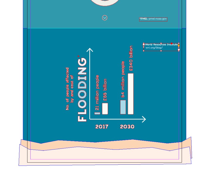
Zoom into the bottom of the page. Use the Pen Tool (P) to draw a rough shape, mimicking the sandy curves of the bottom of the ocean. Set the Fill to a dark peach shade. 

sand

Edit > Copy, Edit > Paste the shape, and move it below, covering the bottom of the page completely. Adjust the Fill to a beige shade. 

sand

Step 3

Scroll up towards the top of the page. 

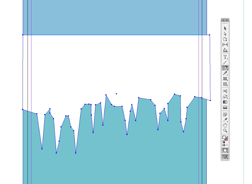
Use the Pen Tool (P) to draw a straight line across the top guide (beneath the first colored section), and then pull it down and work your way across, creating a jagged illustration. This gives the impression of the underneath of an iceberg. 

Join the illustration into a complete shape and set the Fill to [Paper].

paper fill

Expand the Stroke panel (Window > Stroke), and set the Weight of the stroke to 6 pt and Type to Right Slant Hash, to give the design some texture. 

right slant hash

Finally, head up to Object > Effects > Drop Shadow. Bring the Opacity down to 10% and set the Effect Color (by clicking on the colored square next to the Mode menu at the top) to a slightly contrasting blue shade to make the shadow appear subtle and natural. 

effect color

Click OK to exit. 

3. How to Edit the Photo for Your Infographic

Step 1

Head up to File > Save to save your design, and minimize the window for a moment. Open up the polar bear photo in Photoshop

Duplicate the Background layer to keep a copy of the image intact, and switch off its visibility. 

Then use the Lasso Tool (L) to section off an area around the edge of the bear’s silhouette. The aim is to isolate the image from its background. 

lasso tool

Once you’ve selected an area, click on the Refine Edge button in the top Controls panel, and check Smart Radius. Adjust the sliders until you’re happy with the accuracy of the selection, before clicking OK

refine edge

Then hit Delete on your keyboard to remove the selection. 

cut out section

Work your way around the whole image until all of the background is removed. 

Step 2

The image will look more stylish in the final layout if we convert it to black and white.

Head up to Image > Adjustments > Channel Mixer. Check Monochrome at the bottom of the window, and adjust the levels until you’re happy with the result. Click OK.

channel mixer

Then File > Save As your image as a Photoshop (.psd) file, which will preserve the transparent background and the quality of the image. 

Step 3

Return to your InDesign document and lock the Background layer. Unlock the layer above, Photo

Use the Rectangle Frame Tool (F) to create an image frame over the top of the iceberg illustration and the bottom of the sky-blue colored section.

File > Place, choose your Photoshop image, and Open

photo layer

Step 4

With the image frame selected, go to Object > Effects > Transparency, and set the Mode to Hard Light. Click OK.

hard light

Then select the image frame and Edit > Copy, Edit > Paste in Place, creating a second copy of the image layered over the top. Head back to the Effects window again, and adjust the Mode to Normal and Opacity to 50%

transparency

4. How to Format Typography for Your Infographic

Step 1

Lock the Photo layer and unlock the top layer, Typography

Use the Type Tool (T) to create a text frame at the top of the page, and type in the title of the infographic. 

From either the Controls panel at the top of the workspace or the Character and Paragraph panels (Window > Type & Tables > Character), set the Font to Charlevoix Pro Bold, Size 140 pt, Tracking 40, and Align Center. Adjust the Font Color to [Paper] from the Swatches panel.

text frame

To create a border around the title, click on the text frame with the Selection Tool (V, Escape), and set the Stroke of the frame to [Paper] from the Swatches panel. Then go to Object > Text Frame Options and increase the Inset value (here, to 30 px) until the text is nicely centered in the frame.

text frame options

You can also create a text frame below the main title for a subtitle if you wish. Set the text in Charlevoix Pro Regular.

Step 2

Create another text frame and layer over the top of the polar bear photo. Type in ‘2050’ and set the Font Color to Heat Gradient. Set the Font to Bebas Neue and make the Font Size very generous (around 600 pt).

You can also adjust the Transparency settings in the Effects window to Multiply, to bring through some of the photo beneath. 

heat gradient

Step 3

Create a text frame to the top-left of the polar bear, and type in your first fact. You can of course adapt this to whatever statistic you’d like to present. 

Set the Font to Charlevoix Pro and play with the proportions of the text, adjusting the Font Size, Leading (line-spacing), and Font Color to create a hierarchy in the paragraph and pull out key words. 

text highlighted

Step 4

You can create ‘pointers’ for items of text by using the Line Tool (\). In the Stroke panel, set the Type to CircleSolid.

circle solid

Add credits for each statistic in a separate text frame, set in a smaller Font Size.

text frame

Step 5

You can create arrows by using the Line Tool (\) and Stroke panel too, though I generally prefer to use the Line Tool to create both the stem and arrow head, allowing me to control the exact proportions of the arrow. 

arrow

Here I’ve created an arrow to the right side of the polar bear, before setting a statistic in Charlevoix Pro Bold in a text frame next to it. I’ve adjusted the Font Color to Heat Gradient for extra impact. 

heat gradient

I continue to build up text around this key statistic, set in more pared-back Charlevoix Pro Regular and a [Paper] Font Color. 

text frame

Step 6

Once you’ve designed one statistic, you can use this as a model for creating others, by copying and pasting. 

Here I’ve pasted the arrow and text frames onto the center of the iceberg section, and adjusted the text content and Font Color. 

text frame

Once you’re completely happy with the formatting and arrangement of text, you can head up to Type > Create Outlines to vectorise this text*. This allows you to scale the group easily to suit your design. 

*Please note, this will prevent you from applying further formatting, like adjusting tracking etc., so it might be sensible to paste a copy of your original text onto the artboard next to the page. 

create outlines

Step 7

You can add icons to your infographic quickly and easily by opening up a vector set of icons in Illustrator, before copying and pasting over individual icons. 

Here, I’ve pasted in a weight icon from this scales and rulers set, before adjusting the Fill to an off-white swatch. 

weight icon

Embellish your icon designs with arrows and text, and pull out key figures or words in a contrasting color. 

statistic

Step 8

You can also create section arrow icons by using the Ellipse Tool (L) and holding Shift to create a small circle towards the bottom of a colored section. 

circle

Use the Pen Tool (P) to create a simple arrow shape inside the circle.

arrow head

Right-Click > Group the elements together to create an icon that’s easy to copy and paste. 

group

Continue to build up statistics down the length of your infographic, varying the Font Colors for contrast and interest. 

statistic

Step 9

To create a pie chart, we’ll need the brief help of Illustrator. Minimize your InDesign document, and open up Illustrator.

Use the Ellipse Tool (L) and hold Shift to create a circle on the artboard, setting it to have no fill and a thick stroke (around 50 pt).

circle

Go to Object > Path > Outline Stroke.

outline stroke

Then head up to Edit > Copy.

Step 10

Return to your InDesign document and Edit > Paste the circle onto the page, setting it in the center of a colored section. Adjust the color to a pale swatch.

white circle

Edit > Paste, Edit > Paste in Place the circle directly on top of the first, and adjust the color to a contrasting swatch. 

brown circle

Then take the Scissors Tool (C) and snip away at the sides of the circle on top, isolating a section of the ‘pie’ to roughly match the percentage of your statistic. 

cut out section
percentage

Step 11

You can also add bar charts to your infographic, which are easier to do directly in InDesign. 

First, use the Line Tool (\) to create two arrows, one pointing upwards and the other pointing right. 

arrows

Then use the Rectangle Tool (M) to create ‘bars’ on the chart. You can soften the corners of these by going to Object > Corner Options and setting the Shape to Rounded

rounded corners

Add captions under the lower arrow and above each bar if you wish. 

captions

I’ve used the Flood Gradient swatch to make the main title of the bar chart really stand out. 

flood gradient
flooding chart final

5. How to Export Your Design for Web

Step 1

When you’ve finished your infographic design, make sure to File > Save all your hard work.

To export the design ready for sharing online, head up to File > Export. Choose JPEG or PNG from the Format menu at the bottom of the window, and give the image a suitable name. 

png export

Click Save.

Step 2

In the export options window, you can adjust the settings of the image to make it suitable for uploading online. Adjust the Quality to Medium or High, set the Resolution to 72 ppi, and make sure the Color Space is set to RGB

export png

Finally, click Export to create your web-ready image. 

Awesome job! Your infographic is finished!

Conclusion: Your Finished Infographic

With your infographic exported, it’s time to get it up online and spread the word about the impact of global warming on climate and environmental change. Or why not print it out and post it up on the noticeboard at your college or workplace?

If you’re looking for more resources for your infographic designs, you can find plenty of themed icons on GraphicRiver and ready-to-edit infographic templates on Envato Elements

Climate Change End Result

Learn more about infographics:

How to Create a Climate Change Infographic in Adobe InDesign

Post pobrano z: How to Create a Climate Change Infographic in Adobe InDesign

Final product image
What You’ll Be Creating

Help spread awareness about the effects of global warming with this informative climate change infographic. Easily adaptable to your own choice of facts and stats, this is a great template for creating a unique design.

We’ll set up the layout in Adobe InDesign and prepare it for sharing online, on social media or Pinterest. 

Ready to spread the word about climate change? Let’s get started…

Looking for infographic template recommendations? Check out the following article:

What You’ll Need to Create Your Infographic

You’ll need access to Adobe InDesign and Adobe Photoshop to create your design. If you want to create circular pie-chart graphics, you’ll also need to have Adobe Illustrator to hand. In addition, you’ll need to download the following images and font files:

If you want to customise your design with more icon details, you can look at using some of the icons in this line energy set or this environment set.

Once you’ve downloaded the images and installed the fonts onto your computer, you’re ready to dive in.

1. How to Set Up Your Infographic Document

Step 1

Open up InDesign and go to File > New > Document. Choose Web for the Intent at the top, and deselect Facing Pages

Under Page Size, set the Width to 1800 px* and the Height to 6950 px (you can adjust the height later if you wish by using the Page Tool).

new document

Click OK to create your document. 

*Pinterest recommends an image width of 600 px. 1800 px is three times that recommended width, which means that your design will look crisp and clear when later resized

document

Step 2

Expand the Layers panel (Window > Layers), and double-click on Layer 1 to open the Options window. Rename the layer Background and click OK.

Click on the Create New Layer button at the bottom of the panel and rename this second layer Photo. Then create a final new layer called Typography

new layer

Lock all the layers except Background

layers

Step 3

It’s a good idea to create a complete color palette for using across your design before you begin. Here’s how.

Expand the Swatches panel (Window > Color > Swatches), and select New Color Swatch from the panel’s drop-down menu (at top-right). 

With the Type set to Process and Mode to RGB, adjust the levels of Red, Green and Blue until you’ve created your desired result. Click Add and then OK

swatch options

Repeat this process to create more RGB swatches, building up a full palette. To create the palette used on the design pictured here, create the following swatches:

  • R=251 G=252 B=247
  • R=224 G=110 B=9
  • R=164 G=104 B=13
  • R=118 G=81 B=37
  • R=229 G=35 B=47
  • R=168 G=217 B=232
  • R=83 G=172 B=188
  • R=45 G=4 B=11
  • R=116 G=194 B=206
  • R=47 G=154 B=172
  • R=0 G=127 B=159
  • R=51 G=52 B=80

Step 4

You can also create two gradient swatches by choosing New Gradient Swatch from the panel menu. Here, we can create one ‘Heat Gradient’ and one ‘Flood Gradient’ to create contrasting effects on the design. 

For the Heat Gradient swatch, set the Type to Radial and choose Swatches for the Stop Color. Then choose a darker red swatch for one stop and an orange swatch for the other.

heat gradient

For the Flood Gradient swatch, choose a pale blue for one stop and [Paper] (white) for the other. 

flood gradient

Step 5

With the rulers visible (View > Show Rulers), drag a guide down from the top ruler, down to Y position 1865 px (you can see this in the top Controls panel).

Drag a second guide down to 3780 px, a third to 4540 px, and a final to 5385 px. This sections up the page, ready for applying our background color. 

guides

2. How to Build Up a Background on Your Layout

Step 1

Take the Rectangle Tool (M) and drag across the top section of the page, extending it down to the first guide. From the Swatches panel, set the Fill to a sky-blue swatch. 

top blue rectangle

Create more rectangle shapes, filling each designated section with a color, graduating from pale sea-blue to deep blue towards the bottom. 

swatches

Step 2

Zoom into the bottom of the page. Use the Pen Tool (P) to draw a rough shape, mimicking the sandy curves of the bottom of the ocean. Set the Fill to a dark peach shade. 

sand

Edit > Copy, Edit > Paste the shape, and move it below, covering the bottom of the page completely. Adjust the Fill to a beige shade. 

sand

Step 3

Scroll up towards the top of the page. 

Use the Pen Tool (P) to draw a straight line across the top guide (beneath the first colored section), and then pull it down and work your way across, creating a jagged illustration. This gives the impression of the underneath of an iceberg. 

Join the illustration into a complete shape and set the Fill to [Paper].

paper fill

Expand the Stroke panel (Window > Stroke), and set the Weight of the stroke to 6 pt and Type to Right Slant Hash, to give the design some texture. 

right slant hash

Finally, head up to Object > Effects > Drop Shadow. Bring the Opacity down to 10% and set the Effect Color (by clicking on the colored square next to the Mode menu at the top) to a slightly contrasting blue shade to make the shadow appear subtle and natural. 

effect color

Click OK to exit. 

3. How to Edit the Photo for Your Infographic

Step 1

Head up to File > Save to save your design, and minimize the window for a moment. Open up the polar bear photo in Photoshop

Duplicate the Background layer to keep a copy of the image intact, and switch off its visibility. 

Then use the Lasso Tool (L) to section off an area around the edge of the bear’s silhouette. The aim is to isolate the image from its background. 

lasso tool

Once you’ve selected an area, click on the Refine Edge button in the top Controls panel, and check Smart Radius. Adjust the sliders until you’re happy with the accuracy of the selection, before clicking OK

refine edge

Then hit Delete on your keyboard to remove the selection. 

cut out section

Work your way around the whole image until all of the background is removed. 

Step 2

The image will look more stylish in the final layout if we convert it to black and white.

Head up to Image > Adjustments > Channel Mixer. Check Monochrome at the bottom of the window, and adjust the levels until you’re happy with the result. Click OK.

channel mixer

Then File > Save As your image as a Photoshop (.psd) file, which will preserve the transparent background and the quality of the image. 

Step 3

Return to your InDesign document and lock the Background layer. Unlock the layer above, Photo

Use the Rectangle Frame Tool (F) to create an image frame over the top of the iceberg illustration and the bottom of the sky-blue colored section.

File > Place, choose your Photoshop image, and Open

photo layer

Step 4

With the image frame selected, go to Object > Effects > Transparency, and set the Mode to Hard Light. Click OK.

hard light

Then select the image frame and Edit > Copy, Edit > Paste in Place, creating a second copy of the image layered over the top. Head back to the Effects window again, and adjust the Mode to Normal and Opacity to 50%

transparency

4. How to Format Typography for Your Infographic

Step 1

Lock the Photo layer and unlock the top layer, Typography

Use the Type Tool (T) to create a text frame at the top of the page, and type in the title of the infographic. 

From either the Controls panel at the top of the workspace or the Character and Paragraph panels (Window > Type & Tables > Character), set the Font to Charlevoix Pro Bold, Size 140 pt, Tracking 40, and Align Center. Adjust the Font Color to [Paper] from the Swatches panel.

text frame

To create a border around the title, click on the text frame with the Selection Tool (V, Escape), and set the Stroke of the frame to [Paper] from the Swatches panel. Then go to Object > Text Frame Options and increase the Inset value (here, to 30 px) until the text is nicely centered in the frame.

text frame options

You can also create a text frame below the main title for a subtitle if you wish. Set the text in Charlevoix Pro Regular.

Step 2

Create another text frame and layer over the top of the polar bear photo. Type in ‘2050’ and set the Font Color to Heat Gradient. Set the Font to Bebas Neue and make the Font Size very generous (around 600 pt).

You can also adjust the Transparency settings in the Effects window to Multiply, to bring through some of the photo beneath. 

heat gradient

Step 3

Create a text frame to the top-left of the polar bear, and type in your first fact. You can of course adapt this to whatever statistic you’d like to present. 

Set the Font to Charlevoix Pro and play with the proportions of the text, adjusting the Font Size, Leading (line-spacing), and Font Color to create a hierarchy in the paragraph and pull out key words. 

text highlighted

Step 4

You can create ‘pointers’ for items of text by using the Line Tool (\). In the Stroke panel, set the Type to CircleSolid.

circle solid

Add credits for each statistic in a separate text frame, set in a smaller Font Size.

text frame

Step 5

You can create arrows by using the Line Tool (\) and Stroke panel too, though I generally prefer to use the Line Tool to create both the stem and arrow head, allowing me to control the exact proportions of the arrow. 

arrow

Here I’ve created an arrow to the right side of the polar bear, before setting a statistic in Charlevoix Pro Bold in a text frame next to it. I’ve adjusted the Font Color to Heat Gradient for extra impact. 

heat gradient

I continue to build up text around this key statistic, set in more pared-back Charlevoix Pro Regular and a [Paper] Font Color. 

text frame

Step 6

Once you’ve designed one statistic, you can use this as a model for creating others, by copying and pasting. 

Here I’ve pasted the arrow and text frames onto the center of the iceberg section, and adjusted the text content and Font Color. 

text frame

Once you’re completely happy with the formatting and arrangement of text, you can head up to Type > Create Outlines to vectorise this text*. This allows you to scale the group easily to suit your design. 

*Please note, this will prevent you from applying further formatting, like adjusting tracking etc., so it might be sensible to paste a copy of your original text onto the artboard next to the page. 

create outlines

Step 7

You can add icons to your infographic quickly and easily by opening up a vector set of icons in Illustrator, before copying and pasting over individual icons. 

Here, I’ve pasted in a weight icon from this scales and rulers set, before adjusting the Fill to an off-white swatch. 

weight icon

Embellish your icon designs with arrows and text, and pull out key figures or words in a contrasting color. 

statistic

Step 8

You can also create section arrow icons by using the Ellipse Tool (L) and holding Shift to create a small circle towards the bottom of a colored section. 

circle

Use the Pen Tool (P) to create a simple arrow shape inside the circle.

arrow head

Right-Click > Group the elements together to create an icon that’s easy to copy and paste. 

group

Continue to build up statistics down the length of your infographic, varying the Font Colors for contrast and interest. 

statistic

Step 9

To create a pie chart, we’ll need the brief help of Illustrator. Minimize your InDesign document, and open up Illustrator.

Use the Ellipse Tool (L) and hold Shift to create a circle on the artboard, setting it to have no fill and a thick stroke (around 50 pt).

circle

Go to Object > Path > Outline Stroke.

outline stroke

Then head up to Edit > Copy.

Step 10

Return to your InDesign document and Edit > Paste the circle onto the page, setting it in the center of a colored section. Adjust the color to a pale swatch.

white circle

Edit > Paste, Edit > Paste in Place the circle directly on top of the first, and adjust the color to a contrasting swatch. 

brown circle

Then take the Scissors Tool (C) and snip away at the sides of the circle on top, isolating a section of the ‘pie’ to roughly match the percentage of your statistic. 

cut out section
percentage

Step 11

You can also add bar charts to your infographic, which are easier to do directly in InDesign. 

First, use the Line Tool (\) to create two arrows, one pointing upwards and the other pointing right. 

arrows

Then use the Rectangle Tool (M) to create ‘bars’ on the chart. You can soften the corners of these by going to Object > Corner Options and setting the Shape to Rounded

rounded corners

Add captions under the lower arrow and above each bar if you wish. 

captions

I’ve used the Flood Gradient swatch to make the main title of the bar chart really stand out. 

flood gradient
flooding chart final

5. How to Export Your Design for Web

Step 1

When you’ve finished your infographic design, make sure to File > Save all your hard work.

To export the design ready for sharing online, head up to File > Export. Choose JPEG or PNG from the Format menu at the bottom of the window, and give the image a suitable name. 

png export

Click Save.

Step 2

In the export options window, you can adjust the settings of the image to make it suitable for uploading online. Adjust the Quality to Medium or High, set the Resolution to 72 ppi, and make sure the Color Space is set to RGB

export png

Finally, click Export to create your web-ready image. 

Awesome job! Your infographic is finished!

Conclusion: Your Finished Infographic

With your infographic exported, it’s time to get it up online and spread the word about the impact of global warming on climate and environmental change. Or why not print it out and post it up on the noticeboard at your college or workplace?

If you’re looking for more resources for your infographic designs, you can find plenty of themed icons on GraphicRiver and ready-to-edit infographic templates on Envato Elements

Climate Change End Result

Learn more about infographics:

How to Create a Climate Change Infographic in Adobe InDesign

Post pobrano z: How to Create a Climate Change Infographic in Adobe InDesign

Final product image
What You’ll Be Creating

Help spread awareness about the effects of global warming with this informative climate change infographic. Easily adaptable to your own choice of facts and stats, this is a great template for creating a unique design.

We’ll set up the layout in Adobe InDesign and prepare it for sharing online, on social media or Pinterest. 

Ready to spread the word about climate change? Let’s get started…

Looking for infographic template recommendations? Check out the following article:

What You’ll Need to Create Your Infographic

You’ll need access to Adobe InDesign and Adobe Photoshop to create your design. If you want to create circular pie-chart graphics, you’ll also need to have Adobe Illustrator to hand. In addition, you’ll need to download the following images and font files:

If you want to customise your design with more icon details, you can look at using some of the icons in this line energy set or this environment set.

Once you’ve downloaded the images and installed the fonts onto your computer, you’re ready to dive in.

1. How to Set Up Your Infographic Document

Step 1

Open up InDesign and go to File > New > Document. Choose Web for the Intent at the top, and deselect Facing Pages

Under Page Size, set the Width to 1800 px* and the Height to 6950 px (you can adjust the height later if you wish by using the Page Tool).

new document

Click OK to create your document. 

*Pinterest recommends an image width of 600 px. 1800 px is three times that recommended width, which means that your design will look crisp and clear when later resized

document

Step 2

Expand the Layers panel (Window > Layers), and double-click on Layer 1 to open the Options window. Rename the layer Background and click OK.

Click on the Create New Layer button at the bottom of the panel and rename this second layer Photo. Then create a final new layer called Typography

new layer

Lock all the layers except Background

layers

Step 3

It’s a good idea to create a complete color palette for using across your design before you begin. Here’s how.

Expand the Swatches panel (Window > Color > Swatches), and select New Color Swatch from the panel’s drop-down menu (at top-right). 

With the Type set to Process and Mode to RGB, adjust the levels of Red, Green and Blue until you’ve created your desired result. Click Add and then OK

swatch options

Repeat this process to create more RGB swatches, building up a full palette. To create the palette used on the design pictured here, create the following swatches:

  • R=251 G=252 B=247
  • R=224 G=110 B=9
  • R=164 G=104 B=13
  • R=118 G=81 B=37
  • R=229 G=35 B=47
  • R=168 G=217 B=232
  • R=83 G=172 B=188
  • R=45 G=4 B=11
  • R=116 G=194 B=206
  • R=47 G=154 B=172
  • R=0 G=127 B=159
  • R=51 G=52 B=80

Step 4

You can also create two gradient swatches by choosing New Gradient Swatch from the panel menu. Here, we can create one ‘Heat Gradient’ and one ‘Flood Gradient’ to create contrasting effects on the design. 

For the Heat Gradient swatch, set the Type to Radial and choose Swatches for the Stop Color. Then choose a darker red swatch for one stop and an orange swatch for the other.

heat gradient

For the Flood Gradient swatch, choose a pale blue for one stop and [Paper] (white) for the other. 

flood gradient

Step 5

With the rulers visible (View > Show Rulers), drag a guide down from the top ruler, down to Y position 1865 px (you can see this in the top Controls panel).

Drag a second guide down to 3780 px, a third to 4540 px, and a final to 5385 px. This sections up the page, ready for applying our background color. 

guides

2. How to Build Up a Background on Your Layout

Step 1

Take the Rectangle Tool (M) and drag across the top section of the page, extending it down to the first guide. From the Swatches panel, set the Fill to a sky-blue swatch. 

top blue rectangle

Create more rectangle shapes, filling each designated section with a color, graduating from pale sea-blue to deep blue towards the bottom. 

swatches

Step 2

Zoom into the bottom of the page. Use the Pen Tool (P) to draw a rough shape, mimicking the sandy curves of the bottom of the ocean. Set the Fill to a dark peach shade. 

sand

Edit > Copy, Edit > Paste the shape, and move it below, covering the bottom of the page completely. Adjust the Fill to a beige shade. 

sand

Step 3

Scroll up towards the top of the page. 

Use the Pen Tool (P) to draw a straight line across the top guide (beneath the first colored section), and then pull it down and work your way across, creating a jagged illustration. This gives the impression of the underneath of an iceberg. 

Join the illustration into a complete shape and set the Fill to [Paper].

paper fill

Expand the Stroke panel (Window > Stroke), and set the Weight of the stroke to 6 pt and Type to Right Slant Hash, to give the design some texture. 

right slant hash

Finally, head up to Object > Effects > Drop Shadow. Bring the Opacity down to 10% and set the Effect Color (by clicking on the colored square next to the Mode menu at the top) to a slightly contrasting blue shade to make the shadow appear subtle and natural. 

effect color

Click OK to exit. 

3. How to Edit the Photo for Your Infographic

Step 1

Head up to File > Save to save your design, and minimize the window for a moment. Open up the polar bear photo in Photoshop

Duplicate the Background layer to keep a copy of the image intact, and switch off its visibility. 

Then use the Lasso Tool (L) to section off an area around the edge of the bear’s silhouette. The aim is to isolate the image from its background. 

lasso tool

Once you’ve selected an area, click on the Refine Edge button in the top Controls panel, and check Smart Radius. Adjust the sliders until you’re happy with the accuracy of the selection, before clicking OK

refine edge

Then hit Delete on your keyboard to remove the selection. 

cut out section

Work your way around the whole image until all of the background is removed. 

Step 2

The image will look more stylish in the final layout if we convert it to black and white.

Head up to Image > Adjustments > Channel Mixer. Check Monochrome at the bottom of the window, and adjust the levels until you’re happy with the result. Click OK.

channel mixer

Then File > Save As your image as a Photoshop (.psd) file, which will preserve the transparent background and the quality of the image. 

Step 3

Return to your InDesign document and lock the Background layer. Unlock the layer above, Photo

Use the Rectangle Frame Tool (F) to create an image frame over the top of the iceberg illustration and the bottom of the sky-blue colored section.

File > Place, choose your Photoshop image, and Open

photo layer

Step 4

With the image frame selected, go to Object > Effects > Transparency, and set the Mode to Hard Light. Click OK.

hard light

Then select the image frame and Edit > Copy, Edit > Paste in Place, creating a second copy of the image layered over the top. Head back to the Effects window again, and adjust the Mode to Normal and Opacity to 50%

transparency

4. How to Format Typography for Your Infographic

Step 1

Lock the Photo layer and unlock the top layer, Typography

Use the Type Tool (T) to create a text frame at the top of the page, and type in the title of the infographic. 

From either the Controls panel at the top of the workspace or the Character and Paragraph panels (Window > Type & Tables > Character), set the Font to Charlevoix Pro Bold, Size 140 pt, Tracking 40, and Align Center. Adjust the Font Color to [Paper] from the Swatches panel.

text frame

To create a border around the title, click on the text frame with the Selection Tool (V, Escape), and set the Stroke of the frame to [Paper] from the Swatches panel. Then go to Object > Text Frame Options and increase the Inset value (here, to 30 px) until the text is nicely centered in the frame.

text frame options

You can also create a text frame below the main title for a subtitle if you wish. Set the text in Charlevoix Pro Regular.

Step 2

Create another text frame and layer over the top of the polar bear photo. Type in ‘2050’ and set the Font Color to Heat Gradient. Set the Font to Bebas Neue and make the Font Size very generous (around 600 pt).

You can also adjust the Transparency settings in the Effects window to Multiply, to bring through some of the photo beneath. 

heat gradient

Step 3

Create a text frame to the top-left of the polar bear, and type in your first fact. You can of course adapt this to whatever statistic you’d like to present. 

Set the Font to Charlevoix Pro and play with the proportions of the text, adjusting the Font Size, Leading (line-spacing), and Font Color to create a hierarchy in the paragraph and pull out key words. 

text highlighted

Step 4

You can create ‘pointers’ for items of text by using the Line Tool (\). In the Stroke panel, set the Type to CircleSolid.

circle solid

Add credits for each statistic in a separate text frame, set in a smaller Font Size.

text frame

Step 5

You can create arrows by using the Line Tool (\) and Stroke panel too, though I generally prefer to use the Line Tool to create both the stem and arrow head, allowing me to control the exact proportions of the arrow. 

arrow

Here I’ve created an arrow to the right side of the polar bear, before setting a statistic in Charlevoix Pro Bold in a text frame next to it. I’ve adjusted the Font Color to Heat Gradient for extra impact. 

heat gradient

I continue to build up text around this key statistic, set in more pared-back Charlevoix Pro Regular and a [Paper] Font Color. 

text frame

Step 6

Once you’ve designed one statistic, you can use this as a model for creating others, by copying and pasting. 

Here I’ve pasted the arrow and text frames onto the center of the iceberg section, and adjusted the text content and Font Color. 

text frame

Once you’re completely happy with the formatting and arrangement of text, you can head up to Type > Create Outlines to vectorise this text*. This allows you to scale the group easily to suit your design. 

*Please note, this will prevent you from applying further formatting, like adjusting tracking etc., so it might be sensible to paste a copy of your original text onto the artboard next to the page. 

create outlines

Step 7

You can add icons to your infographic quickly and easily by opening up a vector set of icons in Illustrator, before copying and pasting over individual icons. 

Here, I’ve pasted in a weight icon from this scales and rulers set, before adjusting the Fill to an off-white swatch. 

weight icon

Embellish your icon designs with arrows and text, and pull out key figures or words in a contrasting color. 

statistic

Step 8

You can also create section arrow icons by using the Ellipse Tool (L) and holding Shift to create a small circle towards the bottom of a colored section. 

circle

Use the Pen Tool (P) to create a simple arrow shape inside the circle.

arrow head

Right-Click > Group the elements together to create an icon that’s easy to copy and paste. 

group

Continue to build up statistics down the length of your infographic, varying the Font Colors for contrast and interest. 

statistic

Step 9

To create a pie chart, we’ll need the brief help of Illustrator. Minimize your InDesign document, and open up Illustrator.

Use the Ellipse Tool (L) and hold Shift to create a circle on the artboard, setting it to have no fill and a thick stroke (around 50 pt).

circle

Go to Object > Path > Outline Stroke.

outline stroke

Then head up to Edit > Copy.

Step 10

Return to your InDesign document and Edit > Paste the circle onto the page, setting it in the center of a colored section. Adjust the color to a pale swatch.

white circle

Edit > Paste, Edit > Paste in Place the circle directly on top of the first, and adjust the color to a contrasting swatch. 

brown circle

Then take the Scissors Tool (C) and snip away at the sides of the circle on top, isolating a section of the ‘pie’ to roughly match the percentage of your statistic. 

cut out section
percentage

Step 11

You can also add bar charts to your infographic, which are easier to do directly in InDesign. 

First, use the Line Tool (\) to create two arrows, one pointing upwards and the other pointing right. 

arrows

Then use the Rectangle Tool (M) to create ‘bars’ on the chart. You can soften the corners of these by going to Object > Corner Options and setting the Shape to Rounded

rounded corners

Add captions under the lower arrow and above each bar if you wish. 

captions

I’ve used the Flood Gradient swatch to make the main title of the bar chart really stand out. 

flood gradient
flooding chart final

5. How to Export Your Design for Web

Step 1

When you’ve finished your infographic design, make sure to File > Save all your hard work.

To export the design ready for sharing online, head up to File > Export. Choose JPEG or PNG from the Format menu at the bottom of the window, and give the image a suitable name. 

png export

Click Save.

Step 2

In the export options window, you can adjust the settings of the image to make it suitable for uploading online. Adjust the Quality to Medium or High, set the Resolution to 72 ppi, and make sure the Color Space is set to RGB

export png

Finally, click Export to create your web-ready image. 

Awesome job! Your infographic is finished!

Conclusion: Your Finished Infographic

With your infographic exported, it’s time to get it up online and spread the word about the impact of global warming on climate and environmental change. Or why not print it out and post it up on the noticeboard at your college or workplace?

If you’re looking for more resources for your infographic designs, you can find plenty of themed icons on GraphicRiver and ready-to-edit infographic templates on Envato Elements

Climate Change End Result

Learn more about infographics:

How to Create a Climate Change Infographic in Adobe InDesign

Post pobrano z: How to Create a Climate Change Infographic in Adobe InDesign

Final product image
What You’ll Be Creating

Help spread awareness about the effects of global warming with this informative climate change infographic. Easily adaptable to your own choice of facts and stats, this is a great template for creating a unique design.

We’ll set up the layout in Adobe InDesign and prepare it for sharing online, on social media or Pinterest. 

Ready to spread the word about climate change? Let’s get started…

Looking for infographic template recommendations? Check out the following article:

What You’ll Need to Create Your Infographic

You’ll need access to Adobe InDesign and Adobe Photoshop to create your design. If you want to create circular pie-chart graphics, you’ll also need to have Adobe Illustrator to hand. In addition, you’ll need to download the following images and font files:

If you want to customise your design with more icon details, you can look at using some of the icons in this line energy set or this environment set.

Once you’ve downloaded the images and installed the fonts onto your computer, you’re ready to dive in.

1. How to Set Up Your Infographic Document

Step 1

Open up InDesign and go to File > New > Document. Choose Web for the Intent at the top, and deselect Facing Pages

Under Page Size, set the Width to 1800 px* and the Height to 6950 px (you can adjust the height later if you wish by using the Page Tool).

new document

Click OK to create your document. 

*Pinterest recommends an image width of 600 px. 1800 px is three times that recommended width, which means that your design will look crisp and clear when later resized

document

Step 2

Expand the Layers panel (Window > Layers), and double-click on Layer 1 to open the Options window. Rename the layer Background and click OK.

Click on the Create New Layer button at the bottom of the panel and rename this second layer Photo. Then create a final new layer called Typography

new layer

Lock all the layers except Background

layers

Step 3

It’s a good idea to create a complete color palette for using across your design before you begin. Here’s how.

Expand the Swatches panel (Window > Color > Swatches), and select New Color Swatch from the panel’s drop-down menu (at top-right). 

With the Type set to Process and Mode to RGB, adjust the levels of Red, Green and Blue until you’ve created your desired result. Click Add and then OK

swatch options

Repeat this process to create more RGB swatches, building up a full palette. To create the palette used on the design pictured here, create the following swatches:

  • R=251 G=252 B=247
  • R=224 G=110 B=9
  • R=164 G=104 B=13
  • R=118 G=81 B=37
  • R=229 G=35 B=47
  • R=168 G=217 B=232
  • R=83 G=172 B=188
  • R=45 G=4 B=11
  • R=116 G=194 B=206
  • R=47 G=154 B=172
  • R=0 G=127 B=159
  • R=51 G=52 B=80

Step 4

You can also create two gradient swatches by choosing New Gradient Swatch from the panel menu. Here, we can create one ‘Heat Gradient’ and one ‘Flood Gradient’ to create contrasting effects on the design. 

For the Heat Gradient swatch, set the Type to Radial and choose Swatches for the Stop Color. Then choose a darker red swatch for one stop and an orange swatch for the other.

heat gradient

For the Flood Gradient swatch, choose a pale blue for one stop and [Paper] (white) for the other. 

flood gradient

Step 5

With the rulers visible (View > Show Rulers), drag a guide down from the top ruler, down to Y position 1865 px (you can see this in the top Controls panel).

Drag a second guide down to 3780 px, a third to 4540 px, and a final to 5385 px. This sections up the page, ready for applying our background color. 

guides

2. How to Build Up a Background on Your Layout

Step 1

Take the Rectangle Tool (M) and drag across the top section of the page, extending it down to the first guide. From the Swatches panel, set the Fill to a sky-blue swatch. 

top blue rectangle

Create more rectangle shapes, filling each designated section with a color, graduating from pale sea-blue to deep blue towards the bottom. 

swatches

Step 2

Zoom into the bottom of the page. Use the Pen Tool (P) to draw a rough shape, mimicking the sandy curves of the bottom of the ocean. Set the Fill to a dark peach shade. 

sand

Edit > Copy, Edit > Paste the shape, and move it below, covering the bottom of the page completely. Adjust the Fill to a beige shade. 

sand

Step 3

Scroll up towards the top of the page. 

Use the Pen Tool (P) to draw a straight line across the top guide (beneath the first colored section), and then pull it down and work your way across, creating a jagged illustration. This gives the impression of the underneath of an iceberg. 

Join the illustration into a complete shape and set the Fill to [Paper].

paper fill

Expand the Stroke panel (Window > Stroke), and set the Weight of the stroke to 6 pt and Type to Right Slant Hash, to give the design some texture. 

right slant hash

Finally, head up to Object > Effects > Drop Shadow. Bring the Opacity down to 10% and set the Effect Color (by clicking on the colored square next to the Mode menu at the top) to a slightly contrasting blue shade to make the shadow appear subtle and natural. 

effect color

Click OK to exit. 

3. How to Edit the Photo for Your Infographic

Step 1

Head up to File > Save to save your design, and minimize the window for a moment. Open up the polar bear photo in Photoshop

Duplicate the Background layer to keep a copy of the image intact, and switch off its visibility. 

Then use the Lasso Tool (L) to section off an area around the edge of the bear’s silhouette. The aim is to isolate the image from its background. 

lasso tool

Once you’ve selected an area, click on the Refine Edge button in the top Controls panel, and check Smart Radius. Adjust the sliders until you’re happy with the accuracy of the selection, before clicking OK

refine edge

Then hit Delete on your keyboard to remove the selection. 

cut out section

Work your way around the whole image until all of the background is removed. 

Step 2

The image will look more stylish in the final layout if we convert it to black and white.

Head up to Image > Adjustments > Channel Mixer. Check Monochrome at the bottom of the window, and adjust the levels until you’re happy with the result. Click OK.

channel mixer

Then File > Save As your image as a Photoshop (.psd) file, which will preserve the transparent background and the quality of the image. 

Step 3

Return to your InDesign document and lock the Background layer. Unlock the layer above, Photo

Use the Rectangle Frame Tool (F) to create an image frame over the top of the iceberg illustration and the bottom of the sky-blue colored section.

File > Place, choose your Photoshop image, and Open

photo layer

Step 4

With the image frame selected, go to Object > Effects > Transparency, and set the Mode to Hard Light. Click OK.

hard light

Then select the image frame and Edit > Copy, Edit > Paste in Place, creating a second copy of the image layered over the top. Head back to the Effects window again, and adjust the Mode to Normal and Opacity to 50%

transparency

4. How to Format Typography for Your Infographic

Step 1

Lock the Photo layer and unlock the top layer, Typography

Use the Type Tool (T) to create a text frame at the top of the page, and type in the title of the infographic. 

From either the Controls panel at the top of the workspace or the Character and Paragraph panels (Window > Type & Tables > Character), set the Font to Charlevoix Pro Bold, Size 140 pt, Tracking 40, and Align Center. Adjust the Font Color to [Paper] from the Swatches panel.

text frame

To create a border around the title, click on the text frame with the Selection Tool (V, Escape), and set the Stroke of the frame to [Paper] from the Swatches panel. Then go to Object > Text Frame Options and increase the Inset value (here, to 30 px) until the text is nicely centered in the frame.

text frame options

You can also create a text frame below the main title for a subtitle if you wish. Set the text in Charlevoix Pro Regular.

Step 2

Create another text frame and layer over the top of the polar bear photo. Type in ‘2050’ and set the Font Color to Heat Gradient. Set the Font to Bebas Neue and make the Font Size very generous (around 600 pt).

You can also adjust the Transparency settings in the Effects window to Multiply, to bring through some of the photo beneath. 

heat gradient

Step 3

Create a text frame to the top-left of the polar bear, and type in your first fact. You can of course adapt this to whatever statistic you’d like to present. 

Set the Font to Charlevoix Pro and play with the proportions of the text, adjusting the Font Size, Leading (line-spacing), and Font Color to create a hierarchy in the paragraph and pull out key words. 

text highlighted

Step 4

You can create ‘pointers’ for items of text by using the Line Tool (\). In the Stroke panel, set the Type to CircleSolid.

circle solid

Add credits for each statistic in a separate text frame, set in a smaller Font Size.

text frame

Step 5

You can create arrows by using the Line Tool (\) and Stroke panel too, though I generally prefer to use the Line Tool to create both the stem and arrow head, allowing me to control the exact proportions of the arrow. 

arrow

Here I’ve created an arrow to the right side of the polar bear, before setting a statistic in Charlevoix Pro Bold in a text frame next to it. I’ve adjusted the Font Color to Heat Gradient for extra impact. 

heat gradient

I continue to build up text around this key statistic, set in more pared-back Charlevoix Pro Regular and a [Paper] Font Color. 

text frame

Step 6

Once you’ve designed one statistic, you can use this as a model for creating others, by copying and pasting. 

Here I’ve pasted the arrow and text frames onto the center of the iceberg section, and adjusted the text content and Font Color. 

text frame

Once you’re completely happy with the formatting and arrangement of text, you can head up to Type > Create Outlines to vectorise this text*. This allows you to scale the group easily to suit your design. 

*Please note, this will prevent you from applying further formatting, like adjusting tracking etc., so it might be sensible to paste a copy of your original text onto the artboard next to the page. 

create outlines

Step 7

You can add icons to your infographic quickly and easily by opening up a vector set of icons in Illustrator, before copying and pasting over individual icons. 

Here, I’ve pasted in a weight icon from this scales and rulers set, before adjusting the Fill to an off-white swatch. 

weight icon

Embellish your icon designs with arrows and text, and pull out key figures or words in a contrasting color. 

statistic

Step 8

You can also create section arrow icons by using the Ellipse Tool (L) and holding Shift to create a small circle towards the bottom of a colored section. 

circle

Use the Pen Tool (P) to create a simple arrow shape inside the circle.

arrow head

Right-Click > Group the elements together to create an icon that’s easy to copy and paste. 

group

Continue to build up statistics down the length of your infographic, varying the Font Colors for contrast and interest. 

statistic

Step 9

To create a pie chart, we’ll need the brief help of Illustrator. Minimize your InDesign document, and open up Illustrator.

Use the Ellipse Tool (L) and hold Shift to create a circle on the artboard, setting it to have no fill and a thick stroke (around 50 pt).

circle

Go to Object > Path > Outline Stroke.

outline stroke

Then head up to Edit > Copy.

Step 10

Return to your InDesign document and Edit > Paste the circle onto the page, setting it in the center of a colored section. Adjust the color to a pale swatch.

white circle

Edit > Paste, Edit > Paste in Place the circle directly on top of the first, and adjust the color to a contrasting swatch. 

brown circle

Then take the Scissors Tool (C) and snip away at the sides of the circle on top, isolating a section of the ‘pie’ to roughly match the percentage of your statistic. 

cut out section
percentage

Step 11

You can also add bar charts to your infographic, which are easier to do directly in InDesign. 

First, use the Line Tool (\) to create two arrows, one pointing upwards and the other pointing right. 

arrows

Then use the Rectangle Tool (M) to create ‘bars’ on the chart. You can soften the corners of these by going to Object > Corner Options and setting the Shape to Rounded

rounded corners

Add captions under the lower arrow and above each bar if you wish. 

captions

I’ve used the Flood Gradient swatch to make the main title of the bar chart really stand out. 

flood gradient
flooding chart final

5. How to Export Your Design for Web

Step 1

When you’ve finished your infographic design, make sure to File > Save all your hard work.

To export the design ready for sharing online, head up to File > Export. Choose JPEG or PNG from the Format menu at the bottom of the window, and give the image a suitable name. 

png export

Click Save.

Step 2

In the export options window, you can adjust the settings of the image to make it suitable for uploading online. Adjust the Quality to Medium or High, set the Resolution to 72 ppi, and make sure the Color Space is set to RGB

export png

Finally, click Export to create your web-ready image. 

Awesome job! Your infographic is finished!

Conclusion: Your Finished Infographic

With your infographic exported, it’s time to get it up online and spread the word about the impact of global warming on climate and environmental change. Or why not print it out and post it up on the noticeboard at your college or workplace?

If you’re looking for more resources for your infographic designs, you can find plenty of themed icons on GraphicRiver and ready-to-edit infographic templates on Envato Elements

Climate Change End Result

Learn more about infographics:

How to Create a Climate Change Infographic in Adobe InDesign

Post pobrano z: How to Create a Climate Change Infographic in Adobe InDesign

Final product image
What You’ll Be Creating

Help spread awareness about the effects of global warming with this informative climate change infographic. Easily adaptable to your own choice of facts and stats, this is a great template for creating a unique design.

We’ll set up the layout in Adobe InDesign and prepare it for sharing online, on social media or Pinterest. 

Ready to spread the word about climate change? Let’s get started…

Looking for infographic template recommendations? Check out the following article:

What You’ll Need to Create Your Infographic

You’ll need access to Adobe InDesign and Adobe Photoshop to create your design. If you want to create circular pie-chart graphics, you’ll also need to have Adobe Illustrator to hand. In addition, you’ll need to download the following images and font files:

If you want to customise your design with more icon details, you can look at using some of the icons in this line energy set or this environment set.

Once you’ve downloaded the images and installed the fonts onto your computer, you’re ready to dive in.

1. How to Set Up Your Infographic Document

Step 1

Open up InDesign and go to File > New > Document. Choose Web for the Intent at the top, and deselect Facing Pages

Under Page Size, set the Width to 1800 px* and the Height to 6950 px (you can adjust the height later if you wish by using the Page Tool).

new document

Click OK to create your document. 

*Pinterest recommends an image width of 600 px. 1800 px is three times that recommended width, which means that your design will look crisp and clear when later resized

document

Step 2

Expand the Layers panel (Window > Layers), and double-click on Layer 1 to open the Options window. Rename the layer Background and click OK.

Click on the Create New Layer button at the bottom of the panel and rename this second layer Photo. Then create a final new layer called Typography

new layer

Lock all the layers except Background

layers

Step 3

It’s a good idea to create a complete color palette for using across your design before you begin. Here’s how.

Expand the Swatches panel (Window > Color > Swatches), and select New Color Swatch from the panel’s drop-down menu (at top-right). 

With the Type set to Process and Mode to RGB, adjust the levels of Red, Green and Blue until you’ve created your desired result. Click Add and then OK

swatch options

Repeat this process to create more RGB swatches, building up a full palette. To create the palette used on the design pictured here, create the following swatches:

  • R=251 G=252 B=247
  • R=224 G=110 B=9
  • R=164 G=104 B=13
  • R=118 G=81 B=37
  • R=229 G=35 B=47
  • R=168 G=217 B=232
  • R=83 G=172 B=188
  • R=45 G=4 B=11
  • R=116 G=194 B=206
  • R=47 G=154 B=172
  • R=0 G=127 B=159
  • R=51 G=52 B=80

Step 4

You can also create two gradient swatches by choosing New Gradient Swatch from the panel menu. Here, we can create one ‘Heat Gradient’ and one ‘Flood Gradient’ to create contrasting effects on the design. 

For the Heat Gradient swatch, set the Type to Radial and choose Swatches for the Stop Color. Then choose a darker red swatch for one stop and an orange swatch for the other.

heat gradient

For the Flood Gradient swatch, choose a pale blue for one stop and [Paper] (white) for the other. 

flood gradient

Step 5

With the rulers visible (View > Show Rulers), drag a guide down from the top ruler, down to Y position 1865 px (you can see this in the top Controls panel).

Drag a second guide down to 3780 px, a third to 4540 px, and a final to 5385 px. This sections up the page, ready for applying our background color. 

guides

2. How to Build Up a Background on Your Layout

Step 1

Take the Rectangle Tool (M) and drag across the top section of the page, extending it down to the first guide. From the Swatches panel, set the Fill to a sky-blue swatch. 

top blue rectangle

Create more rectangle shapes, filling each designated section with a color, graduating from pale sea-blue to deep blue towards the bottom. 

swatches

Step 2

Zoom into the bottom of the page. Use the Pen Tool (P) to draw a rough shape, mimicking the sandy curves of the bottom of the ocean. Set the Fill to a dark peach shade. 

sand

Edit > Copy, Edit > Paste the shape, and move it below, covering the bottom of the page completely. Adjust the Fill to a beige shade. 

sand

Step 3

Scroll up towards the top of the page. 

Use the Pen Tool (P) to draw a straight line across the top guide (beneath the first colored section), and then pull it down and work your way across, creating a jagged illustration. This gives the impression of the underneath of an iceberg. 

Join the illustration into a complete shape and set the Fill to [Paper].

paper fill

Expand the Stroke panel (Window > Stroke), and set the Weight of the stroke to 6 pt and Type to Right Slant Hash, to give the design some texture. 

right slant hash

Finally, head up to Object > Effects > Drop Shadow. Bring the Opacity down to 10% and set the Effect Color (by clicking on the colored square next to the Mode menu at the top) to a slightly contrasting blue shade to make the shadow appear subtle and natural. 

effect color

Click OK to exit. 

3. How to Edit the Photo for Your Infographic

Step 1

Head up to File > Save to save your design, and minimize the window for a moment. Open up the polar bear photo in Photoshop

Duplicate the Background layer to keep a copy of the image intact, and switch off its visibility. 

Then use the Lasso Tool (L) to section off an area around the edge of the bear’s silhouette. The aim is to isolate the image from its background. 

lasso tool

Once you’ve selected an area, click on the Refine Edge button in the top Controls panel, and check Smart Radius. Adjust the sliders until you’re happy with the accuracy of the selection, before clicking OK

refine edge

Then hit Delete on your keyboard to remove the selection. 

cut out section

Work your way around the whole image until all of the background is removed. 

Step 2

The image will look more stylish in the final layout if we convert it to black and white.

Head up to Image > Adjustments > Channel Mixer. Check Monochrome at the bottom of the window, and adjust the levels until you’re happy with the result. Click OK.

channel mixer

Then File > Save As your image as a Photoshop (.psd) file, which will preserve the transparent background and the quality of the image. 

Step 3

Return to your InDesign document and lock the Background layer. Unlock the layer above, Photo

Use the Rectangle Frame Tool (F) to create an image frame over the top of the iceberg illustration and the bottom of the sky-blue colored section.

File > Place, choose your Photoshop image, and Open

photo layer

Step 4

With the image frame selected, go to Object > Effects > Transparency, and set the Mode to Hard Light. Click OK.

hard light

Then select the image frame and Edit > Copy, Edit > Paste in Place, creating a second copy of the image layered over the top. Head back to the Effects window again, and adjust the Mode to Normal and Opacity to 50%

transparency

4. How to Format Typography for Your Infographic

Step 1

Lock the Photo layer and unlock the top layer, Typography

Use the Type Tool (T) to create a text frame at the top of the page, and type in the title of the infographic. 

From either the Controls panel at the top of the workspace or the Character and Paragraph panels (Window > Type & Tables > Character), set the Font to Charlevoix Pro Bold, Size 140 pt, Tracking 40, and Align Center. Adjust the Font Color to [Paper] from the Swatches panel.

text frame

To create a border around the title, click on the text frame with the Selection Tool (V, Escape), and set the Stroke of the frame to [Paper] from the Swatches panel. Then go to Object > Text Frame Options and increase the Inset value (here, to 30 px) until the text is nicely centered in the frame.

text frame options

You can also create a text frame below the main title for a subtitle if you wish. Set the text in Charlevoix Pro Regular.

Step 2

Create another text frame and layer over the top of the polar bear photo. Type in ‘2050’ and set the Font Color to Heat Gradient. Set the Font to Bebas Neue and make the Font Size very generous (around 600 pt).

You can also adjust the Transparency settings in the Effects window to Multiply, to bring through some of the photo beneath. 

heat gradient

Step 3

Create a text frame to the top-left of the polar bear, and type in your first fact. You can of course adapt this to whatever statistic you’d like to present. 

Set the Font to Charlevoix Pro and play with the proportions of the text, adjusting the Font Size, Leading (line-spacing), and Font Color to create a hierarchy in the paragraph and pull out key words. 

text highlighted

Step 4

You can create ‘pointers’ for items of text by using the Line Tool (\). In the Stroke panel, set the Type to CircleSolid.

circle solid

Add credits for each statistic in a separate text frame, set in a smaller Font Size.

text frame

Step 5

You can create arrows by using the Line Tool (\) and Stroke panel too, though I generally prefer to use the Line Tool to create both the stem and arrow head, allowing me to control the exact proportions of the arrow. 

arrow

Here I’ve created an arrow to the right side of the polar bear, before setting a statistic in Charlevoix Pro Bold in a text frame next to it. I’ve adjusted the Font Color to Heat Gradient for extra impact. 

heat gradient

I continue to build up text around this key statistic, set in more pared-back Charlevoix Pro Regular and a [Paper] Font Color. 

text frame

Step 6

Once you’ve designed one statistic, you can use this as a model for creating others, by copying and pasting. 

Here I’ve pasted the arrow and text frames onto the center of the iceberg section, and adjusted the text content and Font Color. 

text frame

Once you’re completely happy with the formatting and arrangement of text, you can head up to Type > Create Outlines to vectorise this text*. This allows you to scale the group easily to suit your design. 

*Please note, this will prevent you from applying further formatting, like adjusting tracking etc., so it might be sensible to paste a copy of your original text onto the artboard next to the page. 

create outlines

Step 7

You can add icons to your infographic quickly and easily by opening up a vector set of icons in Illustrator, before copying and pasting over individual icons. 

Here, I’ve pasted in a weight icon from this scales and rulers set, before adjusting the Fill to an off-white swatch. 

weight icon

Embellish your icon designs with arrows and text, and pull out key figures or words in a contrasting color. 

statistic

Step 8

You can also create section arrow icons by using the Ellipse Tool (L) and holding Shift to create a small circle towards the bottom of a colored section. 

circle

Use the Pen Tool (P) to create a simple arrow shape inside the circle.

arrow head

Right-Click > Group the elements together to create an icon that’s easy to copy and paste. 

group

Continue to build up statistics down the length of your infographic, varying the Font Colors for contrast and interest. 

statistic

Step 9

To create a pie chart, we’ll need the brief help of Illustrator. Minimize your InDesign document, and open up Illustrator.

Use the Ellipse Tool (L) and hold Shift to create a circle on the artboard, setting it to have no fill and a thick stroke (around 50 pt).

circle

Go to Object > Path > Outline Stroke.

outline stroke

Then head up to Edit > Copy.

Step 10

Return to your InDesign document and Edit > Paste the circle onto the page, setting it in the center of a colored section. Adjust the color to a pale swatch.

white circle

Edit > Paste, Edit > Paste in Place the circle directly on top of the first, and adjust the color to a contrasting swatch. 

brown circle

Then take the Scissors Tool (C) and snip away at the sides of the circle on top, isolating a section of the ‘pie’ to roughly match the percentage of your statistic. 

cut out section
percentage

Step 11

You can also add bar charts to your infographic, which are easier to do directly in InDesign. 

First, use the Line Tool (\) to create two arrows, one pointing upwards and the other pointing right. 

arrows

Then use the Rectangle Tool (M) to create ‘bars’ on the chart. You can soften the corners of these by going to Object > Corner Options and setting the Shape to Rounded

rounded corners

Add captions under the lower arrow and above each bar if you wish. 

captions

I’ve used the Flood Gradient swatch to make the main title of the bar chart really stand out. 

flood gradient
flooding chart final

5. How to Export Your Design for Web

Step 1

When you’ve finished your infographic design, make sure to File > Save all your hard work.

To export the design ready for sharing online, head up to File > Export. Choose JPEG or PNG from the Format menu at the bottom of the window, and give the image a suitable name. 

png export

Click Save.

Step 2

In the export options window, you can adjust the settings of the image to make it suitable for uploading online. Adjust the Quality to Medium or High, set the Resolution to 72 ppi, and make sure the Color Space is set to RGB

export png

Finally, click Export to create your web-ready image. 

Awesome job! Your infographic is finished!

Conclusion: Your Finished Infographic

With your infographic exported, it’s time to get it up online and spread the word about the impact of global warming on climate and environmental change. Or why not print it out and post it up on the noticeboard at your college or workplace?

If you’re looking for more resources for your infographic designs, you can find plenty of themed icons on GraphicRiver and ready-to-edit infographic templates on Envato Elements

Climate Change End Result

Learn more about infographics: