After 36 years, Peru finally qualified to a World Cup. There was just one problem: this tournament took place in Russia, a more expensive country. And with thousands of Peruvian fans doing the impossible to get there, we knew we had to do something for them; so we used our well-known low prices to plan a great idea.
We located the 3 main supermarkets in the cities where Peru was going to play – Saransk, Yekaterinburg, and Sochi – and made a unique agreement with them: to lower their prices, so they could match the ones in Peru. By doing this; Peruvian fans saved plenty of money, and all they had to do was to show their ID.
After 36 years, Peru finally qualified to a World Cup. There was just one problem: this tournament took place in Russia, a more expensive country. And with thousands of Peruvian fans doing the impossible to get there, we knew we had to do something for them; so we used our well-known low prices to plan a great idea.
We located the 3 main supermarkets in the cities where Peru was going to play – Saransk, Yekaterinburg, and Sochi – and made a unique agreement with them: to lower their prices, so they could match the ones in Peru. By doing this; Peruvian fans saved plenty of money, and all they had to do was to show their ID.
After 36 years, Peru finally qualified to a World Cup. There was just one problem: this tournament took place in Russia, a more expensive country. And with thousands of Peruvian fans doing the impossible to get there, we knew we had to do something for them; so we used our well-known low prices to plan a great idea.
We located the 3 main supermarkets in the cities where Peru was going to play – Saransk, Yekaterinburg, and Sochi – and made a unique agreement with them: to lower their prices, so they could match the ones in Peru. By doing this; Peruvian fans saved plenty of money, and all they had to do was to show their ID.
After 36 years, Peru finally qualified to a World Cup. There was just one problem: this tournament took place in Russia, a more expensive country. And with thousands of Peruvian fans doing the impossible to get there, we knew we had to do something for them; so we used our well-known low prices to plan a great idea.
We located the 3 main supermarkets in the cities where Peru was going to play – Saransk, Yekaterinburg, and Sochi – and made a unique agreement with them: to lower their prices, so they could match the ones in Peru. By doing this; Peruvian fans saved plenty of money, and all they had to do was to show their ID.
After 36 years, Peru finally qualified to a World Cup. There was just one problem: this tournament took place in Russia, a more expensive country. And with thousands of Peruvian fans doing the impossible to get there, we knew we had to do something for them; so we used our well-known low prices to plan a great idea.
We located the 3 main supermarkets in the cities where Peru was going to play – Saransk, Yekaterinburg, and Sochi – and made a unique agreement with them: to lower their prices, so they could match the ones in Peru. By doing this; Peruvian fans saved plenty of money, and all they had to do was to show their ID.
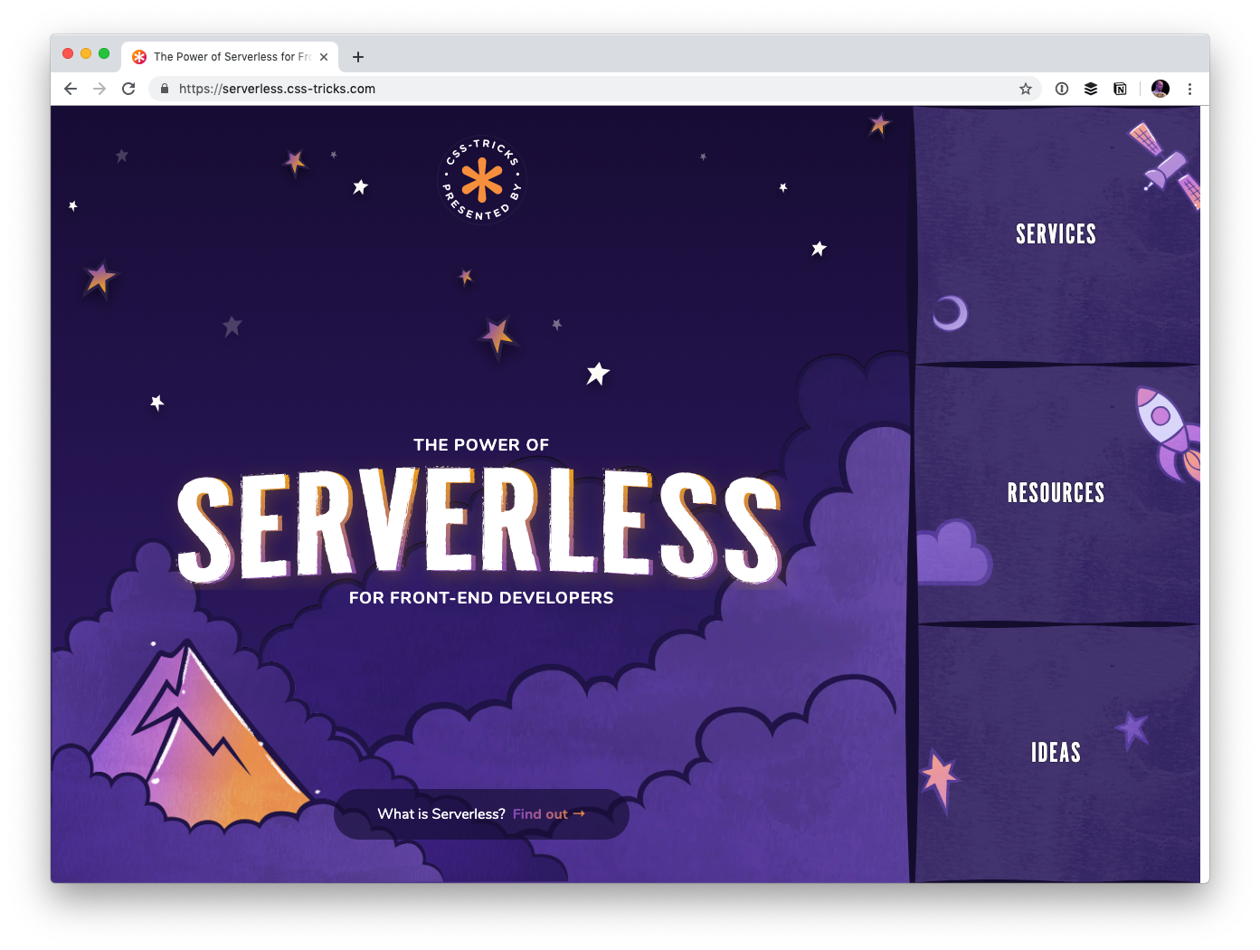
I created a website called The Power of Serverless for Front-End Developers over at thepowerofserverless.info a little while back while I was learning about that whole idea. I know a little more now but still have an endless amount to learn. Still, I felt like it was time to revamp that site a bit.
For one thing, just like our little conferences website, the new site is a subdomain of this very site:
The whole idea behind the serverless buzzword is a pretty big deal. Rather than maintaining your own servers, which you already buy from some other company, you architect your app such that everything is run on commoditized servers you access on-demand instead.
Hosting becomes static, which is rife with advantages. Just look at Netlify who offer blazing-fast static hosting and innovate around the developer experience. The bits you still need back-end services for run in cloud functions that are cheap and efficient.
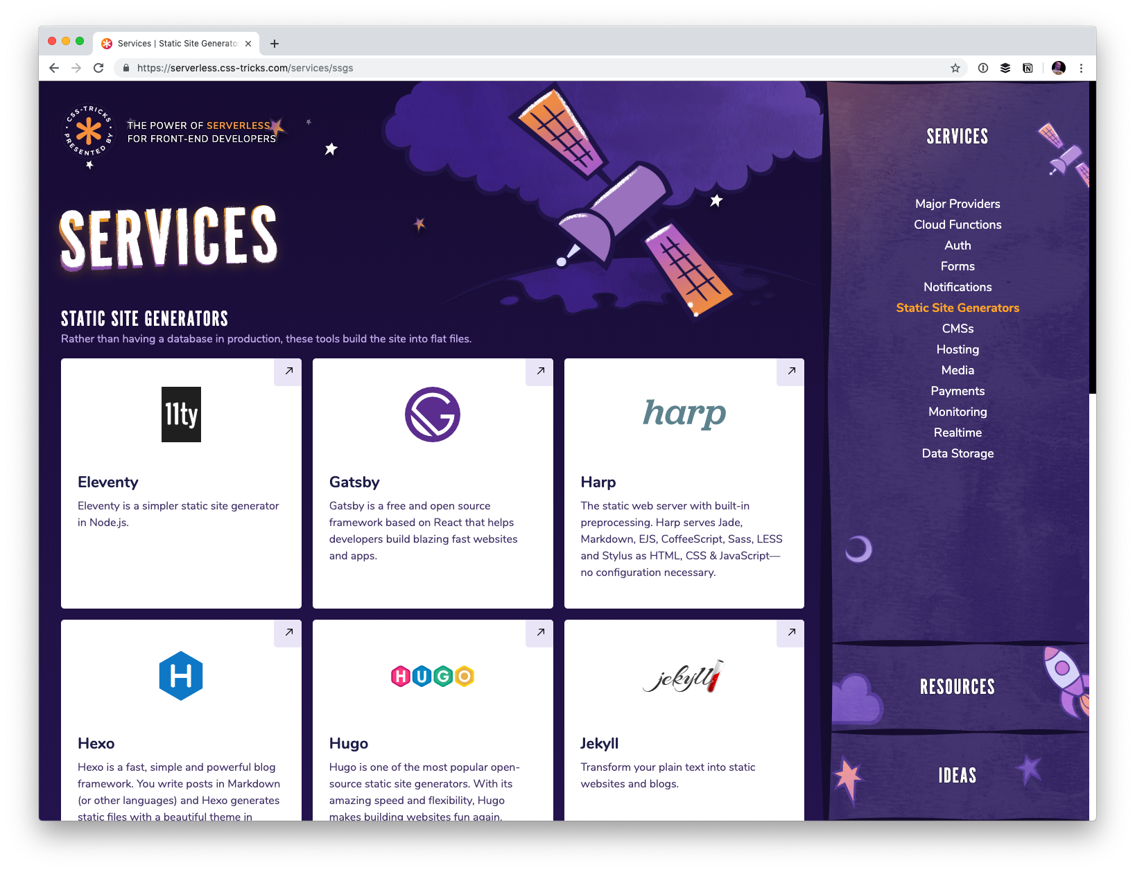
But you still need to know how to string it all together. Who do you use to process forms? Where do you store the data? What can I use for user authentication? What content management systems are available in this world? That’s what this site is all about! I’d like the site to be able to explain the concept and offer resources, but more importantly, be a directory to the slew of services out there that make up this new serverless world.
The site also features a section containing ideas that might help you figure out how you might use serverless technology. Perhaps you’ll even take a spin making a serverless site.
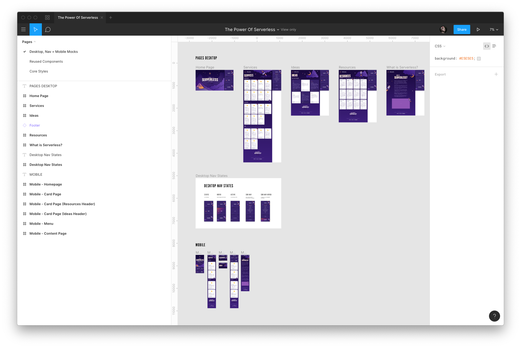
Design by Kylie Timpani and illustration by Geri Coady
Kylie Timpani (yes, the same Kylie who worked on the v17 design of this site!) did all the visual design for this project.
If anything looks off or weird, blame my poor implementation of their work. I’m still making my way through checklists of improvements as we speak. Sometimes you just gotta launch things and improve as you go.
Everything is on GitHub and contributions are welcome
I’d appreciate any help cleaning up copy, adding services, making it more accessible… really anything you think would improve the site. Feel free to link up your own work, although I tend to find that contributions are stronger when you are propping up someone else rather than yourself. It’s ultimately my call whether your pull request is accepted. That might be subjective sometimes.
Before doing anything dramatic, probably best to talk it out by emailing me or opening an issue. There’s already a handful of issues in there.
I suspect companies that exist in this space will be interested in being represented in here somewhere, and I’m cool with that. Go for it. Perhaps we can open up some kind of sponsorship opportunities as well.
Creating with components: A good idea
I went with Gatsby for this project. A little site like this (a couple of pages of static content) deserves to be rendered entirely server-side. Gatsby does that, even though you work entirely in React, which is generally thought of as a client-side technology. Next.js and react-static are similar in spirit.
I purposely wanted to work in JavaScript because I feel like JavaScript has been doing the best job around the idea of architecting sites in components. Sure, you could sling some partials and pass local variables in Rails partials or Nunjucks includes, but it’s a far cry from the versatility you get in a framework like React, Vue or Angular that are designing entirely to help build components for the front end.
The fact that these JavaScript frameworks are getting first-class server-side rendering stories is big. Plus, after the site’s initial render, the site „hydrates” and you end up getting that SPA feel anyway… fantastic. Yet another thing that shows how a JavaScript-focused front-end developer is getting more and more powerful.
As an aside: I don’t have much experience with more complicated content data structures and JAMstack sites. I suspect once you’ve gone past this „little simple cards of data” structure, you might be beyond what front-matter Markdown files are best suited toward and need to get into a more full-fledged CMS situation, hopefully with a GraphQL endpoint to get whatever you need. Ripe space, for sure.
In this tutorial, I’ll show you what halftone is and how to achieve a halftone effect. I’ll also show you how to make your own halftone brushes.
What Is Halftone?
You might be familiar with halftone patterns being used in printing. While the pattern is essential for that specific medium, halftone patterns also give a unique look to design work. Halftone is a technique that simulates tone gradations by using dots. These dots vary in size, spacing and sometimes even shape to generate a halftone gradient effect. The closer and bigger the dots on the halftone, the darker the image is. The smaller and more spread out the dots are, the lighter the image is. When it is all put together, the halftone effect creates the illusion of gradation when seen from afar.
Nowadays, halftone is commonly used digitally to achieve a comic-book look, representing nostalgia for the past in the digital age.
In this tutorial, I’ll show you how to achieve a halftone effect in Photoshop. You can apply these steps to any image of your liking to achieve a black and white halftone and color halftone. We will also take a look at how to create your own halftone brushes in Photoshop, which can help you add great details to your artwork. Lastly, we will look at how to create halftone brushes in Illustrator. This is perfect if you are getting started in the illustration world and want to develop your skill and style.
You’ll need access to Adobe Photoshop and Illustrator; if you don’t have the software, you can download a trial from the Adobe website. You’ll also need this image:
To achieve a color halftone in Photoshop, go to Filter > Pixelate > Color Halftone.
Step 2
In the Color Halftone option window, you’ll notice the Max. Radius and Channels options. Max. Radius dictates the maximum size of the dots, which will dictate how detailed you want your image to be. The bigger the dots, the less detailed it is; the smaller the dots, the more detailed it will be.
The Channels represent cyan, magenta, yellow, and black, and the angle these colors will get mixed in. This is to achieve specific colors and tones. The angle creates moiré effects and rosette patterns that are useful for printing when halftoning is necessary. In this tutorial, we will focus on the look of halftone effects that can be printed or used digitally as a style.
The Color Halftone option window has default settings. Mine are set to the following:
Max. Radius 8 pixels
Channel 1: 108
Channel 2: 162
Channel 3: 90
Channel 4: 45
Click OK.
In the example below, you can see that we’ve created a color halftone in Photoshop. The closer and bigger the dots are, the darker the image is, and the smaller and more spread out, the lighter the image is. The image is very textured due to the low Max. Radius. Look at the image from afar, and you’ll notice that the dots disappear, lending a tone gradation illusion.
Step 3
Press Command-Z to go back a step. Go to Filter > Pixelate > Color Halftone. Let’s try the halftone effect with a different Max. Radius setting:
Max. Radius 20 pixels
Channel 1: 108
Channel 2: 162
Channel 3: 90
Channel 4: 45
Click OK.
You’ll notice the dots are much bigger, and you can see the CMYK color mix as a scattered pattern.
Step 4
Press Command-Z to go back a step. Go to Filter > Pixelate > Color Halftone. Let’s try the halftone effect with the same Max. Radius setting as above and changing the channels to 45:
Max. Radius 20 pixels
Channel 1: 45
Channel 2: 45
Channel 3: 45
Channel 4: 45
Click OK.
You’ll notice the dots are the same size but the angles are lined up on a grid, creating a neat pattern.
Step 5
Press Command-Z to go back a step.
Another way of achieving a halftone effect is by using the bitmap option. With the bitmap option, you can create a black and white halftone effect and use different halftone shapes. This technique will maintain the edges of the image as a cookie-cutter to create the halftone pattern. In order to access the bitmap option, we need to turn the image to grayscale.
Head over to Image > Mode > Grayscale, followed by Image > Mode > Bitmap.
Step 6
In the Bitmap option window, set the Output to 72 Pixels/Inch. Under Method, Use: Halftone Screen and click OK.
In the Halftone Screen option window, set the Frequency to 3 Lines/Inch, the Angle to 45 degrees, and Shape to Round. Click OK.
You’ll notice in the image below that compared to the Halftone Effect, this instead cuts out the dots on the edge.
Step 7
Let’s say you want to achieve a different kind of halftone effect. Press Command-Z to go back a step.
Go to Image > Mode > Bitmap. In the Bitmap option window, set the Output to 72 Pixels/Inch. Under Method, Use: Halftone Screen and click OK.
Let’s use the same settings, but this time change the Shape to Line. Click OK. By the traditional definition, this isn’t exactly halftone because it is not composed of dots, but it has the same idea. We are creating a halftone gradient with the lines.
2. How to Make Halftone Brushes in Photoshop
Step 1
Go to File > New and create a new file named Halftone brush.
Set the Width and Height to 1500 Pixels, Resolution to 72 Pixels/Inch, and click Create.
Step 2
Select the Brush Tool (B) from the toolbar. Right-click on the document to open the brush options.
Select the Hard Round Brush, and set the Size to 500 px and the Hardness to 25%. The hardness will help spread out the brush, and this will translate into a halftone gradient in which the dots vary in size as they spread out.
Step 3
Click once on the document to create one brush stroke.
Head over to Filter > Pixelate > Color Halftone. Set the Max. Radius to 20 Pixels and all the Channels to 45. Click OK.
Step 4
Go to Edit > Define Brush Preset. In the Brush Name option window, set the Name to Halftone Brush. Click OK.
Step 5
Now you can use the new brush by brushing strokes on the document.
Head over to Window > Brush Settings to open the Brush Settings panel. Here, you can change the settings to achieve different looks. Change the Spacing to 1% to achieve a smoother transition and to 95% to separate the strokes. Now your brush is ready to use.
3. How to Make Halftone Brushes in Adobe Illustrator
Step 1
Open Illustrator, and head over to File > New.
In the New Document window, select the Print tab. Select the Letter size blank preset. Name the file Halftone, and set the Units to Centimeters and Orientation to Horizontal. Click Create.
Step 2
For this brush, we will create a halftone pattern in Illustrator from scratch and later build up to a composition.
Select the Ellipse Tool (L) from the toolbar. Click on the artboard to open the Ellipse option window. Set the Width and Height to 1 cm. Click OK.
Set the Fill color to Black.
Create a second Ellipse, this time setting the Width and Height to 0.3 cm. Click OK.
Step 3
Select both circles. Open the Align panel by going to Window > Align. Select the Horizontal Align Center button.
Select the Blend Tool (W) from the toolbar. Click on any of the circles followed by the other circle. This will fill the gap between the two objects by creating a number of steps.
Step 4
To alter the number of steps between the two objects, double-click on the Blend Tool button on the toolbar.
In the Blend Options window, check the Preview box. Set the Spacing to Specified Steps, andset the number to 9. Click OK.
Step 5
Head over to Object > Expand. In the Expand option window, select Object and Fill. Click OK. This will convert steps into objects. You’ll know you’ve done so when the line from the Blend Tool running across the steps has disappeared.
Duplicate the object to the right by holding Shift-Option and dragging. Shift will keep the object at the same axis, and Option will Duplicate the object.
Select the Blend Tool (W) from the toolbar. Click on one set of circles followed by the second set. This will create steps to fill in the gap.
Step 6
Go to Object > Expand and click OK in the Expand option window.
In order to create a brush, we need to create a tile that is able to multiply. Using the Rectangle Tool (M), create a square that covers the center of the outermost circle from left to right. Below, I’ve colored the rectangle in cyan for you to see.
Step 7
While selecting the circles and the square, press Command-7 to Make a Clipping Mask.
Step 8
Hold down Shift-Option on your keyboard and drag to the right three times to create a tile.
Step 9
Open the Brushes panel by going to Window > Brushes.
Select all three tiles and drag into the Brushes panel. In the New Brush window, select Art Brush. Click OK.
Step 10
On the Art Brush Options window, Name the brush Halftone. Set the Width to Fixed and Brush Scale Options to Stretch to Fit Stroke Length. Click OK.
Step 11
To apply the brush on a path, select the Pen Tool (P) from the toolbar. Create a line on the artboard. Set the Stroke color to Black.
On the Brushes panel, select the Halftone brush we created.
Step 12
You can control the size of the pattern by opening the Strokes panel. Go to Window > Strokes. On the Strokes panel, set the Stroke Weight to 0.75 pt.
Step 13
Let’s apply this halftone brush pattern to a circle.
First, head to the Brushes panel and double-click on the halftone brush to change the settings. In the Art Brush Options window, set the Colorization Method to Hue Shift.
Step 14
Using the Ellipse Tool (L), create an ellipse on the artboard—any size is fine. Set the Fill color to 40% Cyan.
Select the Brush Tool (B) from the toolbar. Draw a curve on the bottom left quadrant portion of the circle.
Set the Stroke on the Strokes panel to 0.5 pt. Set the Stroke color to a darker cyan. Position the stroke on the ellipse.
Select the ellipse and press Shift-Command-] to bring the shape Forward. Select both the ellipse and the stroke and press Command-7 to Make a Clipping Mask.
Select the ellipse again and set the Fill to 40% Cyan.
This is great to add subtle shadows to your illustration.
Great Job! You’ve Finished This Tutorial!
In this tutorial, you learned what halftone is and how you can achieve this comic book look. This style will lend a great texture to your artwork and a style that can range from clean comic book to grungy. Today, you learned to:
apply a halftone effect to an image
apply a halftone effect to a black and white image through the Bitmap option
In this tutorial, I’ll show you what halftone is and how to achieve a halftone effect. I’ll also show you how to make your own halftone brushes.
What Is Halftone?
You might be familiar with halftone patterns being used in printing. While the pattern is essential for that specific medium, halftone patterns also give a unique look to design work. Halftone is a technique that simulates tone gradations by using dots. These dots vary in size, spacing and sometimes even shape to generate a halftone gradient effect. The closer and bigger the dots on the halftone, the darker the image is. The smaller and more spread out the dots are, the lighter the image is. When it is all put together, the halftone effect creates the illusion of gradation when seen from afar.
Nowadays, halftone is commonly used digitally to achieve a comic-book look, representing nostalgia for the past in the digital age.
In this tutorial, I’ll show you how to achieve a halftone effect in Photoshop. You can apply these steps to any image of your liking to achieve a black and white halftone and color halftone. We will also take a look at how to create your own halftone brushes in Photoshop, which can help you add great details to your artwork. Lastly, we will look at how to create halftone brushes in Illustrator. This is perfect if you are getting started in the illustration world and want to develop your skill and style.
You’ll need access to Adobe Photoshop and Illustrator; if you don’t have the software, you can download a trial from the Adobe website. You’ll also need this image:
To achieve a color halftone in Photoshop, go to Filter > Pixelate > Color Halftone.
Step 2
In the Color Halftone option window, you’ll notice the Max. Radius and Channels options. Max. Radius dictates the maximum size of the dots, which will dictate how detailed you want your image to be. The bigger the dots, the less detailed it is; the smaller the dots, the more detailed it will be.
The Channels represent cyan, magenta, yellow, and black, and the angle these colors will get mixed in. This is to achieve specific colors and tones. The angle creates moiré effects and rosette patterns that are useful for printing when halftoning is necessary. In this tutorial, we will focus on the look of halftone effects that can be printed or used digitally as a style.
The Color Halftone option window has default settings. Mine are set to the following:
Max. Radius 8 pixels
Channel 1: 108
Channel 2: 162
Channel 3: 90
Channel 4: 45
Click OK.
In the example below, you can see that we’ve created a color halftone in Photoshop. The closer and bigger the dots are, the darker the image is, and the smaller and more spread out, the lighter the image is. The image is very textured due to the low Max. Radius. Look at the image from afar, and you’ll notice that the dots disappear, lending a tone gradation illusion.
Step 3
Press Command-Z to go back a step. Go to Filter > Pixelate > Color Halftone. Let’s try the halftone effect with a different Max. Radius setting:
Max. Radius 20 pixels
Channel 1: 108
Channel 2: 162
Channel 3: 90
Channel 4: 45
Click OK.
You’ll notice the dots are much bigger, and you can see the CMYK color mix as a scattered pattern.
Step 4
Press Command-Z to go back a step. Go to Filter > Pixelate > Color Halftone. Let’s try the halftone effect with the same Max. Radius setting as above and changing the channels to 45:
Max. Radius 20 pixels
Channel 1: 45
Channel 2: 45
Channel 3: 45
Channel 4: 45
Click OK.
You’ll notice the dots are the same size but the angles are lined up on a grid, creating a neat pattern.
Step 5
Press Command-Z to go back a step.
Another way of achieving a halftone effect is by using the bitmap option. With the bitmap option, you can create a black and white halftone effect and use different halftone shapes. This technique will maintain the edges of the image as a cookie-cutter to create the halftone pattern. In order to access the bitmap option, we need to turn the image to grayscale.
Head over to Image > Mode > Grayscale, followed by Image > Mode > Bitmap.
Step 6
In the Bitmap option window, set the Output to 72 Pixels/Inch. Under Method, Use: Halftone Screen and click OK.
In the Halftone Screen option window, set the Frequency to 3 Lines/Inch, the Angle to 45 degrees, and Shape to Round. Click OK.
You’ll notice in the image below that compared to the Halftone Effect, this instead cuts out the dots on the edge.
Step 7
Let’s say you want to achieve a different kind of halftone effect. Press Command-Z to go back a step.
Go to Image > Mode > Bitmap. In the Bitmap option window, set the Output to 72 Pixels/Inch. Under Method, Use: Halftone Screen and click OK.
Let’s use the same settings, but this time change the Shape to Line. Click OK. By the traditional definition, this isn’t exactly halftone because it is not composed of dots, but it has the same idea. We are creating a halftone gradient with the lines.
2. How to Make Halftone Brushes in Photoshop
Step 1
Go to File > New and create a new file named Halftone brush.
Set the Width and Height to 1500 Pixels, Resolution to 72 Pixels/Inch, and click Create.
Step 2
Select the Brush Tool (B) from the toolbar. Right-click on the document to open the brush options.
Select the Hard Round Brush, and set the Size to 500 px and the Hardness to 25%. The hardness will help spread out the brush, and this will translate into a halftone gradient in which the dots vary in size as they spread out.
Step 3
Click once on the document to create one brush stroke.
Head over to Filter > Pixelate > Color Halftone. Set the Max. Radius to 20 Pixels and all the Channels to 45. Click OK.
Step 4
Go to Edit > Define Brush Preset. In the Brush Name option window, set the Name to Halftone Brush. Click OK.
Step 5
Now you can use the new brush by brushing strokes on the document.
Head over to Window > Brush Settings to open the Brush Settings panel. Here, you can change the settings to achieve different looks. Change the Spacing to 1% to achieve a smoother transition and to 95% to separate the strokes. Now your brush is ready to use.
3. How to Make Halftone Brushes in Adobe Illustrator
Step 1
Open Illustrator, and head over to File > New.
In the New Document window, select the Print tab. Select the Letter size blank preset. Name the file Halftone, and set the Units to Centimeters and Orientation to Horizontal. Click Create.
Step 2
For this brush, we will create a halftone pattern in Illustrator from scratch and later build up to a composition.
Select the Ellipse Tool (L) from the toolbar. Click on the artboard to open the Ellipse option window. Set the Width and Height to 1 cm. Click OK.
Set the Fill color to Black.
Create a second Ellipse, this time setting the Width and Height to 0.3 cm. Click OK.
Step 3
Select both circles. Open the Align panel by going to Window > Align. Select the Horizontal Align Center button.
Select the Blend Tool (W) from the toolbar. Click on any of the circles followed by the other circle. This will fill the gap between the two objects by creating a number of steps.
Step 4
To alter the number of steps between the two objects, double-click on the Blend Tool button on the toolbar.
In the Blend Options window, check the Preview box. Set the Spacing to Specified Steps, andset the number to 9. Click OK.
Step 5
Head over to Object > Expand. In the Expand option window, select Object and Fill. Click OK. This will convert steps into objects. You’ll know you’ve done so when the line from the Blend Tool running across the steps has disappeared.
Duplicate the object to the right by holding Shift-Option and dragging. Shift will keep the object at the same axis, and Option will Duplicate the object.
Select the Blend Tool (W) from the toolbar. Click on one set of circles followed by the second set. This will create steps to fill in the gap.
Step 6
Go to Object > Expand and click OK in the Expand option window.
In order to create a brush, we need to create a tile that is able to multiply. Using the Rectangle Tool (M), create a square that covers the center of the outermost circle from left to right. Below, I’ve colored the rectangle in cyan for you to see.
Step 7
While selecting the circles and the square, press Command-7 to Make a Clipping Mask.
Step 8
Hold down Shift-Option on your keyboard and drag to the right three times to create a tile.
Step 9
Open the Brushes panel by going to Window > Brushes.
Select all three tiles and drag into the Brushes panel. In the New Brush window, select Art Brush. Click OK.
Step 10
On the Art Brush Options window, Name the brush Halftone. Set the Width to Fixed and Brush Scale Options to Stretch to Fit Stroke Length. Click OK.
Step 11
To apply the brush on a path, select the Pen Tool (P) from the toolbar. Create a line on the artboard. Set the Stroke color to Black.
On the Brushes panel, select the Halftone brush we created.
Step 12
You can control the size of the pattern by opening the Strokes panel. Go to Window > Strokes. On the Strokes panel, set the Stroke Weight to 0.75 pt.
Step 13
Let’s apply this halftone brush pattern to a circle.
First, head to the Brushes panel and double-click on the halftone brush to change the settings. In the Art Brush Options window, set the Colorization Method to Hue Shift.
Step 14
Using the Ellipse Tool (L), create an ellipse on the artboard—any size is fine. Set the Fill color to 40% Cyan.
Select the Brush Tool (B) from the toolbar. Draw a curve on the bottom left quadrant portion of the circle.
Set the Stroke on the Strokes panel to 0.5 pt. Set the Stroke color to a darker cyan. Position the stroke on the ellipse.
Select the ellipse and press Shift-Command-] to bring the shape Forward. Select both the ellipse and the stroke and press Command-7 to Make a Clipping Mask.
Select the ellipse again and set the Fill to 40% Cyan.
This is great to add subtle shadows to your illustration.
Great Job! You’ve Finished This Tutorial!
In this tutorial, you learned what halftone is and how you can achieve this comic book look. This style will lend a great texture to your artwork and a style that can range from clean comic book to grungy. Today, you learned to:
apply a halftone effect to an image
apply a halftone effect to a black and white image through the Bitmap option
In this tutorial, I’ll show you what halftone is and how to achieve a halftone effect. I’ll also show you how to make your own halftone brushes.
What Is Halftone?
You might be familiar with halftone patterns being used in printing. While the pattern is essential for that specific medium, halftone patterns also give a unique look to design work. Halftone is a technique that simulates tone gradations by using dots. These dots vary in size, spacing and sometimes even shape to generate a halftone gradient effect. The closer and bigger the dots on the halftone, the darker the image is. The smaller and more spread out the dots are, the lighter the image is. When it is all put together, the halftone effect creates the illusion of gradation when seen from afar.
Nowadays, halftone is commonly used digitally to achieve a comic-book look, representing nostalgia for the past in the digital age.
In this tutorial, I’ll show you how to achieve a halftone effect in Photoshop. You can apply these steps to any image of your liking to achieve a black and white halftone and color halftone. We will also take a look at how to create your own halftone brushes in Photoshop, which can help you add great details to your artwork. Lastly, we will look at how to create halftone brushes in Illustrator. This is perfect if you are getting started in the illustration world and want to develop your skill and style.
You’ll need access to Adobe Photoshop and Illustrator; if you don’t have the software, you can download a trial from the Adobe website. You’ll also need this image:
To achieve a color halftone in Photoshop, go to Filter > Pixelate > Color Halftone.
Step 2
In the Color Halftone option window, you’ll notice the Max. Radius and Channels options. Max. Radius dictates the maximum size of the dots, which will dictate how detailed you want your image to be. The bigger the dots, the less detailed it is; the smaller the dots, the more detailed it will be.
The Channels represent cyan, magenta, yellow, and black, and the angle these colors will get mixed in. This is to achieve specific colors and tones. The angle creates moiré effects and rosette patterns that are useful for printing when halftoning is necessary. In this tutorial, we will focus on the look of halftone effects that can be printed or used digitally as a style.
The Color Halftone option window has default settings. Mine are set to the following:
Max. Radius 8 pixels
Channel 1: 108
Channel 2: 162
Channel 3: 90
Channel 4: 45
Click OK.
In the example below, you can see that we’ve created a color halftone in Photoshop. The closer and bigger the dots are, the darker the image is, and the smaller and more spread out, the lighter the image is. The image is very textured due to the low Max. Radius. Look at the image from afar, and you’ll notice that the dots disappear, lending a tone gradation illusion.
Step 3
Press Command-Z to go back a step. Go to Filter > Pixelate > Color Halftone. Let’s try the halftone effect with a different Max. Radius setting:
Max. Radius 20 pixels
Channel 1: 108
Channel 2: 162
Channel 3: 90
Channel 4: 45
Click OK.
You’ll notice the dots are much bigger, and you can see the CMYK color mix as a scattered pattern.
Step 4
Press Command-Z to go back a step. Go to Filter > Pixelate > Color Halftone. Let’s try the halftone effect with the same Max. Radius setting as above and changing the channels to 45:
Max. Radius 20 pixels
Channel 1: 45
Channel 2: 45
Channel 3: 45
Channel 4: 45
Click OK.
You’ll notice the dots are the same size but the angles are lined up on a grid, creating a neat pattern.
Step 5
Press Command-Z to go back a step.
Another way of achieving a halftone effect is by using the bitmap option. With the bitmap option, you can create a black and white halftone effect and use different halftone shapes. This technique will maintain the edges of the image as a cookie-cutter to create the halftone pattern. In order to access the bitmap option, we need to turn the image to grayscale.
Head over to Image > Mode > Grayscale, followed by Image > Mode > Bitmap.
Step 6
In the Bitmap option window, set the Output to 72 Pixels/Inch. Under Method, Use: Halftone Screen and click OK.
In the Halftone Screen option window, set the Frequency to 3 Lines/Inch, the Angle to 45 degrees, and Shape to Round. Click OK.
You’ll notice in the image below that compared to the Halftone Effect, this instead cuts out the dots on the edge.
Step 7
Let’s say you want to achieve a different kind of halftone effect. Press Command-Z to go back a step.
Go to Image > Mode > Bitmap. In the Bitmap option window, set the Output to 72 Pixels/Inch. Under Method, Use: Halftone Screen and click OK.
Let’s use the same settings, but this time change the Shape to Line. Click OK. By the traditional definition, this isn’t exactly halftone because it is not composed of dots, but it has the same idea. We are creating a halftone gradient with the lines.
2. How to Make Halftone Brushes in Photoshop
Step 1
Go to File > New and create a new file named Halftone brush.
Set the Width and Height to 1500 Pixels, Resolution to 72 Pixels/Inch, and click Create.
Step 2
Select the Brush Tool (B) from the toolbar. Right-click on the document to open the brush options.
Select the Hard Round Brush, and set the Size to 500 px and the Hardness to 25%. The hardness will help spread out the brush, and this will translate into a halftone gradient in which the dots vary in size as they spread out.
Step 3
Click once on the document to create one brush stroke.
Head over to Filter > Pixelate > Color Halftone. Set the Max. Radius to 20 Pixels and all the Channels to 45. Click OK.
Step 4
Go to Edit > Define Brush Preset. In the Brush Name option window, set the Name to Halftone Brush. Click OK.
Step 5
Now you can use the new brush by brushing strokes on the document.
Head over to Window > Brush Settings to open the Brush Settings panel. Here, you can change the settings to achieve different looks. Change the Spacing to 1% to achieve a smoother transition and to 95% to separate the strokes. Now your brush is ready to use.
3. How to Make Halftone Brushes in Adobe Illustrator
Step 1
Open Illustrator, and head over to File > New.
In the New Document window, select the Print tab. Select the Letter size blank preset. Name the file Halftone, and set the Units to Centimeters and Orientation to Horizontal. Click Create.
Step 2
For this brush, we will create a halftone pattern in Illustrator from scratch and later build up to a composition.
Select the Ellipse Tool (L) from the toolbar. Click on the artboard to open the Ellipse option window. Set the Width and Height to 1 cm. Click OK.
Set the Fill color to Black.
Create a second Ellipse, this time setting the Width and Height to 0.3 cm. Click OK.
Step 3
Select both circles. Open the Align panel by going to Window > Align. Select the Horizontal Align Center button.
Select the Blend Tool (W) from the toolbar. Click on any of the circles followed by the other circle. This will fill the gap between the two objects by creating a number of steps.
Step 4
To alter the number of steps between the two objects, double-click on the Blend Tool button on the toolbar.
In the Blend Options window, check the Preview box. Set the Spacing to Specified Steps, andset the number to 9. Click OK.
Step 5
Head over to Object > Expand. In the Expand option window, select Object and Fill. Click OK. This will convert steps into objects. You’ll know you’ve done so when the line from the Blend Tool running across the steps has disappeared.
Duplicate the object to the right by holding Shift-Option and dragging. Shift will keep the object at the same axis, and Option will Duplicate the object.
Select the Blend Tool (W) from the toolbar. Click on one set of circles followed by the second set. This will create steps to fill in the gap.
Step 6
Go to Object > Expand and click OK in the Expand option window.
In order to create a brush, we need to create a tile that is able to multiply. Using the Rectangle Tool (M), create a square that covers the center of the outermost circle from left to right. Below, I’ve colored the rectangle in cyan for you to see.
Step 7
While selecting the circles and the square, press Command-7 to Make a Clipping Mask.
Step 8
Hold down Shift-Option on your keyboard and drag to the right three times to create a tile.
Step 9
Open the Brushes panel by going to Window > Brushes.
Select all three tiles and drag into the Brushes panel. In the New Brush window, select Art Brush. Click OK.
Step 10
On the Art Brush Options window, Name the brush Halftone. Set the Width to Fixed and Brush Scale Options to Stretch to Fit Stroke Length. Click OK.
Step 11
To apply the brush on a path, select the Pen Tool (P) from the toolbar. Create a line on the artboard. Set the Stroke color to Black.
On the Brushes panel, select the Halftone brush we created.
Step 12
You can control the size of the pattern by opening the Strokes panel. Go to Window > Strokes. On the Strokes panel, set the Stroke Weight to 0.75 pt.
Step 13
Let’s apply this halftone brush pattern to a circle.
First, head to the Brushes panel and double-click on the halftone brush to change the settings. In the Art Brush Options window, set the Colorization Method to Hue Shift.
Step 14
Using the Ellipse Tool (L), create an ellipse on the artboard—any size is fine. Set the Fill color to 40% Cyan.
Select the Brush Tool (B) from the toolbar. Draw a curve on the bottom left quadrant portion of the circle.
Set the Stroke on the Strokes panel to 0.5 pt. Set the Stroke color to a darker cyan. Position the stroke on the ellipse.
Select the ellipse and press Shift-Command-] to bring the shape Forward. Select both the ellipse and the stroke and press Command-7 to Make a Clipping Mask.
Select the ellipse again and set the Fill to 40% Cyan.
This is great to add subtle shadows to your illustration.
Great Job! You’ve Finished This Tutorial!
In this tutorial, you learned what halftone is and how you can achieve this comic book look. This style will lend a great texture to your artwork and a style that can range from clean comic book to grungy. Today, you learned to:
apply a halftone effect to an image
apply a halftone effect to a black and white image through the Bitmap option