With Photoshop actions, you can create your own Photoshop filters that can be used on your images to achieve cool photo effects. In this tutorial, I’ll show you how to create an action in Photoshop that is perfect for wedding photos. By creating this wedding Photoshop action, you’ll learn how to easily create your own photo filters and effects.
First, make sure your image is a background layer. If not, go to Layer > New > Background From Layer.
Step 2
Use your chosen selection tool to outline the silhouette of the couple. Try to be as precise as possible. I used the Pen Tool (P), and then I used the Refine Edge (Select > Refine Edge) panel to make the edge softer.
Step 3
Create a New Layer. Fill it with black using the Paint Bucket Tool (G).
Step 4
Create a New Layer below. Fill it with a black and white gradient using the Gradient Tool (G). The white part will be later affected by the blur. The black part will stay as it is. Plan your gradient accordingly.
Step 5
Click somewhere outside of the layers to deselect them. Create a New Action. Give it a name and click Record.
Step 6
Go to the Channels tab. Right-click any channel and select Duplicate Channel. Name it mask. Select the RGB channel again and go back to the Layers tab.
Step 7
Hide both masks. Duplicate the Background layer with Control-J. Go to Filter > Blur > Lens Blur. Use the channel mask as the Source for the Depth Map. Adjust the Radius for the amount of blur, and the Brightness and Threshold for the bokeh effect.
Step 8
Let’s create a custom photo filter by mixing a couple of adjustments. First, add a Gradient Map. The left side colorizes the dark tones of the image, and the right side the light ones. You can add a hue and change the lightness of these areas by adding colors to this gradient. You can also achieve a trendy effect of lower contrast by colorizing the darker areas with a bright color.
Feel free to experiment with the colors, but if you want to achieve the same effect as me, here are the exact values:
#3b1a5c, Location 0%
#698646, Location 34%
#59edfa, Location 100%
Step 9
Lower the Opacity of this layer to make the effect subtler.
Step 10
Add a Curves adjustment. Switch the Channel to Green and drag the curve down to make the greens more subdued.
Step 11
Add a Levels adjustment. Drag the left marker of the Output to brighten the dark shades.
Step 12
Double-click the layer to open the Blending Options panel. Drag the
lower left marker of the Blend If settings to remove the effect of the
adjustment from the dark areas. Split the marker with the Alt key to
make the effect more transitional.
Step 13
Adjustments can be also added selectively to a part of the picture. Go to the Channels tab, hold Control, and click the thumbnail of the mask channel. Then go back to the Layers tab and add a Solid Color adjustment. Make it blue (#548cdf).
Step 14
Change its Blend Mode to Divide and lower the Opacity to make the effect subtler.
Step 15
Finally, let’s make the bright parts brighter. Add a Brightness/Contrast adjustment. Make the whole image brighter, without trying to keep it looking good.
Step 16
Double-click the layer. Adjust the Blend If settings to make the brightening effect more selective. Lower the Opacity if the effect is still too intense.
Step 17
Let’s make the image just a little sharper as well. Make a selection out of the silhouette of the couple and duplicate the Background layer with Control-J. Drag it to the top. Go to Filter > Other > High Pass. Drag the Radius until you see the lines without too much glow around.
Step 18
Change the Blend Mode to Linear Light. If you want to make this effect more intense, duplicate the layer.
Step 19
The action is finished now, so click Stop Recording.
Now you can add the same photo effect to other photos. Just create the masks and click Play. Because this Photoshop filter consists of various adjustment layers, they all can be adjusted afterwards to customize the effect.
Wedding Photoshop actions can make your wedding photos even more special and beautiful than they already are! This set of actions will provide a soft and non-destructive matte pastel toning,
enhancing the overall look and feel of your images, adding atmosphere and an artsy touch. Plus that little white balance tune-up that you were
looking for.
The Bouquet Wedding collection features beautiful photo actions for wedding, engagement, love-story, and portrait photography.
Enhance your Photoshop post-processing and create your signature artistic style!
Vintage Wedding Action for Photoshop is specially designed for wedding and event photography. It will provide a beautiful and non-destructive film-inspired toning, enhancing the overall look and feel of your images and adding atmosphere and expression.
Add beautiful effects to your photos with one click. These
Photoshop actions simulate the popular subtle faded looks used in
wedding photography, and they’re extremely easy to use. Simply play one
action and pick from any of the 12 effects.
Caramel Wedding is a must-have Photoshop action for wedding, event, portrait photographers, and bloggers. Whether you are a pro or an amateur, Caramel will speed up your post-processing and help you get awesome results fast. It allows full customization with adjustment layers!
Good Job!
Now you know how to create a wedding Photoshop action. If you’re interested in other photo filters and effects, check out these tutorials:
This tutorial is for those who want to incorporate a real-world drawing technique into digital drawing. If you like texture, grunge, or paint brushes, or if you enjoy drawing in Illustrator and would like to have a more diverse brush arsenal, please stay here. In this quick tip tutorial, you will learn how to make and install a brush in Illustrator. I promise that it’s easy, and after this tutorial you will want to create a few dozen more of them!
If you like grunge or texture Illustrator brushes, but don’t want to spend time making them and would just like to get some free Illustrator brushes—it’s your choice!
If you would like to learn more about how to install and use a custom brush, feel free to check this article about it.
Or maybe you want to stay here, but need some inspiration about what to draw using this brush? Just browse GraphicRiver for some graphics, and I’m sure you will find something you like!
1. How to Create a Stroke for the Illustrator Brush
Step 1
To start creating our texture brush (I assume you already created a new document), delete the stroke color and set a black fill color. Draw a tiny ellipse using the Ellipse Tool (L).
After that, draw some more ellipses that overlap each other. We are now creating the pencil stroke, so try to stay in an imaginary rectangle. Remember how a real pencil leaves its track on a paper? It’s actually a tiny, super narrow rectangle.
Step 2
Then we want to distort the ellipses a little, to make sure that the pencil stroke looks even more realistic. For this, we will need the Wrinkle Tool (this tool is hidden under the Width Tool (Shift-W) or under the Warp Tool (Shift-R)—it depends on which version of AI you have).
Double-click on the Wrinkle Tool, as we need to adjust it. A new dialogue window will pop up, called Wrinkle Tool Options. Enter the options you see in the image below, and press OK.
Step 3
Before distorting our ellipses with the Wrinkle Tool, group them together (select them, and then right-click > Group). Now take the Wrinkle Tool and click on the ellipses here and there. You will notice how the ellipses start to wrinkle, and that’s exactly what we need.
2. How to Install the Adobe Illustrator Brush
Step 1
After you are satisfied with the result or how the stroke looks, select it, and on the Pathfinder panel (Window > Pathfinder), press the Unite button. You just turned all the ellipses into one shape.
And now we are going to create a brush from this shape. Keep it selected, and on the Brushes panel (Window > Brushes), click on the icon that looks like three lines, in the top right corner. Select New Brush… In the new pop-up window, check Art Brush and press OK.
Another window will pop up. Enter the options you see below, and press OK.
Step 2
So, we already created a new brush from a stroke that consists of wrinkled ellipses, but we haven’t used it yet. Now we want to adjust the Paintbrush Tool (B) options to have some nice curved lines later on while using the new brush. It’s as if we prepared the „paint” when we created the texture stroke, and now we need to adjust the brush.
Double-click on the Paintbrush Tool (B). In the new dialogue window, move the Fidelity slider to Smooth, check Edit Selected Paths 12 pixels, and press OK.
Your Paintbrush Tool is already selected, so now take your „paint” on the Brushes panel: the new stroke you created from the wrinkled ellipses. And now the fun begins: draw something!
Conclusion
You did it! Today, you’ve learned how to make a texture or grunge brush in Illustrator, and how to install it on your Brushes panel. Using this technique, you can create another Illustrator brush. It would be great to see your results posted in the comments section down below. And if you still have some questions, please feel free to ask me!
Looking to add texture to your illustrations? Why not try these amazing handmade grunge brushes to create an organic, textured look. This grunge brush pack is made from real paintbrushes and can be used to roughen up your vector artwork within seconds.
Help your creativity flow with these amazing grain and texture Illustrator brushes. Carefully hand crafted, they have varying degrees of density, texture, and grunginess. These AI scatter brushes are perfect for shading, or
simply adding some texture or noise to your vector artwork. Just have
some fun and play around with them!
Add some grunge texture to your vector designs. Each brush was made using the texture of various real objects, making
the set one of the most lifelike available. The brushes emulate
anything from the texture of brick to paint or pastel. The uses are
endless!
This is a fun, versatile collection of modern, hand-painted, messy brushstrokes, originally created using Sumi ink and a variety of brushes and non-brush tools. Ideas for usage include unique textile and patterns, marketing
ads, visual branding, T-shirt designs, packaging, modern stationery or
invites, as an image mask, for adding texture to your mood boards, social
media graphics, digital collage, abstract art, and so much more.
Add this big brush pack to your collection: it’s a set of 56 varied illustrator brushes, including stipple brushes, chalk and pastel, ink, flourish, patterns, and more.
And try some scatter texture brushes! Use them for texturing—it’s really fast and simple to use, and the best thing is that you can vary it in a second.
If you like my tutorials, feel free to check the latest:
This tutorial is for those who want to incorporate a real-world drawing technique into digital drawing. If you like texture, grunge, or paint brushes, or if you enjoy drawing in Illustrator and would like to have a more diverse brush arsenal, please stay here. In this quick tip tutorial, you will learn how to make and install a brush in Illustrator. I promise that it’s easy, and after this tutorial you will want to create a few dozen more of them!
If you like grunge or texture Illustrator brushes, but don’t want to spend time making them and would just like to get some free Illustrator brushes—it’s your choice!
If you would like to learn more about how to install and use a custom brush, feel free to check this article about it.
Or maybe you want to stay here, but need some inspiration about what to draw using this brush? Just browse GraphicRiver for some graphics, and I’m sure you will find something you like!
1. How to Create a Stroke for the Illustrator Brush
Step 1
To start creating our texture brush (I assume you already created a new document), delete the stroke color and set a black fill color. Draw a tiny ellipse using the Ellipse Tool (L).
After that, draw some more ellipses that overlap each other. We are now creating the pencil stroke, so try to stay in an imaginary rectangle. Remember how a real pencil leaves its track on a paper? It’s actually a tiny, super narrow rectangle.
Step 2
Then we want to distort the ellipses a little, to make sure that the pencil stroke looks even more realistic. For this, we will need the Wrinkle Tool (this tool is hidden under the Width Tool (Shift-W) or under the Warp Tool (Shift-R)—it depends on which version of AI you have).
Double-click on the Wrinkle Tool, as we need to adjust it. A new dialogue window will pop up, called Wrinkle Tool Options. Enter the options you see in the image below, and press OK.
Step 3
Before distorting our ellipses with the Wrinkle Tool, group them together (select them, and then right-click > Group). Now take the Wrinkle Tool and click on the ellipses here and there. You will notice how the ellipses start to wrinkle, and that’s exactly what we need.
2. How to Install the Adobe Illustrator Brush
Step 1
After you are satisfied with the result or how the stroke looks, select it, and on the Pathfinder panel (Window > Pathfinder), press the Unite button. You just turned all the ellipses into one shape.
And now we are going to create a brush from this shape. Keep it selected, and on the Brushes panel (Window > Brushes), click on the icon that looks like three lines, in the top right corner. Select New Brush… In the new pop-up window, check Art Brush and press OK.
Another window will pop up. Enter the options you see below, and press OK.
Step 2
So, we already created a new brush from a stroke that consists of wrinkled ellipses, but we haven’t used it yet. Now we want to adjust the Paintbrush Tool (B) options to have some nice curved lines later on while using the new brush. It’s as if we prepared the „paint” when we created the texture stroke, and now we need to adjust the brush.
Double-click on the Paintbrush Tool (B). In the new dialogue window, move the Fidelity slider to Smooth, check Edit Selected Paths 12 pixels, and press OK.
Your Paintbrush Tool is already selected, so now take your „paint” on the Brushes panel: the new stroke you created from the wrinkled ellipses. And now the fun begins: draw something!
Conclusion
You did it! Today, you’ve learned how to make a texture or grunge brush in Illustrator, and how to install it on your Brushes panel. Using this technique, you can create another Illustrator brush. It would be great to see your results posted in the comments section down below. And if you still have some questions, please feel free to ask me!
Looking to add texture to your illustrations? Why not try these amazing handmade grunge brushes to create an organic, textured look. This grunge brush pack is made from real paintbrushes and can be used to roughen up your vector artwork within seconds.
Help your creativity flow with these amazing grain and texture Illustrator brushes. Carefully hand crafted, they have varying degrees of density, texture, and grunginess. These AI scatter brushes are perfect for shading, or
simply adding some texture or noise to your vector artwork. Just have
some fun and play around with them!
Add some grunge texture to your vector designs. Each brush was made using the texture of various real objects, making
the set one of the most lifelike available. The brushes emulate
anything from the texture of brick to paint or pastel. The uses are
endless!
This is a fun, versatile collection of modern, hand-painted, messy brushstrokes, originally created using Sumi ink and a variety of brushes and non-brush tools. Ideas for usage include unique textile and patterns, marketing
ads, visual branding, T-shirt designs, packaging, modern stationery or
invites, as an image mask, for adding texture to your mood boards, social
media graphics, digital collage, abstract art, and so much more.
Add this big brush pack to your collection: it’s a set of 56 varied illustrator brushes, including stipple brushes, chalk and pastel, ink, flourish, patterns, and more.
And try some scatter texture brushes! Use them for texturing—it’s really fast and simple to use, and the best thing is that you can vary it in a second.
If you like my tutorials, feel free to check the latest:
This tutorial is for those who want to incorporate a real-world drawing technique into digital drawing. If you like texture, grunge, or paint brushes, or if you enjoy drawing in Illustrator and would like to have a more diverse brush arsenal, please stay here. In this quick tip tutorial, you will learn how to make and install a brush in Illustrator. I promise that it’s easy, and after this tutorial you will want to create a few dozen more of them!
If you like grunge or texture Illustrator brushes, but don’t want to spend time making them and would just like to get some free Illustrator brushes—it’s your choice!
If you would like to learn more about how to install and use a custom brush, feel free to check this article about it.
Or maybe you want to stay here, but need some inspiration about what to draw using this brush? Just browse GraphicRiver for some graphics, and I’m sure you will find something you like!
1. How to Create a Stroke for the Illustrator Brush
Step 1
To start creating our texture brush (I assume you already created a new document), delete the stroke color and set a black fill color. Draw a tiny ellipse using the Ellipse Tool (L).
After that, draw some more ellipses that overlap each other. We are now creating the pencil stroke, so try to stay in an imaginary rectangle. Remember how a real pencil leaves its track on a paper? It’s actually a tiny, super narrow rectangle.
Step 2
Then we want to distort the ellipses a little, to make sure that the pencil stroke looks even more realistic. For this, we will need the Wrinkle Tool (this tool is hidden under the Width Tool (Shift-W) or under the Warp Tool (Shift-R)—it depends on which version of AI you have).
Double-click on the Wrinkle Tool, as we need to adjust it. A new dialogue window will pop up, called Wrinkle Tool Options. Enter the options you see in the image below, and press OK.
Step 3
Before distorting our ellipses with the Wrinkle Tool, group them together (select them, and then right-click > Group). Now take the Wrinkle Tool and click on the ellipses here and there. You will notice how the ellipses start to wrinkle, and that’s exactly what we need.
2. How to Install the Adobe Illustrator Brush
Step 1
After you are satisfied with the result or how the stroke looks, select it, and on the Pathfinder panel (Window > Pathfinder), press the Unite button. You just turned all the ellipses into one shape.
And now we are going to create a brush from this shape. Keep it selected, and on the Brushes panel (Window > Brushes), click on the icon that looks like three lines, in the top right corner. Select New Brush… In the new pop-up window, check Art Brush and press OK.
Another window will pop up. Enter the options you see below, and press OK.
Step 2
So, we already created a new brush from a stroke that consists of wrinkled ellipses, but we haven’t used it yet. Now we want to adjust the Paintbrush Tool (B) options to have some nice curved lines later on while using the new brush. It’s as if we prepared the „paint” when we created the texture stroke, and now we need to adjust the brush.
Double-click on the Paintbrush Tool (B). In the new dialogue window, move the Fidelity slider to Smooth, check Edit Selected Paths 12 pixels, and press OK.
Your Paintbrush Tool is already selected, so now take your „paint” on the Brushes panel: the new stroke you created from the wrinkled ellipses. And now the fun begins: draw something!
Conclusion
You did it! Today, you’ve learned how to make a texture or grunge brush in Illustrator, and how to install it on your Brushes panel. Using this technique, you can create another Illustrator brush. It would be great to see your results posted in the comments section down below. And if you still have some questions, please feel free to ask me!
Looking to add texture to your illustrations? Why not try these amazing handmade grunge brushes to create an organic, textured look. This grunge brush pack is made from real paintbrushes and can be used to roughen up your vector artwork within seconds.
Help your creativity flow with these amazing grain and texture Illustrator brushes. Carefully hand crafted, they have varying degrees of density, texture, and grunginess. These AI scatter brushes are perfect for shading, or
simply adding some texture or noise to your vector artwork. Just have
some fun and play around with them!
Add some grunge texture to your vector designs. Each brush was made using the texture of various real objects, making
the set one of the most lifelike available. The brushes emulate
anything from the texture of brick to paint or pastel. The uses are
endless!
This is a fun, versatile collection of modern, hand-painted, messy brushstrokes, originally created using Sumi ink and a variety of brushes and non-brush tools. Ideas for usage include unique textile and patterns, marketing
ads, visual branding, T-shirt designs, packaging, modern stationery or
invites, as an image mask, for adding texture to your mood boards, social
media graphics, digital collage, abstract art, and so much more.
Add this big brush pack to your collection: it’s a set of 56 varied illustrator brushes, including stipple brushes, chalk and pastel, ink, flourish, patterns, and more.
And try some scatter texture brushes! Use them for texturing—it’s really fast and simple to use, and the best thing is that you can vary it in a second.
If you like my tutorials, feel free to check the latest:
This tutorial is for those who want to incorporate a real-world drawing technique into digital drawing. If you like texture, grunge, or paint brushes, or if you enjoy drawing in Illustrator and would like to have a more diverse brush arsenal, please stay here. In this quick tip tutorial, you will learn how to make and install a brush in Illustrator. I promise that it’s easy, and after this tutorial you will want to create a few dozen more of them!
If you like grunge or texture Illustrator brushes, but don’t want to spend time making them and would just like to get some free Illustrator brushes—it’s your choice!
If you would like to learn more about how to install and use a custom brush, feel free to check this article about it.
Or maybe you want to stay here, but need some inspiration about what to draw using this brush? Just browse GraphicRiver for some graphics, and I’m sure you will find something you like!
1. How to Create a Stroke for the Illustrator Brush
Step 1
To start creating our texture brush (I assume you already created a new document), delete the stroke color and set a black fill color. Draw a tiny ellipse using the Ellipse Tool (L).
After that, draw some more ellipses that overlap each other. We are now creating the pencil stroke, so try to stay in an imaginary rectangle. Remember how a real pencil leaves its track on a paper? It’s actually a tiny, super narrow rectangle.
Step 2
Then we want to distort the ellipses a little, to make sure that the pencil stroke looks even more realistic. For this, we will need the Wrinkle Tool (this tool is hidden under the Width Tool (Shift-W) or under the Warp Tool (Shift-R)—it depends on which version of AI you have).
Double-click on the Wrinkle Tool, as we need to adjust it. A new dialogue window will pop up, called Wrinkle Tool Options. Enter the options you see in the image below, and press OK.
Step 3
Before distorting our ellipses with the Wrinkle Tool, group them together (select them, and then right-click > Group). Now take the Wrinkle Tool and click on the ellipses here and there. You will notice how the ellipses start to wrinkle, and that’s exactly what we need.
2. How to Install the Adobe Illustrator Brush
Step 1
After you are satisfied with the result or how the stroke looks, select it, and on the Pathfinder panel (Window > Pathfinder), press the Unite button. You just turned all the ellipses into one shape.
And now we are going to create a brush from this shape. Keep it selected, and on the Brushes panel (Window > Brushes), click on the icon that looks like three lines, in the top right corner. Select New Brush… In the new pop-up window, check Art Brush and press OK.
Another window will pop up. Enter the options you see below, and press OK.
Step 2
So, we already created a new brush from a stroke that consists of wrinkled ellipses, but we haven’t used it yet. Now we want to adjust the Paintbrush Tool (B) options to have some nice curved lines later on while using the new brush. It’s as if we prepared the „paint” when we created the texture stroke, and now we need to adjust the brush.
Double-click on the Paintbrush Tool (B). In the new dialogue window, move the Fidelity slider to Smooth, check Edit Selected Paths 12 pixels, and press OK.
Your Paintbrush Tool is already selected, so now take your „paint” on the Brushes panel: the new stroke you created from the wrinkled ellipses. And now the fun begins: draw something!
Conclusion
You did it! Today, you’ve learned how to make a texture or grunge brush in Illustrator, and how to install it on your Brushes panel. Using this technique, you can create another Illustrator brush. It would be great to see your results posted in the comments section down below. And if you still have some questions, please feel free to ask me!
Looking to add texture to your illustrations? Why not try these amazing handmade grunge brushes to create an organic, textured look. This grunge brush pack is made from real paintbrushes and can be used to roughen up your vector artwork within seconds.
Help your creativity flow with these amazing grain and texture Illustrator brushes. Carefully hand crafted, they have varying degrees of density, texture, and grunginess. These AI scatter brushes are perfect for shading, or
simply adding some texture or noise to your vector artwork. Just have
some fun and play around with them!
Add some grunge texture to your vector designs. Each brush was made using the texture of various real objects, making
the set one of the most lifelike available. The brushes emulate
anything from the texture of brick to paint or pastel. The uses are
endless!
This is a fun, versatile collection of modern, hand-painted, messy brushstrokes, originally created using Sumi ink and a variety of brushes and non-brush tools. Ideas for usage include unique textile and patterns, marketing
ads, visual branding, T-shirt designs, packaging, modern stationery or
invites, as an image mask, for adding texture to your mood boards, social
media graphics, digital collage, abstract art, and so much more.
Add this big brush pack to your collection: it’s a set of 56 varied illustrator brushes, including stipple brushes, chalk and pastel, ink, flourish, patterns, and more.
And try some scatter texture brushes! Use them for texturing—it’s really fast and simple to use, and the best thing is that you can vary it in a second.
If you like my tutorials, feel free to check the latest:
This tutorial is for those who want to incorporate a real-world drawing technique into digital drawing. If you like texture, grunge, or paint brushes, or if you enjoy drawing in Illustrator and would like to have a more diverse brush arsenal, please stay here. In this quick tip tutorial, you will learn how to make and install a brush in Illustrator. I promise that it’s easy, and after this tutorial you will want to create a few dozen more of them!
If you like grunge or texture Illustrator brushes, but don’t want to spend time making them and would just like to get some free Illustrator brushes—it’s your choice!
If you would like to learn more about how to install and use a custom brush, feel free to check this article about it.
Or maybe you want to stay here, but need some inspiration about what to draw using this brush? Just browse GraphicRiver for some graphics, and I’m sure you will find something you like!
1. How to Create a Stroke for the Illustrator Brush
Step 1
To start creating our texture brush (I assume you already created a new document), delete the stroke color and set a black fill color. Draw a tiny ellipse using the Ellipse Tool (L).
After that, draw some more ellipses that overlap each other. We are now creating the pencil stroke, so try to stay in an imaginary rectangle. Remember how a real pencil leaves its track on a paper? It’s actually a tiny, super narrow rectangle.
Step 2
Then we want to distort the ellipses a little, to make sure that the pencil stroke looks even more realistic. For this, we will need the Wrinkle Tool (this tool is hidden under the Width Tool (Shift-W) or under the Warp Tool (Shift-R)—it depends on which version of AI you have).
Double-click on the Wrinkle Tool, as we need to adjust it. A new dialogue window will pop up, called Wrinkle Tool Options. Enter the options you see in the image below, and press OK.
Step 3
Before distorting our ellipses with the Wrinkle Tool, group them together (select them, and then right-click > Group). Now take the Wrinkle Tool and click on the ellipses here and there. You will notice how the ellipses start to wrinkle, and that’s exactly what we need.
2. How to Install the Adobe Illustrator Brush
Step 1
After you are satisfied with the result or how the stroke looks, select it, and on the Pathfinder panel (Window > Pathfinder), press the Unite button. You just turned all the ellipses into one shape.
And now we are going to create a brush from this shape. Keep it selected, and on the Brushes panel (Window > Brushes), click on the icon that looks like three lines, in the top right corner. Select New Brush… In the new pop-up window, check Art Brush and press OK.
Another window will pop up. Enter the options you see below, and press OK.
Step 2
So, we already created a new brush from a stroke that consists of wrinkled ellipses, but we haven’t used it yet. Now we want to adjust the Paintbrush Tool (B) options to have some nice curved lines later on while using the new brush. It’s as if we prepared the „paint” when we created the texture stroke, and now we need to adjust the brush.
Double-click on the Paintbrush Tool (B). In the new dialogue window, move the Fidelity slider to Smooth, check Edit Selected Paths 12 pixels, and press OK.
Your Paintbrush Tool is already selected, so now take your „paint” on the Brushes panel: the new stroke you created from the wrinkled ellipses. And now the fun begins: draw something!
Conclusion
You did it! Today, you’ve learned how to make a texture or grunge brush in Illustrator, and how to install it on your Brushes panel. Using this technique, you can create another Illustrator brush. It would be great to see your results posted in the comments section down below. And if you still have some questions, please feel free to ask me!
Looking to add texture to your illustrations? Why not try these amazing handmade grunge brushes to create an organic, textured look. This grunge brush pack is made from real paintbrushes and can be used to roughen up your vector artwork within seconds.
Help your creativity flow with these amazing grain and texture Illustrator brushes. Carefully hand crafted, they have varying degrees of density, texture, and grunginess. These AI scatter brushes are perfect for shading, or
simply adding some texture or noise to your vector artwork. Just have
some fun and play around with them!
Add some grunge texture to your vector designs. Each brush was made using the texture of various real objects, making
the set one of the most lifelike available. The brushes emulate
anything from the texture of brick to paint or pastel. The uses are
endless!
This is a fun, versatile collection of modern, hand-painted, messy brushstrokes, originally created using Sumi ink and a variety of brushes and non-brush tools. Ideas for usage include unique textile and patterns, marketing
ads, visual branding, T-shirt designs, packaging, modern stationery or
invites, as an image mask, for adding texture to your mood boards, social
media graphics, digital collage, abstract art, and so much more.
Add this big brush pack to your collection: it’s a set of 56 varied illustrator brushes, including stipple brushes, chalk and pastel, ink, flourish, patterns, and more.
And try some scatter texture brushes! Use them for texturing—it’s really fast and simple to use, and the best thing is that you can vary it in a second.
If you like my tutorials, feel free to check the latest:
This tutorial is for those who want to incorporate a real-world drawing technique into digital drawing. If you like texture, grunge, or paint brushes, or if you enjoy drawing in Illustrator and would like to have a more diverse brush arsenal, please stay here. In this quick tip tutorial, you will learn how to make and install a brush in Illustrator. I promise that it’s easy, and after this tutorial you will want to create a few dozen more of them!
If you like grunge or texture Illustrator brushes, but don’t want to spend time making them and would just like to get some free Illustrator brushes—it’s your choice!
If you would like to learn more about how to install and use a custom brush, feel free to check this article about it.
Or maybe you want to stay here, but need some inspiration about what to draw using this brush? Just browse GraphicRiver for some graphics, and I’m sure you will find something you like!
1. How to Create a Stroke for the Illustrator Brush
Step 1
To start creating our texture brush (I assume you already created a new document), delete the stroke color and set a black fill color. Draw a tiny ellipse using the Ellipse Tool (L).
After that, draw some more ellipses that overlap each other. We are now creating the pencil stroke, so try to stay in an imaginary rectangle. Remember how a real pencil leaves its track on a paper? It’s actually a tiny, super narrow rectangle.
Step 2
Then we want to distort the ellipses a little, to make sure that the pencil stroke looks even more realistic. For this, we will need the Wrinkle Tool (this tool is hidden under the Width Tool (Shift-W) or under the Warp Tool (Shift-R)—it depends on which version of AI you have).
Double-click on the Wrinkle Tool, as we need to adjust it. A new dialogue window will pop up, called Wrinkle Tool Options. Enter the options you see in the image below, and press OK.
Step 3
Before distorting our ellipses with the Wrinkle Tool, group them together (select them, and then right-click > Group). Now take the Wrinkle Tool and click on the ellipses here and there. You will notice how the ellipses start to wrinkle, and that’s exactly what we need.
2. How to Install the Adobe Illustrator Brush
Step 1
After you are satisfied with the result or how the stroke looks, select it, and on the Pathfinder panel (Window > Pathfinder), press the Unite button. You just turned all the ellipses into one shape.
And now we are going to create a brush from this shape. Keep it selected, and on the Brushes panel (Window > Brushes), click on the icon that looks like three lines, in the top right corner. Select New Brush… In the new pop-up window, check Art Brush and press OK.
Another window will pop up. Enter the options you see below, and press OK.
Step 2
So, we already created a new brush from a stroke that consists of wrinkled ellipses, but we haven’t used it yet. Now we want to adjust the Paintbrush Tool (B) options to have some nice curved lines later on while using the new brush. It’s as if we prepared the „paint” when we created the texture stroke, and now we need to adjust the brush.
Double-click on the Paintbrush Tool (B). In the new dialogue window, move the Fidelity slider to Smooth, check Edit Selected Paths 12 pixels, and press OK.
Your Paintbrush Tool is already selected, so now take your „paint” on the Brushes panel: the new stroke you created from the wrinkled ellipses. And now the fun begins: draw something!
Conclusion
You did it! Today, you’ve learned how to make a texture or grunge brush in Illustrator, and how to install it on your Brushes panel. Using this technique, you can create another Illustrator brush. It would be great to see your results posted in the comments section down below. And if you still have some questions, please feel free to ask me!
Looking to add texture to your illustrations? Why not try these amazing handmade grunge brushes to create an organic, textured look. This grunge brush pack is made from real paintbrushes and can be used to roughen up your vector artwork within seconds.
Help your creativity flow with these amazing grain and texture Illustrator brushes. Carefully hand crafted, they have varying degrees of density, texture, and grunginess. These AI scatter brushes are perfect for shading, or
simply adding some texture or noise to your vector artwork. Just have
some fun and play around with them!
Add some grunge texture to your vector designs. Each brush was made using the texture of various real objects, making
the set one of the most lifelike available. The brushes emulate
anything from the texture of brick to paint or pastel. The uses are
endless!
This is a fun, versatile collection of modern, hand-painted, messy brushstrokes, originally created using Sumi ink and a variety of brushes and non-brush tools. Ideas for usage include unique textile and patterns, marketing
ads, visual branding, T-shirt designs, packaging, modern stationery or
invites, as an image mask, for adding texture to your mood boards, social
media graphics, digital collage, abstract art, and so much more.
Add this big brush pack to your collection: it’s a set of 56 varied illustrator brushes, including stipple brushes, chalk and pastel, ink, flourish, patterns, and more.
And try some scatter texture brushes! Use them for texturing—it’s really fast and simple to use, and the best thing is that you can vary it in a second.
If you like my tutorials, feel free to check the latest:
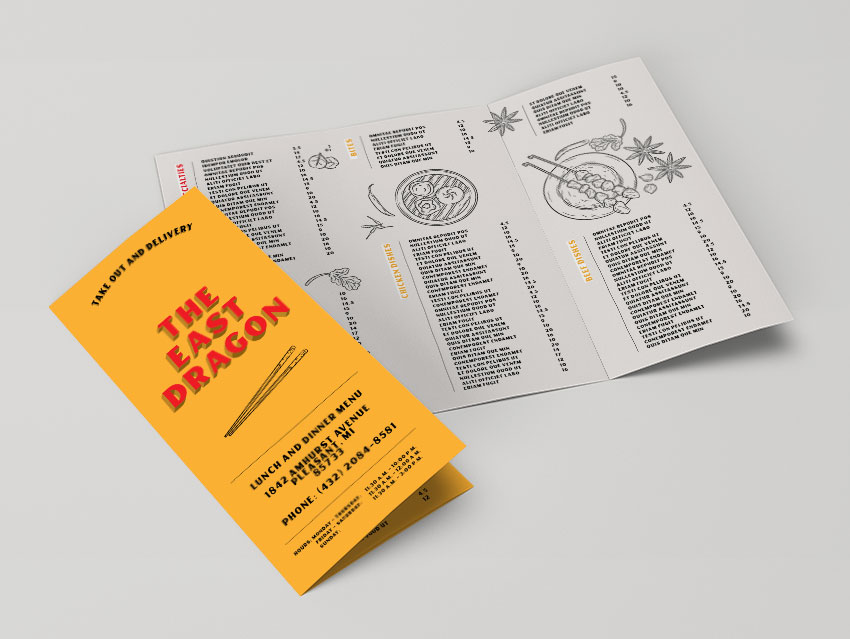
In this tutorial, we show you how to easily create a take-out menu template in InDesign.
Restaurants invest a great amount of their budget on printing and reprinting take-out menus. These menus can make or break what customers might order for their next night off. Selecting the right menu can make a difference to the customer experience your clients are providing.
In this tutorial, we’ll show you how to easily create a food menu template. We’ll show you how to set up a trifold brochure menu template, complete with beautiful illustrations. You’ll learn how to successfully insert tables to add menu items—this will make your template super easy to edit!
What You Will Need for Your Take-Out Menu InDesign Template
You’ll need access to Adobe InDesign and Adobe Illustrator. If you don’t have the software, you can download a trial from the Adobe website. You’ll also need these assets:
Download the assets and make sure the font is installed on your system before starting. When you are ready, we can dive in!
1.Setting Up a Take-Out Menu InDesign Template
A common trifold dimension when open flat is letter size or A4. We will be using a letter size page for this tutorial, but feel free to use an A4 page if you prefer. As trifold brochure dimensions will vary depending on your needs, I’ve created an equation chart that you can follow below:
Step 1
The take-out menu template size for this tutorial is a letter page. First, we need to divide the final width (279.4 mm) by 3 (93.13 mm). To this new width, we need to add a buffer for the fold (1 mm). The width of the two panels is 94.13 mm.
Later on, we will modify the size of the shorter panel. We need to subtract 2 mm from the panel to accommodate the fold (91.13 mm).
In InDesign, go to File > New. Name the document Take Out Menu Template. Set the trifold dimensions to the following:
Width to 94.13 mm
Height to 215.9 mm
Units to Millimetres
Orientation to Portrait
Uncheck Facing Pages
Pages to 6
Margins to 10 mm
Bleeds to 3 mm (although it’s best to seek your professional printer’s preference)
Click Create.
Step 2
A trifold brochure has a flap that folds in; this is the shorter panel. We will create a second Master Page with this new size.
Head over to the Pages panel. If you don’t have it active, head over to Windows > Pages. The top portion of the panel contains the Master Pages.
Right-click on A-Master > New Master. In the New Master window, make sure Based on Master is set to [Master]. Set the Width to 91.13 mm (subtract 2 mm from the 93.13 mm).Click OK.
Step 3
On the Pages panel, right-click on the B-Master we just created and select Apply Master. In the Apply Master window, under To Pages, enter 1, 6 (this is to specify that we are changing Pages 1 and 6). Click OK.
In the Master Page Size Conflict window, click Use Master Page Size.
Step 4
Now that we have the page sizes set up, we can move the pages to set up the spreads. Pages 1-3 will be the outside spread, and Pages 4-6 will be the inside spreads.
On the Main Menu of the Pages panel, make sure that Allow Document Pages to Shuffle is unchecked. Drag Page 2 towards Page 1 to combine them. Combine Pages 1-3 as one spread and Pages 4-6. Make sure that you have the BAA and AAB Master Pages configuration.
To exit Master Pages mode, double-click on the regular pages thumbnail.
Step 5
For this take-out menu template tutorial, we will work with three layers. This will make it easier to update the template when it needs to be updated with new information.
Bring up the Layers panel by going to Window > Layers. Double-click on Layer 1 and rename it Background.
On the Layers panel main menu, select New Layer. Name it Illustrations, and click OK.
Add one last layer and name it Copy. Click OK.
Step 6
Before we start with the design of this menu template, let’s add some color swatches. Head over to Window > Color > Swatches to expand the Swatches panel. Choose New Color Swatch button from the main menu. Add the following colors:
Light Yellow: C=0 M=35 Y=90 K=0. Click Add and OK.
Medium Yellow: C=0 M=35 Y=90 K=30. Click Add and OK.
Dark Yellow: C=0 M=35 Y=90 K=55. Click Add and OK.
Red: C=0 M=100 Y=100 K=0. Click Add and OK.
Grey: C=5 M=5 Y=5 K=0.
Click Add and OK after you input each of the color values.
Step 7
Paragraph styles allow us to add formatting attributes to be applied to large amounts of text. This is useful if you want to maintain the same type settings throughout your menu template design. Therefore, the styles will keep your template flawless and cohesive. For this tutorial, we will create two styles: Section Title and Menu Items.
Head over to Window > Paragraph Styles. On the Paragraph Styles panel, select the New Paragraph Style option from the main menu.
In the New Paragraph Style window option, select Basic Character Formats in the left menu. Set the Style Name to Section Title. Use the following settings for the Basic Paragraph Formats options:
Font Family: Carters
Font Style: Regular
Size: 16 pt
Click on Indents and Spacing from the left side menu. Set the Alignment to Right.
Click OK.
Create a new Paragraph Style and name it Menu Items. Use the following settings for the Basic Paragraph Formats options:
Font Family: Carters
Font Style: Regular
Size: 9 pt
Click OK.
2.How to Use Tables in Your Take-Out Menu InDesign Template
For this food menu template, we’ll start by designing the inside of the menu and finish the design with the cover.
Step 1
Select the Background layer from the Layers panel.
Using the Rectangle Tool (M), create a rectangle that covers all three panels. Make sure the rectangle also covers the bleeds.
On the Swatches panel, set the color to Grey.
Lock the Background layer and select the Copy layer.
Step 2
Using the Text Tool (T) from the toolbar, create a small text frame. In it, add the title of the section—in my case, it is Our Specialties.
On the Paragraph Styles panel, select the Section Title to style the text frame. While selecting the text frame, set the color to [Paper]. Press J to change the color of the text and select the red color.
Select the Rotate Tool (R) from the toolbar. Rotate the text frame 90° and place it in the top left corner of the first panel.
Step 3
Using the Text Tool (T), create a text frame that measures 6 cm in Width and 9 cmin Height.
Double-click on the text frame. Head over to the menu bar and select Table > Insert Table. In the Insert Table option window, set the Body Rows to 24 and the Columns to 2.
For the Table Style, select New Table Style.
In the New Table Style option window, set the Style Name to Menu Table.
Under Cell Styles, set the Body Rows to New Cell Style.
In the New Cell Style option window, set the Paragraph Style to Menu Items.
Select the Text option from the left side menu. Set all the Cell Insets to 0.
Select the Stroke and Fills option from the left side menu. Set the Color to [None]. Click OK.
For the New Table Style, select the Table Setup option from the left side menu. Set the Table Border Color to [None]. Under Table Spacing, set the Space Before and After to 0 cm. Click OK.
Click OK in the Insert Table option window.
Step 4
Head over to Window > Type & Tables > Table. Using the Text Tool (T), select the table we just created to activate the optionson the Table panel.
On the Table panel, set the Row Height to At Least 0.36 cm.
Select the first column only, and set the Column Width to 5 cm. Select the second column and set the Column Width to 1 cm.
Step 5
Now you are ready to add content to the table on your InDesign menu template.
Using the Line Tool (/), create a stroke that extends from the top of the table to the last item. Head over to Window > Stroke and set the Stroke Weight to 0.5 pt. Place the stroke between the section title and the table.
Step 6
Duplicate the section title, stroke and table by selecting all three items. Press Option-Shift and drag to the lower section of the same panel. Leave a gap between the two sections; we will add an illustration in a later step.
Using the Text Tool (T), select the section title to change the name. On the Swatches panel, change the color to light yellow.
Using the Text Tool (T), select all of the duplicated table. Head over to the Table panel and set the Number of Body Rows to 20. This is how you’ll be able to lengthen and shorten tables. Using the Selection Tool (V), shorten the stroke to match the table.
Step 7
You can add a special note by using the Text Tool (T). Create a text frame that matches the width of the table. Open the Text panel (Window > Type & Tables > Character) and set the Font to Carters, Size to 8 pt, and Leading to 8 pt.
Step 8
Duplicate the section title, stroke and table to fill up the rest of the panels. Select all three items and press Shift-Option and drag. Use the Table panel to add or delete rows on the tables of the menu design template.
Step 9
To finish off the inside of the panel of the restaurant menu template, open the Hand Drawn Asian Restaurant Menu in Adobe Illustrator.
Select the items and Ungroup them by pressing Shift-Command-G. If necessary, Ungroup the subgroups by using the same shortcut.
Select any of the illustrations, press Command-C to Copy, and head over to the take-out menu template in InDesign. On the Layers panel, select the Illustrations layer. Press Command-V to Paste the illustrations.
3.Designing the Outside Panels of the Take-Out Menu InDesign Template
Step 1
Select the Background layer from the Layers panel of the food menu template.
Using the Rectangle Tool (M), create three rectangles that cover each panel.
On the Swatches panel, set the color of the first and third rectangle to Yellow. Set the second rectangle to Grey.
Lock the Background layer and select the Copy layer of the Chinese take-out menu template.
Step 2
Duplicate the section title, stroke and table from the inside panels by pressing Shift-Option and dragging. Edit the table and section title as you need through the front panel of the Chinese take-out menu template.
Step 3
Head over to Illustrator and select illustrations to Copy and Paste onto the outside panel of the Chinese take-out menu template.
4.Designing the Front Cover of the Take-Out Menu InDesign Template
Step 1
Select the Ellipse Tool (L) from the toolbar. Click on the food menu template document to open the Ellipse option window. Set the Width to 7.5 cm and the Height to 3.5 cm.
Select the Type on a Path Tool from the toolbar and click on the ellipse.
I added text and opened the Character panel. Set the Font to Carters Regular and Size to 16 pt.
On the Swatches panel, set the color to [Black].
Step 2
Duplicate the ellipse by pressing Shift-Option and dragging downwards. Change the font on the text from the Character panel to Carters Shadow. On the Swatches panel, set the color to medium yellow.
Step 3
Duplicate the ellipse once more by pressing Shift-Option and dragging downwards. Change the font on the text from the Character panel to Carters Black Shadow. On the Swatches panel, set the color to dark yellow.
Select all three ellipses and open the Align panel by going to Window > Object & Layout > Align. Press the Align Vertical Center button to align all three ellipses.
Press Command-G to Group all three ellipses.
Step 4
Using the Text Tool (T), create a text frame that fits the width of the panel on the menu template. On the Character panel, set the Font to Carters Regular, Size to 55 pt, and Leading to 45 pt.
On the Swatches panel, set the color to red.
Duplicate the text frame by pressing Shift-Option and dragging downwards. Change the font on the Character panel to Carters Shadow. On the Swatches panel, set the color to medium yellow.
Duplicate the text frame once more by pressing Shift-Option and dragging downwards. Change the font from the Character panel to Carters Black Shadow. On the Swatches panel, set the color to dark yellow.
Select all three text frames and head over to the Align panel. Select the Align Vertical Center button to align the frames.
Step 5
From Illustrator, feel free to add an illustration below the title on the restaurant menu template. Press Command-C to Copy and Command-V to Paste.
Using the Line Tool (/), add a stroke that runs across the width of the panel. Set the Stroke Weight to 0.5 pt.
Step 6
Using the Text Tool (T), add an address and phone number to the Chinese take-out menu. On the Character panel, set the Font to Carters, the Size to 16 pt, and the Leading to 12 pt.
Using the Line Tool (/), add a stroke that runs across the width of the panel. Set the Stroke Weight to 0.5 pt.
Step 7
Duplicate one of the menu table items to the front cover of the take-out menu. Delete all the contents and open the Table panel.
On the Table panel, set the Number of Rows to 3 and set the Row Height to At Least 0.3 cm.
Select the first column and set the Column Width to 1 cm. Set the second and third column Width to 3 cm.
On the Character panel, set the Font to Carters and Size to 8 pt.
Add ‘hours’ in the first column and days in the second column. In the third column, add times.
5.How to Export a File for Printing
Before exporting a file for printing, it’s useful to take a look around all the edges of the menu design template. This is to make sure all the images and vectors bleeding out are touching the bleeds. Press W to go between Preview mode and Normal mode.
Remember that each fold will be represented by a crop mark. Let your professional printer know to avoid confusion. It is also helpful to ask for a printer’s proof to make sure the project is printed correctly.
Step 1
To export the menu design template, go to File > Export. Name the file trifold brochure and choose Adobe PDF (Print) from the Format drop-down menu. Click Save.
Step 2
In the Export Adobe PDF window, set the Adobe PDF Preset to Press Quality. Under Pages, select Export As Spreads.
On the left side of the panel, select Marks and Bleeds. Check All Printer’s Marks and Use Document Bleed Settings. Click Export. You will have a ready-to-print PDF file.
Great Job! You’ve Finished This Tutorial!
In this tutorial, we learned how to make an InDesign menu template. We covered key tools that will help your users edit a template quickly and easily for their ever-changing menus. Today, we learned to:
In this tutorial, we show you how to easily create a take-out menu template in InDesign.
Restaurants invest a great amount of their budget on printing and reprinting take-out menus. These menus can make or break what customers might order for their next night off. Selecting the right menu can make a difference to the customer experience your clients are providing.
In this tutorial, we’ll show you how to easily create a food menu template. We’ll show you how to set up a trifold brochure menu template, complete with beautiful illustrations. You’ll learn how to successfully insert tables to add menu items—this will make your template super easy to edit!
What You Will Need for Your Take-Out Menu InDesign Template
You’ll need access to Adobe InDesign and Adobe Illustrator. If you don’t have the software, you can download a trial from the Adobe website. You’ll also need these assets:
Download the assets and make sure the font is installed on your system before starting. When you are ready, we can dive in!
1.Setting Up a Take-Out Menu InDesign Template
A common trifold dimension when open flat is letter size or A4. We will be using a letter size page for this tutorial, but feel free to use an A4 page if you prefer. As trifold brochure dimensions will vary depending on your needs, I’ve created an equation chart that you can follow below:
Step 1
The take-out menu template size for this tutorial is a letter page. First, we need to divide the final width (279.4 mm) by 3 (93.13 mm). To this new width, we need to add a buffer for the fold (1 mm). The width of the two panels is 94.13 mm.
Later on, we will modify the size of the shorter panel. We need to subtract 2 mm from the panel to accommodate the fold (91.13 mm).
In InDesign, go to File > New. Name the document Take Out Menu Template. Set the trifold dimensions to the following:
Width to 94.13 mm
Height to 215.9 mm
Units to Millimetres
Orientation to Portrait
Uncheck Facing Pages
Pages to 6
Margins to 10 mm
Bleeds to 3 mm (although it’s best to seek your professional printer’s preference)
Click Create.
Step 2
A trifold brochure has a flap that folds in; this is the shorter panel. We will create a second Master Page with this new size.
Head over to the Pages panel. If you don’t have it active, head over to Windows > Pages. The top portion of the panel contains the Master Pages.
Right-click on A-Master > New Master. In the New Master window, make sure Based on Master is set to [Master]. Set the Width to 91.13 mm (subtract 2 mm from the 93.13 mm).Click OK.
Step 3
On the Pages panel, right-click on the B-Master we just created and select Apply Master. In the Apply Master window, under To Pages, enter 1, 6 (this is to specify that we are changing Pages 1 and 6). Click OK.
In the Master Page Size Conflict window, click Use Master Page Size.
Step 4
Now that we have the page sizes set up, we can move the pages to set up the spreads. Pages 1-3 will be the outside spread, and Pages 4-6 will be the inside spreads.
On the Main Menu of the Pages panel, make sure that Allow Document Pages to Shuffle is unchecked. Drag Page 2 towards Page 1 to combine them. Combine Pages 1-3 as one spread and Pages 4-6. Make sure that you have the BAA and AAB Master Pages configuration.
To exit Master Pages mode, double-click on the regular pages thumbnail.
Step 5
For this take-out menu template tutorial, we will work with three layers. This will make it easier to update the template when it needs to be updated with new information.
Bring up the Layers panel by going to Window > Layers. Double-click on Layer 1 and rename it Background.
On the Layers panel main menu, select New Layer. Name it Illustrations, and click OK.
Add one last layer and name it Copy. Click OK.
Step 6
Before we start with the design of this menu template, let’s add some color swatches. Head over to Window > Color > Swatches to expand the Swatches panel. Choose New Color Swatch button from the main menu. Add the following colors:
Light Yellow: C=0 M=35 Y=90 K=0. Click Add and OK.
Medium Yellow: C=0 M=35 Y=90 K=30. Click Add and OK.
Dark Yellow: C=0 M=35 Y=90 K=55. Click Add and OK.
Red: C=0 M=100 Y=100 K=0. Click Add and OK.
Grey: C=5 M=5 Y=5 K=0.
Click Add and OK after you input each of the color values.
Step 7
Paragraph styles allow us to add formatting attributes to be applied to large amounts of text. This is useful if you want to maintain the same type settings throughout your menu template design. Therefore, the styles will keep your template flawless and cohesive. For this tutorial, we will create two styles: Section Title and Menu Items.
Head over to Window > Paragraph Styles. On the Paragraph Styles panel, select the New Paragraph Style option from the main menu.
In the New Paragraph Style window option, select Basic Character Formats in the left menu. Set the Style Name to Section Title. Use the following settings for the Basic Paragraph Formats options:
Font Family: Carters
Font Style: Regular
Size: 16 pt
Click on Indents and Spacing from the left side menu. Set the Alignment to Right.
Click OK.
Create a new Paragraph Style and name it Menu Items. Use the following settings for the Basic Paragraph Formats options:
Font Family: Carters
Font Style: Regular
Size: 9 pt
Click OK.
2.How to Use Tables in Your Take-Out Menu InDesign Template
For this food menu template, we’ll start by designing the inside of the menu and finish the design with the cover.
Step 1
Select the Background layer from the Layers panel.
Using the Rectangle Tool (M), create a rectangle that covers all three panels. Make sure the rectangle also covers the bleeds.
On the Swatches panel, set the color to Grey.
Lock the Background layer and select the Copy layer.
Step 2
Using the Text Tool (T) from the toolbar, create a small text frame. In it, add the title of the section—in my case, it is Our Specialties.
On the Paragraph Styles panel, select the Section Title to style the text frame. While selecting the text frame, set the color to [Paper]. Press J to change the color of the text and select the red color.
Select the Rotate Tool (R) from the toolbar. Rotate the text frame 90° and place it in the top left corner of the first panel.
Step 3
Using the Text Tool (T), create a text frame that measures 6 cm in Width and 9 cmin Height.
Double-click on the text frame. Head over to the menu bar and select Table > Insert Table. In the Insert Table option window, set the Body Rows to 24 and the Columns to 2.
For the Table Style, select New Table Style.
In the New Table Style option window, set the Style Name to Menu Table.
Under Cell Styles, set the Body Rows to New Cell Style.
In the New Cell Style option window, set the Paragraph Style to Menu Items.
Select the Text option from the left side menu. Set all the Cell Insets to 0.
Select the Stroke and Fills option from the left side menu. Set the Color to [None]. Click OK.
For the New Table Style, select the Table Setup option from the left side menu. Set the Table Border Color to [None]. Under Table Spacing, set the Space Before and After to 0 cm. Click OK.
Click OK in the Insert Table option window.
Step 4
Head over to Window > Type & Tables > Table. Using the Text Tool (T), select the table we just created to activate the optionson the Table panel.
On the Table panel, set the Row Height to At Least 0.36 cm.
Select the first column only, and set the Column Width to 5 cm. Select the second column and set the Column Width to 1 cm.
Step 5
Now you are ready to add content to the table on your InDesign menu template.
Using the Line Tool (/), create a stroke that extends from the top of the table to the last item. Head over to Window > Stroke and set the Stroke Weight to 0.5 pt. Place the stroke between the section title and the table.
Step 6
Duplicate the section title, stroke and table by selecting all three items. Press Option-Shift and drag to the lower section of the same panel. Leave a gap between the two sections; we will add an illustration in a later step.
Using the Text Tool (T), select the section title to change the name. On the Swatches panel, change the color to light yellow.
Using the Text Tool (T), select all of the duplicated table. Head over to the Table panel and set the Number of Body Rows to 20. This is how you’ll be able to lengthen and shorten tables. Using the Selection Tool (V), shorten the stroke to match the table.
Step 7
You can add a special note by using the Text Tool (T). Create a text frame that matches the width of the table. Open the Text panel (Window > Type & Tables > Character) and set the Font to Carters, Size to 8 pt, and Leading to 8 pt.
Step 8
Duplicate the section title, stroke and table to fill up the rest of the panels. Select all three items and press Shift-Option and drag. Use the Table panel to add or delete rows on the tables of the menu design template.
Step 9
To finish off the inside of the panel of the restaurant menu template, open the Hand Drawn Asian Restaurant Menu in Adobe Illustrator.
Select the items and Ungroup them by pressing Shift-Command-G. If necessary, Ungroup the subgroups by using the same shortcut.
Select any of the illustrations, press Command-C to Copy, and head over to the take-out menu template in InDesign. On the Layers panel, select the Illustrations layer. Press Command-V to Paste the illustrations.
3.Designing the Outside Panels of the Take-Out Menu InDesign Template
Step 1
Select the Background layer from the Layers panel of the food menu template.
Using the Rectangle Tool (M), create three rectangles that cover each panel.
On the Swatches panel, set the color of the first and third rectangle to Yellow. Set the second rectangle to Grey.
Lock the Background layer and select the Copy layer of the Chinese take-out menu template.
Step 2
Duplicate the section title, stroke and table from the inside panels by pressing Shift-Option and dragging. Edit the table and section title as you need through the front panel of the Chinese take-out menu template.
Step 3
Head over to Illustrator and select illustrations to Copy and Paste onto the outside panel of the Chinese take-out menu template.
4.Designing the Front Cover of the Take-Out Menu InDesign Template
Step 1
Select the Ellipse Tool (L) from the toolbar. Click on the food menu template document to open the Ellipse option window. Set the Width to 7.5 cm and the Height to 3.5 cm.
Select the Type on a Path Tool from the toolbar and click on the ellipse.
I added text and opened the Character panel. Set the Font to Carters Regular and Size to 16 pt.
On the Swatches panel, set the color to [Black].
Step 2
Duplicate the ellipse by pressing Shift-Option and dragging downwards. Change the font on the text from the Character panel to Carters Shadow. On the Swatches panel, set the color to medium yellow.
Step 3
Duplicate the ellipse once more by pressing Shift-Option and dragging downwards. Change the font on the text from the Character panel to Carters Black Shadow. On the Swatches panel, set the color to dark yellow.
Select all three ellipses and open the Align panel by going to Window > Object & Layout > Align. Press the Align Vertical Center button to align all three ellipses.
Press Command-G to Group all three ellipses.
Step 4
Using the Text Tool (T), create a text frame that fits the width of the panel on the menu template. On the Character panel, set the Font to Carters Regular, Size to 55 pt, and Leading to 45 pt.
On the Swatches panel, set the color to red.
Duplicate the text frame by pressing Shift-Option and dragging downwards. Change the font on the Character panel to Carters Shadow. On the Swatches panel, set the color to medium yellow.
Duplicate the text frame once more by pressing Shift-Option and dragging downwards. Change the font from the Character panel to Carters Black Shadow. On the Swatches panel, set the color to dark yellow.
Select all three text frames and head over to the Align panel. Select the Align Vertical Center button to align the frames.
Step 5
From Illustrator, feel free to add an illustration below the title on the restaurant menu template. Press Command-C to Copy and Command-V to Paste.
Using the Line Tool (/), add a stroke that runs across the width of the panel. Set the Stroke Weight to 0.5 pt.
Step 6
Using the Text Tool (T), add an address and phone number to the Chinese take-out menu. On the Character panel, set the Font to Carters, the Size to 16 pt, and the Leading to 12 pt.
Using the Line Tool (/), add a stroke that runs across the width of the panel. Set the Stroke Weight to 0.5 pt.
Step 7
Duplicate one of the menu table items to the front cover of the take-out menu. Delete all the contents and open the Table panel.
On the Table panel, set the Number of Rows to 3 and set the Row Height to At Least 0.3 cm.
Select the first column and set the Column Width to 1 cm. Set the second and third column Width to 3 cm.
On the Character panel, set the Font to Carters and Size to 8 pt.
Add ‘hours’ in the first column and days in the second column. In the third column, add times.
5.How to Export a File for Printing
Before exporting a file for printing, it’s useful to take a look around all the edges of the menu design template. This is to make sure all the images and vectors bleeding out are touching the bleeds. Press W to go between Preview mode and Normal mode.
Remember that each fold will be represented by a crop mark. Let your professional printer know to avoid confusion. It is also helpful to ask for a printer’s proof to make sure the project is printed correctly.
Step 1
To export the menu design template, go to File > Export. Name the file trifold brochure and choose Adobe PDF (Print) from the Format drop-down menu. Click Save.
Step 2
In the Export Adobe PDF window, set the Adobe PDF Preset to Press Quality. Under Pages, select Export As Spreads.
On the left side of the panel, select Marks and Bleeds. Check All Printer’s Marks and Use Document Bleed Settings. Click Export. You will have a ready-to-print PDF file.
Great Job! You’ve Finished This Tutorial!
In this tutorial, we learned how to make an InDesign menu template. We covered key tools that will help your users edit a template quickly and easily for their ever-changing menus. Today, we learned to:
In this tutorial, we show you how to easily create a take-out menu template in InDesign.
Restaurants invest a great amount of their budget on printing and reprinting take-out menus. These menus can make or break what customers might order for their next night off. Selecting the right menu can make a difference to the customer experience your clients are providing.
In this tutorial, we’ll show you how to easily create a food menu template. We’ll show you how to set up a trifold brochure menu template, complete with beautiful illustrations. You’ll learn how to successfully insert tables to add menu items—this will make your template super easy to edit!
What You Will Need for Your Take-Out Menu InDesign Template
You’ll need access to Adobe InDesign and Adobe Illustrator. If you don’t have the software, you can download a trial from the Adobe website. You’ll also need these assets:
Download the assets and make sure the font is installed on your system before starting. When you are ready, we can dive in!
1.Setting Up a Take-Out Menu InDesign Template
A common trifold dimension when open flat is letter size or A4. We will be using a letter size page for this tutorial, but feel free to use an A4 page if you prefer. As trifold brochure dimensions will vary depending on your needs, I’ve created an equation chart that you can follow below:
Step 1
The take-out menu template size for this tutorial is a letter page. First, we need to divide the final width (279.4 mm) by 3 (93.13 mm). To this new width, we need to add a buffer for the fold (1 mm). The width of the two panels is 94.13 mm.
Later on, we will modify the size of the shorter panel. We need to subtract 2 mm from the panel to accommodate the fold (91.13 mm).
In InDesign, go to File > New. Name the document Take Out Menu Template. Set the trifold dimensions to the following:
Width to 94.13 mm
Height to 215.9 mm
Units to Millimetres
Orientation to Portrait
Uncheck Facing Pages
Pages to 6
Margins to 10 mm
Bleeds to 3 mm (although it’s best to seek your professional printer’s preference)
Click Create.
Step 2
A trifold brochure has a flap that folds in; this is the shorter panel. We will create a second Master Page with this new size.
Head over to the Pages panel. If you don’t have it active, head over to Windows > Pages. The top portion of the panel contains the Master Pages.
Right-click on A-Master > New Master. In the New Master window, make sure Based on Master is set to [Master]. Set the Width to 91.13 mm (subtract 2 mm from the 93.13 mm).Click OK.
Step 3
On the Pages panel, right-click on the B-Master we just created and select Apply Master. In the Apply Master window, under To Pages, enter 1, 6 (this is to specify that we are changing Pages 1 and 6). Click OK.
In the Master Page Size Conflict window, click Use Master Page Size.
Step 4
Now that we have the page sizes set up, we can move the pages to set up the spreads. Pages 1-3 will be the outside spread, and Pages 4-6 will be the inside spreads.
On the Main Menu of the Pages panel, make sure that Allow Document Pages to Shuffle is unchecked. Drag Page 2 towards Page 1 to combine them. Combine Pages 1-3 as one spread and Pages 4-6. Make sure that you have the BAA and AAB Master Pages configuration.
To exit Master Pages mode, double-click on the regular pages thumbnail.
Step 5
For this take-out menu template tutorial, we will work with three layers. This will make it easier to update the template when it needs to be updated with new information.
Bring up the Layers panel by going to Window > Layers. Double-click on Layer 1 and rename it Background.
On the Layers panel main menu, select New Layer. Name it Illustrations, and click OK.
Add one last layer and name it Copy. Click OK.
Step 6
Before we start with the design of this menu template, let’s add some color swatches. Head over to Window > Color > Swatches to expand the Swatches panel. Choose New Color Swatch button from the main menu. Add the following colors:
Light Yellow: C=0 M=35 Y=90 K=0. Click Add and OK.
Medium Yellow: C=0 M=35 Y=90 K=30. Click Add and OK.
Dark Yellow: C=0 M=35 Y=90 K=55. Click Add and OK.
Red: C=0 M=100 Y=100 K=0. Click Add and OK.
Grey: C=5 M=5 Y=5 K=0.
Click Add and OK after you input each of the color values.
Step 7
Paragraph styles allow us to add formatting attributes to be applied to large amounts of text. This is useful if you want to maintain the same type settings throughout your menu template design. Therefore, the styles will keep your template flawless and cohesive. For this tutorial, we will create two styles: Section Title and Menu Items.
Head over to Window > Paragraph Styles. On the Paragraph Styles panel, select the New Paragraph Style option from the main menu.
In the New Paragraph Style window option, select Basic Character Formats in the left menu. Set the Style Name to Section Title. Use the following settings for the Basic Paragraph Formats options:
Font Family: Carters
Font Style: Regular
Size: 16 pt
Click on Indents and Spacing from the left side menu. Set the Alignment to Right.
Click OK.
Create a new Paragraph Style and name it Menu Items. Use the following settings for the Basic Paragraph Formats options:
Font Family: Carters
Font Style: Regular
Size: 9 pt
Click OK.
2.How to Use Tables in Your Take-Out Menu InDesign Template
For this food menu template, we’ll start by designing the inside of the menu and finish the design with the cover.
Step 1
Select the Background layer from the Layers panel.
Using the Rectangle Tool (M), create a rectangle that covers all three panels. Make sure the rectangle also covers the bleeds.
On the Swatches panel, set the color to Grey.
Lock the Background layer and select the Copy layer.
Step 2
Using the Text Tool (T) from the toolbar, create a small text frame. In it, add the title of the section—in my case, it is Our Specialties.
On the Paragraph Styles panel, select the Section Title to style the text frame. While selecting the text frame, set the color to [Paper]. Press J to change the color of the text and select the red color.
Select the Rotate Tool (R) from the toolbar. Rotate the text frame 90° and place it in the top left corner of the first panel.
Step 3
Using the Text Tool (T), create a text frame that measures 6 cm in Width and 9 cmin Height.
Double-click on the text frame. Head over to the menu bar and select Table > Insert Table. In the Insert Table option window, set the Body Rows to 24 and the Columns to 2.
For the Table Style, select New Table Style.
In the New Table Style option window, set the Style Name to Menu Table.
Under Cell Styles, set the Body Rows to New Cell Style.
In the New Cell Style option window, set the Paragraph Style to Menu Items.
Select the Text option from the left side menu. Set all the Cell Insets to 0.
Select the Stroke and Fills option from the left side menu. Set the Color to [None]. Click OK.
For the New Table Style, select the Table Setup option from the left side menu. Set the Table Border Color to [None]. Under Table Spacing, set the Space Before and After to 0 cm. Click OK.
Click OK in the Insert Table option window.
Step 4
Head over to Window > Type & Tables > Table. Using the Text Tool (T), select the table we just created to activate the optionson the Table panel.
On the Table panel, set the Row Height to At Least 0.36 cm.
Select the first column only, and set the Column Width to 5 cm. Select the second column and set the Column Width to 1 cm.
Step 5
Now you are ready to add content to the table on your InDesign menu template.
Using the Line Tool (/), create a stroke that extends from the top of the table to the last item. Head over to Window > Stroke and set the Stroke Weight to 0.5 pt. Place the stroke between the section title and the table.
Step 6
Duplicate the section title, stroke and table by selecting all three items. Press Option-Shift and drag to the lower section of the same panel. Leave a gap between the two sections; we will add an illustration in a later step.
Using the Text Tool (T), select the section title to change the name. On the Swatches panel, change the color to light yellow.
Using the Text Tool (T), select all of the duplicated table. Head over to the Table panel and set the Number of Body Rows to 20. This is how you’ll be able to lengthen and shorten tables. Using the Selection Tool (V), shorten the stroke to match the table.
Step 7
You can add a special note by using the Text Tool (T). Create a text frame that matches the width of the table. Open the Text panel (Window > Type & Tables > Character) and set the Font to Carters, Size to 8 pt, and Leading to 8 pt.
Step 8
Duplicate the section title, stroke and table to fill up the rest of the panels. Select all three items and press Shift-Option and drag. Use the Table panel to add or delete rows on the tables of the menu design template.
Step 9
To finish off the inside of the panel of the restaurant menu template, open the Hand Drawn Asian Restaurant Menu in Adobe Illustrator.
Select the items and Ungroup them by pressing Shift-Command-G. If necessary, Ungroup the subgroups by using the same shortcut.
Select any of the illustrations, press Command-C to Copy, and head over to the take-out menu template in InDesign. On the Layers panel, select the Illustrations layer. Press Command-V to Paste the illustrations.
3.Designing the Outside Panels of the Take-Out Menu InDesign Template
Step 1
Select the Background layer from the Layers panel of the food menu template.
Using the Rectangle Tool (M), create three rectangles that cover each panel.
On the Swatches panel, set the color of the first and third rectangle to Yellow. Set the second rectangle to Grey.
Lock the Background layer and select the Copy layer of the Chinese take-out menu template.
Step 2
Duplicate the section title, stroke and table from the inside panels by pressing Shift-Option and dragging. Edit the table and section title as you need through the front panel of the Chinese take-out menu template.
Step 3
Head over to Illustrator and select illustrations to Copy and Paste onto the outside panel of the Chinese take-out menu template.
4.Designing the Front Cover of the Take-Out Menu InDesign Template
Step 1
Select the Ellipse Tool (L) from the toolbar. Click on the food menu template document to open the Ellipse option window. Set the Width to 7.5 cm and the Height to 3.5 cm.
Select the Type on a Path Tool from the toolbar and click on the ellipse.
I added text and opened the Character panel. Set the Font to Carters Regular and Size to 16 pt.
On the Swatches panel, set the color to [Black].
Step 2
Duplicate the ellipse by pressing Shift-Option and dragging downwards. Change the font on the text from the Character panel to Carters Shadow. On the Swatches panel, set the color to medium yellow.
Step 3
Duplicate the ellipse once more by pressing Shift-Option and dragging downwards. Change the font on the text from the Character panel to Carters Black Shadow. On the Swatches panel, set the color to dark yellow.
Select all three ellipses and open the Align panel by going to Window > Object & Layout > Align. Press the Align Vertical Center button to align all three ellipses.
Press Command-G to Group all three ellipses.
Step 4
Using the Text Tool (T), create a text frame that fits the width of the panel on the menu template. On the Character panel, set the Font to Carters Regular, Size to 55 pt, and Leading to 45 pt.
On the Swatches panel, set the color to red.
Duplicate the text frame by pressing Shift-Option and dragging downwards. Change the font on the Character panel to Carters Shadow. On the Swatches panel, set the color to medium yellow.
Duplicate the text frame once more by pressing Shift-Option and dragging downwards. Change the font from the Character panel to Carters Black Shadow. On the Swatches panel, set the color to dark yellow.
Select all three text frames and head over to the Align panel. Select the Align Vertical Center button to align the frames.
Step 5
From Illustrator, feel free to add an illustration below the title on the restaurant menu template. Press Command-C to Copy and Command-V to Paste.
Using the Line Tool (/), add a stroke that runs across the width of the panel. Set the Stroke Weight to 0.5 pt.
Step 6
Using the Text Tool (T), add an address and phone number to the Chinese take-out menu. On the Character panel, set the Font to Carters, the Size to 16 pt, and the Leading to 12 pt.
Using the Line Tool (/), add a stroke that runs across the width of the panel. Set the Stroke Weight to 0.5 pt.
Step 7
Duplicate one of the menu table items to the front cover of the take-out menu. Delete all the contents and open the Table panel.
On the Table panel, set the Number of Rows to 3 and set the Row Height to At Least 0.3 cm.
Select the first column and set the Column Width to 1 cm. Set the second and third column Width to 3 cm.
On the Character panel, set the Font to Carters and Size to 8 pt.
Add ‘hours’ in the first column and days in the second column. In the third column, add times.
5.How to Export a File for Printing
Before exporting a file for printing, it’s useful to take a look around all the edges of the menu design template. This is to make sure all the images and vectors bleeding out are touching the bleeds. Press W to go between Preview mode and Normal mode.
Remember that each fold will be represented by a crop mark. Let your professional printer know to avoid confusion. It is also helpful to ask for a printer’s proof to make sure the project is printed correctly.
Step 1
To export the menu design template, go to File > Export. Name the file trifold brochure and choose Adobe PDF (Print) from the Format drop-down menu. Click Save.
Step 2
In the Export Adobe PDF window, set the Adobe PDF Preset to Press Quality. Under Pages, select Export As Spreads.
On the left side of the panel, select Marks and Bleeds. Check All Printer’s Marks and Use Document Bleed Settings. Click Export. You will have a ready-to-print PDF file.
Great Job! You’ve Finished This Tutorial!
In this tutorial, we learned how to make an InDesign menu template. We covered key tools that will help your users edit a template quickly and easily for their ever-changing menus. Today, we learned to:


 Adobe PhotoshopHow to Create a Cool Glitch Photo Effect in Adobe PhotoshopMelody Nieves
 Photoshop ActionsHow to Create a Vintage Photo Effect Action in PhotoshopMarko Kožokar
 BrushesHow to Make a Stellar Photo Effect With a Star Brush in PhotoshopMelody Nieves
 Photoshop ActionsHow to Make a Photoshop Action to Create a Portrait Photo EffectMonika Zagrobelna
 Photo ManipulationHow to Create a Dark Double Exposure Effect in Affinity PhotoAbbey Esparza