Managing WordPress Metadata in Gutenberg Using a Sidebar Plugin

Post pobrano z: Managing WordPress Metadata in Gutenberg Using a Sidebar Plugin

WordPress released their anticipated over to the post editor, nicknamed Gutenberg, which is also referred to as the block editor. It transforms a WordPress post into a collection of blocks that you can add, edit, remove and re-order in the layout. Before the official release, Gutenberg was available as a plugin and, during that time, I was interested in learning how to create custom blocks for the editor. I was able to learn a lot about Gutenberg that I decided to put together a course that discusses almost everything you need to know to develop blocks for Gutenberg.

In this article, we will discuss metaboxes and metafields in WordPress. Specifically, we’ll cover how to replace the old PHP metaboxes in Gutenberg and extend Gutenberg’s sidebar to add a React component that will be used to manipulate the metadata using the global JavaScript Redux-like stores. Note that metadata in Gutenberg can also be manipulated using blocks. And both ways are discussed in my course, however, in this article I am going to focus on managing metadata in the sidebar since I believe this method will be used more often.

This article assumes some familiarity with ReactJS and Redux. Gutenberg relies heavily on these technologies to render UI and manage state. You can also check out the CSS-Tricks guide to learning Gutenberg for an intro to some of the concepts we’ll cover here.
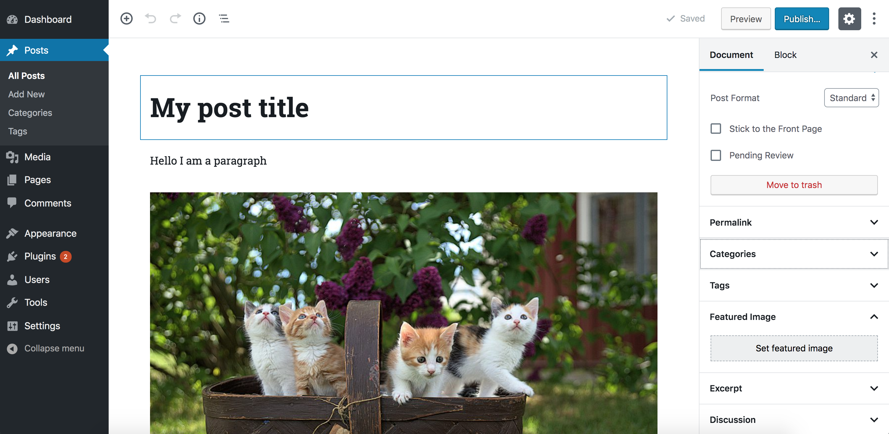
The block editor interface

Gutenberg is a React application

At its core, Gutenberg is a ReactJS application. Everything you see in the editor is rendered using a React component. The post title, the content area that contains the blocks, the toolbar at the top and the right sidebar are all React components. Data or application states in this React application are stored in centralized JavaScript objects, or „stores.” These stores are managed by WordPress’ data module. This module shares a lot of core principles with Redux. So, concepts like stores, reducers, actions, action creators, etc., also exist in this module. I will sometimes refer to these stores as „Redux-like” stores.

These stores do not only store any data about the current post, like the post content (the blocks), the post title, and the selected categories, but it also stores global information about a WordPress website, like all the categories, tags, posts, attachments and so on. In addition to that, UI state information like,”is the sidebar opened or closed?” are also stored in these global stores. One of the jobs of the „data module” is to retrieve data from these stores and also change data in the stores. Since these stores are global and can be used by multiple React components changing data in any store will be reflected in any Gutenberg UI part (including blocks) that uses this piece of data.

Once a post is saved, the WordPress REST API will be used to update the post using the data stored in these global stores. So the post title, the content, categories etc., that are stored in these global stores will be sent as payload in the WP REST API endpoint that updates the post. And thus if we are able to manipulate data in these stores, once the user clicks save, the data that we manipulated will be stored in the database by the API without us having to do anything.

One of the things that is not managed by these global stores in Gutenberg is metadata. If you have some metafields that you used to manage using a metabox in the pre-Gutenberg „classic” editor, those will not be stored and manipulated using the global Redux-like stores by default. However, we can opt-in to manage metadata using JavaScript and the Redux-like stores. Although those old PHP metaboxes will still appear in Gutenberg, WordPress recommends porting these PHP metaboxes to another approach that uses the global stores and React components. And this will ensure a more unified and consistent experience. You can read more about problems that could occur by using PHP metaboxes in Gutenberg.

So before we start, let’s take a look at the Redux-like stores in Gutenberg and how to use them.

Retrieving and changing data in Gutenberg’s Redux-like stores

We now know that the Gutenberg page is managed using these Redux-like stores. We have some default „core” stores that are defined by WordPress. Additionally, we can also define our own stores if we have some data that we would like to share between multiple blocks or even between blocks and other UI elements in the Gutenberg page, like the sidebar. Creating your own stores is also discussed in my course and you can read about it in the official docs. However, in this article we will focus on how to use the existing stores. Using the existing stores lets us manipulate metadata; therefore we will not need to create any custom stores.

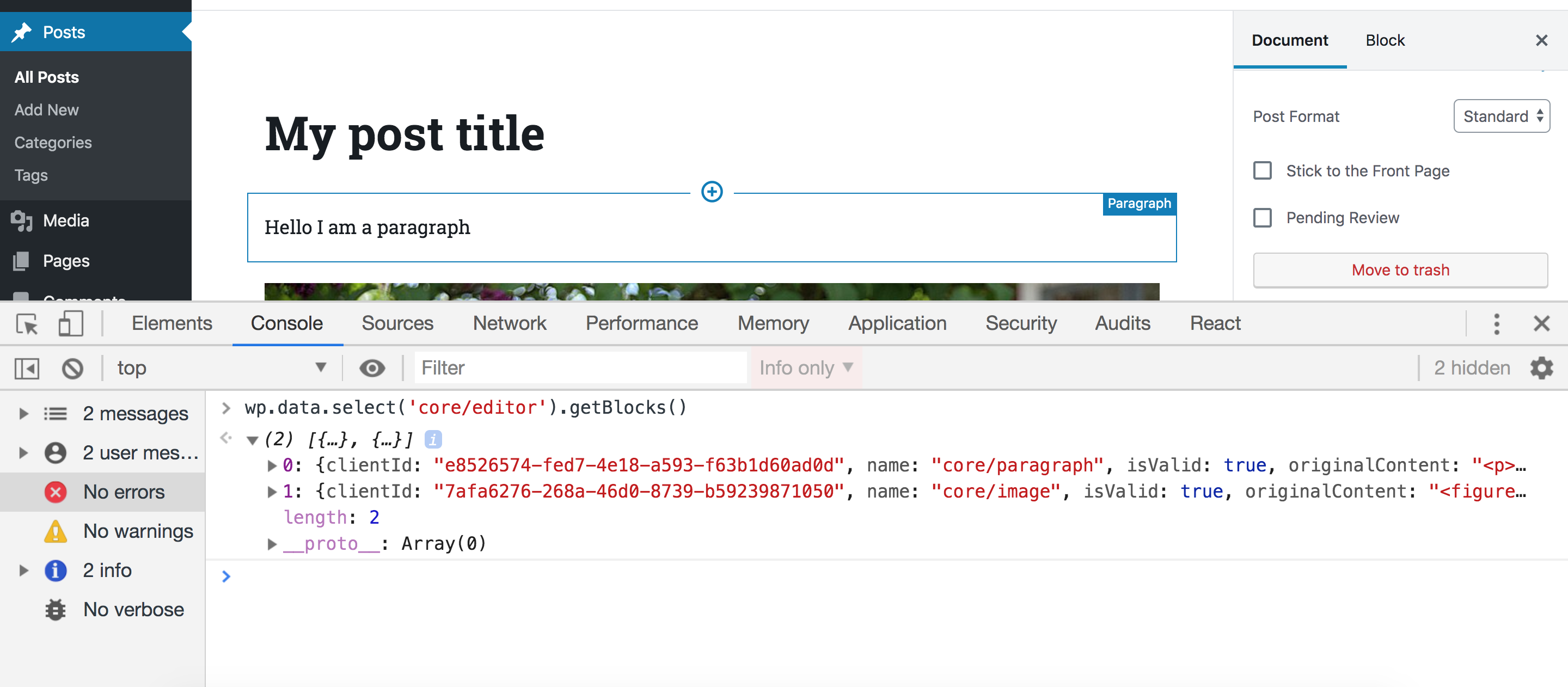
In order to access these stores, make sure you have the latest WordPress version with Gutenberg active and edit any post or page. Then, open your browser console an type the following statement:

wp.data.select('core/editor').getBlocks()

You should get something like this:

Let’s break this down. First, we access the wp.data module which (as we discussed) is responsible for managing the Redux-like stores. This module will be available inside the global wp variable if you have Gutenberg in your WordPress installation. Then, inside this module, we call a function called select. This function receives a store name as an argument and returns all the selectors for this store. A selector is a term used by the data module and it simply means a function that gets some data from the store. So, in our example, we accessed the core/editor store, and this will return a bunch of functions that can be used to get data from this store. One of these functions is getBlocks() which we called above. This function will return an array of objects where each object represents a block in your current post. So depending on how many blocks you have in your post, this array will change.

As we’ve seen, we accessed a store called core/editor. This store contains information about the current post that you are editing. We’ve also seen how to get the blocks in the current post but we can also get a lot of other stuff. We can get the title of the current post, the current post ID, the current post post type and pretty much everything else we might need.

But in the example above, we were only able to retrieve data. What if we want to change data? Let’s take a look at another selector in the ‘core/editor’ store. Let’s run this selector in our browser console:

wp.data.select('core/editor').getEditedPostAttribute('title')

This should return the title of the post currently being edited:

Great! Now what if we want to change the title using the data module? Instead of calling select(), we can call dispatch() which will also receive a store name and return some actions that you can dispatch. If you are familiar with Redux, terms like „actions” and „dispatch” will sound familiar to you. If this sounds new to you, all you need to know is that dispatching a certain action simply means changing some data in a store. In our case, we want to change the post title in the store, so we can call this function:

wp.data.dispatch('core/editor').editPost({title: 'My new title'})

Now take a look at the post title in the editor — it will be changed accordingly!
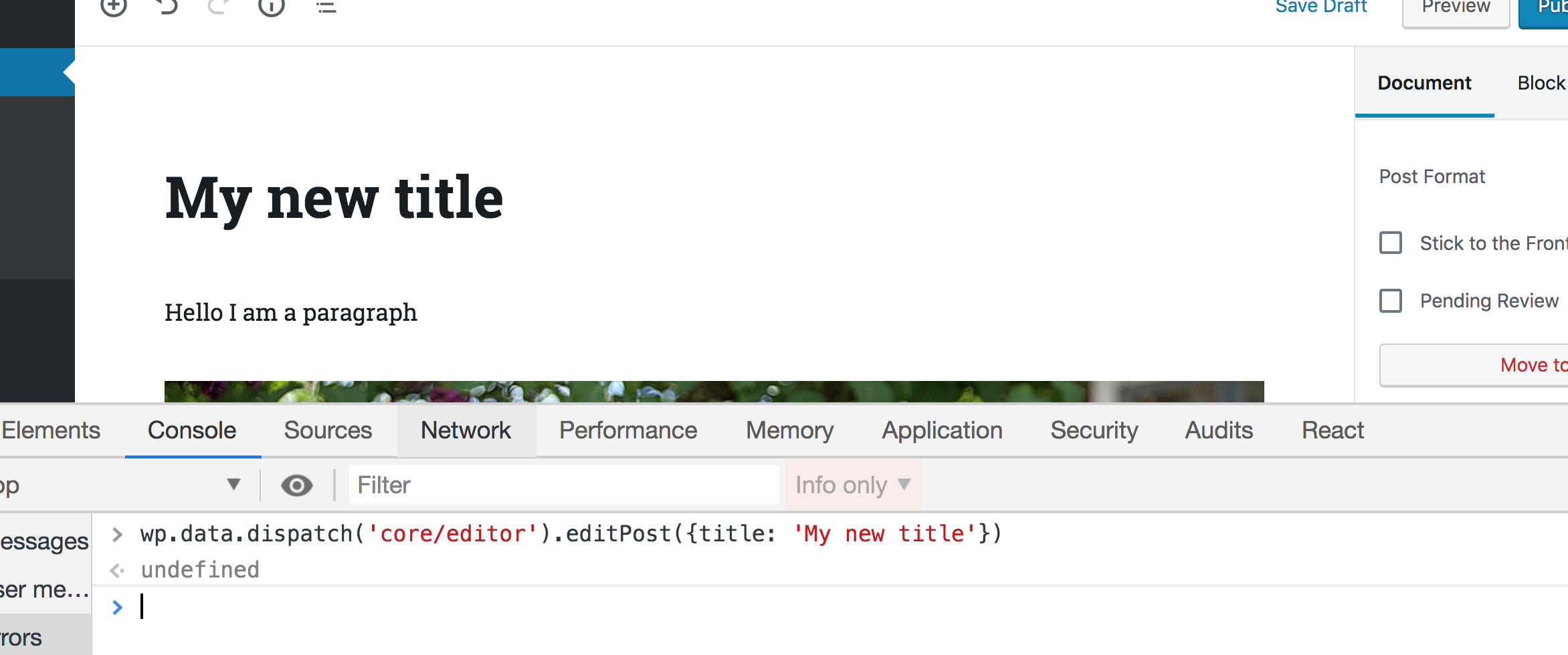
That’s how we can manipulate any piece of data in the Gutenberg interface. Wan retrieve the data using selectors and change that data using actions. Any change will be reflected in any part of the UI that uses this data.

There are, of course, other stores in Gutenberg that you can checkout on this page. So, let’s take a quick look at a couple of more stores before we move on.

The stores that you will use the most are the core/editor which we just looked at, and the core store. Unlike core/editor, the core store contains information, not only about the currently edited post, but also about the whole WordPress website in general. So, for instance, we can get all the authors on the website using:

wp.data.select('core').getAuthors()
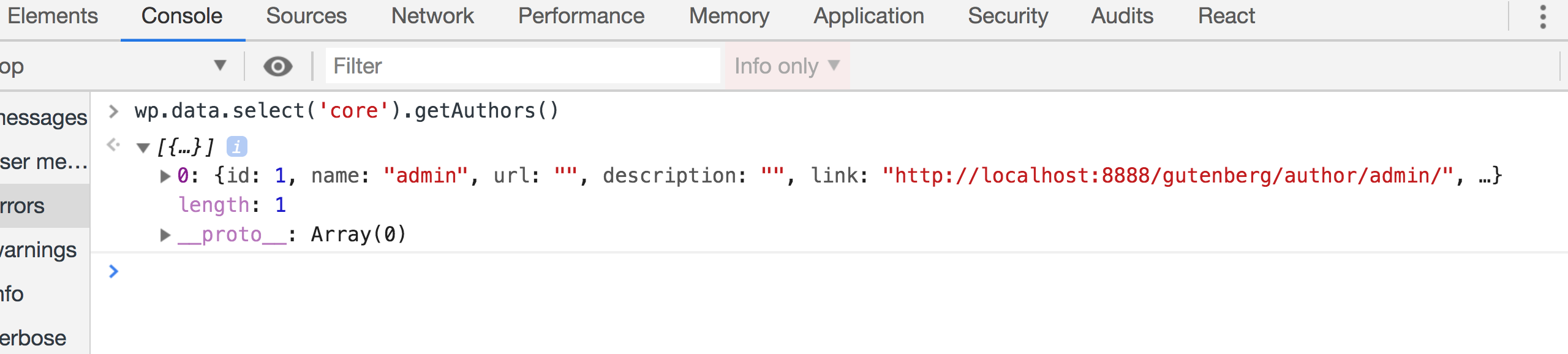
We can also get some posts from the website like so:

wp.data.select('core').getEntityRecords('postType','post',{per_page: 5})

Make sure to run this twice if the first result was null. Some selectors like this one will send an API call first to get your post. That means the the returned value will initially be null until the API request is fulfilled:
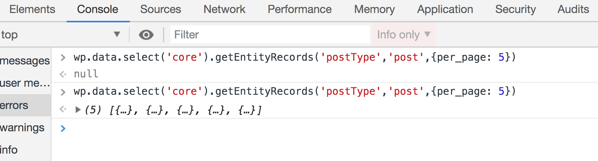
Let’s look at one more store: edit-post. This store is responsible for the UI information in the actual editor. For example, we can have selectors that check if the sidebar is currently open:

wp.data.select('core/edit-post').isEditorSidebarOpened()

This will return true if the sidebar is opened. But try closing the sidebar, run this function again, and it should return false.

We can also open and close the sidebar by dispatching actions in this store. Having the sidebar open and running this action in the browser console, the sidebar should be closed:

wp.data.dispatch('core/edit-post').closeGeneralSidebar()

You will unlikely need to use this store, but it’s good to know that this is what Gutenberg does when you click on the sidebar icon to close it.

There are some more stores that you might need to take a look at. The core/notices store, for instance, could be useful. This can help you display error, warning and success messages in the Gutenberg page. You can also check all the other stores here.

Try to play around with these stores in your browser until you feel comfortable using them. After that, we can see how to use them in real code outside the browser.

Let’s setup a WordPress plugin to add a Gutenberg sidebar

Now that we know how to use the Redux-like stores in Gutenberg, the next step is to add a React sidebar component in the editor. This React component will be connected to the core/editor store and it will have some input that, when changed, will dispatch some action that will manipulate metadata — like the way we manipulated the post title earlier. But to do that, we need to create a WordPress plugin that holds our code.

You can follow along by cloning or downloading the repository for this example on GitHub.

Let’s create a new folder inside wp-content/plugins directory of the WordPress installation. I am going to call it gutenberg-sidebar. Inside this folder, let’s create the entry point for our plugin. The entry point is the PHP file that will be run when activating your plugin. It can be called index.php or plugin.php. We’re going to use plugin.php for this example and put some information about the plugin at the top as well as add some code that avoids direct access:

<?php
/**
  * Plugin Name: gutenberg-sidebar
  * Plugin URI: https://alialaa.com/
  * Description: Sidebar for the block editor.
  * Author: Ali Alaa
  * Author URI: https://alialaa.com/
  */
if( ! defined( 'ABSPATH') ) {
    exit;
}

You should find your plugin on the Plugins screen in the WordPress admin. Click on „Activate” in order for the code to run.

As you might imagine, we will write a lot of JavaScript and React from this point, forward. And in order to code React components easily we will need to use JSX. And JSX is not valid JavaScript that can run in your browser, it needs to be converted into plain JavaScript. We might also need to use ESNext features and import statements for importing and exporting modules.

And these features will not work on all browsers, so it’s better to transform our code into old ES5 JavaScript. Thankfully, there are a lot of tools that can help us achieve that. A famous one is webpack. webpack, however, is a big topic in itself and it won’t fit the scope of this article. Therefore, we are going to use another tool that WordPress provides which is @wordpress/scripts. By installing this package, we will get a recommended webpack configuration without having to do anything in webpack ourselves. Personally, I recommend that you learn webpack and try to do the configuration yourself. This will help you understand what’s going on and give you more control. You can find a lot of resources online and it’s also discussed in my course. But for now, let’s install the WordPress webpack configuration tool.

Change to your plugin folder in Terminal:

cd path/to/your/theme/folder

Next, we need to initialize npm in that folder in order to install @wordpress/scripts. This can be done by running this command:

npm init

This command will ask you some questions like the package name, version, license, etc. You can keep hitting Enter and leave the default values. You should have a package.json file in your folder and we can start installing npm packages. Let’s install @wordpress/scripts by running the following command:

npm install @wordpress/scripts --save-dev

This package will expose a CLI called wp-scripts which you can use in your npm scripts. There are different commands that you can run. We will focus on the build and start commands for now. The <code>build script will transform your files so that they are minified and ready for production. Your source code’s entry point is configured in src/index.js and the transformed output will be at build/index.js. Similarly, the start script will transform your code in src/index.js to build/index.js, however, this time, the code will not be minified to save time and memory — the command will also watch for changes in your files and re-build your files every time something is changed. The start command is suitable to be used for development while the build command is for production. To use these commands, we will replace the scripts key in the package.json file which will look something like this if you used the default options when we initialized npm.

Change this:

"scripts": {
  "test": "echo "Error: no test specified" && exit 1"
},

…to this:

"scripts": {
  "start": "wp-scripts start",
  "build": "wp-scripts build"
},

Now we can run npm start and npm run build to start development or build files, respectively.

Let’s create a new folder in the plugin’s root called src and add an index.js file in it. We can see it things are working by sprinkling in a little JavaScript. We’ll try an alert.
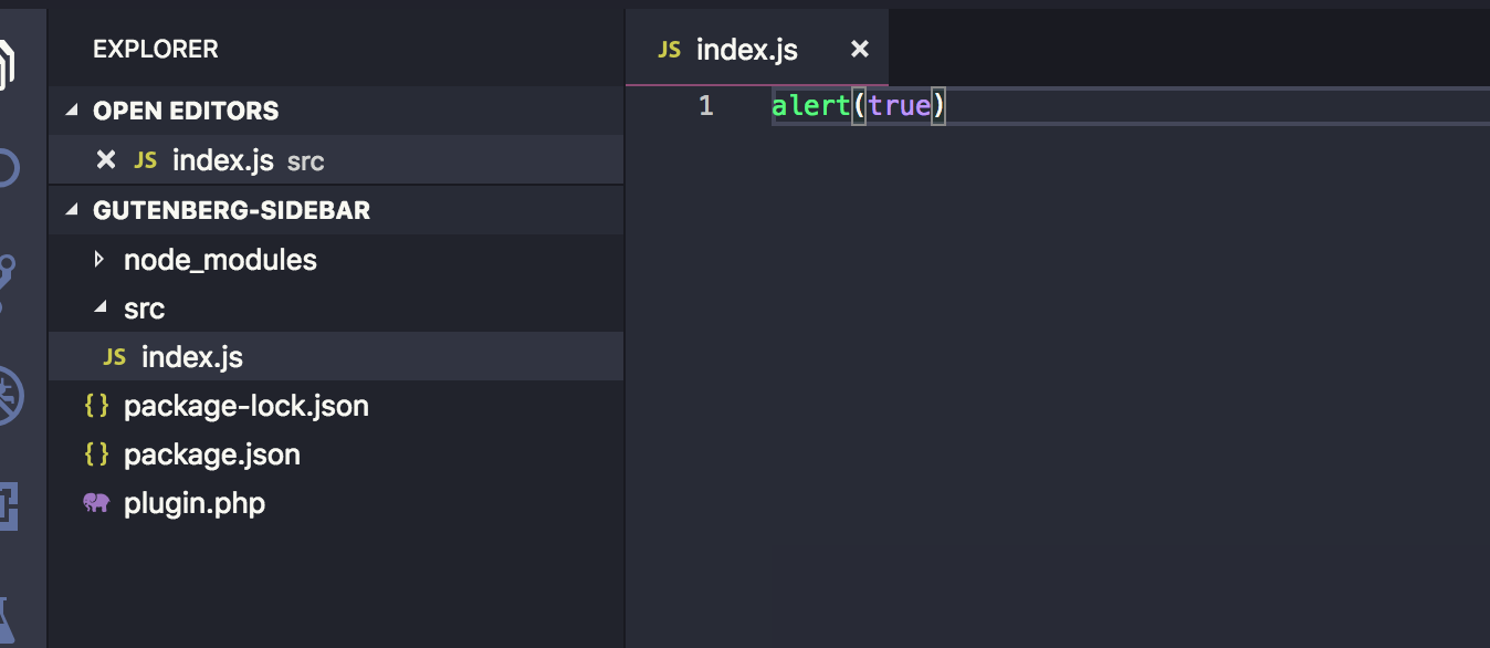
Now run npm start in Terminal. You should find the build folder created with the compiled index.js and also sourcemap files. In addition to that, you will notice that the build/index.js file is not minified and webpack will be watching for changes. Try changing the src/index.js file and save again. The build/index.js file will re-generated:
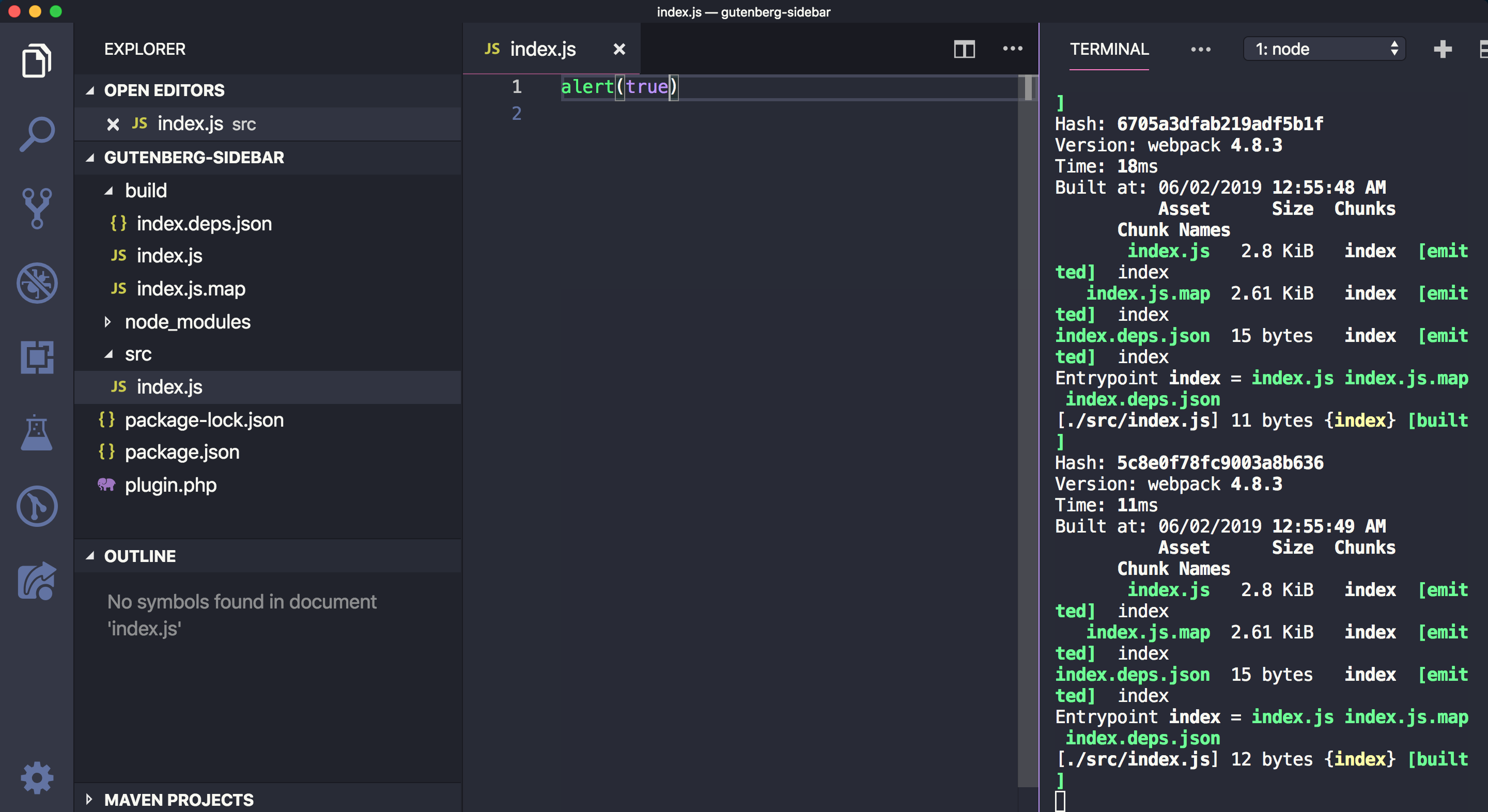
If you stop the watch (Ctrl + C ) in Terminal and run npm run build, the build/index.js file should now be minified.


Now that we have our JavaScript bundle, we need to enqueue this file in the Gutenberg editor. To do that we can use the hoo enqueue_block_editor_assets which will insure that the files are enqueued only in the Gutenberg page and not in other wp-admin pages where it isn’t needed.

We can enqueue our file like so in plugin.php:

// Note that it’s a best practice to prefix function names (e.g. myprefix)
function myprefix_enqueue_assets() {
  wp_enqueue_script(
    'myprefix-gutenberg-sidebar',
    plugins_url( 'build/index.js', __FILE__ )
  );
}
add_action( 'enqueue_block_editor_assets', 'myprefix_enqueue_assets' );

Visit the Gutenberg page. If all is well, you should get an alert, thanks to what we added to src/index.js earlier.
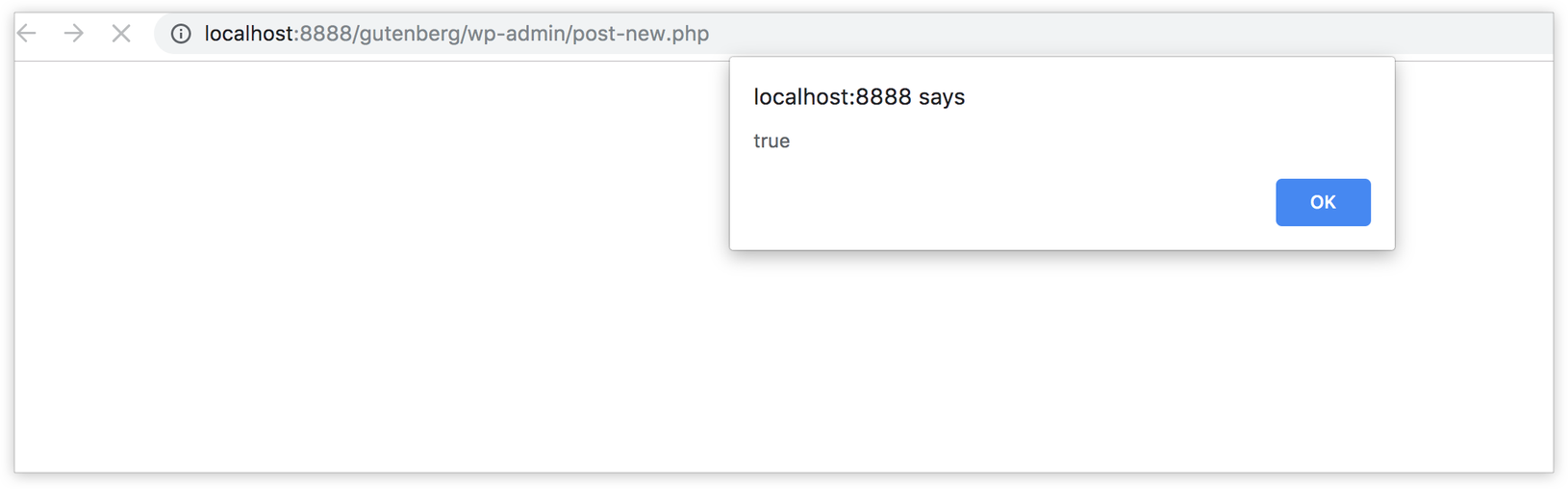
Fantastic! We’re ready to write some JavaScript code, so let’s get started!

Importing WordPress JavaScript packages

In order to add some content to the existing Gutenberg sidebar or create a new blank sidebar, we need to register a Gutenberg JavaScript plugin — and in order to do that, we need to use some functions and components from packages provided by WordPress: wp-plugins, wp-edit-post and wp-i18n. These packages will be available in the wp global variable in the browser as wp.plugins, wp.editPost and wp.i18n.

We can import the functions that we need into src/index.js. Specifically, those functions are: registerPlugin and PluginSidebar.

const { registerPlugin } = wp.plugins;
const { PluginSidebar } = wp.editPost;
const { __ } = wp.i18n;

It’s worth noting that we need to make sure that we have these files as dependencies when we enqueue our JavaScript file in order to make sure that our index.js file will be loaded after the wp-plugins, wp-edit-posts and wp-i18n packages. Let’s add those to plugin.php:

function myprefix_enqueue_assets() {
  wp_enqueue_script(
    'myprefix-gutenberg-sidebar',
    plugins_url( 'build/index.js', __FILE__ ),
    array( 'wp-plugins', 'wp-edit-post', 'wp-i18n', 'wp-element' )
  );
}
add_action( 'enqueue_block_editor_assets', 'myprefix_enqueue_assets' );

Notice that I added wp-element in there as a dependency. I did that because we will write some React components using JSX. Typically, we’d import the entire React library when making React components. However, wp-element is an abstraction layer atop React so we never have to install or import React directly. Instead, we use wp-element as a global variable.

These packages are also available as npm packages. Instead of importing functions from the global wp variable (which will only be available in the browser that your code editor knows nothing about), we can simply install these packages using npm and import them in our file. These WordPress packages are usually prefixed with @wordpress.

Let’s install the two packages that we need:

npm install @wordpress/edit-post @wordpress/plugins @wordpress/i18n --save

Now we can import our packages in index.js:

import { registerPlugin } from "@wordpress/plugins";
import { PluginSidebar } from "@wordpress/edit-post";
import { __ } from "@wordpress/i18n";

The advantage of importing the packages this way is that your text editor knows what @wordpress/edit-post and @wordpress/plugins are and it can autocomplete functions and components for you — unlike importing from wp.plugins and wp.editPost which will only be available in the browser while the text editor has no clue what wp is.
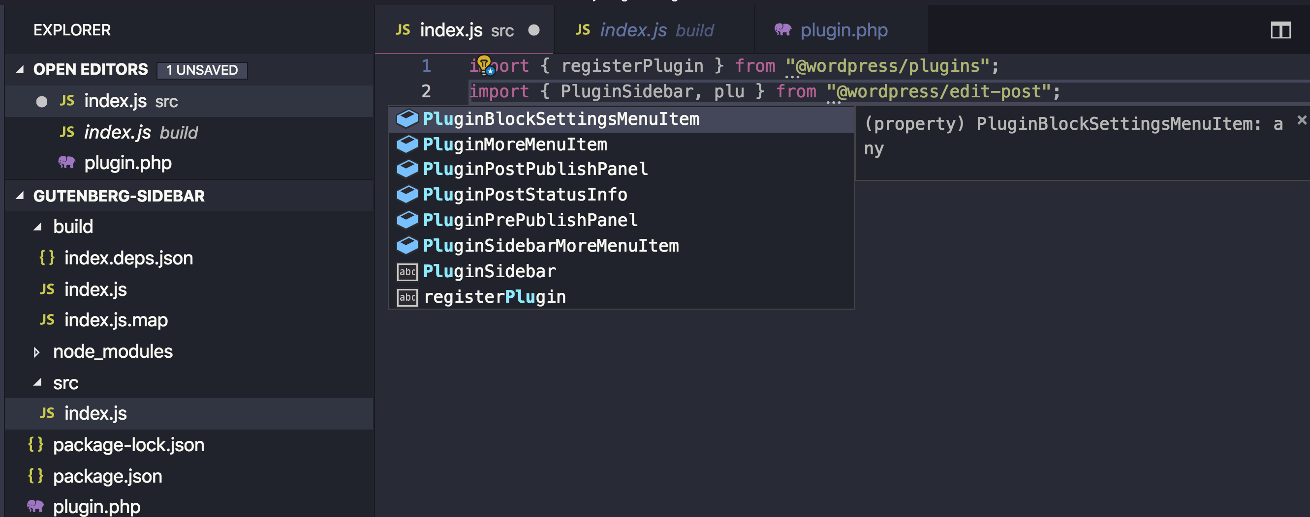
Your text editor can autocomplete component names for you.

You might also think that importing these packages in your bundle will increase your bundle size, but there’s no worries there. The webpack config file that comes with @wordpress/scripts is instructed to skip bundling these @wordpress packages and depend of the wp global variable instead. As a result, the final bundle will not actually contain the various packages, but reference them via the wp variable.
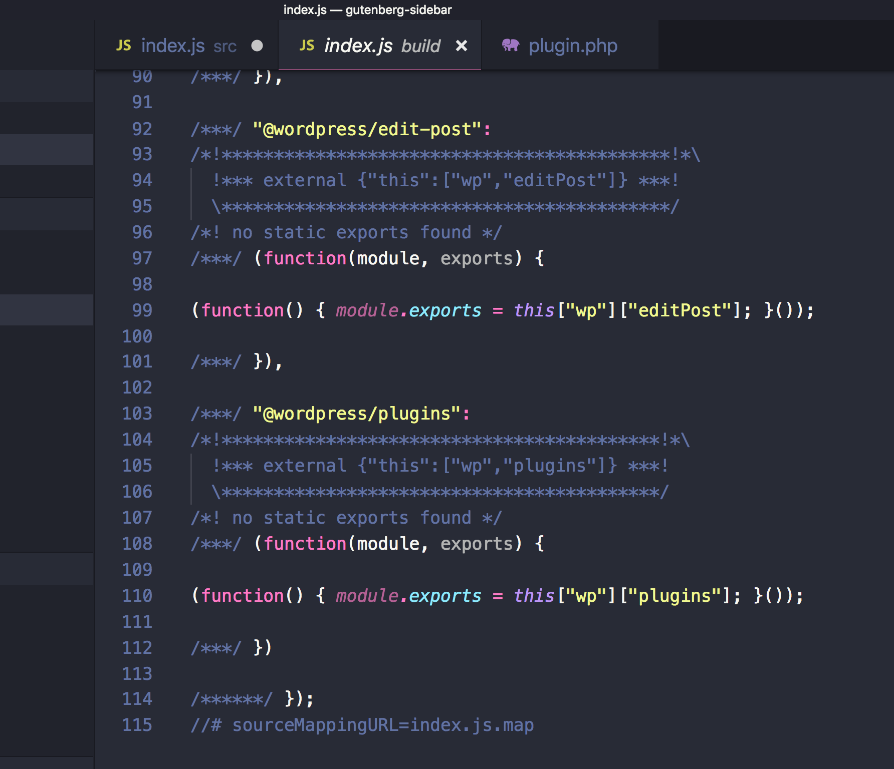
Great! so I am going to stick to importing packages using npm in this article, but you are totally welcome to import from the global wp variable if you prefer. Let’s now use the functions that we imported!

Registering a Gutenberg Plugin

In order to add a new custom sidebar in Gutenberg, we first need to register a plugin — and that’s what the registerPlugin function that we imported will do. As a first argument, registerPlugin will receive a unique slug for this plugin. We can have an array of options as a second argument. Among these options, we can have an icon name (from the dashicons library) and a render function. This render function can return some components from the wp-edit-post package. In our case. we imported the PluginSidebar component from wp-edit-post and created a sidebar in the Gutenberg editor by returning this component in the render function. I also added PluginSidebar inside a React fragment since we can add other components in the render function as well. Also, the __ function imported from wp-i18n will be used so we can translate any string that we output:

registerPlugin( 'myprefix-sidebar', {
  icon: 'smiley',
  render: () => {
    return (
      <>
        <PluginSidebar
          title={__('Meta Options', 'textdomain')}
        >
          Some Content
        </PluginSidebar>
      </>
    )
  }
})

You should now have a new icon beside the cog icon in the Gutenberg editor screen. This smiley icon will toggle our new sidebar which will have whatever content we have inside the PluginSidebar component:
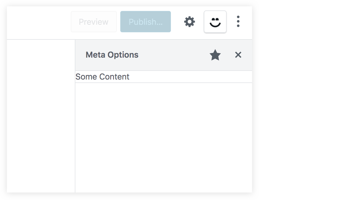
If you were to click on that star icon beside the sidebar title, the sidebar smiley icon will be removed from the top toolbar. Therefore, we need to add another way to access our sidebar in case the user un-stars it from the top toolbar, and to do that, we can import a new component from wp-edit-post called PluginSidebarMoreMenuItem. So, let’s modify out import statement:

import { PluginSidebar, PluginSidebarMoreMenuItem } from "@wordpress/edit-post";

The PluginSidebarMoreMenuItem will allow us to add an item in the Gutenberg menu that you can toggle using the three dots icon at the top-right of the page. We want to modify our plugin to include this component. We need to give PluginSidebar a name prop and give PluginSidebarMoreMenuItem a target prop with the same value:

registerPlugin( 'myprefix-sidebar', {
  icon: 'smiley',
  render: () => {
    return (
      <>
        <PluginSidebarMoreMenuItem
          target="myprefix-sidebar"
        >
          {__('Meta Options', 'textdomain')}
        </PluginSidebarMoreMenuItem>
        <PluginSidebar
          name="myprefix-sidebar"
          title={__('Meta Options', 'textdomain')}
        >
          Some Content
        </PluginSidebar>
      </>
    )
  }
})

In the menu now, we will have a „Meta Options” item with our smiley icon. This new item should toggle our custom sidebar since they are linked using the name and the target props:
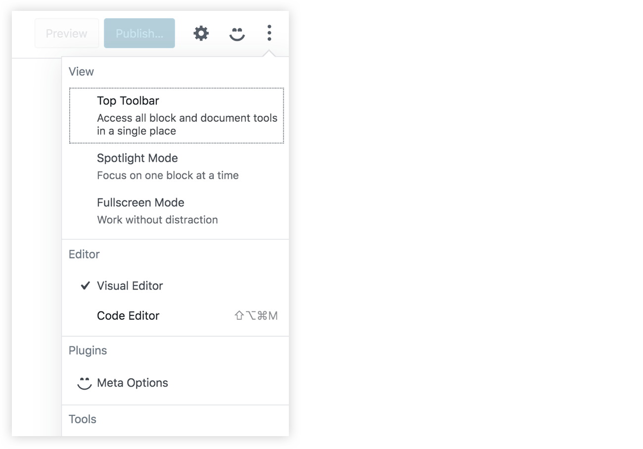
Great! Now we have a new space in our Gutenberg page. We can replace the „some content” text in PluginSidebar and add some React components of our own!

Also, let’s make sure to check the edit-post package documentation. This package contains a lot of other components that you can add in your plugin. These components can allow you to extend the existing default sidebar and add your own components in it. Also, we can find components that allow us to add items in the Gutenberg top-right menu and also for the blocks menu.

Handling metadata in the classic editor

Let’s take a quick look at how we used to manage metadata in the classic editor using metaboxes. First, install and activate the classic editor plugin in order to switch back to the classic editor. Then, add some code that will add a metabox in the editor page. This metabox will manage a custom field that we’ll call _myprefix_text_metafield. This metafield will just be a text field that accepts HTML markup. You can add this code in plugin.php or put it in a separate file and include it plugin.php:

<?php
function myprefix_add_meta_box() {
  add_meta_box( 
    'myprefix_post_options_metabox', 
    'Post Options', 
    'myprefix_post_options_metabox_html', 
    'post', 
    'normal', 
    'default'
  );
}
add_action( 'add_meta_boxes', 'myprefix_add_meta_box' );
function myprefix_post_options_metabox_html($post) {
  $field_value = get_post_meta($post->ID, '_myprefix_text_metafield', true);
  wp_nonce_field( 'myprefix_update_post_metabox', 'myprefix_update_post_nonce' );
  ?>
  <p>
    <label for="myprefix_text_metafield"><?php esc_html_e( 'Text Custom Field', 'textdomain' ); ?></label>
    <br />
    <input class="widefat" type="text" name="myprefix_text_metafield" id="myprefix_text_metafield" value="<?php echo esc_attr( $field_value ); ?>" />
  </p>
  <?php
}
function myprefix_save_post_metabox($post_id, $post) {
  $edit_cap = get_post_type_object( $post->post_type )->cap->edit_post;
  if( !current_user_can( $edit_cap, $post_id )) {
    return;
  }
  if( !isset( $_POST['myprefix_update_post_nonce']) || !wp_verify_nonce( $_POST['myprefix_update_post_nonce'], 'myprefix_update_post_metabox' )) {
    return;
  }
  if(array_key_exists('myprefix_text_metafield', $_POST)) {
    update_post_meta( 
      $post_id, 
      '_myprefix_text_metafield', 
      sanitize_text_field($_POST['myprefix_text_metafield'])
    );
  }
}
add_action( 'save_post', 'myprefix_save_post_metabox', 10, 2 );

I am not going to go into details in this code since this is out of the scope of the article, but what it’s essentially doing is:

  • Making a metabox using the add_meta_box function
  • Rendering an HTML input using the myprefix_post_options_metabox_html function
  • Controlling the metafield, called _myprefix_text_metafield
  • Using the save_post action hook to get the HTML input value and update the field using update_post_meta.

If you have the classic editor plugin installed, then you should see the metafield in the post editor:
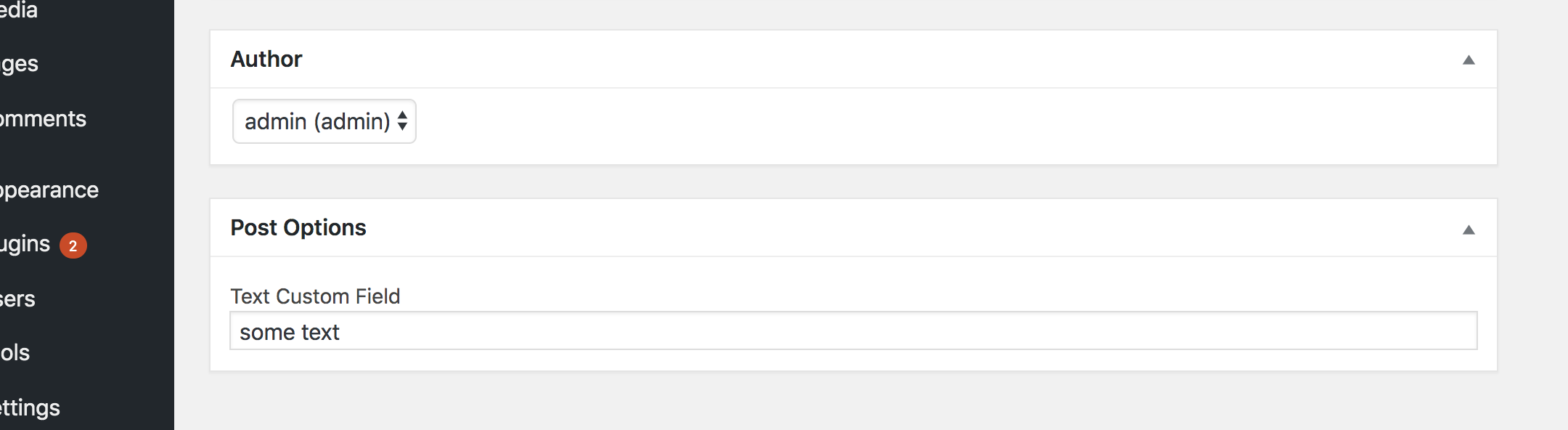
Note that the field is prefixed with an underscore (_myprefix_text_metafield) which prevents it from being edited using the custom fields metabox that comes standard in WordPress. We add this underscore because we intend to manage the field ourselves and because it allows us to hide it from the standard Custom Fields section of the editor.

Now that we have a way to manage the field in the classic editor, let’s go ahead and deactivate the classic editor plugin and switch back to Gutenberg. The metabox will still appear in Gutenberg. However, as we discussed earlier, WordPress recommends porting this PHP-based metabox using a JavaScript approach.
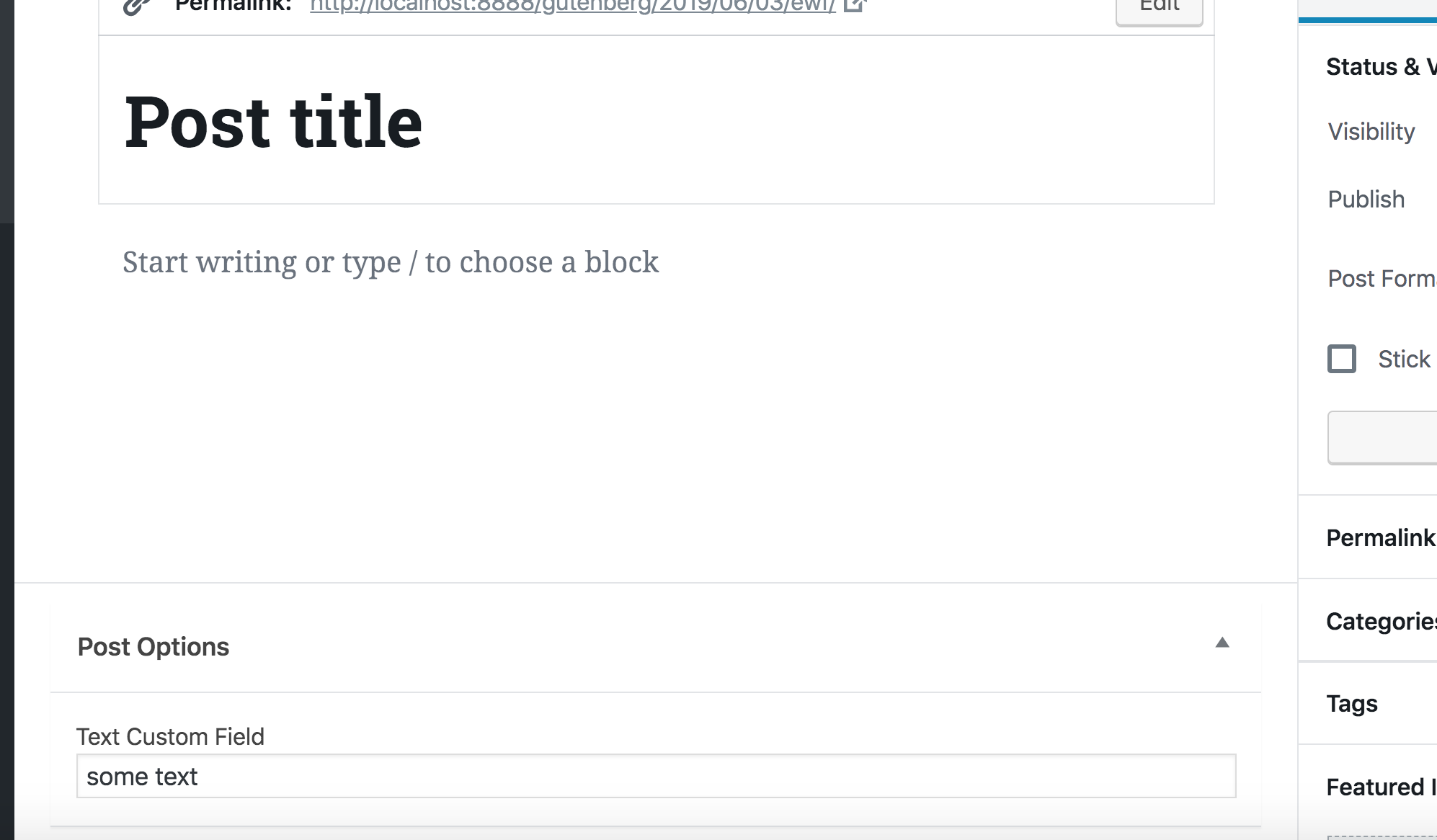
That’s what we will do in the rest of the article. Now that we know how to use the Redux-like stores to manipulate data and how to add some React content in the sidebar, we can finally create a React component that will manipulate our metafield and add it in the sidebar of the Gutenberg editor.

We don’t want to completely get rid of the PHP-based field because it’s still helpful in the event that we need to use the classic editor for some reason. So, we’re going to hide the field when Gutenberg is active and show it when the classic editor is active. We can do that by updating the myprefix_add_meta_box function to use the __back_compat_meta_box option:

function myprefix_add_meta_box() {
  add_meta_box( 
    'myprefix_post_options_metabox', 
    'Post Options', 
    'myprefix_post_options_metabox_html', 
    'post', 
    'normal', 
    'default',
    array('__back_compat_meta_box' => true)
  );
}

Let’s move on to creating the React component that manages the metadata.

Getting and setting metadata using JavaScript

We have seen how to get the post title and how to change it using the wp-data module. Let’s take a look at how to do the same for custom fields. To get metafields, we can call the save selector getEditedPostAttribute. But this time we will pass it a value of meta instead of title.

Once that’s done, test it out in the browser console:

wp.data.select('core/editor').getEditedPostAttribute('meta')

As you will see, this function will return an empty array, although we are sure that we have a custom field called _myprefix_text_metafield that we are managing using the classic editor. To make custom fields manageable using the data module, we first have to register the field in the plugin.php.

function myprefix_register_meta() {
  register_meta('post', '_myprefix_text_metafield', array(
    'show_in_rest' => true,
    'type' => 'string',
    'single' => true,
  ));
}
add_action('init', 'myprefix_register_meta');

Make sure to set the show_in_rest option to true. WordPress will fetch the fields using the WP REST API. That means, we need to enable the show_in_rest option to expose it.

Run the console test again and we will have an object with all of our custom fields returned.
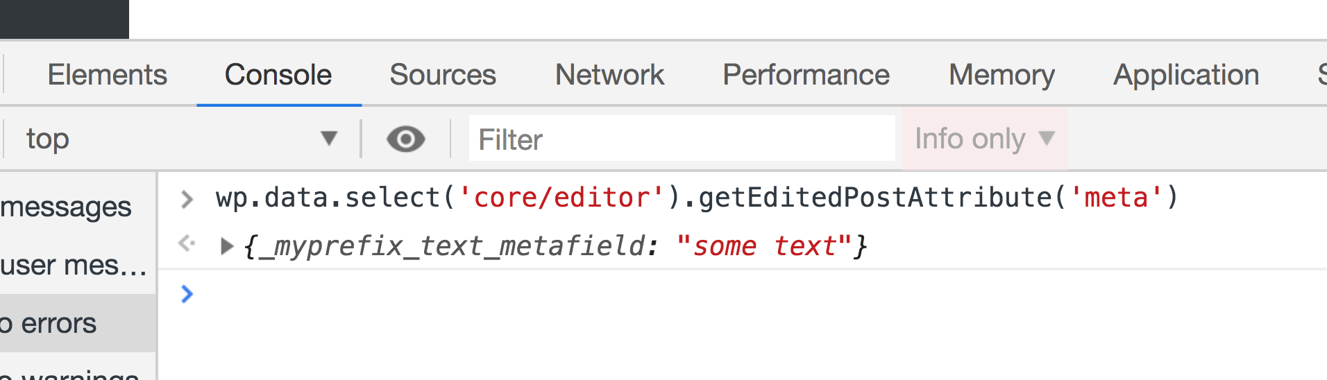
Amazing! We are able to get our custom field value, so now let’s take a look at how can we change the value in the store. We can dispatch the editPost action in the core/editor store and pass it an object with a meta key, which will be another object with the fields that we need to update:

wp.data.dispatch('core/editor').editPost({meta: {_myprefix_text_metafield: 'new value'}})

Now try running the getEditedPostAttribute selector again and the value should be updated to new value.
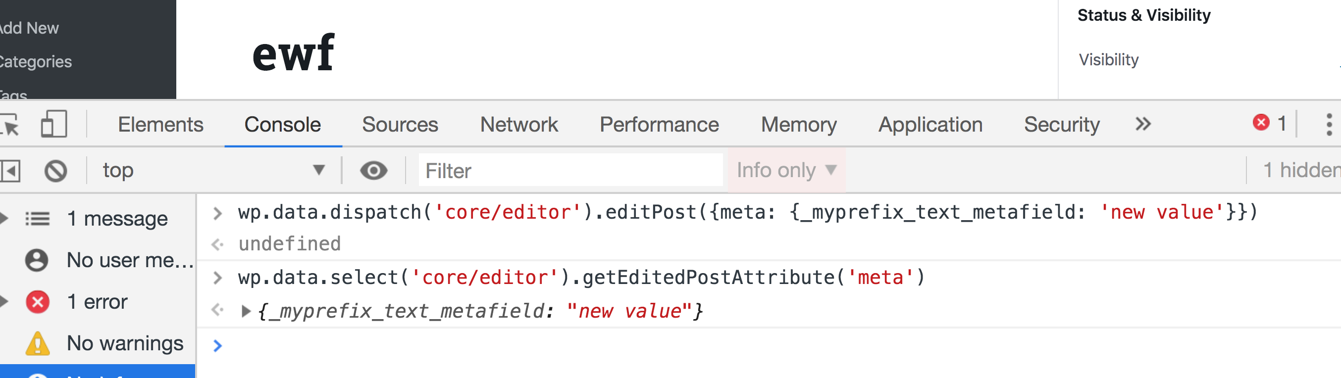
If you try saving a post after updating the field using Redux, you will get an error. And if you take a look at the Network tab in DevTools, you will find that the error is returned from the wp-json/wp/v2/posts/{id} REST endpoint that says that we are not allowed to update _myprefix_text_metafield.
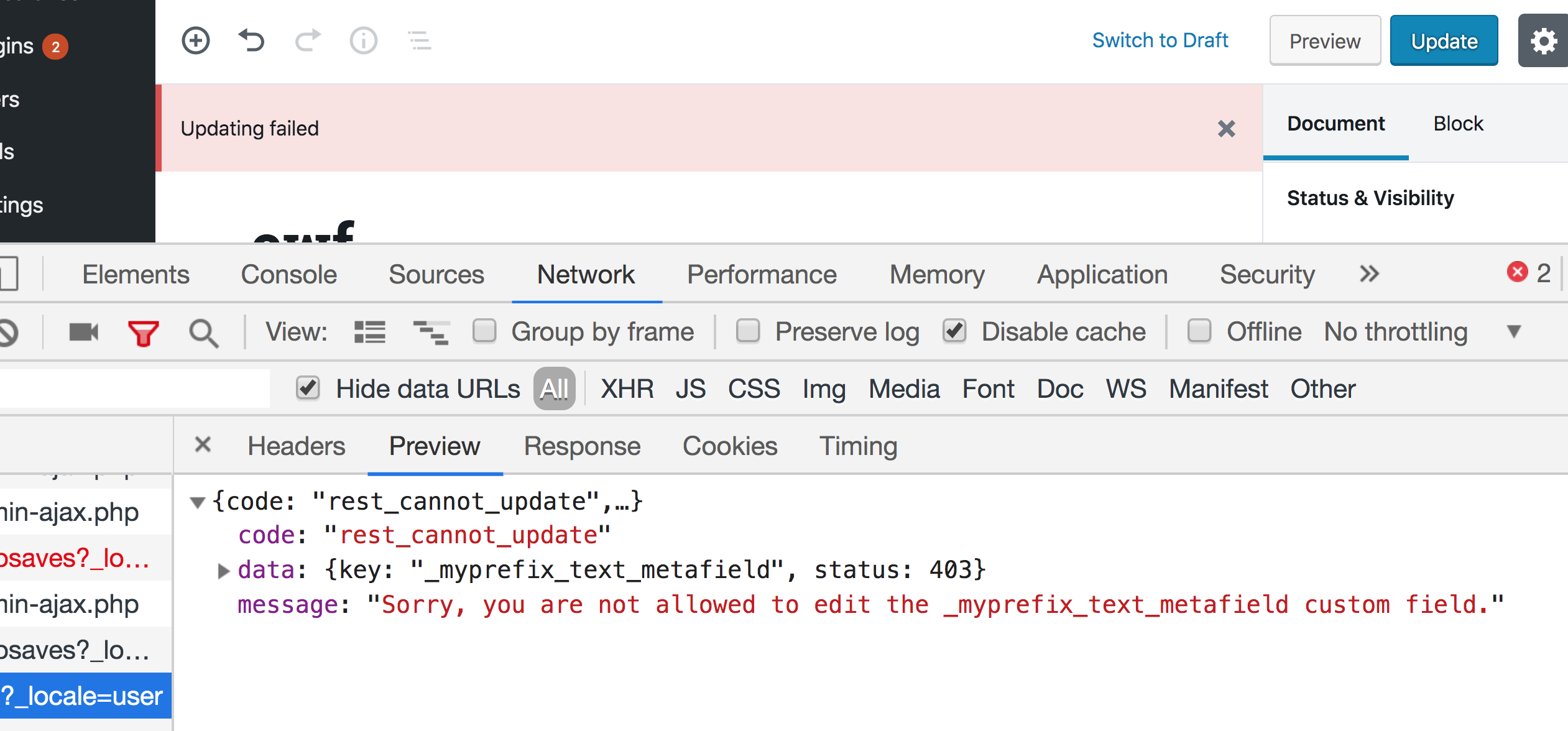
This because WordPress treats any field that is prefixed with an underscore as a private value that cannot be updated using the REST API. We can, however, specify an auth_callback option that will allow updating this field using the REST API when it returns true as long as the editor is capable of editing posts. We can also add the sanitize_text_field function to sanitize the value before saving to the database:

function myprefix_register_meta() {
  register_meta('post', '_myprefix_text_metafield', array(
    'show_in_rest' => true,
    'type' => 'string',
    'single' => true,
    'sanitize_callback' => 'sanitize_text_field',
    'auth_callback' => function() { 
      return current_user_can('edit_posts');
    }
  ));
}
add_action('init', 'myprefix_register_meta');

Now try the following:

  • Open a new post in WordPress.
  • Run this in the DevTools console see the current value of the field:
wp.data.select('core/editor').getEditedPostAttribute('meta')
  • Run this in DevTools to update the value:
wp.data.dispatch('core/editor').editPost({meta: {_myprefix_text_metafield: 'new value'}})
  • There will be errors, so save the post to clear them.
  • Refresh the page and run this in the DevTools console:
wp.data.select('core/editor').getEditedPostAttribute('meta')

Does the new value show up in the console? If so, great! Now we know how to get and set the meta field value using Redux and we are ready to create a react component in the sidebar to do that.

Creating a React component to manage the custom fields

What we need to do next is create a React component that contains a text field that is controlled by the value of the metafield in the Redux store. It should have the value of the meta field…and hey, we already know how to get that! We can create the component in a separate file and then import it index.js. However I am simply going to create directly in index.js since we’re dealing with a very small example.

Again, we’re only working with a single text field, so let’s import a component provided by a WordPress package called @wordpress/components. This package contains a lot of reusable components that are Gutenberg-ready without us having to write them from scratch. It’s a good idea to use components from this package in order to be consistent with the rest of the Gutenberg UI.

First, let’s install this package:

npm install --save @wordpress/components

We’ll import TextControl and PanelBody at the top of index.js to fetch the two components we need from the package:

import { PanelBody, TextControl } from "@wordpress/components";

Now let’s create our component. I am going to create a React functional component and call it PluginMetaFields, but you can use a class component if you’d prefer that.

let PluginMetaFields = (props) => {
  return (
    <>
      <PanelBody
        title={__("Meta Fields Panel", "textdomain")}
        icon="admin-post"
        intialOpen={ true }
      >
        <TextControl 
          value={wp.data.select('core/editor').getEditedPostAttribute('meta')['_myprefix_text_metafield']}
          label={__("Text Meta", "textdomain")}
        />
      </PanelBody>
    </>
  )
}

PanelBody takes title, icon and initialOpen props. Title and icon are pretty self-explanatory. initialOpen puts the panel in an open/expanded state by default. Inside the panel, we have TextControl. which receives a label and a value for the input. As you can see in the snippet above, we get the value from the global store by accessing the _myprefix_text_metafield field from the object returned by wp.data.select('core/editor').getEditedPostAttribute('meta').

Notice that we are now depending on @wordpress/components and use wp.data. We must add these packages as dependencies when we enqueue our file in plugin.php:

function myprefix_enqueue_assets() {
wp_enqueue_script(
    'myprefix-gutenberg-sidebar',
    plugins_url( 'build/index.js', __FILE__ ),
    array( 'wp-plugins', 'wp-edit-post', 'wp-element', 'wp-components', 'wp-data' )
  );
}
add_action( 'enqueue_block_editor_assets', 'myprefix_enqueue_assets' );

Let’s officially add the component to the sidebar instead of the dummy text we put in earlier as a quick example:

registerPlugin( 'myprefix-sidebar', {
  icon: 'smiley',
  render: () => {
    return (
      <>
        <PluginSidebarMoreMenuItem
          target="myprefix-sidebar"
        >
          {__('Meta Options', 'textdomain')}
        </PluginSidebarMoreMenuItem>
        <PluginSidebar
          name="myprefix-sidebar"
          title={__('Meta Options', 'textdomain')}
        >
          <PluginMetaFields />
        </PluginSidebar>
      </>
    )
  }
})

This should should give you a „Meta Options” panel that contains a „Meta Fields” title, a pin icon, and a text input with a „Test Meta” label and default value of „new value.”
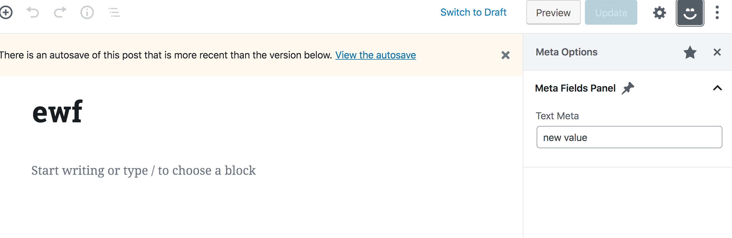
Nothing will happen when you type into the text input because we are not yet handling updating the field. We’ll do that next, however, we first need to take care of another problem. Try to run editPost in the DevTools console again, but with a new value:

wp.data.dispatch('core/editor').editPost({meta: {_myprefix_text_metafield: 'a newer value'}})

You will notice that the value in the text field will not update to the new value. That’s the problem. We need the field to be controlled by the value in the Redux store, but we don’t see that reflected in the component. What’s up with that?

If you have used Redux with React before, then you probably know that we need to use a higher order component called connect in order to use Redux store values in a React component. The same goes for React components in Gutenberg — we have to use some higher order component to connect our component with the Redux-like store. Unfortunately, we are unable to simply call wp.data.select directly as we did before. This higher order component lives in the wp.data global variable which is also available as an npm package called @wordpress.data. So let’s install it to help us solve the issue.

npm install --save @wordpress/data

The higher order component we need is called withSelect, so let’s import it in index.js.

import { withSelect } from "@wordpress/data";

Remember that we already added wp-data as a dependency in wp_enqueue_script, so we can just use it by wrapping our component with it, like so:

PluginMetaFields = withSelect(
  (select) => {
    return {
      text_metafield: select('core/editor').getEditedPostAttribute('meta')['_myprefix_text_metafield']
    }
  }
)(PluginMetaFields);

Here, we’re overriding our PluginMetaFields component and assigning it the same component, now wrapped with the withSelect higher order component. withSelect will receive a function as an argument. This function will receive the select function (which we used to access wp.data.select) and it should return an object. Each key in this object will be injected as a prop in the component (similar to connect in Redux). withSelect will return a function that we can pass it the component (PluginMetaFields) again as seen above. So, by having this higher order component, we now get text_metafield as a prop in the component, and whenever the meta value in the redux store is updated, the prop will also get updated — thus, the component will update since components update whenever a prop is changed.

let PluginMetaFields = (props) => {
  return (
    <>
      <PanelBody
        title={__("Meta Fields Panel", "textdomain")}
        icon="admin-post"
        intialOpen={ true }
      >
      <TextControl 
          value={props.text_metafield}
          label={__("Text Meta", "textdomain")}
        />
      </PanelBody>
    </>
  )
}

If you now try and run editPost with a new meta value in your browser, the value of the text field in the sidebar should also be updated accordingly!

So far, so good. Now we know how to connect our React components with our Redux-like stores. We are now left with updating the meta value in the store whenever we type in the text field.

Dispatching actions in React components

We now need to dispatch the editPost action whenever we type into the text field. Similar to wp.data.select, we also should not call wp.data.dispatch directly in our component like so:

// Do not do this
<TextControl 
    value={props.text_metafield}
    label={__("Text Meta", "textdomain")}
    onChange={(value) => wp.data.dispatch('core/editor').editPost({meta: {_myprefix_text_metafield: value}})
    }
/>

We will instead wrap our component with another higher order component from the @wordpress.data package called withDispatch. We’ve gotta import that, again, in plugin.js:

import { withSelect, withDispatch } from "@wordpress/data";

In order to use it, we can wrap our component — which is already wrapped with withSelect and again with withDispatch — like so:

PluginMetaFields = withDispatch(
  (dispatch) => {
    return {
      onMetaFieldChange: (value) => {
        dispatch('core/editor').editPost({meta: {_myprefix_text_metafield: value}})
      }
    }
  }
)(PluginMetaFields);

You can check out yet another WordPress package called @wordpress/compose. It makes using multiple high order components a bit cleaner for use in a single component. But I will leave that to you to try out for the sake of keeping our example simple.

withDispatch is similar to withSelect in that it will receive a function that has the dispatch function as an argument. That allows us to return an object from this function that contains functions that will be available inside the component’s props. I went about this by creating a function with an arbitrary name (onMetaFieldChange) that will receive a value, dispatch the editPost action, and set the meta value in the Redux store to the value received in the function’s argument. We can call this function in the component and pass it the value of the text field inside the onChange callback:

<TextControl 
  value={props.text_metafield}
  label={__("Text Meta", "textdomain")}
  onChange={(value) => props.onMetaFieldChange(value)}
/>

Confirm everything is working fine by opening the custom sidebar in the WordPress post editor, updating the field, saving the post and then refreshing the page to make sure the value is saved in the database!

Let’s add a color picker

It should be clear now that can we update a meta field using JavaScript, but we’ve only looked at simple text field so far. The @wordpress/components library provides a lot of very useful components, including dropdowns, checkboxes, radio buttons, and so on. Let’s level up and conclude this tutorial by taking a look at how we can use the color picker component that’s included in the library.

You probably know what to do. First, we, import this component in index.js:

import { PanelBody, TextControl, ColorPicker } from "@wordpress/components";

Now, instead of registering a new custom field, let’s aim for simplicity and assume that this color picker will be controlled by the same _myprefix_text_metafield field we worked with earlier. We can use the ColorPicker component inside our PanelBody and it will be very similar to what we saw with TextControl, but the prop names will be slightly different. We have a color prop instead of value and onChangeComplete instead on onChange. Also, onChangeComplete will receive a color object that contains some information about the chosen color. This object will have a hex property we can use to store the color value in the _myprefix_text_metafield field.

Catch all that? It boils down to this:

<ColorPicker
  color={props.text_metafield}
  label={__("Colour Meta", "textdomain")}
  onChangeComplete={(color) => props.onMetaFieldChange(color.hex)}
/>

We should now have a color picker in our sidebar, and since it’s controlling the same meta field as the TextControl component, our old text field should update whenever we pick a new color.
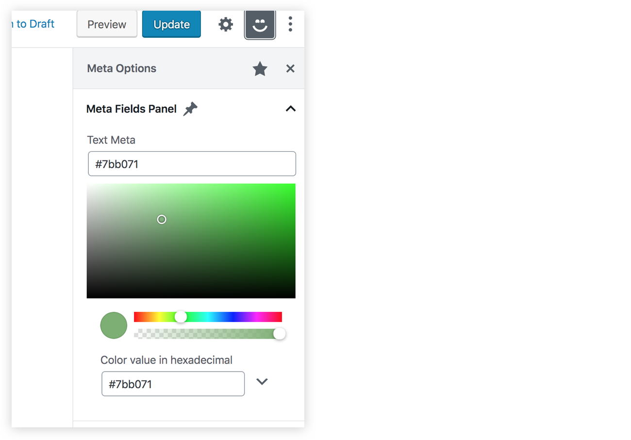
That’s a wrap!

If you have reached this far in the article, then congratulations! I hope you enjoyed it. Make sure to check out my course if you want to learn more about Gutenberg and custom blocks. You can also find the final code for this article over at GitHub.

The post Managing WordPress Metadata in Gutenberg Using a Sidebar Plugin appeared first on CSS-Tricks.
Reduced Motion Picture Technique, Take Two

Post pobrano z: Reduced Motion Picture Technique, Take Two

Did you see that neat technique for using the <picture> element with <source media=""> to serve an animated image (or not) based on a prefers-reduced-motion media query?

After we shared that in our newsletter, we got an interesting reply from Michael Gale:

What about folks who love their animated GIFs, but just didn’t want the UI to be zooming all over the place? Are they now forced to make a choice between content and UI?

I thought that was a pretty interesting question.

Also, whenever I see <img src="gif.gif"> these days, my brain is triggered into WELL WHAT ABOUT MP4?! territory, as I’ve been properly convinced that videos are better-in-all-ways on the web than GIFs. Turns out, some browsers support videos right within the <img> element and, believe it or not, you can write fallbacks for that, with — drumroll, please — for the <picture> element as well!

Let’s take a crack at combining all this stuff.

Adding an MP4 source

The easy one is adding an additional <source> with the video. That means we’ll need three source media files:

  1. A fallback non-animated graphic when prefers-reduced-motion is reduce.
  2. An animated GIF as the default.
  3. An MP4 video to replace the GIF, if the fallback is supported.

For example:

<picture>
  <source srcset="static.png" media="(prefers-reduced-motion: reduce)"></source>
  <source srcset="animated.mp4" type="video/mp4">
  <img srcset="animated.gif" alt="animated image" />
</picture>

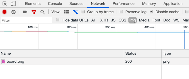
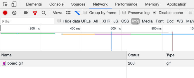
Under default conditions in Chrome, only the GIF is downloaded and shown:

Chrome DevTools showing only gif downloaded

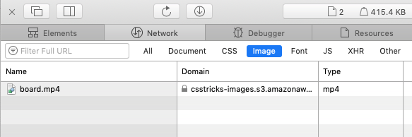
Under default conditions in Safari, only the MP4 is downloaded and shown:

Safari DevTools showing only mp4 downloaded

If you’ve activated prefers-reduced-motion: reduce in either Chrome or Safari (on my Mac, I go to System PreferencesAccessibilityDisplayReduce Motion), both browsers only download the static PNG file.

Chrome DevTools showing png downloaded

I tested Firefox and it doesn’t seem to work, instead continuing to download the GIF version. Firefox seems to support prefers-reduced-motion, but perhaps it’s just not supported on <source> elements yet? I’m not sure what’s up there.

Wouldn’t it be kinda cool to provide a single animated source and have a tool generate the others from it? I bet you could wire that up with something like Cloudinary.

Adding a toggle to show the animated version

Like Michael Gale mentioned, it seems a pity that you’re entirely locked out from seeing the animated version just because you’ve flipped on a reduced motion toggle.

It should be easy enough to have a <button> that would use JavaScript to yank out the media query and force the browser to show the animated version.

I’m fairly sure there is no practical way to do this declaratively in HTML. We also can’t put this button within the <picture> tag. Even though <picture> isn’t a replaced element, the browser still gets confused and doesn’t like it. Instead, it doesn’t render it at all. No big deal, we can use a wrapper.

<div class="picture-wrap">
  
  <picture>
     <!-- sources  -->
  </picture>

  <button class="animate-button">Animate</button>

</div>

We can position the button on top of the image somewhere. This is just an arbitrary choice — you could put it wherever you want, or even have the entire image be tappable as long as you think you could explain that to users. Remember to only show the button when the same media query matches:

.picture-wrap .animate-button {
  display: none;
}

@media (prefers-reduced-motion: reduce) {
  .picture-wrap .animate-button {
     display: block;
  }
}

When the button is clicked (or tapped), we need to remove the media query to start the animation by downloading an animated source.

let button = document.querySelector(".animate-button");

button.addEventListener("click", () => {
  const parent = button.closest(".picture-wrap");
  const picture = parent.querySelector("picture");
  picture.querySelector("source[media]").remove();
});

Here’s that in action:

See the Pen
Prefers Reduction Motion Technique PLUS!
by Chris Coyier (@chriscoyier)
on CodePen.

Maybe this is a good component?

We could automatically include the button, the button styling, and the button functionality with a web component. Hey, why not?

See the Pen
Prefers Reduction Motion Technique as Web Component
by Chris Coyier (@chriscoyier)
on CodePen.

The post Reduced Motion Picture Technique, Take Two appeared first on CSS-Tricks.

Reduced Motion Picture Technique, Take Two

Post pobrano z: Reduced Motion Picture Technique, Take Two

Did you see that neat technique for using the <picture> element with <source media=""> to serve an animated image (or not) based on a prefers-reduced-motion media query?

After we shared that in our newsletter, we got an interesting reply from Michael Gale:

What about folks who love their animated GIFs, but just didn’t want the UI to be zooming all over the place? Are they now forced to make a choice between content and UI?

I thought that was a pretty interesting question.

Also, whenever I see <img src="gif.gif"> these days, my brain is triggered into WELL WHAT ABOUT MP4?! territory, as I’ve been properly convinced that videos are better-in-all-ways on the web than GIFs. Turns out, some browsers support videos right within the <img> element and, believe it or not, you can write fallbacks for that, with — drumroll, please — for the <picture> element as well!

Let’s take a crack at combining all this stuff.

Adding an MP4 source

The easy one is adding an additional <source> with the video. That means we’ll need three source media files:

  1. A fallback non-animated graphic when prefers-reduced-motion is reduce.
  2. An animated GIF as the default.
  3. An MP4 video to replace the GIF, if the fallback is supported.

For example:

<picture>
  <source srcset="static.png" media="(prefers-reduced-motion: reduce)"></source>
  <source srcset="animated.mp4" type="video/mp4">
  <img srcset="animated.gif" alt="animated image" />
</picture>

Under default conditions in Chrome, only the GIF is downloaded and shown:

Chrome DevTools showing only gif downloaded

Under default conditions in Safari, only the MP4 is downloaded and shown:

Safari DevTools showing only mp4 downloaded

If you’ve activated prefers-reduced-motion: reduce in either Chrome or Safari (on my Mac, I go to System PreferencesAccessibilityDisplayReduce Motion), both browsers only download the static PNG file.

Chrome DevTools showing png downloaded

I tested Firefox and it doesn’t seem to work, instead continuing to download the GIF version. Firefox seems to support prefers-reduced-motion, but perhaps it’s just not supported on <source> elements yet? I’m not sure what’s up there.

Wouldn’t it be kinda cool to provide a single animated source and have a tool generate the others from it? I bet you could wire that up with something like Cloudinary.

Adding a toggle to show the animated version

Like Michael Gale mentioned, it seems a pity that you’re entirely locked out from seeing the animated version just because you’ve flipped on a reduced motion toggle.

It should be easy enough to have a <button> that would use JavaScript to yank out the media query and force the browser to show the animated version.

I’m fairly sure there is no practical way to do this declaratively in HTML. We also can’t put this button within the <picture> tag. Even though <picture> isn’t a replaced element, the browser still gets confused and doesn’t like it. Instead, it doesn’t render it at all. No big deal, we can use a wrapper.

<div class="picture-wrap">
  
  <picture>
     <!-- sources  -->
  </picture>

  <button class="animate-button">Animate</button>

</div>

We can position the button on top of the image somewhere. This is just an arbitrary choice — you could put it wherever you want, or even have the entire image be tappable as long as you think you could explain that to users. Remember to only show the button when the same media query matches:

.picture-wrap .animate-button {
  display: none;
}

@media (prefers-reduced-motion: reduce) {
  .picture-wrap .animate-button {
     display: block;
  }
}

When the button is clicked (or tapped), we need to remove the media query to start the animation by downloading an animated source.

let button = document.querySelector(".animate-button");

button.addEventListener("click", () => {
  const parent = button.closest(".picture-wrap");
  const picture = parent.querySelector("picture");
  picture.querySelector("source[media]").remove();
});

Here’s that in action:

See the Pen
Prefers Reduction Motion Technique PLUS!
by Chris Coyier (@chriscoyier)
on CodePen.

Maybe this is a good component?

We could automatically include the button, the button styling, and the button functionality with a web component. Hey, why not?

See the Pen
Prefers Reduction Motion Technique as Web Component
by Chris Coyier (@chriscoyier)
on CodePen.

The post Reduced Motion Picture Technique, Take Two appeared first on CSS-Tricks.

Weekly Platform News: Mozilla’s AV1 Encoder, Samsung One UI CSS, DOM Matches Method

Post pobrano z: Weekly Platform News: Mozilla’s AV1 Encoder, Samsung One UI CSS, DOM Matches Method

Šime posts regular content for web developers on webplatform.news.

In this week’s weekly roundup, Vimeo and Mozilla partner up on a video encoding format, how to bind instructions to to form fields using aria labels, the DOM has a matching function, and Samsung is working on its own CSS library.


Vimeo partners with Mozilla to use their rav1e encoder

Vittorio Giovara: AV1 is a royalty-free video codec designed by the Alliance for Open Media and the the most anticipated successor of H.264. Vimeo is contributing to the development of Mozilla’s AV1 encoder.

In order for AV1 to succeed, there is a need of an encoder like x264, a free and open source encoder, written by the community, for the community, and available to everyone: rav1e. Vimeo believes in what Mozilla is doing.

Use aria-describedby to bind instructions to form fields

Raghavendra Satish Peri: If you provide additional instructions for a form field, use the aria-describedby attribute to bind the instruction to the field. Otherwise, assistive technology users who use the Tab key might miss this information.

<label for="dob">Date of Birth</label>
<input type="text" aria-describedby="dob1" id="dob" />
<span id="dob1">Use DD/MM/YY</span>

Samsung Internet announces One UI CSS

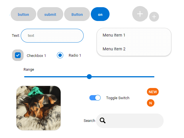
Diego González: Samsung is experimentally developing a CSS library based on its new One UI design language. The library is called One UI CSS and includes styles for common form controls such as buttons, menus, and sliders, as well as other assets (web fonts, SVG icons, polyfills).

Some of the controls present in One UI CSS.

DOM elements have a matches method

Sam Thorogood: You can use the matches method to test if a DOM element has a specific CSS class, attribute or ID value. This method accepts a CSS selector and returns true if the element matches the given selector.

el.classList.has('foo')  /* becomes */ el.matches('.foo');
el.hasAttribute('hello') /* becomes */ el.matches('[hello]');
el.id === 'bar'          /* becomes */ el.matches('#bar');

The post Weekly Platform News: Mozilla’s AV1 Encoder, Samsung One UI CSS, DOM Matches Method appeared first on CSS-Tricks.

Weekly Platform News: Mozilla’s AV1 Encoder, Samsung One UI CSS, DOM Matches Method

Post pobrano z: Weekly Platform News: Mozilla’s AV1 Encoder, Samsung One UI CSS, DOM Matches Method

Šime posts regular content for web developers on webplatform.news.

In this week’s weekly roundup, Vimeo and Mozilla partner up on a video encoding format, how to bind instructions to to form fields using aria labels, the DOM has a matching function, and Samsung is working on its own CSS library.


Vimeo partners with Mozilla to use their rav1e encoder

Vittorio Giovara: AV1 is a royalty-free video codec designed by the Alliance for Open Media and the the most anticipated successor of H.264. Vimeo is contributing to the development of Mozilla’s AV1 encoder.

In order for AV1 to succeed, there is a need of an encoder like x264, a free and open source encoder, written by the community, for the community, and available to everyone: rav1e. Vimeo believes in what Mozilla is doing.

Use aria-describedby to bind instructions to form fields

Raghavendra Satish Peri: If you provide additional instructions for a form field, use the aria-describedby attribute to bind the instruction to the field. Otherwise, assistive technology users who use the Tab key might miss this information.

<label for="dob">Date of Birth</label>
<input type="text" aria-describedby="dob1" id="dob" />
<span id="dob1">Use DD/MM/YY</span>

Samsung Internet announces One UI CSS

Diego González: Samsung is experimentally developing a CSS library based on its new One UI design language. The library is called One UI CSS and includes styles for common form controls such as buttons, menus, and sliders, as well as other assets (web fonts, SVG icons, polyfills).

Some of the controls present in One UI CSS.

DOM elements have a matches method

Sam Thorogood: You can use the matches method to test if a DOM element has a specific CSS class, attribute or ID value. This method accepts a CSS selector and returns true if the element matches the given selector.

el.classList.has('foo')  /* becomes */ el.matches('.foo');
el.hasAttribute('hello') /* becomes */ el.matches('[hello]');
el.id === 'bar'          /* becomes */ el.matches('#bar');

The post Weekly Platform News: Mozilla’s AV1 Encoder, Samsung One UI CSS, DOM Matches Method appeared first on CSS-Tricks.

10 Essential Tips in Creating Print Design

Post pobrano z: 10 Essential Tips in Creating Print Design

Final product image
What You’ll Be Creating

Have you been wondering how you can take your print design materials to the next level? In this article, we give you ten great tips to take your design to print. 

What Is Print Design?

Print design is a branch of the graphic design industry focusing on printed materials. That includes magazines, book covers, packaging, business cards, flyers, brochures, and anything that ends in a tangible printed product.  

Before starting a project, make sure you have all the necessary information you need. Will you be working from a template or are you creating the design from zero? Are there brand guidelines you need to follow? Are the images provided optimal for printing? Are there any color limits? Double and triple-check the page size and ask what the final deliverables will be.

There are several basic key aspects to keep in mind when designing for print. Creating a file for printing has its own specific settings that, if not done properly, can have terrible consequences and result in wasted time and money. The basics are making sure that all print files have a CMYK format and are set at 300 DPI. Just as important is using appropriate bleeds and margins to ensure perfect printing. 

Having a good relationship with your professional printer is a bonus—they are knowledgeable especially when it comes to packaging and custom sizes. Keep in communication with them as they can help you out when you can’t find an answer to your problem. As you send files to press, you can ask printers for proofs. These are great to make sure the design, color, and format are what you need. Proofs give you one last chance to change anything that might look off and to check the spelling. If you are working with heavy copy, have a second set of eyes or, even better, a copy editor to proofread the project. 

Print design covers a wide range of printed pieces. If you are new to InDesign, this article covers some great tips you can follow to create some awesome projects. If you are just getting started with InDesign and can’t quite figure it out yet, don’t stress! We’ve got amazing InDesign brochure templates and InDesign flyer templates over at Envato Elements and GraphicRiver. Go check them out! 

1. Apply Grid Systems

Grid systems are one of the elements in design that go unnoticed because they are mostly behind the scenes. Whether you are designing one or hundreds of pages, a grid system is essential in developing a layout. Grids can help you position text and images so that the page will look polished and clean. 

The structure is made up of intersecting horizontal and vertical lines. It doesn’t end there—if you want to add complexity to your page, try adding angular or curved lines. There are no strict rules as to what is and what isn’t a grid. That’s the beauty of design—as a designer, you can create your own grid. As long as you follow it throughout a project, you will create clean pages. 

Take a look at the designs of Josef Müller-Brockmann for the ultimate inspiration. Or check out this template below. The designer created a four-column grid which they smartly used to lay out the elements on the poster.  

Nostalgia A0 Poster
Nostalgia A0 Poster

Many designers think that grids are a synonym for constraints. While lines can appear to be limits, it is up to your creativity to work around them. Grids are open to plenty of options for us to play with. 

For instance, let’s take a look at this InDesign template. The designer used the grid as if they were using multiple layers on the document. This superimposed playful layout creates depth while keeping the page clean and minimalist. 

Fashion Flyer
Fashion Flyer

Check out this Bauhaus poster tutorial in InDesign to create an awesome angular layout. If you’d like to learn more about creating InDesign layout templates, take a look at this article. We break down the essential elements to create your own templates.

2. Layer It Up

Gone are the days when layouts were simply flat. Print design has come a long way, and with the help of grids, we’ve started creating multi-layered layouts. We are not talking about the InDesign layers panel but the layered elements on a page. Images over colored backgrounds, type over images, graphics over type, etc. The juxtaposition of elements adds carefully measured playfulness. 

There are a few questions you need to ask yourself when creating a multi-layered document. If you happen to be working with heavy content, ask yourself if it’s legible. It all comes down to legibility, so if the copy is difficult to read, you might try choosing a lighter background like the one in the InDesign template below. 

Madelynn Magazine
Madelynn Magazine

Type over imagery is one of the easiest ways to apply multiple layers. Make sure the colors on the content and the colors of the image aren’t mixing to the point of illegibility. Ask yourself if it makes sense for the medium you are working in. If you are choosing to play with type over images, apply it throughout the design. Some people might think the decision was a mistake, so make it obvious.

INFUSION Lifestyle Magazine

Take a look at this InDesign catalog template, featuring type over images throughout the layout.

3. Back to Basics

Minimalism never goes out of style. You can’t go wrong with crisp, clean, and organized. This movement has influenced multiple fields, from print design to user interfaces, films, and architecture. Create visual harmony with a few elements—not just any, but the best you can find. Select high-quality fonts and images, a muted color palette, and a basic grid. Minimalism can seem stark due to the lack of color, but use the content and images as elements to add contrast. 

This magazine layout template uses the most essential elements to create an easygoing vibe on the pages. Use a mix of different font sizes to add visual interest to the page without creating clutter. 

Emily Pack
Emily Pack

This InDesign flyer template is another great example of using multiple font sizes. If carefully placed, they’ll add balance to the layout. Use high-quality photography and enlarge the star of the show for a dramatic touch.

Lightning Flyer
Lightning Flyer

Check out these tutorials, in which you’ll learn to create clean and minimalist layouts in InDesign.

4. Play With Borders

This decorative element on the edge of the paper is not just an adornment. Borders can help you reinforce the theme of your project by stylising them. They can frame the page and create a strong delivery. This vintage style border uses intricate lines. With that alone, this element can bring the quality of your design to a higher level.

Retro Indie Menu Trifold

Borders can also be colorful. This bold border helps unify the theme of the design by complementing it. Use the design of the page as inspiration to add a border. If it becomes too crowded, try using fewer colors and a simpler design.

Mexican Style Food Menu Template

Check out these InDesign template tutorials that feature some cool borders in the designs.

5. Use a Pattern

Patterns are extremely versatile and perfect for filling up empty space. If you’ve gone too far with minimalism and thought to yourself, „How can I make this special?”, patterns are the answer as they are flexible, functional, and visually effective. Not to mention that you can explore patterns for years—there are never two of the same. For some inspiration, check out the City of Melbourne branding by Landor Associates, which includes a plethora of geometric patterns.

As in the business card below, you can keep it monochromatic, minimal, and clean. This is a discreet way to add something special to the back of business cards. Keep a sleek palette if your pattern gets intricate.

Business Card
Business Card

It all depends on what feel you are going for. This book mockup has an organic, playful pattern in which each element has a different color. Work with a color palette that allows you to create visual harmony between the pattern and the background. 

Pattern Cover Book Mock Up
Pattern Cover Mock Up

Check out this easy tutorial on how to make a pastel neon flyer in InDesign with a subtle pattern. If you are more versed in Illustrator, learn how to create this pattern set in different styles.

6. Invert It

Colors evoke different feelings in design. While we see logos and printed materials in many different colors, black still holds strong. Black translates into high-end, luxury, and elegance. This mysterious color is the new 'white canvas.’ Paired with other colors, it brings out a contrast that can’t be compared to white. The play of light and dark lends a sharp contrast to the page. 

This InDesign template works beautifully with a black background. The subject’s clothing gets lost in the background, highlighting the subject herself. The white type acts as a middle ground between the black and yellow. The only yellow element is even more pronounced because of its color and how strongly it lights up against the black.

Book Cover
Book Cover

You can also use stronger colors over black. This business card template features a bright orange color. Due to the dark background, the color appears much brighter. A dark background mixed with a bright color can bring some visual interest to a minimalist design.

Corporative Business Card

Take a look at these InDesign template tutorials, which use dark blue backgrounds to highlight other elements on the page. 

7. Brand Consistency

Turning a logo into a complete brand identity can be daunting. A professionally designed brand identity needs to be visually attractive and fresh. Aside from marketing, consumers will be looking at your branding to make sure you have a credible company. 

An identity package consists of business cards, letterheads, invoices, envelopes, and creative folders. There are other materials that can be included, but these are the essentials. These elements need to work together cohesively. So if you are applying a pattern to a business card, this needs to extend to the rest of the stationery. This graphic translation will help you create a quality brand that will stand out from the crowd. The consistency doesn’t stop after printing—make sure that the brand identity is applied across multiple media.

If you are struggling to find something you like, check out this InDesign template. It is clean, minimal, and breathable. You only need a few elements, add a pattern and a tasteful royal blue color, and you are all set!

Stationery
Stationery

If you are looking for something, let’s say… loud—here’s this bright InDesign template. It is still neatly organized and features those multi-layer tips we were talking about before. You can’t go wrong with a highly typographic piece. 

Stationery
Stationery

If you interested in creating your own stationery set or looking for tips on creating professional letterheads, check out these awesome tutorials:

8. Change Directions

There are a number of ways you can add emphasis and movement to your project. Colors and shapes are a couple. Rotating text from horizontal to vertical is a different way of adding movement and direction in your design.

When applying this tip, think as if you were the audience. In this InDesign template, details are aligned on the y-axis and aren’t too overwhelming. Leaving the date on the fold is a bold move too—and it looks great! In this case, the trifold brochure contains the long copy from top to bottom—remember we still need legibility. Do practice this tip carefully; overdoing it can cause disharmony on the page. 

Nostalgia Trifold Invitation

Find other great examples that show different orientations and typography. We’ve got two tutorials on this topic that don’t compromise legibility at all and are visually stunning:

9. Basic Graphics Go a Long Way

There are some simple steps you can take to spice up a minimalist layout. One of them is using basic graphics that vary in size and color. These will add visual weight and help with direction by emphasizing content. If you open a brochure and you are not quite sure what to read first and how to follow the content, lean on basic graphics. 

This InDesign template is a great example of adding basic graphics. Each panel contains at least two graphic elements. Each either contains color or a photograph highlighting the content. The graphics are smaller and occupy what might have been empty spaces. 

Brochure - Digital Agency 4-Fold A5
Brochure – Digital Agency 4-Fold A5

Basic graphics can also make for great brand identity stationery. This InDesign template contains a pattern of multiple basic graphics arranged diagonally. The end result is a playful and dynamic identity that is ready to take on the world.

Colorful Shapes Stationery

Learn how to incorporate basic shapes in your design in these two tutorials. This InDesign flyer template successfully mixes graphics and photos. 

10. Use High-Quality Images

Last but not least, high-quality images. It is no secret that using full-page, bleed-to-bleed images creates a major impact. While it seems as if it would be easy, it really isn’t. First, you need to find high-quality images that you can enlarge to a full page. If you use low-quality images and carelessly stretch them over a page, you can run into some unpleasant problems. Pixelated images aren’t pretty to look at, and they can be a bad reflection on the brand. 

When you obtain an image, make sure you run it through Photoshop first. Make sure the resolution is set to 300 DPI before placing it in InDesign. Once you are in InDesign, use the image at 100% scale. You could go up to 120% in some cases, but always do a test print just to make sure you are in the clear. 

This InDesign menu template is great for highlighting some tasty food as an opener. It adds a great impact to your design.

Restaurant Menu

If you are having trouble finding high-quality images, make sure you check out Envato Elements. They have an ever-growing library of images, fonts, graphic templates, web templates, stock videos, and sound. You are sure to find some excellent assets for your next project.

Envato Elements
Envato Elements

Now It’s Your Turn!

In this article, we’ve covered a wide range of tips to help you take your print design elements to the next level. We know it can be daunting to create something that’s going to be put out into the world. Take these tips and see how they can be applied to your next project. 

If you are new to InDesign and aren’t sure of how to start, we’ve got some great templates that can help you out. We have everything from InDesign business cards to InDesign brochure templates and much more. Time savers! Head over to Envato Elements and GraphicRiver and take a look!

If you liked this tutorial, you might like these:

10 Essential Tips in Creating Print Design

Post pobrano z: 10 Essential Tips in Creating Print Design

Final product image
What You’ll Be Creating

Have you been wondering how you can take your print design materials to the next level? In this article, we give you ten great tips to take your design to print. 

What Is Print Design?

Print design is a branch of the graphic design industry focusing on printed materials. That includes magazines, book covers, packaging, business cards, flyers, brochures, and anything that ends in a tangible printed product.  

Before starting a project, make sure you have all the necessary information you need. Will you be working from a template or are you creating the design from zero? Are there brand guidelines you need to follow? Are the images provided optimal for printing? Are there any color limits? Double and triple-check the page size and ask what the final deliverables will be.

There are several basic key aspects to keep in mind when designing for print. Creating a file for printing has its own specific settings that, if not done properly, can have terrible consequences and result in wasted time and money. The basics are making sure that all print files have a CMYK format and are set at 300 DPI. Just as important is using appropriate bleeds and margins to ensure perfect printing. 

Having a good relationship with your professional printer is a bonus—they are knowledgeable especially when it comes to packaging and custom sizes. Keep in communication with them as they can help you out when you can’t find an answer to your problem. As you send files to press, you can ask printers for proofs. These are great to make sure the design, color, and format are what you need. Proofs give you one last chance to change anything that might look off and to check the spelling. If you are working with heavy copy, have a second set of eyes or, even better, a copy editor to proofread the project. 

Print design covers a wide range of printed pieces. If you are new to InDesign, this article covers some great tips you can follow to create some awesome projects. If you are just getting started with InDesign and can’t quite figure it out yet, don’t stress! We’ve got amazing InDesign brochure templates and InDesign flyer templates over at Envato Elements and GraphicRiver. Go check them out! 

1. Apply Grid Systems

Grid systems are one of the elements in design that go unnoticed because they are mostly behind the scenes. Whether you are designing one or hundreds of pages, a grid system is essential in developing a layout. Grids can help you position text and images so that the page will look polished and clean. 

The structure is made up of intersecting horizontal and vertical lines. It doesn’t end there—if you want to add complexity to your page, try adding angular or curved lines. There are no strict rules as to what is and what isn’t a grid. That’s the beauty of design—as a designer, you can create your own grid. As long as you follow it throughout a project, you will create clean pages. 

Take a look at the designs of Josef Müller-Brockmann for the ultimate inspiration. Or check out this template below. The designer created a four-column grid which they smartly used to lay out the elements on the poster.  

Nostalgia A0 Poster
Nostalgia A0 Poster

Many designers think that grids are a synonym for constraints. While lines can appear to be limits, it is up to your creativity to work around them. Grids are open to plenty of options for us to play with. 

For instance, let’s take a look at this InDesign template. The designer used the grid as if they were using multiple layers on the document. This superimposed playful layout creates depth while keeping the page clean and minimalist. 

Fashion Flyer
Fashion Flyer

Check out this Bauhaus poster tutorial in InDesign to create an awesome angular layout. If you’d like to learn more about creating InDesign layout templates, take a look at this article. We break down the essential elements to create your own templates.

2. Layer It Up

Gone are the days when layouts were simply flat. Print design has come a long way, and with the help of grids, we’ve started creating multi-layered layouts. We are not talking about the InDesign layers panel but the layered elements on a page. Images over colored backgrounds, type over images, graphics over type, etc. The juxtaposition of elements adds carefully measured playfulness. 

There are a few questions you need to ask yourself when creating a multi-layered document. If you happen to be working with heavy content, ask yourself if it’s legible. It all comes down to legibility, so if the copy is difficult to read, you might try choosing a lighter background like the one in the InDesign template below. 

Madelynn Magazine
Madelynn Magazine

Type over imagery is one of the easiest ways to apply multiple layers. Make sure the colors on the content and the colors of the image aren’t mixing to the point of illegibility. Ask yourself if it makes sense for the medium you are working in. If you are choosing to play with type over images, apply it throughout the design. Some people might think the decision was a mistake, so make it obvious.

INFUSION Lifestyle Magazine

Take a look at this InDesign catalog template, featuring type over images throughout the layout.

3. Back to Basics

Minimalism never goes out of style. You can’t go wrong with crisp, clean, and organized. This movement has influenced multiple fields, from print design to user interfaces, films, and architecture. Create visual harmony with a few elements—not just any, but the best you can find. Select high-quality fonts and images, a muted color palette, and a basic grid. Minimalism can seem stark due to the lack of color, but use the content and images as elements to add contrast. 

This magazine layout template uses the most essential elements to create an easygoing vibe on the pages. Use a mix of different font sizes to add visual interest to the page without creating clutter. 

Emily Pack
Emily Pack

This InDesign flyer template is another great example of using multiple font sizes. If carefully placed, they’ll add balance to the layout. Use high-quality photography and enlarge the star of the show for a dramatic touch.

Lightning Flyer
Lightning Flyer

Check out these tutorials, in which you’ll learn to create clean and minimalist layouts in InDesign.

4. Play With Borders

This decorative element on the edge of the paper is not just an adornment. Borders can help you reinforce the theme of your project by stylising them. They can frame the page and create a strong delivery. This vintage style border uses intricate lines. With that alone, this element can bring the quality of your design to a higher level.

Retro Indie Menu Trifold

Borders can also be colorful. This bold border helps unify the theme of the design by complementing it. Use the design of the page as inspiration to add a border. If it becomes too crowded, try using fewer colors and a simpler design.

Mexican Style Food Menu Template

Check out these InDesign template tutorials that feature some cool borders in the designs.

5. Use a Pattern

Patterns are extremely versatile and perfect for filling up empty space. If you’ve gone too far with minimalism and thought to yourself, „How can I make this special?”, patterns are the answer as they are flexible, functional, and visually effective. Not to mention that you can explore patterns for years—there are never two of the same. For some inspiration, check out the City of Melbourne branding by Landor Associates, which includes a plethora of geometric patterns.

As in the business card below, you can keep it monochromatic, minimal, and clean. This is a discreet way to add something special to the back of business cards. Keep a sleek palette if your pattern gets intricate.

Business Card
Business Card

It all depends on what feel you are going for. This book mockup has an organic, playful pattern in which each element has a different color. Work with a color palette that allows you to create visual harmony between the pattern and the background. 

Pattern Cover Book Mock Up
Pattern Cover Mock Up

Check out this easy tutorial on how to make a pastel neon flyer in InDesign with a subtle pattern. If you are more versed in Illustrator, learn how to create this pattern set in different styles.

6. Invert It

Colors evoke different feelings in design. While we see logos and printed materials in many different colors, black still holds strong. Black translates into high-end, luxury, and elegance. This mysterious color is the new 'white canvas.’ Paired with other colors, it brings out a contrast that can’t be compared to white. The play of light and dark lends a sharp contrast to the page. 

This InDesign template works beautifully with a black background. The subject’s clothing gets lost in the background, highlighting the subject herself. The white type acts as a middle ground between the black and yellow. The only yellow element is even more pronounced because of its color and how strongly it lights up against the black.

Book Cover
Book Cover

You can also use stronger colors over black. This business card template features a bright orange color. Due to the dark background, the color appears much brighter. A dark background mixed with a bright color can bring some visual interest to a minimalist design.

Corporative Business Card

Take a look at these InDesign template tutorials, which use dark blue backgrounds to highlight other elements on the page. 

7. Brand Consistency

Turning a logo into a complete brand identity can be daunting. A professionally designed brand identity needs to be visually attractive and fresh. Aside from marketing, consumers will be looking at your branding to make sure you have a credible company. 

An identity package consists of business cards, letterheads, invoices, envelopes, and creative folders. There are other materials that can be included, but these are the essentials. These elements need to work together cohesively. So if you are applying a pattern to a business card, this needs to extend to the rest of the stationery. This graphic translation will help you create a quality brand that will stand out from the crowd. The consistency doesn’t stop after printing—make sure that the brand identity is applied across multiple media.

If you are struggling to find something you like, check out this InDesign template. It is clean, minimal, and breathable. You only need a few elements, add a pattern and a tasteful royal blue color, and you are all set!

Stationery
Stationery

If you are looking for something, let’s say… loud—here’s this bright InDesign template. It is still neatly organized and features those multi-layer tips we were talking about before. You can’t go wrong with a highly typographic piece. 

Stationery
Stationery

If you interested in creating your own stationery set or looking for tips on creating professional letterheads, check out these awesome tutorials:

8. Change Directions

There are a number of ways you can add emphasis and movement to your project. Colors and shapes are a couple. Rotating text from horizontal to vertical is a different way of adding movement and direction in your design.

When applying this tip, think as if you were the audience. In this InDesign template, details are aligned on the y-axis and aren’t too overwhelming. Leaving the date on the fold is a bold move too—and it looks great! In this case, the trifold brochure contains the long copy from top to bottom—remember we still need legibility. Do practice this tip carefully; overdoing it can cause disharmony on the page. 

Nostalgia Trifold Invitation

Find other great examples that show different orientations and typography. We’ve got two tutorials on this topic that don’t compromise legibility at all and are visually stunning:

9. Basic Graphics Go a Long Way

There are some simple steps you can take to spice up a minimalist layout. One of them is using basic graphics that vary in size and color. These will add visual weight and help with direction by emphasizing content. If you open a brochure and you are not quite sure what to read first and how to follow the content, lean on basic graphics. 

This InDesign template is a great example of adding basic graphics. Each panel contains at least two graphic elements. Each either contains color or a photograph highlighting the content. The graphics are smaller and occupy what might have been empty spaces. 

Brochure - Digital Agency 4-Fold A5
Brochure – Digital Agency 4-Fold A5

Basic graphics can also make for great brand identity stationery. This InDesign template contains a pattern of multiple basic graphics arranged diagonally. The end result is a playful and dynamic identity that is ready to take on the world.

Colorful Shapes Stationery

Learn how to incorporate basic shapes in your design in these two tutorials. This InDesign flyer template successfully mixes graphics and photos. 

10. Use High-Quality Images

Last but not least, high-quality images. It is no secret that using full-page, bleed-to-bleed images creates a major impact. While it seems as if it would be easy, it really isn’t. First, you need to find high-quality images that you can enlarge to a full page. If you use low-quality images and carelessly stretch them over a page, you can run into some unpleasant problems. Pixelated images aren’t pretty to look at, and they can be a bad reflection on the brand. 

When you obtain an image, make sure you run it through Photoshop first. Make sure the resolution is set to 300 DPI before placing it in InDesign. Once you are in InDesign, use the image at 100% scale. You could go up to 120% in some cases, but always do a test print just to make sure you are in the clear. 

This InDesign menu template is great for highlighting some tasty food as an opener. It adds a great impact to your design.

Restaurant Menu

If you are having trouble finding high-quality images, make sure you check out Envato Elements. They have an ever-growing library of images, fonts, graphic templates, web templates, stock videos, and sound. You are sure to find some excellent assets for your next project.

Envato Elements
Envato Elements

Now It’s Your Turn!

In this article, we’ve covered a wide range of tips to help you take your print design elements to the next level. We know it can be daunting to create something that’s going to be put out into the world. Take these tips and see how they can be applied to your next project. 

If you are new to InDesign and aren’t sure of how to start, we’ve got some great templates that can help you out. We have everything from InDesign business cards to InDesign brochure templates and much more. Time savers! Head over to Envato Elements and GraphicRiver and take a look!

If you liked this tutorial, you might like these:

10 Essential Tips in Creating Print Design

Post pobrano z: 10 Essential Tips in Creating Print Design

Final product image
What You’ll Be Creating

Have you been wondering how you can take your print design materials to the next level? In this article, we give you ten great tips to take your design to print. 

What Is Print Design?

Print design is a branch of the graphic design industry focusing on printed materials. That includes magazines, book covers, packaging, business cards, flyers, brochures, and anything that ends in a tangible printed product.  

Before starting a project, make sure you have all the necessary information you need. Will you be working from a template or are you creating the design from zero? Are there brand guidelines you need to follow? Are the images provided optimal for printing? Are there any color limits? Double and triple-check the page size and ask what the final deliverables will be.

There are several basic key aspects to keep in mind when designing for print. Creating a file for printing has its own specific settings that, if not done properly, can have terrible consequences and result in wasted time and money. The basics are making sure that all print files have a CMYK format and are set at 300 DPI. Just as important is using appropriate bleeds and margins to ensure perfect printing. 

Having a good relationship with your professional printer is a bonus—they are knowledgeable especially when it comes to packaging and custom sizes. Keep in communication with them as they can help you out when you can’t find an answer to your problem. As you send files to press, you can ask printers for proofs. These are great to make sure the design, color, and format are what you need. Proofs give you one last chance to change anything that might look off and to check the spelling. If you are working with heavy copy, have a second set of eyes or, even better, a copy editor to proofread the project. 

Print design covers a wide range of printed pieces. If you are new to InDesign, this article covers some great tips you can follow to create some awesome projects. If you are just getting started with InDesign and can’t quite figure it out yet, don’t stress! We’ve got amazing InDesign brochure templates and InDesign flyer templates over at Envato Elements and GraphicRiver. Go check them out! 

1. Apply Grid Systems

Grid systems are one of the elements in design that go unnoticed because they are mostly behind the scenes. Whether you are designing one or hundreds of pages, a grid system is essential in developing a layout. Grids can help you position text and images so that the page will look polished and clean. 

The structure is made up of intersecting horizontal and vertical lines. It doesn’t end there—if you want to add complexity to your page, try adding angular or curved lines. There are no strict rules as to what is and what isn’t a grid. That’s the beauty of design—as a designer, you can create your own grid. As long as you follow it throughout a project, you will create clean pages. 

Take a look at the designs of Josef Müller-Brockmann for the ultimate inspiration. Or check out this template below. The designer created a four-column grid which they smartly used to lay out the elements on the poster.  

Nostalgia A0 Poster
Nostalgia A0 Poster

Many designers think that grids are a synonym for constraints. While lines can appear to be limits, it is up to your creativity to work around them. Grids are open to plenty of options for us to play with. 

For instance, let’s take a look at this InDesign template. The designer used the grid as if they were using multiple layers on the document. This superimposed playful layout creates depth while keeping the page clean and minimalist. 

Fashion Flyer
Fashion Flyer

Check out this Bauhaus poster tutorial in InDesign to create an awesome angular layout. If you’d like to learn more about creating InDesign layout templates, take a look at this article. We break down the essential elements to create your own templates.

2. Layer It Up

Gone are the days when layouts were simply flat. Print design has come a long way, and with the help of grids, we’ve started creating multi-layered layouts. We are not talking about the InDesign layers panel but the layered elements on a page. Images over colored backgrounds, type over images, graphics over type, etc. The juxtaposition of elements adds carefully measured playfulness. 

There are a few questions you need to ask yourself when creating a multi-layered document. If you happen to be working with heavy content, ask yourself if it’s legible. It all comes down to legibility, so if the copy is difficult to read, you might try choosing a lighter background like the one in the InDesign template below. 

Madelynn Magazine
Madelynn Magazine

Type over imagery is one of the easiest ways to apply multiple layers. Make sure the colors on the content and the colors of the image aren’t mixing to the point of illegibility. Ask yourself if it makes sense for the medium you are working in. If you are choosing to play with type over images, apply it throughout the design. Some people might think the decision was a mistake, so make it obvious.

INFUSION Lifestyle Magazine

Take a look at this InDesign catalog template, featuring type over images throughout the layout.

3. Back to Basics

Minimalism never goes out of style. You can’t go wrong with crisp, clean, and organized. This movement has influenced multiple fields, from print design to user interfaces, films, and architecture. Create visual harmony with a few elements—not just any, but the best you can find. Select high-quality fonts and images, a muted color palette, and a basic grid. Minimalism can seem stark due to the lack of color, but use the content and images as elements to add contrast. 

This magazine layout template uses the most essential elements to create an easygoing vibe on the pages. Use a mix of different font sizes to add visual interest to the page without creating clutter. 

Emily Pack
Emily Pack

This InDesign flyer template is another great example of using multiple font sizes. If carefully placed, they’ll add balance to the layout. Use high-quality photography and enlarge the star of the show for a dramatic touch.

Lightning Flyer
Lightning Flyer

Check out these tutorials, in which you’ll learn to create clean and minimalist layouts in InDesign.

4. Play With Borders

This decorative element on the edge of the paper is not just an adornment. Borders can help you reinforce the theme of your project by stylising them. They can frame the page and create a strong delivery. This vintage style border uses intricate lines. With that alone, this element can bring the quality of your design to a higher level.

Retro Indie Menu Trifold

Borders can also be colorful. This bold border helps unify the theme of the design by complementing it. Use the design of the page as inspiration to add a border. If it becomes too crowded, try using fewer colors and a simpler design.

Mexican Style Food Menu Template

Check out these InDesign template tutorials that feature some cool borders in the designs.

5. Use a Pattern

Patterns are extremely versatile and perfect for filling up empty space. If you’ve gone too far with minimalism and thought to yourself, „How can I make this special?”, patterns are the answer as they are flexible, functional, and visually effective. Not to mention that you can explore patterns for years—there are never two of the same. For some inspiration, check out the City of Melbourne branding by Landor Associates, which includes a plethora of geometric patterns.

As in the business card below, you can keep it monochromatic, minimal, and clean. This is a discreet way to add something special to the back of business cards. Keep a sleek palette if your pattern gets intricate.

Business Card
Business Card

It all depends on what feel you are going for. This book mockup has an organic, playful pattern in which each element has a different color. Work with a color palette that allows you to create visual harmony between the pattern and the background. 

Pattern Cover Book Mock Up
Pattern Cover Mock Up

Check out this easy tutorial on how to make a pastel neon flyer in InDesign with a subtle pattern. If you are more versed in Illustrator, learn how to create this pattern set in different styles.

6. Invert It

Colors evoke different feelings in design. While we see logos and printed materials in many different colors, black still holds strong. Black translates into high-end, luxury, and elegance. This mysterious color is the new 'white canvas.’ Paired with other colors, it brings out a contrast that can’t be compared to white. The play of light and dark lends a sharp contrast to the page. 

This InDesign template works beautifully with a black background. The subject’s clothing gets lost in the background, highlighting the subject herself. The white type acts as a middle ground between the black and yellow. The only yellow element is even more pronounced because of its color and how strongly it lights up against the black.

Book Cover
Book Cover

You can also use stronger colors over black. This business card template features a bright orange color. Due to the dark background, the color appears much brighter. A dark background mixed with a bright color can bring some visual interest to a minimalist design.

Corporative Business Card

Take a look at these InDesign template tutorials, which use dark blue backgrounds to highlight other elements on the page. 

7. Brand Consistency

Turning a logo into a complete brand identity can be daunting. A professionally designed brand identity needs to be visually attractive and fresh. Aside from marketing, consumers will be looking at your branding to make sure you have a credible company. 

An identity package consists of business cards, letterheads, invoices, envelopes, and creative folders. There are other materials that can be included, but these are the essentials. These elements need to work together cohesively. So if you are applying a pattern to a business card, this needs to extend to the rest of the stationery. This graphic translation will help you create a quality brand that will stand out from the crowd. The consistency doesn’t stop after printing—make sure that the brand identity is applied across multiple media.

If you are struggling to find something you like, check out this InDesign template. It is clean, minimal, and breathable. You only need a few elements, add a pattern and a tasteful royal blue color, and you are all set!

Stationery
Stationery

If you are looking for something, let’s say… loud—here’s this bright InDesign template. It is still neatly organized and features those multi-layer tips we were talking about before. You can’t go wrong with a highly typographic piece. 

Stationery
Stationery

If you interested in creating your own stationery set or looking for tips on creating professional letterheads, check out these awesome tutorials:

8. Change Directions

There are a number of ways you can add emphasis and movement to your project. Colors and shapes are a couple. Rotating text from horizontal to vertical is a different way of adding movement and direction in your design.

When applying this tip, think as if you were the audience. In this InDesign template, details are aligned on the y-axis and aren’t too overwhelming. Leaving the date on the fold is a bold move too—and it looks great! In this case, the trifold brochure contains the long copy from top to bottom—remember we still need legibility. Do practice this tip carefully; overdoing it can cause disharmony on the page. 

Nostalgia Trifold Invitation

Find other great examples that show different orientations and typography. We’ve got two tutorials on this topic that don’t compromise legibility at all and are visually stunning:

9. Basic Graphics Go a Long Way

There are some simple steps you can take to spice up a minimalist layout. One of them is using basic graphics that vary in size and color. These will add visual weight and help with direction by emphasizing content. If you open a brochure and you are not quite sure what to read first and how to follow the content, lean on basic graphics. 

This InDesign template is a great example of adding basic graphics. Each panel contains at least two graphic elements. Each either contains color or a photograph highlighting the content. The graphics are smaller and occupy what might have been empty spaces. 

Brochure - Digital Agency 4-Fold A5
Brochure – Digital Agency 4-Fold A5

Basic graphics can also make for great brand identity stationery. This InDesign template contains a pattern of multiple basic graphics arranged diagonally. The end result is a playful and dynamic identity that is ready to take on the world.

Colorful Shapes Stationery

Learn how to incorporate basic shapes in your design in these two tutorials. This InDesign flyer template successfully mixes graphics and photos. 

10. Use High-Quality Images

Last but not least, high-quality images. It is no secret that using full-page, bleed-to-bleed images creates a major impact. While it seems as if it would be easy, it really isn’t. First, you need to find high-quality images that you can enlarge to a full page. If you use low-quality images and carelessly stretch them over a page, you can run into some unpleasant problems. Pixelated images aren’t pretty to look at, and they can be a bad reflection on the brand. 

When you obtain an image, make sure you run it through Photoshop first. Make sure the resolution is set to 300 DPI before placing it in InDesign. Once you are in InDesign, use the image at 100% scale. You could go up to 120% in some cases, but always do a test print just to make sure you are in the clear. 

This InDesign menu template is great for highlighting some tasty food as an opener. It adds a great impact to your design.

Restaurant Menu

If you are having trouble finding high-quality images, make sure you check out Envato Elements. They have an ever-growing library of images, fonts, graphic templates, web templates, stock videos, and sound. You are sure to find some excellent assets for your next project.

Envato Elements
Envato Elements

Now It’s Your Turn!

In this article, we’ve covered a wide range of tips to help you take your print design elements to the next level. We know it can be daunting to create something that’s going to be put out into the world. Take these tips and see how they can be applied to your next project. 

If you are new to InDesign and aren’t sure of how to start, we’ve got some great templates that can help you out. We have everything from InDesign business cards to InDesign brochure templates and much more. Time savers! Head over to Envato Elements and GraphicRiver and take a look!

If you liked this tutorial, you might like these:

10 Essential Tips in Creating Print Design

Post pobrano z: 10 Essential Tips in Creating Print Design

Final product image
What You’ll Be Creating

Have you been wondering how you can take your print design materials to the next level? In this article, we give you ten great tips to take your design to print. 

What Is Print Design?

Print design is a branch of the graphic design industry focusing on printed materials. That includes magazines, book covers, packaging, business cards, flyers, brochures, and anything that ends in a tangible printed product.  

Before starting a project, make sure you have all the necessary information you need. Will you be working from a template or are you creating the design from zero? Are there brand guidelines you need to follow? Are the images provided optimal for printing? Are there any color limits? Double and triple-check the page size and ask what the final deliverables will be.

There are several basic key aspects to keep in mind when designing for print. Creating a file for printing has its own specific settings that, if not done properly, can have terrible consequences and result in wasted time and money. The basics are making sure that all print files have a CMYK format and are set at 300 DPI. Just as important is using appropriate bleeds and margins to ensure perfect printing. 

Having a good relationship with your professional printer is a bonus—they are knowledgeable especially when it comes to packaging and custom sizes. Keep in communication with them as they can help you out when you can’t find an answer to your problem. As you send files to press, you can ask printers for proofs. These are great to make sure the design, color, and format are what you need. Proofs give you one last chance to change anything that might look off and to check the spelling. If you are working with heavy copy, have a second set of eyes or, even better, a copy editor to proofread the project. 

Print design covers a wide range of printed pieces. If you are new to InDesign, this article covers some great tips you can follow to create some awesome projects. If you are just getting started with InDesign and can’t quite figure it out yet, don’t stress! We’ve got amazing InDesign brochure templates and InDesign flyer templates over at Envato Elements and GraphicRiver. Go check them out! 

1. Apply Grid Systems

Grid systems are one of the elements in design that go unnoticed because they are mostly behind the scenes. Whether you are designing one or hundreds of pages, a grid system is essential in developing a layout. Grids can help you position text and images so that the page will look polished and clean. 

The structure is made up of intersecting horizontal and vertical lines. It doesn’t end there—if you want to add complexity to your page, try adding angular or curved lines. There are no strict rules as to what is and what isn’t a grid. That’s the beauty of design—as a designer, you can create your own grid. As long as you follow it throughout a project, you will create clean pages. 

Take a look at the designs of Josef Müller-Brockmann for the ultimate inspiration. Or check out this template below. The designer created a four-column grid which they smartly used to lay out the elements on the poster.  

Nostalgia A0 Poster
Nostalgia A0 Poster

Many designers think that grids are a synonym for constraints. While lines can appear to be limits, it is up to your creativity to work around them. Grids are open to plenty of options for us to play with. 

For instance, let’s take a look at this InDesign template. The designer used the grid as if they were using multiple layers on the document. This superimposed playful layout creates depth while keeping the page clean and minimalist. 

Fashion Flyer
Fashion Flyer

Check out this Bauhaus poster tutorial in InDesign to create an awesome angular layout. If you’d like to learn more about creating InDesign layout templates, take a look at this article. We break down the essential elements to create your own templates.

2. Layer It Up

Gone are the days when layouts were simply flat. Print design has come a long way, and with the help of grids, we’ve started creating multi-layered layouts. We are not talking about the InDesign layers panel but the layered elements on a page. Images over colored backgrounds, type over images, graphics over type, etc. The juxtaposition of elements adds carefully measured playfulness. 

There are a few questions you need to ask yourself when creating a multi-layered document. If you happen to be working with heavy content, ask yourself if it’s legible. It all comes down to legibility, so if the copy is difficult to read, you might try choosing a lighter background like the one in the InDesign template below. 

Madelynn Magazine
Madelynn Magazine

Type over imagery is one of the easiest ways to apply multiple layers. Make sure the colors on the content and the colors of the image aren’t mixing to the point of illegibility. Ask yourself if it makes sense for the medium you are working in. If you are choosing to play with type over images, apply it throughout the design. Some people might think the decision was a mistake, so make it obvious.

INFUSION Lifestyle Magazine

Take a look at this InDesign catalog template, featuring type over images throughout the layout.

3. Back to Basics

Minimalism never goes out of style. You can’t go wrong with crisp, clean, and organized. This movement has influenced multiple fields, from print design to user interfaces, films, and architecture. Create visual harmony with a few elements—not just any, but the best you can find. Select high-quality fonts and images, a muted color palette, and a basic grid. Minimalism can seem stark due to the lack of color, but use the content and images as elements to add contrast. 

This magazine layout template uses the most essential elements to create an easygoing vibe on the pages. Use a mix of different font sizes to add visual interest to the page without creating clutter. 

Emily Pack
Emily Pack

This InDesign flyer template is another great example of using multiple font sizes. If carefully placed, they’ll add balance to the layout. Use high-quality photography and enlarge the star of the show for a dramatic touch.

Lightning Flyer
Lightning Flyer

Check out these tutorials, in which you’ll learn to create clean and minimalist layouts in InDesign.

4. Play With Borders

This decorative element on the edge of the paper is not just an adornment. Borders can help you reinforce the theme of your project by stylising them. They can frame the page and create a strong delivery. This vintage style border uses intricate lines. With that alone, this element can bring the quality of your design to a higher level.

Retro Indie Menu Trifold

Borders can also be colorful. This bold border helps unify the theme of the design by complementing it. Use the design of the page as inspiration to add a border. If it becomes too crowded, try using fewer colors and a simpler design.

Mexican Style Food Menu Template

Check out these InDesign template tutorials that feature some cool borders in the designs.

5. Use a Pattern

Patterns are extremely versatile and perfect for filling up empty space. If you’ve gone too far with minimalism and thought to yourself, „How can I make this special?”, patterns are the answer as they are flexible, functional, and visually effective. Not to mention that you can explore patterns for years—there are never two of the same. For some inspiration, check out the City of Melbourne branding by Landor Associates, which includes a plethora of geometric patterns.

As in the business card below, you can keep it monochromatic, minimal, and clean. This is a discreet way to add something special to the back of business cards. Keep a sleek palette if your pattern gets intricate.

Business Card
Business Card

It all depends on what feel you are going for. This book mockup has an organic, playful pattern in which each element has a different color. Work with a color palette that allows you to create visual harmony between the pattern and the background. 

Pattern Cover Book Mock Up
Pattern Cover Mock Up

Check out this easy tutorial on how to make a pastel neon flyer in InDesign with a subtle pattern. If you are more versed in Illustrator, learn how to create this pattern set in different styles.

6. Invert It

Colors evoke different feelings in design. While we see logos and printed materials in many different colors, black still holds strong. Black translates into high-end, luxury, and elegance. This mysterious color is the new 'white canvas.’ Paired with other colors, it brings out a contrast that can’t be compared to white. The play of light and dark lends a sharp contrast to the page. 

This InDesign template works beautifully with a black background. The subject’s clothing gets lost in the background, highlighting the subject herself. The white type acts as a middle ground between the black and yellow. The only yellow element is even more pronounced because of its color and how strongly it lights up against the black.

Book Cover
Book Cover

You can also use stronger colors over black. This business card template features a bright orange color. Due to the dark background, the color appears much brighter. A dark background mixed with a bright color can bring some visual interest to a minimalist design.

Corporative Business Card

Take a look at these InDesign template tutorials, which use dark blue backgrounds to highlight other elements on the page. 

7. Brand Consistency

Turning a logo into a complete brand identity can be daunting. A professionally designed brand identity needs to be visually attractive and fresh. Aside from marketing, consumers will be looking at your branding to make sure you have a credible company. 

An identity package consists of business cards, letterheads, invoices, envelopes, and creative folders. There are other materials that can be included, but these are the essentials. These elements need to work together cohesively. So if you are applying a pattern to a business card, this needs to extend to the rest of the stationery. This graphic translation will help you create a quality brand that will stand out from the crowd. The consistency doesn’t stop after printing—make sure that the brand identity is applied across multiple media.

If you are struggling to find something you like, check out this InDesign template. It is clean, minimal, and breathable. You only need a few elements, add a pattern and a tasteful royal blue color, and you are all set!

Stationery
Stationery

If you are looking for something, let’s say… loud—here’s this bright InDesign template. It is still neatly organized and features those multi-layer tips we were talking about before. You can’t go wrong with a highly typographic piece. 

Stationery
Stationery

If you interested in creating your own stationery set or looking for tips on creating professional letterheads, check out these awesome tutorials:

8. Change Directions

There are a number of ways you can add emphasis and movement to your project. Colors and shapes are a couple. Rotating text from horizontal to vertical is a different way of adding movement and direction in your design.

When applying this tip, think as if you were the audience. In this InDesign template, details are aligned on the y-axis and aren’t too overwhelming. Leaving the date on the fold is a bold move too—and it looks great! In this case, the trifold brochure contains the long copy from top to bottom—remember we still need legibility. Do practice this tip carefully; overdoing it can cause disharmony on the page. 

Nostalgia Trifold Invitation

Find other great examples that show different orientations and typography. We’ve got two tutorials on this topic that don’t compromise legibility at all and are visually stunning:

9. Basic Graphics Go a Long Way

There are some simple steps you can take to spice up a minimalist layout. One of them is using basic graphics that vary in size and color. These will add visual weight and help with direction by emphasizing content. If you open a brochure and you are not quite sure what to read first and how to follow the content, lean on basic graphics. 

This InDesign template is a great example of adding basic graphics. Each panel contains at least two graphic elements. Each either contains color or a photograph highlighting the content. The graphics are smaller and occupy what might have been empty spaces. 

Brochure - Digital Agency 4-Fold A5
Brochure – Digital Agency 4-Fold A5

Basic graphics can also make for great brand identity stationery. This InDesign template contains a pattern of multiple basic graphics arranged diagonally. The end result is a playful and dynamic identity that is ready to take on the world.

Colorful Shapes Stationery

Learn how to incorporate basic shapes in your design in these two tutorials. This InDesign flyer template successfully mixes graphics and photos. 

10. Use High-Quality Images

Last but not least, high-quality images. It is no secret that using full-page, bleed-to-bleed images creates a major impact. While it seems as if it would be easy, it really isn’t. First, you need to find high-quality images that you can enlarge to a full page. If you use low-quality images and carelessly stretch them over a page, you can run into some unpleasant problems. Pixelated images aren’t pretty to look at, and they can be a bad reflection on the brand. 

When you obtain an image, make sure you run it through Photoshop first. Make sure the resolution is set to 300 DPI before placing it in InDesign. Once you are in InDesign, use the image at 100% scale. You could go up to 120% in some cases, but always do a test print just to make sure you are in the clear. 

This InDesign menu template is great for highlighting some tasty food as an opener. It adds a great impact to your design.

Restaurant Menu

If you are having trouble finding high-quality images, make sure you check out Envato Elements. They have an ever-growing library of images, fonts, graphic templates, web templates, stock videos, and sound. You are sure to find some excellent assets for your next project.

Envato Elements
Envato Elements

Now It’s Your Turn!

In this article, we’ve covered a wide range of tips to help you take your print design elements to the next level. We know it can be daunting to create something that’s going to be put out into the world. Take these tips and see how they can be applied to your next project. 

If you are new to InDesign and aren’t sure of how to start, we’ve got some great templates that can help you out. We have everything from InDesign business cards to InDesign brochure templates and much more. Time savers! Head over to Envato Elements and GraphicRiver and take a look!

If you liked this tutorial, you might like these:

10 Essential Tips in Creating Print Design

Post pobrano z: 10 Essential Tips in Creating Print Design

Final product image
What You’ll Be Creating

Have you been wondering how you can take your print design materials to the next level? In this article, we give you ten great tips to take your design to print. 

What Is Print Design?

Print design is a branch of the graphic design industry focusing on printed materials. That includes magazines, book covers, packaging, business cards, flyers, brochures, and anything that ends in a tangible printed product.  

Before starting a project, make sure you have all the necessary information you need. Will you be working from a template or are you creating the design from zero? Are there brand guidelines you need to follow? Are the images provided optimal for printing? Are there any color limits? Double and triple-check the page size and ask what the final deliverables will be.

There are several basic key aspects to keep in mind when designing for print. Creating a file for printing has its own specific settings that, if not done properly, can have terrible consequences and result in wasted time and money. The basics are making sure that all print files have a CMYK format and are set at 300 DPI. Just as important is using appropriate bleeds and margins to ensure perfect printing. 

Having a good relationship with your professional printer is a bonus—they are knowledgeable especially when it comes to packaging and custom sizes. Keep in communication with them as they can help you out when you can’t find an answer to your problem. As you send files to press, you can ask printers for proofs. These are great to make sure the design, color, and format are what you need. Proofs give you one last chance to change anything that might look off and to check the spelling. If you are working with heavy copy, have a second set of eyes or, even better, a copy editor to proofread the project. 

Print design covers a wide range of printed pieces. If you are new to InDesign, this article covers some great tips you can follow to create some awesome projects. If you are just getting started with InDesign and can’t quite figure it out yet, don’t stress! We’ve got amazing InDesign brochure templates and InDesign flyer templates over at Envato Elements and GraphicRiver. Go check them out! 

1. Apply Grid Systems

Grid systems are one of the elements in design that go unnoticed because they are mostly behind the scenes. Whether you are designing one or hundreds of pages, a grid system is essential in developing a layout. Grids can help you position text and images so that the page will look polished and clean. 

The structure is made up of intersecting horizontal and vertical lines. It doesn’t end there—if you want to add complexity to your page, try adding angular or curved lines. There are no strict rules as to what is and what isn’t a grid. That’s the beauty of design—as a designer, you can create your own grid. As long as you follow it throughout a project, you will create clean pages. 

Take a look at the designs of Josef Müller-Brockmann for the ultimate inspiration. Or check out this template below. The designer created a four-column grid which they smartly used to lay out the elements on the poster.  

Nostalgia A0 Poster
Nostalgia A0 Poster

Many designers think that grids are a synonym for constraints. While lines can appear to be limits, it is up to your creativity to work around them. Grids are open to plenty of options for us to play with. 

For instance, let’s take a look at this InDesign template. The designer used the grid as if they were using multiple layers on the document. This superimposed playful layout creates depth while keeping the page clean and minimalist. 

Fashion Flyer
Fashion Flyer

Check out this Bauhaus poster tutorial in InDesign to create an awesome angular layout. If you’d like to learn more about creating InDesign layout templates, take a look at this article. We break down the essential elements to create your own templates.

2. Layer It Up

Gone are the days when layouts were simply flat. Print design has come a long way, and with the help of grids, we’ve started creating multi-layered layouts. We are not talking about the InDesign layers panel but the layered elements on a page. Images over colored backgrounds, type over images, graphics over type, etc. The juxtaposition of elements adds carefully measured playfulness. 

There are a few questions you need to ask yourself when creating a multi-layered document. If you happen to be working with heavy content, ask yourself if it’s legible. It all comes down to legibility, so if the copy is difficult to read, you might try choosing a lighter background like the one in the InDesign template below. 

Madelynn Magazine
Madelynn Magazine

Type over imagery is one of the easiest ways to apply multiple layers. Make sure the colors on the content and the colors of the image aren’t mixing to the point of illegibility. Ask yourself if it makes sense for the medium you are working in. If you are choosing to play with type over images, apply it throughout the design. Some people might think the decision was a mistake, so make it obvious.

INFUSION Lifestyle Magazine

Take a look at this InDesign catalog template, featuring type over images throughout the layout.

3. Back to Basics

Minimalism never goes out of style. You can’t go wrong with crisp, clean, and organized. This movement has influenced multiple fields, from print design to user interfaces, films, and architecture. Create visual harmony with a few elements—not just any, but the best you can find. Select high-quality fonts and images, a muted color palette, and a basic grid. Minimalism can seem stark due to the lack of color, but use the content and images as elements to add contrast. 

This magazine layout template uses the most essential elements to create an easygoing vibe on the pages. Use a mix of different font sizes to add visual interest to the page without creating clutter. 

Emily Pack
Emily Pack

This InDesign flyer template is another great example of using multiple font sizes. If carefully placed, they’ll add balance to the layout. Use high-quality photography and enlarge the star of the show for a dramatic touch.

Lightning Flyer
Lightning Flyer

Check out these tutorials, in which you’ll learn to create clean and minimalist layouts in InDesign.

4. Play With Borders

This decorative element on the edge of the paper is not just an adornment. Borders can help you reinforce the theme of your project by stylising them. They can frame the page and create a strong delivery. This vintage style border uses intricate lines. With that alone, this element can bring the quality of your design to a higher level.

Retro Indie Menu Trifold

Borders can also be colorful. This bold border helps unify the theme of the design by complementing it. Use the design of the page as inspiration to add a border. If it becomes too crowded, try using fewer colors and a simpler design.

Mexican Style Food Menu Template

Check out these InDesign template tutorials that feature some cool borders in the designs.

5. Use a Pattern

Patterns are extremely versatile and perfect for filling up empty space. If you’ve gone too far with minimalism and thought to yourself, „How can I make this special?”, patterns are the answer as they are flexible, functional, and visually effective. Not to mention that you can explore patterns for years—there are never two of the same. For some inspiration, check out the City of Melbourne branding by Landor Associates, which includes a plethora of geometric patterns.

As in the business card below, you can keep it monochromatic, minimal, and clean. This is a discreet way to add something special to the back of business cards. Keep a sleek palette if your pattern gets intricate.

Business Card
Business Card

It all depends on what feel you are going for. This book mockup has an organic, playful pattern in which each element has a different color. Work with a color palette that allows you to create visual harmony between the pattern and the background. 

Pattern Cover Book Mock Up
Pattern Cover Mock Up

Check out this easy tutorial on how to make a pastel neon flyer in InDesign with a subtle pattern. If you are more versed in Illustrator, learn how to create this pattern set in different styles.

6. Invert It

Colors evoke different feelings in design. While we see logos and printed materials in many different colors, black still holds strong. Black translates into high-end, luxury, and elegance. This mysterious color is the new 'white canvas.’ Paired with other colors, it brings out a contrast that can’t be compared to white. The play of light and dark lends a sharp contrast to the page. 

This InDesign template works beautifully with a black background. The subject’s clothing gets lost in the background, highlighting the subject herself. The white type acts as a middle ground between the black and yellow. The only yellow element is even more pronounced because of its color and how strongly it lights up against the black.

Book Cover
Book Cover

You can also use stronger colors over black. This business card template features a bright orange color. Due to the dark background, the color appears much brighter. A dark background mixed with a bright color can bring some visual interest to a minimalist design.

Corporative Business Card

Take a look at these InDesign template tutorials, which use dark blue backgrounds to highlight other elements on the page. 

7. Brand Consistency

Turning a logo into a complete brand identity can be daunting. A professionally designed brand identity needs to be visually attractive and fresh. Aside from marketing, consumers will be looking at your branding to make sure you have a credible company. 

An identity package consists of business cards, letterheads, invoices, envelopes, and creative folders. There are other materials that can be included, but these are the essentials. These elements need to work together cohesively. So if you are applying a pattern to a business card, this needs to extend to the rest of the stationery. This graphic translation will help you create a quality brand that will stand out from the crowd. The consistency doesn’t stop after printing—make sure that the brand identity is applied across multiple media.

If you are struggling to find something you like, check out this InDesign template. It is clean, minimal, and breathable. You only need a few elements, add a pattern and a tasteful royal blue color, and you are all set!

Stationery
Stationery

If you are looking for something, let’s say… loud—here’s this bright InDesign template. It is still neatly organized and features those multi-layer tips we were talking about before. You can’t go wrong with a highly typographic piece. 

Stationery
Stationery

If you interested in creating your own stationery set or looking for tips on creating professional letterheads, check out these awesome tutorials:

8. Change Directions

There are a number of ways you can add emphasis and movement to your project. Colors and shapes are a couple. Rotating text from horizontal to vertical is a different way of adding movement and direction in your design.

When applying this tip, think as if you were the audience. In this InDesign template, details are aligned on the y-axis and aren’t too overwhelming. Leaving the date on the fold is a bold move too—and it looks great! In this case, the trifold brochure contains the long copy from top to bottom—remember we still need legibility. Do practice this tip carefully; overdoing it can cause disharmony on the page. 

Nostalgia Trifold Invitation

Find other great examples that show different orientations and typography. We’ve got two tutorials on this topic that don’t compromise legibility at all and are visually stunning:

9. Basic Graphics Go a Long Way

There are some simple steps you can take to spice up a minimalist layout. One of them is using basic graphics that vary in size and color. These will add visual weight and help with direction by emphasizing content. If you open a brochure and you are not quite sure what to read first and how to follow the content, lean on basic graphics. 

This InDesign template is a great example of adding basic graphics. Each panel contains at least two graphic elements. Each either contains color or a photograph highlighting the content. The graphics are smaller and occupy what might have been empty spaces. 

Brochure - Digital Agency 4-Fold A5
Brochure – Digital Agency 4-Fold A5

Basic graphics can also make for great brand identity stationery. This InDesign template contains a pattern of multiple basic graphics arranged diagonally. The end result is a playful and dynamic identity that is ready to take on the world.

Colorful Shapes Stationery

Learn how to incorporate basic shapes in your design in these two tutorials. This InDesign flyer template successfully mixes graphics and photos. 

10. Use High-Quality Images

Last but not least, high-quality images. It is no secret that using full-page, bleed-to-bleed images creates a major impact. While it seems as if it would be easy, it really isn’t. First, you need to find high-quality images that you can enlarge to a full page. If you use low-quality images and carelessly stretch them over a page, you can run into some unpleasant problems. Pixelated images aren’t pretty to look at, and they can be a bad reflection on the brand. 

When you obtain an image, make sure you run it through Photoshop first. Make sure the resolution is set to 300 DPI before placing it in InDesign. Once you are in InDesign, use the image at 100% scale. You could go up to 120% in some cases, but always do a test print just to make sure you are in the clear. 

This InDesign menu template is great for highlighting some tasty food as an opener. It adds a great impact to your design.

Restaurant Menu

If you are having trouble finding high-quality images, make sure you check out Envato Elements. They have an ever-growing library of images, fonts, graphic templates, web templates, stock videos, and sound. You are sure to find some excellent assets for your next project.

Envato Elements
Envato Elements

Now It’s Your Turn!

In this article, we’ve covered a wide range of tips to help you take your print design elements to the next level. We know it can be daunting to create something that’s going to be put out into the world. Take these tips and see how they can be applied to your next project. 

If you are new to InDesign and aren’t sure of how to start, we’ve got some great templates that can help you out. We have everything from InDesign business cards to InDesign brochure templates and much more. Time savers! Head over to Envato Elements and GraphicRiver and take a look!

If you liked this tutorial, you might like these: