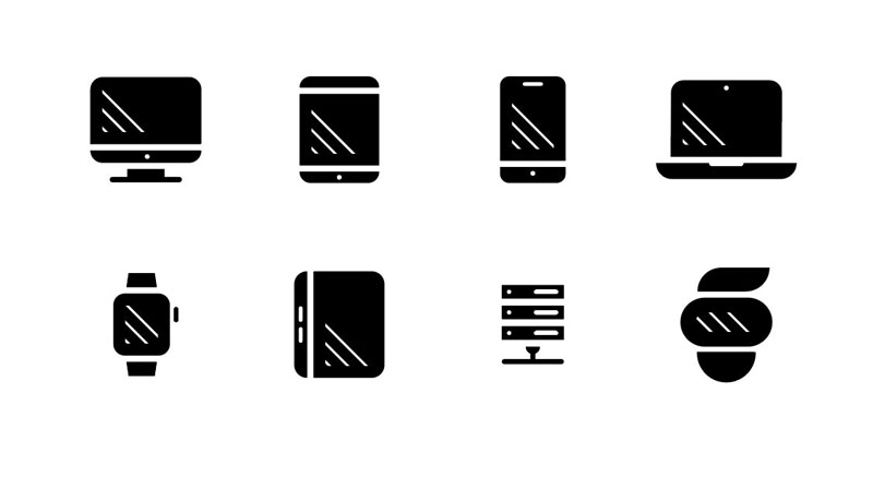
We are happy to release this great set of FREE electronic device icons. To download it, just subscribe to our blog using the form in the sidebar and confirm your subscription. The download link will then be available in every blog update until we change for another one, so this one will not be available for free anymore.
This set includes all kinds of electronic devices, designed with a plain design icon style. The icons included are a computer icon, a tablet icon, a smartphone icon, a laptop icon, a smartwatch icon, a Kindle icon, a web server icon, and an oculus icon. You can use it for free in any personal or commercial project. Attribution is not mandatory, but appreciated.
If you are already a subscriber of Designer Daily, your download link should appear at the bottom of this blog post in your email.
Greek mythology tells the story of Zeus creating the cloud nymph, Nephele. Like other Greek myths, this tale gets pretty bizarre and X-rated. Here’s a very abridged, polite version.
Nephele, we are told, was created by Zeus in the image of his own beautiful wife. A mortal meets Nephele, falls in love with her and, together, they take an adult nap™. Finally, in a strange twist, the cloud gives birth to half-human half-horse Centaur babies.
Weird, right? Personally, I can’t make heads or tails of it. Thankfully, the process for creating clouds in the browser is much more straightforward and far less risqué.
Recently, I discovered that developer Yuan Chuan has realized code-generated, photorealistic clouds. For me, this notion in the browser had long been the stuff of myth.
With one glance at the code in this pen we can imagine that convincing individual clouds are achievable through the use of CSS box-shadow with a <filter> element containing two SVG filters as its complement.
The photorealism we want is achieved with a delicate mix of feTurbulence and feDisplacementMap. These SVG filters are powerful, complex and offer very exciting features (including an Oscar winning algorithm)! However, under the hood, their complexity can be a bit intimidating.
For this article, we will focus on learning to use these SVG filters to get spectacular results. We don’t need to delve too deeply into what is happening behind the scenes algorithmically, much in the way an artist isn’t required know the molecular structure of paint to render a stunning landscape.
Instead, let’s pay close attention to small handful of SVG attributes that are essential for drawing convincing clouds in the browser. Their use will enable us to bend these powerful filters to our will and learn how to customize them with precision in our own projects.
Let’s start with some basics
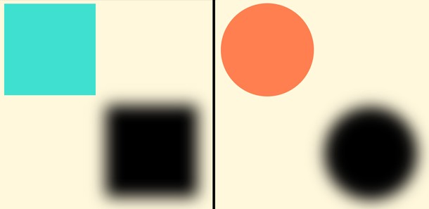
The CSS box-shadow property has five values that deserve close attention:
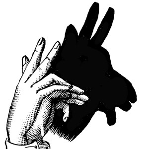
In the same way that a hand changes shape to alter the shadow, a „source shape” in the our HTML can move and morph to move and alter the shape of a shadow rendered in the browser. box-shadow duplicates the „morphing” features on the original size and border-radius. SVG filters get applied to both the element and its shadow.
This is the markup for our SVG so far. It won’t render because we haven’t defined anything visual (not to mention the zero width and height). It’s sole purpose is to hold a filter that we feed our SourceGraphic (aka our <div>). Our source <div>and its shadow are both being distorted independently by the filter.
We’ll add the essential CSS rule linking the HTML element (`#cloud-circle`) to the SVG filter using its ID:
No worries! We have only just scratched the surface and have a lot more good stuff to look at.
Experimenting with the feDisplacementMap scale attribute
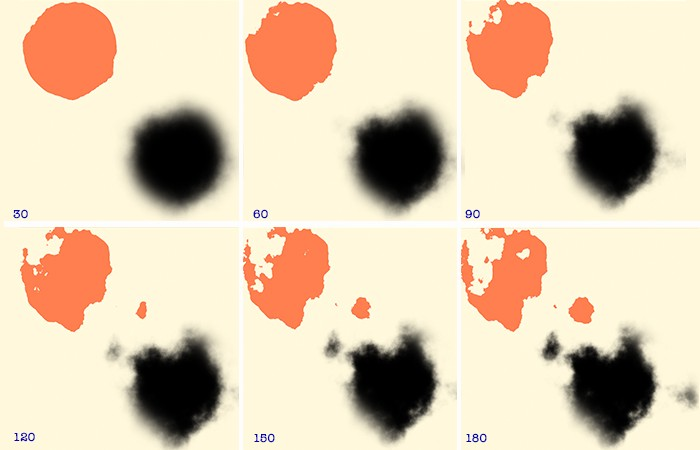
A few un-scientific experiments with this one attribute can yield dramatic results. For the moment, let’s keep the all values in feTurbulence constant and simply adjust the scale attribute of DisplacementMap.
As scale increases (by increments of 30) our source <div> becomes distorted and casts a shadow to mirror the stochastic form in which clouds appear in the sky.
Great, now the source element is getting in the way. 😫
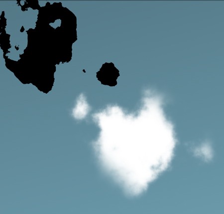
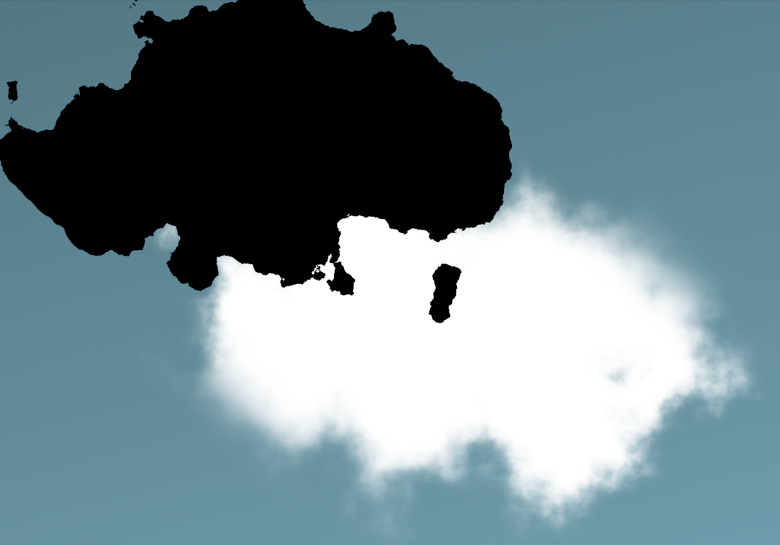
Wait! We’ve widened the source element and now it’s in the way of our of the white shadow we’re calling a cloud. Let’s „re-cast” the shadow at a greater distance so that our cloud is no longer obscured by the source image. (Think of this as moving your hand away further from the wall so it doesn’t block the view of your shadow puppet.)
This is nicely achieved with a bit of CSS positioning. The <body> is the parent element for our cloud, which is statically positioned by default. Let’s „tuck” our source <div> up and out of the way with some absolute positioning. Initially, that will reposition our shadow as well, so we’ll also need to increase the distance of the shadow from the element and nudge the element a bit more.
#cloud-circle {
  width: 500px;
  height: 275px;
  background: #000;
  border-radius: 50%;
  filter: url(#filter);
  box-shadow: 400px 400px 60px 0px #fff; /* Increase shadow offset */
  position: absolute; /* Take the parent out of the document flow */
  top: -320px; /* Move a little down */
  left: -320px; /* Move a little right */
}
What is painted to the browser is a pretty decent depiction of a cloud–But, I’m not sure…does this cloud really do justice the cloud nymph, Nephele? I’m sure we can do better!
From the look of the depth, texture and richness of the clouds in this photograph, one thing is clear: Zeus went to art school. At the very least, he must have read the The Universal Principles of Design which illustrates a powerful–yet, deceptively ordinary–concept:
[…] lighting bias plays a significant role in the interpretation of depth and naturalness, and can be manipulated in a variety of ways by designers…Use the level of contrast between light and dark areas to vary the appearance of depth.
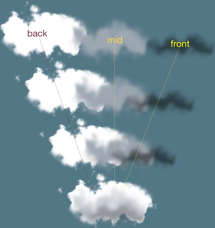
This passage provides for us a hint as to how to we can vastly improve our own code-generated cloud. We can render our cloud with a good deal of fidelity to the clouds in our reference image by stacking layers of differing form, size and color on top of each other. All that takes is calling our filter as many times as we want layers.
Applying our layers will afford us an opportunity to explore feTurbulence and realize its versatility. We’ll choose the smoother type available to us: fractalNoise with numOctaves cranked up to 6.
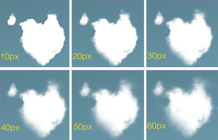
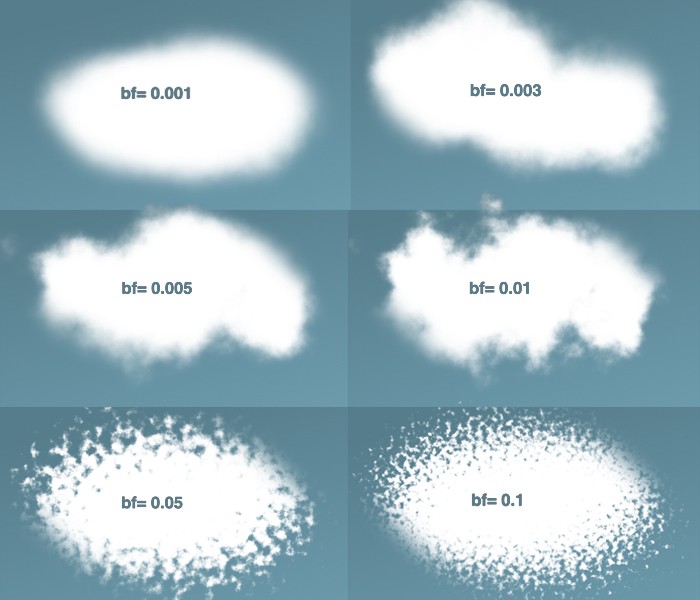
What does all that mean? For now, let’s focus specifically on the baseFrequency attribute. Here’s what we get as we increase the value of n:
The lower the value, the rounder and fuzzier we get. The higher the value, the rounder and more rigid we get.
Words like turbulence, noise, frequency, and octave may seem odd and even confusing. But fear not! It’s actually perfectly accurate to analogize this filter’s effects to sound waves. We may equate a low frequency (baseFrequency=0.001) with a low, muffled noise and a rising frequency (baseFrequency=0.1) with a higher, crisper pitch.
We can see that our sweet spot for a cumulus-like effect may lie comfortably around the ~0.005 and ~0.01 range for the baseFrequency.
Adding detail with numOctaves
Incrementing numOctaves allows us to render our image in extremely granular detail. This requires a great deal of calculation, so be warned: high values are a significant performance hit. Try to resist the temptation to pump up this value unless your browser is wearing a helmet and knee-pads.
The higher the value we put into numOctaves the more granular detail give to our cloud.
The good news is that we don’t have to crank this value too high in order to produce detail and delicacy. As the array of images above shows, we can satisfy ourselves with a numOctavesvalue of 4 or 5.
There is much to say about the seed attribute as it offers a hint into the magic happening behind the scenes. But, for our purposes, the utility of seed can be reduced to four words: „different value, different shape.”
The Perlin Noise function (mentioned earlier) uses this value as the starting point for its random number generator. Choosing not to include this attribute will default seed to zero. When included, however, whatever value we give seed, we don’t need to worry about a performance hit.
Different seed values produce different shapes.
The GIF above represents some of what seed has to offer. Keep in mind that each of those clouds is a layered, composite cloud. (While I have tweaked attributes for each layer, I have kept their respective seed values uniform.)
Here, with a close look at the reference image, I’ve layered 3 cloud-<div>s (of differing in opacity) onto a single base div. Through trial and error and punching in arbitrary seed values, I eventually arrived at a shape resembling the shape of the cloud in the photograph.
Of course, it would be hubris to think that the <div>s that we paint to the browser could be superior to Zeus’s, Nephele.
However, the more mystery we are able to tease out of CSS and SVG filters, the more we are empowered create something visually stunning with a high degree of fidelity to the Thunder God’s original creation. We can, then, can go on experiment further!
I hope this gets you excited about creating a bit of photorealism on the web. I developed a little tool to help put them all to use and experiment a bit. Any questions, suggestions or advice? Ping me in the twitterverse drop a comment here.
Lindsey Kopacz has a wonderful blog about accessibility. I’ve seen a number of her articles making the rounds lately and I was like, dang I better make sure I’m subscribed. For example:
Regarding that last one, I remember learning from Sara Soueidan that a good tip for this to position them over the new custom checkboxes and hide them via opacity instead of hiding the native checkboxes by clipping them away. That covers the scenario of people exploring a touch screen for native interactive elements.
All the modern JavaScript frameworks are component-based. Even when they disagree with each other about specific things (like how Svelterequires compilation), they all seem to agree on the model of working in components. React is all components. A popular static site generator for React is Next.js. The Vue version of that is Nuxt.js.
Then there is Gatsby which is all React. (Listen to our latest ShopTalk Show as we discuss it.) Gridsome seems like the most 1-to-1 comparison in Vue-land, the notable comparison being how they both are designed to suck in data from any source. Components though, of course. I’m not sure there is a flagship Angular-based static site generator, but they are out there, and Angular is components all the way down.
Components are so ubiquitous that perhaps you don’t even think about it anymore. But you might feel it, particularly if you jump back and forth between projects that aren’t component-driven. WordPress development, generally, I feel, isn’t component driven. Sure, you’ve got your header.php and footer.php files and such. You can break those apart however you want, but it’s rather ad-hoc. You aren’t explicitly building components and feeding those components local data and testing them as such. (You can get a lot closer with something like Timber.)
Building front-ends out of server-side code is absolutely fine. Server-side rendering is rife with advantages. But server-side languages don’t seem to have embraced components the way JavaScript has. And since everyone seems to like components (front-end devs obviously love it, designers think that way anyway, back-end devs understand it…) it’s no surprise to me to see this surge of beloved projects build server-side (or build-time) generated sites from JavaScript, simply because it’s component-based and components are just a good idea.
All the modern JavaScript frameworks are component-based. Even when they disagree with each other about specific things (like how Svelterequires compilation), they all seem to agree on the model of working in components. React is all components. A popular static site generator for React is Next.js. The Vue version of that is Nuxt.js.
Then there is Gatsby which is all React. (Listen to our latest ShopTalk Show as we discuss it.) Gridsome seems like the most 1-to-1 comparison in Vue-land, the notable comparison being how they both are designed to suck in data from any source. Components though, of course. I’m not sure there is a flagship Angular-based static site generator, but they are out there, and Angular is components all the way down.
Components are so ubiquitous that perhaps you don’t even think about it anymore. But you might feel it, particularly if you jump back and forth between projects that aren’t component-driven. WordPress development, generally, I feel, isn’t component driven. Sure, you’ve got your header.php and footer.php files and such. You can break those apart however you want, but it’s rather ad-hoc. You aren’t explicitly building components and feeding those components local data and testing them as such. (You can get a lot closer with something like Timber.)
Building front-ends out of server-side code is absolutely fine. Server-side rendering is rife with advantages. But server-side languages don’t seem to have embraced components the way JavaScript has. And since everyone seems to like components (front-end devs obviously love it, designers think that way anyway, back-end devs understand it…) it’s no surprise to me to see this surge of beloved projects build server-side (or build-time) generated sites from JavaScript, simply because it’s component-based and components are just a good idea.
Šime posts regular content for web developers on webplatform.news.
In this week’s roundup, Chrome is adding an install option for Progressive Web Apps, Opera GX comes to Windows, the ECMAScript proposals get an update, and CSS Scroll Snap is coming to a Firefox browser near you.
An install icon is coming to Chrome on desktop
Pete LePage: The next version of Chrome will automatically show an install icon in the address bar on desktop if the site meets Chrome’s PWA „installability” criteria. You can listen for the appinstalled event to detect if the user installed your PWA.
Opera GX is available on Windows
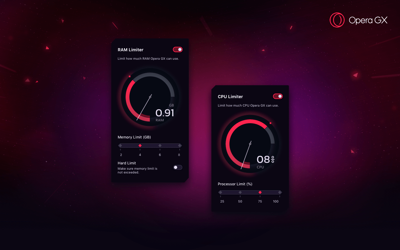
Maciej Kocemba: The preview version of Opera GX for Windows is now available. This is a special version of Opera that lets users limit how much CPU and RAM is available to the browser.
Updated ECMAScript proposals
Azu The JavaScript optional chaining operator (obj?.prop) and null-ish coalescing operator (x ?? y) proposals have been moved to Stage 2 of the TC39 process. (See Web Platform News issue 902 for more information about the TC39 process.)
// BEFORE
let text = response.settings && response.settings.headerText;
if (text == null) text = "Hello, world!";

// AFTER
let text = response.settings?.headerText ?? "Hello, world!";
CSS Scroll Snap is coming to Firefox
Šime Vidas: CSS Scroll Snap is supported in Chrome, Safari, and the next version of Firefox. Scroll snapping works well on touch screen devices but there are some usability issues on desktop platforms.
Šime posts regular content for web developers on webplatform.news.
In this week’s roundup, Chrome is adding an install option for Progressive Web Apps, Opera GX comes to Windows, the ECMAScript proposals get an update, and CSS Scroll Snap is coming to a Firefox browser near you.
An install icon is coming to Chrome on desktop
Pete LePage: The next version of Chrome will automatically show an install icon in the address bar on desktop if the site meets Chrome’s PWA „installability” criteria. You can listen for the appinstalled event to detect if the user installed your PWA.
Opera GX is available on Windows
Maciej Kocemba: The preview version of Opera GX for Windows is now available. This is a special version of Opera that lets users limit how much CPU and RAM is available to the browser.
Updated ECMAScript proposals
Azu The JavaScript optional chaining operator (obj?.prop) and null-ish coalescing operator (x ?? y) proposals have been moved to Stage 2 of the TC39 process. (See Web Platform News issue 902 for more information about the TC39 process.)
// BEFORE
let text = response.settings && response.settings.headerText;
if (text == null) text = "Hello, world!";

// AFTER
let text = response.settings?.headerText ?? "Hello, world!";
CSS Scroll Snap is coming to Firefox
Šime Vidas: CSS Scroll Snap is supported in Chrome, Safari, and the next version of Firefox. Scroll snapping works well on touch screen devices but there are some usability issues on desktop platforms.
A couple of weeks ago, Apple released its long-awaited new Mac Pro. To say that it was not appreciated would be an understatement. The pricing of the screen stand was widely commented, which sounds quite normal when you take a look at the price of $999.
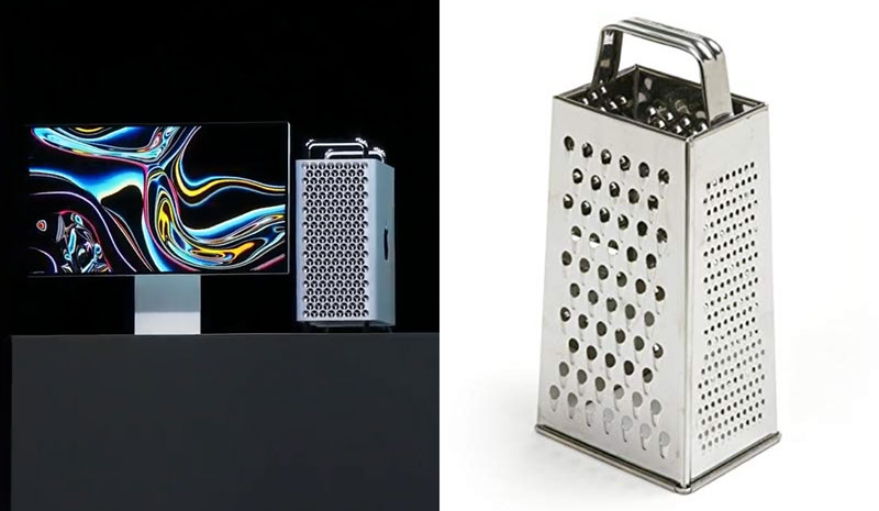
However, there was more too it. The main complain was probably about the design of the computer tower itself, which was quickly compared to a cheese grater on Twitter. This is a problem when you are a company that usually sells good design.
In Bulgaria, this whole controversy gave ideas to some opportunistic and clever advertisers. An agency that goes by the name The Smarts went to IKEA and sold them a campaign that involves making fun of Apple.
The visual of the ad makes fun of pretty much everything: the look-and-feel of the Mac Pro, the company name (designed for Apples), and the ridiculous price.
A couple of weeks ago, Apple released its long-awaited new Mac Pro. To say that it was not appreciated would be an understatement. The pricing of the screen stand was widely commented, which sounds quite normal when you take a look at the price of $999.
However, there was more too it. The main complain was probably about the design of the computer tower itself, which was quickly compared to a cheese grater on Twitter. This is a problem when you are a company that usually sells good design.
In Bulgaria, this whole controversy gave ideas to some opportunistic and clever advertisers. An agency that goes by the name The Smarts went to IKEA and sold them a campaign that involves making fun of Apple.
The visual of the ad makes fun of pretty much everything: the look-and-feel of the Mac Pro, the company name (designed for Apples), and the ridiculous price.
A couple of weeks ago, Apple released its long-awaited new Mac Pro. To say that it was not appreciated would be an understatement. The pricing of the screen stand was widely commented, which sounds quite normal when you take a look at the price of $999.
However, there was more too it. The main complain was probably about the design of the computer tower itself, which was quickly compared to a cheese grater on Twitter. This is a problem when you are a company that usually sells good design.
In Bulgaria, this whole controversy gave ideas to some opportunistic and clever advertisers. An agency that goes by the name The Smarts went to IKEA and sold them a campaign that involves making fun of Apple.
The visual of the ad makes fun of pretty much everything: the look-and-feel of the Mac Pro, the company name (designed for Apples), and the ridiculous price.