10 Top Tips for Creative Brochure Design

Post pobrano z: 10 Top Tips for Creative Brochure Design

Final product image
What You’ll Be Creating

Designing a relevant and highly effective brochure can contribute to a company’s success. A well-designed brochure can educate your readers, increase credibility, attract a target audience, and ultimately lead consumers to take action.

Creating a quality brochure can be a challenge, so today, we bring you ten tips for creative brochure design. A brochure is commonly seen on racks providing information about a company, product, event, or service. Brochures can come in a variety of formats and sizes, so knowing which one you need can become a challenge of its own. 

In this article, we’ll walk you through everything from preparing copy and images to the final edit of your brochure, providing examples of templates and tutorials along the way. You’re sure to take away some great tips. 

In a hurry? We’ve got amazing brochure templates and InDesign portfolio book templates over at Envato Elements and GraphicRiver. Go check them out! 

1. Prepare Copy and Images

Before you start working directly in the software, it is essential to know how long your copy is and what kind of images you’ll be working with. This will help you decide about layout, brochure format, length, and font size. As designers, we know that getting attached to one solution is a no-no. So be prepared to make changes and be flexible along the way.

Keep in mind that big blocks of text can be overwhelming for readers. People tend to scan pages quickly, so shoot for just the ideal amount of information. Use headlines and sub-headlines to structure the content. Bullet points are useful to make short, quick statements that can get your message across.

If you are designing for a specific brand, make sure the colors and feel are in line with the branding. Are there any specific colors and fonts that should be used? Ask for the brand guidelines, which can help you make some of the decisions. This will create a brochure design that belongs to a specific company rather than a random marketing element. 

Gather the images and make sure you can use them as big you need, especially if you want the brochure to look expensive. People nowadays notice when pixelation occurs. Find a way to tell a cohesive story with your images. 

If you have doubts, try to keep the brochure design clean and simple. For best results, try to do a round of edits to see what elements are absolutely necessary to include. Envato Elements offers high-quality images, and with an ever-growing library, you are sure to find what you need. 

Envato Elements
Envato Elements

2. Know Your Folds

With just over a dozen types of brochure, knowing which type you need is crucial. Think about how users will interact with the piece. 

For a bifold brochure, they will look at the cover and open it to reveal the inside. Then they’ll close it to reveal the back. 

For a trifold brochure, which has three panels, users will unfold each panel separately. Here, you can add some kind of surprise as the brochure unfolds to create an interesting piece. While each panel is seen as a boundary, take advantage of it and span images or text across two panels.

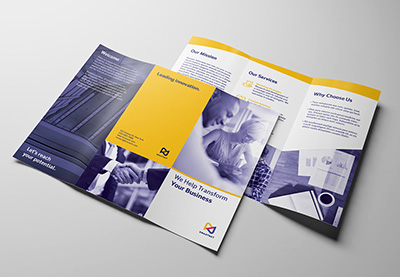
A trifold brochure is the most popular piece used by businesses. This is great if you want to display general information about a company and its services. Take this trifold business brochure as an example. Use imagery and quotes to reinforce your message. Break up the text with graphic elements and white space. Take advantage of using icons and symbols to simplify the message. 

Trifold Brochure
Trifold Brochure

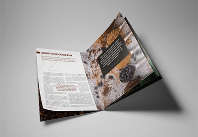
For more extensive brochures, you might want to go for a multi-page document like a booklet or portfolio. Apply careful thought as you’ll want this to be cost-effective. With more pages, you’d need to treat this brochure slightly differently. Pay attention to the pace of each page, making sure you are not overwhelming the reader with information. After all, you want them to get to know you just enough that they can set up a meeting to get to know your business better. 

This architecture portfolio template in InDesign is a multipage document. It’s designed with clean and simple details, allowing the images to shine on their own.

architecture portfolio brochure
Architecture Portfolio Brochure

If you’d like to learn more about brochure formats and dimensions, we’ve got a handy article on that. It includes specific measurements, types of folds, and the uses for each brochure. 

3. Choose Legible and Limited Fonts

If you are designing a business brochure for a specific company, ask what fonts they are using on their logo and brand in general. It is our job as designers to deliver cohesiveness throughout a brand. Typically in a brochure design you’d need a headline, sub-headline, and copy. Stick to using no more than two fonts and take advantage of using the font’s families to highlight certain copy (regular, bold, italic, etc.).

Both brochure ideas below use a serif and a sans serif font. Nowadays, there aren’t really any rules as to what fonts to use for copy. Traditionalists might opt to use serif fonts for a lengthy amount of body copy and sans serif for display copy. Use italics to highlight text or bold sans serif to add quotes on a panel. If you are layering type over a dark background, run a test print to make sure the copy is legible. 

Lumina trifold brochure
LUMINA Trifold Brochure

This proposal brochure template comes with files editable in Adobe InDesign and Word. The clear typographic hierarchy can help guide readers and create a good flow throughout the design.

Proposal brochure design
Proposal Brochure Design

If you are looking for some high-quality fonts, check out Envato Elements. Browse the fonts section to find suitable families for your next marketing brochure.

Envato Elements Fonts

4. Design a User-Friendly Flow

Pacing is something I personally think is important when designing a printed piece. If the piece is interesting enough, users can decide to either read it or put it down. Think about how readers would want to receive the information.

Balance the amount of text and visuals on each business brochure panel. These two elements are meant to work together and support each other for a striking finished product. Opt for a bite-size amount of copy in each panel—large chunks of text can be tiring to read and can appear visually heavy. Use color to create hierarchy within the copy. Highlight the headlines and use dark colors for copy, as in the pamphlet design below. 

Marketing Agency Brochure Trifold

Most cultures read from left to right and top to bottom. Arrange the information in a logical flow so it complements the way a marketing brochure unfolds. If you are not able to use high-quality imagery, use graphics to create movement and depth. Check out this clean template using the minimal amount of images. It is carefully balanced by the amount of graphics and text displayed in each panel.

Maskot business and corporate brochure trifold
Maskot Business and Corporate Brochure Trifold

5. Create an Effective Cover

A cover is prime real estate that will call for your reader’s attention if designed successfully. To design a compelling cover, include only concise information, so that it’s easy and fast to read at a distance, especially if your brochure is placed on a rack. Avoid cluttered covers, and instead use simple and impactful imagery that represents your company/client. Images are sometimes more intuitive than words. 

Check out this minimalist fashion portfolio template. The most important elements—title and image—are placed on the right side of the cover. This makes helps the reader make a connection between the two while keeping the less important information on the opposite side.

Fashion Brochure
Fashion Brochure

This clean booklet design lays a rectangle over the image. This creates a sense of depth while hinting at the kind of company we are about to see. The title and company name are highly visible and free of any visual disturbances.

Corporate Brochure
Corporate Brochure

This medical brochure template tutorial includes a simple but successful cover. Include a big image at the top and concentrate the copy at the bottom, so readers will get the information they need right away.

6. Use High-Quality Imagery

The importance of using high quality images is usually underrated. Consumers can tell how much care you’ve put into creating a brochure design by simply looking at the images used. Use imagery that reflects your intent and communicates your message. 

Once you’ve picked out the right imagery, check the resolution. Make sure the images can be printed to avoid pixelated prints. This can bring down the quality level of your design. Check for color tones and color correction. If you’ve acquired images with different tones, try adding a visual treatment like an overlay. This will give all the images an even look across the board. 

This product brochure template includes an interior design theme. All the images are crisp white and clean, with a consistent yellow color making an appearance. This is another great way to create cohesiveness throughout the design.

Brochure
Brochure

Check out this brochure template tutorial. Using profile pictures of the pets is a great idea! Even better is the consistent use of white background in each photo—it really makes it look as if the designer has put in the effort to arrange for a photo shoot. 

The presentation template is also an awesome example to achieve a cohesive brochure design layout. Add an overlay to all your images and you are set for success. 

7. Embrace Negative Space

If you are choosing to use a multi-panel brochure, try adding elements of surprise for your readership. Alternating panels between a light and a dark color can enhance the look of the brochure. It avoids making the brochure seem monotone and adds visual weight. Use this negative space to highlight certain information you want to add more attention to. Add a quote, or use a call to action over a dark background to communicate a message much more clearly. 

Brochure
Brochure

In addition to highlighting information, try alternating panels between a light and dark background. Treat each panel as if they were separate pages of a book. While the panels need to have a consistent layout (font and type hierarchy), it is a great idea to add something special to each design. Treat them as if they were cousins, not siblings.

Brochure
Brochure

Take a look at this trifold pamphlet template tutorial. This is a great example of how to include colors to make your design pop.

8. Include a Clear Call to Action

Every marketing brochure design out there has a common goal, for the reader to take action. A call to action (CTA) needs to be transparent and stated in a big way. Give your readers a reason to contact you by avoiding having the CTA part of a long paragraph. Instead, make the statement bold and hard to miss, as in the brochure template below. 

Short sentences like “get in touch” or “contact us now” can do the trick. Urge the reader to act right away. Other common offers can include discounts for specific specials, giveaways with limited quantities, or a free gift.

Corporate trifold brochure
Corporate Trifold Brochure

You can also try using other short incentives that communicate achievement. Check out this trifold pamphlet tutorial that very positively states, “Let’s reach your potential.”
9. Make It Easy to Respond

Include vital contact information in the brochure. Readers might not be able to find the information, even if you’ve included all they need. Therefore, place it somewhere highly visible like the back panel or even the cover. 

If you are showing multiple personnel profiles, add contact information for each person. Include a website, email, social media accounts, phone number, and address. QR codes are also popular. With a quick scan, they can take people to a specific website. 

This template has all the necessary information laid out on the back panel. It is clean and clear so readers won’t have a hard time finding it.

trifold brochure
Trifold Brochure

Unlike the example above, this bifold brochure has the contact information on the cover. This is great if there’s ample space that allows you to include everything you need.

Business brochure
Business Brochure

10. Design a Brochure Worth Keeping

Compared to other pieces of printed design, brochures tend to have a short life. They aren’t often seen as something to be kept for a long time and usually end in the trash right after they are delivered to users. Designing not only an eye-catching brochure but one that can double its use can help users wonder, “What else can I use this for?”

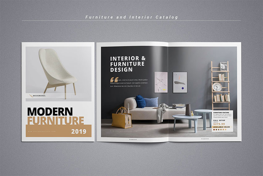
Photography portfolios and fashion and furniture brochures have a higher chance of being kept. Readers usually want to go back and take a look at the latest artistic and fashion trends. Furniture catalogues are great inspiration for most users on how to decorate, so consider adding tips along with the content. 
Furniture and interior catalog
Furniture and Interior Catalog

Check out this tutorial on how to make a stylish Adobe InDesign portfolio template. Art and beautiful imagery are a great way to entice readers to keep your brochures, so why not give it a try! 

Designers tend to be collectors, and most people keep things that feel expensive to the touch. It isn’t always necessary to spend more money to design something worth keeping. To add value to a brochure, include useful information that serves a purpose to the user, such as a city guide, a calendar, or emergency numbers.

If the budget allows, try investing in a different paper weight, high-end finishes, and special processes. It might not seem like much, but the way a printed piece feels on the hands can dictate what your users think of the company. Talk to your printer to see what options are available, and they might be able to help you raise the bar on your next marketing brochure design.

Check out this tutorial on how to create a fold-out city guide—it’s a clever idea! 

Now It’s Your Turn! 

Once your brochure is designed, take your time to look at the final product. A round of edits is helpful to see if you can lose some elements that aren’t helping in the design. Make sure there’s a second pair of eyes reading the copy—here you really want to avoid typos and mistakes. Finally, ask yourself the following questions:

  • Does the brochure grab attention?
  • Is the message communicated clearly?
  • Is the call to action clear?
  • Does the brochure represent the brand?

Brochure designs are fun, but there are many considerations to keep in mind. Aim for a long-lasting design, and when in doubt, keep it simple. If you are new to design, pre-designed templates can make your job much easier. Layouts and fonts are figured out for you, and if necessary, you can customise the colors. 

Most of them are easy to edit—simply add your content and images, and you are good to go. If you want to explore InDesign portfolio templates or fashion portfolio templates right away, head over to Envato Elements and GraphicRiver. We’ve got many options!

If you are an experienced designer and are looking to create mockups of your brochure designs, head over to PlaceitThe website provides you with a wide selection of images in which you can apply our own design to quickly mock up projects. 

We’ve gathered some of our favorite tutorials below. If you want to dive into creating your own designs, this is a great place to start:

10 Top Tips for Creative Brochure Design

Post pobrano z: 10 Top Tips for Creative Brochure Design

Final product image
What You’ll Be Creating

Designing a relevant and highly effective brochure can contribute to a company’s success. A well-designed brochure can educate your readers, increase credibility, attract a target audience, and ultimately lead consumers to take action.

Creating a quality brochure can be a challenge, so today, we bring you ten tips for creative brochure design. A brochure is commonly seen on racks providing information about a company, product, event, or service. Brochures can come in a variety of formats and sizes, so knowing which one you need can become a challenge of its own. 

In this article, we’ll walk you through everything from preparing copy and images to the final edit of your brochure, providing examples of templates and tutorials along the way. You’re sure to take away some great tips. 

In a hurry? We’ve got amazing brochure templates and InDesign portfolio book templates over at Envato Elements and GraphicRiver. Go check them out! 

1. Prepare Copy and Images

Before you start working directly in the software, it is essential to know how long your copy is and what kind of images you’ll be working with. This will help you decide about layout, brochure format, length, and font size. As designers, we know that getting attached to one solution is a no-no. So be prepared to make changes and be flexible along the way.

Keep in mind that big blocks of text can be overwhelming for readers. People tend to scan pages quickly, so shoot for just the ideal amount of information. Use headlines and sub-headlines to structure the content. Bullet points are useful to make short, quick statements that can get your message across.

If you are designing for a specific brand, make sure the colors and feel are in line with the branding. Are there any specific colors and fonts that should be used? Ask for the brand guidelines, which can help you make some of the decisions. This will create a brochure design that belongs to a specific company rather than a random marketing element. 

Gather the images and make sure you can use them as big you need, especially if you want the brochure to look expensive. People nowadays notice when pixelation occurs. Find a way to tell a cohesive story with your images. 

If you have doubts, try to keep the brochure design clean and simple. For best results, try to do a round of edits to see what elements are absolutely necessary to include. Envato Elements offers high-quality images, and with an ever-growing library, you are sure to find what you need. 

Envato Elements
Envato Elements

2. Know Your Folds

With just over a dozen types of brochure, knowing which type you need is crucial. Think about how users will interact with the piece. 

For a bifold brochure, they will look at the cover and open it to reveal the inside. Then they’ll close it to reveal the back. 

For a trifold brochure, which has three panels, users will unfold each panel separately. Here, you can add some kind of surprise as the brochure unfolds to create an interesting piece. While each panel is seen as a boundary, take advantage of it and span images or text across two panels.

A trifold brochure is the most popular piece used by businesses. This is great if you want to display general information about a company and its services. Take this trifold business brochure as an example. Use imagery and quotes to reinforce your message. Break up the text with graphic elements and white space. Take advantage of using icons and symbols to simplify the message. 

Trifold Brochure
Trifold Brochure

For more extensive brochures, you might want to go for a multi-page document like a booklet or portfolio. Apply careful thought as you’ll want this to be cost-effective. With more pages, you’d need to treat this brochure slightly differently. Pay attention to the pace of each page, making sure you are not overwhelming the reader with information. After all, you want them to get to know you just enough that they can set up a meeting to get to know your business better. 

This architecture portfolio template in InDesign is a multipage document. It’s designed with clean and simple details, allowing the images to shine on their own.

architecture portfolio brochure
Architecture Portfolio Brochure

If you’d like to learn more about brochure formats and dimensions, we’ve got a handy article on that. It includes specific measurements, types of folds, and the uses for each brochure. 

3. Choose Legible and Limited Fonts

If you are designing a business brochure for a specific company, ask what fonts they are using on their logo and brand in general. It is our job as designers to deliver cohesiveness throughout a brand. Typically in a brochure design you’d need a headline, sub-headline, and copy. Stick to using no more than two fonts and take advantage of using the font’s families to highlight certain copy (regular, bold, italic, etc.).

Both brochure ideas below use a serif and a sans serif font. Nowadays, there aren’t really any rules as to what fonts to use for copy. Traditionalists might opt to use serif fonts for a lengthy amount of body copy and sans serif for display copy. Use italics to highlight text or bold sans serif to add quotes on a panel. If you are layering type over a dark background, run a test print to make sure the copy is legible. 

Lumina trifold brochure
LUMINA Trifold Brochure

This proposal brochure template comes with files editable in Adobe InDesign and Word. The clear typographic hierarchy can help guide readers and create a good flow throughout the design.

Proposal brochure design
Proposal Brochure Design

If you are looking for some high-quality fonts, check out Envato Elements. Browse the fonts section to find suitable families for your next marketing brochure.

Envato Elements Fonts

4. Design a User-Friendly Flow

Pacing is something I personally think is important when designing a printed piece. If the piece is interesting enough, users can decide to either read it or put it down. Think about how readers would want to receive the information.

Balance the amount of text and visuals on each business brochure panel. These two elements are meant to work together and support each other for a striking finished product. Opt for a bite-size amount of copy in each panel—large chunks of text can be tiring to read and can appear visually heavy. Use color to create hierarchy within the copy. Highlight the headlines and use dark colors for copy, as in the pamphlet design below. 

Marketing Agency Brochure Trifold

Most cultures read from left to right and top to bottom. Arrange the information in a logical flow so it complements the way a marketing brochure unfolds. If you are not able to use high-quality imagery, use graphics to create movement and depth. Check out this clean template using the minimal amount of images. It is carefully balanced by the amount of graphics and text displayed in each panel.

Maskot business and corporate brochure trifold
Maskot Business and Corporate Brochure Trifold

5. Create an Effective Cover

A cover is prime real estate that will call for your reader’s attention if designed successfully. To design a compelling cover, include only concise information, so that it’s easy and fast to read at a distance, especially if your brochure is placed on a rack. Avoid cluttered covers, and instead use simple and impactful imagery that represents your company/client. Images are sometimes more intuitive than words. 

Check out this minimalist fashion portfolio template. The most important elements—title and image—are placed on the right side of the cover. This makes helps the reader make a connection between the two while keeping the less important information on the opposite side.

Fashion Brochure
Fashion Brochure

This clean booklet design lays a rectangle over the image. This creates a sense of depth while hinting at the kind of company we are about to see. The title and company name are highly visible and free of any visual disturbances.

Corporate Brochure
Corporate Brochure

This medical brochure template tutorial includes a simple but successful cover. Include a big image at the top and concentrate the copy at the bottom, so readers will get the information they need right away.

6. Use High-Quality Imagery

The importance of using high quality images is usually underrated. Consumers can tell how much care you’ve put into creating a brochure design by simply looking at the images used. Use imagery that reflects your intent and communicates your message. 

Once you’ve picked out the right imagery, check the resolution. Make sure the images can be printed to avoid pixelated prints. This can bring down the quality level of your design. Check for color tones and color correction. If you’ve acquired images with different tones, try adding a visual treatment like an overlay. This will give all the images an even look across the board. 

This product brochure template includes an interior design theme. All the images are crisp white and clean, with a consistent yellow color making an appearance. This is another great way to create cohesiveness throughout the design.

Brochure
Brochure

Check out this brochure template tutorial. Using profile pictures of the pets is a great idea! Even better is the consistent use of white background in each photo—it really makes it look as if the designer has put in the effort to arrange for a photo shoot. 

The presentation template is also an awesome example to achieve a cohesive brochure design layout. Add an overlay to all your images and you are set for success. 

7. Embrace Negative Space

If you are choosing to use a multi-panel brochure, try adding elements of surprise for your readership. Alternating panels between a light and a dark color can enhance the look of the brochure. It avoids making the brochure seem monotone and adds visual weight. Use this negative space to highlight certain information you want to add more attention to. Add a quote, or use a call to action over a dark background to communicate a message much more clearly. 

Brochure
Brochure

In addition to highlighting information, try alternating panels between a light and dark background. Treat each panel as if they were separate pages of a book. While the panels need to have a consistent layout (font and type hierarchy), it is a great idea to add something special to each design. Treat them as if they were cousins, not siblings.

Brochure
Brochure

Take a look at this trifold pamphlet template tutorial. This is a great example of how to include colors to make your design pop.

8. Include a Clear Call to Action

Every marketing brochure design out there has a common goal, for the reader to take action. A call to action (CTA) needs to be transparent and stated in a big way. Give your readers a reason to contact you by avoiding having the CTA part of a long paragraph. Instead, make the statement bold and hard to miss, as in the brochure template below. 

Short sentences like “get in touch” or “contact us now” can do the trick. Urge the reader to act right away. Other common offers can include discounts for specific specials, giveaways with limited quantities, or a free gift.

Corporate trifold brochure
Corporate Trifold Brochure

You can also try using other short incentives that communicate achievement. Check out this trifold pamphlet tutorial that very positively states, “Let’s reach your potential.”

9. Make It Easy to Respond

Include vital contact information in the brochure. Readers might not be able to find the information, even if you’ve included all they need. Therefore, place it somewhere highly visible like the back panel or even the cover. 

If you are showing multiple personnel profiles, add contact information for each person. Include a website, email, social media accounts, phone number, and address. QR codes are also popular. With a quick scan, they can take people to a specific website. 

This template has all the necessary information laid out on the back panel. It is clean and clear so readers won’t have a hard time finding it.

trifold brochure
Trifold Brochure

Unlike the example above, this bifold brochure has the contact information on the cover. This is great if there’s ample space that allows you to include everything you need.

Business brochure
Business Brochure

10. Design a Brochure Worth Keeping

Compared to other pieces of printed design, brochures tend to have a short life. They aren’t often seen as something to be kept for a long time and usually end in the trash right after they are delivered to users. Designing not only an eye-catching brochure but one that can double its use can help users wonder, “What else can I use this for?”

Photography portfolios and fashion and furniture brochures have a higher chance of being kept. Readers usually want to go back and take a look at the latest artistic and fashion trends. Furniture catalogues are great inspiration for most users on how to decorate, so consider adding tips along with the content. 

Furniture and interior catalog
Furniture and Interior Catalog

Check out this tutorial on how to make a stylish Adobe InDesign portfolio template. Art and beautiful imagery are a great way to entice readers to keep your brochures, so why not give it a try! 

Designers tend to be collectors, and most people keep things that feel expensive to the touch. It isn’t always necessary to spend more money to design something worth keeping. To add value to a brochure, include useful information that serves a purpose to the user, such as a city guide, a calendar, or emergency numbers.

If the budget allows, try investing in a different paper weight, high-end finishes, and special processes. It might not seem like much, but the way a printed piece feels on the hands can dictate what your users think of the company. Talk to your printer to see what options are available, and they might be able to help you raise the bar on your next marketing brochure design.

Check out this tutorial on how to create a fold-out city guide—it’s a clever idea! 

Now It’s Your Turn! 

Once your brochure is designed, take your time to look at the final product. A round of edits is helpful to see if you can lose some elements that aren’t helping in the design. Make sure there’s a second pair of eyes reading the copy—here you really want to avoid typos and mistakes. Finally, ask yourself the following questions:

  • Does the brochure grab attention?
  • Is the message communicated clearly?
  • Is the call to action clear?
  • Does the brochure represent the brand?

Brochure designs are fun, but there are many considerations to keep in mind. Aim for a long-lasting design, and when in doubt, keep it simple. If you are new to design, pre-designed templates can make your job much easier. Layouts and fonts are figured out for you, and if necessary, you can customise the colors. 

Most of them are easy to edit—simply add your content and images, and you are good to go. If you want to explore InDesign portfolio templates or fashion portfolio templates right away, head over to Envato Elements and GraphicRiver. We’ve got many options!

If you are an experienced designer and are looking to create mockups of your brochure designs, head over to PlaceitThe website provides you with a wide selection of images in which you can apply our own design to quickly mock up projects. 

We’ve gathered some of our favorite tutorials below. If you want to dive into creating your own designs, this is a great place to start:

10 Top Tips for Creative Brochure Design

Post pobrano z: 10 Top Tips for Creative Brochure Design

Final product image
What You’ll Be Creating

Designing a relevant and highly effective brochure can contribute to a company’s success. A well-designed brochure can educate your readers, increase credibility, attract a target audience, and ultimately lead consumers to take action.

Creating a quality brochure can be a challenge, so today, we bring you ten tips for creative brochure design. A brochure is commonly seen on racks providing information about a company, product, event, or service. Brochures can come in a variety of formats and sizes, so knowing which one you need can become a challenge of its own. 

In this article, we’ll walk you through everything from preparing copy and images to the final edit of your brochure, providing examples of templates and tutorials along the way. You’re sure to take away some great tips. 

In a hurry? We’ve got amazing brochure templates and InDesign portfolio book templates over at Envato Elements and GraphicRiver. Go check them out! 

1. Prepare Copy and Images

Before you start working directly in the software, it is essential to know how long your copy is and what kind of images you’ll be working with. This will help you decide about layout, brochure format, length, and font size. As designers, we know that getting attached to one solution is a no-no. So be prepared to make changes and be flexible along the way.

Keep in mind that big blocks of text can be overwhelming for readers. People tend to scan pages quickly, so shoot for just the ideal amount of information. Use headlines and sub-headlines to structure the content. Bullet points are useful to make short, quick statements that can get your message across.

If you are designing for a specific brand, make sure the colors and feel are in line with the branding. Are there any specific colors and fonts that should be used? Ask for the brand guidelines, which can help you make some of the decisions. This will create a brochure design that belongs to a specific company rather than a random marketing element. 

Gather the images and make sure you can use them as big you need, especially if you want the brochure to look expensive. People nowadays notice when pixelation occurs. Find a way to tell a cohesive story with your images. 

If you have doubts, try to keep the brochure design clean and simple. For best results, try to do a round of edits to see what elements are absolutely necessary to include. Envato Elements offers high-quality images, and with an ever-growing library, you are sure to find what you need. 

Envato Elements
Envato Elements

2. Know Your Folds

With just over a dozen types of brochure, knowing which type you need is crucial. Think about how users will interact with the piece. 

For a bifold brochure, they will look at the cover and open it to reveal the inside. Then they’ll close it to reveal the back. 

For a trifold brochure, which has three panels, users will unfold each panel separately. Here, you can add some kind of surprise as the brochure unfolds to create an interesting piece. While each panel is seen as a boundary, take advantage of it and span images or text across two panels.

A trifold brochure is the most popular piece used by businesses. This is great if you want to display general information about a company and its services. Take this trifold business brochure as an example. Use imagery and quotes to reinforce your message. Break up the text with graphic elements and white space. Take advantage of using icons and symbols to simplify the message. 

Trifold Brochure
Trifold Brochure

For more extensive brochures, you might want to go for a multi-page document like a booklet or portfolio. Apply careful thought as you’ll want this to be cost-effective. With more pages, you’d need to treat this brochure slightly differently. Pay attention to the pace of each page, making sure you are not overwhelming the reader with information. After all, you want them to get to know you just enough that they can set up a meeting to get to know your business better. 

This architecture portfolio template in InDesign is a multipage document. It’s designed with clean and simple details, allowing the images to shine on their own.

architecture portfolio brochure
Architecture Portfolio Brochure

If you’d like to learn more about brochure formats and dimensions, we’ve got a handy article on that. It includes specific measurements, types of folds, and the uses for each brochure. 

3. Choose Legible and Limited Fonts

If you are designing a business brochure for a specific company, ask what fonts they are using on their logo and brand in general. It is our job as designers to deliver cohesiveness throughout a brand. Typically in a brochure design you’d need a headline, sub-headline, and copy. Stick to using no more than two fonts and take advantage of using the font’s families to highlight certain copy (regular, bold, italic, etc.).

Both brochure ideas below use a serif and a sans serif font. Nowadays, there aren’t really any rules as to what fonts to use for copy. Traditionalists might opt to use serif fonts for a lengthy amount of body copy and sans serif for display copy. Use italics to highlight text or bold sans serif to add quotes on a panel. If you are layering type over a dark background, run a test print to make sure the copy is legible. 

Lumina trifold brochure
LUMINA Trifold Brochure

This proposal brochure template comes with files editable in Adobe InDesign and Word. The clear typographic hierarchy can help guide readers and create a good flow throughout the design.

Proposal brochure design
Proposal Brochure Design

If you are looking for some high-quality fonts, check out Envato Elements. Browse the fonts section to find suitable families for your next marketing brochure.

Envato Elements Fonts

4. Design a User-Friendly Flow

Pacing is something I personally think is important when designing a printed piece. If the piece is interesting enough, users can decide to either read it or put it down. Think about how readers would want to receive the information.

Balance the amount of text and visuals on each business brochure panel. These two elements are meant to work together and support each other for a striking finished product. Opt for a bite-size amount of copy in each panel—large chunks of text can be tiring to read and can appear visually heavy. Use color to create hierarchy within the copy. Highlight the headlines and use dark colors for copy, as in the pamphlet design below. 

Marketing Agency Brochure Trifold

Most cultures read from left to right and top to bottom. Arrange the information in a logical flow so it complements the way a marketing brochure unfolds. If you are not able to use high-quality imagery, use graphics to create movement and depth. Check out this clean template using the minimal amount of images. It is carefully balanced by the amount of graphics and text displayed in each panel.

Maskot business and corporate brochure trifold
Maskot Business and Corporate Brochure Trifold

5. Create an Effective Cover

A cover is prime real estate that will call for your reader’s attention if designed successfully. To design a compelling cover, include only concise information, so that it’s easy and fast to read at a distance, especially if your brochure is placed on a rack. Avoid cluttered covers, and instead use simple and impactful imagery that represents your company/client. Images are sometimes more intuitive than words. 

Check out this minimalist fashion portfolio template. The most important elements—title and image—are placed on the right side of the cover. This makes helps the reader make a connection between the two while keeping the less important information on the opposite side.

Fashion Brochure
Fashion Brochure

This clean booklet design lays a rectangle over the image. This creates a sense of depth while hinting at the kind of company we are about to see. The title and company name are highly visible and free of any visual disturbances.

Corporate Brochure
Corporate Brochure

This medical brochure template tutorial includes a simple but successful cover. Include a big image at the top and concentrate the copy at the bottom, so readers will get the information they need right away.

6. Use High-Quality Imagery

The importance of using high quality images is usually underrated. Consumers can tell how much care you’ve put into creating a brochure design by simply looking at the images used. Use imagery that reflects your intent and communicates your message. 

Once you’ve picked out the right imagery, check the resolution. Make sure the images can be printed to avoid pixelated prints. This can bring down the quality level of your design. Check for color tones and color correction. If you’ve acquired images with different tones, try adding a visual treatment like an overlay. This will give all the images an even look across the board. 

This product brochure template includes an interior design theme. All the images are crisp white and clean, with a consistent yellow color making an appearance. This is another great way to create cohesiveness throughout the design.

Brochure
Brochure

Check out this brochure template tutorial. Using profile pictures of the pets is a great idea! Even better is the consistent use of white background in each photo—it really makes it look as if the designer has put in the effort to arrange for a photo shoot. 

The presentation template is also an awesome example to achieve a cohesive brochure design layout. Add an overlay to all your images and you are set for success. 

7. Embrace Negative Space

If you are choosing to use a multi-panel brochure, try adding elements of surprise for your readership. Alternating panels between a light and a dark color can enhance the look of the brochure. It avoids making the brochure seem monotone and adds visual weight. Use this negative space to highlight certain information you want to add more attention to. Add a quote, or use a call to action over a dark background to communicate a message much more clearly. 

Brochure
Brochure

In addition to highlighting information, try alternating panels between a light and dark background. Treat each panel as if they were separate pages of a book. While the panels need to have a consistent layout (font and type hierarchy), it is a great idea to add something special to each design. Treat them as if they were cousins, not siblings.

Brochure
Brochure

Take a look at this trifold pamphlet template tutorial. This is a great example of how to include colors to make your design pop.

8. Include a Clear Call to Action

Every marketing brochure design out there has a common goal, for the reader to take action. A call to action (CTA) needs to be transparent and stated in a big way. Give your readers a reason to contact you by avoiding having the CTA part of a long paragraph. Instead, make the statement bold and hard to miss, as in the brochure template below. 

Short sentences like “get in touch” or “contact us now” can do the trick. Urge the reader to act right away. Other common offers can include discounts for specific specials, giveaways with limited quantities, or a free gift.

Corporate trifold brochure
Corporate Trifold Brochure

You can also try using other short incentives that communicate achievement. Check out this trifold pamphlet tutorial that very positively states, “Let’s reach your potential.”

9. Make It Easy to Respond

Include vital contact information in the brochure. Readers might not be able to find the information, even if you’ve included all they need. Therefore, place it somewhere highly visible like the back panel or even the cover. 

If you are showing multiple personnel profiles, add contact information for each person. Include a website, email, social media accounts, phone number, and address. QR codes are also popular. With a quick scan, they can take people to a specific website. 

This template has all the necessary information laid out on the back panel. It is clean and clear so readers won’t have a hard time finding it.

trifold brochure
Trifold Brochure

Unlike the example above, this bifold brochure has the contact information on the cover. This is great if there’s ample space that allows you to include everything you need.

Business brochure
Business Brochure

10. Design a Brochure Worth Keeping

Compared to other pieces of printed design, brochures tend to have a short life. They aren’t often seen as something to be kept for a long time and usually end in the trash right after they are delivered to users. Designing not only an eye-catching brochure but one that can double its use can help users wonder, “What else can I use this for?”

Photography portfolios and fashion and furniture brochures have a higher chance of being kept. Readers usually want to go back and take a look at the latest artistic and fashion trends. Furniture catalogues are great inspiration for most users on how to decorate, so consider adding tips along with the content. 

Furniture and interior catalog
Furniture and Interior Catalog

Check out this tutorial on how to make a stylish Adobe InDesign portfolio template. Art and beautiful imagery are a great way to entice readers to keep your brochures, so why not give it a try! 

Designers tend to be collectors, and most people keep things that feel expensive to the touch. It isn’t always necessary to spend more money to design something worth keeping. To add value to a brochure, include useful information that serves a purpose to the user, such as a city guide, a calendar, or emergency numbers.

If the budget allows, try investing in a different paper weight, high-end finishes, and special processes. It might not seem like much, but the way a printed piece feels on the hands can dictate what your users think of the company. Talk to your printer to see what options are available, and they might be able to help you raise the bar on your next marketing brochure design.

Check out this tutorial on how to create a fold-out city guide—it’s a clever idea! 

Now It’s Your Turn! 

Once your brochure is designed, take your time to look at the final product. A round of edits is helpful to see if you can lose some elements that aren’t helping in the design. Make sure there’s a second pair of eyes reading the copy—here you really want to avoid typos and mistakes. Finally, ask yourself the following questions:

  • Does the brochure grab attention?
  • Is the message communicated clearly?
  • Is the call to action clear?
  • Does the brochure represent the brand?

Brochure designs are fun, but there are many considerations to keep in mind. Aim for a long-lasting design, and when in doubt, keep it simple. If you are new to design, pre-designed templates can make your job much easier. Layouts and fonts are figured out for you, and if necessary, you can customise the colors. 

Most of them are easy to edit—simply add your content and images, and you are good to go. If you want to explore InDesign portfolio templates or fashion portfolio templates right away, head over to Envato Elements and GraphicRiver. We’ve got many options!

If you are an experienced designer and are looking to create mockups of your brochure designs, head over to PlaceitThe website provides you with a wide selection of images in which you can apply our own design to quickly mock up projects. 

We’ve gathered some of our favorite tutorials below. If you want to dive into creating your own designs, this is a great place to start:

10 Top Tips for Creative Brochure Design

Post pobrano z: 10 Top Tips for Creative Brochure Design

Final product image
What You’ll Be Creating

Designing a relevant and highly effective brochure can contribute to a company’s success. A well-designed brochure can educate your readers, increase credibility, attract a target audience, and ultimately lead consumers to take action.

Creating a quality brochure can be a challenge, so today, we bring you ten tips for creative brochure design. A brochure is commonly seen on racks providing information about a company, product, event, or service. Brochures can come in a variety of formats and sizes, so knowing which one you need can become a challenge of its own. 

In this article, we’ll walk you through everything from preparing copy and images to the final edit of your brochure, providing examples of templates and tutorials along the way. You’re sure to take away some great tips. 

In a hurry? We’ve got amazing brochure templates and InDesign portfolio book templates over at Envato Elements and GraphicRiver. Go check them out! 

1. Prepare Copy and Images

Before you start working directly in the software, it is essential to know how long your copy is and what kind of images you’ll be working with. This will help you decide about layout, brochure format, length, and font size. As designers, we know that getting attached to one solution is a no-no. So be prepared to make changes and be flexible along the way.

Keep in mind that big blocks of text can be overwhelming for readers. People tend to scan pages quickly, so shoot for just the ideal amount of information. Use headlines and sub-headlines to structure the content. Bullet points are useful to make short, quick statements that can get your message across.

If you are designing for a specific brand, make sure the colors and feel are in line with the branding. Are there any specific colors and fonts that should be used? Ask for the brand guidelines, which can help you make some of the decisions. This will create a brochure design that belongs to a specific company rather than a random marketing element. 

Gather the images and make sure you can use them as big you need, especially if you want the brochure to look expensive. People nowadays notice when pixelation occurs. Find a way to tell a cohesive story with your images. 

If you have doubts, try to keep the brochure design clean and simple. For best results, try to do a round of edits to see what elements are absolutely necessary to include. Envato Elements offers high-quality images, and with an ever-growing library, you are sure to find what you need. 

Envato Elements
Envato Elements

2. Know Your Folds

With just over a dozen types of brochure, knowing which type you need is crucial. Think about how users will interact with the piece. 

For a bifold brochure, they will look at the cover and open it to reveal the inside. Then they’ll close it to reveal the back. 

For a trifold brochure, which has three panels, users will unfold each panel separately. Here, you can add some kind of surprise as the brochure unfolds to create an interesting piece. While each panel is seen as a boundary, take advantage of it and span images or text across two panels.

A trifold brochure is the most popular piece used by businesses. This is great if you want to display general information about a company and its services. Take this trifold business brochure as an example. Use imagery and quotes to reinforce your message. Break up the text with graphic elements and white space. Take advantage of using icons and symbols to simplify the message. 

Trifold Brochure
Trifold Brochure

For more extensive brochures, you might want to go for a multi-page document like a booklet or portfolio. Apply careful thought as you’ll want this to be cost-effective. With more pages, you’d need to treat this brochure slightly differently. Pay attention to the pace of each page, making sure you are not overwhelming the reader with information. After all, you want them to get to know you just enough that they can set up a meeting to get to know your business better. 

This architecture portfolio template in InDesign is a multipage document. It’s designed with clean and simple details, allowing the images to shine on their own.

architecture portfolio brochure
Architecture Portfolio Brochure

If you’d like to learn more about brochure formats and dimensions, we’ve got a handy article on that. It includes specific measurements, types of folds, and the uses for each brochure. 

3. Choose Legible and Limited Fonts

If you are designing a business brochure for a specific company, ask what fonts they are using on their logo and brand in general. It is our job as designers to deliver cohesiveness throughout a brand. Typically in a brochure design you’d need a headline, sub-headline, and copy. Stick to using no more than two fonts and take advantage of using the font’s families to highlight certain copy (regular, bold, italic, etc.).

Both brochure ideas below use a serif and a sans serif font. Nowadays, there aren’t really any rules as to what fonts to use for copy. Traditionalists might opt to use serif fonts for a lengthy amount of body copy and sans serif for display copy. Use italics to highlight text or bold sans serif to add quotes on a panel. If you are layering type over a dark background, run a test print to make sure the copy is legible. 

Lumina trifold brochure
LUMINA Trifold Brochure

This proposal brochure template comes with files editable in Adobe InDesign and Word. The clear typographic hierarchy can help guide readers and create a good flow throughout the design.

Proposal brochure design
Proposal Brochure Design

If you are looking for some high-quality fonts, check out Envato Elements. Browse the fonts section to find suitable families for your next marketing brochure.

Envato Elements Fonts

4. Design a User-Friendly Flow

Pacing is something I personally think is important when designing a printed piece. If the piece is interesting enough, users can decide to either read it or put it down. Think about how readers would want to receive the information.

Balance the amount of text and visuals on each business brochure panel. These two elements are meant to work together and support each other for a striking finished product. Opt for a bite-size amount of copy in each panel—large chunks of text can be tiring to read and can appear visually heavy. Use color to create hierarchy within the copy. Highlight the headlines and use dark colors for copy, as in the pamphlet design below. 

Marketing Agency Brochure Trifold

Most cultures read from left to right and top to bottom. Arrange the information in a logical flow so it complements the way a marketing brochure unfolds. If you are not able to use high-quality imagery, use graphics to create movement and depth. Check out this clean template using the minimal amount of images. It is carefully balanced by the amount of graphics and text displayed in each panel.

Maskot business and corporate brochure trifold
Maskot Business and Corporate Brochure Trifold

5. Create an Effective Cover

A cover is prime real estate that will call for your reader’s attention if designed successfully. To design a compelling cover, include only concise information, so that it’s easy and fast to read at a distance, especially if your brochure is placed on a rack. Avoid cluttered covers, and instead use simple and impactful imagery that represents your company/client. Images are sometimes more intuitive than words. 

Check out this minimalist fashion portfolio template. The most important elements—title and image—are placed on the right side of the cover. This makes helps the reader make a connection between the two while keeping the less important information on the opposite side.

Fashion Brochure
Fashion Brochure

This clean booklet design lays a rectangle over the image. This creates a sense of depth while hinting at the kind of company we are about to see. The title and company name are highly visible and free of any visual disturbances.

Corporate Brochure
Corporate Brochure

This medical brochure template tutorial includes a simple but successful cover. Include a big image at the top and concentrate the copy at the bottom, so readers will get the information they need right away.

6. Use High-Quality Imagery

The importance of using high quality images is usually underrated. Consumers can tell how much care you’ve put into creating a brochure design by simply looking at the images used. Use imagery that reflects your intent and communicates your message. 

Once you’ve picked out the right imagery, check the resolution. Make sure the images can be printed to avoid pixelated prints. This can bring down the quality level of your design. Check for color tones and color correction. If you’ve acquired images with different tones, try adding a visual treatment like an overlay. This will give all the images an even look across the board. 

This product brochure template includes an interior design theme. All the images are crisp white and clean, with a consistent yellow color making an appearance. This is another great way to create cohesiveness throughout the design.

Brochure
Brochure

Check out this brochure template tutorial. Using profile pictures of the pets is a great idea! Even better is the consistent use of white background in each photo—it really makes it look as if the designer has put in the effort to arrange for a photo shoot. 

The presentation template is also an awesome example to achieve a cohesive brochure design layout. Add an overlay to all your images and you are set for success. 

7. Embrace Negative Space

If you are choosing to use a multi-panel brochure, try adding elements of surprise for your readership. Alternating panels between a light and a dark color can enhance the look of the brochure. It avoids making the brochure seem monotone and adds visual weight. Use this negative space to highlight certain information you want to add more attention to. Add a quote, or use a call to action over a dark background to communicate a message much more clearly. 

Brochure
Brochure

In addition to highlighting information, try alternating panels between a light and dark background. Treat each panel as if they were separate pages of a book. While the panels need to have a consistent layout (font and type hierarchy), it is a great idea to add something special to each design. Treat them as if they were cousins, not siblings.

Brochure
Brochure

Take a look at this trifold pamphlet template tutorial. This is a great example of how to include colors to make your design pop.

8. Include a Clear Call to Action

Every marketing brochure design out there has a common goal, for the reader to take action. A call to action (CTA) needs to be transparent and stated in a big way. Give your readers a reason to contact you by avoiding having the CTA part of a long paragraph. Instead, make the statement bold and hard to miss, as in the brochure template below. 

Short sentences like “get in touch” or “contact us now” can do the trick. Urge the reader to act right away. Other common offers can include discounts for specific specials, giveaways with limited quantities, or a free gift.

Corporate trifold brochure
Corporate Trifold Brochure

You can also try using other short incentives that communicate achievement. Check out this trifold pamphlet tutorial that very positively states, “Let’s reach your potential.”

9. Make It Easy to Respond

Include vital contact information in the brochure. Readers might not be able to find the information, even if you’ve included all they need. Therefore, place it somewhere highly visible like the back panel or even the cover. 

If you are showing multiple personnel profiles, add contact information for each person. Include a website, email, social media accounts, phone number, and address. QR codes are also popular. With a quick scan, they can take people to a specific website. 

This template has all the necessary information laid out on the back panel. It is clean and clear so readers won’t have a hard time finding it.

trifold brochure
Trifold Brochure

Unlike the example above, this bifold brochure has the contact information on the cover. This is great if there’s ample space that allows you to include everything you need.

Business brochure
Business Brochure

10. Design a Brochure Worth Keeping

Compared to other pieces of printed design, brochures tend to have a short life. They aren’t often seen as something to be kept for a long time and usually end in the trash right after they are delivered to users. Designing not only an eye-catching brochure but one that can double its use can help users wonder, “What else can I use this for?”

Photography portfolios and fashion and furniture brochures have a higher chance of being kept. Readers usually want to go back and take a look at the latest artistic and fashion trends. Furniture catalogues are great inspiration for most users on how to decorate, so consider adding tips along with the content. 

Furniture and interior catalog
Furniture and Interior Catalog

Check out this tutorial on how to make a stylish Adobe InDesign portfolio template. Art and beautiful imagery are a great way to entice readers to keep your brochures, so why not give it a try! 

Designers tend to be collectors, and most people keep things that feel expensive to the touch. It isn’t always necessary to spend more money to design something worth keeping. To add value to a brochure, include useful information that serves a purpose to the user, such as a city guide, a calendar, or emergency numbers.

If the budget allows, try investing in a different paper weight, high-end finishes, and special processes. It might not seem like much, but the way a printed piece feels on the hands can dictate what your users think of the company. Talk to your printer to see what options are available, and they might be able to help you raise the bar on your next marketing brochure design.

Check out this tutorial on how to create a fold-out city guide—it’s a clever idea! 

Now It’s Your Turn! 

Once your brochure is designed, take your time to look at the final product. A round of edits is helpful to see if you can lose some elements that aren’t helping in the design. Make sure there’s a second pair of eyes reading the copy—here you really want to avoid typos and mistakes. Finally, ask yourself the following questions:

  • Does the brochure grab attention?
  • Is the message communicated clearly?
  • Is the call to action clear?
  • Does the brochure represent the brand?

Brochure designs are fun, but there are many considerations to keep in mind. Aim for a long-lasting design, and when in doubt, keep it simple. If you are new to design, pre-designed templates can make your job much easier. Layouts and fonts are figured out for you, and if necessary, you can customise the colors. 

Most of them are easy to edit—simply add your content and images, and you are good to go. If you want to explore InDesign portfolio templates or fashion portfolio templates right away, head over to Envato Elements and GraphicRiver. We’ve got many options!

If you are an experienced designer and are looking to create mockups of your brochure designs, head over to PlaceitThe website provides you with a wide selection of images in which you can apply our own design to quickly mock up projects. 

We’ve gathered some of our favorite tutorials below. If you want to dive into creating your own designs, this is a great place to start:

How to Create and Use Luminosity Masks in Adobe Photoshop

Post pobrano z: How to Create and Use Luminosity Masks in Adobe Photoshop

Final product image
What You’ll Be Creating

Creating good, dependable, seamless selections in Adobe Photoshop can be excruciatingly slow and difficult. However, the program has entire toolsets devoted to making this task better, faster, and easier. 

In this Quick Tip, I’ll explore one of the easiest and most useful ways to create selections based on the brightness values of the pixels in the image. This allows very easy editing of the highlights, shadows, and midtones, with unprecedented control. 

These selections then allow for some high-end photo retouching techniques that would be extremely difficult otherwise. This technique also creates selection edges that are completely seamless. All without even touching a single selection tool!  

For more great photo effects, check out our incredible Photoshop Actions on Envato Market.

Follow along with us over on our Envato Tuts+ YouTube Channel, with a video created by Monika Zagrobelna:

1. How to Create the Selections

The selection techniques here will work on any image, but to follow along with the retouching steps, you will need to download this image:

Step 1

The first selection is of the luminous values of the image. Creating this selection is fundamental to this technique as the other selections are all based on this one. 

As important as this is, there’s no menu or tool to be found to create it. It’s almost like Photoshop’s secret handshake. The keyboard shortcut is the hand cramping combination of Alt-Control-2. Prior to CS5, it was Alt-Control- ~ (yes, that’s a tilde!) But the easier method to create the selection is to go to the Channels panel and Control-click on the composite RGB channel. This creates a selection around all the luminous or highlight areas of the image.

select luminosity

Step 2

Click on the Save Selection as Channel icon at the foot of the Channels panel. This creates a new channel automatically called Alpha 1. Rename the channel to Highlights.

Create the Highlights Channel

Step 3

Next, intersect this selection with itself. Do that by holding down Control-Alt-Shift while clicking on the Highlights thumbnail. This selects a brighter subset of the highlights selection. Save this as a new channel called Bright Highlights.

Create the Bright Highlights channel

Step 4

Intersect the Bright Highlights selection with itself (again, that’s by holding down Control-Alt-Shift while clicking on the thumbnail) and save this selection as the Brightest Highlights.

Selecting the Brightest Highlights

That now provides selections for three different levels of highlights to work with. You could keep going by continually intersecting the selection with itself, but I’ve never found the need to go further than these three. It’s time to turn our attention to the shadow areas.

Step 5

Reselect the Highlights selection by Control-clicking on that channel. Then go to Select > Inverse (Shift-Control-I)—this changes the selection to be the opposite of what it was. That means instead of it being a highlights selection, it’s a shadow selection. Save this as a new channel and name it Shadows.

Shadow Selection

Step 6

Use the same self-intersection technique to create two more channels of increasingly darker selections named Darker Shadows and Darkest Shadows, respectively.

Two more shadow selection channels

Step 7

So with three highlight channels and three shadow channels, what’s left? The midtones, of course! Start by selecting the entire canvas with Select > All (Control-A), and then subtract the highlights from it by holding Control-Alt while clicking on the Highlights channel. Then subtract the Shadows from the resulting selection in the same manner.

Midtones Selection

At this point, Photoshop might give a warning about the selection edge not being visible because no pixels are more than 50% selected. This just means that a selection will be active that will not have the „marching ants” around it.

invisible pixels warning

Save this new selection as Midtones. There’s no need to intersect this channel with itself as that produces an empty selection.

Always finish up by returning to the composite RGB channel before resuming work in the Layers panel. This series of steps works on every image, regardless of what it is. Consider recording an Action to generate these channels at the press of a button, especially if you tend to do a lot of photo editing and retouching.

composite rgb channel

2. How to Use the Selections

The luminosity selections are now safely stored away in the Channels panel. So how are they any benefit? Why did we even bother to create them? Because they allow targeted adjustments that would be difficult, if not nearly impossible, by any other selection means.

Step 1

Control-click the Highlights channel to create a selection. Then, back in the Layers panel, add a Curves adjustment layer (Layer > New Adjustment Layer > Curves). Photoshop automatically uses the selection as a mask on the adjustment layer. So pulling the midpoint of the curve upwards will only brighten the highlights in the image and leave the midtones and shadows alone.

Adjust the brightness of the highlights
select curbes adjustment layer
curves adjustment
how to use curves for contrast

Step 2

Load the Shadows selection by Control-clicking on that channel and add another Curves adjustment layer. This time, pull the midpoint of the curve slightly downwards to deepen the shadows.

select shadows channel
darken selection with curves
lower brightness with curves

Step 3

The midtones selection can be used to create beautiful and subtle lighting effects without worrying about affecting the highlights and shadows. Load the Midtones selection and add a Hue/Saturation adjustment layer. Click the Colorize option and set the sliders to a color cast of your choice. The values I used are below.

  • Hue: 33
  • Saturation: 46
  • Lightness: +8
select midtones channel
add hue saturation adjustment layer
colorize midtones
how to colorize midtones separately

Just for the purpose of illustration, try Shift-clicking on the mask thumbnail to temporarily turn off the mask. See how strong that colorize effect is without the mask? Yuck! Imagine trying to paint out all those highlights and shadow areas by hand! That alone shows just how useful this technique is. Just be sure to Shift-click the mask again to reveal it.

Hide the mask to see how the image looks without it

Step 4

Add a New Layer (Control-Shift-N) to the top of the layer stack and name it Highlights Dodge. Then go to Edit > Fill and select 50% Gray for the Contents and hit OK. Set this layer’s Blending Mode to Overlay to render all the gray invisible. Use the Dodge Tool with the Range set to Midtones and Exposure at 9%. Softly begin brushing over the highlight areas to further expand them.

change blend mode to overlay
change dodge settings
dodge highlights

Step 5

Load the Highlights selection and use it as a Layer Mask to restrict the dodging to only the highlight areas. Then look in the Properties panel and reduce the mask’s Density to 60% to fade that restriction.

select highlights channel
lower density of mask
dodge with mask

Step 6

Use the same technique to create a Shadows Burn layer. Only this time, use the Burn tool to deepen the shadow areas and use the Shadow selection for the layer mask.

add burn to shadows
how to burn shadows separately

Step 7

Create a merged layer at the top of the layer stack by holding down the Alt key while going to Layer > Merge Visible. Then go to Filter > Sharpen > Smart Sharpen and adjust the settings to be slightly too sharp. Here are the settings I used for this image:

  • Amount: 207%
  • Radius: 0.9 px
  • Reduce Noise: 7%
add sharpness

Step 8

Load the Brighter Highlights selection and use it as a Layer Mask on the merged/sharpened layer. This restricts the sharpening effect to only the brighter highlight pixels. Reduce this restriction slightly by adjusting the mask Density to 81%.

add mask to sharpening
sharpen with mask

Premium Actions From Envato Elements

50 High Contrast Photoshop Actions

For a speedy way to boost contrast and give your images a professional, distinguished look, use these 50 premium high-contrast effects.
Ideal for photographers, bloggers, web designers, graphic designers, these Photoshop actions are flawless with Photoshop CS3, CS4,
CS5, CS6, and CC.

50 High Contrast Photoshop Actions

Suburbia Photoshop Actions

Suburbia Actions for Adobe Photoshop are great
for portraits and all genres of modern authentic photography: blog
photography, lifestyle, weddings, and newborn/children photography. They’re one-click, fully-automated actions, with no user input required. Create your signature portrait style!

Suburbia Photoshop Actions

Cinnamon Portrait Actions

Cinnamon features six creative fantasy toning actions for Adobe
Photoshop. Wild, mysterious and enigmatic, Cinnamon actions can be used
to process your portrait, fashion, editorial, or fine-art imagery.

Cinnamon Portrait Actions

Dark Photoshop Actions Vol. 2

Dark Photoshop Actions Vol. 2 is a collection of ten professional Photoshop actions that are made for portrait, nature, and
travel photography. They provide high-quality results, are easy to use, and are great time-savers. Create dark Gothic effects in a few clicks.

Dark Photoshop Actions Vol 2

Taboo Dark Fantasy Photoshop Actions

The Taboo set includes four fantasy portrait actions for
Adobe Photoshop. Dark, cinematic, and eerie, Taboo actions were designed
to enhance portrait, fashion, or editorial imagery. Bring a dark
fantasy mood to your photo workflow!

Taboo Dark Fantasy Photoshop Actions

Finished!

Take a look at our final result. We’ve created some
very controlled contrast in the highlights and shadows, adjusted the
color of the light without making it obnoxious, added some stylistic
dodge and burn effects, and applied a sharpening effect to only the
areas we wanted. All without using a single selection tool! Behold the
amazing power of Luminosity Masks!

If you want to learn more about Photoshop effects, try our other tutorials:

how to use luminosity masks in photoshop

How to Create and Use Luminosity Masks in Adobe Photoshop

Post pobrano z: How to Create and Use Luminosity Masks in Adobe Photoshop

Final product image
What You’ll Be Creating

Creating good, dependable, seamless selections in Adobe Photoshop can be excruciatingly slow and difficult. However, the program has entire toolsets devoted to making this task better, faster, and easier. 

In this Quick Tip, I’ll explore one of the easiest and most useful ways to create selections based on the brightness values of the pixels in the image. This allows very easy editing of the highlights, shadows, and midtones, with unprecedented control. 

These selections then allow for some high-end photo retouching techniques that would be extremely difficult otherwise. This technique also creates selection edges that are completely seamless. All without even touching a single selection tool!  

For more great photo effects, check out our incredible Photoshop Actions on Envato Market.

Follow along with us over on our Envato Tuts+ YouTube Channel, with a video created by Monika Zagrobelna:

1. How to Create the Selections

The selection techniques here will work on any image, but to follow along with the retouching steps, you will need to download this image:

Step 1

The first selection is of the luminous values of the image. Creating this selection is fundamental to this technique as the other selections are all based on this one. 

As important as this is, there’s no menu or tool to be found to create it. It’s almost like Photoshop’s secret handshake. The keyboard shortcut is the hand cramping combination of Alt-Control-2. Prior to CS5, it was Alt-Control- ~ (yes, that’s a tilde!) But the easier method to create the selection is to go to the Channels panel and Control-click on the composite RGB channel. This creates a selection around all the luminous or highlight areas of the image.

select luminosity

Step 2

Click on the Save Selection as Channel icon at the foot of the Channels panel. This creates a new channel automatically called Alpha 1. Rename the channel to Highlights.

Create the Highlights Channel

Step 3

Next, intersect this selection with itself. Do that by holding down Control-Alt-Shift while clicking on the Highlights thumbnail. This selects a brighter subset of the highlights selection. Save this as a new channel called Bright Highlights.

Create the Bright Highlights channel

Step 4

Intersect the Bright Highlights selection with itself (again, that’s by holding down Control-Alt-Shift while clicking on the thumbnail) and save this selection as the Brightest Highlights.

Selecting the Brightest Highlights

That now provides selections for three different levels of highlights to work with. You could keep going by continually intersecting the selection with itself, but I’ve never found the need to go further than these three. It’s time to turn our attention to the shadow areas.

Step 5

Reselect the Highlights selection by Control-clicking on that channel. Then go to Select > Inverse (Shift-Control-I)—this changes the selection to be the opposite of what it was. That means instead of it being a highlights selection, it’s a shadow selection. Save this as a new channel and name it Shadows.

Shadow Selection

Step 6

Use the same self-intersection technique to create two more channels of increasingly darker selections named Darker Shadows and Darkest Shadows, respectively.

Two more shadow selection channels

Step 7

So with three highlight channels and three shadow channels, what’s left? The midtones, of course! Start by selecting the entire canvas with Select > All (Control-A), and then subtract the highlights from it by holding Control-Alt while clicking on the Highlights channel. Then subtract the Shadows from the resulting selection in the same manner.

Midtones Selection

At this point, Photoshop might give a warning about the selection edge not being visible because no pixels are more than 50% selected. This just means that a selection will be active that will not have the „marching ants” around it.

invisible pixels warning

Save this new selection as Midtones. There’s no need to intersect this channel with itself as that produces an empty selection.

Always finish up by returning to the composite RGB channel before resuming work in the Layers panel. This series of steps works on every image, regardless of what it is. Consider recording an Action to generate these channels at the press of a button, especially if you tend to do a lot of photo editing and retouching.

composite rgb channel

2. How to Use the Selections

The luminosity selections are now safely stored away in the Channels panel. So how are they any benefit? Why did we even bother to create them? Because they allow targeted adjustments that would be difficult, if not nearly impossible, by any other selection means.

Step 1

Control-click the Highlights channel to create a selection. Then, back in the Layers panel, add a Curves adjustment layer (Layer > New Adjustment Layer > Curves). Photoshop automatically uses the selection as a mask on the adjustment layer. So pulling the midpoint of the curve upwards will only brighten the highlights in the image and leave the midtones and shadows alone.

Adjust the brightness of the highlights
select curbes adjustment layer
curves adjustment
how to use curves for contrast

Step 2

Load the Shadows selection by Control-clicking on that channel and add another Curves adjustment layer. This time, pull the midpoint of the curve slightly downwards to deepen the shadows.

select shadows channel
darken selection with curves
lower brightness with curves

Step 3

The midtones selection can be used to create beautiful and subtle lighting effects without worrying about affecting the highlights and shadows. Load the Midtones selection and add a Hue/Saturation adjustment layer. Click the Colorize option and set the sliders to a color cast of your choice. The values I used are below.

  • Hue: 33
  • Saturation: 46
  • Lightness: +8
select midtones channel
add hue saturation adjustment layer
colorize midtones
how to colorize midtones separately

Just for the purpose of illustration, try Shift-clicking on the mask thumbnail to temporarily turn off the mask. See how strong that colorize effect is without the mask? Yuck! Imagine trying to paint out all those highlights and shadow areas by hand! That alone shows just how useful this technique is. Just be sure to Shift-click the mask again to reveal it.

Hide the mask to see how the image looks without it

Step 4

Add a New Layer (Control-Shift-N) to the top of the layer stack and name it Highlights Dodge. Then go to Edit > Fill and select 50% Gray for the Contents and hit OK. Set this layer’s Blending Mode to Overlay to render all the gray invisible. Use the Dodge Tool with the Range set to Midtones and Exposure at 9%. Softly begin brushing over the highlight areas to further expand them.

change blend mode to overlay
change dodge settings
dodge highlights

Step 5

Load the Highlights selection and use it as a Layer Mask to restrict the dodging to only the highlight areas. Then look in the Properties panel and reduce the mask’s Density to 60% to fade that restriction.

select highlights channel
lower density of mask
dodge with mask

Step 6

Use the same technique to create a Shadows Burn layer. Only this time, use the Burn tool to deepen the shadow areas and use the Shadow selection for the layer mask.

add burn to shadows
how to burn shadows separately

Step 7

Create a merged layer at the top of the layer stack by holding down the Alt key while going to Layer > Merge Visible. Then go to Filter > Sharpen > Smart Sharpen and adjust the settings to be slightly too sharp. Here are the settings I used for this image:

  • Amount: 207%
  • Radius: 0.9 px
  • Reduce Noise: 7%
add sharpness

Step 8

Load the Brighter Highlights selection and use it as a Layer Mask on the merged/sharpened layer. This restricts the sharpening effect to only the brighter highlight pixels. Reduce this restriction slightly by adjusting the mask Density to 81%.

add mask to sharpening
sharpen with mask

Premium Actions From Envato Elements

50 High Contrast Photoshop Actions

For a speedy way to boost contrast and give your images a professional, distinguished look, use these 50 premium high-contrast effects.
Ideal for photographers, bloggers, web designers, graphic designers, these Photoshop actions are flawless with Photoshop CS3, CS4,
CS5, CS6, and CC.

50 High Contrast Photoshop Actions

Suburbia Photoshop Actions

Suburbia Actions for Adobe Photoshop are great
for portraits and all genres of modern authentic photography: blog
photography, lifestyle, weddings, and newborn/children photography. They’re one-click, fully-automated actions, with no user input required. Create your signature portrait style!

Suburbia Photoshop Actions

Cinnamon Portrait Actions

Cinnamon features six creative fantasy toning actions for Adobe
Photoshop. Wild, mysterious and enigmatic, Cinnamon actions can be used
to process your portrait, fashion, editorial, or fine-art imagery.

Cinnamon Portrait Actions

Dark Photoshop Actions Vol. 2

Dark Photoshop Actions Vol. 2 is a collection of ten professional Photoshop actions that are made for portrait, nature, and
travel photography. They provide high-quality results, are easy to use, and are great time-savers. Create dark Gothic effects in a few clicks.

Dark Photoshop Actions Vol 2

Taboo Dark Fantasy Photoshop Actions

The Taboo set includes four fantasy portrait actions for
Adobe Photoshop. Dark, cinematic, and eerie, Taboo actions were designed
to enhance portrait, fashion, or editorial imagery. Bring a dark
fantasy mood to your photo workflow!

Taboo Dark Fantasy Photoshop Actions

Finished!

Take a look at our final result. We’ve created some
very controlled contrast in the highlights and shadows, adjusted the
color of the light without making it obnoxious, added some stylistic
dodge and burn effects, and applied a sharpening effect to only the
areas we wanted. All without using a single selection tool! Behold the
amazing power of Luminosity Masks!

If you want to learn more about Photoshop effects, try our other tutorials:

how to use luminosity masks in photoshop

How to Create and Use Luminosity Masks in Adobe Photoshop

Post pobrano z: How to Create and Use Luminosity Masks in Adobe Photoshop

Final product image
What You’ll Be Creating

Creating good, dependable, seamless selections in Adobe Photoshop can be excruciatingly slow and difficult. However, the program has entire toolsets devoted to making this task better, faster, and easier. 

In this Quick Tip, I’ll explore one of the easiest and most useful ways to create selections based on the brightness values of the pixels in the image. This allows very easy editing of the highlights, shadows, and midtones, with unprecedented control. 

These selections then allow for some high-end photo retouching techniques that would be extremely difficult otherwise. This technique also creates selection edges that are completely seamless. All without even touching a single selection tool!  

For more great photo effects, check out our incredible Photoshop Actions on Envato Market.

Follow along with us over on our Envato Tuts+ YouTube Channel, with a video created by Monika Zagrobelna:

1. How to Create the Selections

The selection techniques here will work on any image, but to follow along with the retouching steps, you will need to download this image:

Step 1

The first selection is of the luminous values of the image. Creating this selection is fundamental to this technique as the other selections are all based on this one. 

As important as this is, there’s no menu or tool to be found to create it. It’s almost like Photoshop’s secret handshake. The keyboard shortcut is the hand cramping combination of Alt-Control-2. Prior to CS5, it was Alt-Control- ~ (yes, that’s a tilde!) But the easier method to create the selection is to go to the Channels panel and Control-click on the composite RGB channel. This creates a selection around all the luminous or highlight areas of the image.

select luminosity

Step 2

Click on the Save Selection as Channel icon at the foot of the Channels panel. This creates a new channel automatically called Alpha 1. Rename the channel to Highlights.

Create the Highlights Channel

Step 3

Next, intersect this selection with itself. Do that by holding down Control-Alt-Shift while clicking on the Highlights thumbnail. This selects a brighter subset of the highlights selection. Save this as a new channel called Bright Highlights.

Create the Bright Highlights channel

Step 4

Intersect the Bright Highlights selection with itself (again, that’s by holding down Control-Alt-Shift while clicking on the thumbnail) and save this selection as the Brightest Highlights.

Selecting the Brightest Highlights

That now provides selections for three different levels of highlights to work with. You could keep going by continually intersecting the selection with itself, but I’ve never found the need to go further than these three. It’s time to turn our attention to the shadow areas.

Step 5

Reselect the Highlights selection by Control-clicking on that channel. Then go to Select > Inverse (Shift-Control-I)—this changes the selection to be the opposite of what it was. That means instead of it being a highlights selection, it’s a shadow selection. Save this as a new channel and name it Shadows.

Shadow Selection

Step 6

Use the same self-intersection technique to create two more channels of increasingly darker selections named Darker Shadows and Darkest Shadows, respectively.

Two more shadow selection channels

Step 7

So with three highlight channels and three shadow channels, what’s left? The midtones, of course! Start by selecting the entire canvas with Select > All (Control-A), and then subtract the highlights from it by holding Control-Alt while clicking on the Highlights channel. Then subtract the Shadows from the resulting selection in the same manner.

Midtones Selection

At this point, Photoshop might give a warning about the selection edge not being visible because no pixels are more than 50% selected. This just means that a selection will be active that will not have the „marching ants” around it.

invisible pixels warning

Save this new selection as Midtones. There’s no need to intersect this channel with itself as that produces an empty selection.

Always finish up by returning to the composite RGB channel before resuming work in the Layers panel. This series of steps works on every image, regardless of what it is. Consider recording an Action to generate these channels at the press of a button, especially if you tend to do a lot of photo editing and retouching.

composite rgb channel

2. How to Use the Selections

The luminosity selections are now safely stored away in the Channels panel. So how are they any benefit? Why did we even bother to create them? Because they allow targeted adjustments that would be difficult, if not nearly impossible, by any other selection means.

Step 1

Control-click the Highlights channel to create a selection. Then, back in the Layers panel, add a Curves adjustment layer (Layer > New Adjustment Layer > Curves). Photoshop automatically uses the selection as a mask on the adjustment layer. So pulling the midpoint of the curve upwards will only brighten the highlights in the image and leave the midtones and shadows alone.

Adjust the brightness of the highlights
select curbes adjustment layer
curves adjustment
how to use curves for contrast

Step 2

Load the Shadows selection by Control-clicking on that channel and add another Curves adjustment layer. This time, pull the midpoint of the curve slightly downwards to deepen the shadows.

select shadows channel
darken selection with curves
lower brightness with curves

Step 3

The midtones selection can be used to create beautiful and subtle lighting effects without worrying about affecting the highlights and shadows. Load the Midtones selection and add a Hue/Saturation adjustment layer. Click the Colorize option and set the sliders to a color cast of your choice. The values I used are below.

  • Hue: 33
  • Saturation: 46
  • Lightness: +8
select midtones channel
add hue saturation adjustment layer
colorize midtones
how to colorize midtones separately

Just for the purpose of illustration, try Shift-clicking on the mask thumbnail to temporarily turn off the mask. See how strong that colorize effect is without the mask? Yuck! Imagine trying to paint out all those highlights and shadow areas by hand! That alone shows just how useful this technique is. Just be sure to Shift-click the mask again to reveal it.

Hide the mask to see how the image looks without it

Step 4

Add a New Layer (Control-Shift-N) to the top of the layer stack and name it Highlights Dodge. Then go to Edit > Fill and select 50% Gray for the Contents and hit OK. Set this layer’s Blending Mode to Overlay to render all the gray invisible. Use the Dodge Tool with the Range set to Midtones and Exposure at 9%. Softly begin brushing over the highlight areas to further expand them.

change blend mode to overlay
change dodge settings
dodge highlights

Step 5

Load the Highlights selection and use it as a Layer Mask to restrict the dodging to only the highlight areas. Then look in the Properties panel and reduce the mask’s Density to 60% to fade that restriction.

select highlights channel
lower density of mask
dodge with mask

Step 6

Use the same technique to create a Shadows Burn layer. Only this time, use the Burn tool to deepen the shadow areas and use the Shadow selection for the layer mask.

add burn to shadows
how to burn shadows separately

Step 7

Create a merged layer at the top of the layer stack by holding down the Alt key while going to Layer > Merge Visible. Then go to Filter > Sharpen > Smart Sharpen and adjust the settings to be slightly too sharp. Here are the settings I used for this image:

  • Amount: 207%
  • Radius: 0.9 px
  • Reduce Noise: 7%
add sharpness

Step 8

Load the Brighter Highlights selection and use it as a Layer Mask on the merged/sharpened layer. This restricts the sharpening effect to only the brighter highlight pixels. Reduce this restriction slightly by adjusting the mask Density to 81%.

add mask to sharpening
sharpen with mask

Premium Actions From Envato Elements

50 High Contrast Photoshop Actions

For a speedy way to boost contrast and give your images a professional, distinguished look, use these 50 premium high-contrast effects.
Ideal for photographers, bloggers, web designers, graphic designers, these Photoshop actions are flawless with Photoshop CS3, CS4,
CS5, CS6, and CC.

50 High Contrast Photoshop Actions

Suburbia Photoshop Actions

Suburbia Actions for Adobe Photoshop are great
for portraits and all genres of modern authentic photography: blog
photography, lifestyle, weddings, and newborn/children photography. They’re one-click, fully-automated actions, with no user input required. Create your signature portrait style!

Suburbia Photoshop Actions

Cinnamon Portrait Actions

Cinnamon features six creative fantasy toning actions for Adobe
Photoshop. Wild, mysterious and enigmatic, Cinnamon actions can be used
to process your portrait, fashion, editorial, or fine-art imagery.

Cinnamon Portrait Actions

Dark Photoshop Actions Vol. 2

Dark Photoshop Actions Vol. 2 is a collection of ten professional Photoshop actions that are made for portrait, nature, and
travel photography. They provide high-quality results, are easy to use, and are great time-savers. Create dark Gothic effects in a few clicks.

Dark Photoshop Actions Vol 2

Taboo Dark Fantasy Photoshop Actions

The Taboo set includes four fantasy portrait actions for
Adobe Photoshop. Dark, cinematic, and eerie, Taboo actions were designed
to enhance portrait, fashion, or editorial imagery. Bring a dark
fantasy mood to your photo workflow!

Taboo Dark Fantasy Photoshop Actions

Finished!

Take a look at our final result. We’ve created some
very controlled contrast in the highlights and shadows, adjusted the
color of the light without making it obnoxious, added some stylistic
dodge and burn effects, and applied a sharpening effect to only the
areas we wanted. All without using a single selection tool! Behold the
amazing power of Luminosity Masks!

If you want to learn more about Photoshop effects, try our other tutorials:

how to use luminosity masks in photoshop

How to Create and Use Luminosity Masks in Adobe Photoshop

Post pobrano z: How to Create and Use Luminosity Masks in Adobe Photoshop

Final product image
What You’ll Be Creating

Creating good, dependable, seamless selections in Adobe Photoshop can be excruciatingly slow and difficult. However, the program has entire toolsets devoted to making this task better, faster, and easier. 

In this Quick Tip, I’ll explore one of the easiest and most useful ways to create selections based on the brightness values of the pixels in the image. This allows very easy editing of the highlights, shadows, and midtones, with unprecedented control. 

These selections then allow for some high-end photo retouching techniques that would be extremely difficult otherwise. This technique also creates selection edges that are completely seamless. All without even touching a single selection tool!  

For more great photo effects, check out our incredible Photoshop Actions on Envato Market.

Follow along with us over on our Envato Tuts+ YouTube Channel, with a video created by Monika Zagrobelna:

1. How to Create the Selections

The selection techniques here will work on any image, but to follow along with the retouching steps, you will need to download this image:

Step 1

The first selection is of the luminous values of the image. Creating this selection is fundamental to this technique as the other selections are all based on this one. 

As important as this is, there’s no menu or tool to be found to create it. It’s almost like Photoshop’s secret handshake. The keyboard shortcut is the hand cramping combination of Alt-Control-2. Prior to CS5, it was Alt-Control- ~ (yes, that’s a tilde!) But the easier method to create the selection is to go to the Channels panel and Control-click on the composite RGB channel. This creates a selection around all the luminous or highlight areas of the image.

select luminosity

Step 2

Click on the Save Selection as Channel icon at the foot of the Channels panel. This creates a new channel automatically called Alpha 1. Rename the channel to Highlights.

Create the Highlights Channel

Step 3

Next, intersect this selection with itself. Do that by holding down Control-Alt-Shift while clicking on the Highlights thumbnail. This selects a brighter subset of the highlights selection. Save this as a new channel called Bright Highlights.

Create the Bright Highlights channel

Step 4

Intersect the Bright Highlights selection with itself (again, that’s by holding down Control-Alt-Shift while clicking on the thumbnail) and save this selection as the Brightest Highlights.

Selecting the Brightest Highlights

That now provides selections for three different levels of highlights to work with. You could keep going by continually intersecting the selection with itself, but I’ve never found the need to go further than these three. It’s time to turn our attention to the shadow areas.

Step 5

Reselect the Highlights selection by Control-clicking on that channel. Then go to Select > Inverse (Shift-Control-I)—this changes the selection to be the opposite of what it was. That means instead of it being a highlights selection, it’s a shadow selection. Save this as a new channel and name it Shadows.

Shadow Selection

Step 6

Use the same self-intersection technique to create two more channels of increasingly darker selections named Darker Shadows and Darkest Shadows, respectively.

Two more shadow selection channels

Step 7

So with three highlight channels and three shadow channels, what’s left? The midtones, of course! Start by selecting the entire canvas with Select > All (Control-A), and then subtract the highlights from it by holding Control-Alt while clicking on the Highlights channel. Then subtract the Shadows from the resulting selection in the same manner.

Midtones Selection

At this point, Photoshop might give a warning about the selection edge not being visible because no pixels are more than 50% selected. This just means that a selection will be active that will not have the „marching ants” around it.

invisible pixels warning

Save this new selection as Midtones. There’s no need to intersect this channel with itself as that produces an empty selection.

Always finish up by returning to the composite RGB channel before resuming work in the Layers panel. This series of steps works on every image, regardless of what it is. Consider recording an Action to generate these channels at the press of a button, especially if you tend to do a lot of photo editing and retouching.

composite rgb channel

2. How to Use the Selections

The luminosity selections are now safely stored away in the Channels panel. So how are they any benefit? Why did we even bother to create them? Because they allow targeted adjustments that would be difficult, if not nearly impossible, by any other selection means.

Step 1

Control-click the Highlights channel to create a selection. Then, back in the Layers panel, add a Curves adjustment layer (Layer > New Adjustment Layer > Curves). Photoshop automatically uses the selection as a mask on the adjustment layer. So pulling the midpoint of the curve upwards will only brighten the highlights in the image and leave the midtones and shadows alone.

Adjust the brightness of the highlights
select curbes adjustment layer
curves adjustment
how to use curves for contrast

Step 2

Load the Shadows selection by Control-clicking on that channel and add another Curves adjustment layer. This time, pull the midpoint of the curve slightly downwards to deepen the shadows.

select shadows channel
darken selection with curves
lower brightness with curves

Step 3

The midtones selection can be used to create beautiful and subtle lighting effects without worrying about affecting the highlights and shadows. Load the Midtones selection and add a Hue/Saturation adjustment layer. Click the Colorize option and set the sliders to a color cast of your choice. The values I used are below.

  • Hue: 33
  • Saturation: 46
  • Lightness: +8
select midtones channel
add hue saturation adjustment layer
colorize midtones
how to colorize midtones separately

Just for the purpose of illustration, try Shift-clicking on the mask thumbnail to temporarily turn off the mask. See how strong that colorize effect is without the mask? Yuck! Imagine trying to paint out all those highlights and shadow areas by hand! That alone shows just how useful this technique is. Just be sure to Shift-click the mask again to reveal it.

Hide the mask to see how the image looks without it

Step 4

Add a New Layer (Control-Shift-N) to the top of the layer stack and name it Highlights Dodge. Then go to Edit > Fill and select 50% Gray for the Contents and hit OK. Set this layer’s Blending Mode to Overlay to render all the gray invisible. Use the Dodge Tool with the Range set to Midtones and Exposure at 9%. Softly begin brushing over the highlight areas to further expand them.

change blend mode to overlay
change dodge settings
dodge highlights

Step 5

Load the Highlights selection and use it as a Layer Mask to restrict the dodging to only the highlight areas. Then look in the Properties panel and reduce the mask’s Density to 60% to fade that restriction.

select highlights channel
lower density of mask
dodge with mask

Step 6

Use the same technique to create a Shadows Burn layer. Only this time, use the Burn tool to deepen the shadow areas and use the Shadow selection for the layer mask.

add burn to shadows
how to burn shadows separately

Step 7

Create a merged layer at the top of the layer stack by holding down the Alt key while going to Layer > Merge Visible. Then go to Filter > Sharpen > Smart Sharpen and adjust the settings to be slightly too sharp. Here are the settings I used for this image:

  • Amount: 207%
  • Radius: 0.9 px
  • Reduce Noise: 7%
add sharpness

Step 8

Load the Brighter Highlights selection and use it as a Layer Mask on the merged/sharpened layer. This restricts the sharpening effect to only the brighter highlight pixels. Reduce this restriction slightly by adjusting the mask Density to 81%.

add mask to sharpening
sharpen with mask

Premium Actions From Envato Elements

50 High Contrast Photoshop Actions

For a speedy way to boost contrast and give your images a professional, distinguished look, use these 50 premium high-contrast effects.
Ideal for photographers, bloggers, web designers, graphic designers, these Photoshop actions are flawless with Photoshop CS3, CS4,
CS5, CS6, and CC.

50 High Contrast Photoshop Actions

Suburbia Photoshop Actions

Suburbia Actions for Adobe Photoshop are great
for portraits and all genres of modern authentic photography: blog
photography, lifestyle, weddings, and newborn/children photography. They’re one-click, fully-automated actions, with no user input required. Create your signature portrait style!

Suburbia Photoshop Actions

Cinnamon Portrait Actions

Cinnamon features six creative fantasy toning actions for Adobe
Photoshop. Wild, mysterious and enigmatic, Cinnamon actions can be used
to process your portrait, fashion, editorial, or fine-art imagery.

Cinnamon Portrait Actions

Dark Photoshop Actions Vol. 2

Dark Photoshop Actions Vol. 2 is a collection of ten professional Photoshop actions that are made for portrait, nature, and
travel photography. They provide high-quality results, are easy to use, and are great time-savers. Create dark Gothic effects in a few clicks.

Dark Photoshop Actions Vol 2

Taboo Dark Fantasy Photoshop Actions

The Taboo set includes four fantasy portrait actions for
Adobe Photoshop. Dark, cinematic, and eerie, Taboo actions were designed
to enhance portrait, fashion, or editorial imagery. Bring a dark
fantasy mood to your photo workflow!

Taboo Dark Fantasy Photoshop Actions

Finished!

Take a look at our final result. We’ve created some
very controlled contrast in the highlights and shadows, adjusted the
color of the light without making it obnoxious, added some stylistic
dodge and burn effects, and applied a sharpening effect to only the
areas we wanted. All without using a single selection tool! Behold the
amazing power of Luminosity Masks!

If you want to learn more about Photoshop effects, try our other tutorials:

how to use luminosity masks in photoshop

How to Create and Use Luminosity Masks in Adobe Photoshop

Post pobrano z: How to Create and Use Luminosity Masks in Adobe Photoshop

Final product image
What You’ll Be Creating

Creating good, dependable, seamless selections in Adobe Photoshop can be excruciatingly slow and difficult. However, the program has entire toolsets devoted to making this task better, faster, and easier. 

In this Quick Tip, I’ll explore one of the easiest and most useful ways to create selections based on the brightness values of the pixels in the image. This allows very easy editing of the highlights, shadows, and midtones, with unprecedented control. 

These selections then allow for some high-end photo retouching techniques that would be extremely difficult otherwise. This technique also creates selection edges that are completely seamless. All without even touching a single selection tool!  

For more great photo effects, check out our incredible Photoshop Actions on Envato Market.

Follow along with us over on our Envato Tuts+ YouTube Channel, with a video created by Monika Zagrobelna:

1. How to Create the Selections

The selection techniques here will work on any image, but to follow along with the retouching steps, you will need to download this image:

Step 1

The first selection is of the luminous values of the image. Creating this selection is fundamental to this technique as the other selections are all based on this one. 

As important as this is, there’s no menu or tool to be found to create it. It’s almost like Photoshop’s secret handshake. The keyboard shortcut is the hand cramping combination of Alt-Control-2. Prior to CS5, it was Alt-Control- ~ (yes, that’s a tilde!) But the easier method to create the selection is to go to the Channels panel and Control-click on the composite RGB channel. This creates a selection around all the luminous or highlight areas of the image.

select luminosity

Step 2

Click on the Save Selection as Channel icon at the foot of the Channels panel. This creates a new channel automatically called Alpha 1. Rename the channel to Highlights.

Create the Highlights Channel

Step 3

Next, intersect this selection with itself. Do that by holding down Control-Alt-Shift while clicking on the Highlights thumbnail. This selects a brighter subset of the highlights selection. Save this as a new channel called Bright Highlights.

Create the Bright Highlights channel

Step 4

Intersect the Bright Highlights selection with itself (again, that’s by holding down Control-Alt-Shift while clicking on the thumbnail) and save this selection as the Brightest Highlights.

Selecting the Brightest Highlights

That now provides selections for three different levels of highlights to work with. You could keep going by continually intersecting the selection with itself, but I’ve never found the need to go further than these three. It’s time to turn our attention to the shadow areas.

Step 5

Reselect the Highlights selection by Control-clicking on that channel. Then go to Select > Inverse (Shift-Control-I)—this changes the selection to be the opposite of what it was. That means instead of it being a highlights selection, it’s a shadow selection. Save this as a new channel and name it Shadows.

Shadow Selection

Step 6

Use the same self-intersection technique to create two more channels of increasingly darker selections named Darker Shadows and Darkest Shadows, respectively.

Two more shadow selection channels

Step 7

So with three highlight channels and three shadow channels, what’s left? The midtones, of course! Start by selecting the entire canvas with Select > All (Control-A), and then subtract the highlights from it by holding Control-Alt while clicking on the Highlights channel. Then subtract the Shadows from the resulting selection in the same manner.

Midtones Selection

At this point, Photoshop might give a warning about the selection edge not being visible because no pixels are more than 50% selected. This just means that a selection will be active that will not have the „marching ants” around it.

invisible pixels warning

Save this new selection as Midtones. There’s no need to intersect this channel with itself as that produces an empty selection.

Always finish up by returning to the composite RGB channel before resuming work in the Layers panel. This series of steps works on every image, regardless of what it is. Consider recording an Action to generate these channels at the press of a button, especially if you tend to do a lot of photo editing and retouching.

composite rgb channel

2. How to Use the Selections

The luminosity selections are now safely stored away in the Channels panel. So how are they any benefit? Why did we even bother to create them? Because they allow targeted adjustments that would be difficult, if not nearly impossible, by any other selection means.

Step 1

Control-click the Highlights channel to create a selection. Then, back in the Layers panel, add a Curves adjustment layer (Layer > New Adjustment Layer > Curves). Photoshop automatically uses the selection as a mask on the adjustment layer. So pulling the midpoint of the curve upwards will only brighten the highlights in the image and leave the midtones and shadows alone.

Adjust the brightness of the highlights
select curbes adjustment layer
curves adjustment
how to use curves for contrast

Step 2

Load the Shadows selection by Control-clicking on that channel and add another Curves adjustment layer. This time, pull the midpoint of the curve slightly downwards to deepen the shadows.

select shadows channel
darken selection with curves
lower brightness with curves

Step 3

The midtones selection can be used to create beautiful and subtle lighting effects without worrying about affecting the highlights and shadows. Load the Midtones selection and add a Hue/Saturation adjustment layer. Click the Colorize option and set the sliders to a color cast of your choice. The values I used are below.

  • Hue: 33
  • Saturation: 46
  • Lightness: +8
select midtones channel
add hue saturation adjustment layer
colorize midtones
how to colorize midtones separately

Just for the purpose of illustration, try Shift-clicking on the mask thumbnail to temporarily turn off the mask. See how strong that colorize effect is without the mask? Yuck! Imagine trying to paint out all those highlights and shadow areas by hand! That alone shows just how useful this technique is. Just be sure to Shift-click the mask again to reveal it.

Hide the mask to see how the image looks without it

Step 4

Add a New Layer (Control-Shift-N) to the top of the layer stack and name it Highlights Dodge. Then go to Edit > Fill and select 50% Gray for the Contents and hit OK. Set this layer’s Blending Mode to Overlay to render all the gray invisible. Use the Dodge Tool with the Range set to Midtones and Exposure at 9%. Softly begin brushing over the highlight areas to further expand them.

change blend mode to overlay
change dodge settings
dodge highlights

Step 5

Load the Highlights selection and use it as a Layer Mask to restrict the dodging to only the highlight areas. Then look in the Properties panel and reduce the mask’s Density to 60% to fade that restriction.

select highlights channel
lower density of mask
dodge with mask

Step 6

Use the same technique to create a Shadows Burn layer. Only this time, use the Burn tool to deepen the shadow areas and use the Shadow selection for the layer mask.

add burn to shadows
how to burn shadows separately

Step 7

Create a merged layer at the top of the layer stack by holding down the Alt key while going to Layer > Merge Visible. Then go to Filter > Sharpen > Smart Sharpen and adjust the settings to be slightly too sharp. Here are the settings I used for this image:

  • Amount: 207%
  • Radius: 0.9 px
  • Reduce Noise: 7%
add sharpness

Step 8

Load the Brighter Highlights selection and use it as a Layer Mask on the merged/sharpened layer. This restricts the sharpening effect to only the brighter highlight pixels. Reduce this restriction slightly by adjusting the mask Density to 81%.

add mask to sharpening
sharpen with mask

Premium Actions From Envato Elements

50 High Contrast Photoshop Actions

For a speedy way to boost contrast and give your images a professional, distinguished look, use these 50 premium high-contrast effects.
Ideal for photographers, bloggers, web designers, graphic designers, these Photoshop actions are flawless with Photoshop CS3, CS4,
CS5, CS6, and CC.

50 High Contrast Photoshop Actions

Suburbia Photoshop Actions

Suburbia Actions for Adobe Photoshop are great
for portraits and all genres of modern authentic photography: blog
photography, lifestyle, weddings, and newborn/children photography. They’re one-click, fully-automated actions, with no user input required. Create your signature portrait style!

Suburbia Photoshop Actions

Cinnamon Portrait Actions

Cinnamon features six creative fantasy toning actions for Adobe
Photoshop. Wild, mysterious and enigmatic, Cinnamon actions can be used
to process your portrait, fashion, editorial, or fine-art imagery.

Cinnamon Portrait Actions

Dark Photoshop Actions Vol. 2

Dark Photoshop Actions Vol. 2 is a collection of ten professional Photoshop actions that are made for portrait, nature, and
travel photography. They provide high-quality results, are easy to use, and are great time-savers. Create dark Gothic effects in a few clicks.

Dark Photoshop Actions Vol 2

Taboo Dark Fantasy Photoshop Actions

The Taboo set includes four fantasy portrait actions for
Adobe Photoshop. Dark, cinematic, and eerie, Taboo actions were designed
to enhance portrait, fashion, or editorial imagery. Bring a dark
fantasy mood to your photo workflow!

Taboo Dark Fantasy Photoshop Actions

Finished!

Take a look at our final result. We’ve created some
very controlled contrast in the highlights and shadows, adjusted the
color of the light without making it obnoxious, added some stylistic
dodge and burn effects, and applied a sharpening effect to only the
areas we wanted. All without using a single selection tool! Behold the
amazing power of Luminosity Masks!

If you want to learn more about Photoshop effects, try our other tutorials:

how to use luminosity masks in photoshop

How to Create and Use Luminosity Masks in Adobe Photoshop

Post pobrano z: How to Create and Use Luminosity Masks in Adobe Photoshop

Final product image
What You’ll Be Creating

Creating good, dependable, seamless selections in Adobe Photoshop can be excruciatingly slow and difficult. However, the program has entire toolsets devoted to making this task better, faster, and easier. 

In this Quick Tip, I’ll explore one of the easiest and most useful ways to create selections based on the brightness values of the pixels in the image. This allows very easy editing of the highlights, shadows, and midtones, with unprecedented control. 

These selections then allow for some high-end photo retouching techniques that would be extremely difficult otherwise. This technique also creates selection edges that are completely seamless. All without even touching a single selection tool!  

For more great photo effects, check out our incredible Photoshop Actions on Envato Market.

Follow along with us over on our Envato Tuts+ YouTube Channel, with a video created by Monika Zagrobelna:

1. How to Create the Selections

The selection techniques here will work on any image, but to follow along with the retouching steps, you will need to download this image:

Step 1

The first selection is of the luminous values of the image. Creating this selection is fundamental to this technique as the other selections are all based on this one. 

As important as this is, there’s no menu or tool to be found to create it. It’s almost like Photoshop’s secret handshake. The keyboard shortcut is the hand cramping combination of Alt-Control-2. Prior to CS5, it was Alt-Control- ~ (yes, that’s a tilde!) But the easier method to create the selection is to go to the Channels panel and Control-click on the composite RGB channel. This creates a selection around all the luminous or highlight areas of the image.

select luminosity

Step 2

Click on the Save Selection as Channel icon at the foot of the Channels panel. This creates a new channel automatically called Alpha 1. Rename the channel to Highlights.

Create the Highlights Channel

Step 3

Next, intersect this selection with itself. Do that by holding down Control-Alt-Shift while clicking on the Highlights thumbnail. This selects a brighter subset of the highlights selection. Save this as a new channel called Bright Highlights.

Create the Bright Highlights channel

Step 4

Intersect the Bright Highlights selection with itself (again, that’s by holding down Control-Alt-Shift while clicking on the thumbnail) and save this selection as the Brightest Highlights.

Selecting the Brightest Highlights

That now provides selections for three different levels of highlights to work with. You could keep going by continually intersecting the selection with itself, but I’ve never found the need to go further than these three. It’s time to turn our attention to the shadow areas.

Step 5

Reselect the Highlights selection by Control-clicking on that channel. Then go to Select > Inverse (Shift-Control-I)—this changes the selection to be the opposite of what it was. That means instead of it being a highlights selection, it’s a shadow selection. Save this as a new channel and name it Shadows.

Shadow Selection

Step 6

Use the same self-intersection technique to create two more channels of increasingly darker selections named Darker Shadows and Darkest Shadows, respectively.

Two more shadow selection channels

Step 7

So with three highlight channels and three shadow channels, what’s left? The midtones, of course! Start by selecting the entire canvas with Select > All (Control-A), and then subtract the highlights from it by holding Control-Alt while clicking on the Highlights channel. Then subtract the Shadows from the resulting selection in the same manner.

Midtones Selection

At this point, Photoshop might give a warning about the selection edge not being visible because no pixels are more than 50% selected. This just means that a selection will be active that will not have the „marching ants” around it.

invisible pixels warning

Save this new selection as Midtones. There’s no need to intersect this channel with itself as that produces an empty selection.

Always finish up by returning to the composite RGB channel before resuming work in the Layers panel. This series of steps works on every image, regardless of what it is. Consider recording an Action to generate these channels at the press of a button, especially if you tend to do a lot of photo editing and retouching.

composite rgb channel

2. How to Use the Selections

The luminosity selections are now safely stored away in the Channels panel. So how are they any benefit? Why did we even bother to create them? Because they allow targeted adjustments that would be difficult, if not nearly impossible, by any other selection means.

Step 1

Control-click the Highlights channel to create a selection. Then, back in the Layers panel, add a Curves adjustment layer (Layer > New Adjustment Layer > Curves). Photoshop automatically uses the selection as a mask on the adjustment layer. So pulling the midpoint of the curve upwards will only brighten the highlights in the image and leave the midtones and shadows alone.

Adjust the brightness of the highlights
select curbes adjustment layer
curves adjustment
how to use curves for contrast

Step 2

Load the Shadows selection by Control-clicking on that channel and add another Curves adjustment layer. This time, pull the midpoint of the curve slightly downwards to deepen the shadows.

select shadows channel
darken selection with curves
lower brightness with curves

Step 3

The midtones selection can be used to create beautiful and subtle lighting effects without worrying about affecting the highlights and shadows. Load the Midtones selection and add a Hue/Saturation adjustment layer. Click the Colorize option and set the sliders to a color cast of your choice. The values I used are below.

  • Hue: 33
  • Saturation: 46
  • Lightness: +8
select midtones channel
add hue saturation adjustment layer
colorize midtones
how to colorize midtones separately

Just for the purpose of illustration, try Shift-clicking on the mask thumbnail to temporarily turn off the mask. See how strong that colorize effect is without the mask? Yuck! Imagine trying to paint out all those highlights and shadow areas by hand! That alone shows just how useful this technique is. Just be sure to Shift-click the mask again to reveal it.

Hide the mask to see how the image looks without it

Step 4

Add a New Layer (Control-Shift-N) to the top of the layer stack and name it Highlights Dodge. Then go to Edit > Fill and select 50% Gray for the Contents and hit OK. Set this layer’s Blending Mode to Overlay to render all the gray invisible. Use the Dodge Tool with the Range set to Midtones and Exposure at 9%. Softly begin brushing over the highlight areas to further expand them.

change blend mode to overlay
change dodge settings
dodge highlights

Step 5

Load the Highlights selection and use it as a Layer Mask to restrict the dodging to only the highlight areas. Then look in the Properties panel and reduce the mask’s Density to 60% to fade that restriction.

select highlights channel
lower density of mask
dodge with mask

Step 6

Use the same technique to create a Shadows Burn layer. Only this time, use the Burn tool to deepen the shadow areas and use the Shadow selection for the layer mask.

add burn to shadows
how to burn shadows separately

Step 7

Create a merged layer at the top of the layer stack by holding down the Alt key while going to Layer > Merge Visible. Then go to Filter > Sharpen > Smart Sharpen and adjust the settings to be slightly too sharp. Here are the settings I used for this image:

  • Amount: 207%
  • Radius: 0.9 px
  • Reduce Noise: 7%
add sharpness

Step 8

Load the Brighter Highlights selection and use it as a Layer Mask on the merged/sharpened layer. This restricts the sharpening effect to only the brighter highlight pixels. Reduce this restriction slightly by adjusting the mask Density to 81%.

add mask to sharpening
sharpen with mask

Premium Actions From Envato Elements

50 High Contrast Photoshop Actions

For a speedy way to boost contrast and give your images a professional, distinguished look, use these 50 premium high-contrast effects.
Ideal for photographers, bloggers, web designers, graphic designers, these Photoshop actions are flawless with Photoshop CS3, CS4,
CS5, CS6, and CC.

50 High Contrast Photoshop Actions

Suburbia Photoshop Actions

Suburbia Actions for Adobe Photoshop are great
for portraits and all genres of modern authentic photography: blog
photography, lifestyle, weddings, and newborn/children photography. They’re one-click, fully-automated actions, with no user input required. Create your signature portrait style!

Suburbia Photoshop Actions

Cinnamon Portrait Actions

Cinnamon features six creative fantasy toning actions for Adobe
Photoshop. Wild, mysterious and enigmatic, Cinnamon actions can be used
to process your portrait, fashion, editorial, or fine-art imagery.

Cinnamon Portrait Actions

Dark Photoshop Actions Vol. 2

Dark Photoshop Actions Vol. 2 is a collection of ten professional Photoshop actions that are made for portrait, nature, and
travel photography. They provide high-quality results, are easy to use, and are great time-savers. Create dark Gothic effects in a few clicks.

Dark Photoshop Actions Vol 2

Taboo Dark Fantasy Photoshop Actions

The Taboo set includes four fantasy portrait actions for
Adobe Photoshop. Dark, cinematic, and eerie, Taboo actions were designed
to enhance portrait, fashion, or editorial imagery. Bring a dark
fantasy mood to your photo workflow!

Taboo Dark Fantasy Photoshop Actions

Finished!

Take a look at our final result. We’ve created some
very controlled contrast in the highlights and shadows, adjusted the
color of the light without making it obnoxious, added some stylistic
dodge and burn effects, and applied a sharpening effect to only the
areas we wanted. All without using a single selection tool! Behold the
amazing power of Luminosity Masks!

If you want to learn more about Photoshop effects, try our other tutorials:

how to use luminosity masks in photoshop