Every week, we’ll give you an overview of the best deals for designers, make sure you don’t miss any by subscribing to our deals feed. You can also follow the recently launched website Type Deals if you are looking for free fonts or font deals.
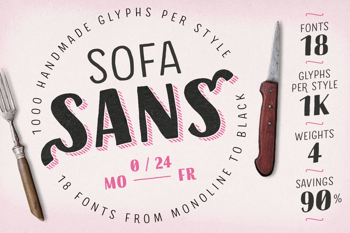
Sofa Sans: 18 Hand-Drawn Sans-Serif Fonts
Sofa Sans’ handcrafted character is friendly and eye-catching. Stylish features and alternates add personality while letting you create unique logos and stunning headlines. The font family boasts 18 different fonts and 4 unique weights from a monolinear Thin to Black, each containing more than 1000 glyphs and plenty of OpenType features.
This exclusive deal from 38 Lineart Studio offers up one stunning calligraphy script font. Khatija Calligraphy mixes elegant letters with a modern touch to create the perfect typeface for creating everything from invitations to packaging. OpenType features such as alternate characters and ligatures give this beauty real flexibility for your latest masterpiece.
The X Bundle: 2,400 Unique Design Elements from 5 Different Artists
The X Bundle isn’t just a bundle. It’s more of a mega bundle since it’s made up of 5 distinct bundles itself. Packed with more than 2,400 items from fonts to icons to patterns, this breathtaking collection features all kinds of themes from animals to plants to abstract designs. Whether you’re creating wedding invitations, apparel or company branding, this mega bundle will set you up for a long time coming.
This coffee-table friendly collection from Sticker Mule features 50 custom coasters in one deeply discounted deal. Upload your artwork and within just 4 days, your full-color coasters will ship! These thick, premium coaster board coasters are great to Impress your friends and family or for work or your own business.
Every week, we’ll give you an overview of the best deals for designers, make sure you don’t miss any by subscribing to our deals feed. You can also follow the recently launched website Type Deals if you are looking for free fonts or font deals.
Sofa Sans: 18 Hand-Drawn Sans-Serif Fonts
Sofa Sans’ handcrafted character is friendly and eye-catching. Stylish features and alternates add personality while letting you create unique logos and stunning headlines. The font family boasts 18 different fonts and 4 unique weights from a monolinear Thin to Black, each containing more than 1000 glyphs and plenty of OpenType features.
This exclusive deal from 38 Lineart Studio offers up one stunning calligraphy script font. Khatija Calligraphy mixes elegant letters with a modern touch to create the perfect typeface for creating everything from invitations to packaging. OpenType features such as alternate characters and ligatures give this beauty real flexibility for your latest masterpiece.
The X Bundle: 2,400 Unique Design Elements from 5 Different Artists
The X Bundle isn’t just a bundle. It’s more of a mega bundle since it’s made up of 5 distinct bundles itself. Packed with more than 2,400 items from fonts to icons to patterns, this breathtaking collection features all kinds of themes from animals to plants to abstract designs. Whether you’re creating wedding invitations, apparel or company branding, this mega bundle will set you up for a long time coming.
This coffee-table friendly collection from Sticker Mule features 50 custom coasters in one deeply discounted deal. Upload your artwork and within just 4 days, your full-color coasters will ship! These thick, premium coaster board coasters are great to Impress your friends and family or for work or your own business.
In this week’s look around the world of web platform news, Google Search Console makes it easier to view crawled markup, we learn that custom properties aren’t computing hogs, variables defined at the top-level in JavaScript are global to other page scripts, and Babel env now supports the defaults query — plus all of last month’s news compiled into a single package for you.
Easier HTML inspection in Google Search Console
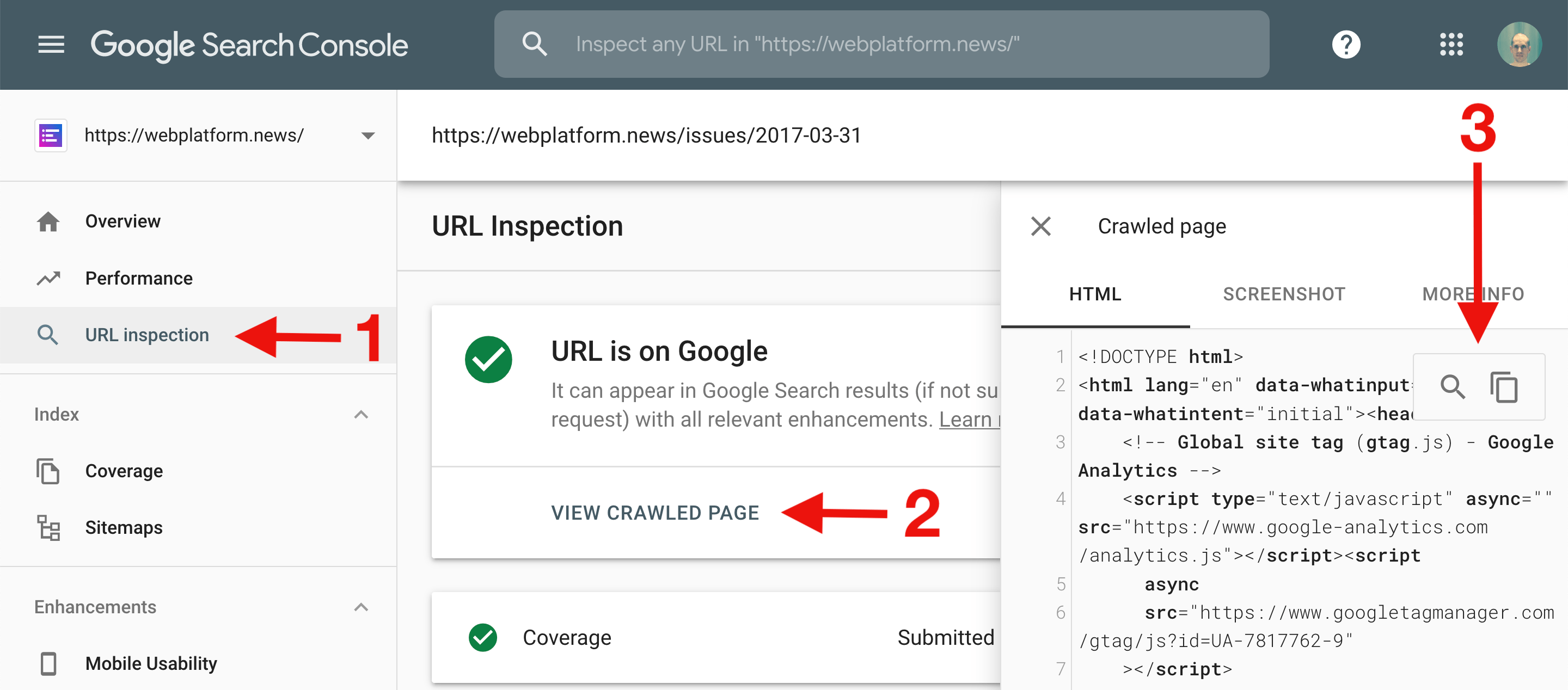
The URL Inspection tool in Google Search Console now includes useful controls for searching within and copying the HTML code of the crawled page.
Note: The URL Inspection tool provides information about Google’s indexed version of a specific page. You can access Google Search Console at https://search.google.com/search-console.
The value of a CSS custom property is computed once per element. If you define a custom property --func on the <html> element that uses the value of another custom property --val, then re-defining the value of --val on a nested DOM element that uses --func won’t have any effect because the inherited value of --func is already computed.
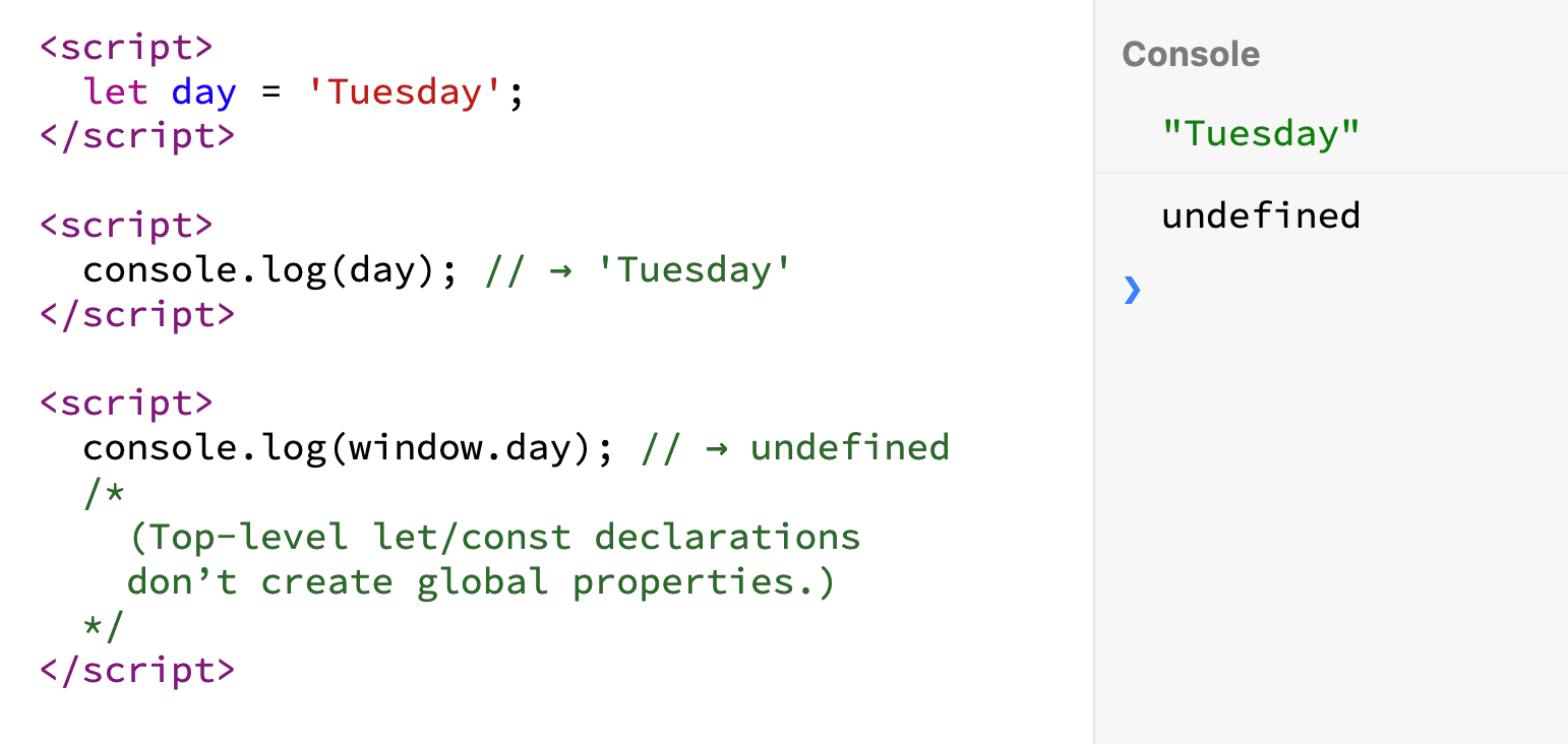
JavaScript variables created via let, const, or class declarations at the top level of a script (<script> element) continue to be defined in subsequent scripts included in the page.
Babel’s env preset (@babel/preset-env) now allows you to target browserslist’s default browsers (which are listed at browsersl.ist). Note that if you don’t specify your target browsers, Babel env will run every syntax transform on your code.
Authentication is a necessary part of every web application. It is a handy means by which we can personalize experiences and load content specific to a user — like a logged in state. It can also be used to evaluate permissions, and prevent otherwise private information from being accessed by unauthorized users.
A common practice that applications use to protect content is to house them under specific routes and build redirect rules that navigate users toward or away from a resource depending on their permissions. To gate content reliably behind protected routes, they need to build to separate static pages. This way, redirect rules can properly handle redirects.
In the case of Single Page Applications (SPAs) built with modern front-end frameworks, like Vue, redirect rules cannot be utilized to protect routes. Because all pages are served from a single entry file, from a browser’s perspective, there is only one page: index.html. In a SPA, route logic generally stems from a routes file. This is where we will do most of our auth configuration for this post. We will specifically lean on Vue’s navigation guards to handle authentication specific routing since this helps us access selected routes before it fully resolves. Let’s dig in to see how this works.
Roots and Routes
Navigation guards are a specific feature within Vue Router that provide additional functionality pertaining to how routes get resolved. They are primarily used to handle error states and navigate a user seamlessly without abruptly interrupting their workflow.
There are three main categories of guards in Vue Router: Global Guards, Per Route Guards and In Component Guards. As the names suggest, Global Guards are called when any navigation is triggered (i.e. when URLs change), Per Route Guards are called when the associated route is called (i.e. when a URL matches a specific route), and Component Guards are called when a component in a route is created, updated or destroyed. Within each category, there are additional methods that gives you more fine grained control of application routes. Here’s a quick break down of all available methods within each type of navigation guard in Vue Router.
Global Guards
beforeEach: action before entering any route (no access to this scope)
beforeResolve: action before the navigation is confirmed, but after in-component guards (same as beforeEach with this scope access)
afterEach: action after the route resolves (cannot affect navigation)
Per Route Guards
beforeEnter: action before entering a specific route (unlike global guards, this has access to this)
Component Guards
beforeRouteEnter: action before navigation is confirmed, and before component creation (no access to this)
beforeRouteUpdate: action after a new route has been called that uses the same component
beforeRouteLeave: action before leaving a route
Protecting Routes
To implement them effectively, it helps to know when to use them in any given scenario. If you wanted to track page views for analytics for instance, you may want to use the global afterEach guard, since it gets fired when the route and associated components are fully resolved. And if you wanted to prefetch data to load onto a Vuex store before a route resolves, you could do so using the beforeEnter per route guard.
Since our example deals with protecting specific routes based on a user’s access permissions, we will use in component navigation guards, namely the beforeEnter hook. This navigation guard gives us access to the proper route before the resolve completes; meaning that we can fetch data or check that data has loaded before letting a user pass through. Before diving into the implementation details of how this works, let’s briefly look at how our beforeEnter hook fits into our existing routes file. Below, we have our sample routes file, which has our protected route, aptly named protected. To this, we will add our beforeEnter hook to it like so:
The anatomy of a beforeEnter is not much different from other available navigation guards in Vue Router. It accepts three parameters: to, the “future” route the app is navigating to; from, the “current/soon past” route the app is navigating away from and next, a function that must be called for the route to resolve successfully.
Generally, when using Vue Router, next is called without any arguments. However, this assumes a perpetual success state. In our case, we want to ensure that unauthorized users who fail to enter a protected resource have an alternate path to take that redirects them appropriately. To do this, we will pass in an argument to next. For this, we will use the name of the route to navigate users to if they are unauthorized like so:
next({
  name: "dashboard"
})
Let’s assume in our case, that we have a Vuex store where we store a user’s authorization token. In order to check that a user has permission, we will check this store and either fail or pass the route appropriately.
beforeEnter(to, from, next) {
  // check vuex store //
  if (store.getters["auth/hasPermission"]) {
    next()
  } else {
    next({
      name: "dashboard" // back to safety route //
    });
  }
}
In order to ensure that events happen in sync and that the route doesn’t prematurely load before the Vuex action is completed, let’s convert our navigation guards to use async/await.
async beforeEnter(to, from, next) {
  try {
    var hasPermission = await store.dispatch("auth/hasPermission");
    if (hasPermission) {
      next()
    }
  } catch (e) {
    next({
      name: "dashboard" // back to safety route //
    })
  }
}
Never forget where you came from
So far our navigation guard fulfills its purpose of preventing unauthorized users access to protected resources by redirecting them to where they may have come from (i.e. the dashboard page). Even so, such a workflow is disruptive. Since the redirect is unexpected, a user may assume user error and attempt to access the route repeatedly with the eventual assumption that the application is broken. To account for this, let’s create a way to let users know when and why they are being redirected.
We can do this by passing in a query parameter to the next function. This allows us to append the protected resource path to the redirect URL. So, if you want to prompt a user to log into an application or obtain the proper permissions without having to remember where they left off, you can do so. We can get access to the path of the protected resource via the to route object that is passed into the beforeEnter function like so: to.fullPath.
async beforeEnter(to, from, next) {
  try {
    var hasPermission = await store.dispatch("auth/hasPermission");
    if (hasPermission) {
      next()
    }
  } catch (e) {
    next({
      name: "login", // back to safety route //
      query: { redirectFrom: to.fullPath }
    })
  }
}
Notifying
The next step in enhancing the workflow of a user failing to access a protected route is to send them a message letting them know of the error and how they can solve the issue (either by logging in or obtaining the proper permissions). For this, we can make use of in component guards, specifically, beforeRouteEnter, to check whether or not a redirect has happened. Because we passed in the redirect path as a query parameter in our routes file, we now can check the route object to see if a redirect happened.
beforeRouteEnter(to, from, next) {
  if (to.query.redirectFrom) {
    // do something //
  }
}
As I mentioned earlier, all navigation guards must call next in order for a route to resolve. The upside to the next function as we saw earlier is that we can pass an object to it. What you may not have known is that you can also access the Vue instance within the next function. Wuuuuuuut? Here’s what that looks like:
next(() => {
  console.log(this) // this is the Vue instance
})
You may have noticed that you don’t technically have access to the this scope when using beforeEnter. Though this might be the case, you can still access the Vue instance by passing in the vm to the function like so:
next(vm => {
  console.log(vm) // this is the Vue instance
})
This is especially handy because you can now create and appropriately update a data property with the relevant error message when a route redirect happens. Say you have a data property called errorMsg. You can now update this property from the next function within your navigation guards easily and without any added configuration. Using this, you would end up with a component like this:
<template>
  <div>
    <span>{{ errorMsg }}</span>
    <!-- some other fun content -->
    ...
    <!-- some other fun content -->
  </div>
</template>
<script>
export default {
  name: "Error",
  data() {
    return {
      errorMsg: null
    }
  },
  beforeRouteEnter(to, from, next) {
    if (to.query.redirectFrom) {
      next(vm => {
        vm.errorMsg =
          "Sorry, you don't have the right access to reach the route requested"
      })
    } else {
      next()
    }
  }
}
</script>
Conclusion
The process of integrating authentication into an application can be a tricky one. We covered how to gate a route from unauthorized access as well as how to put workflows in place that redirect users toward and away from a protected resource based on their permissions. The assumption thus far has been that you already have authentication configured in your application. If you don’t yet have this configured and you’d like to get up and running fast, I highly recommend working with authentication as a service. There are providers like Netlify’s Identity Widget or Auth0’s lock.
You can’t position: sticky; a <thead>. Nor a <tr>. But you can sticky a <th>, which means you can make sticky headers inside a regular ol’ <table>. This is tricky stuff, because if you didn’t know this weird quirk, it would be hard to blame you. It makes way more sense to sticky a parent element like the table header rather than each individiaul element in a row.
The issue boils down to the fact that stickiness requires position: relative to work and that doesn’t apply to <thead> and <tr> in the CSS 2.1 spec.
There are two very extreme reactions to this, should you need to implement sticky table headers and not be aware of the <th> workaround.
Don’t use table markup at all. Instead, use different elements (<div>s and whatnot) and other CSS layout methods to replicate the style of a table, but not locked out of using position: relative and creating position: sticky parent elements.
Use table elements, but totally remove all their styling defaults with new display values.
The first is dangerous because you aren’t using semantic and accessible elements for the content to be read and navigated. The second is almost the same. You can go that route, but need to be really careful to re-apply semantic roles.
Anyway, none of that matters if you just stick (get it?!) to using a sticky value on those <th> elements.
It’s probably a bit weird to have table headers as a row in the middle of a table, but it’s just illustrating the idea. I was imagining colored header bars separating players on different sports teams or something.
Anytime I think about data tables, I also think about how tricky it can be to make them responsive. Fortunately, there are a variety of ways, all depending on the best way to group and explore the data in them.
For the 20th anniversary of Joelapompe.net (The Advertising Copycat hunter since 1999), The Masked Agency is launching an ad campaign starring well-known admen and adwomen who have a curious resemblance to other celebrities with the catchphrase: “Advertising is full of look-alikes. Some are funny, others no. Joe La Pompe. Copycat hunter since 1999”. Who is the original and who is the copy? Like on this blog, it’s up to you to judge! With this small difference that here, it’s only coincidences.
Franck Provost (Hairdresser) vs Stéphane Xiberras (BETC Paris) – Mike Horn vs Olivier Altmann (Altmann + Pacreau) – Peter Graves vs Maurice Levy (Publicis Worldwide) – Josiane Balasko (french actress) vs Mercedes Erra (BETC) – Clint Eastwood vs Sir John Hegarty (BBH) – Vahid Halilhodzic (Soccer manager) vs Jean-Marie Dru (TBWA) – Catherine O’Hara vs Margaret Johnson (Goodby Silverstein & Partners) – Tim Burton vs Gabriel Gaultier – Jorge Garcia vs Pierre Berville – Michael Cain vs Sir Franck Lowe (LOLA Mullen Lowe) – Christopher Lee vs Lee Clow (TBWA)
For the 20th anniversary of Joelapompe.net (The Advertising Copycat hunter since 1999), The Masked Agency is launching an ad campaign starring well-known admen and adwomen who have a curious resemblance to other celebrities with the catchphrase: “Advertising is full of look-alikes. Some are funny, others no. Joe La Pompe. Copycat hunter since 1999”. Who is the original and who is the copy? Like on this blog, it’s up to you to judge! With this small difference that here, it’s only coincidences.
Franck Provost (Hairdresser) vs Stéphane Xiberras (BETC Paris) – Mike Horn vs Olivier Altmann (Altmann + Pacreau) – Peter Graves vs Maurice Levy (Publicis Worldwide) – Josiane Balasko (french actress) vs Mercedes Erra (BETC) – Clint Eastwood vs Sir John Hegarty (BBH) – Vahid Halilhodzic (Soccer manager) vs Jean-Marie Dru (TBWA) – Catherine O’Hara vs Margaret Johnson (Goodby Silverstein & Partners) – Tim Burton vs Gabriel Gaultier – Jorge Garcia vs Pierre Berville – Michael Cain vs Sir Franck Lowe (LOLA Mullen Lowe) – Christopher Lee vs Lee Clow (TBWA)
For the 20th anniversary of Joelapompe.net (The Advertising Copycat hunter since 1999), The Masked Agency is launching an ad campaign starring well-known admen and adwomen who have a curious resemblance to other celebrities with the catchphrase: “Advertising is full of look-alikes. Some are funny, others no. Joe La Pompe. Copycat hunter since 1999”. Who is the original and who is the copy? Like on this blog, it’s up to you to judge! With this small difference that here, it’s only coincidences.
Franck Provost (Hairdresser) vs Stéphane Xiberras (BETC Paris) – Mike Horn vs Olivier Altmann (Altmann + Pacreau) – Peter Graves vs Maurice Levy (Publicis Worldwide) – Josiane Balasko (french actress) vs Mercedes Erra (BETC) – Clint Eastwood vs Sir John Hegarty (BBH) – Vahid Halilhodzic (Soccer manager) vs Jean-Marie Dru (TBWA) – Catherine O’Hara vs Margaret Johnson (Goodby Silverstein & Partners) – Tim Burton vs Gabriel Gaultier – Jorge Garcia vs Pierre Berville – Michael Cain vs Sir Franck Lowe (LOLA Mullen Lowe) – Christopher Lee vs Lee Clow (TBWA)
In this article, we’ll be taking a look at the structure inside <input type='color'> elements, browser inconsistencies, why they look a certain way in a certain browser, and how to dig into it. Having a good understanding of this input allows us to evaluate whether a certain cross-browser look can be achieved and how to do so with a minimum amount of effort and code.
Here’s exactly what we’re talking about:
But before we dive into this, we need to get into…
Accessibility issues!
We’ve got a huge problem here: for those who completely rely on a keyboard, this input doesn’t work as it should in Safari and in Firefox on Windows, but it does work in Firefox on Mac and Linux (which I only tested on Fedora, so feel free to yell at me in the comments if it doesn’t work for you using another distribution).
In Firefox on Windows, we can Tab to the input to focus it, press Enter to bring up a dialog… which we then cannot navigate with the keyboard!
I’ve tried tabbing, arrow keys, and every other key available on the keyboard… nothing! I could at least close the dialog with good old Alt + F4. Later, in the bug ticket I found for this on Bugzilla, I also discovered a workaround: Alt + Tab to another window, then Alt + Tab back and the picker dialog can be navigated with the keyboard.
Things are even worse in Safari. The input isn’t even focusable (bug ticket) if VoiceOver isn’t on. And even when using VoiceOver, tabbing through the dialog the inputs opens is impossible.
If you’d like to use <input type='color'> on an actual website, please let browsers know this is something that needs to be solved!
How to look inside
In Chrome, we need to bring up DevTools, go to Settings and, in the Preferences section under Elements, check the Show user agent shadow DOM option.
How to view the structure inside an input in Chrome.
Then, when we return to inspect our element, we can see inside its shadow DOM.
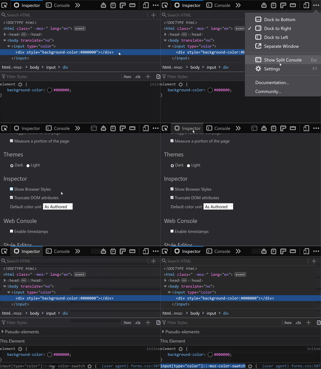
In Firefox, we need to go to about:config and ensure the devtools.inspector.showAllAnonymousContent flag is set to true.
How to view the structure inside an input in Firefox.
Then, we close the DevTools and, when we inspect our input again, we can see inside our input.
Sadly, we don’t seem to have an option for this in pre-Chromium Edge.
The structure inside
The structure revealed in DevTools differs from browser to browser, just like it does for range inputs.
In Chrome, at the top of the shadow DOM, we have a <div> wrapper that we can access using ::-webkit-color-swatch-wrapper.
Inside it, we have another <div> we can access with ::-webkit-color-swatch.
Inner structure in Chrome.
In Firefox, we only see one <div>, but it’s not labeled in any way, so how do we access it?
On a hunch, given this <div> has the background-color set to the input’s value attribute, just like the ::-webkit-color-swatch component, I tried ::-moz-color-swatch. And it turns out it works!
Inner structure in Firefox.
However, I later learned we have a better way of figuring this out for Firefox!
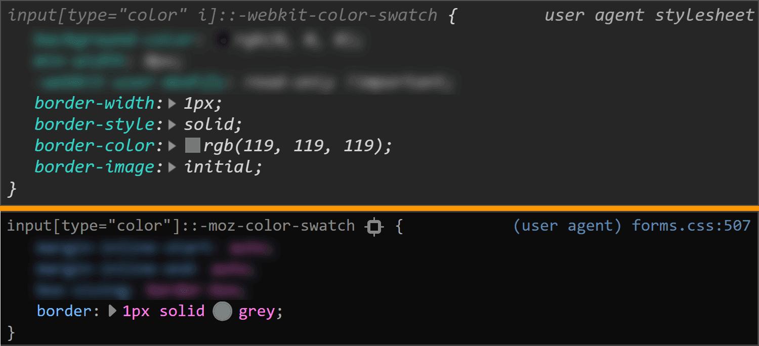
We can go into the Firefox DevTools Settings and, in the Inspector section, make sure the „Show Browser Styles” option is checked. Then, we go back to the Inspector and select this <div> inside our <input type='color'>. Among the user agent styles, we see a rule set for input[type='color']::-moz-color-swatch!
Enable viewing browser styles in Firefox DevTools.
In pre-Chromium Edge, we cannot even see what kind of structure we have inside. I gave ::-ms-color-swatch a try, but it didn’t work and neither did ::-ms-swatch (which I considered because, for an input type='range', we have ::-webkit-slider-thumb and ::-moz-range thumb, but just ::-ms-thumb).
After a lot of searching, all I found was this issue from 2016. Pre-Chromium Edge apparently doesn’t allow us to style whatever is inside this input. Well, that’s a bummer.
How to look at the browser styles
In all browsers, we have the option of not applying any styles of our own and then looking at the computed styles.
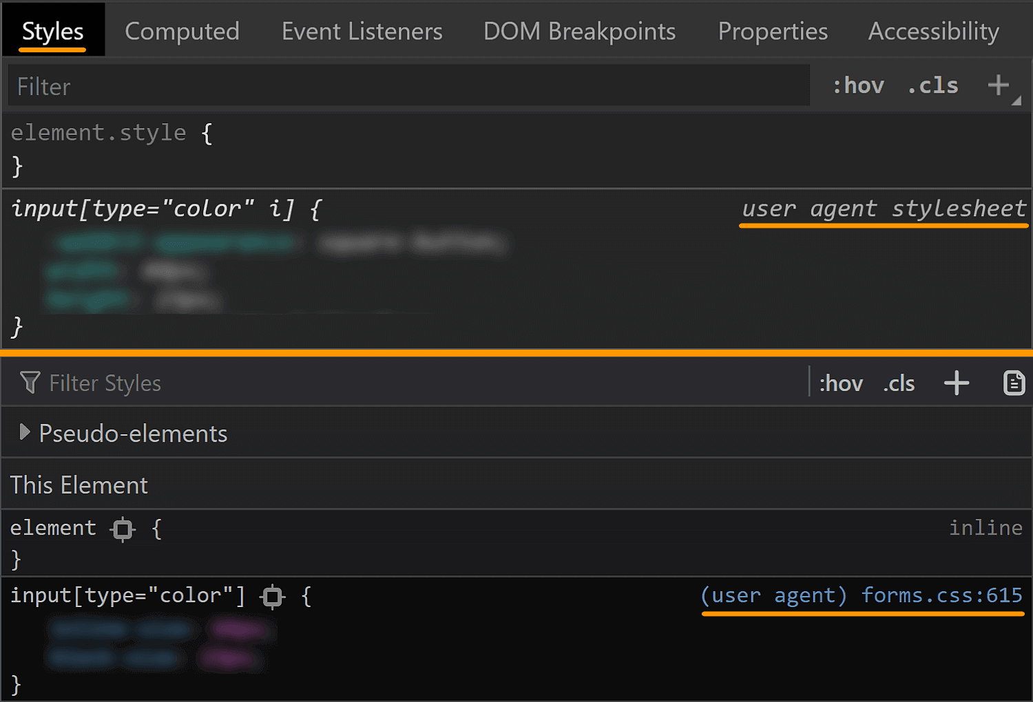
In Chrome and Firefox, we can also see the user agent stylesheet rule sets that are affecting the currently selected element (though we need to explicitly enable this in Firefox, as seen in the previous section).
Checking browser styles in Chrome and Firefox.
This is oftentimes more helpful than the computed styles, but there are exceptions and we should still always check the computed values as well.
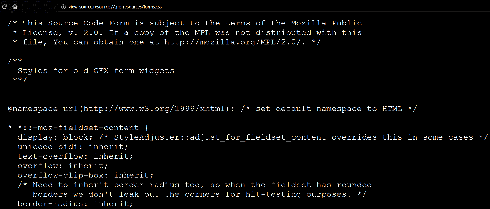
In Firefox, we can also see the CSS file for the form elements at view-source:resource://gre-resources/forms.css.
Checking browser styles in Firefox.
The input element itself
We’ll now be taking a look at the default values of a few properties in various browsers in order to get a clear picture of what we’d really need to set explicitly in order to get a custom cross-browser result.
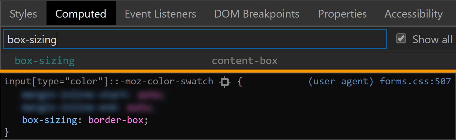
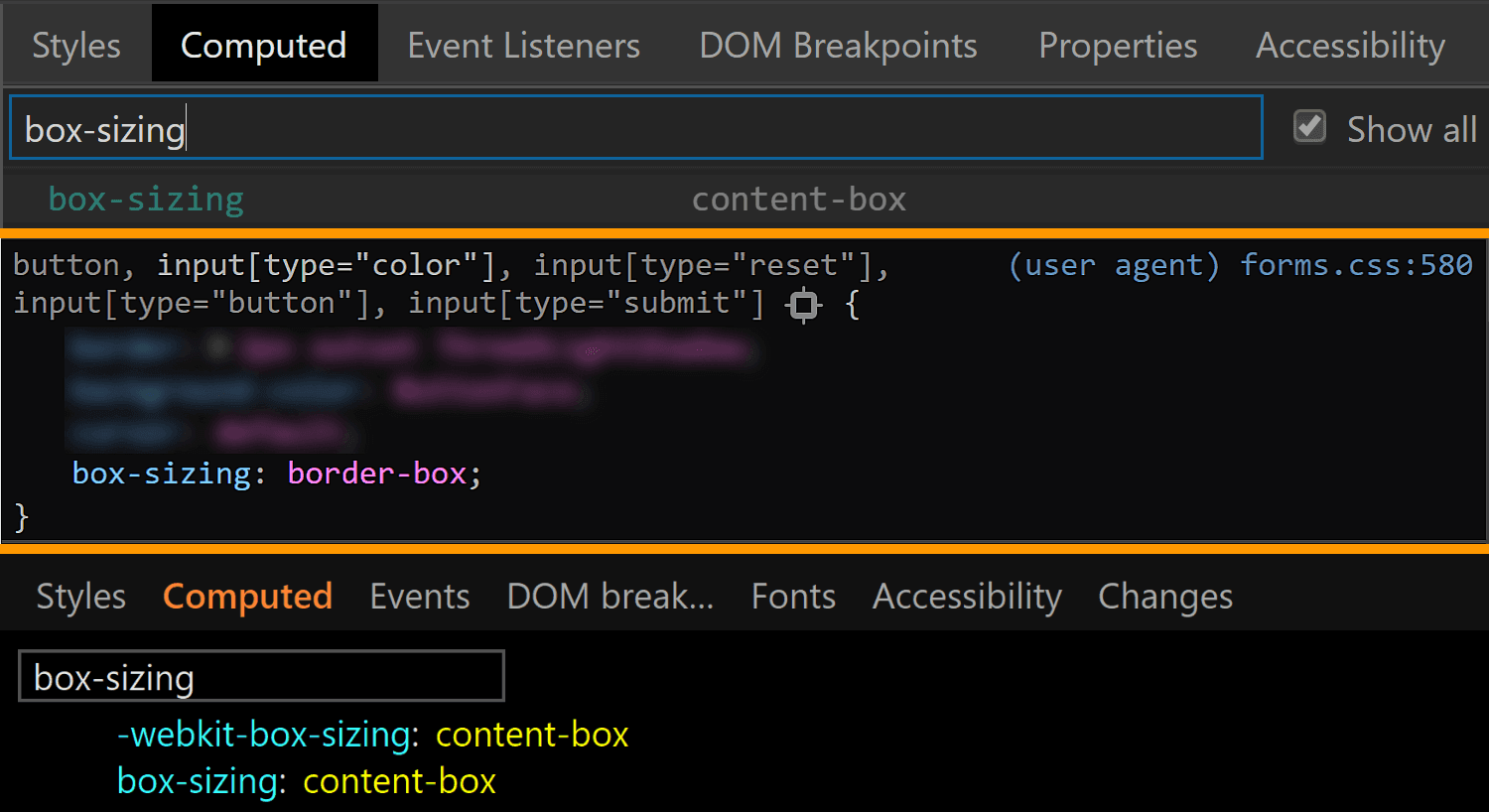
The first property I always think about checking when it comes to <input> elements is box-sizing. The initial value of this property is border-box in Firefox, but content-box in Chrome and Edge.
The box-sizing values for <input type='color'> compared in Chrome, Firefox and Edge (from top-to-bottom).
We can see that Firefox is setting it to border-box on <input type='color'>, but it looks like Chrome isn’t setting it at all, so it’s left with the initial value of content-box (and I suspect the same is true for Edge).
In any event, what it all means is that, if we are to have a border or a padding on this element, we also need to explicitly set box-sizing so that we get a consistent result across all these browsers.
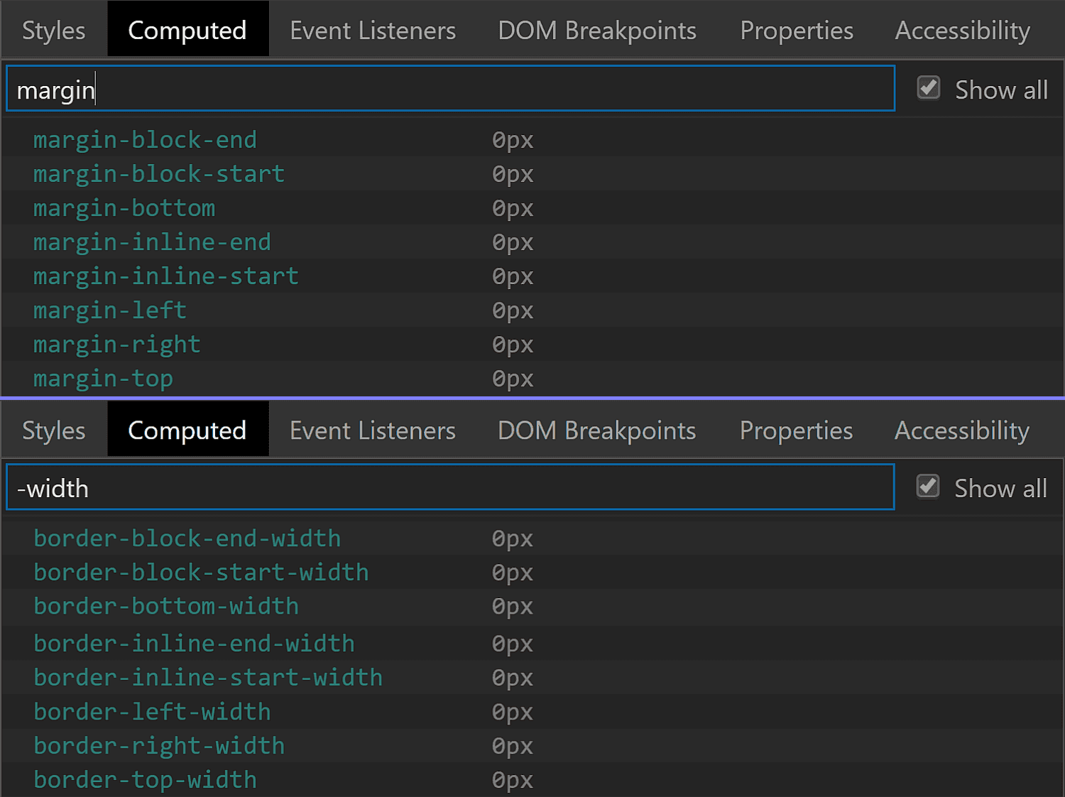
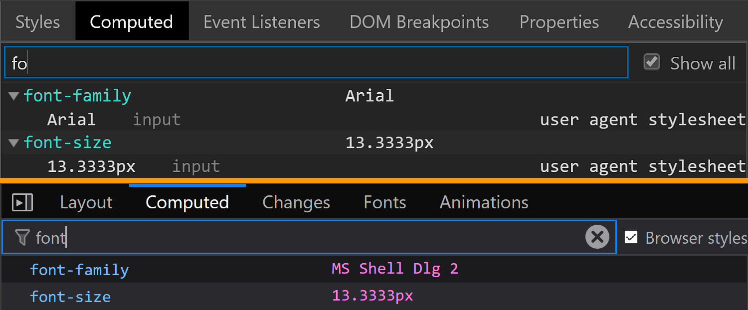
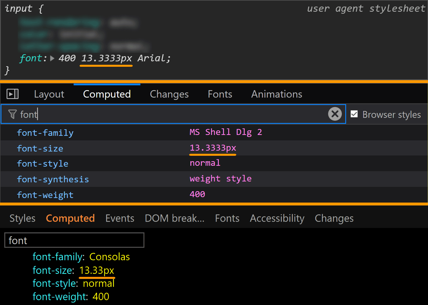
The font property value is different for every browser, but since we don’t have text inside this input, all we really care about is the font-size, which is consistent across all browsers I’ve checked: 13.33(33)px. This is a value that really looks like it came from dividing 40px by 3, at least in Chrome.
The font values for <input type='color'> compared in Chrome, Firefox and Edge (from top-to-bottom).
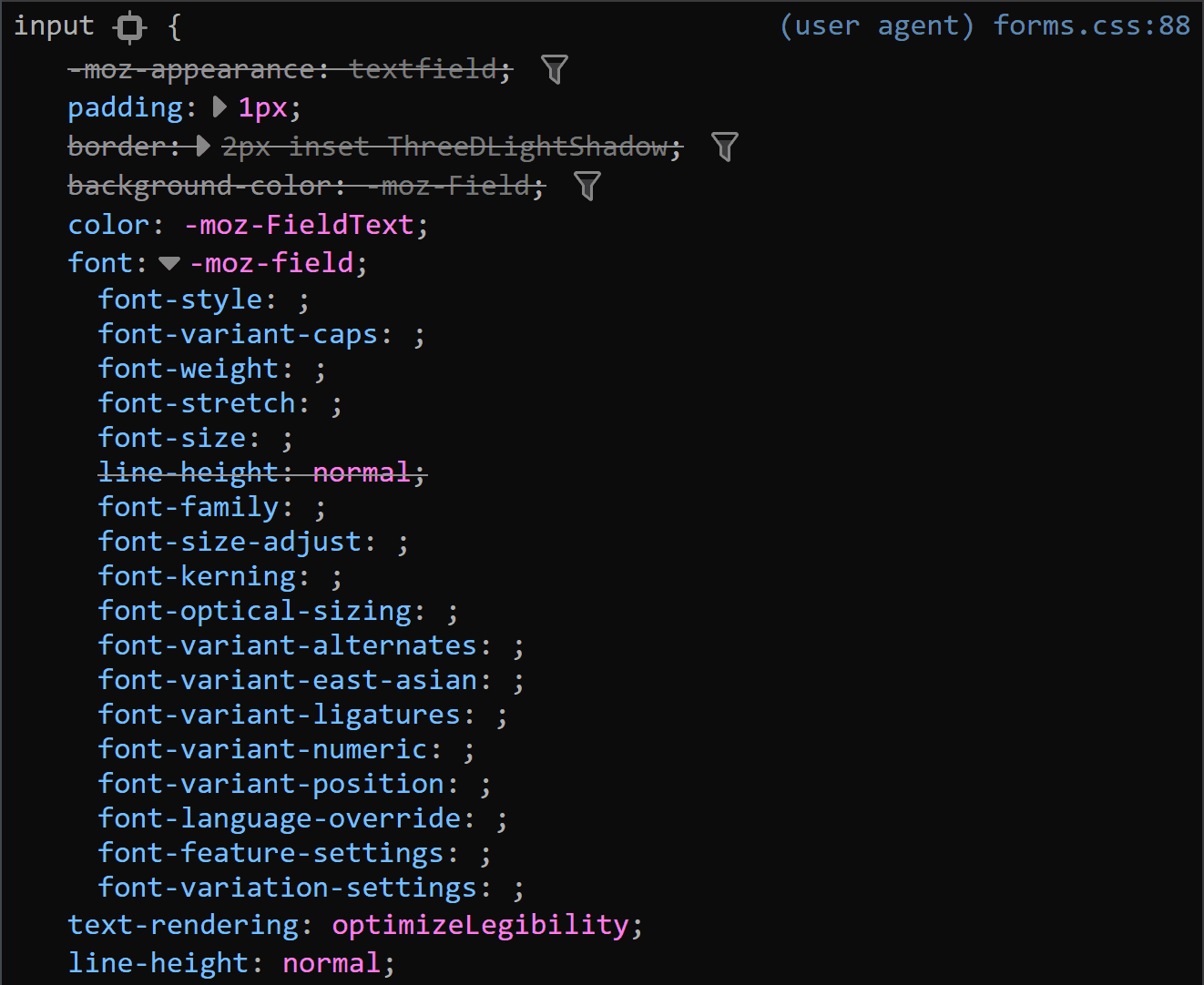
This is a situation where the computed styles are more useful for Firefox, because if we look at the browser styles, we don’t get much in terms of useful information:
Sometimes the browser styles are pretty much useless (Firefox screenshot).
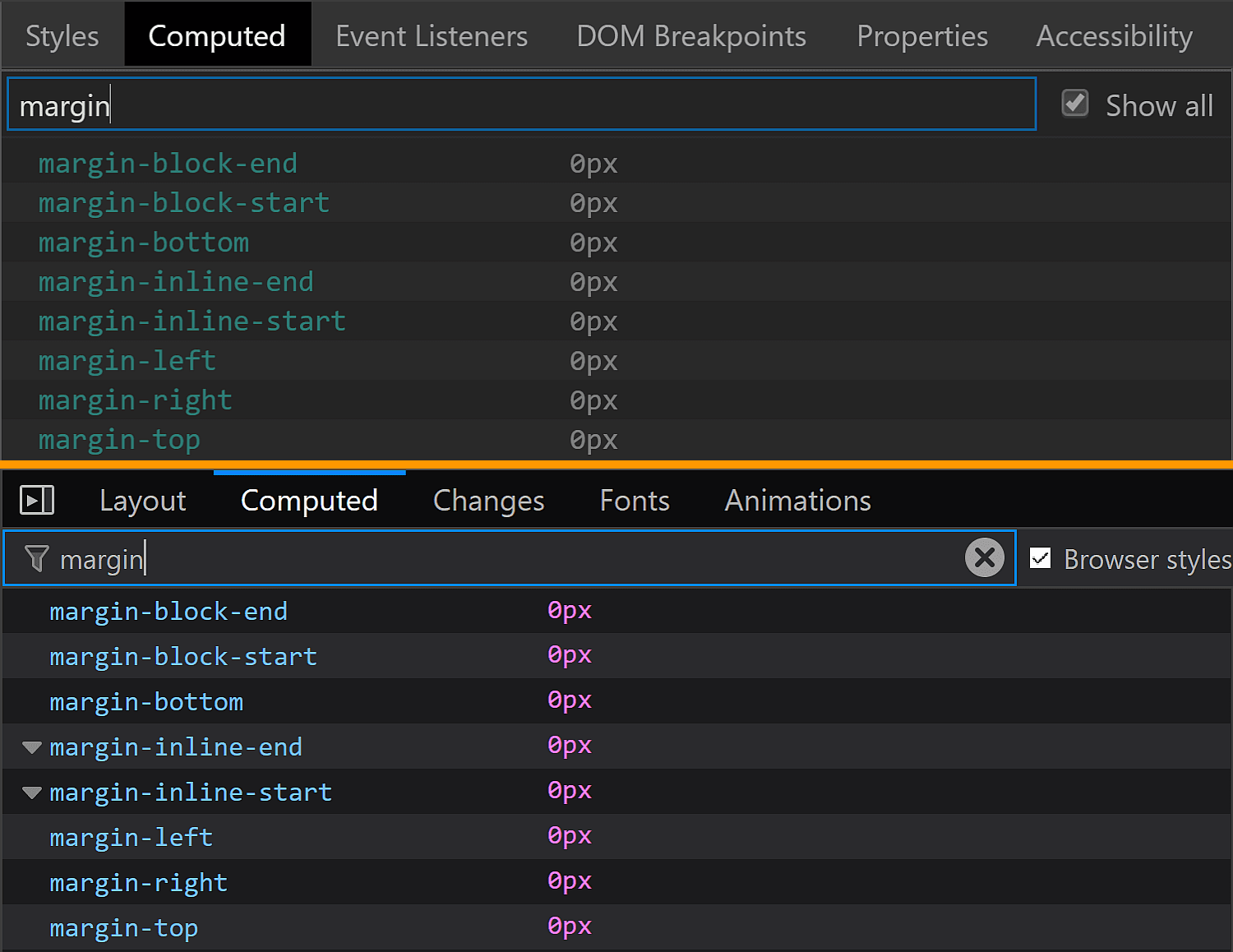
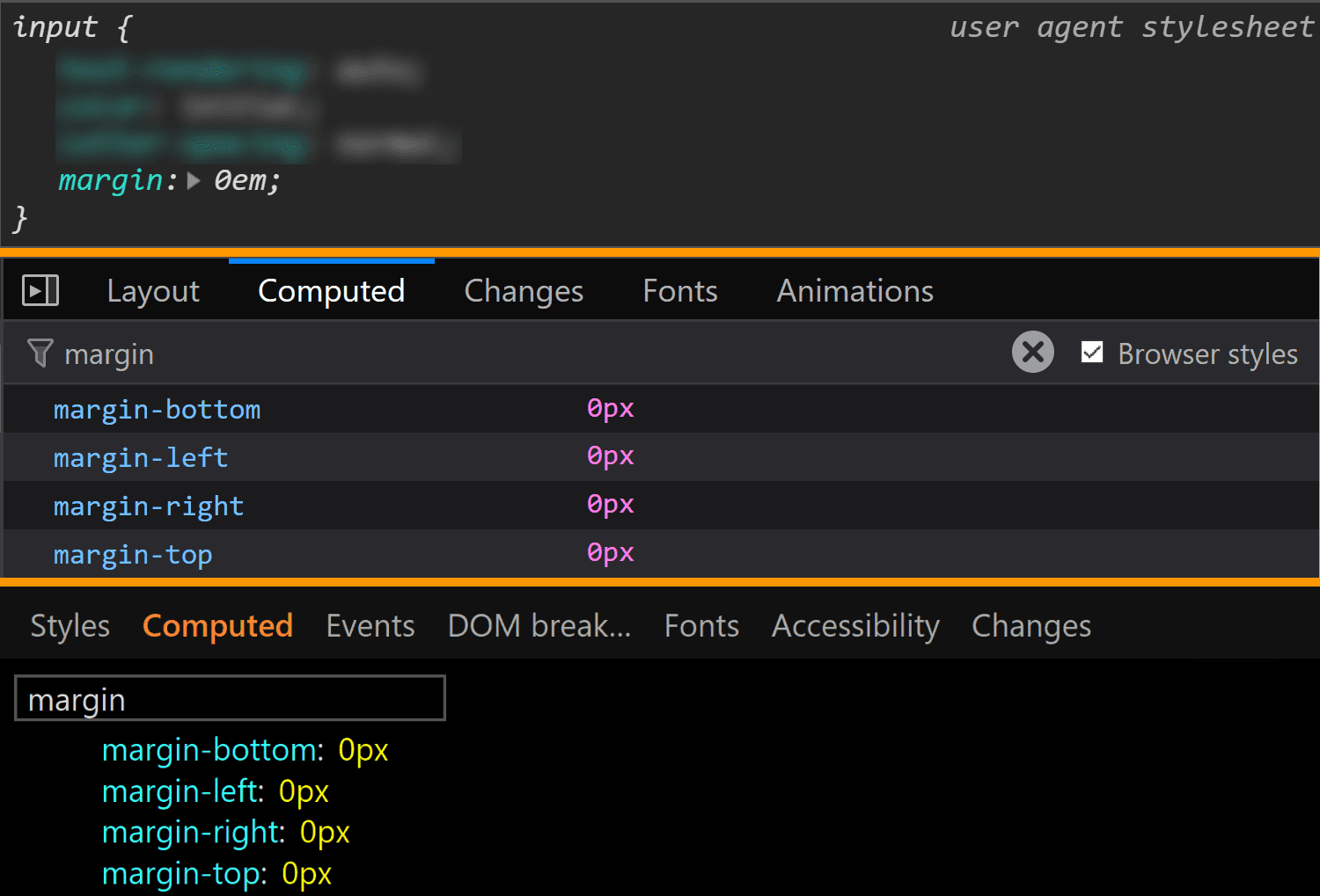
The margin is also consistent across all these browsers, computing to 0.
The margin values for <input type='color'> compared in Chrome, Firefox and Edge (from top-to-bottom).
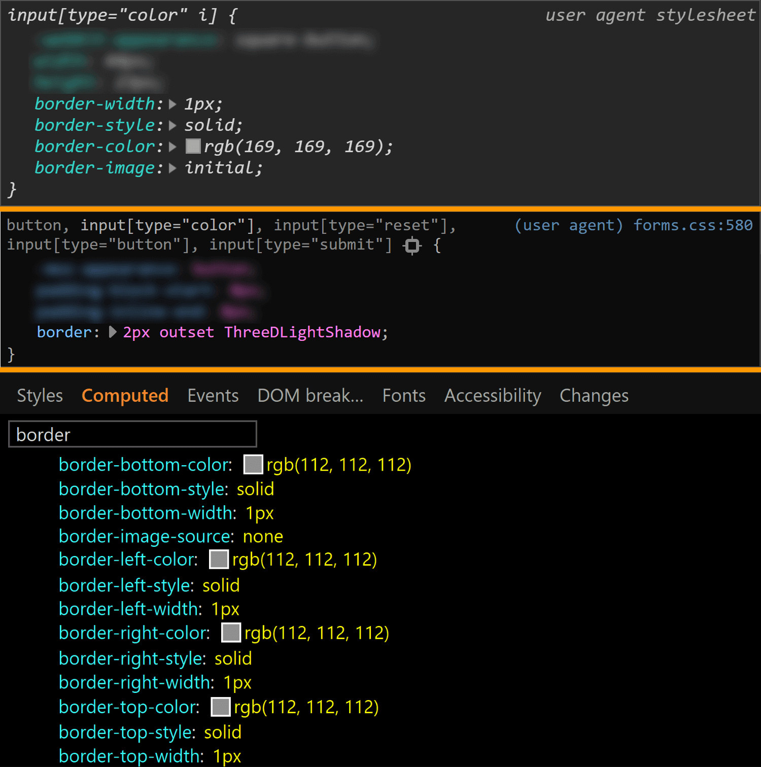
The border is different for every single browser. In both Chrome and Edge, we have a solid 1px one, but the border-color is different (rgb(169, 169, 169) for Chrome and rgb(112, 112, 112) for Edge). In Firefox, the border is an outset 2px one, with a border-color of… ThreeDLightShadow?!
The border values for <input type='color'> compared in Chrome, Firefox and Edge (from top-to-bottom).
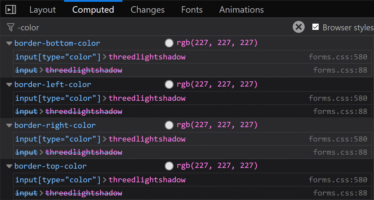
What’s the deal with ThreeDLightShadow? If it doesn’t sound familiar, don’t worry! It’s a (now deprecated) CSS2 system value, which Firefox on Windows shows me to be rgb(227, 227, 227) in the Computed styles tab.
Computed border-color for <input type='color'> in Firefox on Windows.
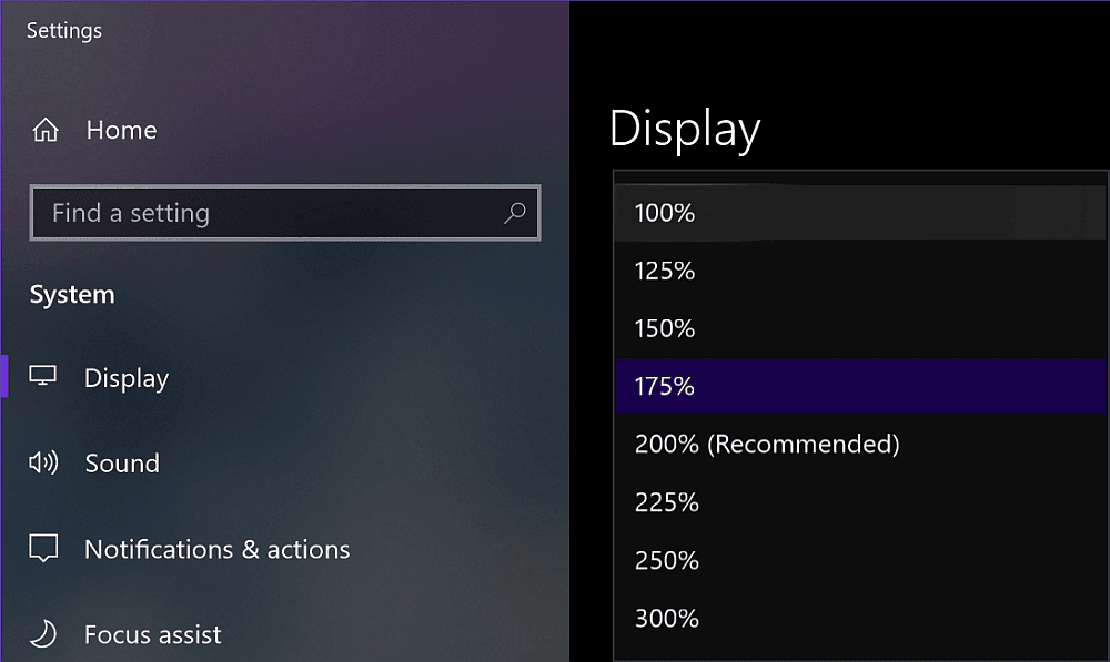
Note that in Firefox (at least on Windows), the operating system zoom level (Settings → System → Display → Scale and Layout → Change the size of text, apps and other items) is going to influence the computed value of the border-width, even though this doesn’t seem to happen for any other property I’ve checked and it seems to be partially related to the border-style.
Zoom level options on Windows.
The strangest thing is the computed border-width values for various zoom levels don’t seem to make any sense. If we keep the initial border-style: outset, we have:
1.6px for 125%
2px for 150%
1.7px for 175%
1.5px for 200%
1.8px for 225%
1.6px for 250%
1.66667px for 300%
If we set border-style: solid, we have a computed border-width of 2px, exactly as it was set, for zoom values that are multiples of 50% and the exact same computed values as for border-style: outset for all the other zoom levels.
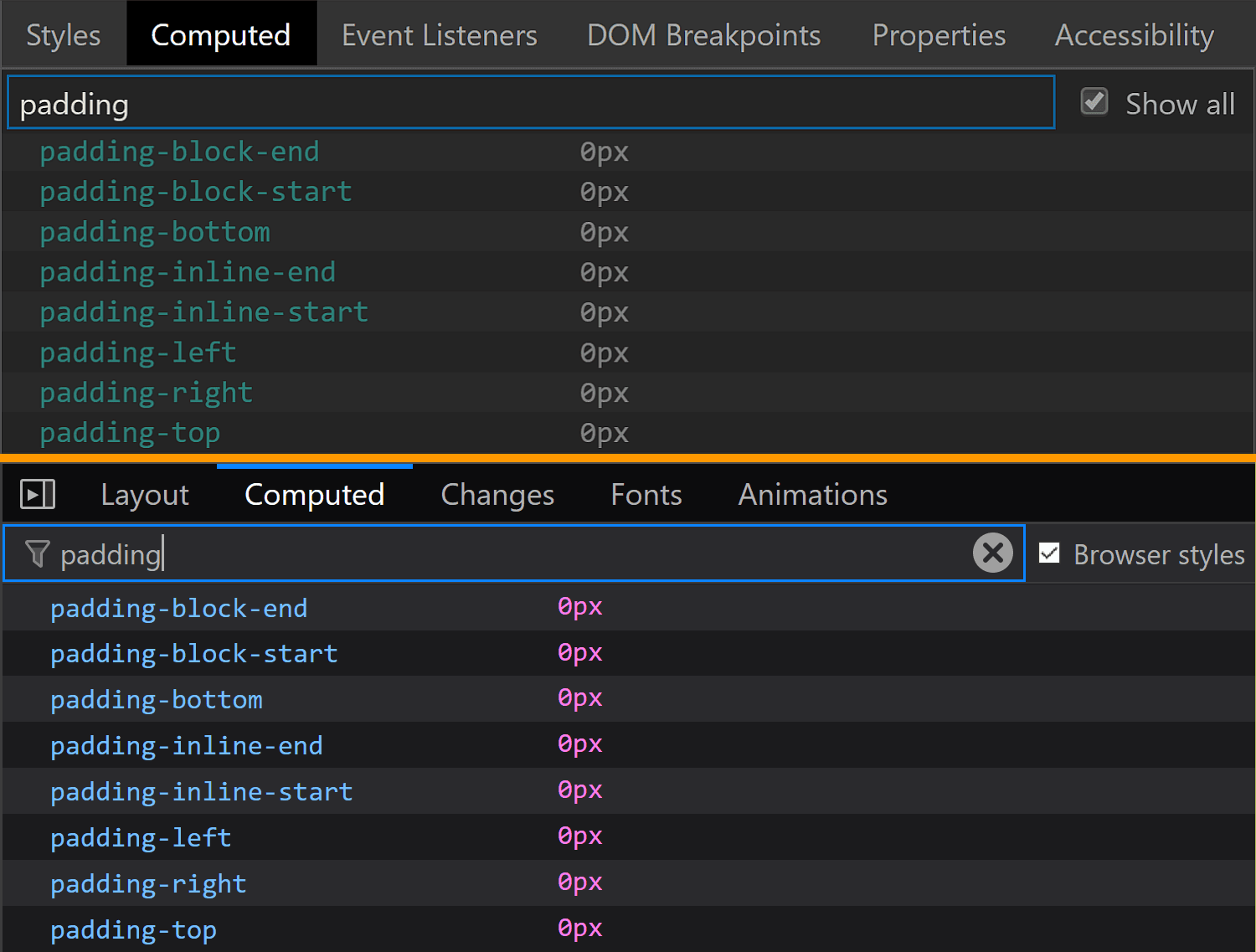
The padding is the same for Chrome and Edge (1px 2px), while Firefox is the odd one out again.
The padding values for <input type='color'> compared in Chrome, Firefox and Edge (from top-to-bottom).
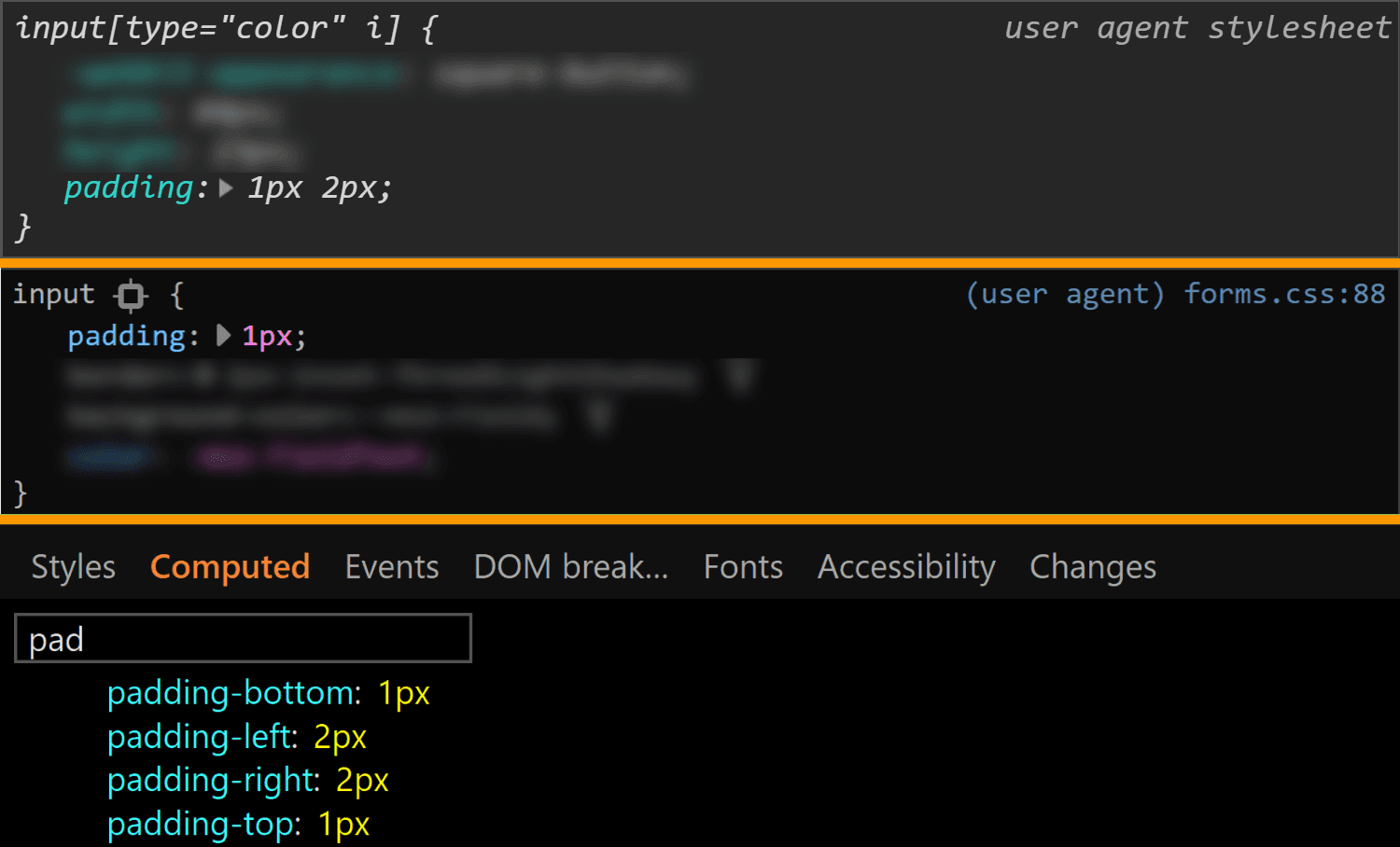
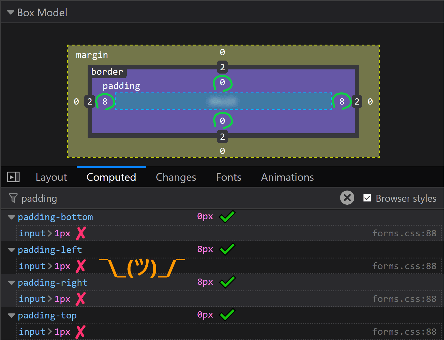
It may look like the Firefox padding is 1px. That’s what it is set to and there’s no indication of anything overriding it — if a property is overridden, then it’s shown as grey and with a strike-through.
Spotting overrides in Firefox.
But the computed value is actually 0 8px! Moreover, this is a value that doesn’t depend on the operating system zoom level. So, what the hairy heck is going on?!
Computed value for padding in Firefox doesn’t match the value that was set on input.
Now, if you’ve actually tried inspecting a color input, took a close look at the styles set on it, and your brain works differently than mine (meaning you do read what’s in front of you and don’t just scan for the one thing that interests you, completely ignoring everything else…) then you’ve probably noticed there is something overriding the 1px padding (and should be marked as such) — the flow-relative padding!
Flow-relative padding overrides in Firefox.
Dang, who knew those properties with lots of letters were actually relevant? Thanks to Zoltan for noticing and letting me know. Otherwise, it probably would have taken me two more days to figure this one out.
This raises the question of whether the same kind of override couldn’t happen in other browsers and/or for other properties.
Edge doesn’t support CSS logical properties, so the answer is a „no” in that corner.
In Chrome, none of the logical properties for margin, border or padding are set explicitly for <input type='color'>, so we have no override.
Concerning other properties in Firefox, we could have found ourselves in the same situation for margin or for border, but with these two, it just so happens the flow-relative properties haven’t been explicitly set for our input, so again, there’s no override.
Even so, it’s definitely something to watch out for in the future!
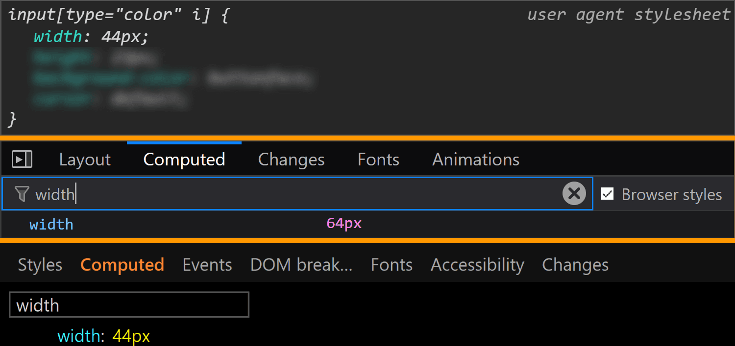
Moving on to dimensions, our input’s width is 44px in Chrome and Edge and 64px in Firefox.
The width values for <input type='color'> compared in Chrome, Firefox and Edge (from top-to-bottom).
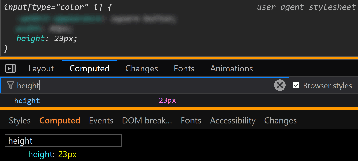
Its height is 23px in all three browsers.
The height values for <input type='color'> compared in Chrome, Firefox and Edge (from top-to-bottom).
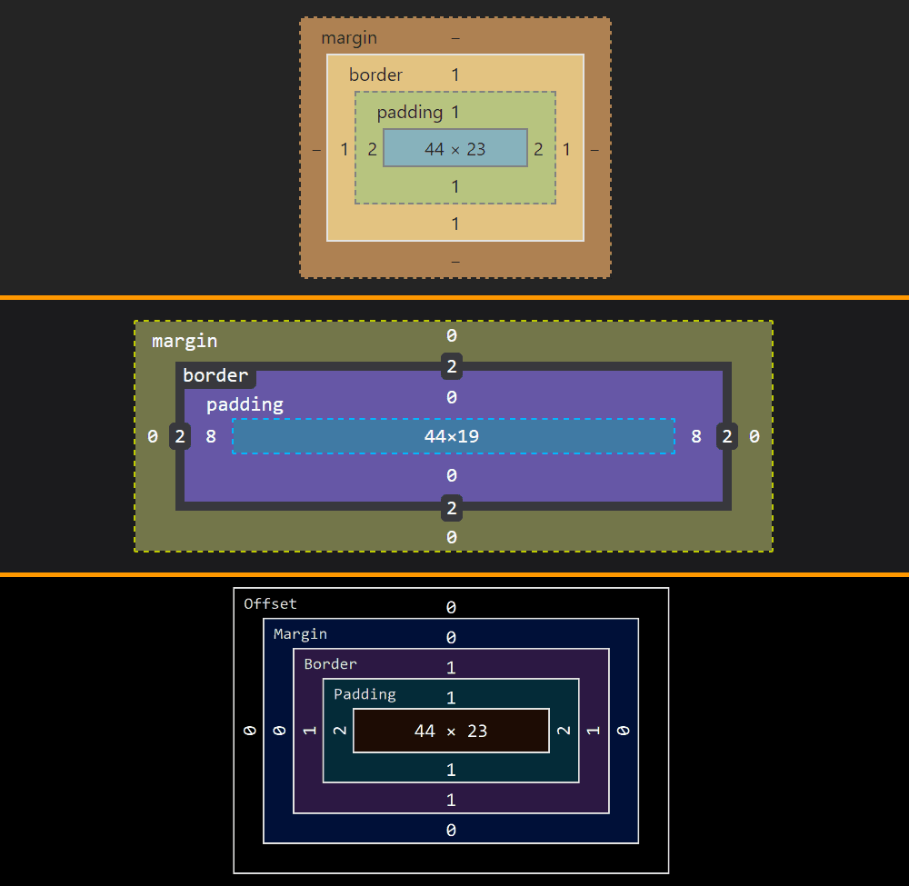
Note that, since Chrome and Edge have a box-sizing of content-box, their width and height values do not include the padding or border. However, since Firefox has box-sizing set to border-box, its dimensions include the padding and border.
The layout boxes for <input type='color'> compared in Chrome, Firefox and Edge (from top-to-bottom).
This means the content-box is 44pxx23px in Chrome and Edge and 44xpxx19px in Firefox, the padding-box is 48pxx25 in Chrome and Edge and 60pxx19px in Firefox and the border-box is 50pxx27px in Chrome and Edge and 64pxx23 in Firefox.
We can clearly see how the dimensions were set in Chrome and I’d assume they were set in the same direct way in Edge as well, even if Edge doesn’t allow us to trace this stuff. Firefox doesn’t show these dimensions as having been explicitly set and doesn’t even allow us to trace where they came from in the Computed tab (as it does for other properties like border, for example). But if we look at all the styles that have been set on input[type='color'], we discover the dimensions have been set as flow-relative ones (inline-size and block-size).
How <input type='color'> dimensions have been set in Firefox.
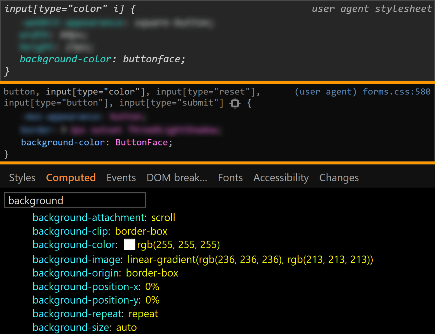
The final property we check for the normal state of the actual input is background. Here, Edge is the only browser to have a background-image (set to a top to bottom gradient), while Chrome and Firefox both have a background-color set to ButtonFace (another deprecated CSS2 system value). The strange thing is this should be rgb(240, 240, 240) (according to this resource), but its computed value in Chrome is rgb(221, 221, 221).
The background values for <input type='color'> compared in Chrome, Firefox and Edge (from top-to-bottom).
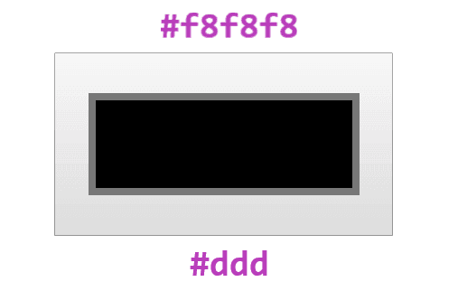
What’s even stranger is that, if we actually look at our input in Chrome, it sure does look like it has a gradient background! If we screenshot it and then use a picker, we get that it has a top to bottom gradient from #f8f8f8 to #ddd.
What the actual input looks like in Chrome. It appears to have a gradient, in spite of the info we get from DevTools telling us it doesn’t.
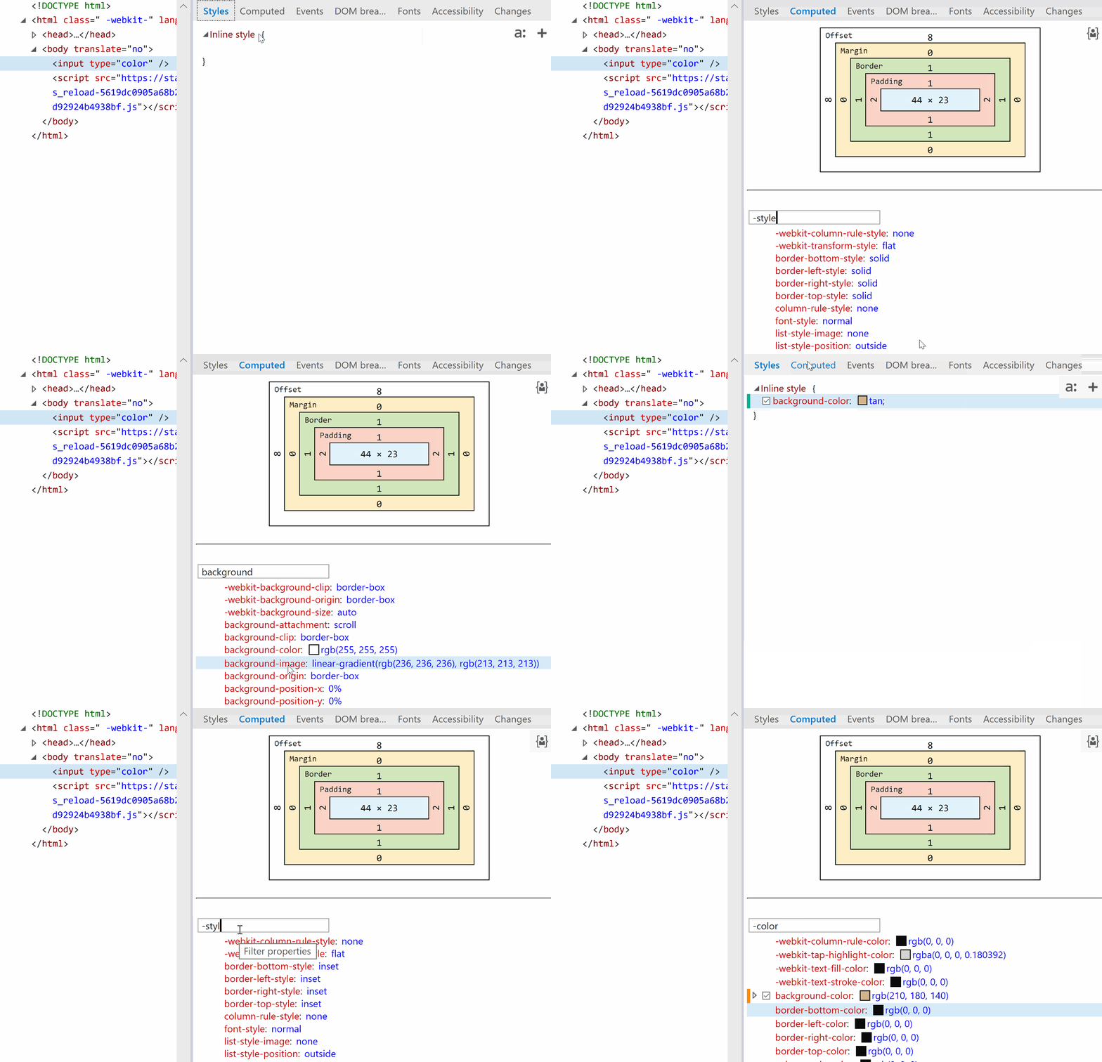
Also, note that changing just the background-color (or another property not related to dimensions like border-radius) in Edge also changes the background-image, background-origin, border-color or border-style.
Edge: side-effects of changing background-color.
Other states
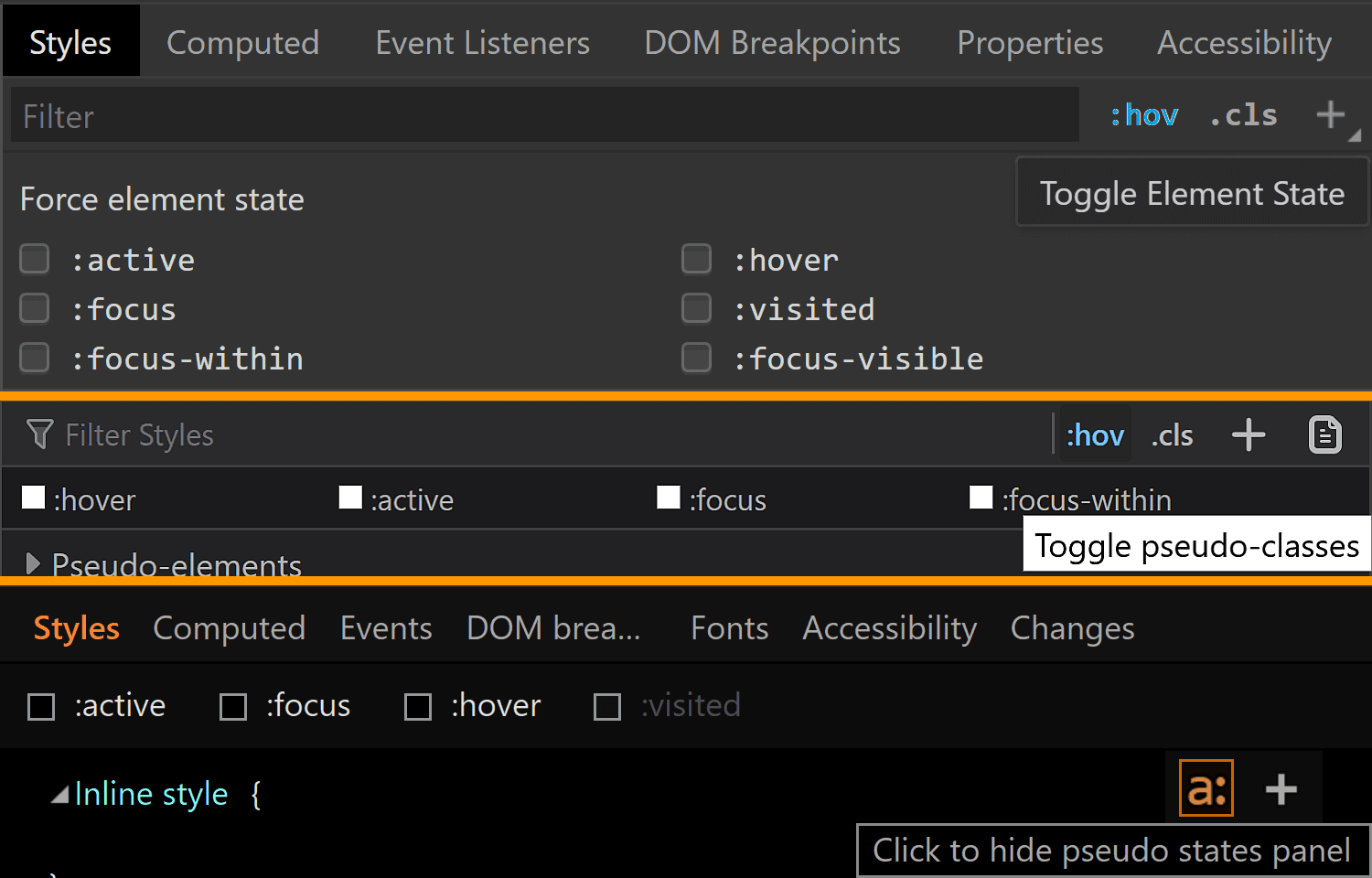
We can take a look at the styles applied for a bunch of other states of an element by clicking the :hov button in the Styles panel for Chrome and Firefox and the a: button in the same Styles panel for Edge. This reveals a section where we can check the desired state(s).
Taking a look at other states in Chrome, Firefox, Edge (from top to bottom).
Note that, in Firefox, checking a class only visually applies the user styles on the selected element, not the browser styles. So, if we check :hover for example, we won’t see the :hover styles applied on our element. We can however see the user agent styles matching the selected state for our selected element shown in DevTools.
Also, we cannot test for all states like this and let’s start with such a state.
:disabled
In order to see how styles change in this state, we need to manually add the disabled attribute to our <input type='color'> element.
Hmm… not much changes in any browser!
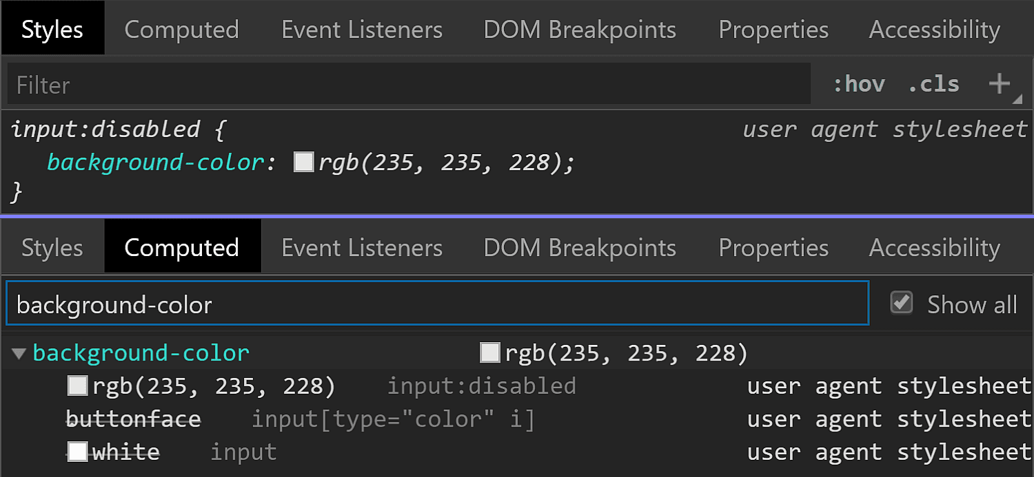
In Chrome, we see the background-color is slightly different (rgb(235, 235, 228) in the :disabled state versus rgb(221, 221, 221) in the normal state).
Chrome :disabled styling.
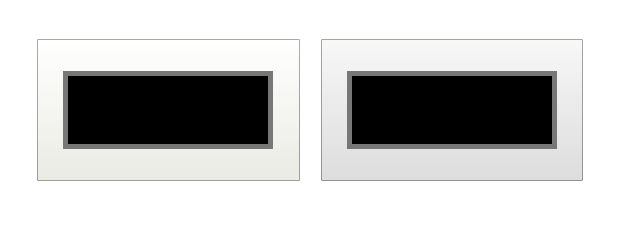
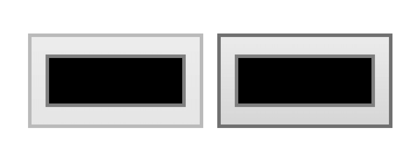
But the difference is only clear looking at the info in DevTools. Visually, I can tell tell there’s a slight difference between an input that’s :disabled and one that’s not if they’re side-by-side, but if I didn’t know beforehand, I couldn’t tell which is which just by looking at them, and if I just saw one, I couldn’t tell whether it’s enabled or not without clicking it.
Disabled (left) versus enabled (right) <input type='color'> in Chrome.
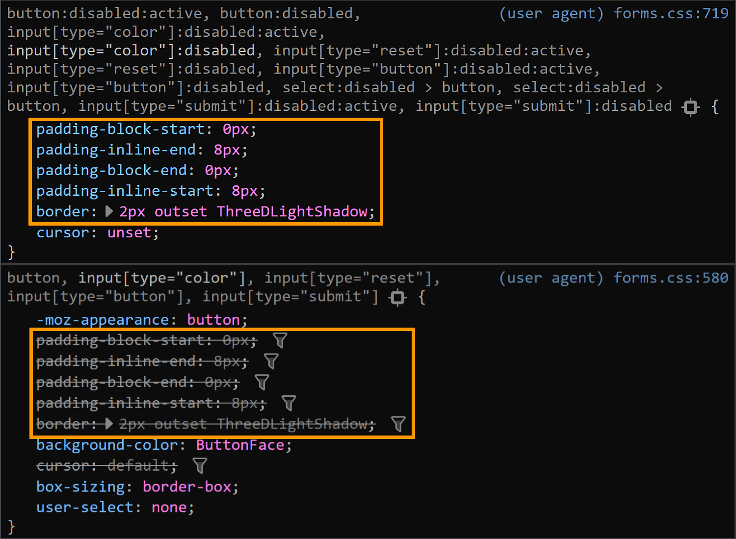
In Firefox, we have the exact same values set for the :disabled state as for the normal state (well, except for the cursor, which realistically, isn’t going to produce different results save for exceptional cases anyway). What gives, Firefox?!
Firefox :disabled (top) versus normal (bottom) styling.
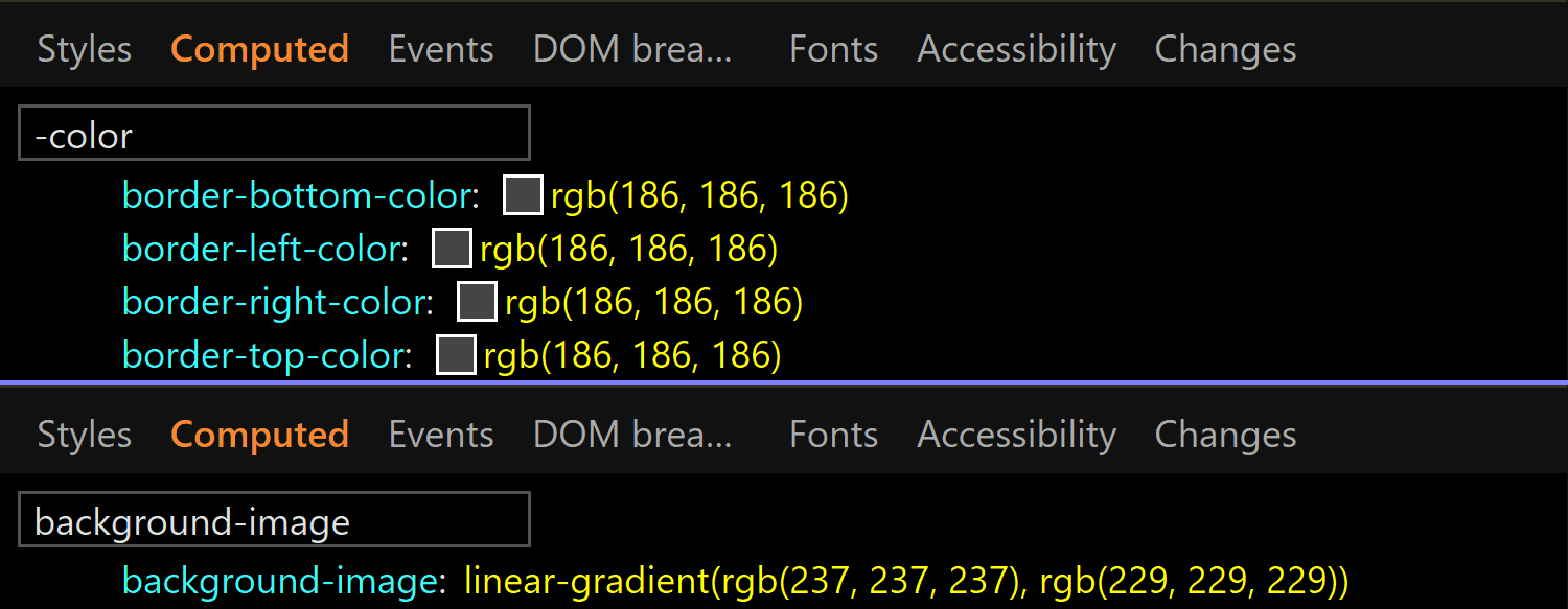
In Edge, both the border-color and the background gradient are different.
Clearly different if we look at the code and visually better than Chrome, though it still may not be quite enough:
Disabled (left) versus enabled (right) <input type='color'> in Edge.
:focus
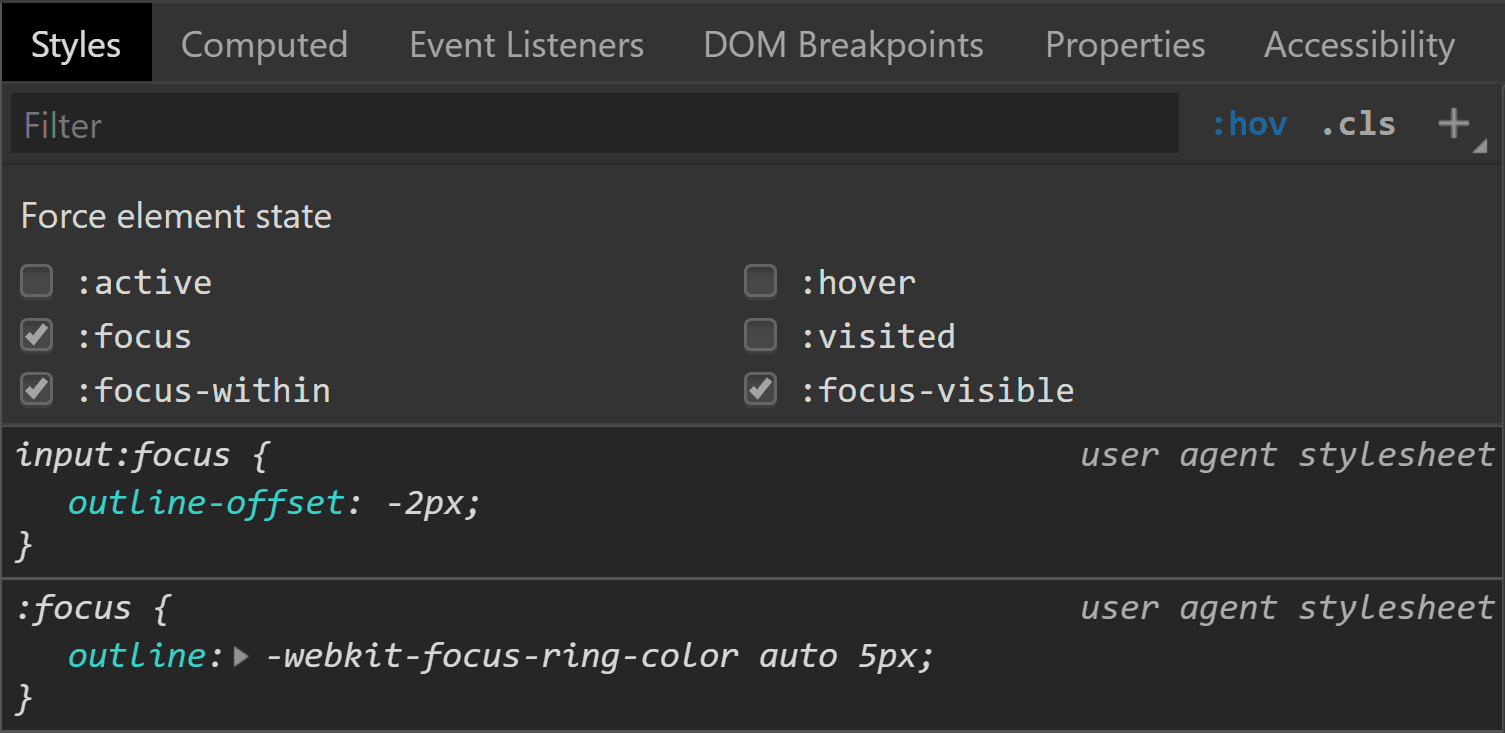
This is one state we can test by toggling the DevTools pseudo-classes. Well, in theory. In practice, it doesn’t really help us in all browsers.
Starting with Chrome, we can see that we have an outline in this state and the outline-color computes to rgb(77, 144, 254), which is some kind of blue.
Chrome :focus styling.
Pretty straightforward and easy to spot.
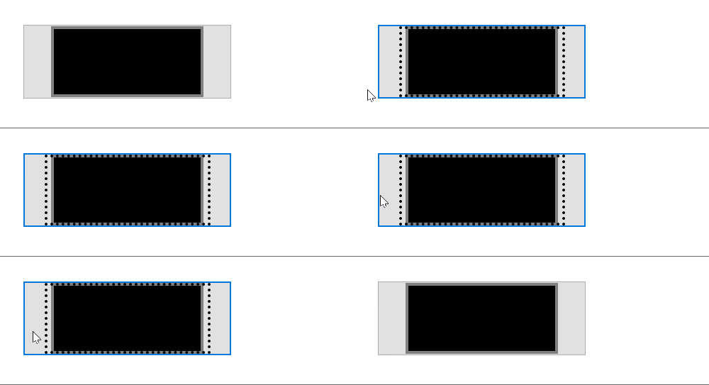
Moving on to Firefox, things start to get hairy! Unlike Chrome, toggling the :focus pseudo-class from DevTools does nothing on the input element, though by focusing it (by tab click), the border becomes blue and we get a dotted rectangle within — but there’s no indication in DevTools regarding what is happening.
What happens in Firefox when tabbing to our input to :focus it.
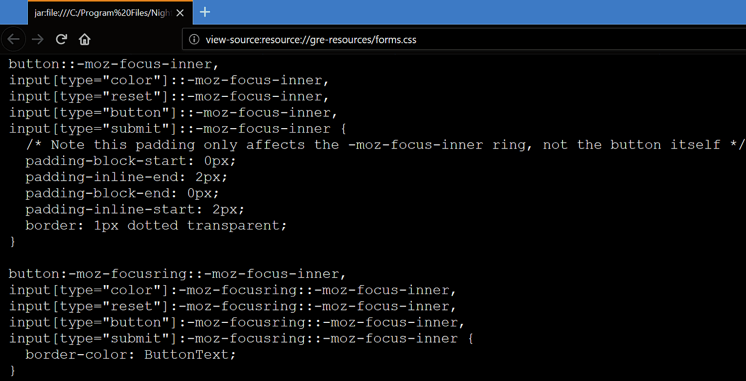
If we check Firefox’s forms.css, it provides an explanation for the dotted rectangle. This is the dotted border of a pseudo-element, ::-moz-focus-inner (a pseudo-element which, for some reason, isn’t shown in DevTools inside our input as ::-moz-color-swatch is). This border is initially transparent and then becomes visible when the input is focused — the pseudo-class used here (:-moz-focusring) is pretty much an old Firefox version of the new standard (:focus-visible), which is currently only supported by Chrome behind the Experimental Web Platform features flag.
Firefox: where the inner dotted rectangle on :focus comes from.
What about the blue border? Well, it appears this one isn’t set by a stylesheet, but at an OS level instead. The good news is we can override all these styles should we choose to do so.
In Edge, we’re faced with a similar situation. Nothing happens when toggling the :focus pseudo-class from DevTools, but if we actually tab to our input to focus it, we can see an inner dotted rectangle.
What happens in Edge when tabbing to our input to :focus it.
Even though I have no way of knowing for sure, I suspect that, just like in Firefox, this inner rectangle is due to a pseudo-element that becomes visible on :focus.
:hover
In Chrome, toggling this pseudo-class doesn’t reveal any :hover-specific styles in DevTools. Furthermore, actually hovering the input doesn’t appear to change anything visually. So it looks like Chrome really doesn’t have any :hover-specific styles?
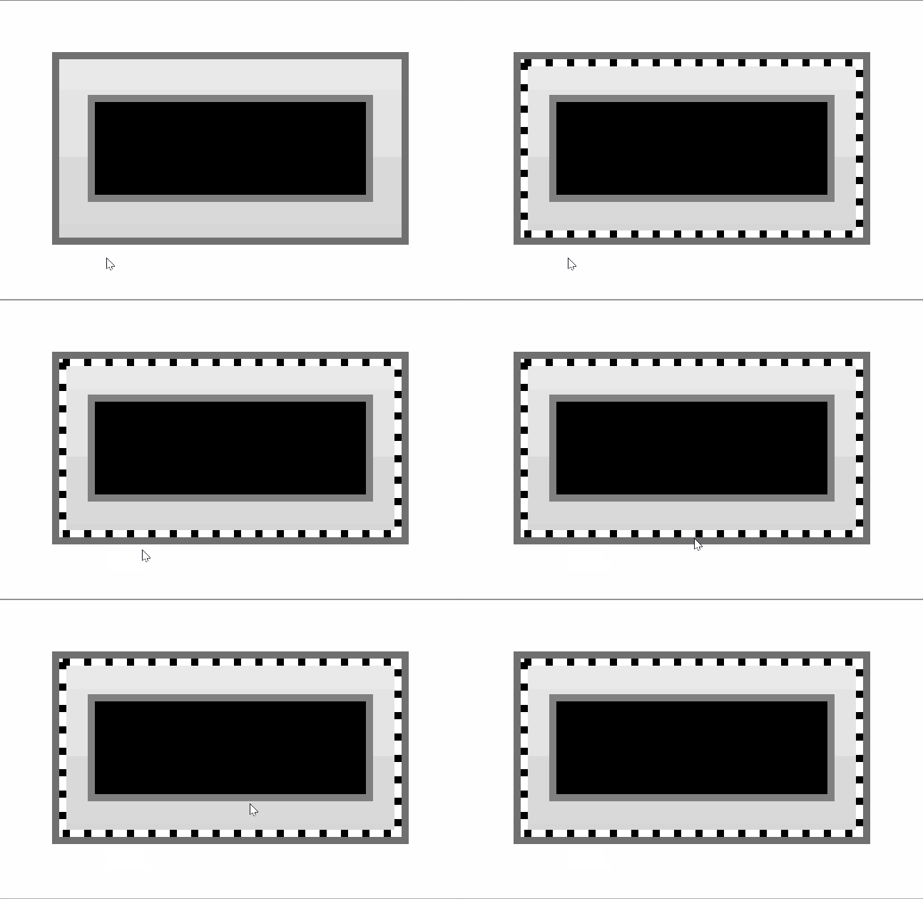
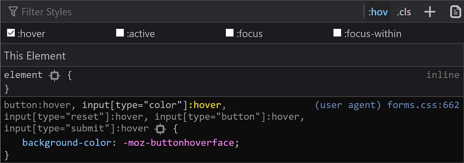
In Firefox, toggling the :hover pseudo-class from DevTools reveals a new rule in the styles panel:
Firefox :hover styling as seen in DevTools.
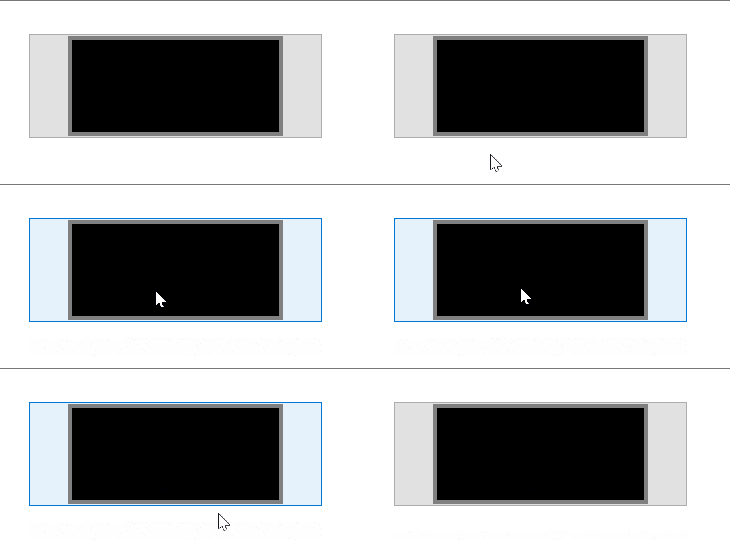
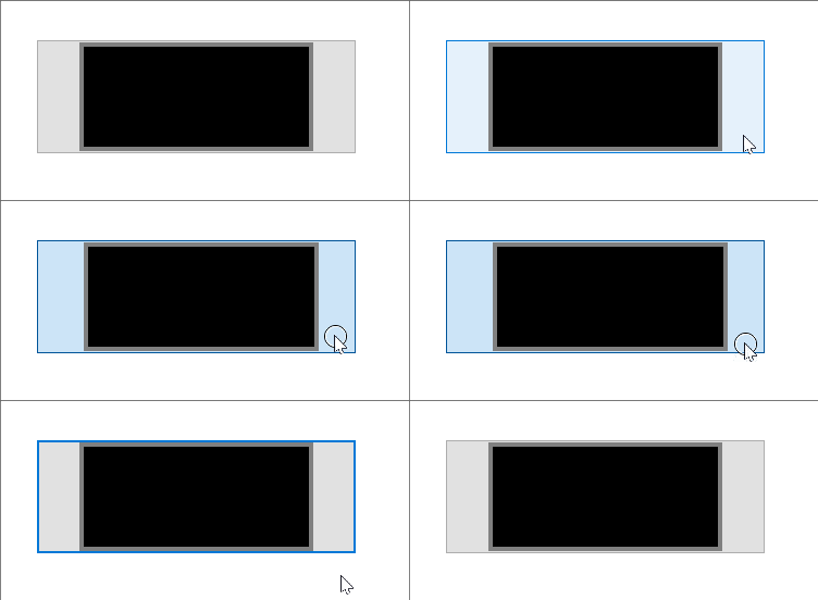
When actually hovering the input, we see the background turns light blue and the border blue, so the first thought would be that light blue is the -moz-buttonhoverface value and that the blue border is again set at an OS level, just like in the :focus case.
What actually happens in Firefox on :hover.
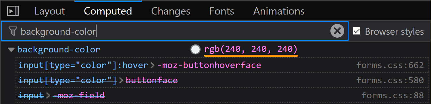
However, if we look at the computed styles, we see the same background we have in the normal state, so that blue background is probably really set at an OS level as well, in spite of having that rule in the forms.css stylesheet.
Firefox: computed background-color of an <input type='color'> on :hover.
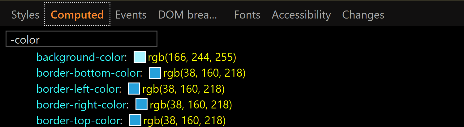
In Edge, toggling the :hover pseudo-class from DevTools gives our input a light blue (rgb(166, 244, 255)) background and a blue (rgb(38, 160, 218)) border, whose exact values we can find in the Computed tab:
Edge: computed background-color and border-color of an <input type='color'> on :hover.
:active
Checking the :active state in the Chrome DevTools does nothing visually and shows no specific rules in the Styles panel. However, if we actually click our input, we see that the background gradient that doesn’t even show up in DevTools in the normal state gets reversed.
What the actual input looks like in Chrome in the :active state. It appears to have a gradient (reversed from the normal state), in spite of the info we get from DevTools telling us it doesn’t.
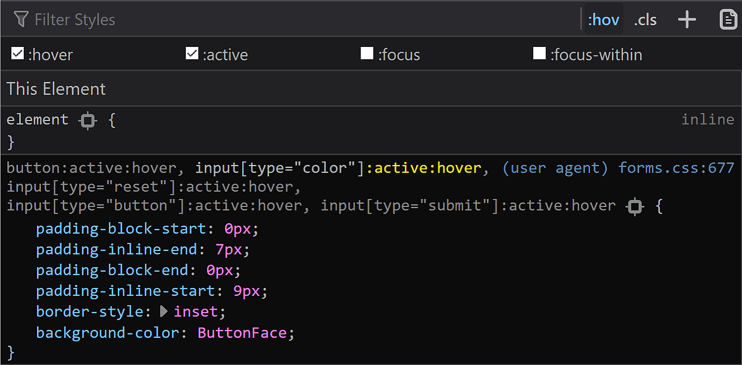
In Firefox DevTools, toggling the :active state on does nothing, but if we also toggle the :hover state on, then we get a rule set that changes the inline padding (the block padding is set to the same value of 0 it has in all other states), the border-style and sets the background-color back to our old friend ButtonFace.
Firefox :active styling as seen in DevTools.
In practice, however, the only thing that matches the info we get from DevTools is the inline shift given by the change in logical padding. The background becomes a lighter blue than the :hover state and the border is blue. Both of these changes are probably happening at an OS level as well.
What actually happens in Firefox in an :active state.
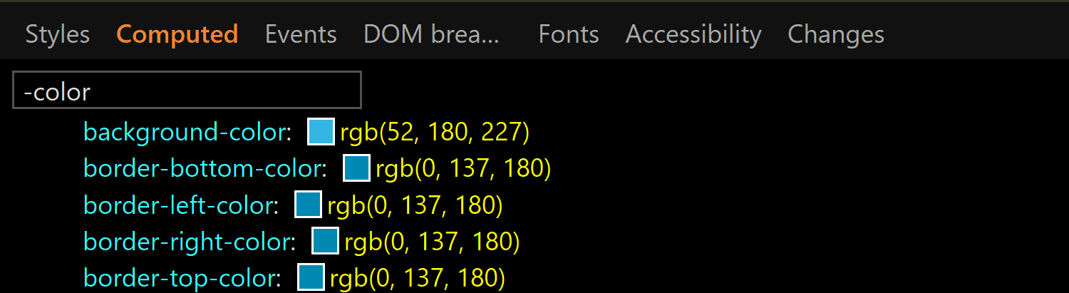
In Edge, activating the :active class from DevTools gives us the exact same styles we have for the :hover state. However, if we have both the :hover and the :active states on, things change a bit. We still have a light blue background and a blue border, but both are darker now (rgb(52, 180, 227) for the background-color and rgb(0, 137, 180) for the border-color):
The computed background-color and border-color of an <input type='color'> on :active viewed in Edge.
This is the takeaway: if we want a consistent cross-browser results for <input type='color'>, we should define our own clearly distinguishable styles for all these states ourselves because, fortunately, almost all the browser defaults — except for the inner rectangle we get in Edge on :focus — can be overridden.
The swatch wrapper
This is a component we only see in Chrome, so if we want a cross-browser result, we should probably ensure it doesn’t affect the swatch inside — this means ensuring it has no margin, border, padding or background and that its dimensions equal those of the actual input’s content-box.
In order to know whether we need to mess with these properties (and maybe others as a result) or not, let’s see what the browser defaults are for them.
Fortunately, we have no margin or border, so we don’t need to worry about these.
The margin and border values for the swatch wrapper in Chrome.
We do however have a non-zero padding (of 4px 2px), so this is something we’ll need to zero out if we want to achieve a consistent cross-browser result.
The padding values for the swatch wrapper in Chrome.
The dimensions are both conveniently set to 100%, which means we won’t need to mess with them.
The size values for the swatch wrapper in Chrome.
Something we need to note here is that we have box-sizing set to border-box, so the padding gets subtracted from the dimensions set on this wrapper.
The box-sizing value for the swatch wrapper in Chrome.
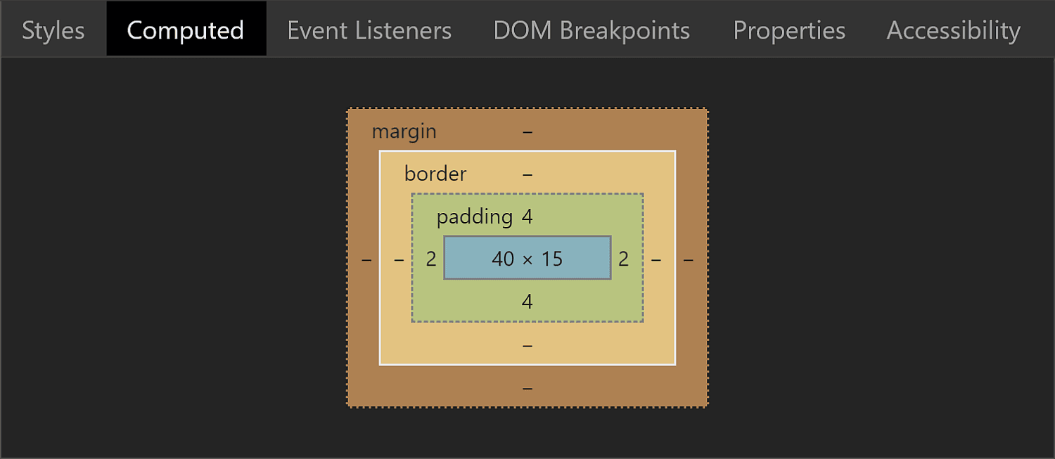
This means that while the padding-box, border-box and margin-box of our wrapper (all equal because we have no margin or border) are identical to the content-box of the actual <input type='color'> (which is 44pxx23px in Chrome), getting the wrapper’s content-box involves subtracting the padding from these dimensions. It results that this box is 40pxx15px.
The box model for the swatch wrapper in Chrome.
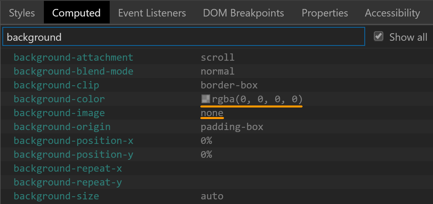
The background is set to transparent, so that’s another property we don’t need to worry about resetting.
The background values for the swatch wrapper in Chrome.
There’s one more property set on this element that caught my attention: display. It has a value of flex, which means its children are flex items.
The display value for the swatch wrapper in Chrome.
The swatch
This is a component we can style in Chrome and Firefox. Sadly, Edge doesn’t expose it to allow us to style it, so we cannot change properties we might want to, such as border, border-radius or box-shadow.
The box-sizing property is one we need to set explicitly if we plan on giving the swatch a border or a padding because its value is content-box in Chrome, but border-box in Firefox.
The box-sizing values for the swatch viewed in Chrome (top) and Firefox (bottom).
Fortunately, the font-size is inherited from the input itself so it’s the same.
The font-size values for the swatch viewed in Chrome (top) and Firefox (bottom).
The margin computes to 0 in both Chrome and Firefox.
The margin values for the swatch viewed in Chrome (top) and Firefox (bottom).
This is because most margins haven’t been set, so they end up being 0 which is the default for <div> elements. However, Firefox is setting the inline margins to auto and we’ll be getting to why that computes to 0 in just a little moment.
The inline margin for the swatch being set to auto in Firefox.
The border is solid 1px in both browsers. The only thing that differs is the border-color, which is rgb(119, 119, 119) in Chrome and grey (or rgb(128, 128, 128), so slightly lighter) in Firefox.
The border values for the swatch viewed in Chrome (top) and Firefox (bottom).
Note that the computed border-width in Firefox (at least on Windows) depends on the OS zoom level, just as it is in the case of the actual input.
The padding is luckily 0 in both Chrome and Firefox.
The padding values for the swatch viewed in Chrome (top) and Firefox (bottom).
The dimensions end up being exactly what we’d expect to find, assuming the swatch covers its parent’s entire content-box.
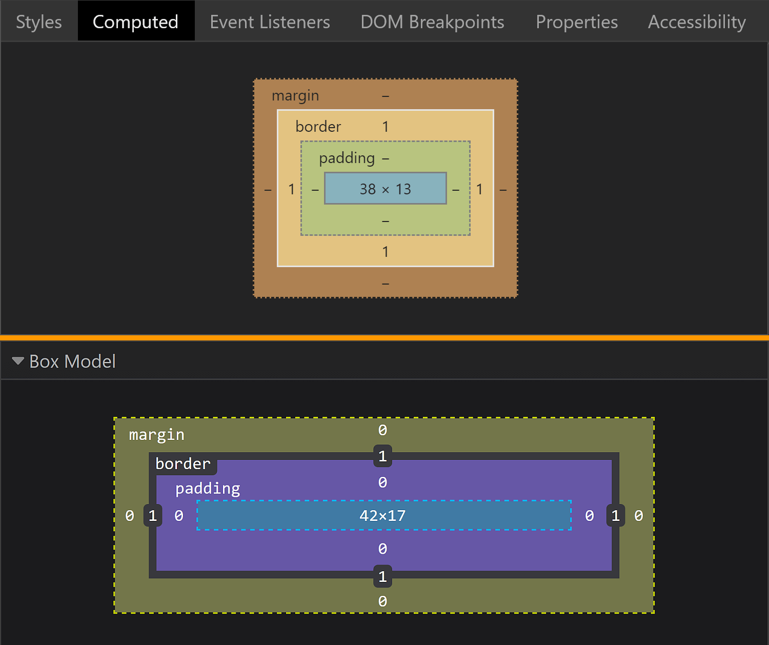
The box model for the swatch viewed in Chrome (top) and Firefox (bottom).
In Chrome, the swatch parent is the <div> wrapper we saw earlier, whose content-box is 4pxx15px. This is equal to the margin-box and the border-box of the swatch (which coincide as we have no margin). Since the padding is 0, the content-box and the padding-box for the swatch are identical and, subtracting the 1px border, we get dimensions that are 38pxx13px.
In Firefox, the swatch parent is the actual input, whose content-box is 44pxx19px one. This is equal to the margin-box and the border-box of the swatch (which coincide as we have no margin). Since the padding is 0, the content-box and the padding-box for the swatch are identical and, subtracting the 1px border, we get that their dimensions are 42pxx17px.
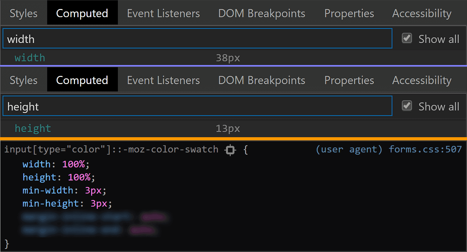
In Firefox, we see that the swatch is made to cover its parent’s content-box by having both its dimensions set to 100%.
The size values for the swatch viewed in Chrome (top) and Firefox (bottom).
This is the reason why the auto value for the inline margin computes to 0.
But what about Chrome? We cannot see any actual dimensions being set. Well, this result is due to the flex layout and the fact that the swatch is a flex item that’s made to stretch such that it covers its parent’s content-box.
The flex value for the swatch wrapper in Chrome.
Final thoughts
Phew, we covered a lot of ground here! While it may seem exhaustive to dig this deep into one specific element, this is the sort of exercise that illustrates how difficult cross-browser support can be. We have our own styles, user agent styles and operating system styles to traverse and some of those are always going to be what they are. But, as we discussed at the very top, this winds up being an accessibility issue at the end of the day, and something to really consider when it comes to implementing a practical, functional application of a color input.
Remember, a lot of this is ripe territory to reach out to browser vendors and let them know how they can update their implementations based on your reported use cases. Here are the three tickets I mentioned earlier where you can either chime in or reference to create a new ticket:
The Cognitive Manual is a new tech innovation from Volkswagen, featured in the new Volkswagen T-Cross. The Cognitive Manual allows drivers to get answers to any and all questions about the car by asking the app or taking a picture of the icons on the dashboard. After all, users are often confused by the meaning of these icons, and the campaign specifically plays on that. It’s almost as if the Cognitive Manual allows people to „translate” their new T-Cross.








![Screenshot of Firefox DevTools highlighting how the border set on input[type='color'] overrides the one set on input and the look (grey + strike-through) of overridden properties.](https://css-tricks.com/wp-content/uploads/2019/05/override_firefox.png)
![Screenshot of Firefox DevTools showing the flow-relative padding overriding the old padding due to higher specificity of selector (input[type='color'] vs. input).](https://css-tricks.com/wp-content/uploads/2019/05/default_l0_padding_firefox.png)
![Screenshot of the Firefox user agent styles showing flow relative dimensions being set on input[type='color'].](https://css-tricks.com/wp-content/uploads/2019/05/default_l0_dim_firefox_logical.png)