How to Create a Cartoon Rainbow Text Effect in Photoshop

Post pobrano z: How to Create a Cartoon Rainbow Text Effect in Photoshop

Final product image
What You’ll Be Creating

Text effects and Photoshop text styles can be a lot of fun—they can be expressive, dynamic, and communicative! In this tutorial, we’ll create a rainbow text effect in Adobe Photoshop, using text effects, layer styles, and some other tricks, too!

Tutorial Assets

The following assets were used in this tutorial:

1. How to Arch Text in Photoshop

Step 1

First, begin with a New Document in Adobe Photoshop. You’re welcome to follow along with my settings, as shown below, but there is no wrong answer here! Choose a size that you prefer.

Example Settings

Step 2

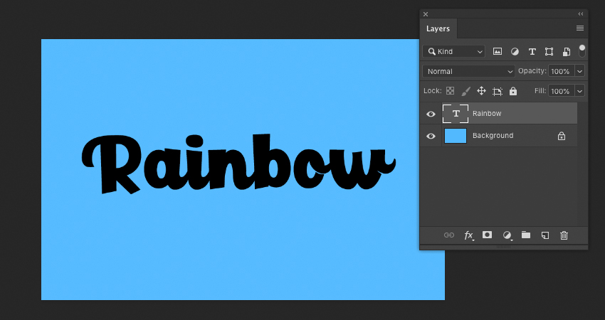
Now, let’s begin with our text. Using the Type Tool, write out the word of your choice. 

I used the word „Rainbow” for this tutorial, but feel free to use any that you like. The techniques we’ll use in this walkthrough could apply to any typeface of your choice, as well.

I used the font Paladise

Example of Text

Step 3

To push the rainbow aesthetic further, we’re going to give the type an arch. 

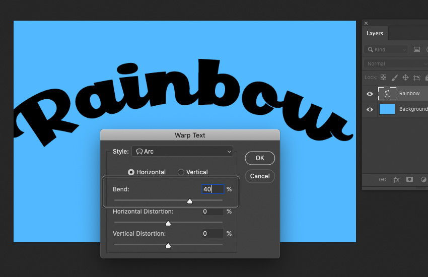
Ever wondered how to curve text in Photoshop? With the Type Tool selected, choose Create Warped Text from the Options Bar. Doing so will bring up the dialog box displayed below.

We want to apply an Arc to our text. Select Horizontal and experiment with the values until you get a curvature that you like. Voila, you know how to arch text in Photoshop! In this case, I chose to set the Bend to 40%.
Example of Arc Added to Text

Step 4

After warping the text, the type might not fit your canvas the way it did prior. In my case, it stretched things out and made the text bigger than I’d originally wanted the text design. Use the Move Tool and your Transform Controls to adjust the type, if necessary.  

Example of Resized Text

2. How to Create the Rainbow Text Effect

Step 1

Now, let’s create the rainbow itself. There’s no right or wrong way to do this, but here is one way you could try.

Start by using the Ellipse Tool to create a rounded shape. Try to follow the curvature of the type. 

Ellipse added on top of Text

Step 2

Copy the ellipse and Move it upwards, changing its color each time. Once I was happy with my colors, I Flattened the ellipses onto one layer.

The red, however, needs to cover more space, to fully cover the top of the type. In this case, I created a New Layer beneath my ellipses and simply created a red rectangle. You could do this with your Shape Tools or simply Fill a selection made with your Selection Tools

Again, this is a case where this could be achieved in many ways. You could, for example, draw the rainbow by hand with a drawing tablet, or you could use the Pen Tool to achieve a similar effect. 

Choose the method you prefer—the important part is that the arc of the rainbow is inspired by the type and that the color completely covers the text area.

Example of initial Rainbow Artwork

Step 3

Once you’re happy with your rainbow, make sure it has all been Flattened onto one Layer. We’re going to Create a Clipping Mask on this Layer.

To do so, Right-Click on the layer (on PC) or Control-Click on the layer (on Mac) to open the Options seen below. Select Create Clipping Mask.

Creating the Clipping Mask

Step 4

Tah dah! Our rainbow has now been applied to the type area. Notice how, when the Clipping Mask is applied, the Layer has a little downwards arrow on it, indicating this.

If you’re unhappy with how your rainbow looks, you can draw directly on this Layer and the contents will still stay confined to the type area. Don’t be afraid to go in and make adjustments! 

Applying the Clipping Mask

3. How to Add Text Effects

Step 1

Now, let’s add some fun effects to push the aesthetic here further.

Rather than using the Drop Shadow Layer Effect, here in Photoshop, let’s create one by hand. 

First, I took our Text Layer and the Clipping Mask Layer and put them into a Folder. This will help keep things organized.

Copy the folder. I labeled these two folders „Rainbow Text Top” and „Rainbow Text Bottom”. The bottom folder is the start of our Drop Shadow. Use the Move Tool to move it downwards.

Creating a Drop Shadow by Hand

Step 2

Now, let’s create a New Layer, right above the rainbow colors applied to our text. Create a Clipping Mask on this Layer, just as we did earlier in this tutorial. 

Fill this Layer with a solid, black color (or, a different color of your choice, if you’d like!). Set the Opacity to 50%—this way, we still see the rainbow colors, but they look a little darker, like a rainbow-tinted shadow. 

Creating an Additional Clipping Mask

Step 3

Next, let’s give our text some depth. 

Copy the rainbow Text Layer and move this Copied Layer to the top of your list of Layers. Change the Color to white.

I have turned off visibility on my other rainbow text layers, so I can visually focus on this one (click the Eye Icons to the left of each Layer to Toggle Visibility On and Off

Duplicating the Text Layer and Making it White

Step 4

We’re going to apply two Layer Effects to the white Text Layer that we just copied. The first one is Bevel & Emboss.

Feel free to copy my settings, as shown below—but again, there is no wrong answer here. Experiment so you get a feel for what the values do! It is, however, important to note that the Highlight Mode is set to Screen and the Shadow Mode is set to Multiply.

Applying Bevel and Emboss

Step 5

Now, let’s also add an Inner Glow. Again, I recommend experimenting with these values to get a feel for what they do (Tip: Keep Preview checked so you can see what changes these values make, in real time). Note that the Blend Mode is set to Screen.

Once you’re happy with the values you’ve selected, click OK.

Applying an Inner Shadow

Step 6

Change the layer’s Blending Mode to Multiply. Notice how the white text disappears into the background, but we’re still left with visible Layer Effects

Changing the Layers Blending Mode

Step 7

Toggle the visibility on for any hidden layers, so we can see everything together now. 

Use the Move Tool to adjust the position of the layer with our Layer Effects, as necessary. I bumped it a little upwards and to the side to get the effect I wanted. 

Adjusting the Layers

4. How to Create Background Elements

Step 1

To push the rainbow aesthetic even further, I thought it would be cute to add in some raindrops. 

I used a drawing tablet to draw some white lines with the Brush Tool. The default Soft Round Brush will do! Then, in varied spots, I drew little spots and dashes to resemble splashes, where the raindrops hit the letters. 

If you don’t have a drawing tablet, that’s okay too! The artwork itself doesn’t have to be perfect—you could use your mouse or the Line Tool, for example, to get the basic shapes down.

Then, apply a Gaussian Blur (located under Filters > Gaussian Blur) to smooth things out and match the hazy white glow at the type of the type. Now, we have a rainy look!

Drawing on Rain Drops

Step 2

Let’s finish things off with a fun background. 

First, on a New Layer below all of the type, I created some simple clouds in a solid, white color. Again, I used my drawing tablet and the Brush Tool to do so—but you could use Shape Tools to achieve a similar result. 

I also added a Gradient, below. The goal was to make the base of the background a little darker than the top. You can do so with the Gradient Tool.

Adding in Clouds and a Gradient

Step 3

Finally, Copy the clouds and Move them so they create a repeated pattern. It doesn’t have to be perfect or symmetrical! Once you’re happy with where you’ve placed them, apply a Gaussian Blur and lower the Opacity of the layer to 80%.

Creating a Cloud Pattern in the Background

And There You Have It!

We’ve created a cartoon rainbow text effect in Adobe Photoshop! Photoshop text effects aren’t as tough as they look, right? I hope these techniques benefit your next project. 

Thank you for following along, and I hope you enjoyed this tutorial! 

Example of Finished Tutorial

If you enjoyed this tutorial, here are some others to check out!

How to Create a Cartoon Rainbow Text Effect in Photoshop

Post pobrano z: How to Create a Cartoon Rainbow Text Effect in Photoshop

Final product image
What You’ll Be Creating

Text effects and Photoshop text styles can be a lot of fun—they can be expressive, dynamic, and communicative! In this tutorial, we’ll create a rainbow text effect in Adobe Photoshop, using text effects, layer styles, and some other tricks, too!

Tutorial Assets

The following assets were used in this tutorial:

1. How to Arch Text in Photoshop

Step 1

First, begin with a New Document in Adobe Photoshop. You’re welcome to follow along with my settings, as shown below, but there is no wrong answer here! Choose a size that you prefer.

Example Settings

Step 2

Now, let’s begin with our text. Using the Type Tool, write out the word of your choice. 

I used the word „Rainbow” for this tutorial, but feel free to use any that you like. The techniques we’ll use in this walkthrough could apply to any typeface of your choice, as well.

I used the font Paladise

Example of Text

Step 3

To push the rainbow aesthetic further, we’re going to give the type an arch. 

Ever wondered how to curve text in Photoshop? With the Type Tool selected, choose Create Warped Text from the Options Bar. Doing so will bring up the dialog box displayed below.

We want to apply an Arc to our text. Select Horizontal and experiment with the values until you get a curvature that you like. Voila, you know how to arch text in Photoshop! In this case, I chose to set the Bend to 40%.

Example of Arc Added to Text

Step 4

After warping the text, the type might not fit your canvas the way it did prior. In my case, it stretched things out and made the text bigger than I’d originally wanted the text design. Use the Move Tool and your Transform Controls to adjust the type, if necessary.  

Example of Resized Text

2. How to Create the Rainbow Text Effect

Step 1

Now, let’s create the rainbow itself. There’s no right or wrong way to do this, but here is one way you could try.

Start by using the Ellipse Tool to create a rounded shape. Try to follow the curvature of the type. 

Ellipse added on top of Text

Step 2

Copy the ellipse and Move it upwards, changing its color each time. Once I was happy with my colors, I Flattened the ellipses onto one layer.

The red, however, needs to cover more space, to fully cover the top of the type. In this case, I created a New Layer beneath my ellipses and simply created a red rectangle. You could do this with your Shape Tools or simply Fill a selection made with your Selection Tools

Again, this is a case where this could be achieved in many ways. You could, for example, draw the rainbow by hand with a drawing tablet, or you could use the Pen Tool to achieve a similar effect. 

Choose the method you prefer—the important part is that the arc of the rainbow is inspired by the type and that the color completely covers the text area.

Example of initial Rainbow Artwork

Step 3

Once you’re happy with your rainbow, make sure it has all been Flattened onto one Layer. We’re going to Create a Clipping Mask on this Layer.

To do so, Right-Click on the layer (on PC) or Control-Click on the layer (on Mac) to open the Options seen below. Select Create Clipping Mask.

Creating the Clipping Mask

Step 4

Tah dah! Our rainbow has now been applied to the type area. Notice how, when the Clipping Mask is applied, the Layer has a little downwards arrow on it, indicating this.

If you’re unhappy with how your rainbow looks, you can draw directly on this Layer and the contents will still stay confined to the type area. Don’t be afraid to go in and make adjustments! 

Applying the Clipping Mask

3. How to Add Text Effects

Step 1

Now, let’s add some fun effects to push the aesthetic here further.

Rather than using the Drop Shadow Layer Effect, here in Photoshop, let’s create one by hand. 

First, I took our Text Layer and the Clipping Mask Layer and put them into a Folder. This will help keep things organized.

Copy the folder. I labeled these two folders „Rainbow Text Top” and „Rainbow Text Bottom”. The bottom folder is the start of our Drop Shadow. Use the Move Tool to move it downwards.

Creating a Drop Shadow by Hand

Step 2

Now, let’s create a New Layer, right above the rainbow colors applied to our text. Create a Clipping Mask on this Layer, just as we did earlier in this tutorial. 

Fill this Layer with a solid, black color (or, a different color of your choice, if you’d like!). Set the Opacity to 50%—this way, we still see the rainbow colors, but they look a little darker, like a rainbow-tinted shadow. 

Creating an Additional Clipping Mask

Step 3

Next, let’s give our text some depth. 

Copy the rainbow Text Layer and move this Copied Layer to the top of your list of Layers. Change the Color to white.

I have turned off visibility on my other rainbow text layers, so I can visually focus on this one (click the Eye Icons to the left of each Layer to Toggle Visibility On and Off

Duplicating the Text Layer and Making it White

Step 4

We’re going to apply two Layer Effects to the white Text Layer that we just copied. The first one is Bevel & Emboss.

Feel free to copy my settings, as shown below—but again, there is no wrong answer here. Experiment so you get a feel for what the values do! It is, however, important to note that the Highlight Mode is set to Screen and the Shadow Mode is set to Multiply.

Applying Bevel and Emboss

Step 5

Now, let’s also add an Inner Glow. Again, I recommend experimenting with these values to get a feel for what they do (Tip: Keep Preview checked so you can see what changes these values make, in real time). Note that the Blend Mode is set to Screen.

Once you’re happy with the values you’ve selected, click OK.

Applying an Inner Shadow

Step 6

Change the layer’s Blending Mode to Multiply. Notice how the white text disappears into the background, but we’re still left with visible Layer Effects

Changing the Layers Blending Mode

Step 7

Toggle the visibility on for any hidden layers, so we can see everything together now. 

Use the Move Tool to adjust the position of the layer with our Layer Effects, as necessary. I bumped it a little upwards and to the side to get the effect I wanted. 

Adjusting the Layers

4. How to Create Background Elements

Step 1

To push the rainbow aesthetic even further, I thought it would be cute to add in some raindrops. 

I used a drawing tablet to draw some white lines with the Brush Tool. The default Soft Round Brush will do! Then, in varied spots, I drew little spots and dashes to resemble splashes, where the raindrops hit the letters. 

If you don’t have a drawing tablet, that’s okay too! The artwork itself doesn’t have to be perfect—you could use your mouse or the Line Tool, for example, to get the basic shapes down.

Then, apply a Gaussian Blur (located under Filters > Gaussian Blur) to smooth things out and match the hazy white glow at the type of the type. Now, we have a rainy look!

Drawing on Rain Drops

Step 2

Let’s finish things off with a fun background. 

First, on a New Layer below all of the type, I created some simple clouds in a solid, white color. Again, I used my drawing tablet and the Brush Tool to do so—but you could use Shape Tools to achieve a similar result. 

I also added a Gradient, below. The goal was to make the base of the background a little darker than the top. You can do so with the Gradient Tool.

Adding in Clouds and a Gradient

Step 3

Finally, Copy the clouds and Move them so they create a repeated pattern. It doesn’t have to be perfect or symmetrical! Once you’re happy with where you’ve placed them, apply a Gaussian Blur and lower the Opacity of the layer to 80%.

Creating a Cloud Pattern in the Background

And There You Have It!

We’ve created a cartoon rainbow text effect in Adobe Photoshop! Photoshop text effects aren’t as tough as they look, right? I hope these techniques benefit your next project. 

Thank you for following along, and I hope you enjoyed this tutorial! 

Example of Finished Tutorial

If you enjoyed this tutorial, here are some others to check out!

Bolivar Plus: Fluffy

Post pobrano z: Bolivar Plus: Fluffy
Print
Bolivar Plus

The order: The launch 360 of the new product (packaging / bottle) fabric softener Bolivar Plus. The challenge was to communicate the softness that the product gives us in the garments, managing to convey the concept of: Causes of embrace.

Advertising Agency:Publicis One, Lima, Peru
Creative Directors:César De María, Gustavo San Cristobal
Art Director:Nicki Meléndez Angeles
Copywriter:Jhonatan Gibson
Illustration and retouch:PlanB
Photographer:Profot
Account Manager:Karen Hablutzel
Producer:Elizabeth Rosas Rivera

Bolivar Plus: Fluffy

Post pobrano z: Bolivar Plus: Fluffy
Print
Bolivar Plus

The order: The launch 360 of the new product (packaging / bottle) fabric softener Bolivar Plus. The challenge was to communicate the softness that the product gives us in the garments, managing to convey the concept of: Causes of embrace.

Advertising Agency:Publicis One, Lima, Peru
Creative Directors:César De María, Gustavo San Cristobal
Art Director:Nicki Meléndez Angeles
Copywriter:Jhonatan Gibson
Illustration and retouch:PlanB
Photographer:Profot
Account Manager:Karen Hablutzel
Producer:Elizabeth Rosas Rivera

Bolivar Plus: Fluffy

Post pobrano z: Bolivar Plus: Fluffy
Print
Bolivar Plus

The order: The launch 360 of the new product (packaging / bottle) fabric softener Bolivar Plus. The challenge was to communicate the softness that the product gives us in the garments, managing to convey the concept of: Causes of embrace.

Advertising Agency:Publicis One, Lima, Peru
Creative Directors:César De María, Gustavo San Cristobal
Art Director:Nicki Meléndez Angeles
Copywriter:Jhonatan Gibson
Illustration and retouch:PlanB
Photographer:Profot
Account Manager:Karen Hablutzel
Producer:Elizabeth Rosas Rivera

The Twelfth Fourth

Post pobrano z: The Twelfth Fourth

CSS-Tricks is 12 years old! Firmly into that Early Adolescence stage, I’d say 😉 As we do each year, let’s reflect upon the past year. I’d better have something to say, right? Otherwise, John Prine would get mad at me.

How the hell can a person go to work in the morning
And come home in the evening and have nothing to say.
– Angel From Montgomery

See the Pen
Fireworks!
by Tim Severien (@timseverien)
on CodePen.

Easily the biggest change this year was design v17

We redesign most years, so it’s not terribly shocking I suppose that we did this year, but I think it’s fairly apparent that this was a big one. The biggest since v10.

Here’s a writeup on v17.

I still get happy emails about it.

The aesthetics of it still feel fresh to me, 6 months later. There are no plans at all yet for what the next version will be. I imagine this one will last a good couple of years with tweaks along the way. I’m always working on it. Just in the last few days, I have several commits cleaning things up, adding little features, and optimizing. That work is never done. v18 might just be a more thorough scrubbing of what is here. Might be a good release to focus on the back-end tech. I’ve always wanted to try some sort of MVC setup.

In a way, things feel easier.

There is a lot going right around here. We’ve got a great staff. Our editorial workflow, led by Geoff, has been smooth. There are ebbs and flows of how many great guest posts are in the pipeline, but it never seems to run dry and these days we stay more ahead than we ever have.

We stay quite organized with Notion. In fact, I still use it heavily across all the teams I’m on. It’s just as fundamental as Slack and email.

We’re still working with BuySellAds as a partner to help us sell advertising and sponsorship partnerships. We’ve worked with them for ages and they really do a good job with clean ad tech, smooth integration workflows, and finding good companies that want to run campaigns.

On the 10th anniversary I wrote:

If you do all the work, the hope is that you just keep to keep on keeping on. Everyone gets paid for their effort. This is not a hockey-stick growth kind of site. It’s a modest publication.

Yep.

Check out a year over year chart from Google Analytics:

I can look at that and celebrate the moments with growth. Long periods of 20% year over year growth, which is cool. Then if you look at just this last month, we’re more even or a little bit under 2018 (looking at only pageviews). Good to know, kinda, but I never put much stock in this kind of generic analytics. I’m glad we record them. I would want to know if we started tanking or growing hugely. But we never do. We have long slow steady growth and that is a comfortable place for me.

Thinking on ads

The world of advertising is tightly integrated around here, of course. I’m sure many of you look at this site and go JEEZ, LITTLE HEAVY ON THE ADS, EH? I hope it’s not too big a turnoff, as I really try to be tasteful with them. But another thing you should know is that the ad tech is clean. No tracking stuff. No retargetting. No mysterious third-party JavaScript. There might be an impression-tracking pixel here and there, but that’s about it. No slew of 100’s of requests doing god-knows-what.

That’s not by accident. It’s clear to me now how to go down that other road, and that road has money on it. Twice as much. But I look at it as what would be short term gains. Nobody is going to be more mad at me than you if I slap 80 tracking scripts on this site, my credibility amongst devs goes out the window along with any hopes of sustaining or growing this site. It’s no surprise to me that on sites without developers as an audience, the tendency is to go down the golden road of tracking scripts.

Even the tech is easier.

Just starting in July I’ve gotten all my sites on Flywheel hosting, and I’ve written about that here just today. Flywheel is a new sponsor here to the site, and I’m equally excited about that as I am in actually using it. Between using Local for local WordPress development, GitHub for repos, Buddy for deployment, Cloudflare for DNS/CDN… everything just feels smooth and easy right now.

The way I feel about tech at the moment is that nearly anything is doable. Even stuff that feels insurmountable. It’s just work. Do a bunch of work, get the thing done.

Fancy posts

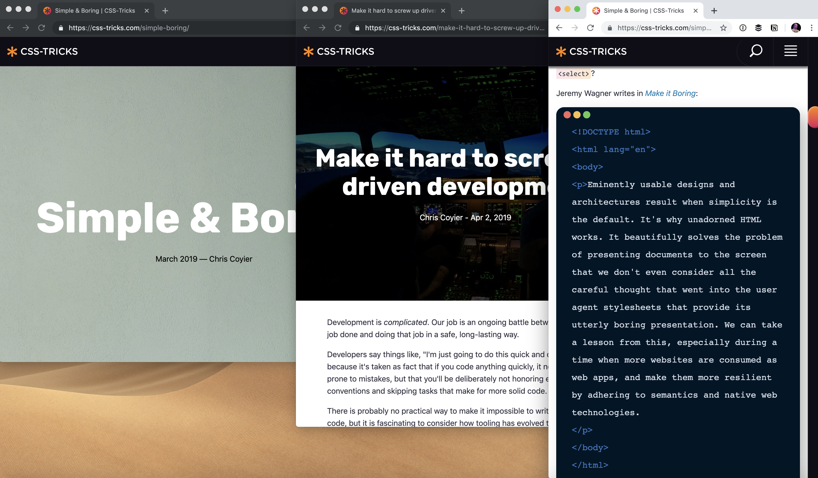
One thing that we snuck in this year is the idea of posts that have special design applied to them. The term „Art-directed articles” seems to be the term that has stuck for that, for better or worse, and we’ve added to that.

There are posts like The Great Divide that I intentionally wanted to make stand out.

And now we’ve taken that and turned it into a template. The point of an art-directed article is to do something unique, so a template is a little antithetical to that, but I think this strikes a nice middle ground. The template assumes a big full-width header with background image under big title and then is otherwise just a centered column of type on white. The point is to use the template, then apply custom styles on top of it as needed to do something special for the post. I have a good feeling we’ll keep using it and have fun with it, and that it won’t be too burdensome for future designs.

Elsewhere

Last year at this time I was just settling into living in Bend, Oregon. It still feels that way. I’m in a new house now, that we’ve bought, and it feels like this is a very permanent living situation. But we’re less than a year into the new house so there is plenty of dust to settle. I’m still honeymooning on Bend as I just love it here so much. My daughter is just over a year and a half now so stability is very much what we’re after.

Professionally, most of my time is on CodePen, of course. There is a lot of overlap, like the fact that we work with BuySellAds on both sites and often sell across both. Plus working on CSS-Tricks always has me in CodePen anyway ;). Miraculously, Dave Rupert and I almost never miss a week on ShopTalk Show. Going strong after all these years. Never a shortage of stuff to talk about when it comes to websites.

Thank you

A big hearty thanks from me! Y’all reading this site is what makes it possible.

The post The Twelfth Fourth appeared first on CSS-Tricks.

SBi Armored Cars: Tabble Tennis, Flowers, Cup

Post pobrano z: SBi Armored Cars: Tabble Tennis, Flowers, Cup
Print
SBI

Behind a SBI armored car, a weapon is no longer a weapon. Check out this funny campaign of Propeg, that puts thieves into embarrassing situations.

Advertising Agency:Propeg, Salvador, Brazil
Ceo:Vitor Barros
CCO:Emerson Braga
Executive Creative Director:Fabiano Ribeiro
Creative Team:Emerson Braga, Alvaro Guimarães, Pedro Chequer, Rodrigo Bonfim
Account:Michele Estevez, Jessica Viana
Media:Patrícia Seabra
Production:Mariana Hosannah, Juliana Leonelli, Bruna Alonso
Planner:Melina romariz, Breno Carvalho
Photographer:Daryan Dornelles
Posproduction:Studio Nuts