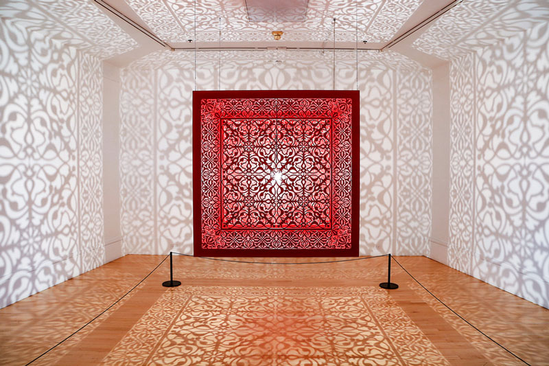
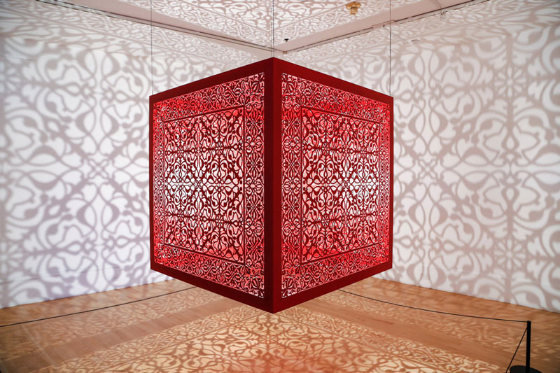
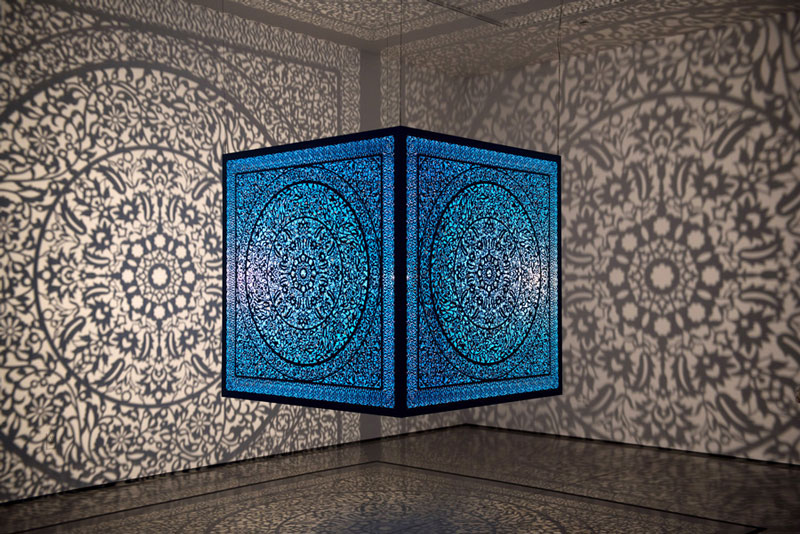
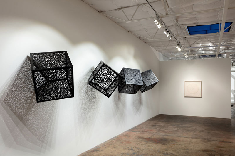
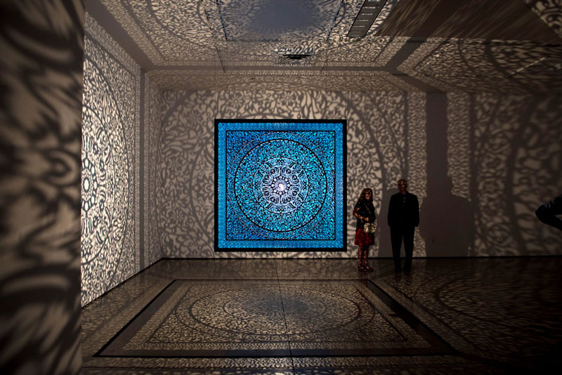
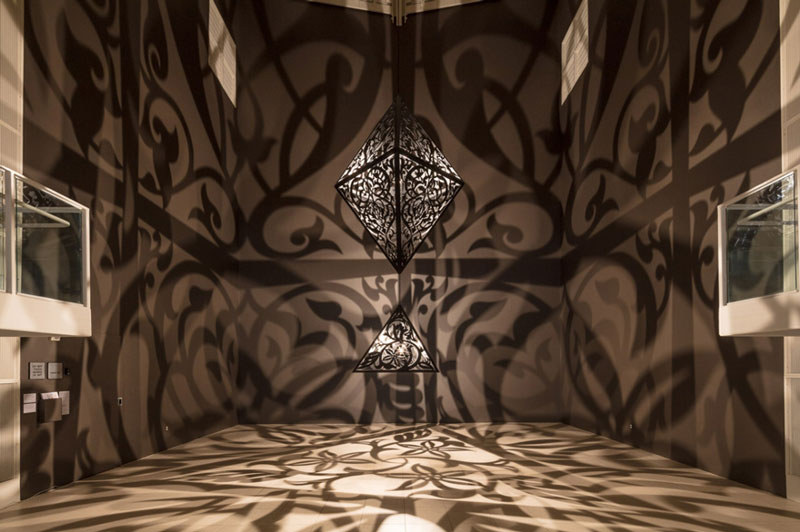
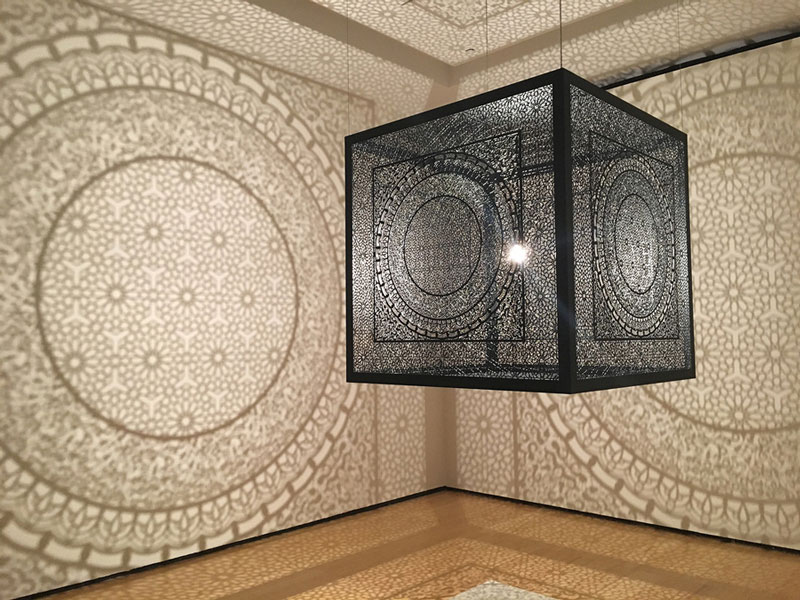
Born in Pakistan, Anila Qayyum Agha gets a big part of her inspiration from the traditional art of her country.
She is now based in Indianapolis, USA, where she teaches art and creates powerful installations. Her light-based installations look stunning, thanks to Islamic-style cuttings that are projected with the light against the walls, which gives a new perspective on the patterns.
Born in Pakistan, Anila Qayyum Agha gets a big part of her inspiration from the traditional art of her country.
She is now based in Indianapolis, USA, where she teaches art and creates powerful installations. Her light-based installations look stunning, thanks to Islamic-style cuttings that are projected with the light against the walls, which gives a new perspective on the patterns.
Every week, we’ll give you an overview of the best deals for designers, make sure you don’t miss any by subscribing to our deals feed. You can also follow the recently launched website Type Deals if you are looking for free fonts or font deals.
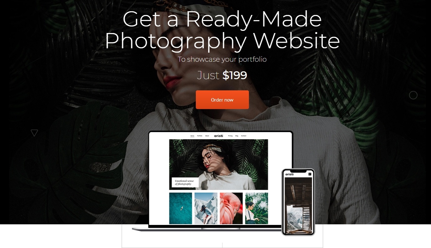
Get a Ready-Made Photography Website
Are you looking for some new ideas to help you improve your photography online-presence? A professionally-looking portfolio is one of the best ways to attract more people to your works. From now on, you do not need to do a tap of work. Thanks to a great photography offer, you online-project will be ready in six days just for $199. You will be provided with:
template installation and color scheme change;
all the necessary plugins;
domain name;
one-year professional hosting;
portfolio page with 15 projects;
services page (in order to highlight your prices).
Remember that you need to share all the details of your future online-portfolio, including pictures, videos, texts, and other elements. Make your business stand out from the crowd here and now.
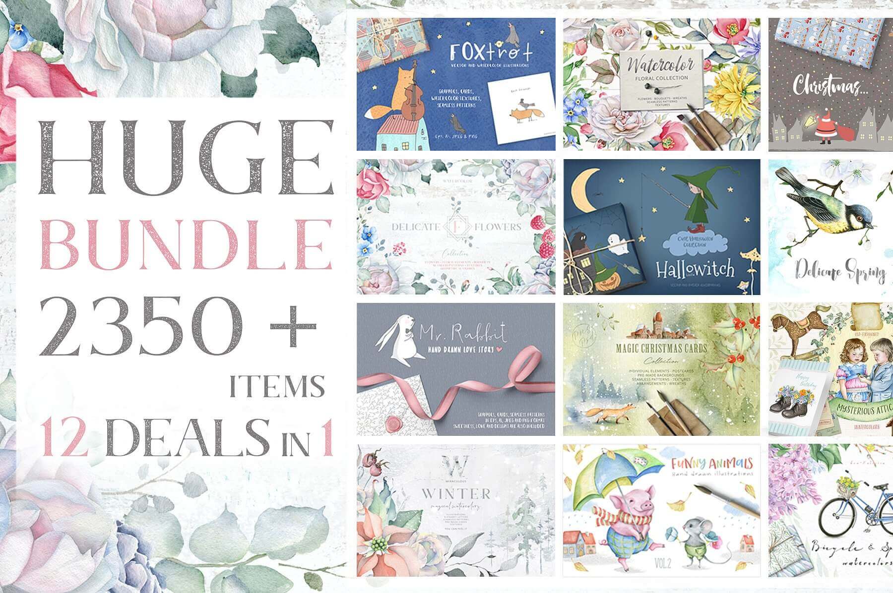
This Mega Graphics Bundle is made up of 12 amazing collections that include everything from textures to backgrounds to funny animals. With more than 2,350 graphic elements, you’ll be set for whatever project you’re working on whether it be packaging, T-shirts or prints. And with the extended license, feel free to make as many as you’d like for personal or commercial use.
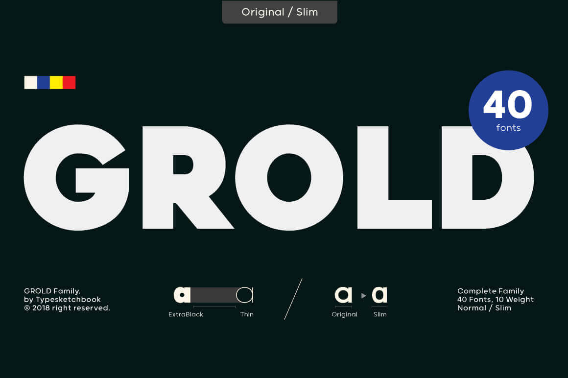
Grold is a post-geometric typeface consisting of 40 different fonts across 10 weights with both normal and slim options. This unique and modern sans typeface, is well suited for a variety of typographic applications such as headlines and small texts, and even supports multiple languages.
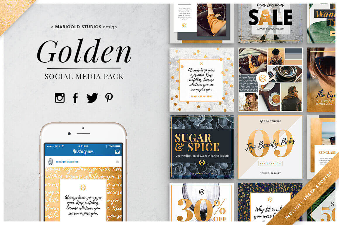
Golden Theme Social Media Pack for Facebook, Twitter, Instagram and Pinterest
Golden is an elegant and stylish media pack that’s perfect for promoting your business, blog, sales or events on the four main social networks: Facebook, Twitter, Instagram and Pinterest. Fully customizable, each network has a separate set of 28 templates full of beautiful images and designs, as well as a golden texture. From fashion bloggers to beauticians, this collection is great for both personal and commercial use.
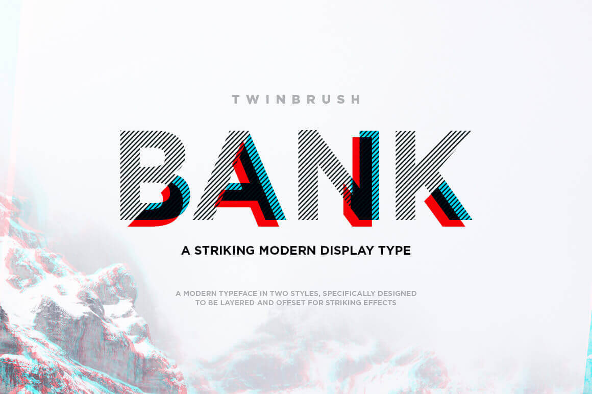
Bank is a modern, all caps display font. Specifically developed for contemporary design styles and applications, it is supplied in two styles: lined and sectioned. These styles have been carefully designed to layer on top of each other, creating an alternate third style. This can be further expanded by duplicating the sectioned style and moving/offsetting it, creating a look reminiscent of offset printing or 3d anaglyphs. This feature allows you to set different colors, opacity and blending mode settings, providing a huge range of possible outcomes.
Every week, we’ll give you an overview of the best deals for designers, make sure you don’t miss any by subscribing to our deals feed. You can also follow the recently launched website Type Deals if you are looking for free fonts or font deals.
Get a Ready-Made Photography Website
Are you looking for some new ideas to help you improve your photography online-presence? A professionally-looking portfolio is one of the best ways to attract more people to your works. From now on, you do not need to do a tap of work. Thanks to a great photography offer, you online-project will be ready in six days just for $199. You will be provided with:
template installation and color scheme change;
all the necessary plugins;
domain name;
one-year professional hosting;
portfolio page with 15 projects;
services page (in order to highlight your prices).
Remember that you need to share all the details of your future online-portfolio, including pictures, videos, texts, and other elements. Make your business stand out from the crowd here and now.
This Mega Graphics Bundle is made up of 12 amazing collections that include everything from textures to backgrounds to funny animals. With more than 2,350 graphic elements, you’ll be set for whatever project you’re working on whether it be packaging, T-shirts or prints. And with the extended license, feel free to make as many as you’d like for personal or commercial use.
Grold is a post-geometric typeface consisting of 40 different fonts across 10 weights with both normal and slim options. This unique and modern sans typeface, is well suited for a variety of typographic applications such as headlines and small texts, and even supports multiple languages.
Golden Theme Social Media Pack for Facebook, Twitter, Instagram and Pinterest
Golden is an elegant and stylish media pack that’s perfect for promoting your business, blog, sales or events on the four main social networks: Facebook, Twitter, Instagram and Pinterest. Fully customizable, each network has a separate set of 28 templates full of beautiful images and designs, as well as a golden texture. From fashion bloggers to beauticians, this collection is great for both personal and commercial use.
Bank is a modern, all caps display font. Specifically developed for contemporary design styles and applications, it is supplied in two styles: lined and sectioned. These styles have been carefully designed to layer on top of each other, creating an alternate third style. This can be further expanded by duplicating the sectioned style and moving/offsetting it, creating a look reminiscent of offset printing or 3d anaglyphs. This feature allows you to set different colors, opacity and blending mode settings, providing a huge range of possible outcomes.
Every week, we’ll give you an overview of the best deals for designers, make sure you don’t miss any by subscribing to our deals feed. You can also follow the recently launched website Type Deals if you are looking for free fonts or font deals.
Get a Ready-Made Photography Website
Are you looking for some new ideas to help you improve your photography online-presence? A professionally-looking portfolio is one of the best ways to attract more people to your works. From now on, you do not need to do a tap of work. Thanks to a great photography offer, you online-project will be ready in six days just for $199. You will be provided with:
template installation and color scheme change;
all the necessary plugins;
domain name;
one-year professional hosting;
portfolio page with 15 projects;
services page (in order to highlight your prices).
Remember that you need to share all the details of your future online-portfolio, including pictures, videos, texts, and other elements. Make your business stand out from the crowd here and now.
This Mega Graphics Bundle is made up of 12 amazing collections that include everything from textures to backgrounds to funny animals. With more than 2,350 graphic elements, you’ll be set for whatever project you’re working on whether it be packaging, T-shirts or prints. And with the extended license, feel free to make as many as you’d like for personal or commercial use.
Grold is a post-geometric typeface consisting of 40 different fonts across 10 weights with both normal and slim options. This unique and modern sans typeface, is well suited for a variety of typographic applications such as headlines and small texts, and even supports multiple languages.
Golden Theme Social Media Pack for Facebook, Twitter, Instagram and Pinterest
Golden is an elegant and stylish media pack that’s perfect for promoting your business, blog, sales or events on the four main social networks: Facebook, Twitter, Instagram and Pinterest. Fully customizable, each network has a separate set of 28 templates full of beautiful images and designs, as well as a golden texture. From fashion bloggers to beauticians, this collection is great for both personal and commercial use.
Bank is a modern, all caps display font. Specifically developed for contemporary design styles and applications, it is supplied in two styles: lined and sectioned. These styles have been carefully designed to layer on top of each other, creating an alternate third style. This can be further expanded by duplicating the sectioned style and moving/offsetting it, creating a look reminiscent of offset printing or 3d anaglyphs. This feature allows you to set different colors, opacity and blending mode settings, providing a huge range of possible outcomes.
No one, unless they frequent the dark web,
wants their website to go undiscovered. You or your business has created a
website in order for people to come visit it and keep visiting it.
It would be great if your website was
instantly at the top of every search engine’s list, standing on top of internet
mountain while casting an eye down on those who withered away at the bottom.
Alas, it is never as simple as snapping your
fingers but there are plenty of ways you can ensure your website is a frequent
stop for visitors and potential customers.
Fast-Loading
With all new technological advancements comes
a whole new load of annoyances. Your mobile phone freezing up, websites
crashing, poor WIFI connections and one of the worst of all, slow loading
times.
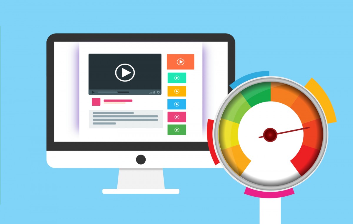
You eventually may need to call in a technical expert to fix the problem, but there are a few things you could do yourself. Remove big images and files off of the front pages, take out any javascript dead ends and use the PageSpeed Insight tool from Google.
Optimizing your page is a surefire way to make
sure people are coming and staying around.
Consistent Content
Make sure you’re adding content on a
consistent basis for viewers and potential customers. The content doesn’t
always have to be a blog post, but it can be new images, articles, multimedia
and social media updates.
The biggest reason for regularly publishing
content is making sure your website looks up-to-date. No one is going to visit
an old website in search for information. Even though it’s all digital,
websites can look abandoned.
Picture Perfect
If you have images on your website, use modern
and engaging images. If you’re obtaining your images from a third-party, make
sure they are reputable and of high quality.
Make sure you’re adding the right alt-text and
meta descriptions to boost visibility. Not just that, but high quality images
make your website easier to read and more pleasurable for the reader.
For Our Mobile Friends
Did you know that the majority of website visits come from those on
mobile devices? It’s been a steady increase over the past few years and
essentially a guarantee to continue.
Making sure your website is mobile friendly is
a way to increase your website’s visibility and make sure you have continuous
visitors. Using a platform like WordPress is an easy way to make your website
mobile and desktop friendly. You’ll want to run plenty of tests on the mobile
site to make sure everything is loading the same and users are receiving the
same content.
Not Too Many Keywords
Keywords are key (pun completely intended) for
boosting traffic to your website. What you don’t want to do is try too hard to put your keywords into your
content and website.
Pushing them too hard is like trying too hard
to be funny. Of course you want to use keywords, but don’t go too crazy. Use
other relevant words, which you can find using Google’s Latent Semantic
Indexing (LSI) to see similar words that can be plugged in. You’ll have variety
while also boosting visibility.
Social Media
So obvious it shouldn’t be mentioned, but a
very important method that should be put into practice immediately. Using
social media is a great and free way to improve your website’s visibility.
By adding regular updates to your social media
pages, you’ll start to drive traffic to your website where people can check out
your services or browse your projects. It’s also a great way to interact with
customers and respond to inquiries easily.
An Audit
While an audit can send a shiver down the
spine of even the bravest men, performing an SEO audit on your website can be
beneficial for your site. It will review your site’s performance and highlight
any areas of needed improvement.
It will help you do a lot of things like
examining any broken links, see how search friendly it is and optimize your
menu structures. You can either find a tool, do the audit yourself or hire an
outside SEO expert to come to the audit for you.
Keeping it Simple
One easy ways to increase your site’s
visibility is by keeping your website’s domain name and meta
description easy to read and understand.
Your domain name and description are the first
pieces of “advertising” any users will see and by stating your objectives
clearly is an easy way to have people come to your website. Remember, first
impressions matter, even in the digital world!
Do Some Research
Whatever your business is, there are probably
plenty of others like it. Unless you have something incredibly unique like
“Animal Jackson Pollock Painting Classes”, there are bound to be others like
you.
Check out what your competitors or similar
businesses are saying in their descriptions and keywords. Find the patterns and
similarities to try and focus on what they’ve done. There’s no crime in borrowing
a bit of strategy here to help your website out.
An idea to help you focus, try to think of
where or to whom you’re trying to promote your product. If you’re going local,
see what these websites are mentioning to be at the top of the local results.
The Long Game
Even if you take all the tips you find on the
internet and implement them perfectly, it’s still going to be awhile before you
start seeing your website at the top. SEO is a long game and you won’t be
seeing big changes over night.
Also be aware that Google and other search
engines make changes to their algorithms from time to time. So what was
relative and vital six months ago may be out of date today. When you’re looking
for tips, make sure it’s a page that was updated recently.
So don’t be frustrated, stay up to date and
keep your eyes on the long-term goal. SEO is a perfect example where practice
makes perfect and with constant practice you will start to reap the benefits of
your rewards.
Let me just frame this for you: we’re going to take a piece of production UI from a Sketch file, break it down into pieces of information and then build it up into a story we tell our friends. Our friends might be hearing, or seeing, or touching the story so we are going to interpret and translate the same information for different people. We’re going to interpret the colors and the typography and even the sizes, and express them in different ways. And we really want everyone to pay attention. This story mustn’t be boring or frustrating; it’s got to be easy to follow, understand and remember. And it’s got to, got to, make sense, from beginning to end.
I’ve asked my colleague Katie to choose a component she has designed in Sketch. I’ll go through and mark it up (we mainly use SCSS, Twig and Craft but the templating language is not very important), then she will respond briefly. Hopefully I’ll get most of it right, and then one or two things wrong, so we can look at how things get lost during handoff.
In white label or framework type front-end, the focus is on building pieces that are as flexible and adaptable as possible, as content and style-agnostic as possible (within the scope of the product), because you simply will never know where the code is going and for what, ultimately it is being used. But recently I moved to a web design agency, which has a complete inversion of this focus. It is particular. It is bespoke. It’s all about really deeply engaging with the particular client you have and the particular clients they have, and designing something that suits them, as a tailor would.
Working so closely with a graphic designer like Katie, with highly finished pixel-spaced UI, instead of directly from wireframes or stories is an adjustment and an education, but there are still lots of things I can bring to the table. Chiefly: document design.
Document design, which admittedly is just the old semantic web with an accessibility hat on, is really looking at graphic design, engaging with it as a system of communication, and translating the underlying purpose of the colors/type/layout into an accessible, linearizable, and traversable DOM. It’s HTML, kids. It’s just HTML. You’d think we all knew it by now… but look around you. You’d be wrong!
Katie has slung me a Sketch file chock full of artboards, and she’s pretty great at writing out what she wants so I don’t have to think too hard:
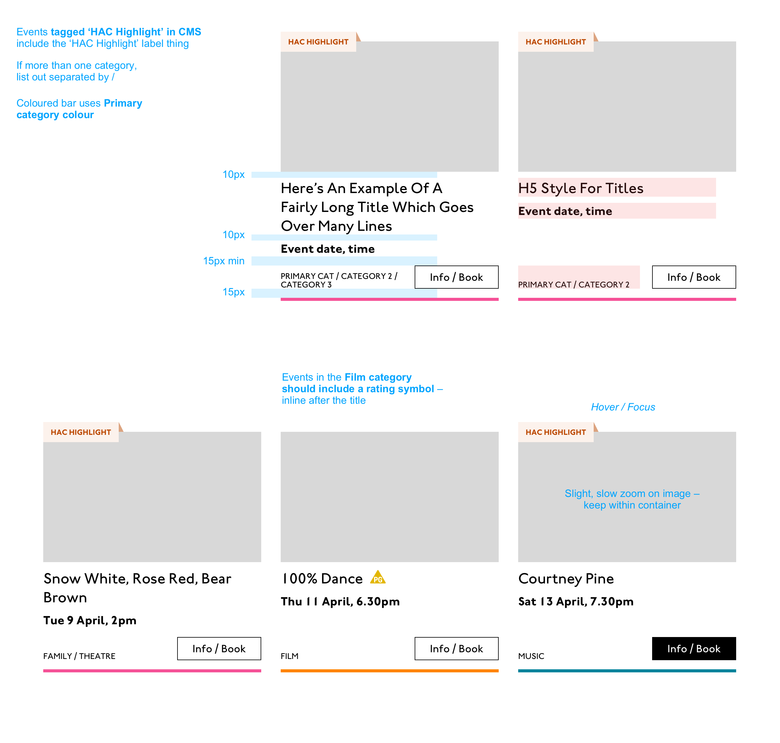
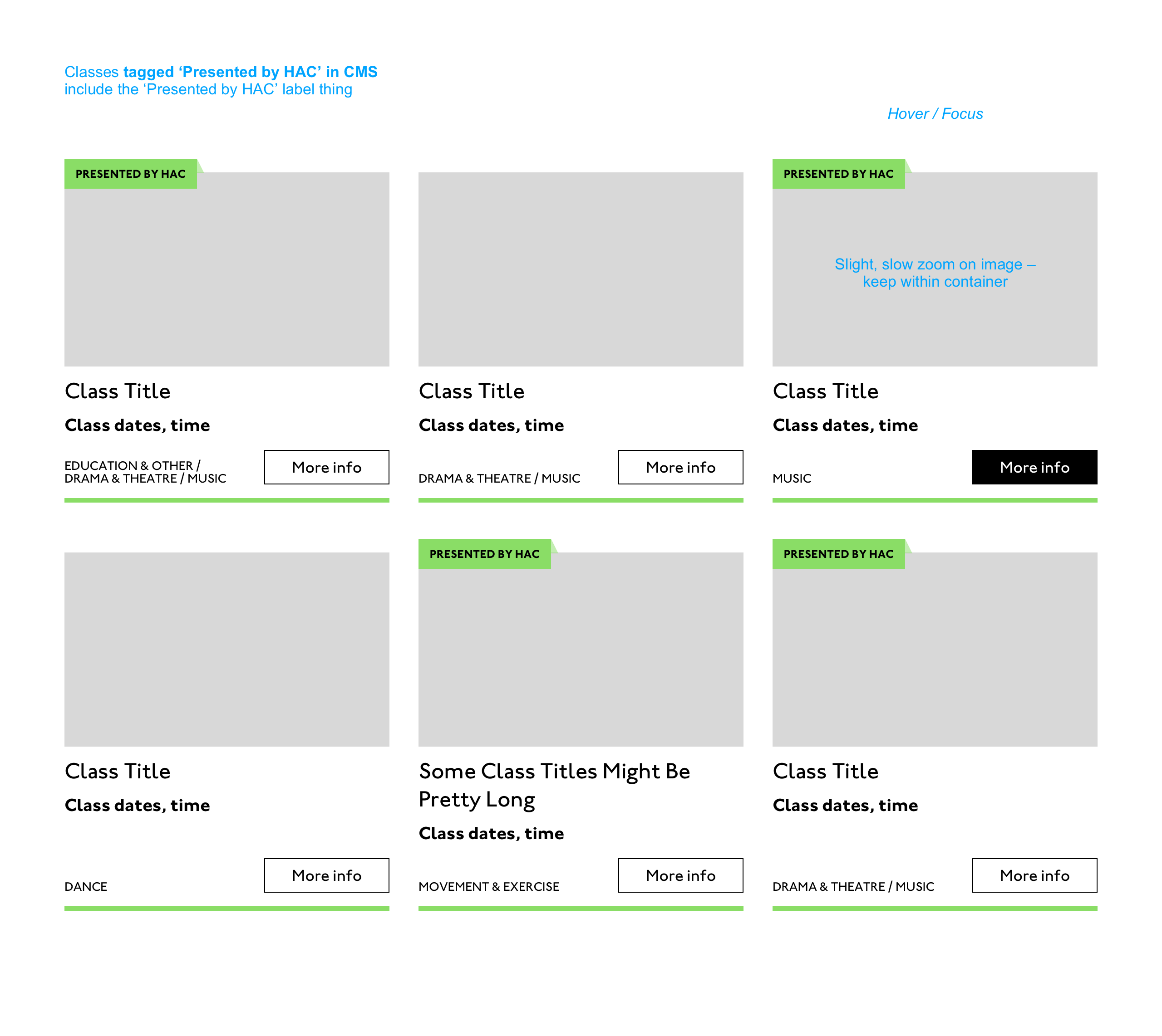
Event card
First I look through the whole UI file and figure out what is actually a card on this site — it turns out there are six or seven components that use this paradigm. Let’s make some observations:
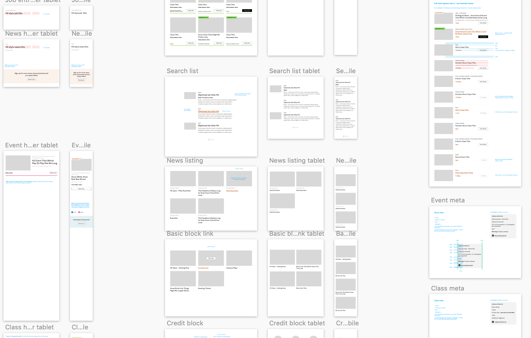
Zoom out on section of artboardsAnother card, classes this time.
A card is a block of meta data about a page on the site.
It has an image/media and metadata — it’s a media object.
It’s shown in a group of objects.
That group is always typed (there’s no view where there are search results and news articles and classes are all mixed up).
Each object has a single link to a page and no other actions.
Each object has a call to action (Book, etc.).
Each object may have times, categories, badges, and calls to action.
Each object must have media, title, and link.
So a card is the major way my user is going to find their way around this site. They are going to be clicking through guided pathways where they get a set of cards they can choose from, based on top pages like „what’s on” or „classes.” They’re not getting options on this card. It’s not really an interactive element — it’s a guide, an index card, that sets her onto her path: in this case a purchase path where she books a ticket for a show at this arts centre.
Before going on, let me just frame this for you:
Imagine you were looking at a flyer for a show and discussing it on the phone. If you actually wanted to go to this show in real life. What would you do? You wouldn’t just read the flyer out, would you? That’s the text. And it might have all kinds of random stuff on it if you started literally at the top. You wouldn’t start with „Twentieth Century Fox” or „Buy Hot Dog Get Cola Free” or „Comedy Drama Musical Family Friendly.” (I would actually hang up on you if you did!) And you wouldn’t simply describe the color or fonts. That’s the CSS. You’d talk through the information on the flyer. You’d say, „It’s The Greatest Showman and it’s on Tuesday, starts at 7:30. It’s at the Odeon on Oxford Street by the tram.” Right?
This is the document. Keep that person on the phone in your mind.
Count, group, and name
So let’s say we’ll deliver a card as the inside of a list item. We want a group and that group should be countable. We’ve already named the page with an <h1> so we’ll introduce and describe the group with a heading, an <h2>. First we’ll name it, then we’ll deliver it, so someone using a screen reader can:
Get the list signaled in the headings overview.
Get a count up front of the number of items on a page.
Know they can skip to the next list item to get the next card.
Know they can skip the group at any point and go to the next page — the pagination is the very next element and it will be labelled as a landmark.
In this particular case, I’m gonna wrap this whole card in an anchor element (<a>). There’s only one link on the card and I want to front load that information so someone can click as soon as they know it’s the right card, instead of having to search forward for the action. A big clickable area is nice too, though of course that can be taken too far and make an interface a sort of booby trap! But these cards are not too enormous and I can see they have a nice gutter around them, so there’s a rest space that will reduce accidental clicking for people with more limited dexterity.
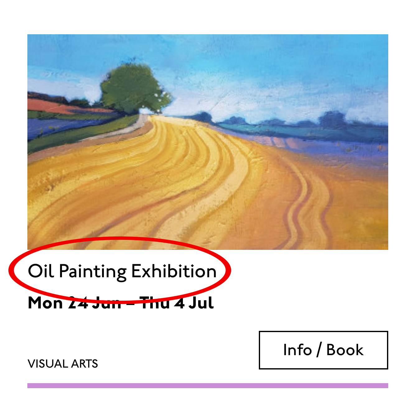
Title
Event card „title” element
Then we’ll jump down a heading level and mark up the name of each show as a heading, an <h3>. The designer has made this type the focus and we will too. Some people browse super fast by jumping to the next heading, then next heading, so I’m not going to put any important information before the heading — they’ll jump right over it. I will put the image there, though, as I know in this case, I can’t get meaningful image descriptions from the API so those images are hidden and have empty alt attributes. Now the user can guess (correctly in my case) that the developer is actually describing the content in some meaningful way and might flip back to headings overview (list headings level 3) and just get a list of the shows.
Now let’s deliver our metadata. Let’s list it:
Badge
Date/Time
Categories
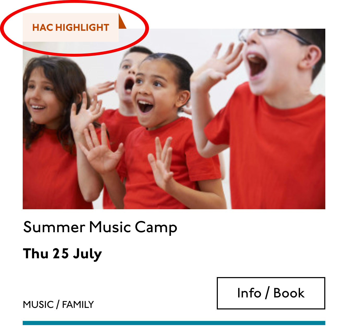
Badge
Event card „badge” element
This seems to be something the venue adds to a card to highlight it. As a developer, I can’t immediately see why a user would look for this, but it’s emphasized strongly by the designer, so I’ll make sure it stays in. Katie has moved the badge up out of the flow, but I know that with a headings jump our user could miss it. So I’ll just put the wording directly after the title, I think. I’ll either put it first or last, so make it easier to account for in a non-visual browse and not be too crazy paving in a tabbing, visual browse.
<p class="c-card__badge"><abbr title="Harrow Arts Centre">HAC</abbr> Highlight.</p>
…But on second thought, I won’t put an <abbr> after all. It’s the brand color, so it’s really a statement of ownership by this venue, and we’ve already said HAC a million times by now, so the user knows where they are.
A quick aside: the 'badging’ is very specific to this organisation. They want to show people clearly and quickly which events they’ve programmed themselves, and which are run by other organizations who’ve hired their venue.
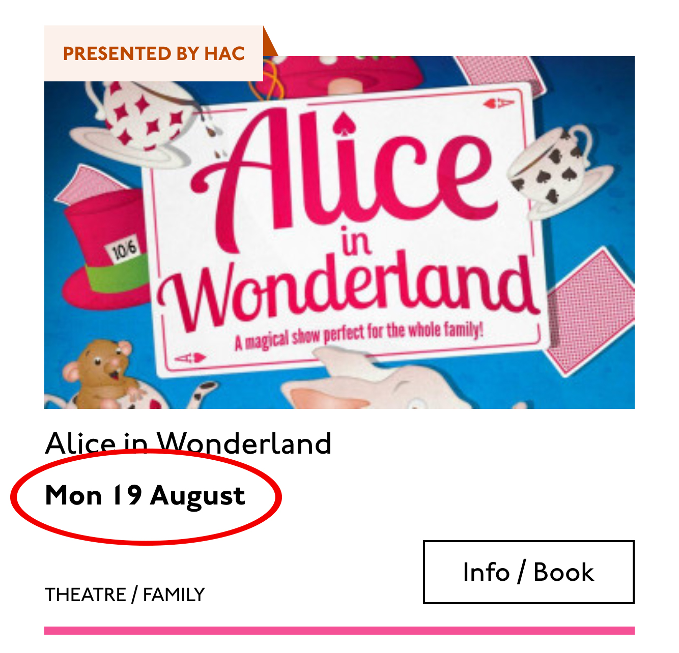
Date/Time
Event card „date/time” element
Now date and time. Katie is keying me in to this decision point by styling the dates in bold. Dates are important. I’m going to pop it in an <h4>, because I’m thinking it looks like someone might be quickly scanning a page of events looking for the matinee, for example, or looking for a news article published on a particular day. I don’t always put dates into headings, especially if there are millions on a page, but I do always make sure they’re in a <time> element with a complete value so the <time>Thu</time> or <time>Mon</time> Katie has specified is read out as comprehensible English words „Thursday” instead of garblage. I could also have used hidden completion or <abbr> with a title.
Categories/ Tags
Event card „categories/tags” element
Next come the categories, and I’m putting them after badge and date. This section is next in the visual order reading top-to-bottom, left-to-right, of course, but it also seems to be deprioritized: it’s been pushed down on the left and the type is smaller. This works for our linear storytelling. As a rule, we don’t want people to sit through repeated or more general content (cinema, cinema, cinema) to get to unique or more specific content (Monday, Tuesday, Wednesday). Remember, we are inside our card: we know it has already been sorted in a few general ways (news, show, class, etc), so it’s likely to have a lot of repeated pieces. We want to ensure that the user will go from specific to general if we can.
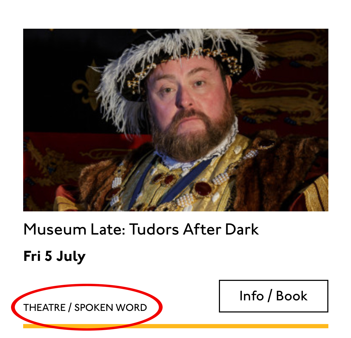
There is a primary category that is sorted first and then some other categories sometimes. I won’t deliver this as a countable list as there’s mostly just one category, and loads of lists of one item is not much use. But I will put a little tag beforehand because otherwise, it’s a slightly impenetrable announcement. MOVEMENT! SPOKEN WORD! (I mean, you can work it out retrospectively, but we always try to name things first and then show them, in linear order. This isn’t Memento.) I used to use title="" fairly heavily but I’ve gotten complaints about the tooltip so I route around. Note the use of colon or full stop to give us a „breath.” That’s a nice bit of polish.
<p class="c-card__tags h-text--label>
  <span class="h-accessibility">Categories: </span>
{% for category in categories.all() %}
  <span class="c-card__tag c-tag">{{category}}{% if not loop.last %} / {% endif %}</span>
{% endfor %}</p>
Also I’m hard-coding in my spaces to make sure the categories never run together into complete garblage even with text compression or spaceless rendering turned on somewhere down the pipeline. (This can happen with screen readers and spans and it’s rather alarming!)
There’s a piece of this design I will do in the CSS but haven’t really pulled into the document design: the color-coding on primary category. I am not describing the color to the reader as it seems arbitrary, not evocative. If there were some subtextual element to the color coding beyond tagging categories (if horticultural classes were green, say), then I might bring it through, but in this case it’s a non-verbal key to a category, so we don’t want it in our verbal key.
I’m sorting the primary category to the front of the category paragraph, but I’m not labeling it as primary. This is because there’s a sorting filter before this list that sorts on primary category, and it’s my surmise that it would be easier and less annoying to select a category from that dropdown than to read through each card saying Categories Primary Category Music Secondary Categories Dance. I could be wrong about that! Striking a balance between useful and too much labeling is sometimes a bit tricky. You have to consider the page context. We may be building components but our user is on a page.
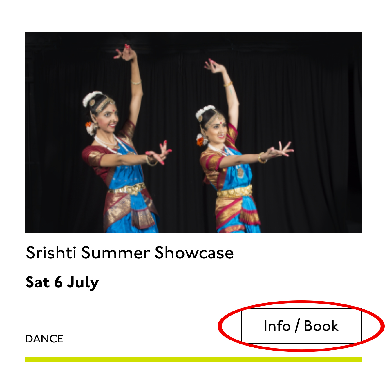
Last, the action. The direction to the user, to Book, or Learn More, or whatever it is, has been styled as a button. It’s not actually a button, it’s just a direction, so I’ll mark it up as a span in this case. I definitely want this to come last in the linear document. It’s a call to action and also a signal that we’ve reached the end of this card. The action is the exit point in both cases: if the user acts, we go to the target entry; if they do not, we go to the next card. We definitely never want any data to come after the action, as they might have left by then.
This markup, which counts, groups, and names data, delivers linear and non-linear interactions. The page makes sense if you read it top to bottom, makes sense if you read parts of it out of context, and helps you jump around.
Katie, over to you…
Katie Parry, designer
What an ace article! Really interesting. (I particularly like that „Mon,” „Tue,” etc. on cards are read as „Monday,” „Tuesday”… smart!)
One thing that struck me is that using assistive tech means users get information served to them in a „set” order that we’ve decided. So, unless there’s a filter, someone browsing for dance events, for example, has to sit/tab through a title, badge, dates, and maybe several other categories to find out whether an event’s for them or not. Bit tiresome. But that’s not something you’ve got wrong — it’s just how the internet works. Something for me to think about in the future.
Most of our clients are arts and cultural venues that need to sell tickets for events so I design a lot of event cards. They’re one of the very first things I’ll work on when designing a site. (Before even settling on a type hierarchy for the rest of the site.)
Thinking visually, here’s how I’d describe the general conventions of an event card:
It must look like a list – so people understand how to use it.
It needs to provide enough information for folks to decide if they’re interested or not. (The minimum information is likely an image, title, date, and link.)
It needs to include a clear call to action — usually a link to find out more information.
It needs to be easily scannable, visually.
Making information visually scannable is a pretty straightforward case of ensuring every information type (e.g. image, title, date, category, link) is sitting in the same place on every card and follows a clear hierarchy.
I focus a lot on typography in my work anyway but clearly: titles are styled to be highly prominent; dates are styled the same as each other but are different from titles; categories look different again – so that folks can easily pick-out the information they’re interested in from simply scanning the page. I’m composing the card for the user, saying, „Hey, look here’s the event’s name, this is when it’s on — and here’s where you go to get your tickets!”
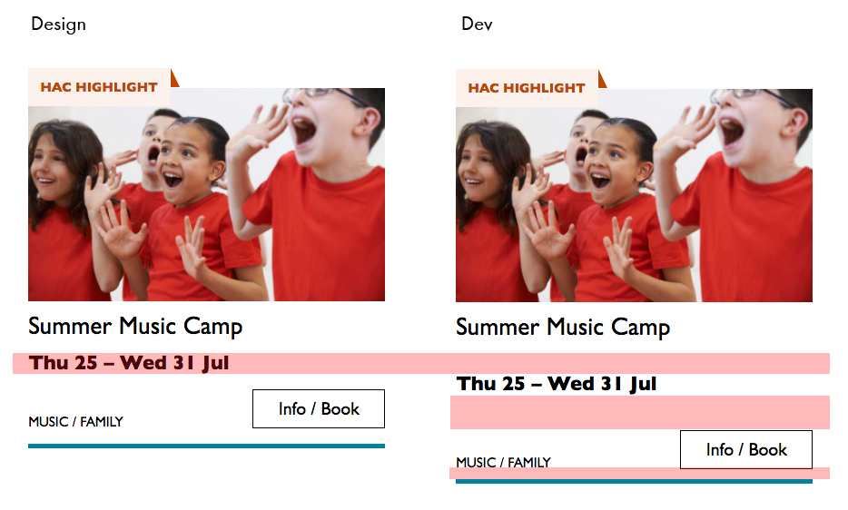
The type styles – and particularly the spacing between them – are doing a lot of work, so I will point out here that the spacings are not quite right in the code sample:
Spacing between the title and dates, dates and button, and button and piping don’t match the design.
This is important. Users need to be able to scan information quickly as they aren’t all looking for the same thing in order to make the decision to go to an event. Too much or too little space between elements can be distracting.
Some people just want a general mooch at what’s coming up at their local venue. Others may have seen an advert for a specific show that tickles their fancy, and want to buy tickets. There are people who love music but don’t care for theatre who just want a list of gigs; nothing else. And some folks who feel like going out at the weekend but aren’t that fussed about what it is they go to. So, I design cards to be easy to scan — because most users aren’t at all reading from top to bottom.
Despite the conventions I just laid out, cards certainly don’t all look the same — or work in the same way — across projects.
There is always a tension in web design between making an interface familiar to the user and original to the client. Custom typefaces and color palettes do a lot here, but the other piece of it is through discovery.
I spend time reading-up about a client, including who their audience is by reading what they say on review sites and social media, as well as working directly with the client. Listening to people talk through how they work, what feedback they get from their audience/users often uncovers some interesting little nuggets which influence a design. Developers aren’t typically involved much in discovery, which is something I’d like to change, but for now, I need to make it super-clear to Sally what’s special about this event card for each new project. I write many, many (many) notes on Sketch files, but find they can tend to get lost, so sometimes we have a spreadsheet defining particular functionality.
Let me just frame this for you: we’re going to take a piece of production UI from a Sketch file, break it down into pieces of information and then build it up into a story we tell our friends. Our friends might be hearing, or seeing, or touching the story so we are going to interpret and translate the same information for different people. We’re going to interpret the colors and the typography and even the sizes, and express them in different ways. And we really want everyone to pay attention. This story mustn’t be boring or frustrating; it’s got to be easy to follow, understand and remember. And it’s got to, got to, make sense, from beginning to end.
I’ve asked my colleague Katie to choose a component she has designed in Sketch. I’ll go through and mark it up (we mainly use SCSS, Twig and Craft but the templating language is not very important), then she will respond briefly. Hopefully I’ll get most of it right, and then one or two things wrong, so we can look at how things get lost during handoff.
In white label or framework type front-end, the focus is on building pieces that are as flexible and adaptable as possible, as content and style-agnostic as possible (within the scope of the product), because you simply will never know where the code is going and for what, ultimately it is being used. But recently I moved to a web design agency, which has a complete inversion of this focus. It is particular. It is bespoke. It’s all about really deeply engaging with the particular client you have and the particular clients they have, and designing something that suits them, as a tailor would.
Working so closely with a graphic designer like Katie, with highly finished pixel-spaced UI, instead of directly from wireframes or stories is an adjustment and an education, but there are still lots of things I can bring to the table. Chiefly: document design.
Document design, which admittedly is just the old semantic web with an accessibility hat on, is really looking at graphic design, engaging with it as a system of communication, and translating the underlying purpose of the colors/type/layout into an accessible, linearizable, and traversable DOM. It’s HTML, kids. It’s just HTML. You’d think we all knew it by now… but look around you. You’d be wrong!
Katie has slung me a Sketch file chock full of artboards, and she’s pretty great at writing out what she wants so I don’t have to think too hard:
Event card
First I look through the whole UI file and figure out what is actually a card on this site — it turns out there are six or seven components that use this paradigm. Let’s make some observations:
Zoom out on section of artboardsAnother card, classes this time.
A card is a block of meta data about a page on the site.
It has an image/media and metadata — it’s a media object.
It’s shown in a group of objects.
That group is always typed (there’s no view where there are search results and news articles and classes are all mixed up).
Each object has a single link to a page and no other actions.
Each object has a call to action (Book, etc.).
Each object may have times, categories, badges, and calls to action.
Each object must have media, title, and link.
So a card is the major way my user is going to find their way around this site. They are going to be clicking through guided pathways where they get a set of cards they can choose from, based on top pages like „what’s on” or „classes.” They’re not getting options on this card. It’s not really an interactive element — it’s a guide, an index card, that sets her onto her path: in this case a purchase path where she books a ticket for a show at this arts centre.
Before going on, let me just frame this for you:
Imagine you were looking at a flyer for a show and discussing it on the phone. If you actually wanted to go to this show in real life. What would you do? You wouldn’t just read the flyer out, would you? That’s the text. And it might have all kinds of random stuff on it if you started literally at the top. You wouldn’t start with „Twentieth Century Fox” or „Buy Hot Dog Get Cola Free” or „Comedy Drama Musical Family Friendly.” (I would actually hang up on you if you did!) And you wouldn’t simply describe the color or fonts. That’s the CSS. You’d talk through the information on the flyer. You’d say, „It’s The Greatest Showman and it’s on Tuesday, starts at 7:30. It’s at the Odeon on Oxford Street by the tram.” Right?
This is the document. Keep that person on the phone in your mind.
Count, group, and name
So let’s say we’ll deliver a card as the inside of a list item. We want a group and that group should be countable. We’ve already named the page with an <h1> so we’ll introduce and describe the group with a heading, an <h2>. First we’ll name it, then we’ll deliver it, so someone using a screen reader can:
Get the list signaled in the headings overview.
Get a count up front of the number of items on a page.
Know they can skip to the next list item to get the next card.
Know they can skip the group at any point and go to the next page — the pagination is the very next element and it will be labelled as a landmark.
In this particular case, I’m gonna wrap this whole card in an anchor element (<a>). There’s only one link on the card and I want to front load that information so someone can click as soon as they know it’s the right card, instead of having to search forward for the action. A big clickable area is nice too, though of course that can be taken too far and make an interface a sort of booby trap! But these cards are not too enormous and I can see they have a nice gutter around them, so there’s a rest space that will reduce accidental clicking for people with more limited dexterity.
Title
Event card „title” element
Then we’ll jump down a heading level and mark up the name of each show as a heading, an <h3>. The designer has made this type the focus and we will too. Some people browse super fast by jumping to the next heading, then next heading, so I’m not going to put any important information before the heading — they’ll jump right over it. I will put the image there, though, as I know in this case, I can’t get meaningful image descriptions from the API so those images are hidden and have empty alt attributes. Now the user can guess (correctly in my case) that the developer is actually describing the content in some meaningful way and might flip back to headings overview (list headings level 3) and just get a list of the shows.
Now let’s deliver our metadata. Let’s list it:
Badge
Date/Time
Categories
Badge
Event card „badge” element
This seems to be something the venue adds to a card to highlight it. As a developer, I can’t immediately see why a user would look for this, but it’s emphasized strongly by the designer, so I’ll make sure it stays in. Katie has moved the badge up out of the flow, but I know that with a headings jump our user could miss it. So I’ll just put the wording directly after the title, I think. I’ll either put it first or last, so make it easier to account for in a non-visual browse and not be too crazy paving in a tabbing, visual browse.
<p class="c-card__badge"><abbr title="Harrow Arts Centre">HAC</abbr> Highlight.</p>
…But on second thought, I won’t put an <abbr> after all. It’s the brand color, so it’s really a statement of ownership by this venue, and we’ve already said HAC a million times by now, so the user knows where they are.
A quick aside: the 'badging’ is very specific to this organisation. They want to show people clearly and quickly which events they’ve programmed themselves, and which are run by other organizations who’ve hired their venue.
Date/Time
Event card „date/time” element
Now date and time. Katie is keying me in to this decision point by styling the dates in bold. Dates are important. I’m going to pop it in an <h4>, because I’m thinking it looks like someone might be quickly scanning a page of events looking for the matinee, for example, or looking for a news article published on a particular day. I don’t always put dates into headings, especially if there are millions on a page, but I do always make sure they’re in a <time> element with a complete value so the <time>Thu</time> or <time>Mon</time> Katie has specified is read out as comprehensible English words „Thursday” instead of garblage. I could also have used hidden completion or <abbr> with a title.
Categories/ Tags
Event card „categories/tags” element
Next come the categories, and I’m putting them after badge and date. This section is next in the visual order reading top-to-bottom, left-to-right, of course, but it also seems to be deprioritized: it’s been pushed down on the left and the type is smaller. This works for our linear storytelling. As a rule, we don’t want people to sit through repeated or more general content (cinema, cinema, cinema) to get to unique or more specific content (Monday, Tuesday, Wednesday). Remember, we are inside our card: we know it has already been sorted in a few general ways (news, show, class, etc), so it’s likely to have a lot of repeated pieces. We want to ensure that the user will go from specific to general if we can.
There is a primary category that is sorted first and then some other categories sometimes. I won’t deliver this as a countable list as there’s mostly just one category, and loads of lists of one item is not much use. But I will put a little tag beforehand because otherwise, it’s a slightly impenetrable announcement. MOVEMENT! SPOKEN WORD! (I mean, you can work it out retrospectively, but we always try to name things first and then show them, in linear order. This isn’t Memento.) I used to use title="" fairly heavily but I’ve gotten complaints about the tooltip so I route around. Note the use of colon or full stop to give us a „breath.” That’s a nice bit of polish.
<p class="c-card__tags h-text--label>
  <span class="h-accessibility">Categories: </span>
{% for category in categories.all() %}
  <span class="c-card__tag c-tag">{{category}}{% if not loop.last %} / {% endif %}</span>
{% endfor %}</p>
Also I’m hard-coding in my spaces to make sure the categories never run together into complete garblage even with text compression or spaceless rendering turned on somewhere down the pipeline. (This can happen with screen readers and spans and it’s rather alarming!)
There’s a piece of this design I will do in the CSS but haven’t really pulled into the document design: the color-coding on primary category. I am not describing the color to the reader as it seems arbitrary, not evocative. If there were some subtextual element to the color coding beyond tagging categories (if horticultural classes were green, say), then I might bring it through, but in this case it’s a non-verbal key to a category, so we don’t want it in our verbal key.
I’m sorting the primary category to the front of the category paragraph, but I’m not labeling it as primary. This is because there’s a sorting filter before this list that sorts on primary category, and it’s my surmise that it would be easier and less annoying to select a category from that dropdown than to read through each card saying Categories Primary Category Music Secondary Categories Dance. I could be wrong about that! Striking a balance between useful and too much labeling is sometimes a bit tricky. You have to consider the page context. We may be building components but our user is on a page.
Last, the action. The direction to the user, to Book, or Learn More, or whatever it is, has been styled as a button. It’s not actually a button, it’s just a direction, so I’ll mark it up as a span in this case. I definitely want this to come last in the linear document. It’s a call to action and also a signal that we’ve reached the end of this card. The action is the exit point in both cases: if the user acts, we go to the target entry; if they do not, we go to the next card. We definitely never want any data to come after the action, as they might have left by then.
This markup, which counts, groups, and names data, delivers linear and non-linear interactions. The page makes sense if you read it top to bottom, makes sense if you read parts of it out of context, and helps you jump around.
Katie, over to you…
Katie Parry, designer
What an ace article! Really interesting. (I particularly like that „Mon,” „Tue,” etc. on cards are read as „Monday,” „Tuesday”… smart!)
One thing that struck me is that using assistive tech means users get information served to them in a „set” order that we’ve decided. So, unless there’s a filter, someone browsing for dance events, for example, has to sit/tab through a title, badge, dates, and maybe several other categories to find out whether an event’s for them or not. Bit tiresome. But that’s not something you’ve got wrong — it’s just how the internet works. Something for me to think about in the future.
Most of our clients are arts and cultural venues that need to sell tickets for events so I design a lot of event cards. They’re one of the very first things I’ll work on when designing a site. (Before even settling on a type hierarchy for the rest of the site.)
Thinking visually, here’s how I’d describe the general conventions of an event card:
It must look like a list – so people understand how to use it.
It needs to provide enough information for folks to decide if they’re interested or not. (The minimum information is likely an image, title, date, and link.)
It needs to include a clear call to action — usually a link to find out more information.
It needs to be easily scannable, visually.
Making information visually scannable is a pretty straightforward case of ensuring every information type (e.g. image, title, date, category, link) is sitting in the same place on every card and follows a clear hierarchy.
I focus a lot on typography in my work anyway but clearly: titles are styled to be highly prominent; dates are styled the same as each other but are different from titles; categories look different again – so that folks can easily pick-out the information they’re interested in from simply scanning the page. I’m composing the card for the user, saying, „Hey, look here’s the event’s name, this is when it’s on — and here’s where you go to get your tickets!”
The type styles – and particularly the spacing between them – are doing a lot of work, so I will point out here that the spacings are not quite right in the code sample:
Spacing between the title and dates, dates and button, and button and piping don’t match the design.
This is important. Users need to be able to scan information quickly as they aren’t all looking for the same thing in order to make the decision to go to an event. Too much or too little space between elements can be distracting.
Some people just want a general mooch at what’s coming up at their local venue. Others may have seen an advert for a specific show that tickles their fancy, and want to buy tickets. There are people who love music but don’t care for theatre who just want a list of gigs; nothing else. And some folks who feel like going out at the weekend but aren’t that fussed about what it is they go to. So, I design cards to be easy to scan — because most users aren’t at all reading from top to bottom.
Despite the conventions I just laid out, cards certainly don’t all look the same — or work in the same way — across projects.
There is always a tension in web design between making an interface familiar to the user and original to the client. Custom typefaces and color palettes do a lot here, but the other piece of it is through discovery.
I spend time reading-up about a client, including who their audience is by reading what they say on review sites and social media, as well as working directly with the client. Listening to people talk through how they work, what feedback they get from their audience/users often uncovers some interesting little nuggets which influence a design. Developers aren’t typically involved much in discovery, which is something I’d like to change, but for now, I need to make it super-clear to Sally what’s special about this event card for each new project. I write many, many (many) notes on Sketch files, but find they can tend to get lost, so sometimes we have a spreadsheet defining particular functionality.
Have you ever had a form that needed to accept a short, arbitrary bit of text? Like a name or whatever. That’s exactly what <input type="text"> is for. There are lots of different input types (and modes!), and picking the right one is a great idea.
But this little story is about something else and applies to any of them.
What if the text needs to be arbitrary (like „What’s your favorite color?”) so people can type in whatever, but you also want to be helpful. Perhaps there are a handful of really popular answers. Wouldn’t it be nice if people could just select one? Not a <select>, but a hybrid between an input and a dropdown. Hold on though. Don’t make your own custom React element just yet.
That’s what <datalist> is for. I just used it successfully the other day so I figured I’d blog it because blogging is cool.
One <input type="text"> for a „flag” (an aribtrary string representing a permission)
I probably wouldn’t do a <datalist> for every username in a database. I don’t think there is a limit, but this is sitting in your HTML, so I’d say it works best at maybe 100 options or less.
But for that second one, we only had maybe 3-4 unique flags we were dealing with at the time, so a datalist for those made perfect sense. You can type in whatever you want, but this UI helps you select the most common choices. So dang useful. Maybe this could be useful for something like a gender input, where there is a list of options you can choose, but it doesn’t enforce you actually choose one of them.
Even lesser known than the fact that <datalist> exists? The fact that it works for all sorts of inputs besides just text, like date, range, and even color.
Adobe InDesign has long been the market leader in publishing software. But rival layout design programs are starting to make waves in the market, with Affinity Publisher being the latest to offer a competitive alternative to InDesign.
If you’re a seasoned print designer or are looking to dip a toe into publishing design, you’ll want to read on to discover our assessment of Affinity Publisher and whether we think it’s a decent alternative to Adobe’s publishing giant.
Discover thousands of assets to use in your layout designs, from fonts to photos, over at Envato Elements and GraphicRiver.
Learn about the key differences between Photoshop and Affinity Photo to help you decide if you want to make the ultimate switch. Take a look at Affinity…
What Is Affinity Publisher?
Affinity Publisher is a publishing program for Mac and Windows that allows you to create single- and multi-page documents. Publishing programs are suitable for creating layout-based media, which combine typography, graphics, and photos, such as magazines, brochures, flyers, and books. Most publishing programs allow users to create content for both print and online, as well as EPUBs (eBooks).
Serif released the full version of Affinity in June 2019 (it had previously only been available in beta format). Fans of Affinity Photo and Affinity Designer, decent and good value alternatives to Adobe Photoshop and Illustrator, will find that Publisher makes a seamless and useful addition to their collection of Affinity apps.
Through technology called StudioLink, Publisher can be integrated with Affinity’s other apps, Photo and Designer, allowing users to seamlessly create and edit images before integrating them into Publisher layouts.
What’s the Difference Between Affinity Publisher and Adobe InDesign?
For budget-conscious creatives, the main advantage of Affinity Publisher is that it’s excellent value, retailing at just £48.99 (around $64 and AU$87) for the single app download. Users aren’t tied into a subscription model, an irritant for some Adobe users.
Publisher’s competitive price will make it a serious competitor on price point with Adobe, which offers InDesign CC at a subscription price only, with the single app costing users $19.99 a month.
In terms of usability, Affinity Publisher owes a great deal to InDesign in terms of functionality and interface. Superficially, the differences between the two are minor, and it really comes down to which program you feel most comfortable with using.
We took Affinity Publisher for a test drive to see how it compares to InDesign and how it functions as a publishing program. Read on to discover our thoughts on Publisher, and assess whether you should make the switch from InDesign.
Dig into these 25 fantastic, fully compatible Affinity Designer brushes, illustrations, icons, templates and more, as well as three courses and eight…
What’s Good About Affinity Publisher?
It’s Adaptable for Modern Web Design
The latest release of InDesign CC has certainly improved the web and ePublishing design experience for users, with better capabilities for setting up web-friendly layouts and exporting to interactive formats. However, it appears that Affinity Publisher has put the modern web design process at the heart of its design.
You can choose from a wide range of screen size options, which include all mass-market up-to-date devices. You can also choose to design specifically for Web or Devices, each of which contains a wide range of pre-saved formats to choose from, including an updated catalog of iPhone, Apple Watch, iPad, Nexus and Kindle screen sizes.
It’s More Flexible Than InDesign… in Some Ways
Because InDesign is built on foundations which preceded web design, stemming from the technology developed by Quark for the first layout publishing program, QuarkXPress, it is still a traditional print publishing program at heart.
Publisher by contrast, though inspired by the InDesign interface, doesn’t have the same historical legacy, and there are some features of the program which feel more relevant for how designers work now.
One example is the ability to set a facing page document to begin on a left-hand page. Sure, this isn’t what you’d want to choose for a traditional multi-page document like a print book or magazine, but there are occasions where you might want to start your document with a two-page spread, like eMagazines or interactive PDFs, for example.
It’s Speedier and Lighter Than InDesign
One of the main complaints with InDesign is the processing power of the software. It’s a very heavy program, which can have an impact on usability, particularly if you’re working on a laptop rather than a desktop. Switching the Display Performance in InDesign to Fast Display can solve the problem, but it also means you have to do the bulk of your work while looking at heavily pixelated images.
Publisher is a heavy program too, but it certainly doesn’t feel that way. It’s whippet-quick, even when I was trying it out on my ancient laptop, which struggles to open InDesign in less than 15 minutes.
Images in Publisher remain crisp and clear, which helps you to assess the quality of images accurately while you work.
An extra bonus—I had no issues with stalling or crashing, which was an almost daily occurrence when I was working with InDesign CS6 and a monthly occurrence with InDesign CC.
Creating a print and web branding package for a new business can be an expensive and time-consuming process. But in our new course, Branding on a Budget With…
If You’re an InDesign User, It Feels Intuitive
Serif has mimicked the InDesign interface in Publisher for good reason, in the hope of converting committed InDesign users.
If you’re a seasoned InDesign user, the Publisher interface will feel very familiar, with the tools panel docked to the left and the most-used panels, including Color, Swatches, and Stroke, docked in their usual position to the right.
The Pages panel has been shifted to the left, but personally this feels like an improvement on InDesign’s default docking of the same panel to the right of the screen.
It Has a Useful Clipboard Feature, 'Assets’
Clipboards are really useful for producing designs that use repeated visual content (such as company logos) or specific sets of icons (such as emojis or UI icons).
Affinity has a handy clipboard function called Assets, which is docked on the left side of the interface, alongside the Pages panel.
It’s quick and easy to create your own library of asset categories, allowing you to access essential images in an instant. Particularly handy for designers working with brand identities.
What’s Not So Good About Affinity Publisher?
Publisher has been tightened up significantly since the beta release, and Serif have obviously benefitted from inviting users to share their thoughts and feedback on the beta version.
Generally, Publisher is a well-rounded program with all the major features InDesign users would be accustomed to. However, it is admittedly better value than InDesign for a reason—it is overall a less sophisticated program that lacks some of the advanced features InDesign users enjoy.
Here are just a few of the issues I encountered in my (albeit Publisher novice) experience with the program.
Some of the Options in Publisher Are Not Immediately Obvious
Many of Publisher’s 'flaws’ are more to do with the difference between the Publisher and InDesign interfaces. Generally I found I had to take more steps to complete the same action in Publisher, but this is unlikely to bother users who are new to InDesign and Publisher.
Welcome back to another Affinity tutorial, in which we’re going to learn how to quickly create a set of glyph icons using some basic geometric shapes which…
In the beta version of Publisher, in the New Document window, the Color Format of the document was not automatically adjusted to the corresponding document Type, but this has since been rectified in the full release.
What is a little different is that the Layout, Color, Margins and Bleed options are organised into separate tabs in the window, meaning that it could be easy to forget to set or check these settings before creating a new document.
For observant (and wide awake designers) this is a minor issue, but there’s something intrinsically helpful about InDesign’s New Document window containing everything you need in one place.
Where’s the Snap?
One of the really nice, but probably under-appreciated, features of InDesign is the ability of the program to ‘snap’ the edges of frames and shapes to other objects. For example, if you’re trying to get two text frames perfectly lined up, InDesign senses what you’re trying to do and produces a ‘snap’ movement and colored line to help guide the frame into position.
By default, InDesign introduces the snap feature, making it instantly easy-peasy to line up the edges of text and image frames.
Publisher doesn’t apply a snap automatically, but as seems to be the case with most things in Publisher, you just need to do a bit of hunting around and apply the desired effect manually. You can switch on snapping in Publisher by going to View > Snapping Manager and checking Enable snapping.
Affinity Publisher: Our Verdict
If you’re looking for a good value alternative to Adobe InDesign, Affinity Publisher is a no-brainer.
For marketers needing to create certain items in-house or designers looking to pick up new publishing design skills, Publisher is a budget-friendly and intuitive way to hone your skills and create a wide range of layout media, from magazines to books. For budding web designers, there’s also plenty on offer for creating layouts for websites, apps and EPUBs too.
If you’re a committed InDesign user, you might find it initially difficult to make the switch to Affinity Publisher, as the latter lacks some of the sophistication and advanced features of the former. Publisher can feel a little clumsy in comparison, but this impression quickly diminishes the more time spent using the application.
All in all, Affinity Publisher is shaping up to be a serious rival for InDesign, competing on both value for money and functionality. So watch this space!
We’d love to know your thoughts on Affinity Publisher. Are you a Publisher convert or die-hard InDesign fan? Leave your thoughts in the comments below.
Discover thousands of assets to use in your layout designs, from fonts to photos, over at Envato Elements and GraphicRiver.
Check out more reviews of Affinity programs and suggestions for alternative design software:
Welcome to the final entry in our series exploring the creative software we have at our disposal outside the familiar world of Adobe. In this article we’ll…
It’s always a good idea to know as much as possible about all the tools at your disposal. With a little exploration you might find there are tools out there,…
Learn about the key differences between Photoshop and Affinity Photo to help you decide if you want to make the ultimate switch. Take a look at Affinity…
Agregator najlepszych postów o designie, webdesignie, cssie i Internecie